日本の伝統色
=Japanese Traditional Color=
色の説明には、染料や染色方法に関する記載が含まれる場合がありますが、これは歴史的背景を説明するものであり、実際の靴の染色に使用されたものではありません。あらかじめご了承ください。
The description of colors may include references to dyes and dyeing methods; however, these are intended to provide historical context and do not indicate actual use in the dyeing of shoes. Please be advised accordingly.
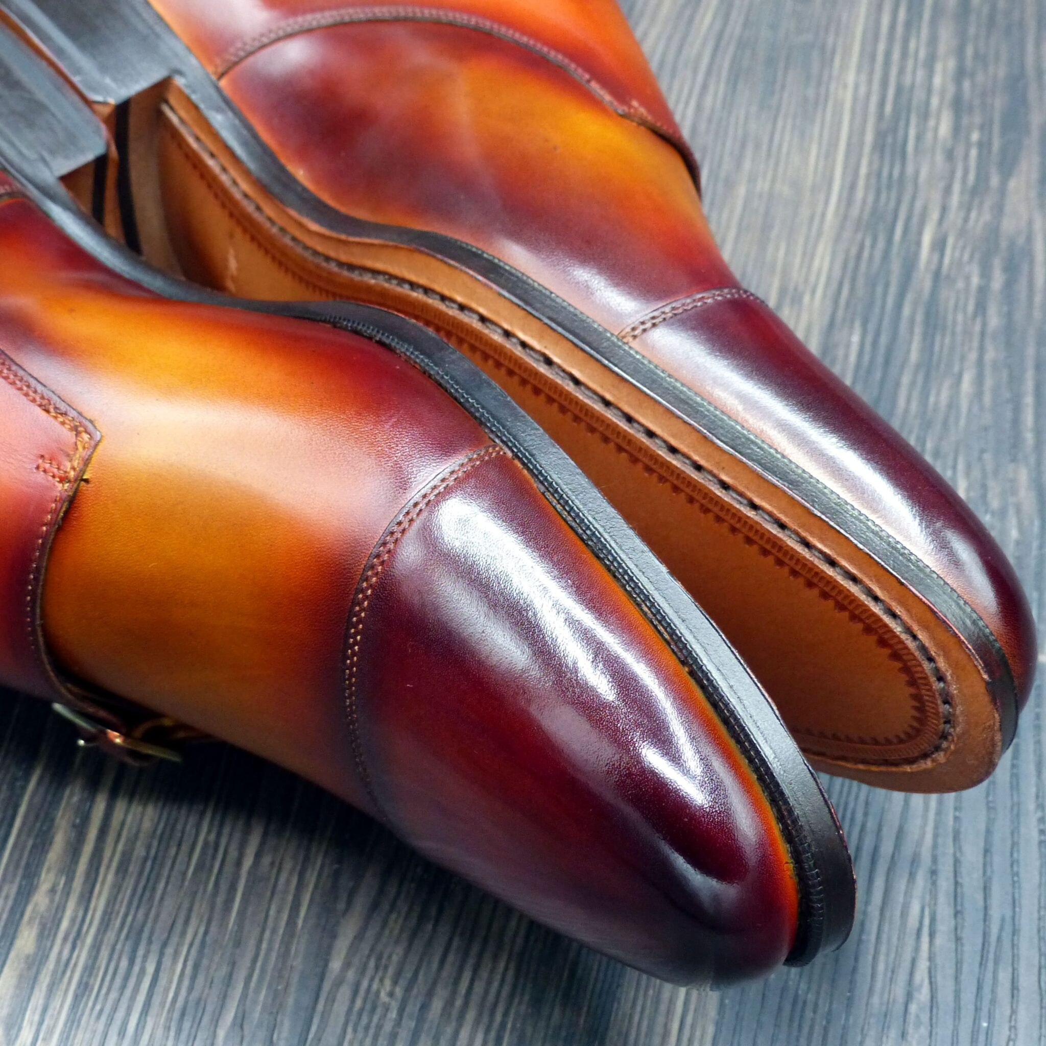
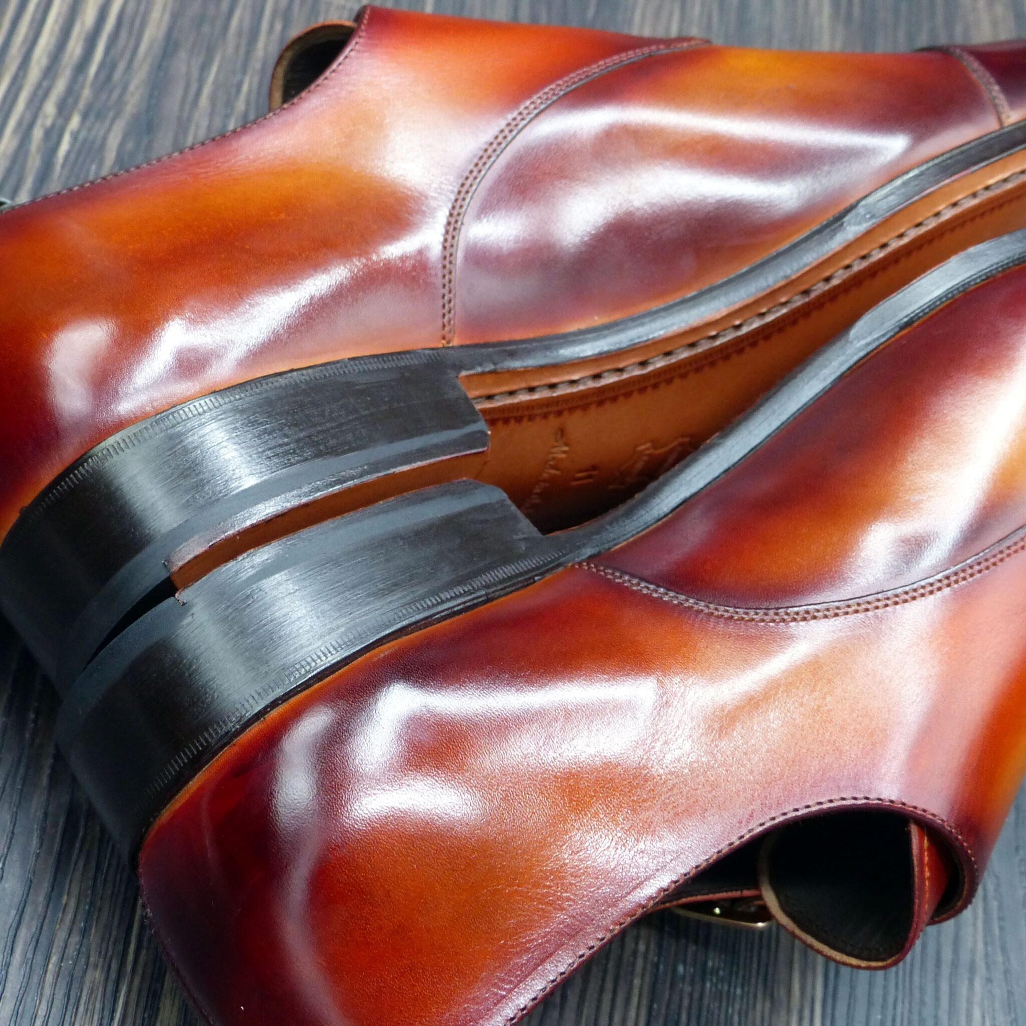
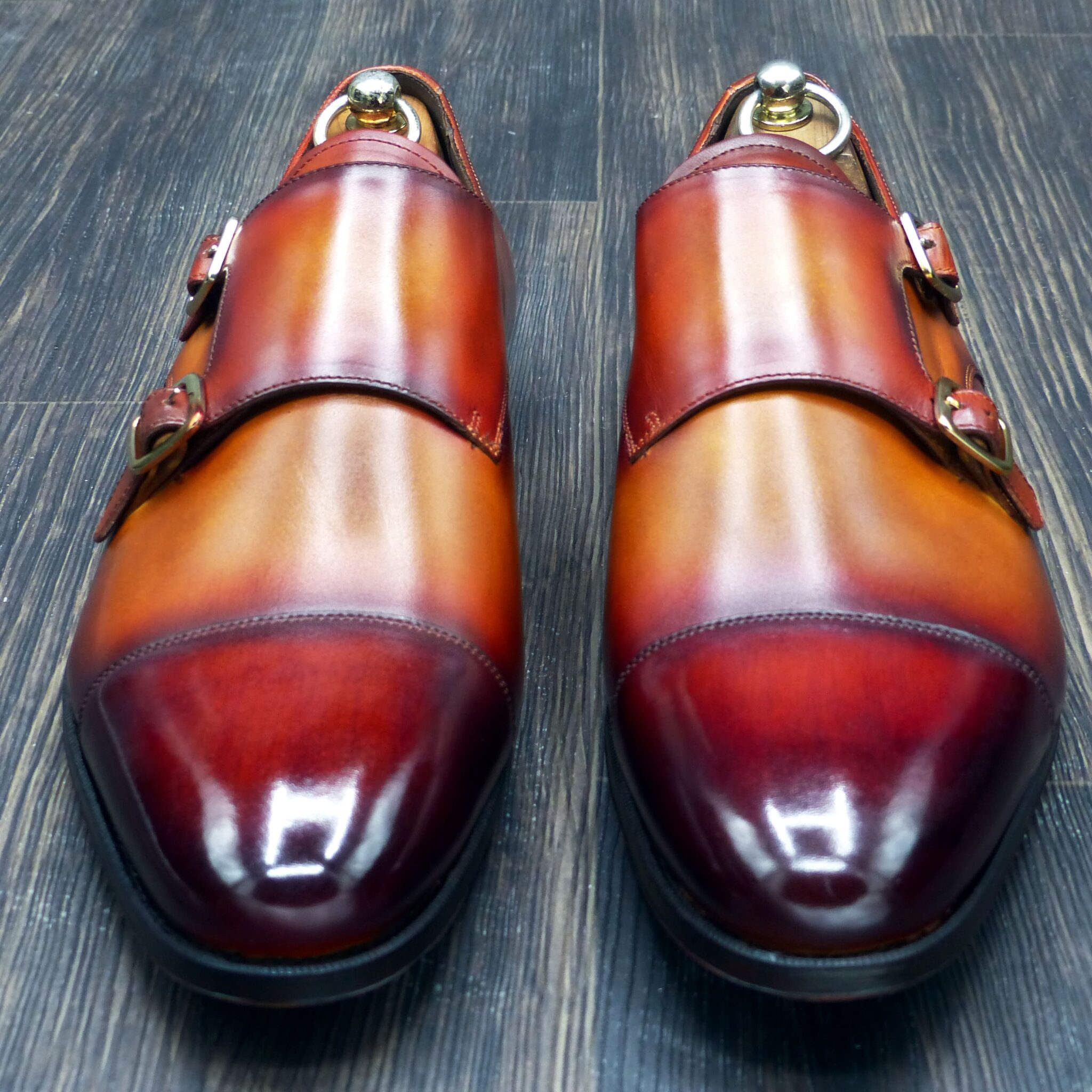
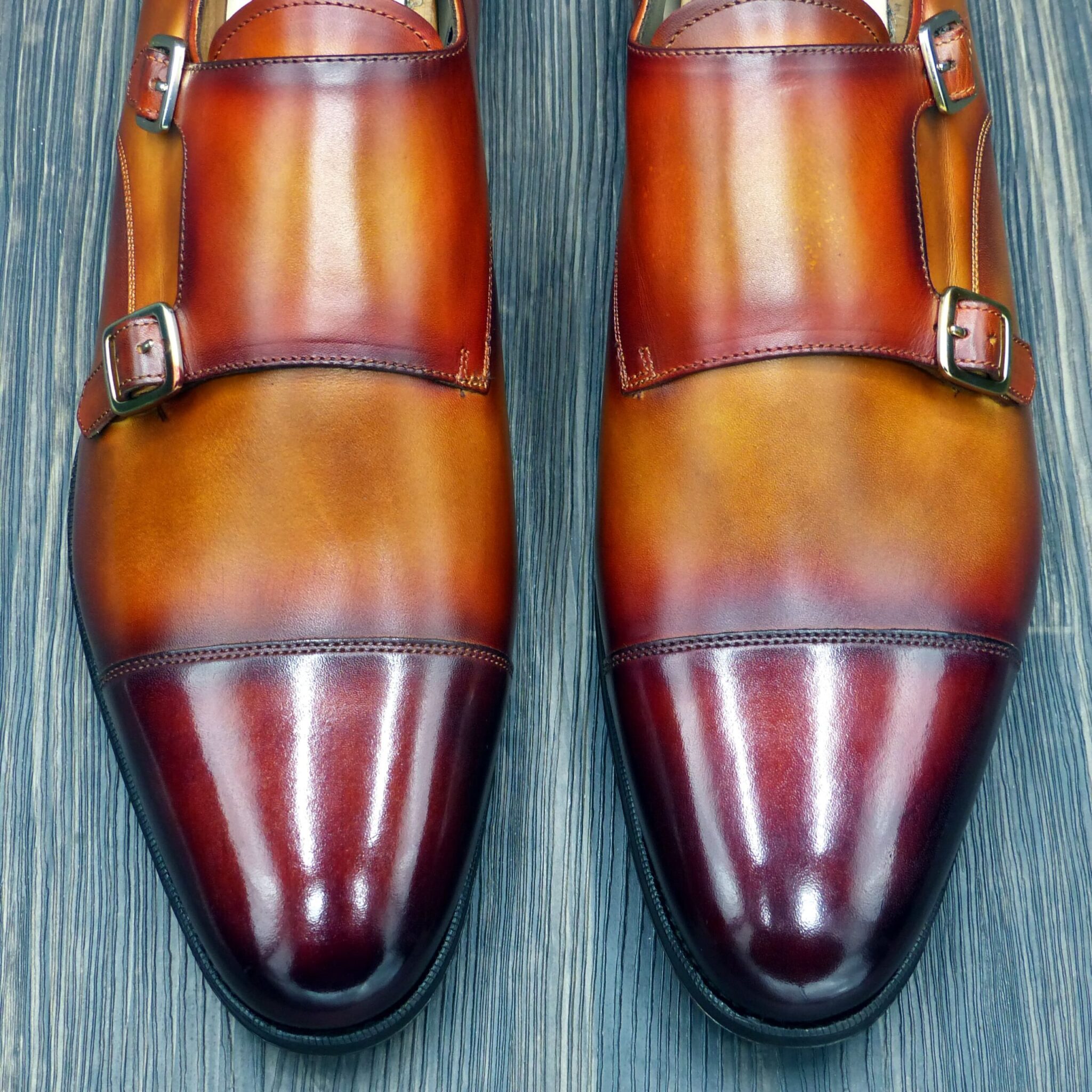
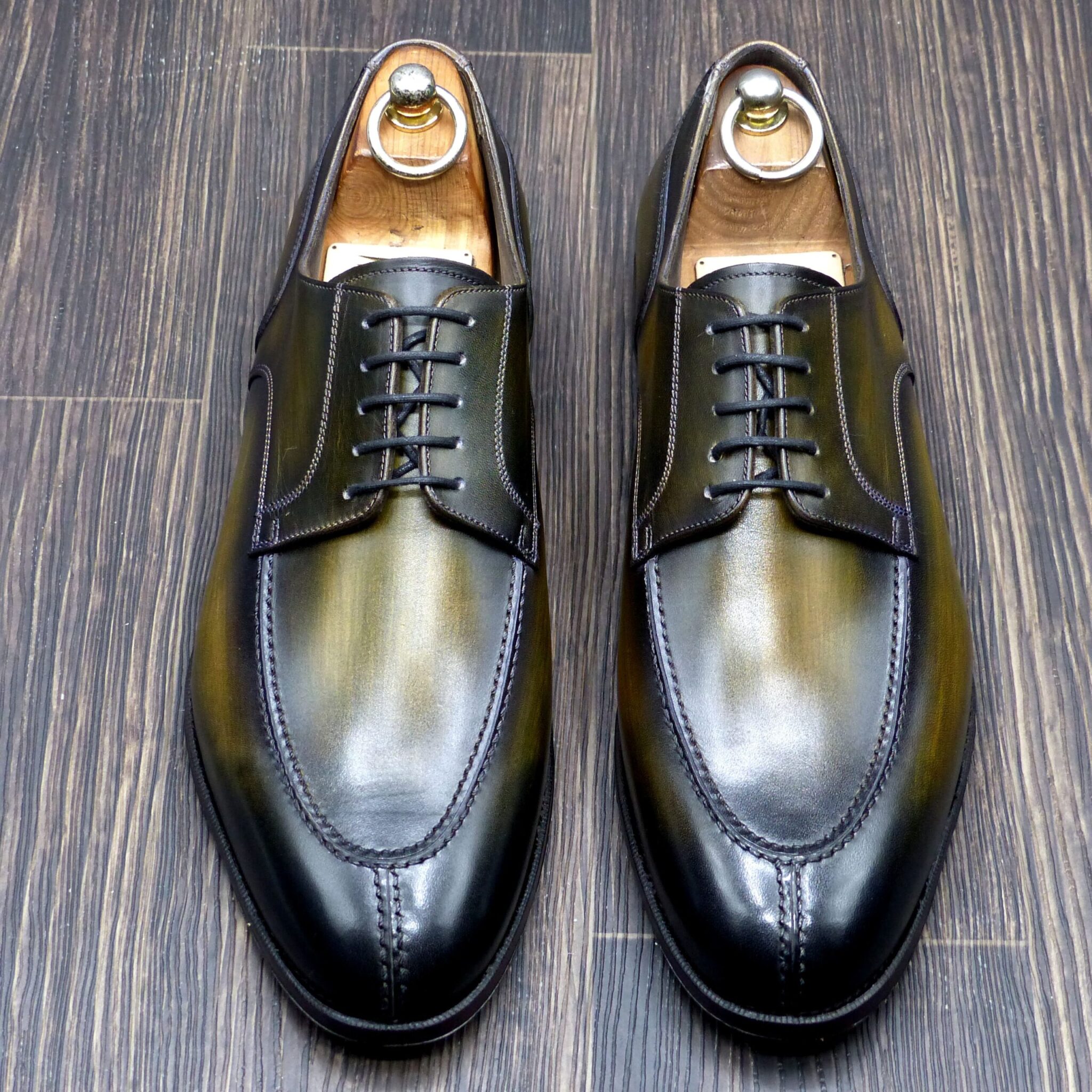
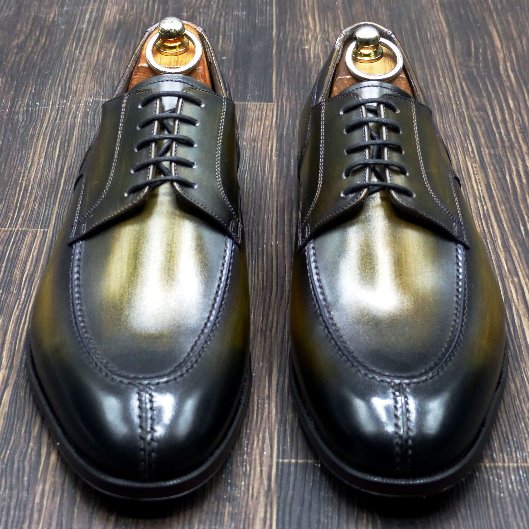
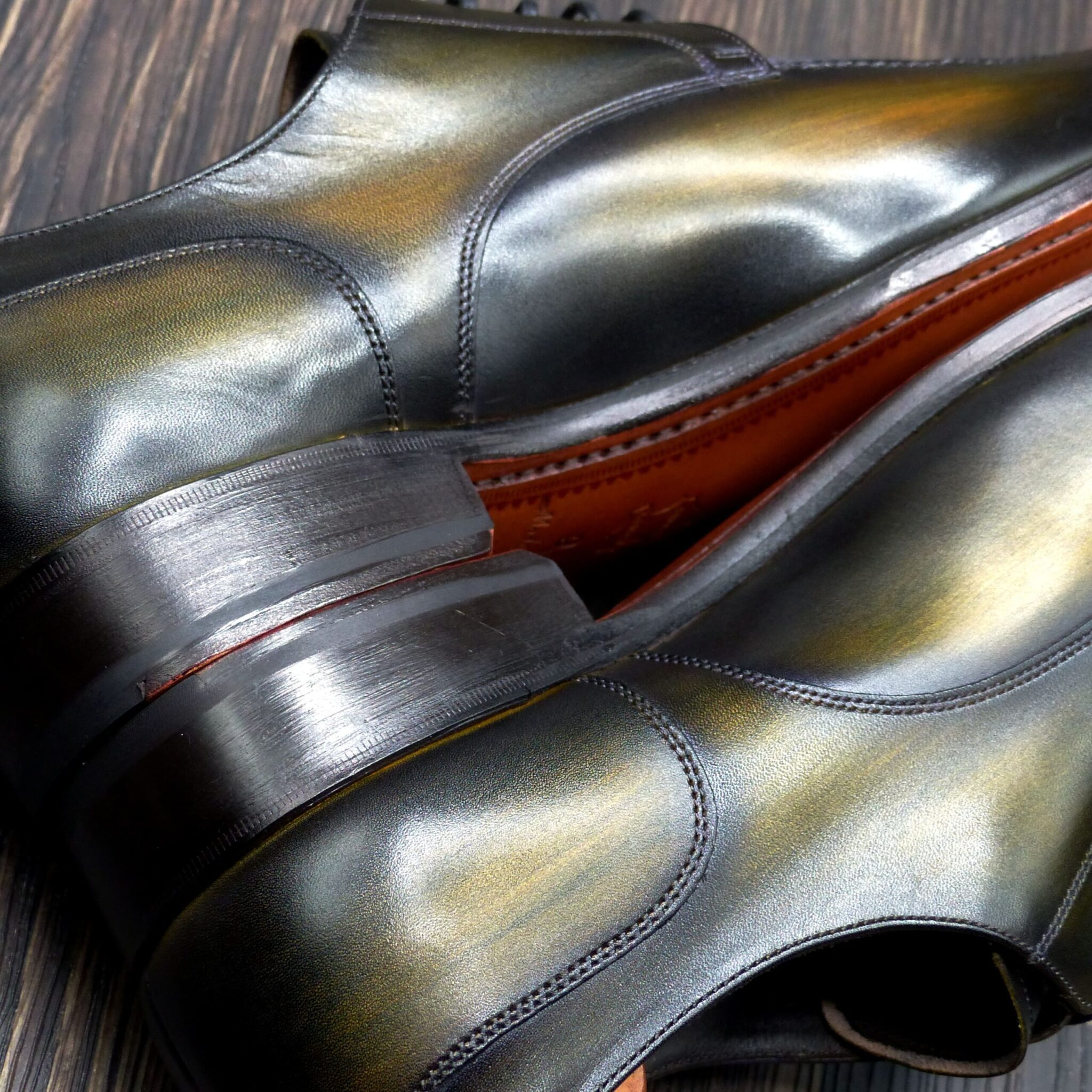
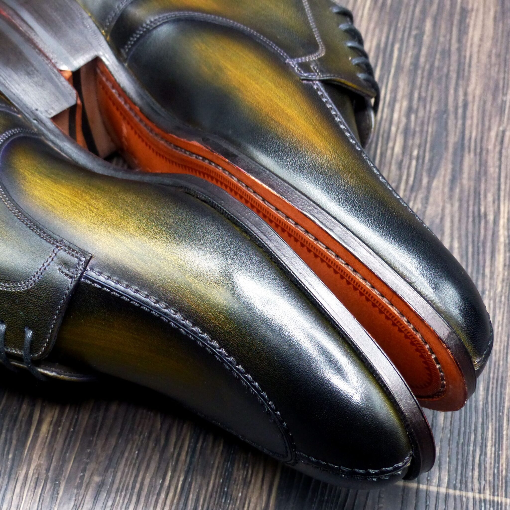
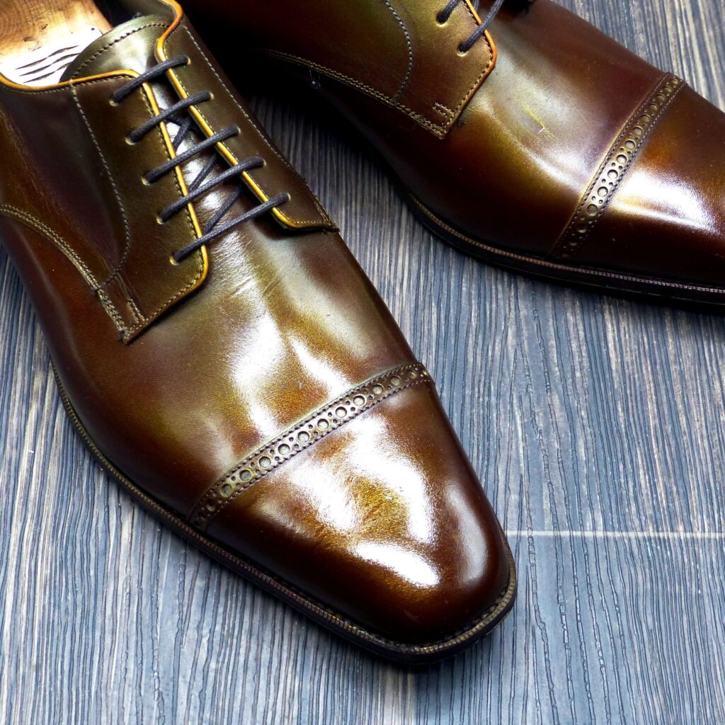
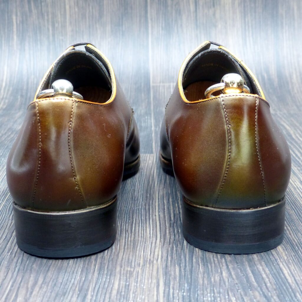
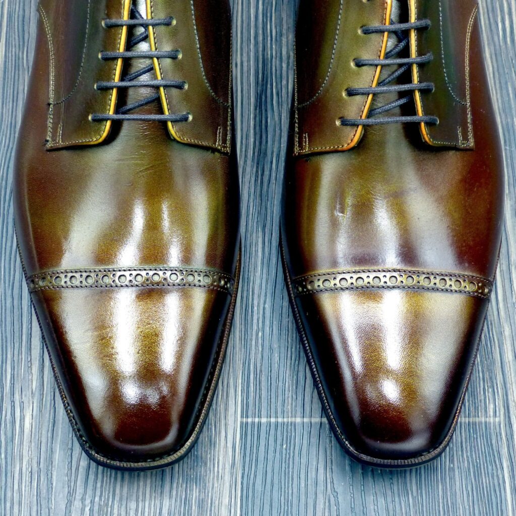
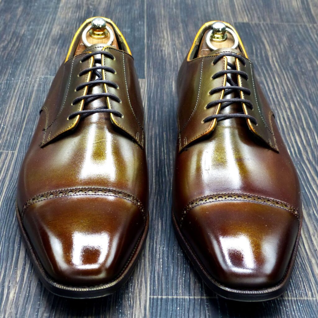
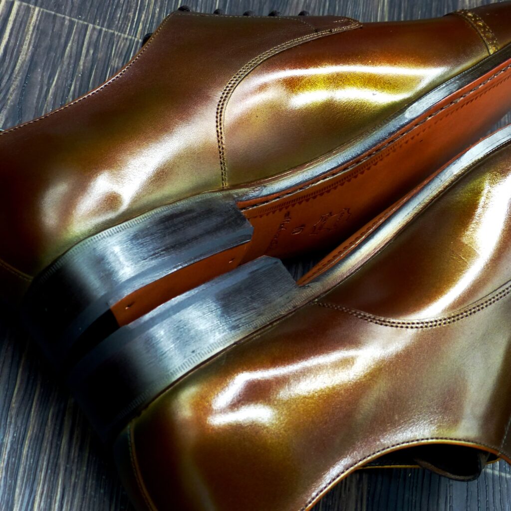
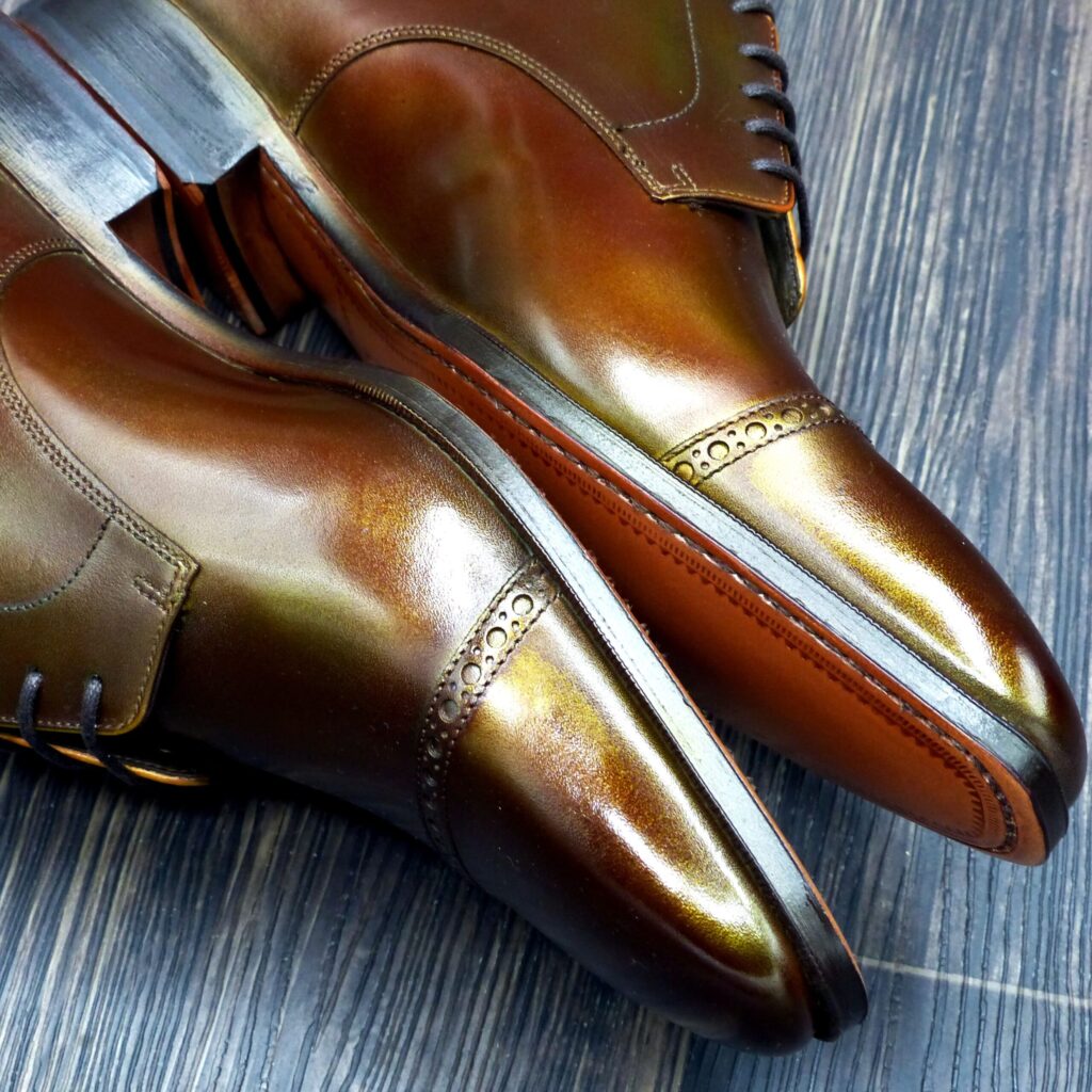
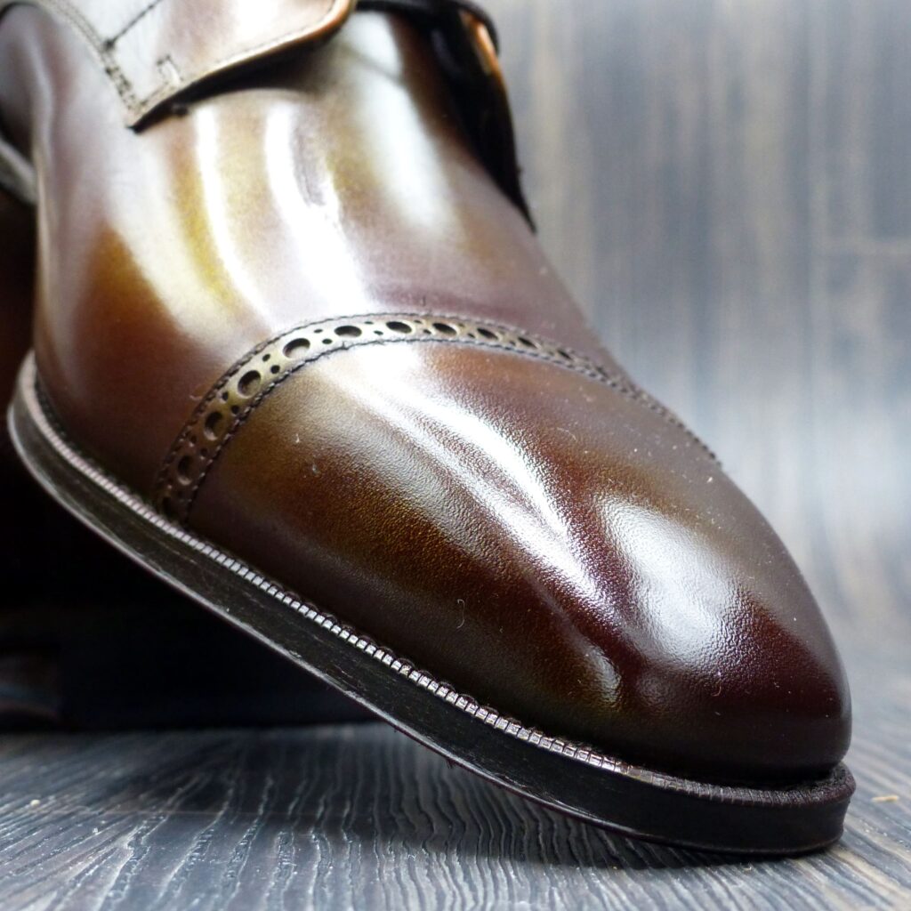
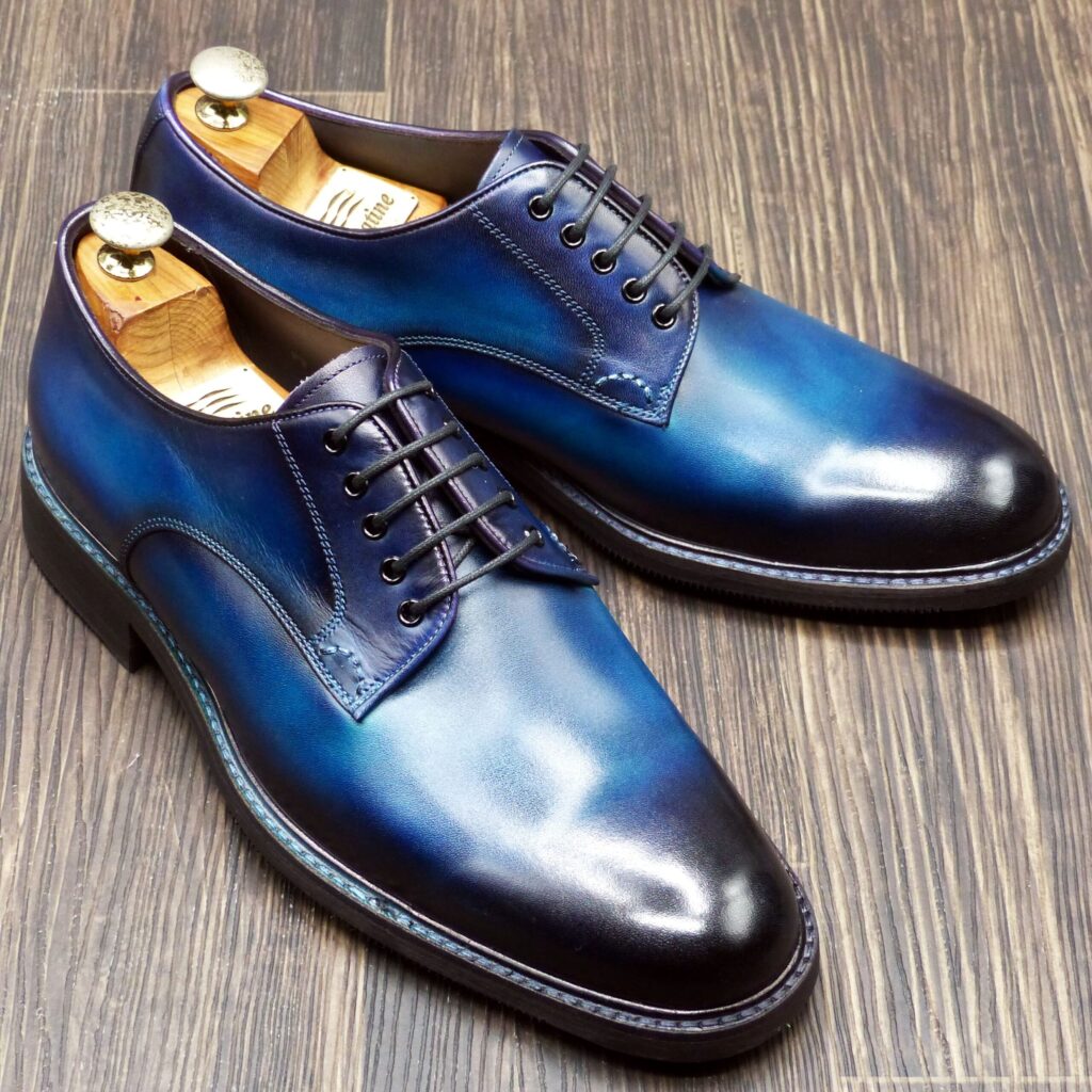
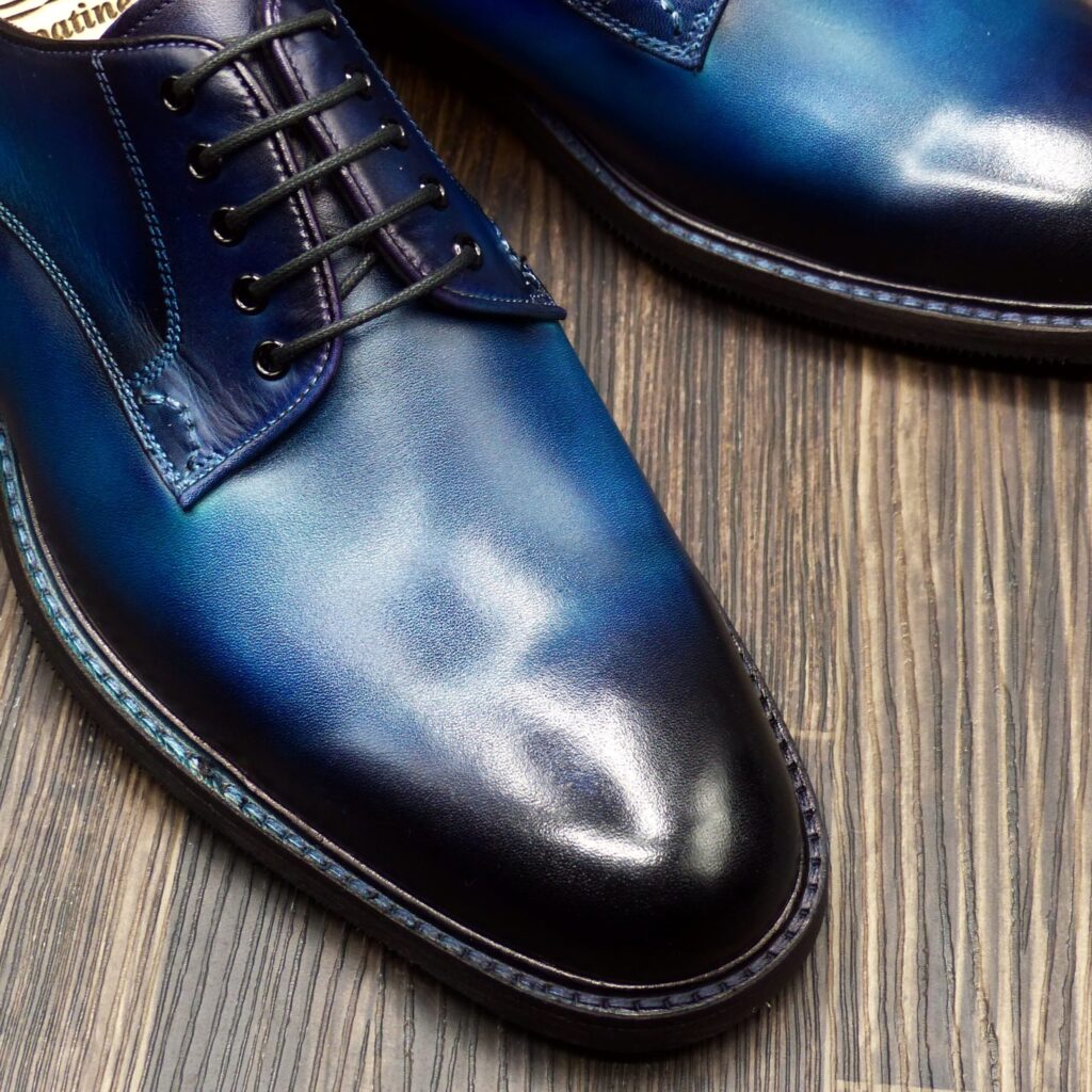
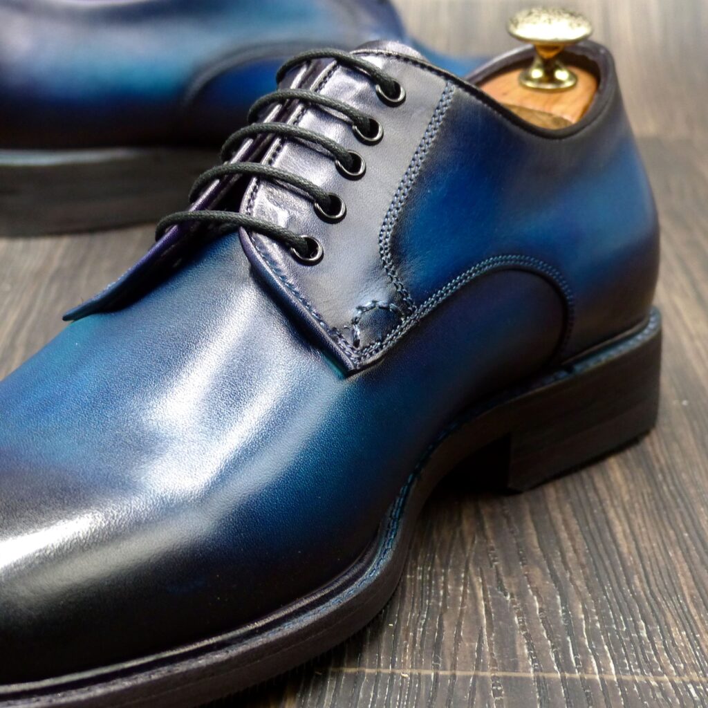
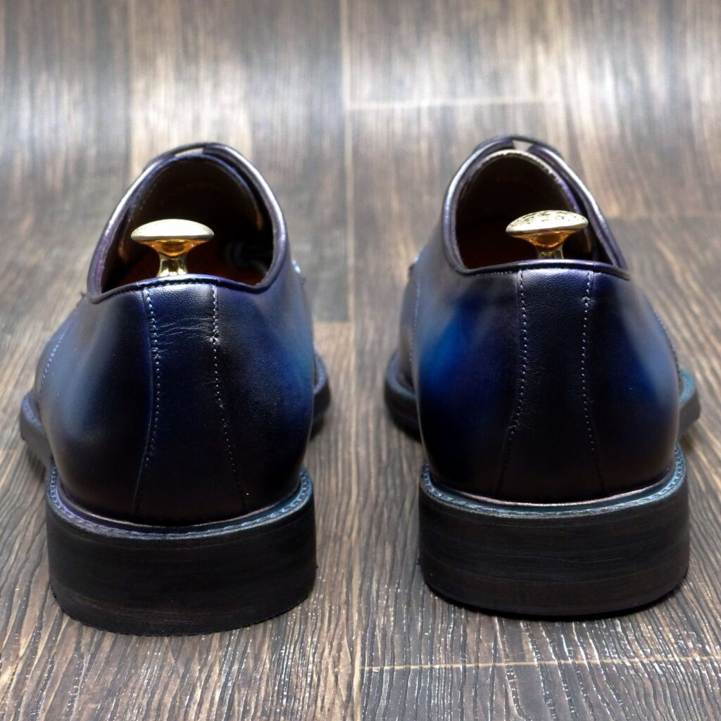
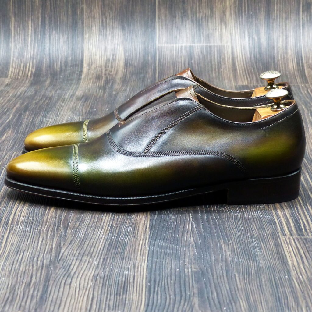
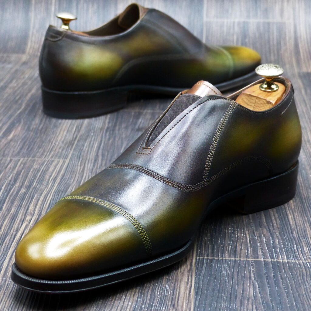
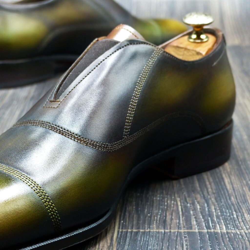
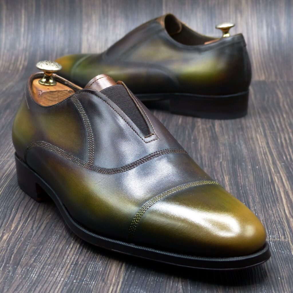
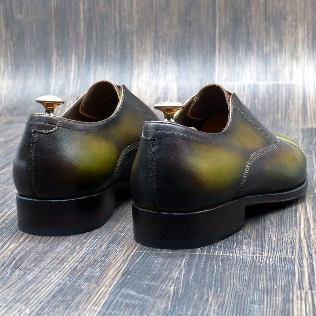
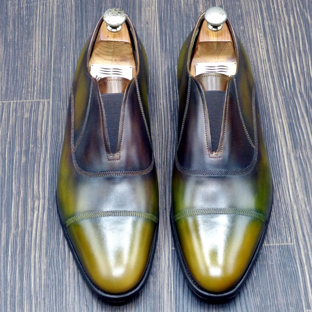
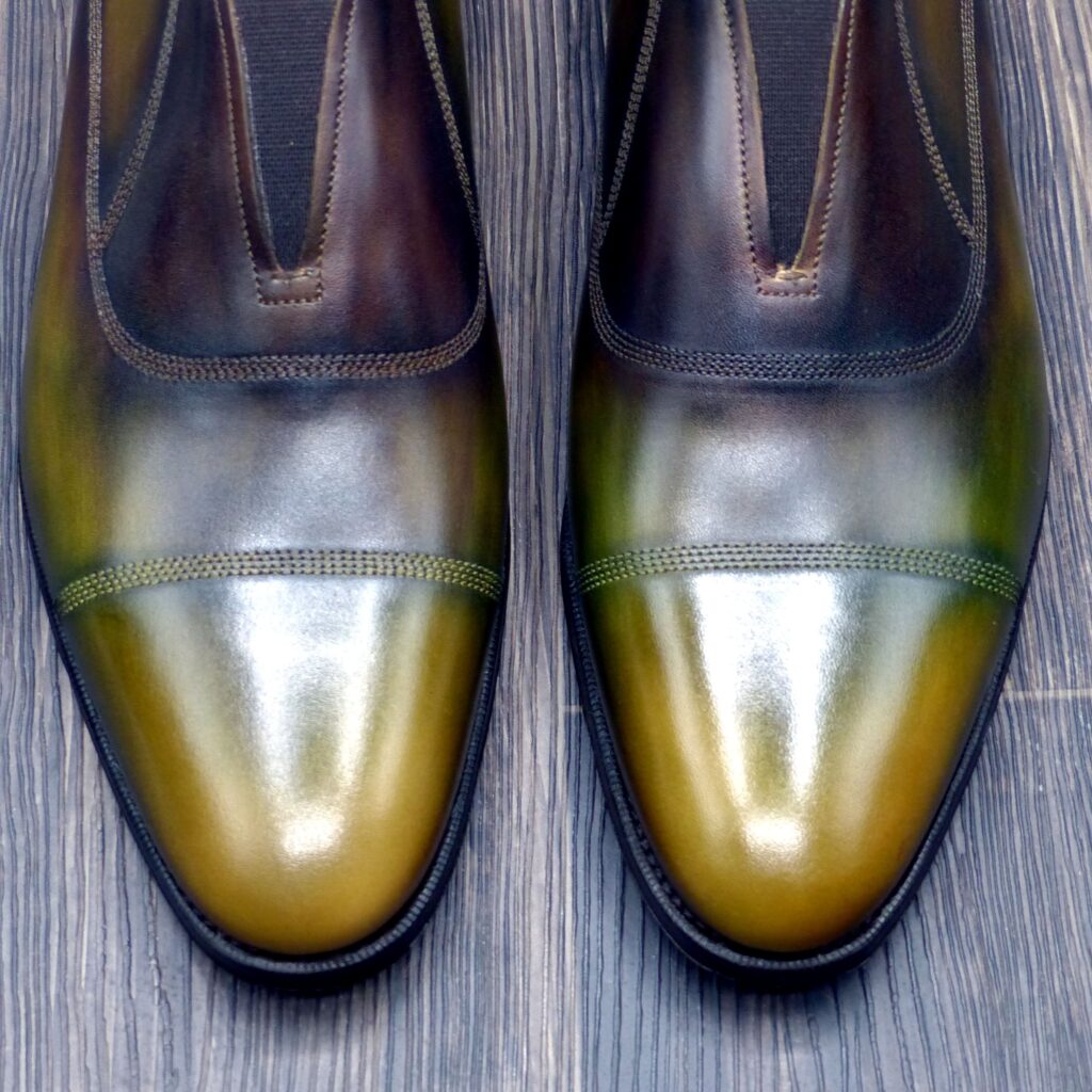
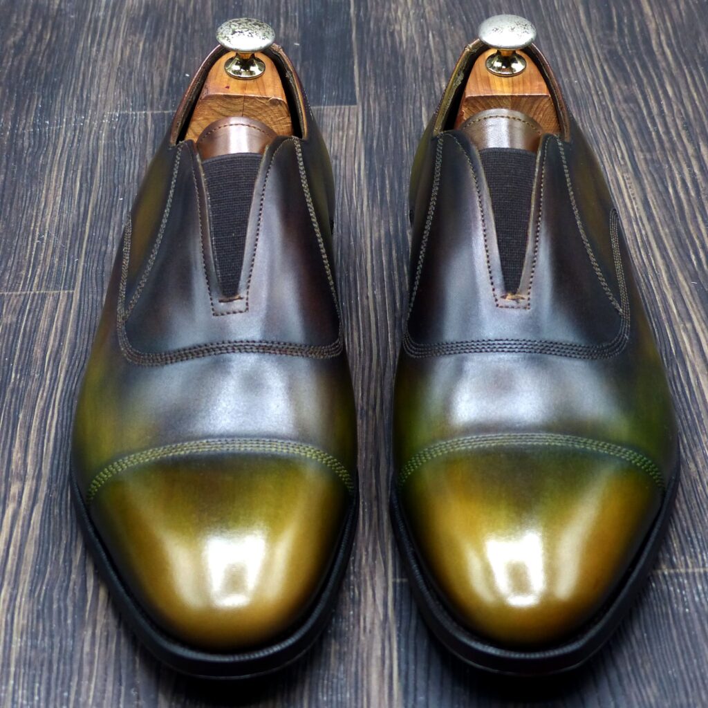
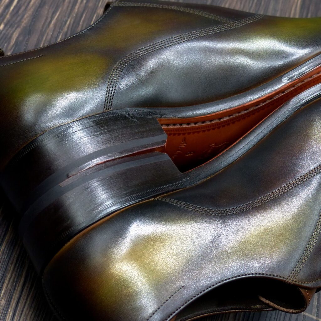
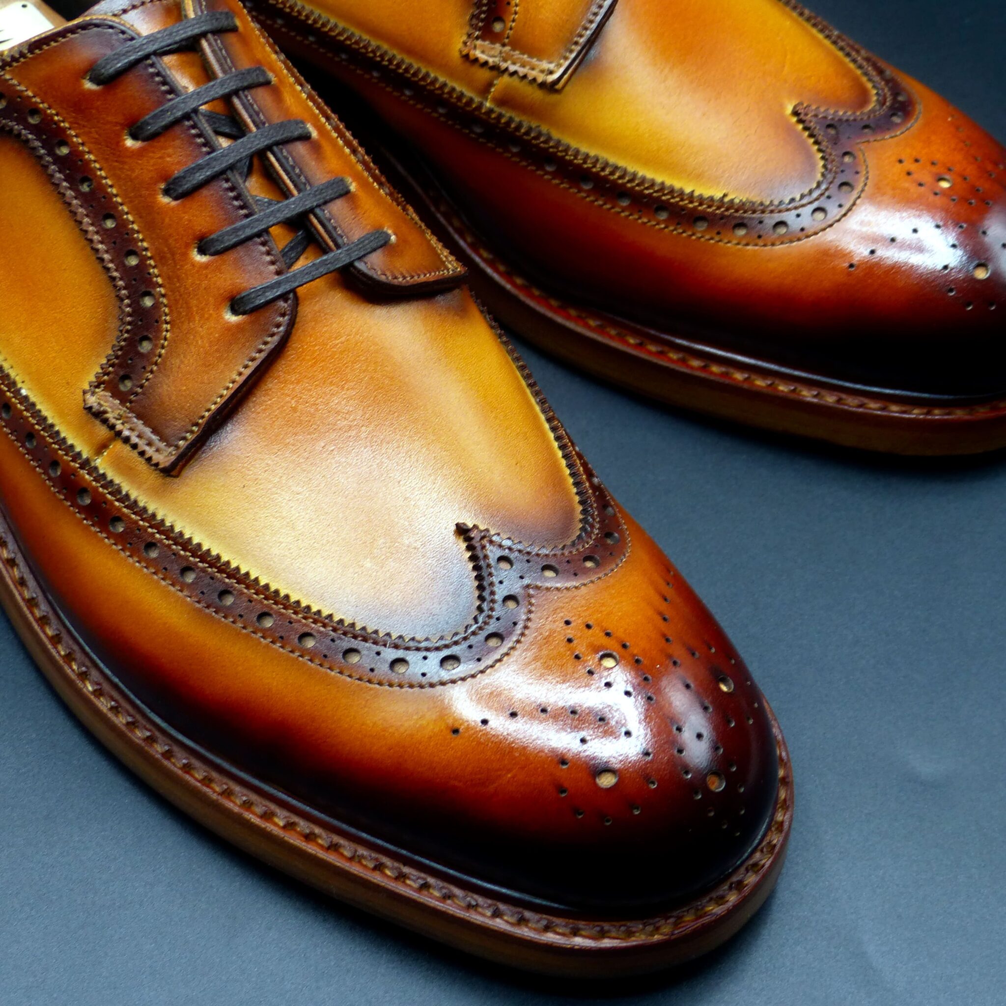
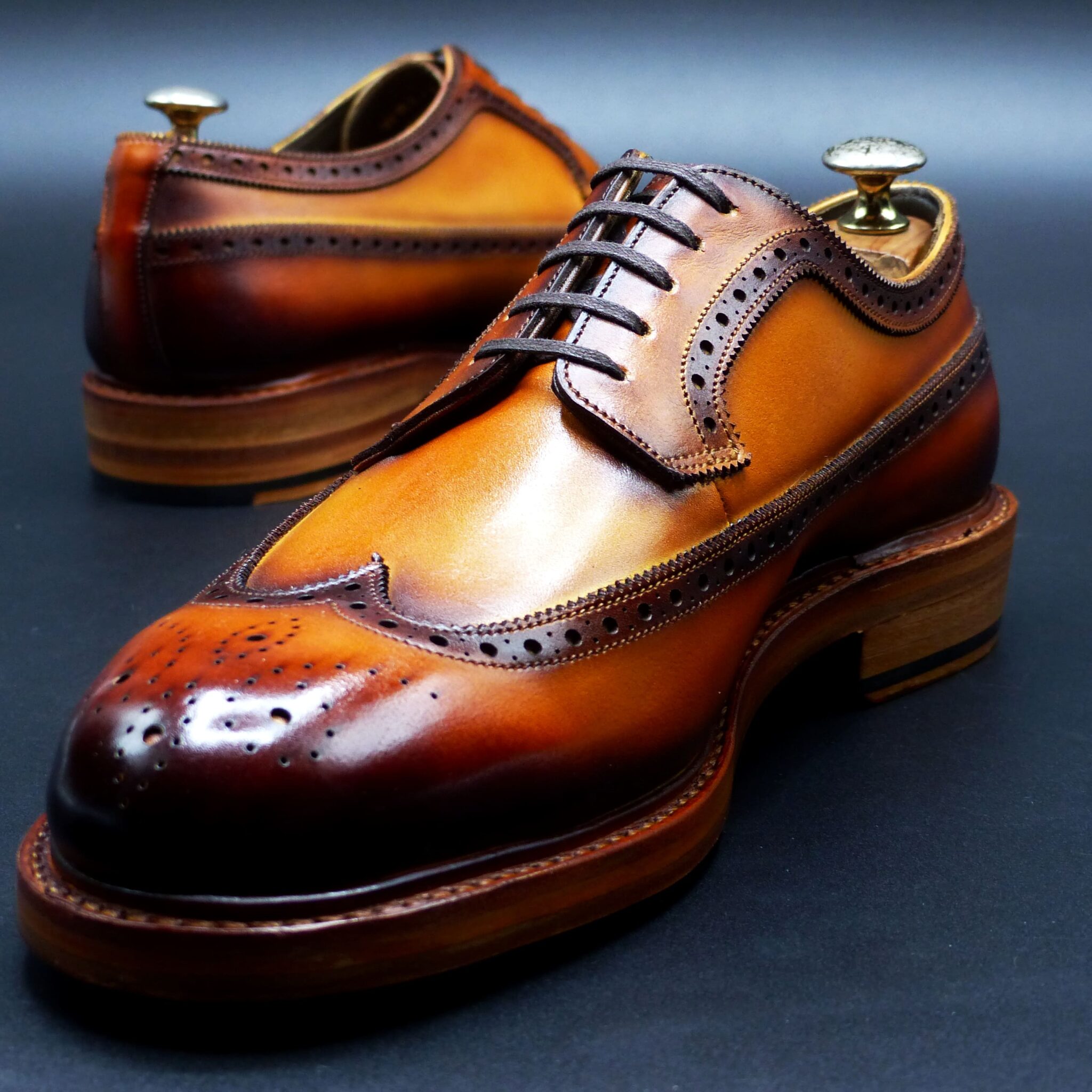
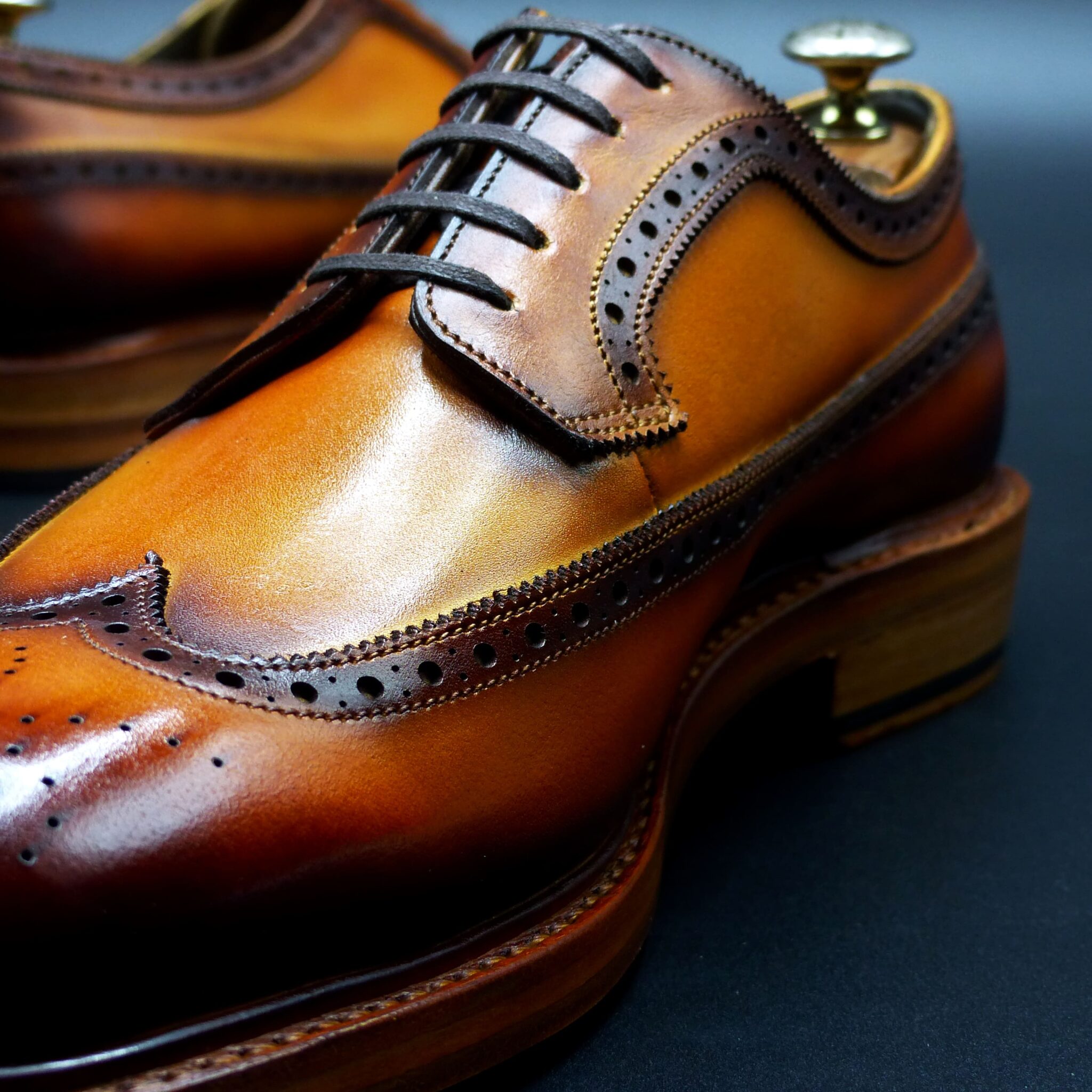
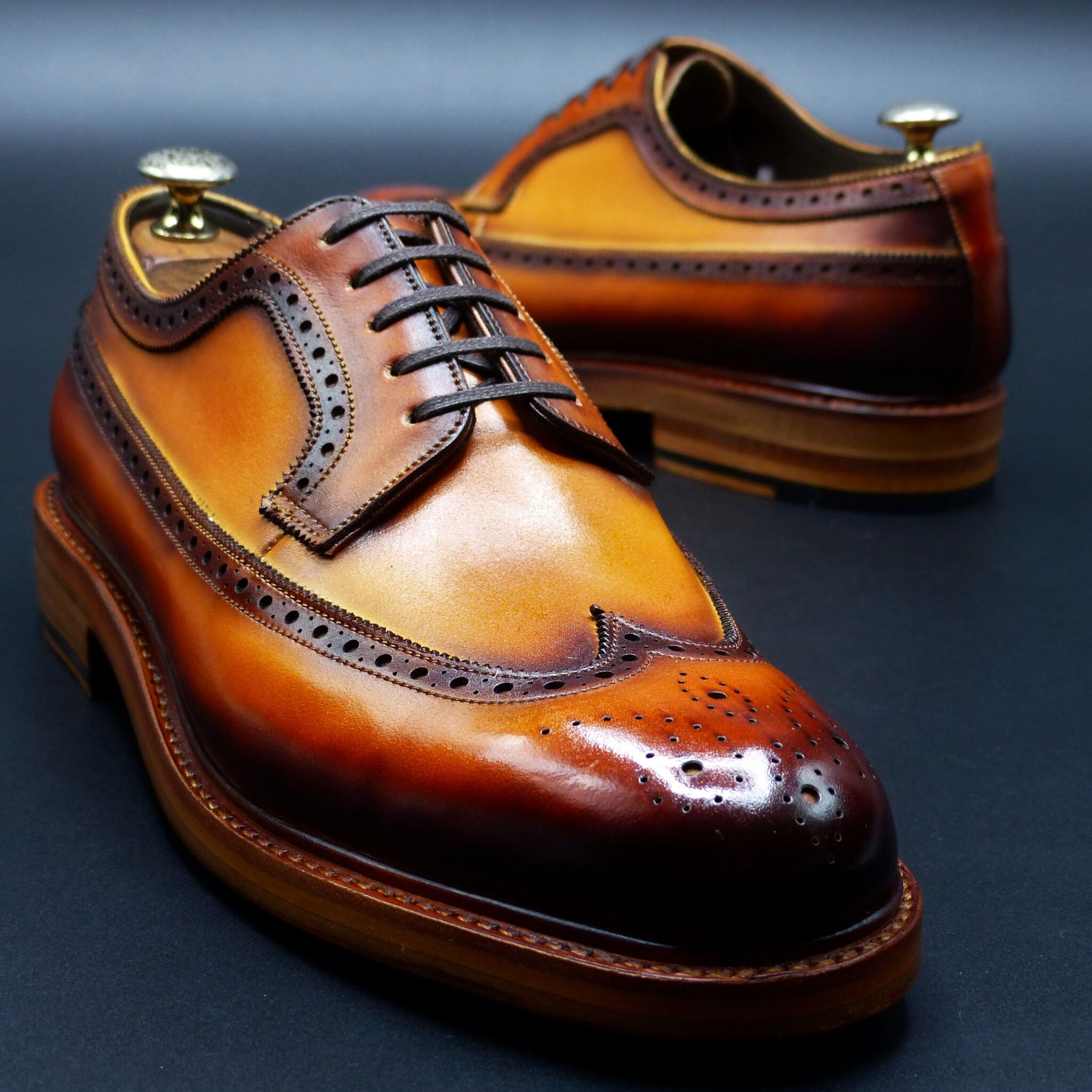
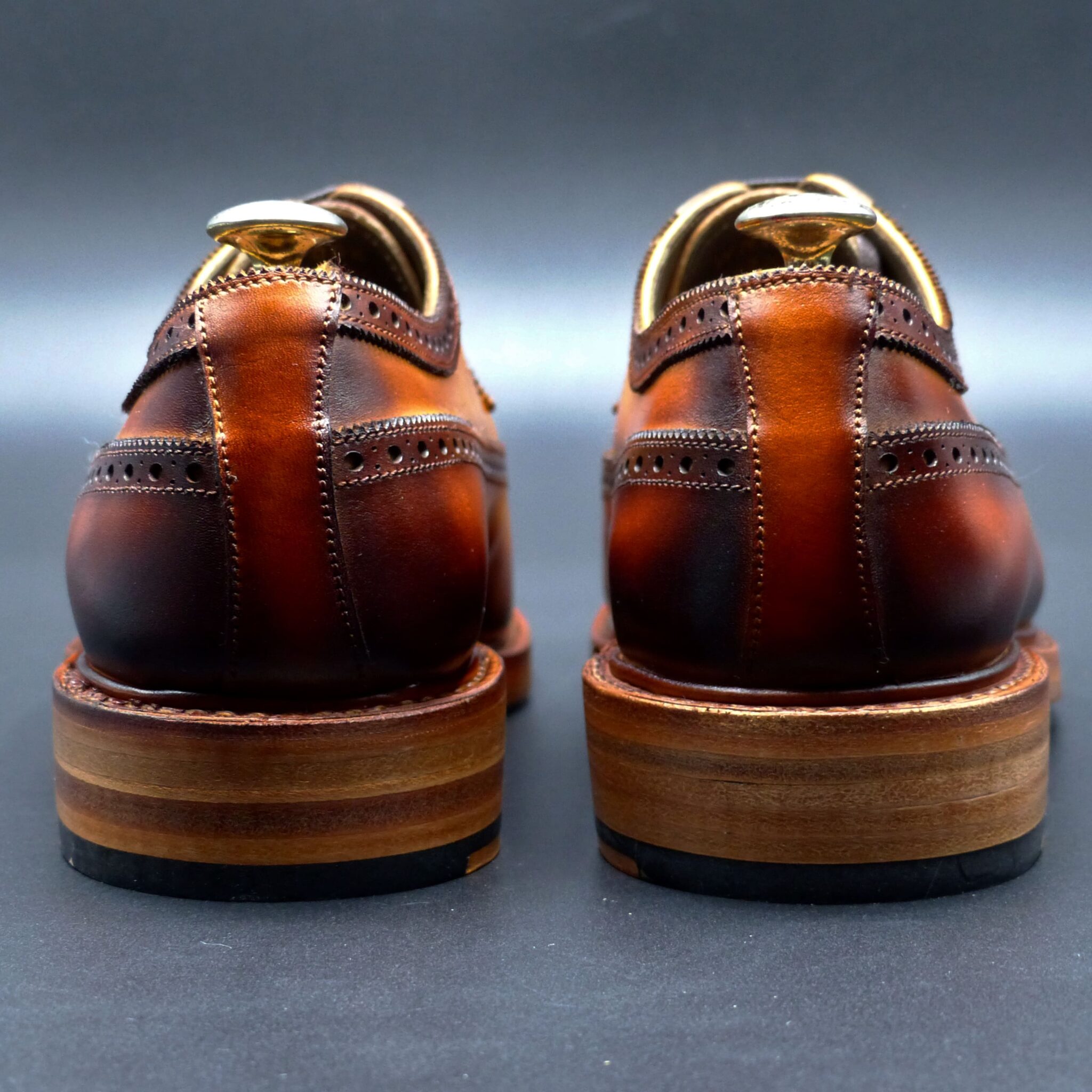
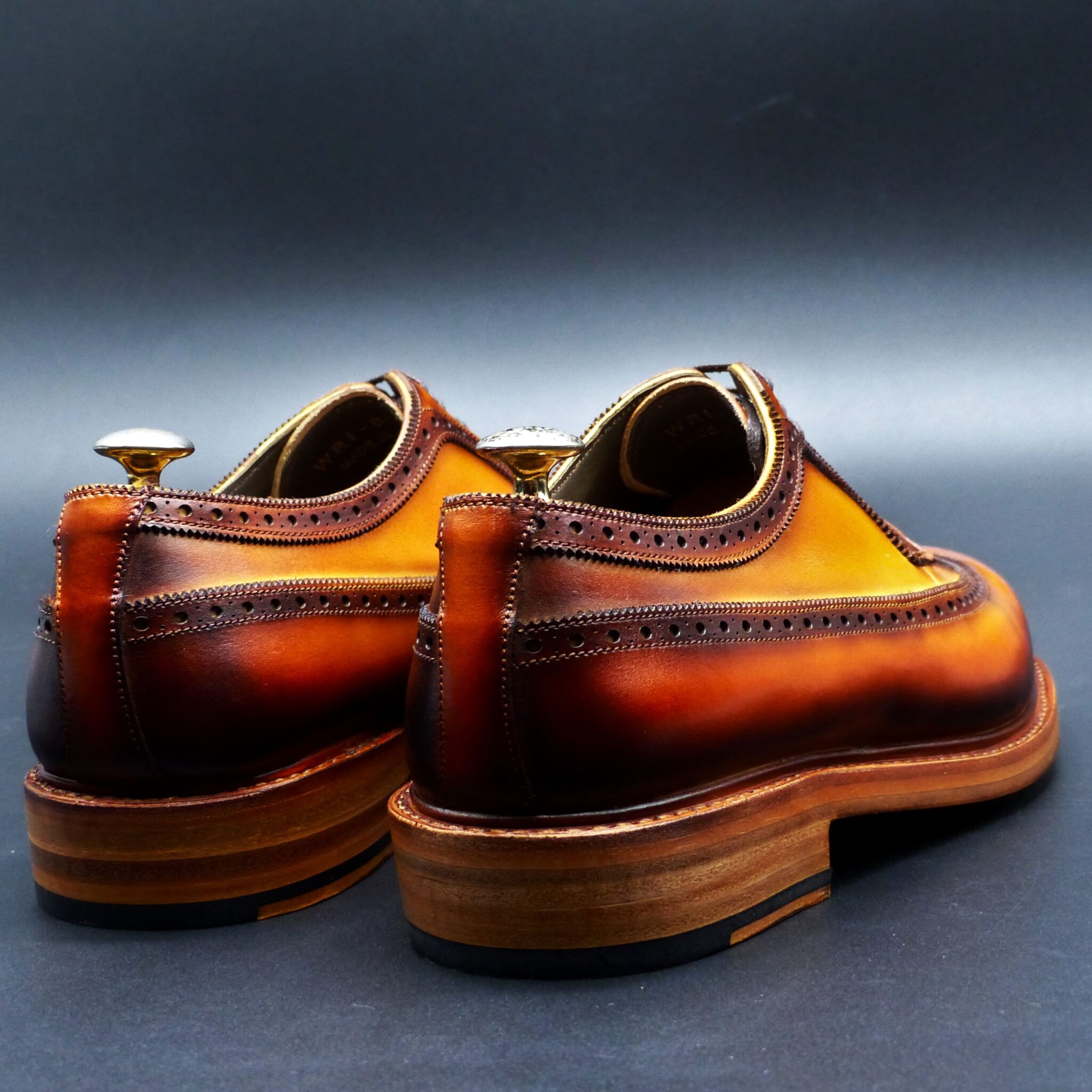
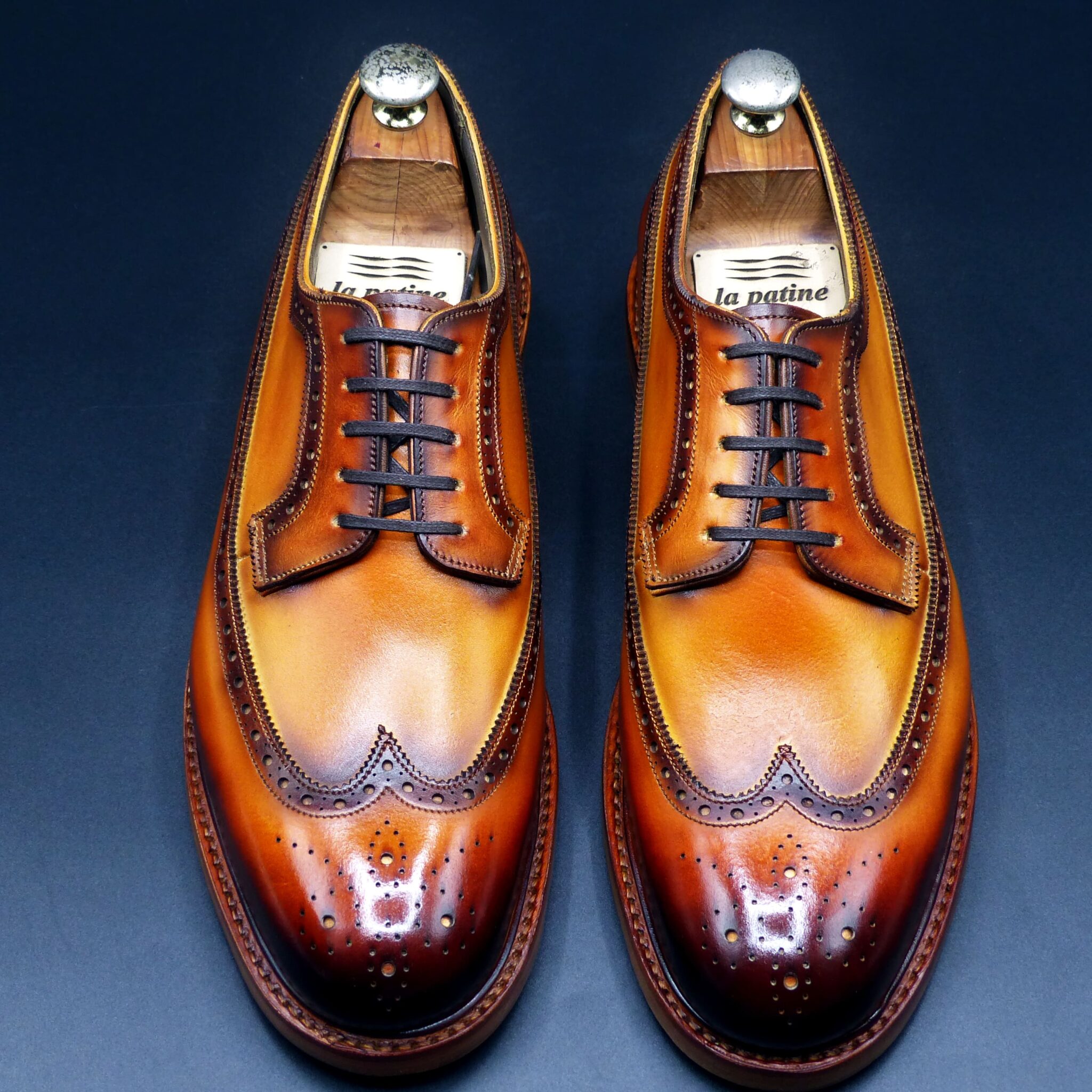
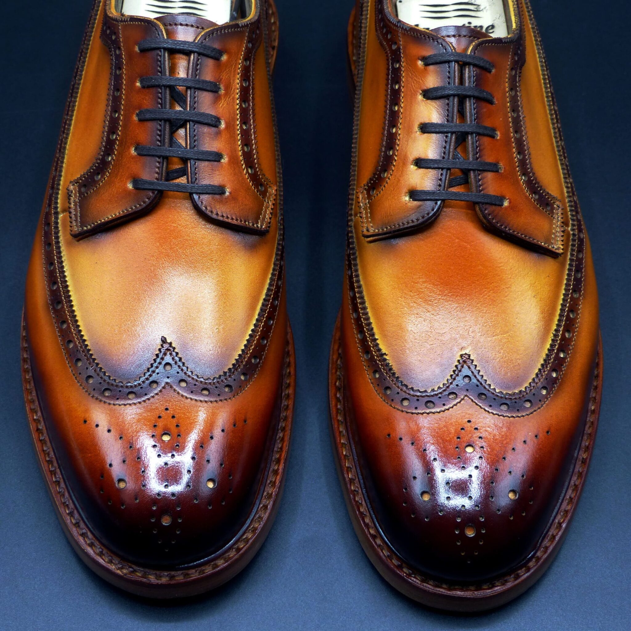
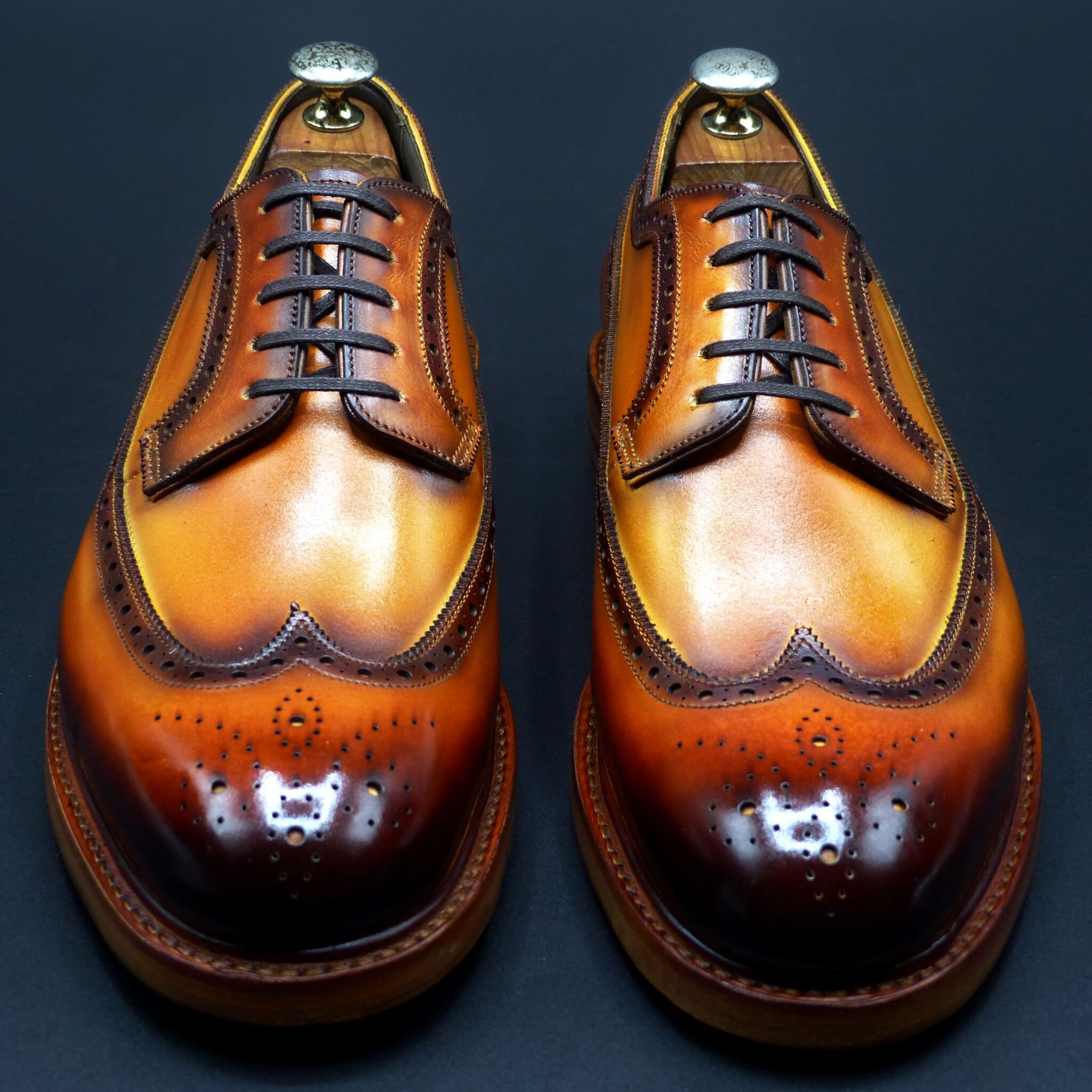
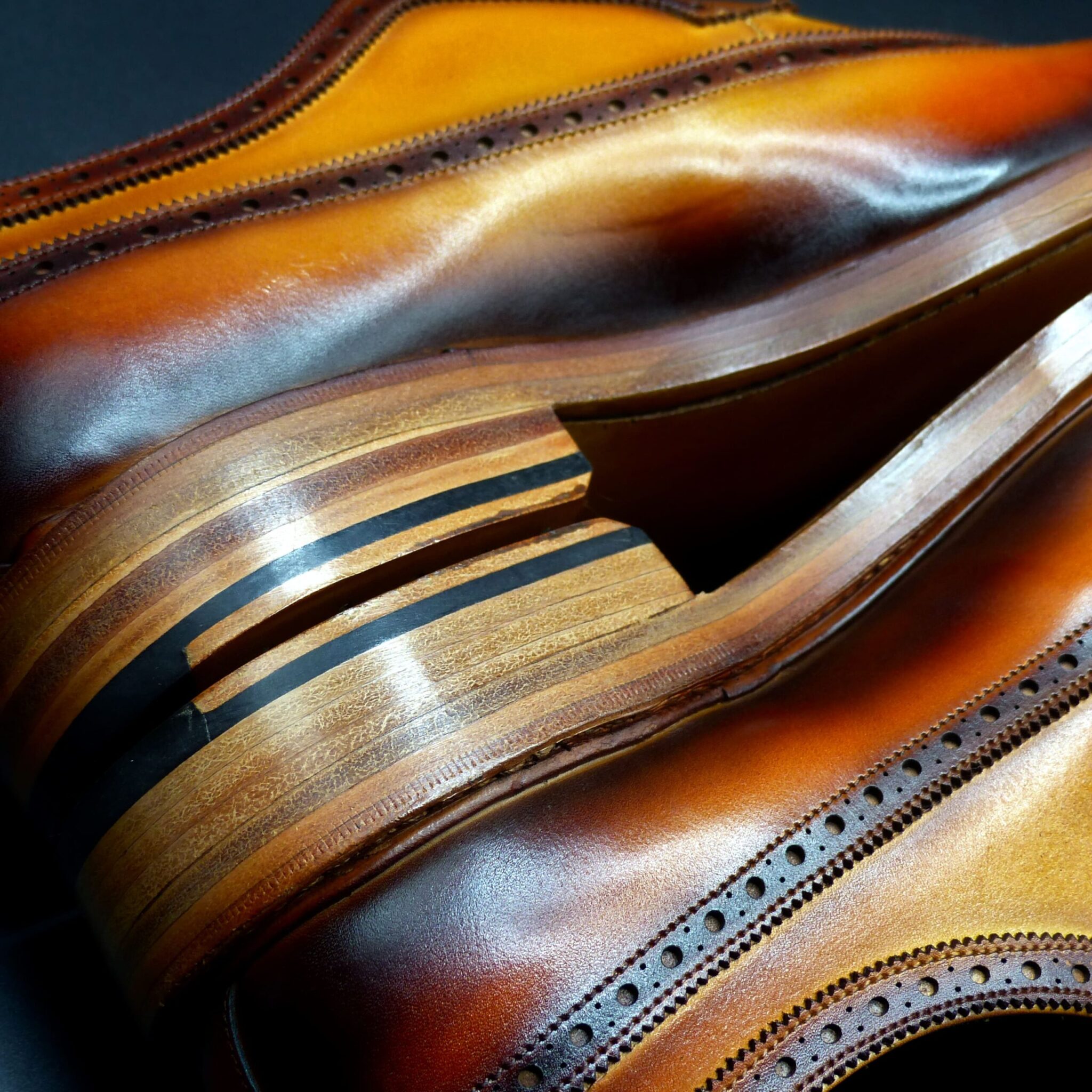
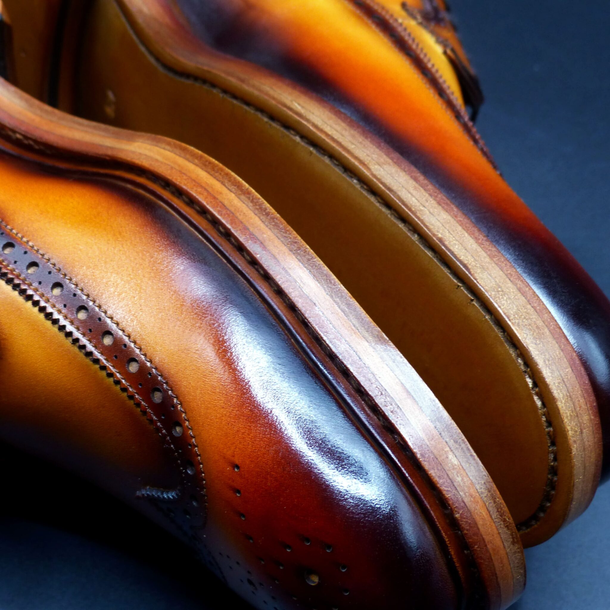
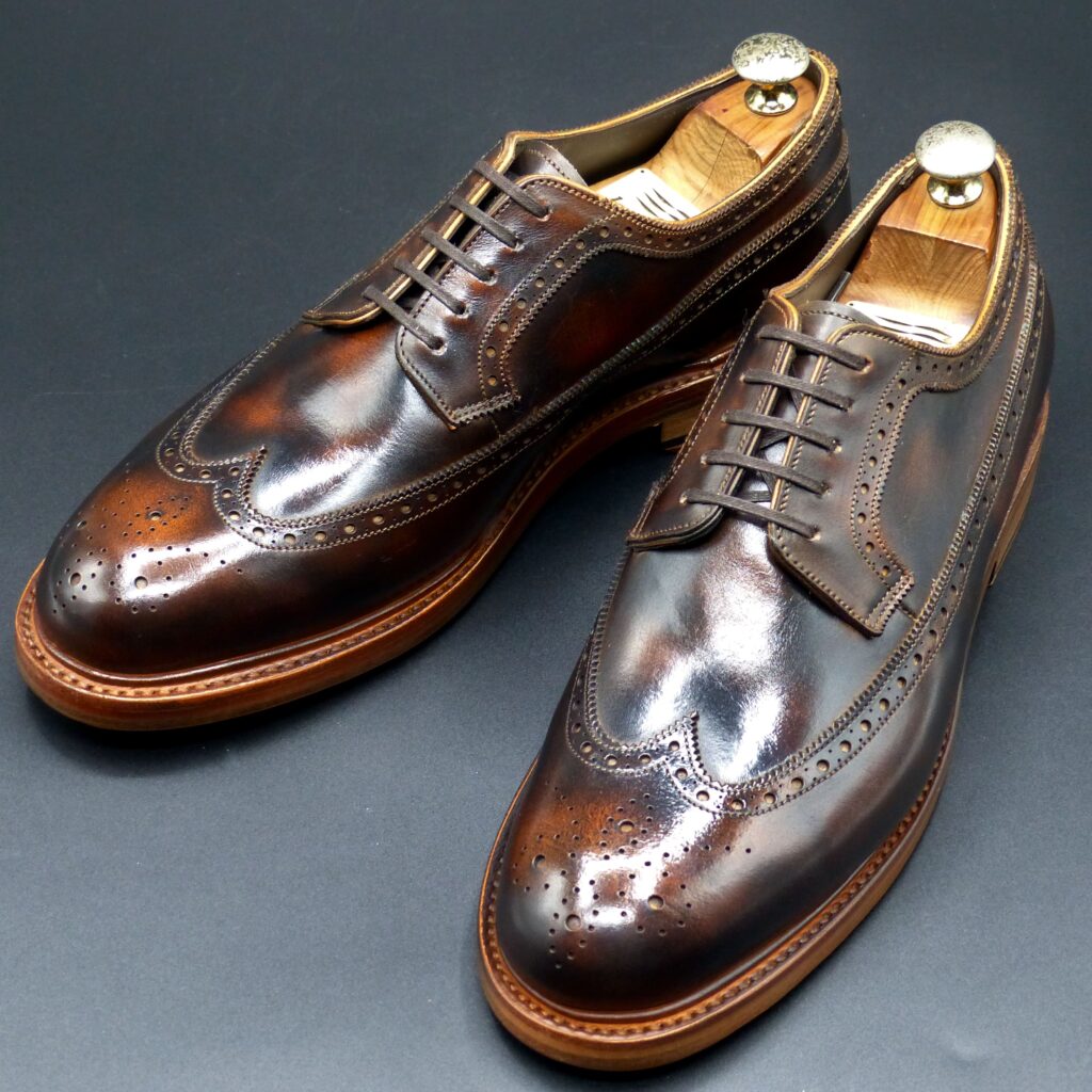
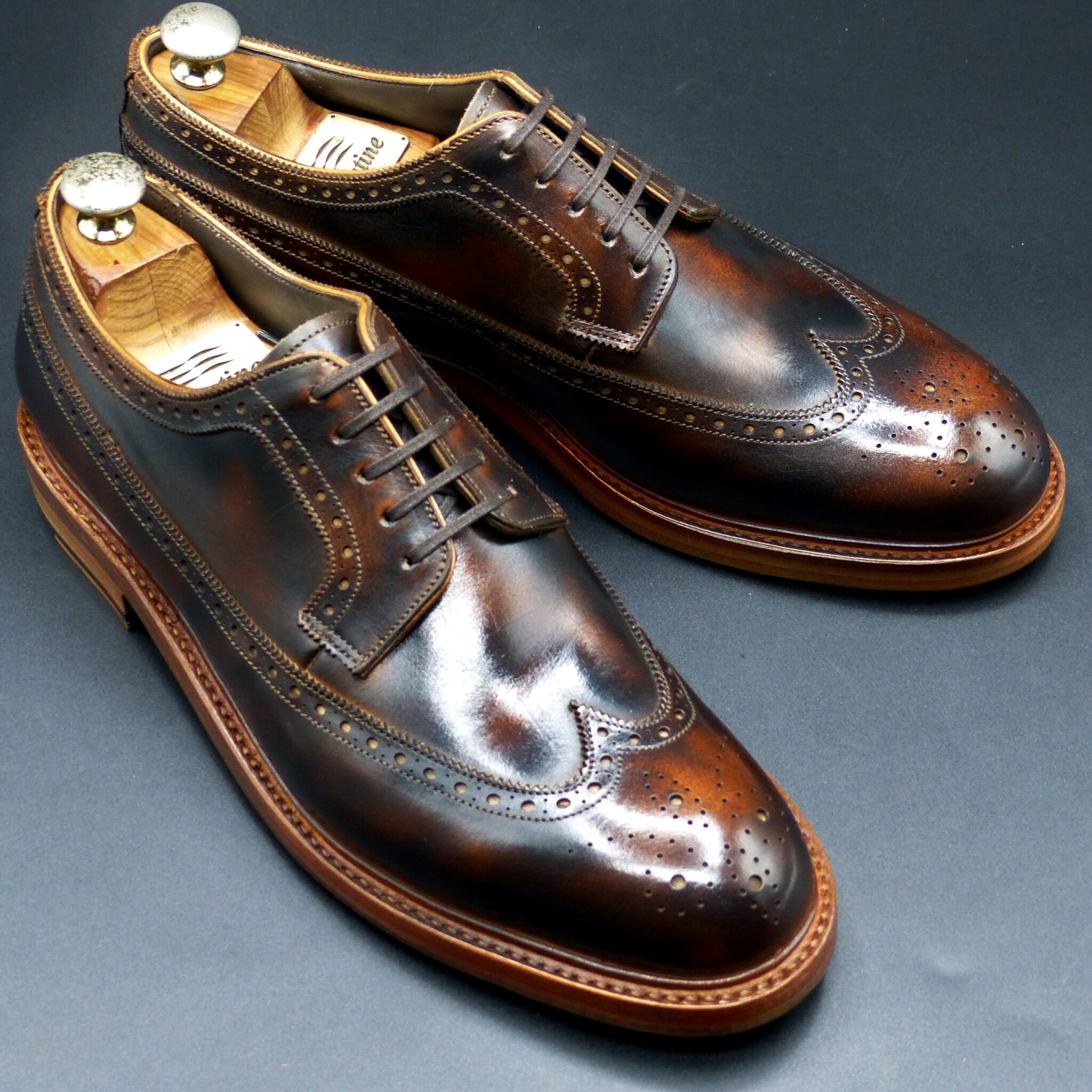
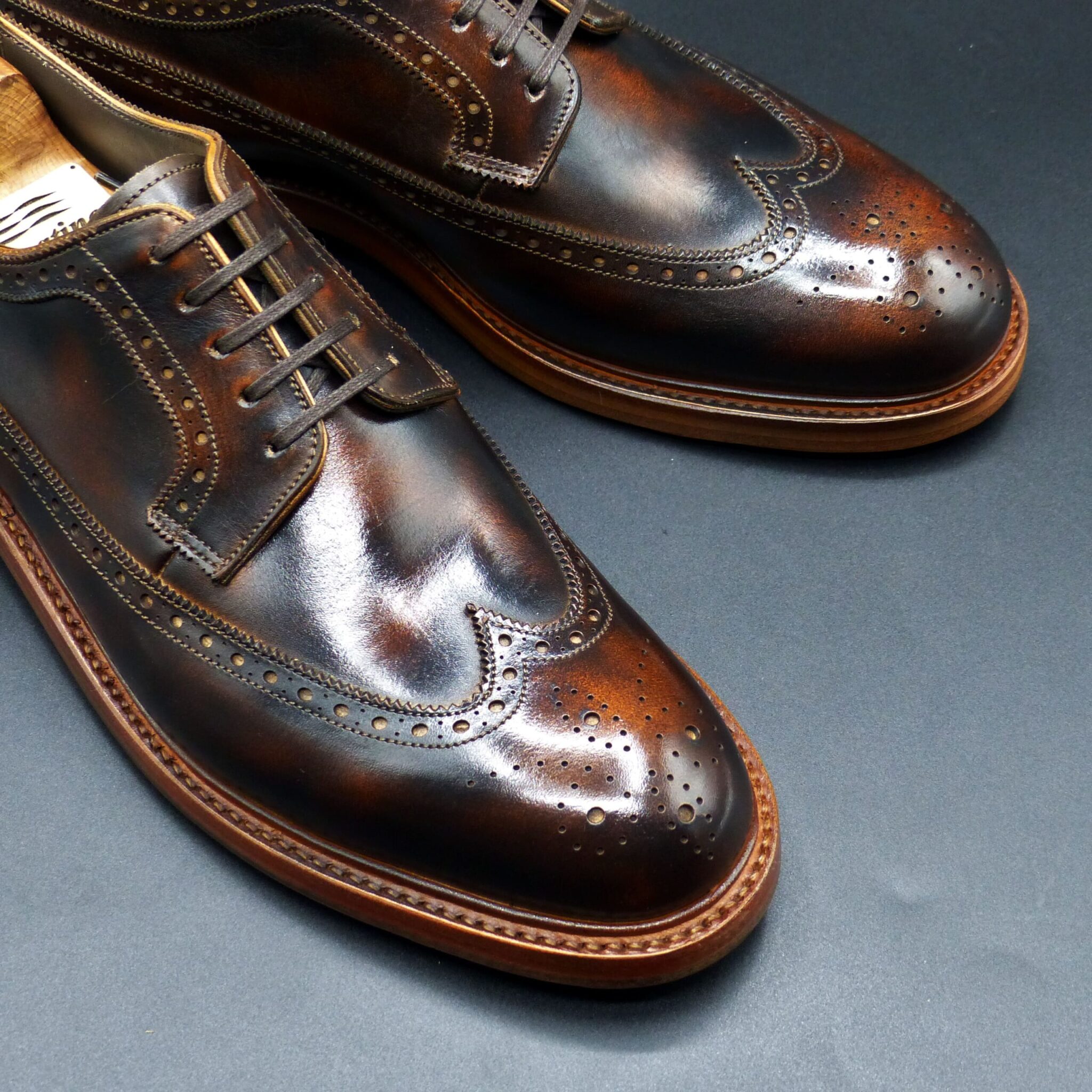
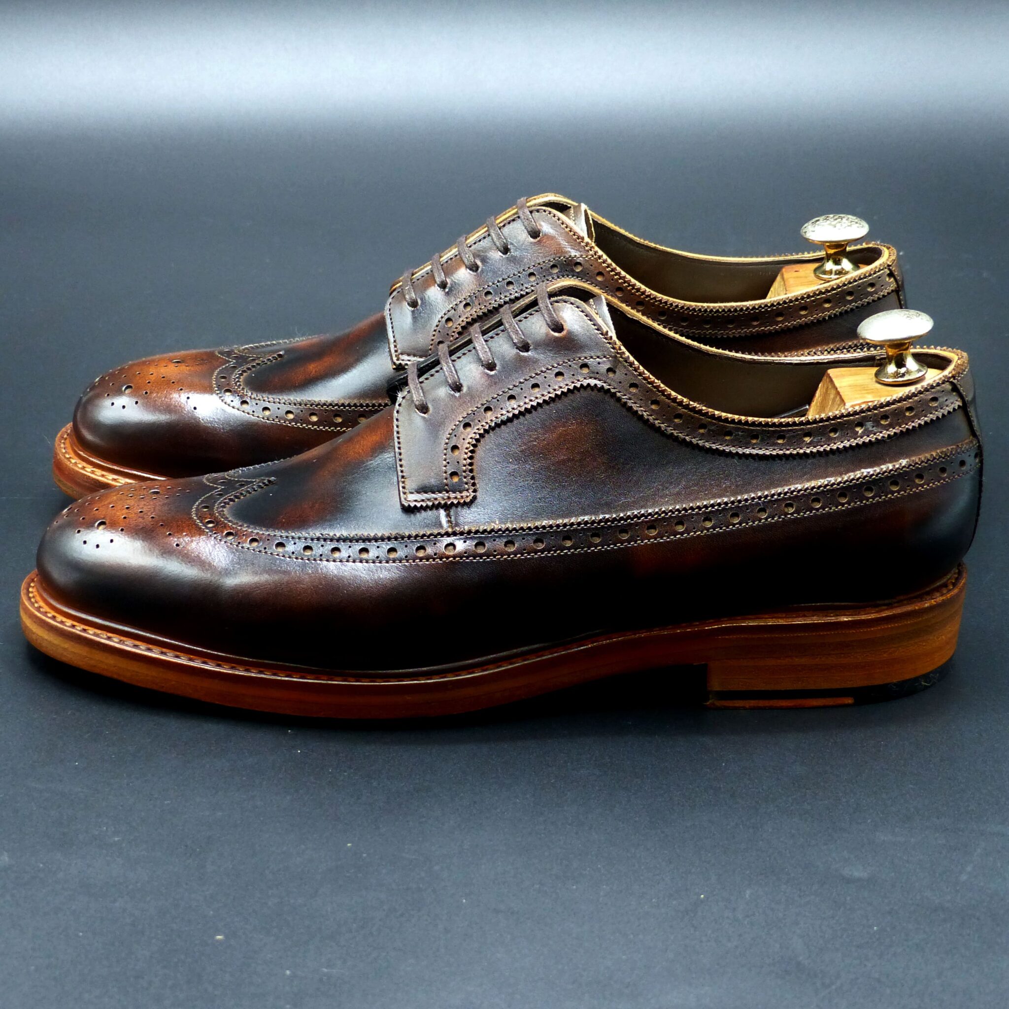
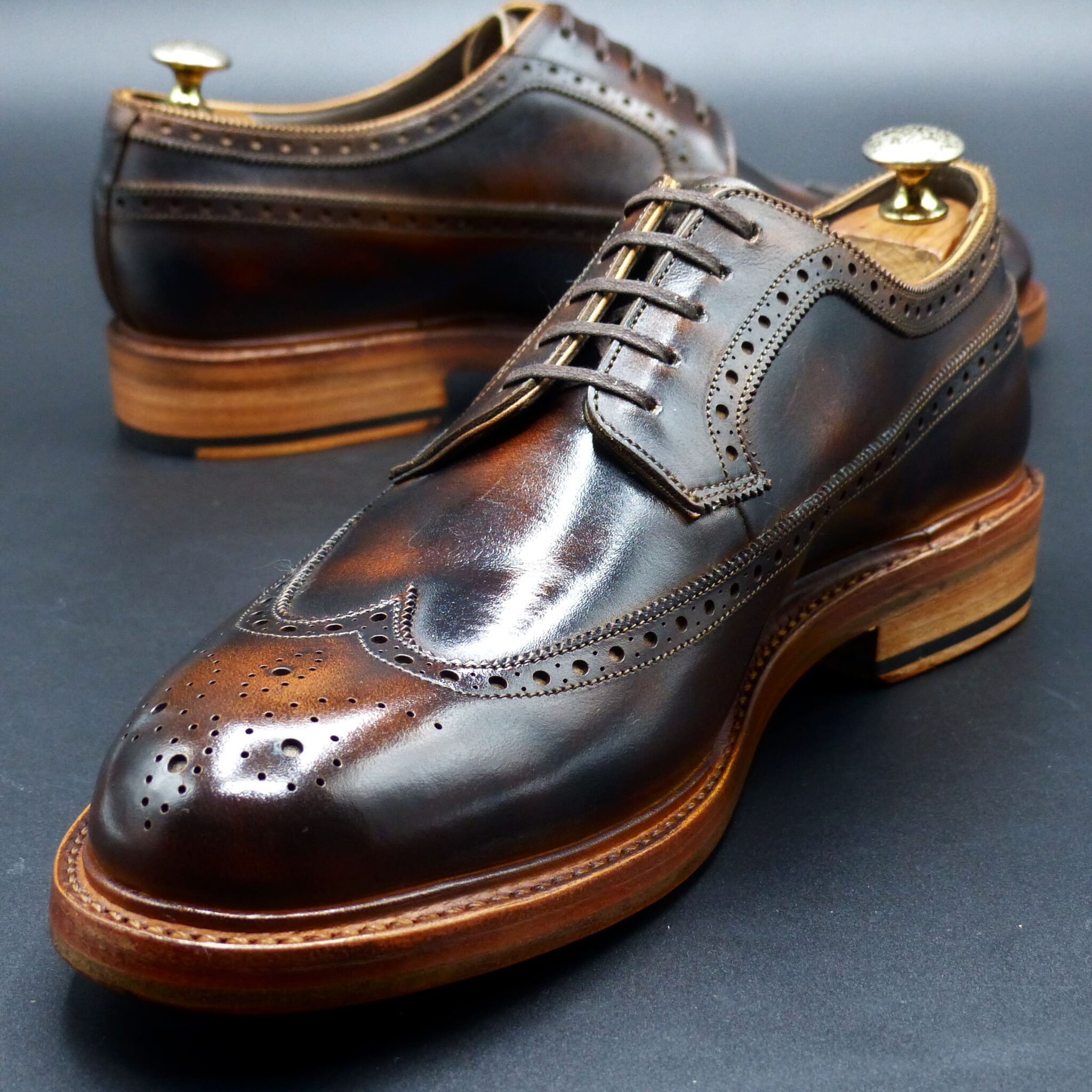
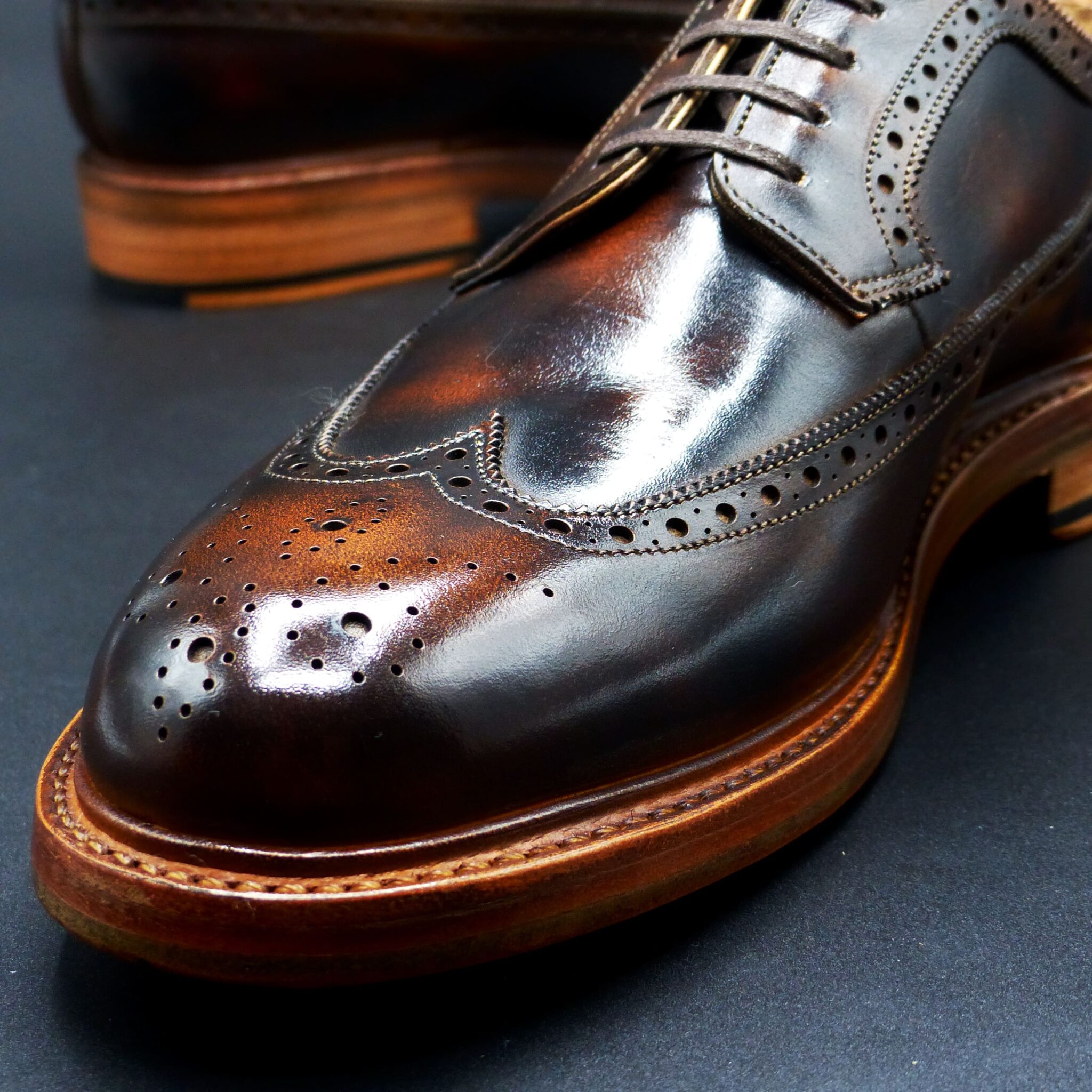
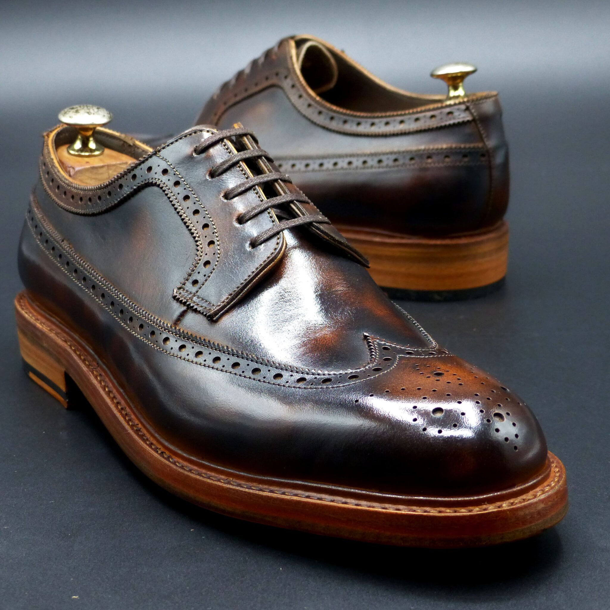
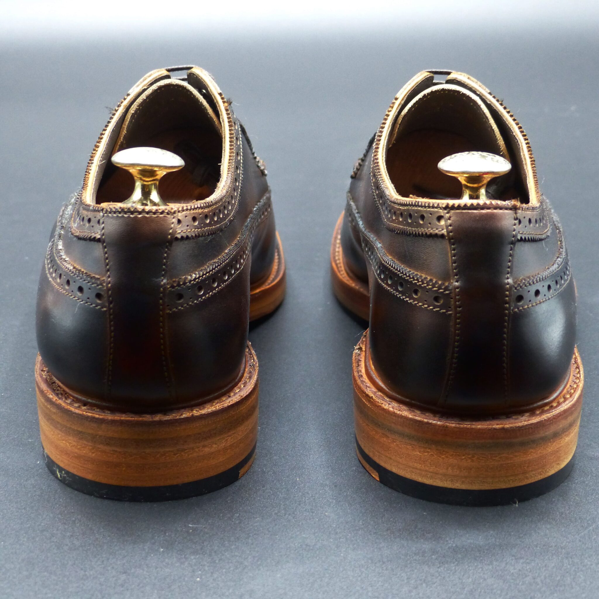
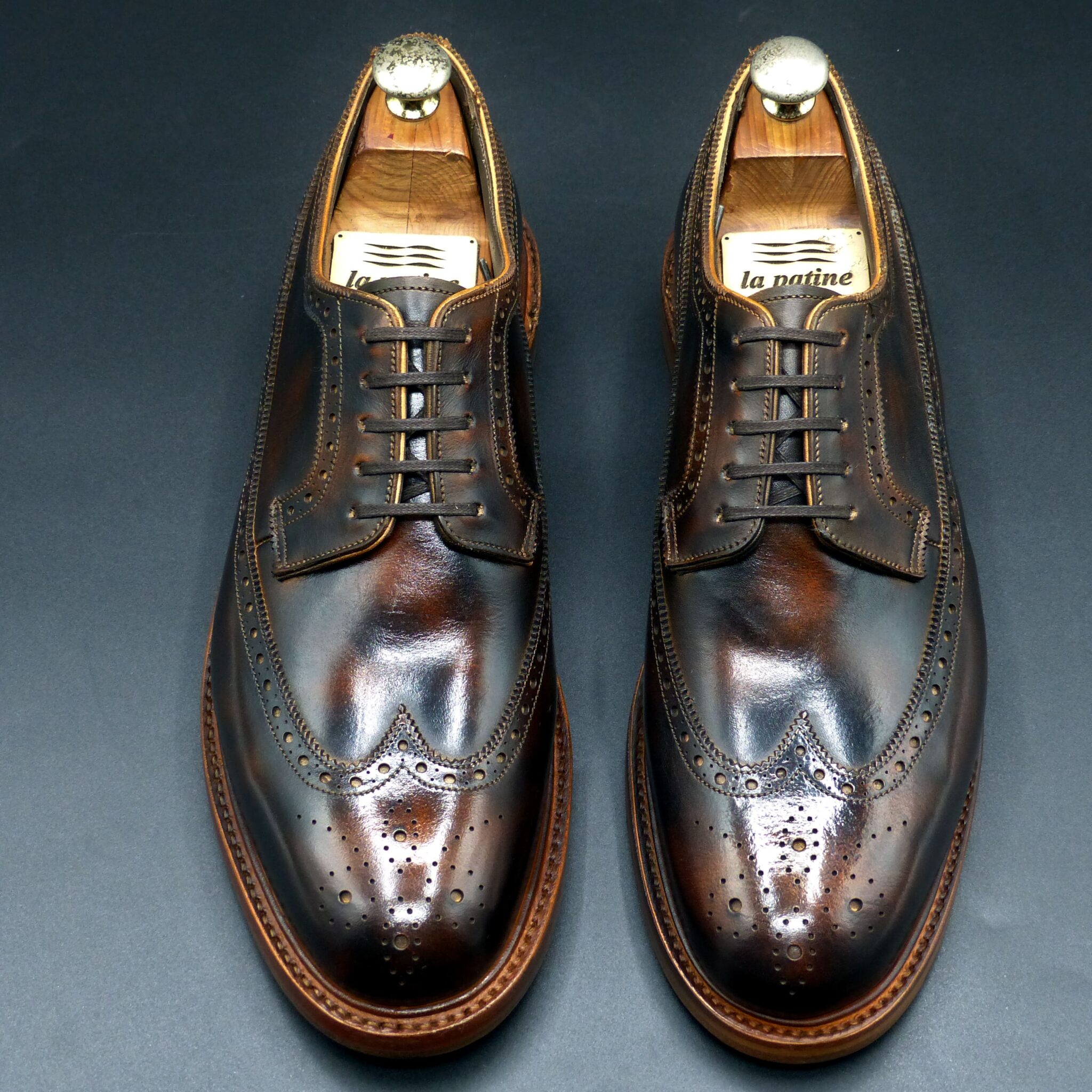
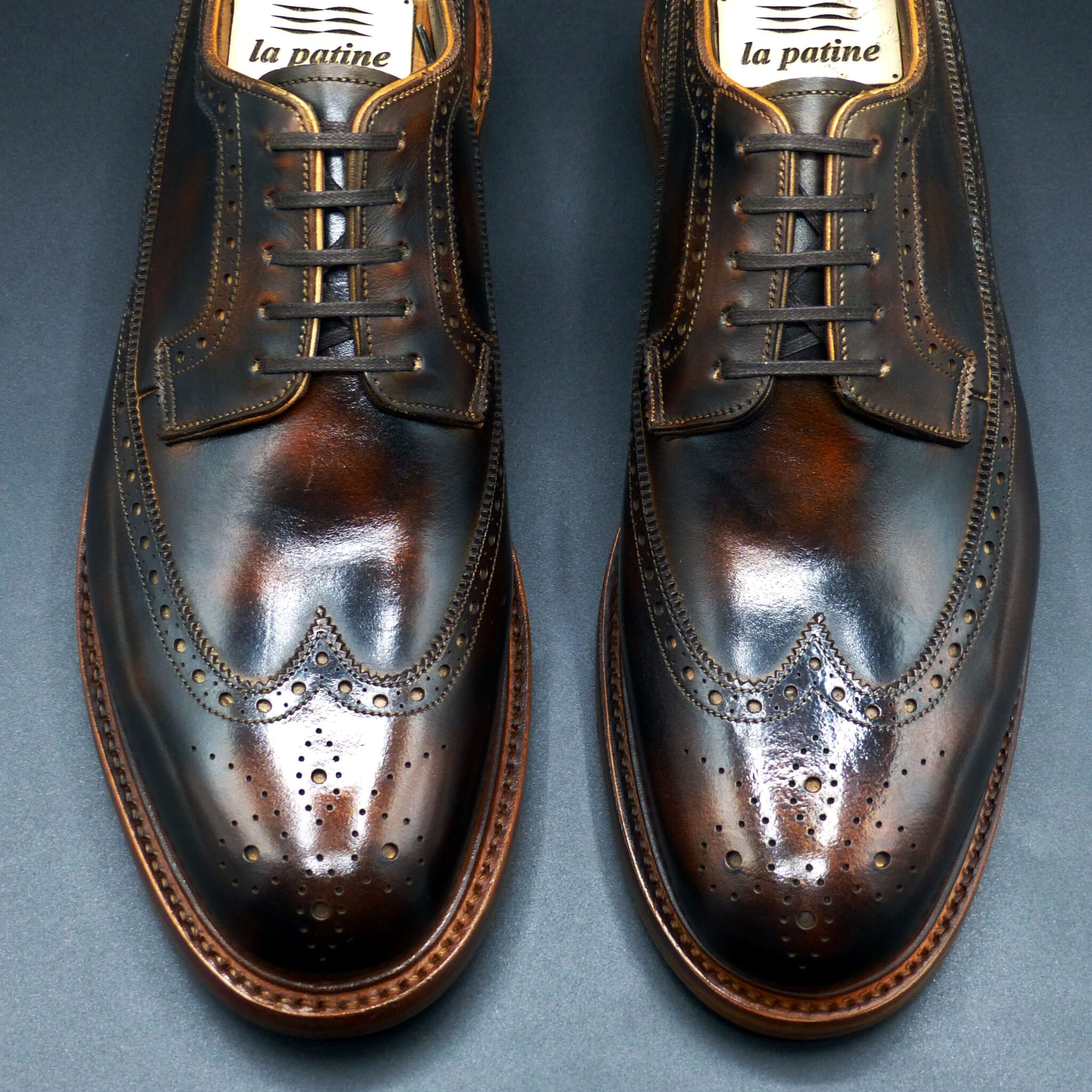
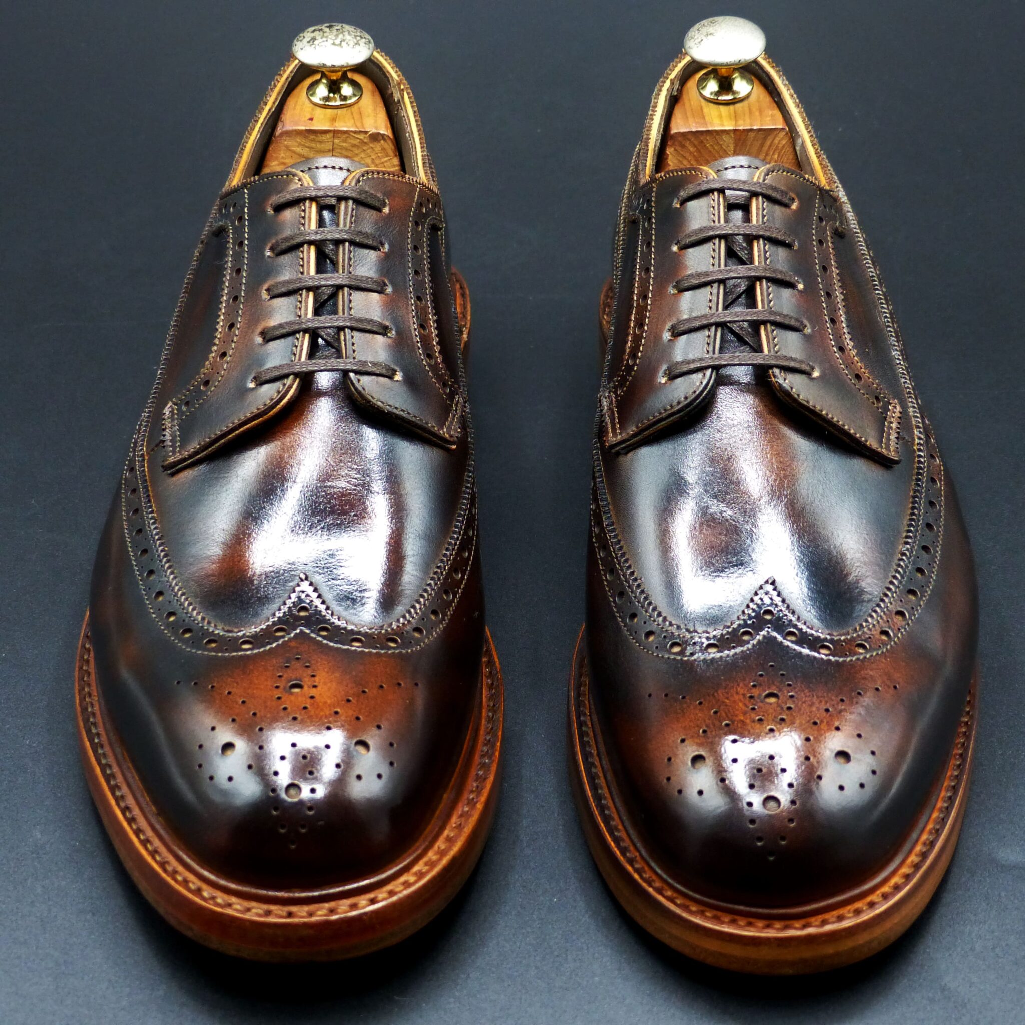
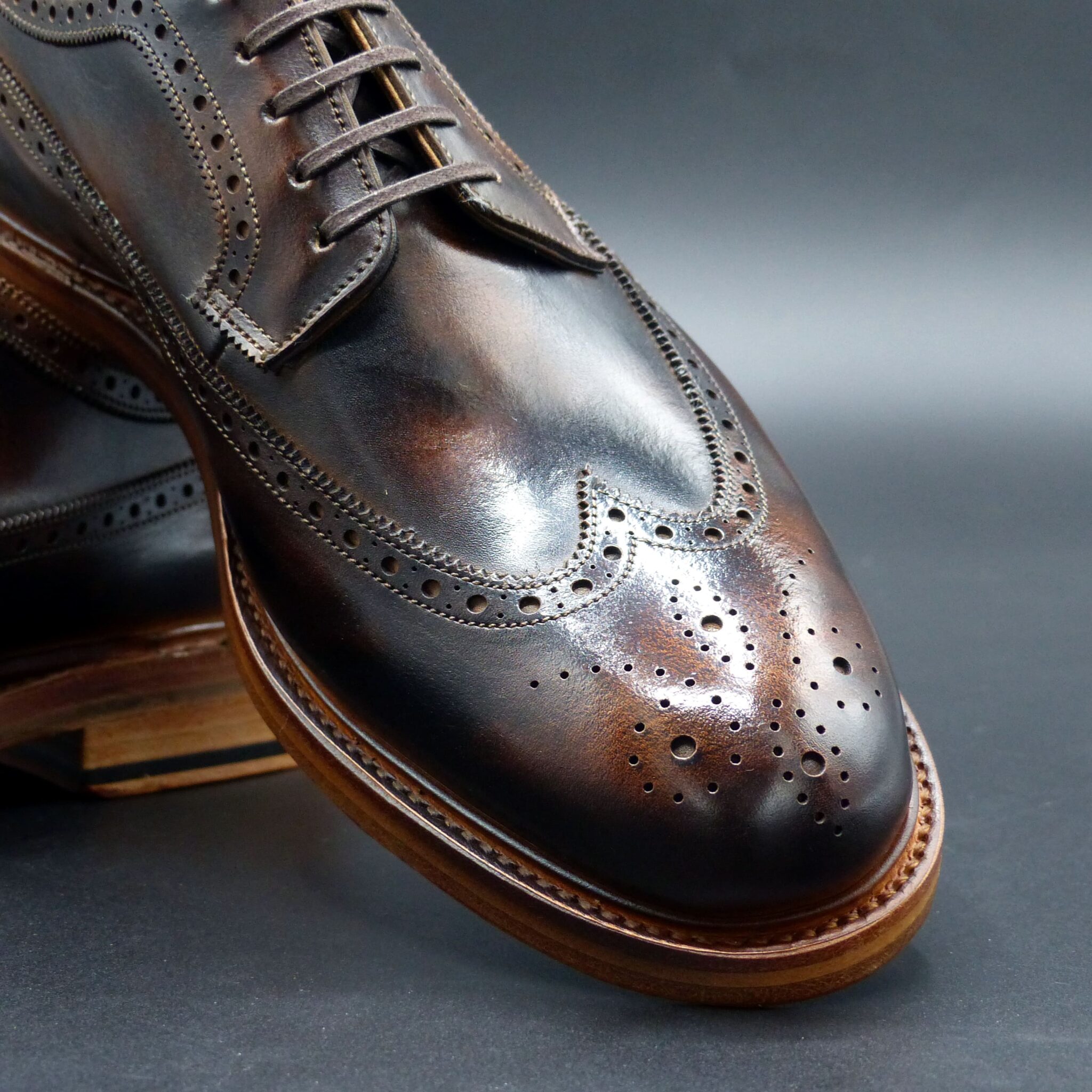
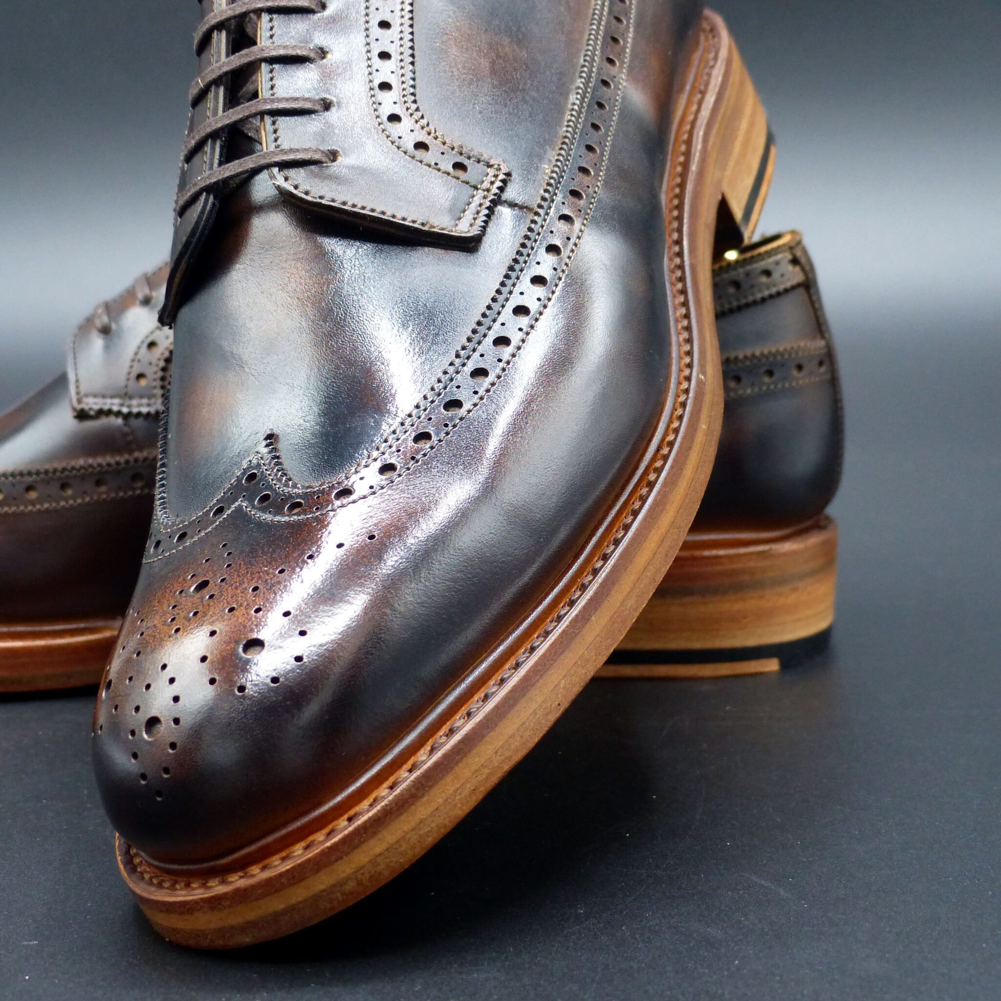
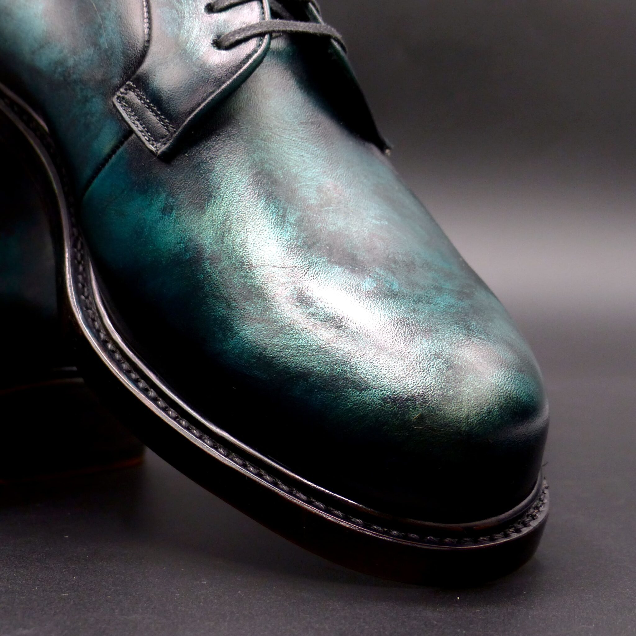
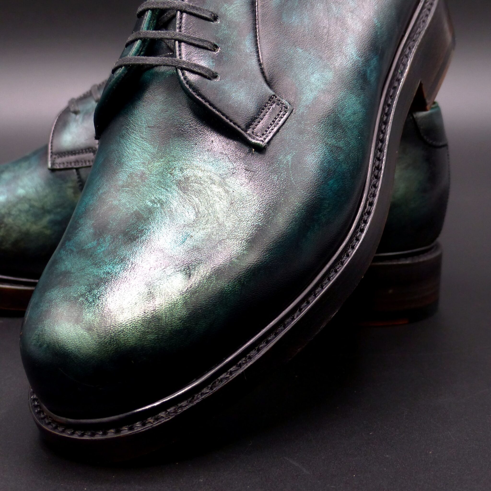
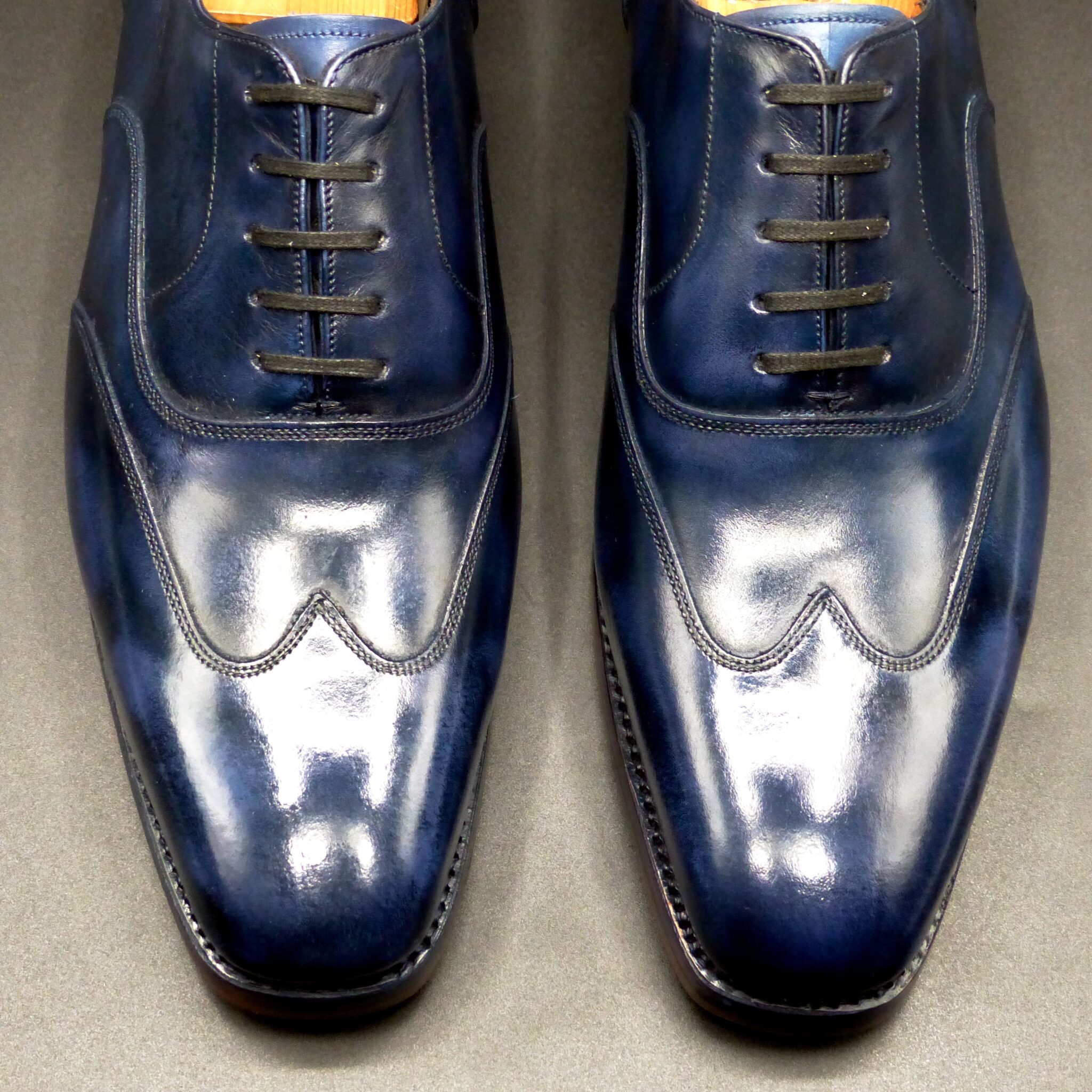
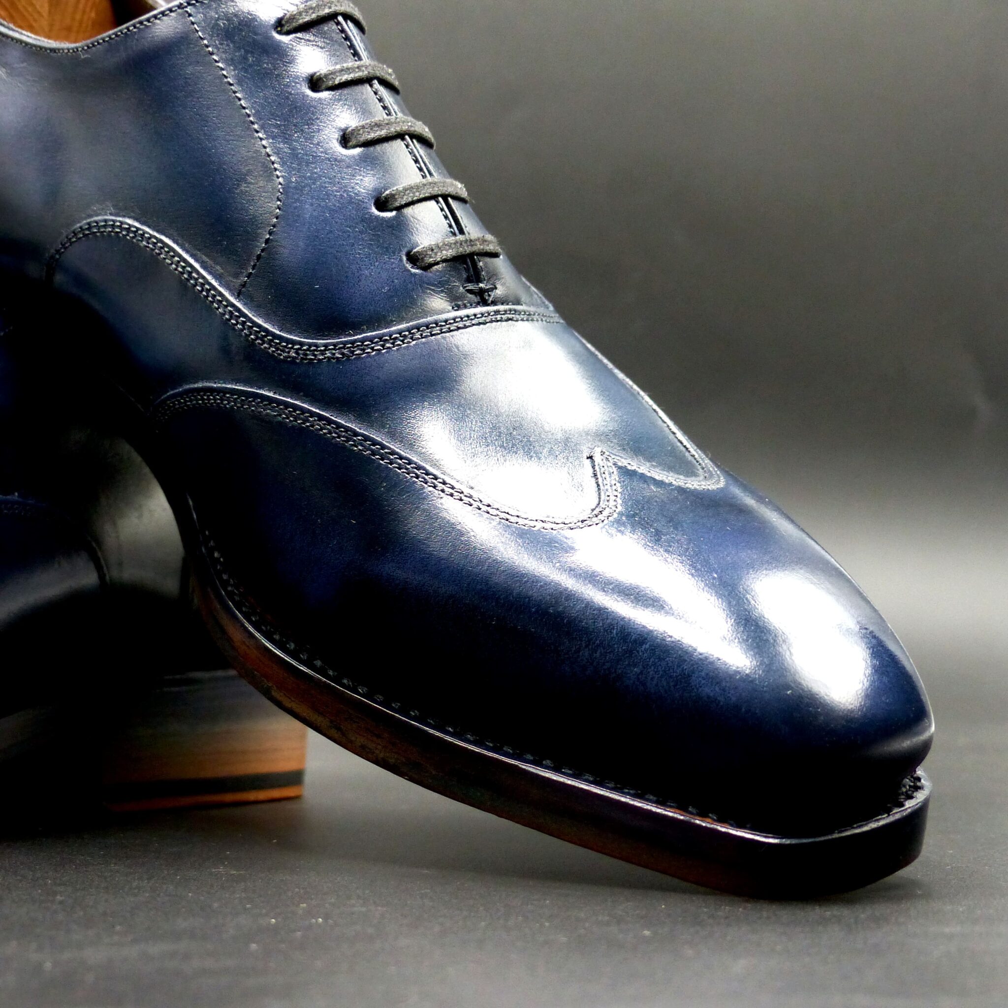
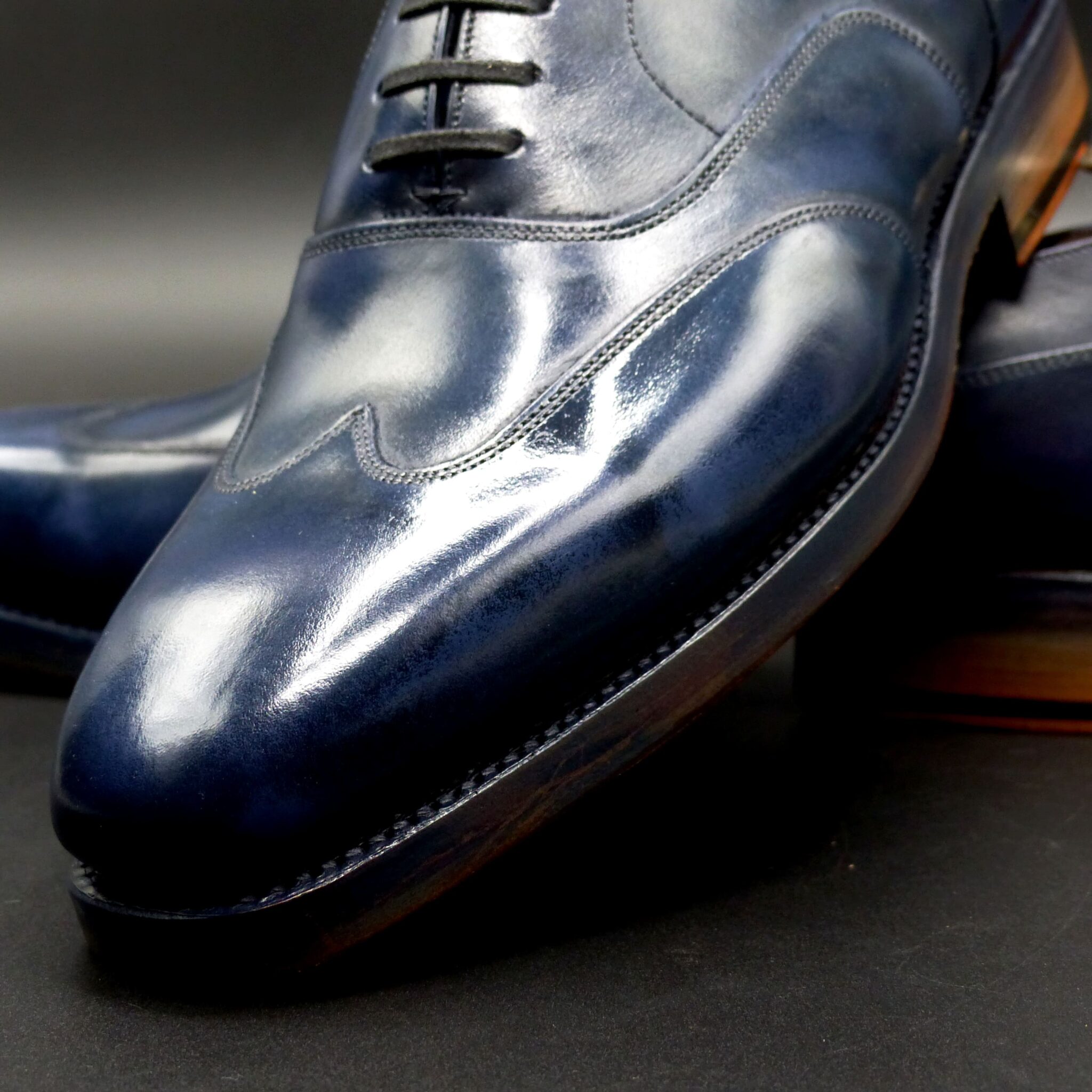
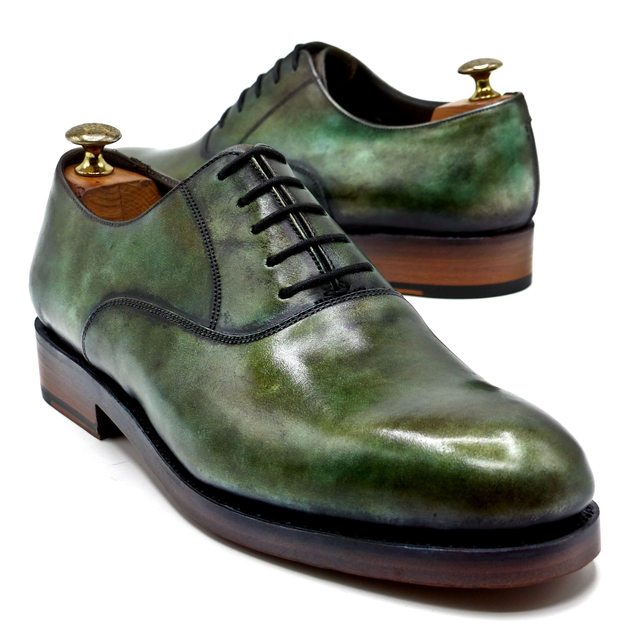
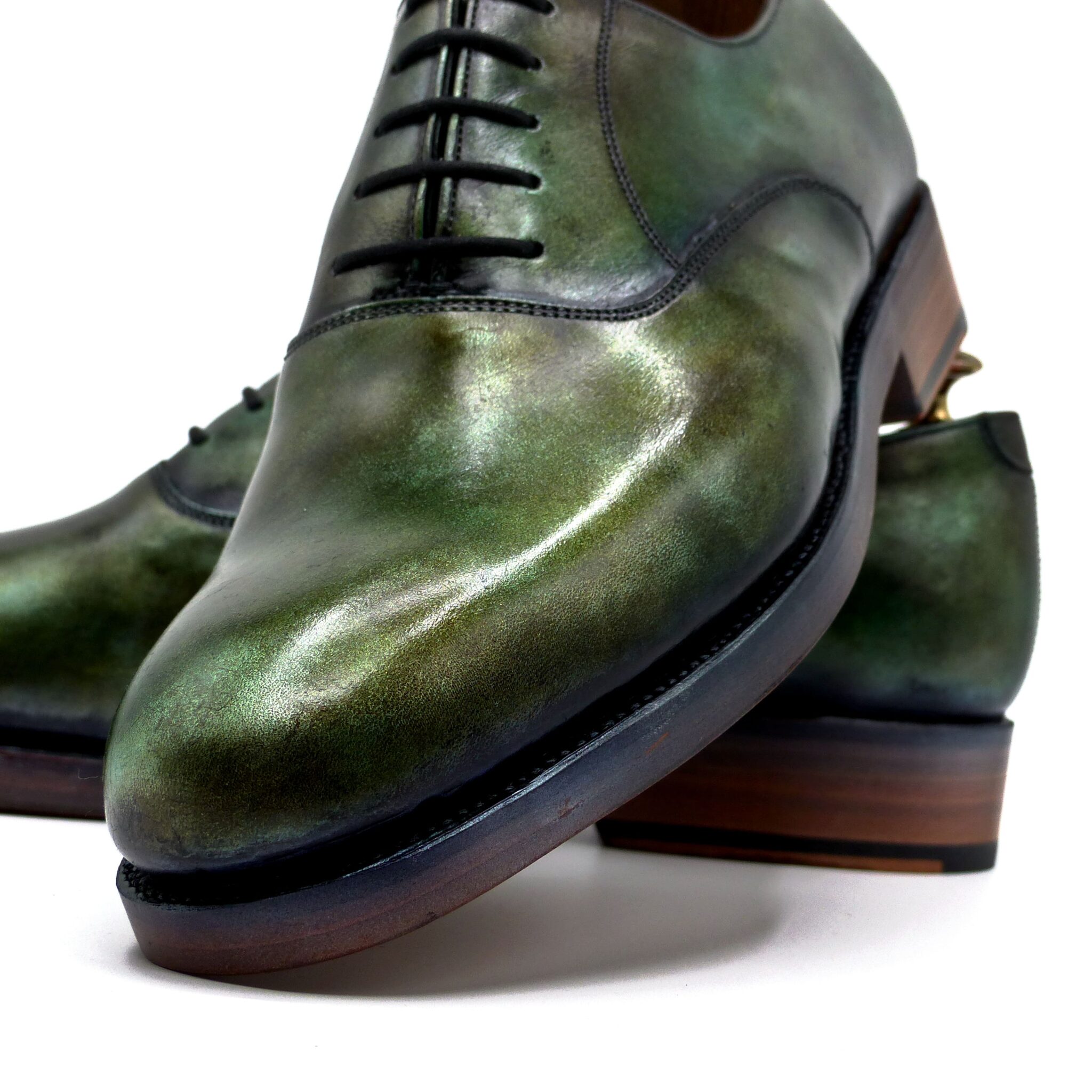
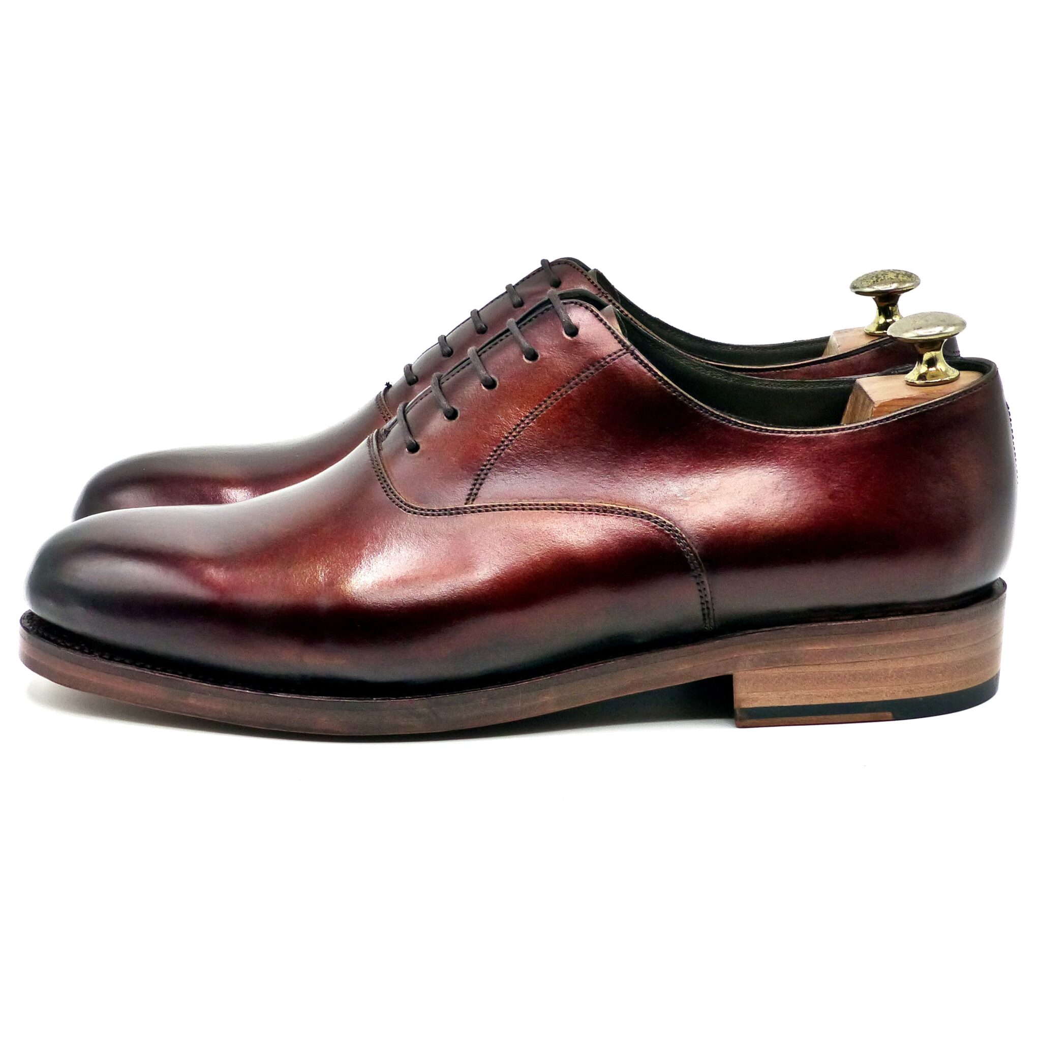
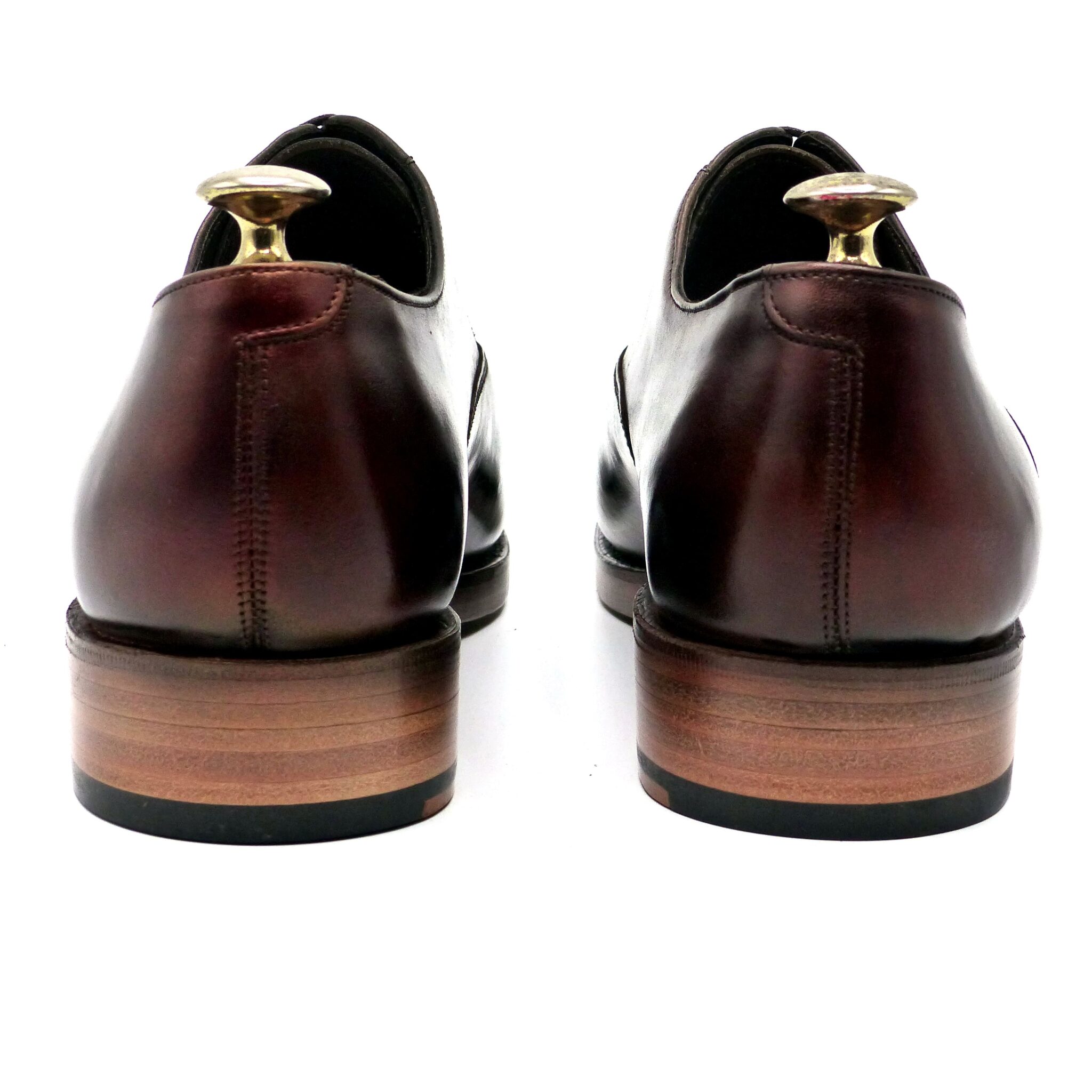
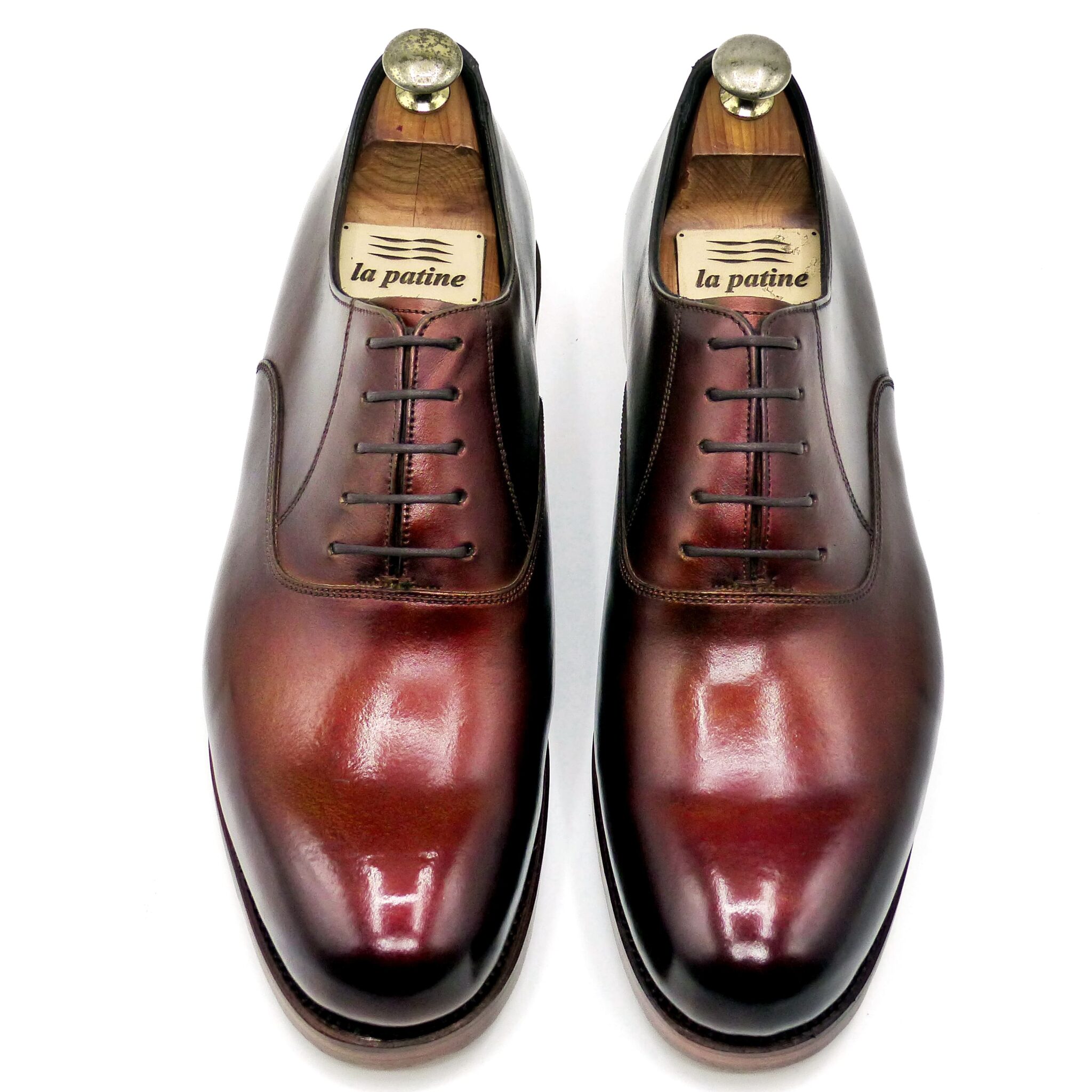
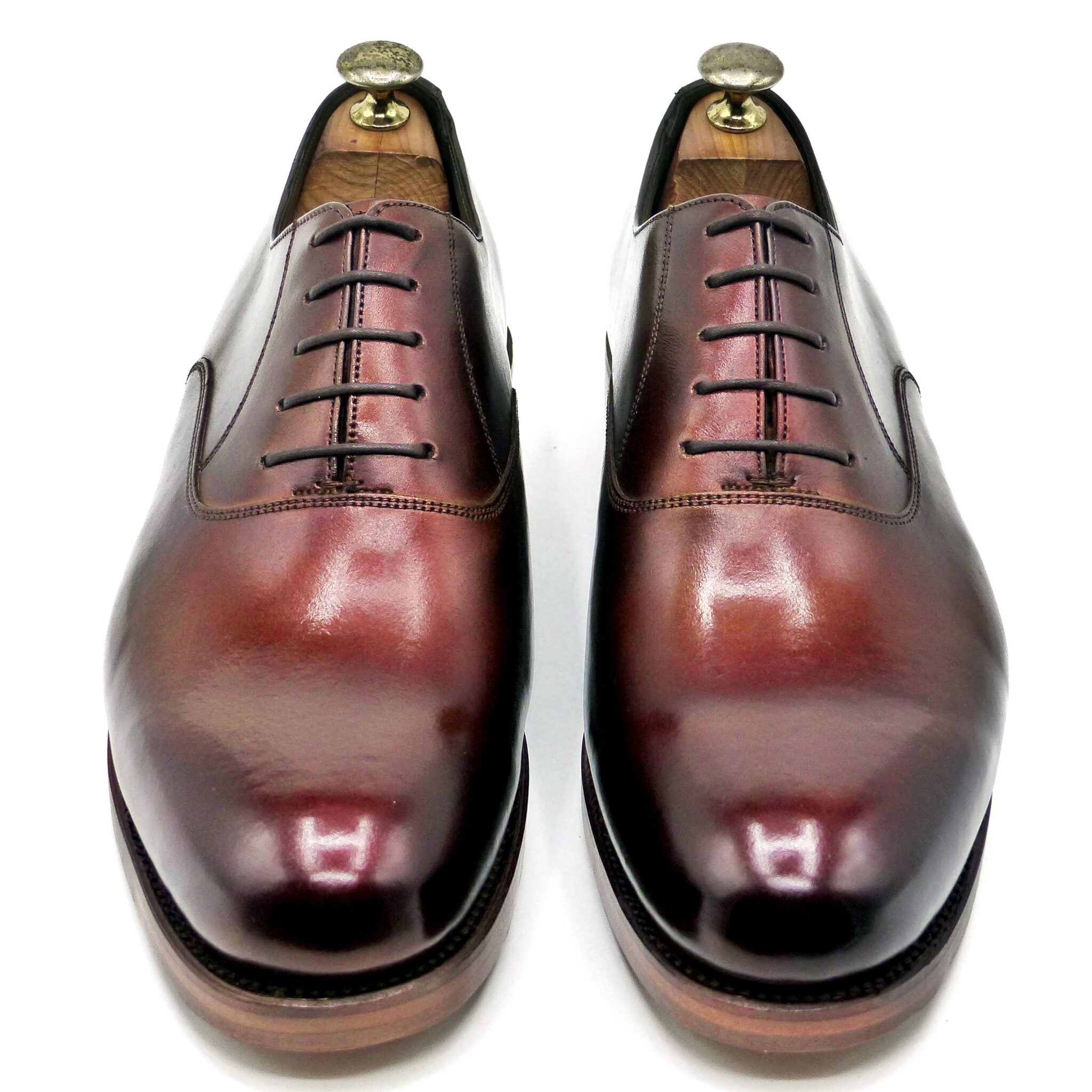
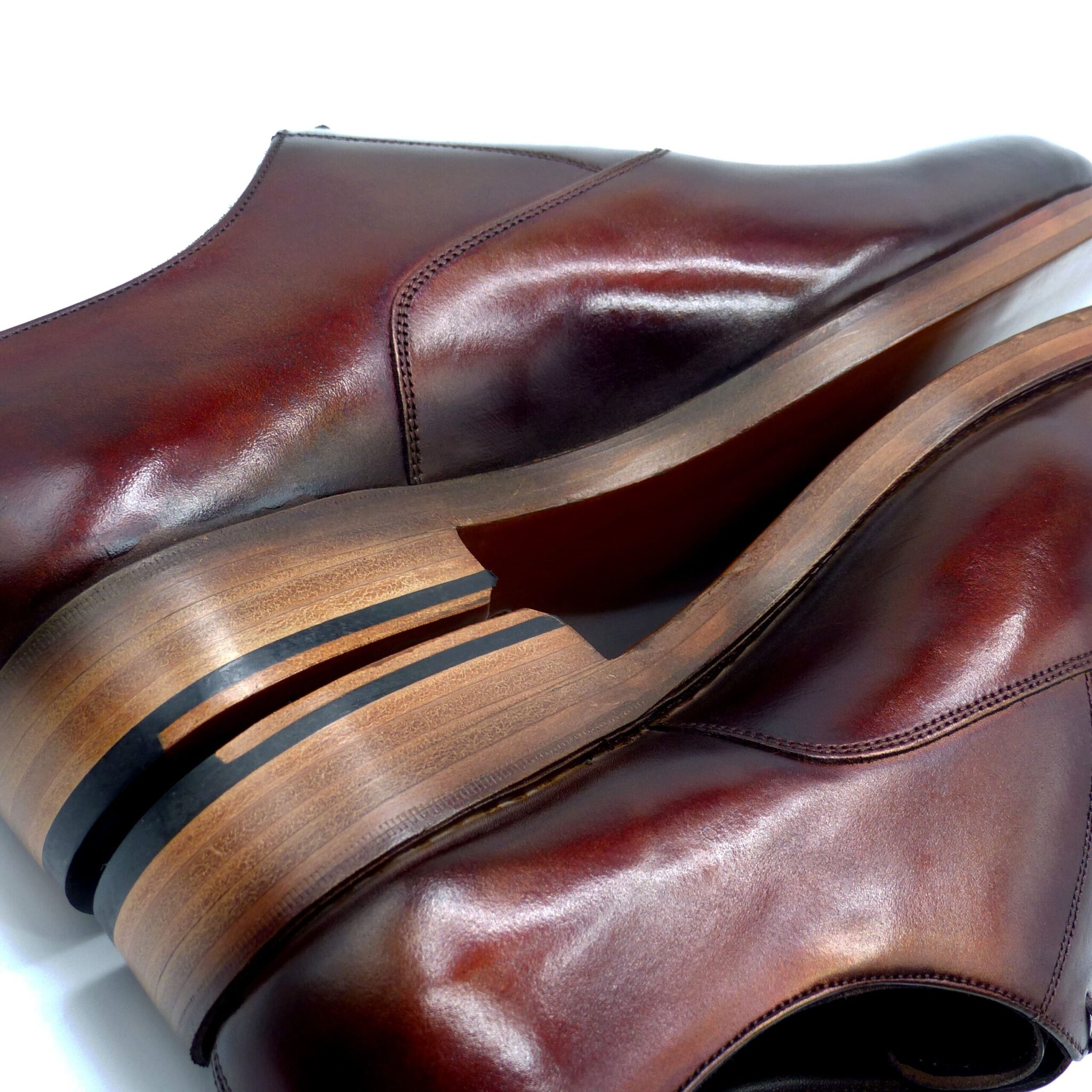
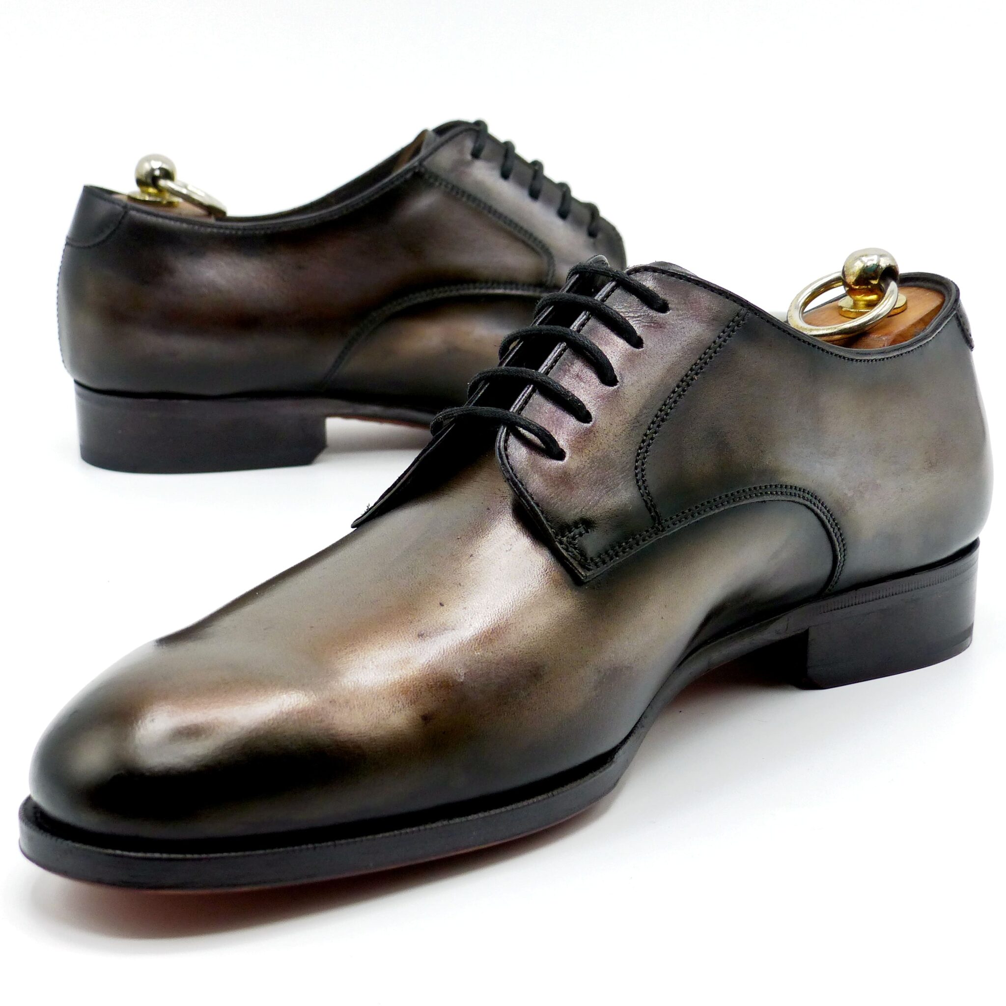
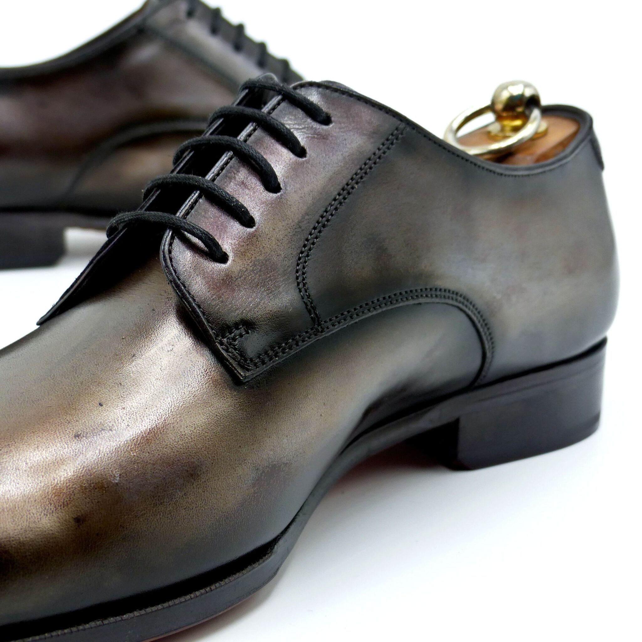
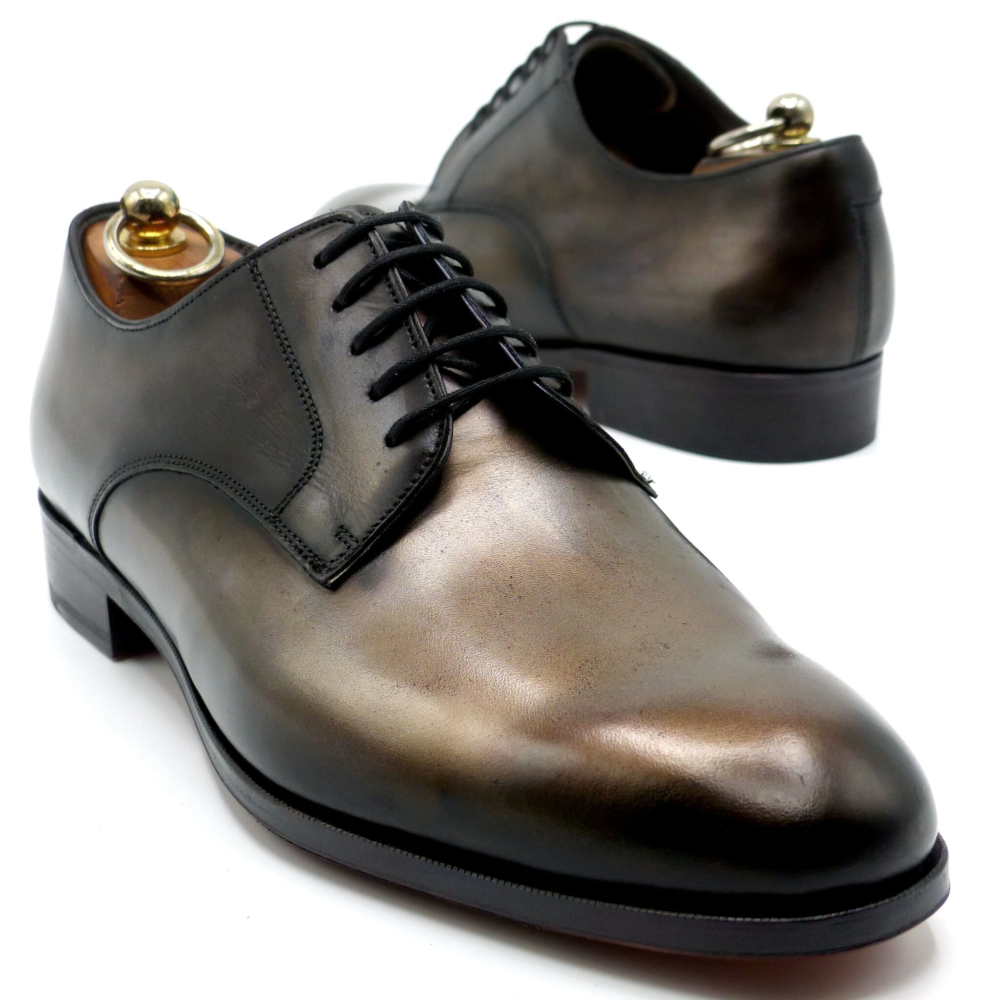
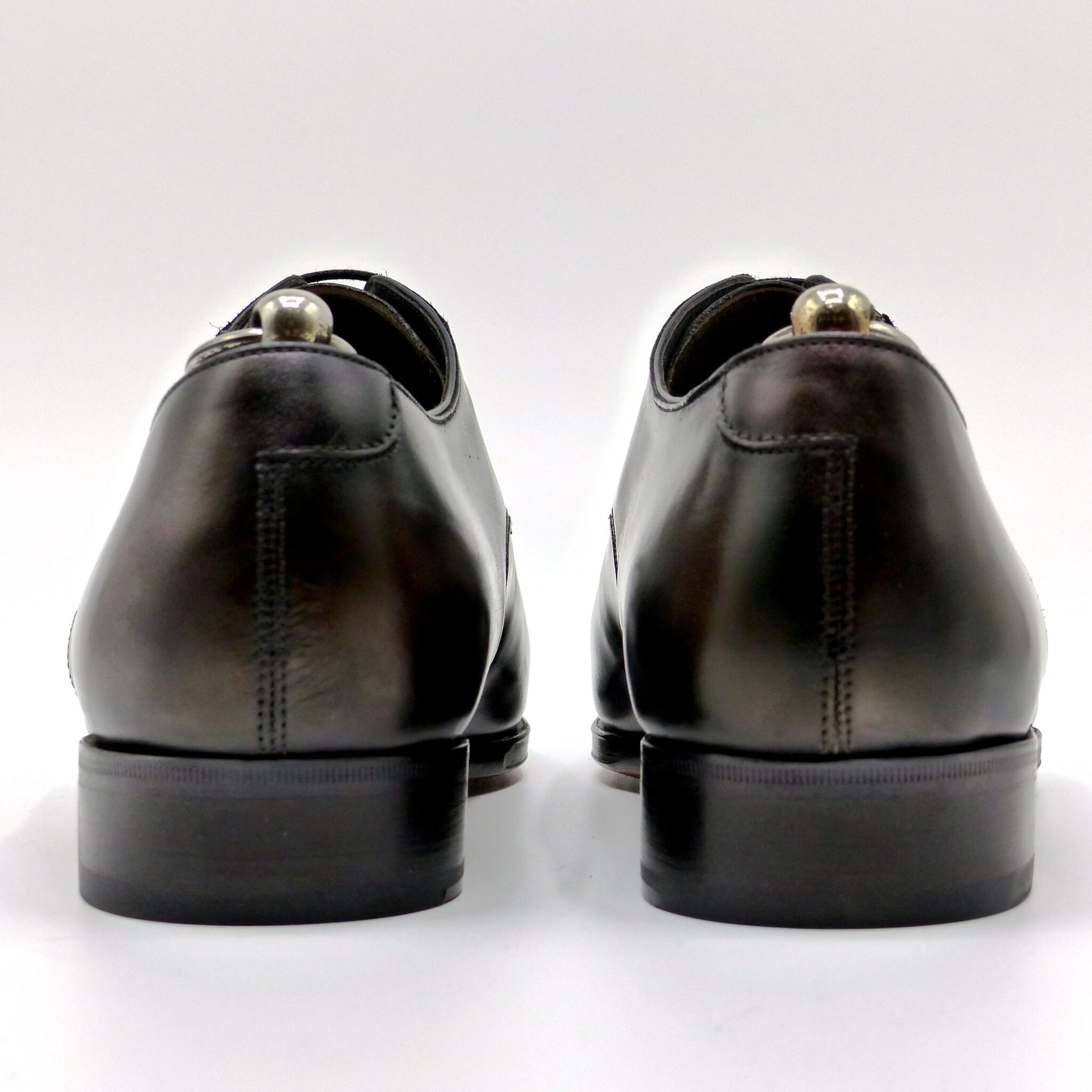
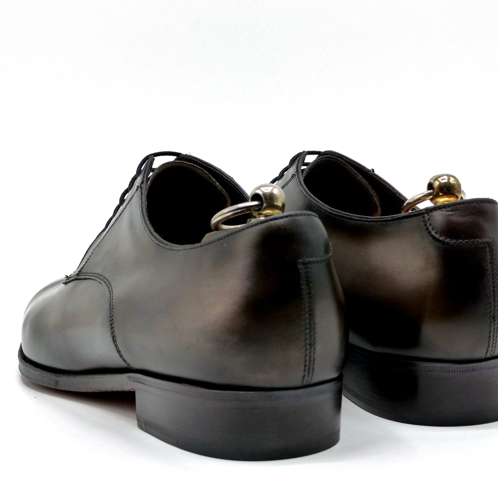
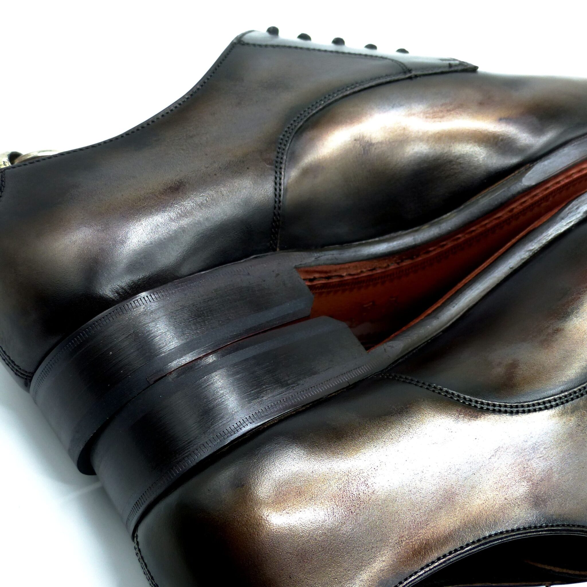
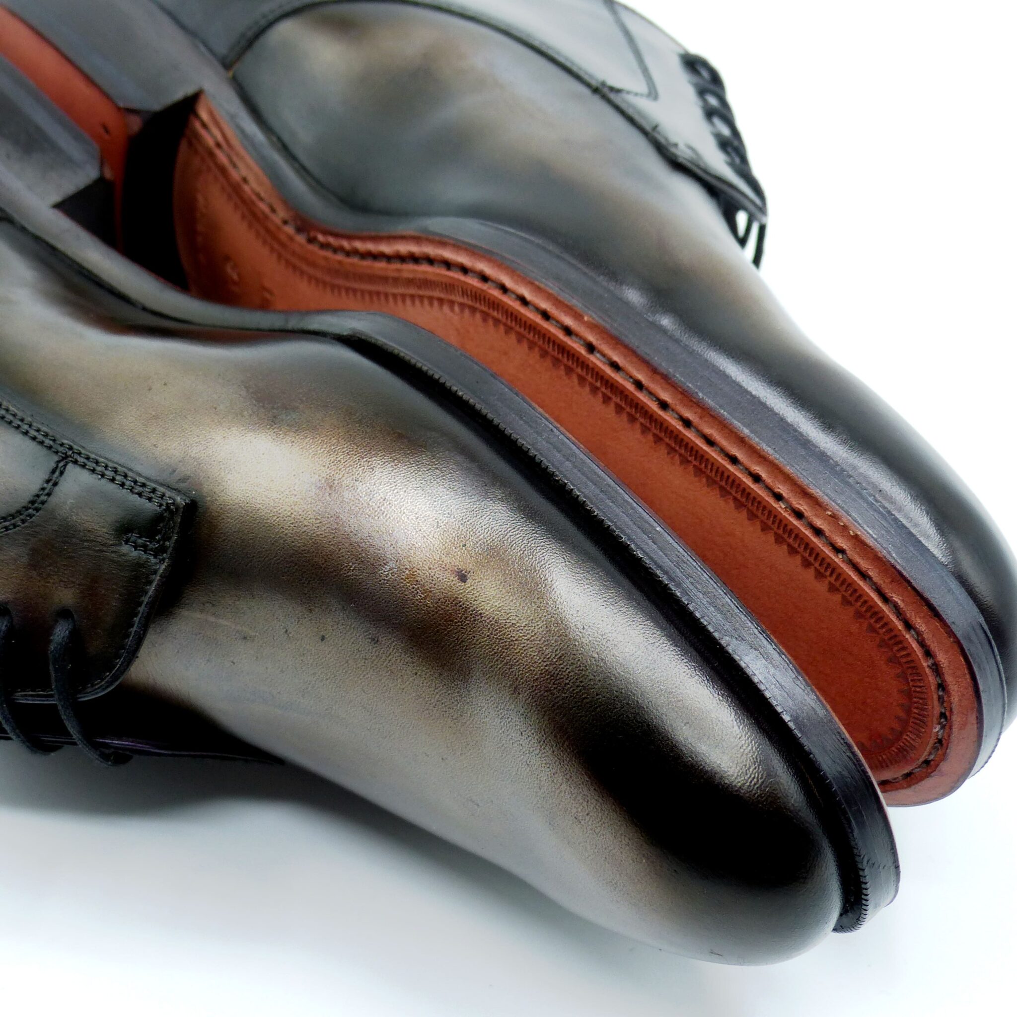
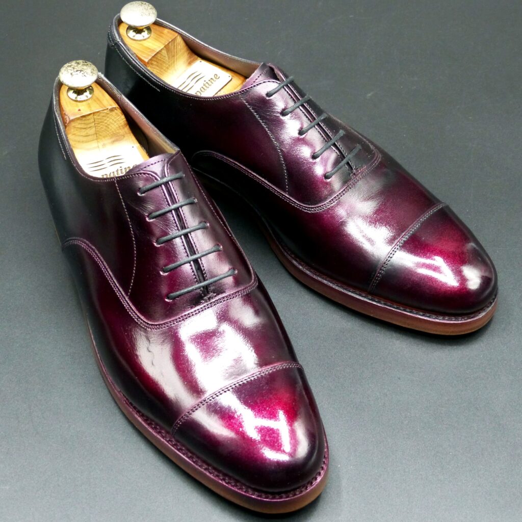
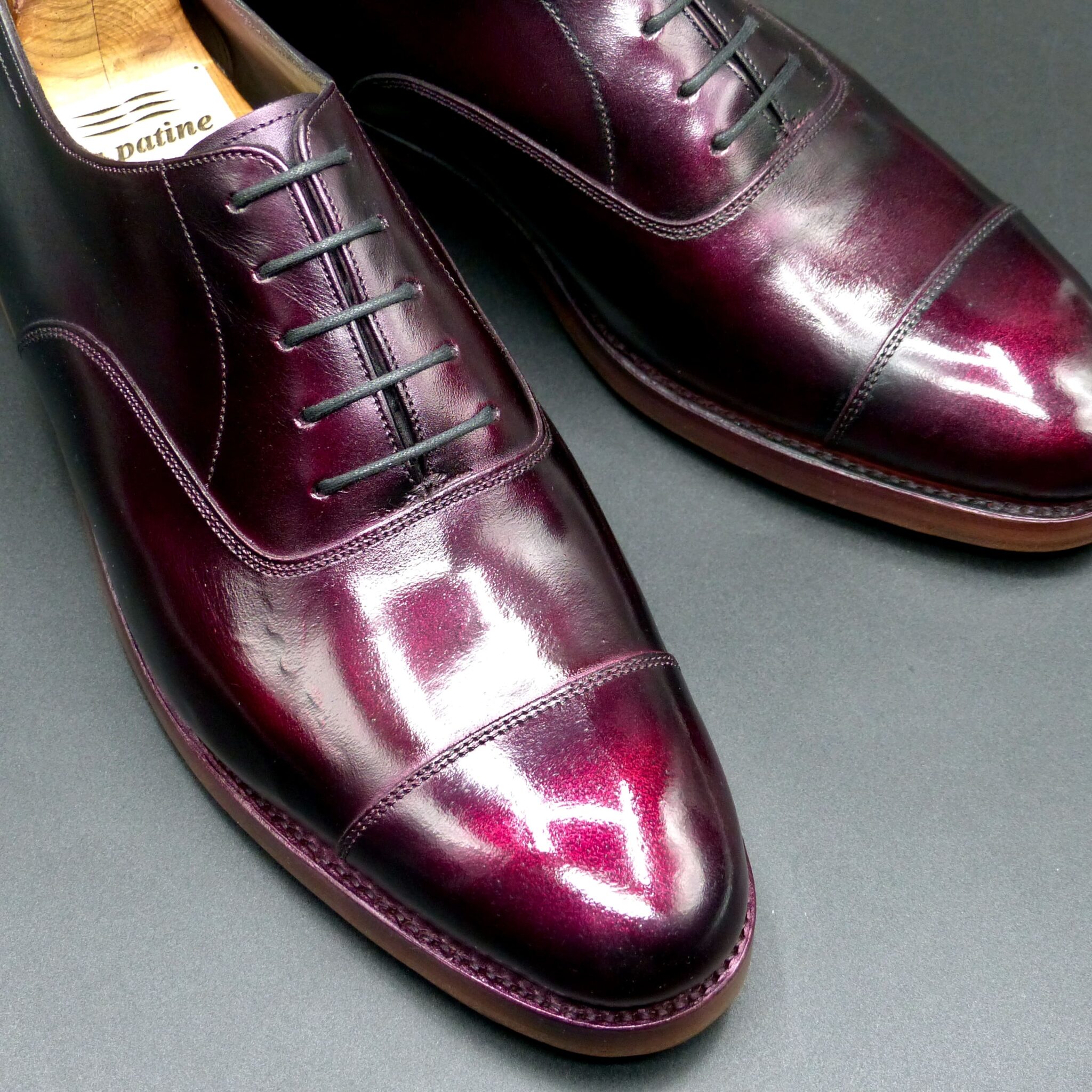
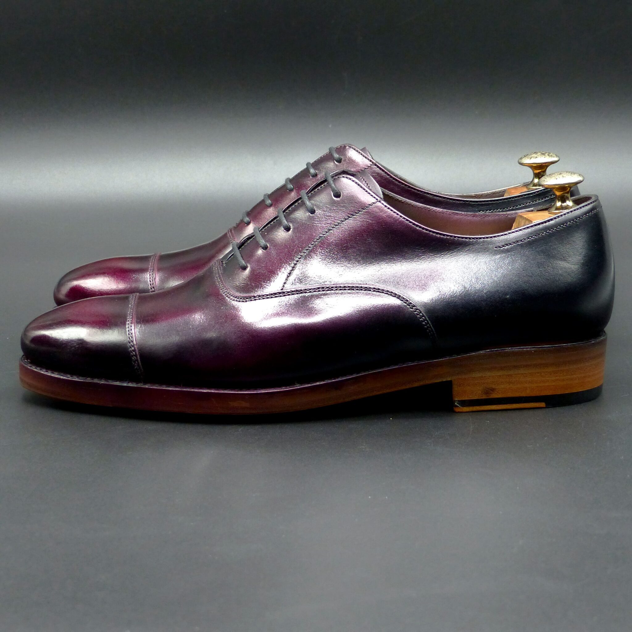
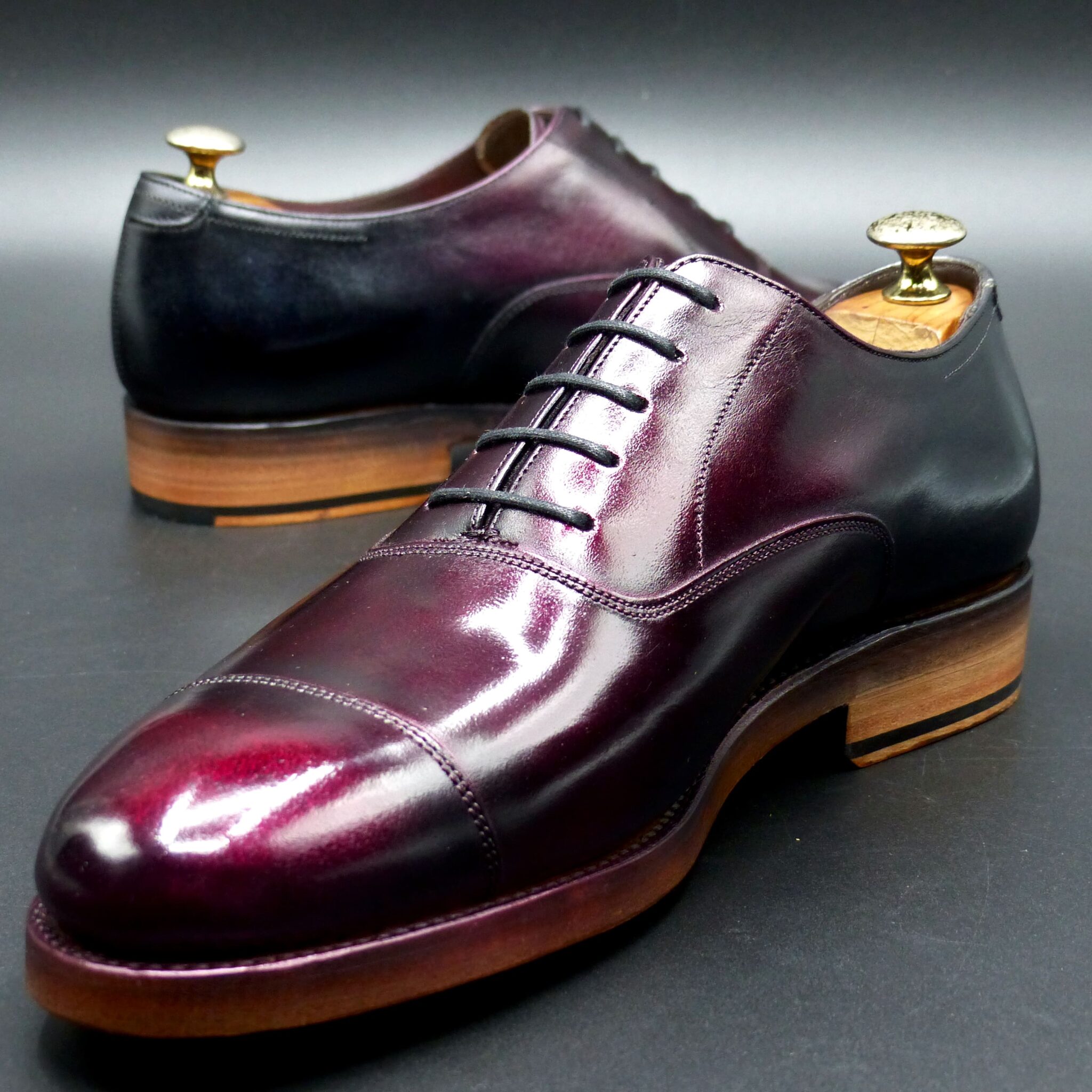
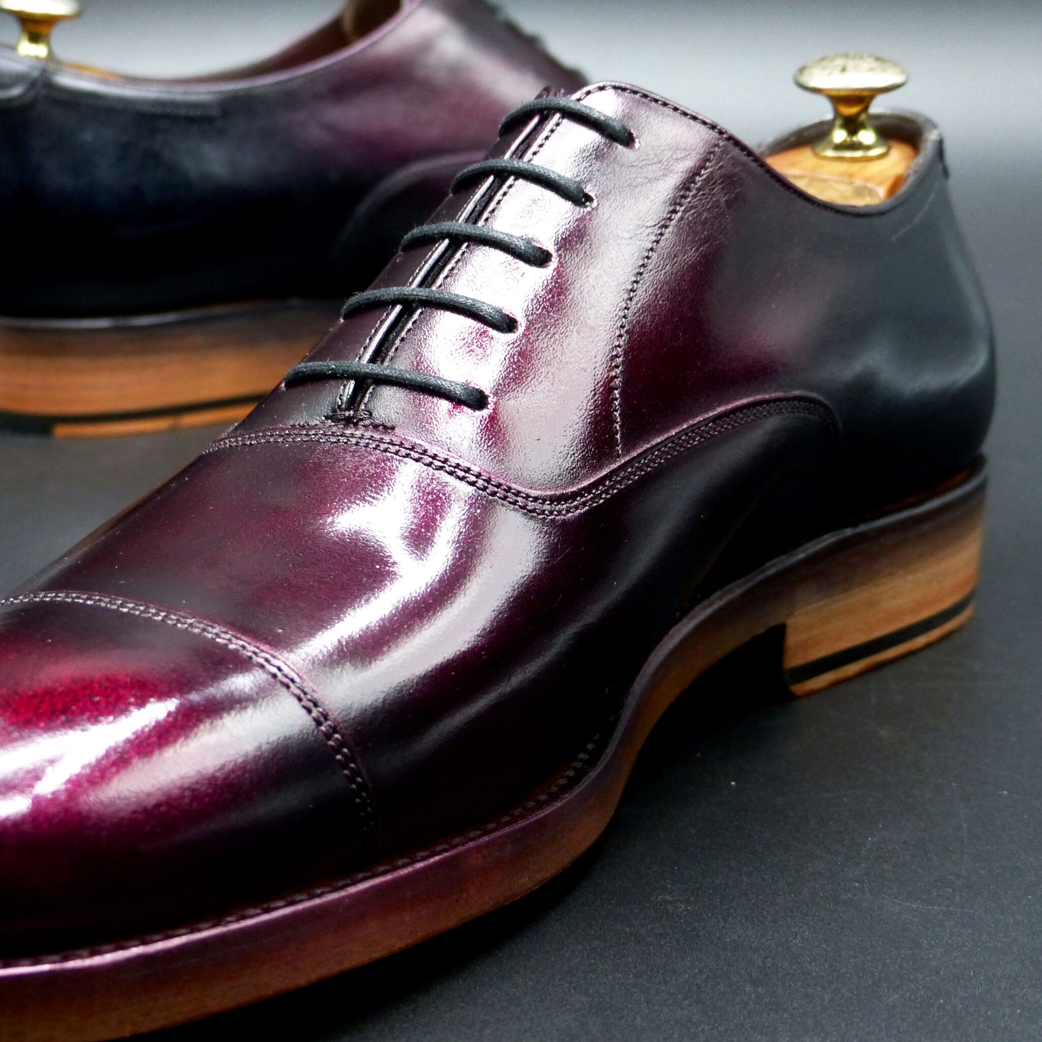
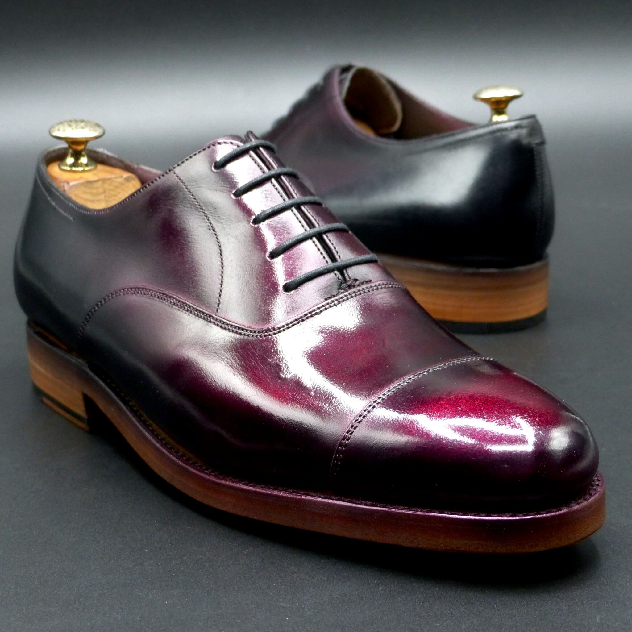
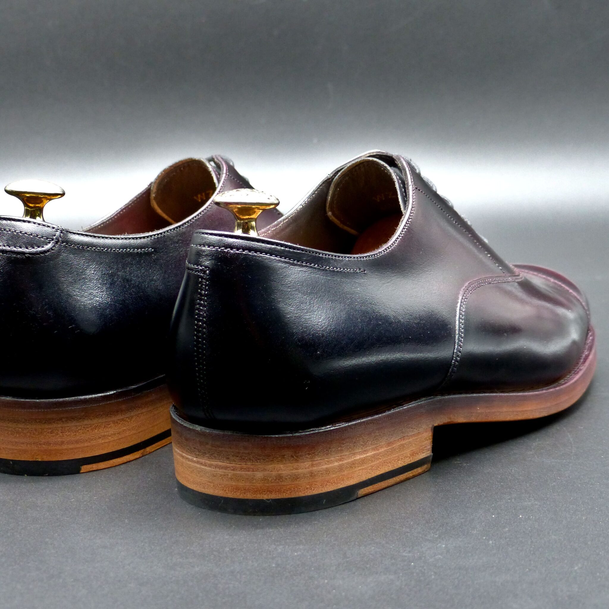
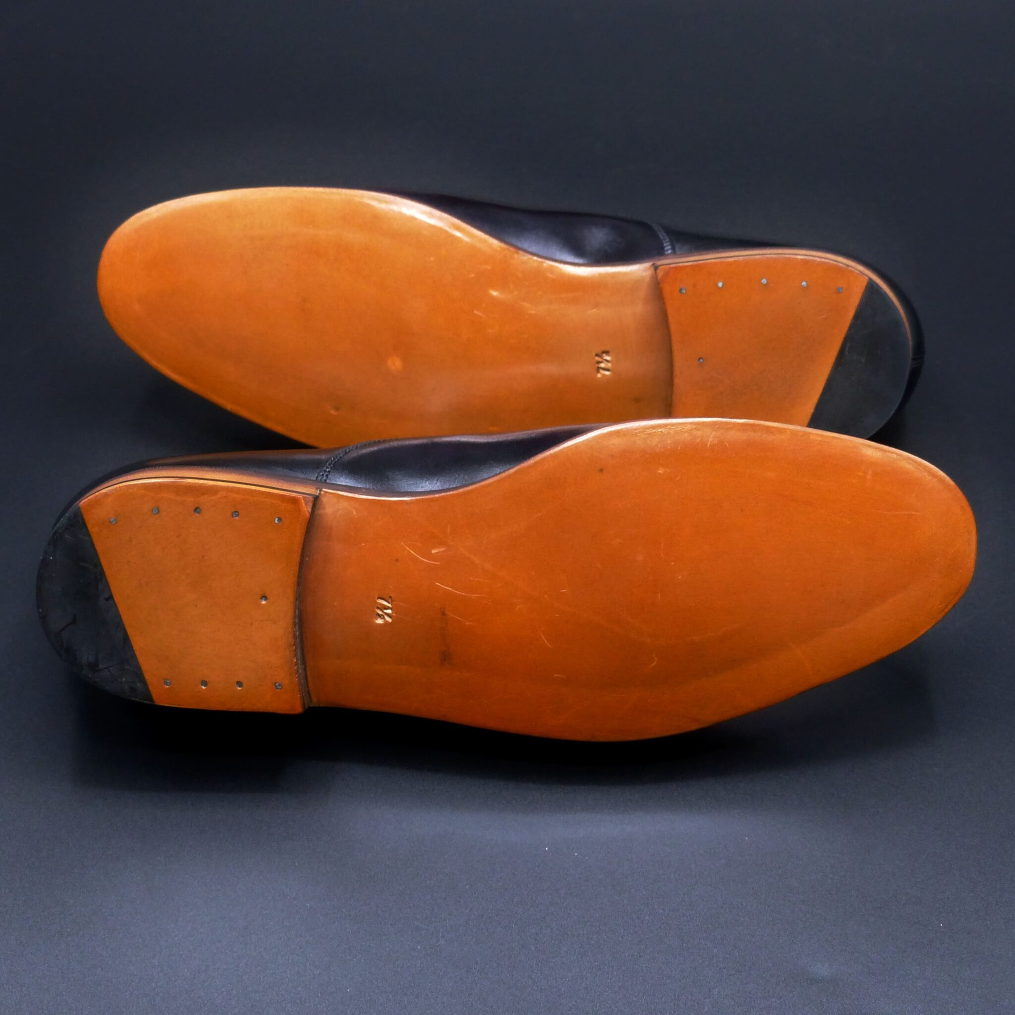
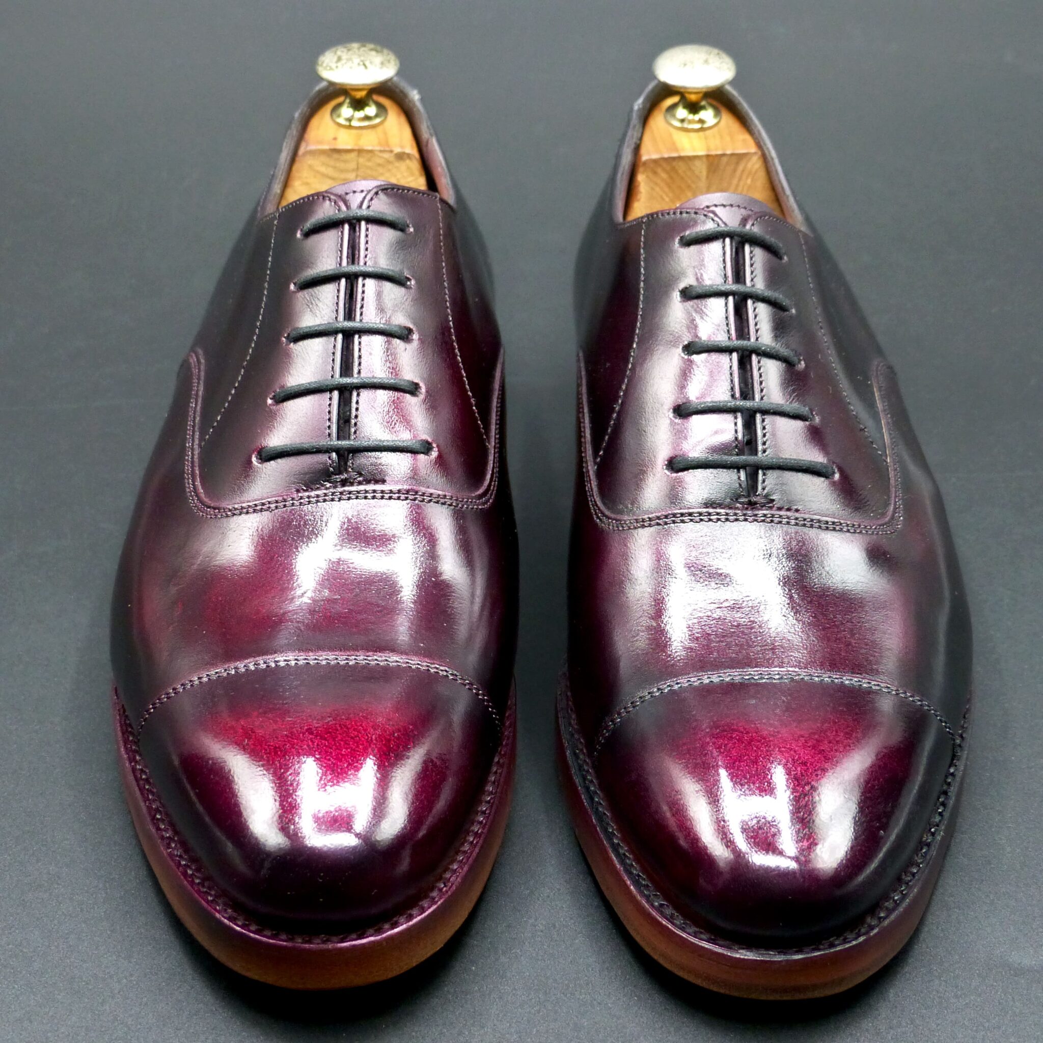
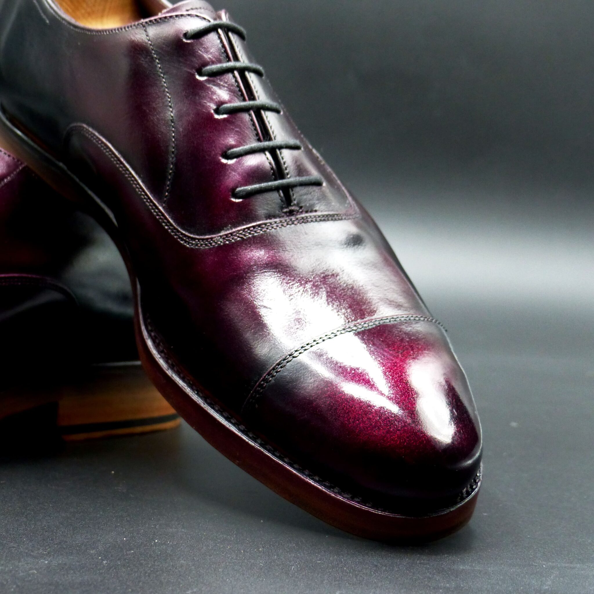
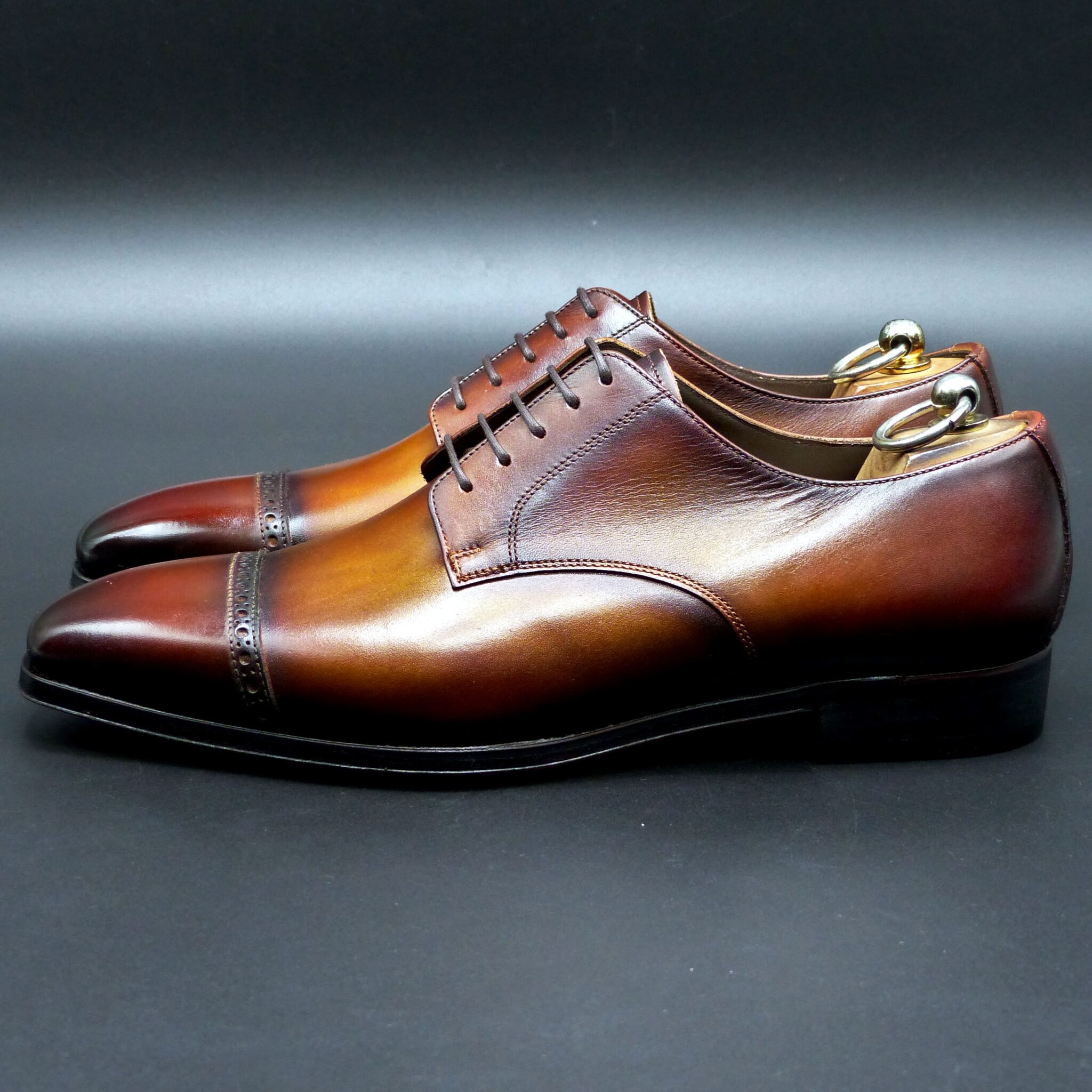
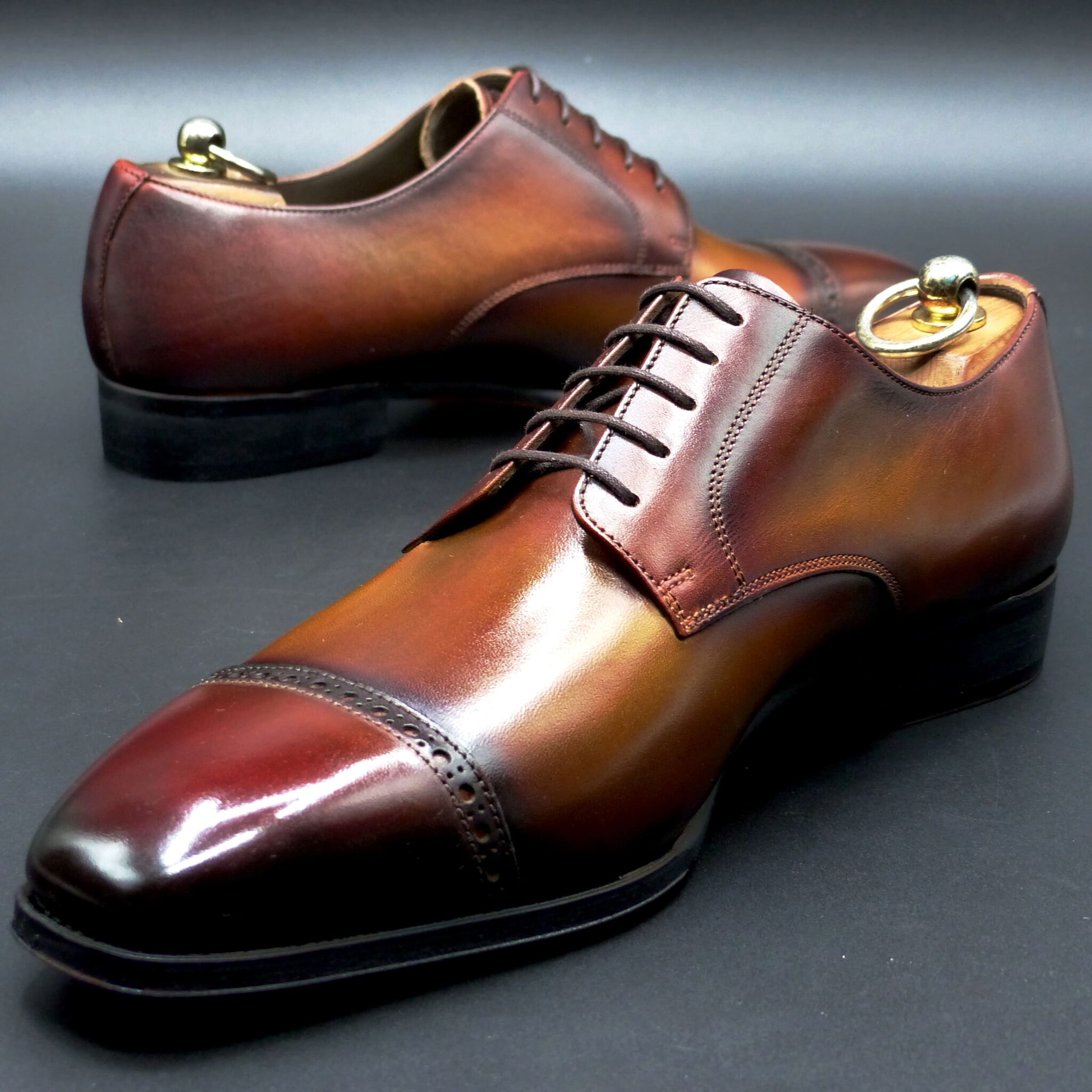
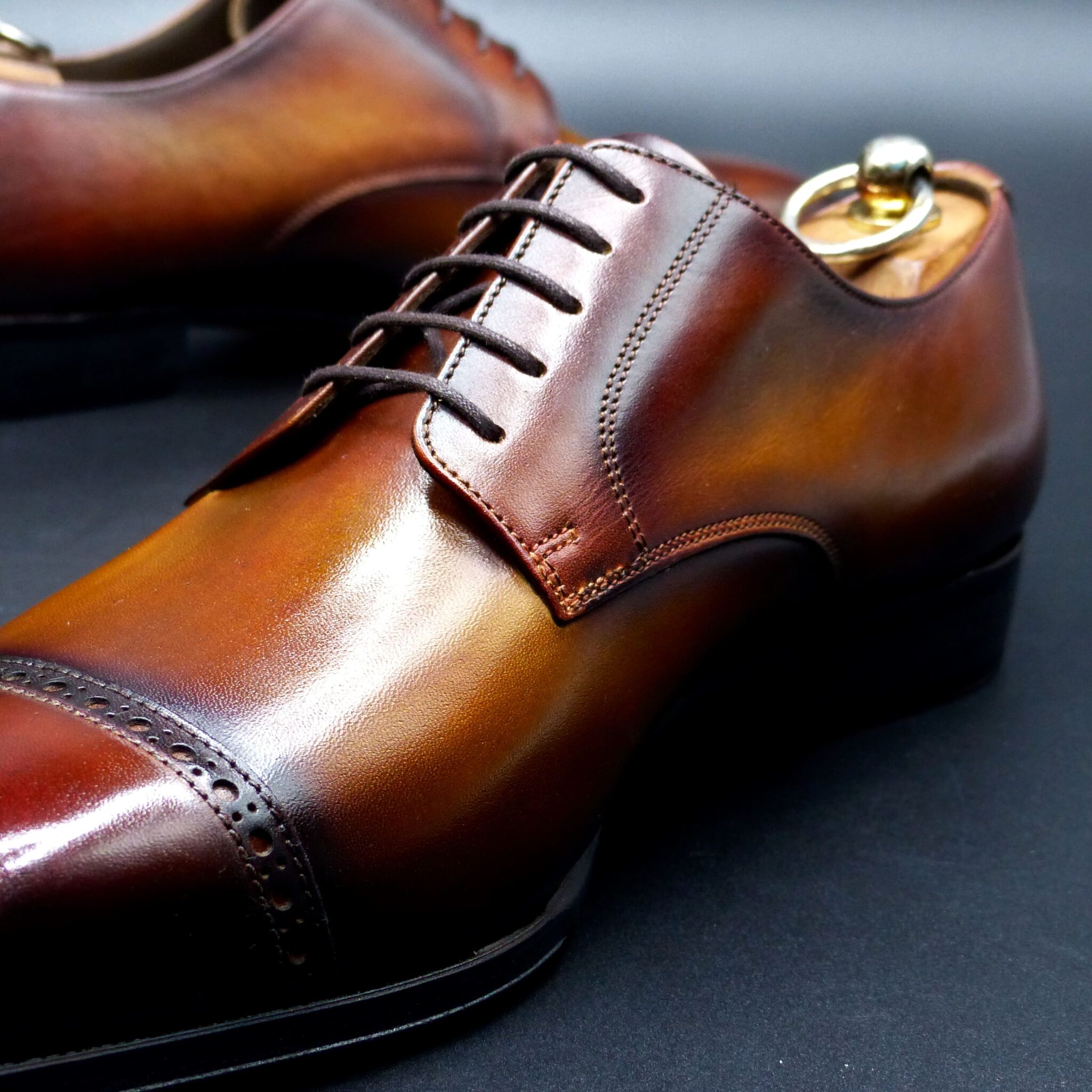
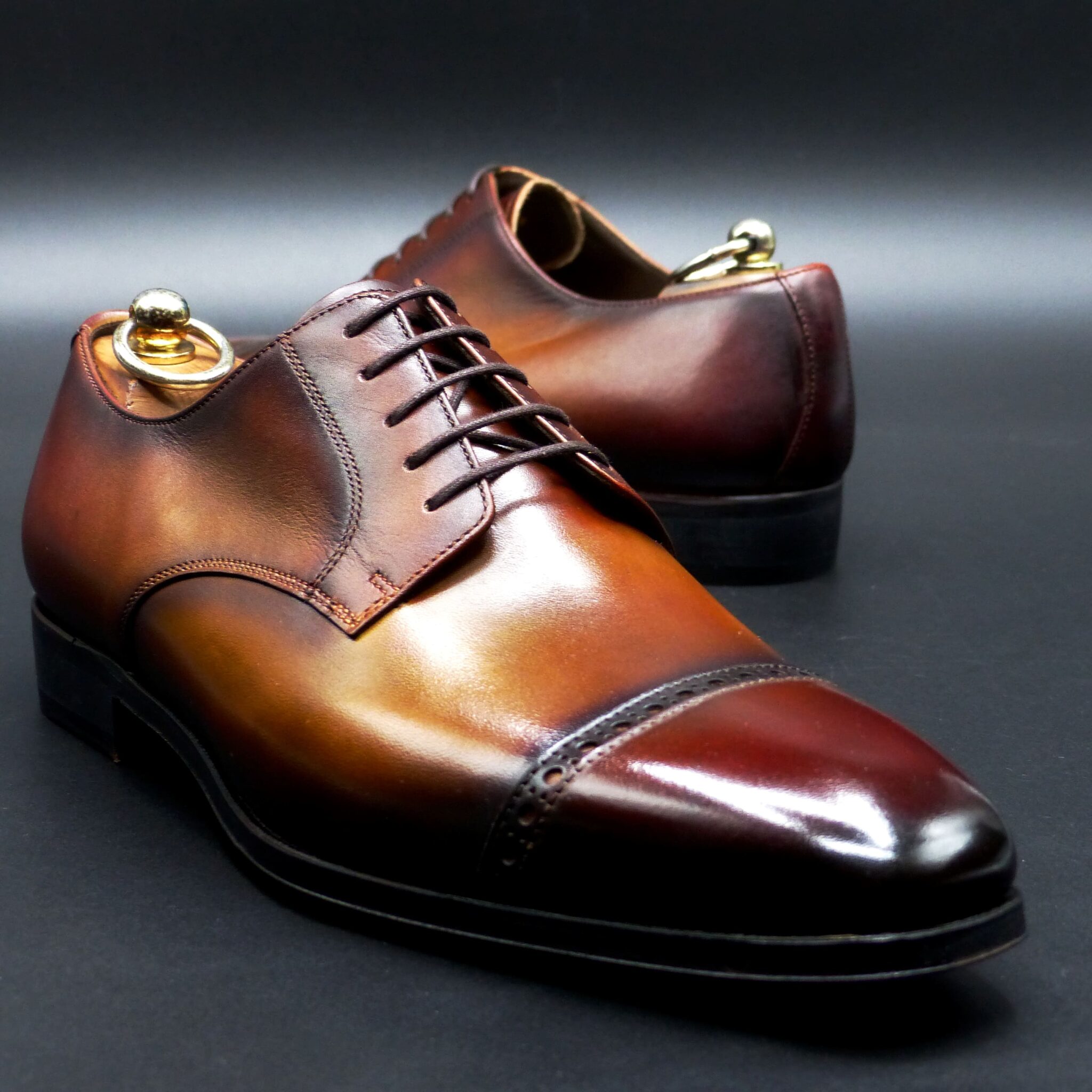
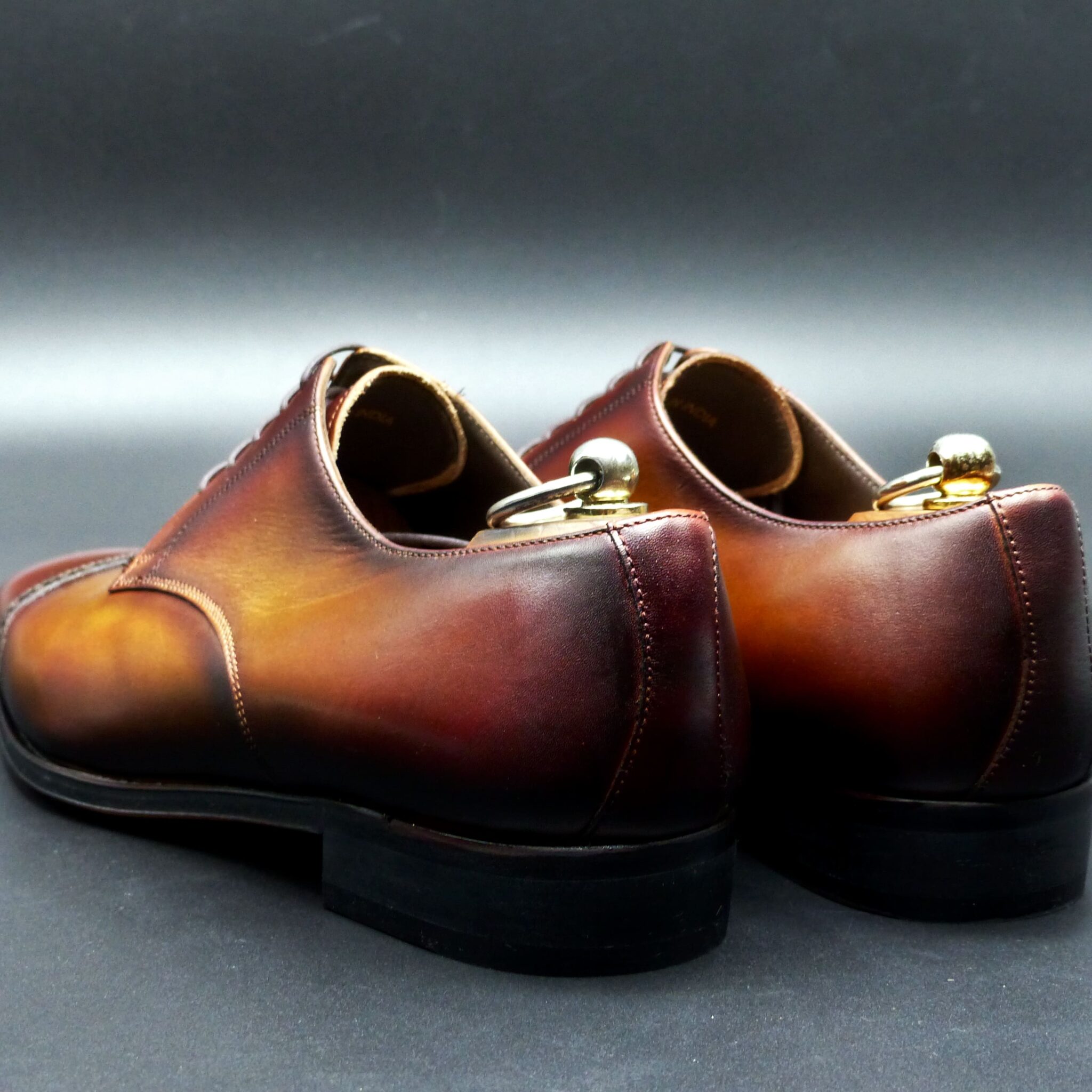
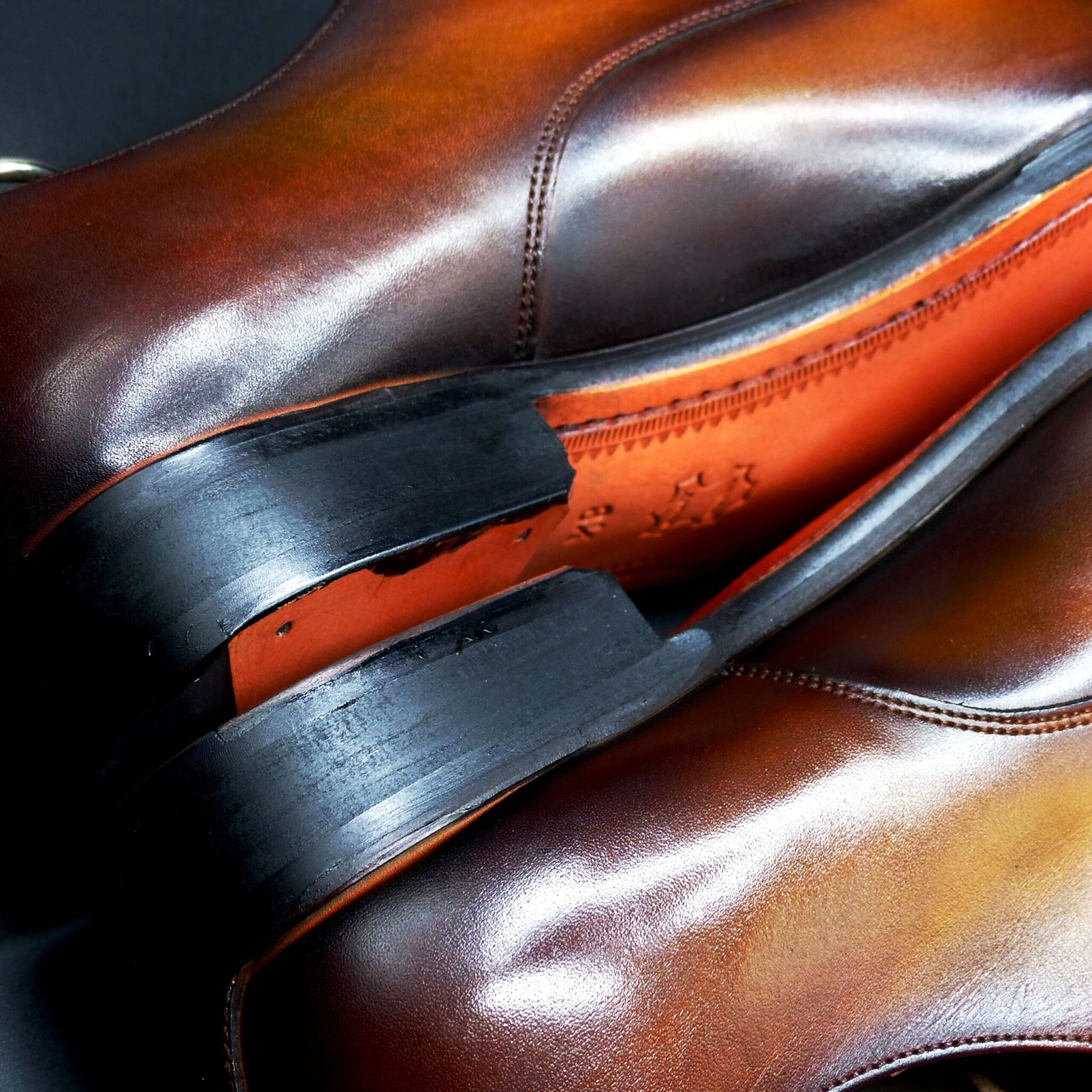
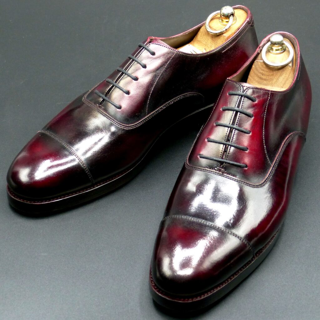
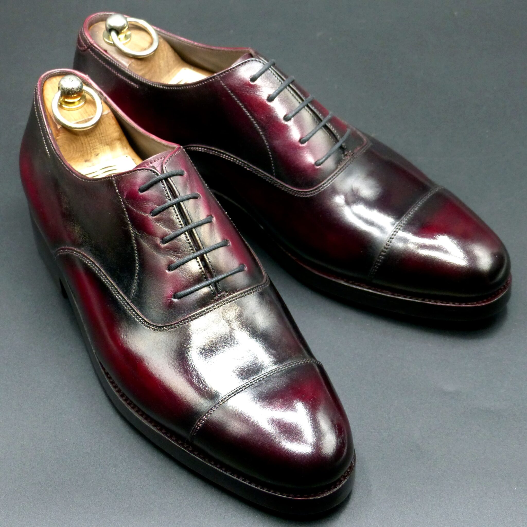
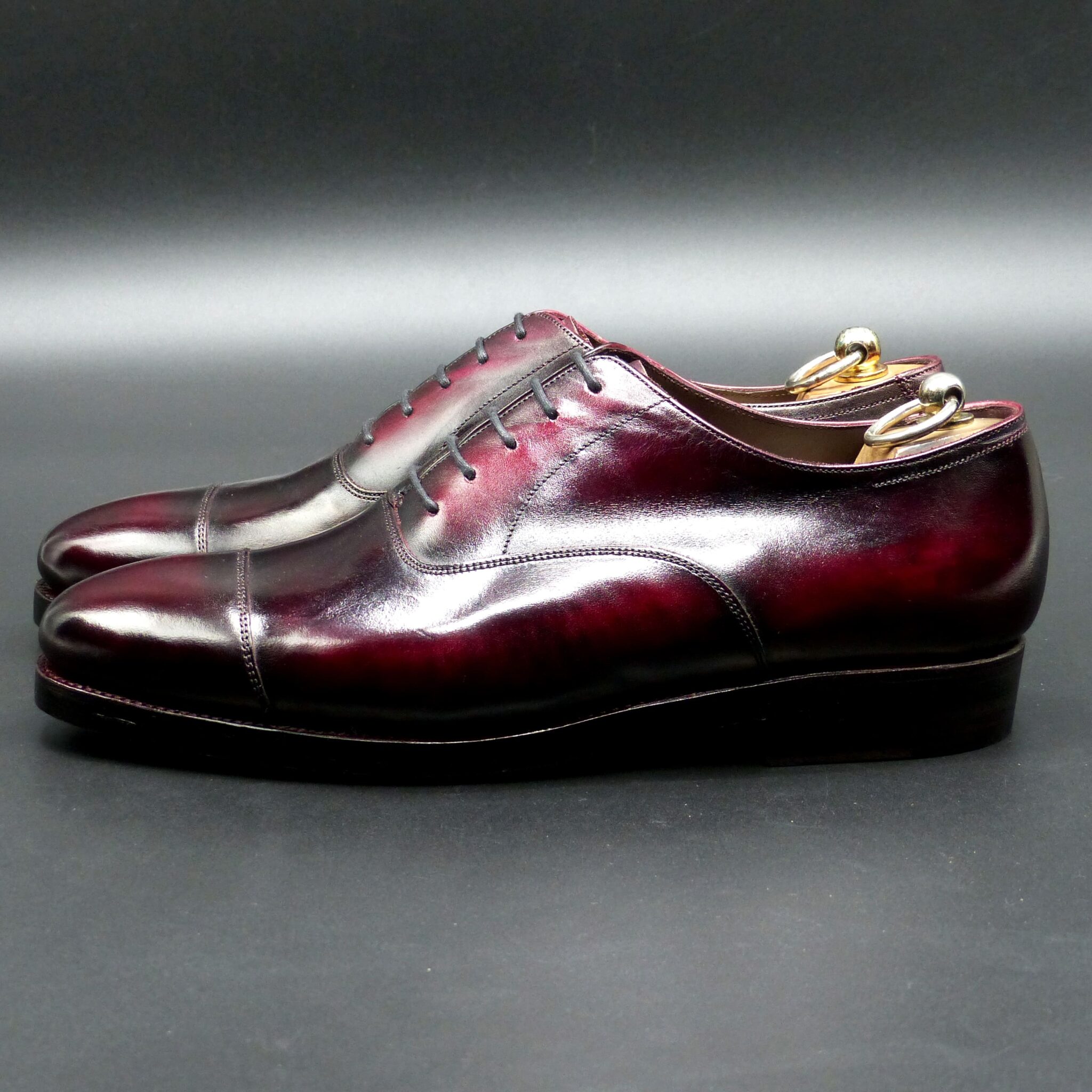
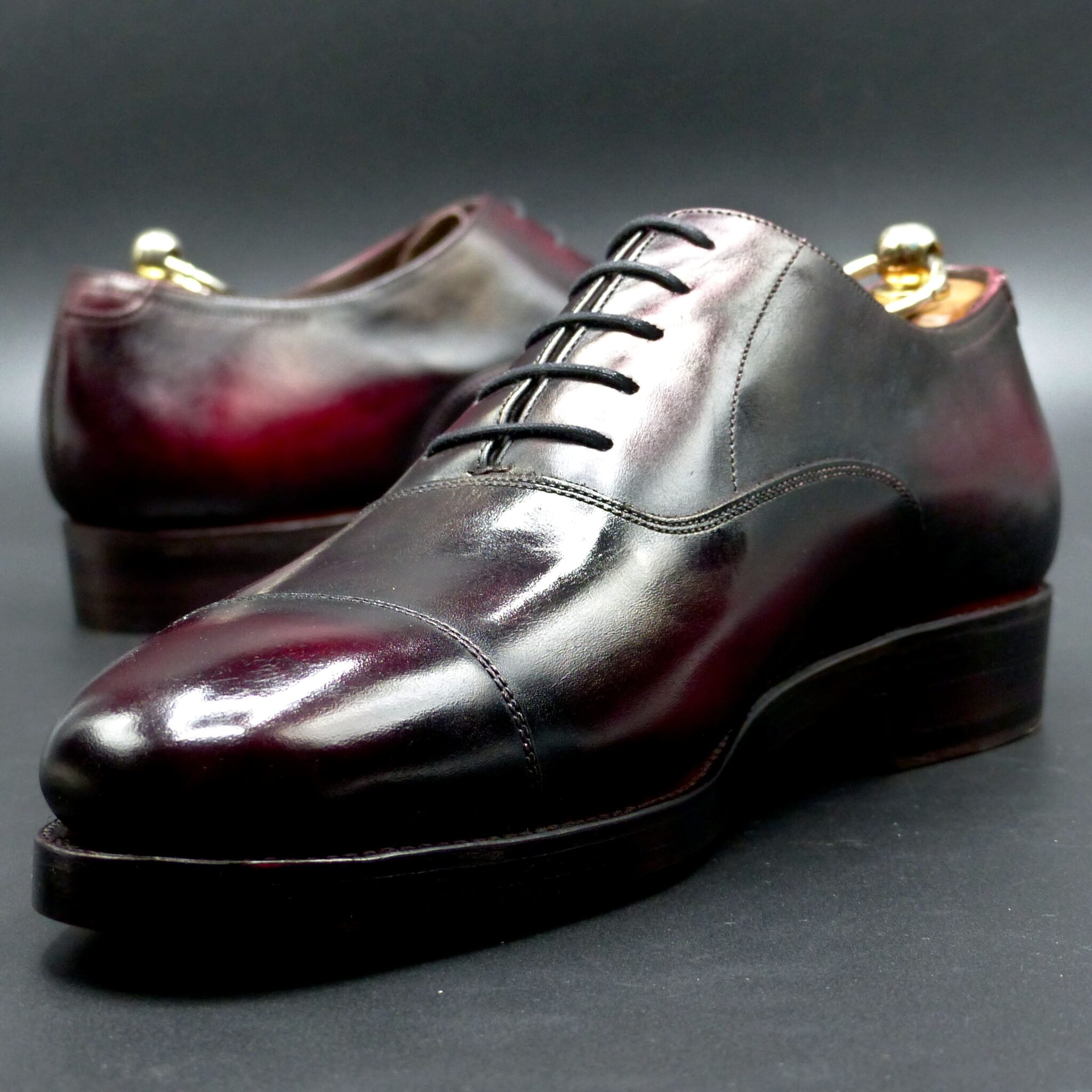
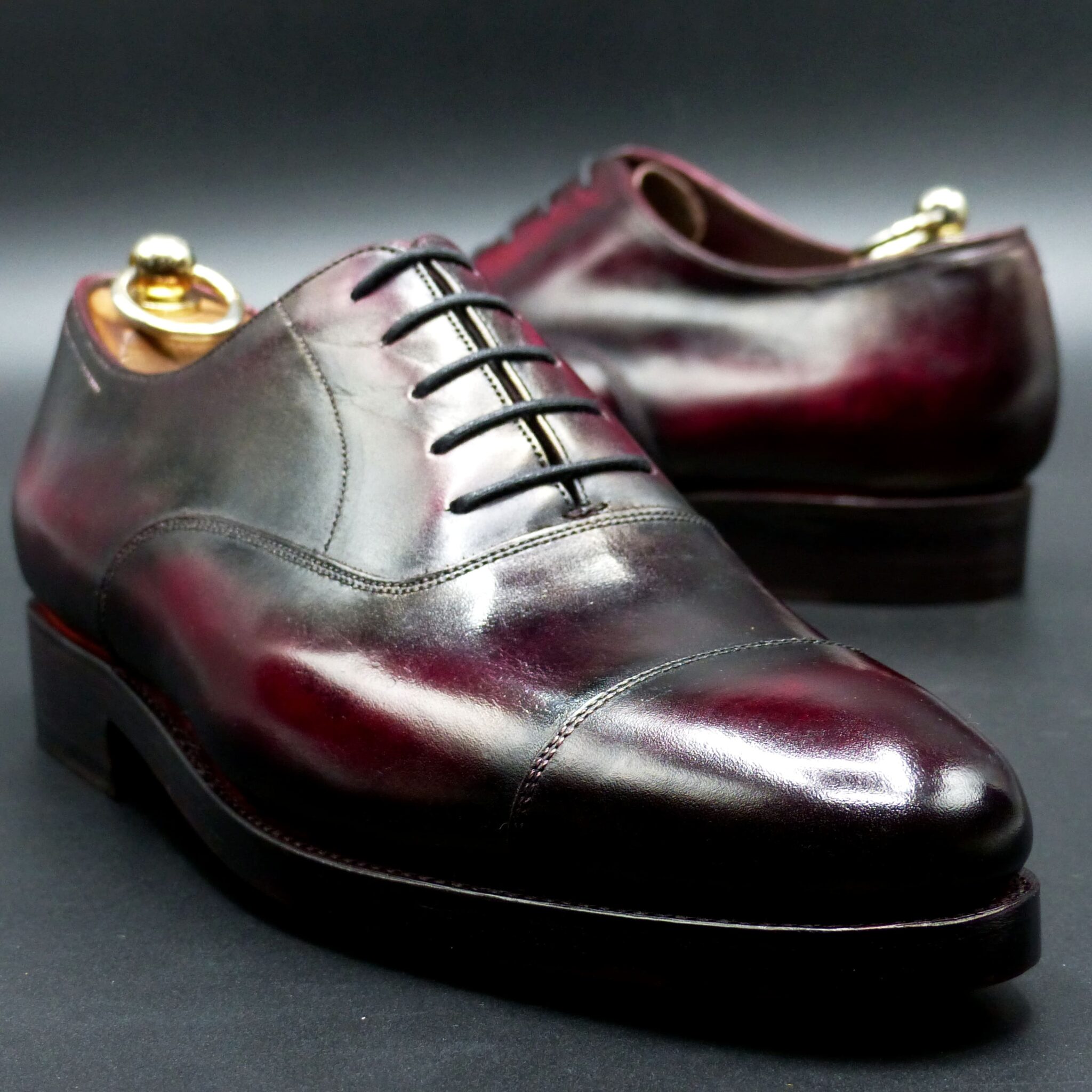
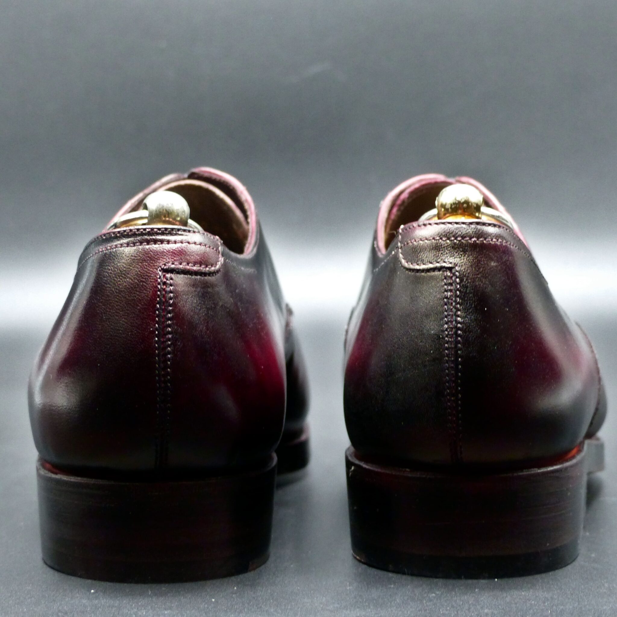
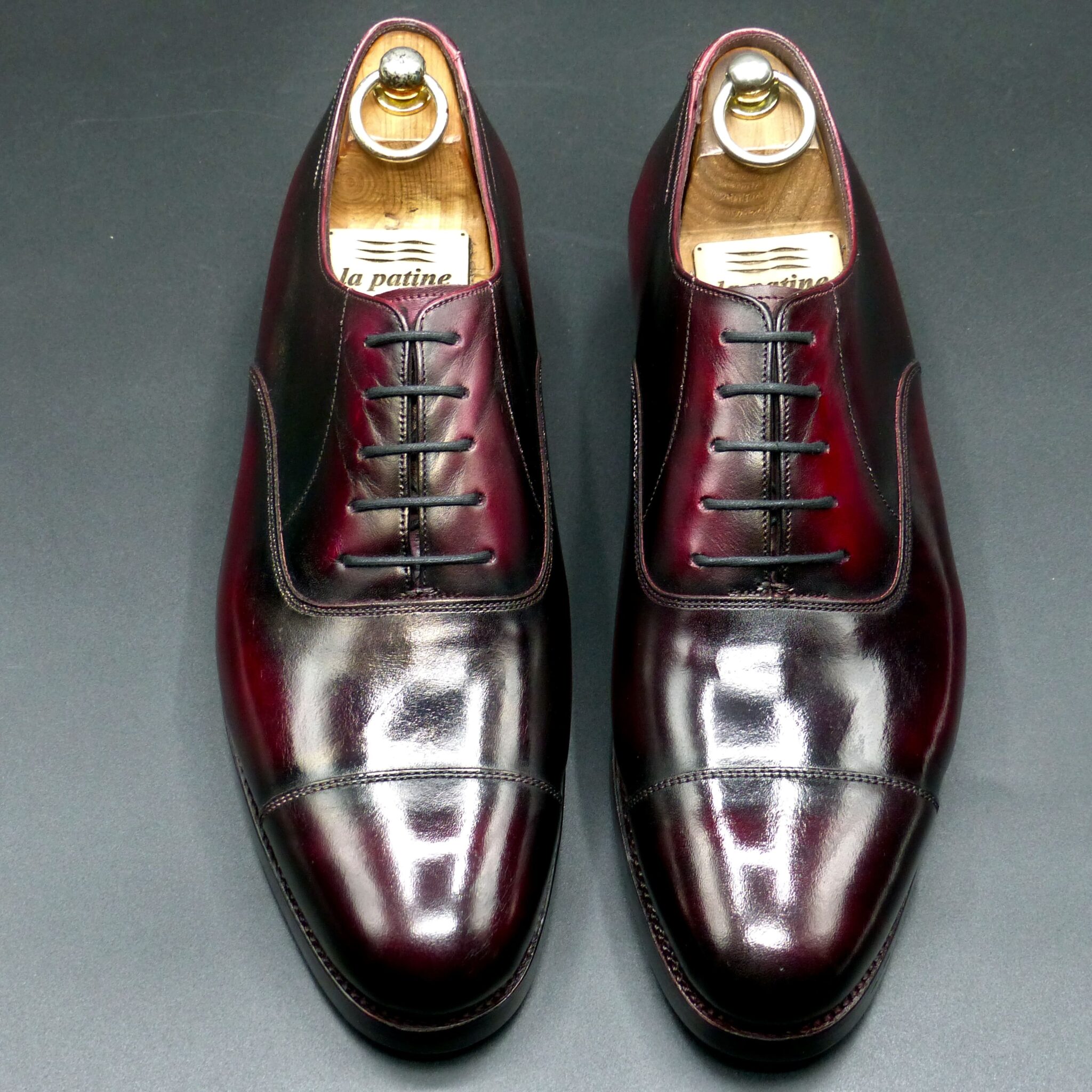
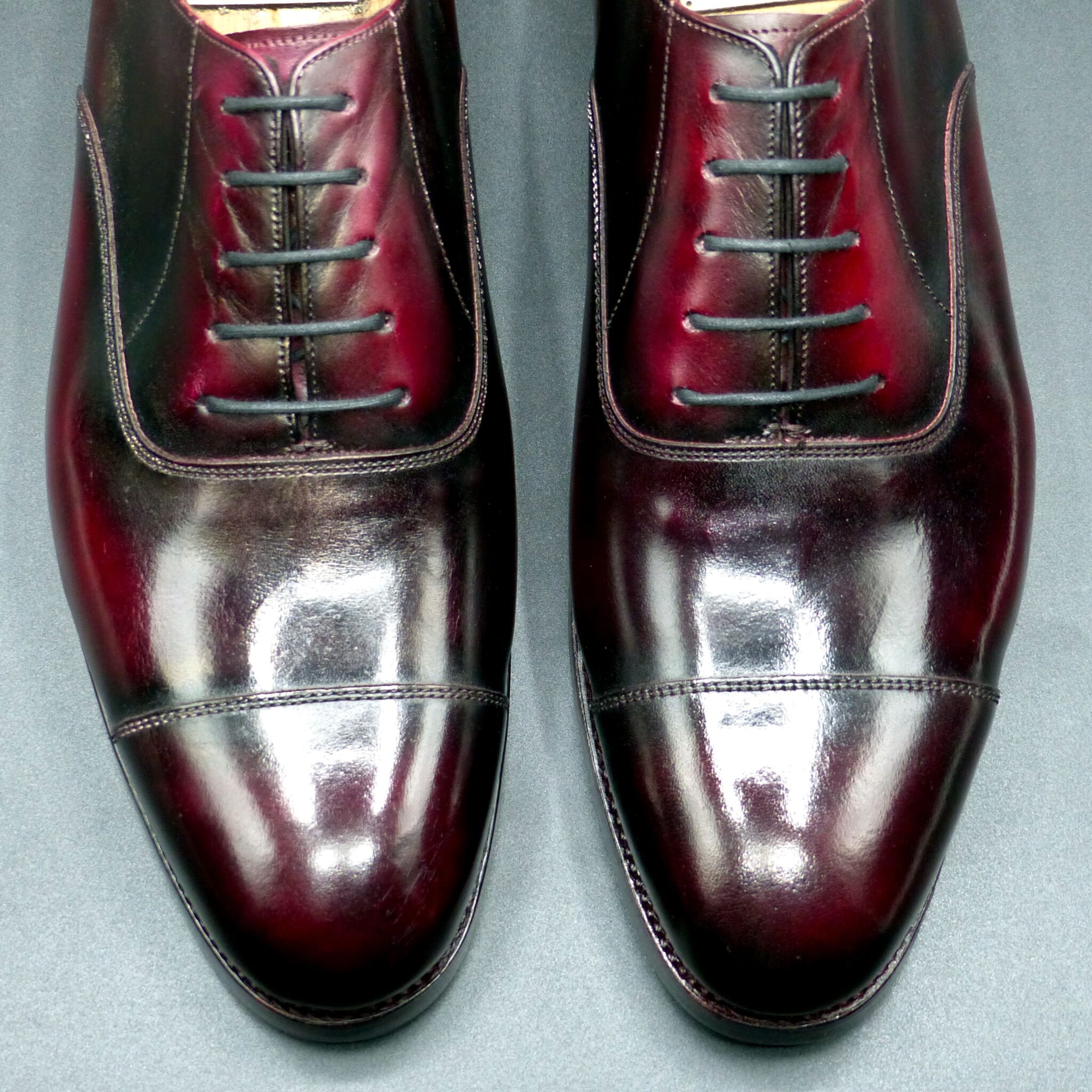
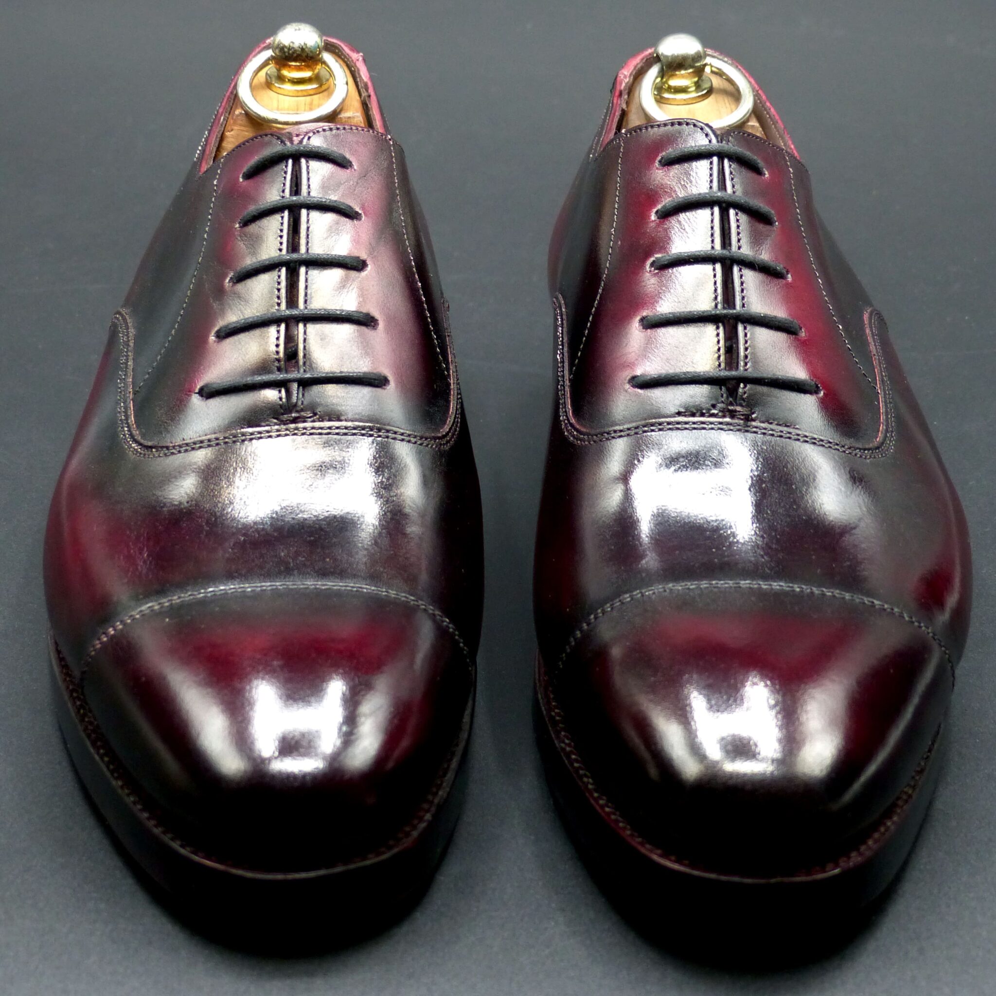
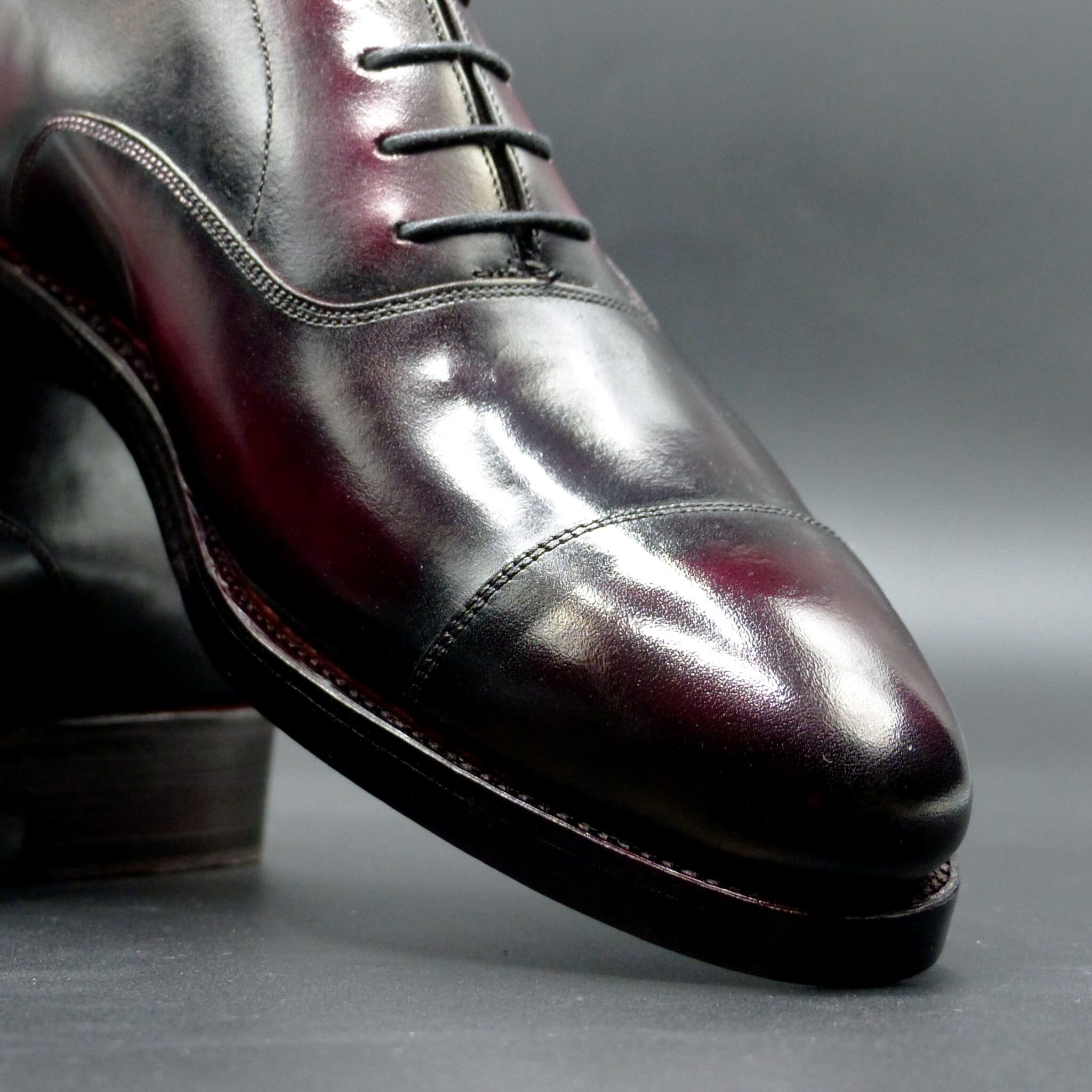
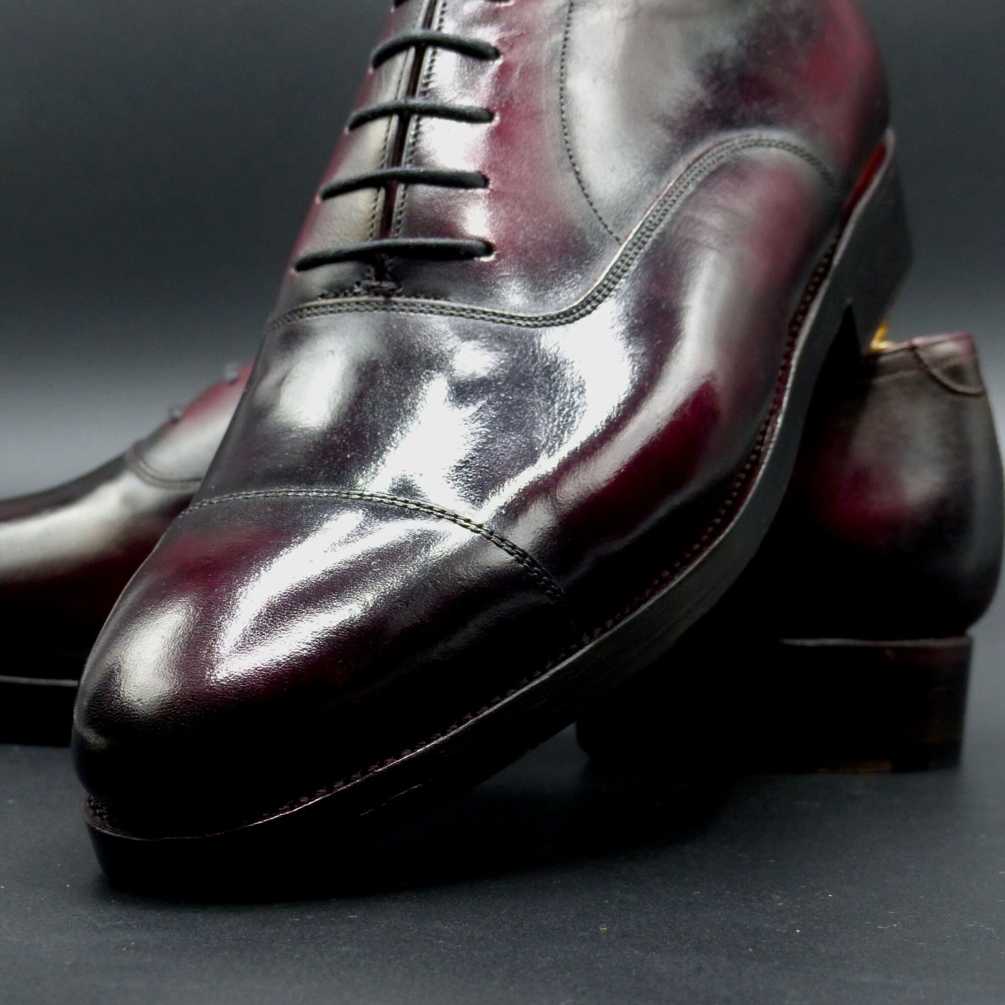
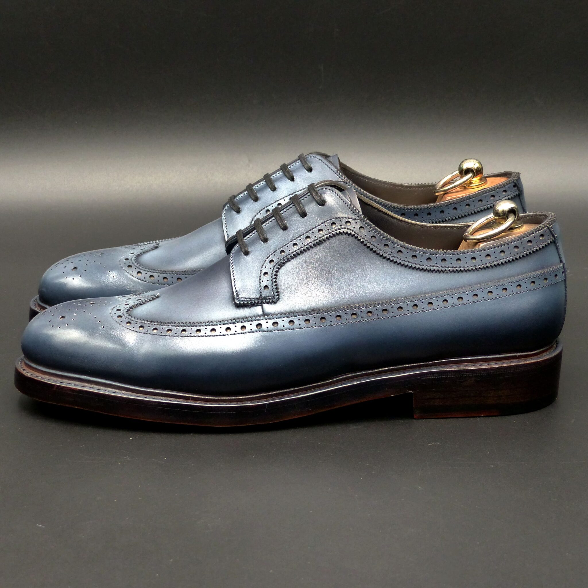
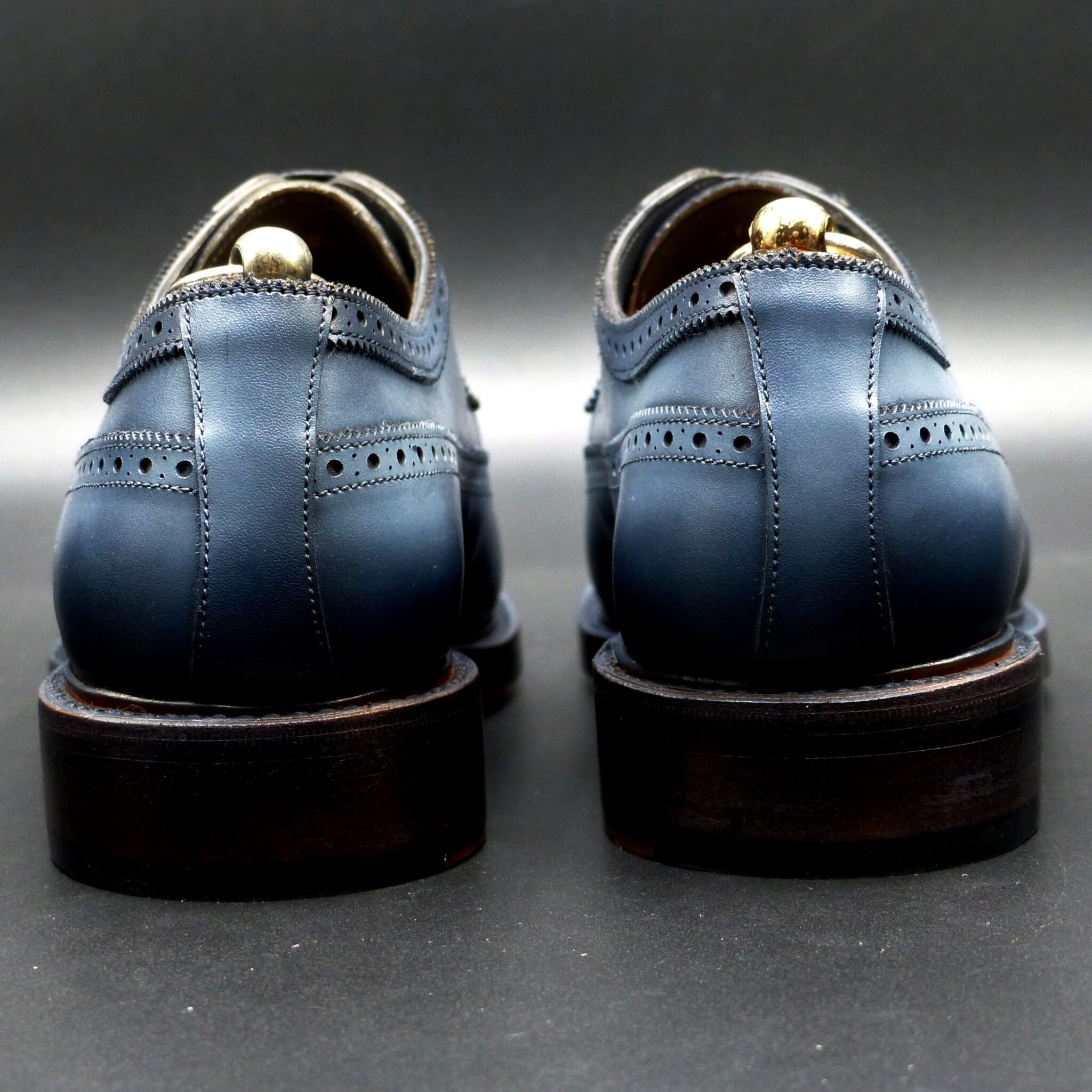
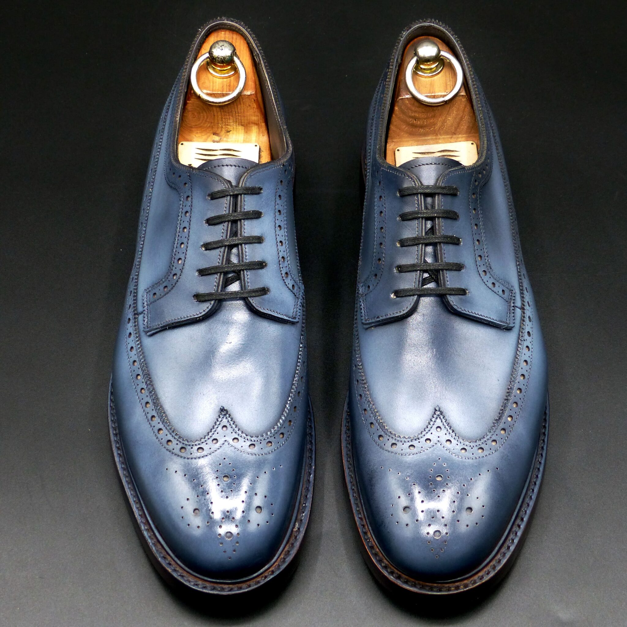
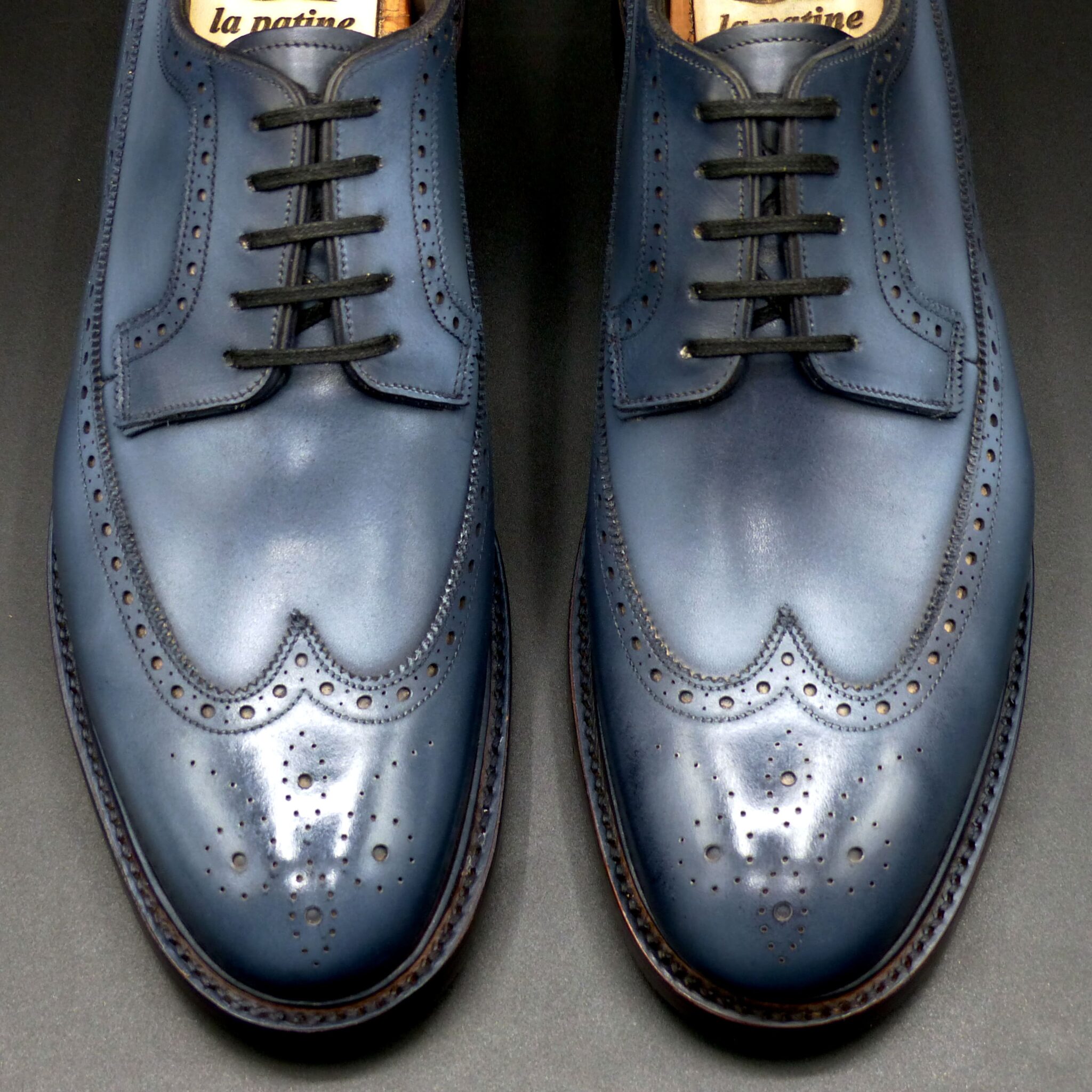
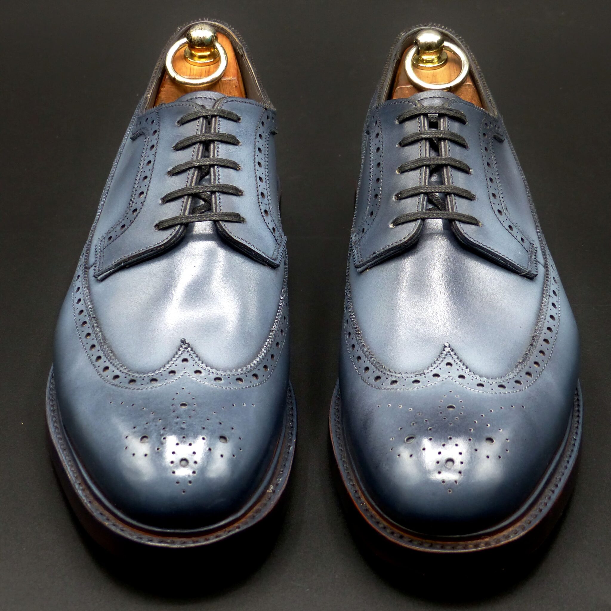
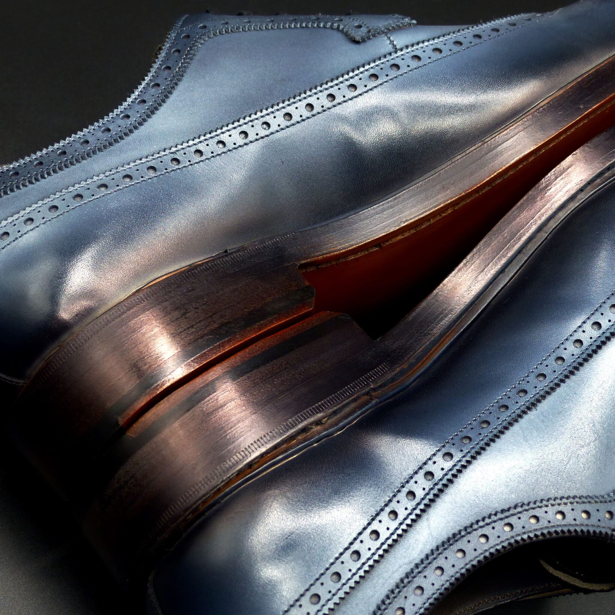
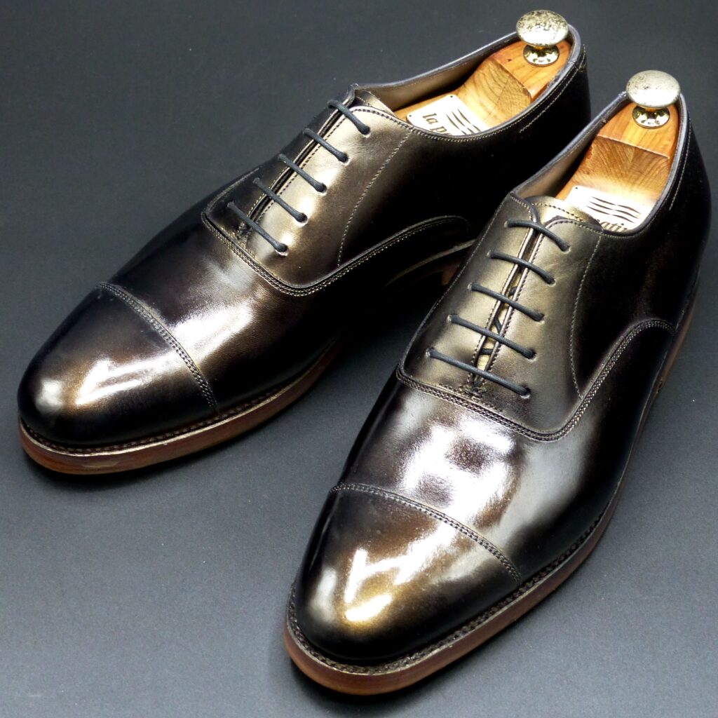
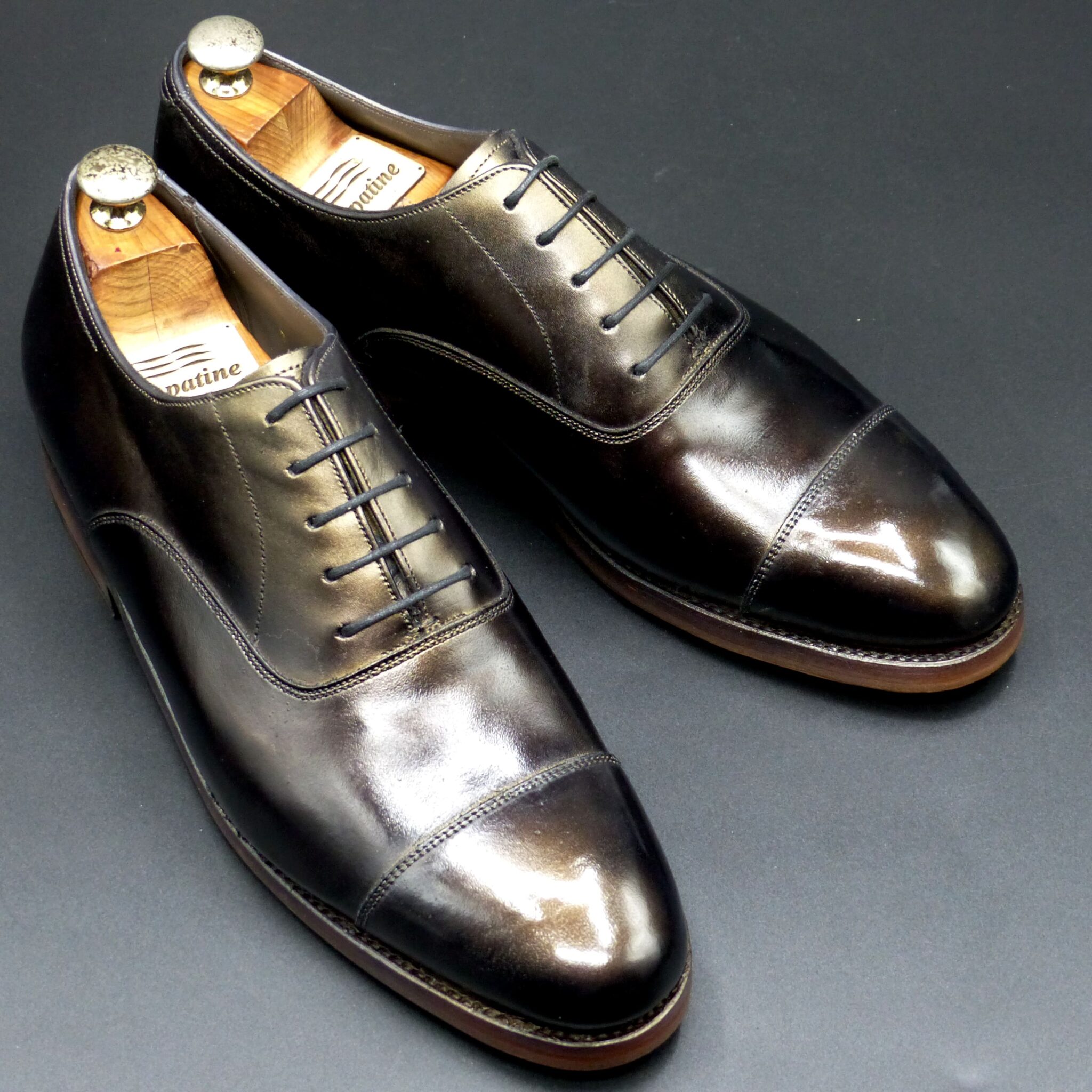
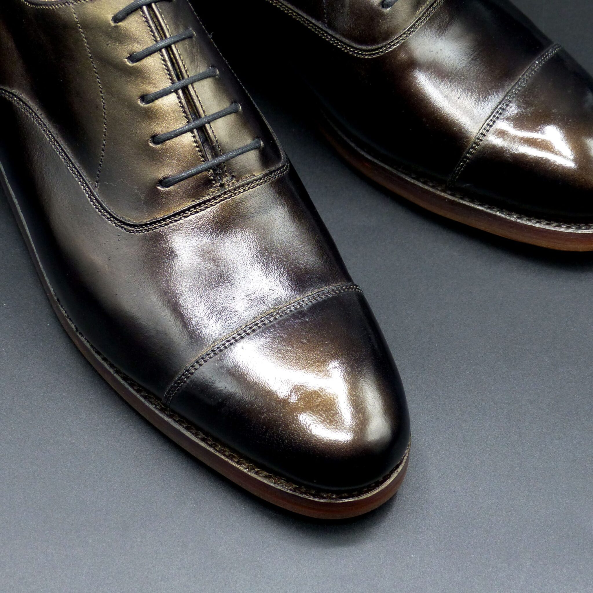
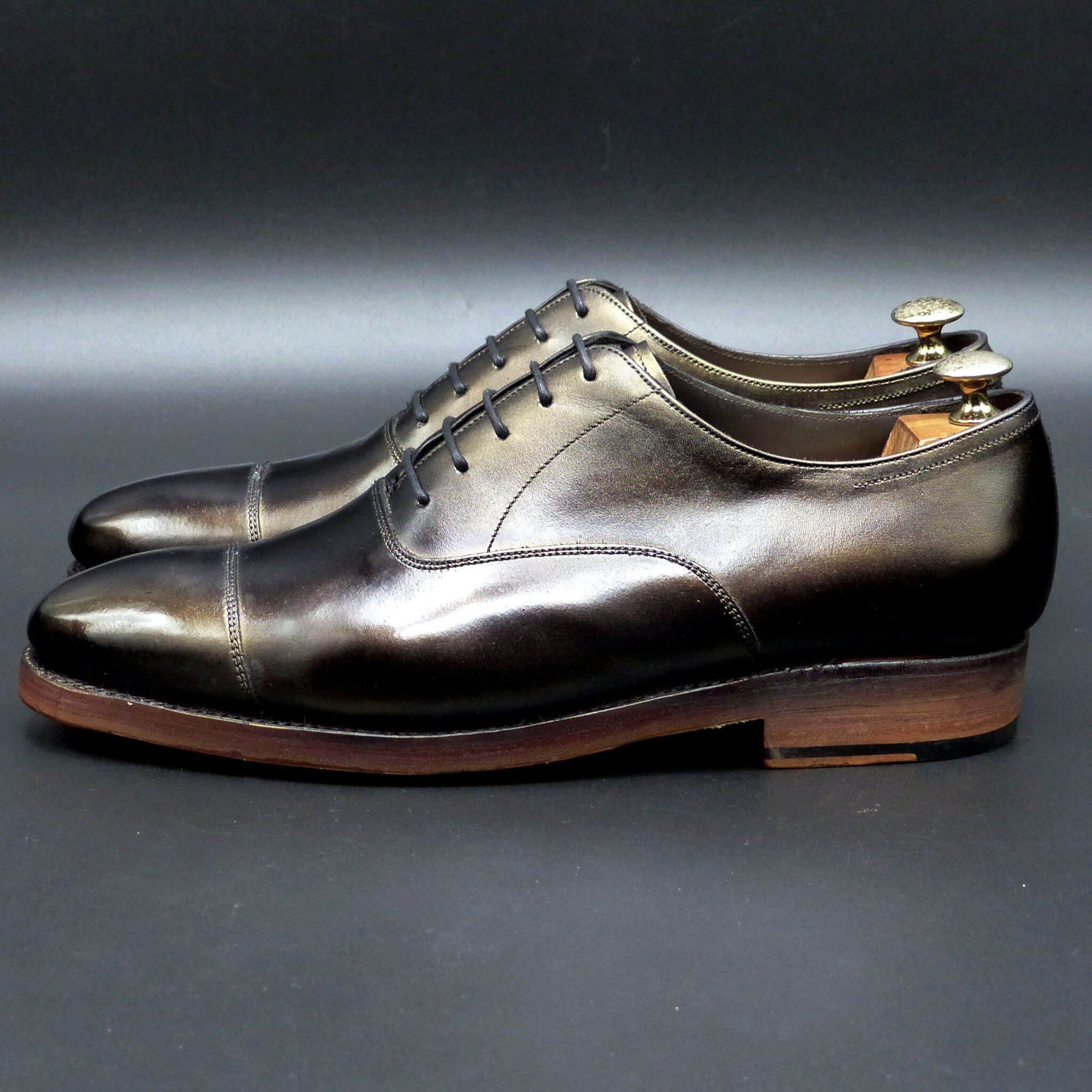
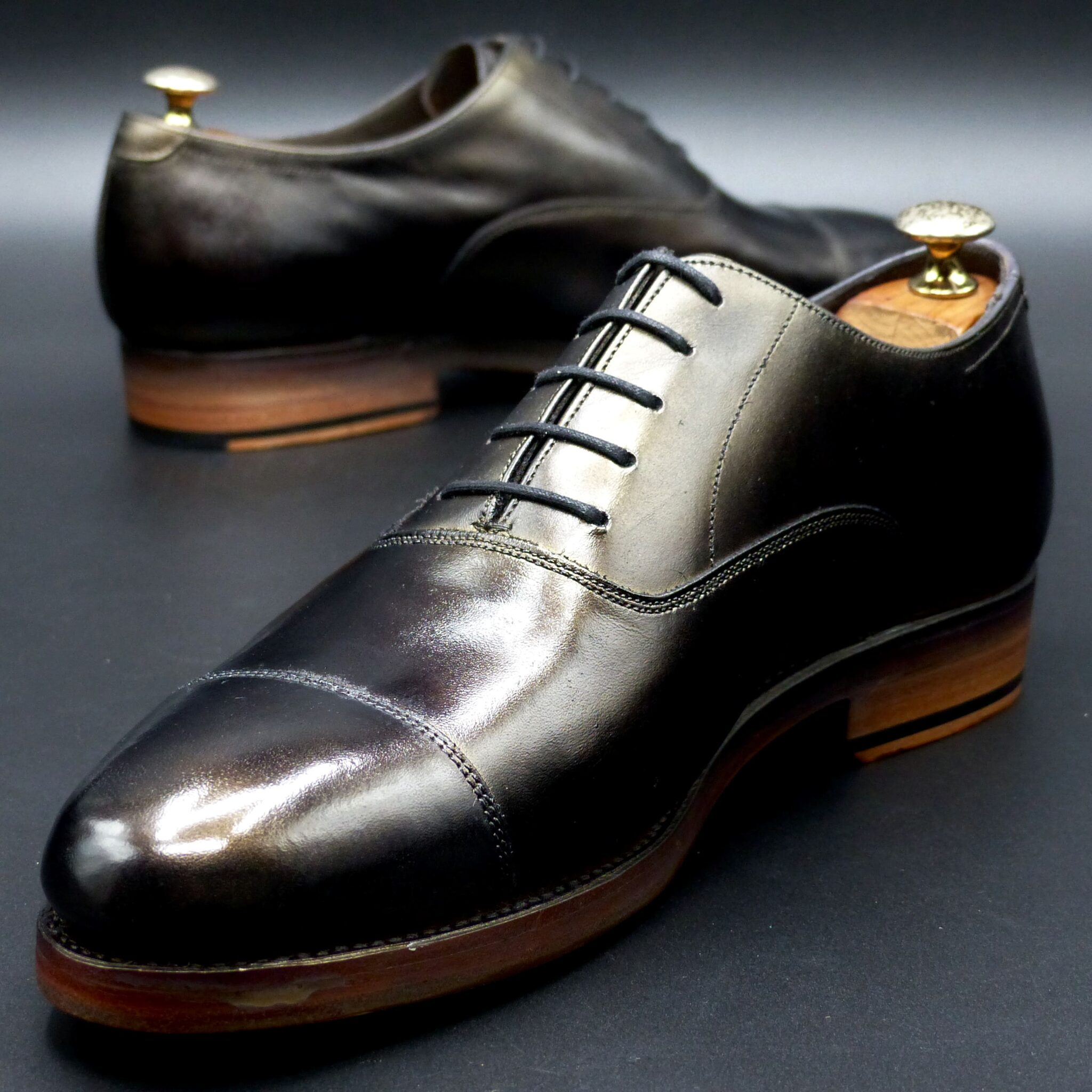
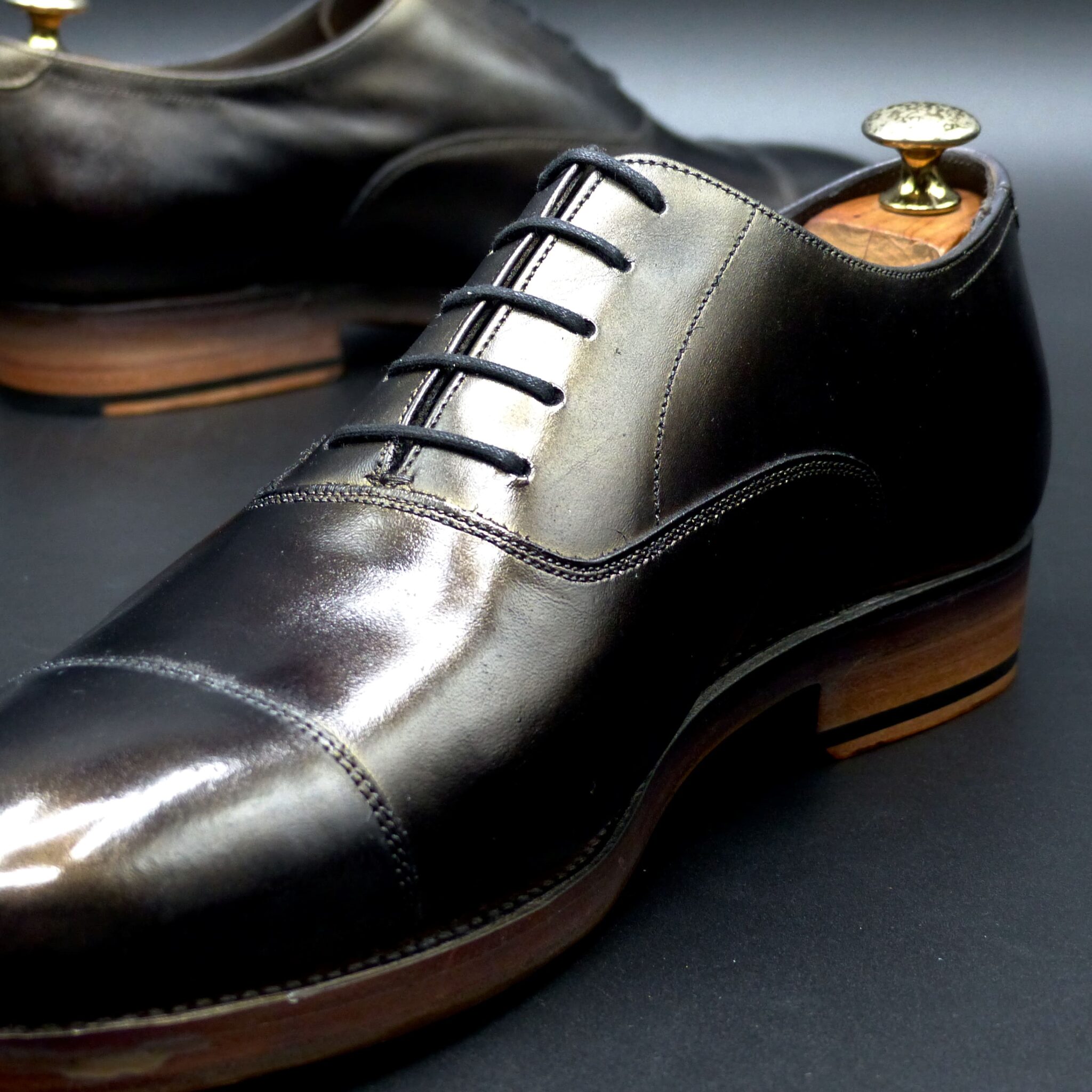
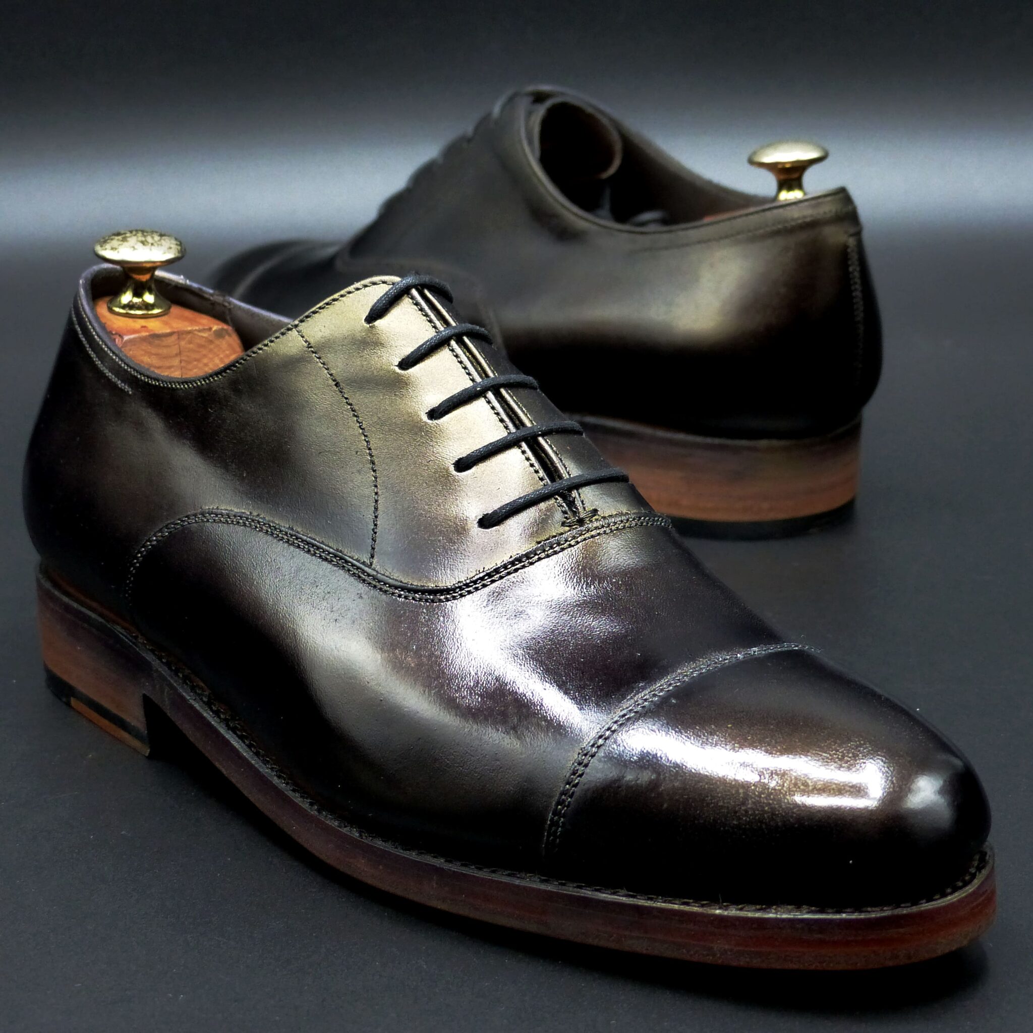
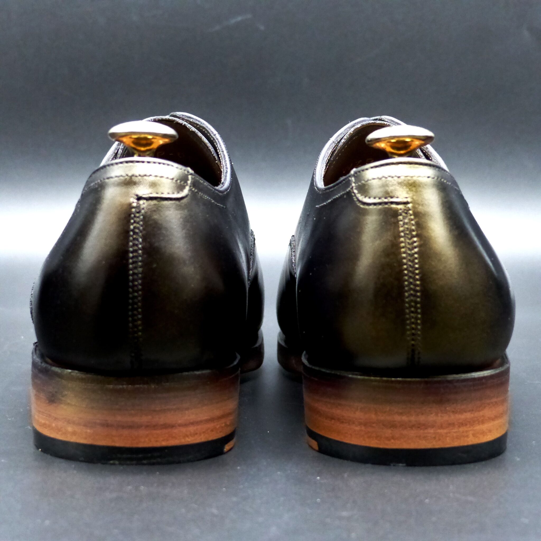
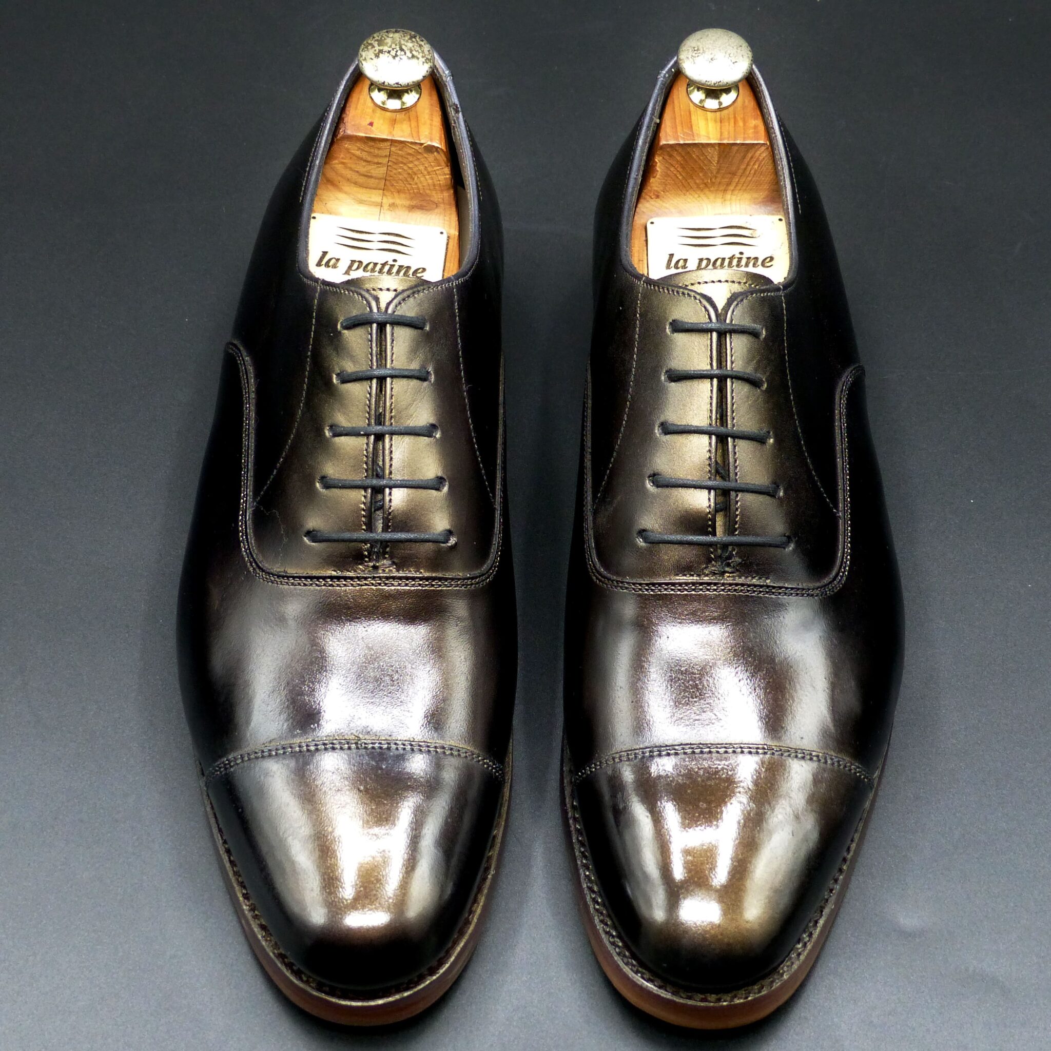
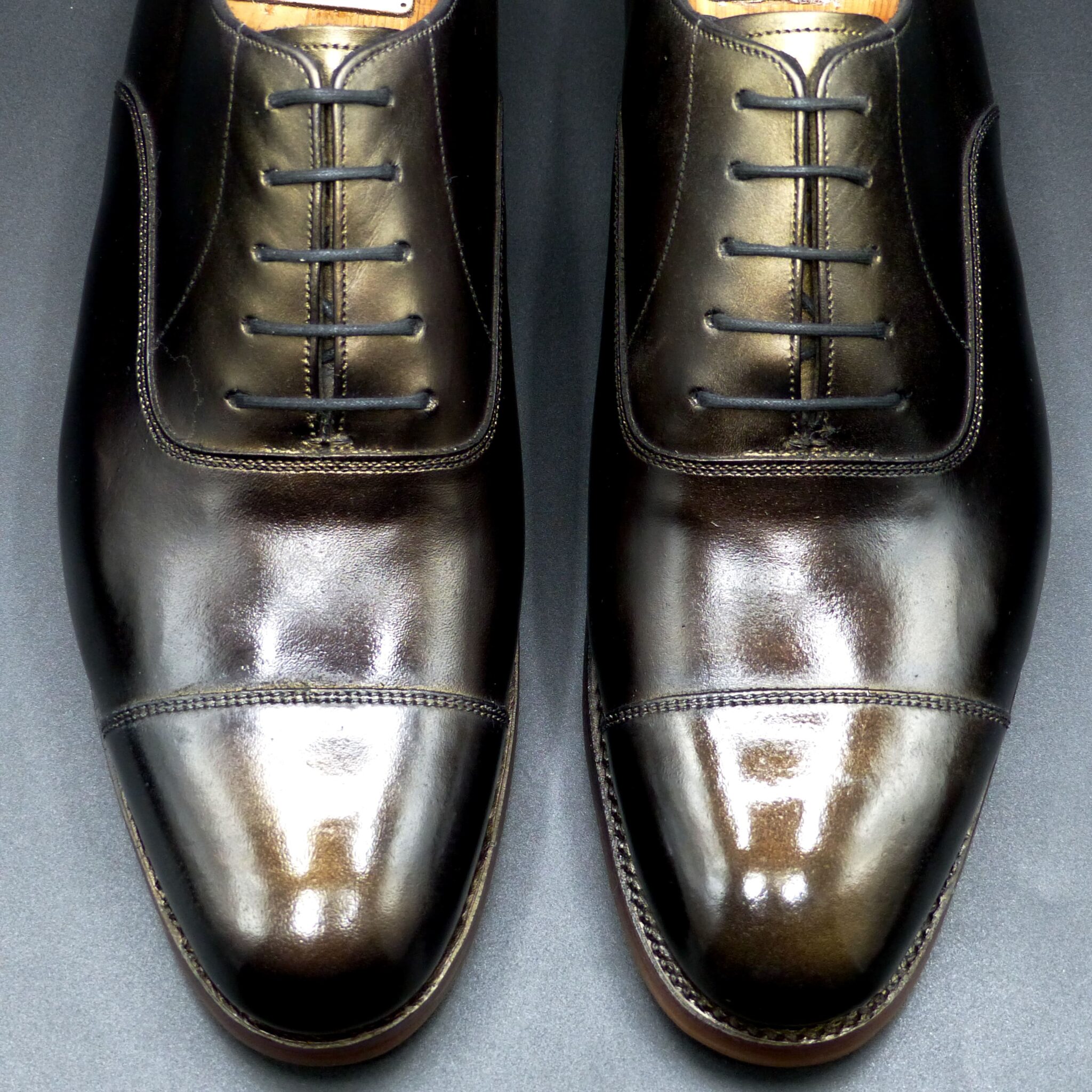
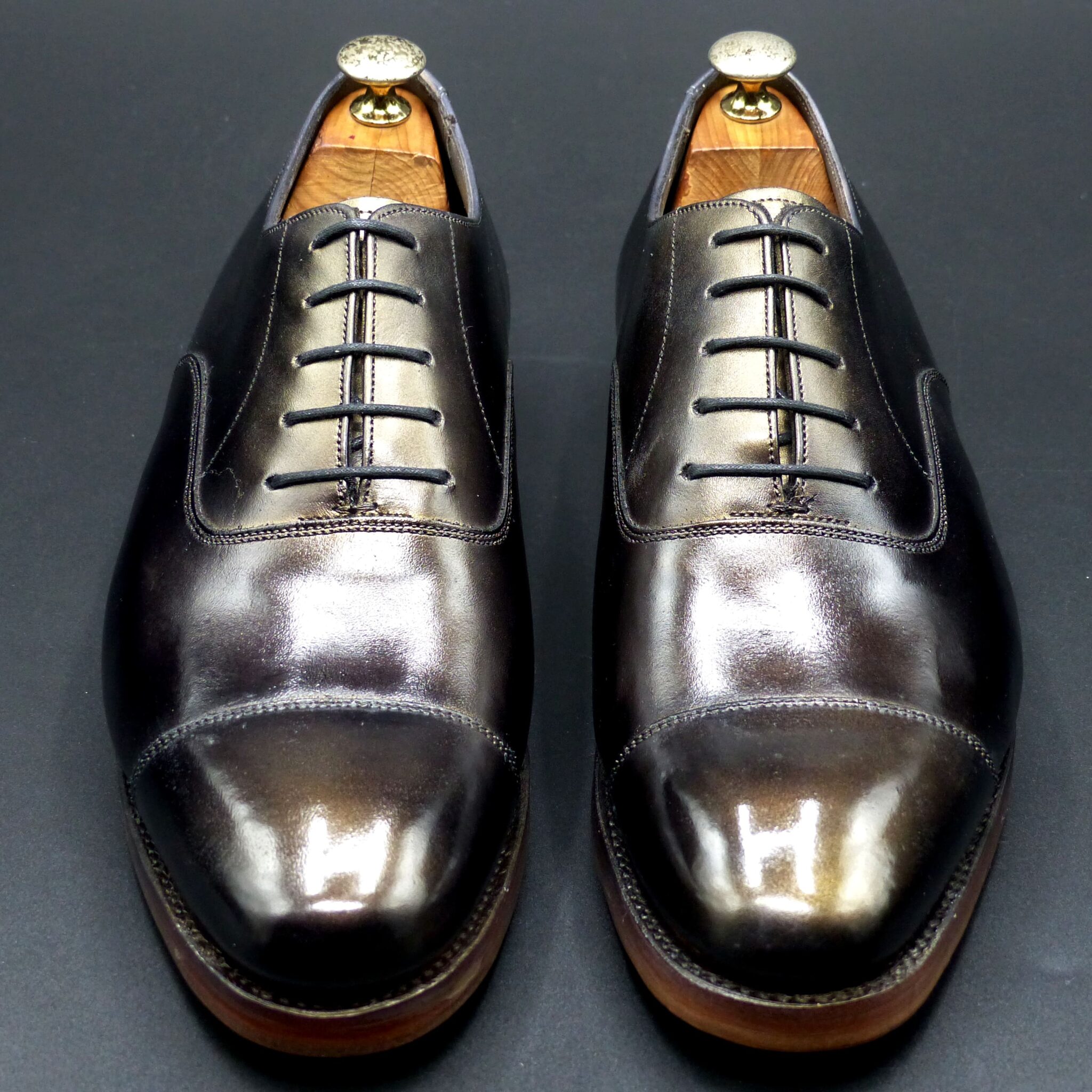
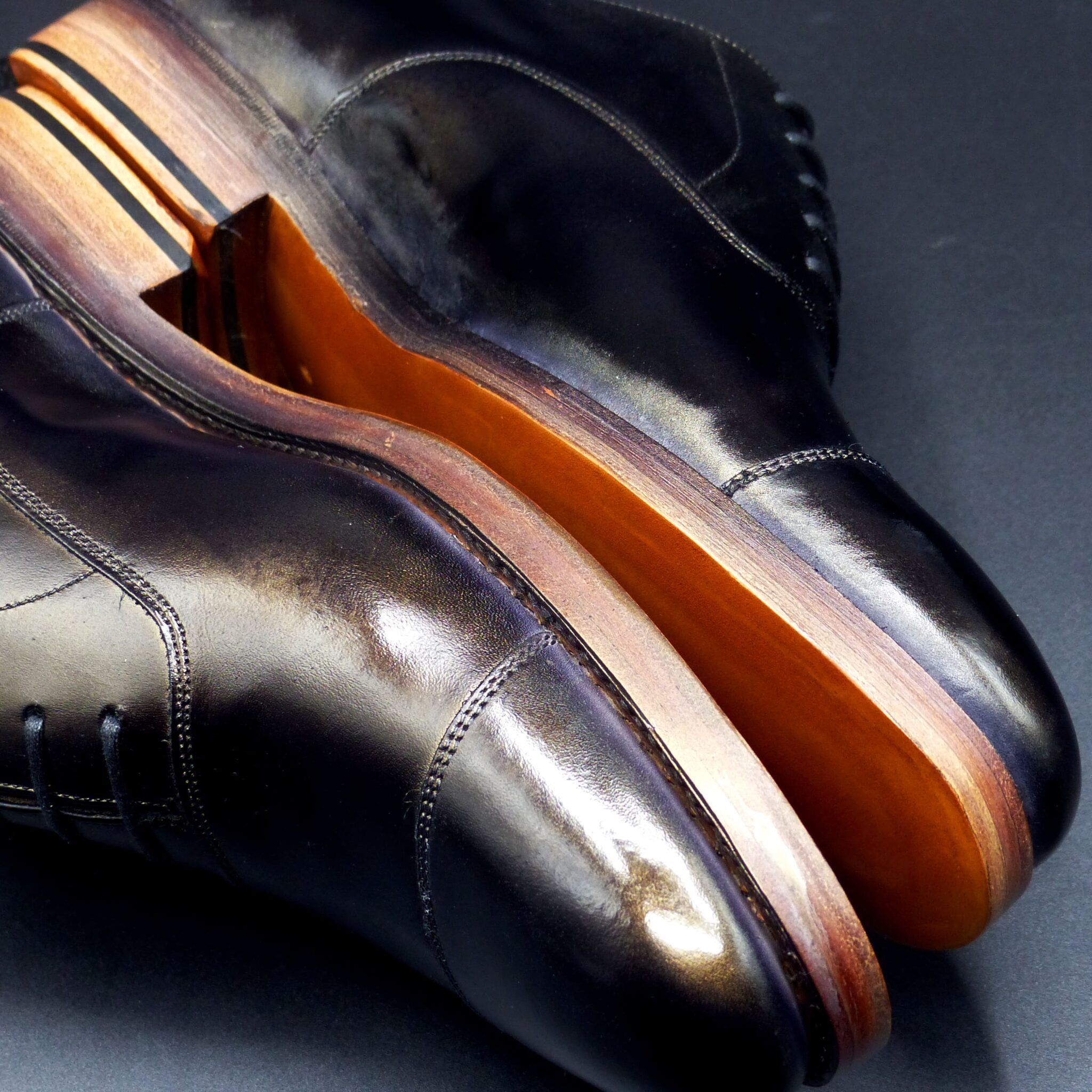
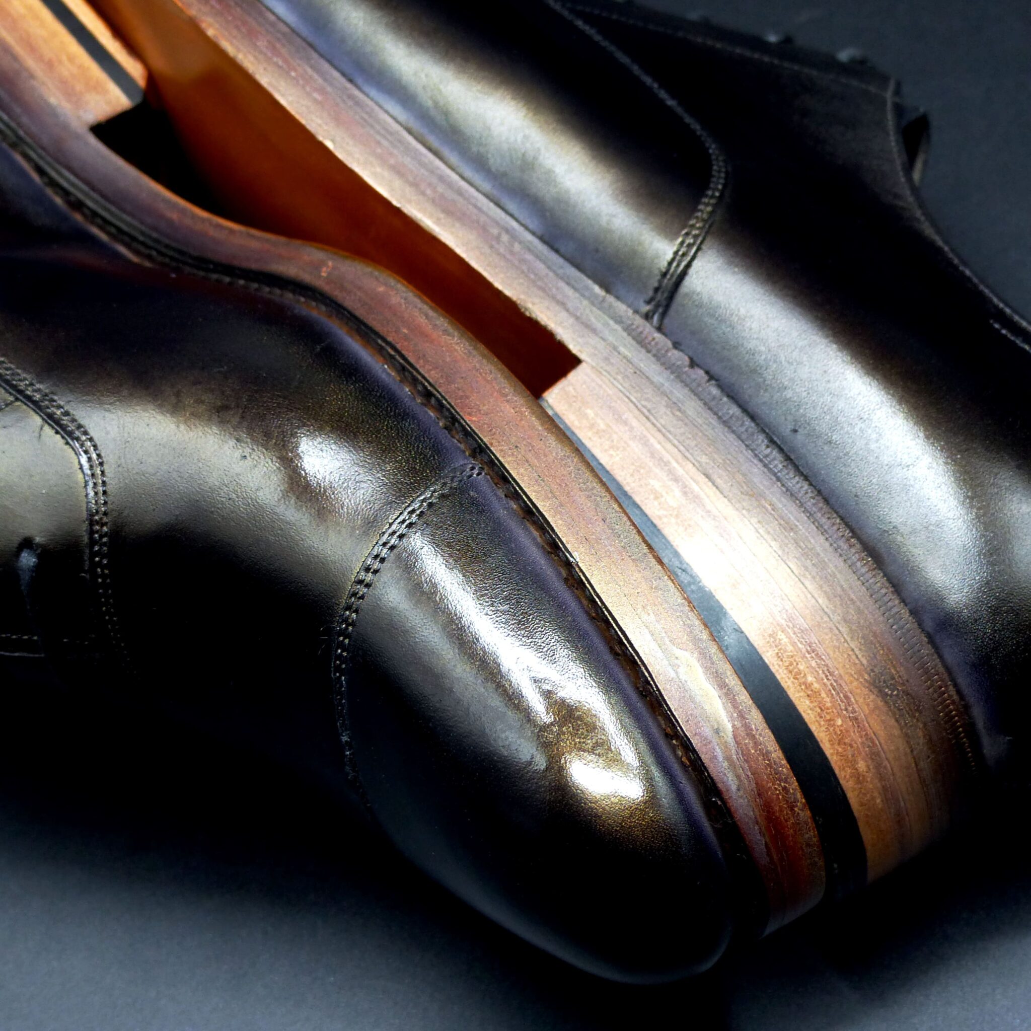
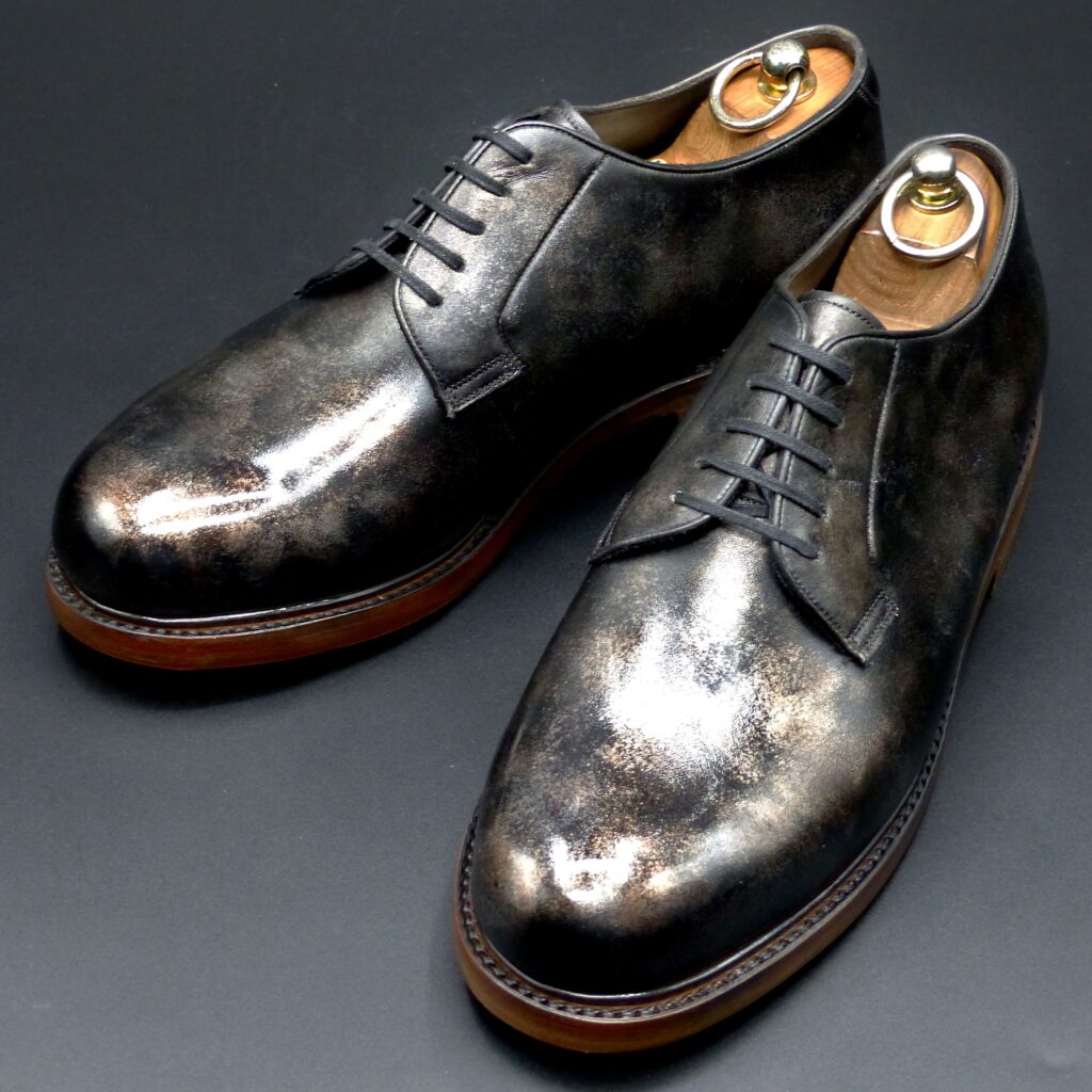
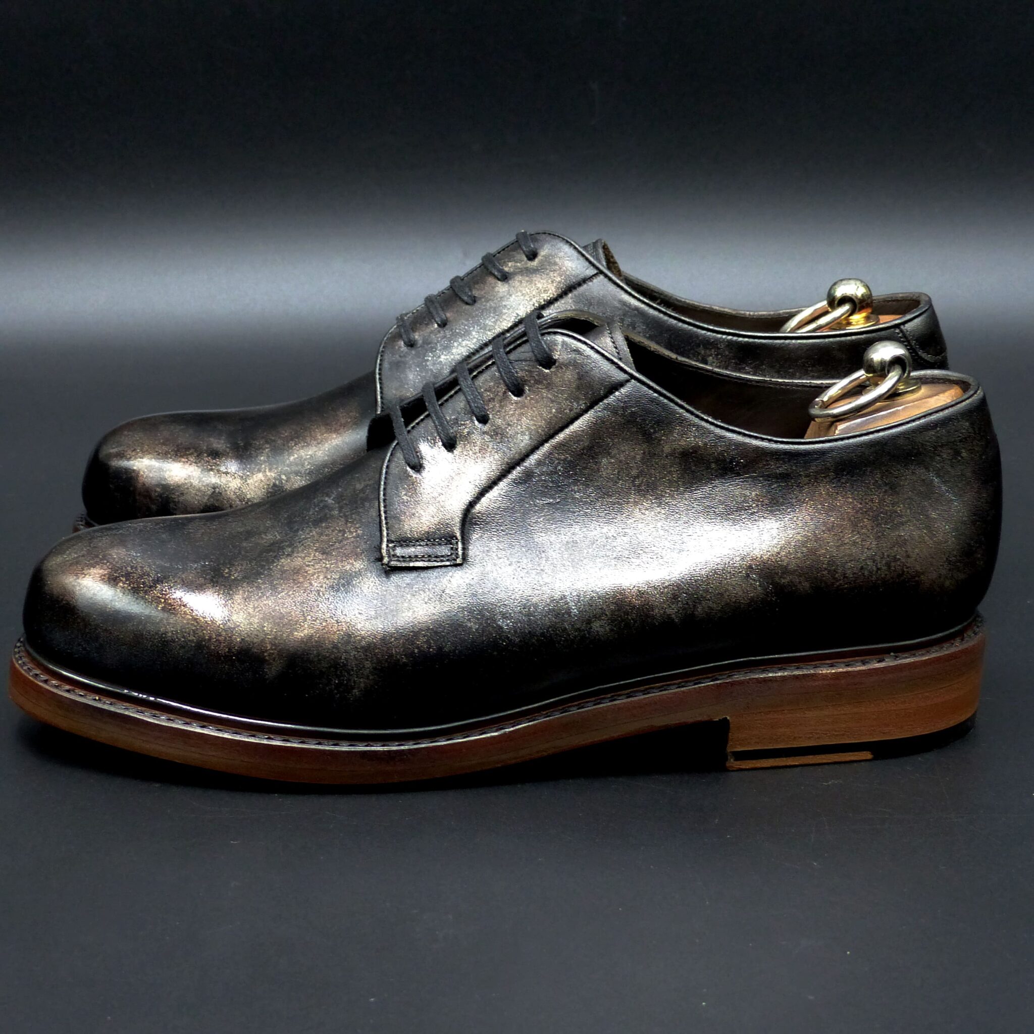
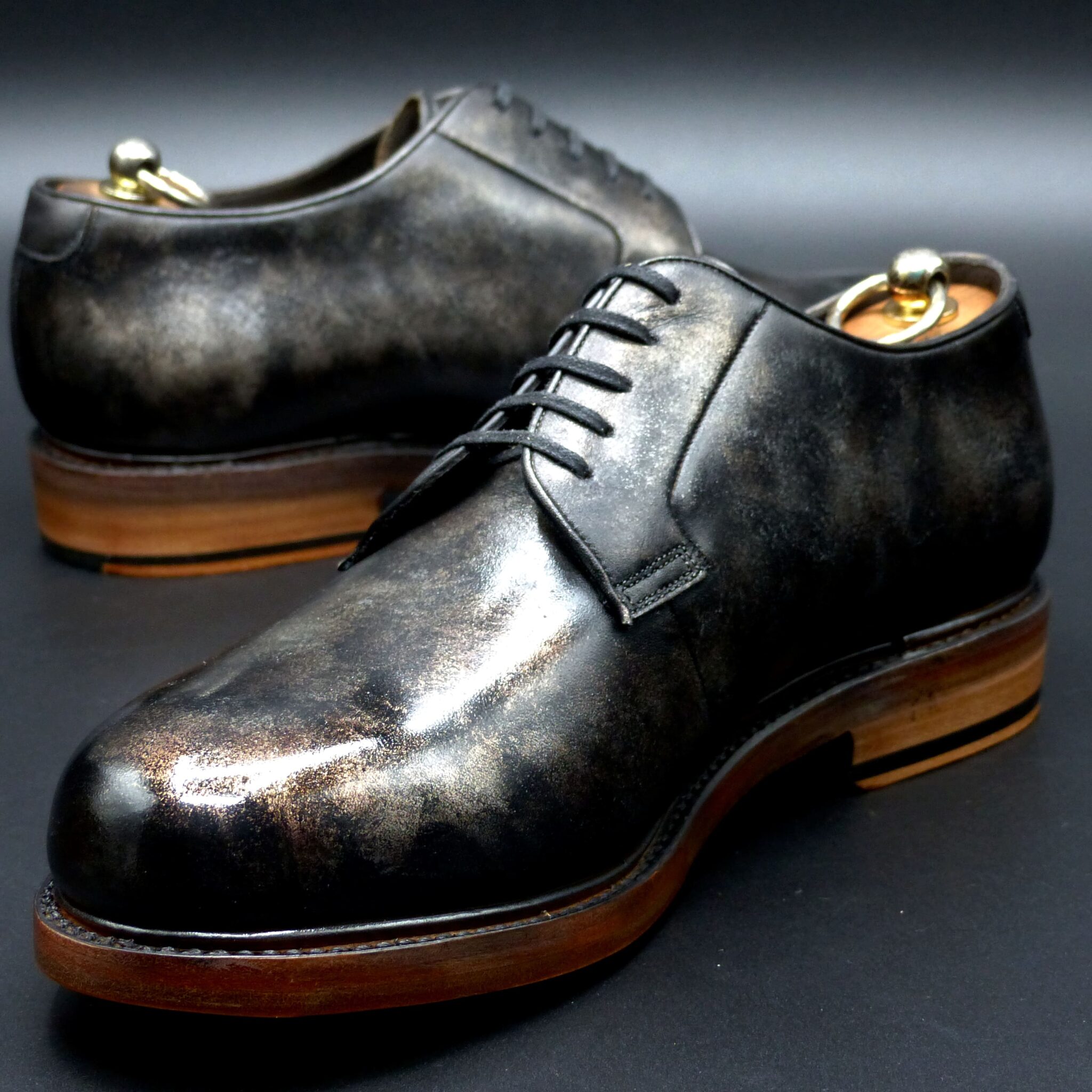
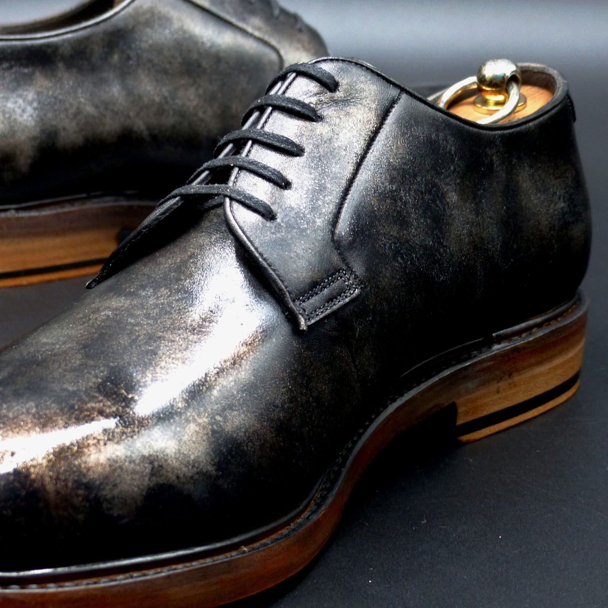
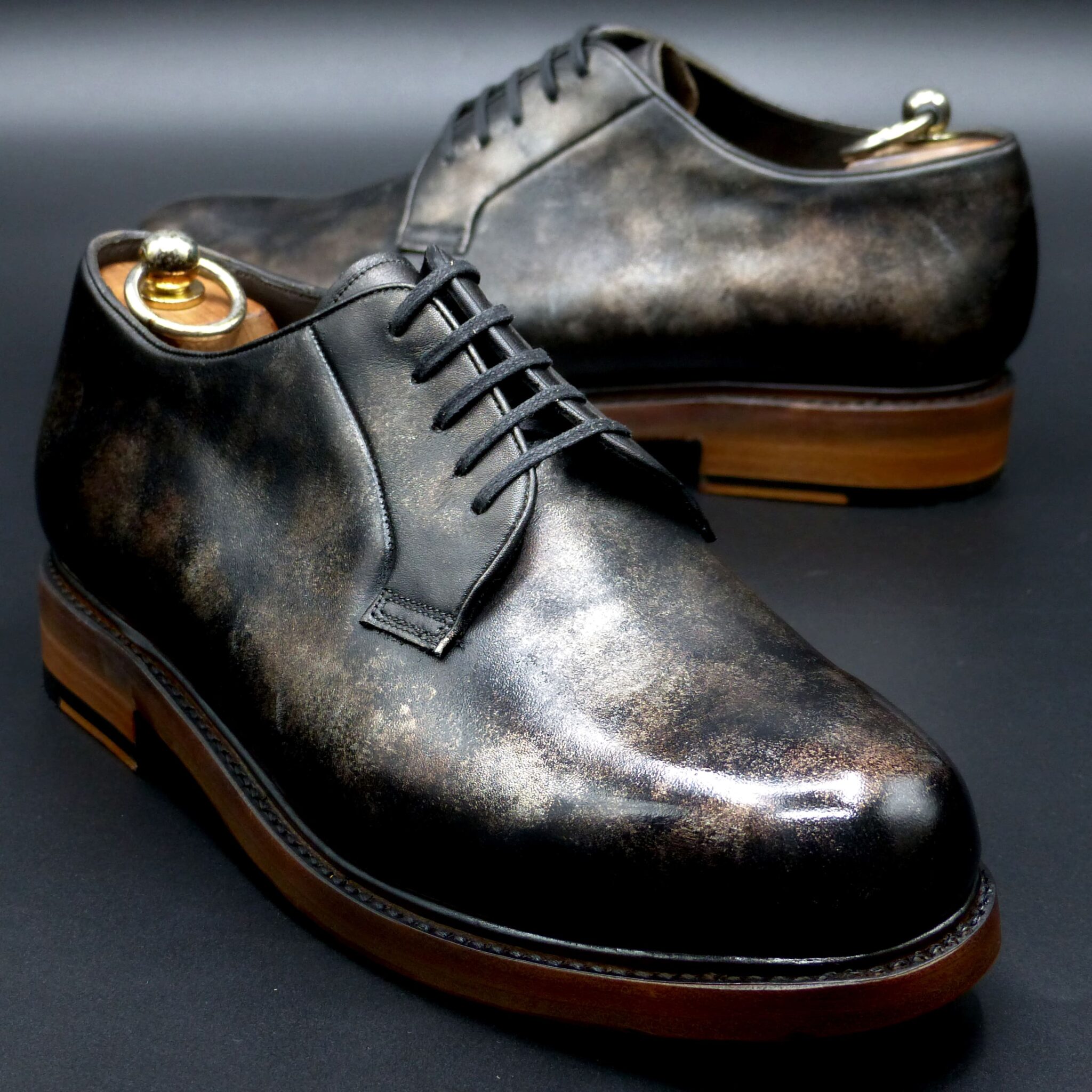
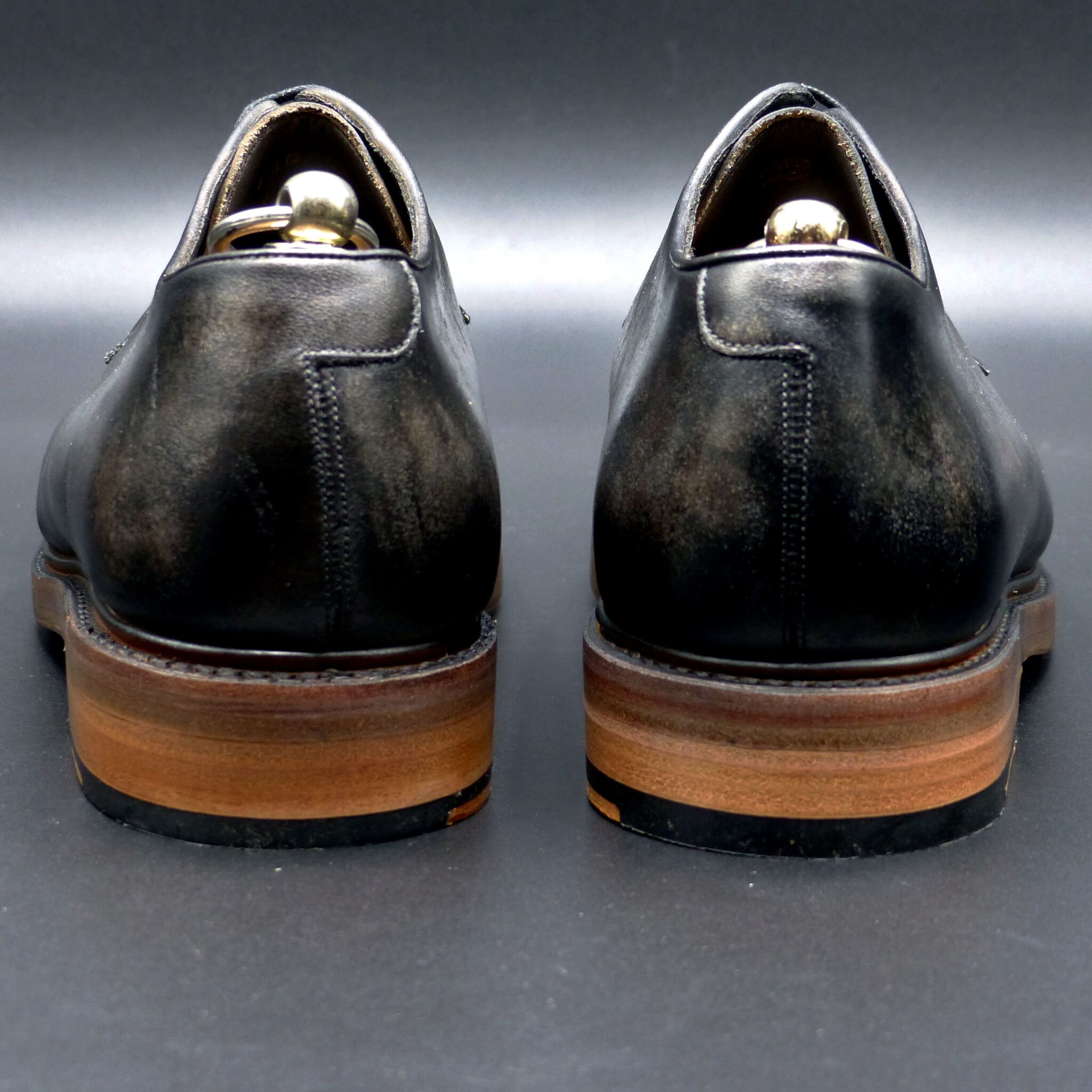
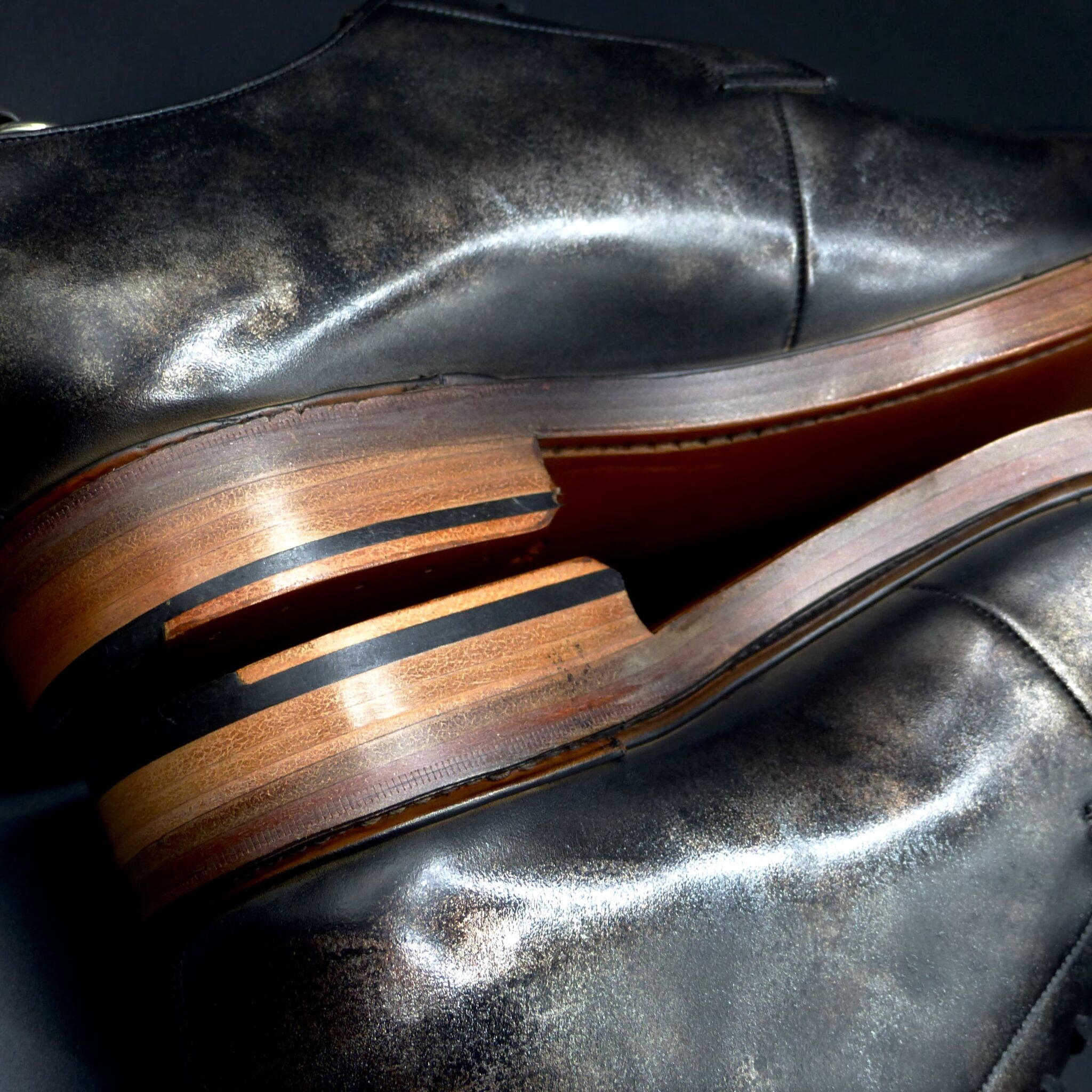
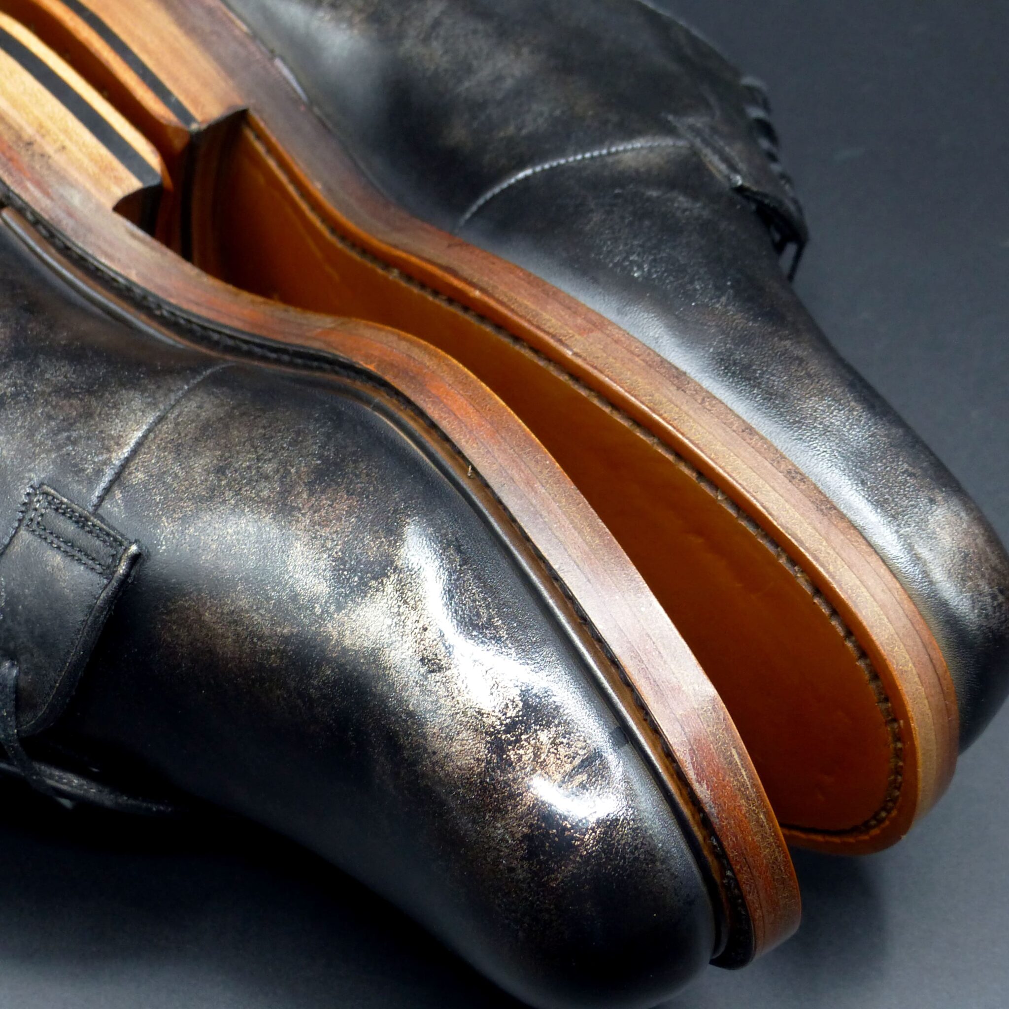
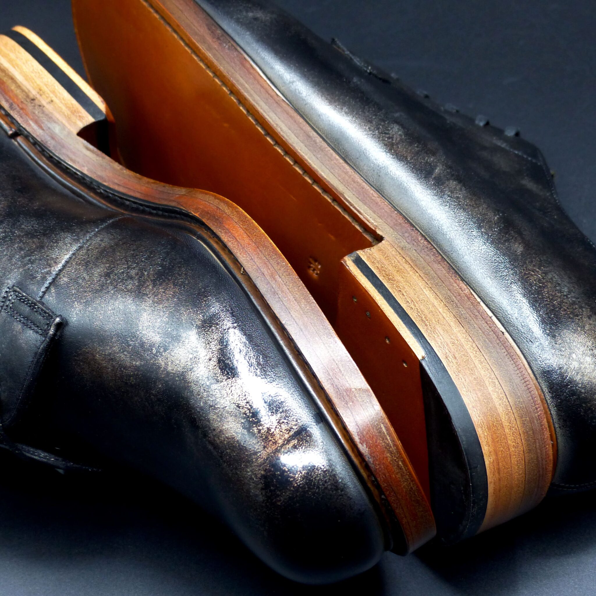
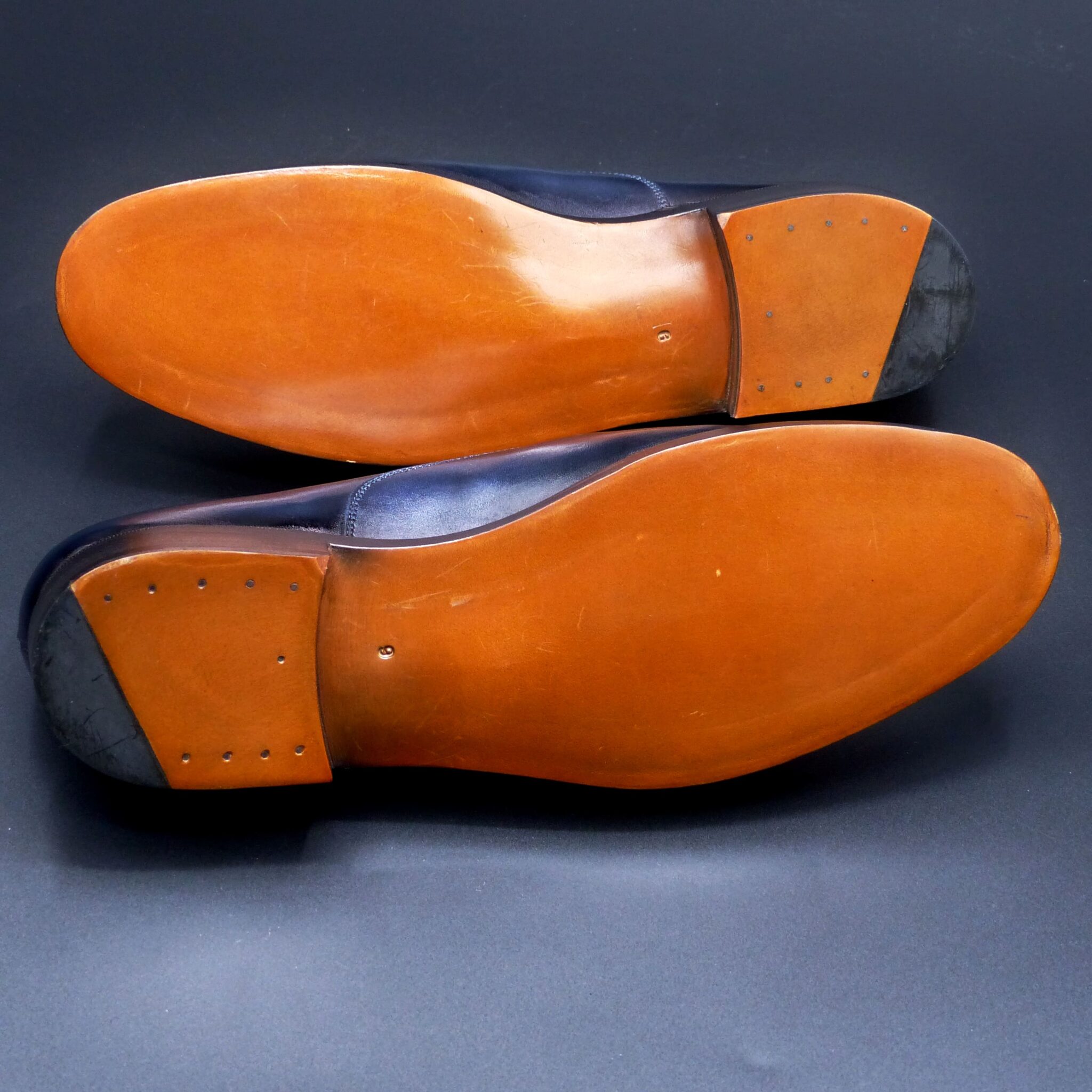
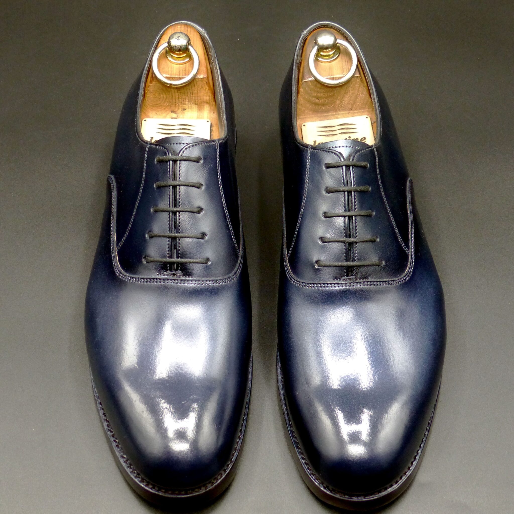
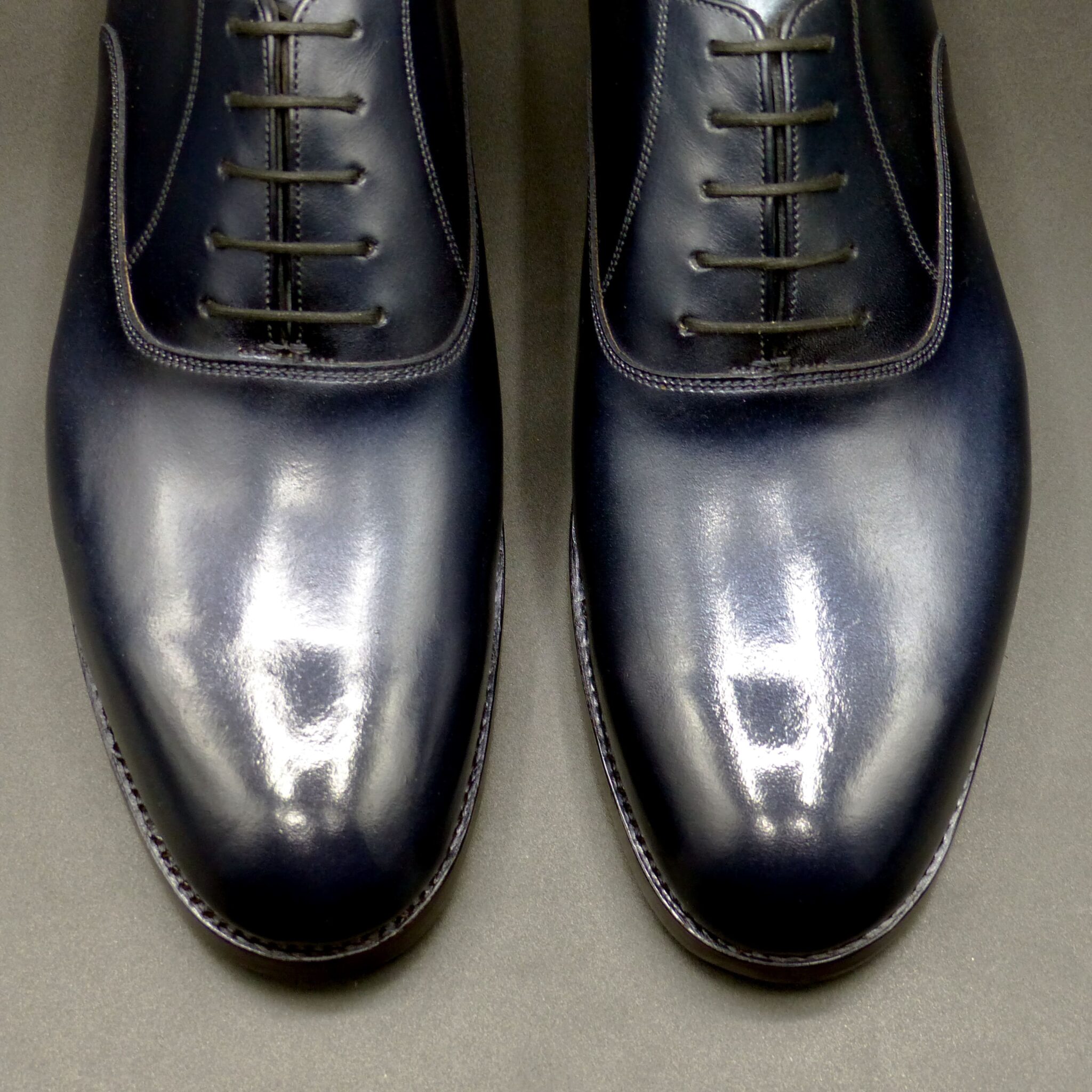
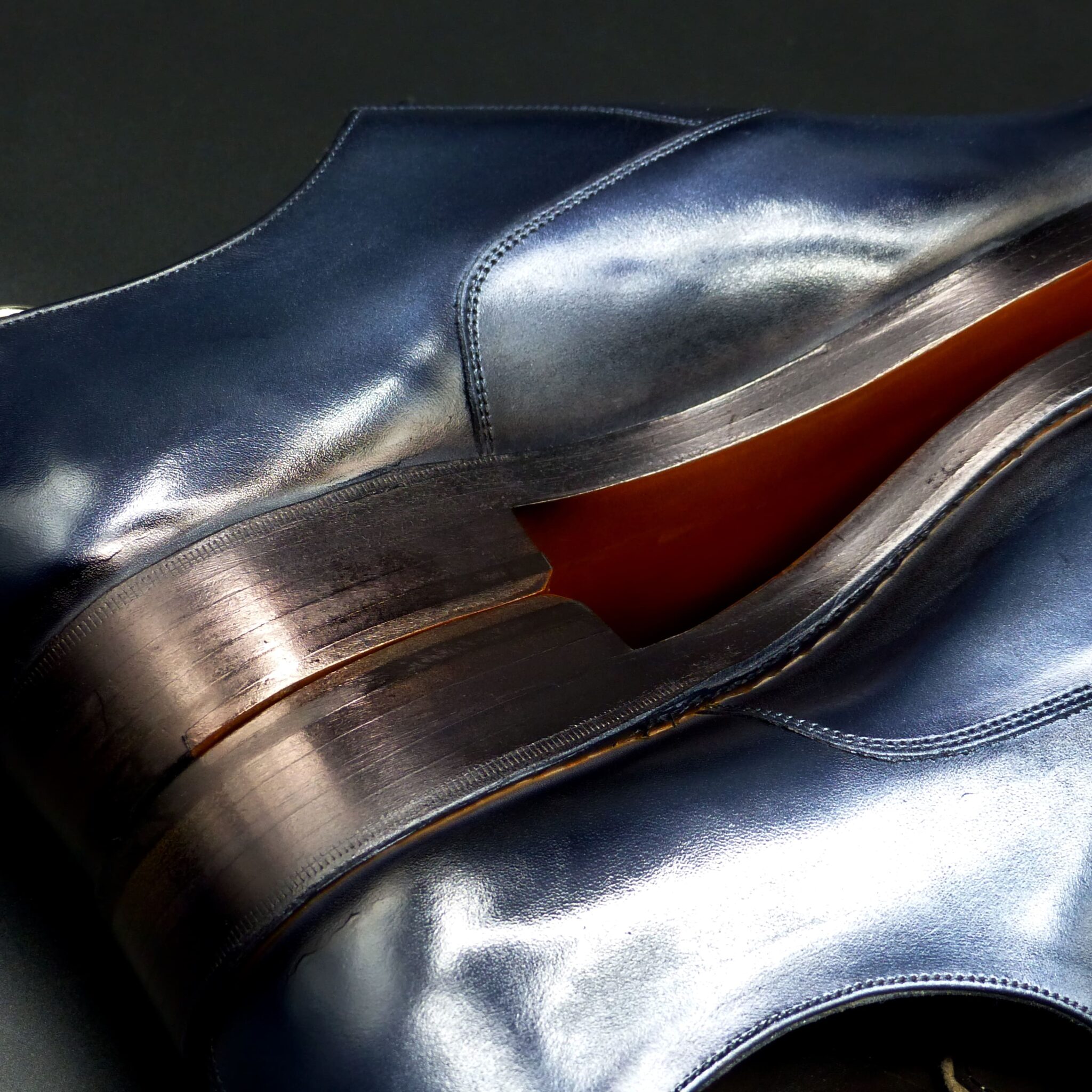
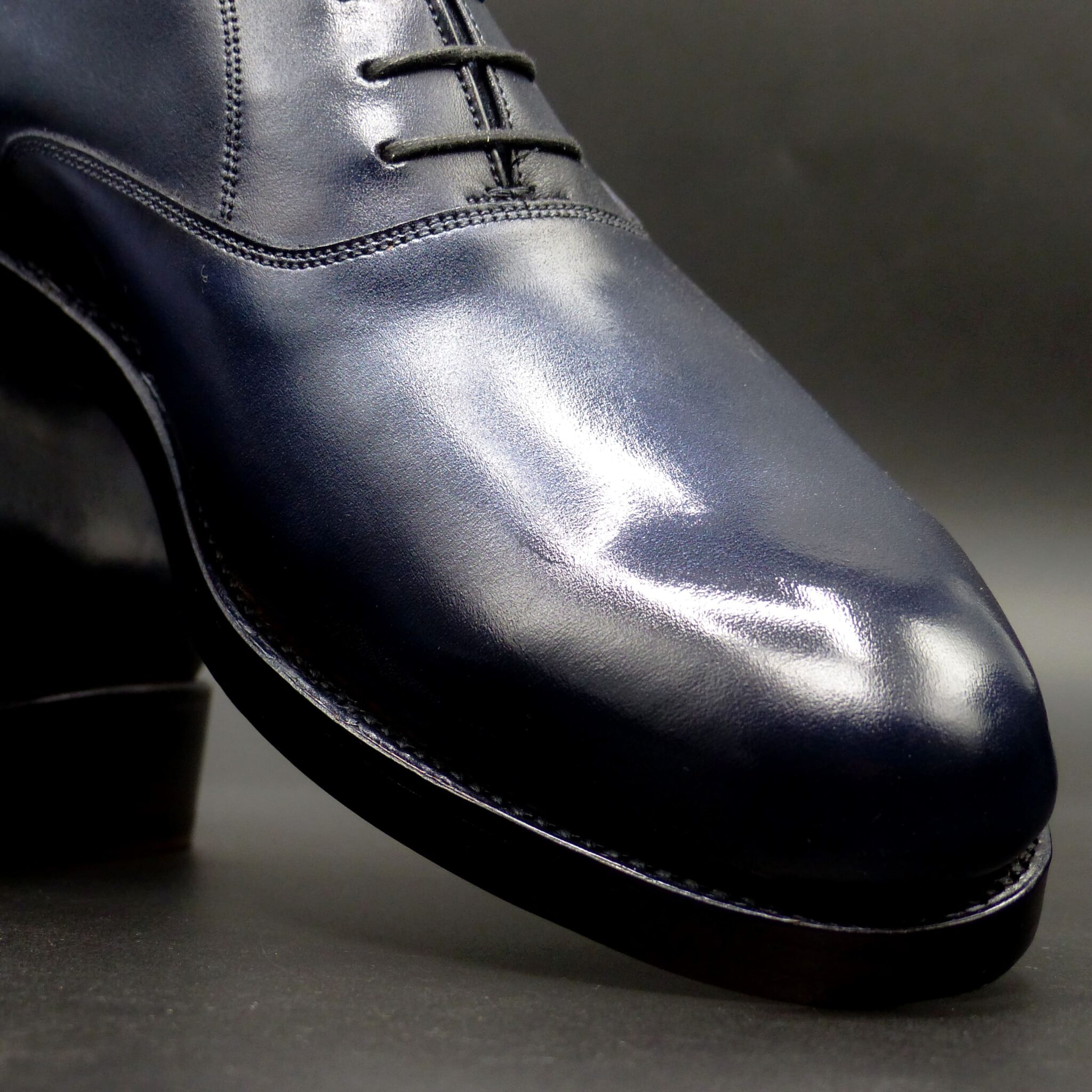
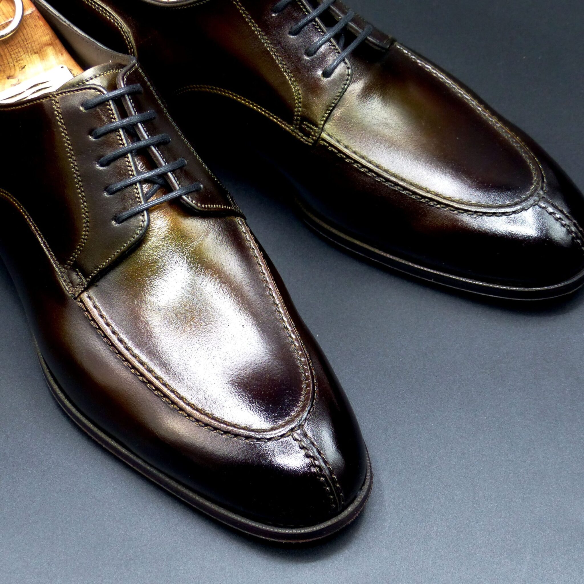
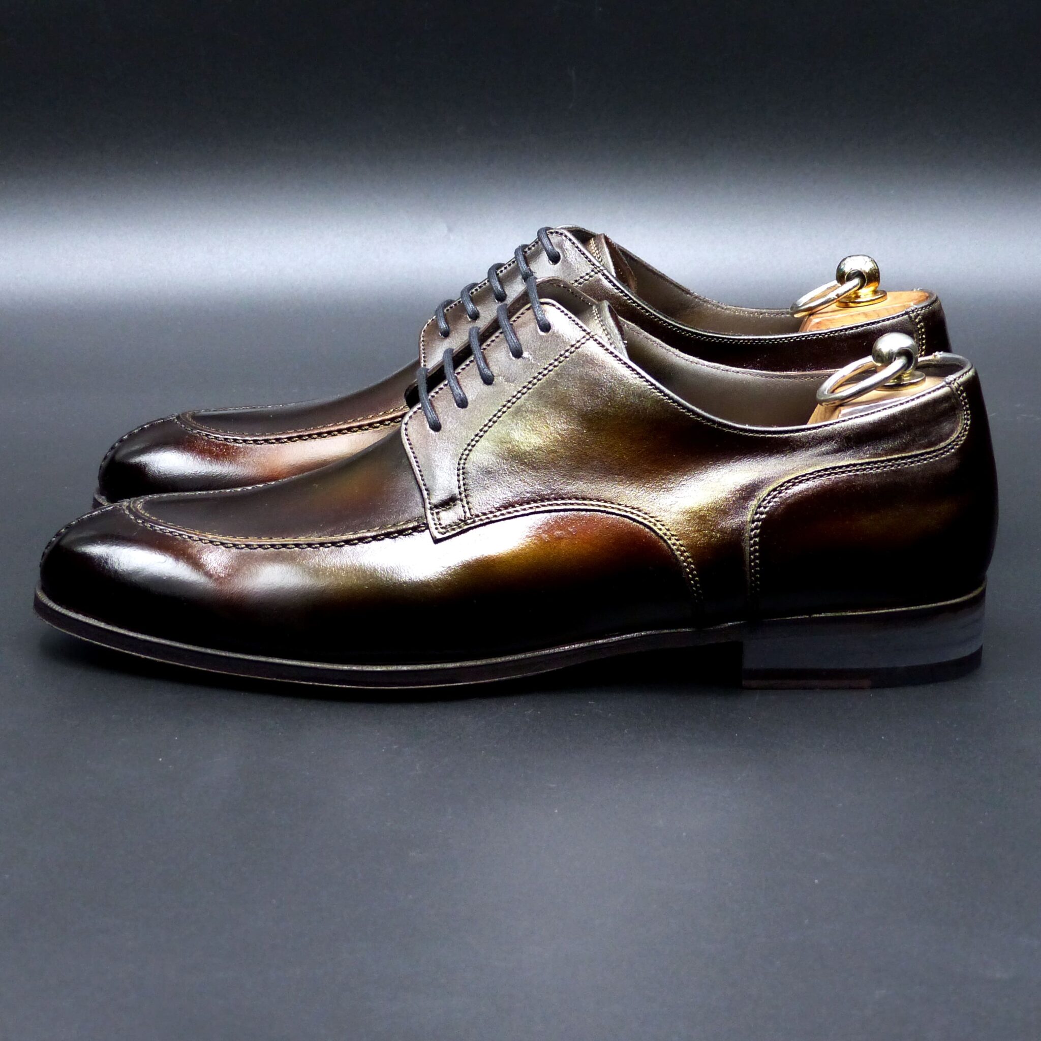
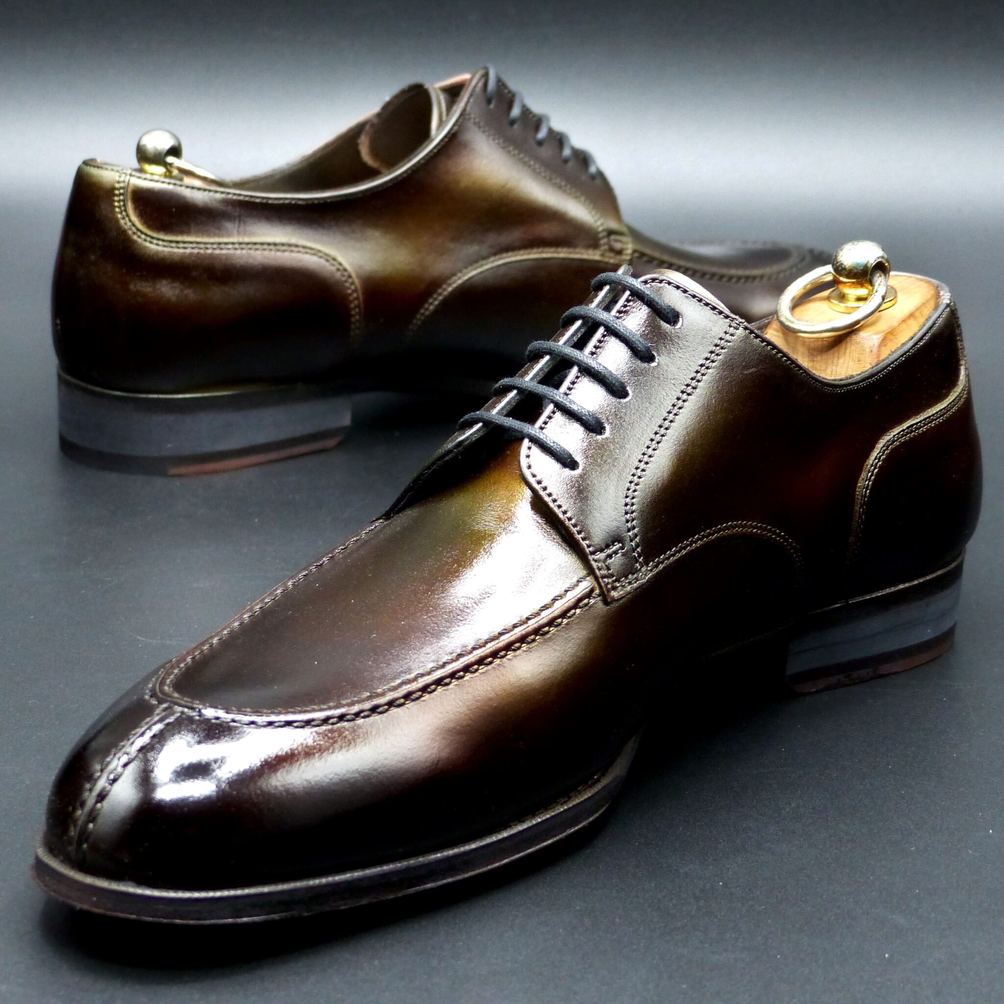
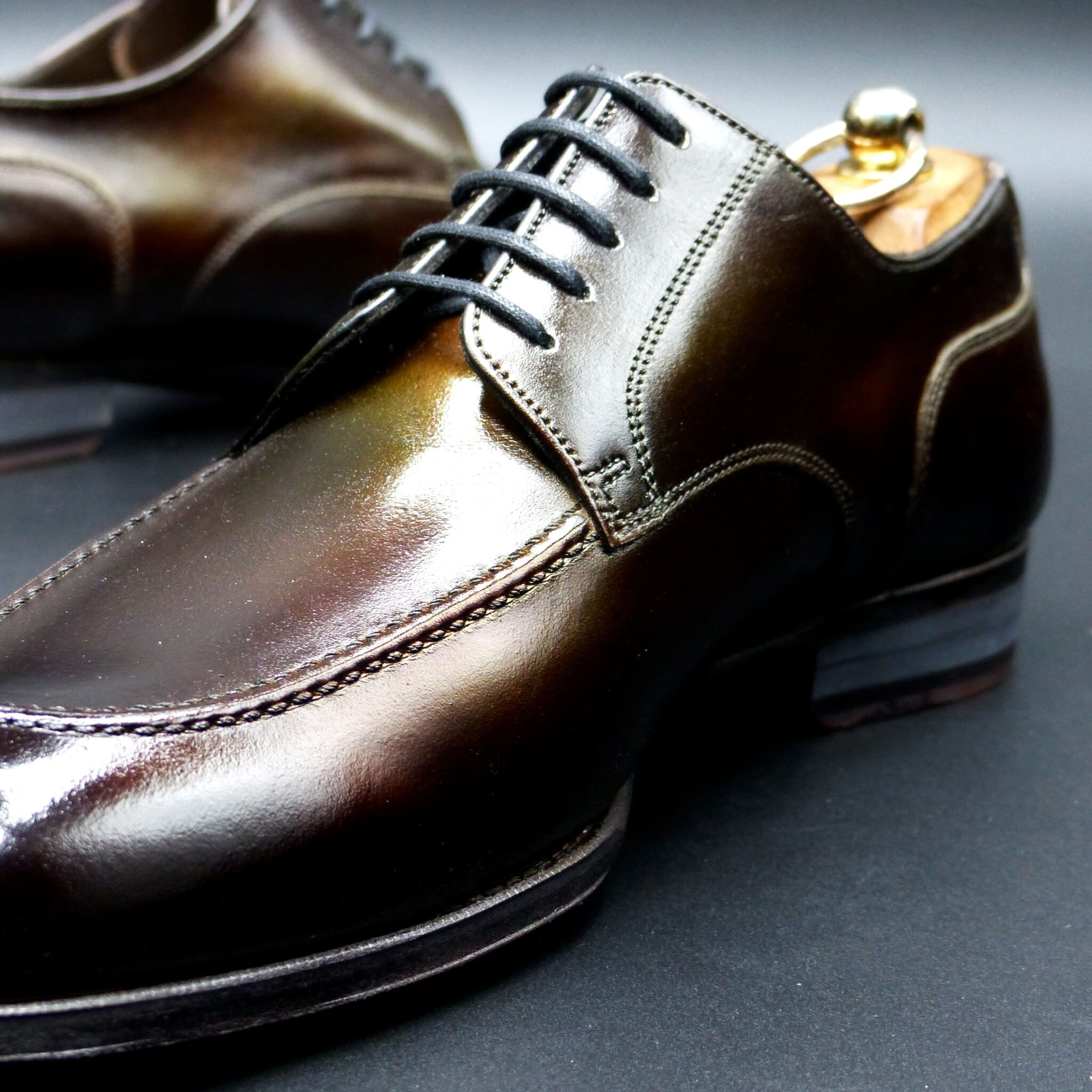
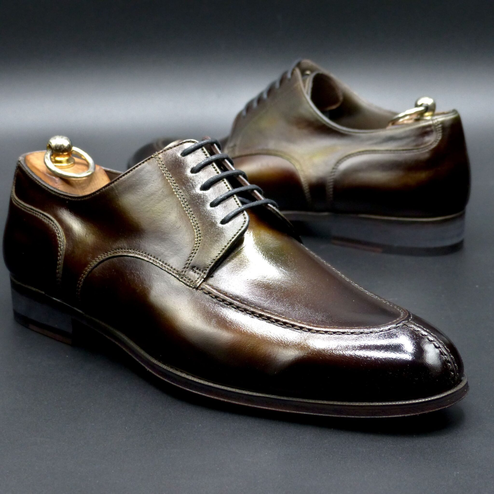
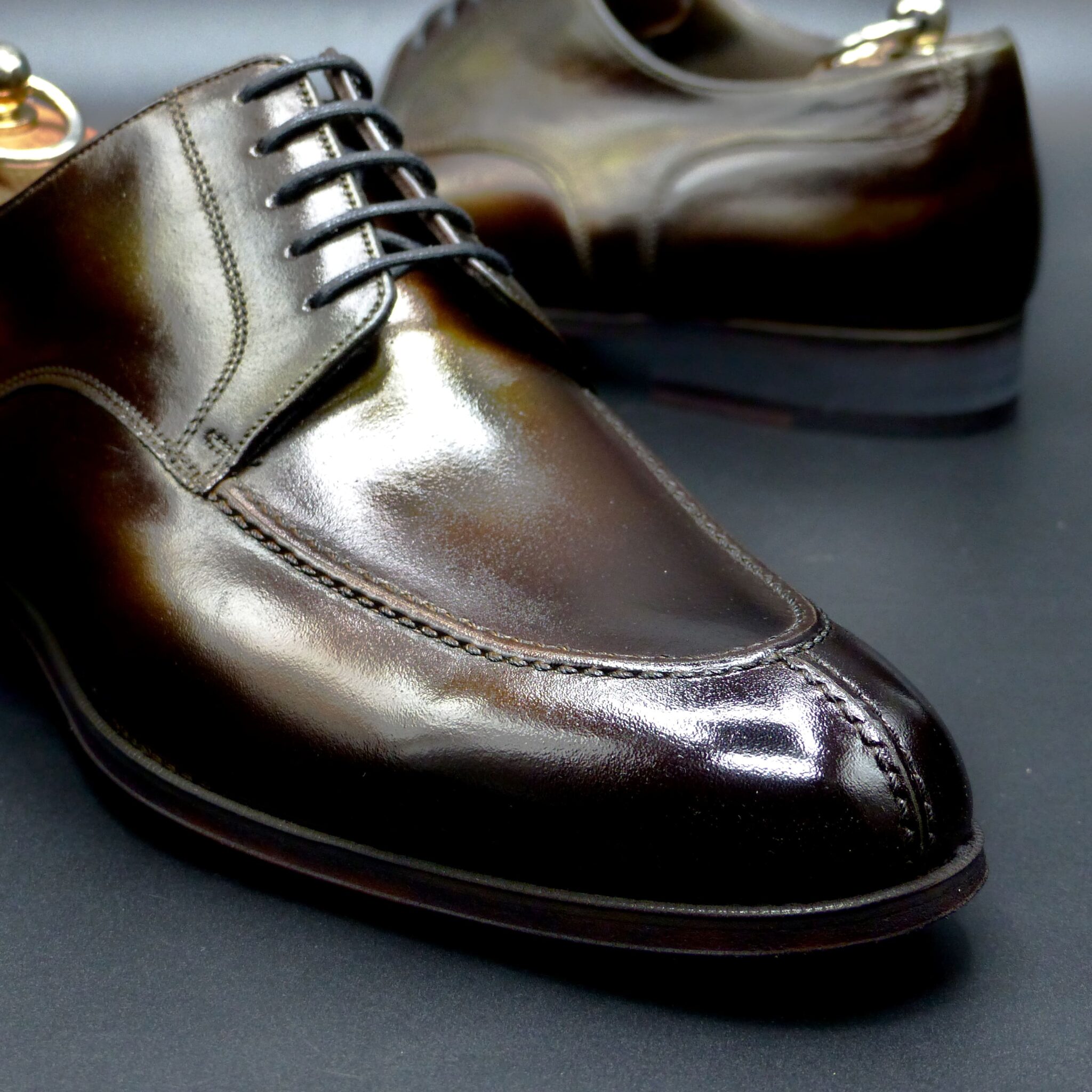
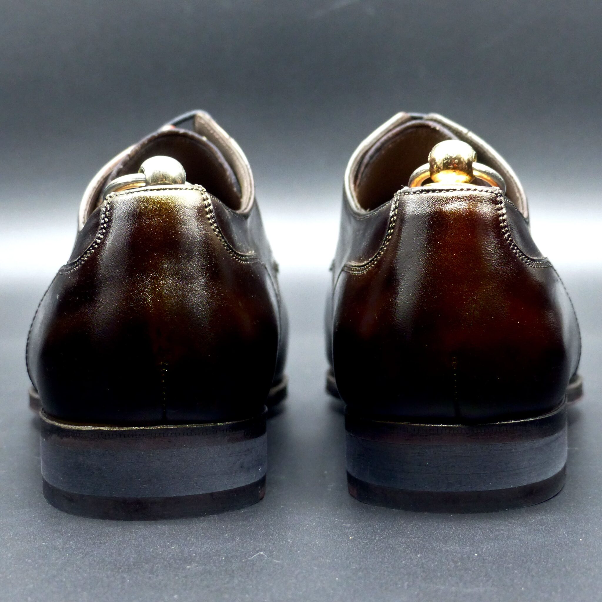
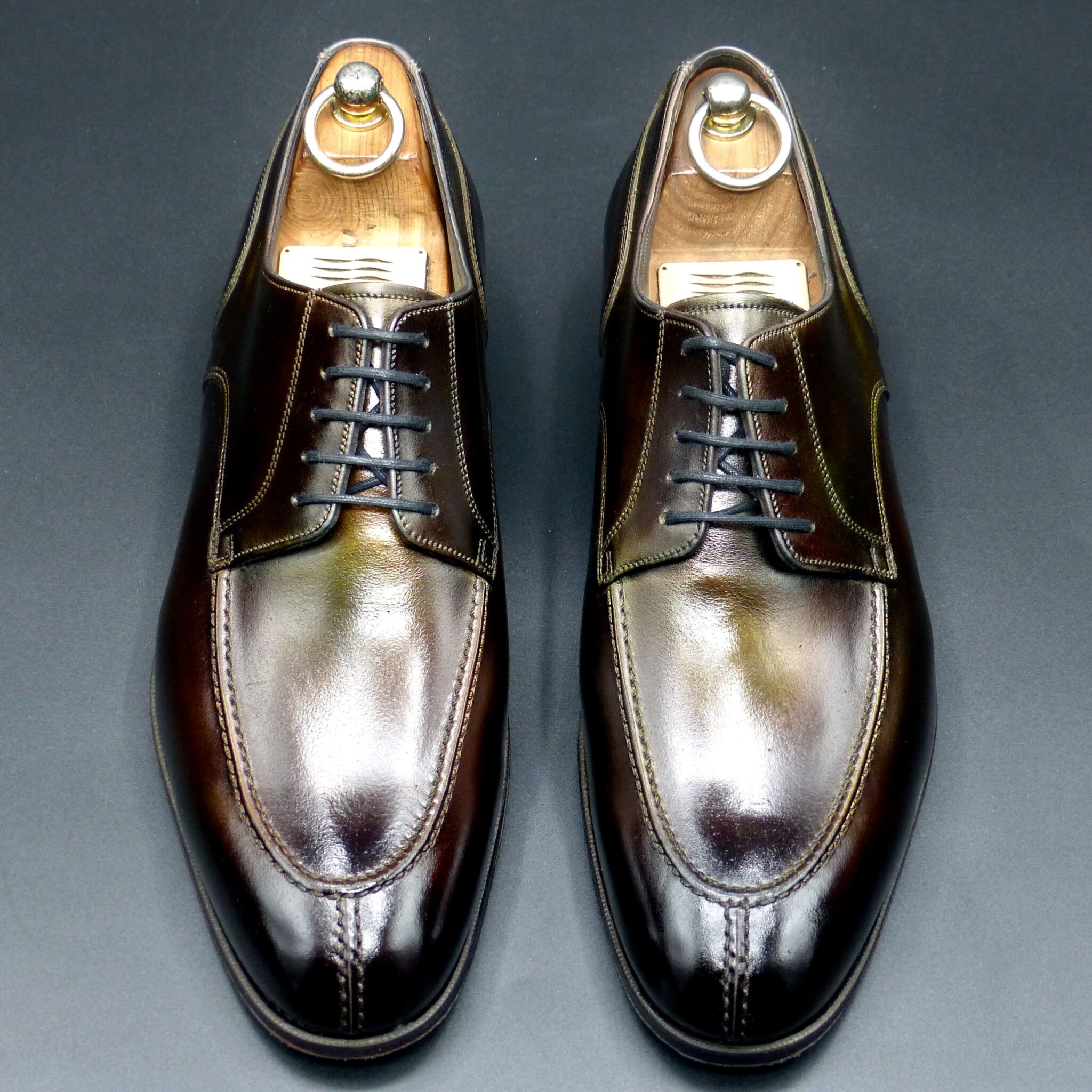
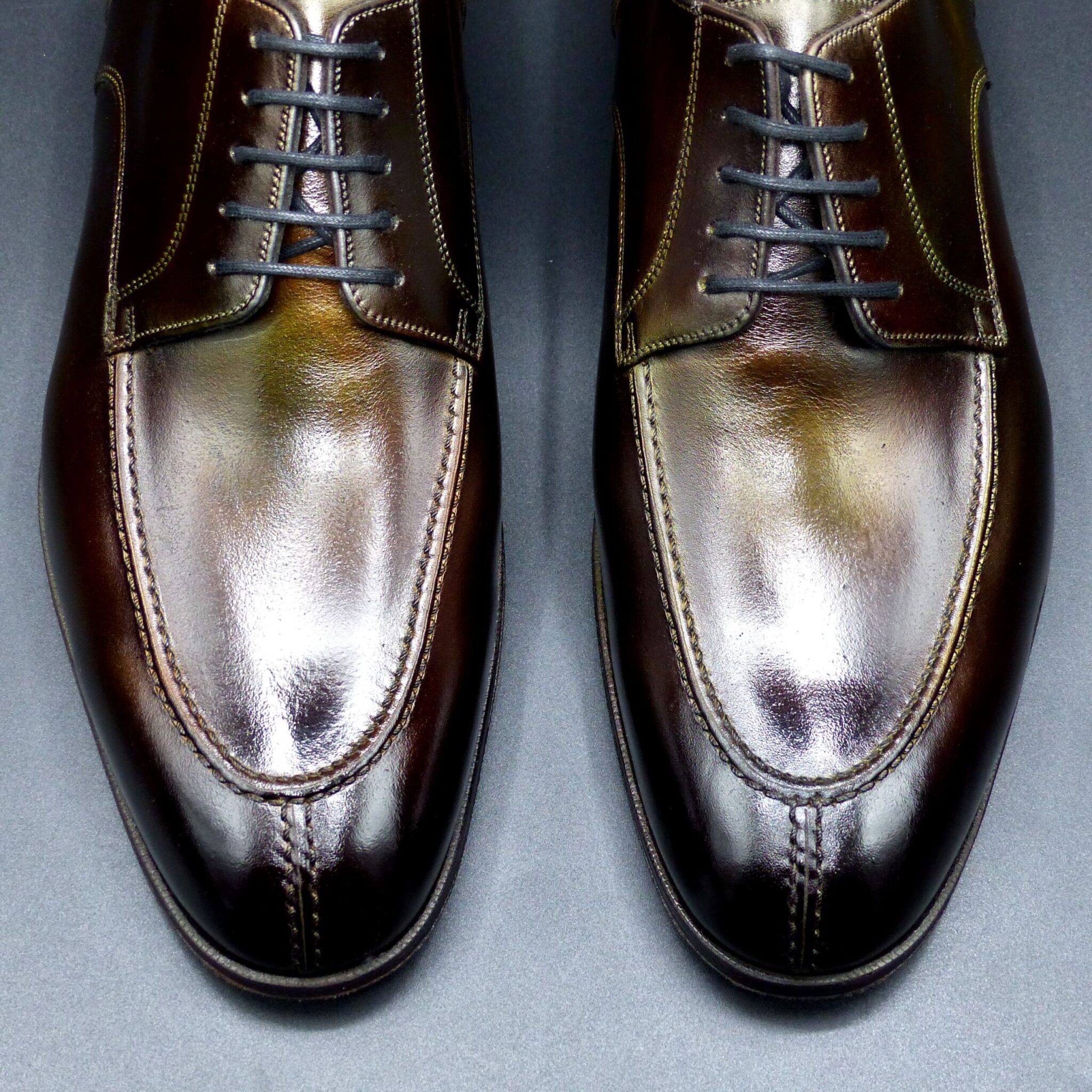
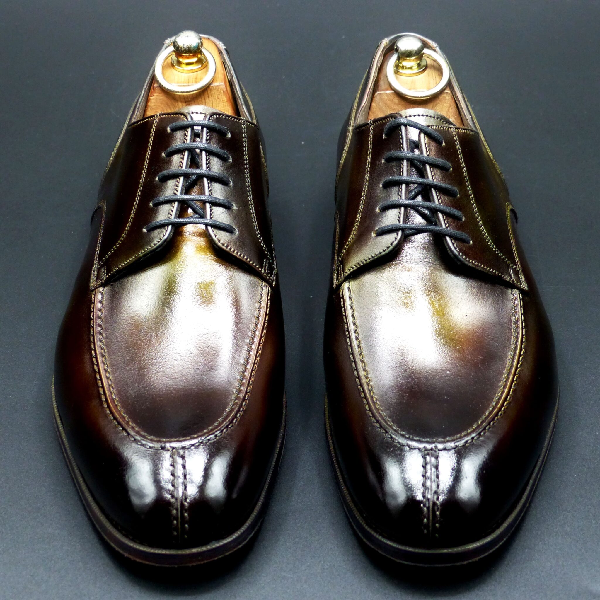
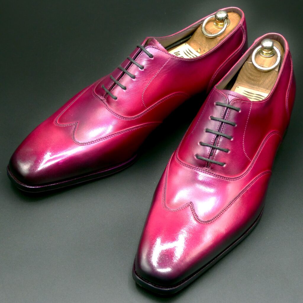
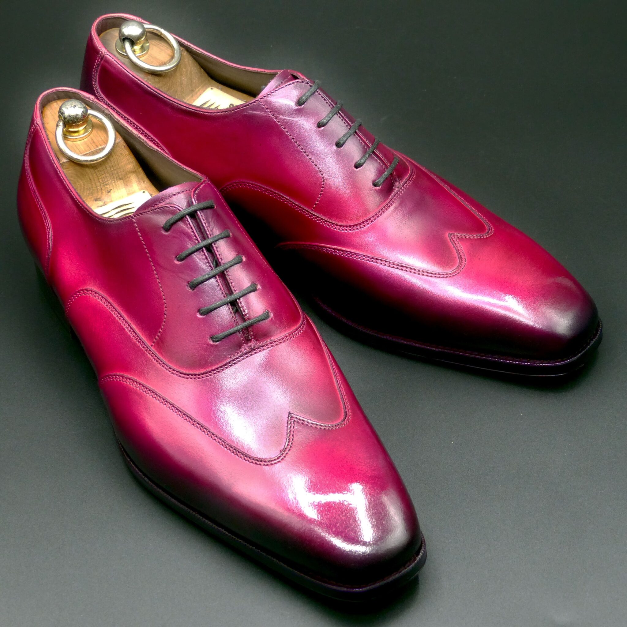
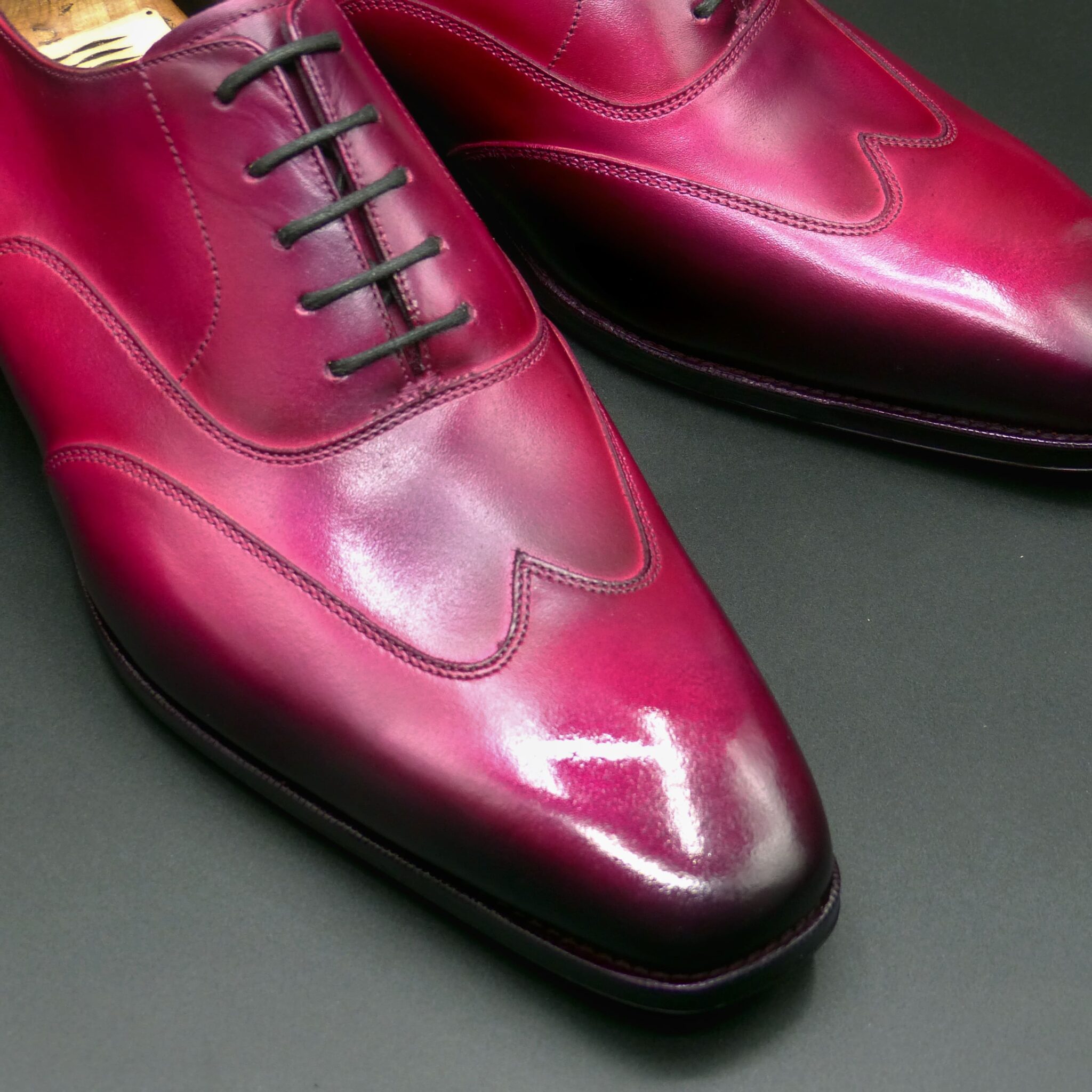
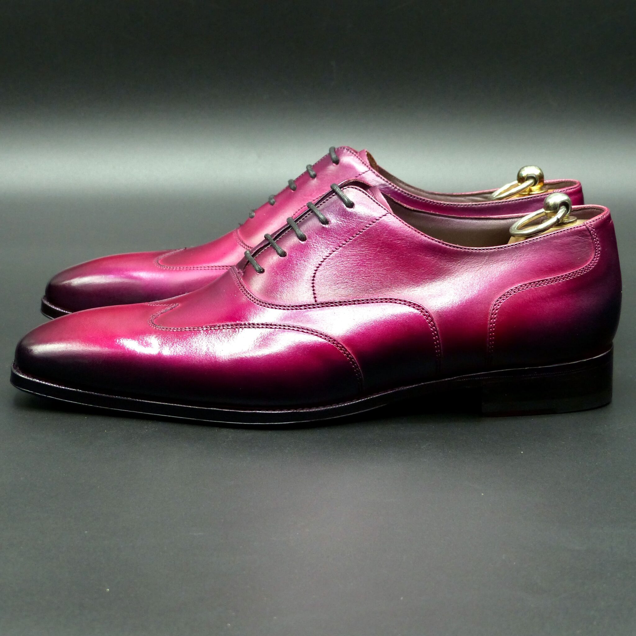
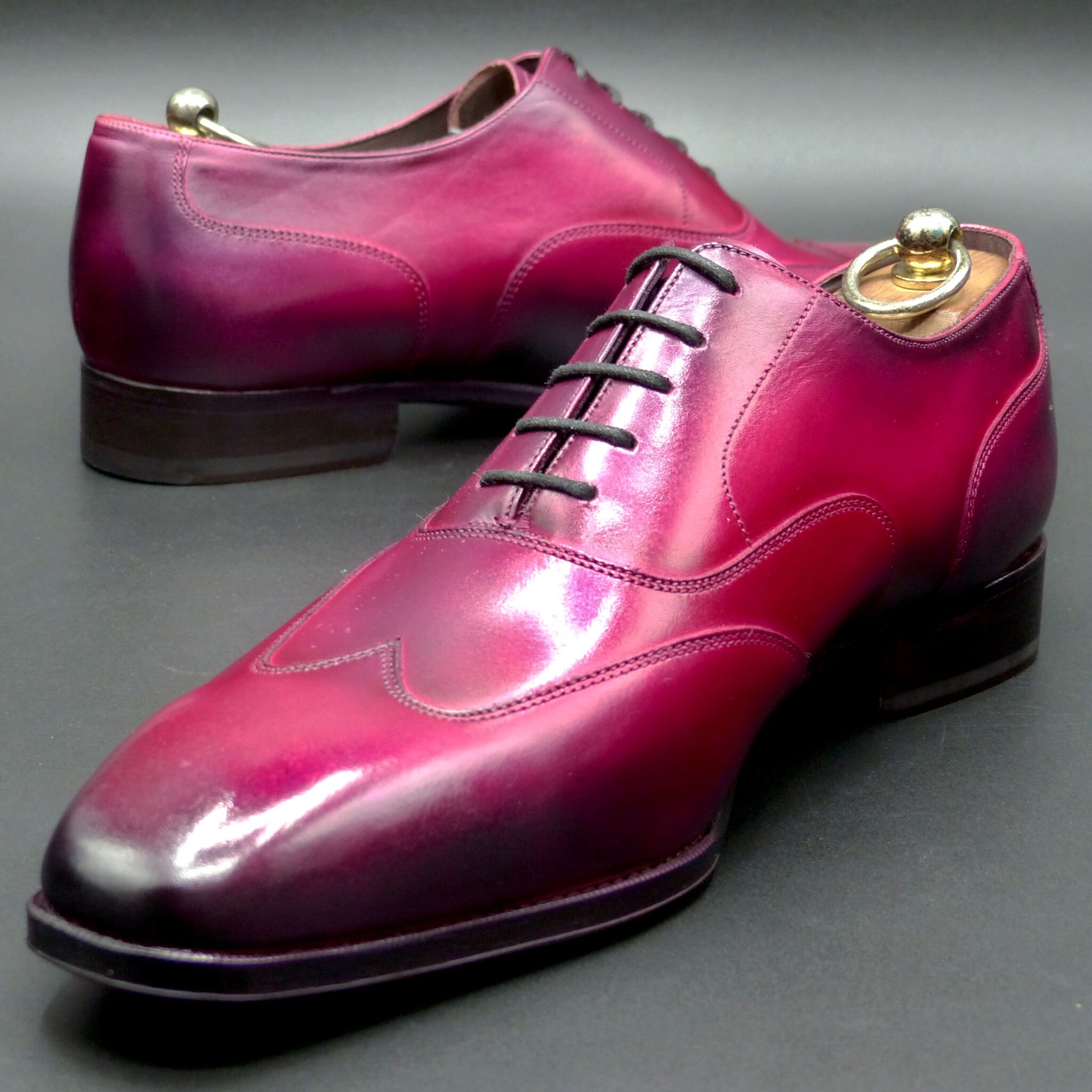
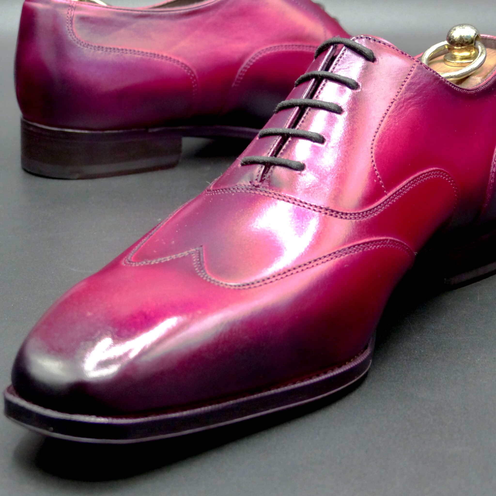
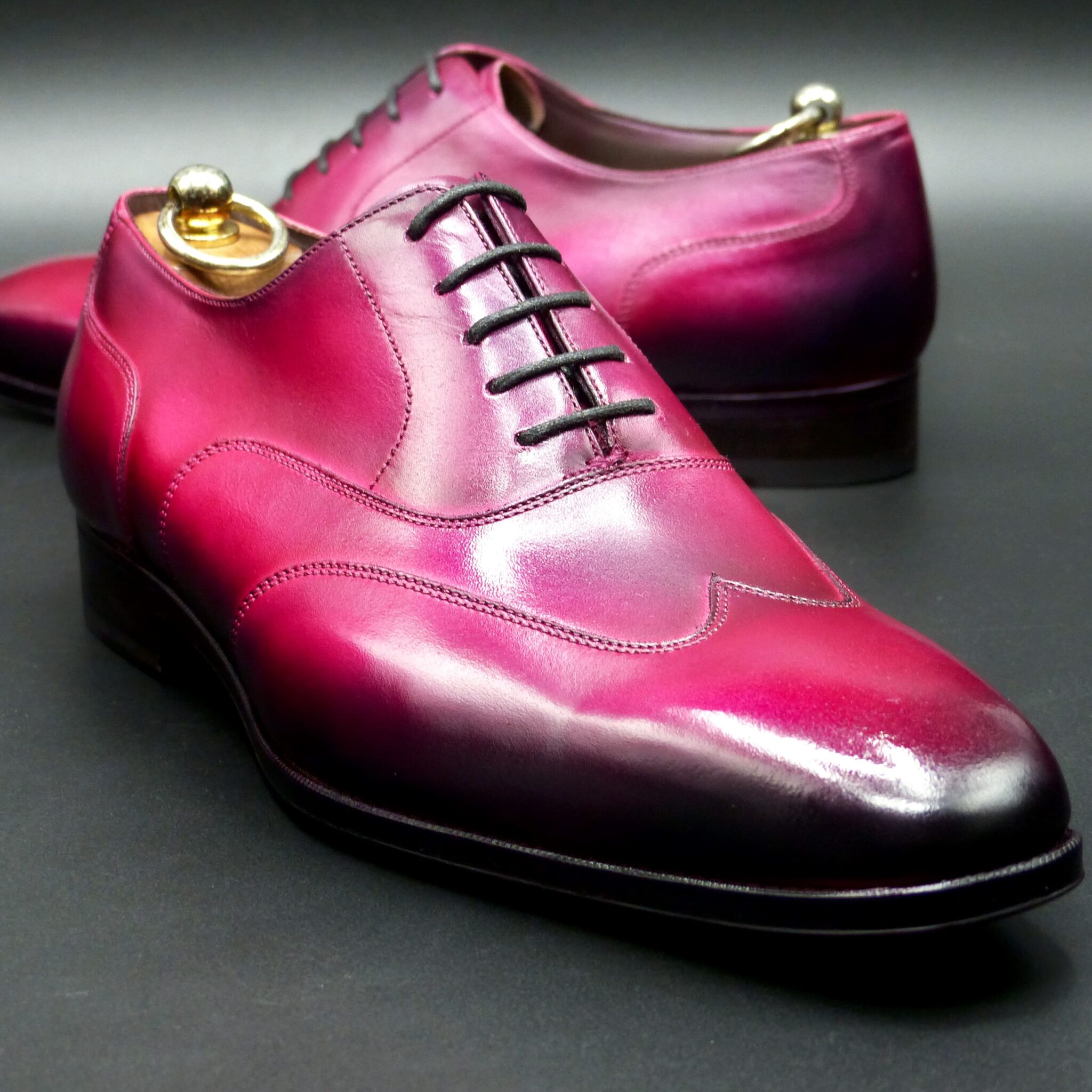
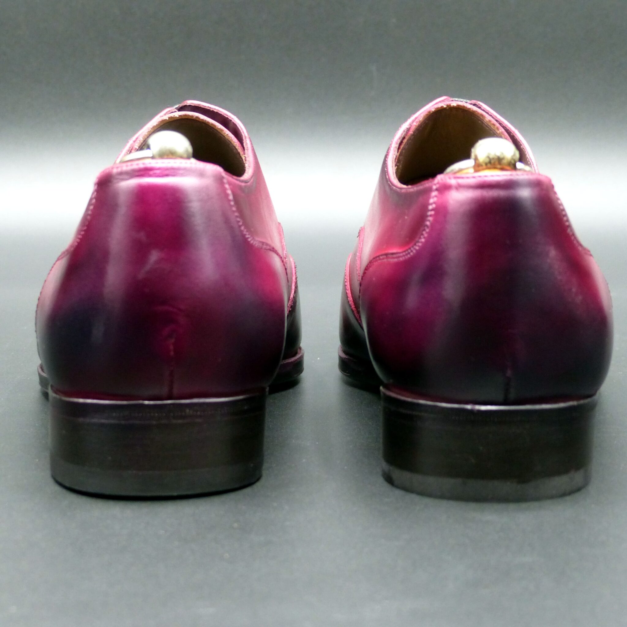
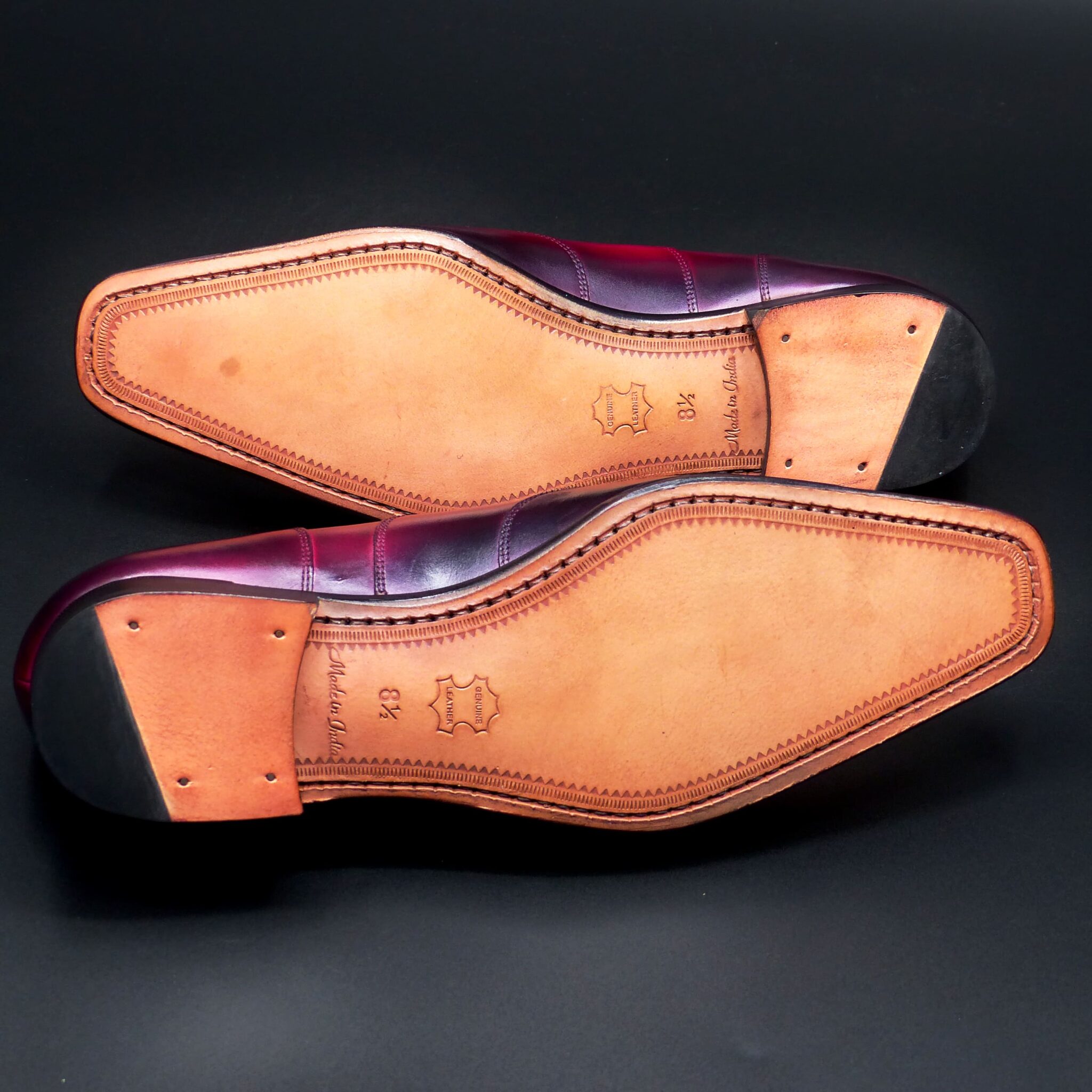
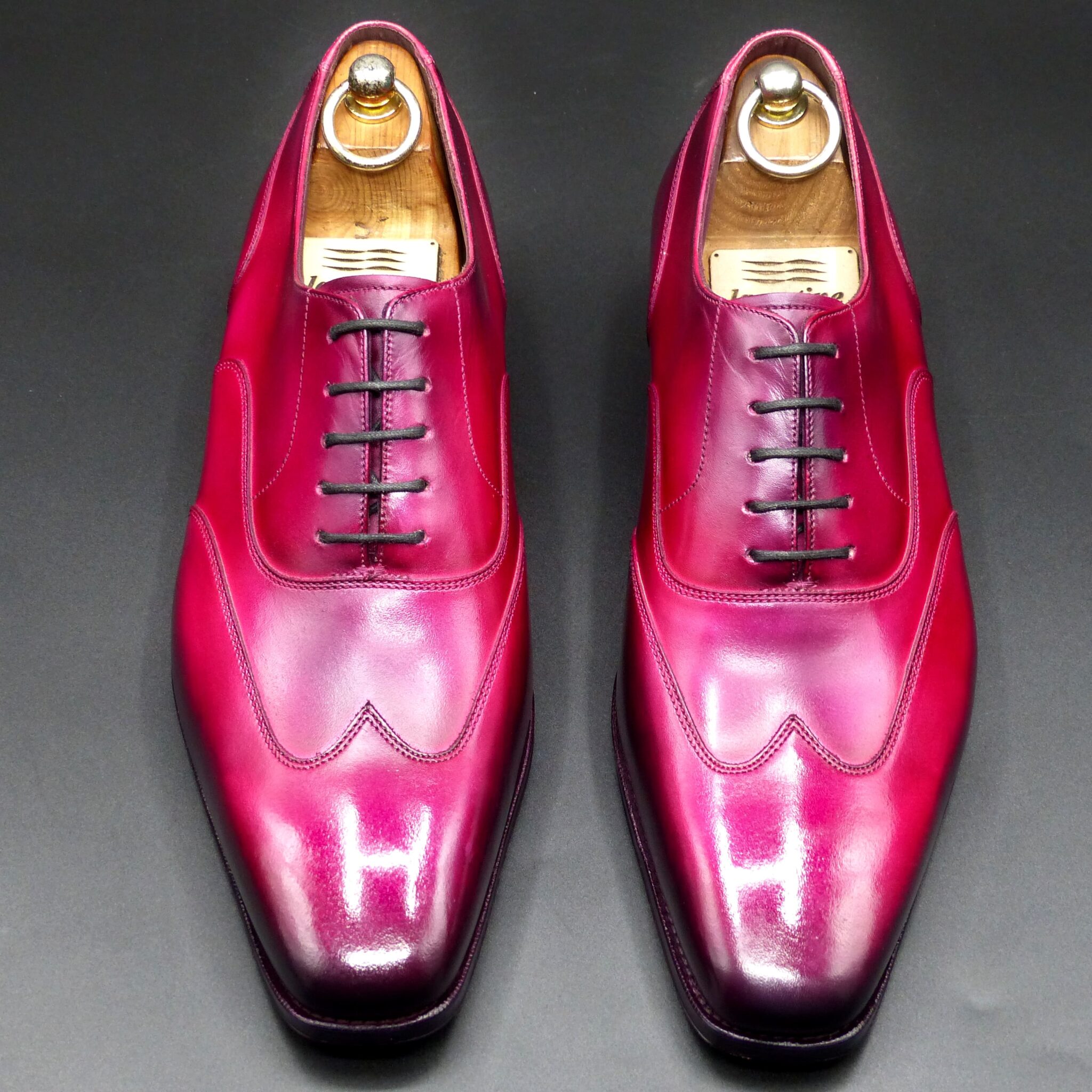
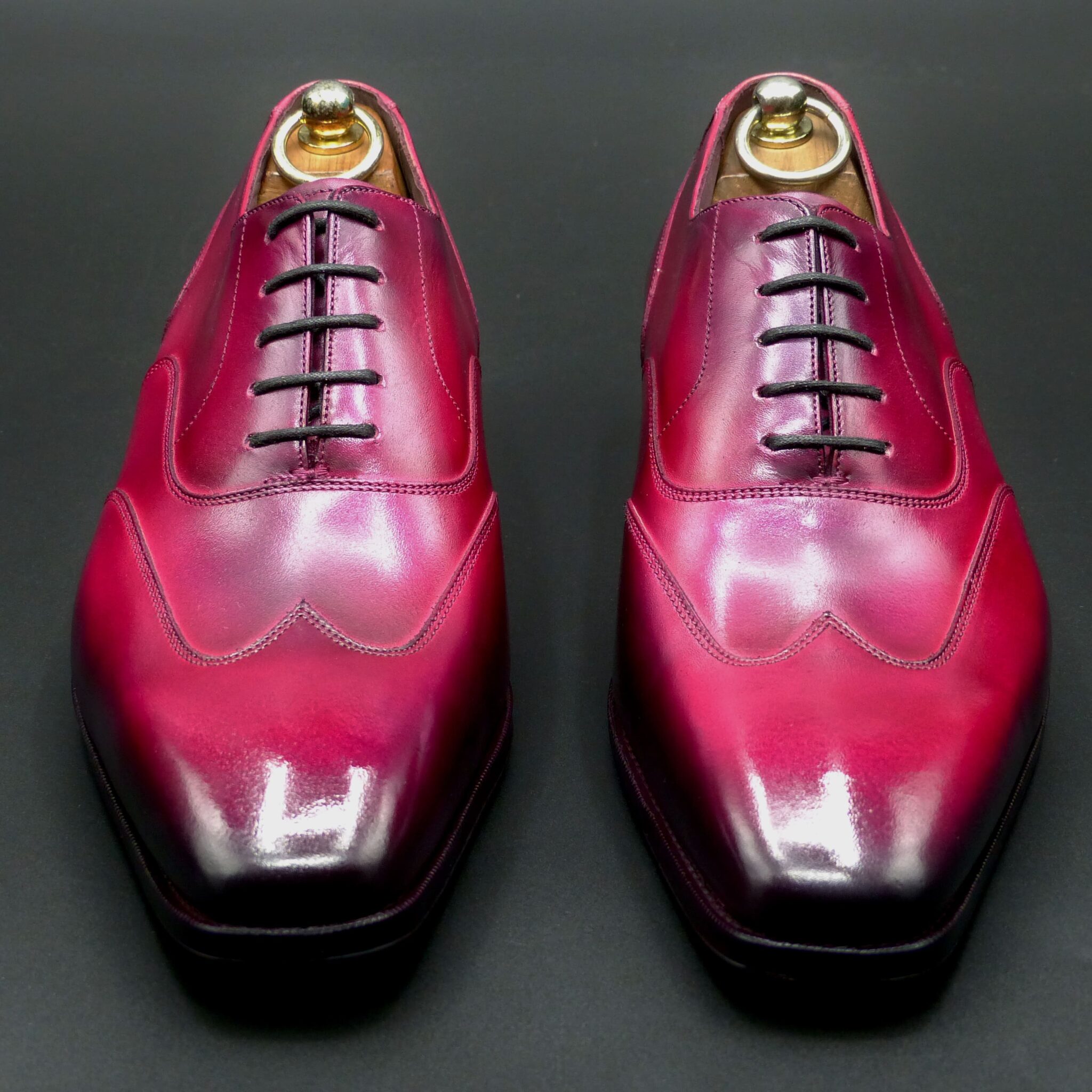
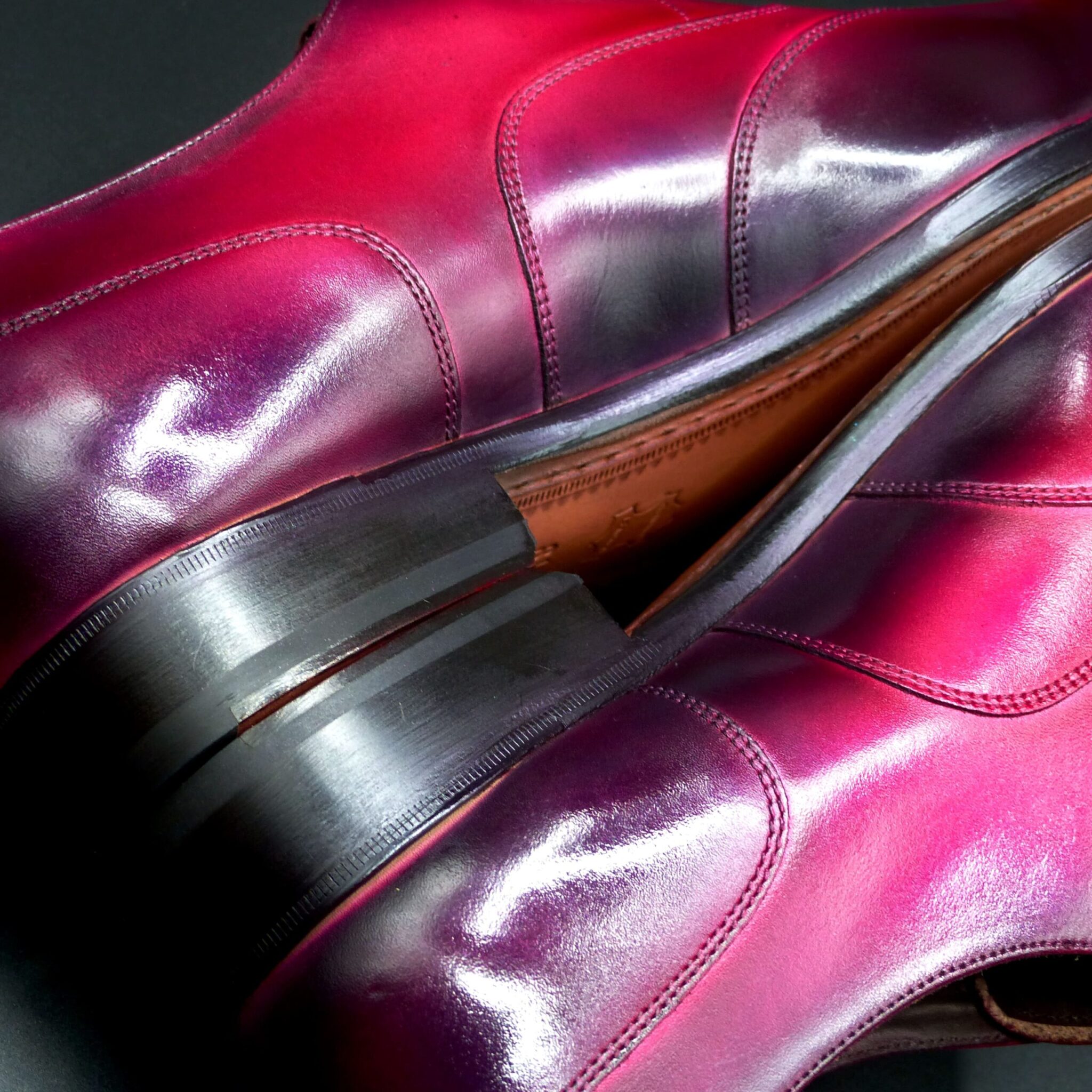
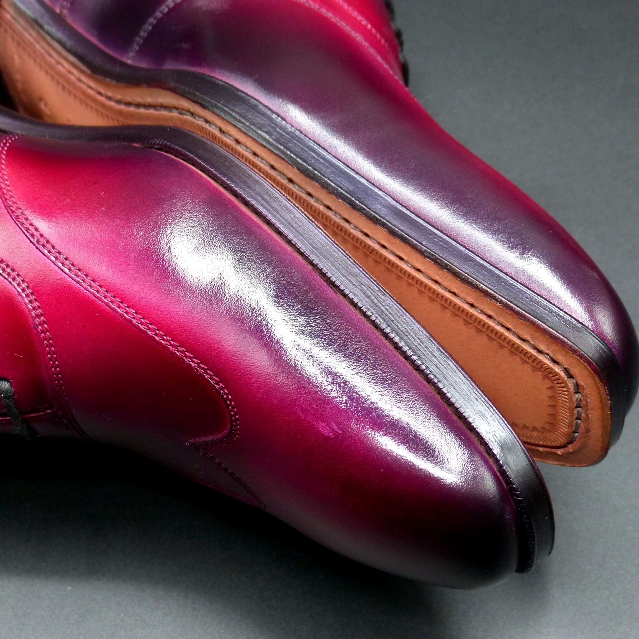
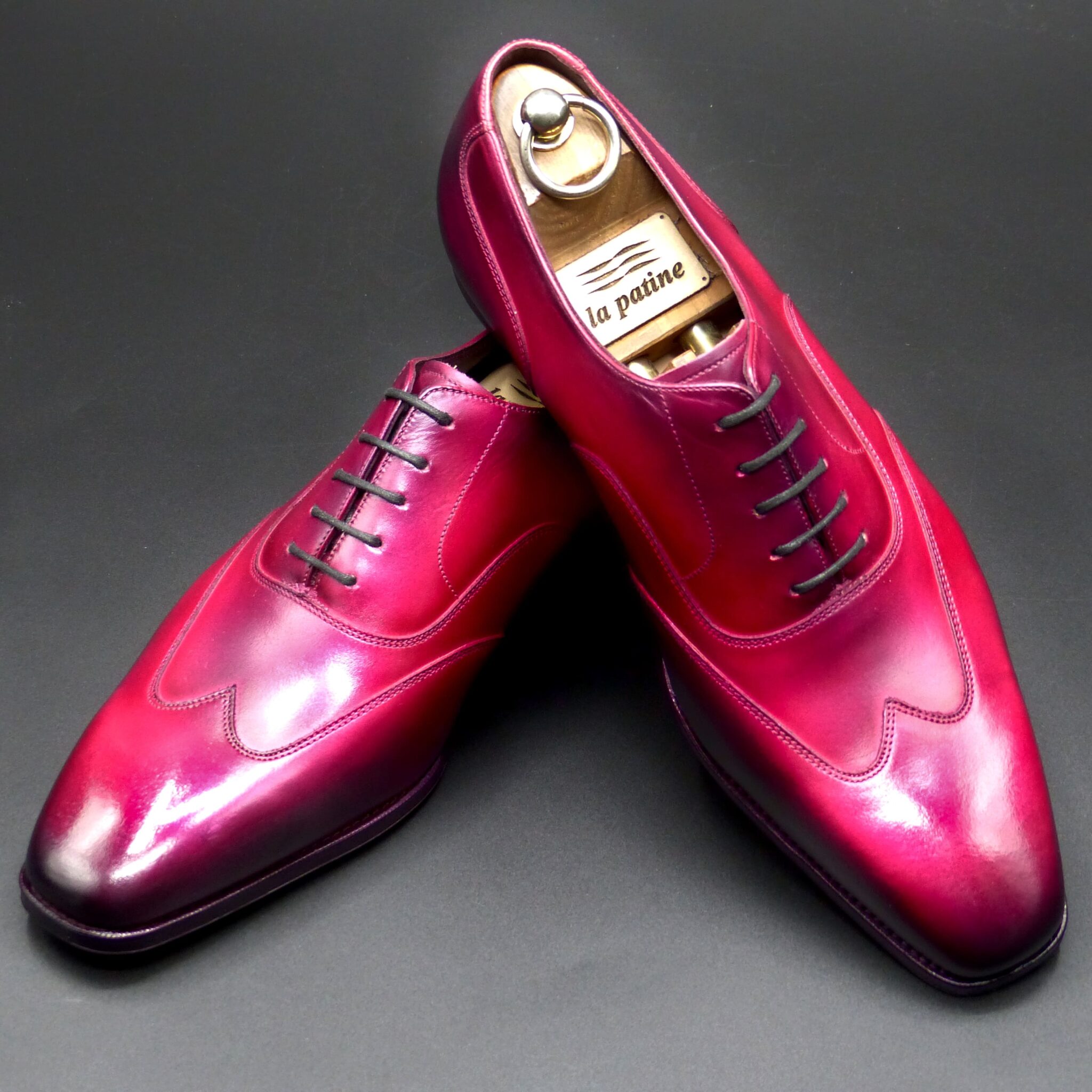
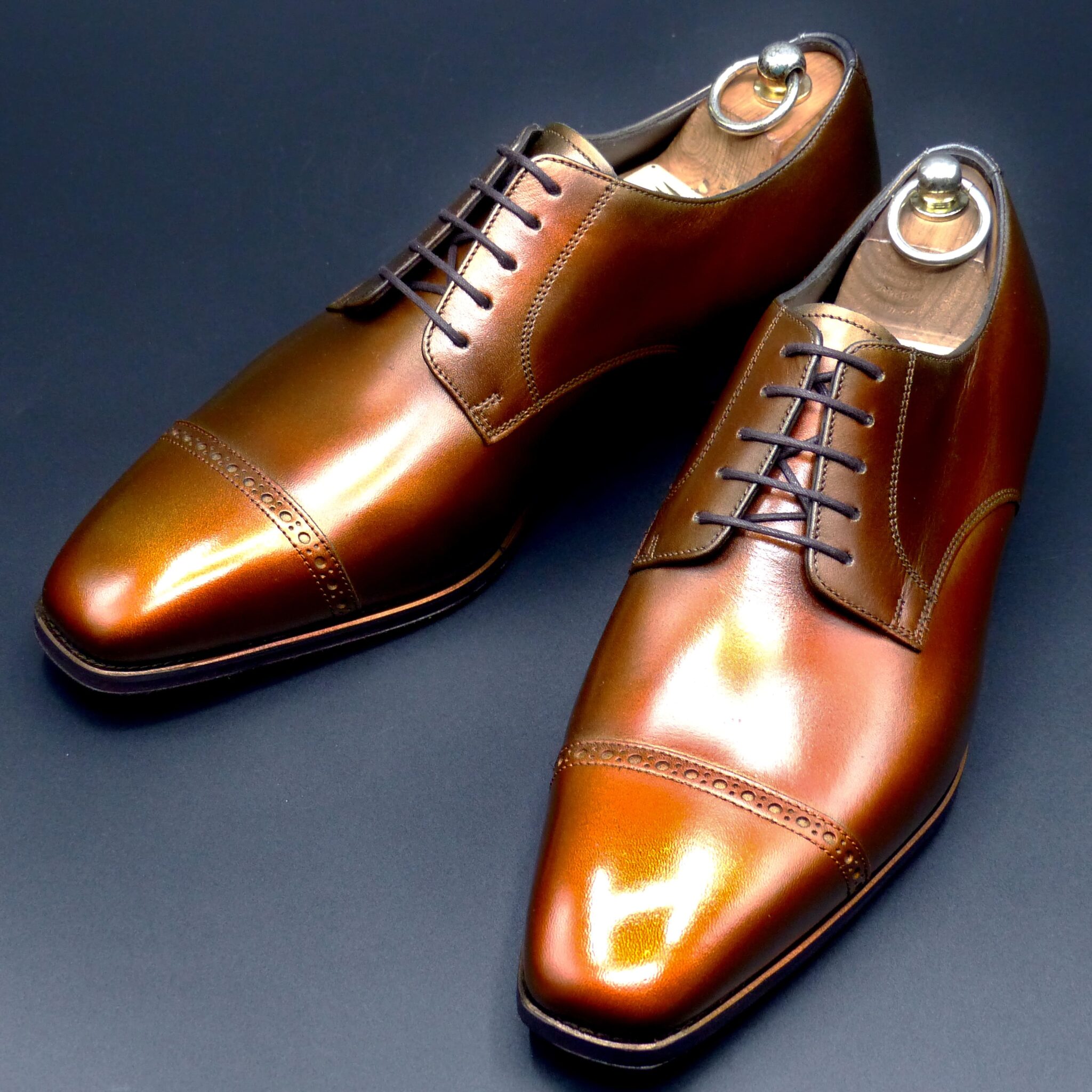
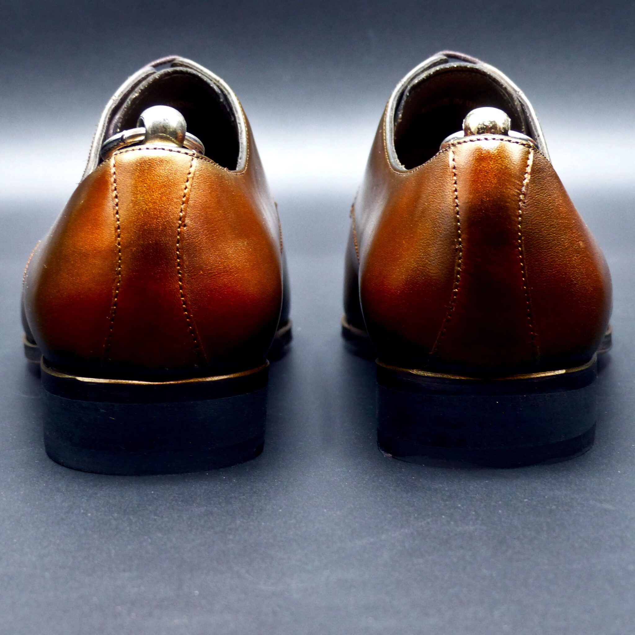
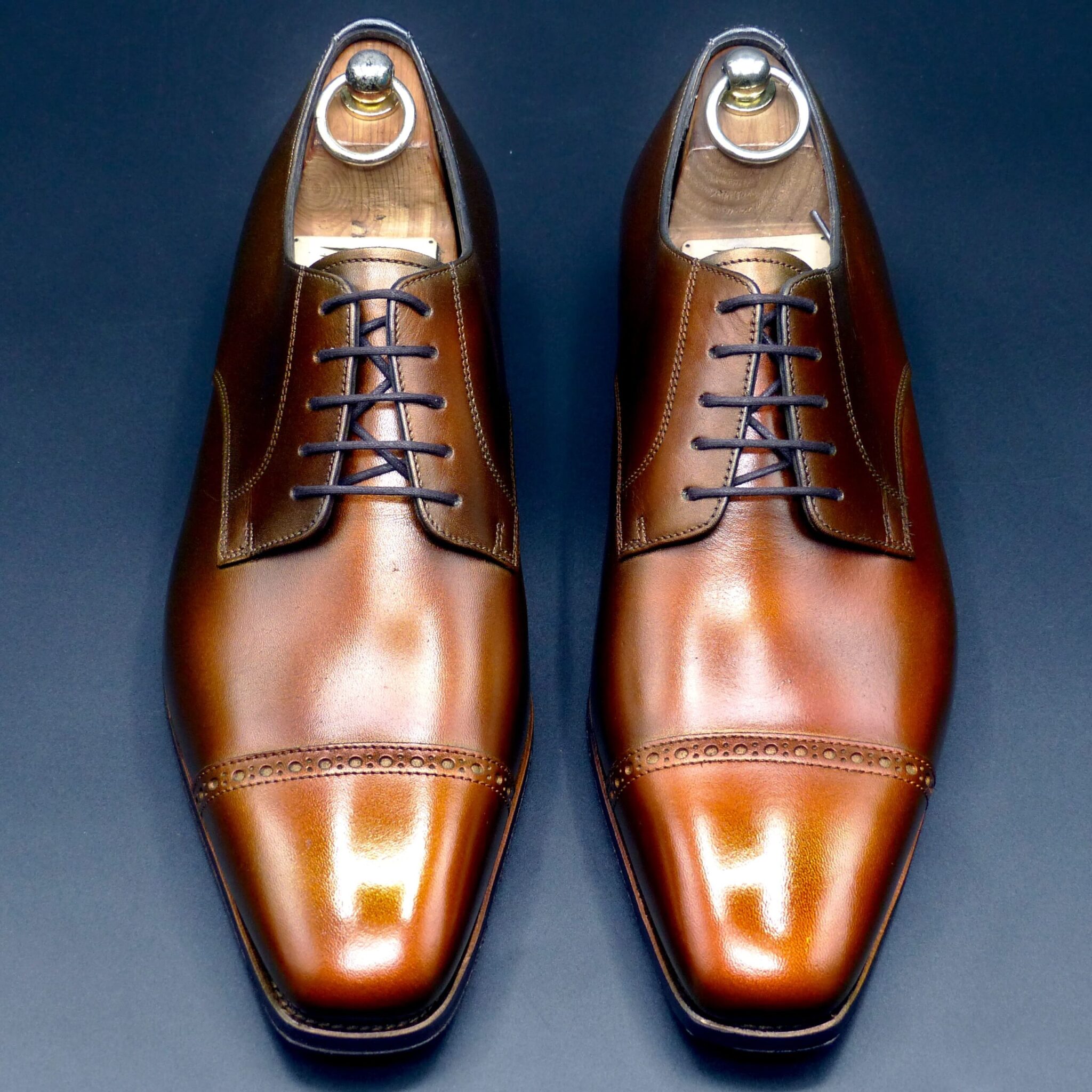
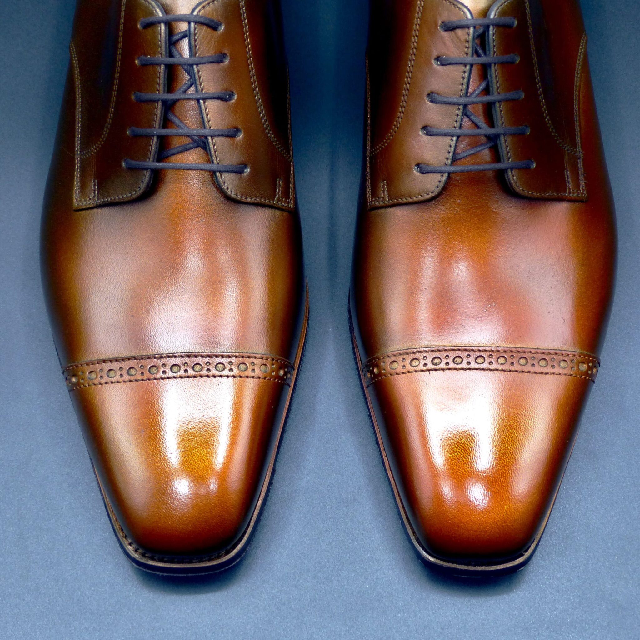
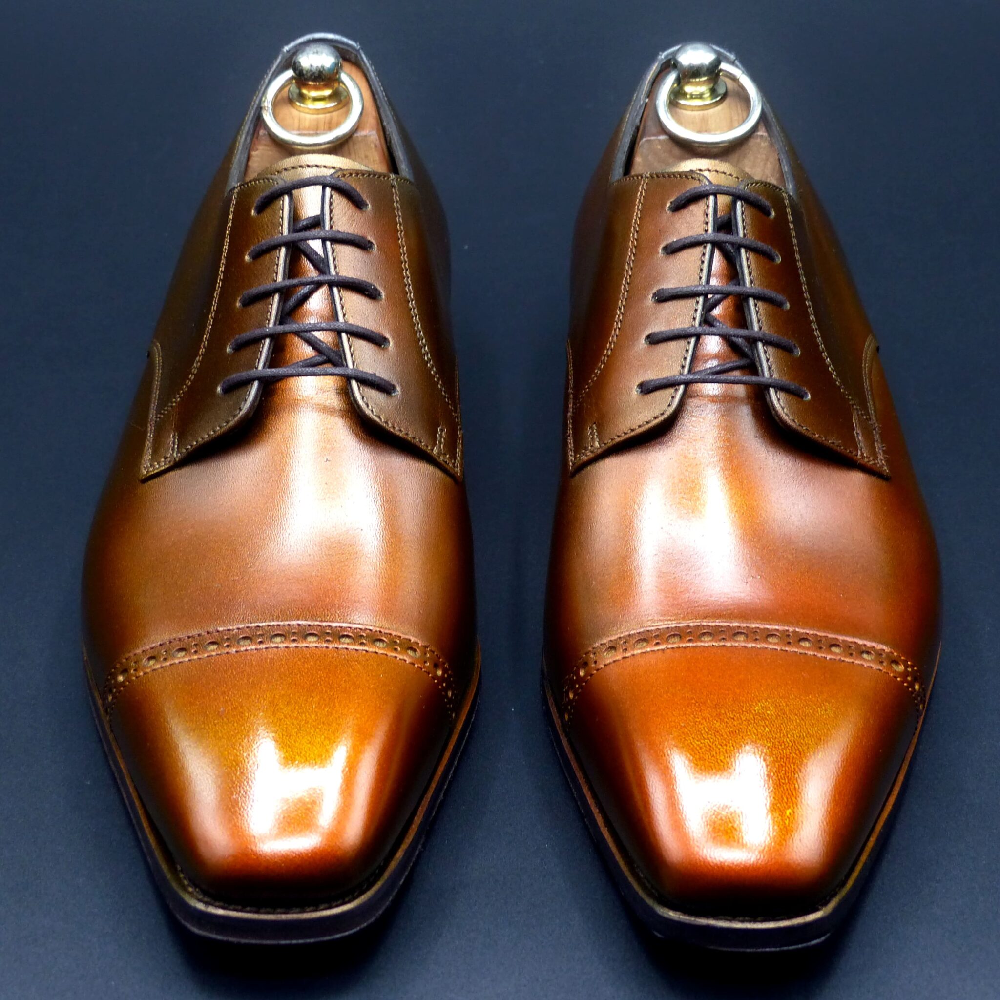
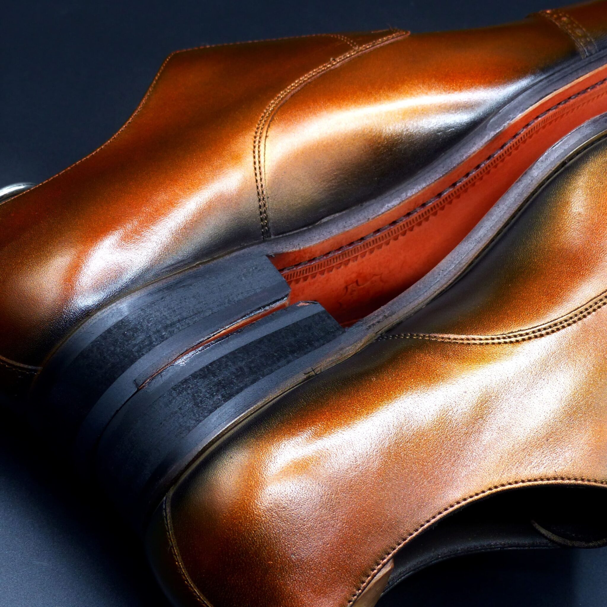
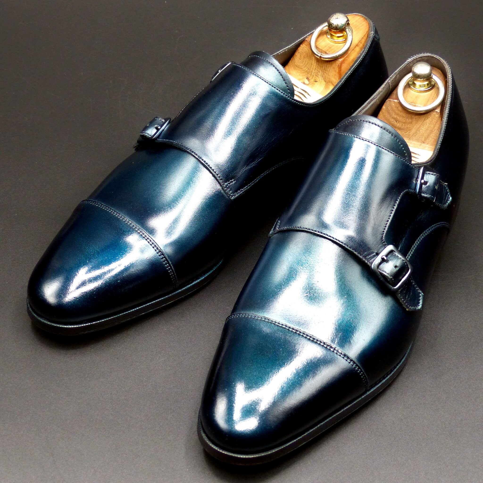
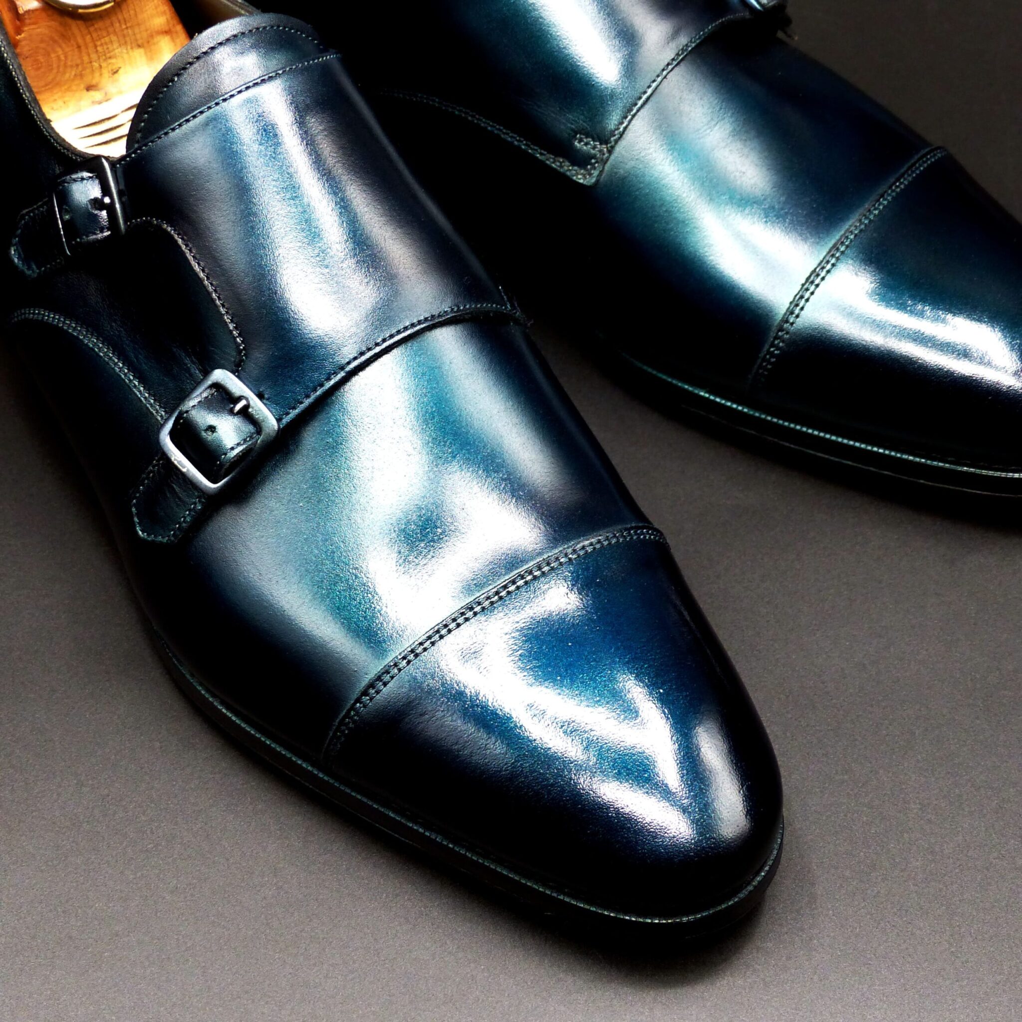
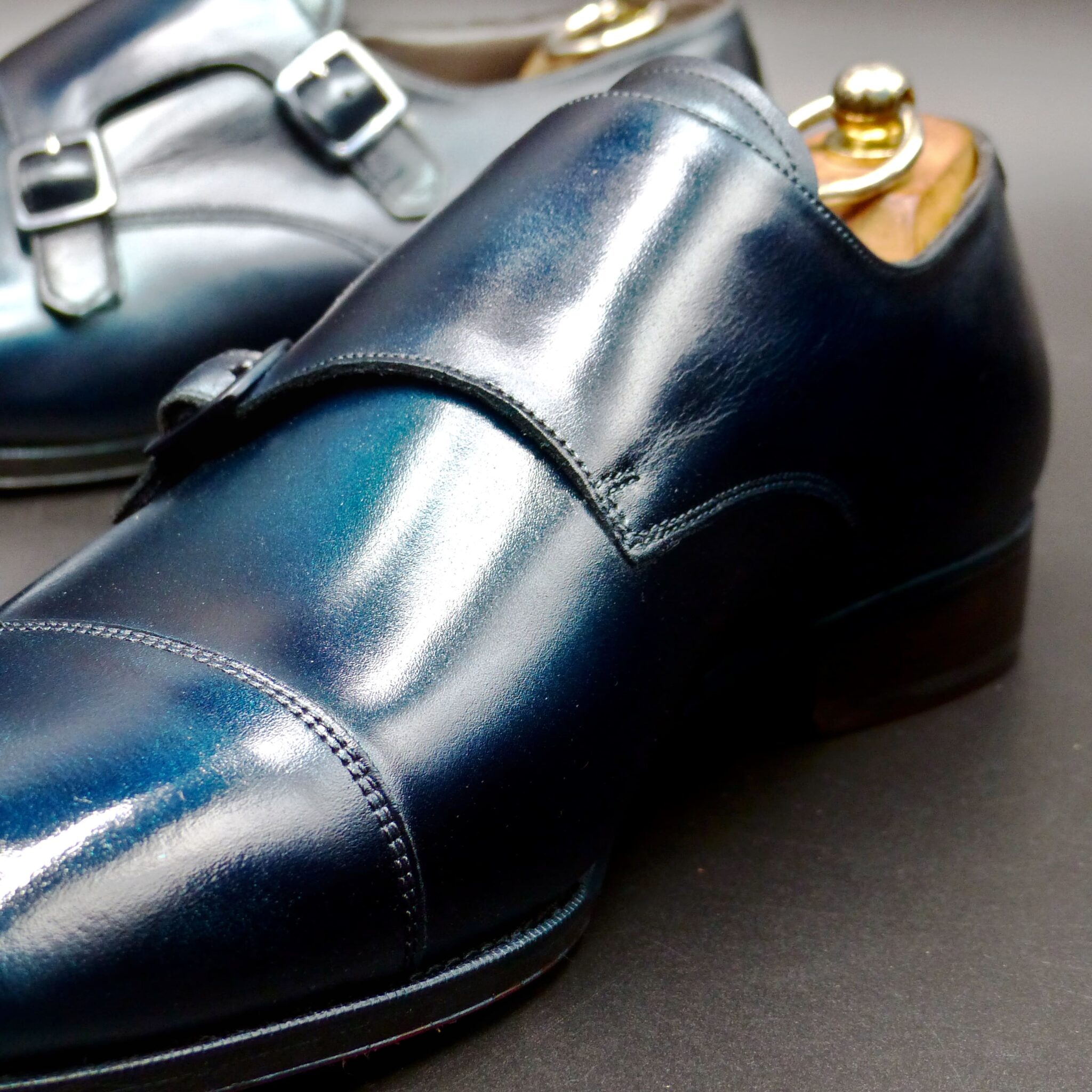
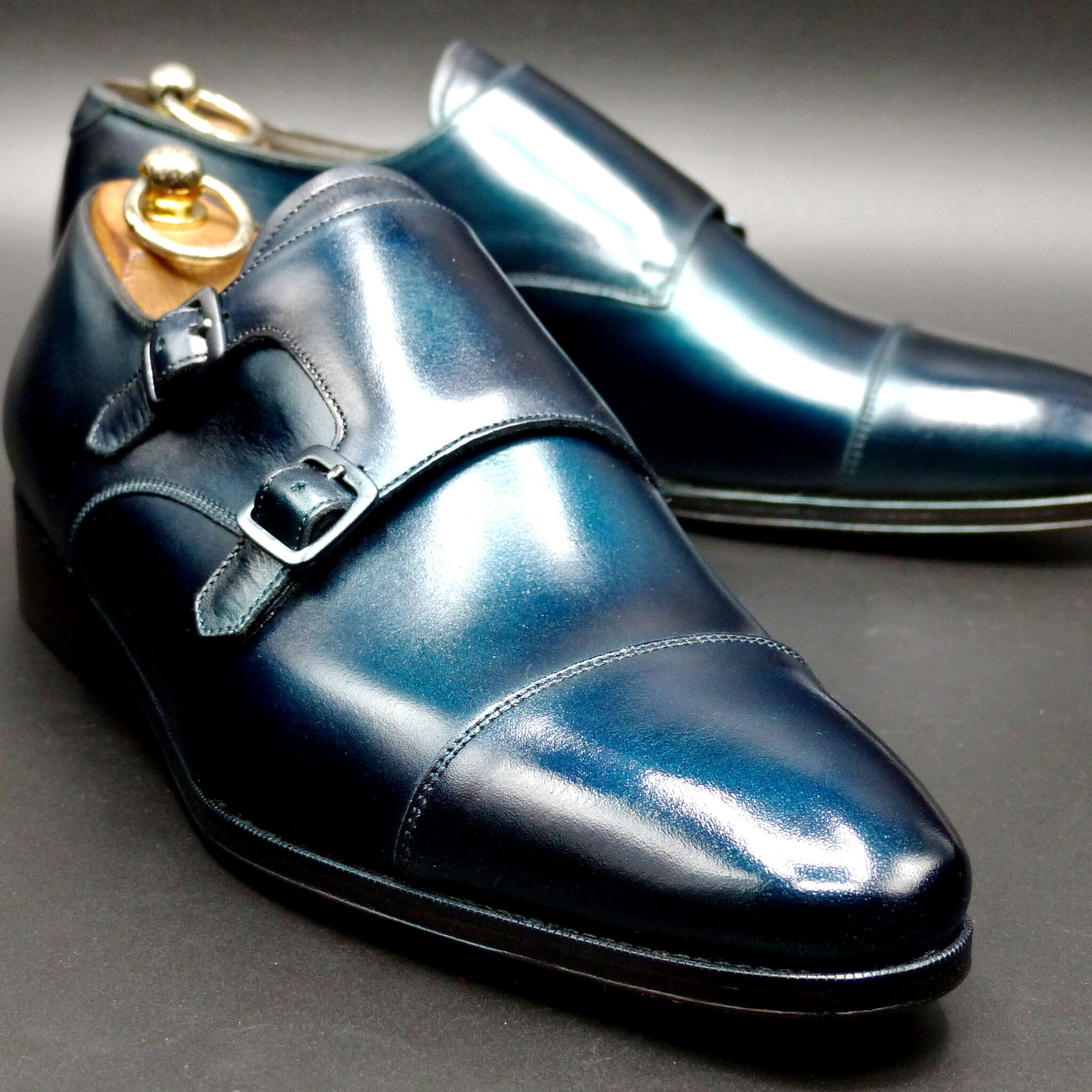
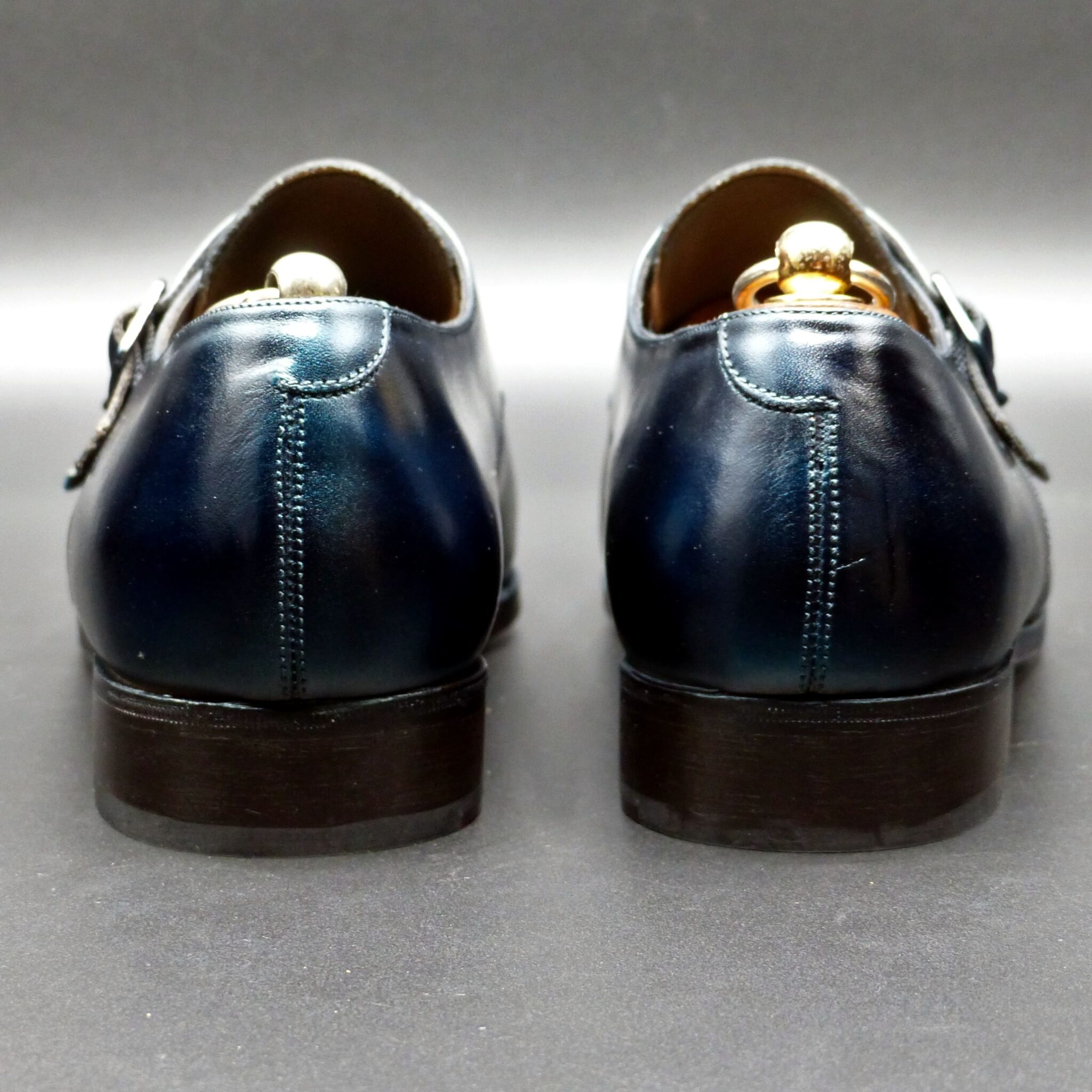
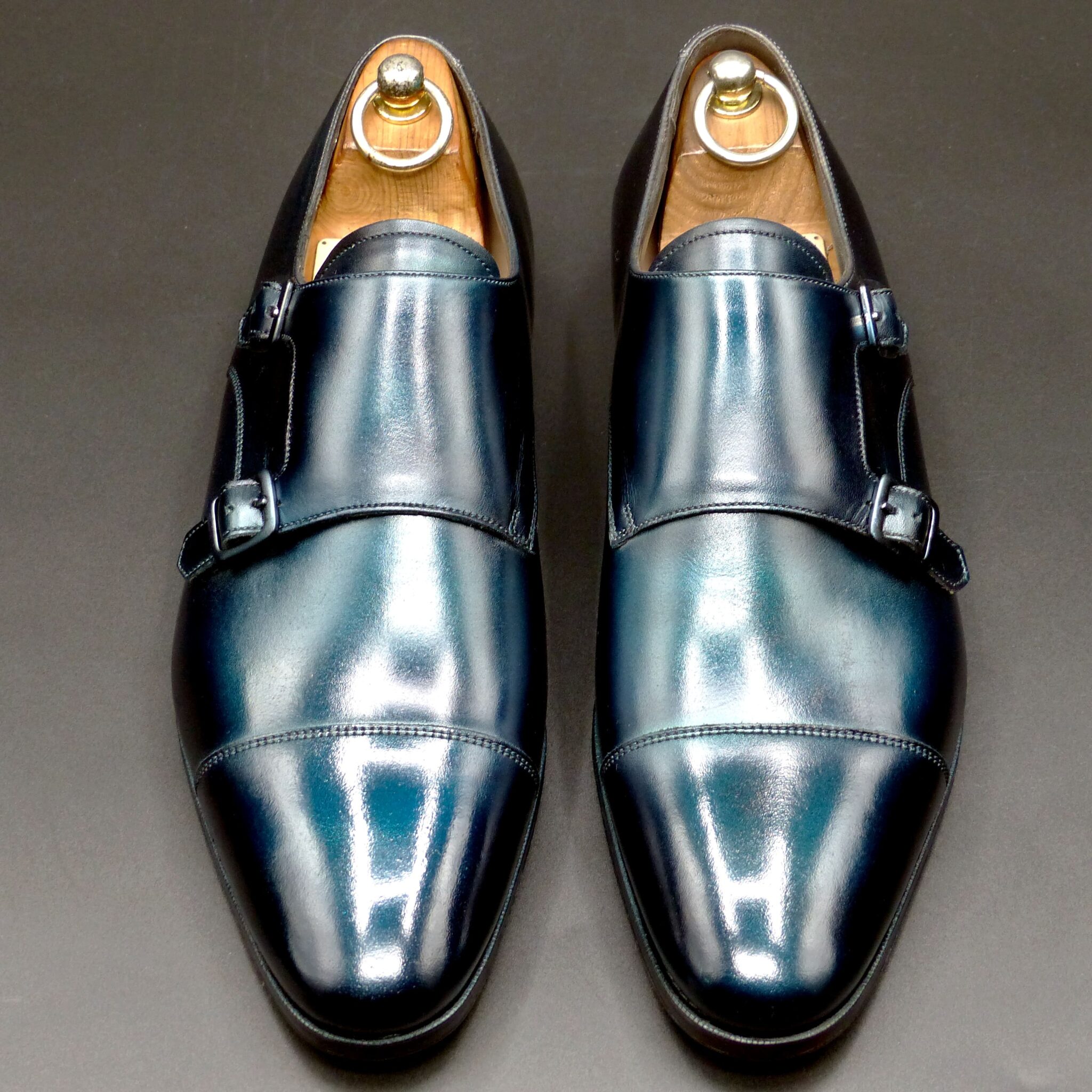
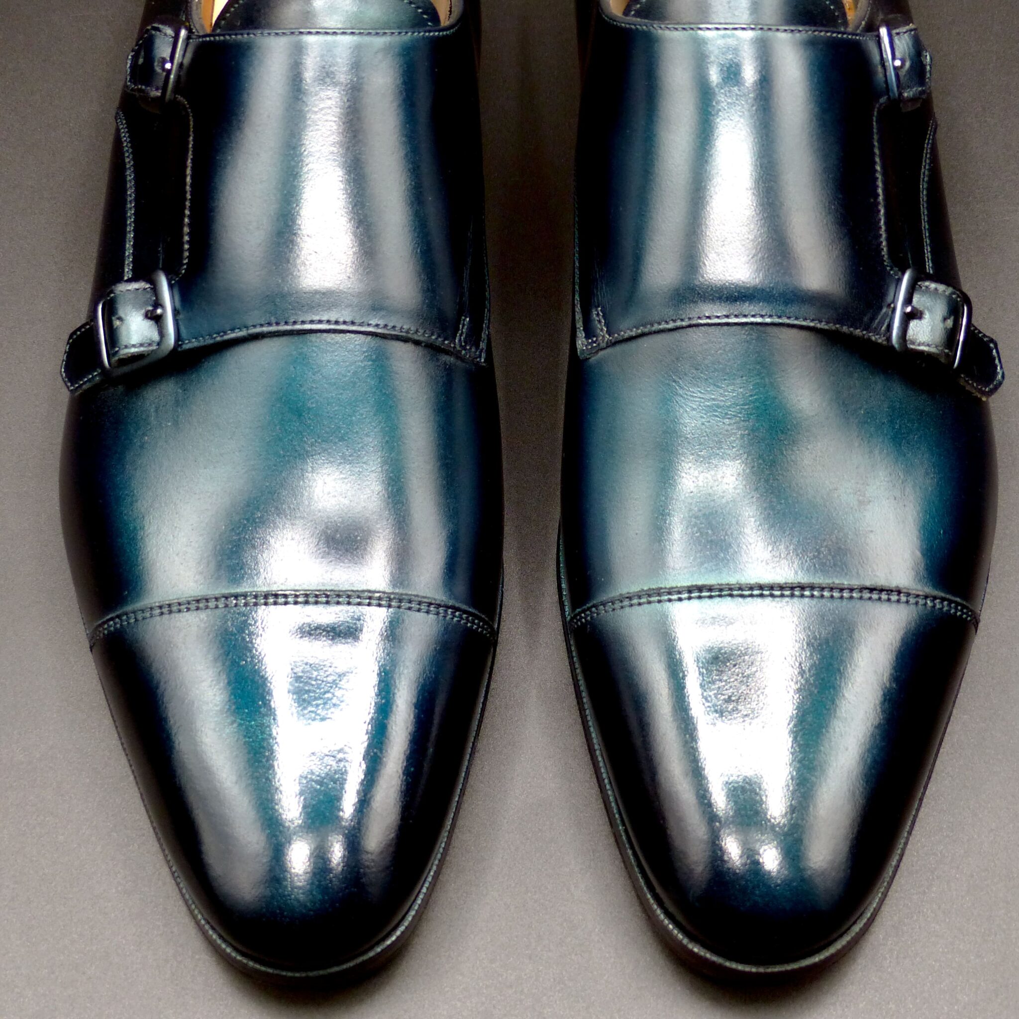
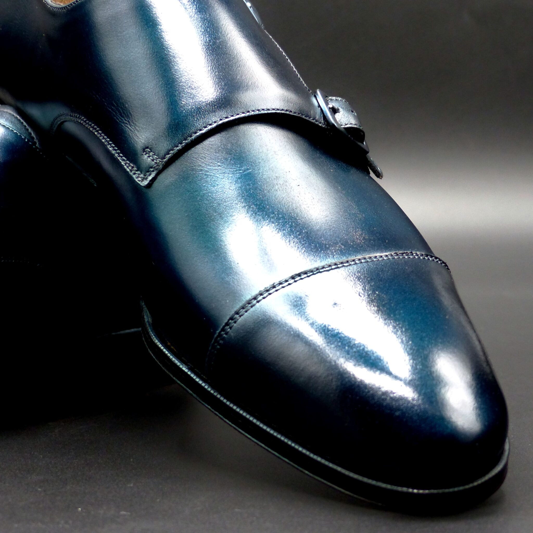
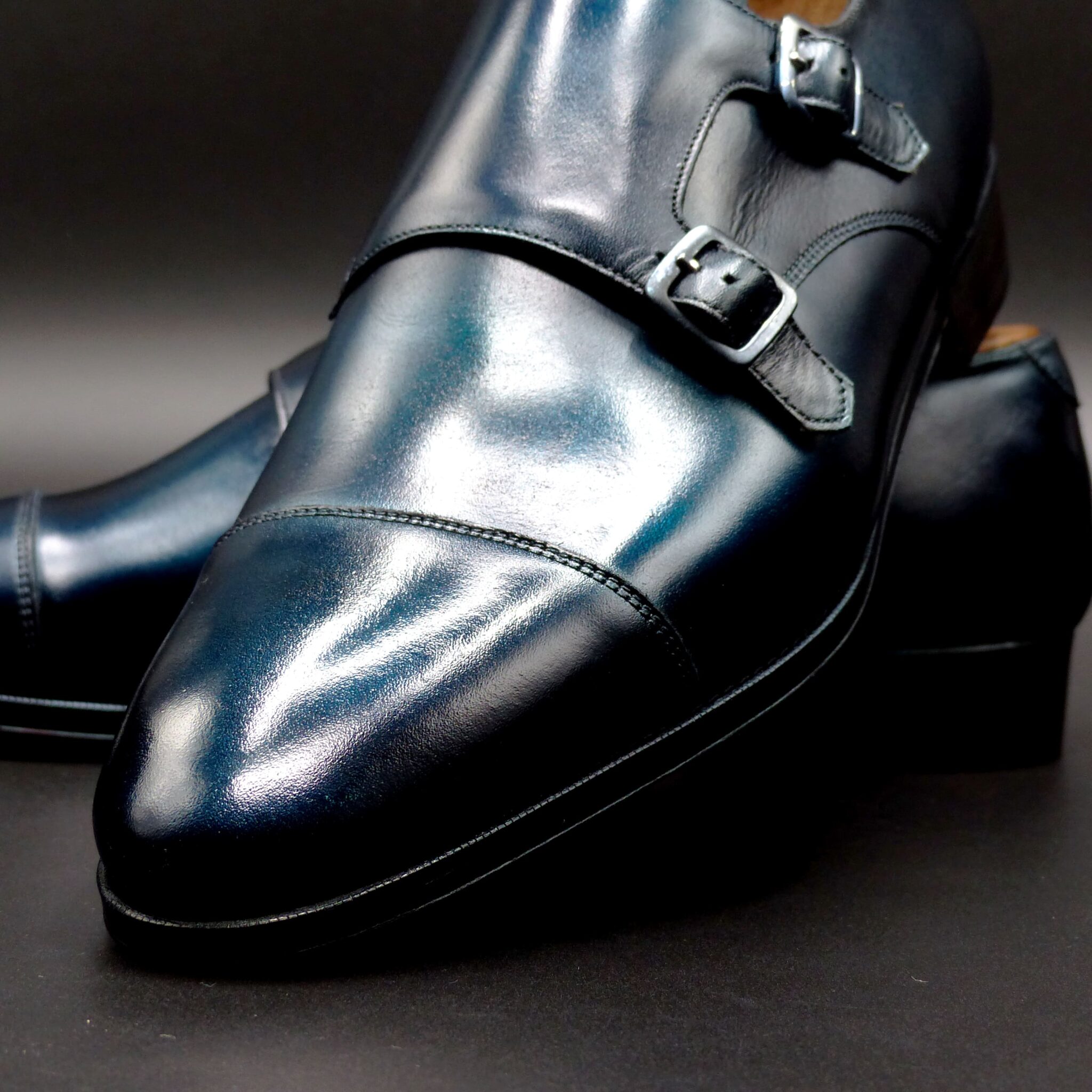
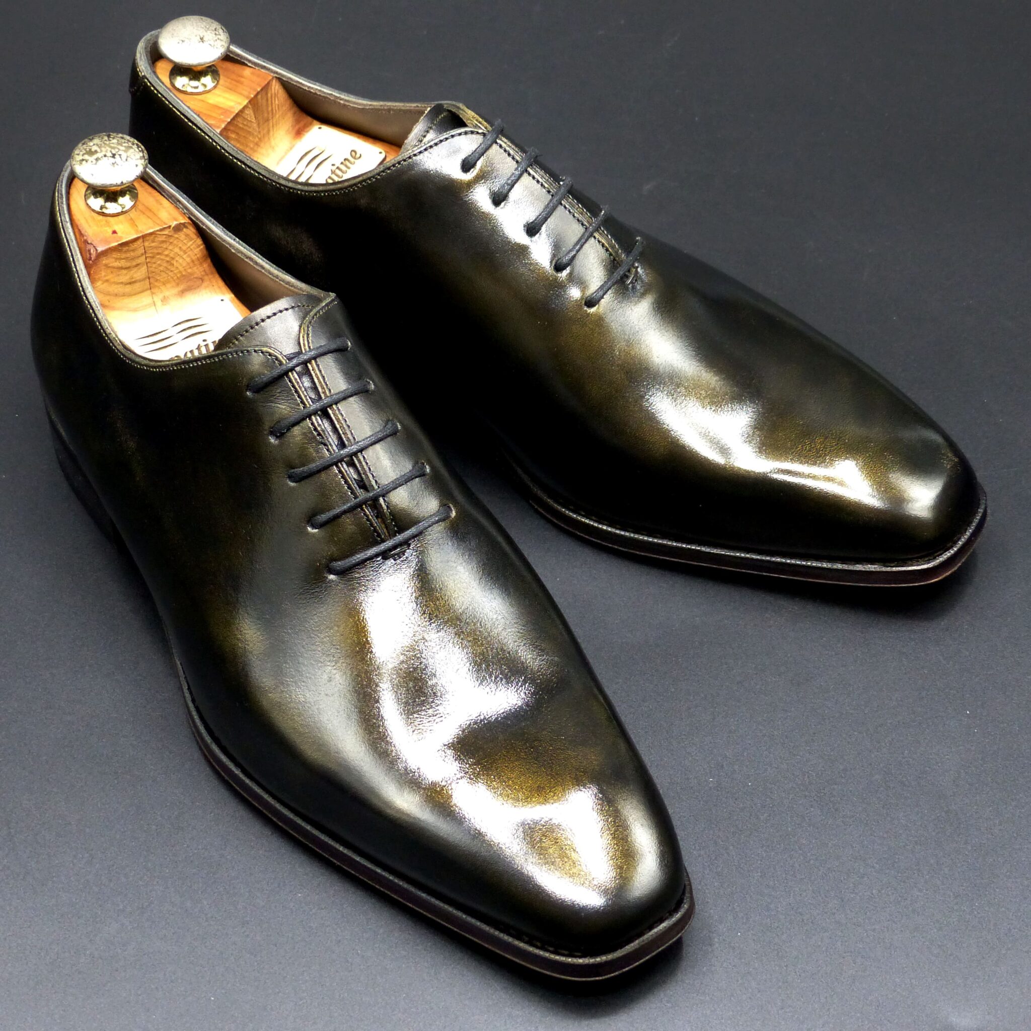
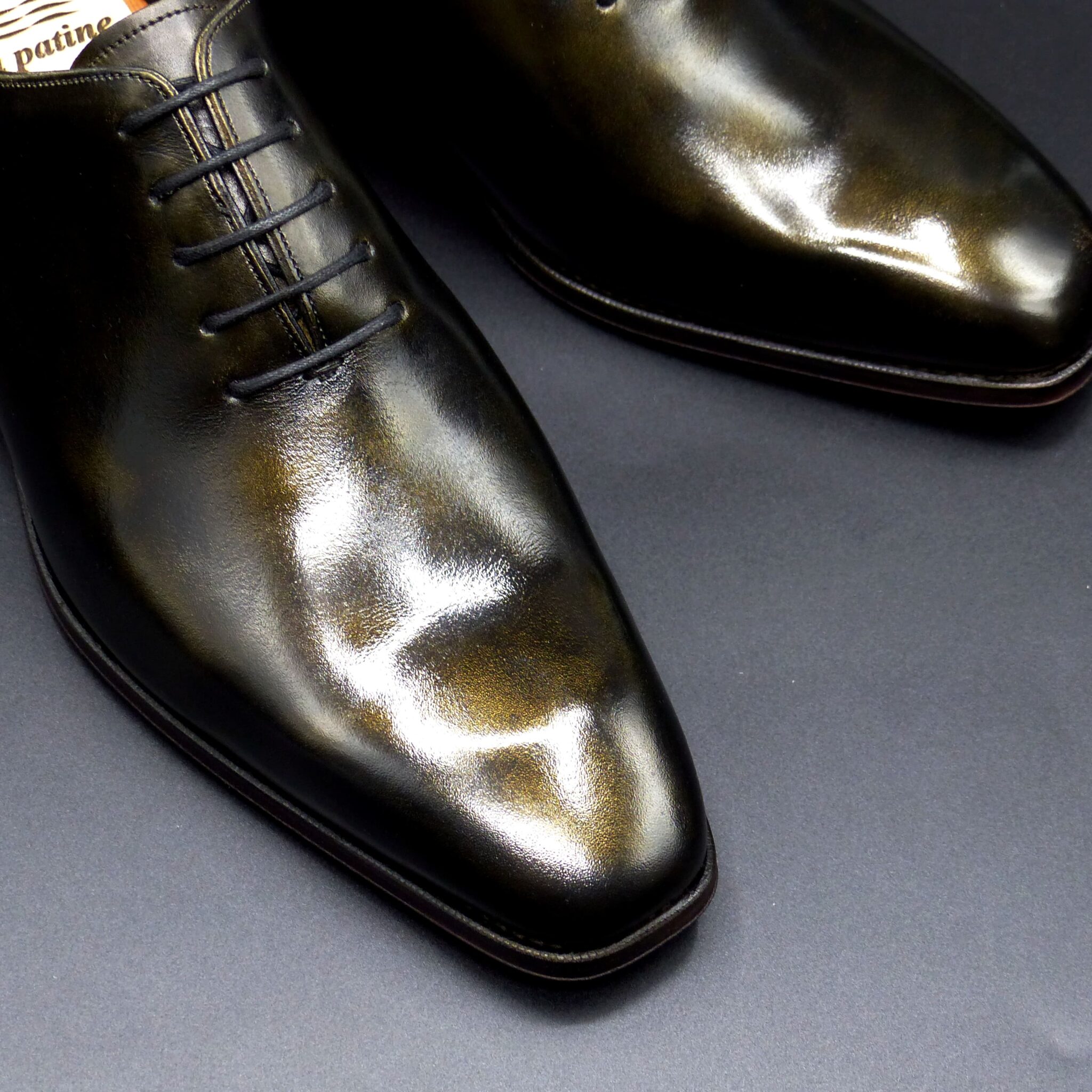
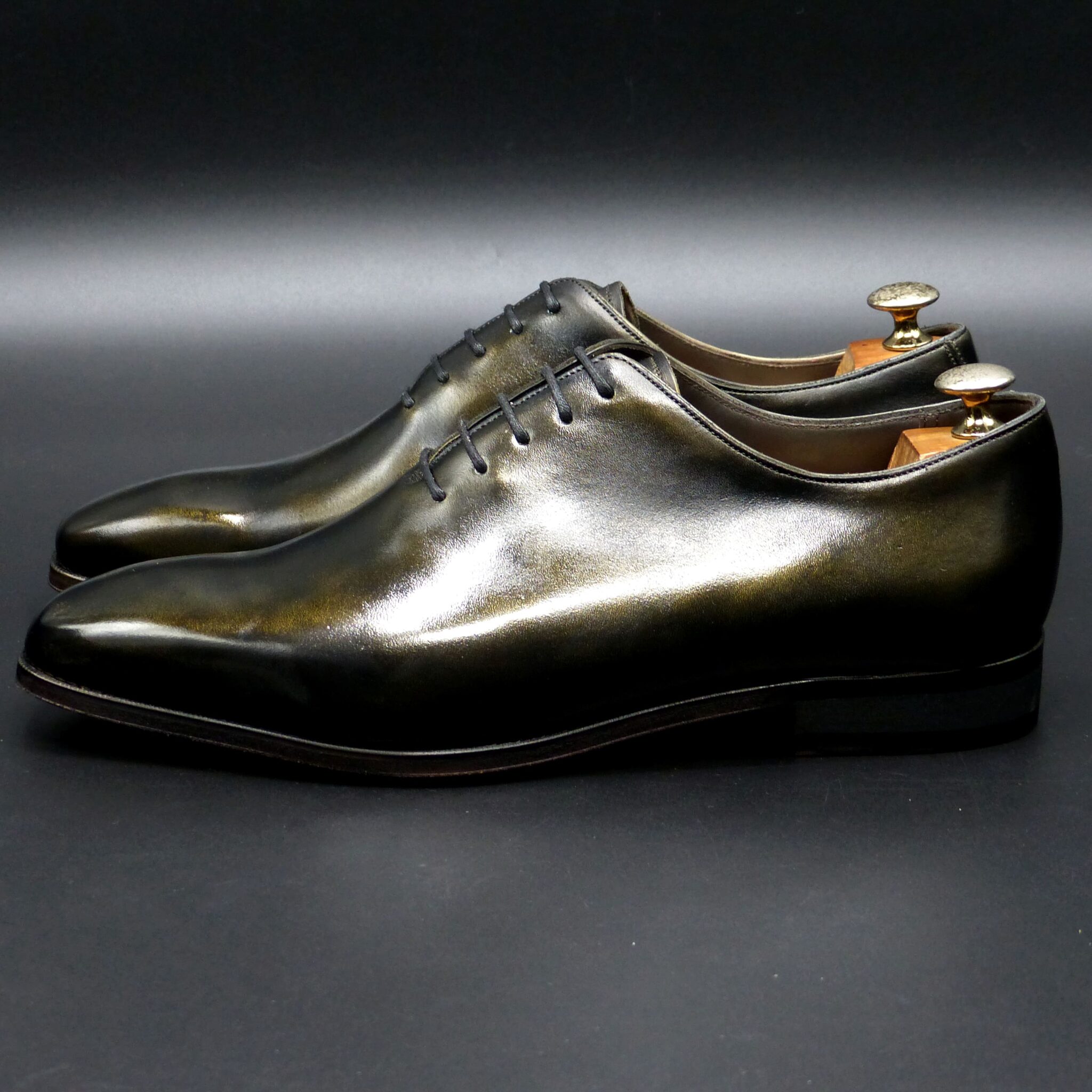
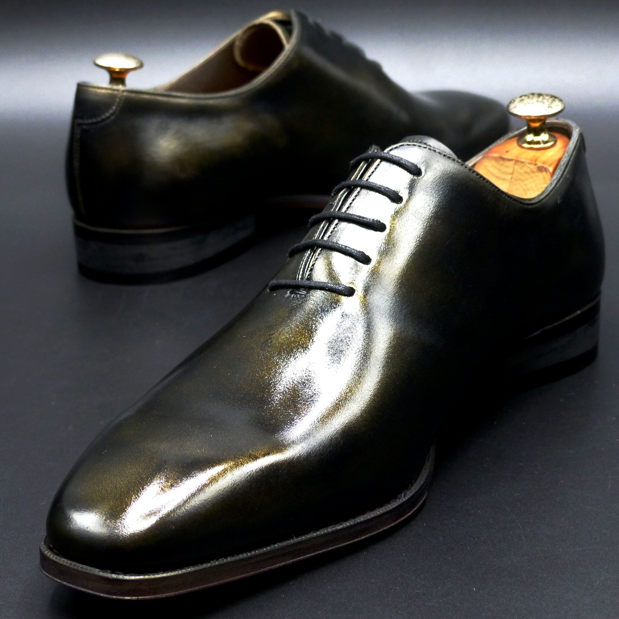
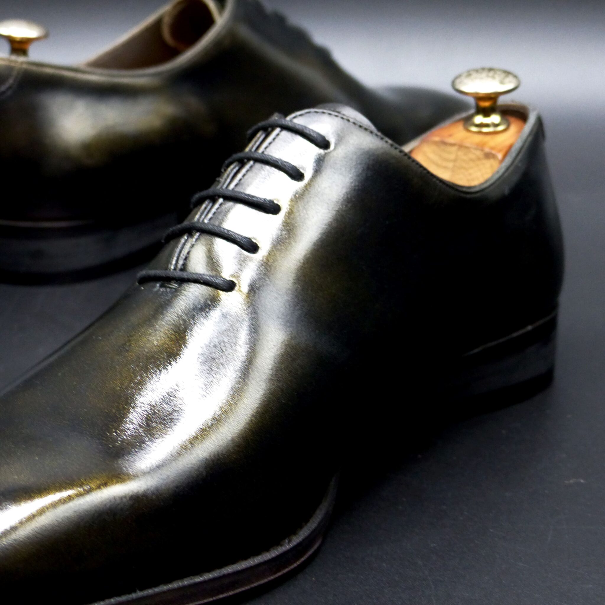
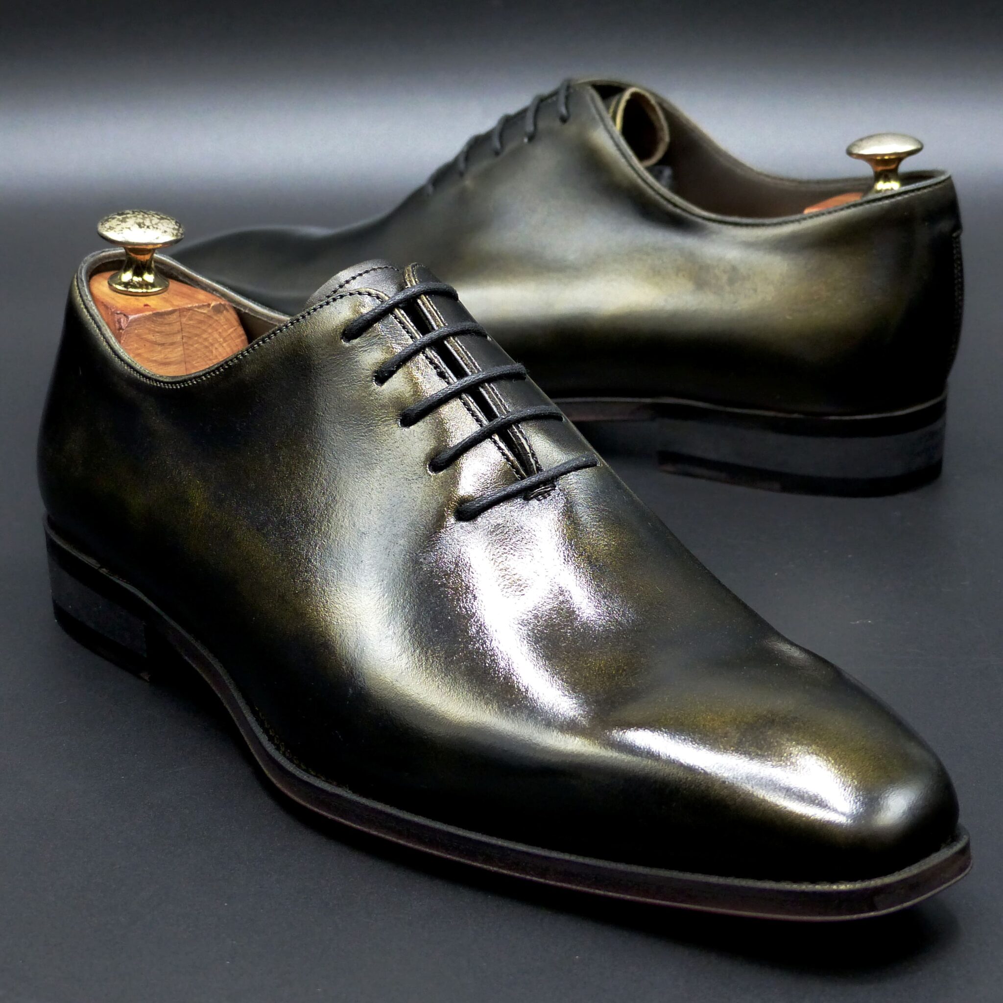
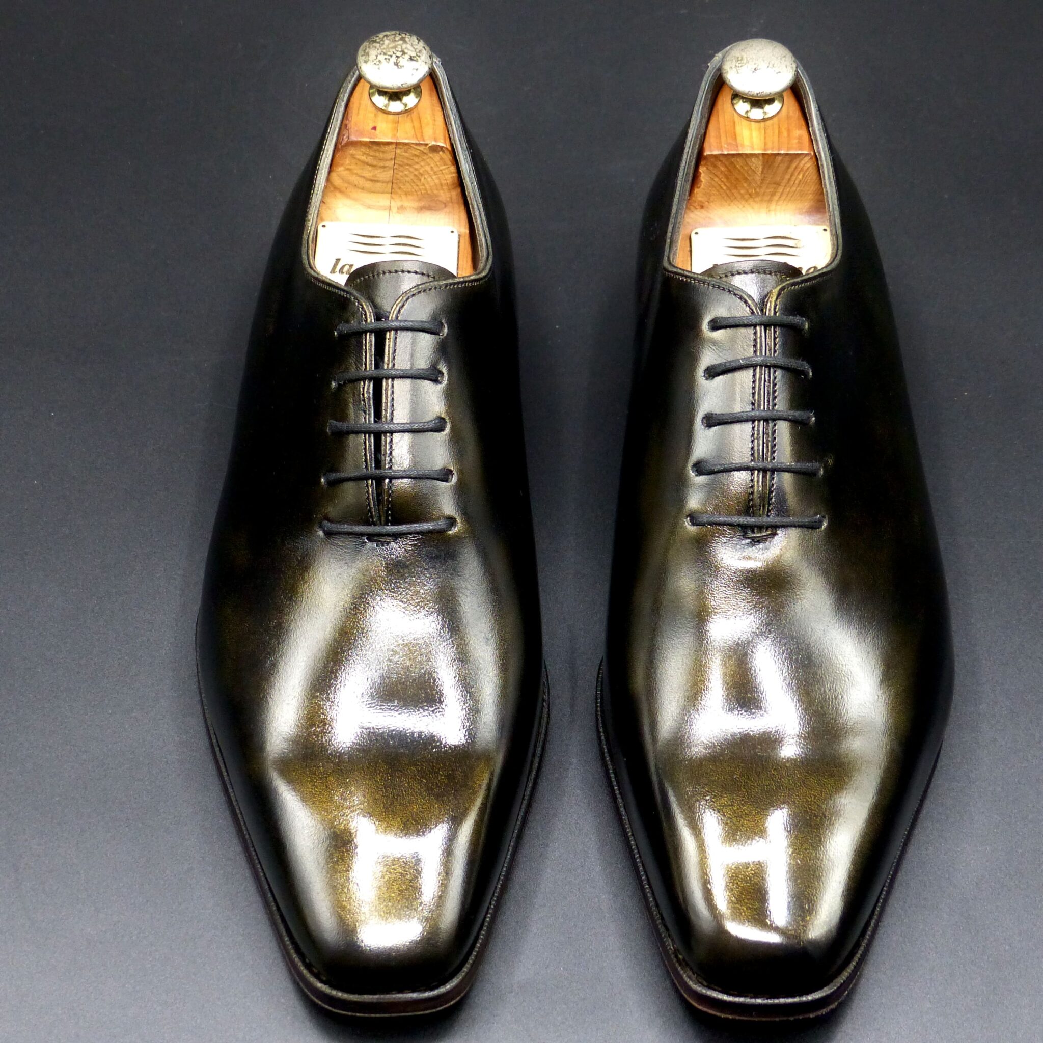
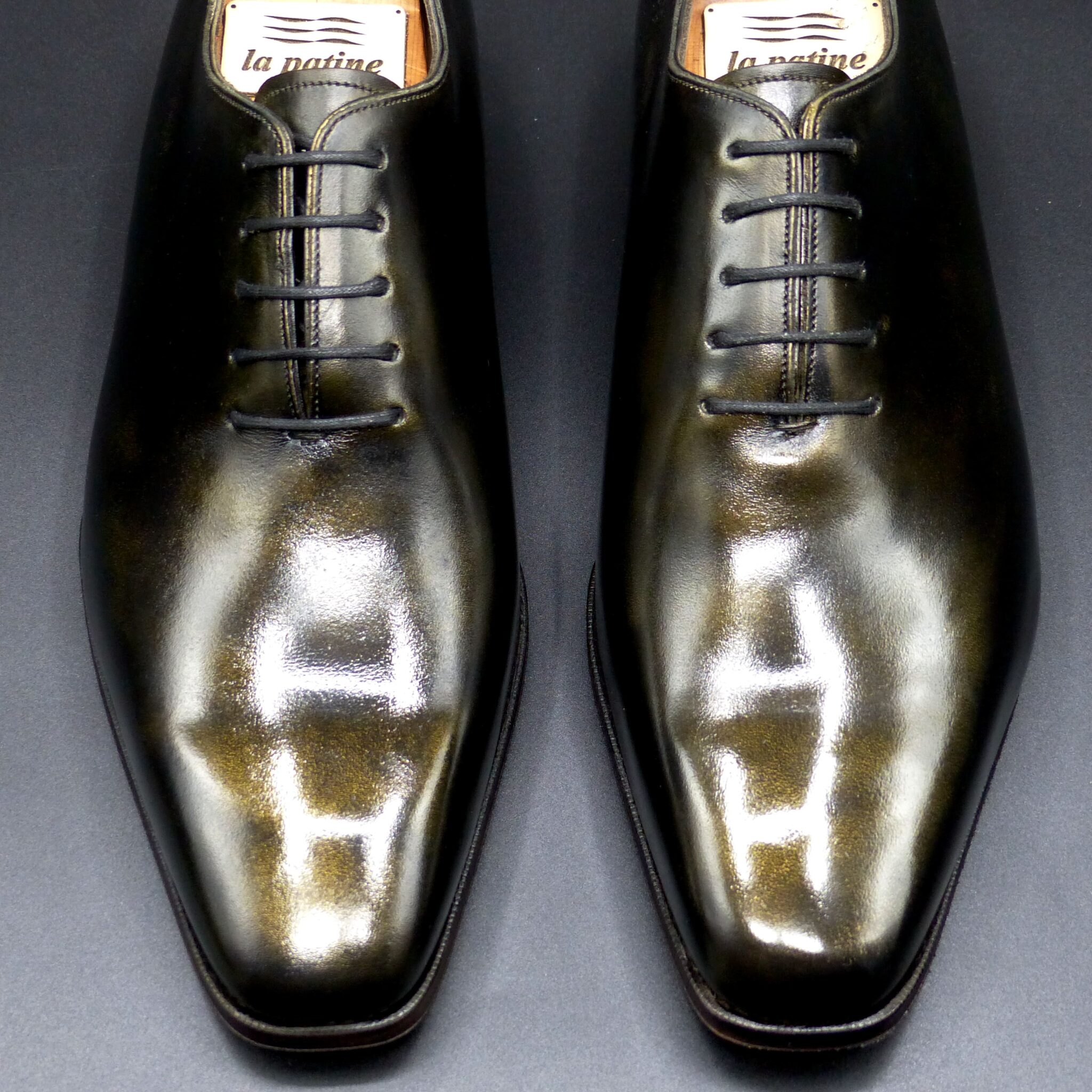
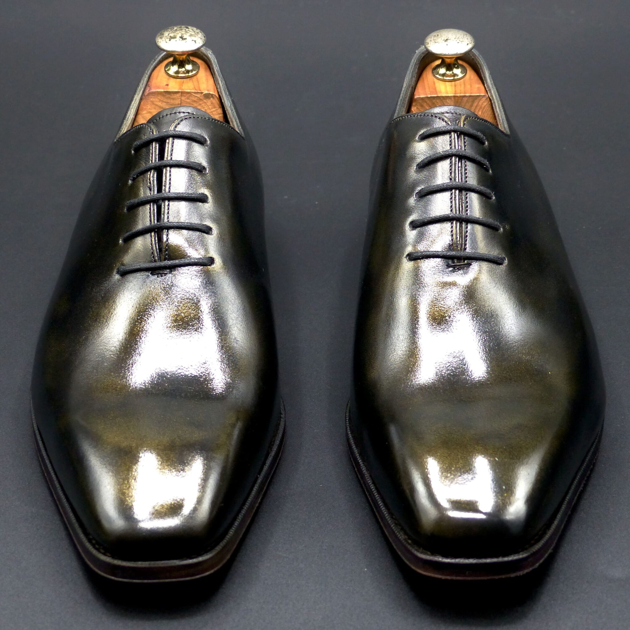
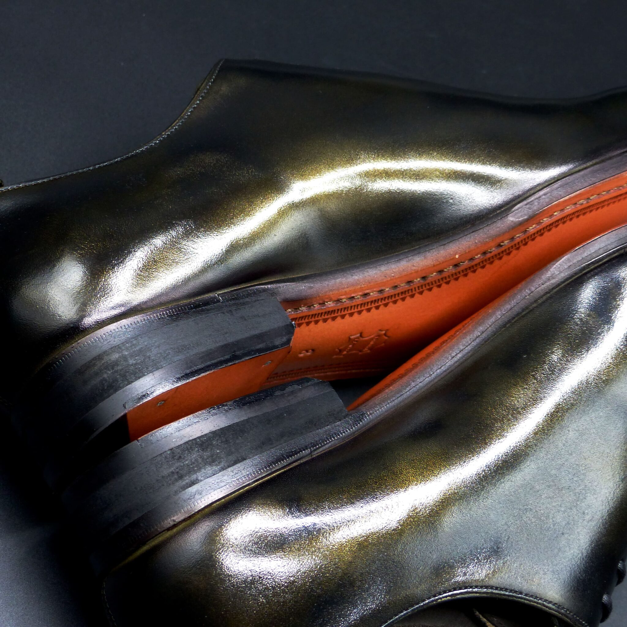
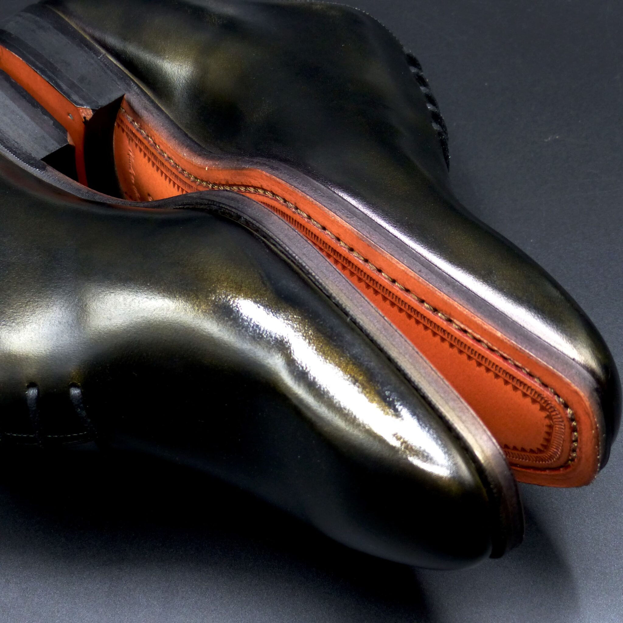
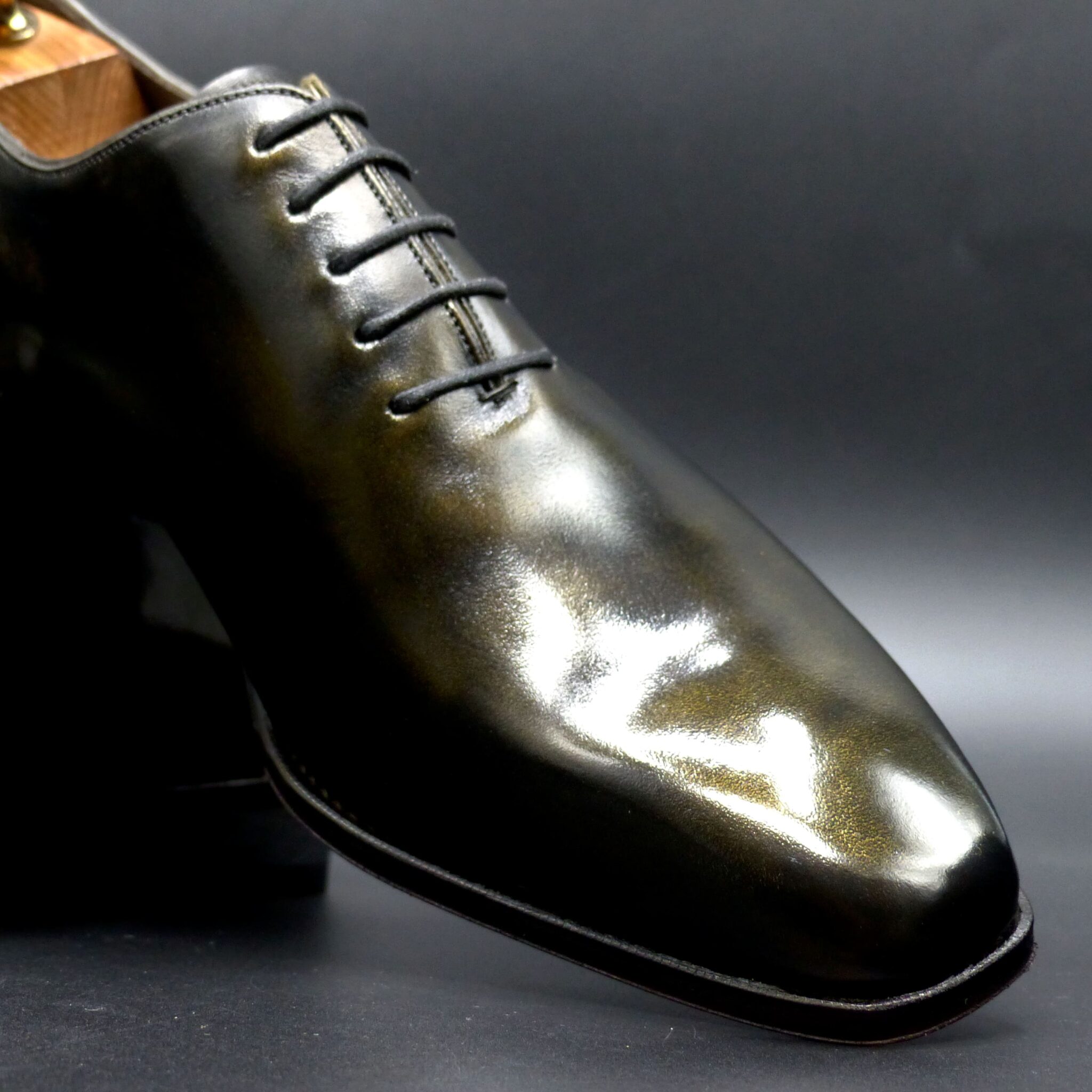
Wモンク
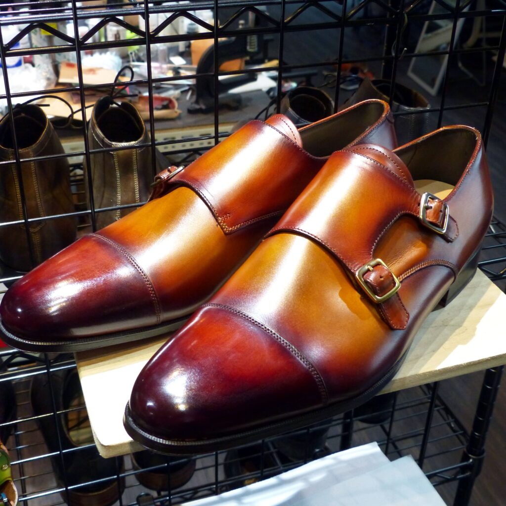
color name;
[ Hi-iro ]
緋色
Double Monk
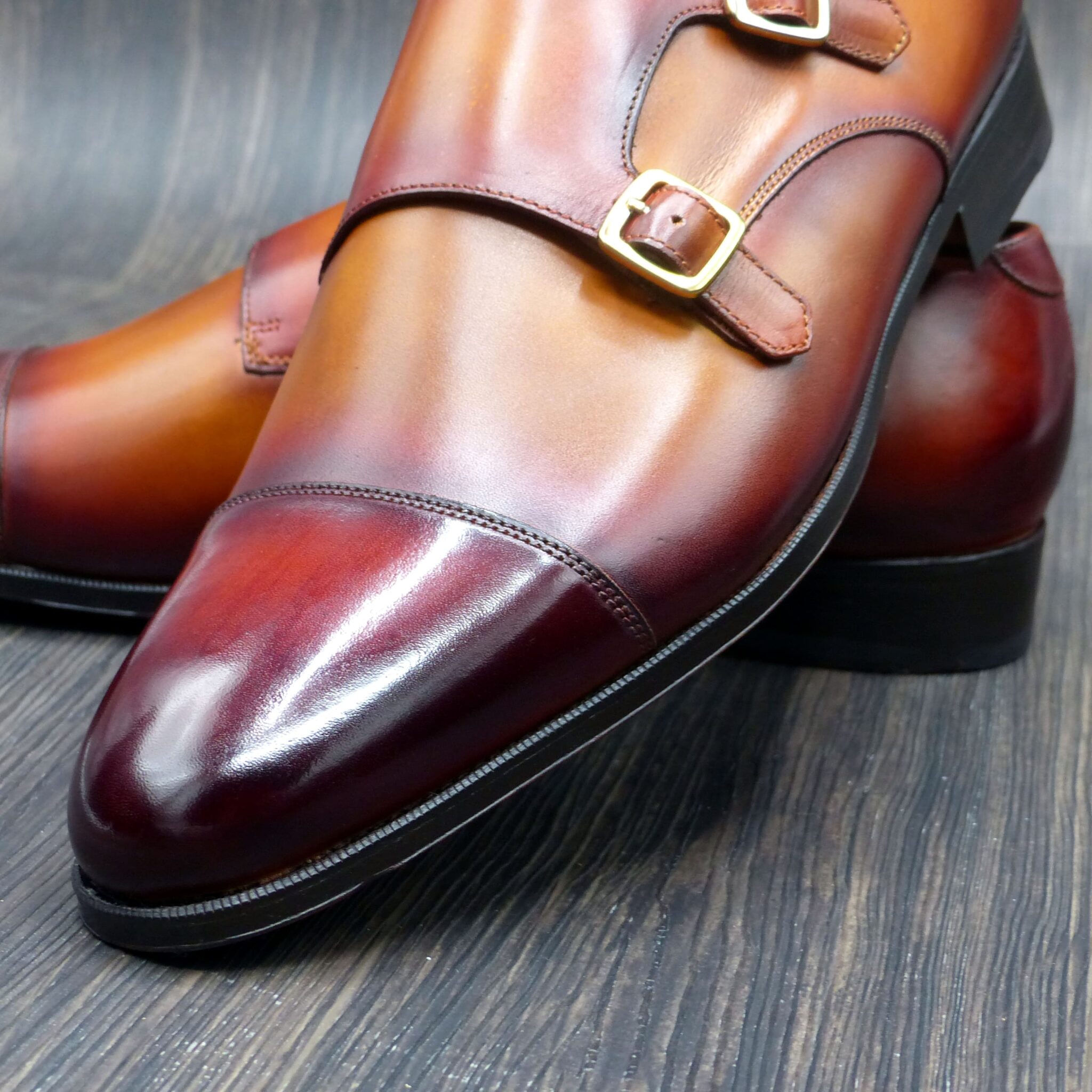

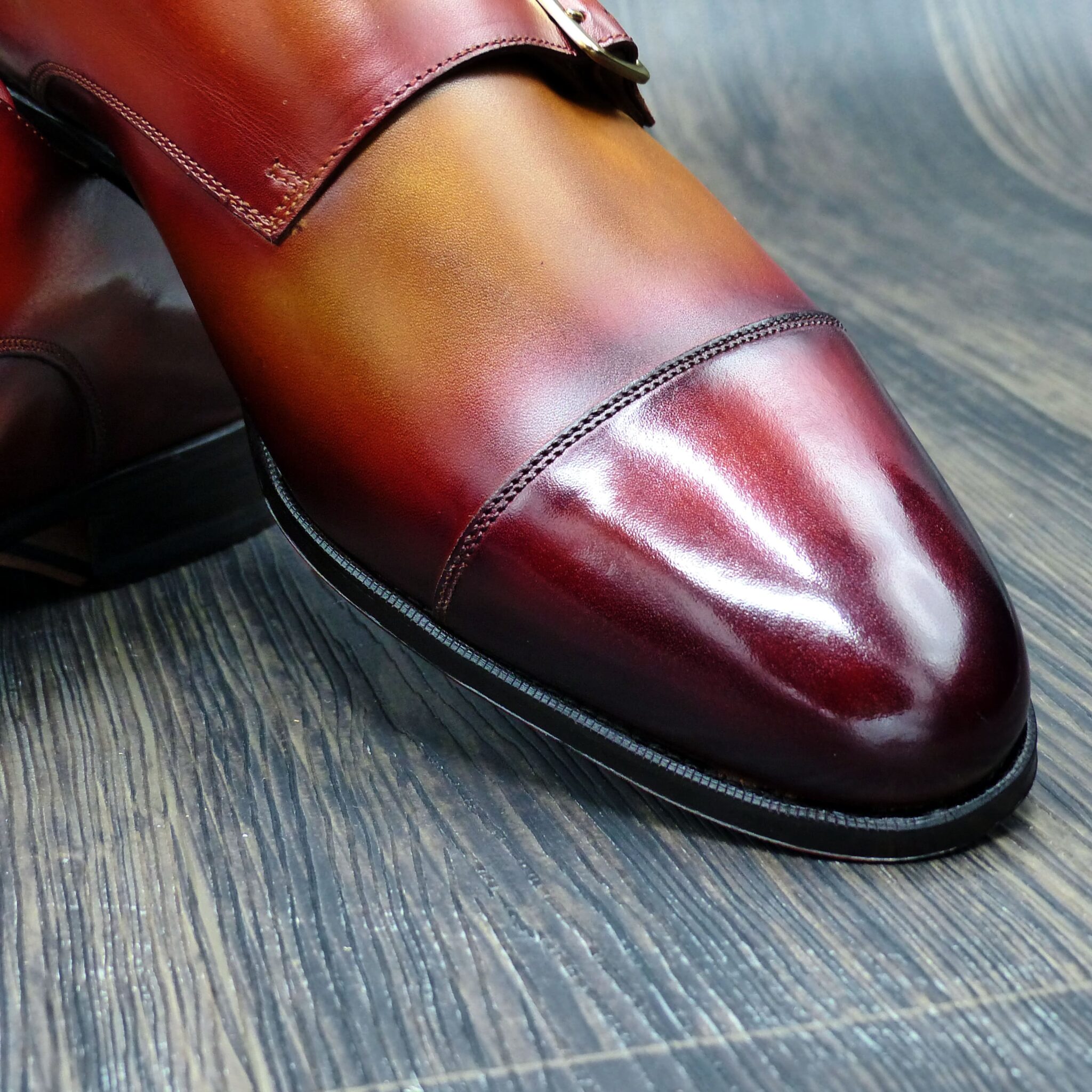
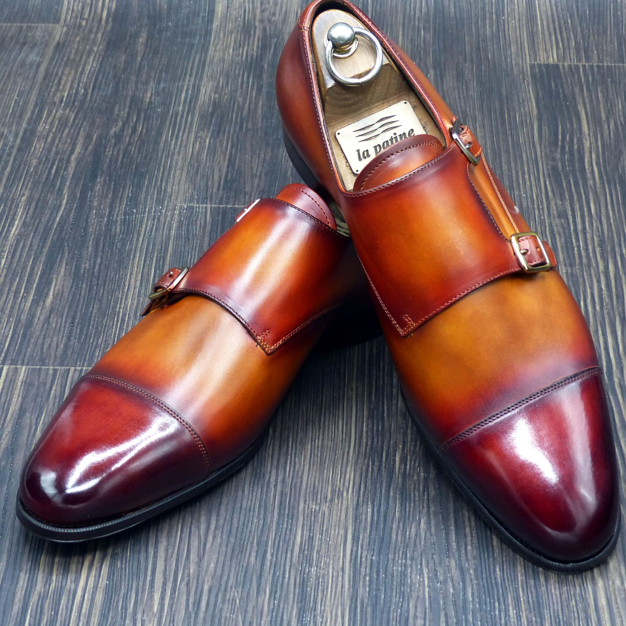
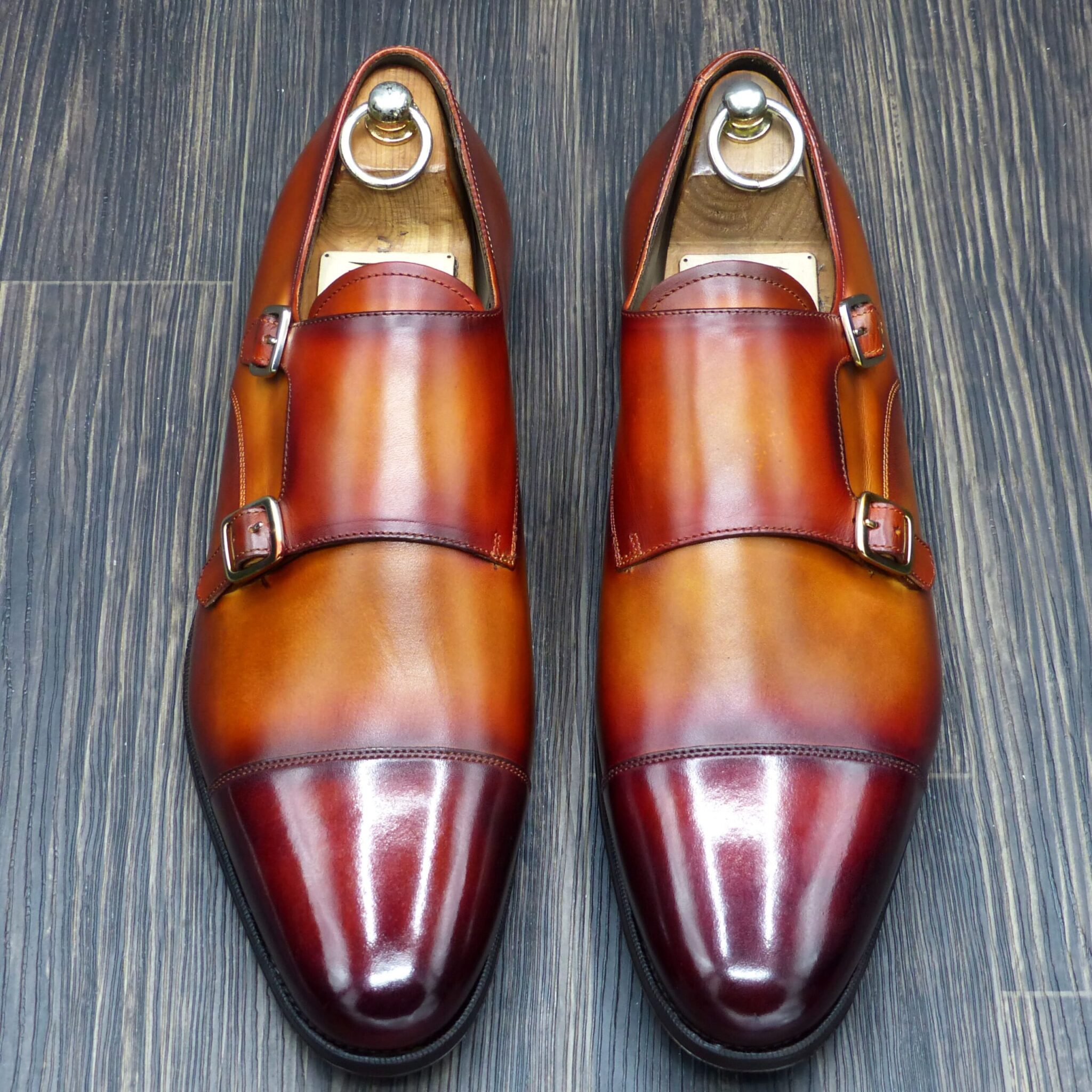

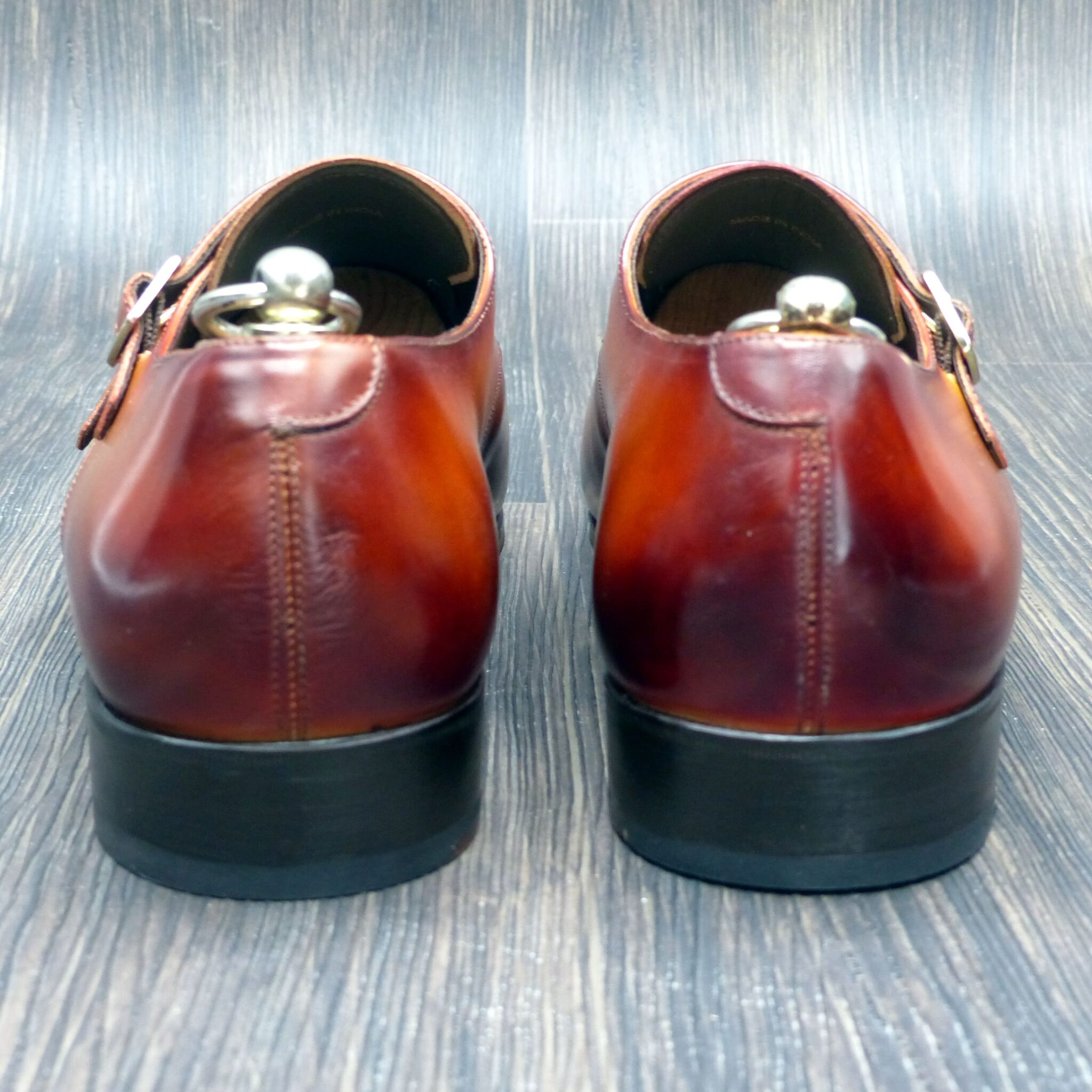
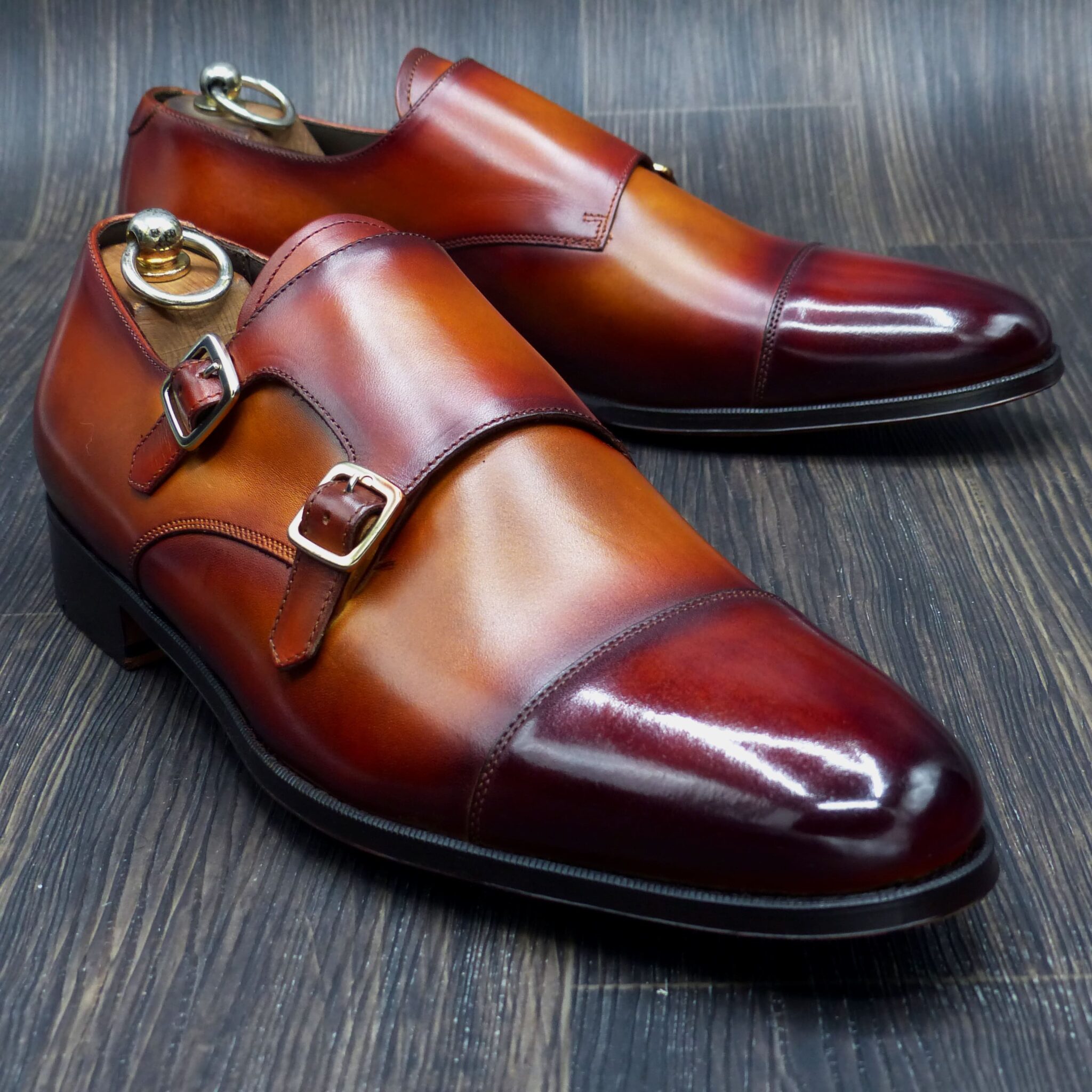
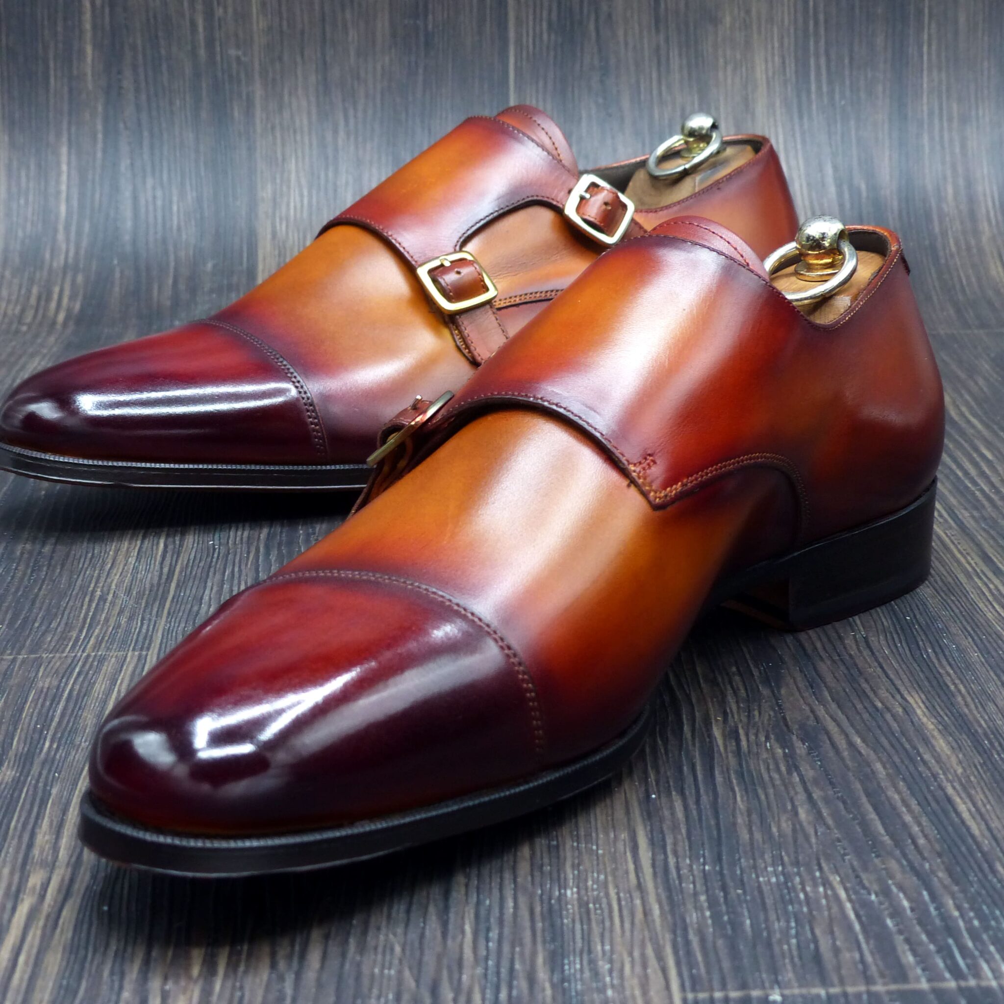
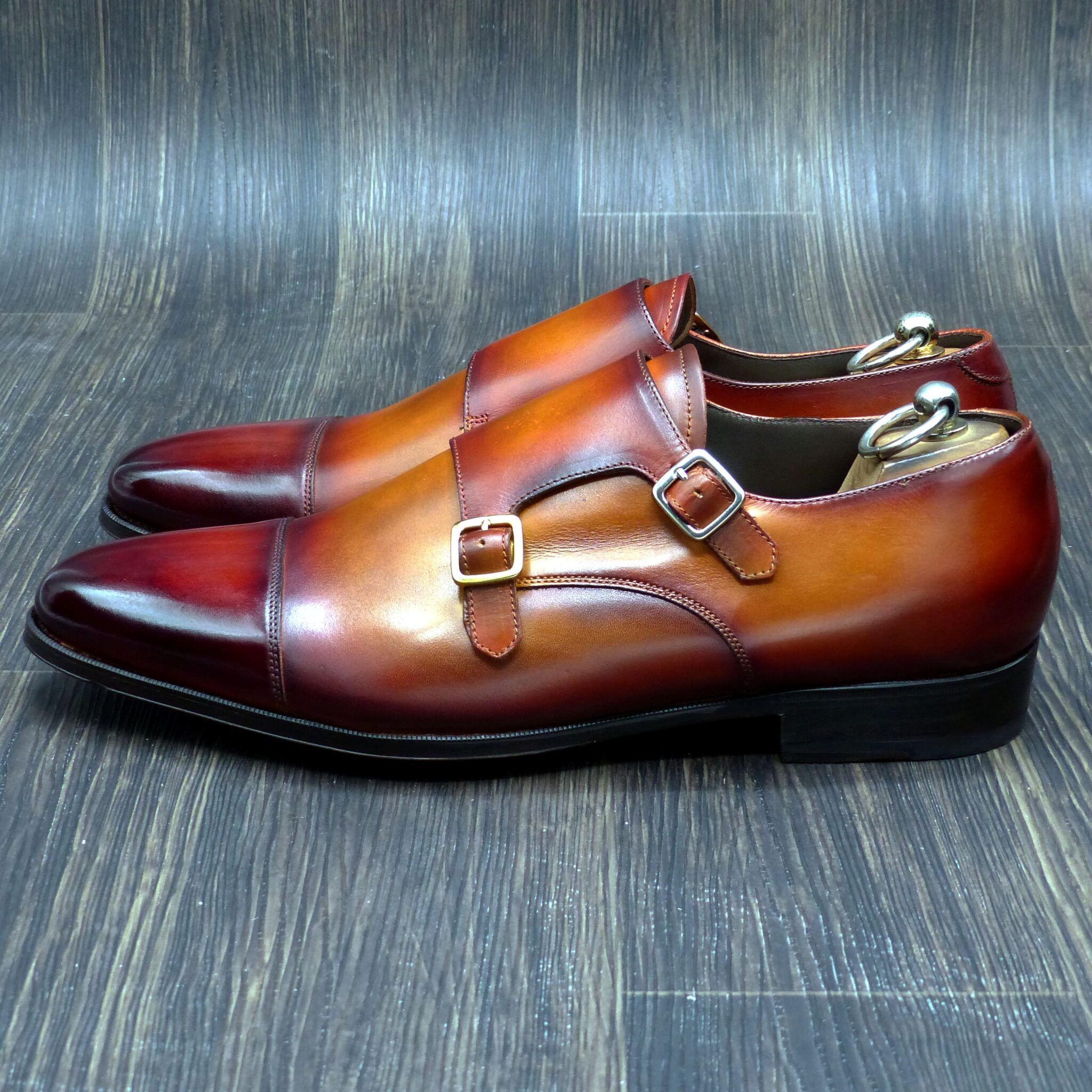
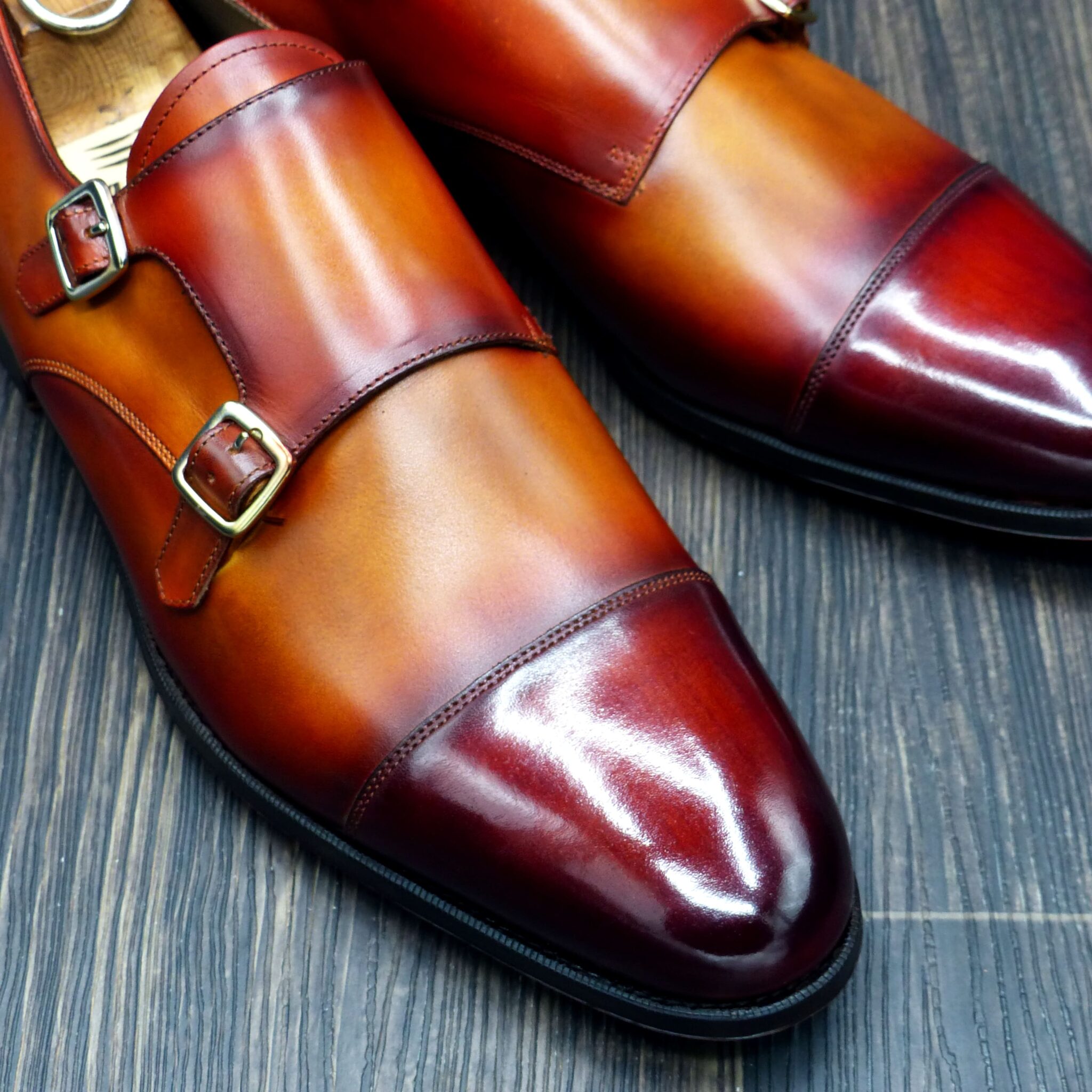
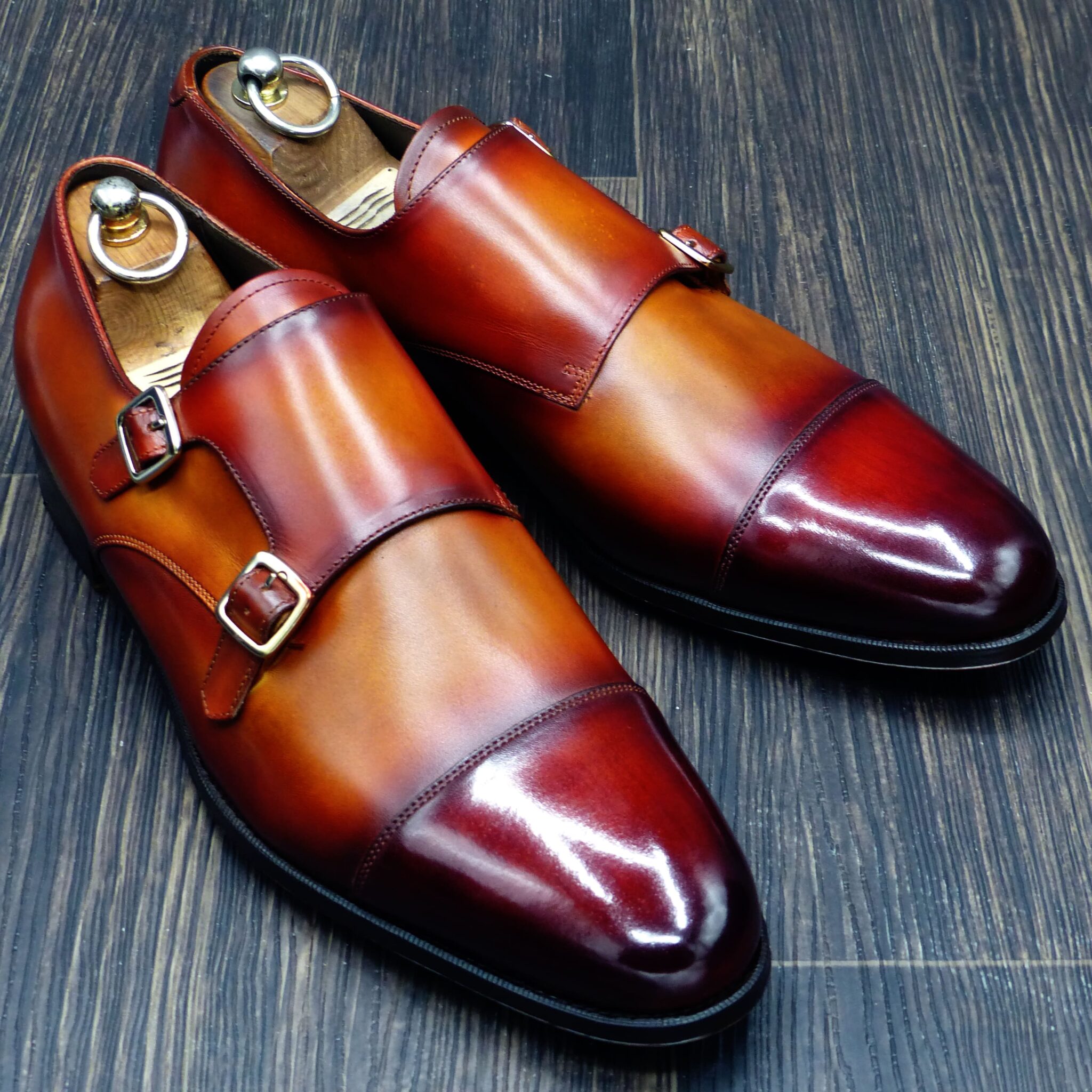
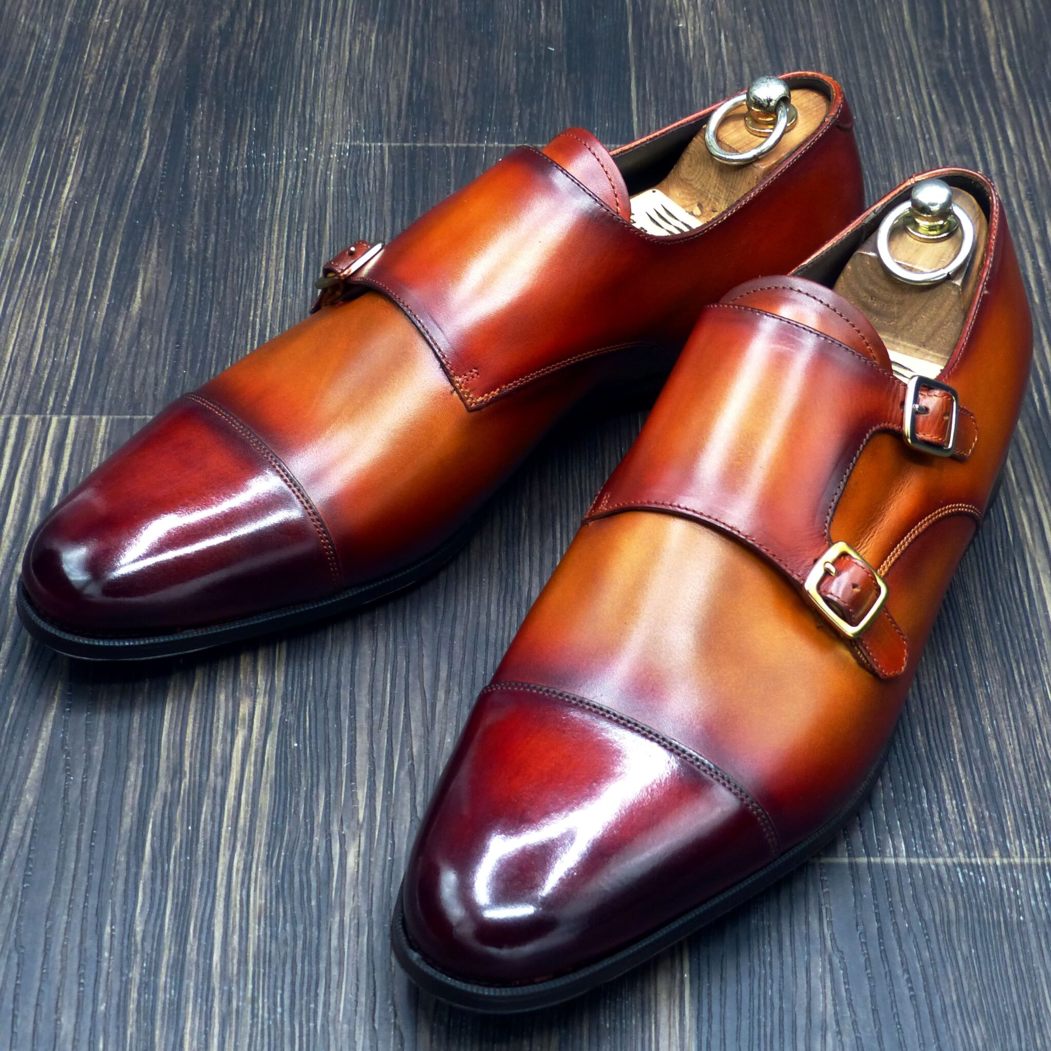
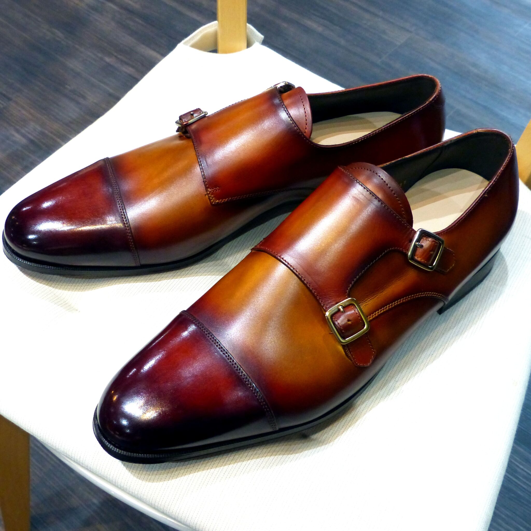
■ 緋色(ひいろ)とは
◉ 概要
緋色とは、やや黄みを帯びた鮮やかな赤で、朱色にも近いが、より赤味が強いのが特徴です。日本の伝統色の中でも特に格式が高く、古くから位階制度・装束・神事において重用されてきた色です。
■ 古代日本での使用シーン
◎ 貴族の正装(平安時代)
- 「衣服令(いふくりょう)」では、色が身分や地位を明確に示すものとされ、緋色は五位以上の官人に着用が許されました。
- 男性の「袍(ほう)」や女性の「十二単(じゅうにひとえ)」にも取り入れられ、特に**高貴な女性の中衣(なかぎぬ)**として象徴的な存在でした。
◎ 神社・仏閣・神事
- 緋色は「神聖」「魔除け」の意味合いを持ち、鳥居・幟・神楽装束にも多く用いられました。
- 火や太陽を象徴し、神前での清浄性や結界の意味を担う色とされました。
◎ 武士の装束(中世以降)
- 鎌倉・室町期には、武士の陣羽織や戦装束にも使われ、勇敢さ・名誉・忠義の象徴として定着。
■ 色構成
- ベース色:赤(朱赤)
- 黄味のニュアンス:ややオレンジがかっている(※鉛丹や紅花を原料とすることが多い)
現代でいえば、RGB 200/37/0 程度のビビッドな赤系。
■ 象徴するもの
象徴 | 意味 |
高貴さ | 官位・格式の象徴 |
神聖性 | 清浄、結界、神との繋がり |
魔除け | 邪気を払う力を持つと信じられた |
生命力 | 火・血・太陽を思わせるエネルギー色 |
■ 緋色の文化的重み
緋色はただの「赤」ではなく、日本の社会制度・宗教観・美意識に深く結びついた色です。
明治以降も、儀礼服や祝賀の場で重用され、「ハレ(晴れ)の色」として現代に至るまで尊ばれています。
■ What is Hi-iro (緋色)?
◉ Overview
Hi-iro is a vivid shade of red with a slight yellow undertone—brighter than vermilion and more intense than typical crimson. Among traditional Japanese colors, it holds a particularly high status and has been used for official garments, rituals, and sacred architecture since ancient times.
■ Historical Usage in Ancient Japan
◎ Noble Attire (Heian Period)
Under the Eifuku-ryō (Clothing Decree), colors were strictly regulated by court rank. Hi-iro was permitted only for officials ranked Fifth Class and above.
It adorned garments such as hō (formal robes) and jūnihitoe (twelve-layered court kimono), especially for high-ranking women.
◎ Shrines and Sacred Rituals
Because Hi-iro symbolized purity and protection, it was widely used in Shinto shrines, including torii gates, banners, and kagura costumes.
The color also represented sacred boundaries and was associated with the sun and fire.
◎ Samurai Armor and Regalia (Medieval Era)
From the Kamakura through Muromachi periods, Hi-iro became a favored color among samurai, used in battle attire and banners to convey valor, loyalty, and honor.
■ Color Composition
- Base Tone: Bright red with a slight orange hue
- Often derived from natural pigments such as benibana (safflower) or endan (lead-based vermilion)
- Modern RGB approximation: #C82500
■ Symbolism
Theme | Meaning |
Nobility | A mark of high rank and formality |
Sacredness | A divine or purifying presence |
Protection | Used to ward off evil and misfortune |
Vitality | Represents fire, the sun, and lifeforce |
■ Cultural Significance
More than just a color, Hi-iro was a symbol of social order, spiritual purity, and aesthetic refinement in classical Japanese culture.
Its use persisted into the modern era in ceremonial clothing, celebratory decorations, and religious settings—making it a revered “color of auspiciousness and dignity.”
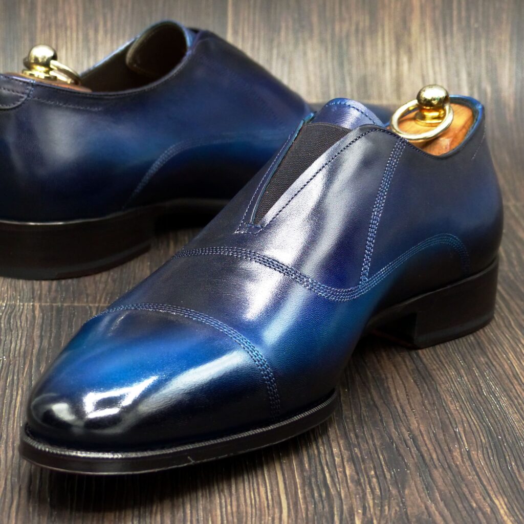
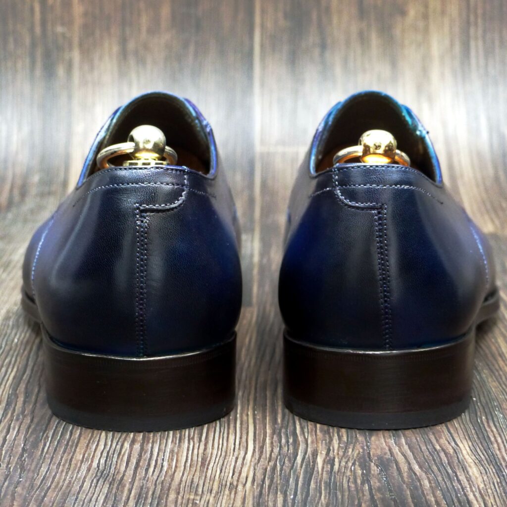
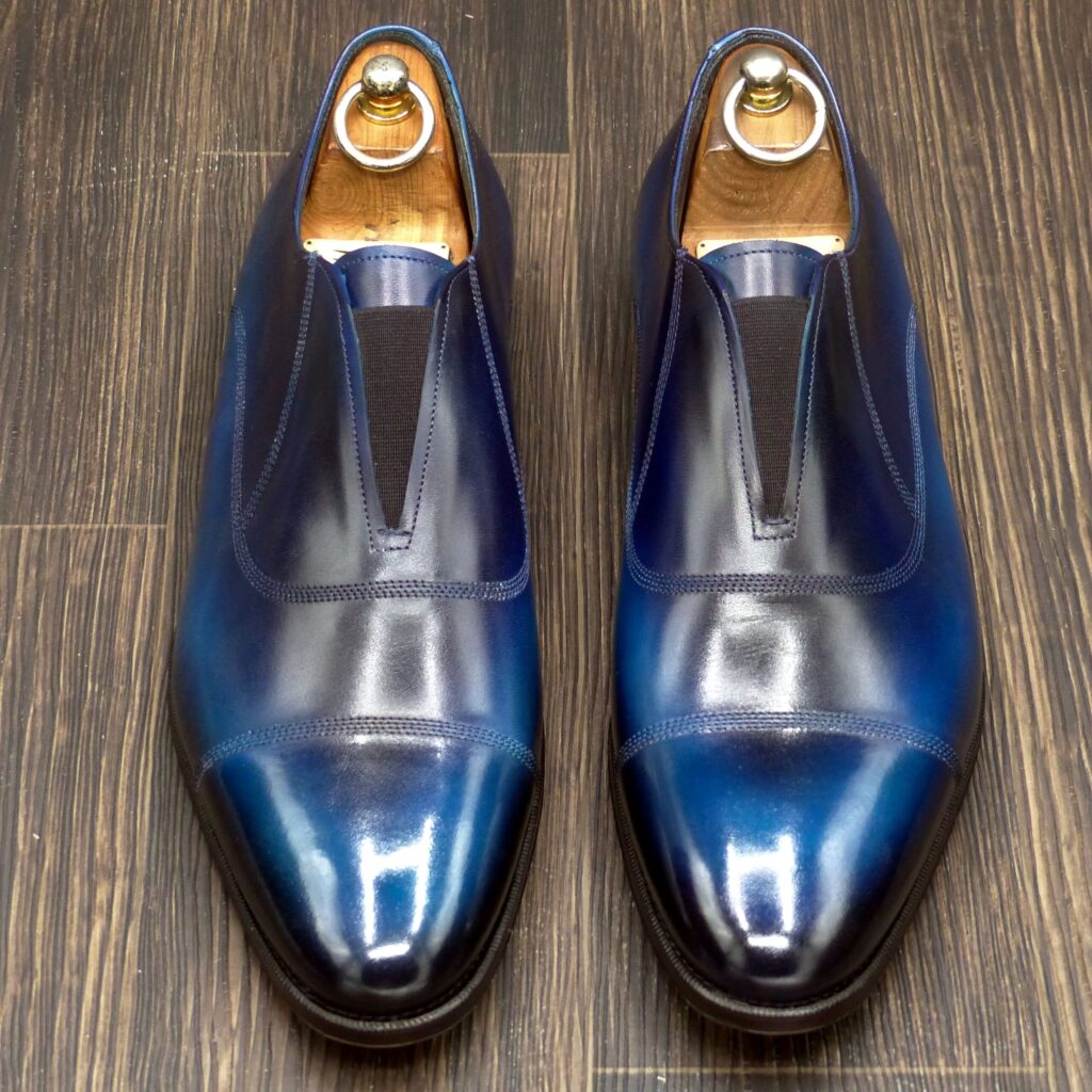
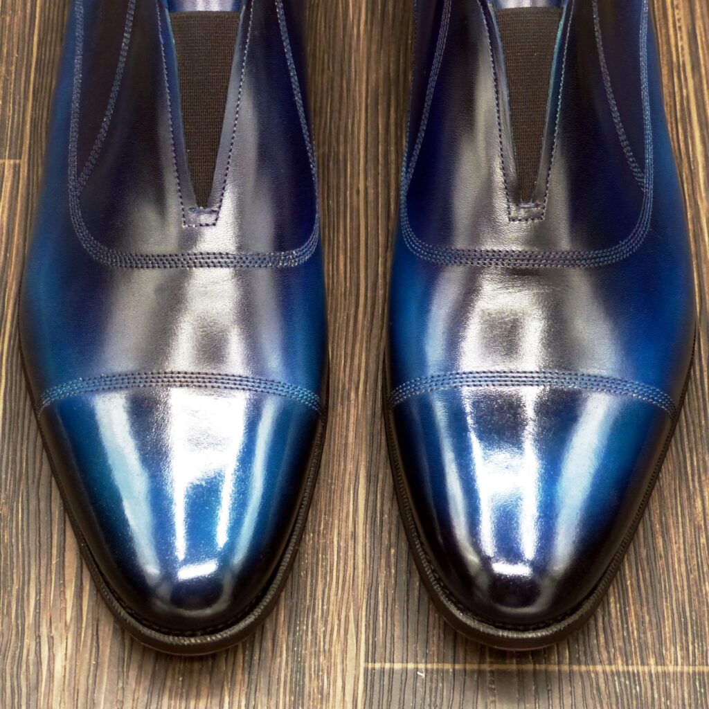
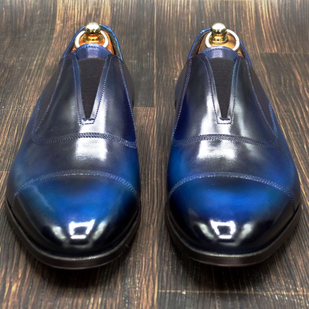
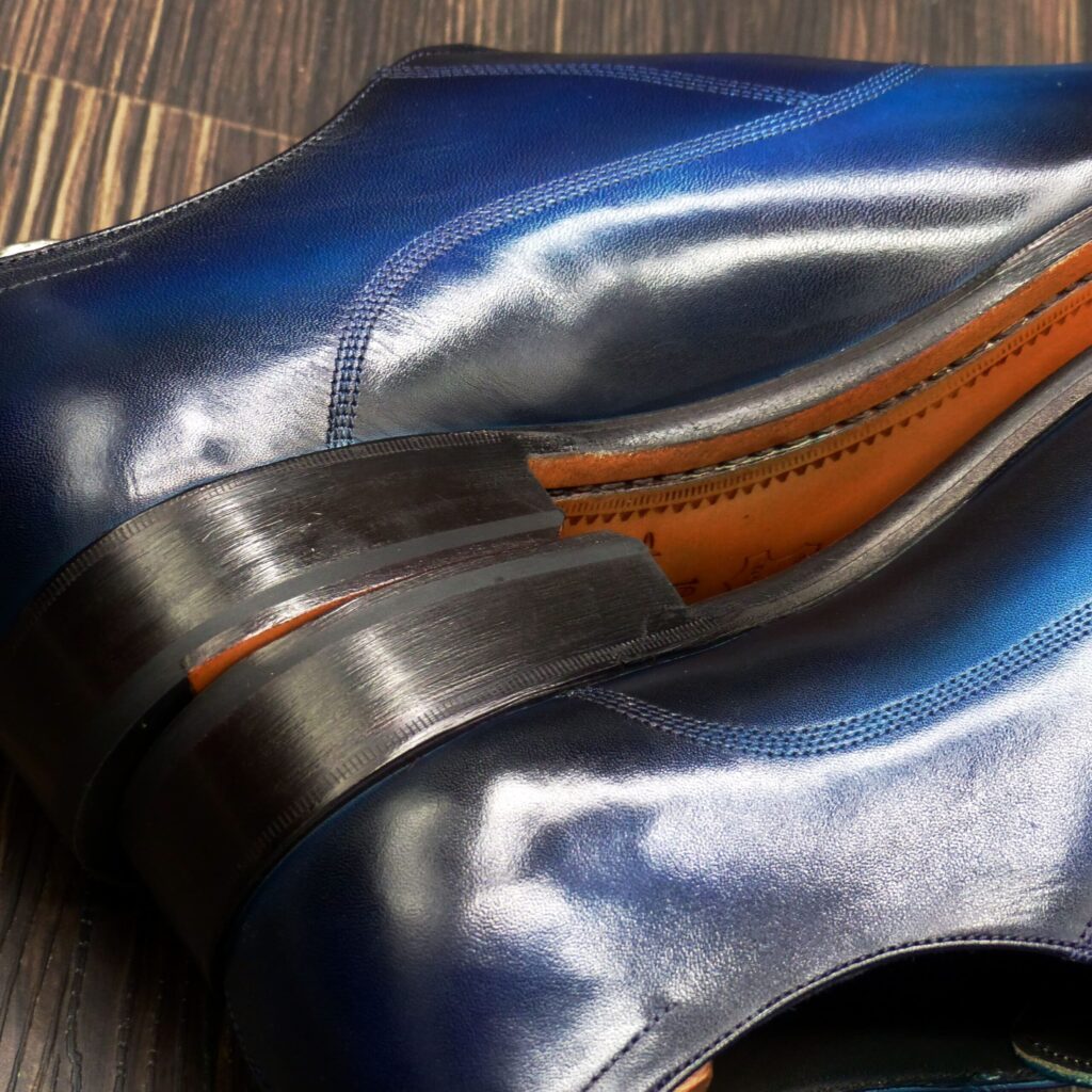
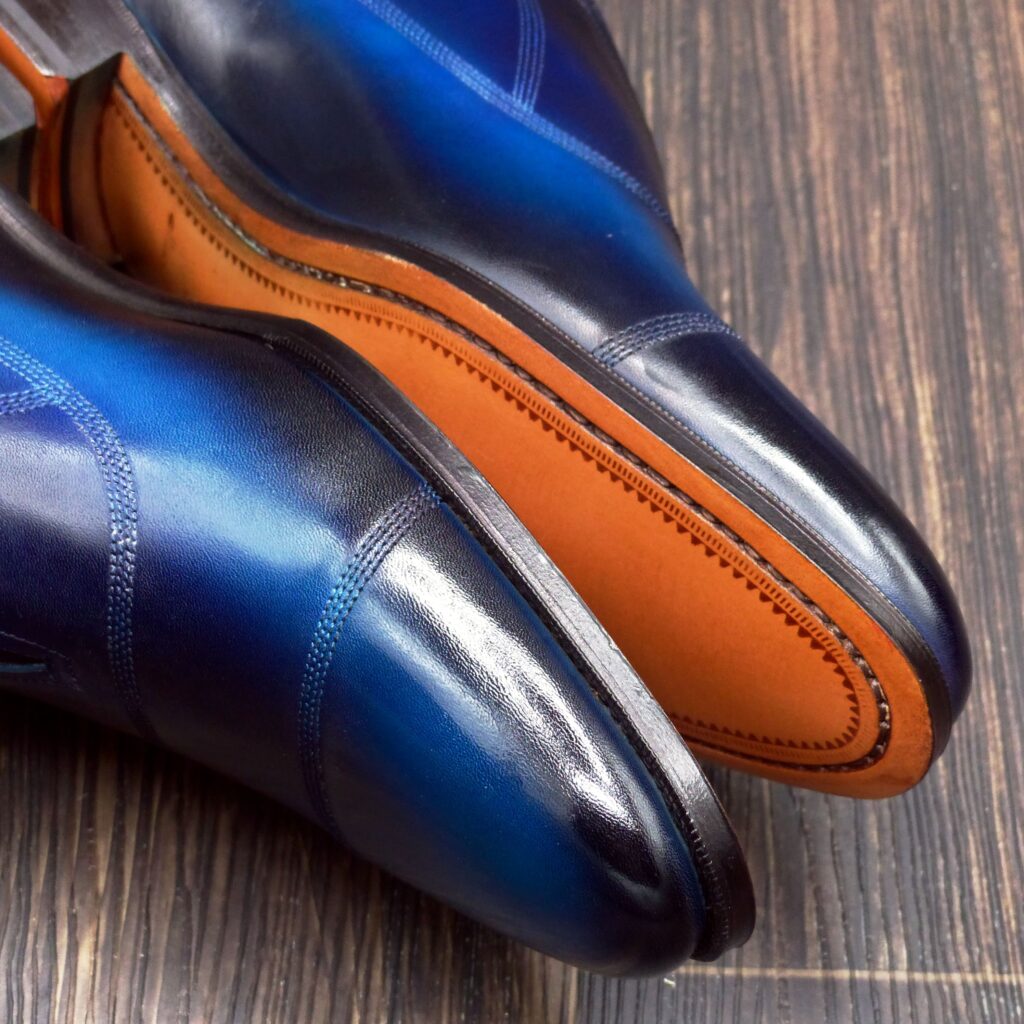
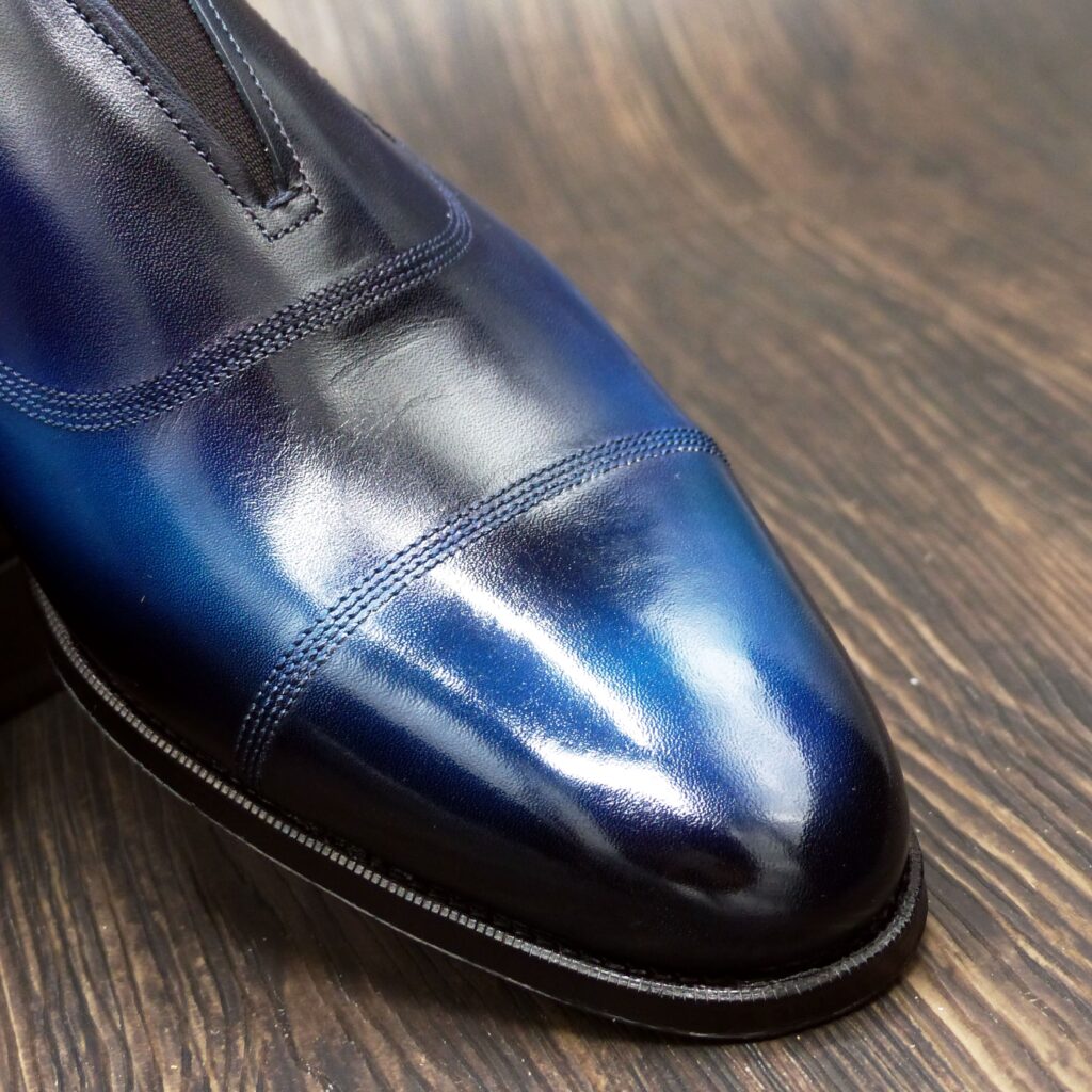
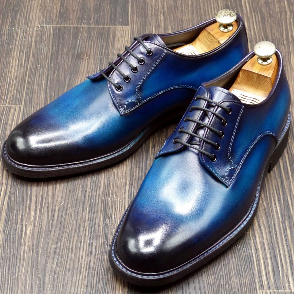
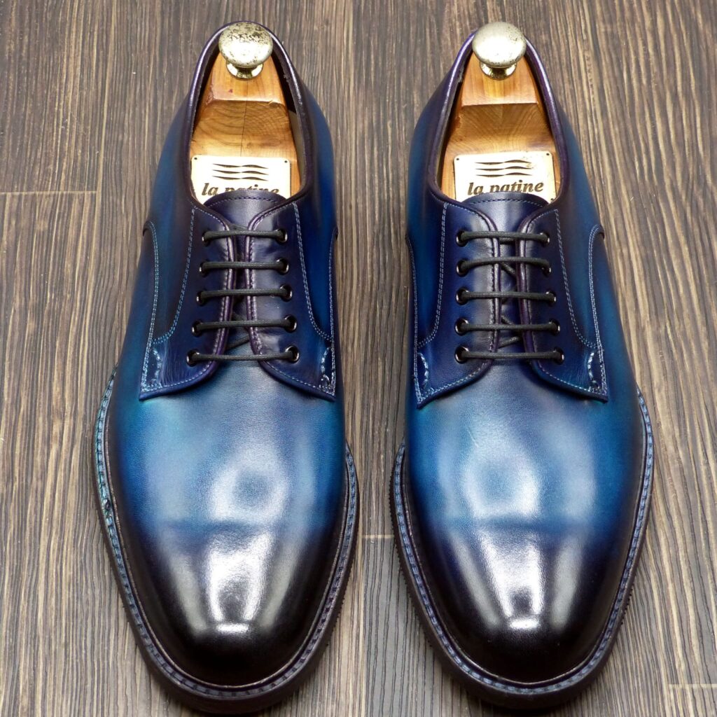
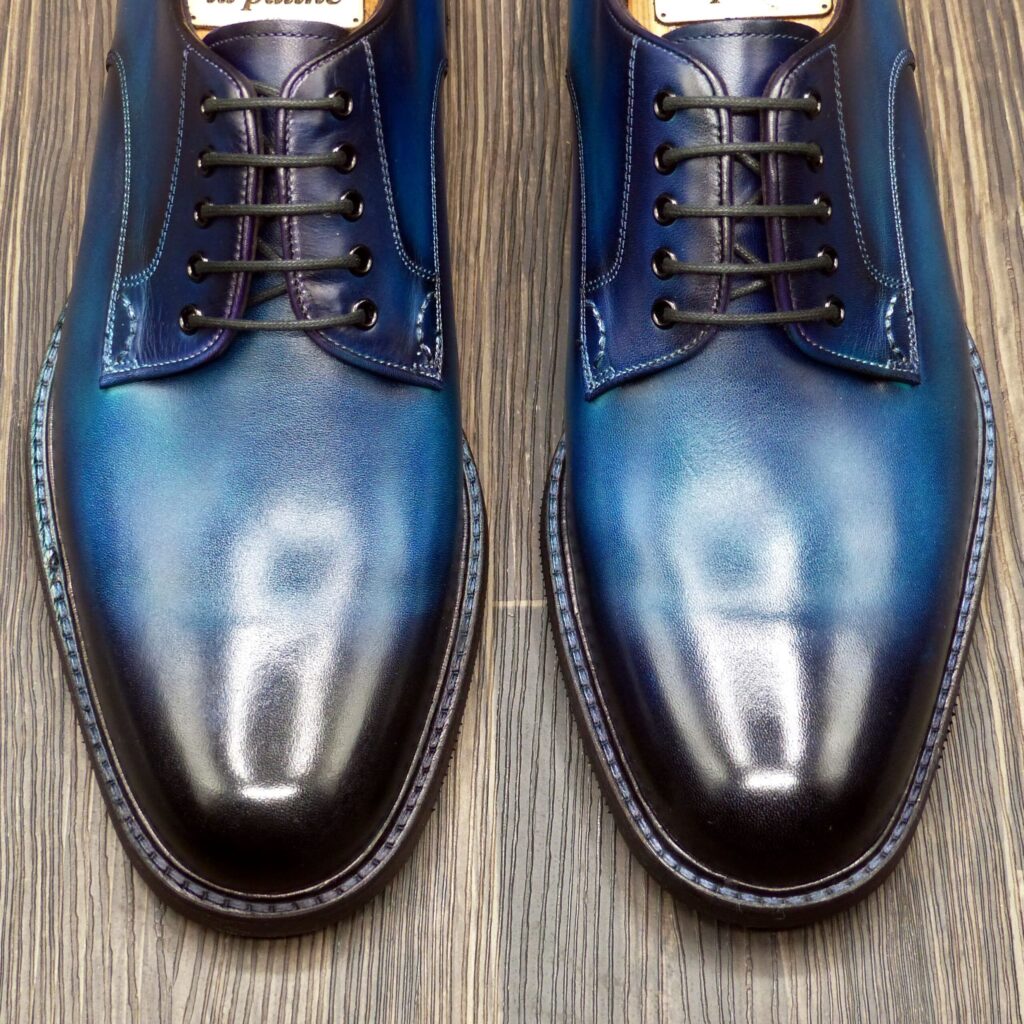
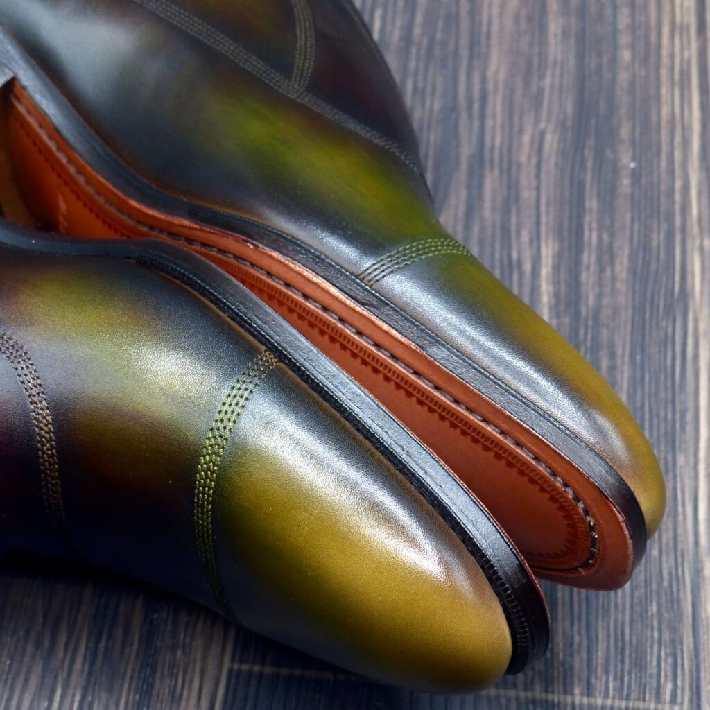
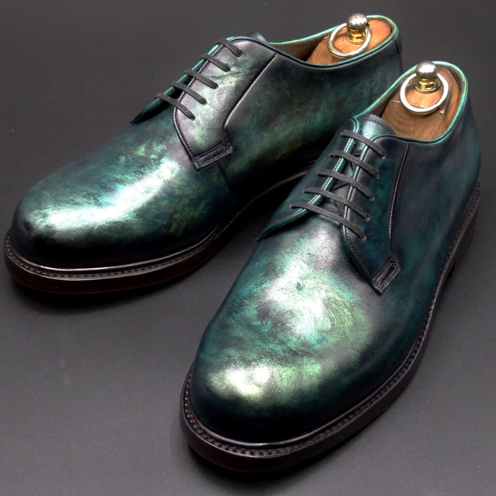
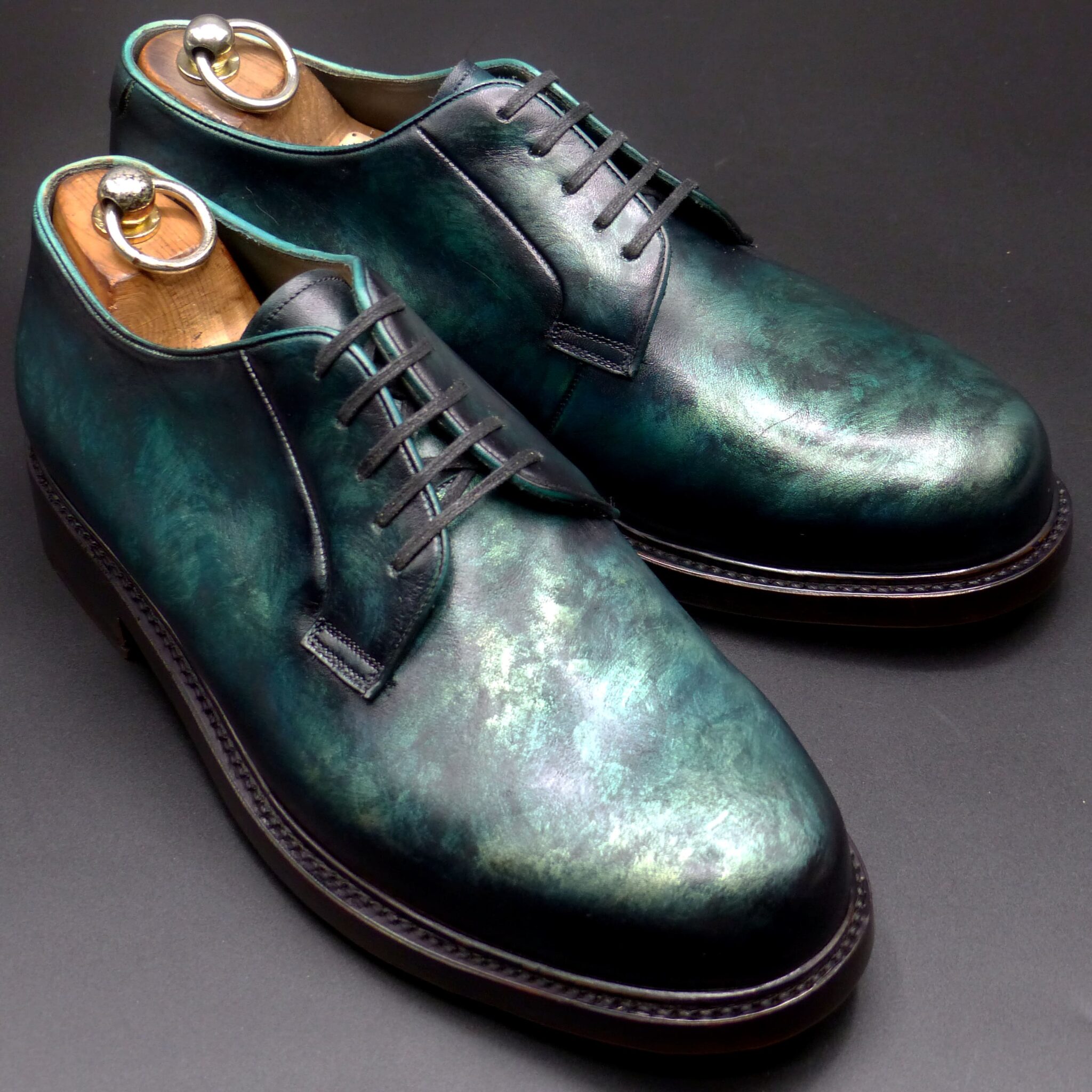
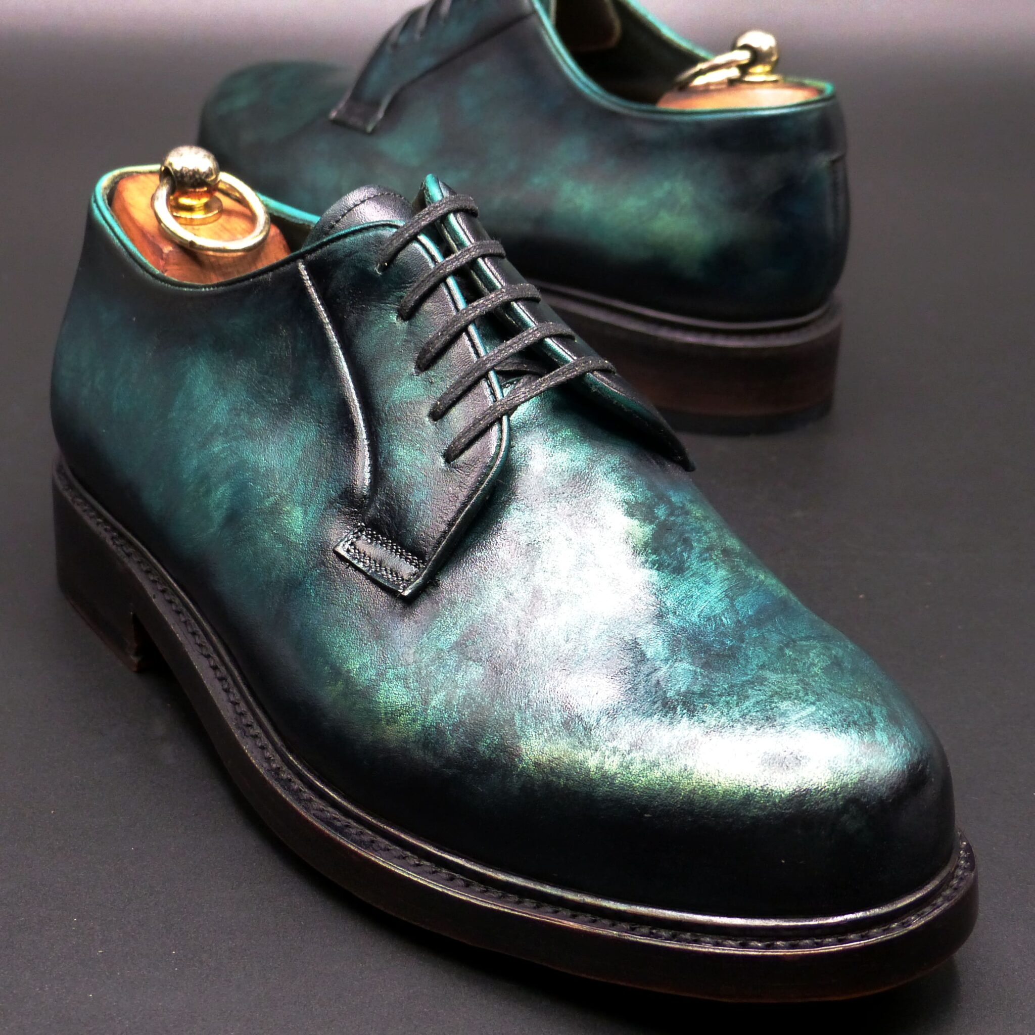
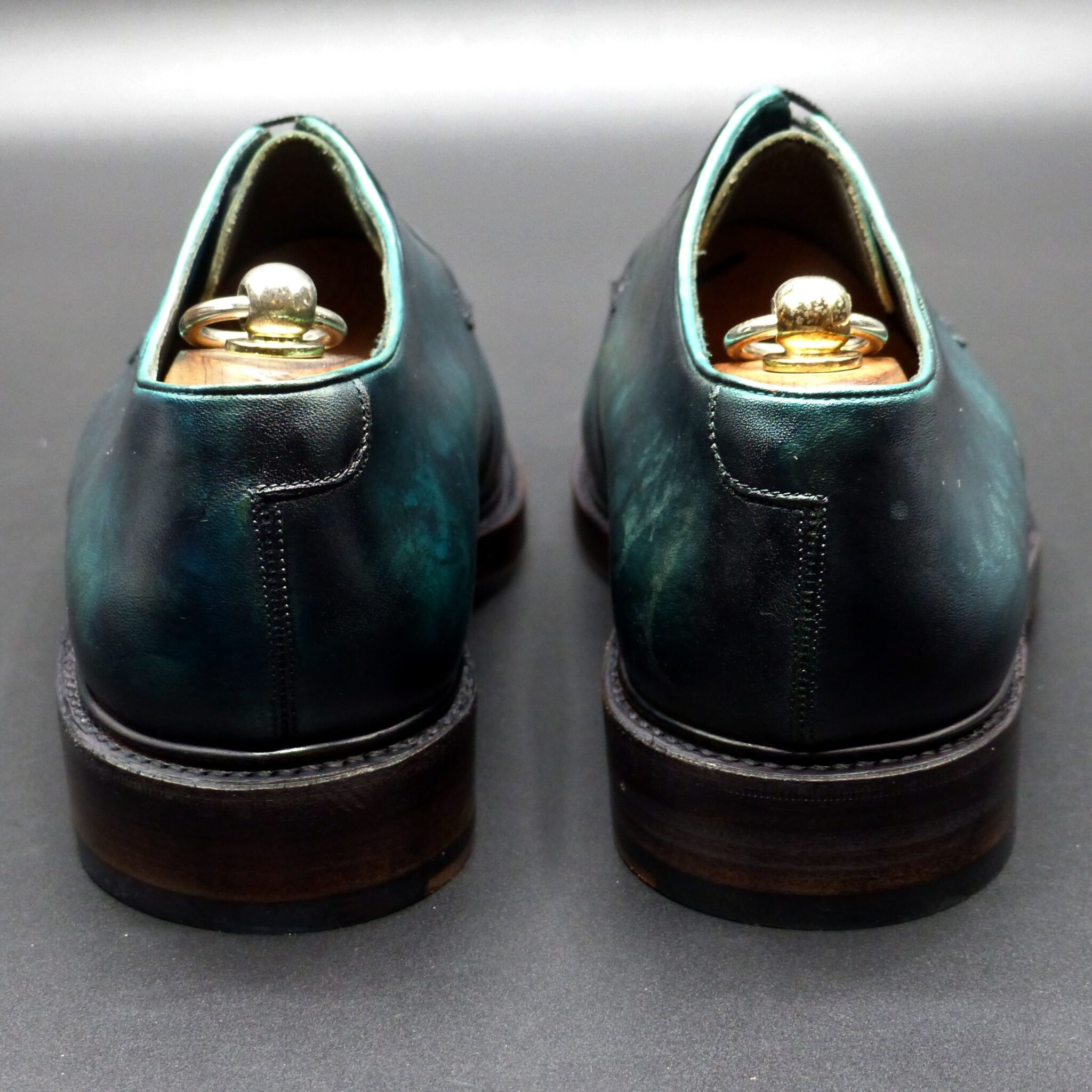
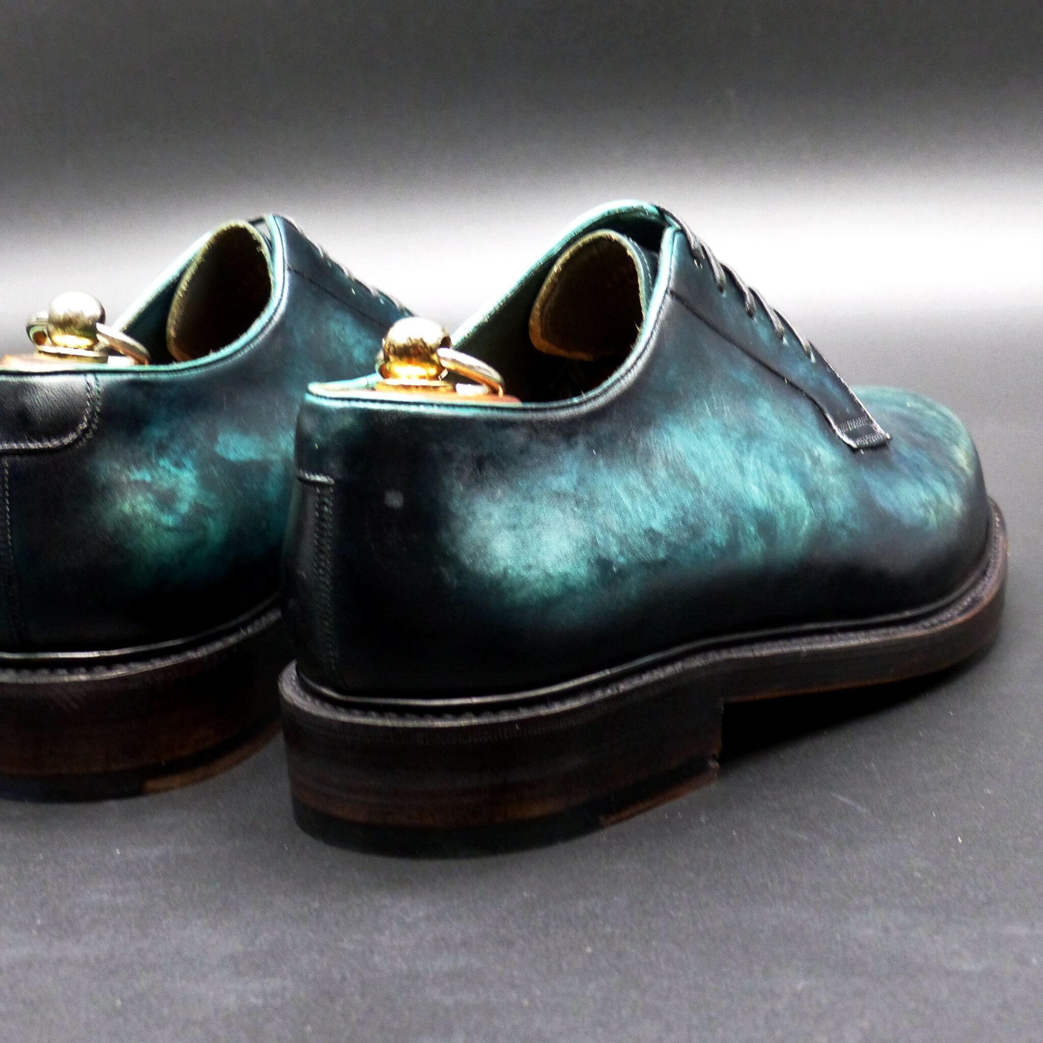
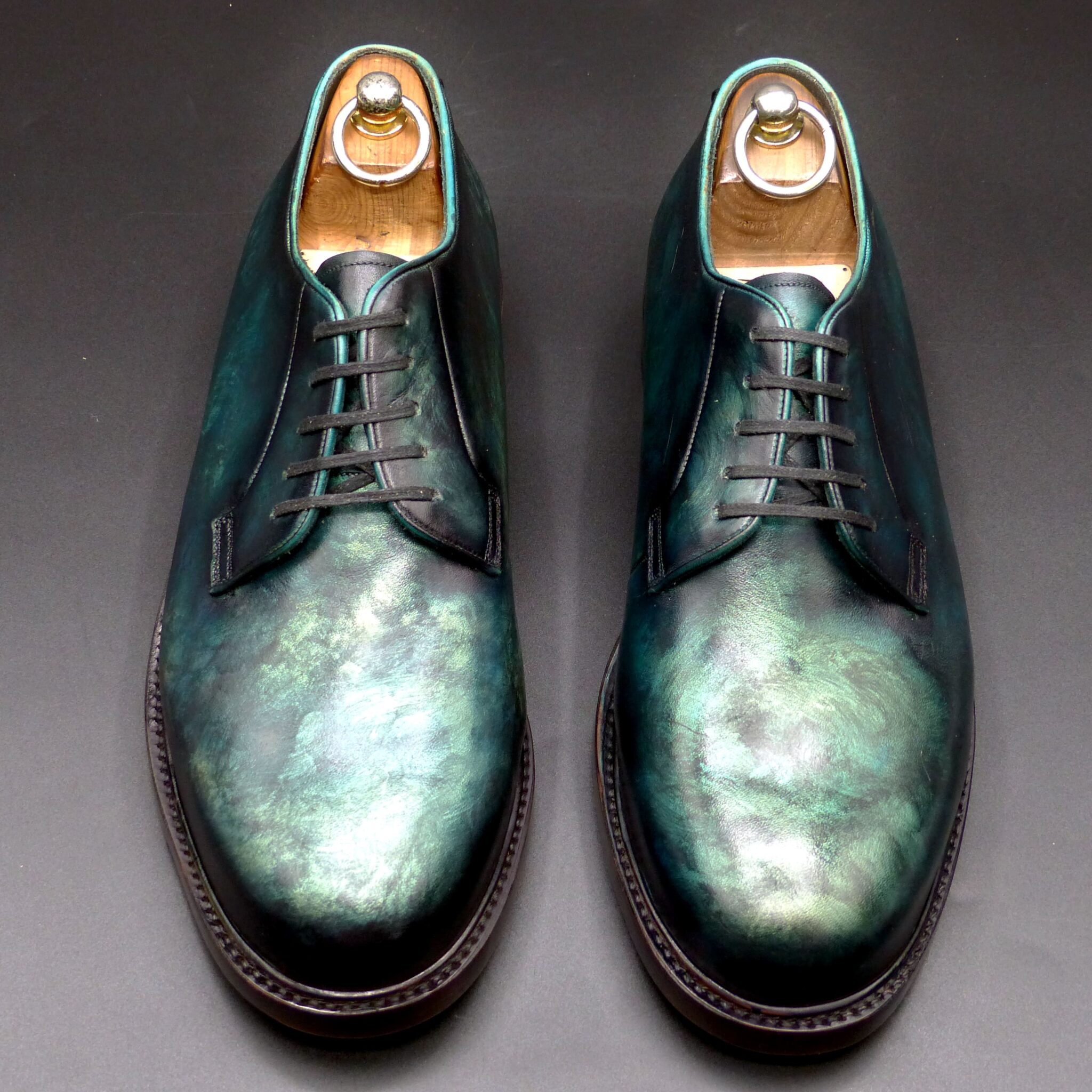
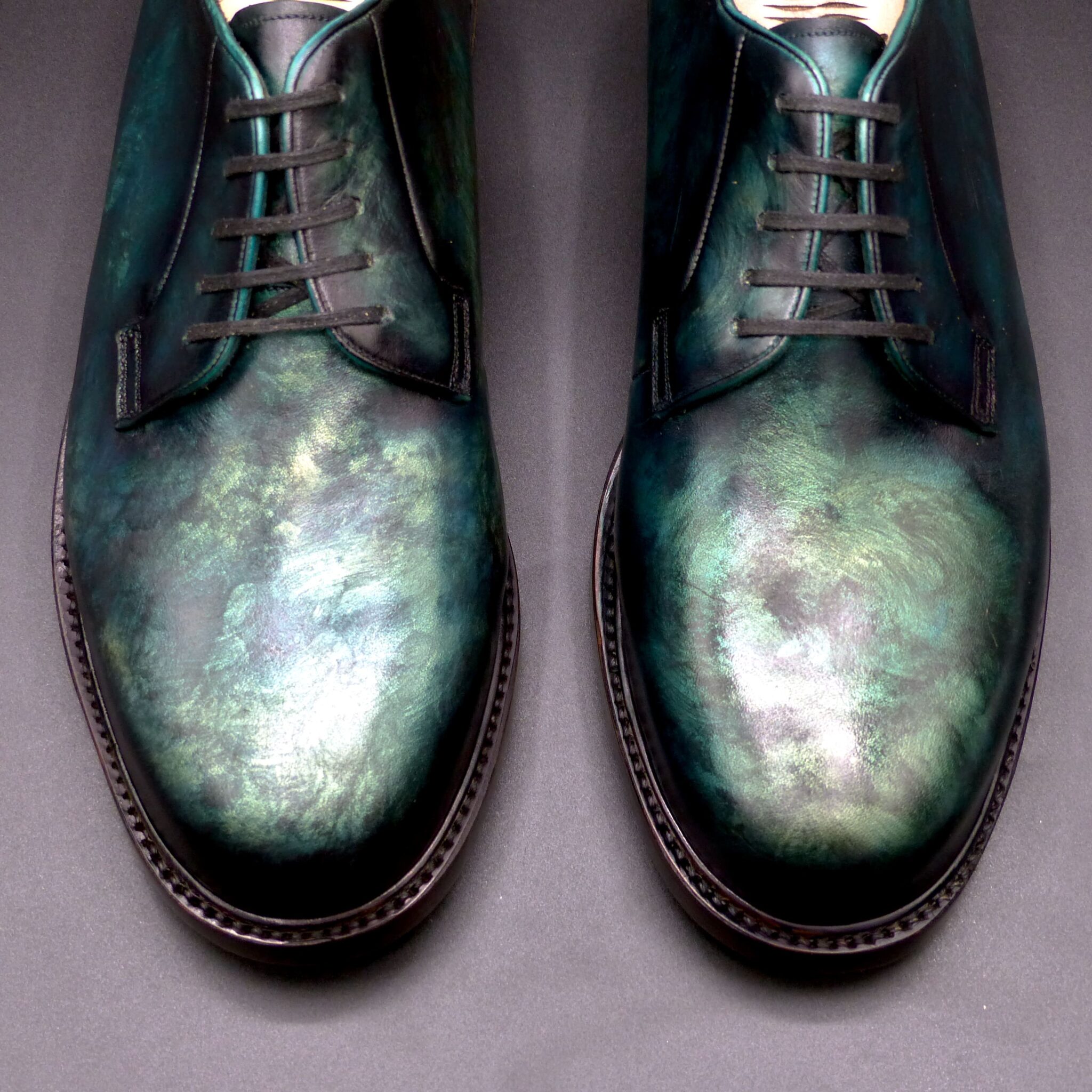
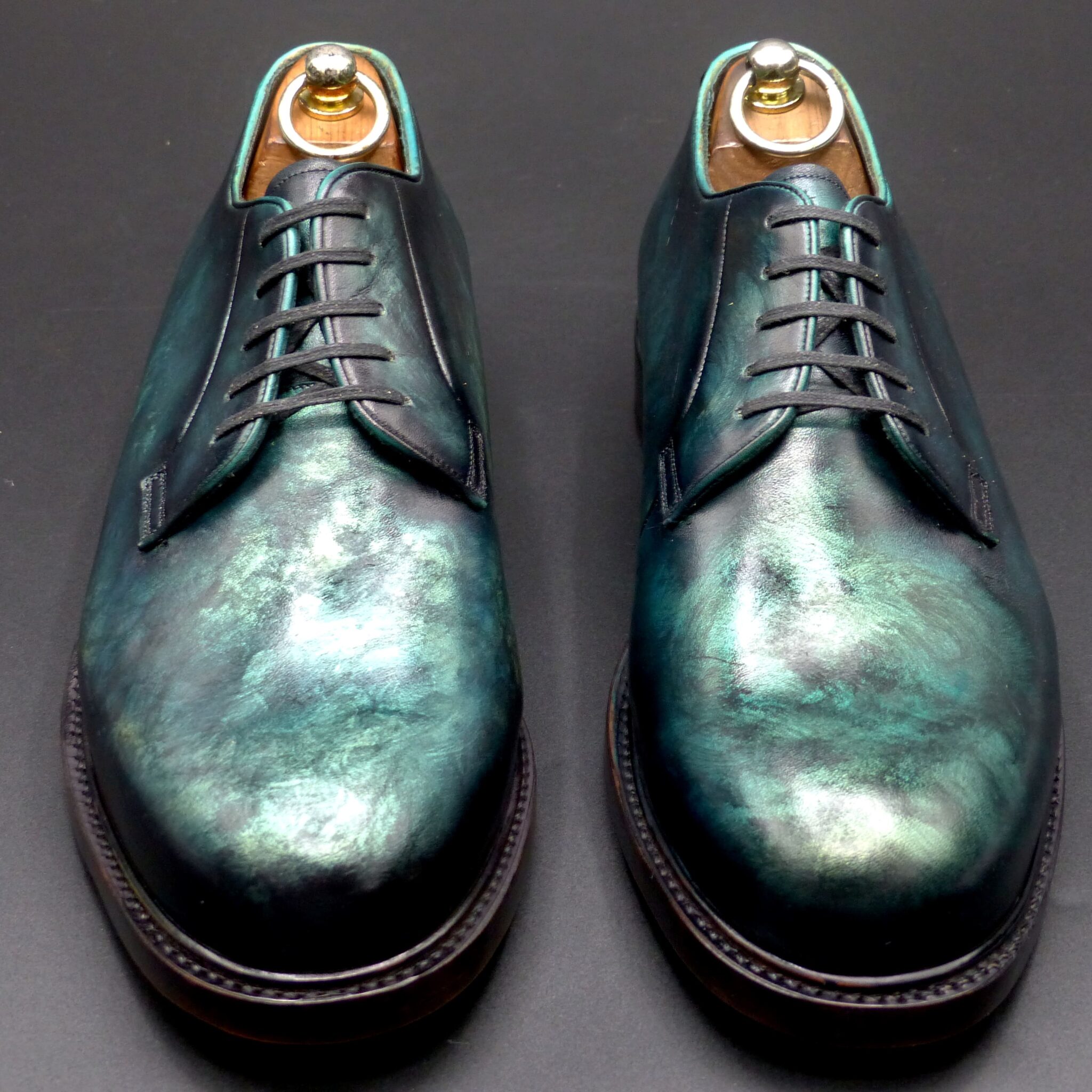
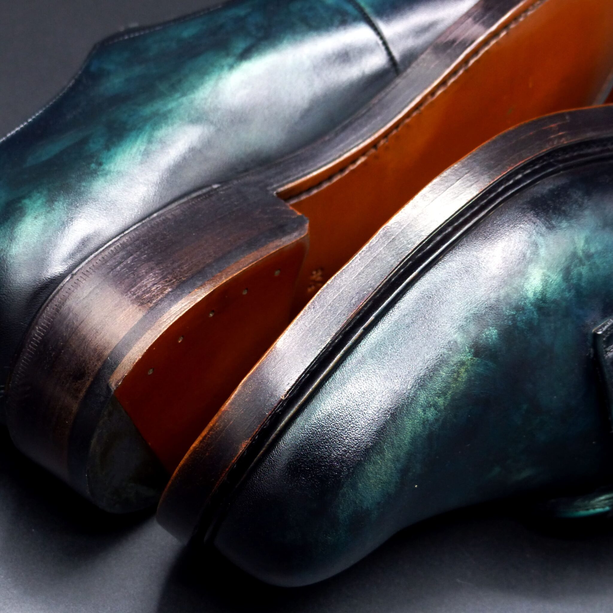
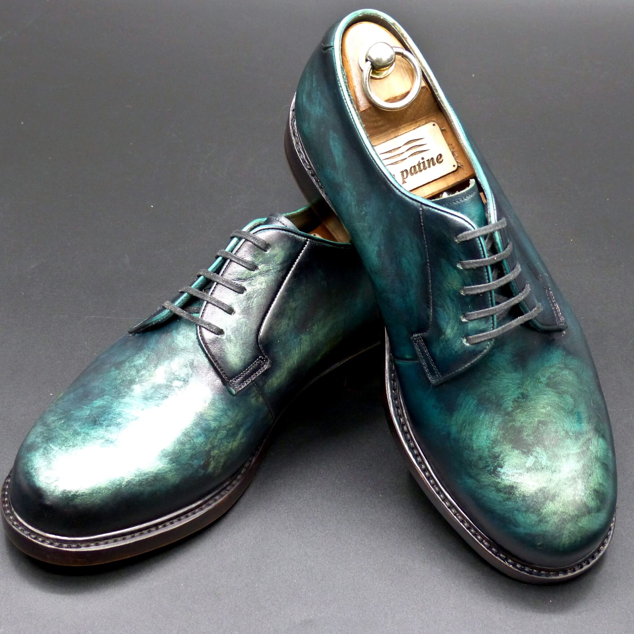
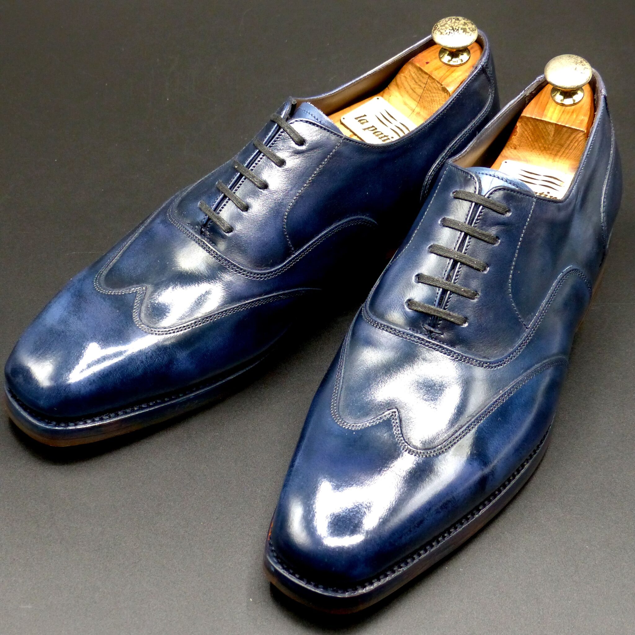
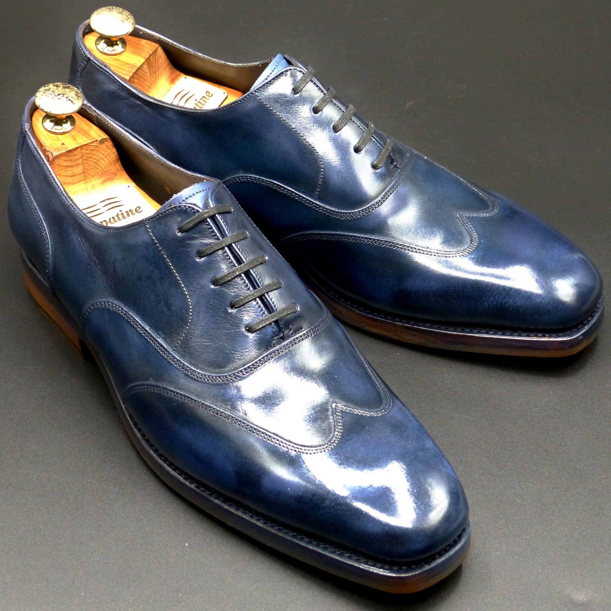
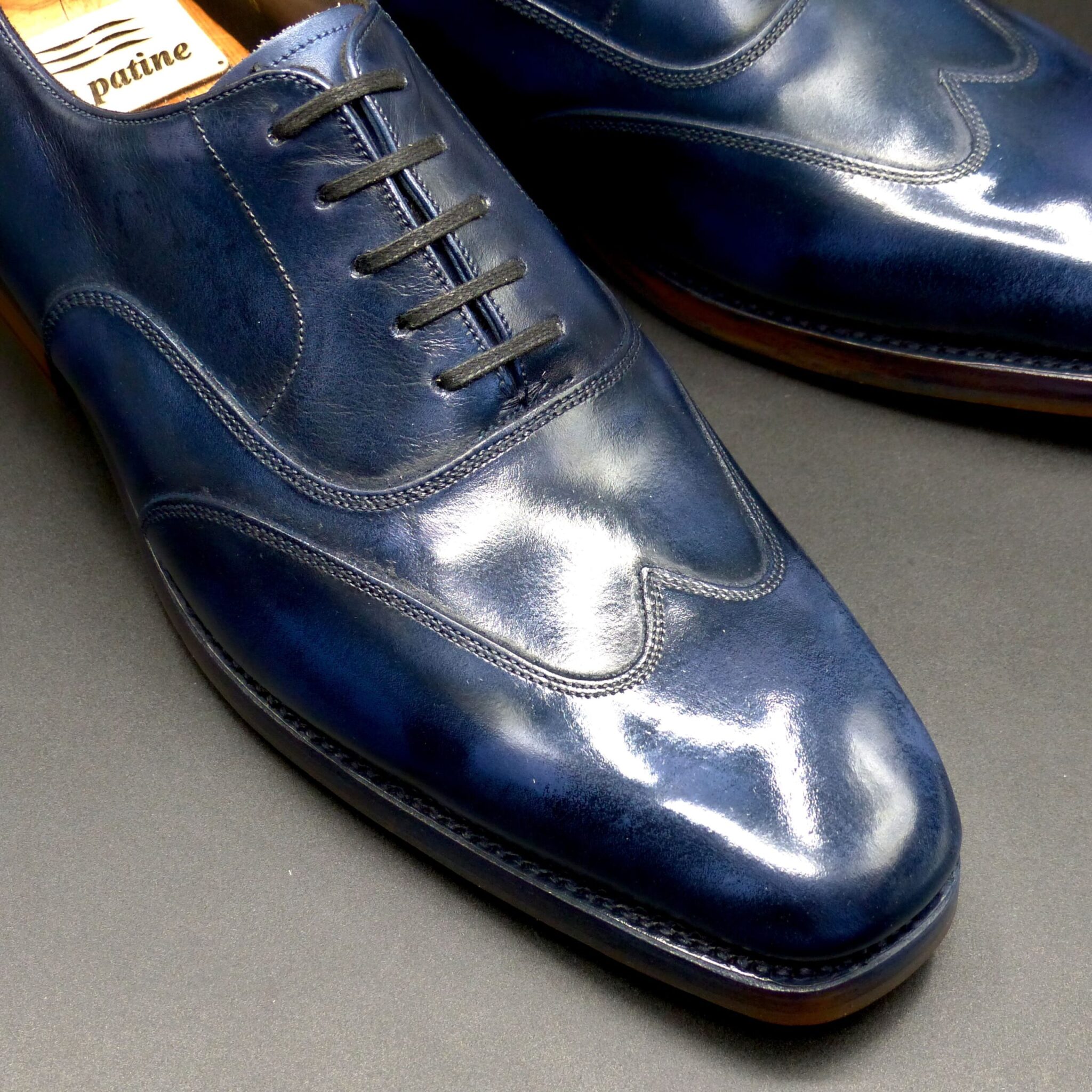
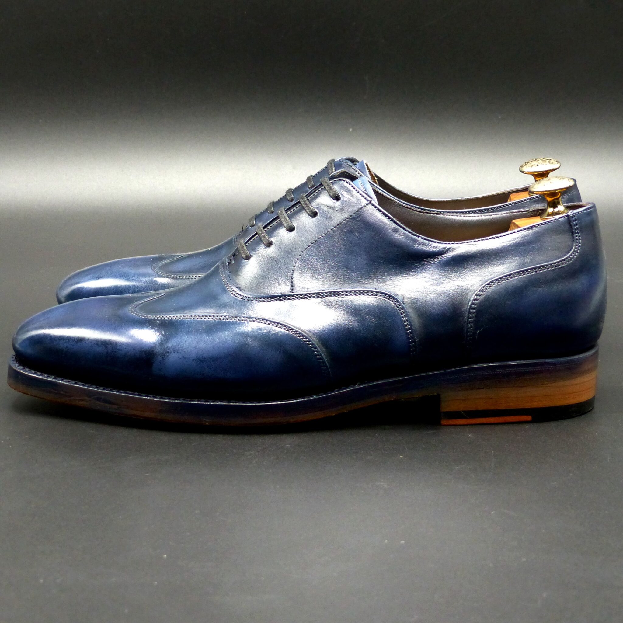
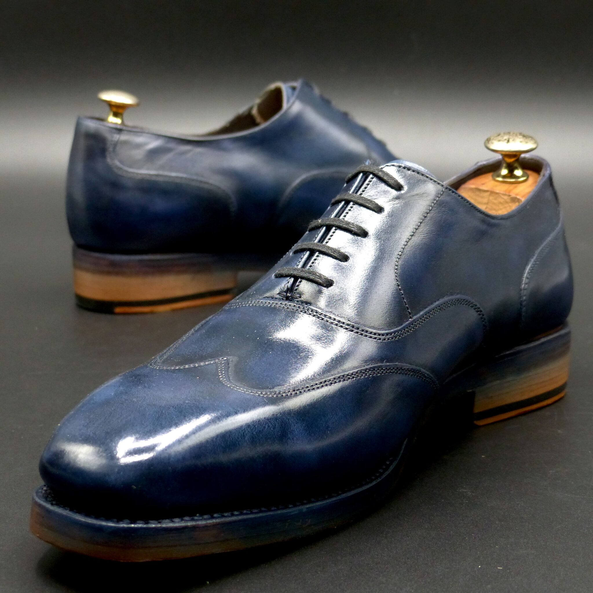
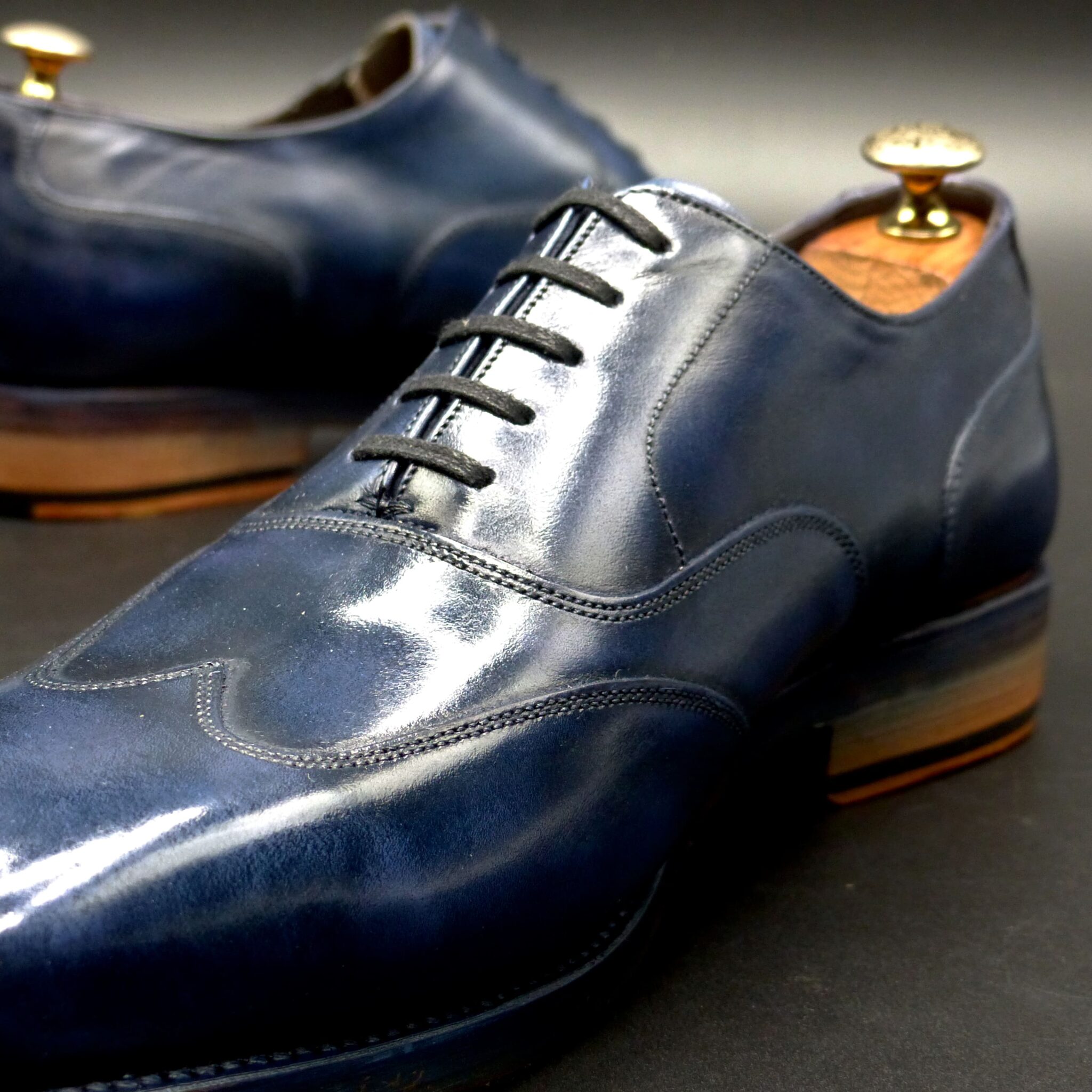
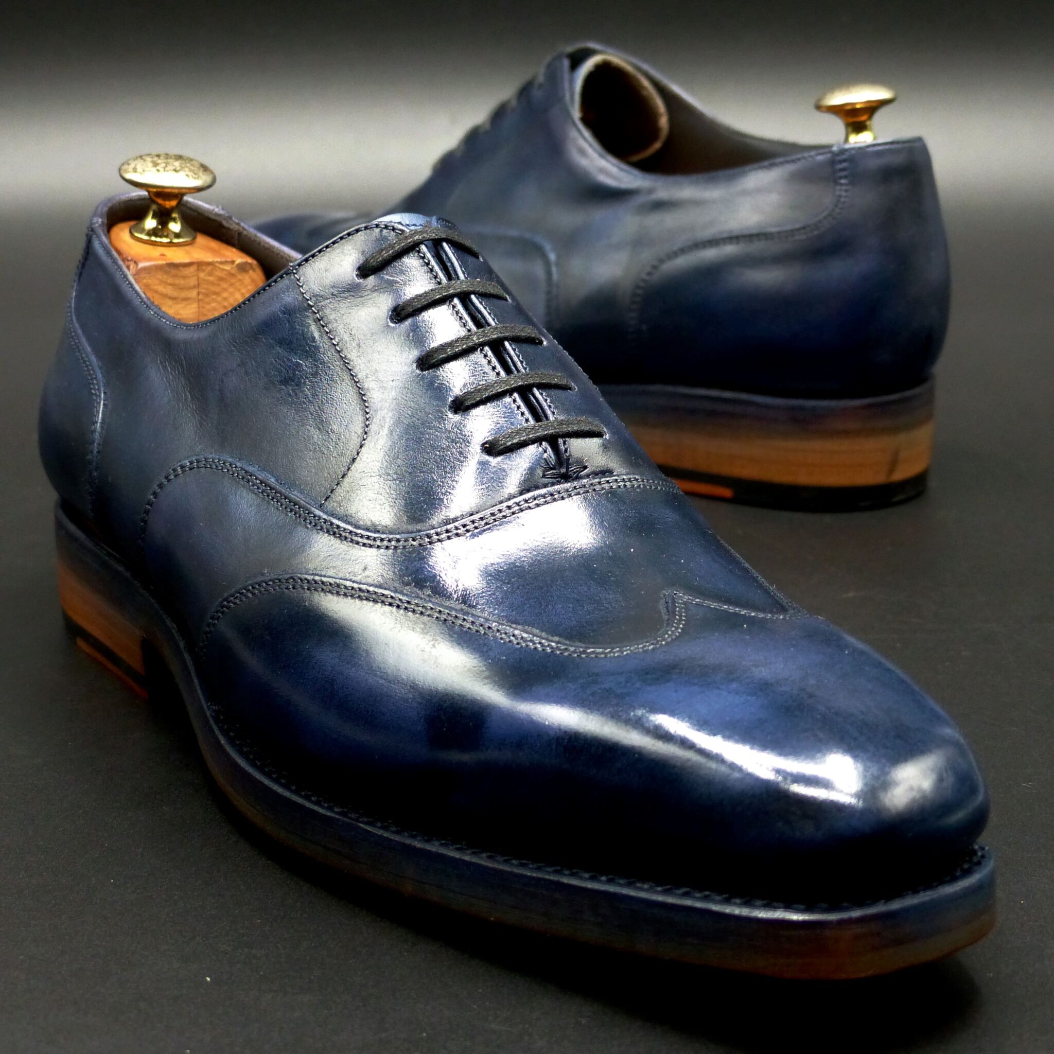
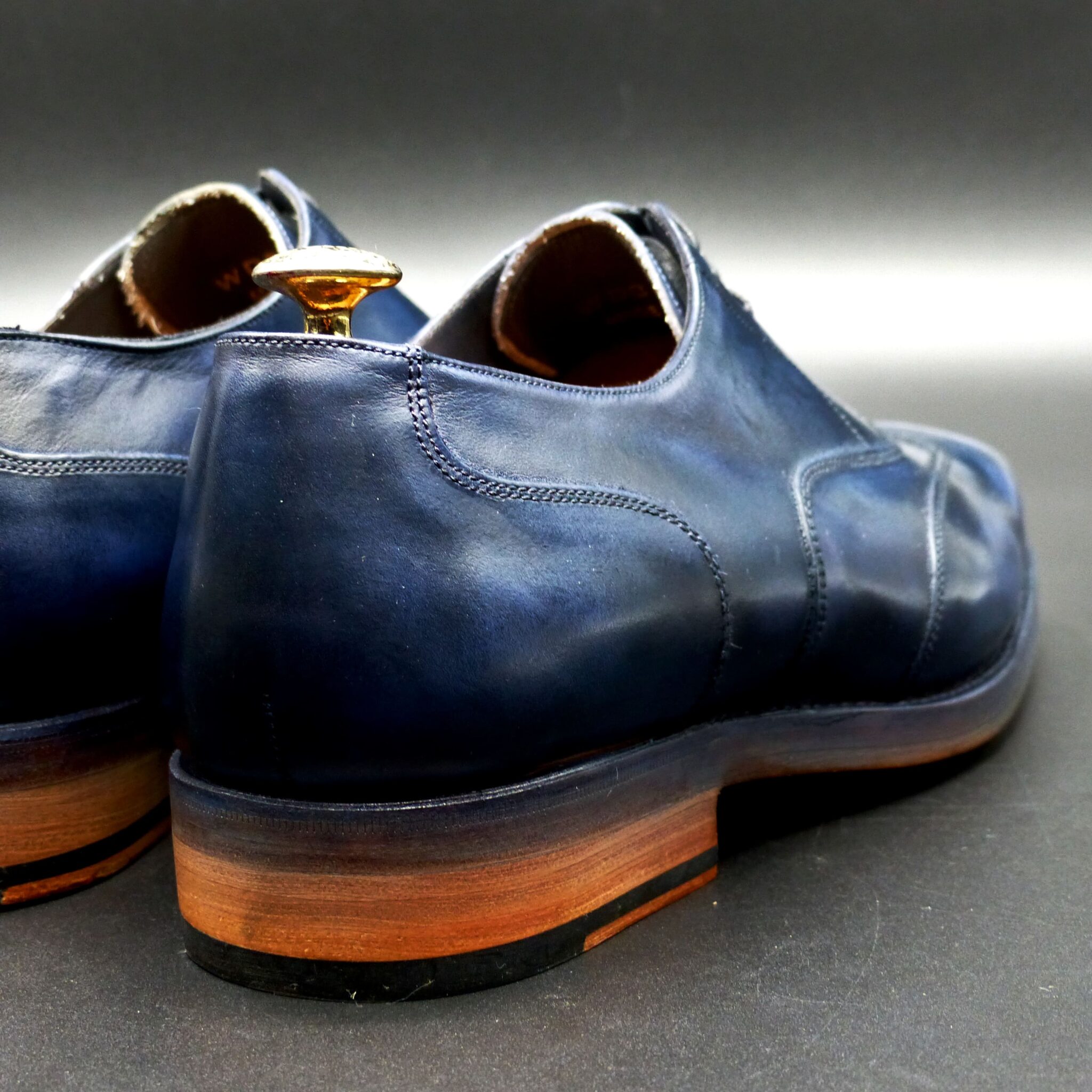
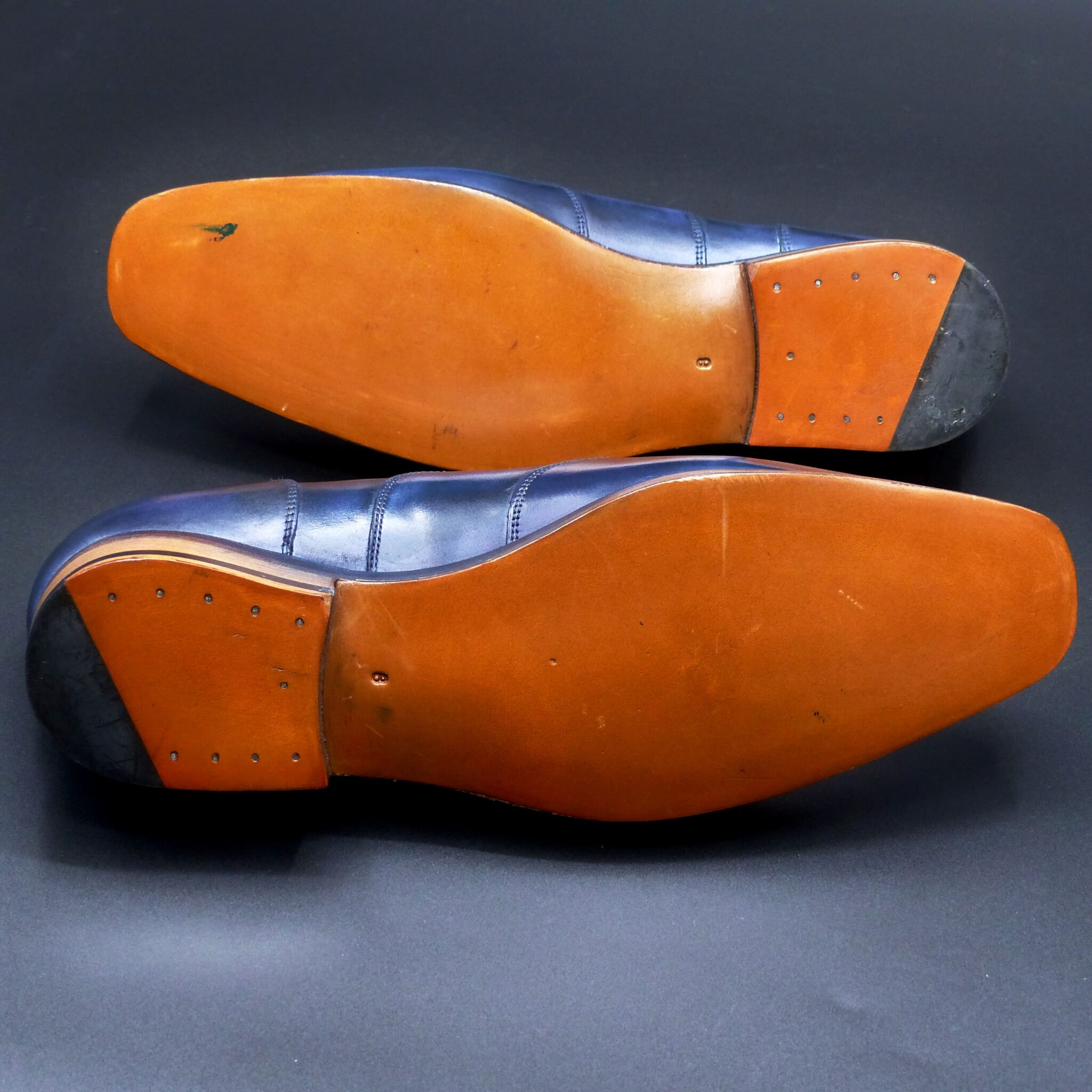
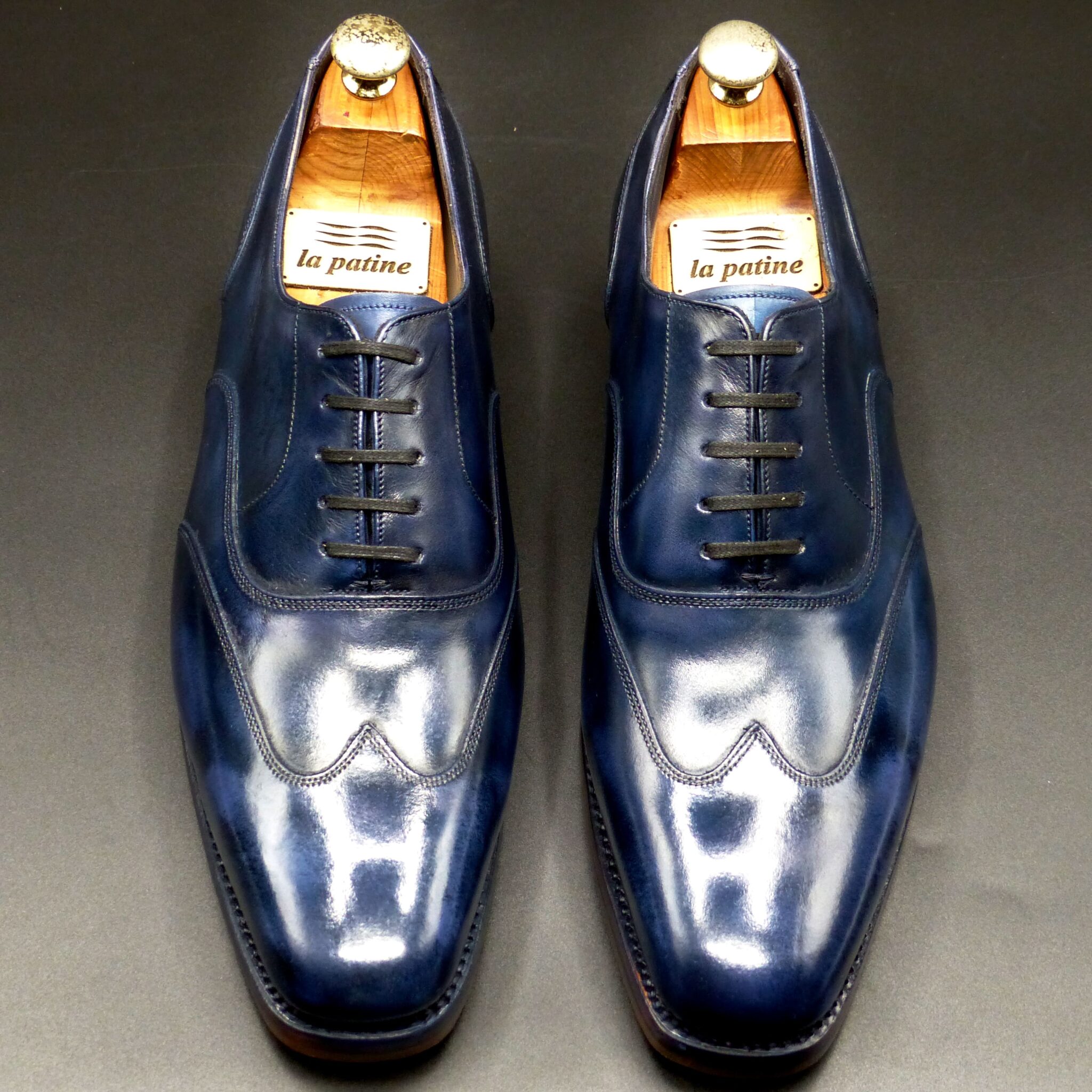
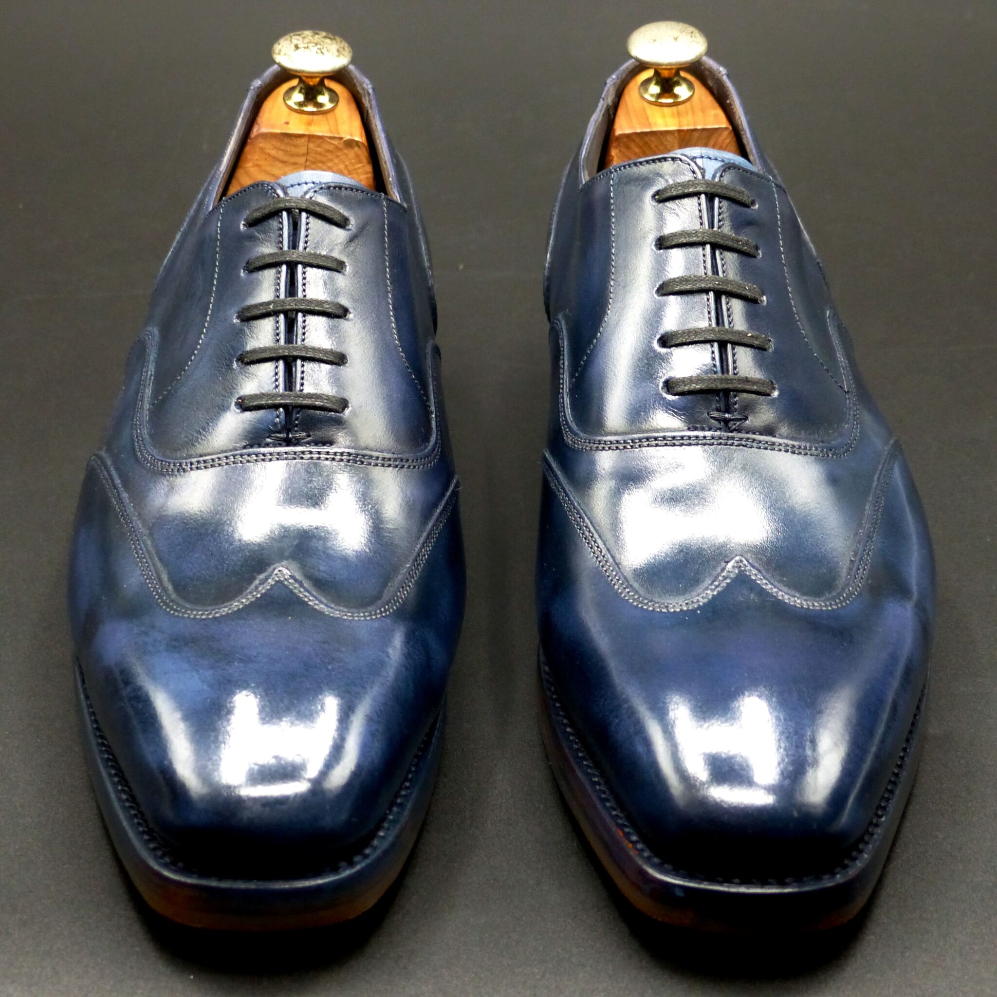
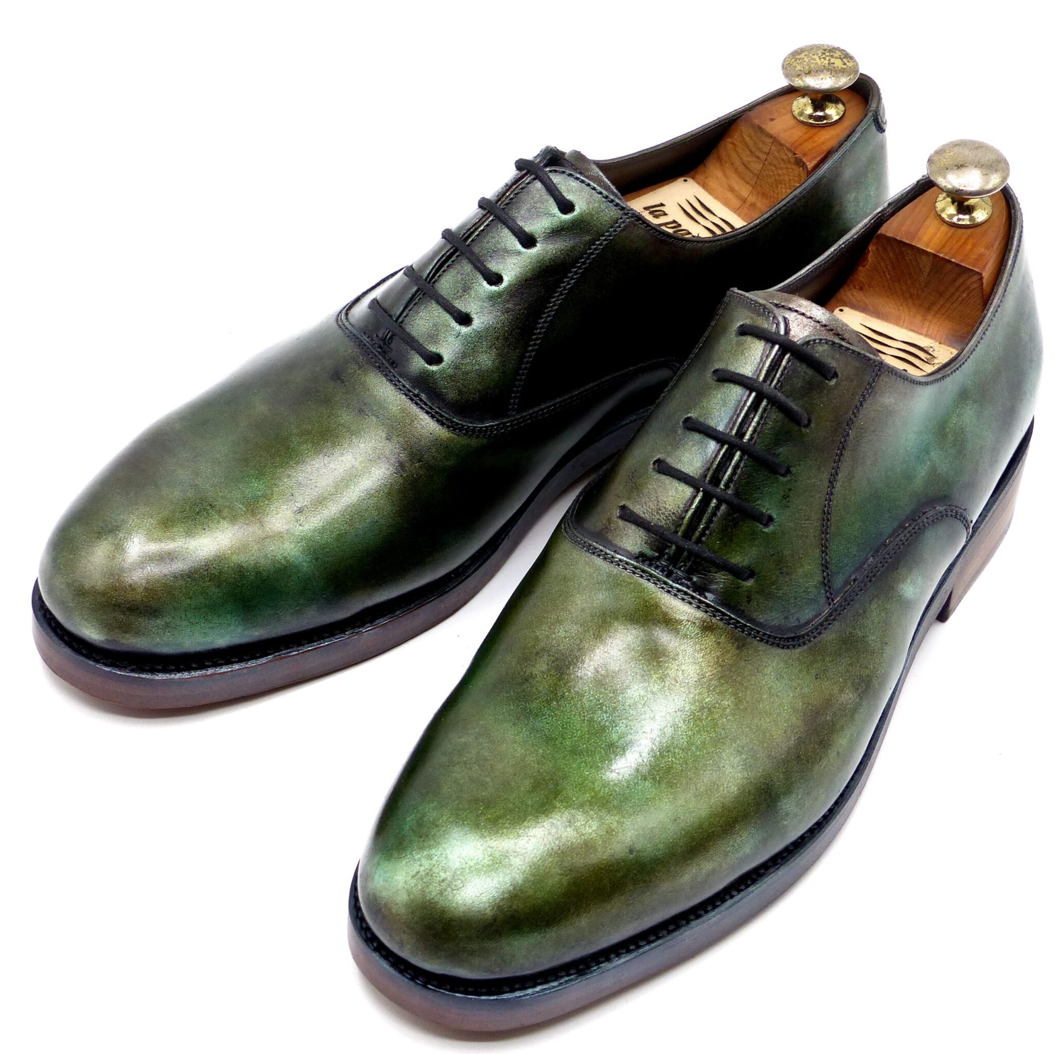
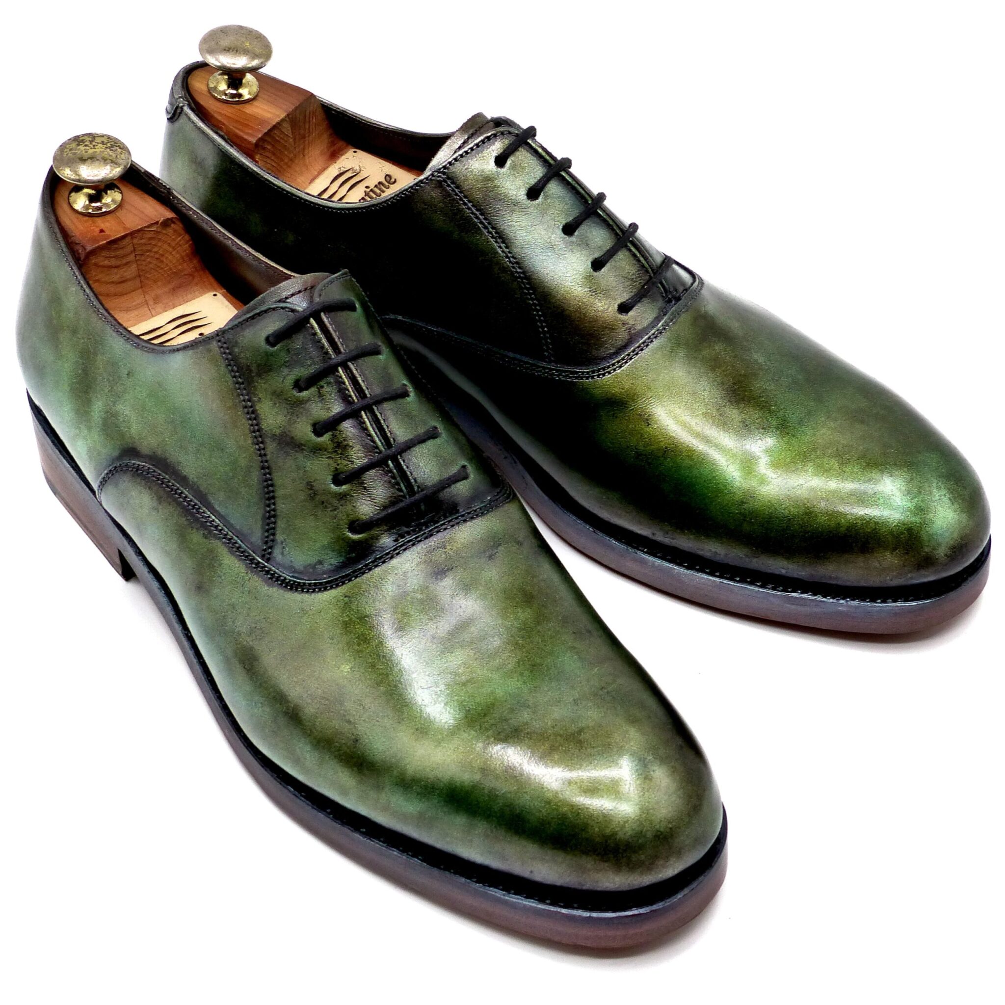
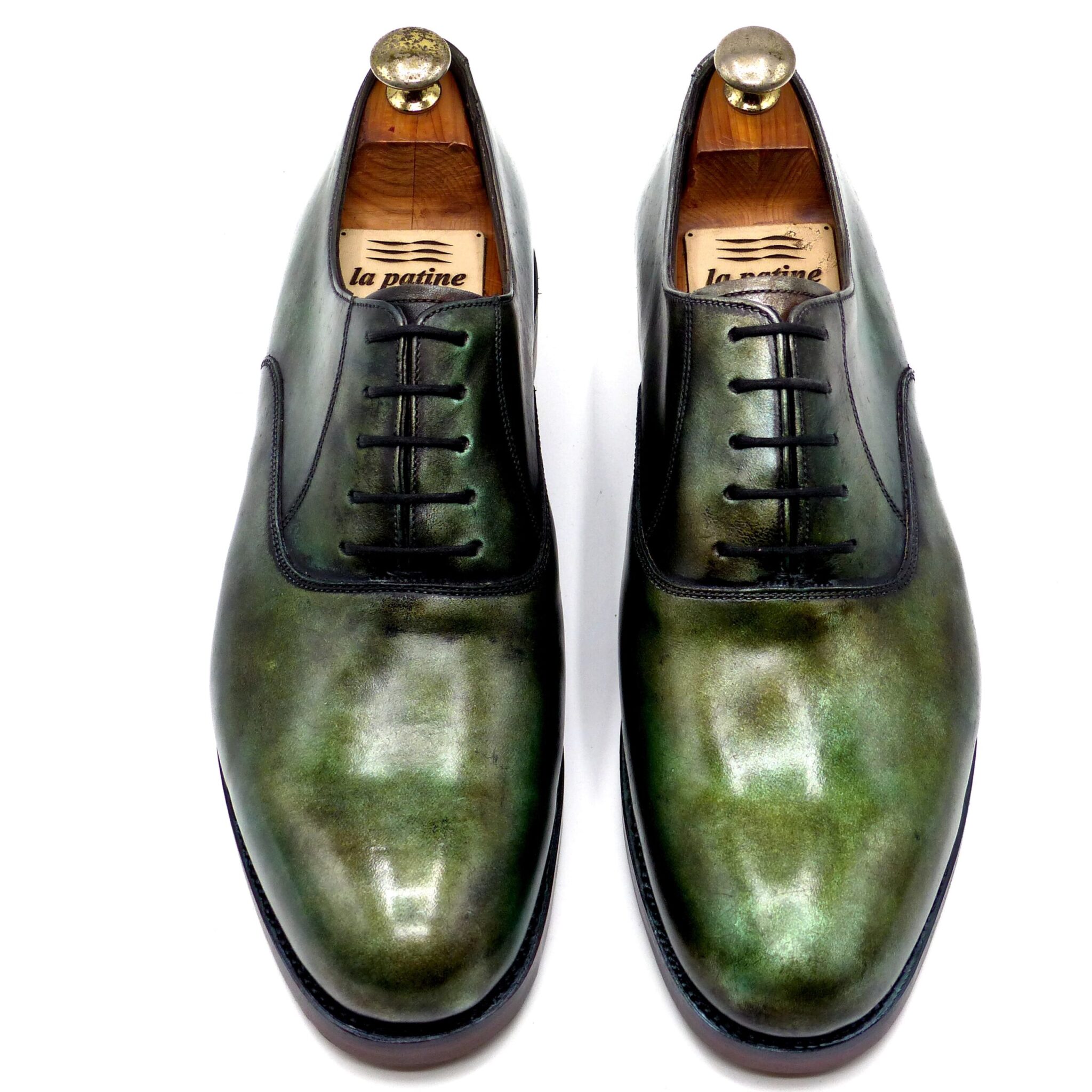
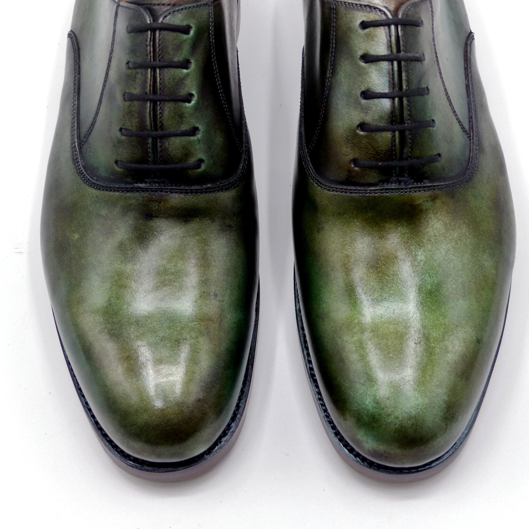
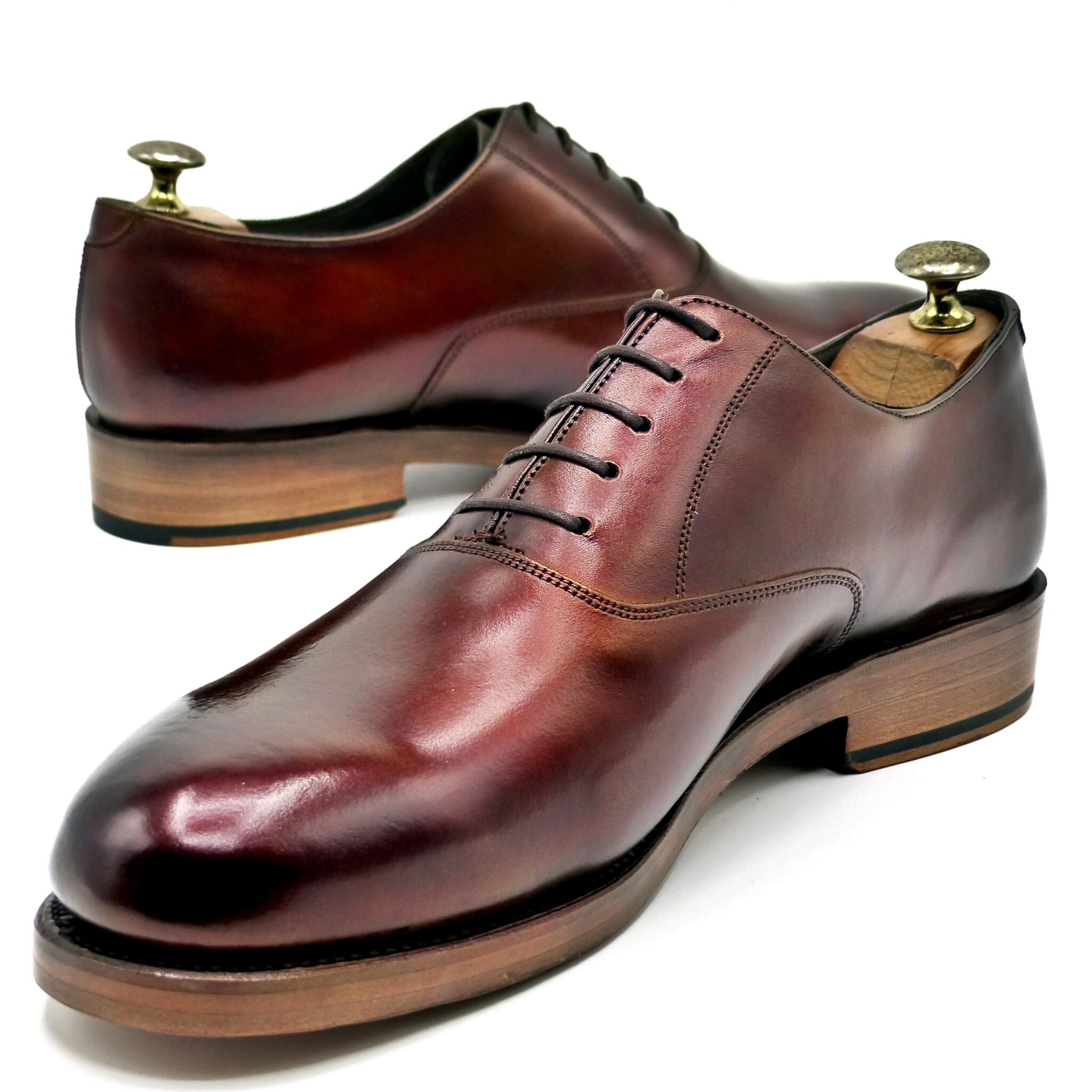
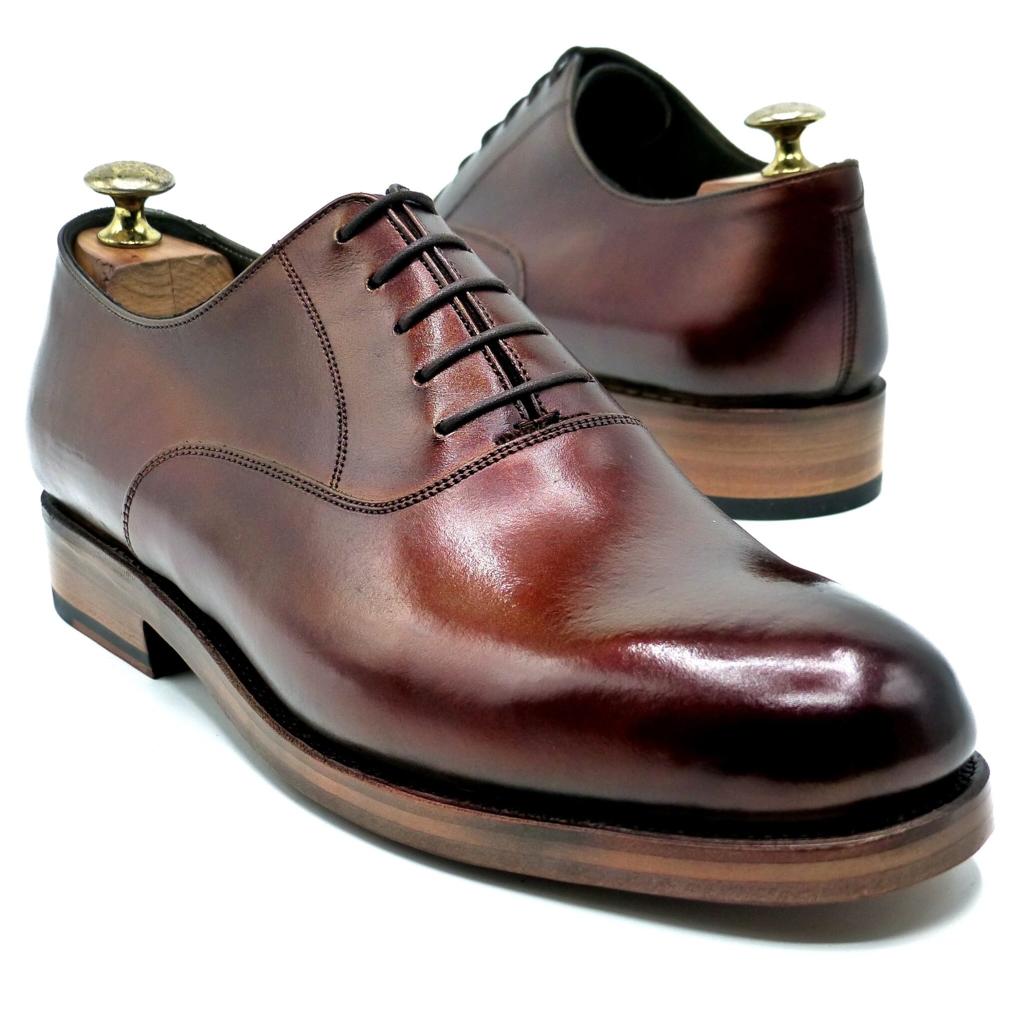
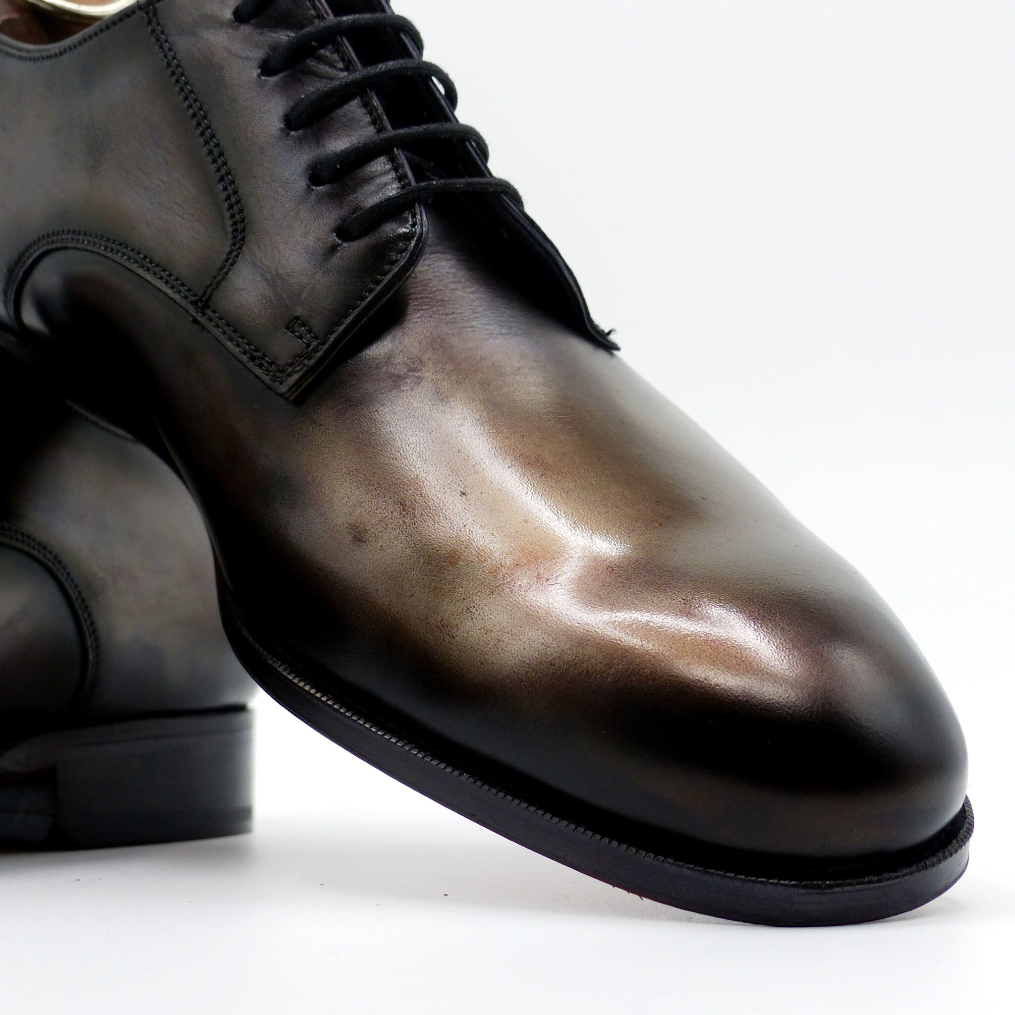
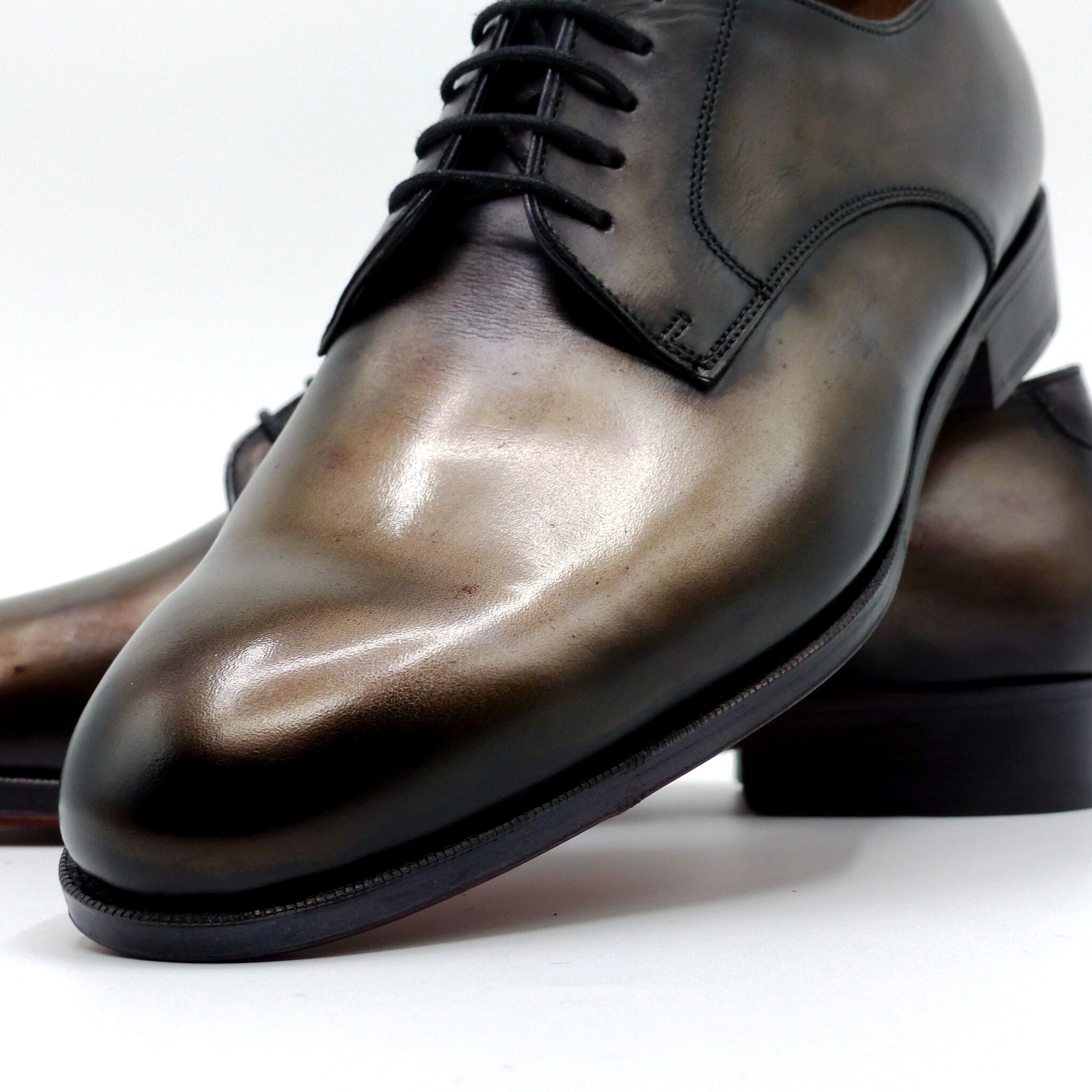
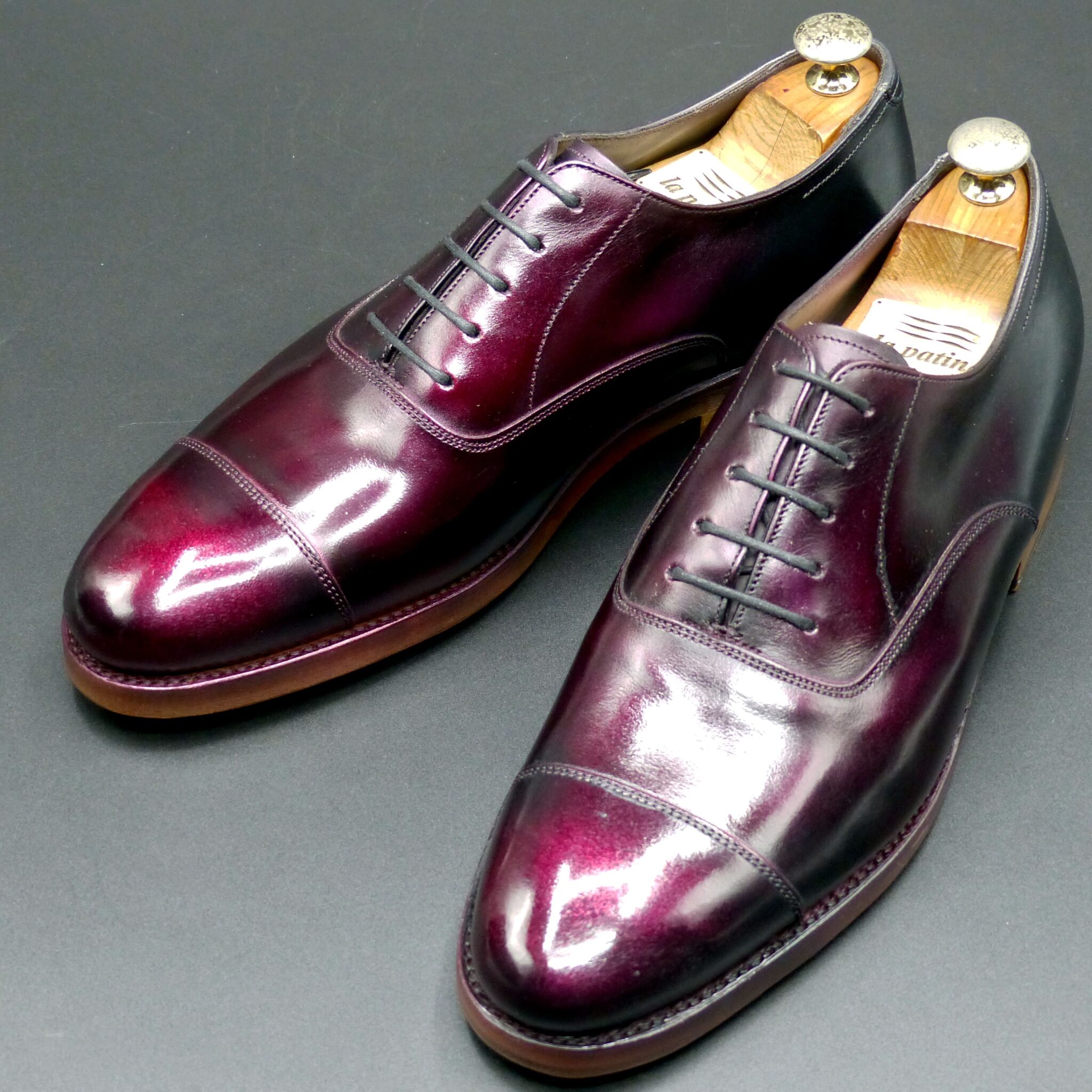
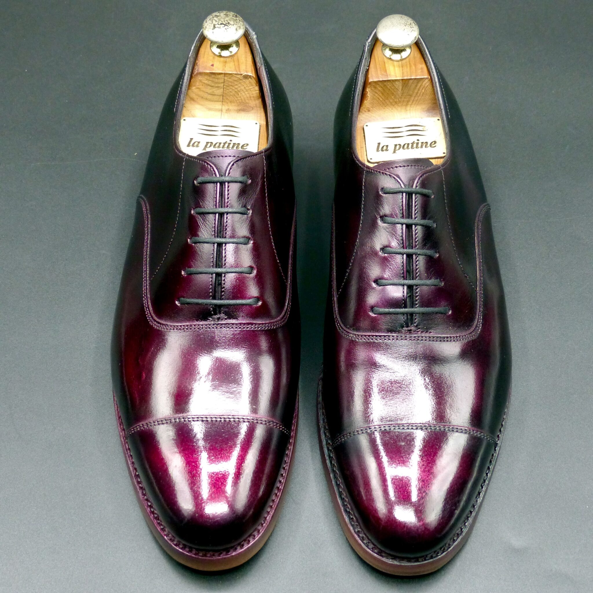
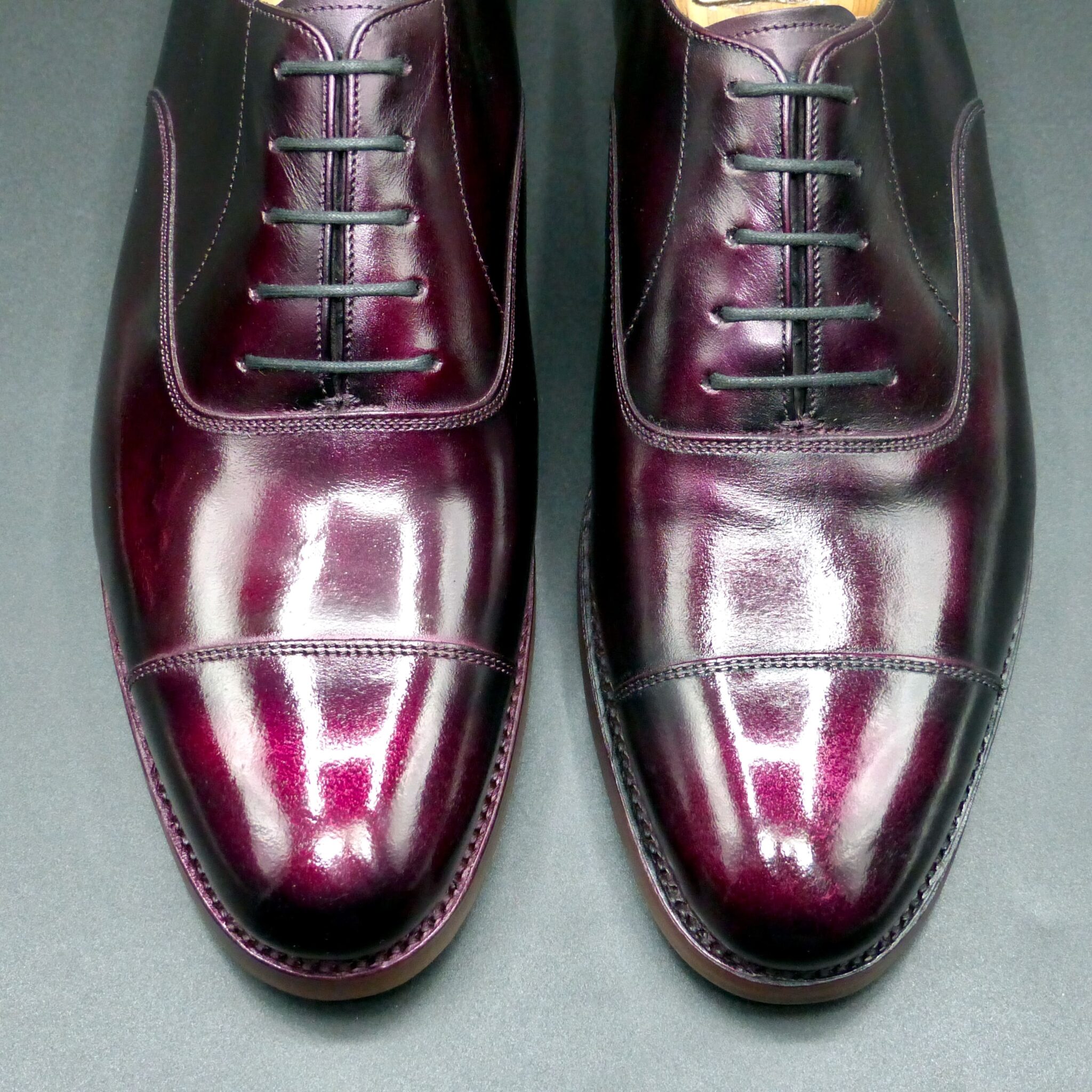
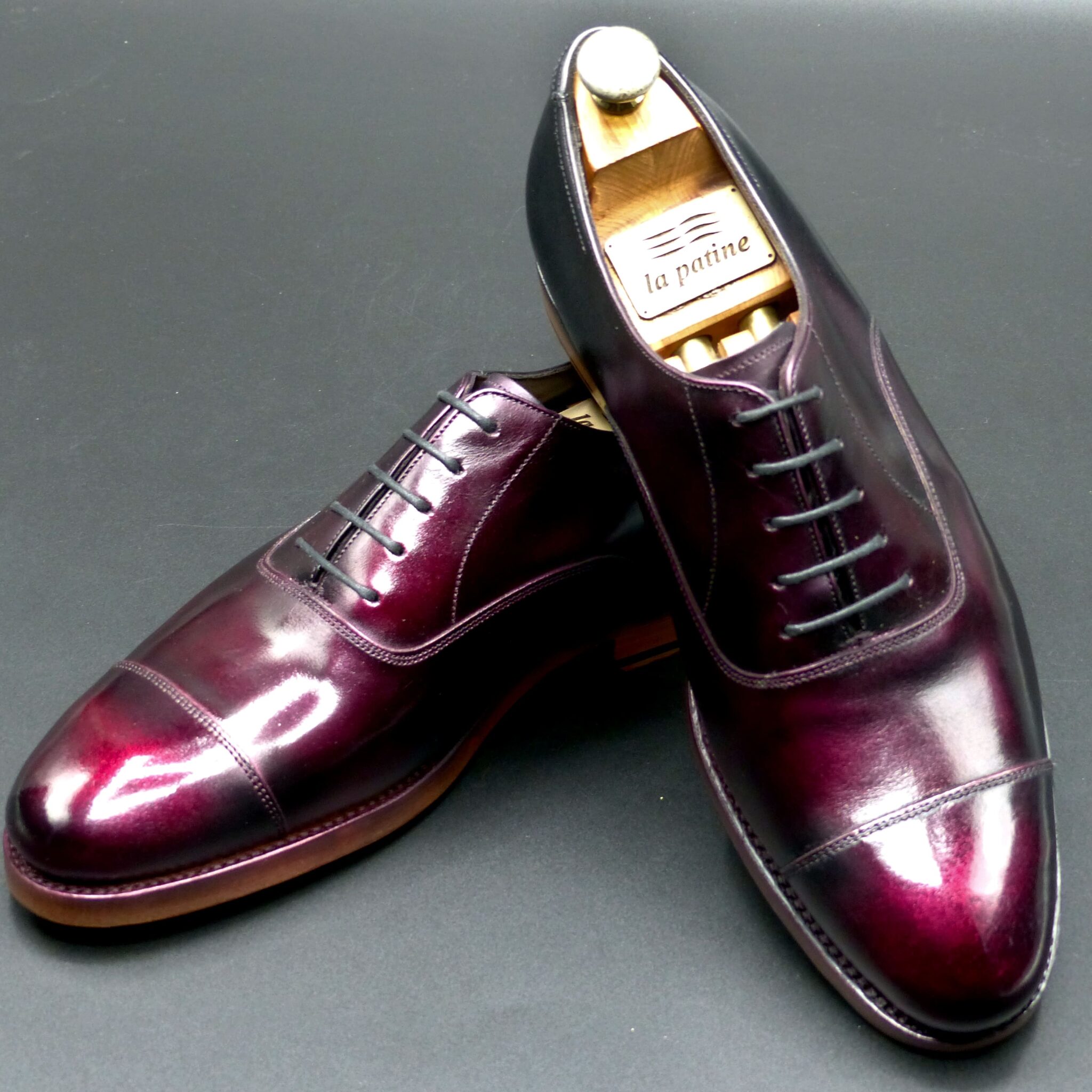
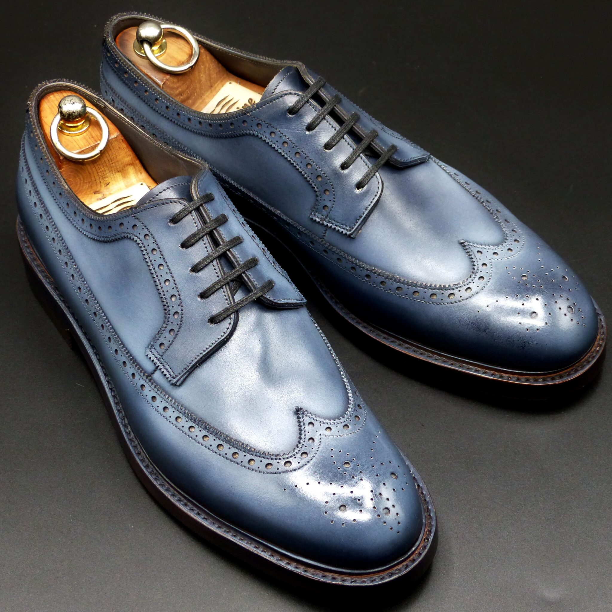
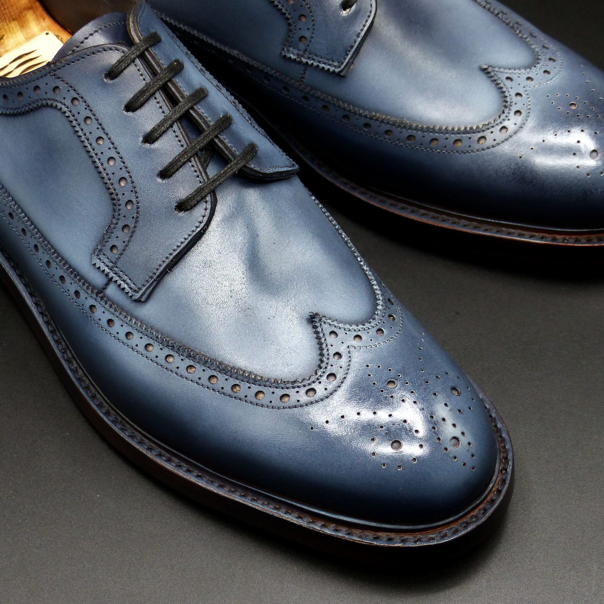
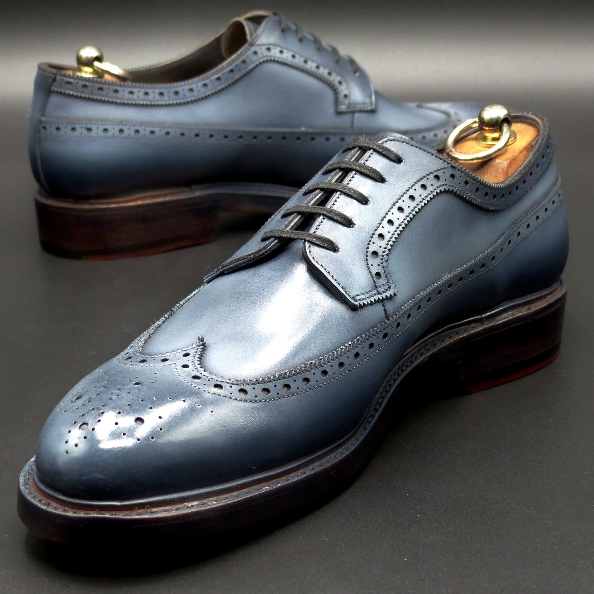
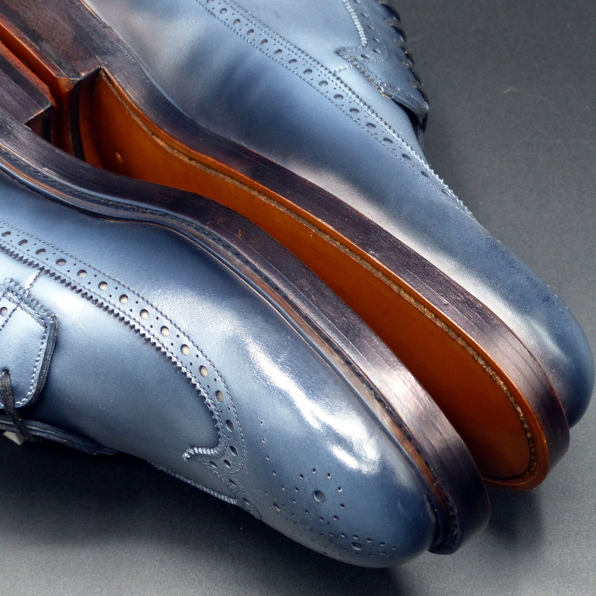
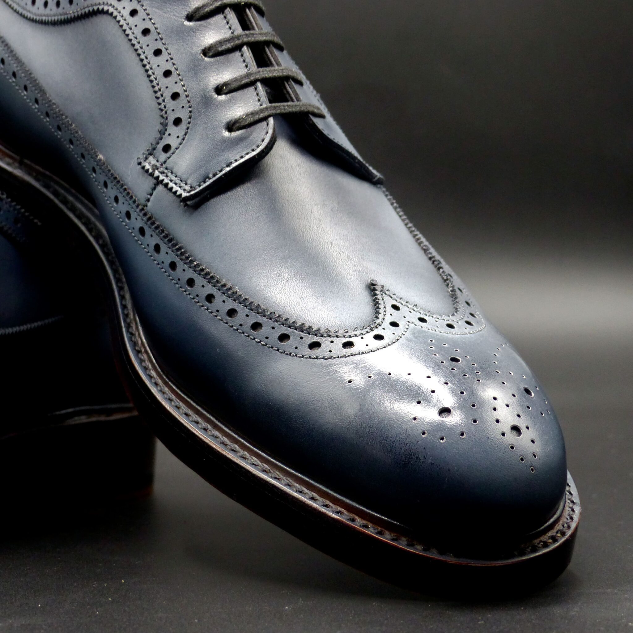
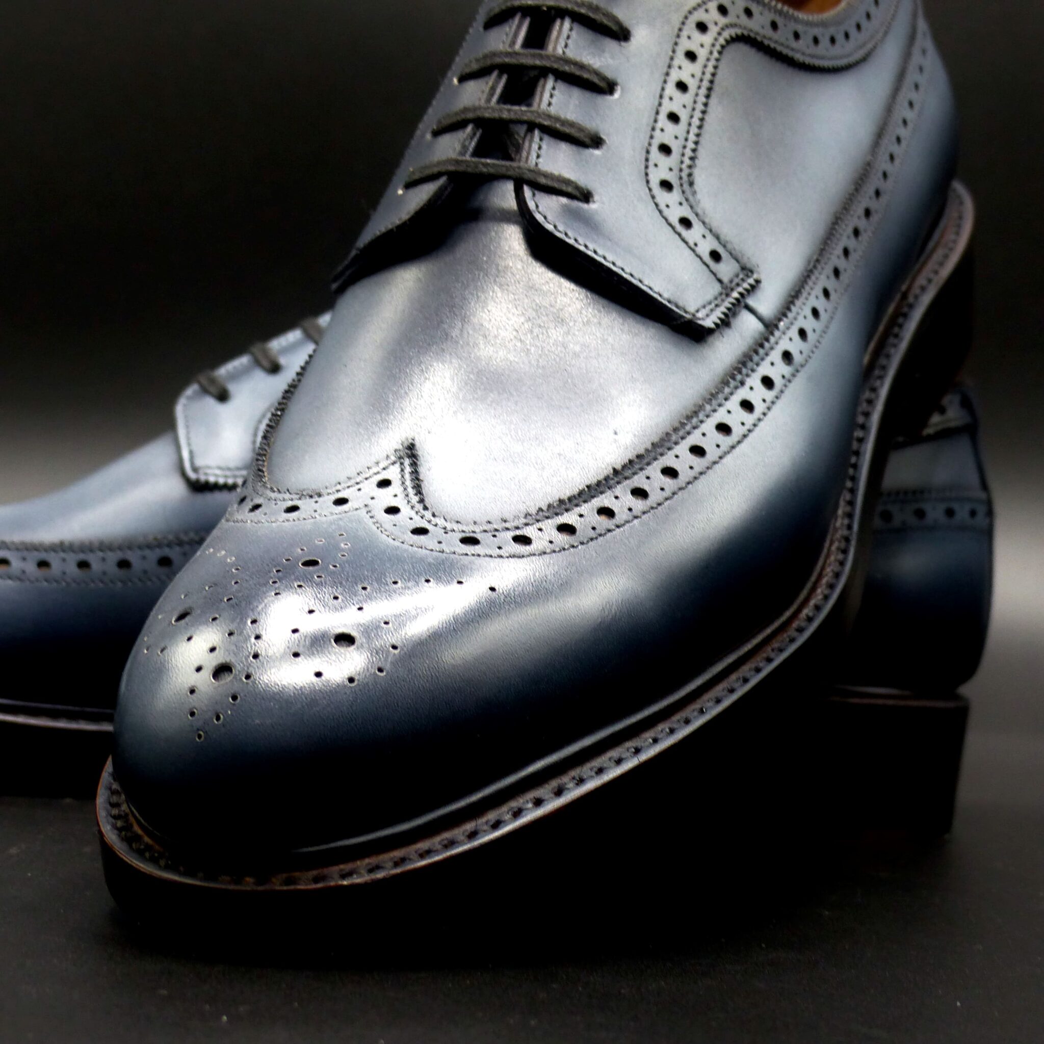
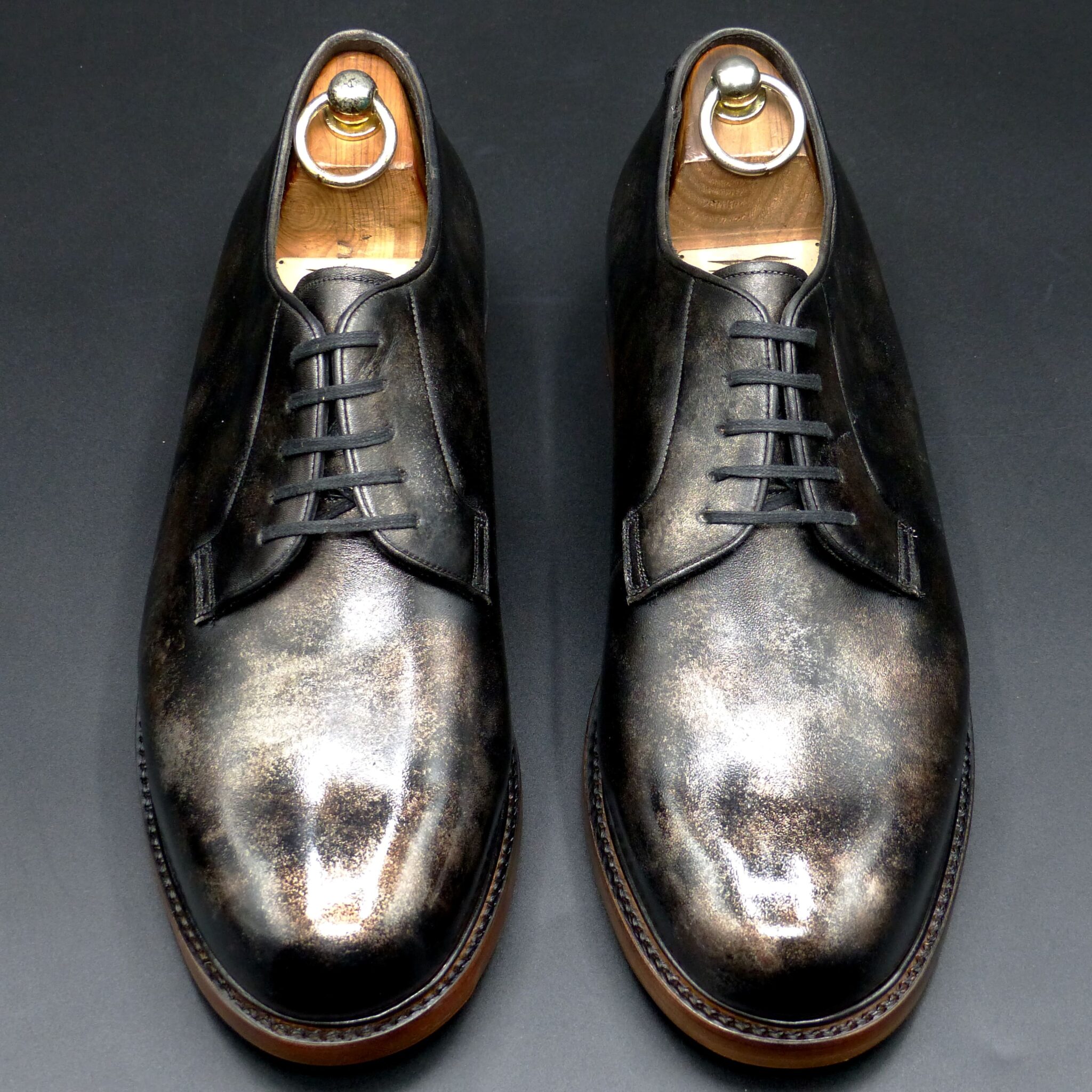
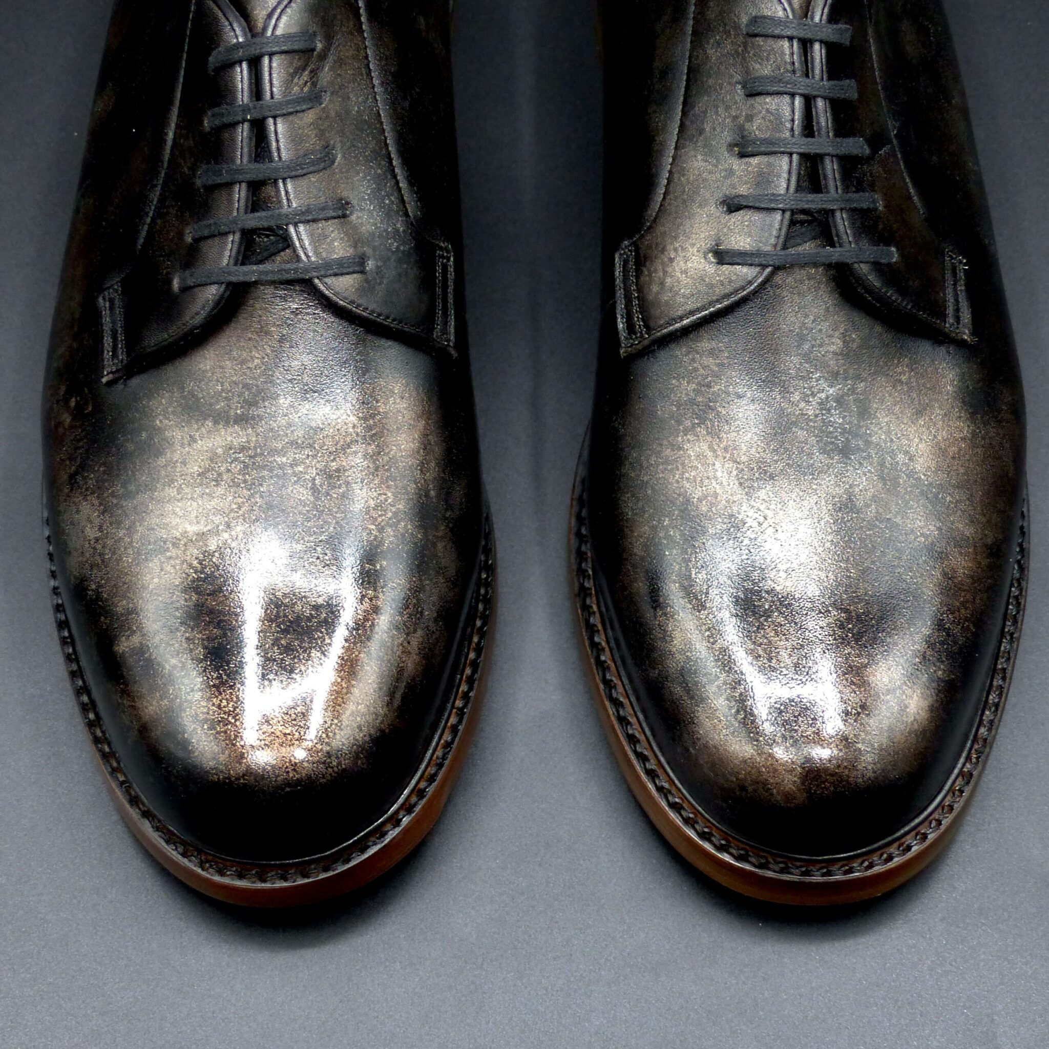
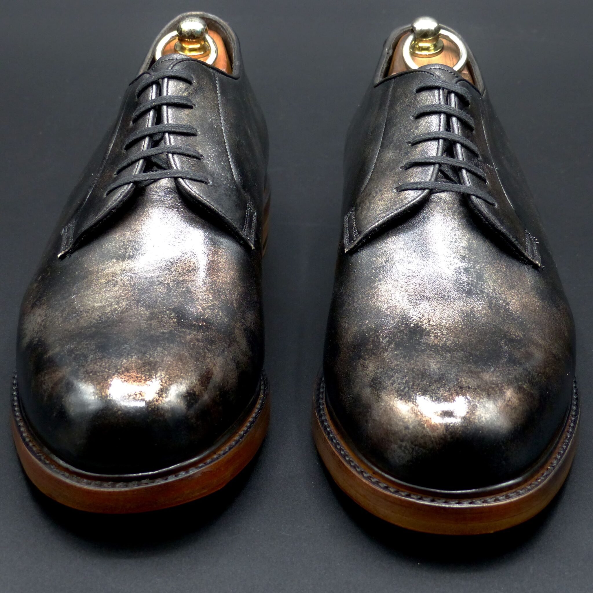
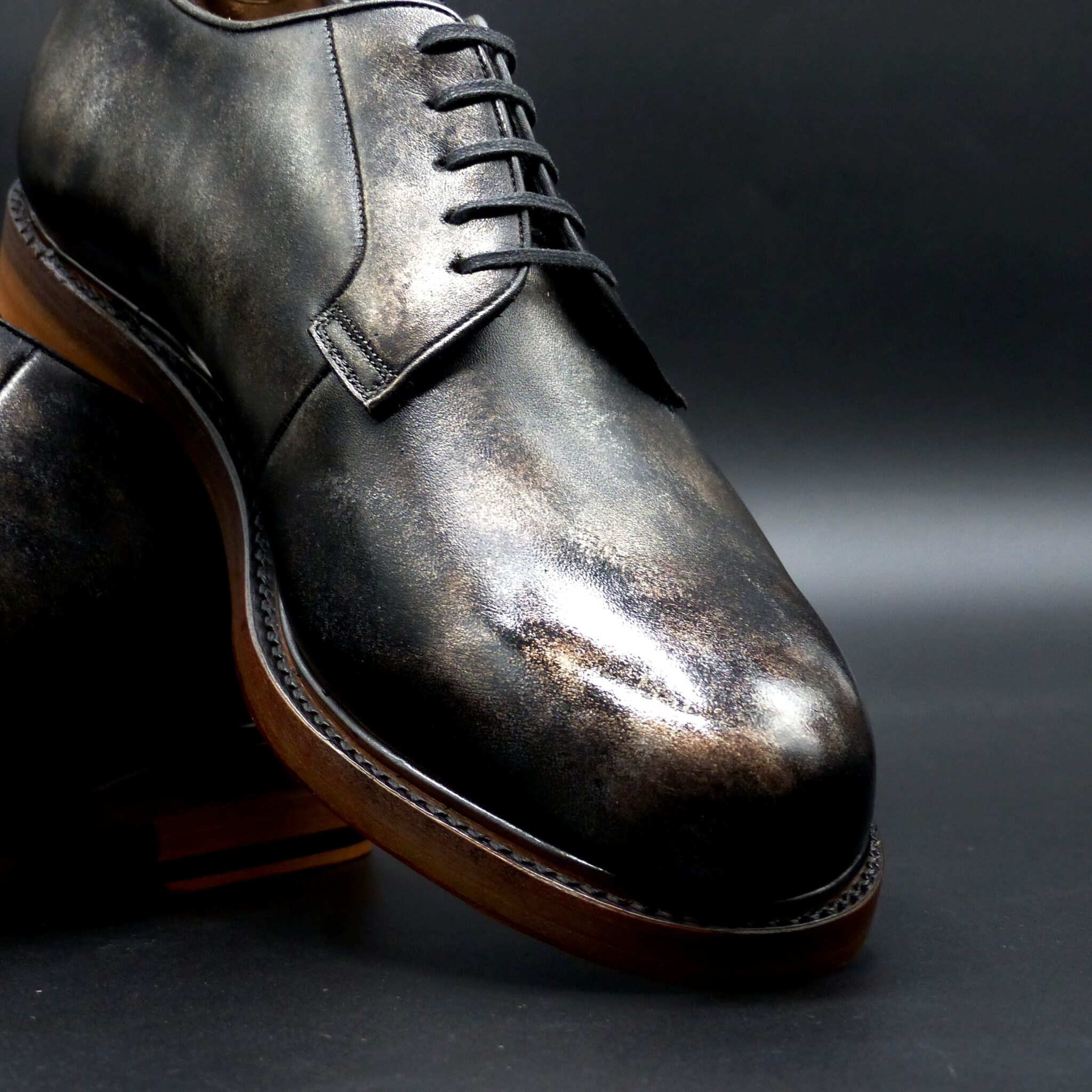
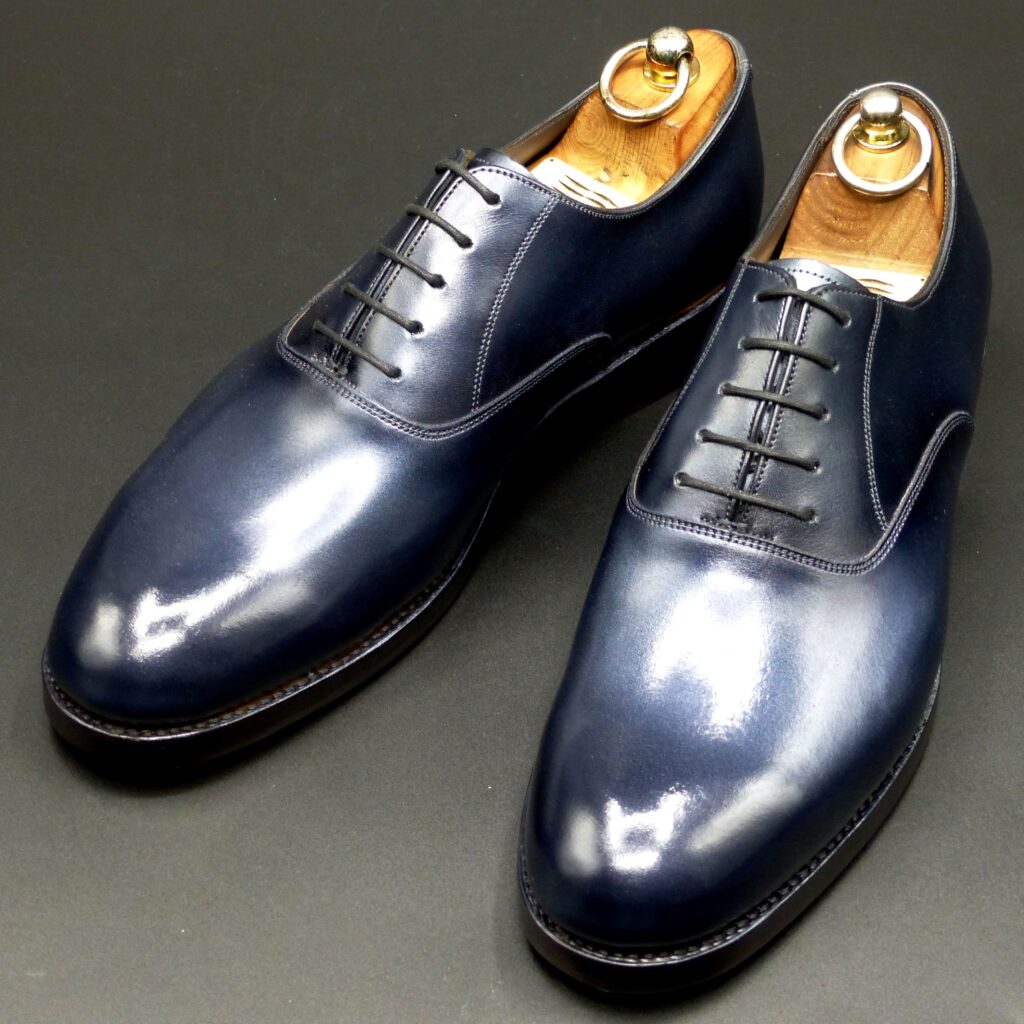
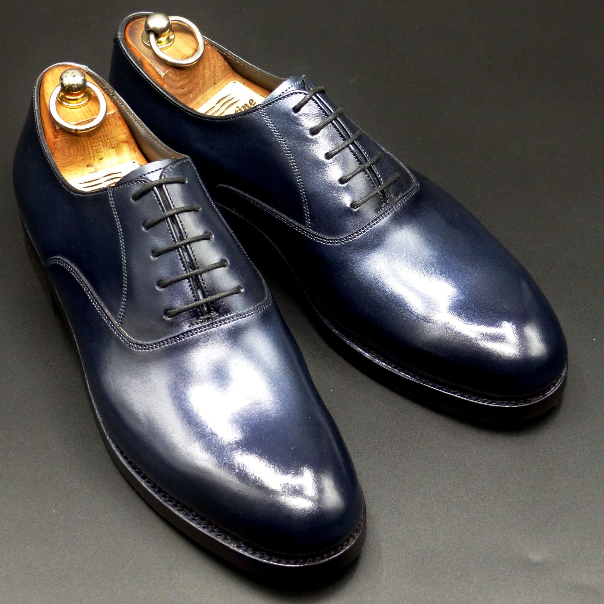
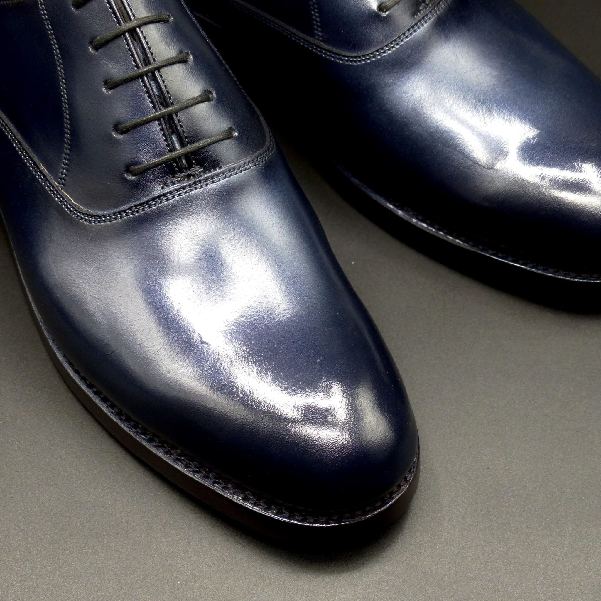
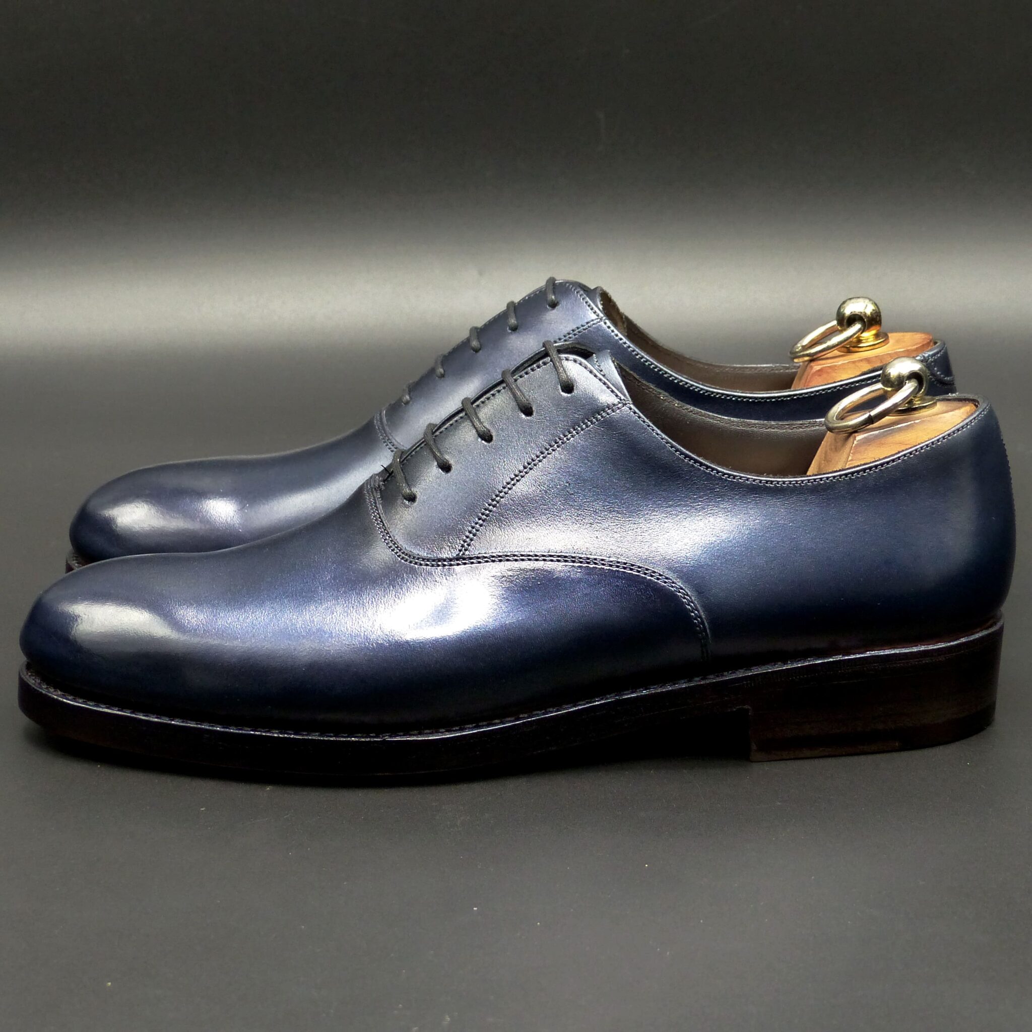
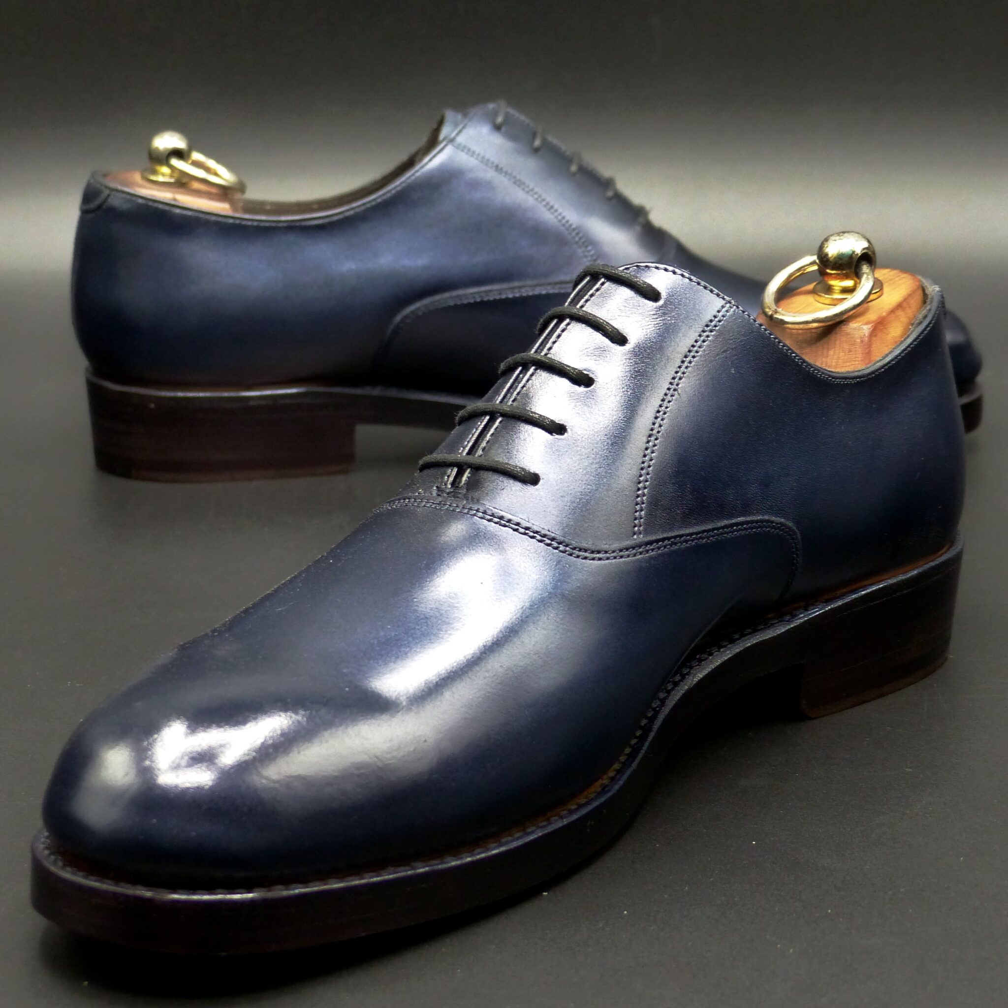
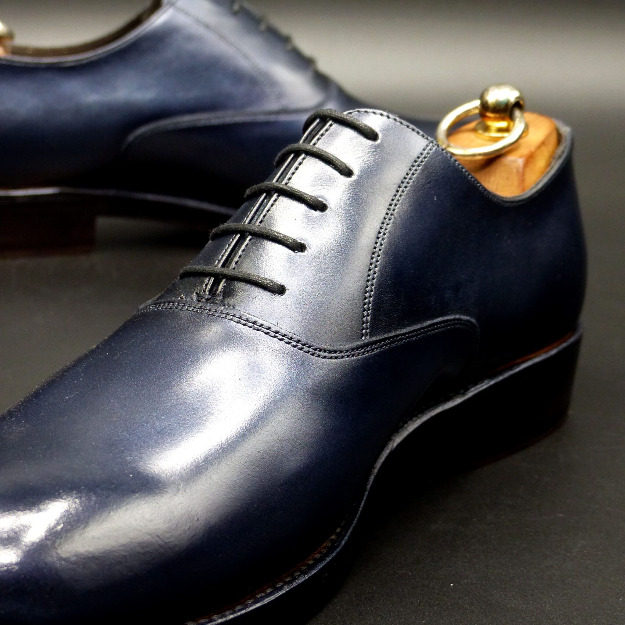
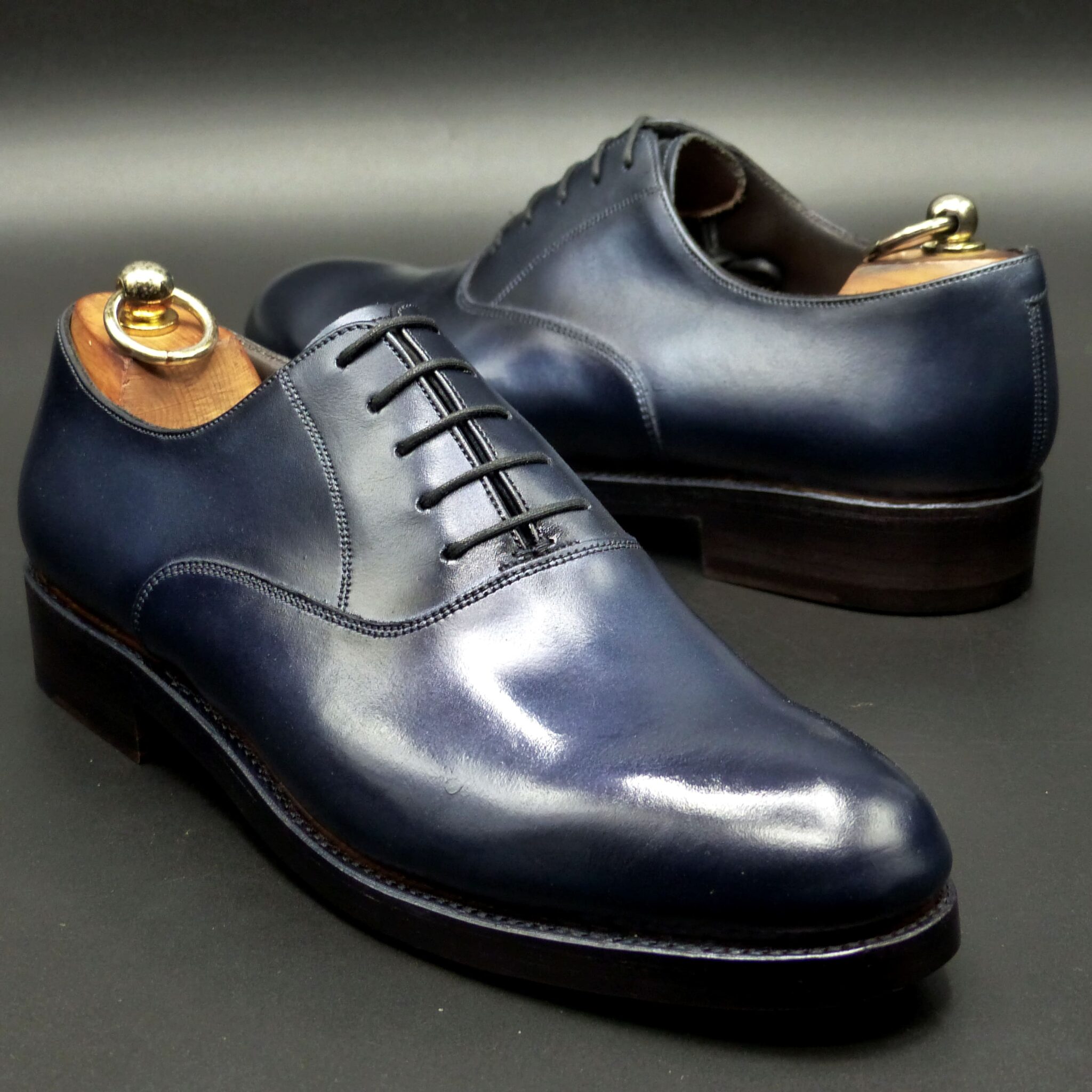
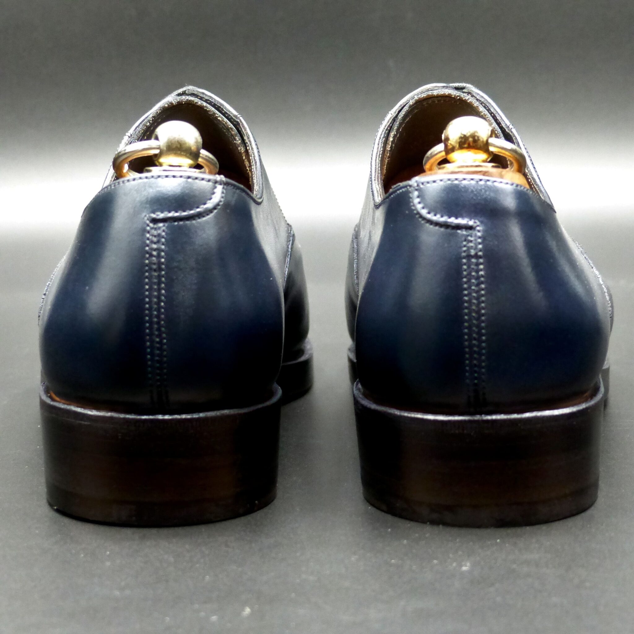
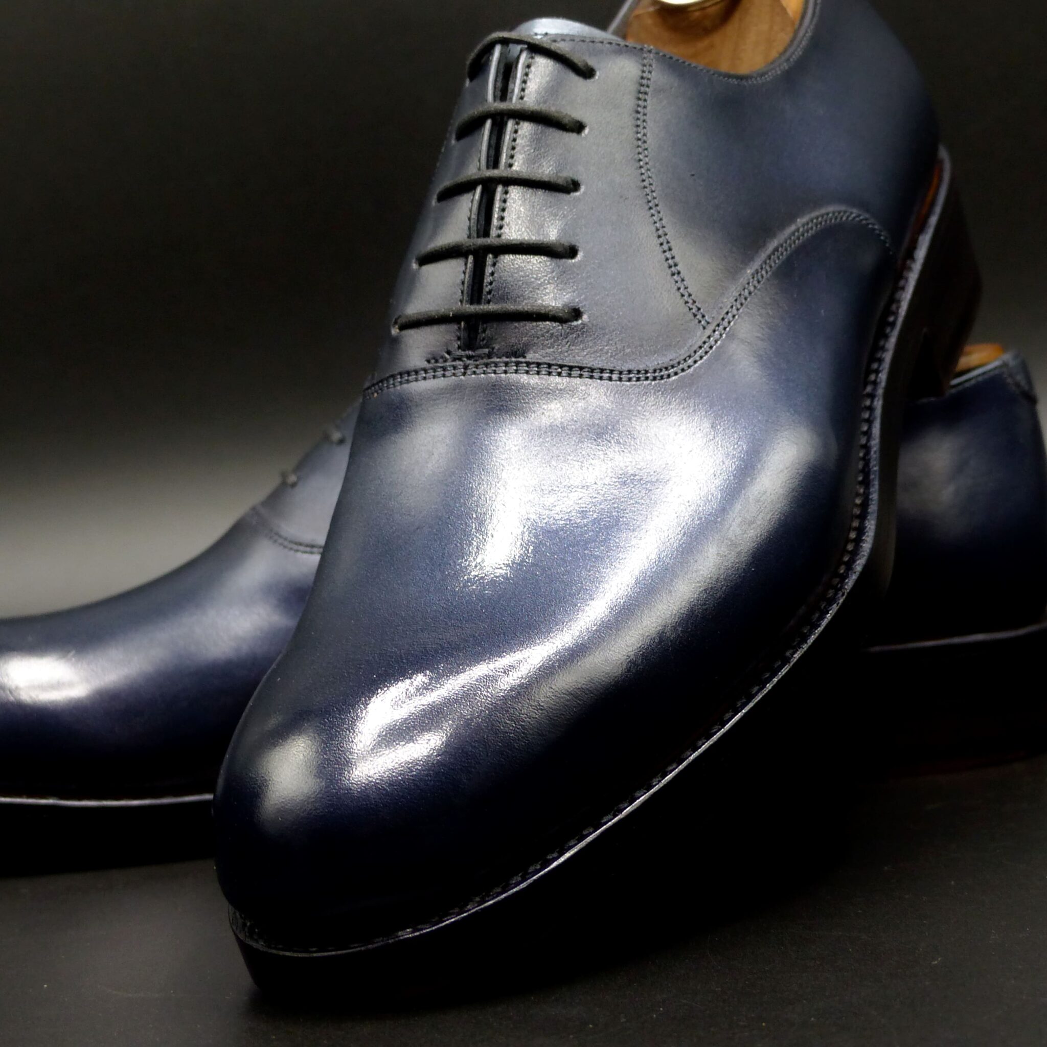
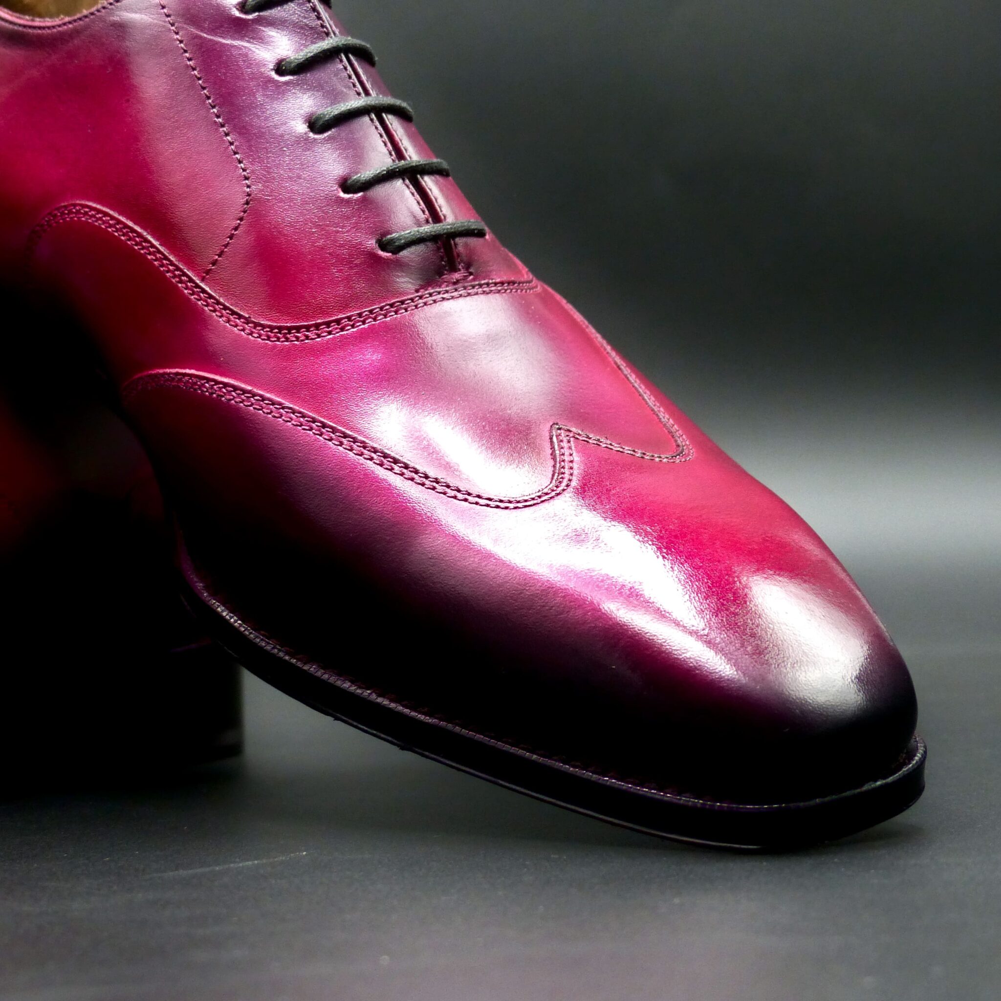
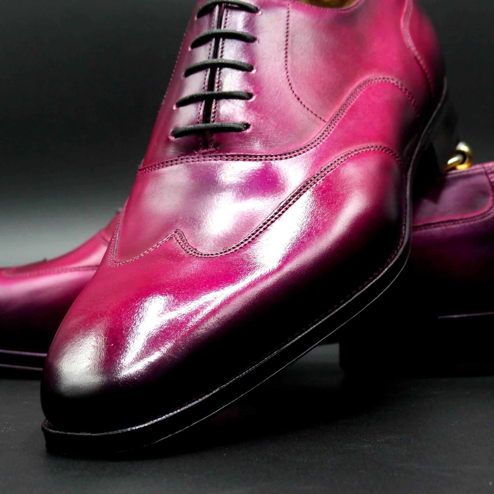
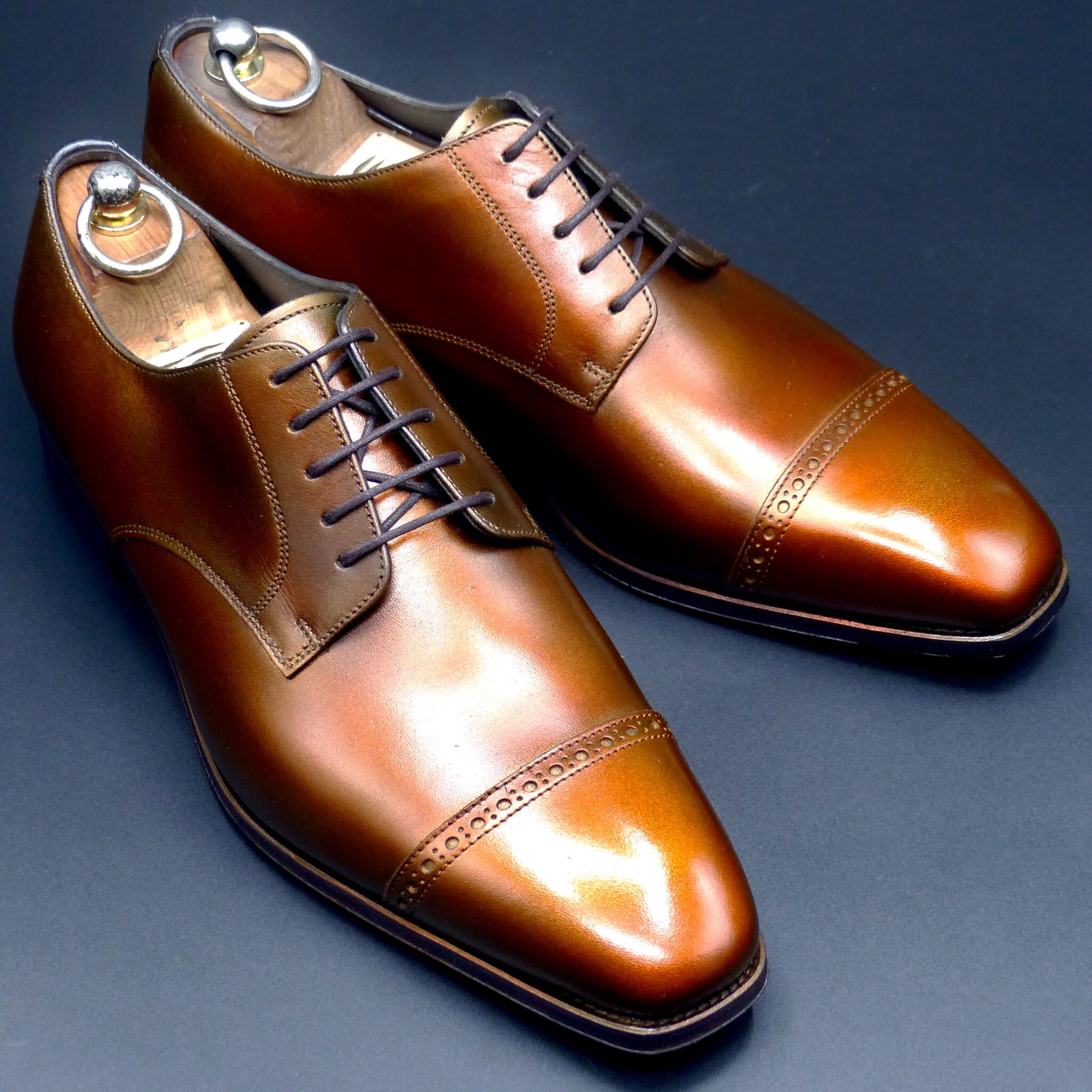
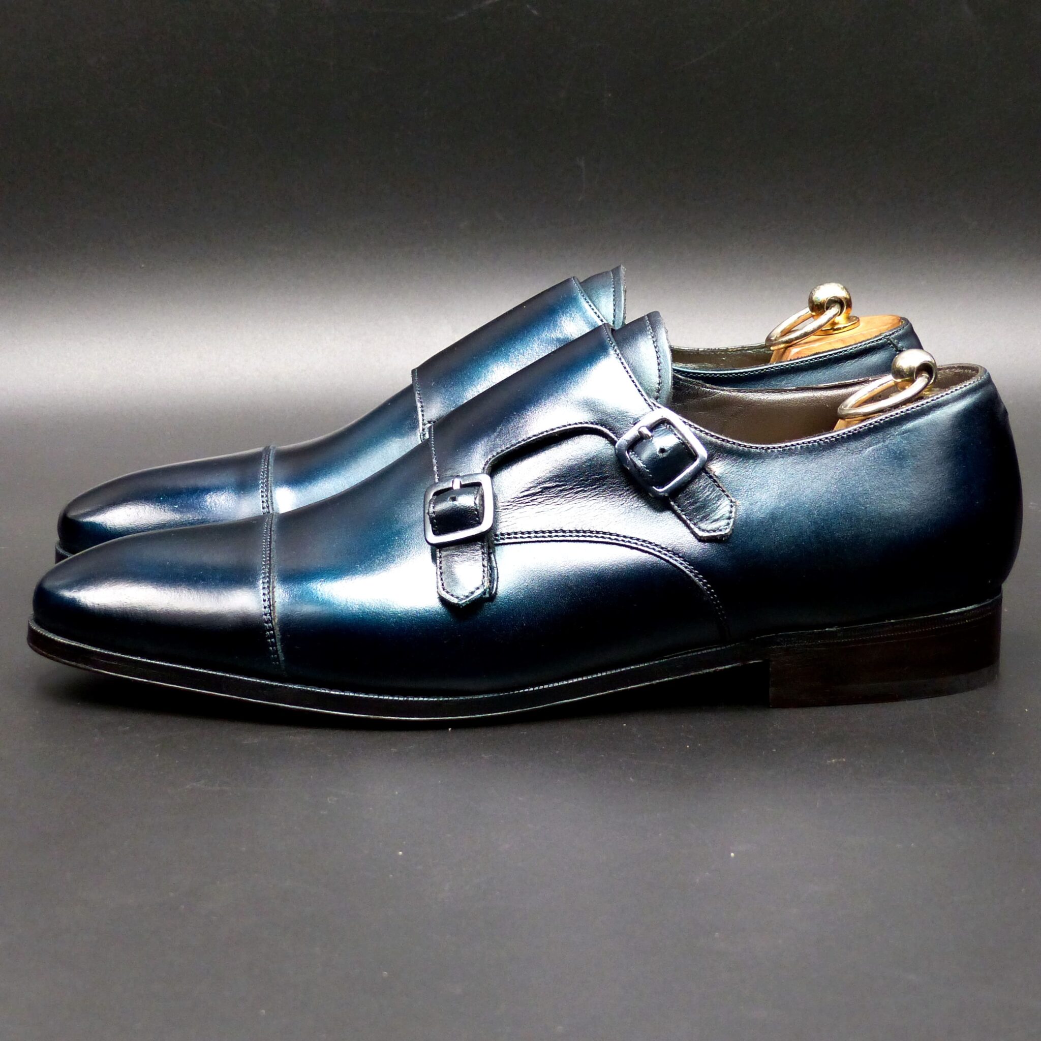
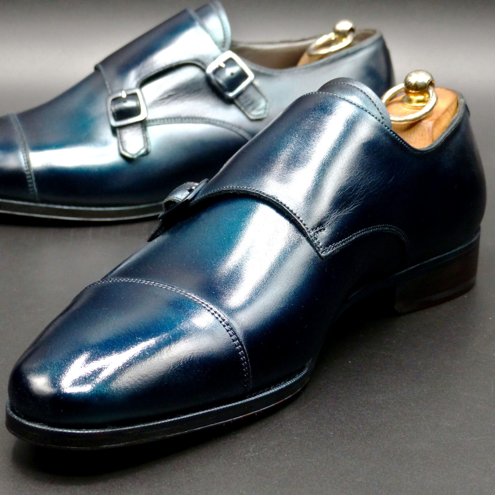
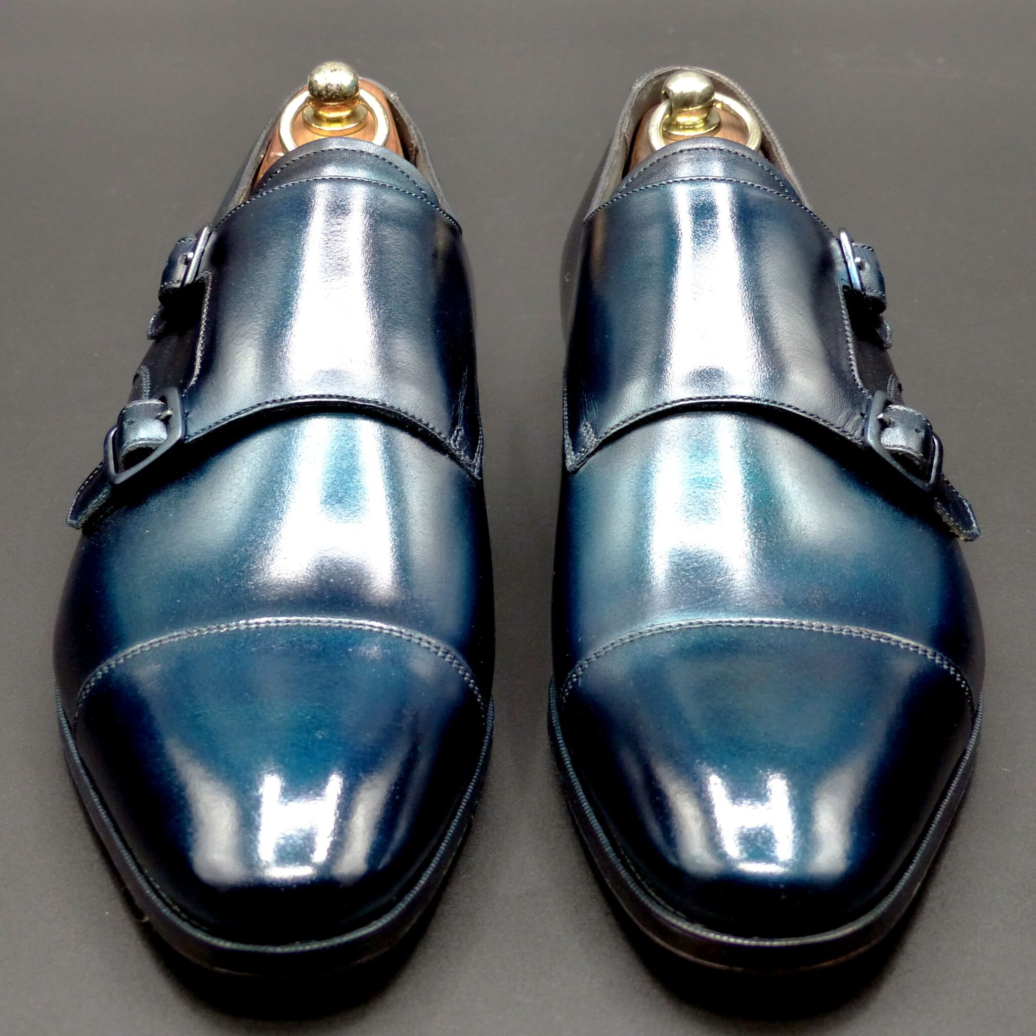
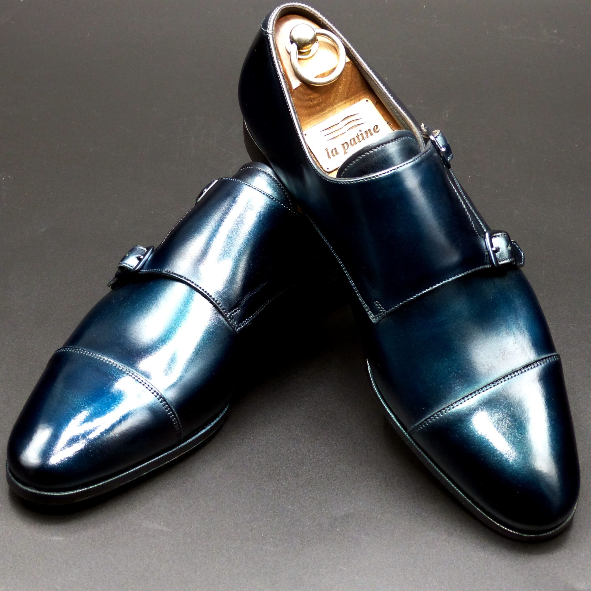
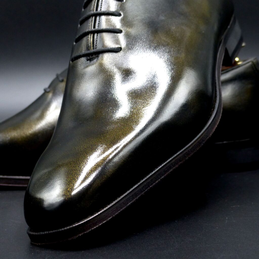
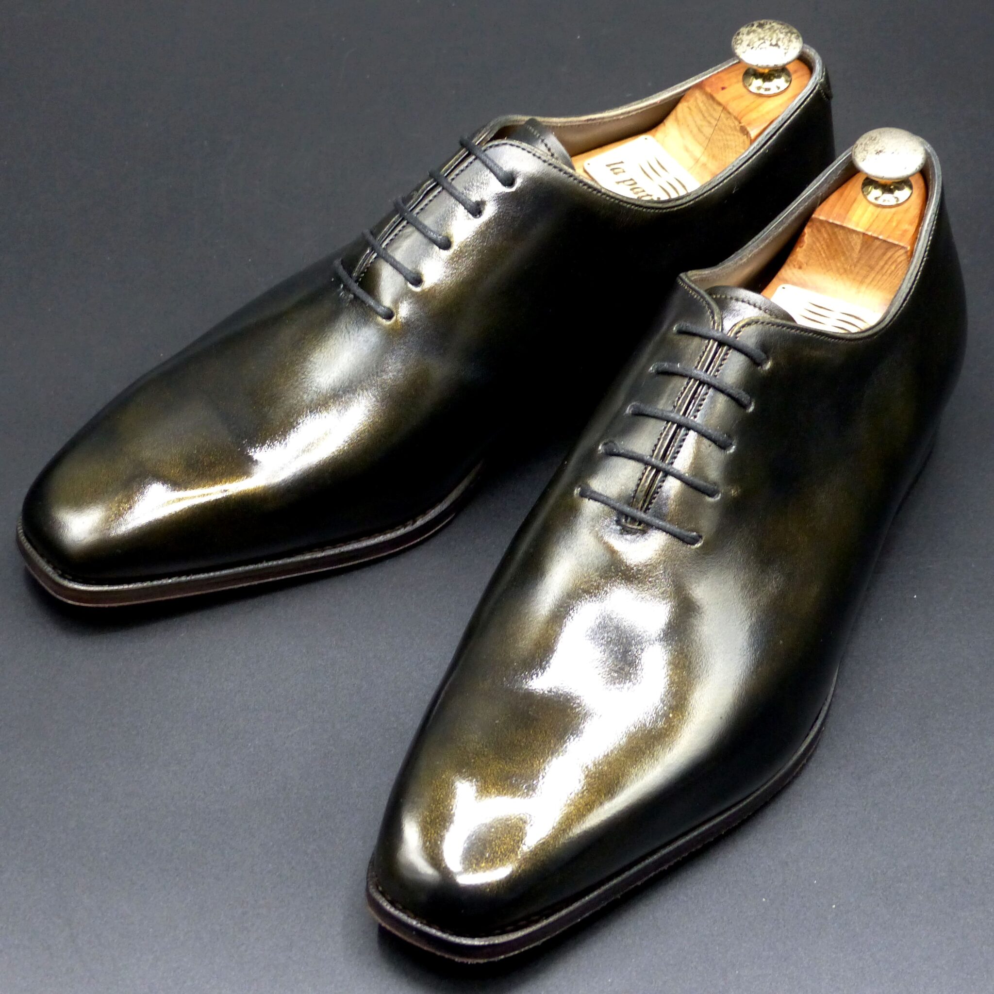
ホールカット・スリッポン
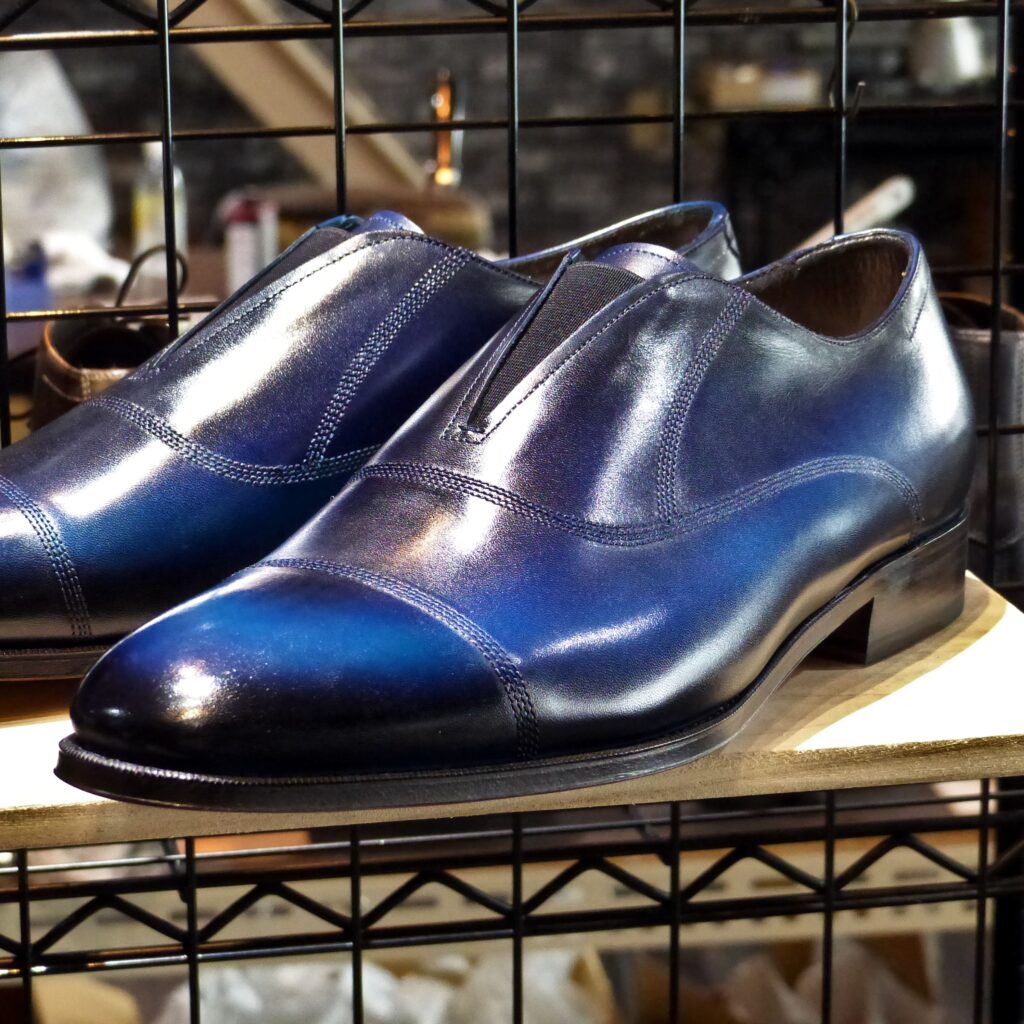
color name;
[ Ruri-Iro ]
瑠璃色
Whole Cut ・ Slip-on
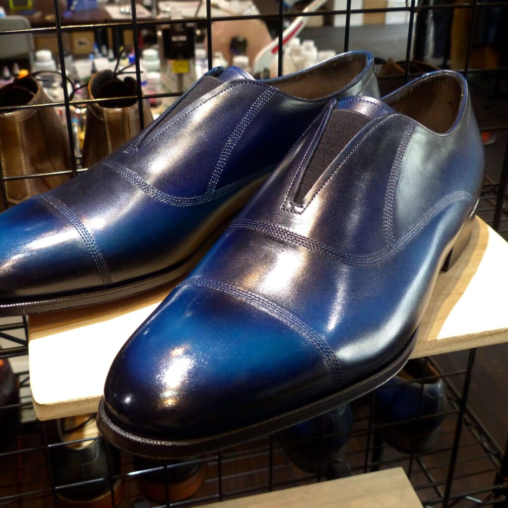

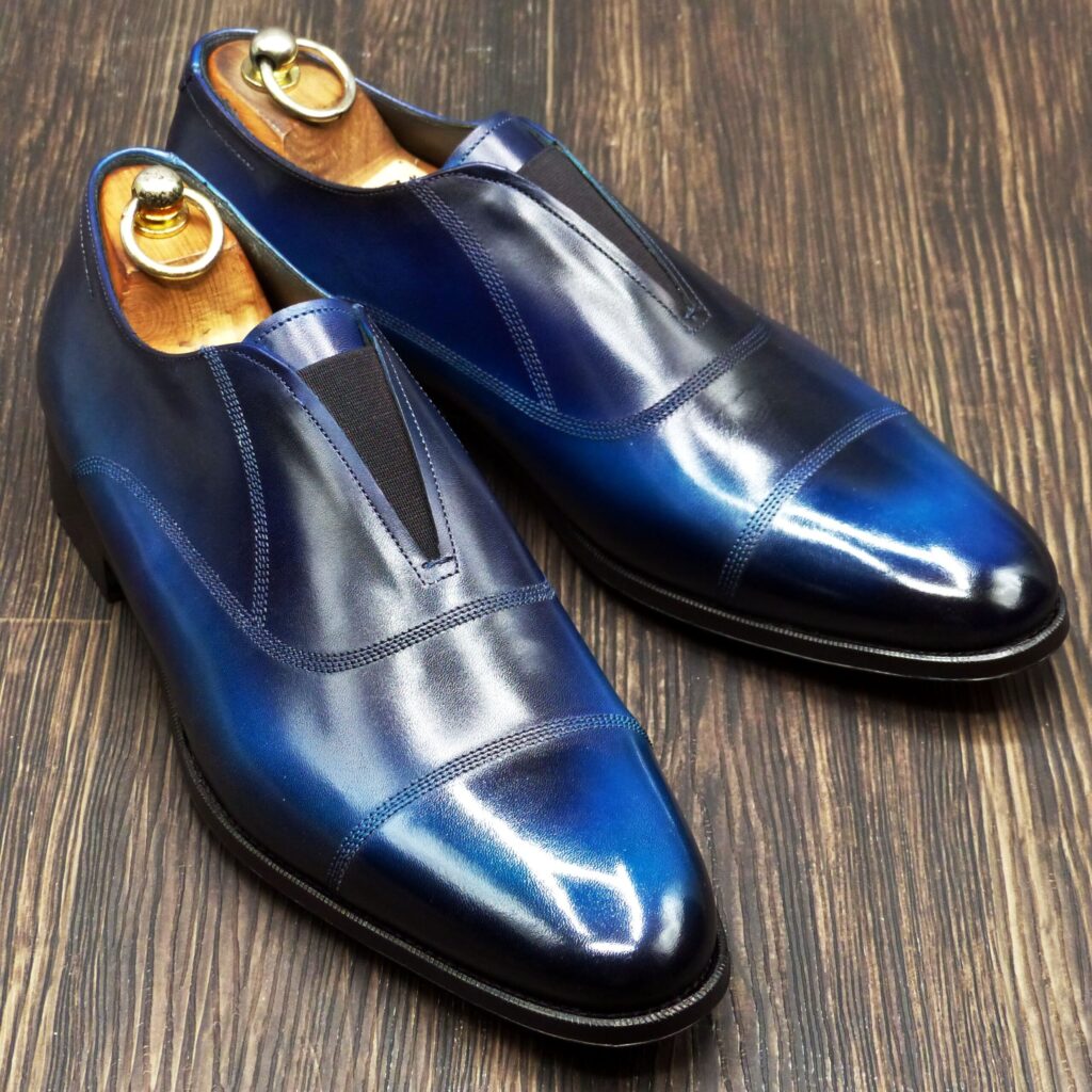
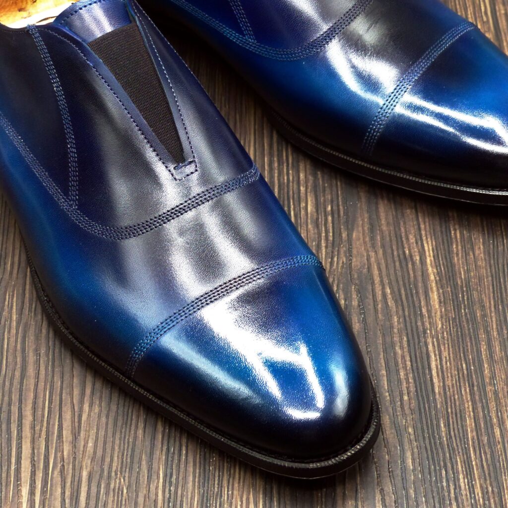


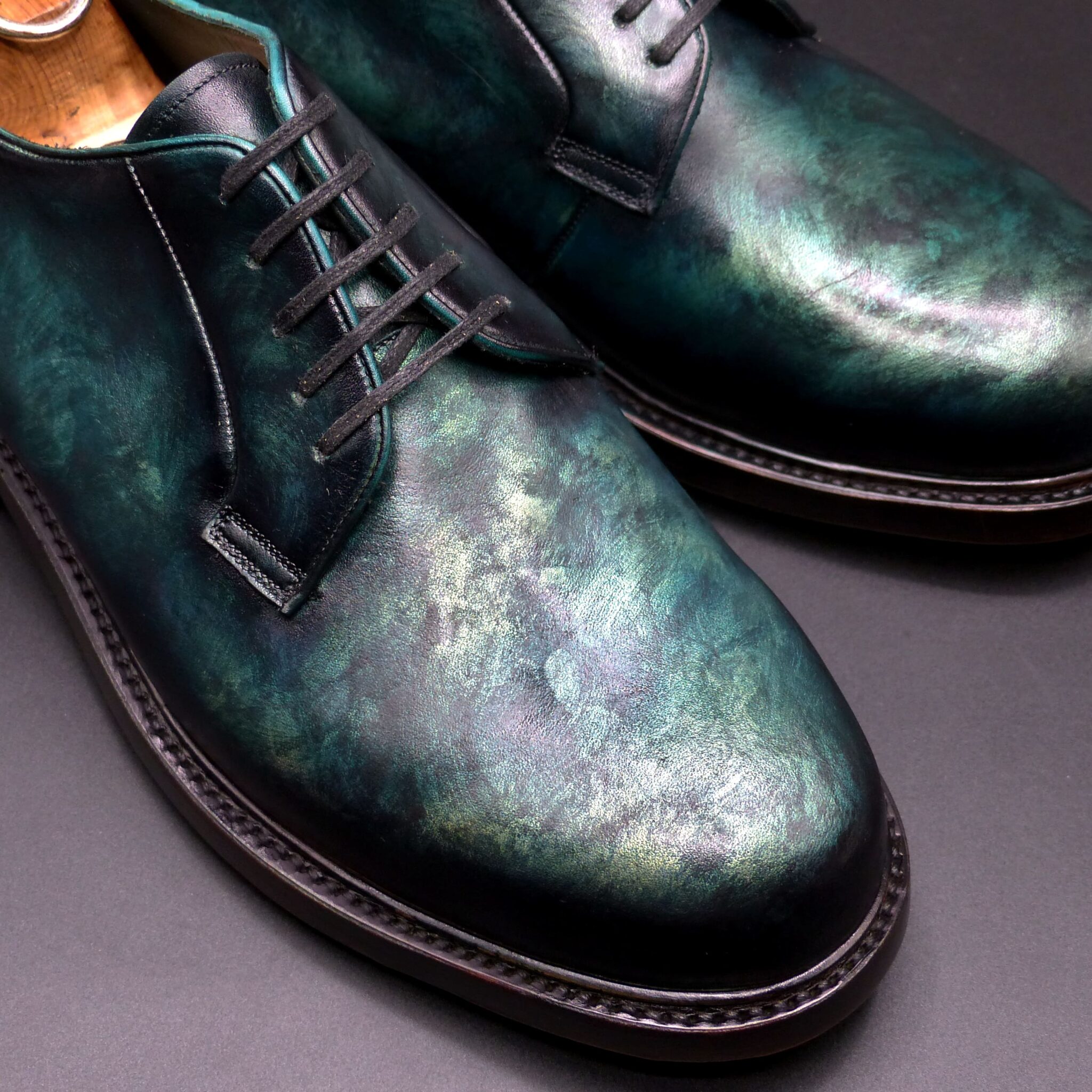
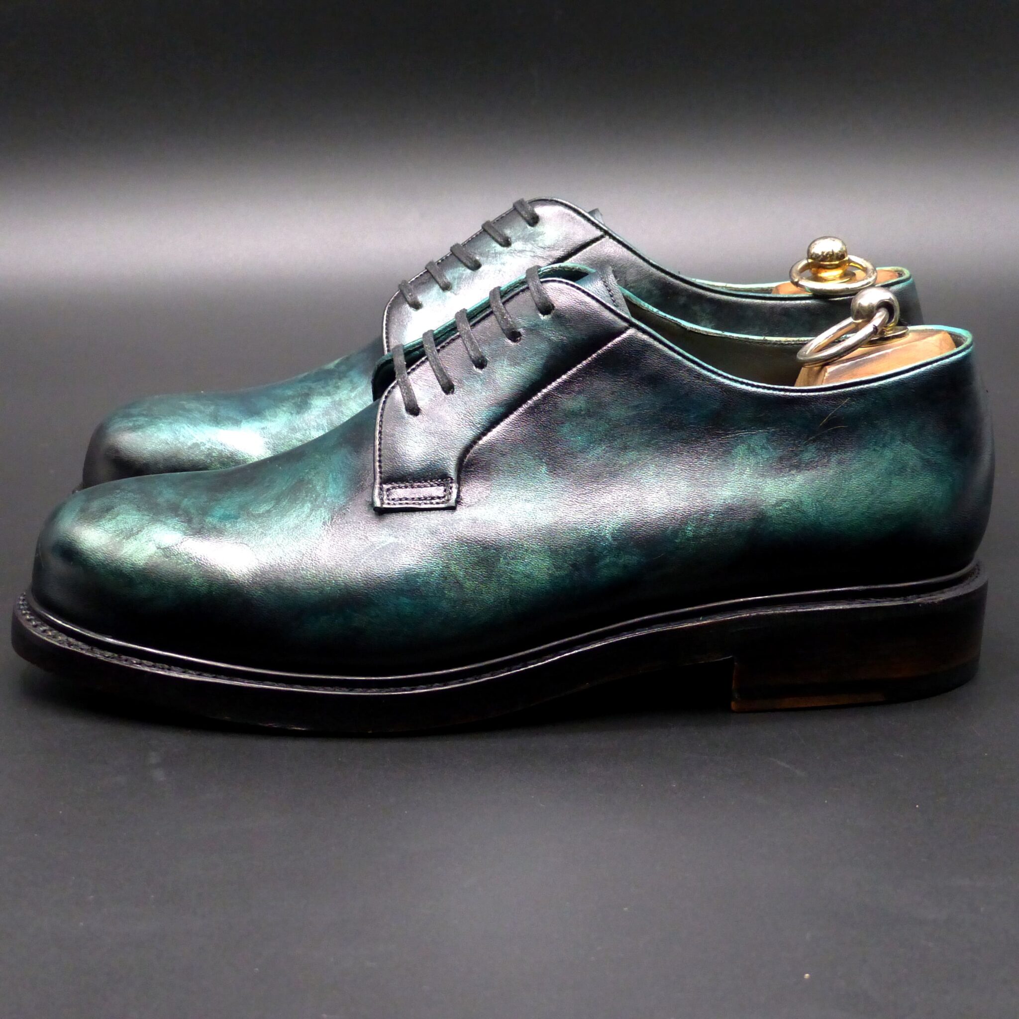
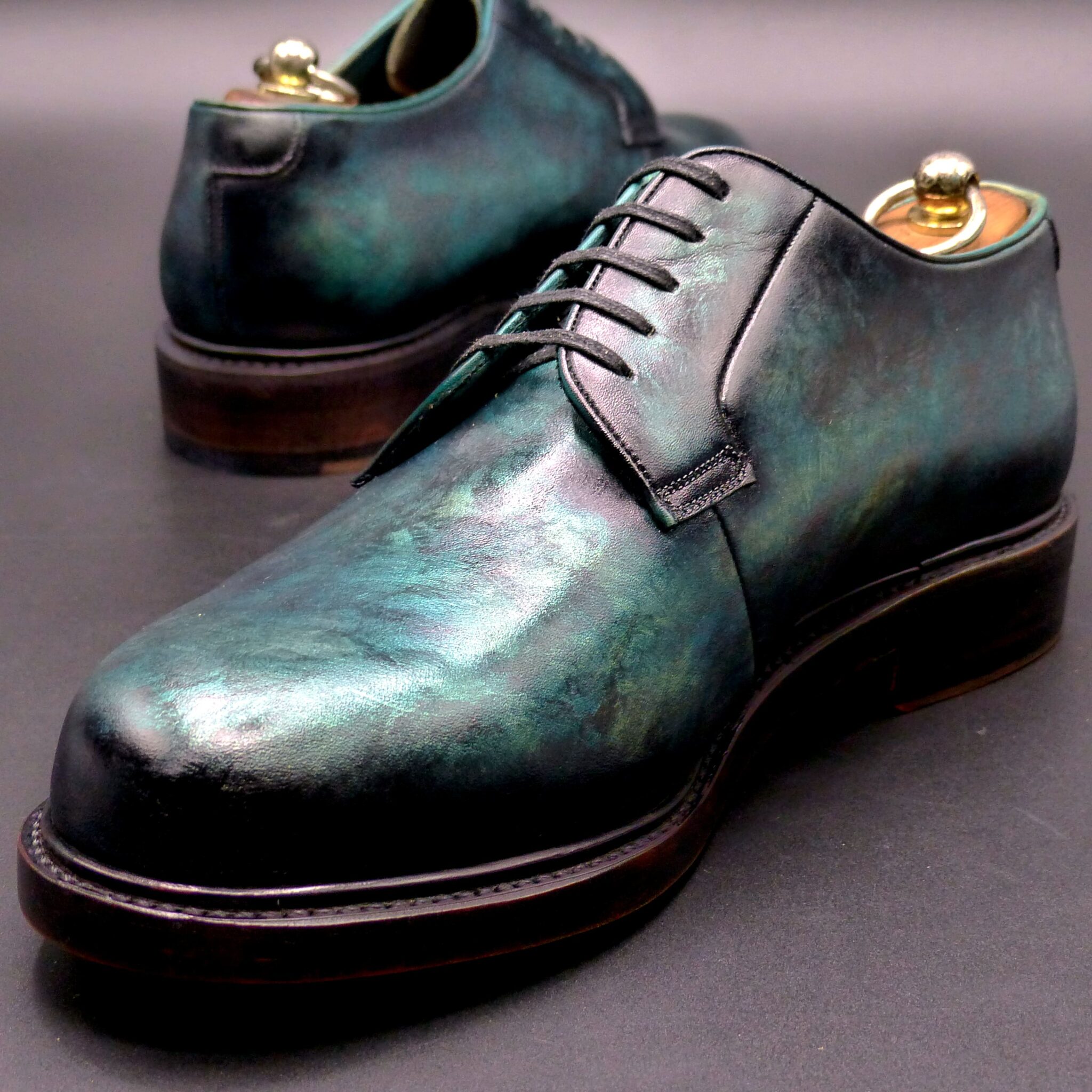
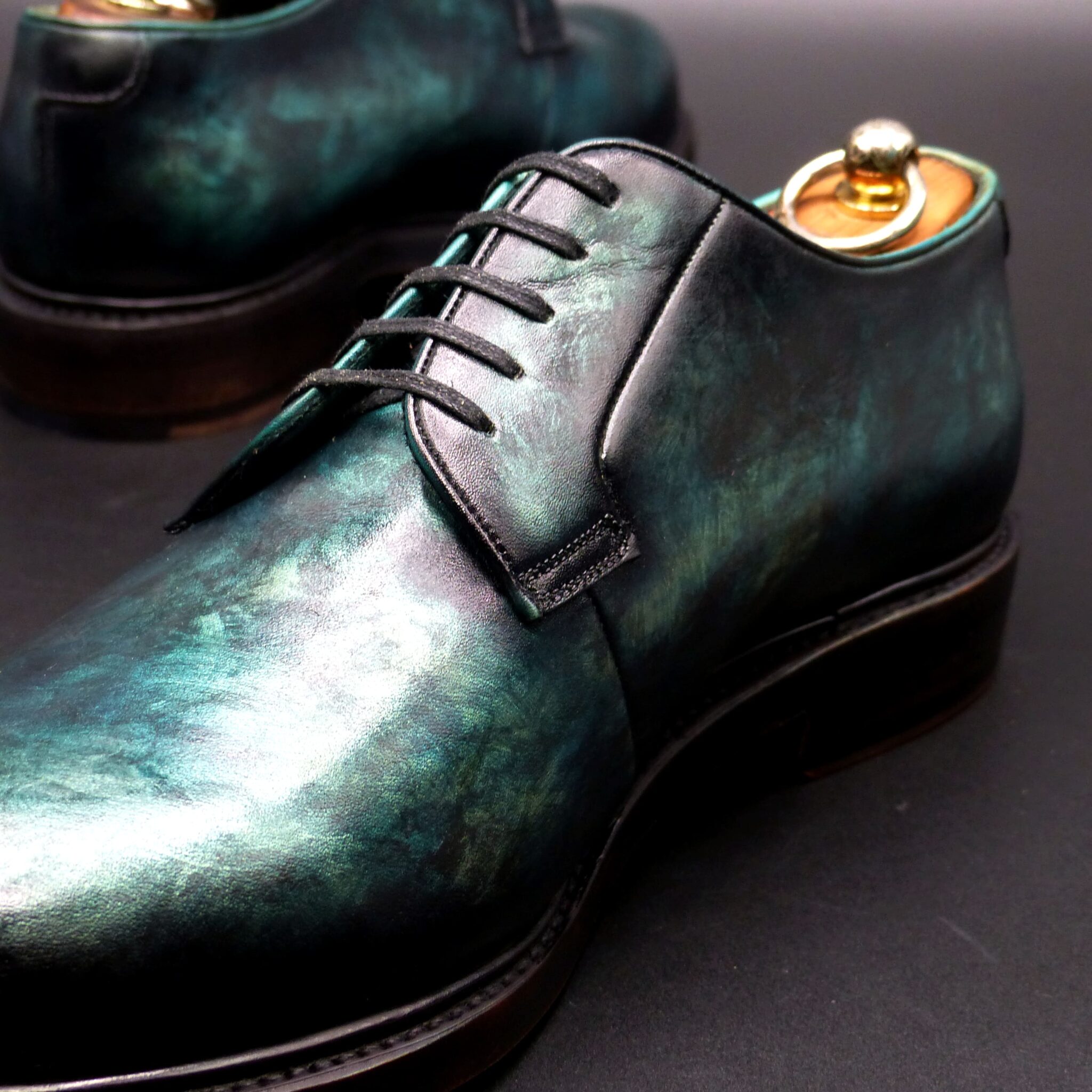
瑠璃色(るりいろ)とは?
瑠璃色(るりいろ)は、古代日本において 深く鮮やかな青色 を指し、仏教や貴族文化の中で特別な意味を持つ色でした。この名称は、宝石の「瑠璃」(ラピスラズリ) に由来し、瑠璃が仏教において神聖なものとされたことから、高貴で神秘的な色とされました。
- 瑠璃色の構成と色の特徴
色の構成
- 濃い群青色に近い深みのある青色。
- 天然のラピスラズリや藍染 から着想を得た色合い。
- 平安時代の『延喜式』にも記録があり、当時の染色技術では 藍染を重ねることで瑠璃色に近づけた と考えられる。
類似の色
- 群青色や紺青色に近いが、やや鮮やかさを持つ深い青。
- 近代では「コバルトブルー」や「ウルトラマリン」に例えられることもある。
- 瑠璃色が使われたシーン
(1)仏教と宗教的シンボル
- 仏教において瑠璃色は極楽浄土を象徴 し、薬師如来の「瑠璃光」から名付けられたとされる。
- 寺院の装飾や仏具、法衣など に瑠璃色が使われることがあった。
- 奈良時代には、仏教の影響で瑠璃色の陶器や装飾品が珍重された。
(2)貴族文化と衣装
- 平安時代には、高貴な身分の人々が愛用 した格式のある色。
- 十二単(じゅうにひとえ)の襲(かさね)の色目 に取り入れられ、特に青系の美しい組み合わせとして用いられた。
(3)染色・工芸品
- 藍染めの最高級の色 とされ、武士や裕福な町人の衣服にも使われた。
- 陶磁器や漆器 などの工芸品にも取り入れられ、江戸時代以降は「瑠璃釉(るりゆう)」という青釉を施した陶器が人気を博した。
- 瑠璃色が象徴するもの
① 神聖さと浄化
- 仏教では「瑠璃光」が病や災厄を払う力を持つとされる。
- 「清らかさ」「精神の純粋さ」を表し、邪気を払う神聖な色 として信じられた。
② 高貴さと格式
- 平安時代には 位の高い貴族の装束 に用いられ、威厳と品格を象徴した。
- 深みのある青は、落ち着きや品位を感じさせる色として重視された。
③ 知恵と静寂
- 瑠璃色は、深く澄んだ空や海の色を連想させ、「知性」「冷静さ」「真理の探求」 を表す色とされた。
- 侘び寂びの美意識にも通じ、茶道や工芸品の中で洗練された色として扱われた。
- まとめ
瑠璃色は、古代日本において 仏教の神聖な色、高貴な貴族の色、格式ある工芸の色 として大切にされました。その深く鮮やかな青は 「神聖さ」「知性」「高貴さ」 を象徴し、宗教や宮廷文化の中で重要な役割を果たしてきました。現代でも、和装や陶器、伝統工芸の分野で瑠璃色の美しさが受け継がれています。
What is Ruriiro (瑠璃色)?
Ruriiro (瑠璃色) is a deep and vivid blue that held special significance in ancient Japan, particularly in Buddhism and aristocratic culture. The name comes from the gemstone “ruri” (lapis lazuli), which was considered sacred in Buddhism. As a result, ruriiro was regarded as a noble and mystical color.
- Composition and Characteristics of Ruriiro
Color Composition
- A rich ultramarine blue close to deep azure.
- Inspired by natural lapis lazuli and indigo dyeing techniques.
- According to historical records such as the Engishiki (延喜式) of the Heian period, the color was achieved by layering indigo dye to create a deep, radiant blue.
Similar Colors
- Close to gunjō-iro (ultramarine) and konjō-iro (deep navy blue) but slightly more vibrant.
- In modern terms, it is often compared to cobalt blue or ultramarine blue.
- Usage of Ruriiro in Ancient Japan
(1) Buddhism and Religious Symbols
- In Buddhism, ruriiro symbolizes the Pure Land, derived from Yakushi Nyorai’s (Medicine Buddha) “Ruriko” (瑠璃光, Lapis Lazuli Light).
- It was used in temple decorations, Buddhist ritual objects, and priestly robes.
- During the Nara period, the influence of Buddhism led to the production of ruriiro-colored ceramics and ornaments, which were highly prized.
(2) Aristocratic Culture and Attire
- During the Heian period, ruriiro was favored by the nobility as a prestigious color.
- It was incorporated into jūnihitoe (twelve-layered kimono) and kasane no irome (layered color combinations) to create elegant and refined attire.
(3) Dyeing and Craftwork
- Considered the highest grade of indigo dye, ruriiro was also used in the clothing of samurai and wealthy townspeople.
- The color was applied to ceramics, lacquerware, and other crafts, and from the Edo period onward, ruriyū (瑠璃釉, blue glaze) became a popular ceramic technique.
- Symbolism of Ruriiro
① Sacredness and Purification
- In Buddhism, “Ruriko” (瑠璃光, Lapis Lazuli Light) was believed to have the power to ward off illness and misfortune.
- The color represented purity, spiritual clarity, and divine protection.
② Nobility and Prestige
- During the Heian period, ruriiro was used in the attire of high-ranking nobles, symbolizing dignity and refinement.
- Its deep, serene hue was associated with elegance, sophistication, and authority.
③ Wisdom and Tranquility
- The deep, clear blue of ruriiro evoked the vast sky and sea, symbolizing intelligence, calmness, and the pursuit of truth.
- It also resonated with the Japanese aesthetics of wabi-sabi, influencing tea ceremonies and traditional crafts.
- Conclusion
Ruriiro was deeply valued in ancient Japan as a sacred Buddhist color, an aristocratic hue, and a refined artistic shade. Its vibrant blue represented divinity, wisdom, and nobility, playing a crucial role in religious, courtly, and artistic traditions. Even today, ruriiro continues to be cherished in kimono, ceramics, and traditional crafts, preserving its timeless beauty.
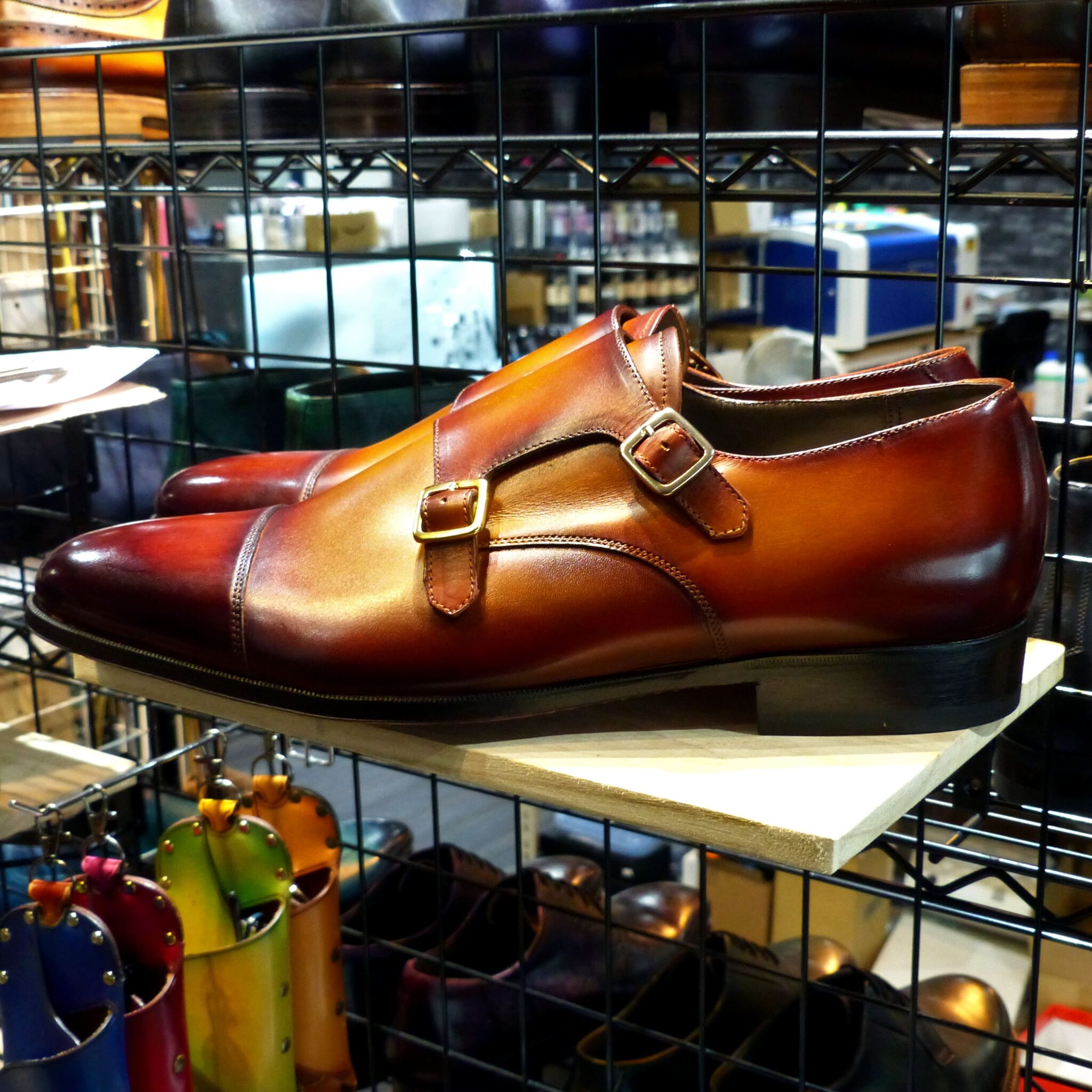
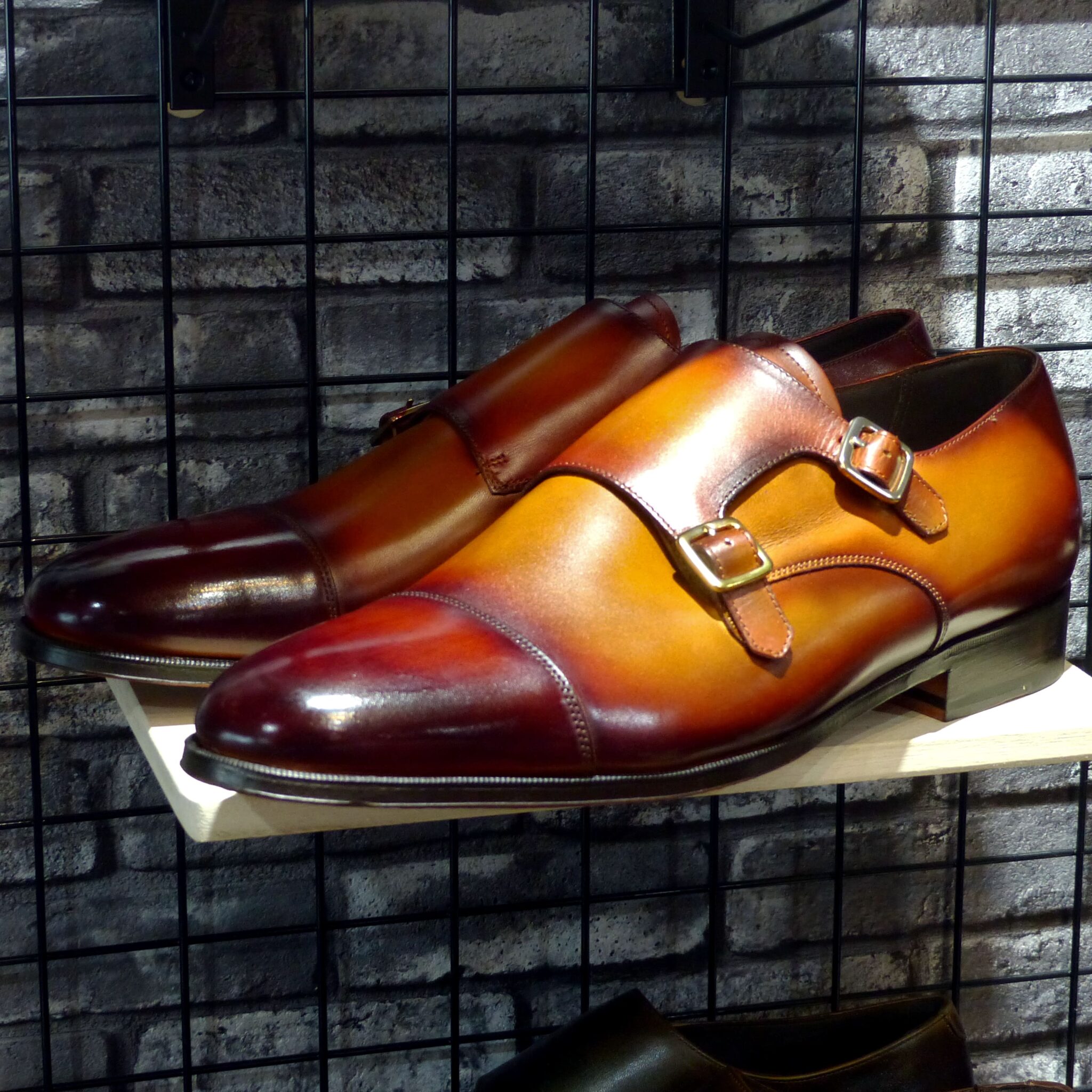
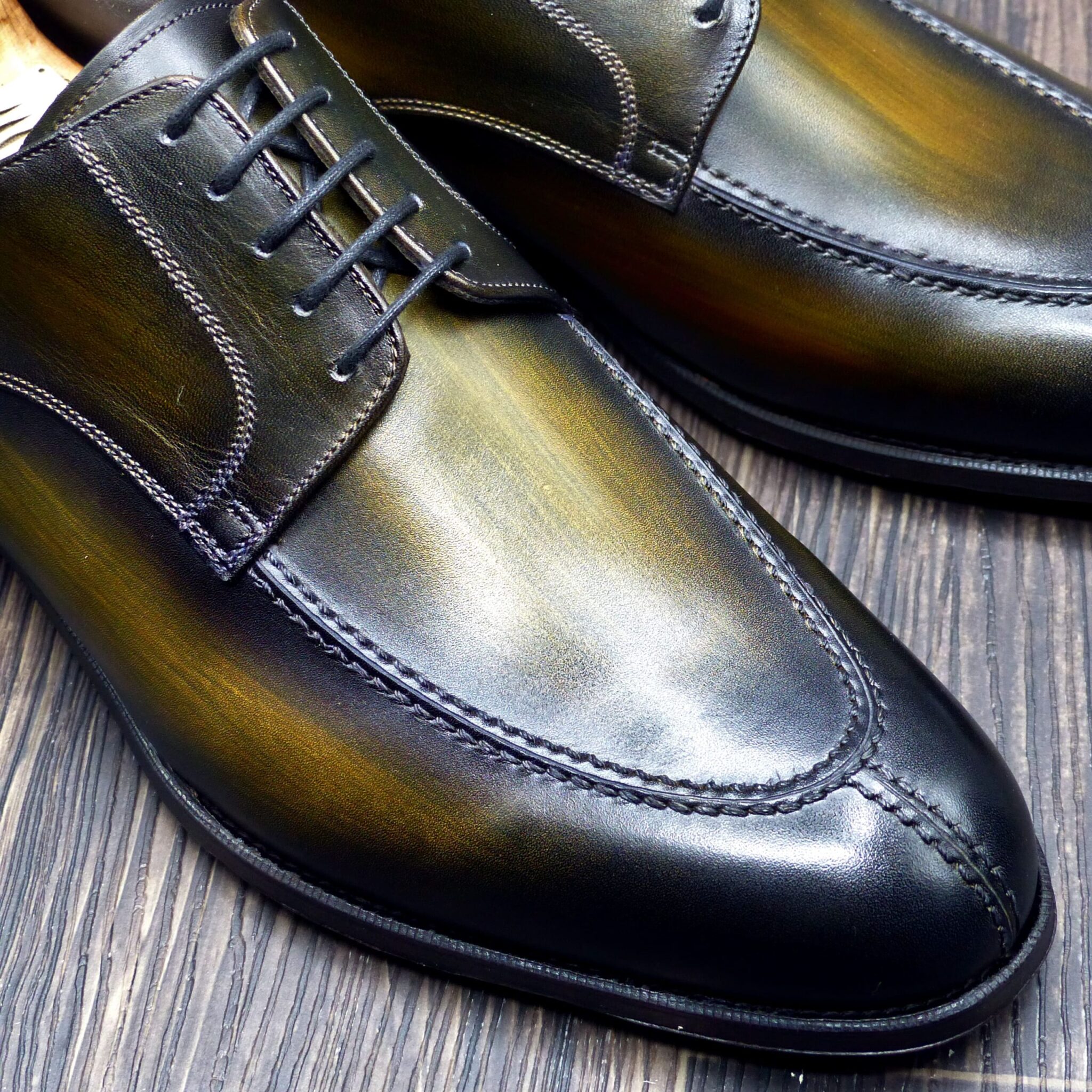
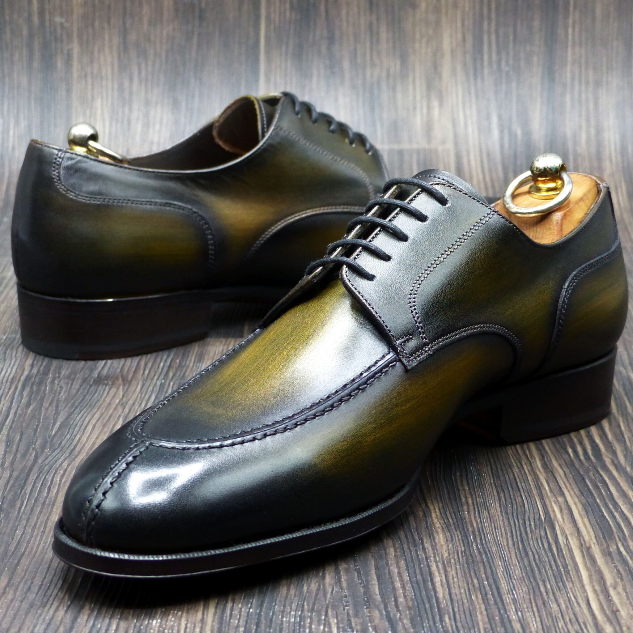
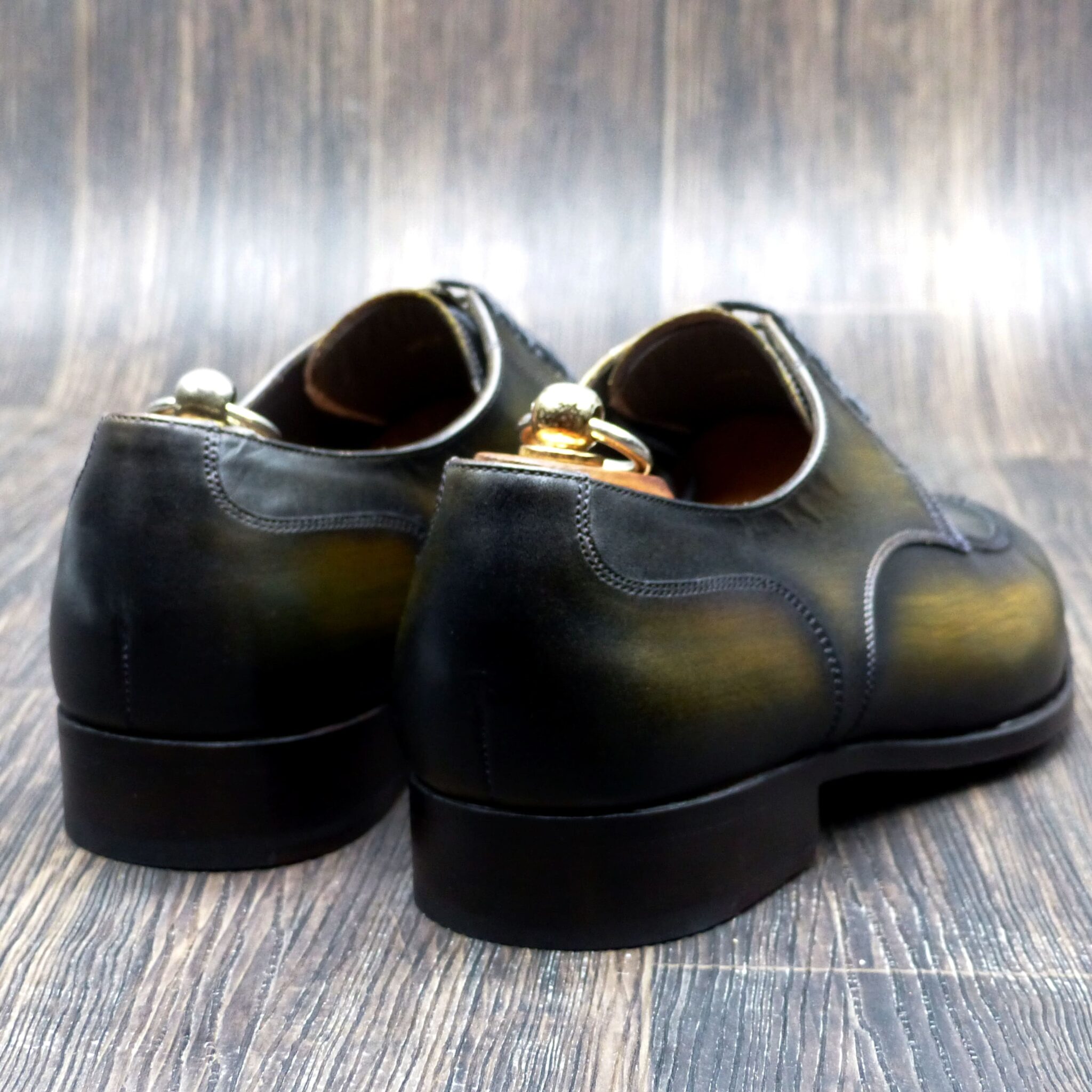
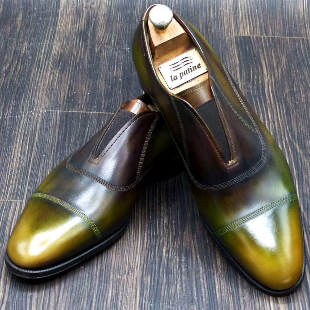
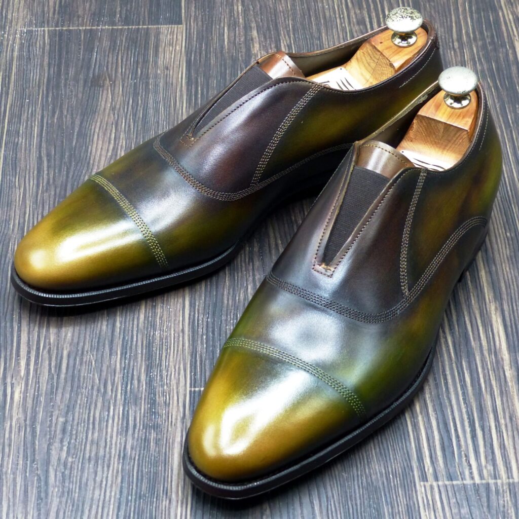
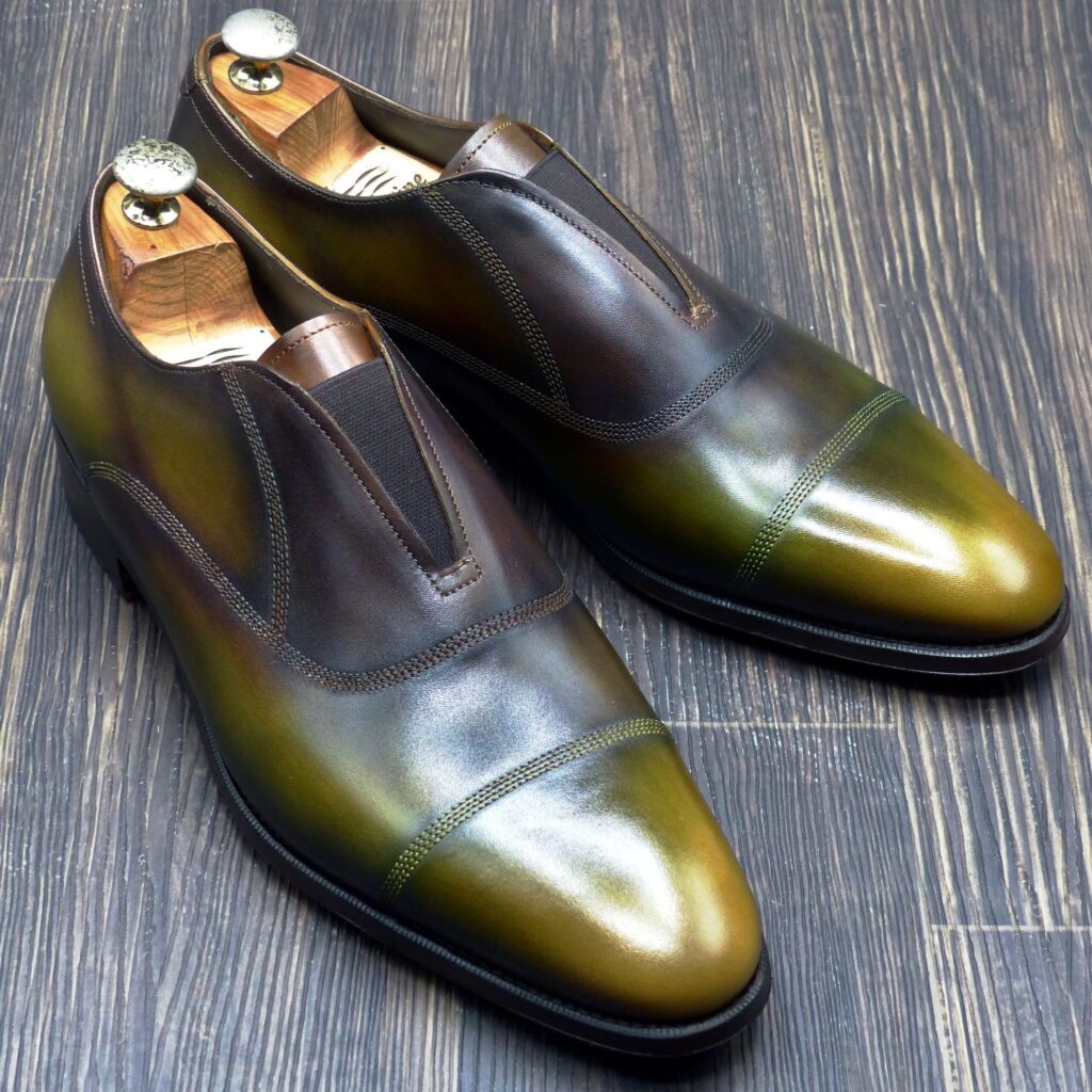
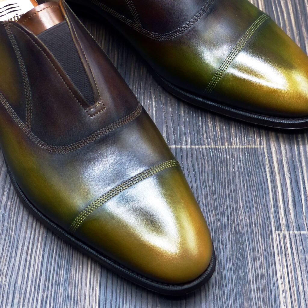
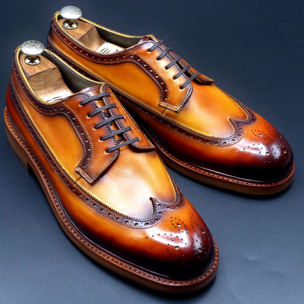
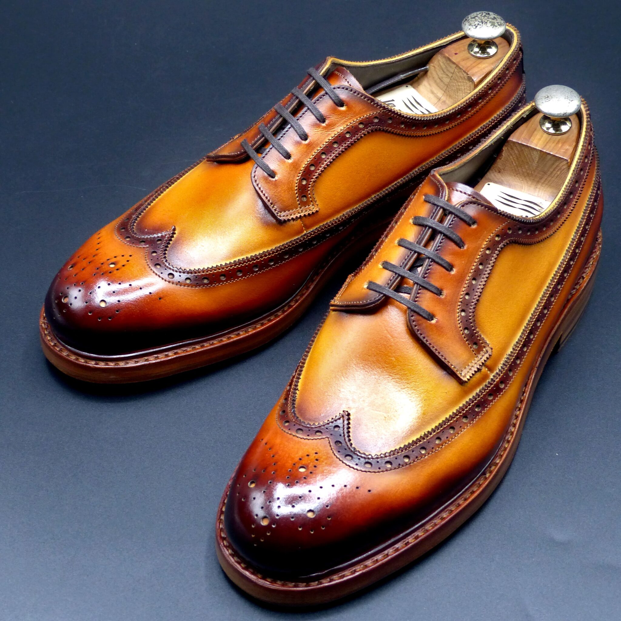
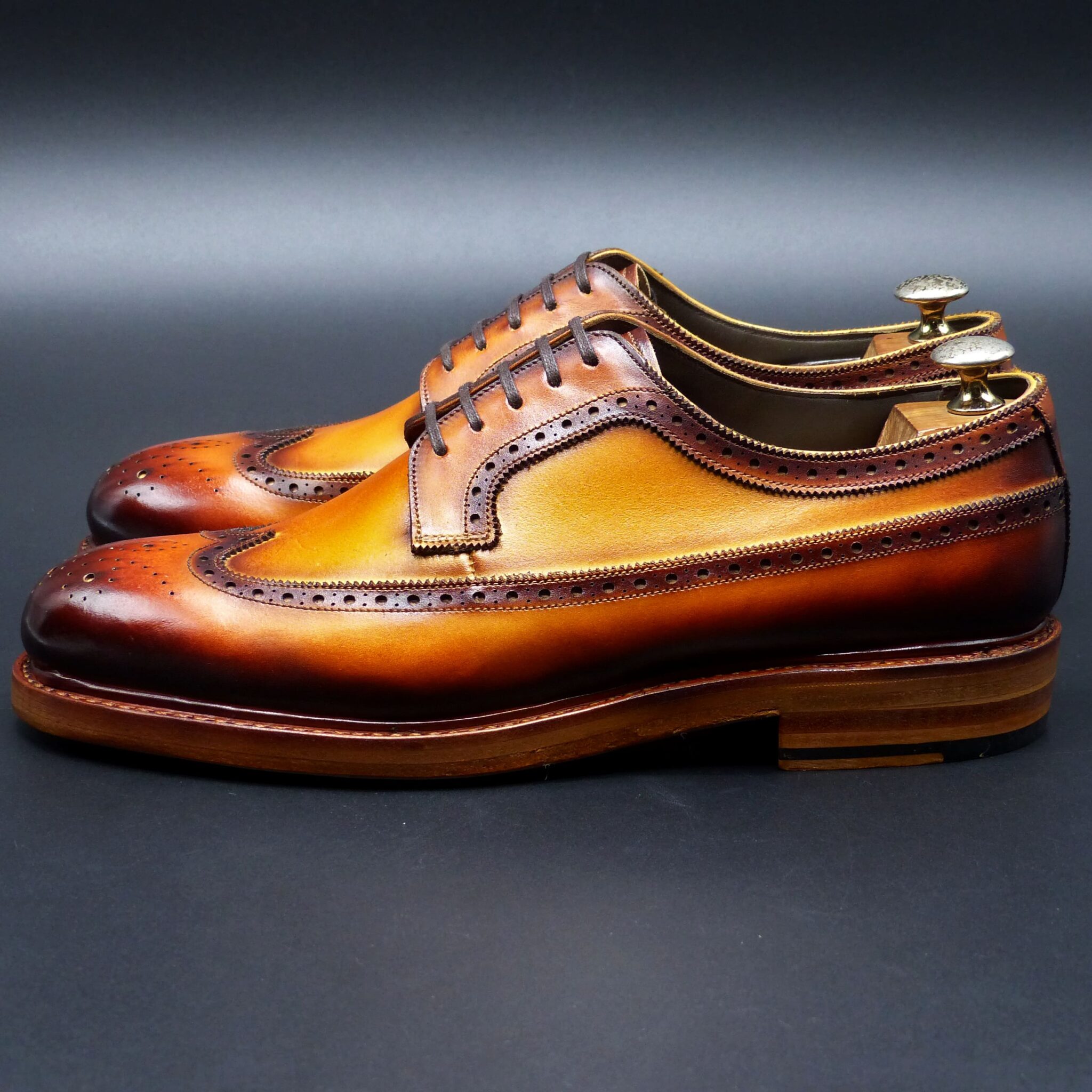
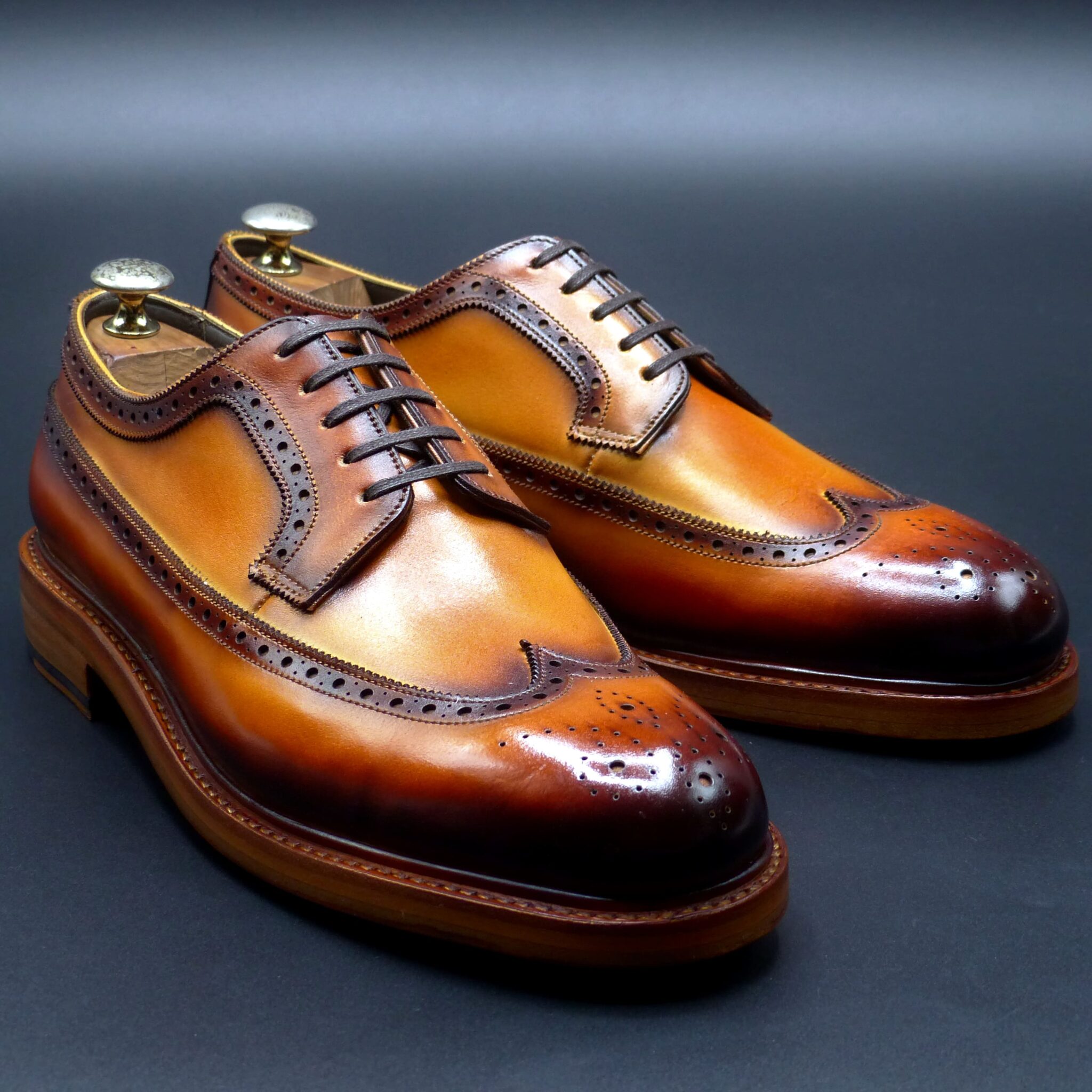
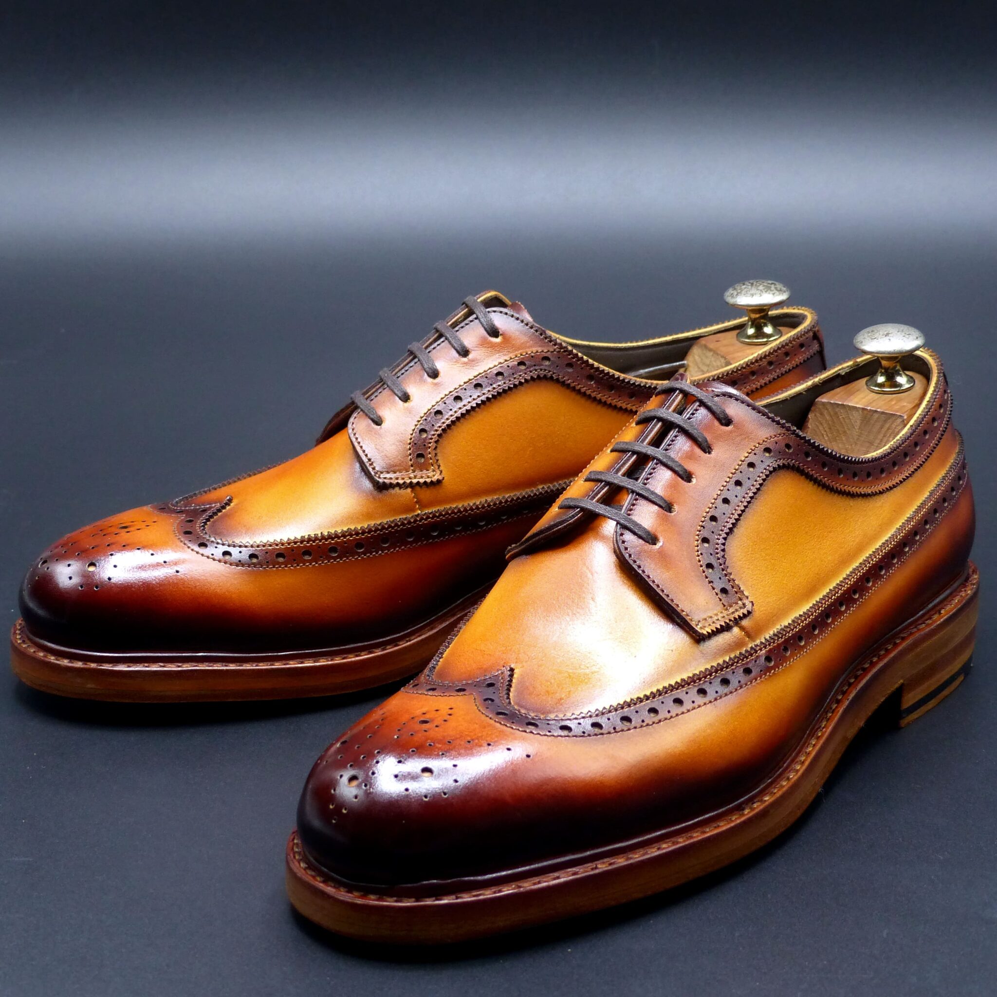
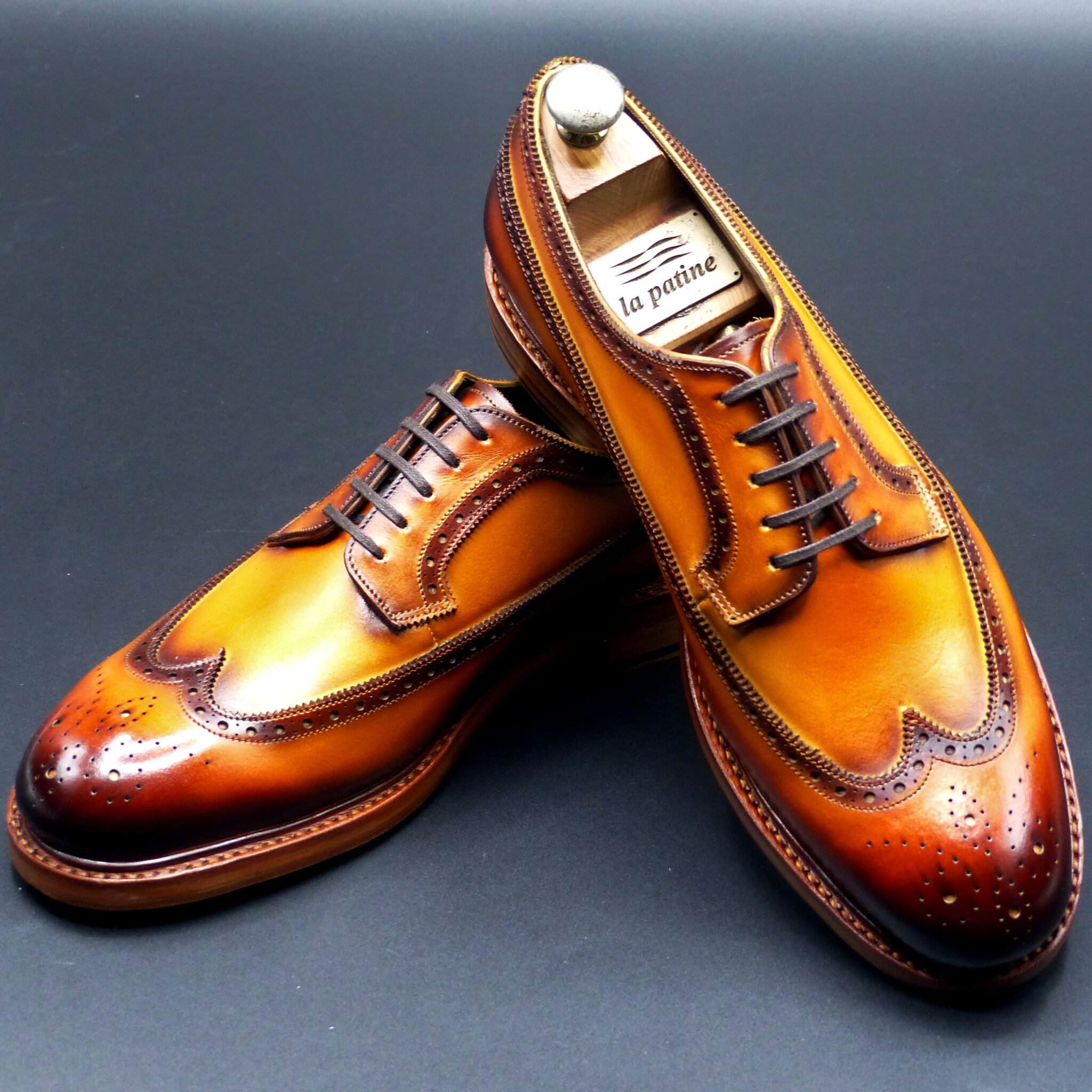
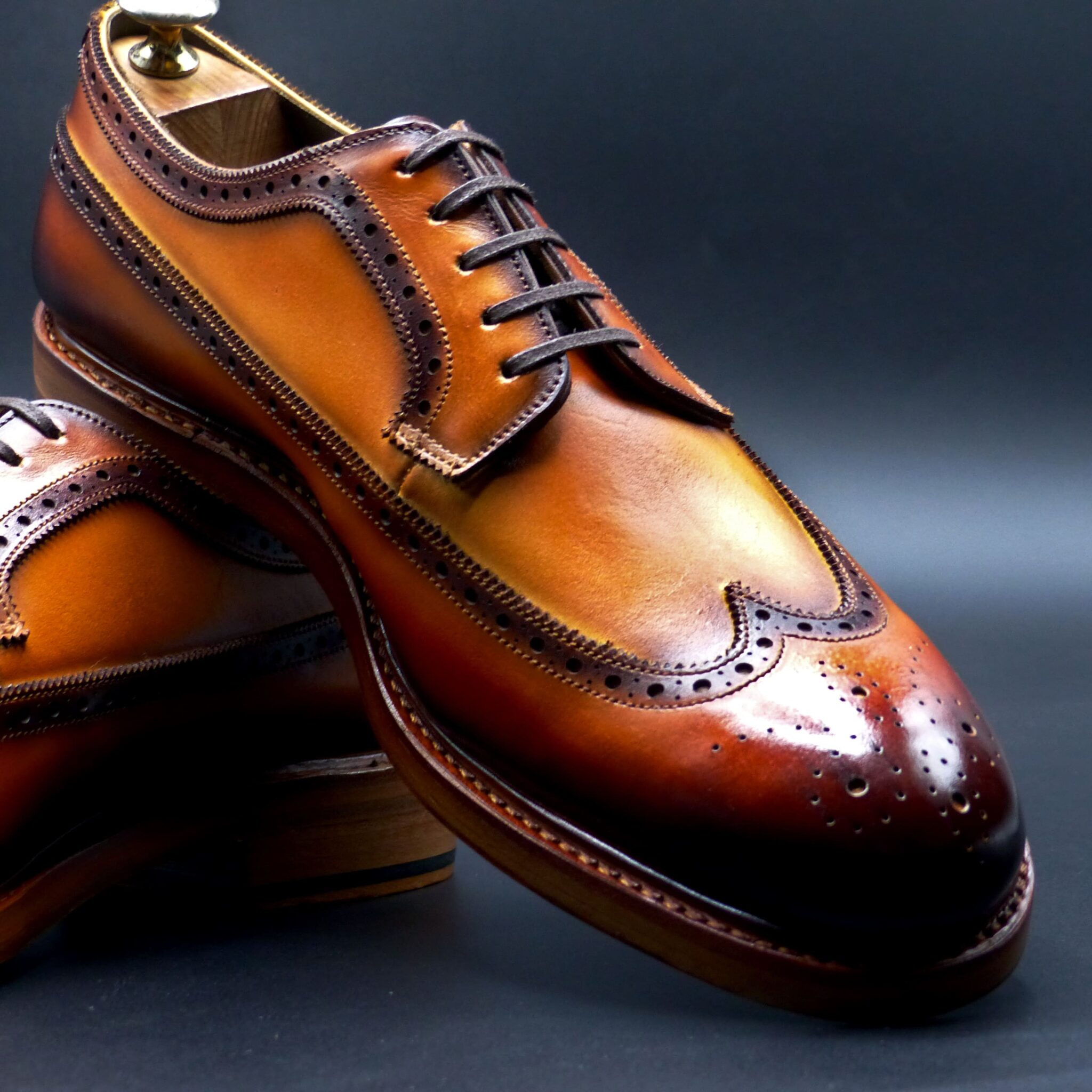
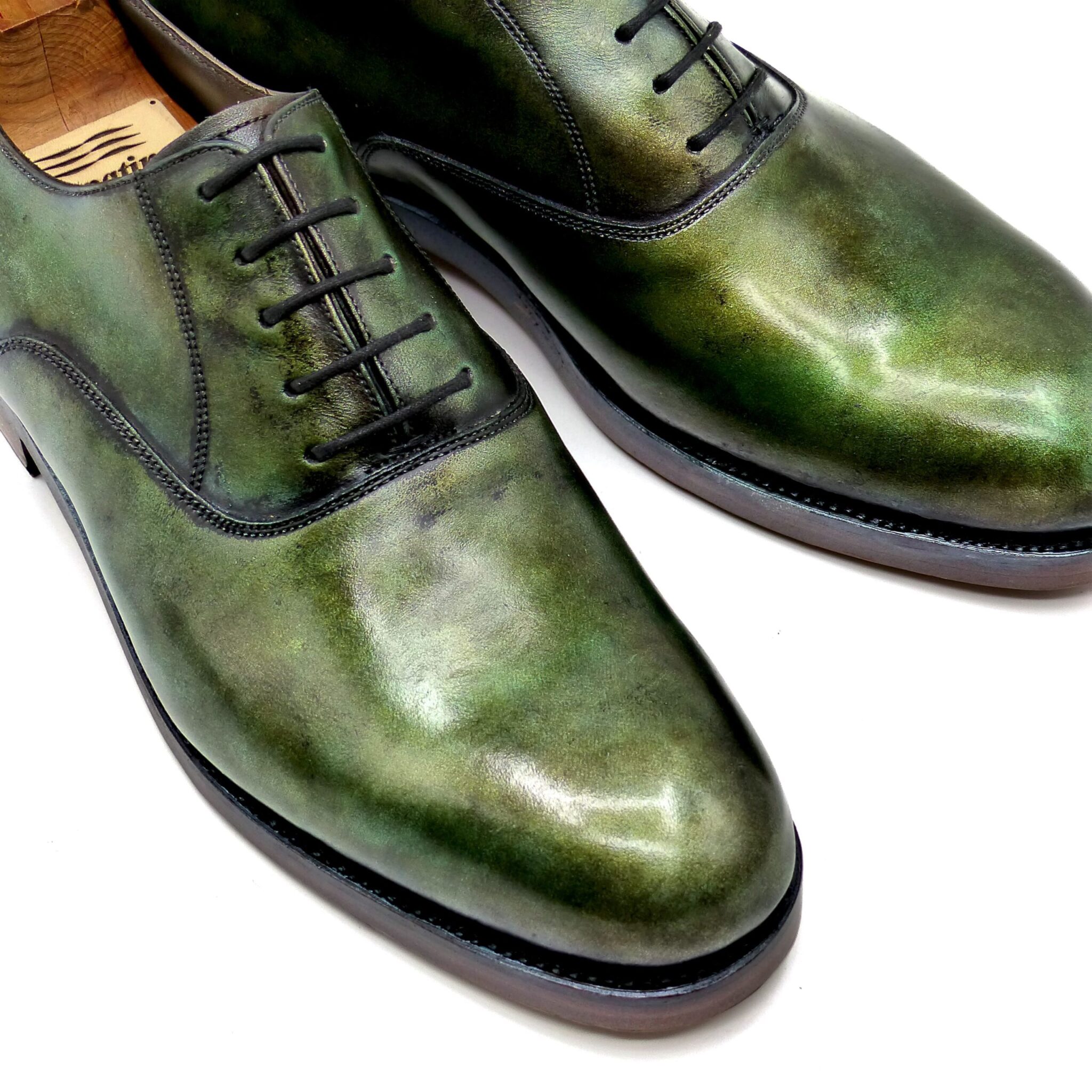
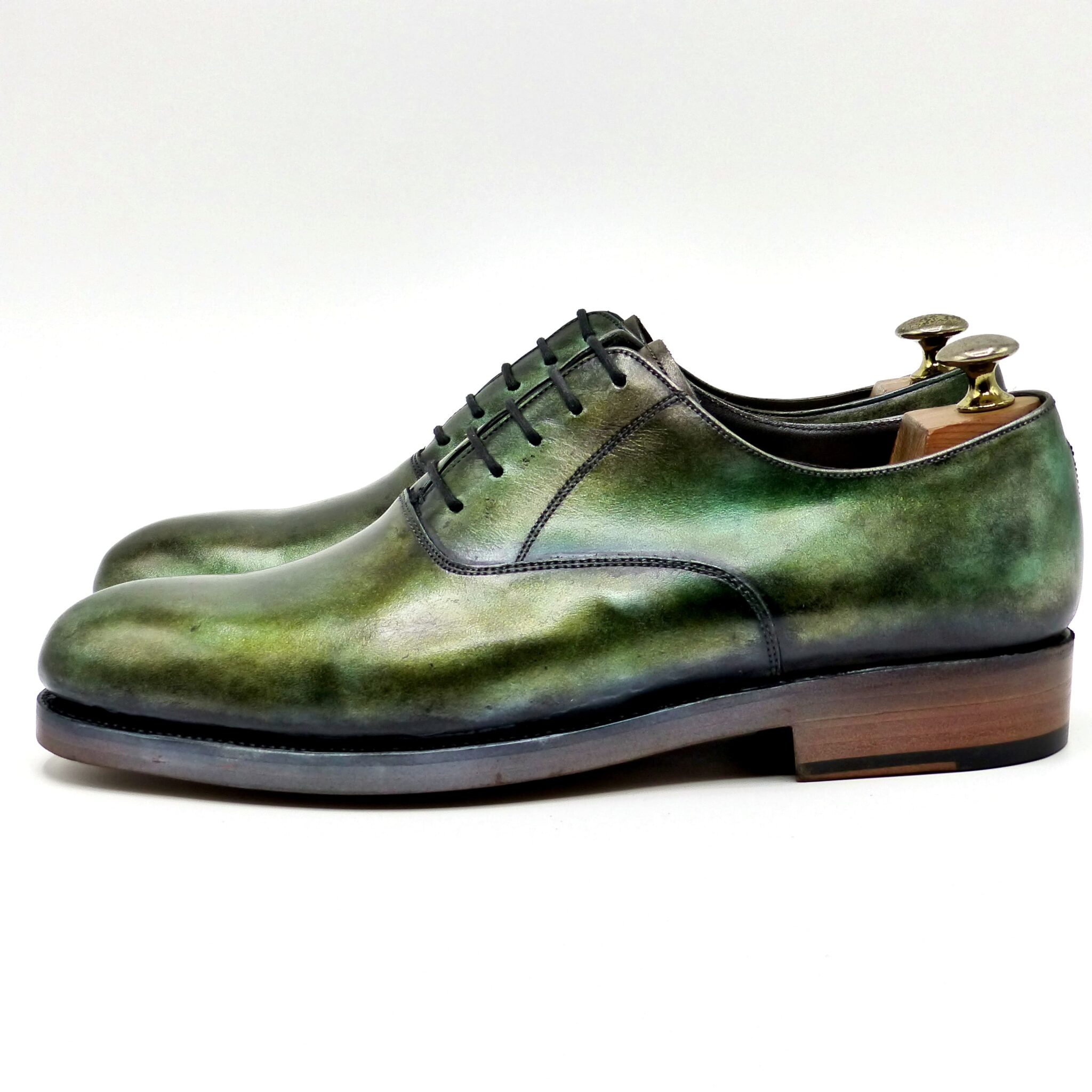
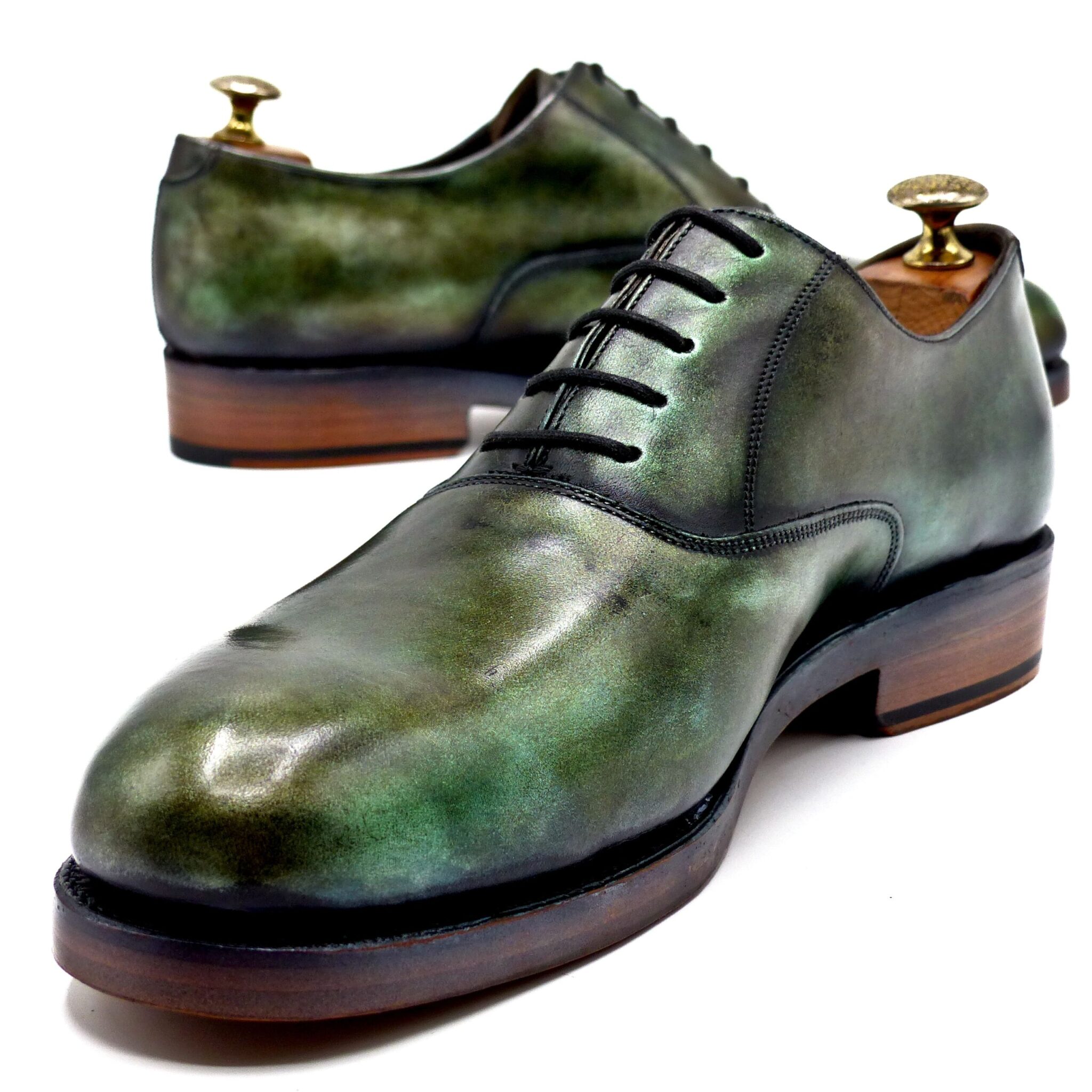
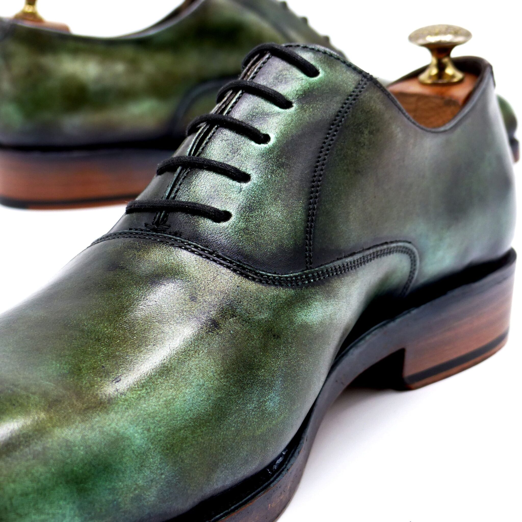
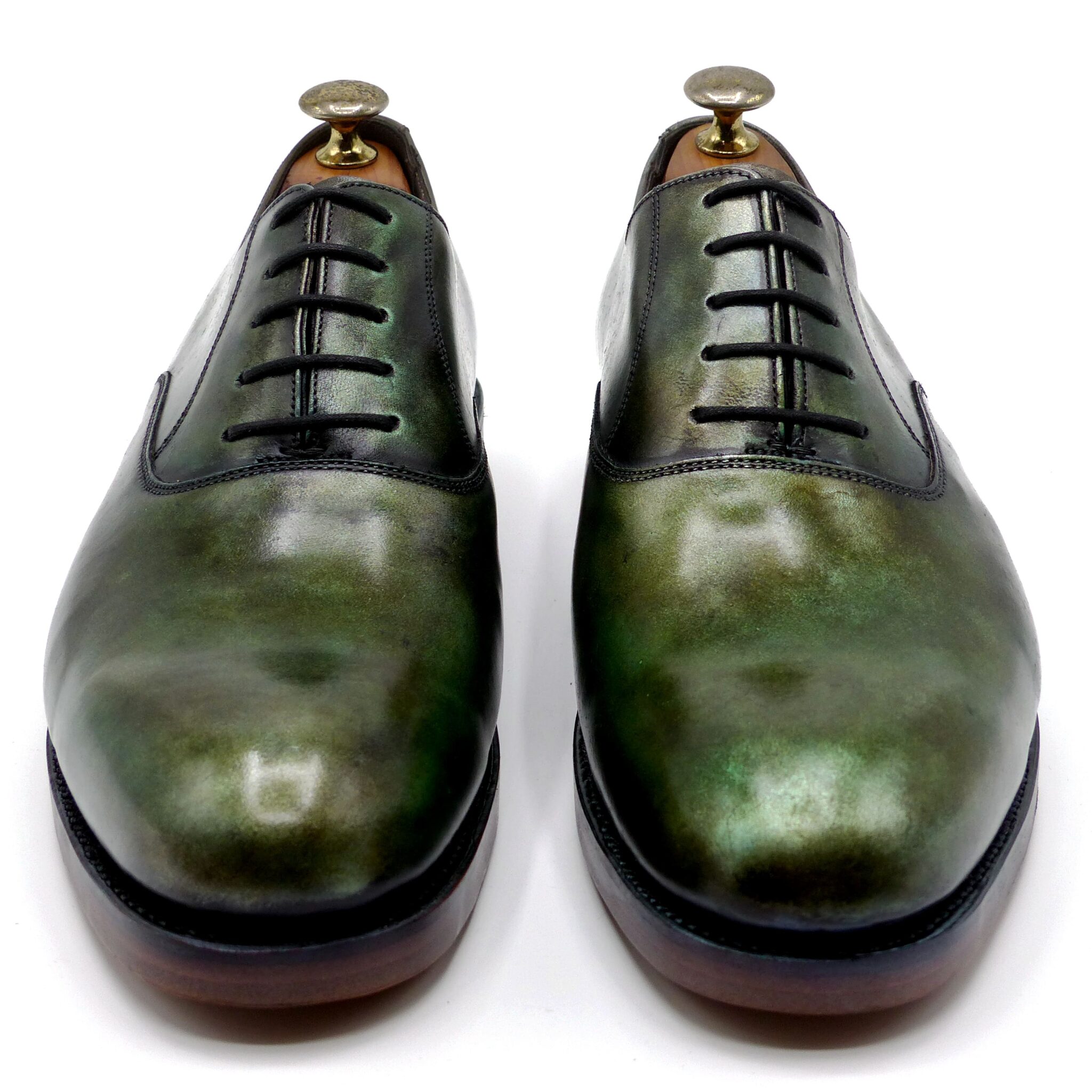
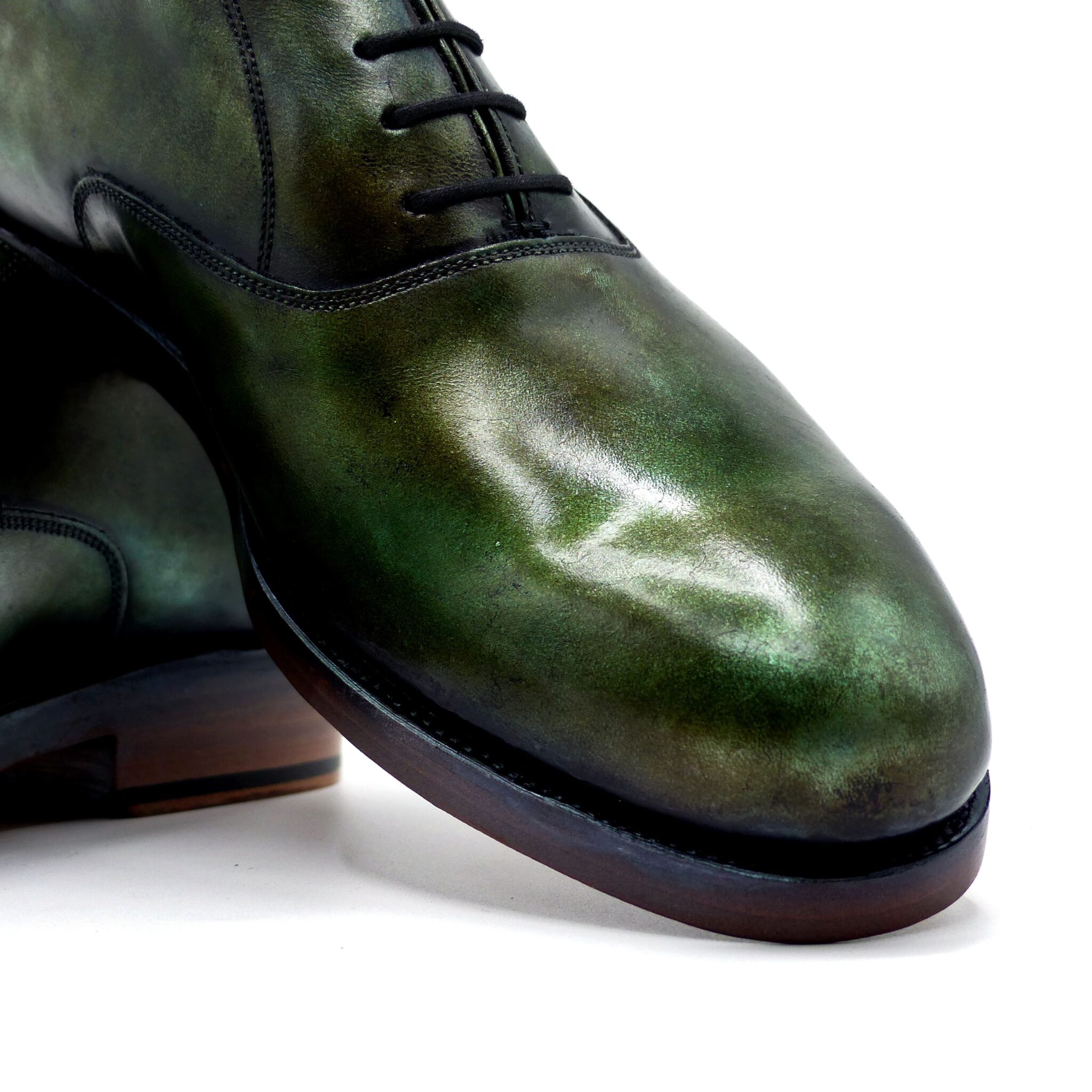
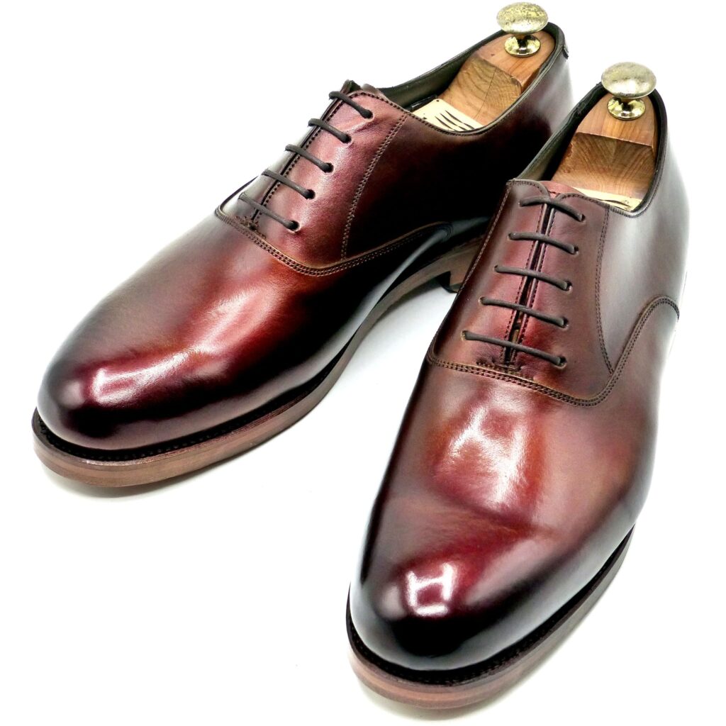
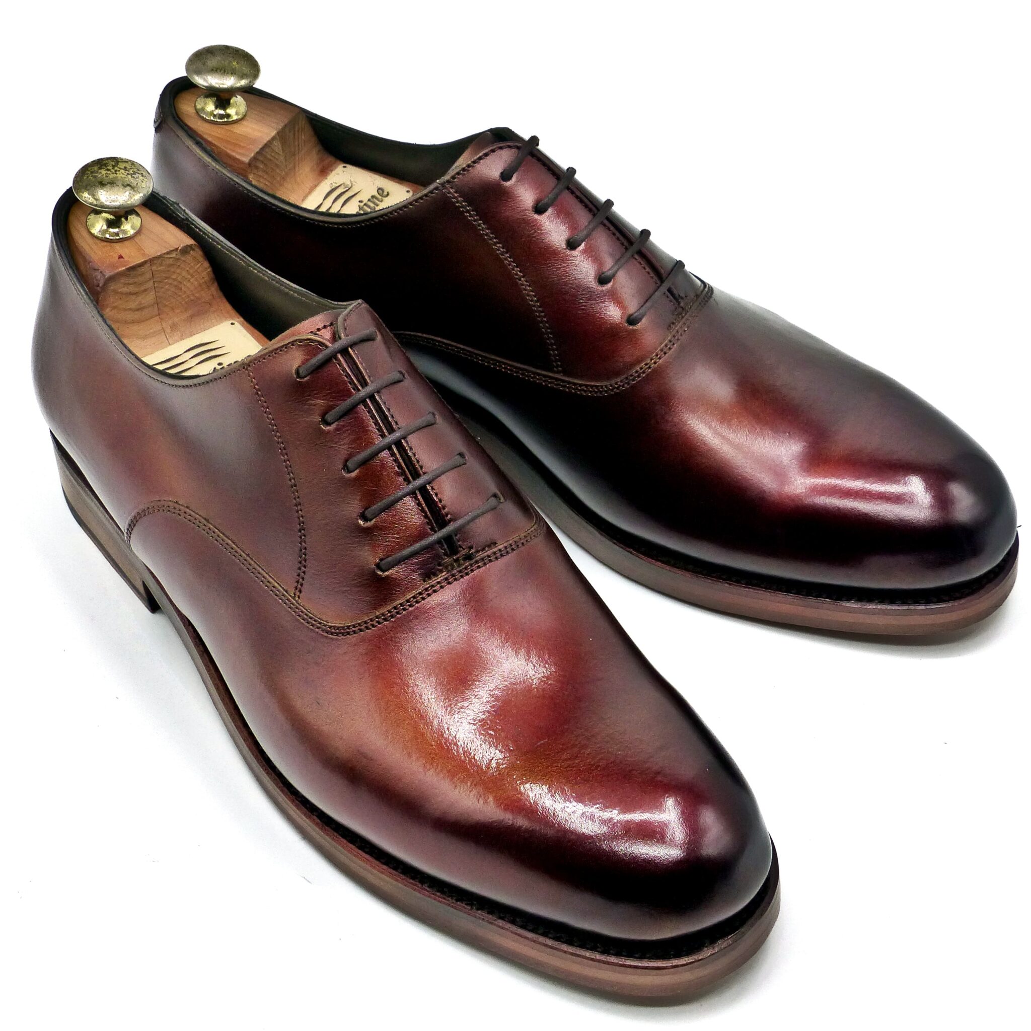
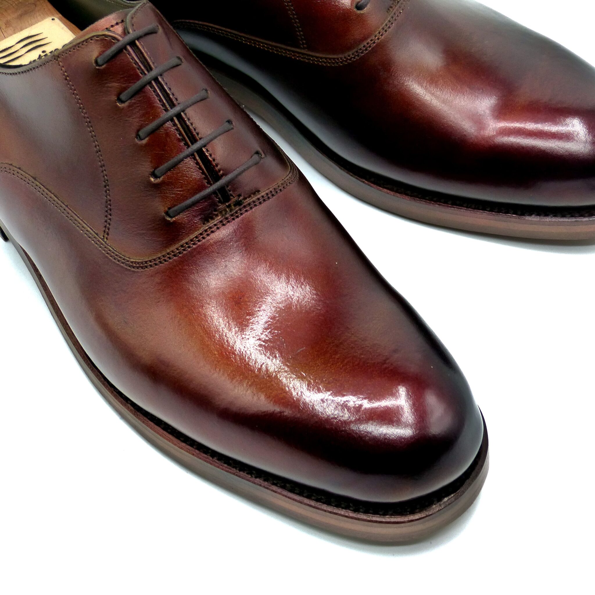
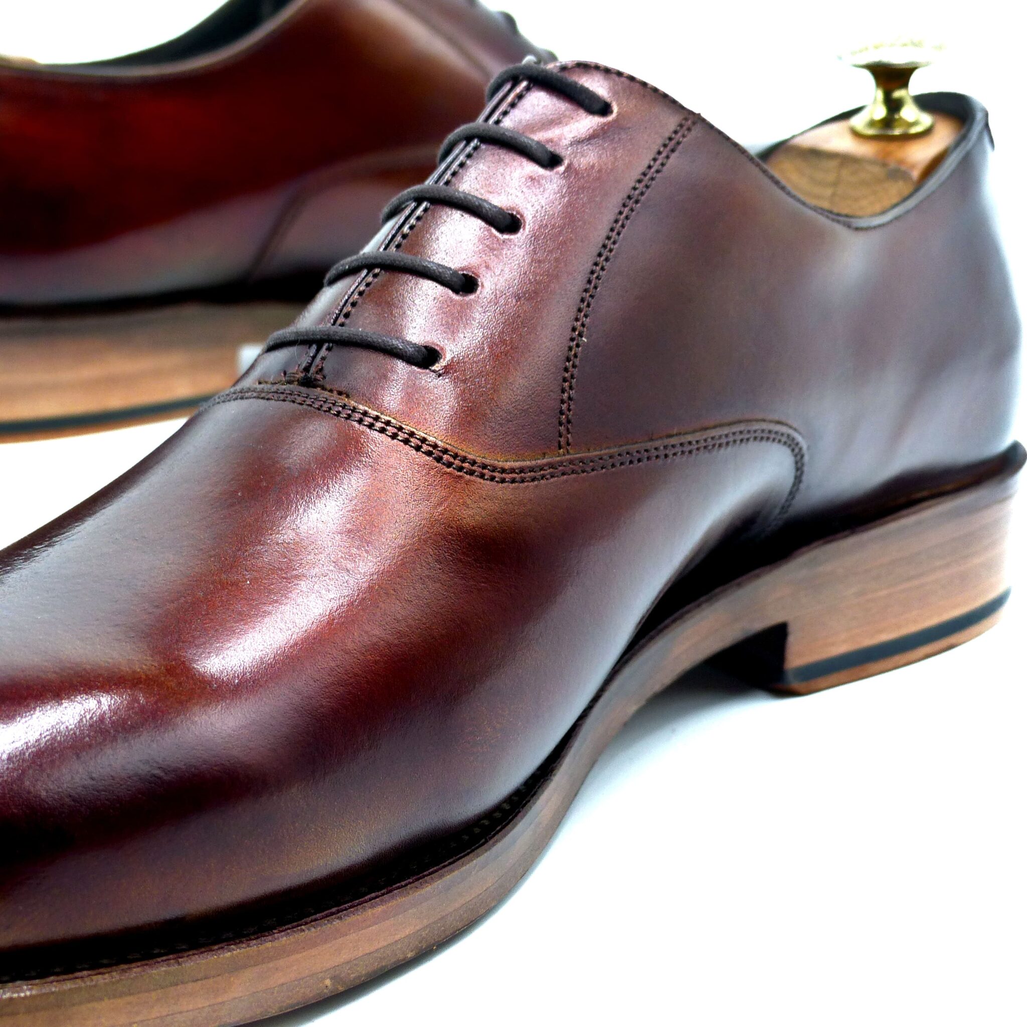
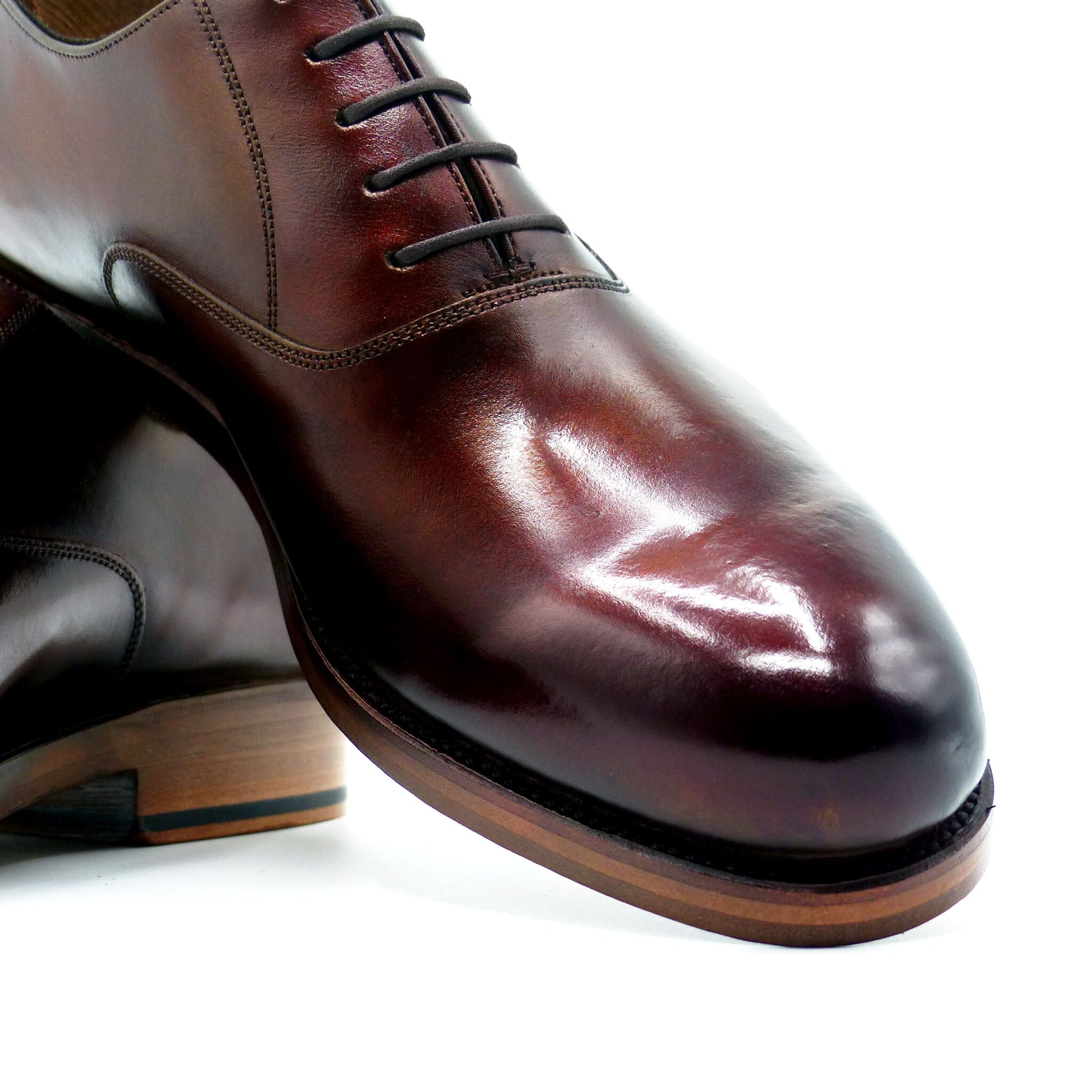
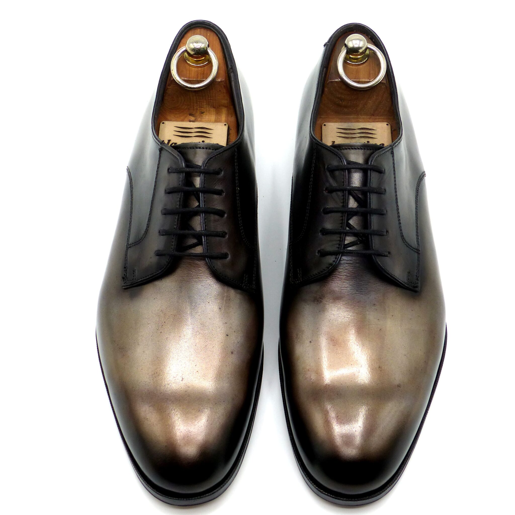
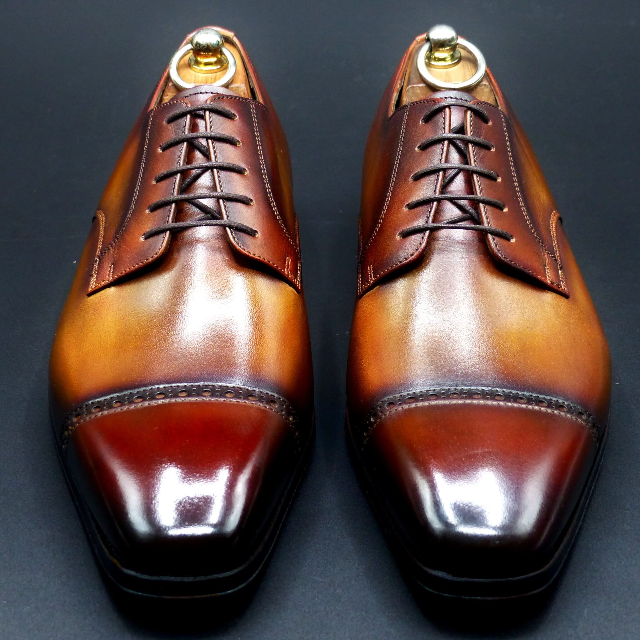
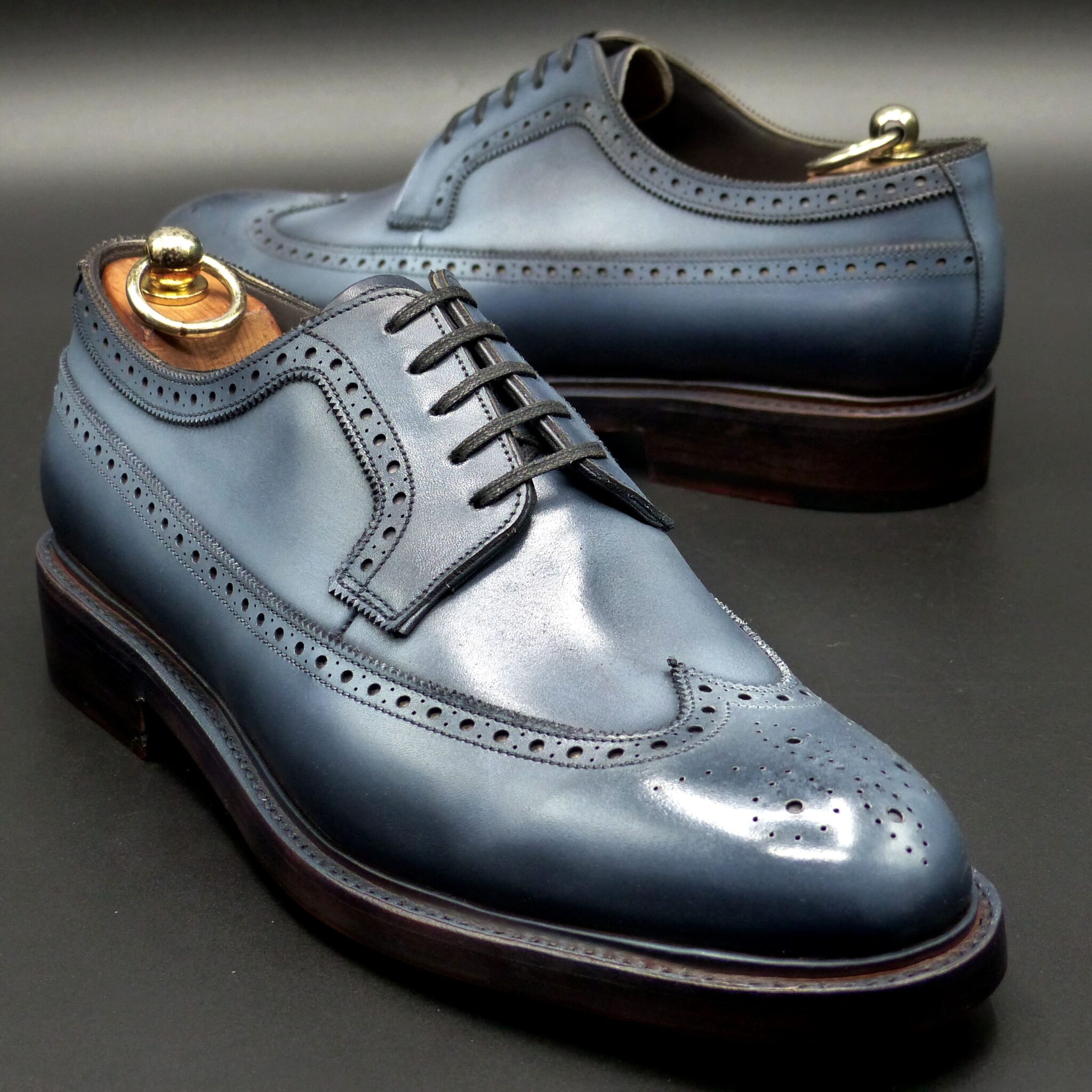
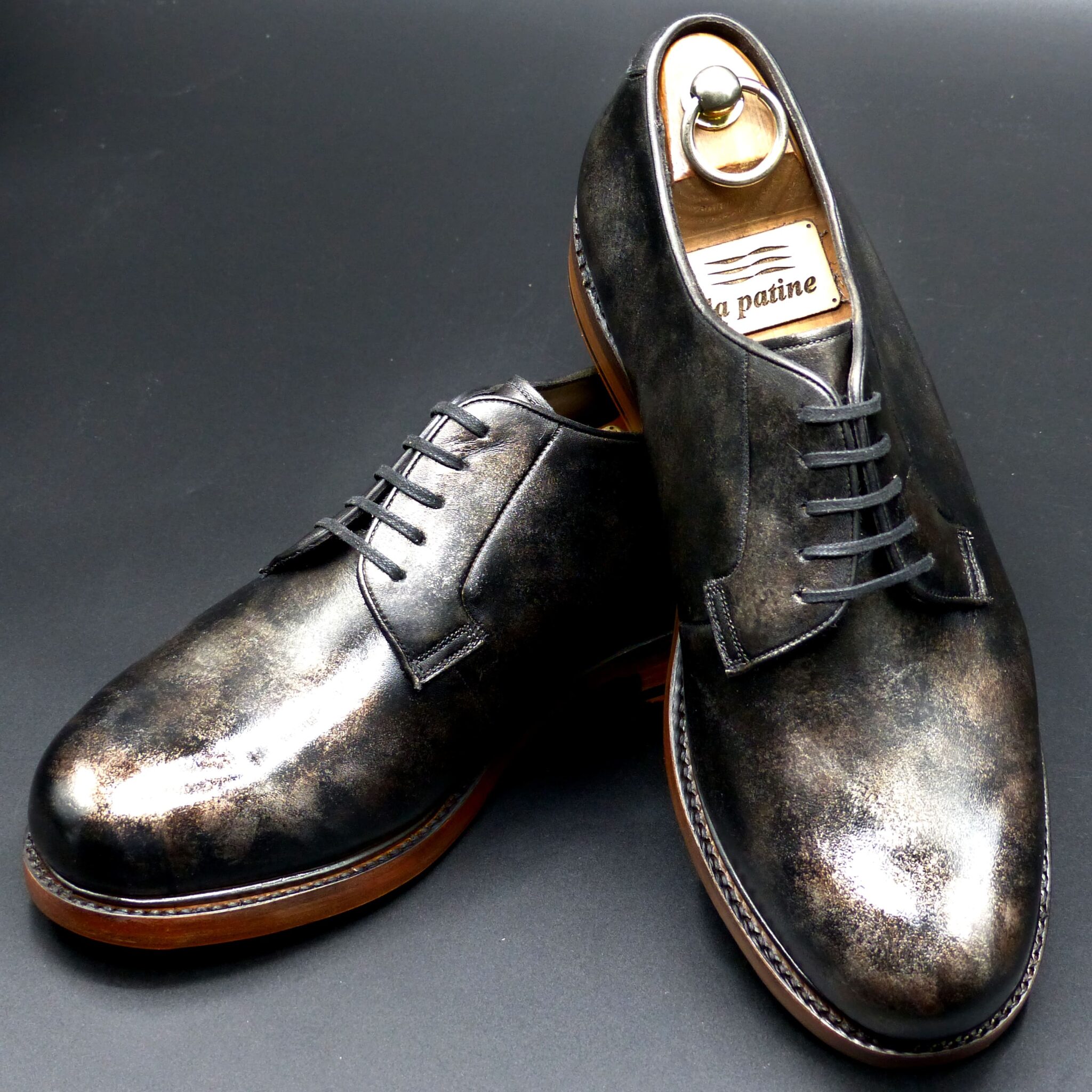
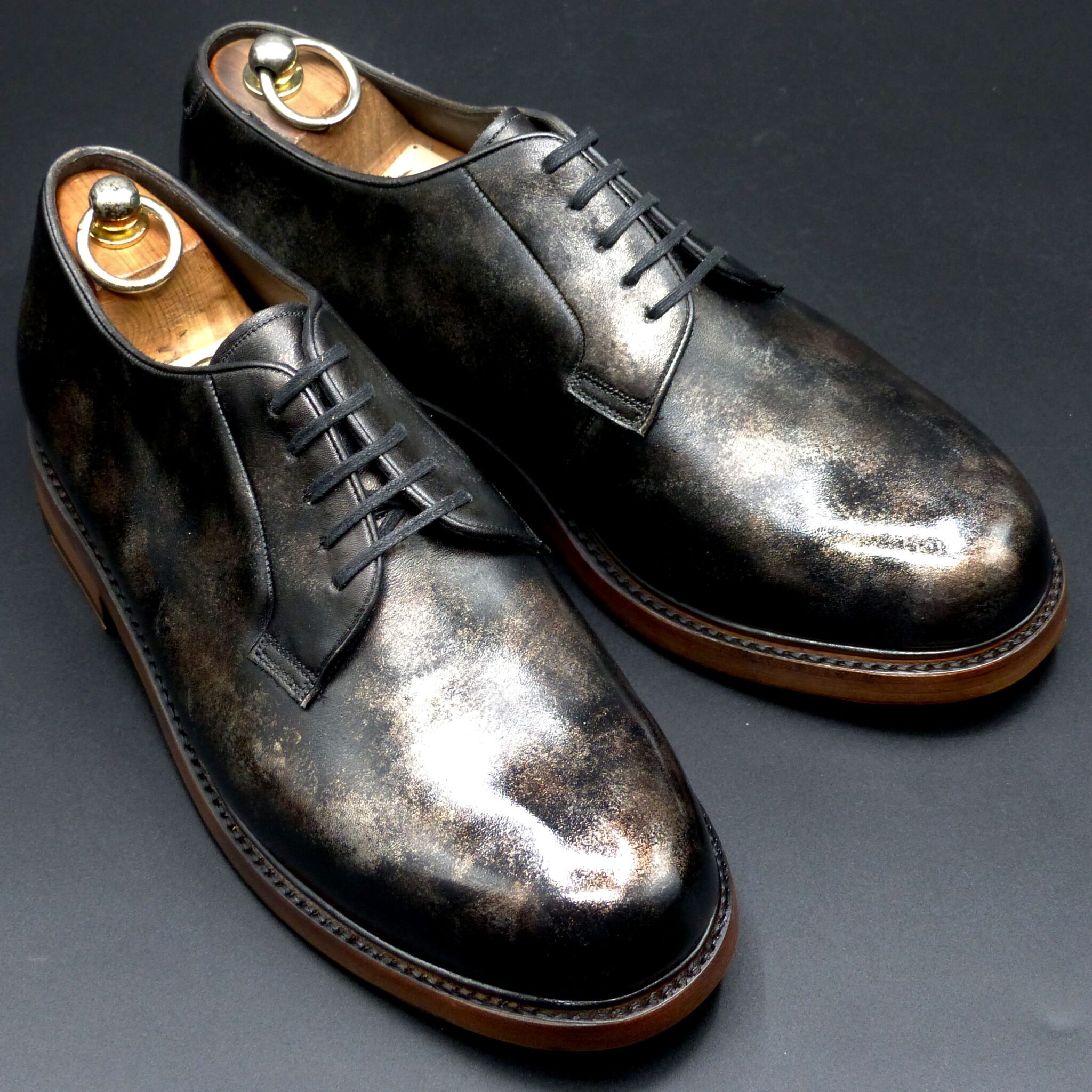
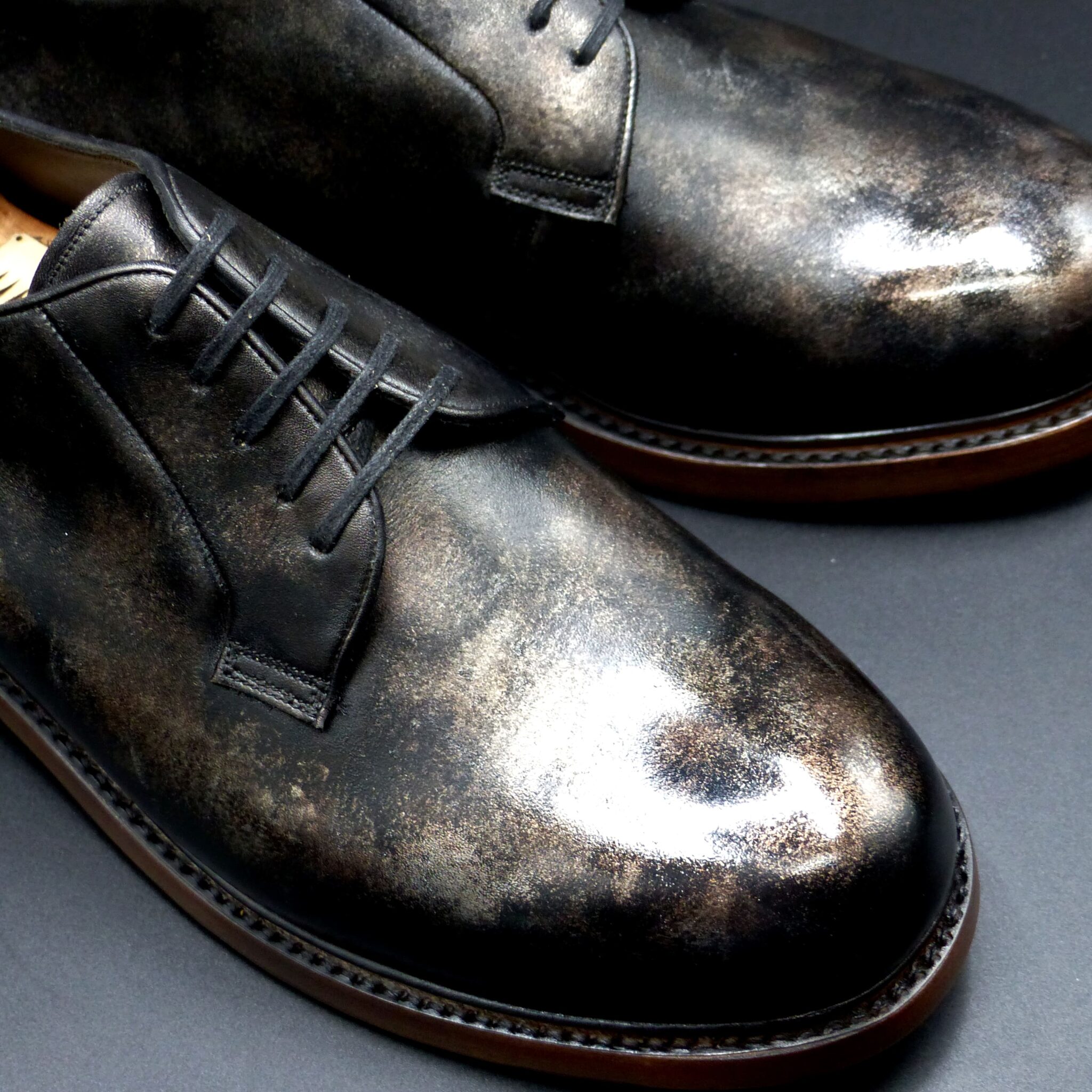
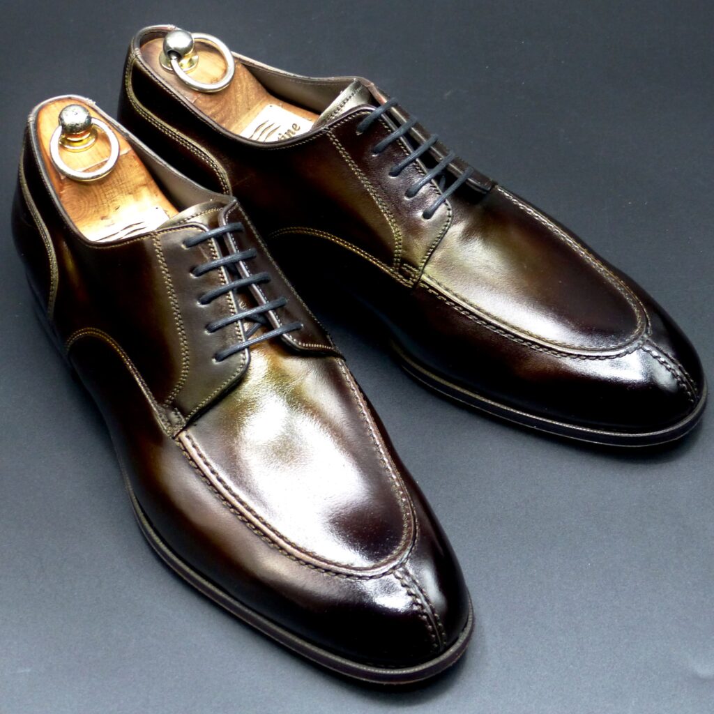
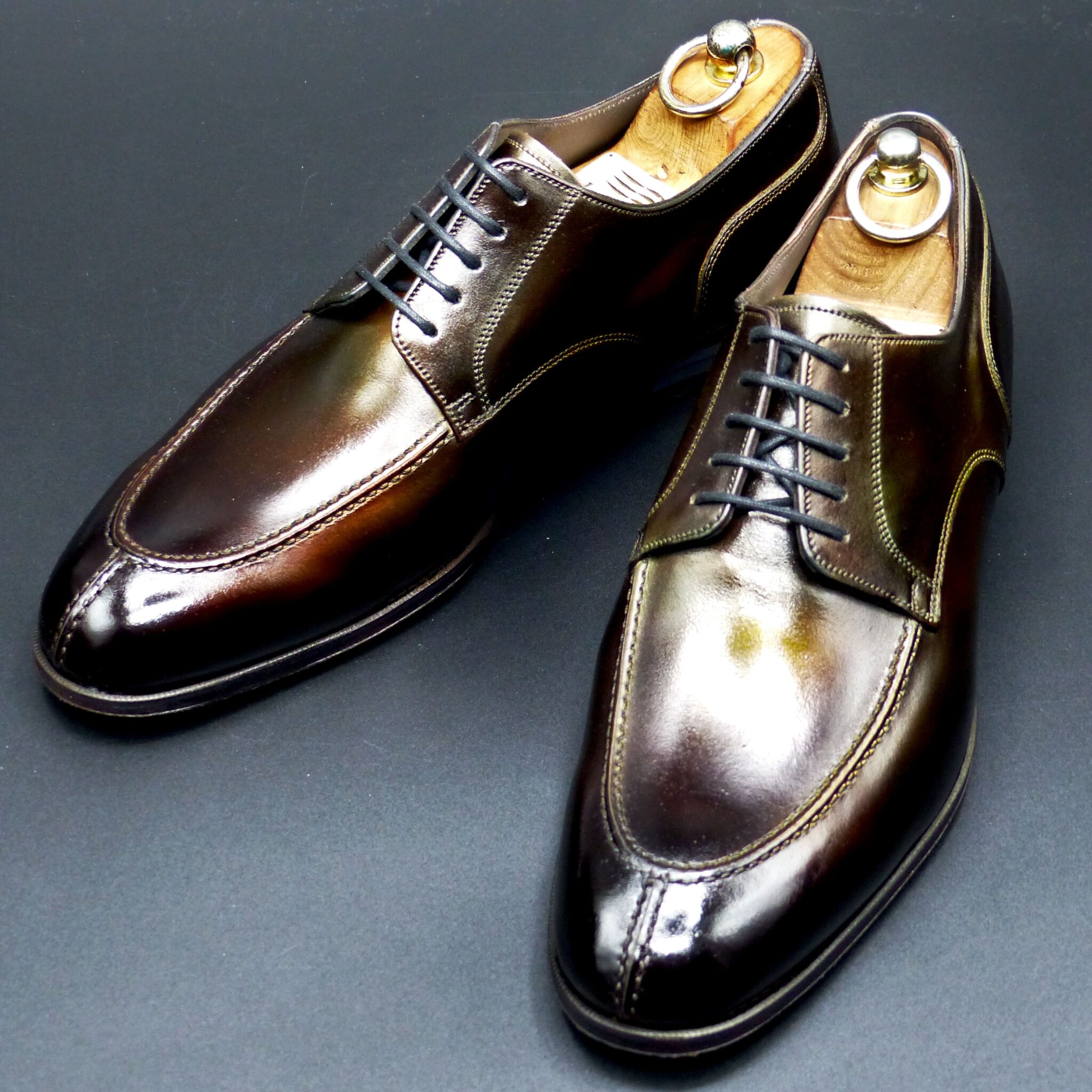
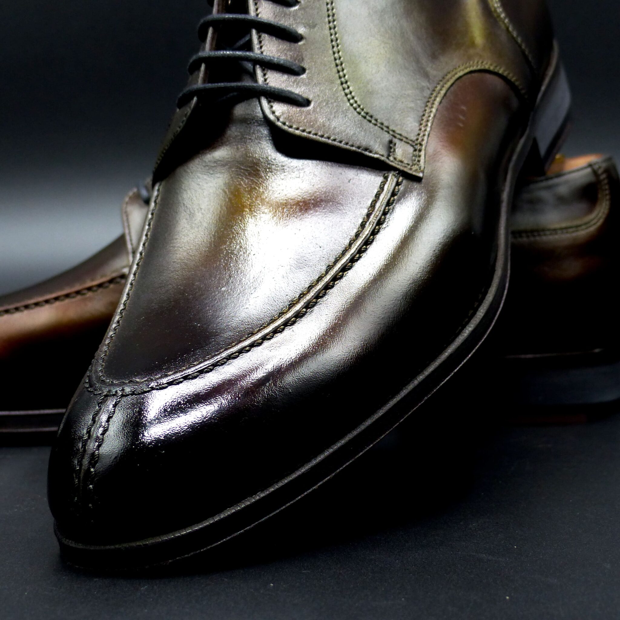
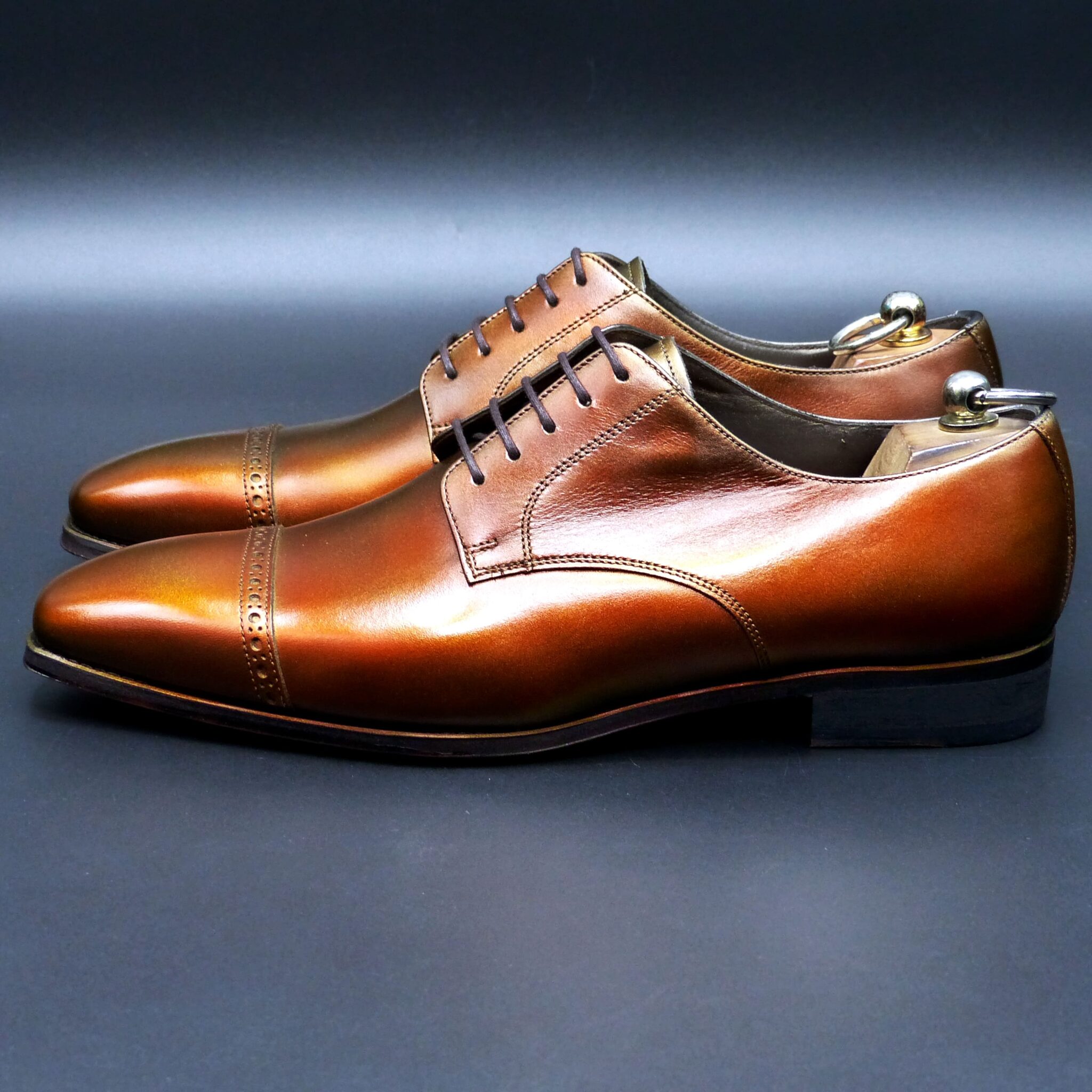
ダービー・Y-チップ

color name;
[ Yanagisusutake ]
柳煤竹
Y-Tip Derby
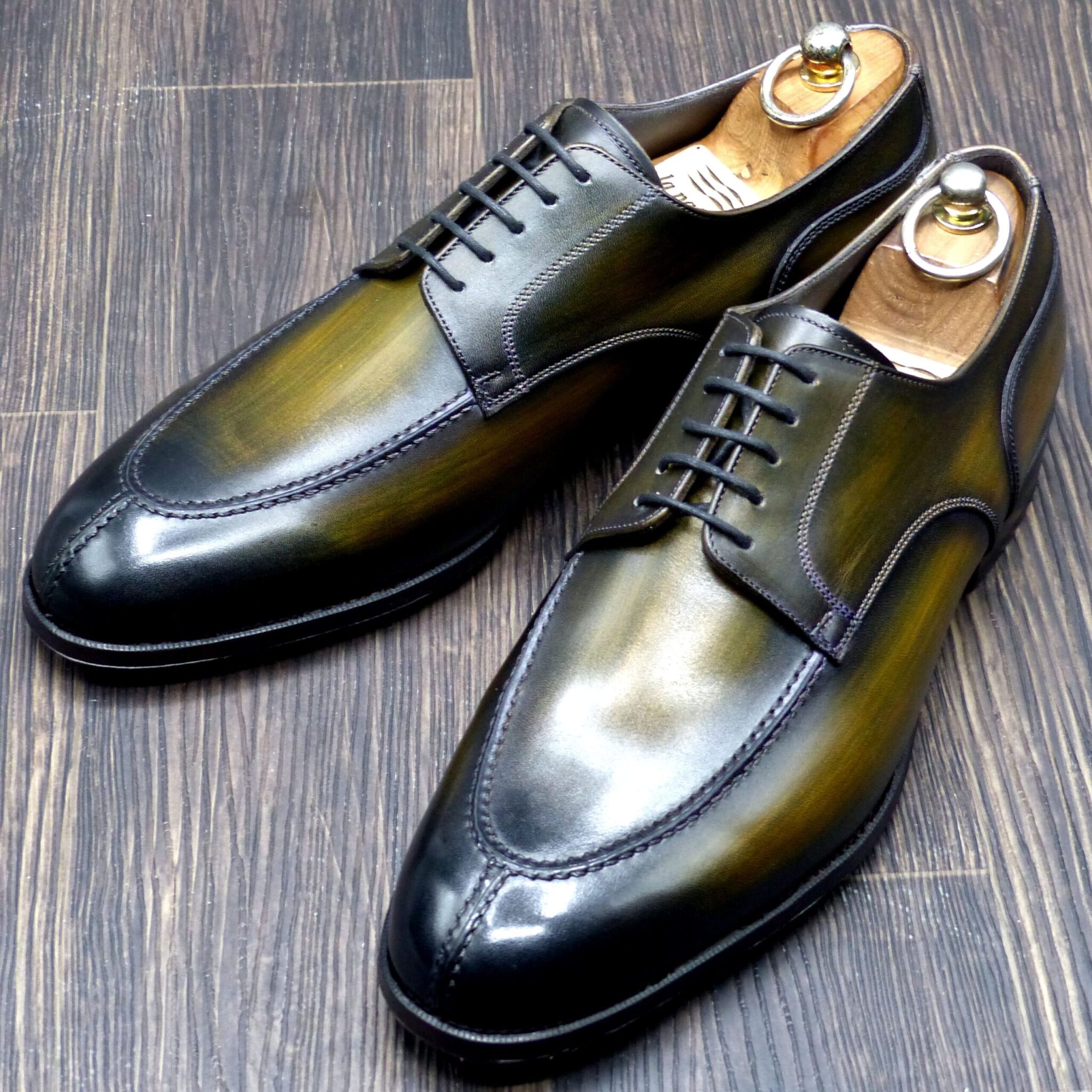


✅ 柳煤竹(やなぎすすたけ)とは – 由来・色構成・象徴
■ 色の由来
「柳煤竹(やなぎすすたけ)」は、
- 柳(やなぎ) のしなやかな葉の緑
- 煤竹(すすたけ)(囲炉裏の煙で燻された竹)の黒褐色
この2つが重なり生まれた、深みのある暗緑色を指します。
元来、日本の伝統色は自然界の素材や風景から名づけられたものが多く、柳煤竹も 「自然と暮らす日本人の感性」 が宿る色名のひとつです。
■ 古代・中世日本での使われ方
- 貴族や武家の衣装
平安時代以降、深い緑系の色は高貴さや厳粛さを示す色とされ、狩衣(かりぎぬ)や直衣(のうし)といった装束に使われました。 - 茶器や調度品の意匠
室町〜安土桃山期、茶の湯文化が栄える中で「煤竹色」を帯びた器や竹細工が珍重され、その延長で深緑を帯びた「柳煤竹」系統の色も好まれました。 - 武具・甲冑の彩色
戦国期には「黒に近い深緑」は威厳と実用性を兼ね備えた色として、甲冑や刀の鞘の塗り色としても選ばれました。
■ 色の構成
- ベース:黒緑(くろみどり) – ほとんど黒に近い濃い緑
- ニュアンス:黄み(柳の葉を思わせる淡いオリーブ)
- 陰影:煤竹のような褐色や墨色のグラデーション
→ 黒・緑・黄褐色が複雑に混ざり、光の当たり方で黒にも緑にも見える深い色。
■ 象徴するもの
- 静寂と奥ゆかしさ – 明るく主張する色ではなく、控えめで落ち着いた美
- 自然との調和 – 柳や竹を思わせるため、和の心や侘び寂びの精神を表現
- 堅牢さと威厳 – 黒の要素を強く含むため、武士の装束や道具にも多用され、強さの象徴ともされた
🎯 まとめ
「柳煤竹(やなぎすすたけ)」は、
“柳のしなやかさ”と“煤竹の渋さ”を併せ持つ、日本的な美意識の結晶ともいえる色 です。
古代から中世にかけては、貴族や武士の装束、茶道具、武具 など、 威厳と品格が求められる場面 で用いられ、今なお 静謐で深みある色合い として受け継がれています。
✅ Yanagisusutake – Historical Usage, Color Composition, and Symbolism
■ Origin of the Color
Yanagisusutake (柳煤竹) combines:
- The green of graceful willow leaves (yanagi)
- The dark brownish-black of smoke-stained bamboo (susutake)
The result is a deep, subdued dark green.
Traditional Japanese colors were often named after elements from nature, and Yanisusutake reflects this sensibility – a harmony of natural beauty and refined subtlety.
■ Usage in Ancient & Medieval Japan
- Aristocratic and Samurai Attire
From the Heian period onward, deep greens conveyed dignity and solemnity, appearing in robes such as kariginu and nōshi. - Tea Utensils and Interior Aesthetics
During the Muromachi to Azuchi-Momoyama periods, the tea ceremony flourished. Bamboo and vessels with a “smoked” look were highly valued, and colors like Yanisusutake found their place in this aesthetic world. - Armor and Weaponry
In the Sengoku era, “near-black deep green” was favored for its authority and practicality, often used in lacquer for armor, scabbards, and other martial implements.
■ Color Composition
- Base: Kuromidori (黒緑) – A nearly black, very deep green
- Nuance: A hint of yellowish olive, recalling willow leaves
- Shadow: Brownish-black tones reminiscent of smoked bamboo
➡ A layered mixture of black, green, and muted yellow-brown, creating a color that appears black in some light and green in others.
■ What It Symbolizes
- Quiet Elegance & Reserve – A muted, understated beauty rather than a loud, vivid one
- Harmony with Nature – Evoking willows and bamboo, it embodies the wabi-sabi spirit
- Strength and Authority – With strong black undertones, it was often chosen by warriors, signifying resilience and power
🎯 Summary
Yanagisusutake represents the suppleness of willow and the austere patina of smoke-darkened bamboo, a quintessential expression of Japanese aesthetic sensibility.
From ancient court robes to samurai armor and tea utensils, it was historically used in contexts demanding dignity and refinement, and continues to convey quiet depth and timeless sophistication today.
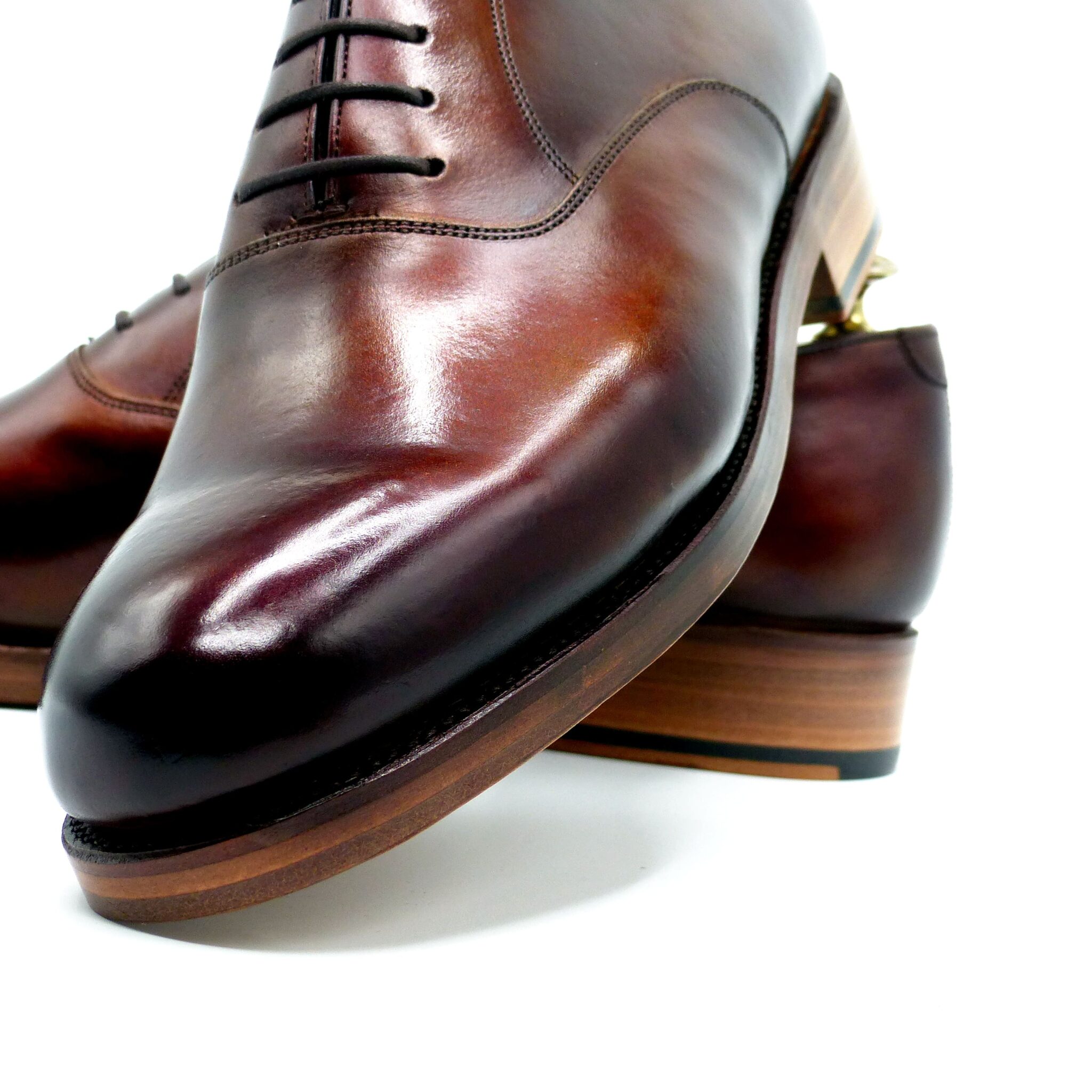
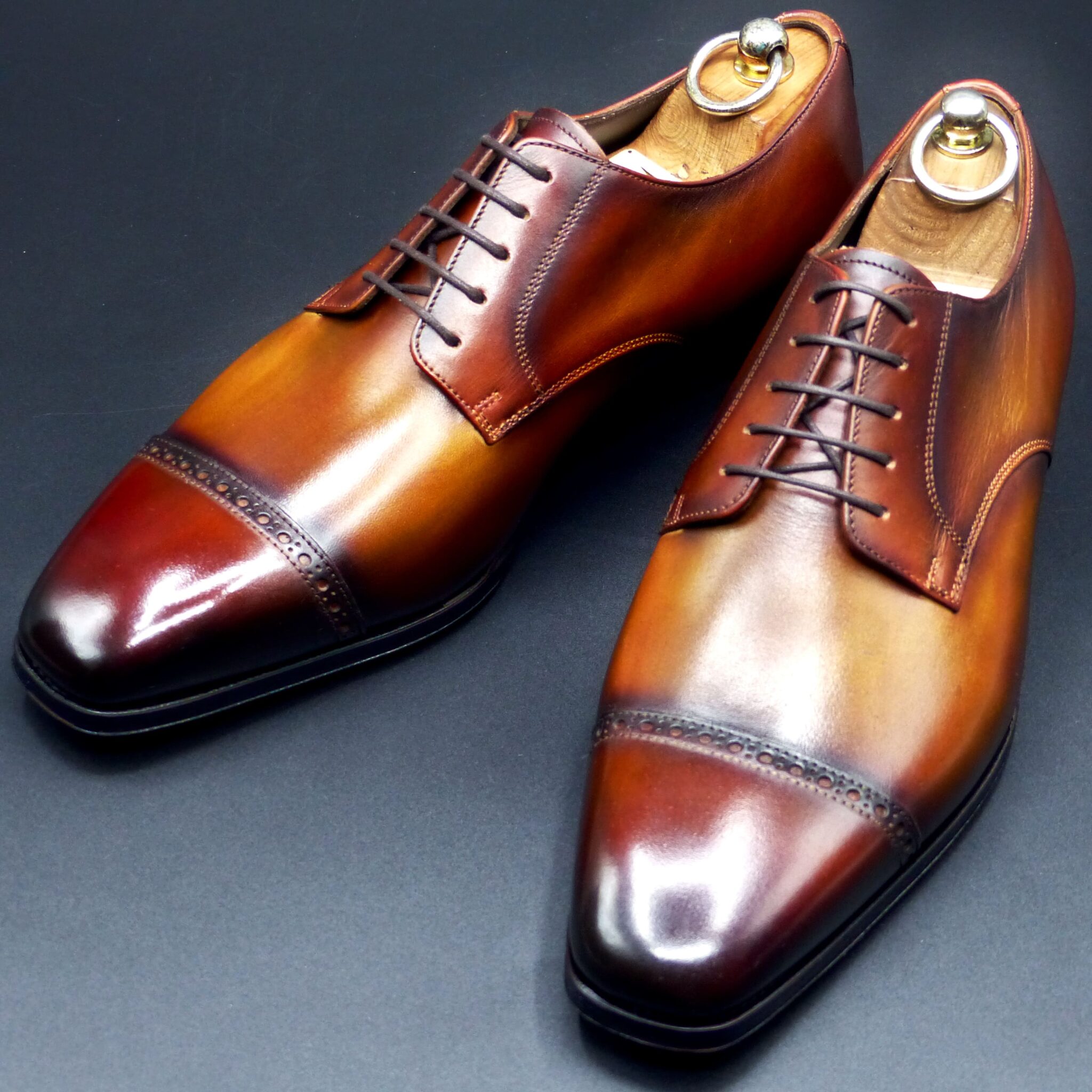
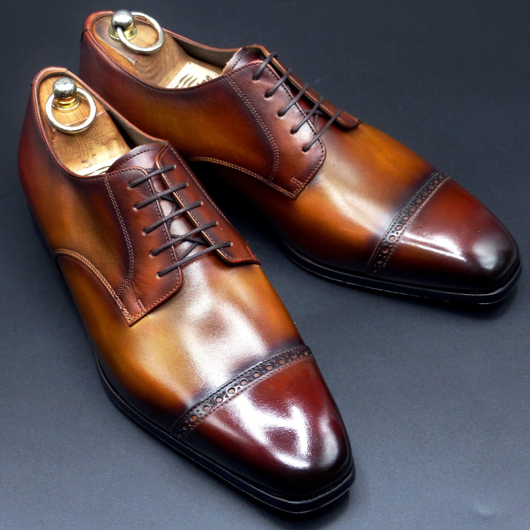
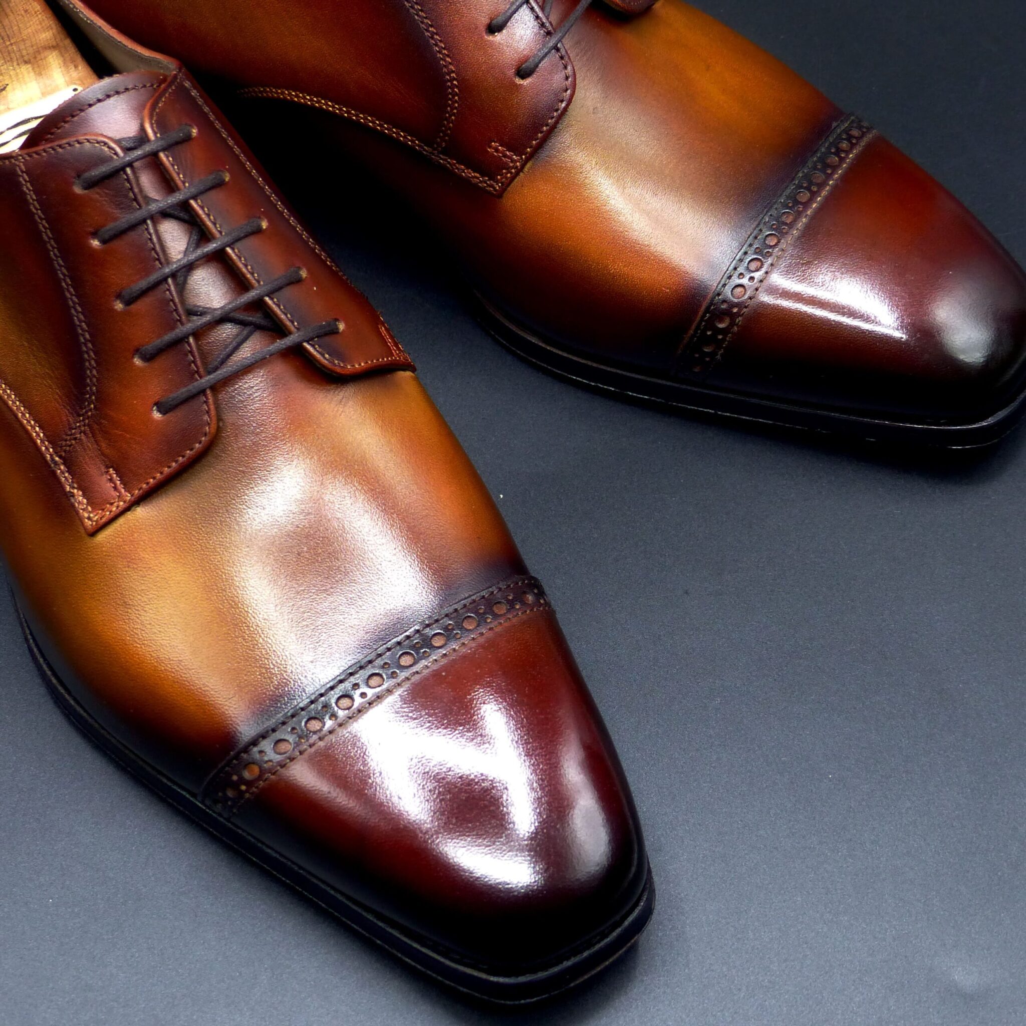
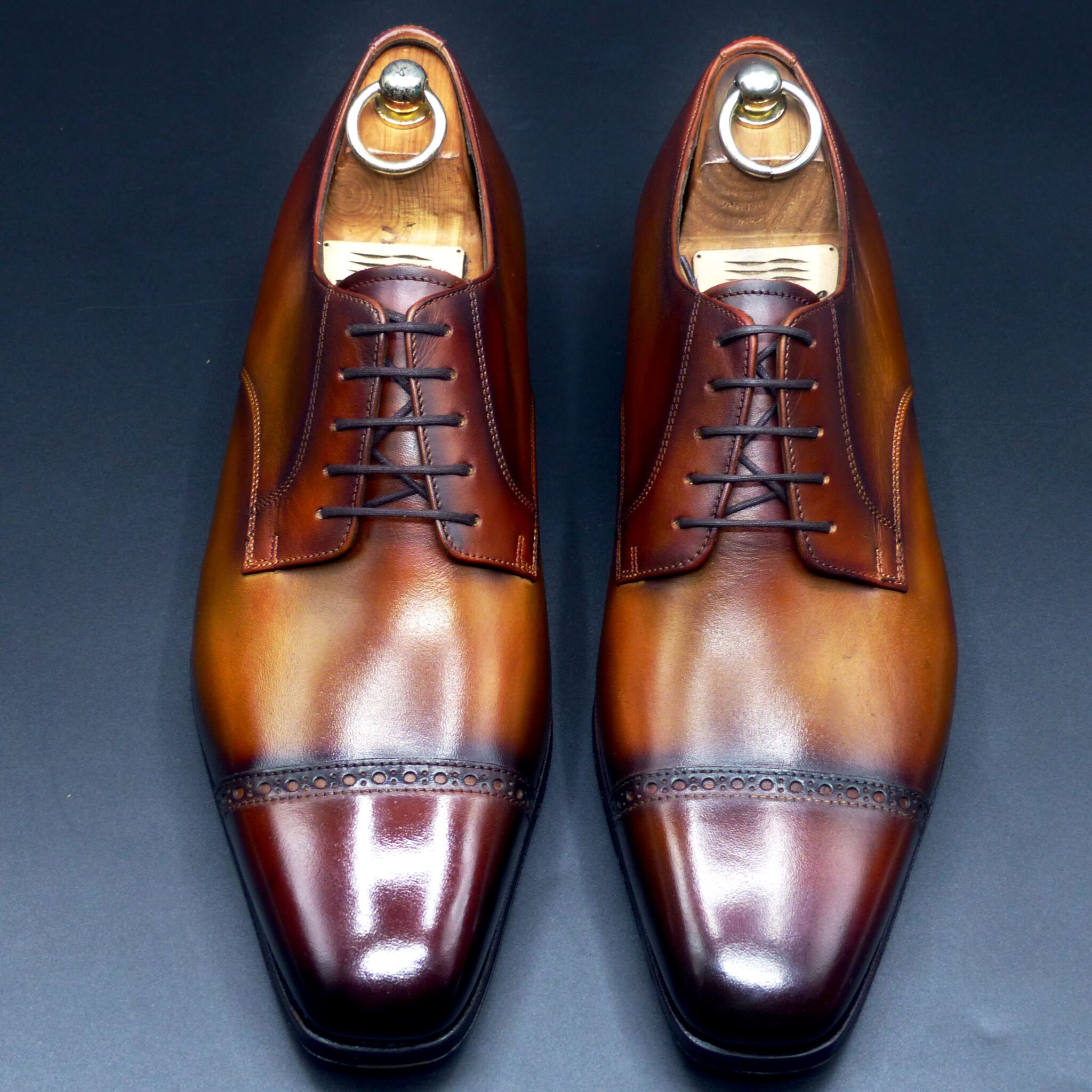
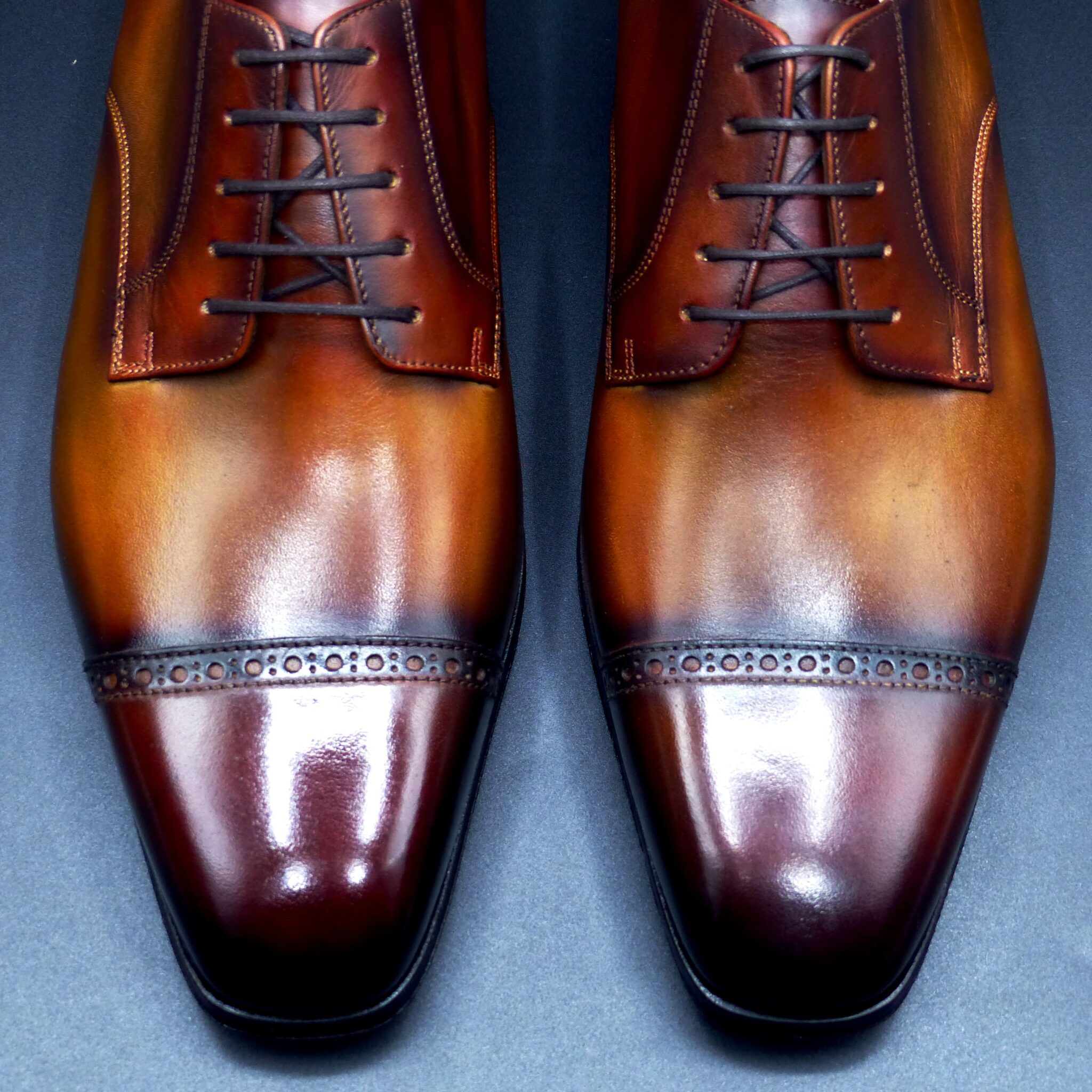
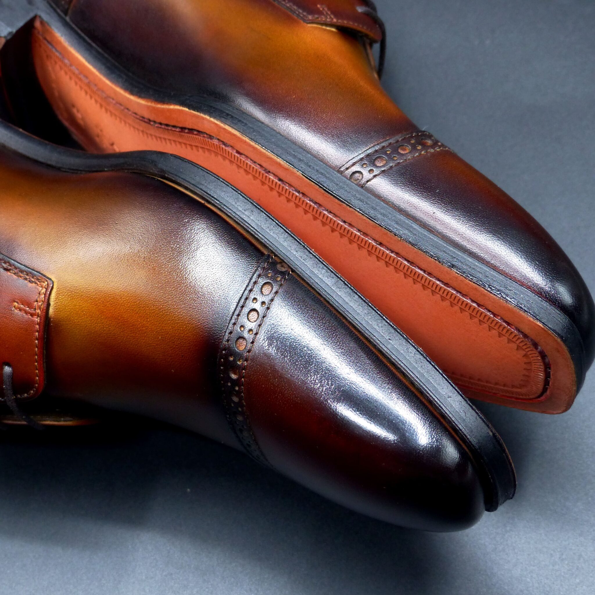
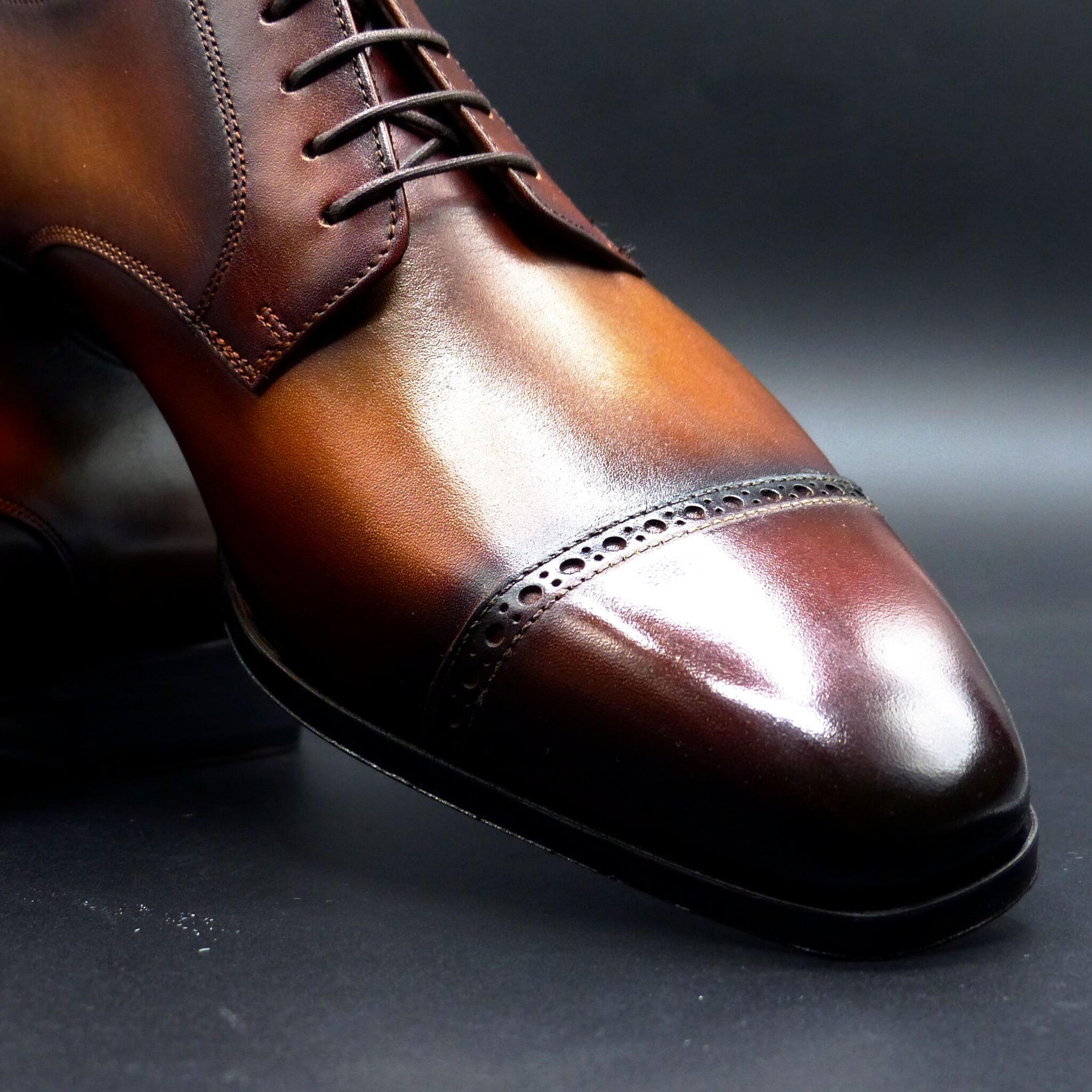
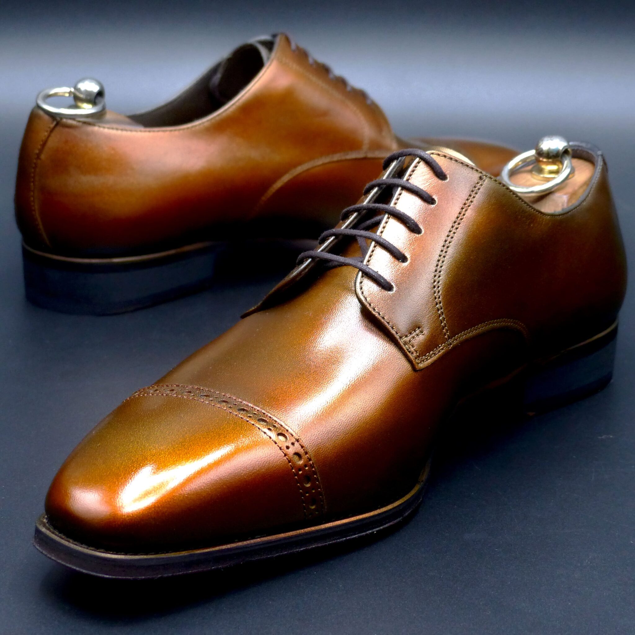
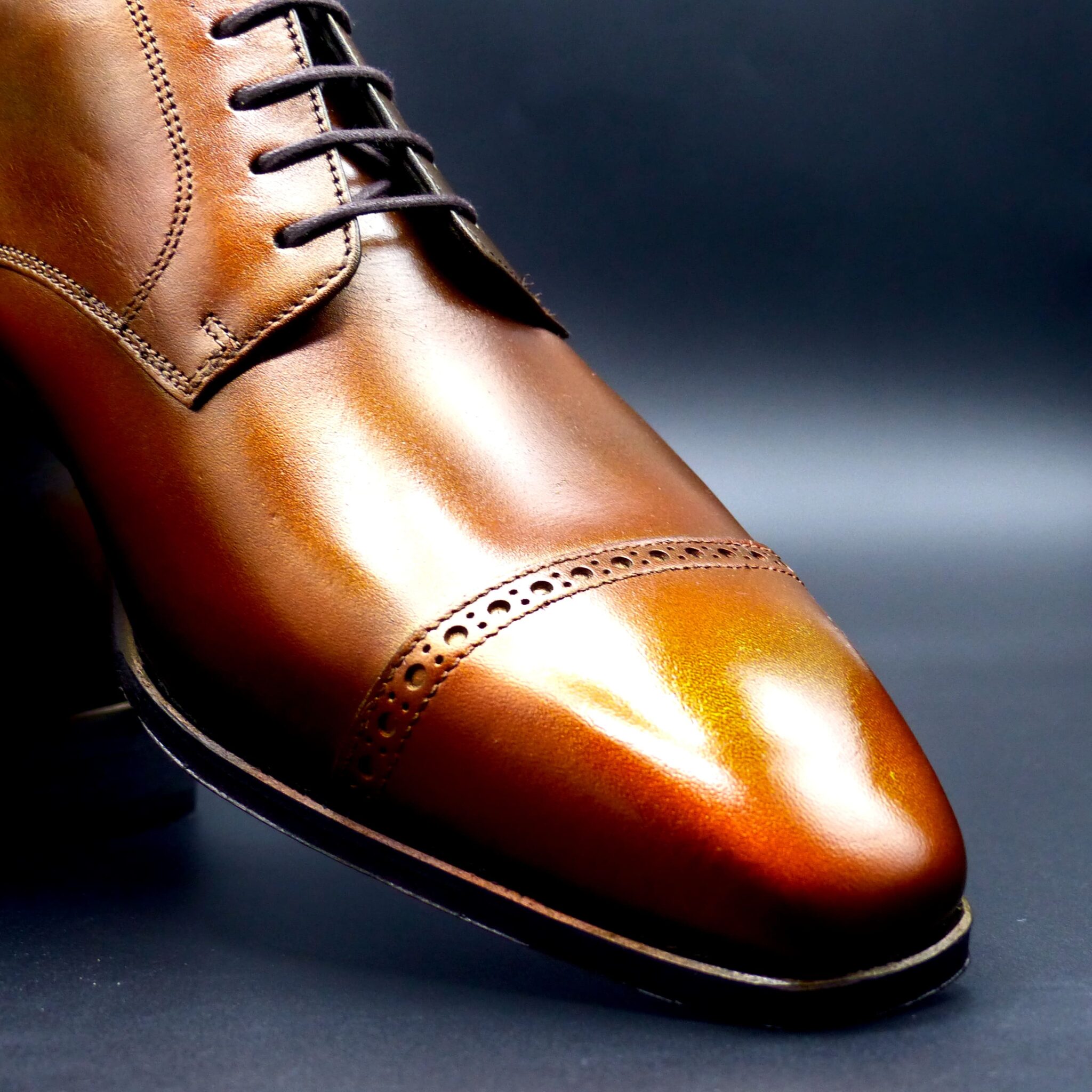
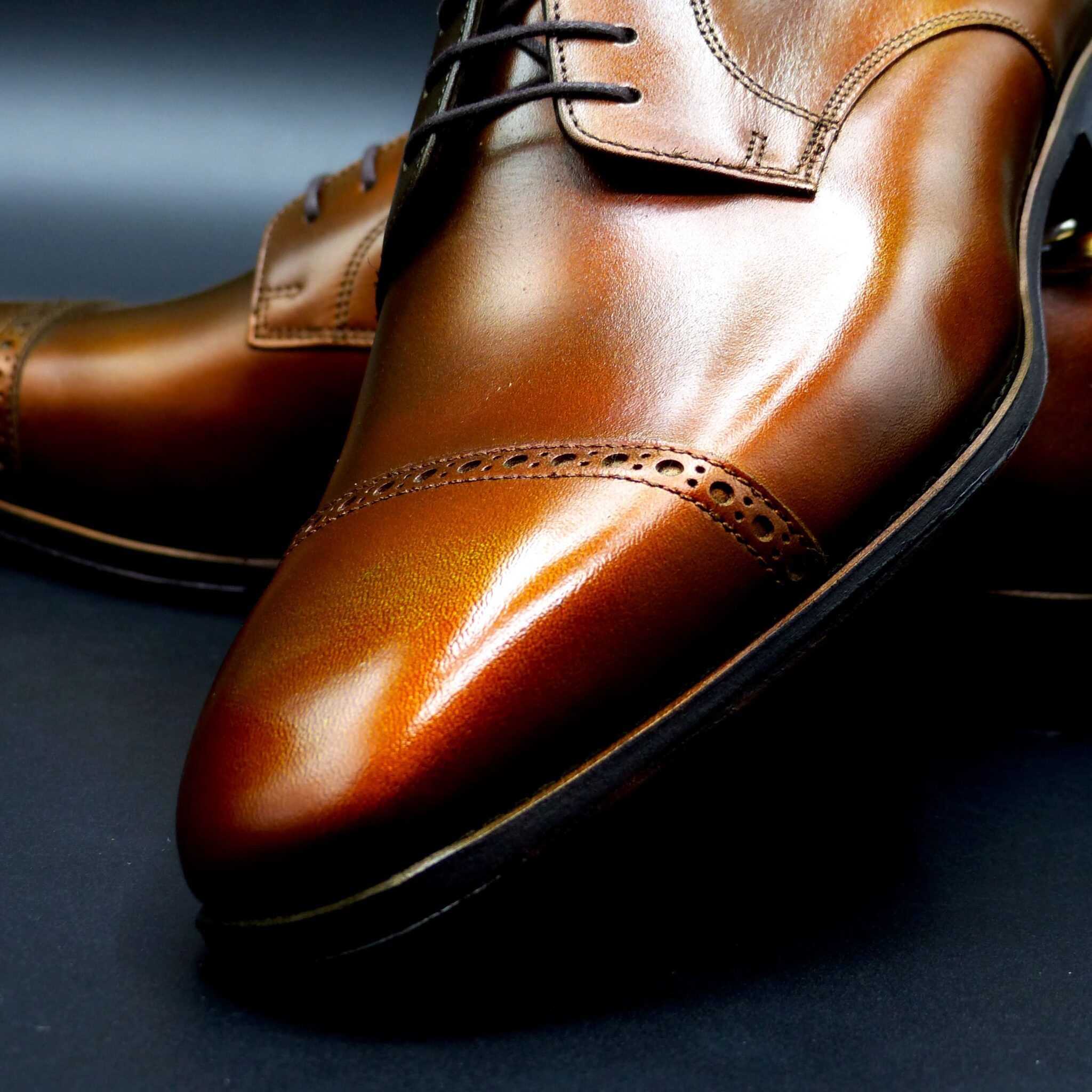
ダービー・パンチドキャップトゥ

color name;
[Kyara-Uguisu]
伽羅鶯
Derby Punched-Cap Toe


伽羅鶯(きゃらうぐいす)
伽羅鶯は、日本の伝統色「伽羅」と「鶯」に着想を得た、奥行きある茶と緑のグラデーションが特徴のパティーヌ仕上げ。
静かに香るような深いブラウンは、高級香木・伽羅の持つ幽玄な雰囲気を、淡くオリーブを含んだ光沢は、鶯の羽色を想わせます。
煌びやかさよりも内に秘めた品格を重んじた、現代の粋。
シーンを選ばず履きこなせる、成熟した大人のためのドレスシューズです。
🪵 伽羅(きゃら)
|沈香の王と称される「伽羅」に由来する、奥深き香色。
- 色の分類:赤みを帯びた深い茶色
- 由来:「伽羅」とは、ベトナムなどから産出される極上の沈香(じんこう)のこと。平安時代から貴族の間で珍重され、「香道」においても最上とされる香木です。
- 色名としての起源:伽羅の名は仏教由来のサンスクリット語「karāgura」に由来し、その香木の深い褐色を表す色としても用いられるようになりました。
- 特徴:赤みと黒みを含んだ重厚な茶色で、落ち着き・格調・静寂を象徴します。
キーワード:気品、幽玄、静けさ、貴族文化、香道
🐦 鶯(うぐいす)
|春告鳥の名にふさわしい、やわらかく渋みある緑茶色。
- 色の分類:くすみがかった黄緑〜茶緑色(オリーブ系)
- 由来:鶯(ウグイス)は、早春に鳴き声を響かせる日本の野鳥で、「春告鳥」とも呼ばれます。その羽の色は黄味を含んだ緑茶色で、古来より風雅な色として親しまれてきました。
- 文化的背景:万葉集にも鶯を詠んだ和歌が多く残されており、平安時代には装束の色名としても使われました。
- 特徴:抑えたトーンの中に温かみを感じさせる色味。自然に溶け込むような、和のやさしさがあります。
キーワード:自然、春、風雅、やわらかさ、くすみ色
🎨「伽羅鶯」という色名の奥深さ
「伽羅」の持つ幽玄な深みと、「鶯」のもつやさしい渋み。
このふたつの伝統色を重ねることで、日本人の美意識――静けさの中にある豊かさ――が表現されます。
靴や革製品など、時を重ねて味わいが増すアイテムに用いるのにふさわしい色名です。
🪵 Kyara – The Sublime Scent of Deep Brown
Color Classification: Deep reddish-brown
Origin:
“Kyara” refers to the highest grade of agarwood (沈香 / Jinkō), a rare and precious aromatic wood imported from Southeast Asia, especially Vietnam. Revered in Japan since the Heian period, kyara became central to the art of kōdō (the Way of Fragrance), where its refined scent symbolized elegance and spiritual depth.
As a traditional color name, “Kyara” evokes the deep, quiet, and noble tones of this sacred wood.
Character:
A rich, subdued brown with subtle red undertones, expressing dignity, stillness, and refined beauty.
Keywords: Elegance, incense, noble, silence, Japanese court culture
🐦 Uguisu – The Gentle Green of Spring’s Herald
Color Classification: Muted olive green / brownish yellow-green
Origin:
“Uguisu” refers to the Japanese bush warbler, a bird known for its melodic call in early spring. Its feathers bear a soft, dusky green hue, subtly tinged with brown or yellow. This color was often used in the Heian era to dye noble garments and appears frequently in classical Japanese poetry such as the Manyōshū.
Character:
A warm, earthy green with quiet charm—both natural and poetic. It reflects harmony with nature and a gentle, understated grace.
Keywords: Nature, early spring, subtlety, softness, poetic tradition
✨ The Essence of “Kyara Uguisu”
“Kyara Uguisu” is a harmonious fusion of deep, aromatic brown and earthy olive green, inspired by two time-honored Japanese colors.
It captures the aesthetic of refined imperfection (wabi-sabi), evoking the quiet luxury and grace of Japanese craftsmanship.
This name is especially well-suited for products like patina leather shoes, where light and time enrich the surface and tell a story through color.
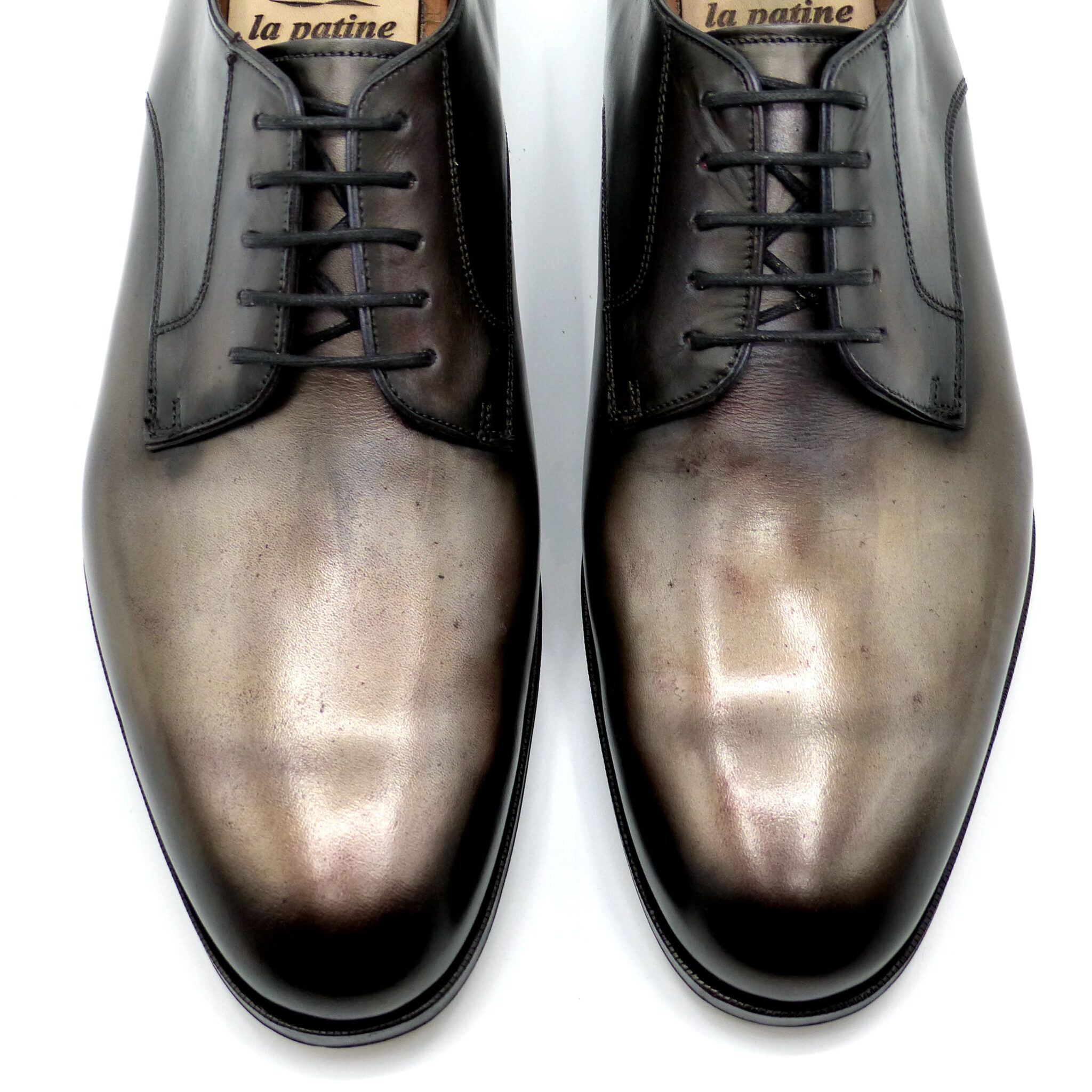
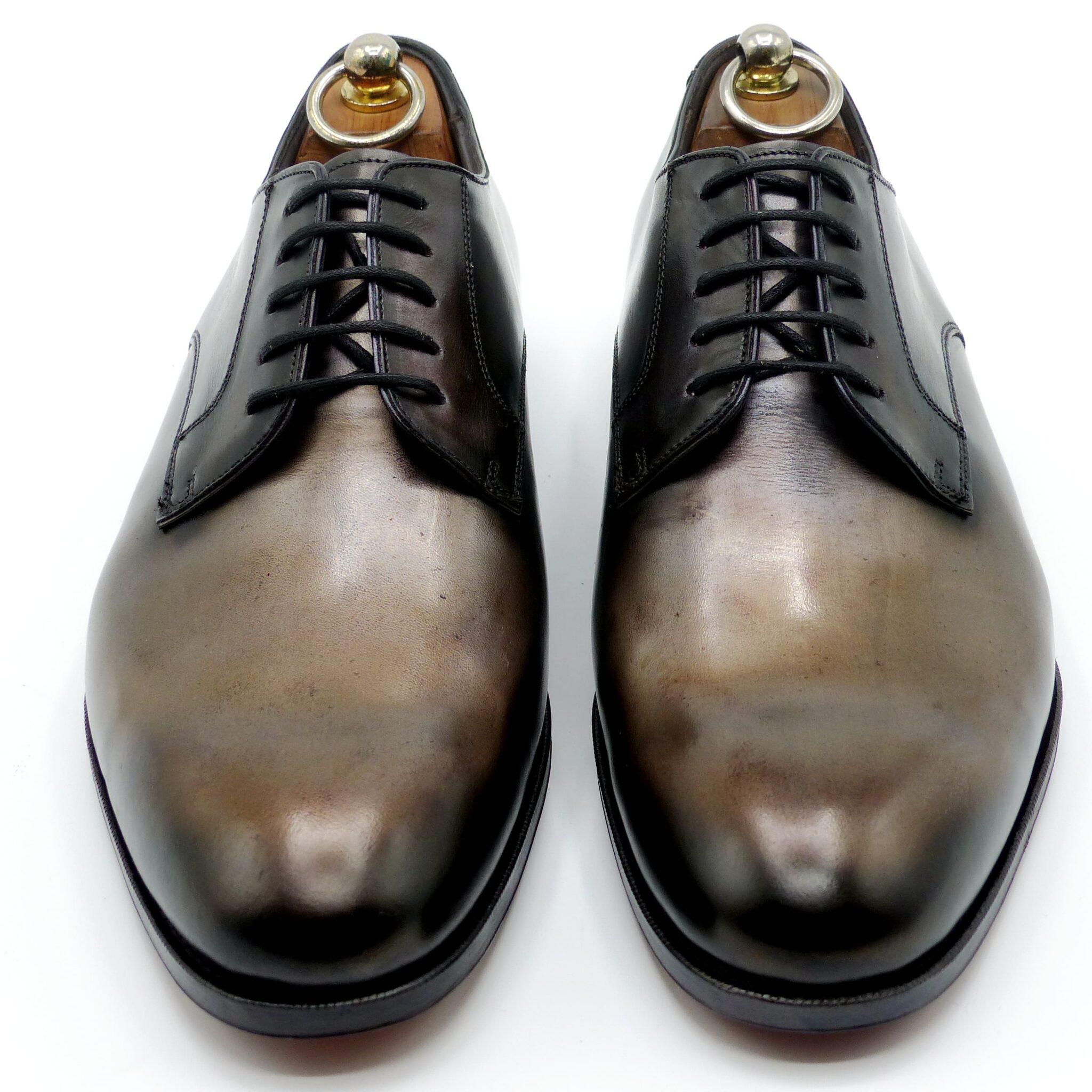
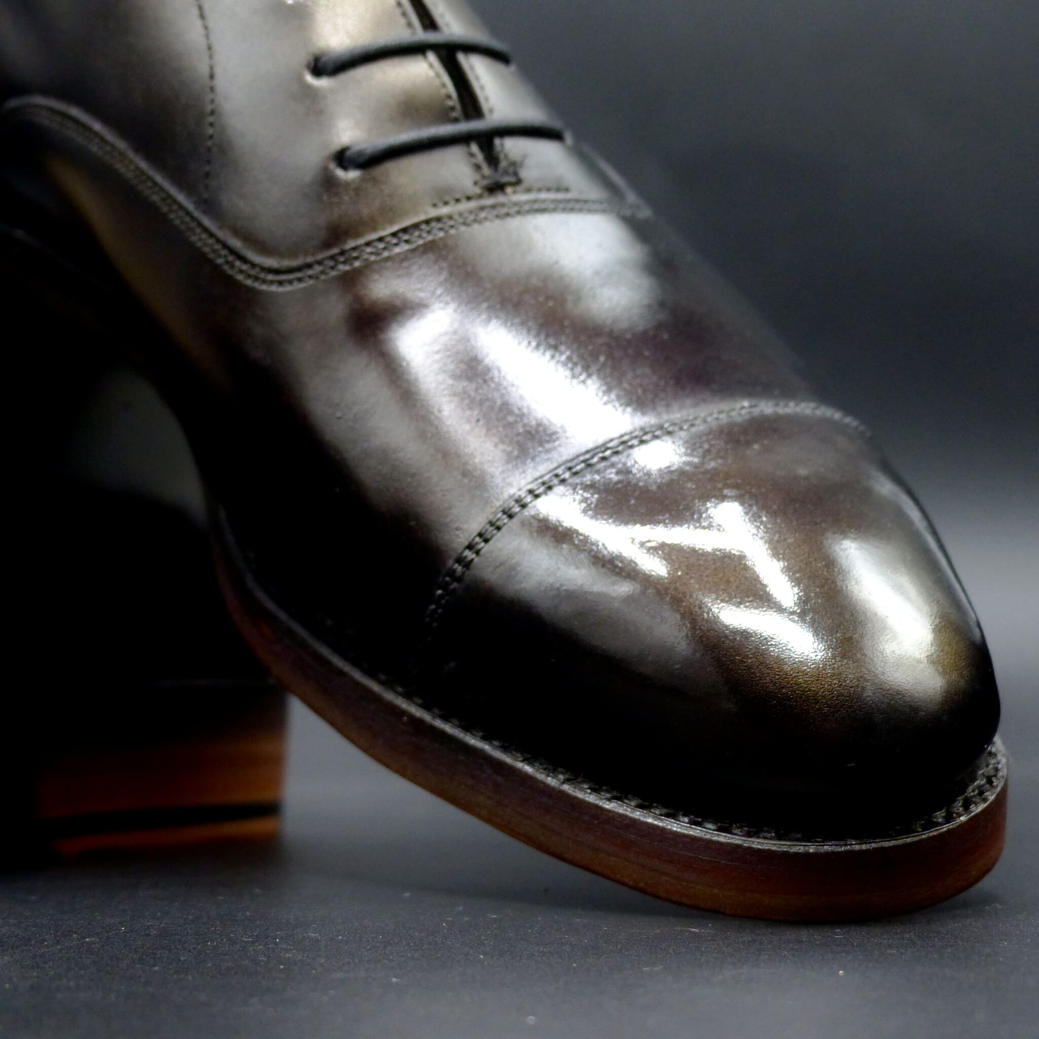
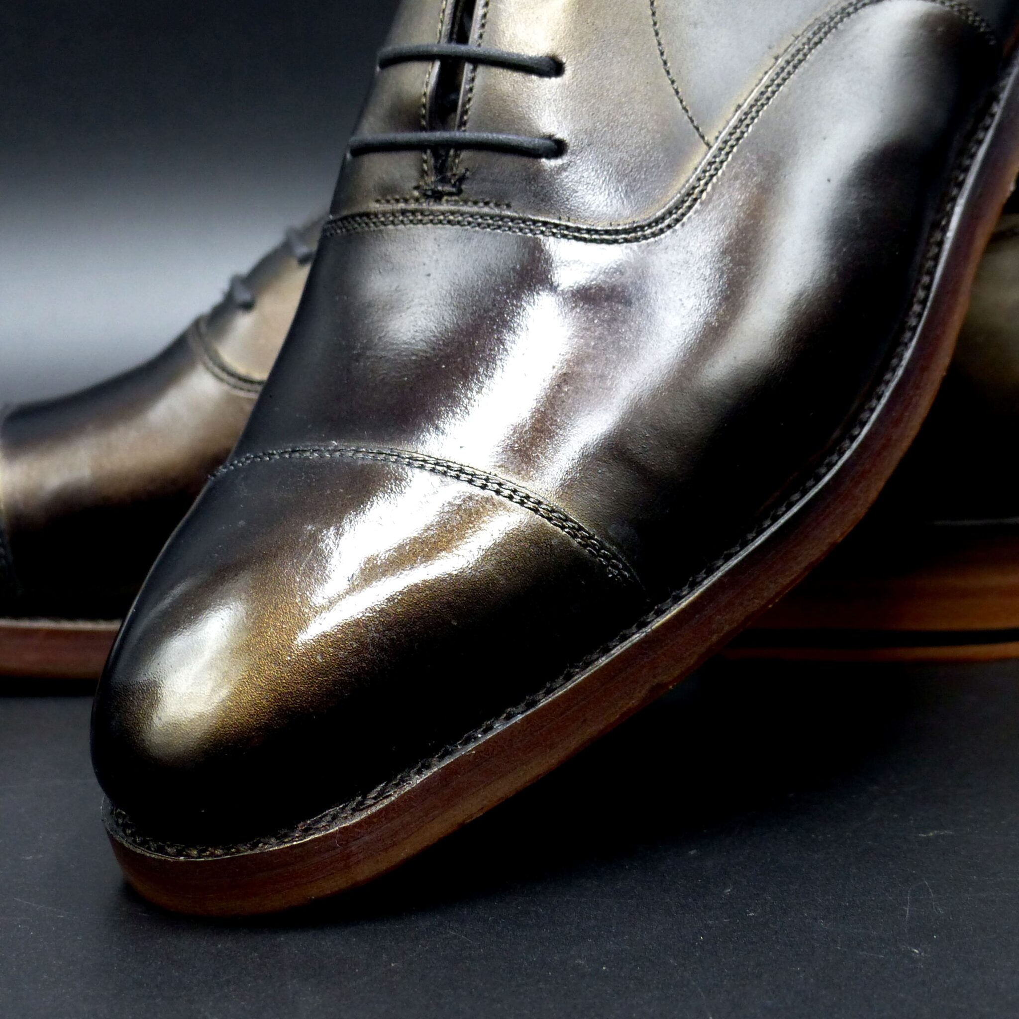
プレーン・ダービー

color name;
[ Aogasumi]
青霞
Plaine Derby


「青霞(あおがすみ)」は、群青から鉄紺、瑠璃色に至るまで、青のすべてを重ねたようなグラデーションが特徴のパティーヌ仕上げ。
朝も夜も区別がつかないような深く幻想的な青が、足元に静謐な空気をまとわせます。
光の角度によって現れる紫がかった艶、黒に近い陰影――
色があるのに、輪郭があいまいなその姿は、まるで青い霞がたなびく情景そのものです。
ただの「青」ではない、時間や空気を内包した色。
「青霞」は、語らずとも印象を残す、沈黙の中の存在感です。
🎌 「青霞」という美意識と文化的背景
◆ 「青(あお)」とは
日本の「青」は、単なる色ではなく、精神性や自然との調和を象徴する色とされています。
特に「群青」「瑠璃」「鉄紺」など、青の系統は古来より仏教や貴族文化、陶磁器、染織に多く用いられ、静けさ・深さ・聡明さを表す色でした。
◆ 「霞(かすみ)」とは
「霞」とは、春や早朝に現れる大気のゆらぎであり、日本の詩歌・絵画・能楽などで多く描かれる**「見えないものの美」**の象徴です。
輪郭をぼかし、明確にしないことで、想像を喚起させる――それが「霞」の本質。
◆ 「青霞(あおがすみ)」が示す世界観
「青霞」は、深く静かな青と、輪郭を曖昧にする霞の感性を重ねた名前です。
このパティーヌがもつグラデーションは、ただの装飾ではなく、日本的な「余白の美」「静謐の中の力強さ」を映し出します。
靴でありながら、風景をまとう。
青霞は、記憶に残る沈黙の色です。
Aogasumi – Mist in Midnight Blue
The quiet brilliance of indigo, the fading edge of twilight, and the whisper of early morning haze—
Aogasumi evokes a landscape more than a color.
It is serenity wrapped in shadows. Elegance that does not demand attention, yet never fades from memory.
——————————————————————————————–
🎌 The Aesthetic and Cultural Essence of “Aogasumi”
◆ The Meaning of “Ao” – Blue in Japanese Culture
In Japanese tradition, ao (blue) is more than a color—it is a symbol of spiritual clarity, depth, and harmony with nature.
Shades such as gunjō (ultramarine), ruri (lapis), and tetsukon (iron navy) have long appeared in Buddhist iconography, court garments, ceramics, and dyed textiles.
They embody quietude, intelligence, and the tranquil elegance of refined beauty.
◆ The Meaning of “Kasumi” – The Beauty of Haze
Kasumi (haze) refers to the delicate atmospheric veil seen in spring mornings or over distant landscapes.
In Japanese poetry, painting, and Noh theatre, it represents the ideal of “beauty in the unseen.”
By blurring contours and avoiding clarity, kasumi invites imagination rather than definition.
To see everything is to know too much.
Kasumi teaches us to find elegance in suggestion.
◆ The Worldview Behind “Aogasumi”
Aogasumi is a name born from the fusion of deep, tranquil blue and the evanescent mystery of haze.
The patina it describes is not merely a surface treatment—it is an expression of Japan’s aesthetic values:
- Ma(間): the beauty of negative space
- Yūgen(幽玄): the profound grace within stillness
- Utsuroi(移ろい): the subtle beauty of transition
Wearing this color is like wearing a landscape—
A silent impression that lingers long after it passes.
Aogasumi is not simply a hue.
It is the color of silence remembered.
ホールカット・スリッポン
color name;
[ Kokekage]
苔影
Whole Cut ・ Slip-on


🎌 「苔影」という色とその文化的背景
◆ 苔(こけ)= 常緑と湿潤の美
苔は、古くから日本の美意識において重要な自然要素。
神社仏閣の庭や石畳に生い茂る苔は、「侘び寂び」の象徴であり、静けさ・継続・陰影の美を表現します。
苔は、目立たず、語らず、そこに在ることの尊さを示す存在です。
◆ 影(かげ)= 美の輪郭をぼかすもの
影は、単なる暗さではなく、光との関係性によって生まれる余白や深みの象徴。
日本の伝統建築や茶室では、「陰翳礼讃(いんえいらいさん)」の美学として、光を制限し、影の中にこそ美を見出してきました。
影があるからこそ、艶は際立ち、色は深まる。
◆ 苔影(こけかげ)という世界観
「苔影」は、目立つための色ではなく、静かに印象を残す色。
和の自然観・侘び寂び・影の表現が融合した、**日本的な“沈黙の存在感”**を体現したネーミングです。
時を超えて残るものとは、騒がしさではなく、静けさである。
苔影は、そう語る色です。
🎌 The Cultural Essence of “Kokekage” – Moss and Shadow
◆ Moss – A Symbol of Stillness and Timeless Beauty
In Japanese aesthetics, koke (moss) is more than a plant—it is a profound metaphor for quiet endurance, humility, and the beauty of age.
Found in temple gardens and ancient stone paths, moss is revered for its ability to thrive in stillness, without seeking light or attention.
It embodies the essence of wabi-sabi—a quiet, unassuming presence that speaks of nature, time, and impermanence.
Moss teaches us that beauty does not always bloom. Sometimes, it lingers.
◆ Shadow – The Space Where Beauty Breathes
Shadow (kage) in Japanese culture is not simply the absence of light, but the canvas upon which true elegance reveals itself.
As described in Jun’ichirō Tanizaki’s In Praise of Shadows, Japanese architecture and tea rooms celebrate dimness and ambiguity—
where color, texture, and form are allowed to deepen through restraint rather than exposure.
In shadow, gloss becomes more profound.
In silence, form becomes more vivid.
◆ Kokekage – A World of Subtle Presence
Kokekage—literally “Moss and Shadow”—is a name that blends nature’s quiet growth with the invisible grace of shade.
It reflects the Japanese philosophy of understatement, where impact is achieved not through brilliance, but through depth and calm.
This patina is not made to dazzle; it is made to endure, to invite reflection, and to remain long after words have faded.
It is a shoe that does not ask to be seen—
Yet once seen, it cannot be forgotten.
ロング・ウィングチップ
color name;
[ Amekuri-Iro]
飴栗色
Long Wing-Tip

「飴栗色(あめくりいろ)」という色名は、日本の伝統色には正式な登録名として存在しない創作的な複合語ですが、その構成要素である「飴色」と「栗色」は、ともに古来より日本文化に深く根ざした色です。この2色を組み合わせた「飴栗色」という考察的色名をもとに、以下にその歴史的背景・色構成・象徴性を詳しくご説明します。
■ 飴栗色の構成要素
◉ 飴色(あめいろ)
- 色調:黄褐色、光沢のある琥珀色系
- 由来:水飴の色に由来し、江戸時代から使われたとされる。
- 使用例:漆器、煙草盆、刀の鞘など。染織では木綿や麻にも。
- 象徴:柔らかさ、温もり、熟成、素朴さ
→ 日本人の生活に根ざした「自然の艶」として親しまれてきました。
◉ 栗色(くりいろ)・栗皮茶(くりかわちゃ)
- 色調:赤みを帯びた濃い茶色(栗の皮のような色)
- 由来:栗の実やその皮からとった染色。奈良時代にはすでに存在。
- 使用例:狩衣や袴などの実用衣料、武士の装束にも多く用いられた。
- 象徴:秋、実り、堅実さ、勇気
→ 男性的・実直な印象を持ち、古武道・武家文化とも関係が深い色です。
■ 飴栗色の文化的意味合い(仮想的解釈)
「飴栗色」は、
- 飴色の艶と温かみ
- 栗色の深みと落ち着き
を兼ね備えた色であり、時間の経過とともに深まる美しさ・熟成・精神的充足を象徴すると考えられます。
これは例えば以下のようなシーンにふさわしい色といえるでしょう:
■ 想定される歴史的・文化的な使われ方(創作的視点)
用途 | 想定される理由・意味合い |
◉ 茶道具の漆や木地 | 飴色の艶と栗色の落ち着きが「侘び寂び」を体現 |
◉ 武士の袴・羽織 | 栗色は武士の精神、飴色は磨き上げた知恵を象徴 |
◉ 襖絵や屏風の彩色 | 自然の実りや季節感を重ねた重厚な色調として |
◉ 商家の看板や蔵の扉 | 商売繁盛=実りの象徴、飴色の艶=信用と品格 |
■ 象徴性まとめ
色 | 象徴するもの |
飴色 | 熟成、温もり、素朴な美、時間の流れ |
栗色 | 実り、堅実さ、秋の深まり、武士道精神 |
→ 飴栗色 = 時を超えて深まる知恵と誠実さ
古来の「用の美」を象徴する色合いであり、現代においても重厚な革製品や木工品、着物の帯や袴にふさわしい風格を備えています。
Amekuri-iro (Candy Chestnut Brown): A Conceptual Traditional Japanese Color
Note: “Amekuri-iro” is not an officially registered name among traditional Japanese colors, but rather a creative compound term combining two historically significant hues: “Ame-iro” (candy brown) and “Kuri-iro” (chestnut brown). The following explains its cultural significance, color composition, and symbolic meaning based on these components.
■ Color Components of Amekuri-iro
◉ Ame-iro (飴色 – Candy Brown)
- Tone: A translucent, amber-like golden brown
- Origin: Named after the color of mizuame (a traditional Japanese sweet syrup), commonly used since the Edo period
- Uses: Lacquerware, tobacco trays, sword scabbards, dyed cotton and hemp fabrics
- Symbolism: Warmth, gentleness, maturity, simplicity
→ This color reflects the natural luster appreciated in daily life and craftsmanship in Japan
◉ Kuri-iro / Kurikawacha (栗色・栗皮茶 – Chestnut Brown)
- Tone: Deep reddish-brown resembling chestnut shells
- Origin: Derived from natural dyes made from chestnut husks and bark; known since the Nara period
- Uses: Everyday garments such as kariginu and hakama, frequently worn by samurai
- Symbolism: Autumn, harvest, diligence, courage
→ A masculine and steadfast color, closely associated with martial virtues and practical aesthetics
■ Cultural Significance of Amekuri-iro (Conceptual Interpretation)
Amekuri-iro combines:
- the soft glow and warmth of Ame-iro
- with the depth and dignity of Kuri-iro
It symbolizes matured beauty that deepens over time—representing wisdom, inner richness, and spiritual contentment.
■ Hypothetical Historical & Cultural Applications (Creative Perspective)
Context | Interpretation & Meaning |
Tea utensils (lacquered or wooden) | Reflecting the aesthetic of wabi-sabi through warmth and quiet dignity |
Samurai garments (hakama, haori) | Expressing intellect (Ame-iro) and integrity (Kuri-iro) |
Fusuma and folding screen painting | Embodying seasonal transitions and the abundance of nature |
Store signage or kura (storehouse) doors | Signifying prosperity (harvest) and trustworthiness (polished luster) |
■ Symbolism Summary
Color | Symbolizes |
Ame-iro | Maturity, warmth, rustic elegance, the passage of time |
Kuri-iro | Fruitfulness, integrity, seasonal depth, samurai spirit |
→ Amekuri-iro = Enduring Wisdom and Honesty
This compound color represents the aesthetics of “functional beauty” (yō no bi) cherished since ancient Japan. Even today, it is well-suited for leather goods, wooden crafts, or formal traditional garments like obi and hakama—carrying a timeless sense of grace and gravitas.
ロング・ウィングチップ
color name;
[ Kabacha-Iro]
樺茶色
Long Wing-Tip


🔶 樺茶(かばちゃ)色とは
- 色の概要
「樺茶(かばちゃ)」は、赤みを帯びた深い茶色で、日本の伝統色のひとつです。「樺(かば)」とは本来、カバノキ科の樹皮の赤褐色を指し、その色味に茶(ちゃ)を加えた濃厚な茶褐色が「樺茶」と呼ばれます。
- 色構成:
- ベース:焦茶(こげちゃ)
- 赤みのニュアンス:弁柄色(べんがらいろ)や栗梅(くりうめ)
- 濃淡により:黒茶、黄土色、赤茶を含むグラデーションが生まれる
🔸 古代日本における使われ方
- 染織や衣服
「樺茶色」は、飛鳥・奈良・平安期にかけて、貴族や高僧の装束などに使われる高級色のひとつでした。特に植物染料による染めが盛んだった当時、**赤みを帯びた茶色は「気品」や「落ち着き」「老成」**を象徴する色として尊ばれました。
- 主に使用された染料:蘇芳(すおう)・阿仙(あせん)・ヤマモモなど
- 染められた素材:絹や麻、後には綿など
- 武具や道具類
鎌倉~戦国時代にかけては、「樺茶色」は漆塗りや革具、刀の柄巻、甲冑の一部にも見られます。この色味が持つ重厚さと精神性が、武士の威厳や精神の落ち着きを象徴するものとして受け入れられていました。
🌾 象徴するもの・意味
象徴 | 説明 |
気品・格式 | 落ち着いた赤茶系統は、派手さを抑えつつも高貴な印象を与える |
熟成・円熟 | 木の年輪や古木の皮の色にも通じ、長い時間を象徴 |
自然との調和 | 土や樹木を思わせる色合いが、自然美と結びつけられた |
静かな情熱 | 派手な赤ではなく、内に秘めた力強さと情熱の象徴としても使われた |
🪵 現代とのつながり
「樺茶」は、現代においてもクラシックなレザー製品、建具、器、漆芸などに好んで使われています。上質で落ち着きのある色味が、日本の美意識「侘び・寂び」とも親和性が高いためです。
🔶 Kabacha – The Traditional Japanese Color of Refined Depth
- Color Overview
Kabacha (樺茶) is a traditional Japanese color — a rich, reddish-brown tone inspired by the bark of birch trees (kaba, in Japanese). It blends the deepness of dark brown (kogecha) with subtle red hues found in natural dyes like bengara (iron oxide red) and kuriume (chestnut plum), creating a color that is warm, aged, and quietly expressive.
- Color composition:
- Base: dark brown (kogecha)
- Accents: red-brown hues like bengara, kuriume, or reddish ochre
- Result: A layered, organic depth of tone that evokes aged wood or ember
🔸 Historical Use in Ancient Japan
- Textiles and Garments
In the Asuka through Heian periods (6th–12th centuries), Kabacha was used in noble and clerical robes, prized for its dignified and calm presence. Natural dyeing techniques brought out this color using ingredients such as sappanwood (suō), asen tree bark, and yamamomo (Japanese bayberry).
- Common dye sources: suō (sappanwood), asen, yamamomo
- Materials: silk, hemp, later cotton
- Worn by: aristocrats, monks, and those in high-ranking positions
- Arms, Armor, and Craftsmanship
From the Kamakura to Sengoku eras (12th–16th centuries), Kabacha appeared on lacquered surfaces, sword hilts, scabbards, and armor. The color was revered for its grounded, composed aura — reflecting a warrior’s restraint, maturity, and inner strength.
🌾 Symbolism and Cultural Meaning
Symbolism | Meaning |
Elegance & Dignity | The subdued red-brown tone projects calm nobility |
Wisdom & Maturity | Evokes aged trees and timeworn materials, signifying experience |
Harmony with Nature | Inspired by earth, bark, and wood, expressing a deep respect for nature |
Quiet Passion | Less flamboyant than bright red, Kabacha implies strength held inwardly |
🪵 Relevance Today
Today, Kabacha remains beloved in leather goods, wooden crafts, architecture, and lacquerware. Its deep, natural tone resonates with the Japanese aesthetics of wabi and sabi, celebrating the beauty of age, imperfection, and inner richness.
プレーン・ダービー
color name;
[ Aonibi]
青鈍
Plain Derby

「青鈍(あおにび)」は、日本の伝統色の中でも特に渋く奥深い色調であり、古代から中世・近世にかけて、さまざまな場面で使用されてきました。以下に、青鈍の歴史的背景・色の構成・象徴する意味について詳しくご説明します。
■ 青鈍とは
「青鈍(あおにび)」は、青みがかった鈍い灰色を指します。
「鈍(にび)」とは、古語で**金属がくすんだような鈍色(にびいろ)**を意味し、光沢を抑えた重厚な色合いを表現しています。
色構成(視覚的特徴):
- 基本色:灰色
- 副色:青緑~青藍系の青み
- トーン:くすんだ低明度・中〜低彩度
■ 歴史的な使用シーン
- 武士の甲冑や装束
青鈍は特に武具や陣羽織、袴、羽織の裏地などで用いられ、勇ましさと沈着冷静な精神性を象徴しました。派手さを避け、質実剛健な美学を体現する色として愛されました。
- 能・狂言の衣装
能楽の中でも、静謐さや悲哀を伴う登場人物(老人、隠者、武将など)の衣装に青鈍が用いられることがありました。この色は沈思黙考・枯淡の境地を映すのにふさわしかったためです。
- 染織・貴族の調度品
貴族の中でも「隠棲的な美学」や「枯れた美」を好む者にとって、青鈍は渋さ・品格・陰影美の象徴であり、屏風、襖絵、文箱などにも取り入れられました。
■ 象徴する意味・美意識
青鈍の色が象徴するものには、以下のようなキーワードがあります:
- 沈静と理性:派手さを抑えた青みのある灰色は、内省的で落ち着いた精神性を表現。
- 陰影と奥行き:光と影の間にある「侘び・寂び」に通じる色。陰影の美、日本特有の感性。
- 品格と謙虚さ:権威を誇示する色ではなく、控えめで誠実な印象を与える。
- 戦いの中の静寂:戦装束に選ばれた背景には、「心を乱さぬ強さ」への象徴的役割も。
■ 現代への応用
現代においても「青鈍」は:
- 落ち着きと品格を求めるフォーマルなスーツや革製品
- 書斎・ギャラリーなどの静かな空間演出
- デザイン・建築のアクセントカラー
として、和の精神をさりげなく現代に取り入れる要素として注目されています。
■ What is Aonibi?
Aonibi is a traditional Japanese color characterized by a subdued gray with hints of blue or green.
The word “nibi” (鈍) refers to a dull or muted metallic tone, expressing a sense of refined restraint rather than vividness. It evokes an impression of aged steel, quiet depth, and shadowed elegance.
Color Composition:
- Base tone: Gray
- Accent hues: Bluish green or indigo
- Tone characteristics: Low brightness, low saturation
It resembles a dim gray with subtle bluish undertones, akin to a weathered piece of iron under soft light.
■ Historical Usage in Japan
- Samurai Armor and Attire
Aonibi was often used in armor, battle surcoats, and formal garments of the samurai class.
Its subdued tone symbolized discipline, courage, and calm under pressure, expressing a warrior’s strength without ostentation.
- Noh and Kyogen Costumes
In traditional theater such as Noh, Aonibi was used for characters like reclusive elders, warriors, or monks.
Its color embodied quiet dignity, melancholy, and spiritual introspection—suiting characters rooted in contemplation or sorrow.
- Aristocratic Objects and Textiles
Among the nobility, Aonibi was favored in furnishings, screens, and writing boxes that reflected a refined, understated taste.
The color’s association with shadow, depth, and silence made it ideal for expressing wabi-sabi, Japan’s aesthetic of impermanence and subtle beauty.
■ Symbolism of Aonibi
Aonibi conveys a range of refined meanings:
- Composure and Rationality
Its cool, muted tone evokes a sense of control, wisdom, and restraint. - Shadow and Depth
Closely tied to the Japanese appreciation of subtle gradations in light—“the beauty of shadows.” - Grace and Modesty
Not a color of assertion, but of quiet strength and dignity. - Stillness Amid Conflict
For warriors, it symbolized mental clarity in battle, a calm heart behind the sword.
■ Modern Applications
Today, Aonibi continues to inspire:
- Formal wear and leather goods for those who prefer subtle sophistication.
- Interior design for calm, contemplative spaces like studies or galleries.
- Product branding where balance, harmony, and authenticity are key.
オーステリティ・オックスフォード

color name;
[ Gunjō-Iro]
群青色
Austerity Oxford
■ 群青色(ぐんじょういろ)とは
群青色は、深い青にわずかに紫みを帯びた鮮やかな濃紺で、もとは「群青(ぐんじょう)」と呼ばれる顔料の色名に由来します。中国を経て輸入された天然のラピスラズリ(瑠璃)から作られた群青顔料や、藍から精製された藍青よりもさらに深い色調が特徴でした。
◯ 色構成
- 主要成分:
- 天然群青顔料(瑠璃=ラピスラズリを細かく砕き精製)
- 後世には藍銅鉱(あいどうこう)・藍鉄(あいてつ)など、諸藍化合物を用いた合成・加工顔料も登場
- 色味の特徴:
- 純粋な藍色や紺色よりも深く、わずかに紫みを含む濃厚な青
- 明るい光の下では艶やかな群青調が、陰影の中ではほとんど黒に近い深みを見せる
◯ 古代日本での使用シーン
- 仏教美術・壁画(天台・真言・密教寺院)
- 平安時代から鎌倉時代にかけて、寺院の壁画や仏像の彩色に「群青」が多用されました。
- 特に青い蓮華や仏の衣装などを表現する際、瑠璃を原料とする群青顔料は「浄土の世界」「神聖な儀礼」の象徴として重宝され、寺院の荘厳さを高めました。
- 屏風絵・絵巻物(公家・武家の意匠)
- 室町時代の能装束図屏風や、絵巻物の夜景、山水画の遠景などに群青が使われ、**「闇夜の深み」「神秘的な山々」**を演出しました。
- 宮廷や武家の邸宅に飾る際も、画面の奥行きを出す効果が重視され、格式ある美術品として愛用されました。
- 漆器・陶磁器の絵付け
- 江戸時代には、磁器の下絵具(藍色釉薬)や漆器の蒔絵に群青寄りの顔料が導入されました。
- 深い青が背景にあるだけで、器全体に高貴な雰囲気を与え、茶道具や酒器などにも珍重されました。
- 染色・染物(高級衣装の裏地・小物)
- 群青の顔料そのものは染料として直接使われにくかったものの、藍染めをさらに濃く定着させる技術として藍鉄(あいてつ)や藍銅(らんどう)などが発展。
- 茶人や商人の礼装、小袖の裏地、帯揚げなど、ところどころに群青調の色味が差されることで、身にまとう人の格式と知性を際立たせました。
◯ 群青色が象徴するもの
象徴する要素 | 意味・背景 |
神聖・浄土 | 羅漢図や浄土図など仏教美術で、瑠璃の青は「仏の世界・浄土」の色とされ、神聖性を示す。 |
深遠な宇宙・夜空 | 夜の闇や遠い山並みを表すのに用いられ、**「はるか遠くを想起させる深み」**を演出。 |
文学・詩情 | 和歌や連歌では、夏の夜空や清涼感を詠む際に「群青の闇」などの表現で詩的イメージを強調。 |
格式・洗練 | 宮廷装束の裏地や高位武将の家紋装飾など、高貴で上品な趣を持たせる色として用いられ、身分や教養の高さを暗示。 |
■ まとめ
群青色(ぐんじょういろ)は、瑠璃(ラピスラズリ)由来の顔料や藍銅鉱を用いた深く鮮やかな青を指す伝統色です。
平安~鎌倉期の仏教美術や能装束図屏風、絵巻物の夜景表現、江戸時代の漆器・陶磁器の装飾まで、神聖さ、夜空の深み、格式高い趣を演出するために広く用いられました。
群青色は、「浄土」「宇宙の深遠」「詩情」「格式の象徴」として、時代を超えて人々に愛され続けています。
■ English Translation: What Is “Gunjō-iro” (群青色)?
“Gunjō-iro” refers to a deep, vivid indigo-blue hue with a faint purple undertone, originally derived from a pigment known as “gunjō” (ultramarine), made by importing and grinding lapis lazuli (ruri) from Central Asia or using locally available mineral compounds such as indigo copper ore (aidōkō) and aizumi (indigo-based pigments).
◯ Color Composition
- Primary Components:
- Natural ultramarine pigment (ruri) – crushed lapis lazuli
- Subsequent variations used aidōkō (indigo copper ore) or indigo-iron compounds to create a synthetic ultramarine-like tone
- Visual Characteristics:
- A deeper, richer blue than pure indigo or navy, with a subtle purple cast
- Under bright light, it appears as a lustrous ultramarine; in shadow, it can look almost black
◯ Historical Usage in Ancient Japan
- Buddhist Art & Murals (Tendai, Shingon, and Esoteric Temples)
- From the Heian to Kamakura periods, temples employed “gunjō” pigment widely for murals, mandalas, and the robes of deities.
- The lapis-lazuli–based blue symbolized the pure, transcendent realm of the Buddha. It adorned backgrounds and iconography, heightening a temple’s spiritual authority and “otherworldly” atmosphere.
- Folding Screens & Handscrolls (Court and Warrior Imagery)
- In the Muromachi period, courtly scenes (e.g., Noh costume depictions) and handscroll landscapes used gunjō to depict night skies, distant mountains, and lake reflections.
- The hue gave paintings a sense of “mysterious depth”—perfect for creating a refined, elegant aesthetic in daimyo residences and aristocratic mansions.
- Lacquerware & Porcelain Decoration
- During the Edo period, ultramarine-like pigments were adopted in porcelain underglaze and lacquer inlay.
- A deep blue background or detailing conveyed nobility and sophistication. Tea ceremony bowls, sake cups, and decorative trays often featured this accent to evoke high status and refined taste.
- Textile Dyeing & Fabrics (Ceremonial Attire Accents)
- Although the lapis-based pigment itself did not dye fabrics directly, techniques evolved to produce a similar deep blue—often called “aizumi” or “aidōsu”—that approximated gunjō’s depth.
- Elite garments, kimono linings, and formal accessories for samurai and courtiers sometimes featured gunjō-like shades, signaling rank, erudition, and a connection to classical aesthetics.
◯ Symbolism of Gunjō-iro
Symbolic Element | Meaning |
Sacred Enlightenment | In Buddhist art, ultramarine blue represents the pure land and the Buddha’s transcendence. |
Profound Night & Cosmos | Used to depict mystical night skies and distant horizons, conjuring a sense of infinite depth. |
Poetic Imagery | In classical poetry and linked verse, phrases like “gunjō no yami” (ultramarine darkness) evoke summer nights and emotional nuance. |
Status & Refinement | Employed in aristocratic and samurai attire, as well as luxury crafts, to indicate high rank and cultivated taste. |
■ Summary
Gunjō-iro (群青色) is a traditional Japanese color denoting the deep ultramarine blue originally derived from lapis lazuli (ruri) pigment or similar indigo-copper compounds.
From Heian- and Kamakura‐period Buddhist murals and temple iconography to Muromachi folding screens depicting the night, and Edo‐period lacquerware and porcelain, its rich indigo hue has symbolized “the sacred realm,” “the profound universe,” “poetic depth,” and “aristocratic elegance.” Gunjō-iro continues to be cherished for its timeless sense of spirituality, mystery, and refined beauty.
プレーン・オックスフォード

color name;
[ Rokushou]
緑青
Plaine Oxford

■ 緑青(ろくしょう)とは
◯ 色の構成
- 基本色調:くすんだ青緑に、金属的な鈍い輝きが混じった色合い。
- イメージ:銅や青銅が長く空気に触れて生まれる「青銅錆(あおどうさび)」、すなわち「緑青」が醸す、古びた金属の渋い緑です。
- 視覚的特徴:暗い緑の中に青みが漂い、光の当たり方で微かに光沢を帯びることでメタリックに見えます。靴の表面に見える緑→黒→灰のグラデーションや、金属を思わせる鈍い光沢がまさに「緑青」の風合いに重なります。
◯ 古代~中世日本での使用シーン
- 青銅器・仏具の経年変化
- 古墳時代以降、日本では青銅製の鏡や仏具(法具)、梵鐘(ぼんしょう)などが作られ、「緑青」はその表面に自然に生じる錆として親しまれてきました。
- とくに仏具では、青銅製品に浮かぶ緑青が「歳月や神聖さの証」として尊ばれ、寺社の内部装飾や鐘楼(しょうろう)に安置される鐘にもそのまま残されました。
- 建築・金物の装飾
- 平安~鎌倉期になると、神社仏閣の屋根飾りや縁金具(えんかなぐ)に青銅が使われ、その表面に美しい緑青が浮かび上がります。
- 緑青は「神域の厳かさ」「年季を経た風格」を象徴し、神社の鳥居金具や桧皮葺(ひわだぶき)屋根の水切り金具などにも見られました。
- 工芸・漆器の意匠
- 鎌倉~室町時代の刀装具(金具類)や漆工にも、意図的に「緑青風」の色彩を再現する技法が取り入れられました。銅に薬品を施して緑青を発色させたり、漆塗りに顔料で青緑を混ぜて「錆色」を出したりすることで、**「時を経た重厚感」**を表現しています。
■ 緑青が象徴するもの
象徴する要素 | 意味・背景 |
経年の風格 | 青銅器や鐘などに自然に浮かぶ緑青は、時間の積み重ねを示し、歴史や重厚さを感じさせる色として尊ばれました。 |
荘厳・神秘性 | 神社仏閣に用いられる青銅製品の緑青は、神聖な領域のしるしとされ、荘厳で静かな美しさを演出します。 |
侘び・寂び | 完璧ではない「錆び」を美とする日本独自の美意識を表し、変化や朽ちゆく過程そのものに価値を見出す精神を象徴します。 |
自然との調和 | 炉や屋外の風雨にさらされた金属の姿に、自然と人とが織り成す「共生」の美しさが宿ると考えられてきました。 |
■ まとめ
緑青(ろくしょう)は、青銅の表面に長く生じる青緑の錆をそのまま色名にした伝統色です。古くは仏具や鐘楼、神社仏閣の金具などに自然発生し、「時を経た重厚さ」「神聖な厳かさ」「わび・さびの精神」「人と自然の共生」を象徴しました。現代においても、その渋い緑味と金属的な鈍い光沢は、和の美意識を感じさせる装いや空間づくりに生かされ続けています。
■ What Is “Rokushō” (緑青)?
“Rokushō” literally refers to the greenish-blue patina that naturally forms on bronze or copper over time. As a traditional Japanese color name, it denotes “the muted, metal‐tinted teal that appears when bronze ages—akin to the verdigris on ancient bronze vessels.” This hue combines a subdued blue-green core with a faint metallic sheen, evoking the gentle corrosion of copper exposed to the elements.
■ Historical Usage in Ancient Japan
- Aging Bronze Ritual Implements and Temple Accoutrements
- From the Kofun period onward, Japan produced bronze mirrors, Buddhist ritual objects, and temple bells (bonshō). As these artifacts aged, they naturally developed a greenish patina—rokushō— which was revered as a sign of sanctity and the passage of time.
- In Buddhist temples, the verdigris on bells and bronze ritual fittings was preserved rather than removed, because it signified age, spiritual gravity, and veneration.
- Bronze Architectural Fittings and Shrine Decoration
- During the Heian and Kamakura periods, temples and shrines employed bronze for roof ornaments, water spouts, and various metal fittings. Over time, these bronze elements developed a visible patina.
- The resulting green‐blue hue of rokushō was valued as a symbol of the shrine’s or temple’s sacred aura, adding a dignified, time-worn elegance to the architecture.
- Crafts and Lacquerware Techniques
- From the Kamakura through Muromachi periods, artisans intentionally replicated the verdigris effect. They applied chemicals to bronze components of sword fittings, teahouse fixtures, and lacquerware, causing a controlled oxidation that produced a rokushō‐like finish.
- In lacquer art, pigments were blended to mimic verdigris, creating a sense of “aged grandeur” and reflecting the wabi-sabi ideal of beauty in imperfection and natural decay.
■ Color Composition
- Base Tonality: Verdigris Green-Blue
- The core of rokushō is the natural hue that appears when bronze is exposed to moisture and air—an earthy blue-green that hints at both the metal’s original warmth and its gradual oxidation.
- Understatement of Metallic Sheen
- Rather than a bright, glossy green, traditional rokushō carries a dull metallic glimmer—discernible only in certain light. This subtle sheen marks the transition from polished bronze to aged verdigris.
- Gradations from Deep Teal to Ashy Green
- Depending on lighting and viewing angle, a true rokushō surface shifts between a darker teal and an ashen, almost silvery-green, resulting in a complex blend of “deep verdigris” migrating toward “smoky green-blue”.
■ Symbolism
Symbolic Element | Meaning |
Patina of Time & Dignity | The aged green-blue surface represents the passage of years and the gravitas that only time can bestow upon sacred objects. |
Solemnity & Sacredness | Found on bells and bronze temple fittings, rokushō was regarded as a sign of spiritual purity and shrine/temple sanctity. |
Wabi-Sabi (Impermanence) | The gradual oxidation of metal—neither perfect nor uniform—reflects the Japanese appreciation for imperfection and natural decay. |
Harmony with Nature | Since the color emerges from the interaction of metal, moisture, and air, it embodies a fusion of human craftsmanship and the natural world. |
■ Summary
Rokushō (緑青) is the greenish-blue patina that forms naturally on bronze or copper over time. In ancient Japan, it appeared on temple bells, ritual implements, and architectural fittings, where it came to symbolize “the dignity of age,” “sacred solemnity,” “the wabi-sabi spirit,” and “harmony with nature.” Today, its subdued teal-green hue and faint metallic sheen continue to inspire designs that evoke traditional Japanese elegance and timeless refinement.
プレーン・オックスフォード
color name;
[ Akakuchiba]
赤朽葉
Plaine Oxford


赤朽葉(あかくちば)――深まる秋の色です。
赤茶色に染まる朽葉のようなこの色名は、平安時代から伝わるものです。襲(かさね)の色目としては、表に経紅(たてくれない)と緯洗黄(ぬらしき)、裏には黄を配し、晩秋に赤く色づく朽葉の様子を表しています。
「朽葉色」と似ていますが、赤朽葉のほうがより華やかな印象を持ちます。単なる枯葉の色ではなく、秋が深まるにつれて鮮やかに燃えるような美しさを秘めています。
この色は、平安時代の文学にも登場します。『源氏物語』では「赤朽葉の羅(うすもの)のかざみ」として、『かげろふ日記』には「うすもののあかくちばをきたるを……」と記されています。
古の人々が愛し、秋の名残を映した色――それが赤朽葉です。
Akakuchiba (赤朽葉) – The Color of Deepening Autumn
Akakuchiba, a deep red-brown color reminiscent of decaying leaves in autumn, has been passed down since the Heian period. As part of the Kasane no Irome (layered color combinations), it pairs Tatekurenai (a rich crimson) and Nurashiki (a muted yellow) on the outer layers, while the inner layer features yellow, symbolizing the red leaves of late autumn.
Although similar to the color Kuchiba-iro (decayed leaf color), Akakuchiba is more vibrant and gives a more striking impression. It is not merely the color of withered leaves but carries the beauty of autumn’s vivid flames as the season deepens.
This color also appears in Heian literature. In The Tale of Genji, it is described as “Akakuchiba no ra” (a thin robe of red-decayed leaf color), and in The Kagero Diary, it is mentioned as “a garment of thin fabric in akakuchiba…”
Akakuchiba is a color that reflects the nostalgia of autumn and was cherished by ancient people, symbolizing the passing beauty of the season.
プレーン・ダービー

color name;
[ Ginsusutake]
銀煤竹
Plaine Derby


■ 銀煤竹(ぎんすすたけ)とは
「銀煤竹」は、「煤竹(すすたけ)」と呼ばれる、長年薪や炉の煙にさらされて黒褐色に燻された竹に、さらに銀色の光沢を帯びさせたような色合いを指します。古来より、竹の自然な風合いに経年変化の美しさを重視した結果として生まれた、**「渋く燻された黒褐色を基調に、銀色の鈍い光沢をまとった色」**です。
■ 古代日本での使用シーン
- 茶の湯(茶道具)における意匠
- 平安末期~鎌倉時代以降、茶の湯の発展とともに、炉や茶釜まわりに用いられた竹製品(茶筅筒、茶杓の柄、建具の装飾用竹)などが、炎や煙に長く晒されて「煤竹」へと変化していきました。
- 茶人は、その自然に燻された竹の風合いを愛で、 「煤竹」の質感を活かした茶杓(ちゃしゃく)や茶筅(ちゃせん)の筒、建具の襖(ふすま)引き手、棚の装飾材などに取り入れました。銀煤竹に近い、わずかに灰白や銀灰の光沢を感じる色が、茶室の侘びた趣をより深める意匠として重用されました。
- 仏教・寺院装飾の一部として
- 寺院の内装や仏具の付属部材などにおいても、煤竹を素材とした装飾品が見られ、そこに漆(うるし)や金銀箔によって銀色を加えることで、「銀煤竹」のような鈍い銀灰色を演出する例がありました。
- とくに鎌倉・室町期の禅宗文化では、「自然のままに時を重ねたもの」を尊ぶ精神が重視され、煤竹やそれを意識した色合いは、仏堂や書院造りの静かな空間にしっとりとした品格を与えました。
- 武具や調度品の一部意匠素材として
- 室町以降、武家の棟梁や茶人として知られた武将などは、茶の湯具だけでなく、小物入れや装飾棚の飾り材、扇子立ての下地などに煤竹や銀煤竹風の色合いを取り入れました。
- はじめは竹そのものを煙で燻して作った煤竹が主でしたが、後世には漆や染料で銀色の鈍い光沢を加えた「銀煤竹風」の意匠も生まれ、格式ある武具や調度の格調を高める要素として活用されました。
■ 色構成
- 基調は煤竹(くろずみがかった黒褐色)
- 竹を炉や囲炉裏の煙にさらし、長期間燻すことで生まれる黒褐色。木目の縞や縦筋が見え隠れする、自然の素材感が特徴です。
- 銀灰(ぎんはい)の微光沢
- 銀箔や銀泥(ぎんでい)、あるいは灰汁を加えた漆を用いて、煤竹の表面に鈍い銀色の光沢をまとうように仕上げます。この微妙な光り方が「銀煤竹」の名の由来です。
- 灰白(かいはく)~灰黒(はいこく)のグラデーション
- 光の当たり具合や角度によって、煤竹の黒褐色から銀灰への移ろいや、灰白がかった部分が見えるため、「灰みを帯びた黒褐色」と「鈍銀色の中間色」が複雑に混ざり合った色調になります。
■ 象徴するもの
象徴する要素 | 意味・背景 |
時の経過と風格 | 長年烟や炎にさらされた竹が醸し出す深い黒褐色は、時間が生む風格や自然の持つ朽ちゆく美を象徴します。 |
侘び寂び(わせび) | 銀灰の光沢がわずかに艶めく様子は、完璧ではない中にある静かな美しさや、移ろいゆく季節と心の静けさを表します。 |
格式と奥行き | 仏具や茶道具、武具の装飾材として用いられてきた歴史から、格式ある佇まいや内に秘めた奥深さを示し、静かな品格を演出します。 |
自然との一体感 | 素材である竹と炎・煙との関わりから生まれた色であるため、自然の気配と人の手による意匠が融合した、いわば「人と自然の共生」を象徴します。 |
■ まとめ
銀煤竹(ぎんすすたけ)は、天然の竹を煙に長くさらして生まれた黒褐色に、銀灰の鈍い光沢をまとうように仕上げた、古来の和意匠色です。茶の湯具や仏具、武具・調度品などに用いられ、その静かで深い色合いは「時の経過による風格」「侘び寂びの精神」「自然との共生」「格式ある奥行き」を象徴します。現代においても、その落ち着いた渋みとほのかな光沢が、和の美意識を感じさせる装い・空間づくりに活かされ続けています。
■ What Is “Gin-susutake” (銀煤竹)?
“Gin-susutake” refers to a bamboo that has been long exposed to smoke and fire—resulting in a dark brown-black tone known as “susutake”—and then finished so that it carries a subdued, silver-gray sheen. In essence, it is “a deep, smoke-blacked brown rice husk color (susutake) overlaid with a faint, muted silver luster.” This hue celebrates the beauty of natural aging and the subtle radiance of aged bamboo.
■ Historical Usage in Ancient Japan
- Tea Ceremony Utensils and Decorative Elements
- From the late Heian period into the Kamakura era and beyond, the tea ceremony (chanoyu) grew in cultural prominence. Bamboo implements (such as tea whisk containers and tea scoops) that had been placed near the hearth or under the smoke gradually transformed into “susutake.”
- Tea masters prized this aged bamboo’s naturally smoked surface. They incorporated its distinctive texture and color into items such as tea scoops (chashaku), tea whisk tubes (chasen-tsutsu), sliding-door handles (fusuma hikite), and decorative racking within the tea alcove (tokonoma). When a subtle grayish or silvery sheen appeared—akin to “gin-susutake”—it deepened the wabi aesthetic of the tea room.
- Buddhist and Temple Decoration
- Within temple interiors and on certain auxiliary fittings, artisans sometimes used susutake and then applied layers of lacquer mixed with small amounts of silver dust or silver leaf, creating a “gin-susutake” effect.
- Especially in the Kamakura and Muromachi periods—when Zen aesthetics were influential—there was a strong reverence for “objects that have naturally aged”. Susutake and its silvered counterparts imparted a calm dignity and quietly refined presence to temple halls, shoin (study/lecture rooms), and tearooms.
- Weaponry and Furniture Accents
- From the Muromachi period onward, samurai leaders (often also tea practitioners) began using susutake and silvered susutake for accessories such as small weapon cases, shelf accents, and decorative bases for fan stands.
- Initially, the raw bamboo itself was smoked to achieve susutake. Later, craftsmen replicated the “gin-susutake” effect by applying lacquer laced with silver pigments, using the subdued gleam to elevate the status and refinement of weapons and furnishings.
■ Color Composition
- Base Tone: Susutake (Smoke-Blackened Brown-Black)
- This is the natural dark brown-black that results when bamboo is repeatedly exposed to hearth smoke over many years. Faint vertical grain lines and subtle variations in hue—the hallmarks of natural material—remain visible beneath the surface.
- Silver-Gray Sheen
- Craftsmen used silver leaf, silver powder (“gin-dei”), or lacquer mixed with ash to impart a dulled silver sheen on top of susutake. This faint metallic luster is what gives the color its name, “gin-susutake.”
- Gradations from Ashy White to Ashy Black
- Depending on light and viewing angle, the bamboo’s surface shifts between dark brown-black and ash-gray or silvery gray. As a result, “gin-susutake” is truly a complex blend of “ashy black-brown” transitioning to “muted silver-gray.”
■ Symbolism
Symbolic Element | Meaning |
Passage of Time & Dignity | The deep, smoke-blackened bamboo hue represents the dignified aura and elegance that time and elemental exposure bring. |
Wabi-Sabi (Transience & Imperfection) | The slight silvery gleam in the aged bamboo epitomizes quiet beauty found in impermanence, change, and understated refinement. |
Formality & Depth | Used historically in tea and Buddhist implements as well as samurai accouterments, this color conveys dignified stature and hidden profundity. |
Harmony with Nature | Because its tone arises from the interaction of bamboo, fire, and smoke, gin-susutake symbolizes the entwining of human craft and the natural world. |
■ Summary
Gin-susutake (銀煤竹) is a traditional Japanese hue derived from bamboo that has been long smoked—yielding a dark brown-black “susutake”—and then finished with a subtle silver-gray sheen. It was used in tea utensils, temple interiors, Buddhist implements, and samurai accessories. Its quiet, deep tonality embodies “the patina of time,” the wabi-sabi spirit, “harmony with nature,” and a dignified formality. Even today, its subdued richness and faint metallic gleam continue to enhance spaces and objects with a sense of traditional Japanese elegance and enduring refinement.
オックスフォード・ストレートチップ
color name;
[ Akasuke]
赤透
Oxford Straight - Tip
**赤透(あかすけ)**
七宝焼きの伝統的な色彩の一つで、透明感のある鮮やかな赤色を特徴としています。この色は、明治時代初期に名古屋の七宝職人・太田甚之栄によって開発されました。
**赤透の色構成**
- 表(おもて):透明感のある鮮やかな赤色。この赤色は、釉薬に金を溶かし込むことで実現され、宝石のルビーのような深みと輝きを持ちます。
- 裏(うら):通常、七宝焼きの作品では裏面は見えない部分となりますが、作品全体の調和を考慮して、黒や深緑などの落ち着いた色が用いられることがあります。
このように、表面に鮮やかな赤色を施し、裏面に落ち着いた色を配することで、作品に深みと高級感を与えています。
**赤透が象徴するもの**
- 情熱と活力:鮮やかな赤色は、生命力やエネルギーを象徴し、見る者に力強い印象を与えます。
- 魔除けと厄除け:日本文化において、赤色は古くから魔除けや厄除けの力があると信じられ、神社の鳥居や祭礼の装飾などに用いられてきました。
- 祝いと喜び:赤色は祝い事や特別な行事の際に好まれる色であり、喜びや幸福を象徴します。
赤透の色合いは、これらの象徴性を持ちながら、七宝焼きの技術と融合することで、作品に深みと魅力を加えています。
Akasuke is a traditional color in Japanese cloisonné enamelware, characterized by its vivid and transparent red hue. This color was developed in the early Meiji period by the cloisonné artisan Jinsiei Ota from Nagoya.
Color Composition of Akasuke
- Surface (Omote): A bright, transparent red achieved by incorporating gold into the enamel glaze, resulting in a depth and brilliance reminiscent of a ruby.
- Underside (Ura): In cloisonné works, the underside is typically not visible; however, to ensure overall harmony, subdued colors such as black or deep green are sometimes used.
By applying a vibrant red on the surface and a more subdued color on the underside, the piece attains a sense of depth and sophistication.
Symbolism of Akasuke
- Passion and Vitality: The vivid red symbolizes life force and energy, imparting a strong impression to the viewer.
- Protection and Warding Off Evil: In Japanese culture, red has long been believed to possess protective qualities, often used in Shinto shrine gates (torii) and festival decorations.
- Celebration and Joy: Red is a favored color during festive occasions and special ceremonies, symbolizing happiness and good fortune.
The rich hue of Akasu embodies these symbolic meanings, enhancing the depth and allure of cloisonné artworks through its fusion with traditional craftsmanship.
ダービー・パンチドキャップトゥ

color name;
[Hiwada-Iro]
檜皮色
Derby Punched-Cap Toe

**檜皮色(ひわだいろ)**は、古代日本において格式と自然美を象徴する伝統色の一つです。その背景と意味合いについて以下に説明いたします。
■ 色の構成
檜皮色は、やや赤みを帯びた茶色で、名前の通り檜(ひのき)の樹皮の色を写し取ったものです。色味としては、赤褐色〜焦茶に近い落ち着いた色調で、黄味や橙味を含むこともあり、染織や漆芸などで再現されてきました。
■ 古代日本での使用と場面
- 宮中・神事における格式色
檜皮色は、**平安時代の装束(とくに貴族の直衣・狩衣)**において正式な色とされ、四位・五位の位階の装束などにも用いられました。自然の色調を写した「禁色(きんじき)に次ぐ高貴な色」として扱われた歴史があります。
- 建築と調和する色彩
「檜皮葺(ひわだぶき)」という建築様式にも見られるように、神社仏閣の屋根材に使われる檜の皮は、時を経て風合いとともに深い色に変化し、「侘び寂び」の象徴ともなっています。このため、檜皮色は、自然との調和・時間の尊さ・静謐さを象徴する色としても愛されてきました。
■ 象徴するもの
檜皮色が象徴するもの | 意味・背景 |
自然との調和 | 檜という神聖な樹木から採られた色。 |
格式と静けさ | 平安貴族の装束や神事での使用から。 |
時の深み・風格 | 古材のように、時を経た美を表す。 |
■ まとめ
檜皮色とは、古代日本において「自然」と「格式」を結ぶ重要な色であり、神聖さと静寂を併せ持つ色彩です。装束、建築、調度品などにおいて、控えめながら気品ある存在感を放ち、日本人の美意識に深く根ざしています。
■ Composition of the Color
Hiwada-iro (檜皮色) is a reddish-brown traditional Japanese color, inspired by the bark of the Japanese cypress tree (hinoki). It typically ranges from warm, muted reddish tones to soft dark browns, occasionally incorporating subtle hints of orange or yellow, and has been reproduced in dyeing and lacquer work.
■ Historical Use in Ancient Japan
- A Color of Courtly Elegance
During the Heian period, hiwada-iro was used in formal garments worn by nobles of the fourth and fifth court ranks, particularly in robes like naoshi and kariginu. As a refined color modeled on nature, it was regarded as a color of dignity, just below the strictly regulated imperial colors known as kinjiki.
- Harmony with Sacred Architecture
The term hiwadabuki refers to a traditional architectural technique using cypress bark to roof Shinto shrines and Buddhist temples. The aging of this bark creates a naturally rich and dignified hue, symbolic of wabi-sabi, the Japanese aesthetic of beauty in impermanence. Thus, hiwada-iro evokes quietude, spirituality, and respect for time-worn elegance.
■ Symbolism of Hiwada-iro
Symbol | Meaning |
Harmony with Nature | Rooted in the sacred hinoki tree, deeply respected in Shinto tradition. |
Refined Formality | Used in court garments and ceremonial attire. |
Timeless Dignity | Evokes the beauty of aged materials and enduring grace. |
■ Summary
Hiwada-iro is a color that bridges nature and noble formality in ancient Japan. Used in attire, architecture, and decor, it embodies quiet elegance and sacred beauty, deeply reflecting the Japanese sense of aesthetics and reverence for nature and time.
オックスフォード・ストレートチップ
color name;
[ Ebi-Zome]
葡萄染め
Oxford Straight-Tip

**葡萄染(えびぞめ)**は、古代日本において非常に格式高い色とされ、特に平安時代の貴族社会で重用されました。この色は、紫色系統の中でもやや赤みを帯びた深い赤紫で、「葡萄(えび)」とは古語で赤紫を意味し、必ずしも果物のブドウを指すものではありません。
■ 古代日本での使用シーン
- 衣服(特に公家・高位貴族の装束)
平安時代には「禁色(きんじき)」と呼ばれる、天皇や高位の貴族しか着用できない色が定められていました。葡萄染はその一つに準じる高貴な色として、位階の高い者や儀式の場でのみ用いられていました。 - 束帯や狩衣などの正式装束
国家の公式儀礼、天皇の御前、元服(成人式)などの重要な式典で、格式を表す色として使用されていました。 - 仏教・神道の装束にも影響
僧衣や神事の衣装にも、浄めや荘厳の象徴として同系統の色が使われており、精神的な高潔さを感じさせる役割を果たしていました。
■ 色構成
- 主色:赤紫(深い紫みの赤)
- 副色:黒・藍・紅の要素が混じり合い、濃淡によって色味の深さが表現されます。
- 染料例:紫草(むらさき)、蘇芳(すおう)、紅花(べにばな)などが重ね染めされていたとされます。
■ 象徴するもの
- 高貴さ・威厳:朝廷内での序列や敬意を示す象徴的な色。
- 成熟・静謐さ:派手さを抑えた落ち着きのある色で、精神性や品格を表します。
- 神聖性:宗教的儀礼にも用いられたことから、聖域や浄化の象徴としても位置づけられました。
■ まとめ
葡萄染は、古代日本における格式と精神性を色で表現した象徴的存在です。赤紫の奥深い色調は、高貴さと成熟を併せ持ち、着る者や用いる場面に重みと品格を与えました。その由緒ある佇まいは、現代においても「静かな華やぎ」や「洗練の極み」として、上質な装いの中に息づいています。
Certainly. Below is the English translation of the explanation about 葡萄染(えびぞめ, Ebizome), a traditional Japanese color:
Ebizome: Its Historical Use, Color Composition, and Symbolism in Ancient Japan
Ebizome, literally meaning “grape dye,” refers not to the fruit but to a deep reddish-purple hue used in ancient Japan. It held a prominent place in the color hierarchy of the court, especially during the Heian period, and was considered a symbol of nobility and prestige.
■ Historical Use in Ancient Japan
Court Garments for Nobles and Aristocracy
In the Heian period, certain colors were restricted under the system of “kinjiki” (forbidden colors), which could only be worn by the imperial family and high-ranking nobles. Ebizome, while not always one of the strictly forbidden colors, was closely associated with high status and was used in formal wear by those of elevated rank.Official Attire for Ceremonies
Robes dyed in Ebizome were worn during important state rituals, imperial audiences, and rites of passage such as coming-of-age ceremonies (genpuku). The color was a visual representation of rank and solemnity.Religious and Spiritual Use
The color also found its way into the attire of Buddhist monks and Shinto priests, symbolizing purification, sacredness, and a deep sense of spiritual refinement.
■ Color Composition
Primary Hue: Deep reddish-purple
Undertones: A subtle blend of black, indigo, and crimson adds to its depth and elegance.
Typical Dyes Used: Traditional plant-based dyes such as purple gromwell (murasaki), sappanwood (suō), and safflower (benibana) were layered to achieve the rich tone.
■ Symbolism
Nobility & Authority: A mark of status and dignity within the court hierarchy.
Maturity & Serenity: Its muted richness reflects emotional depth and composure.
Sacredness: Used in religious attire and rituals, the color embodies sanctity and spiritual purity.
■ Summary
Ebizome encapsulates the refinement and spirit of ancient Japanese court culture. Its profound reddish-purple shade conveys a quiet grandeur and elegant restraint, representing nobility, inner strength, and sacredness. Even today, Ebizome continues to evoke a sense of timeless sophistication, making it a cherished hue in fine crafts and traditional fashion.
ロング・ウィングチップ

color name;
[ Aijiro]
藍白
Long Wing-Tip


■ 藍白(あいじろ)とは
◯ 色構成
藍白は、藍色に白をたっぷりと加えた非常に淡い青色で、わずかに青みを帯びた白とも表現されます。青の清涼感と白の清潔感が融合した、透き通るような色合いです。
現代のカラーコードで表すなら、#EBF6F7 や #E0F1F4 に近い、やさしく澄んだ色調です。
■ 古代日本における使用シーン
藍白は、平安時代の貴族の装束や襲(かさね)の色目において、とくに春から初夏にかけて使われる涼やかな色目として重宝されました。
また、衣服においては「裏地」や「重ね色目」として、他の色と合わせることで季節感を表現する繊細な美意識の中に活かされました。
この色は、身分や役職を問わず使いやすい色調でもあり、清楚さと品格を備えた色として、女性の衣装を中心に広く親しまれました。
■ 象徴するもの
藍白は、清らかさ・静けさ・品位を象徴します。
また、青系統の中でもとりわけ淡いこの色は、**「雪解け水」や「薄氷」**など、春の訪れを予感させる自然の移ろいと重ねられ、慎ましくも凛とした美しさを表します。
■ まとめ
藍白は、藍の涼やかさに白の清潔さを重ねた、春の空気のように澄んだ色。平安の宮廷では、女性の衣装や重ね色目に多く用いられ、静謐な気品と季節の移ろいを映す色として尊ばれました。
■ What is Aijiro (藍白)?
◯ Color Composition
Aijiro is an extremely pale blue, created by blending indigo (ai) with a generous amount of white (shiro), resulting in a soft, bluish-white tone. It carries both the coolness of blue and the purity of white.
In modern color codes, it closely resembles shades like #EBF6F7 or #E0F1F4, offering a translucent, serene impression.
■ Usage in Ancient Japan
In the Heian period, aijiro was commonly seen in court attire, especially in the layering techniques known as kasane no irome (color layering), typically worn during spring to early summer.
This color was often used for linings or layered combinations in garments, allowing the wearer to express the subtle changes of season through refined color aesthetics.
Thanks to its soft and versatile hue, aijiro was popular across a wide range of social ranks, especially for women’s garments, symbolizing elegance and serenity.
■ Symbolic Meaning
Aijiro symbolizes purity, calmness, and dignity.
Among the many shades of blue, this pale variation is associated with meltwater and thin spring ice, evoking a gentle shift toward spring. It reflects a sense of quiet refinement and understated beauty.
■ Summary
Aijiro is a delicate blend of indigo’s coolness and white’s clarity—like the crisp air of early spring. In the Heian court, it graced women’s robes and layered outfits, revered as a color that embodied seasonal nuance and serene grace.
オックスフォード・ストレートチップ
color name;
[ Makie]
蒔絵
Oxford Straight-Tip


蒔絵(まきえ)は、日本の伝統的な漆芸技法で、特に平安時代から江戸時代にかけて高度に発展し、貴族・武士・茶人たちの間で愛好されてきました。単なる装飾を超えて、身分・美意識・信仰・精神性を表すものとして重要な役割を担っていました。
🌿 蒔絵が使われた古代日本の主なシーン
- 貴族・皇族の調度品
- 平安時代以降、宮廷の文具や鏡箱、化粧道具、香道具などに蒔絵が施されました。
- 蒔絵は、優雅さと教養、雅(みやび)の象徴とされ、和歌や季節の風物がモチーフになることも多くありました。
- 武士の道具・武具
- 鎧兜、刀の鞘、印籠などに蒔絵が多用されました。
- 特に江戸時代には、大名たちが贈答品や家宝として用いるほどの格式ある技法とされ、「家の威信」を示すものでもありました。
- 茶道具
- 茶入れや棗(なつめ)、香合などの道具に精緻な蒔絵が施され、侘び寂びの美と調和するように意匠が考えられていました。
- 簡素な中に豪華さを潜ませる「幽玄」の美意識が体現されました。
- 宗教・祭礼具
- 仏教寺院の仏具、経箱、神輿の装飾など、神聖な場面でも用いられました。
- 蒔絵は、神仏への敬意と祈りの象徴としても機能していました。
🎨 蒔絵の色構成とその象徴
蒔絵では「色」というより「光沢と素材の対比」によって視覚的美を生み出します。その中で以下の要素が主に使われます:
素材・色 | 特徴 | 象徴するもの |
金粉・金箔(本金) | 華やかな輝き | 高貴さ、永遠、太陽、神聖 |
銀粉・銀箔 | 白く鈍い光沢(経年で黒ずむ) | 清らかさ、静寂、月、変化 |
黒漆 | 深く艶やかな背景色 | 精神性、余白、奥行き |
朱漆(赤漆) | 鮮やかな赤 | 生命力、魔除け、祝福 |
螺鈿(らでん) | 貝殻を使った虹色の輝き | 神秘、女性美、水の象徴 |
✨ 蒔絵が象徴するもの
- 精神的な豊かさと時間の蓄積
- 使い込むことで美しさが増す漆と金の対比は、「時の美学」を象徴します。
- 無常と不変の共存
- 銀の変化と金の不変性が同居することで、仏教的な無常観と永遠性が共に表されます。
- 日本的美意識の凝縮
- 「見えない部分にも手を抜かない」、「さりげない中の華やぎ」など、繊細で内面的な美を尊ぶ思想が蒔絵には込められています。
🎴 What is Makie?
Makie is a traditional Japanese lacquerware technique in which designs are drawn with lacquer and sprinkled with metallic powders such as gold or silver before the lacquer hardens. Originating in the Heian period (794–1185), Makie developed into a refined decorative art form, used to convey not just aesthetic beauty, but also social status, spirituality, and the Japanese sense of refined subtlety.
🏯 Historical Usage of Makie in Ancient Japan
- Court and Aristocratic Life
Makie was often used to decorate personal items of the nobility—such as writing boxes, mirrors, cosmetic containers, and incense utensils.
- It symbolized elegance, refinement, and cultured taste.
- Common motifs included seasonal elements, poetry, and scenes from classical literature.
- Samurai Culture
During the Kamakura and Edo periods, Makie adorned samurai gear—sword sheaths, armor, and inrō (seal cases).
- It represented authority, loyalty, and family prestige.
- Powerful families commissioned personalized designs to assert their identity and social rank.
- Tea Ceremony Utensils
Makie was a prominent feature in the design of tea caddies (natsume), incense boxes, and trays.
- Its subtle luxury harmonized with the wabi-sabi philosophy of the tea ceremony.
- The designs often balanced austerity and opulence in a refined way.
- Religious and Ceremonial Objects
Makie was also used for Buddhist ritual implements, scripture boxes, and Shinto altar pieces.
- These works were infused with spiritual reverence and sacred beauty, often emphasizing symmetry and sacred geometry.
🎨 Color Composition in Makie
Makie doesn’t rely on a wide color palette in the modern sense but instead on the interaction of light, metal powders, and lacquer depth.
Material / Color | Characteristics | Symbolism |
Gold Powder / Leaf | Radiant, warm shine | Nobility, eternity, divinity, the sun |
Silver Powder / Leaf | Pale luster, tarnishes over time | Purity, serenity, the moon, impermanence |
Black Lacquer (Urushi) | Deep, glossy background | Mystery, spirituality, silence |
Red Lacquer (Shu-urushi) | Vivid crimson tone | Life force, protection, celebration |
Mother-of-Pearl (Raden) | Iridescent shimmer | Femininity, mystery, water, elegance |
🕊 Symbolism of Makie
- Spiritual and Temporal Depth
The layered process and aging of lacquer symbolize the passage of time and depth of experience. - Impermanence and Eternity
The contrast between silver (which tarnishes) and gold (which endures) reflects a uniquely Japanese view that beauty lies in change, yet also honors lasting values. - Refined Aesthetics
Makie embodies core Japanese values such as:- Understatement over extravagance
- Beauty in restraint and detail
- The sacredness of craftsmanship
プレーン・ダービー
color name;
[ Tetsuguro]
鉄黒
Plain Derby

■ 鉄黒(てつぐろ)
* **使用された場面**
鉄黒は、武具や道具、装束において重厚感や威厳を演出するために用いられてきました。特に武士の鎧や冑、刀の鍔(つば)など金属製の武具に取り入れられたほか、貴族や武士の礼装、喪服にも使われました。また、漆器や家具の下塗りや仕上げにも「鉄黒」は重宝され、実用と美を兼ね備えた色として親しまれました。
* **色構成**
鉄黒は「黒」を基調としつつ、そこにわずかに「藍」や「茶(赤茶・焦茶)」を混ぜることで、冷たさと温かみを同時に含んだ複雑で深い色調を表現します。その名の通り、鉄のように無機的で硬質な質感が特徴です。
* **象徴するもの**
鉄黒は「堅牢さ」「静かな力」「深い思慮」「沈着冷静」といった意味を持ち、控えめながら揺るぎない精神や品位を象徴する色です。きらびやかさを避け、内に秘めた強さを重んじる日本的な美意識を体現しています。また、武士道の精神や喪に服す際の慎み深さとも通じており、「内なる力」を語る色でもあります。
■ Tetsuguro (Iron Black)
Historical Usage in Ancient Japan
Tetsuguro, or “iron black,” was traditionally used in items requiring a sense of gravitas or dignity. It appeared frequently in samurai armor, helmets, and sword fittings such as tsuba (guards), emphasizing strength and resilience. The color was also adopted in formal garments for the nobility and warrior class, including mourning attire. In craftsmanship, it was valued for its use in lacquerware and wooden furnishings, providing both utility and refined aesthetic in everyday objects.
Color Composition
Tetsuguro is a black-based color subtly infused with hints of indigo or reddish-brown (akin to burnt umber or dark tea tones). This creates a cool yet slightly warm undertone, reminiscent of the hardened surface of forged iron. The result is a deep, quiet color with a metallic, austere quality.
Symbolism
Tetsuguro symbolizes strength, composure, deep contemplation, and unshakable dignity. It reflects an inner resolve and calm restraint, favoring subdued elegance over flamboyance—an embodiment of the Japanese aesthetic of yūgen (mysterious profundity). The color also resonates with the stoic virtues of Bushido (the way of the warrior) and the quiet solemnity appropriate in mourning, marking it as a hue that speaks to inward strength and cultural refinement.
オックスフォード・プレーン
color name;
[ Koiai]
濃藍
Oxford Plaine


**濃藍(こいあい)とは**
濃藍(こいあい) は、古来日本において最も深く濃く染められた藍色のことを指します。現在の「ネイビー」に近い色合いで、光の加減によって青みが強く見えるのが特徴です。特に平安時代から武士の時代にかけて、高貴な色として衣服や旗指物(軍旗)に用いられました。
**濃藍の色構成**
濃藍は、伝統的な藍染の技術によって生まれる色で、以下のような色の重なりによって表されます。
- 藍色(あいいろ) – 基本となる青系の染料
- 黒色(墨色・漆黒) – 何度も染め重ねることで生まれる深み
藍を繰り返し染めることで、通常の藍色よりもさらに暗く、深みのある色調が生まれます。
**濃藍が象徴するもの**
- 格式と高貴さ
- 平安時代には貴族や高官の衣装として用いられ、身分の高さを表す色とされました。
- 江戸時代には、武士の裃(かみしも)や羽織に取り入れられ、品格のある色として尊ばれました。
- 武士の気品と誠実さ
- 武士の間では、濃藍は「忠誠心」や「誠実さ」を象徴する色とされました。
- 「藍は武士の色」とも言われ、質素ながらも強さを感じさせる色として好まれました。
- 静寂と精神性
- 濃藍の落ち着いた深い色は、禅の精神とも通じ、「内省」や「静寂」を象徴する色とされました。
- 茶道や能の衣装にも使われ、精神の安定や知性を表す色とされました。
濃藍は、深く染め上げられた格式高い藍色であり、貴族や武士の誇り、誠実さ、精神の安定 を象徴する色でした。現在でも、日本の伝統的な色として着物や工芸品などに受け継がれています。
Koi-ai (濃藍, Deep Indigo) Explanation in English
What is Koi-ai?
Koi-ai (濃藍) refers to the deepest and darkest shade of indigo dye in ancient Japan. It is similar to modern navy blue, with a unique characteristic where its blue hue appears more vivid depending on the lighting. From the Heian period through the era of the samurai, it was considered a noble color, often used in clothing and hata-jirushi (war banners).
Color Composition of Koi-ai
Koi-ai is created through the traditional Japanese indigo dyeing technique, achieved by layering multiple colors:
- Ai-iro (藍色, Indigo Blue) – The primary blue-based dye.
- Kuro-iro (黒色, Black) / Sumi-iro (墨色, Ink Black) / Shikkoku (漆黒, Jet Black) – Added depth through repeated dyeing.
By repeatedly dyeing the fabric, koi-ai becomes a darker, richer shade of blue than standard indigo.
Symbolism of Koi-ai
- Formality and Nobility
- During the Heian period, koi-ai was worn by nobles and high-ranking officials, symbolizing social status and prestige.
- In the Edo period, samurai adopted koi-ai for their kamishimo (formal attire) and haori (short jackets), valuing its dignified and refined appearance.
- Samurai Dignity and Integrity
- Among samurai, koi-ai symbolized loyalty and sincerity.
- It was known as “the color of the samurai”, representing simplicity yet strength, making it a favored choice for warriors.
- Tranquility and Spirituality
- The deep and subdued tone of koi-ai was associated with Zen philosophy, embodying self-reflection and serenity.
- It was also used in tea ceremony and Noh theater costumes, signifying mental stability and wisdom.
Conclusion
Koi-ai, with its rich and profound indigo hue, symbolized nobility, samurai honor, sincerity, and spiritual depth. Even today, it remains an essential color in Japanese traditional clothing, crafts, and cultural artifacts, continuing to embody Japan’s aesthetic heritage
ダービー・Y-チップ
color name;
[ Kurotobi-Iro]
黒鳶色
Y-Tip Derby


■ 黒鳶色(くろとびいろ)
○ 色の構成
黒鳶色は、赤みを帯びた暗い茶色に黒を差したような色で、古来より「鳶(とび)」という猛禽類の羽色に由来します。その名の通り、深い茶褐色に黒を溶かしたような、自然物を思わせる沈着な色調が特徴です。
○ 古代日本における使用シーン
黒鳶色は、主に武家や貴族の装束、また神事や仏具、調度品などで用いられました。その重厚で控えめな色合いは、威厳と品格を求められる場にふさわしく、特に直垂(ひたたれ)や狩衣(かりぎぬ)などの武士の礼服や、宮中の装飾に多く見られます。また、社寺建築の漆塗りや木工品にも用いられ、精神性や静謐さを表す色とされてきました。
○ 象徴するもの
黒鳶色は、「沈着」「信頼」「静かな強さ」といった価値を象徴します。派手さを避けつつも、芯のある存在感を放つこの色は、内に秘めた精神性や節度を重んじる日本の美意識と深く結びついています。また、自然への敬意を表す色としても親しまれ、時を経ることで味わいを増す「育つ色」としても愛されています。
■ Kurotobi-iro (Black Kite Brown)
○ Color Composition
Kurotobi-iro is a dark brown tinged with red and infused with black, inspired by the plumage of the black kite (“tobi”), a bird of prey native to Japan. The color possesses a rich, subdued tone reminiscent of natural materials, characterized by its depth and quiet elegance.
○ Historical Usage in Ancient Japan
In ancient Japan, kurotobi-iro was primarily used in the garments of the warrior class and aristocracy, as well as in religious rituals and temple furnishings. Its dignified and modest appearance made it suitable for formal occasions, particularly in ceremonial robes such as hitatare and kariginu. It was also commonly seen in the lacquerwork of shrine and temple architecture, and in wooden utensils, where it served to evoke a sense of spirituality and tranquility.
○ Symbolism
Kurotobi-iro symbolizes composure, trustworthiness, and quiet strength. Avoiding flamboyance, yet exuding a firm presence, the color reflects the Japanese aesthetic of inner depth and restraint. It is also appreciated as a color that honors nature, often seen as one that “matures with time,” embodying the beauty of natural aging and enduring grace.
オーステリティ・オックスフォード
color name;
[ Suō-Iro]
蘇芳色
Austerity Oxford
蘇芳色(すおういろ)は、古代日本において格式ある赤系統の色として用いられ、主に上流階級や宮廷文化の中で重要な役割を果たしてきました。以下に、その使用された場面・色の構成・象徴する意味を詳しく解説します。
🔶 蘇芳色とは
- 色系統:赤紫がかった深い紅色。
- 原料:インド原産のマメ科の植物「蘇芳(スオウ)」の芯材から得られる染料を用い、媒染剤(特に鉄)によって色の濃淡を調整しました。
- 色構成:赤系に紫・黒を含む複雑で落ち着いたトーン。
- 例:赤 + 鉄媒染 → 深い赤紫
- 光源により、やや褐色や葡萄色にも見えることがあります。
🏯 古代日本での使用場面
- 貴族階級の衣装
- 平安時代には、蘇芳色は五位以上の位階の者の着用色とされ、束帯や狩衣に多用されました。
- 紫よりも控えめでありながら、知性や品位を示す中位の高貴色として愛好されました。
- 仏教美術や寺院装飾
- 仏具や経巻の表装、仏像の装束の染色にも使用され、浄化・献身・内省の象徴として扱われました。
- 女性の装い
- 上流階級の女性が用いる重ね色目(十二単の配色)にも登場し、「蘇芳の表・白の裏」などの組み合わせで優美で落ち着いた印象を演出しました。
🌸 蘇芳色が象徴するもの
要素 | 内容 |
高貴さ | 紫の系統に近く、身分や教養の高さを表現 |
落ち着き | 鮮烈な赤ではなく深みのある色合いのため、内省的な美を象徴 |
和の品格 | 和歌や物語の中でも「しとやかな華やかさ」としてたびたび登場 |
秘めた情熱 | 表に出すのではなく、奥ゆかしさと情緒を重んじる日本的感性の象徴 |
✍️ まとめ(簡潔)
蘇芳色は、赤の持つ情熱を秘めつつも、紫の気品を漂わせる和の伝統色です。格式ある場面で用いられ、落ち着いた中に凛とした存在感を宿す色として、古代から愛されてきました。
🔶 What is Suō-iro?
Suō-iro is a traditional Japanese color — a deep, muted reddish-purple — that has been treasured since ancient times. Derived from the heartwood of the Suō tree (Caesalpinia sappan), this color carries both elegance and historical significance.
- Color tone: A subdued crimson with purplish undertones
- Dye source: Extracted from the sappanwood tree, with iron-based mordants used to achieve its characteristic depth
- Visual impression: Ranges from deep red to plum, depending on lighting and dye concentration
🏯 Historical Use in Ancient Japan
- Aristocratic Attire
During the Heian period, Suō-iro was used in court garments for officials of the fifth rank and above, symbolizing cultured refinement without the overt grandeur of purple. It appeared in robes such as sokutai and kariginu.
- Buddhist Art and Temple Furnishings
The color was also applied in Buddhist contexts — for example, in sutra bindings, ritual objects, and even robes of Buddhist statues, representing purity, devotion, and quiet dignity.
- Elegant Women’s Dress
In jūnihitoe (twelve-layered kimono ensembles), Suō-iro was used as part of layered color combinations (e.g., Suō over white) to convey grace and depth, blending richness with restraint.
🌸 Symbolism of Suō-iro
Element | Symbolic Meaning |
Nobility | As a color used by court nobles, it reflects rank and cultivated taste |
Serenity | Its muted tone embodies quiet strength and introspective beauty |
Refined Elegance | Often seen in poetry and classic literature as a symbol of modest grace |
Subtle Passion | Suggests contained emotion — an aesthetic of reserved intensity |
✍️ Summary
Suō-iro is a traditional color that balances dignity, subtlety, and emotion. In ancient Japan, it was revered not just for its visual richness, but also for the cultural ideals it embodied — of elegance without excess, and strength in stillness.
ダービー・パンチドキャップトゥ

color name;
[Hiwada-Iro]
檜皮色
Derby Punched-Cap Toe


**檜皮色(ひわだいろ)**は、古代日本において格式と自然美を象徴する伝統色の一つです。その背景と意味合いについて以下に説明いたします。
■ 色の構成
檜皮色は、やや赤みを帯びた茶色で、名前の通り檜(ひのき)の樹皮の色を写し取ったものです。色味としては、赤褐色〜焦茶に近い落ち着いた色調で、黄味や橙味を含むこともあり、染織や漆芸などで再現されてきました。
■ 古代日本での使用と場面
- 宮中・神事における格式色
檜皮色は、**平安時代の装束(とくに貴族の直衣・狩衣)**において正式な色とされ、四位・五位の位階の装束などにも用いられました。自然の色調を写した「禁色(きんじき)に次ぐ高貴な色」として扱われた歴史があります。
- 建築と調和する色彩
「檜皮葺(ひわだぶき)」という建築様式にも見られるように、神社仏閣の屋根材に使われる檜の皮は、時を経て風合いとともに深い色に変化し、「侘び寂び」の象徴ともなっています。このため、檜皮色は、自然との調和・時間の尊さ・静謐さを象徴する色としても愛されてきました。
■ 象徴するもの
檜皮色が象徴するもの | 意味・背景 |
自然との調和 | 檜という神聖な樹木から採られた色。 |
格式と静けさ | 平安貴族の装束や神事での使用から。 |
時の深み・風格 | 古材のように、時を経た美を表す。 |
■ まとめ
檜皮色とは、古代日本において「自然」と「格式」を結ぶ重要な色であり、神聖さと静寂を併せ持つ色彩です。装束、建築、調度品などにおいて、控えめながら気品ある存在感を放ち、日本人の美意識に深く根ざしています。
■ Composition of the Color
Hiwada-iro (檜皮色) is a reddish-brown traditional Japanese color, inspired by the bark of the Japanese cypress tree (hinoki). It typically ranges from warm, muted reddish tones to soft dark browns, occasionally incorporating subtle hints of orange or yellow, and has been reproduced in dyeing and lacquer work.
■ Historical Use in Ancient Japan
- A Color of Courtly Elegance
During the Heian period, hiwada-iro was used in formal garments worn by nobles of the fourth and fifth court ranks, particularly in robes like naoshi and kariginu. As a refined color modeled on nature, it was regarded as a color of dignity, just below the strictly regulated imperial colors known as kinjiki.
- Harmony with Sacred Architecture
The term hiwadabuki refers to a traditional architectural technique using cypress bark to roof Shinto shrines and Buddhist temples. The aging of this bark creates a naturally rich and dignified hue, symbolic of wabi-sabi, the Japanese aesthetic of beauty in impermanence. Thus, hiwada-iro evokes quietude, spirituality, and respect for time-worn elegance.
■ Symbolism of Hiwada-iro
Symbol | Meaning |
Harmony with Nature | Rooted in the sacred hinoki tree, deeply respected in Shinto tradition. |
Refined Formality | Used in court garments and ceremonial attire. |
Timeless Dignity | Evokes the beauty of aged materials and enduring grace. |
■ Summary
Hiwada-iro is a color that bridges nature and noble formality in ancient Japan. Used in attire, architecture, and decor, it embodies quiet elegance and sacred beauty, deeply reflecting the Japanese sense of aesthetics and reverence for nature and time.
Wモンク
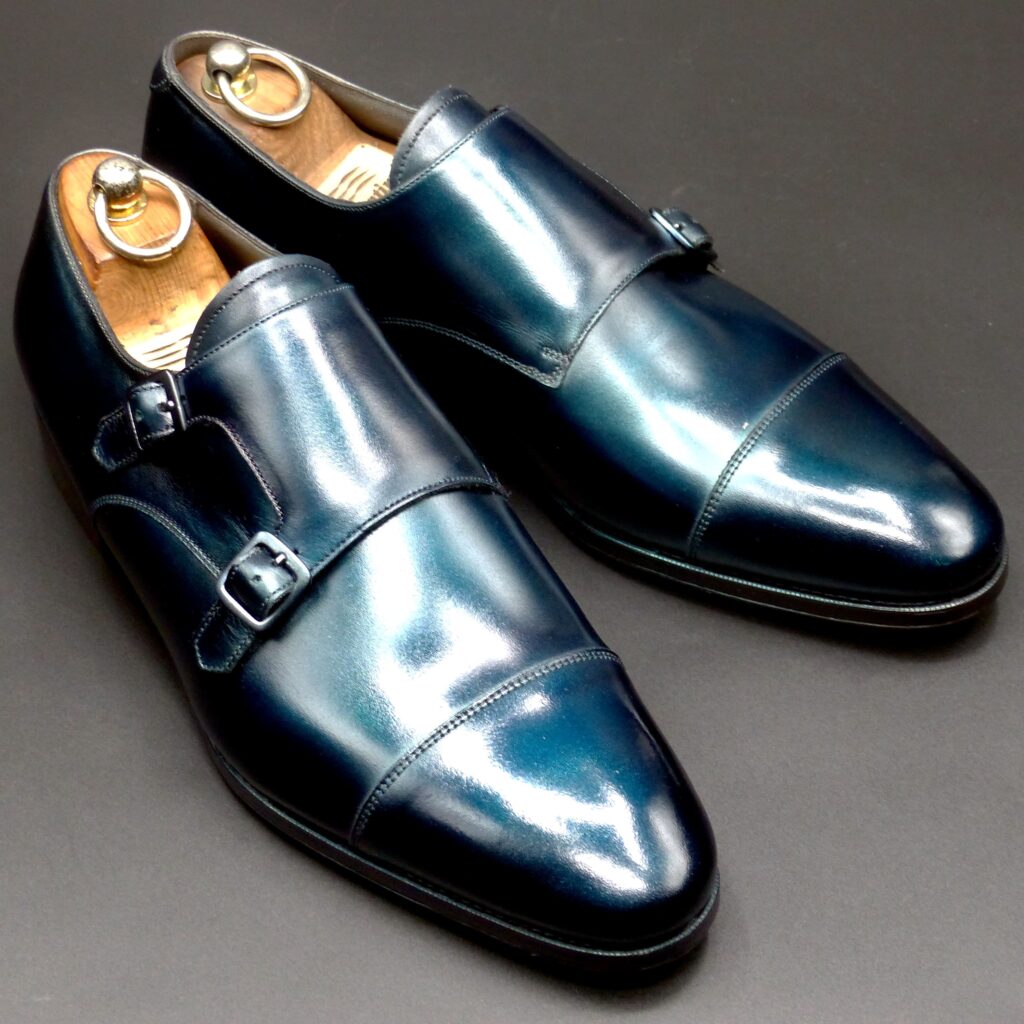
color name;
[ Onando-Iro]
御納戸色
Double Monk


「御納戸色(おなんどいろ)」は、日本の伝統色のひとつであり、青みがかった灰色〜くすんだ青緑色を指します。江戸時代に特に好まれたこの色は、格式・静けさ・内面の美を象徴し、武家や町人の間でも品格のある色として重用されました。
🏯 御納戸色が使われた歴史的シーン
- 武家の装束・衣服
- 江戸時代、武家の裃(かみしも)や羽織、袴などの礼装に多く用いられました。
- 「派手すぎず、地味すぎない」絶妙な中間色であり、武士道の静かなる誠実さや節度を体現する色とされました。
- 納戸(なんど)=収納部屋の装飾・帳簿の色
- 色名の由来となった「納戸」は、物を保管する部屋のことで、そこで使われていた染色された布や帳面の色から「御納戸色」の名がつきました。
- 公的記録や管理の場にふさわしい、落ち着きと信頼感を持った色だったとも言えます。
- 町人・商人の装い
- 絹や木綿の着物、羽織などに用いられ、渋みの中に洗練された趣があるとして好まれました。
- 特に江戸中期以降、華美を避ける「奢侈禁止令(しゃしきんしれい)」の時代にも許容される上品で節度ある色とされていました。
🎨 色構成・色味の特徴
属性 | 説明 |
系統 | 青緑系〜青みを帯びた灰色 |
色調 | 渋め、くすみ系、落ち着いた寒色 |
近似色 | 鉄色、青鈍(あおにび)、藍鼠(あいねず)など |
染料(伝統的) | 藍や灰汁などを組み合わせた天然染料による重ね染めが基本 |
🌸 御納戸色が象徴するもの
象徴する価値観 | 説明 |
節度・格式 | 控えめでありながら凛とした印象を与え、礼儀と秩序を重んじる美学に合致します。 |
内面の美しさ | 派手さよりも、内に秘めた品格を重視する日本人の美意識を反映します。 |
信頼感・誠実さ | 公的な文書や礼装に使われたことから、「信用される色」としての印象を持ちます。 |
静謐・冷静さ | 青みの落ち着いたトーンが、感情の安定や思慮深さを連想させます。 |
🏯 Historical Usage of Onando-iro in Ancient Japan
Onando-iro is a traditional Japanese color characterized by a muted blue-grey or dusky bluish-green tone. It was especially popular during the Edo period, admired for its refined modesty and subtle dignity.
- Samurai Attire and Formal Wear
- This color was widely used in the formal wear of samurai, such as kamishimo, haori, and hakama.
- Its subdued yet elegant tone made it ideal for reflecting the samurai’s values of discipline, integrity, and composure.
- Interior Use in Storerooms (納戸 = Nando)
- The name “Onando-iro” originates from “nando,” a type of storage room in traditional Japanese homes.
- The fabrics or documents stored in such rooms were often dyed in this color, making it a color associated with order, control, and quiet authority.
- Townsperson and Merchant Class Fashion
- As regulations against extravagance increased during the Edo period, onando-iro became a preferred color for merchants and townspeople.
- It struck a balance between elegance and restraint, making it a socially acceptable yet stylish choice under sumptuary laws.
🎨 Color Characteristics and Composition
Attribute | Description |
Color Family | Bluish-grey to subdued blue-green |
Tone | Muted, cool, with a slightly smoky undertone |
Related Colors | Iron blue (tetsukon), dull blue (aonibi), indigo grey (ainezu) |
Traditional Dyes | Natural indigo (ai), ash lye, and other plant-based dyes in layered techniques |
🌸 Symbolism of Onando-iro
Symbolic Value | Explanation |
Restraint and Formality | Subdued yet refined, it reflects the aesthetic of controlled elegance and proper decorum. |
Inner Beauty | Not flashy, it aligns with the Japanese ideal of beauty that lies within. |
Trust and Reliability | Frequently used in official garments and documents, it came to represent integrity and seriousness. |
Calm and Serenity | The cool tone evokes mental composure, clarity, and quiet strength. |
🌐 In Summary
Onando-iro embodies the Japanese principles of modest sophistication and quiet strength.
While subtle in appearance, it carries a rich cultural weight, having adorned warriors, administrators, and refined citizens alike.
ホールカット
color name;
[ Makie]
蒔絵
Whole Cut


蒔絵(まきえ)は、日本の伝統的な漆芸技法で、特に平安時代から江戸時代にかけて高度に発展し、貴族・武士・茶人たちの間で愛好されてきました。単なる装飾を超えて、身分・美意識・信仰・精神性を表すものとして重要な役割を担っていました。
🌿 蒔絵が使われた古代日本の主なシーン
- 貴族・皇族の調度品
- 平安時代以降、宮廷の文具や鏡箱、化粧道具、香道具などに蒔絵が施されました。
- 蒔絵は、優雅さと教養、雅(みやび)の象徴とされ、和歌や季節の風物がモチーフになることも多くありました。
- 武士の道具・武具
- 鎧兜、刀の鞘、印籠などに蒔絵が多用されました。
- 特に江戸時代には、大名たちが贈答品や家宝として用いるほどの格式ある技法とされ、「家の威信」を示すものでもありました。
- 茶道具
- 茶入れや棗(なつめ)、香合などの道具に精緻な蒔絵が施され、侘び寂びの美と調和するように意匠が考えられていました。
- 簡素な中に豪華さを潜ませる「幽玄」の美意識が体現されました。
- 宗教・祭礼具
- 仏教寺院の仏具、経箱、神輿の装飾など、神聖な場面でも用いられました。
- 蒔絵は、神仏への敬意と祈りの象徴としても機能していました。
🎨 蒔絵の色構成とその象徴
蒔絵では「色」というより「光沢と素材の対比」によって視覚的美を生み出します。その中で以下の要素が主に使われます:
素材・色 | 特徴 | 象徴するもの |
金粉・金箔(本金) | 華やかな輝き | 高貴さ、永遠、太陽、神聖 |
銀粉・銀箔 | 白く鈍い光沢(経年で黒ずむ) | 清らかさ、静寂、月、変化 |
黒漆 | 深く艶やかな背景色 | 精神性、余白、奥行き |
朱漆(赤漆) | 鮮やかな赤 | 生命力、魔除け、祝福 |
螺鈿(らでん) | 貝殻を使った虹色の輝き | 神秘、女性美、水の象徴 |
✨ 蒔絵が象徴するもの
- 精神的な豊かさと時間の蓄積
- 使い込むことで美しさが増す漆と金の対比は、「時の美学」を象徴します。
- 無常と不変の共存
- 銀の変化と金の不変性が同居することで、仏教的な無常観と永遠性が共に表されます。
- 日本的美意識の凝縮
- 「見えない部分にも手を抜かない」、「さりげない中の華やぎ」など、繊細で内面的な美を尊ぶ思想が蒔絵には込められています。
🎴 What is Makie?
Makie is a traditional Japanese lacquerware technique in which designs are drawn with lacquer and sprinkled with metallic powders such as gold or silver before the lacquer hardens. Originating in the Heian period (794–1185), Makie developed into a refined decorative art form, used to convey not just aesthetic beauty, but also social status, spirituality, and the Japanese sense of refined subtlety.
🏯 Historical Usage of Makie in Ancient Japan
- Court and Aristocratic Life
Makie was often used to decorate personal items of the nobility—such as writing boxes, mirrors, cosmetic containers, and incense utensils.
- It symbolized elegance, refinement, and cultured taste.
- Common motifs included seasonal elements, poetry, and scenes from classical literature.
- Samurai Culture
During the Kamakura and Edo periods, Makie adorned samurai gear—sword sheaths, armor, and inrō (seal cases).
- It represented authority, loyalty, and family prestige.
- Powerful families commissioned personalized designs to assert their identity and social rank.
- Tea Ceremony Utensils
Makie was a prominent feature in the design of tea caddies (natsume), incense boxes, and trays.
- Its subtle luxury harmonized with the wabi-sabi philosophy of the tea ceremony.
- The designs often balanced austerity and opulence in a refined way.
- Religious and Ceremonial Objects
Makie was also used for Buddhist ritual implements, scripture boxes, and Shinto altar pieces.
- These works were infused with spiritual reverence and sacred beauty, often emphasizing symmetry and sacred geometry.
🎨 Color Composition in Makie
Makie doesn’t rely on a wide color palette in the modern sense but instead on the interaction of light, metal powders, and lacquer depth.
Material / Color | Characteristics | Symbolism |
Gold Powder / Leaf | Radiant, warm shine | Nobility, eternity, divinity, the sun |
Silver Powder / Leaf | Pale luster, tarnishes over time | Purity, serenity, the moon, impermanence |
Black Lacquer (Urushi) | Deep, glossy background | Mystery, spirituality, silence |
Red Lacquer (Shu-urushi) | Vivid crimson tone | Life force, protection, celebration |
Mother-of-Pearl (Raden) | Iridescent shimmer | Femininity, mystery, water, elegance |
🕊 Symbolism of Makie
- Spiritual and Temporal Depth
The layered process and aging of lacquer symbolize the passage of time and depth of experience. - Impermanence and Eternity
The contrast between silver (which tarnishes) and gold (which endures) reflects a uniquely Japanese view that beauty lies in change, yet also honors lasting values. - Refined Aesthetics
Makie embodies core Japanese values such as:- Understatement over extravagance
- Beauty in restraint and detail
- The sacredness of craftsmanship
ギリー・サドル
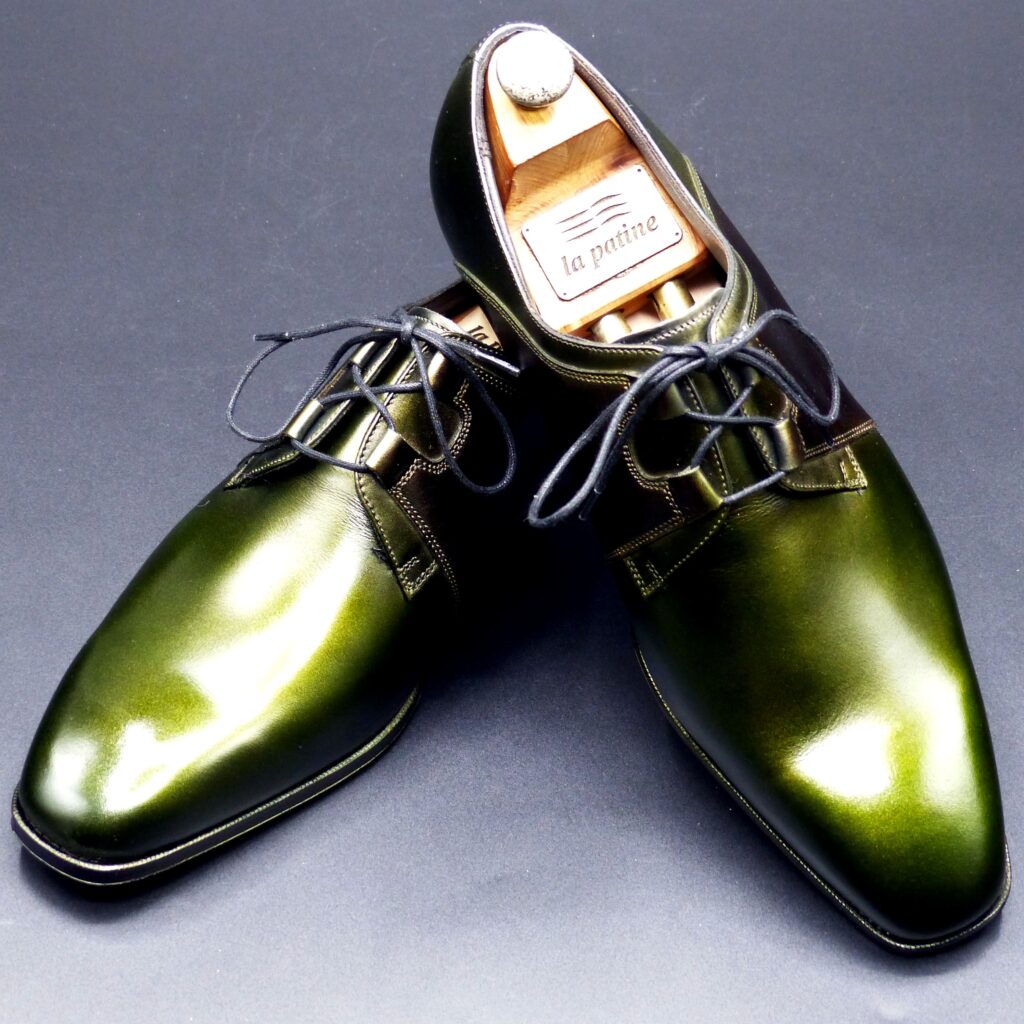
color name;
[ Kujaku-Ishi]
孔雀石
Ghillie Sadle
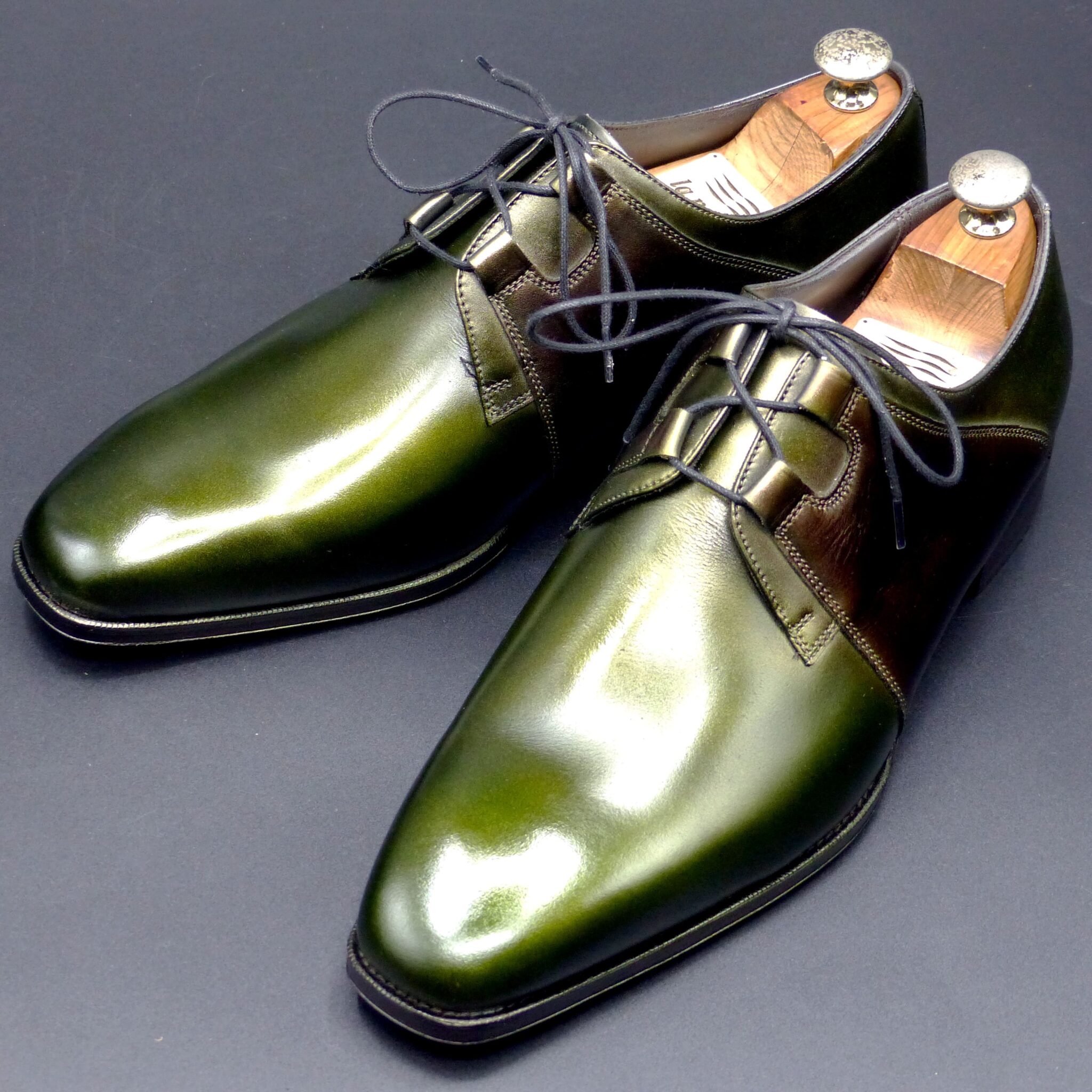
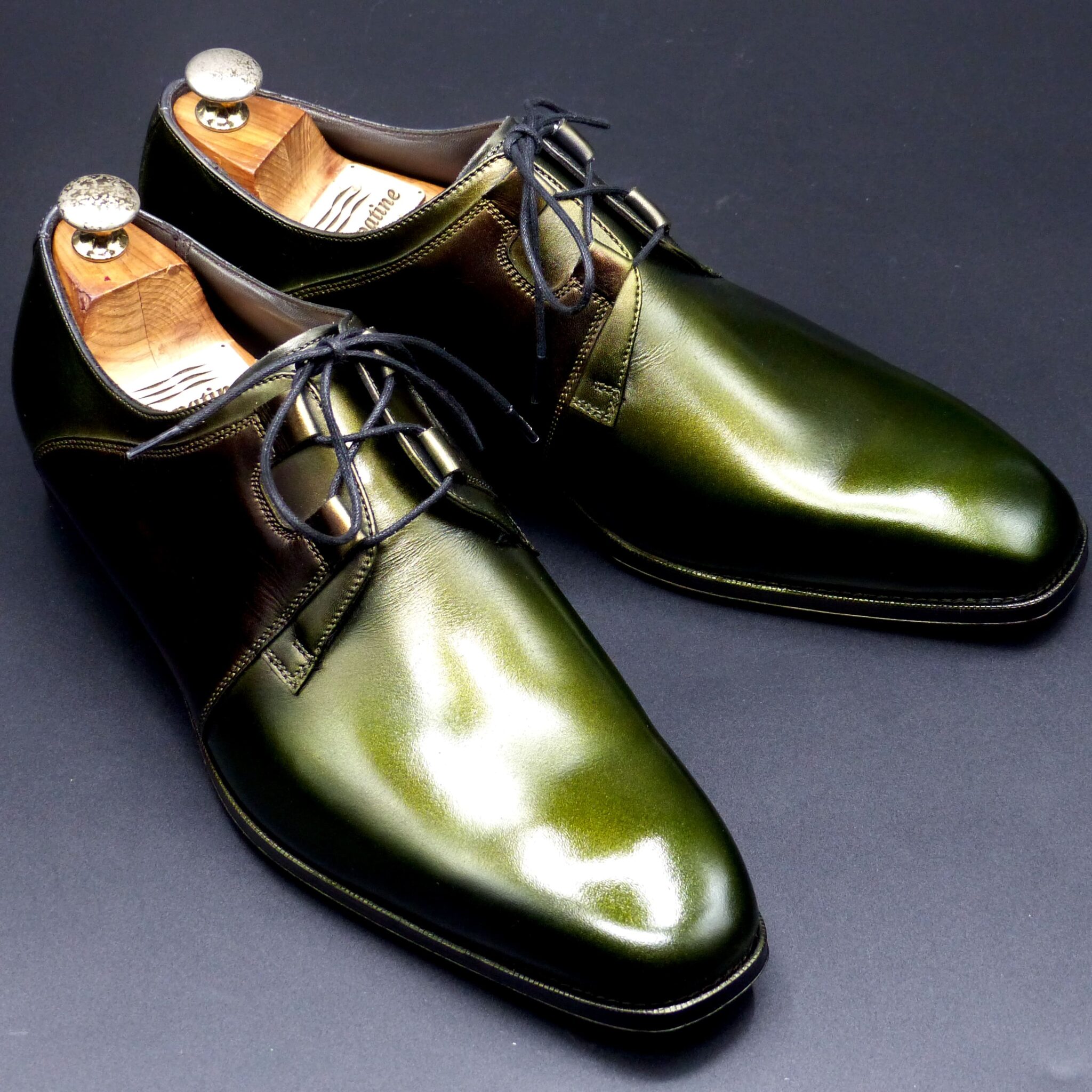
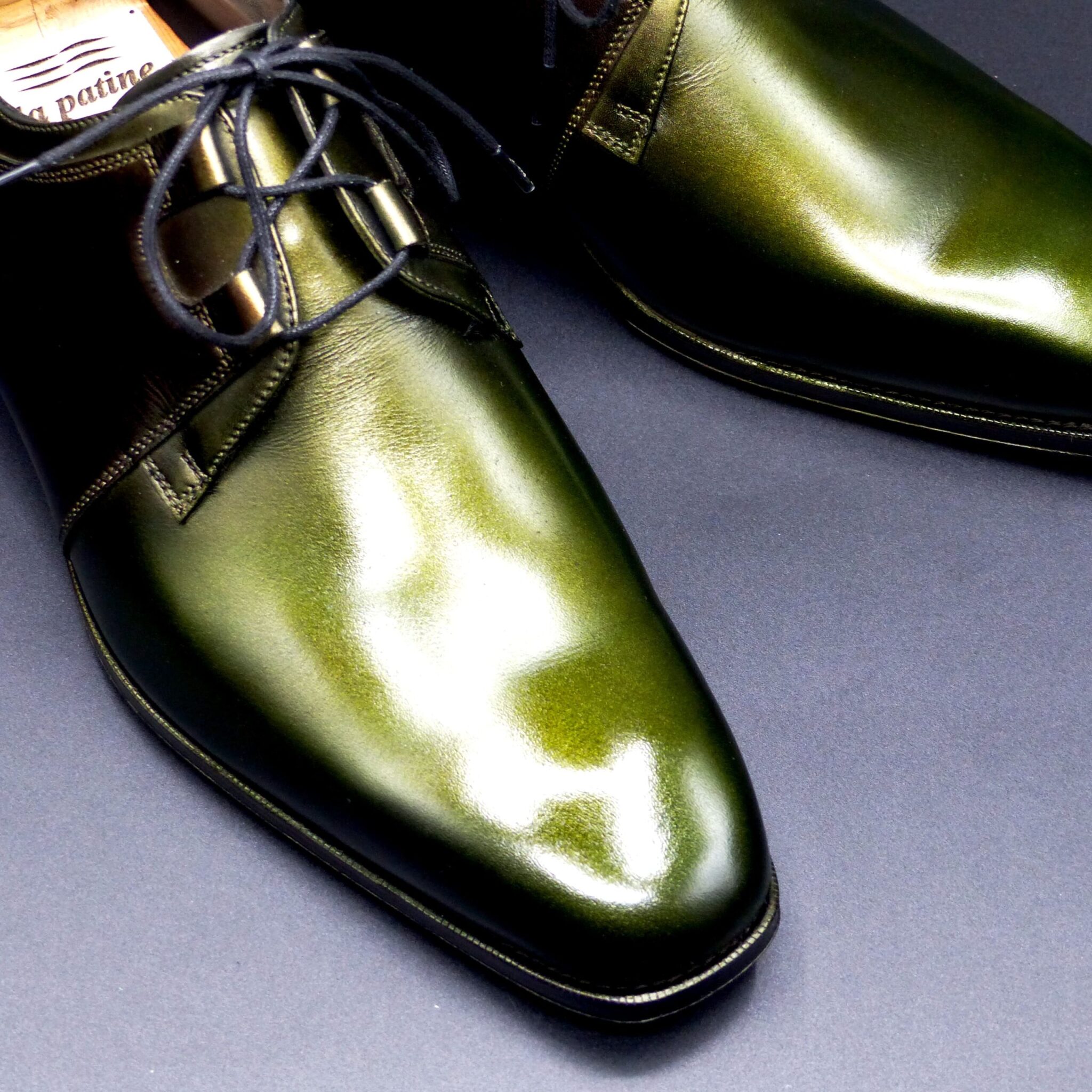
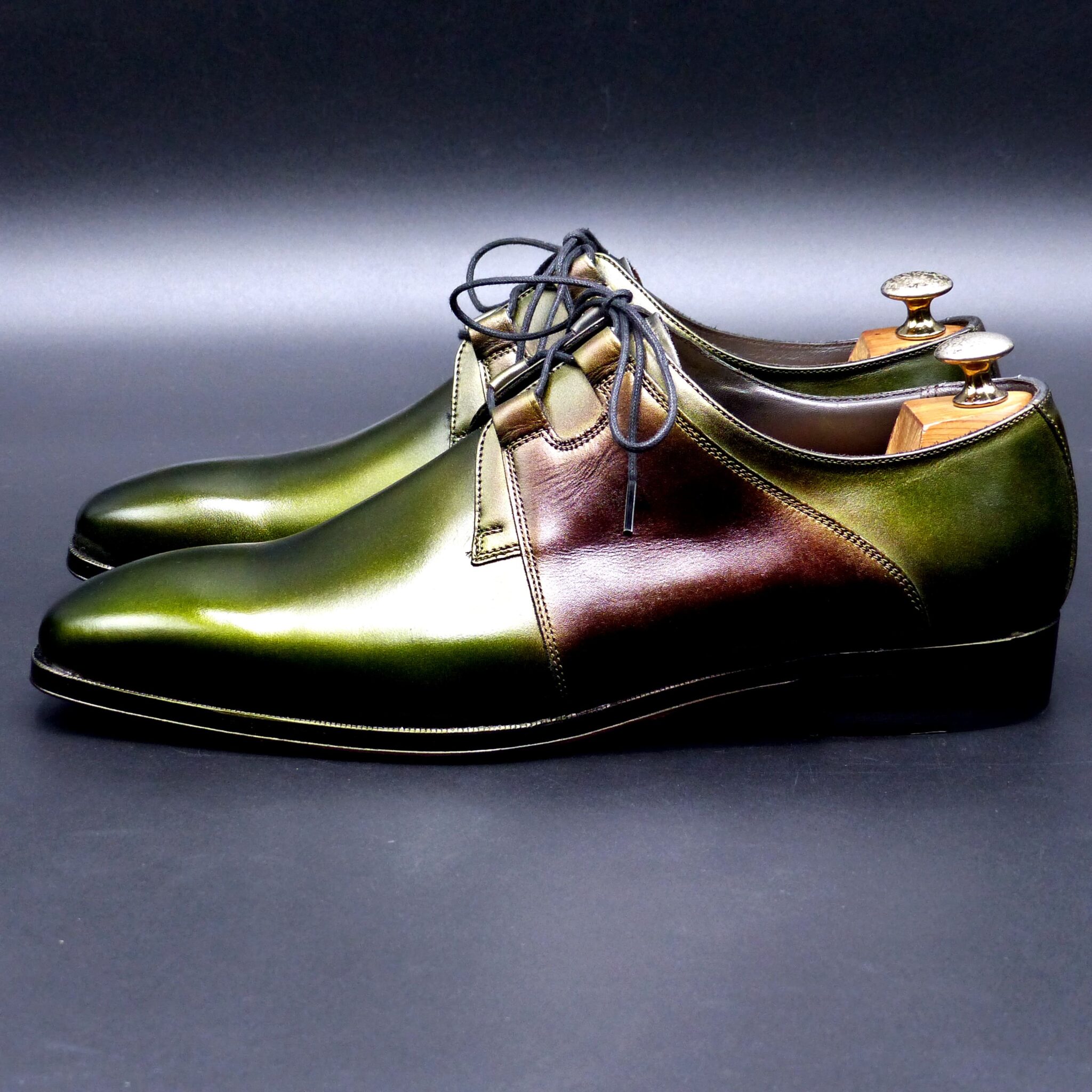
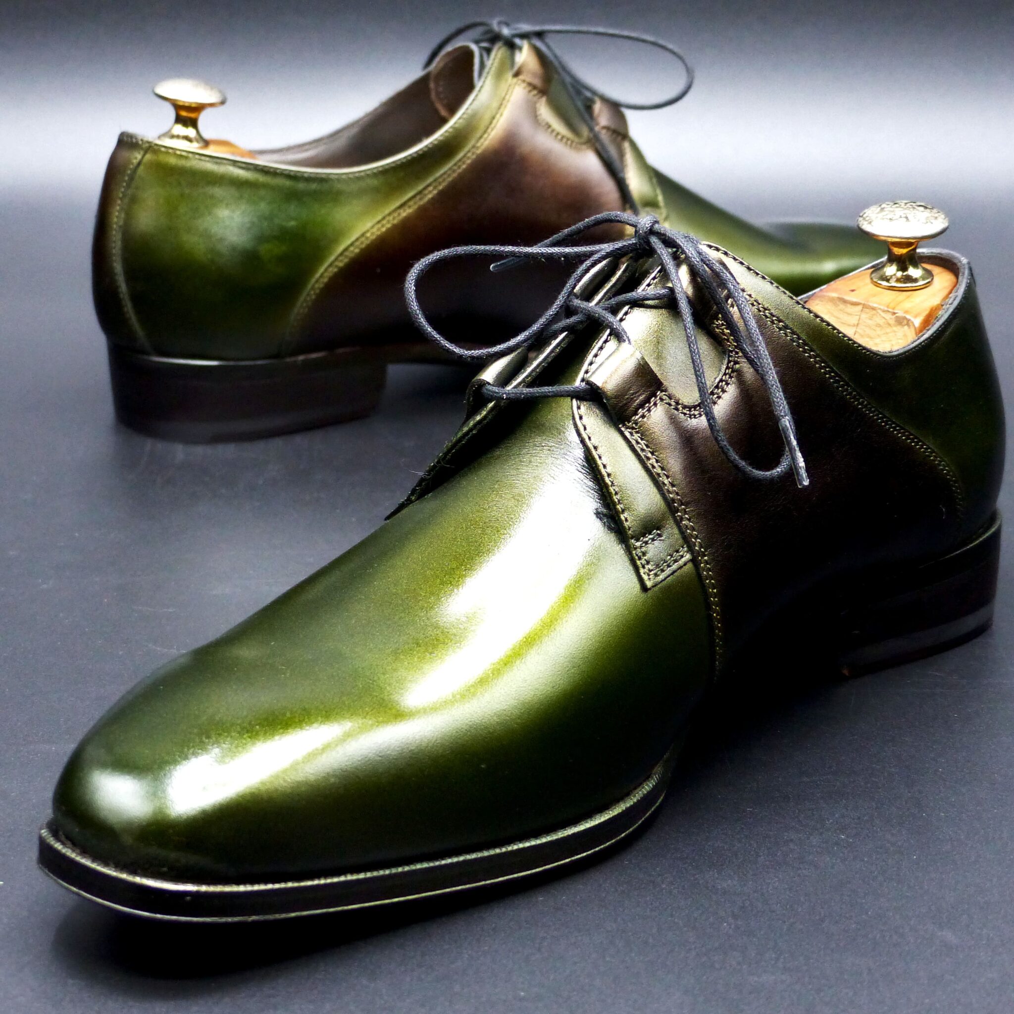
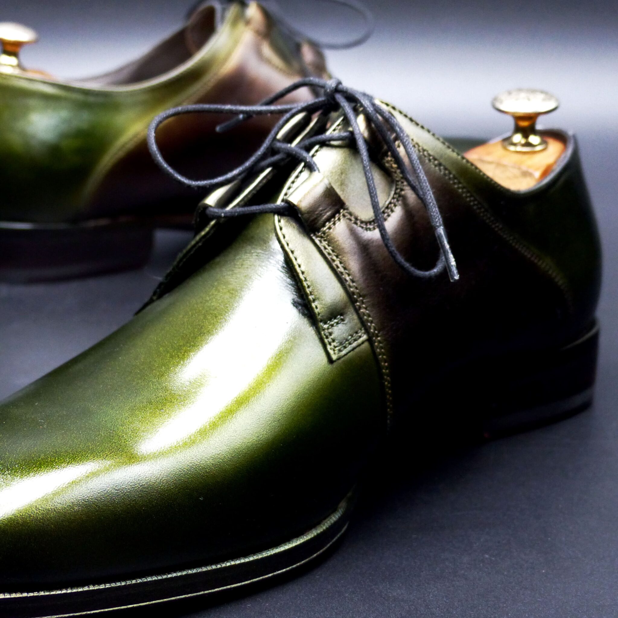
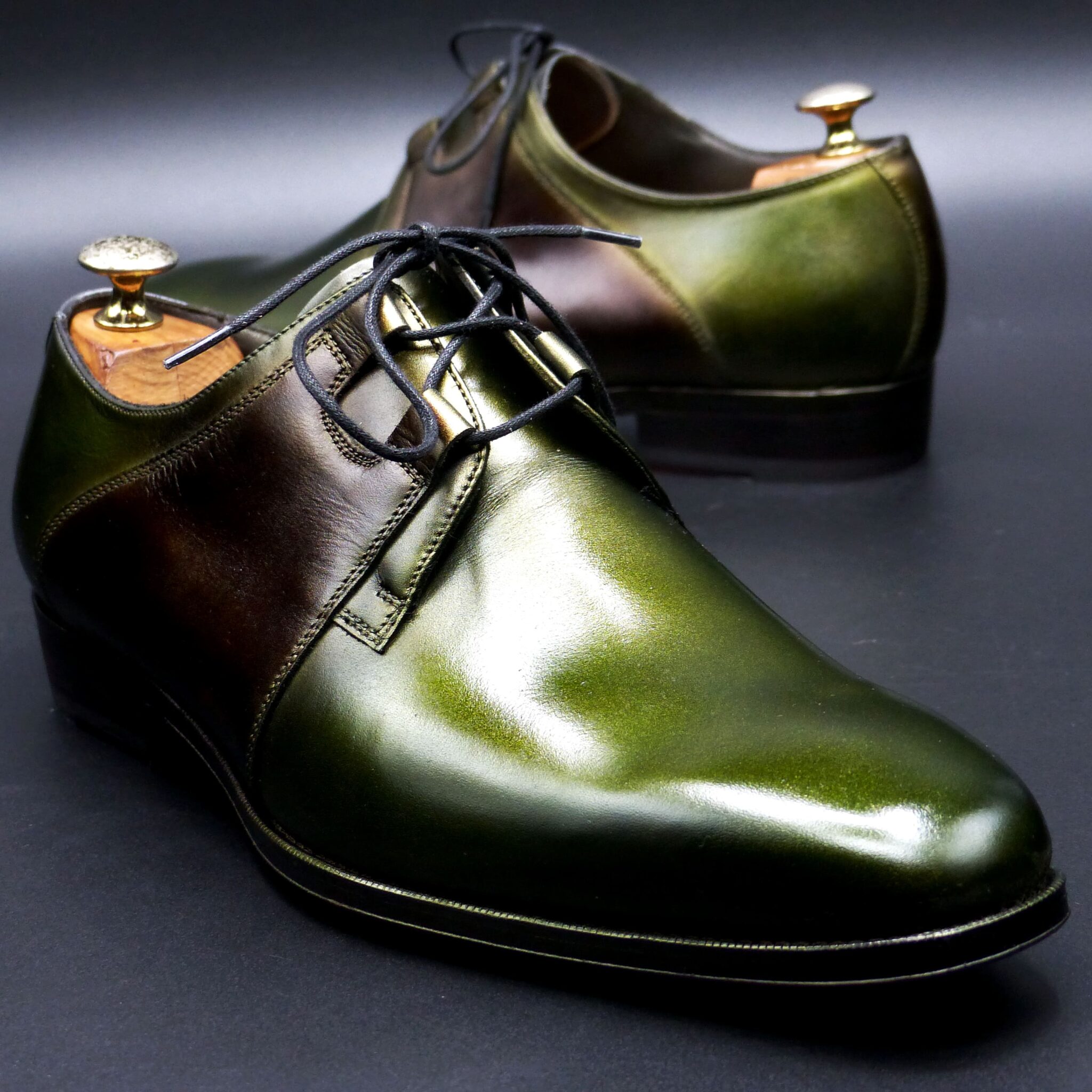
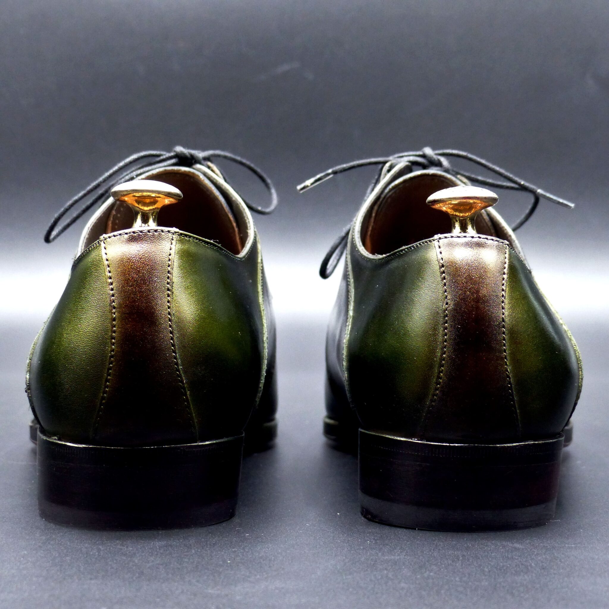

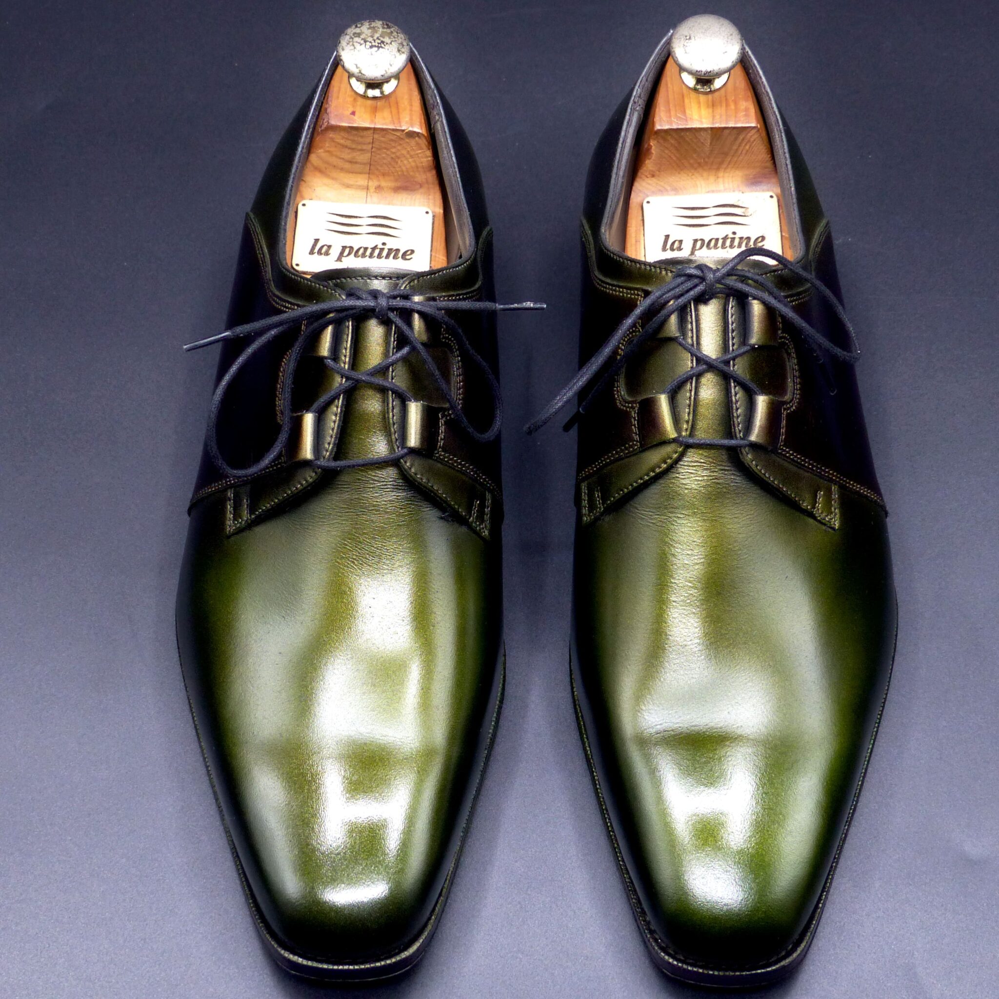
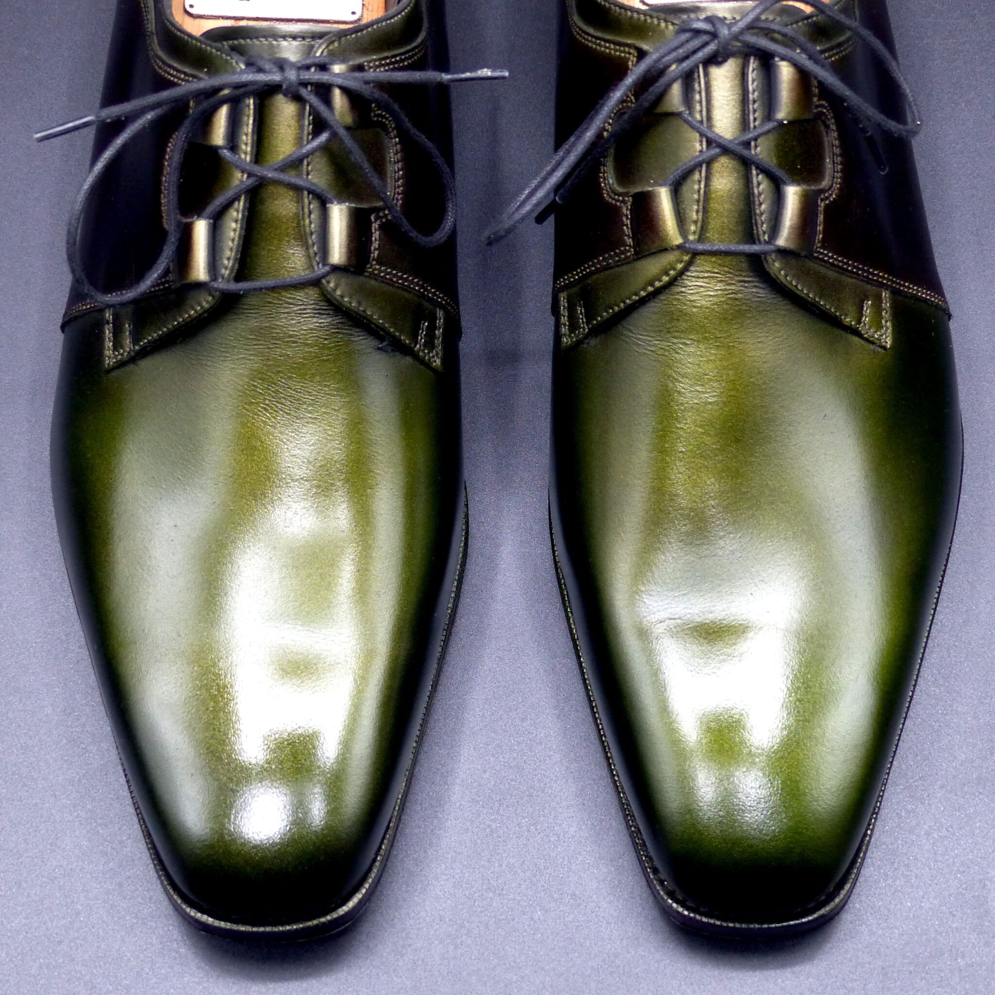
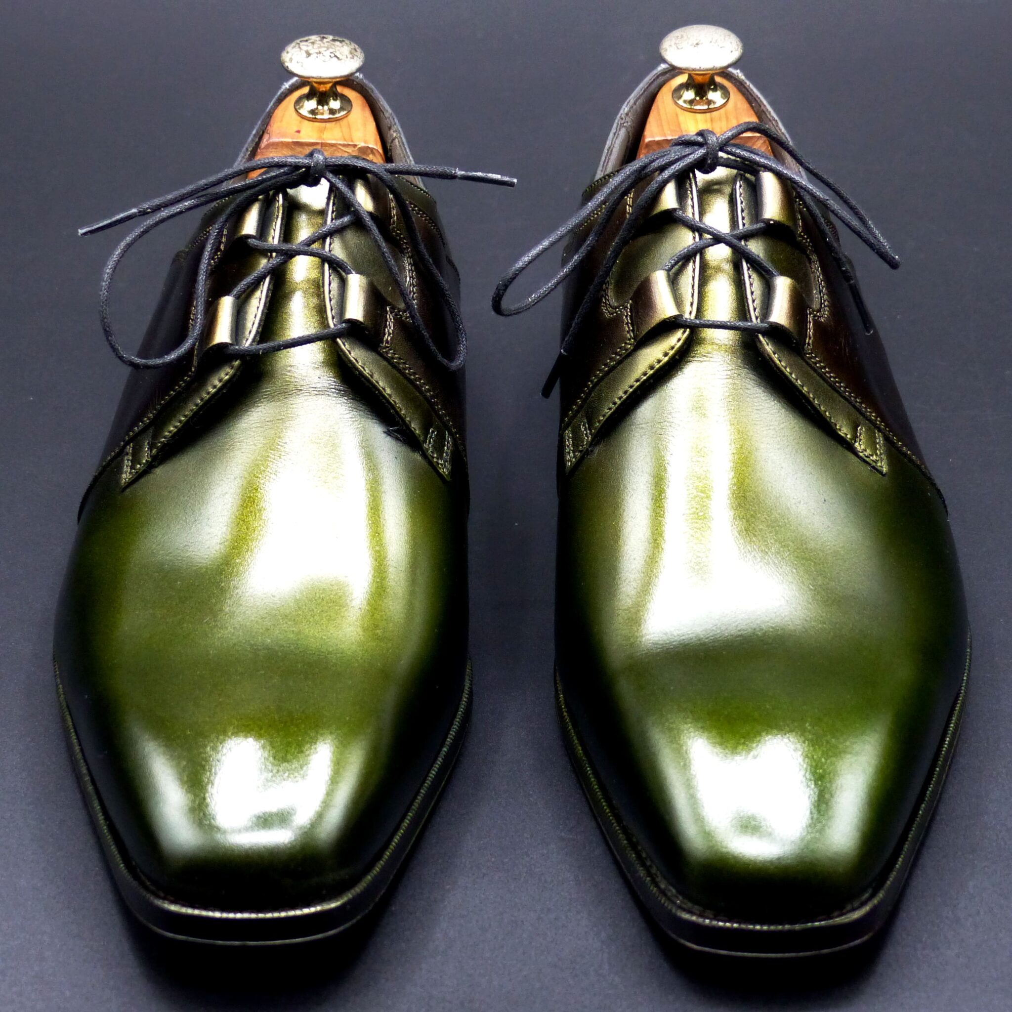
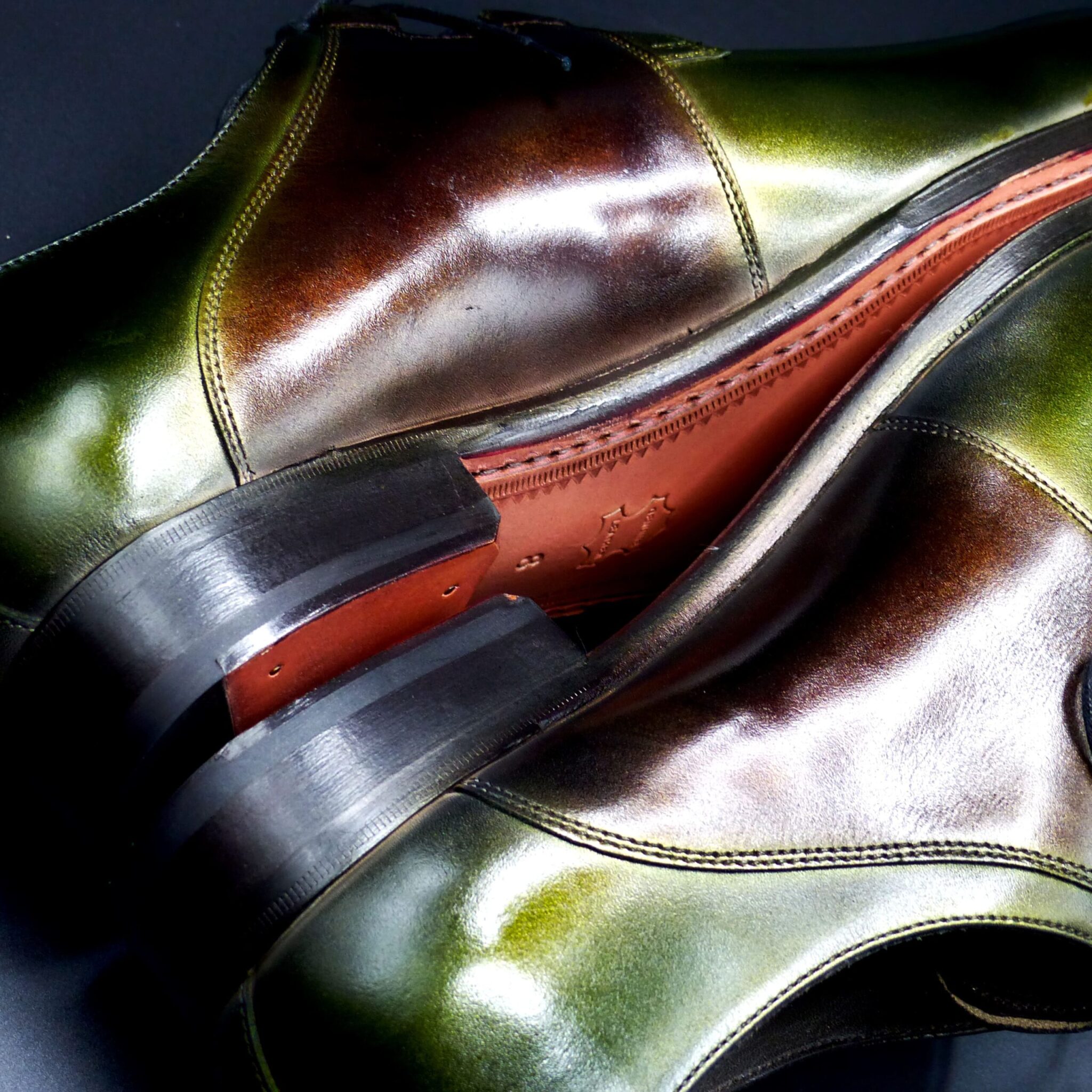
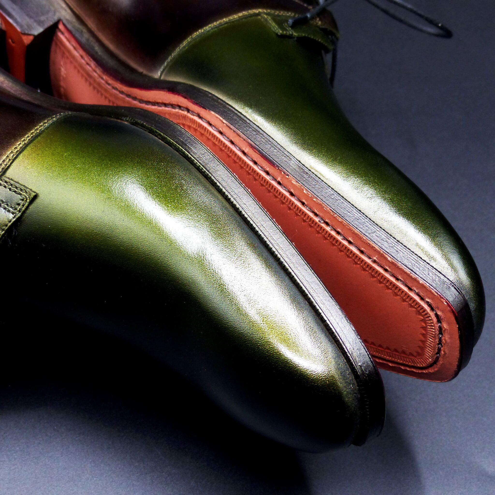
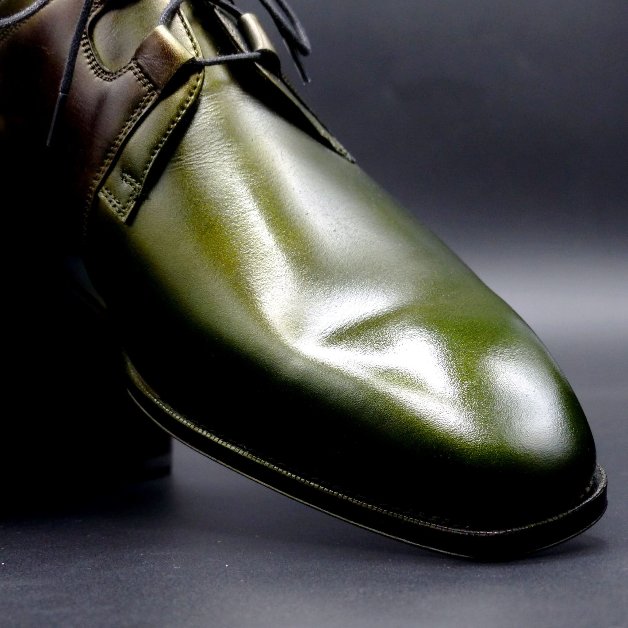
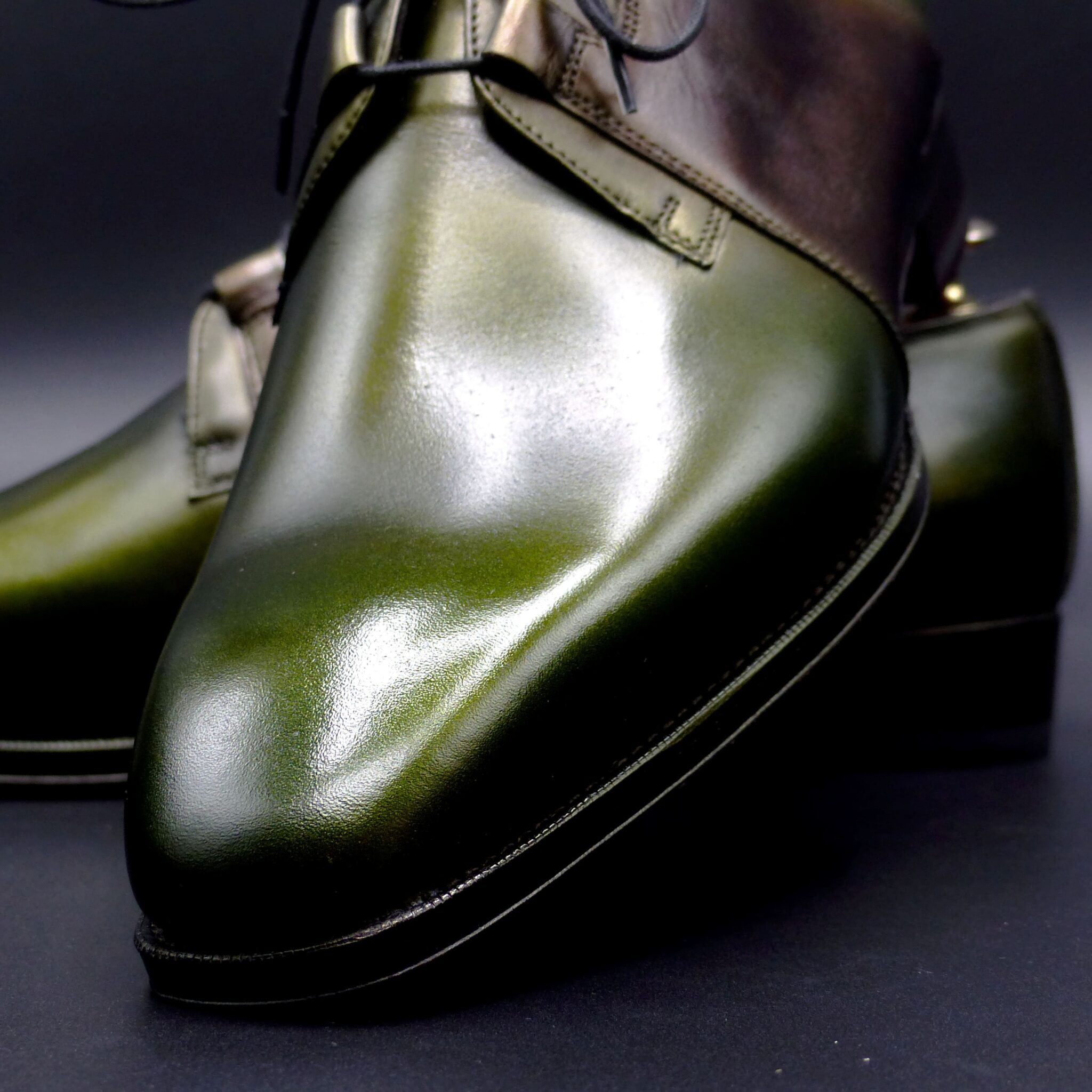
**クジャク石(マラカイト)**とは
これは、銅の錆から得られる青緑色の顔料として知られ、
日本の美術や工芸に広く用いられました。
**色構成**
マラカイトの色は、日本の伝統色に影響を与え、「緑青」や「孔雀緑」といった美しい緑系の色として表現されました。
緑青(ろくしょう) → 鮮やかでやや青みがかった緑。古代の仏画や装飾に使われました。
孔雀緑(くじゃくみどり) → 深みのある青緑色で、孔雀の羽のような鮮やかな輝きを持ちます。 千歳緑(ちとせみどり) → 深く落ち着いた緑。長寿や繁栄を象徴する色とされてきました。
マラカイトは、時間が経過しても色褪せにくく、その鮮やかな緑は長寿や自然の生命力を感じさせるものとされました。
**緑青(マラカイト)が象徴するもの**
古代日本では、緑青(ろくしょう)は神聖な色・長寿・魔除けを象徴し、次のような意味を持っていました。
- 神聖な色 仏像や寺院の壁画に使われ、仏教美術の装飾に欠かせない色だった。 平安時代には、高貴な身分の者が青緑の装束を着ることがあり、格式の高い色とされました。
② 長寿と繁栄 松や常緑樹の色と関連し、「千歳緑」の名の通り、長く続く生命や繁栄を願う象徴。 武士や貴族の間で、家の繁栄と守護の願いを込めて使われました。
- 守護の力 緑青は邪気を払う力があると信じられ、護符や装飾品としても使用。 特に仏像の装飾や神社仏閣に用いられたことから、「神仏の加護を受ける色」とされました。
古代日本では、クジャク石(マラカイト)は**「緑青(ろくしょう)」と呼ばれ、神聖な色として扱われました。その青緑の美しい色合いは、仏教美術・装飾・衣服に取り入れられ、長寿・繁栄を象徴する色として人々に尊ばれてきました。
Peacock Stone (Malachite) in Ancient Japan: Its Name and Symbolism
In ancient Japan, Peacock Stone (Malachite) was known as “Rokusho” (緑青). This term referred to the blue-green pigment derived from copper rust, widely used in Japanese art and craftsmanship.
- Color Composition
The color of malachite influenced traditional Japanese colors and was expressed through beautiful shades of green, such as “Rokusho” and “Peacock Green.”
- Rokusho (緑青)
→ A vivid, slightly bluish green. Used in ancient Buddhist paintings and decorations. - Peacock Green (孔雀緑, Kujaku Midori)
→ A deep blue-green hue with a brilliant luster resembling a peacock’s feathers. - Chitose Green (千歳緑, Chitose Midori)
→ A deep, calm green symbolizing longevity and prosperity.
Malachite retains its vibrant color over time, and its rich green shade was associated with longevity and the vitality of nature.
- The Symbolism of Rokusho (Malachite) in Ancient Japan
In ancient Japan, Rokusho (malachite) symbolized divinity, longevity, and protection against evil and held the following meanings:
① A Sacred Color
- Used in Buddhist statues and temple murals, it was an essential color in Buddhist art.
- In the Heian period, people of high status wore garments in blue-green shades, marking it as a prestigious color.
② Longevity and Prosperity
- Associated with pine trees and evergreen plants, symbolizing everlasting life and prosperity, as reflected in the name “Chitose Midori” (meaning “a thousand years of green”).
- Warriors and aristocrats used it as a symbol of their family’s prosperity and protection.
③ Protective and Purifying Power
- Rokusho was believed to ward off evil spirits and was used in protective talismans and ornaments.
- Especially in Buddhist statues and shrines, it represented divine protection and was considered a sacred color.
Conclusion
In ancient Japan, Peacock Stone (Malachite) was called “Rokusho” (緑青) and regarded as a sacred color. Its brilliant blue-green hue was incorporated into Buddhist art, decorations, and clothing, symbolizing longevity, prosperity, and protection against evil and was highly revered by the people.
ダービー・ストレートチップ
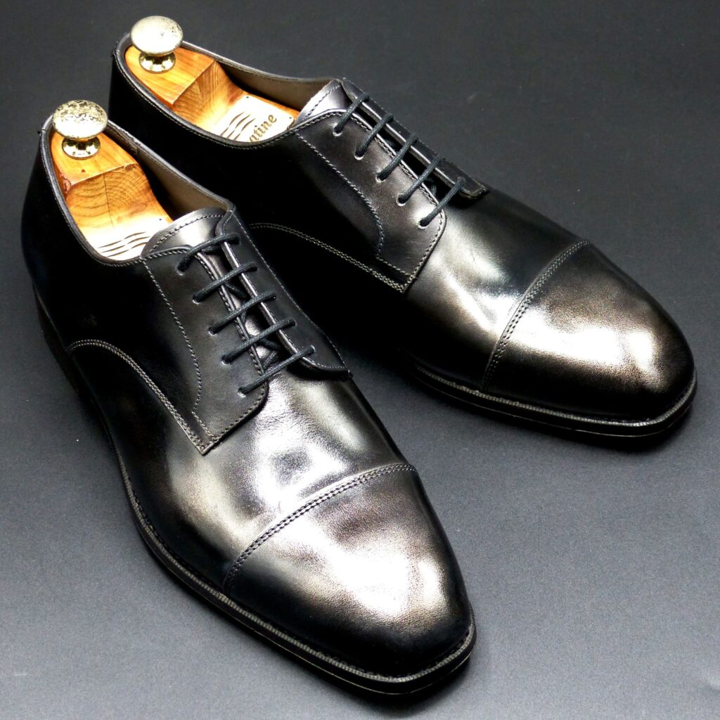
color name;
[ Kurogane]
黒鉄色
Derby Straight-Tip
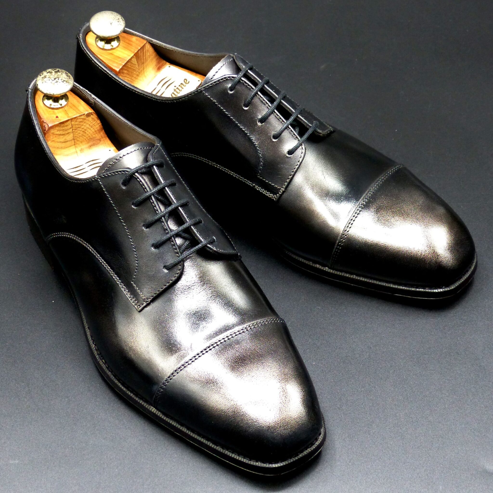
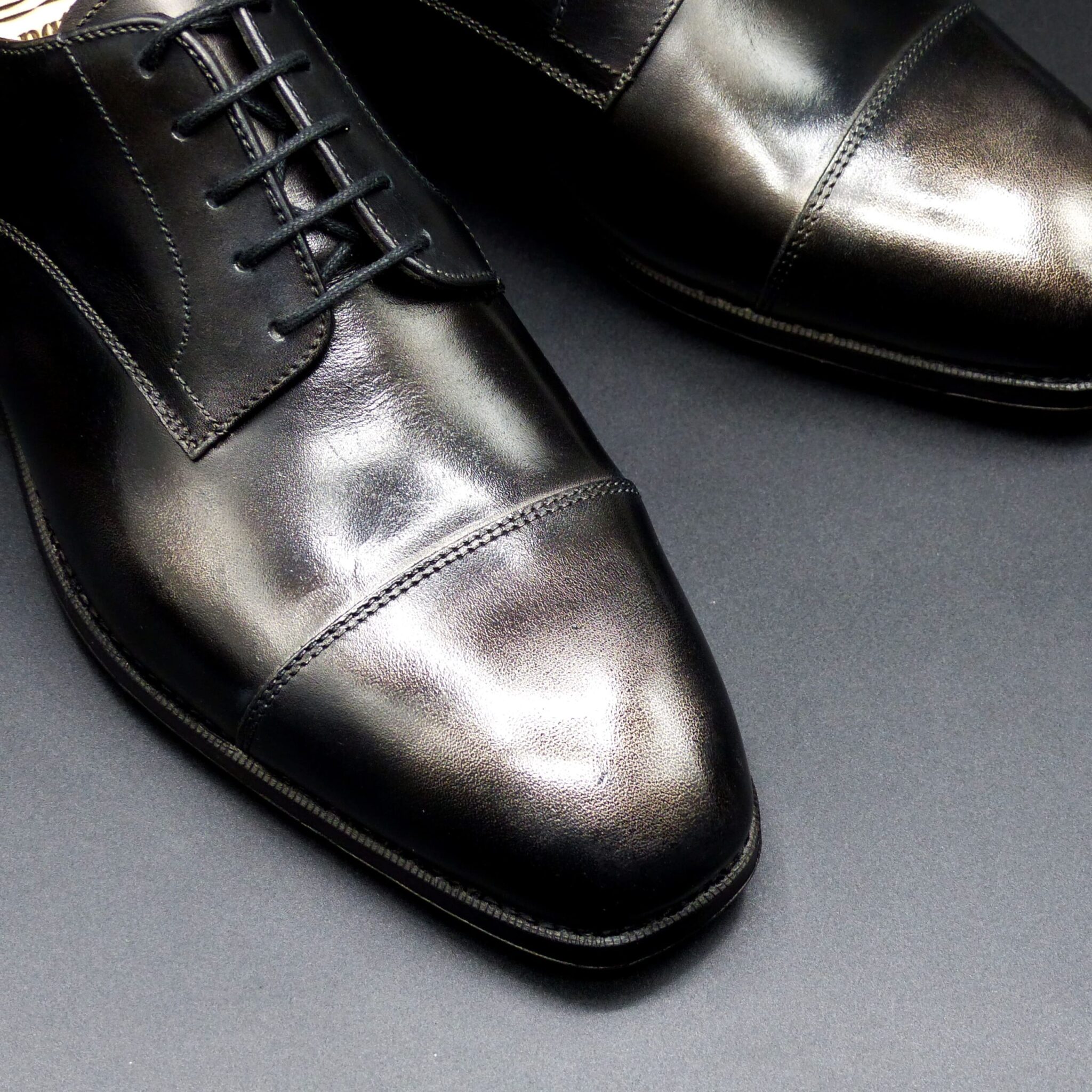
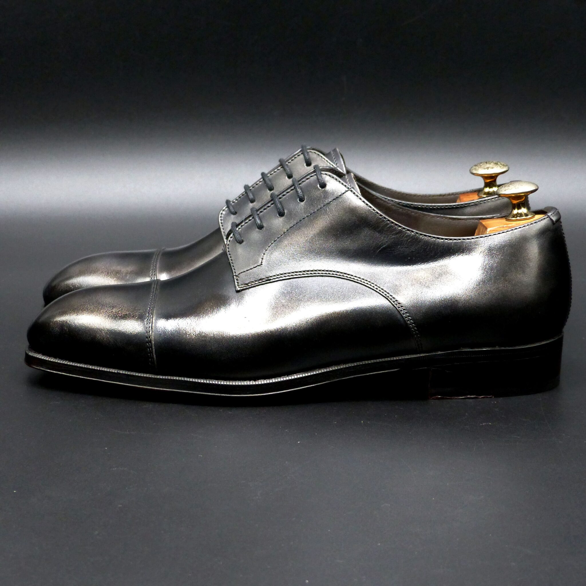
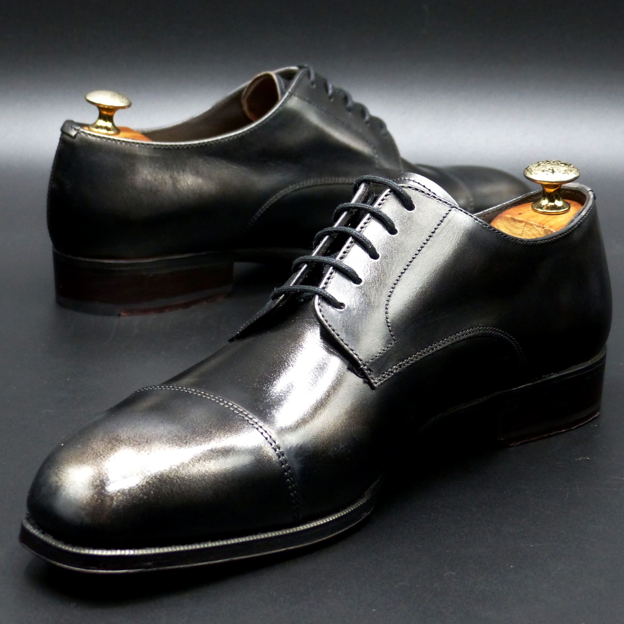
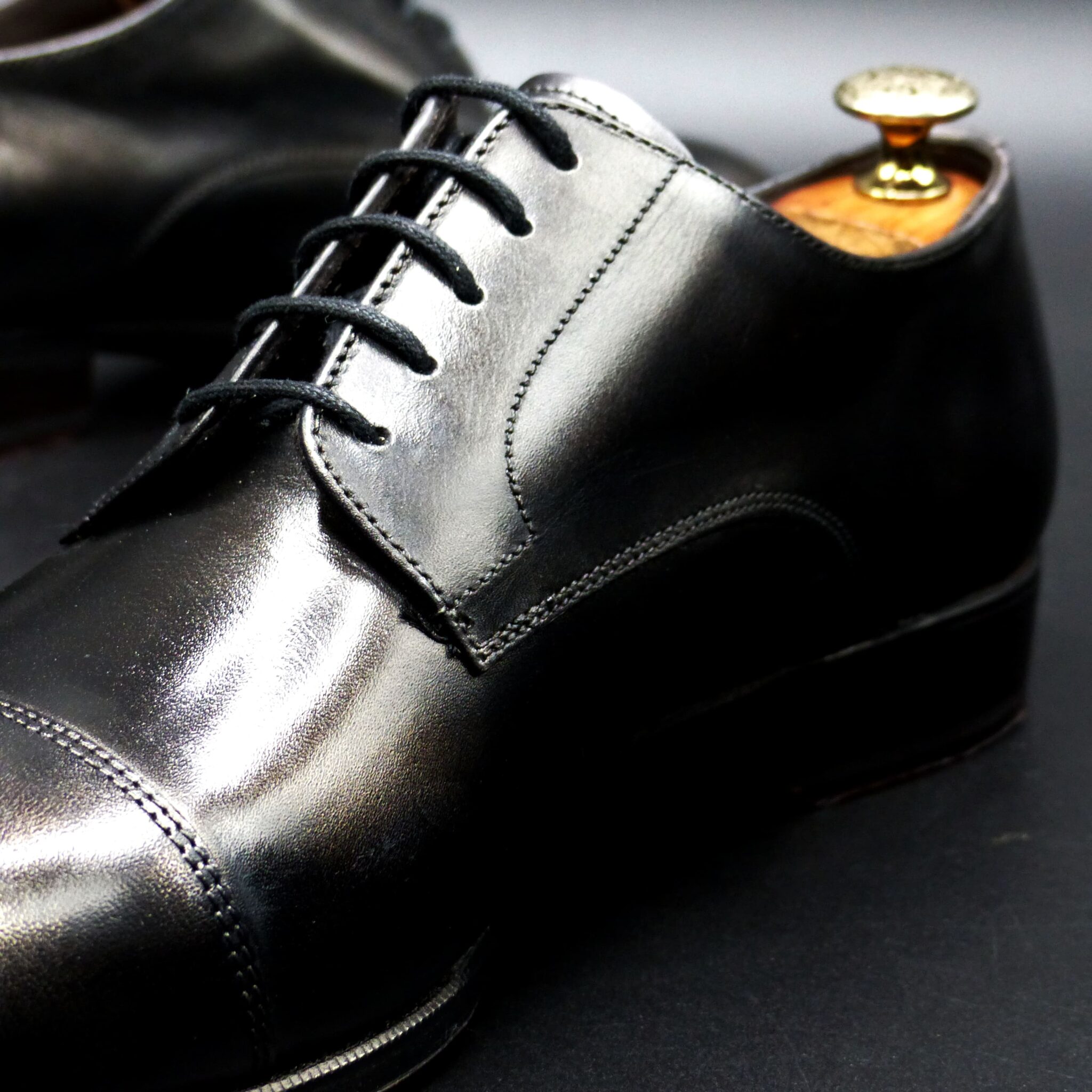
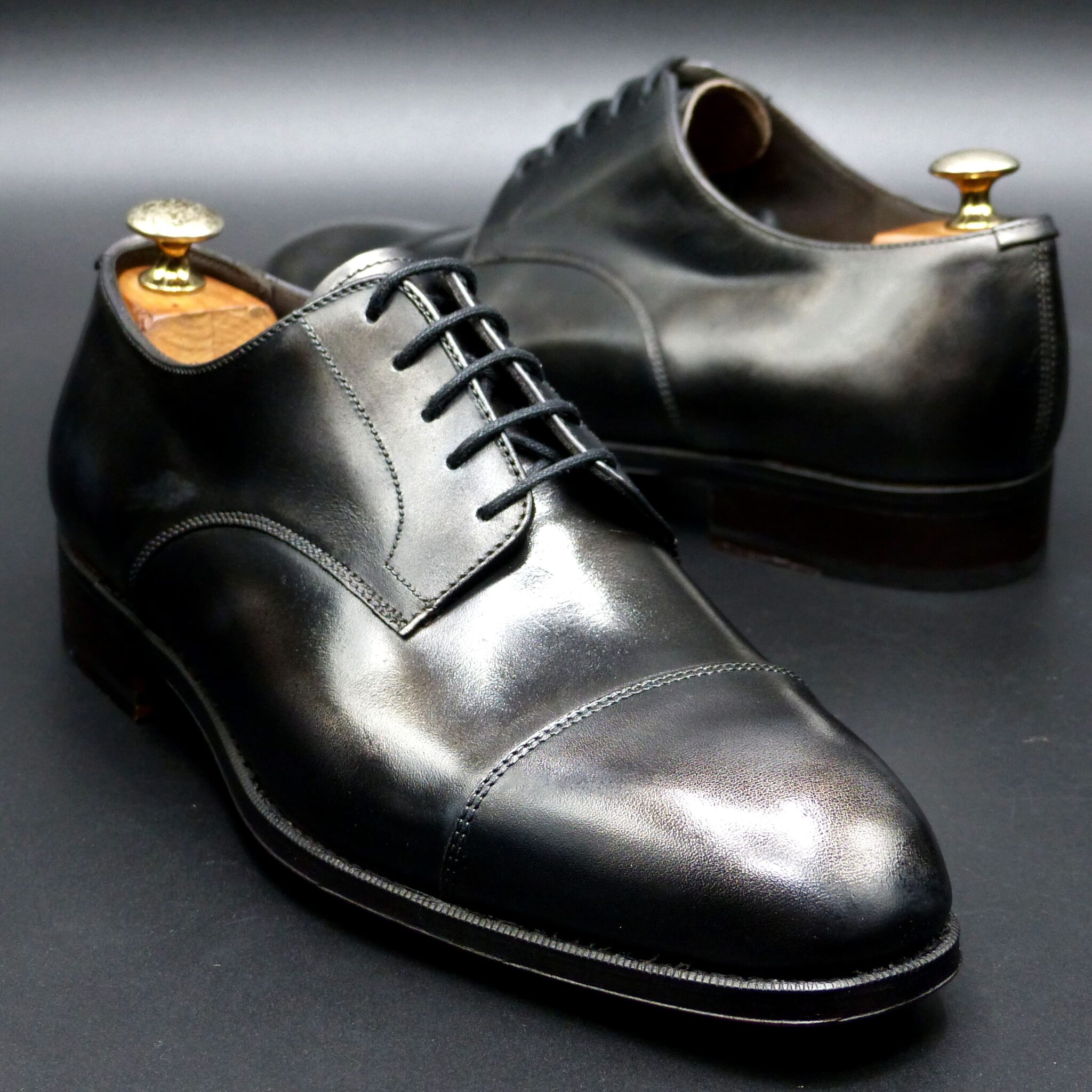
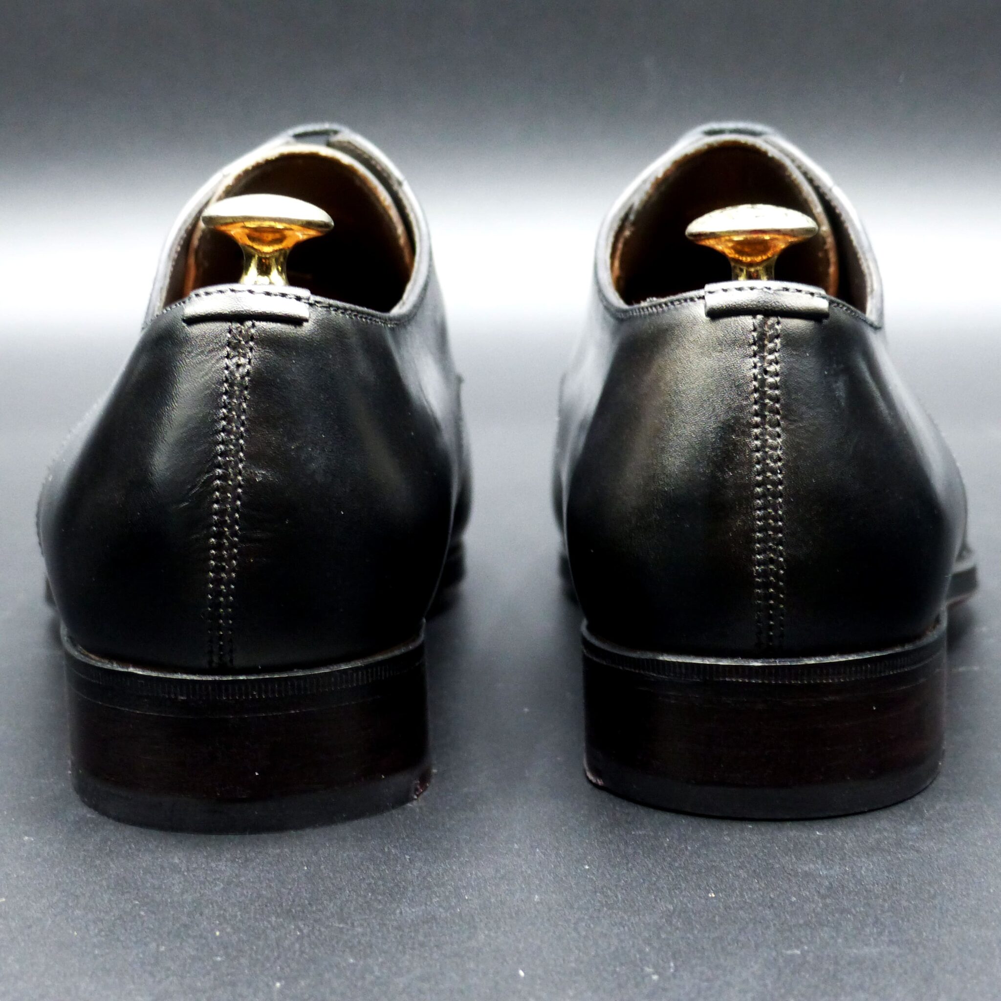

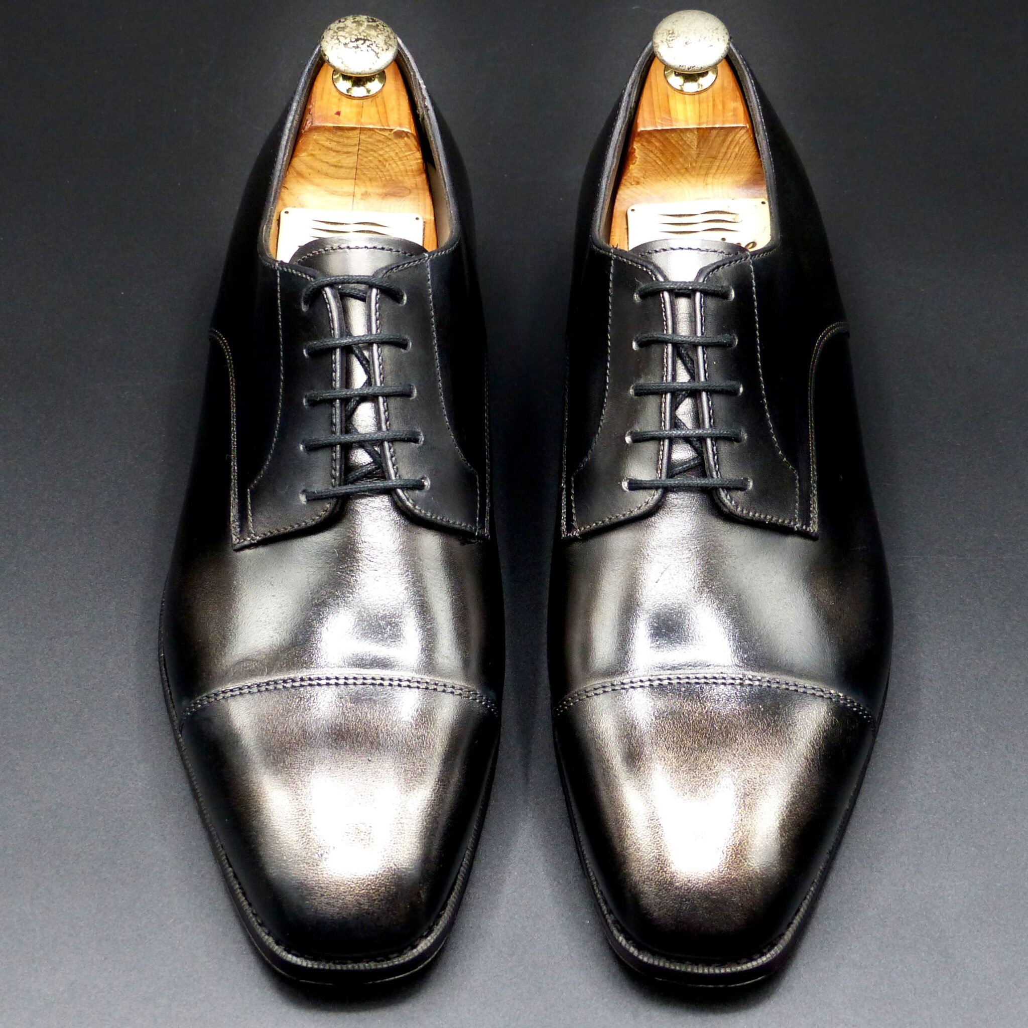
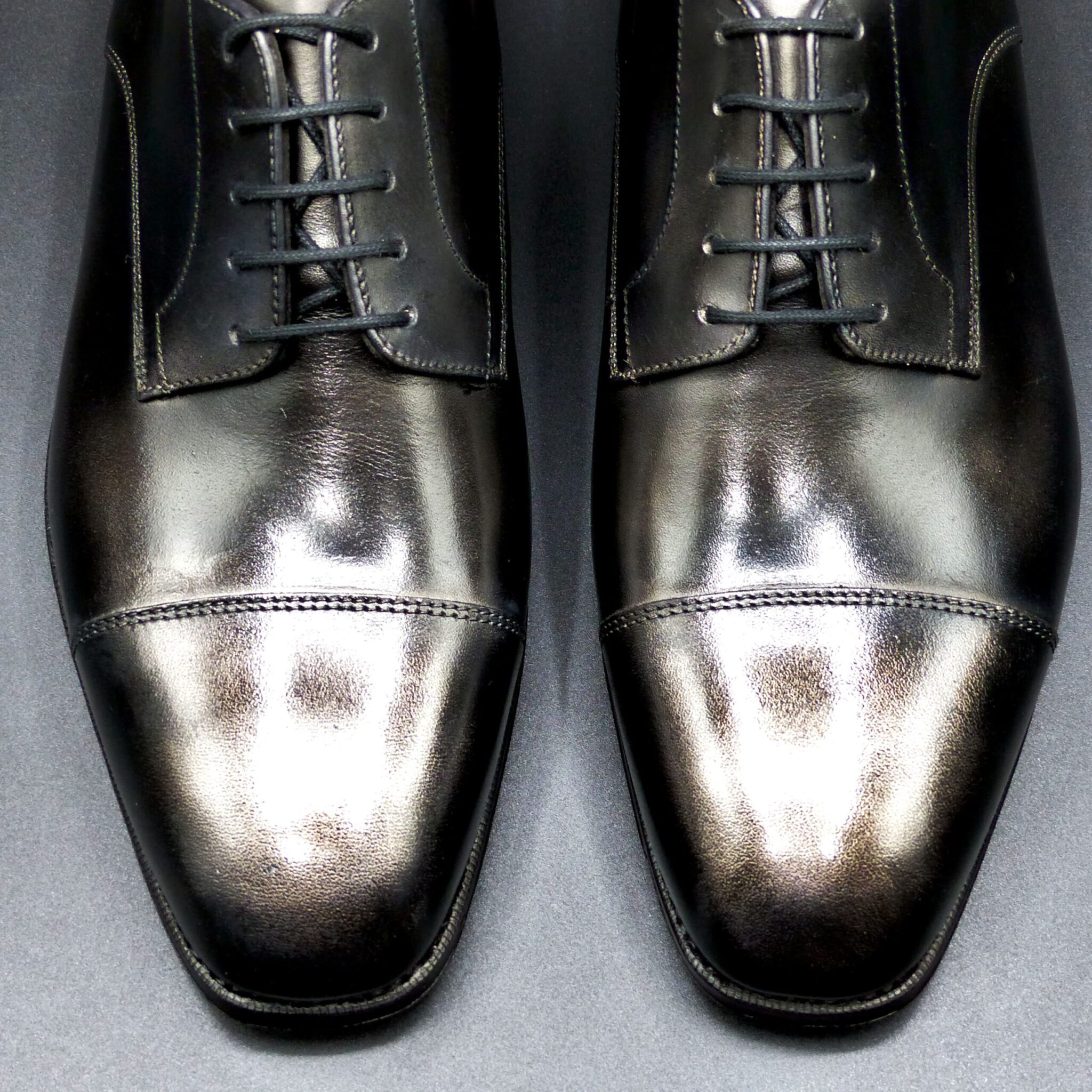
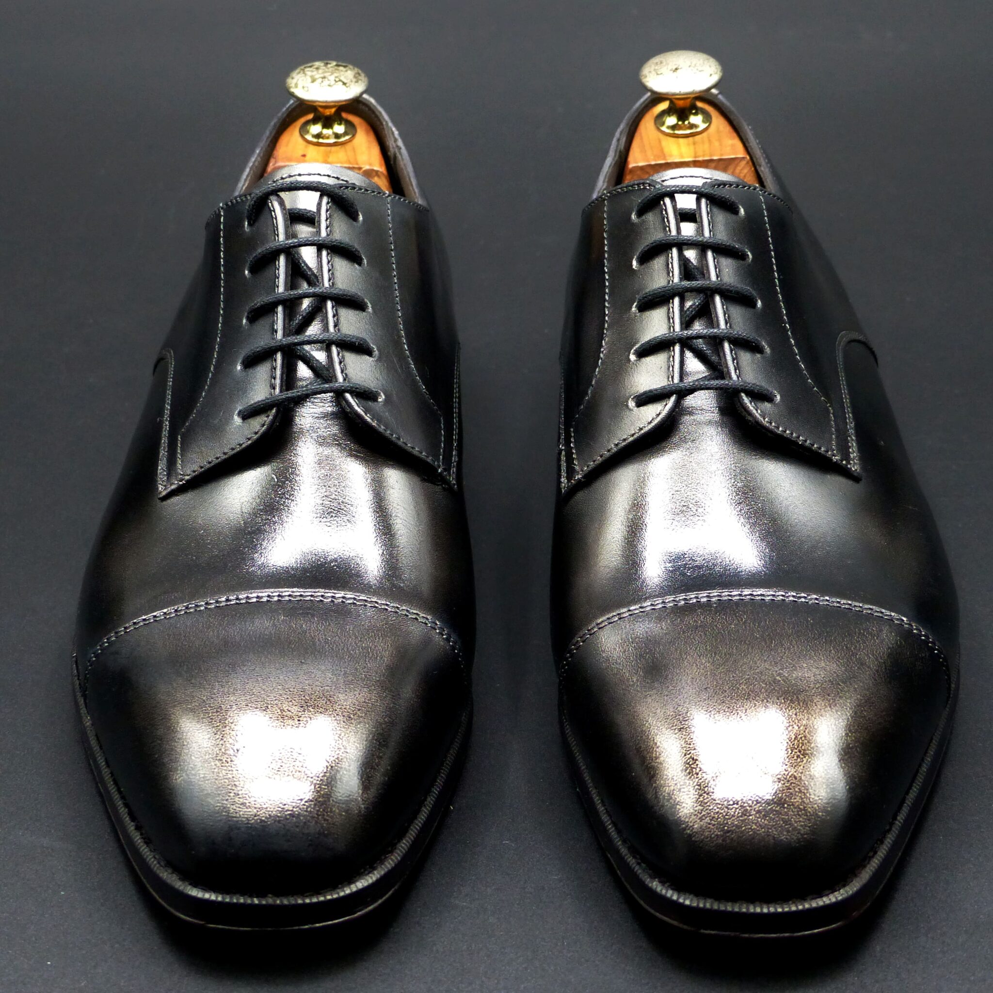
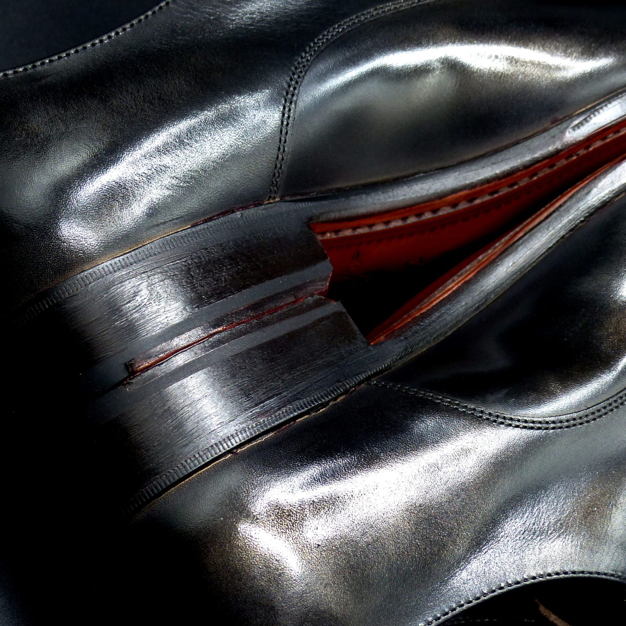


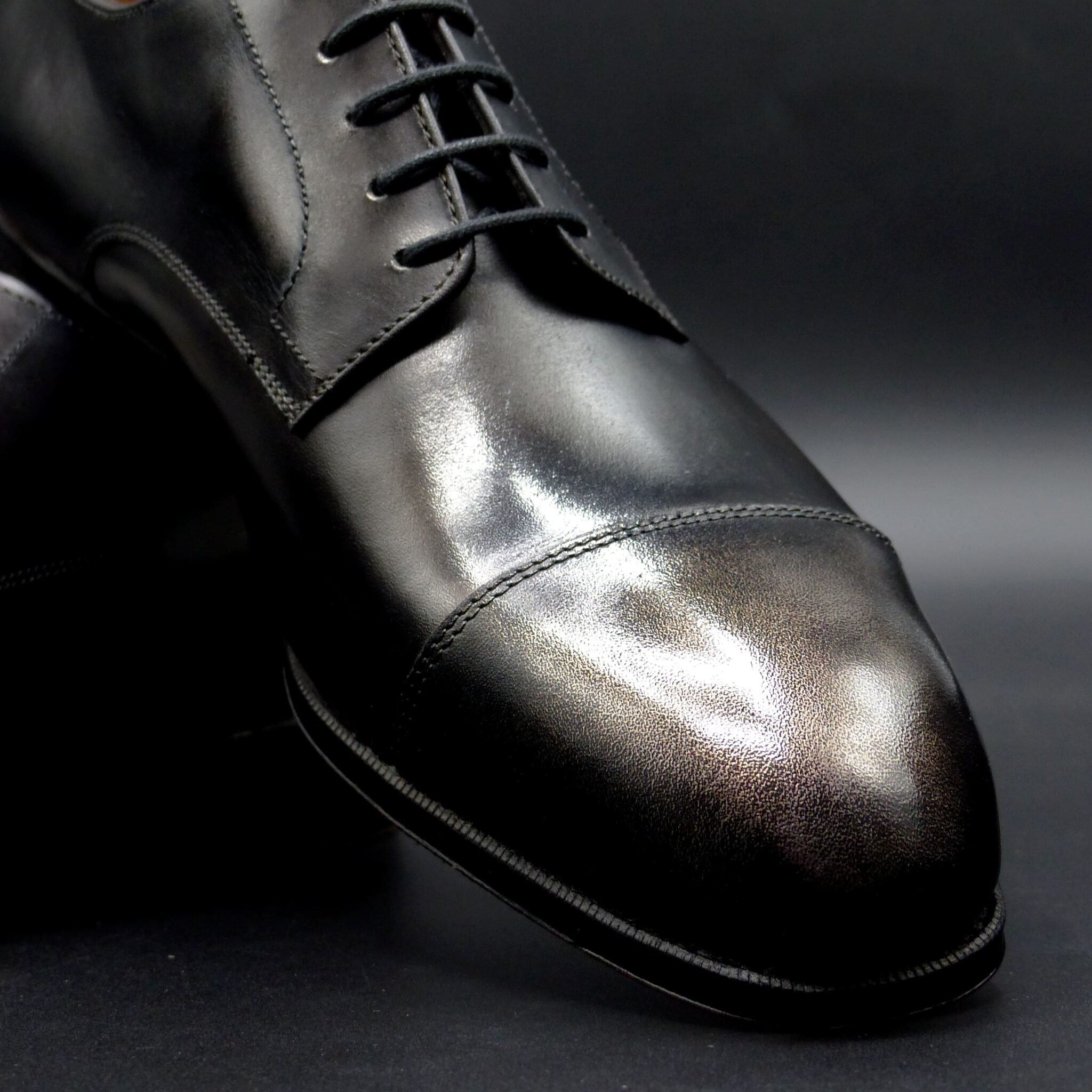
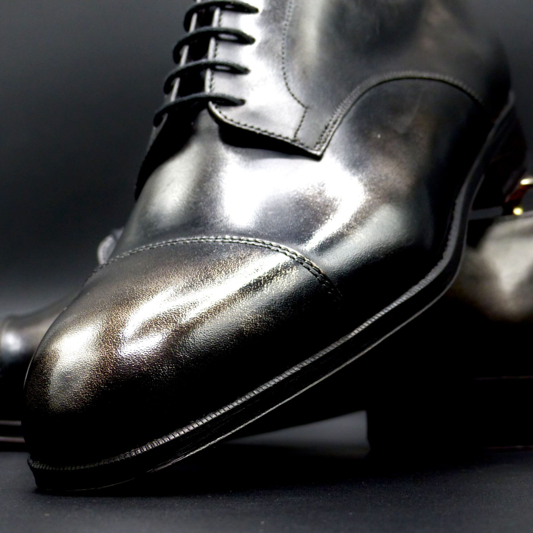
**「くろがね色(黒鉄色)」**とは
鉄を意味する「黒鉄(くろがね)」に由来し、深い青みを帯びた鉄のような黒色です。古代日本では、この色は強さや気品、厳粛さを象徴する色として重宝されました。
________________________________________
- くろがね色の色構成
くろがね色は、黒にわずかな青みが加わった色合いで、鉄の冷たさと硬さを感じさせる深みのある色です。具体的な色構成は以下の通りです:
- 基調色: 深い黒色、暗い灰色
- 青み: 鉄のように、ほんのりと青を帯びた冷徹な色調
- 質感: 金属的な輝きが微かに感じられ、艶消しのような落ち着きがある
________________________________________
- くろがね色が象徴するもの
① 武士の精神と強さ
- くろがね色は、古代日本において武士や戦士の象徴的な色とされました。鉄は武器や甲冑に使われ、強靭さや不屈の精神を表現する色として、武士階級の人々に好まれました。
- 特に甲冑(かっちゅう)や武具に多く見られ、戦いの場での勇気や誇りを象徴する色でした。
② 厳粛さと格式
- くろがね色はその深みと重厚感から、格式の高い色としても重視され、儀式や神事、貴族の衣服に取り入れられました。
- 武士や貴族はこの色を身に纏うことで、高貴で威厳のある存在であることを示しました。
③ 時の流れと無常
- 鉄は変化し続ける物質であり、錆びることから、**無常(むじょう)**を象徴する色でもあります。鉄のように耐久性があり、時間の経過に耐える性質が、**仏教の「無常観」**と結びつけられました。
________________________________________
まとめ
くろがね色(黒鉄色)は、青みがかった深い黒で、鉄の冷たさや硬さを象徴する色です。この色は、古代日本では武士の精神や強さ、格式、無常を象徴する色とされ、戦士の甲冑や貴族の衣装、神事などで使用されました。その深みと静けさは、厳粛さや高貴な存在感を演出し、古代日本の精神性や文化とも深く関わっています。
The Color Composition and Symbolism of “Kurogane-iro (Black Iron Color)” in Ancient Japan
“Kurogane-iro (黒鉄色)”, meaning “black iron,” refers to a deep, bluish-black color resembling iron. In ancient Japan, this color was highly valued for symbolizing strength, nobility, and solemnity.
- Color Composition of Kurogane-iro
Kurogane-iro is a shade of black with a slight bluish tint, evoking the coldness and hardness of iron. The specific color composition is as follows:
- Base color: Deep black, dark gray
- Bluish tint: A cold hue, with just a hint of blue, resembling iron’s color
- Texture: A faint metallic sheen, with a matte quality that suggests calmness
- Symbolism of Kurogane-iro
① The Spirit and Strength of the Samurai
Kurogane-iro was considered a symbolic color of the samurai and warriors in ancient Japan. Iron was used in weapons and armor, and this color expressed strength and indomitable spirit, qualities that were especially revered by the samurai class.
The color was prominently used in armor and weaponry, symbolizing courage and pride on the battlefield.
② Solemnity and Nobility
Due to its depth and weight, kurogane-iro was also regarded as a noble color, highly esteemed for its association with rituals, ceremonies, and the garments of the nobility.
By wearing this color, samurai and aristocrats signaled their high status and dignity, embodying a presence of authority and respect.
③ The Flow of Time and Impermanence
Iron, being a material that changes and rusts over time, also symbolizes impermanence (無常, mujo). The durability and resilience of iron, which withstands the passage of time, are closely associated with the Buddhist concept of mujo, or the transient nature of life.
Thus, this color also reflects the Buddhist view of impermanence—that nothing lasts forever.
Conclusion
Kurogane-iro (black iron color) is a deep, bluish-black color that symbolizes the coldness and hardness of iron. In ancient Japan, this color represented the samurai spirit, strength, nobility, and impermanence. It was used in armor, aristocratic garments, and rituals, with its deep and calm tone conveying solemnity and dignity. This color played a profound role in expressing the spiritual and cultural essence of ancient Japan.
ワークブーツ・プレーン
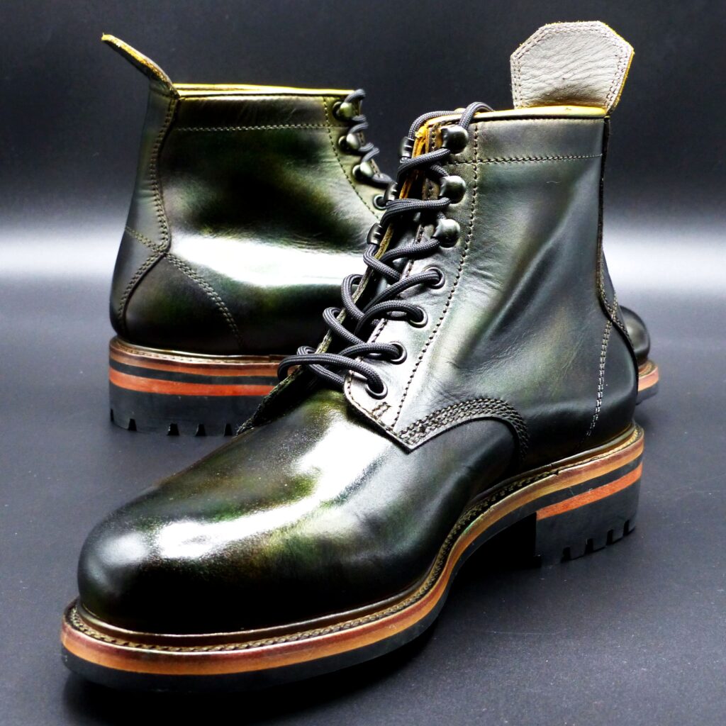
color name;
[ Yamabuki-Gasane]
山吹襲
Work Boots Plaine
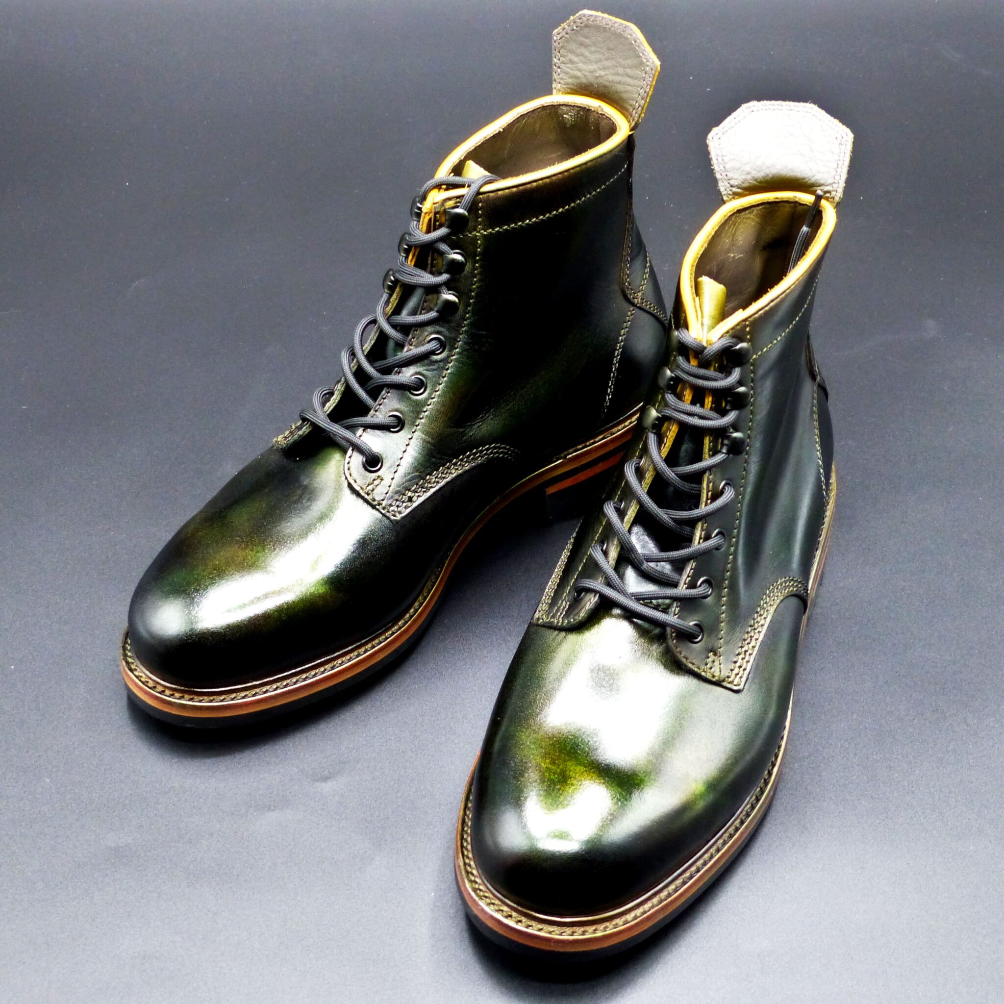
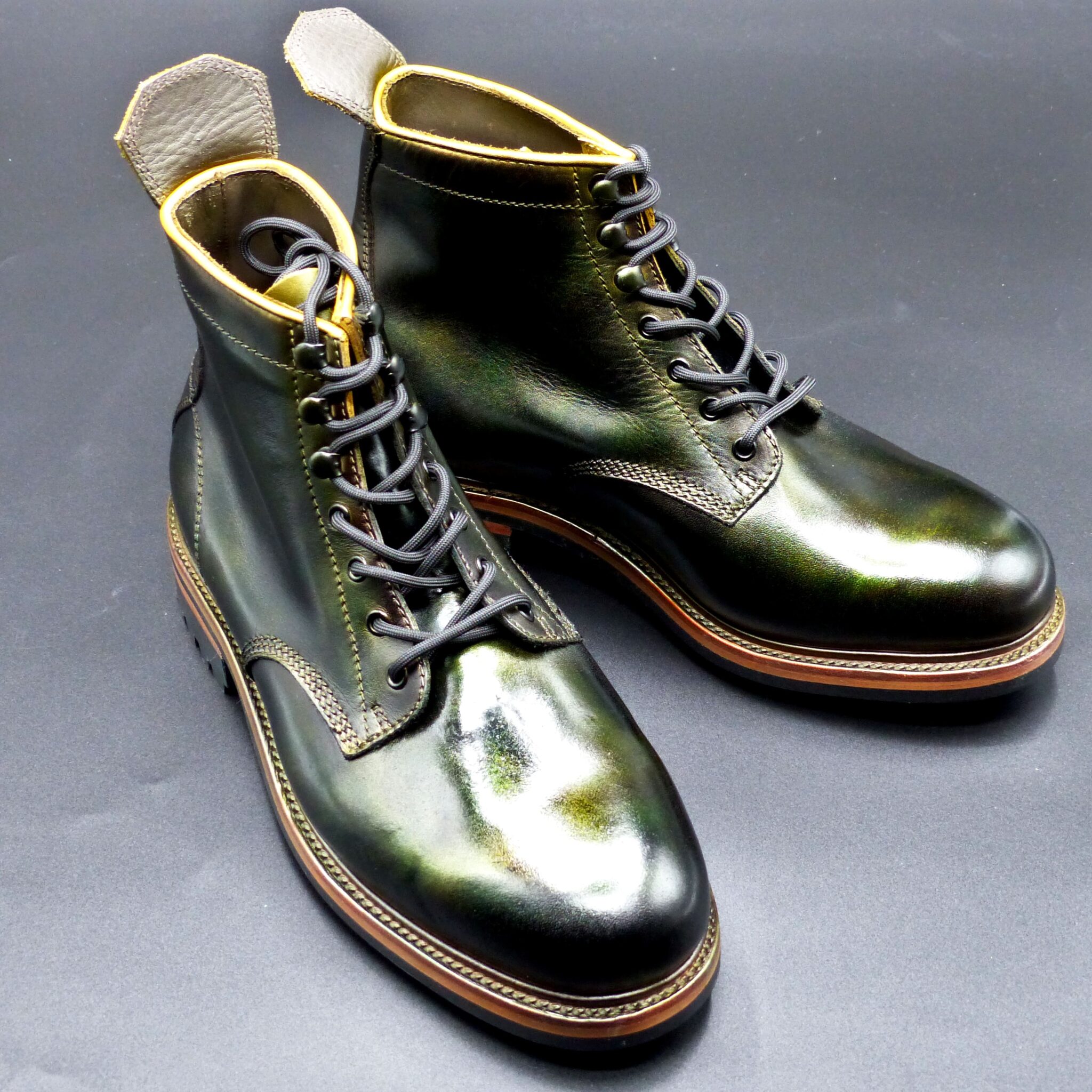
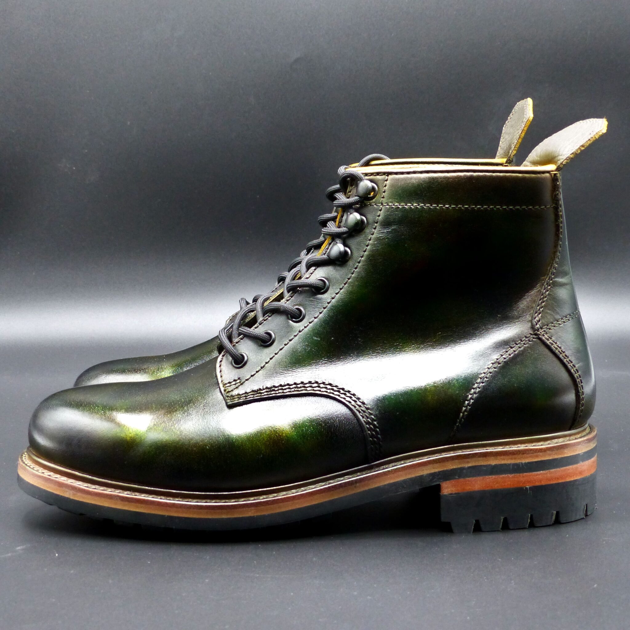

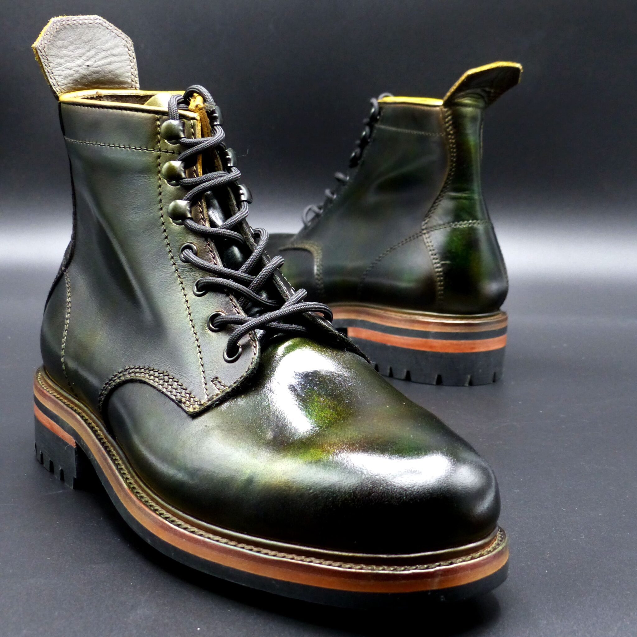
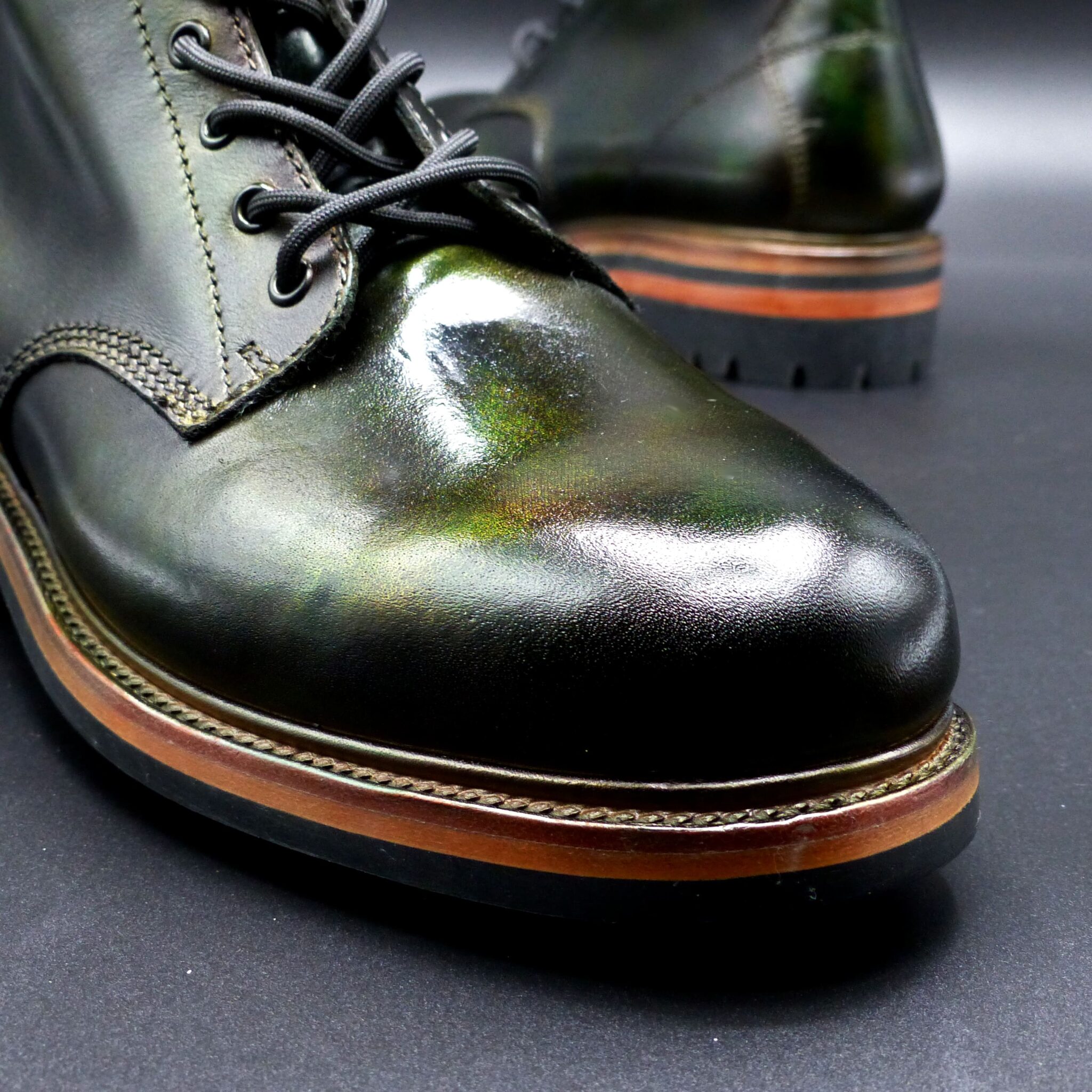
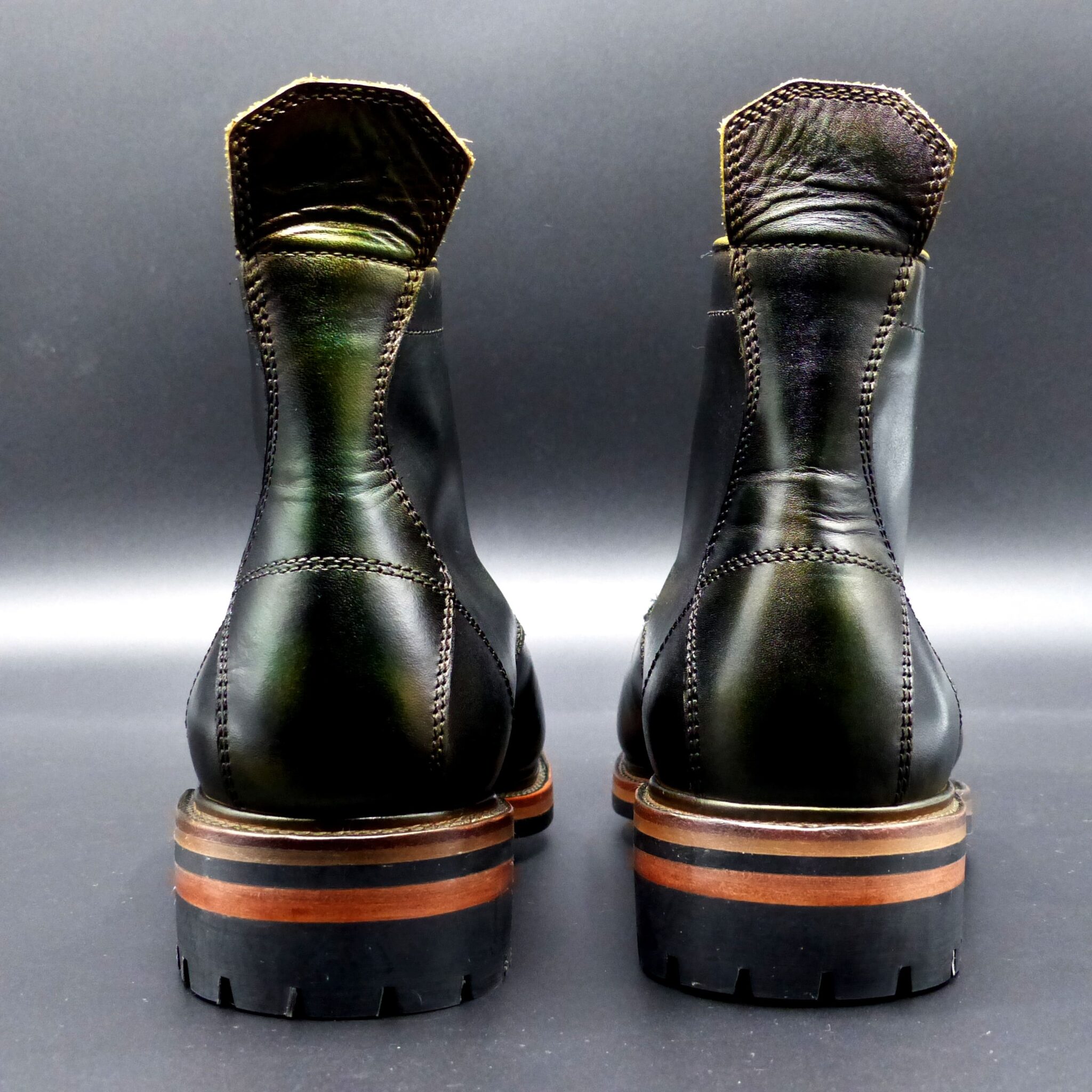
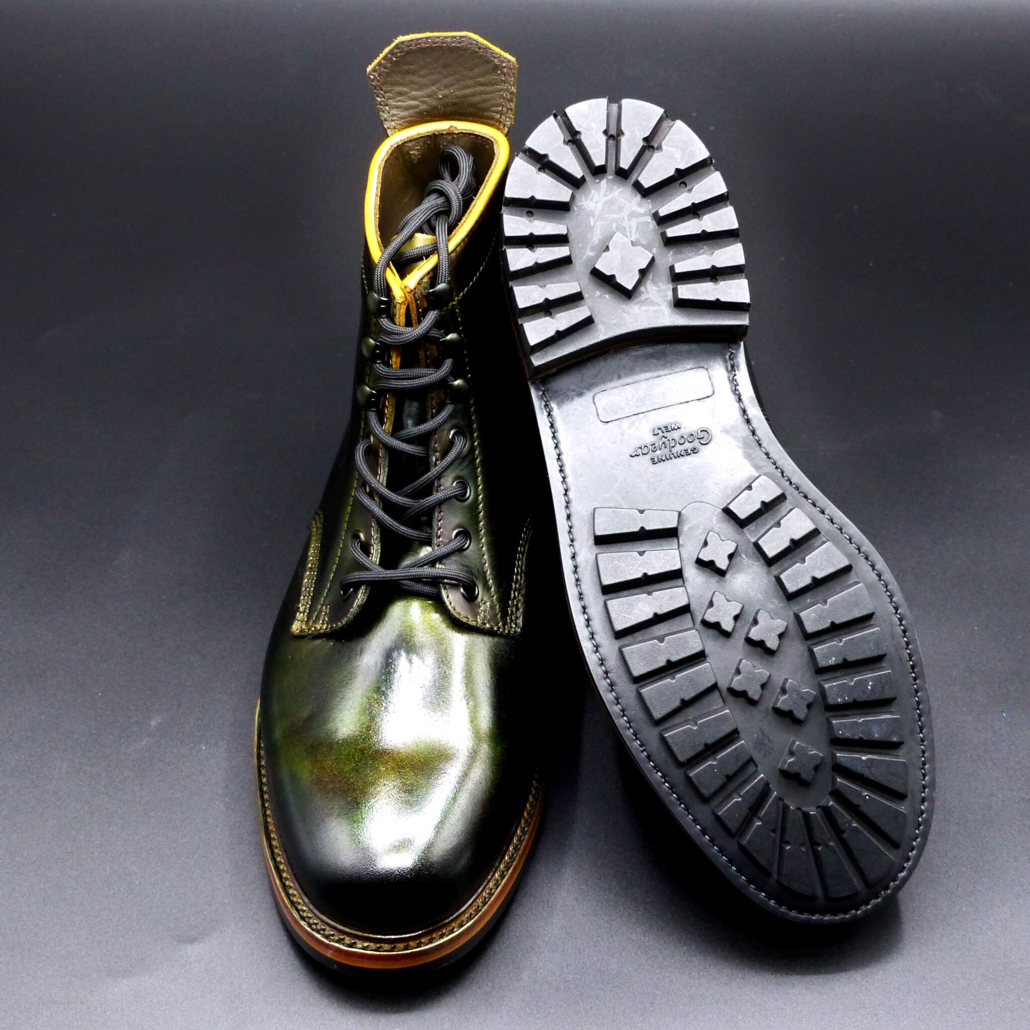
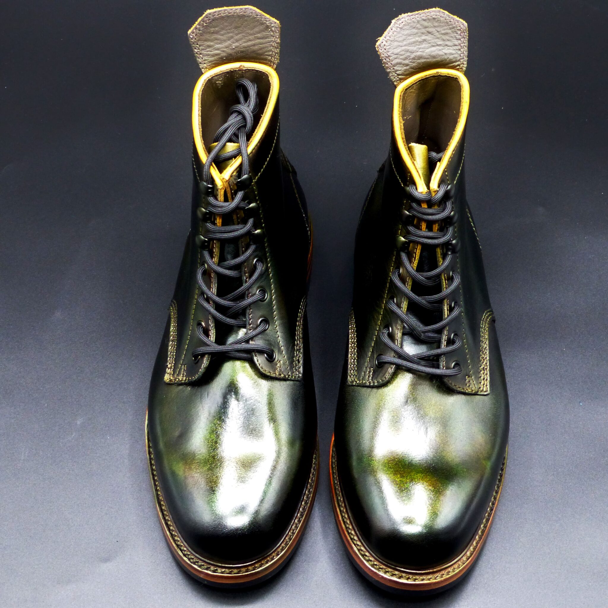
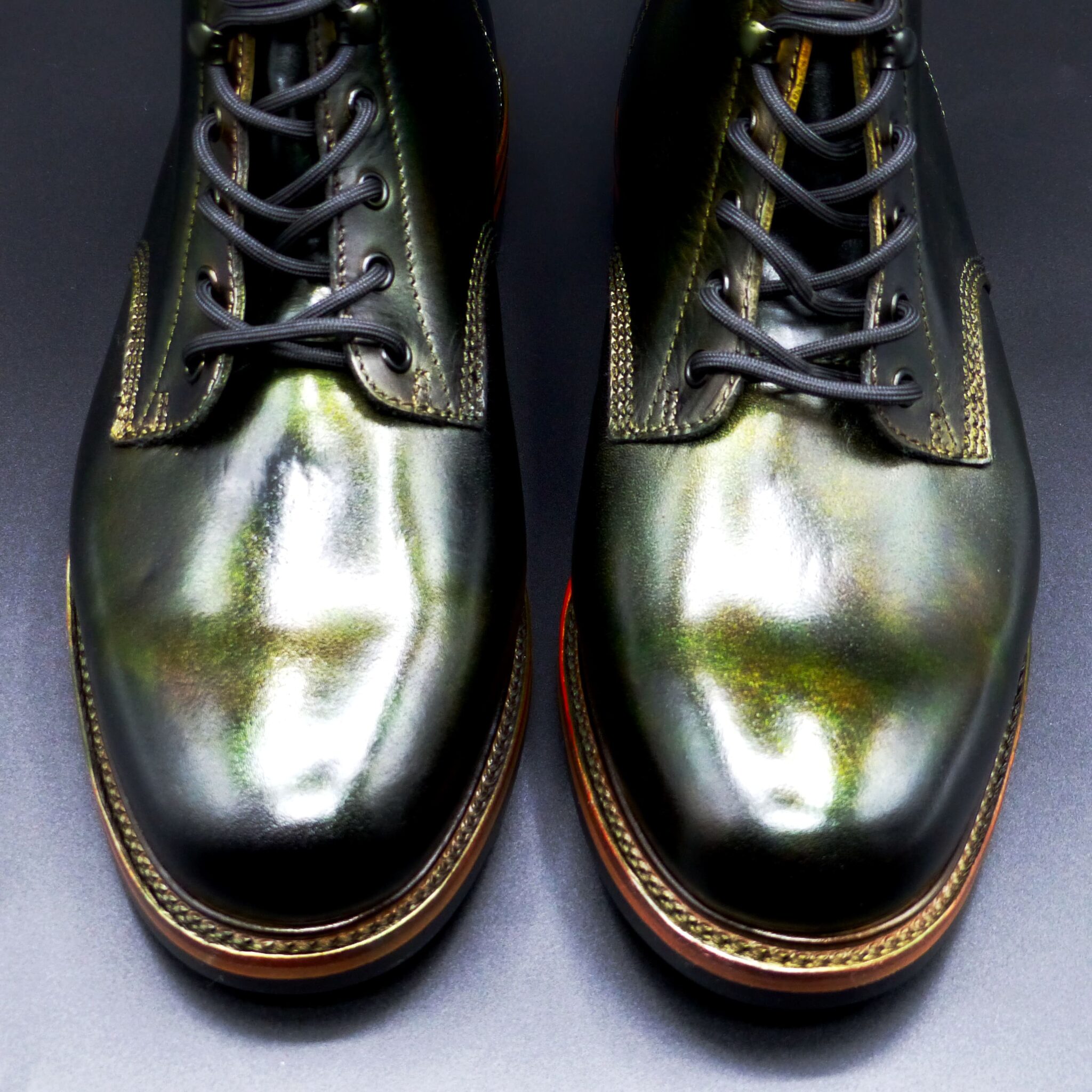
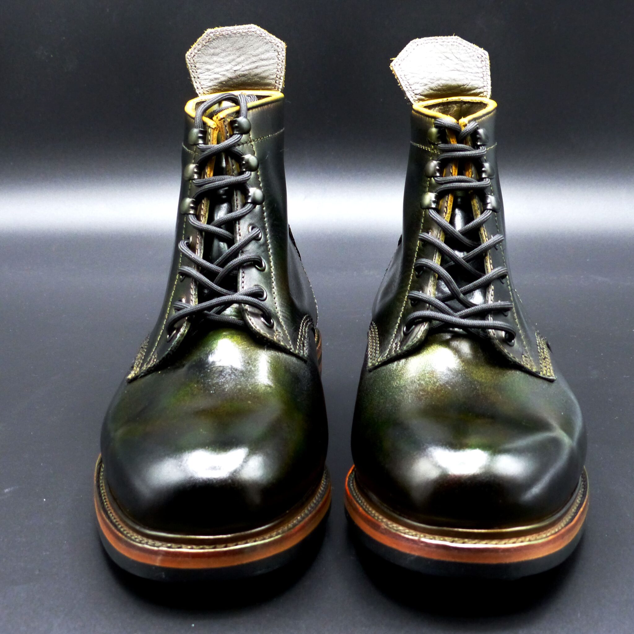

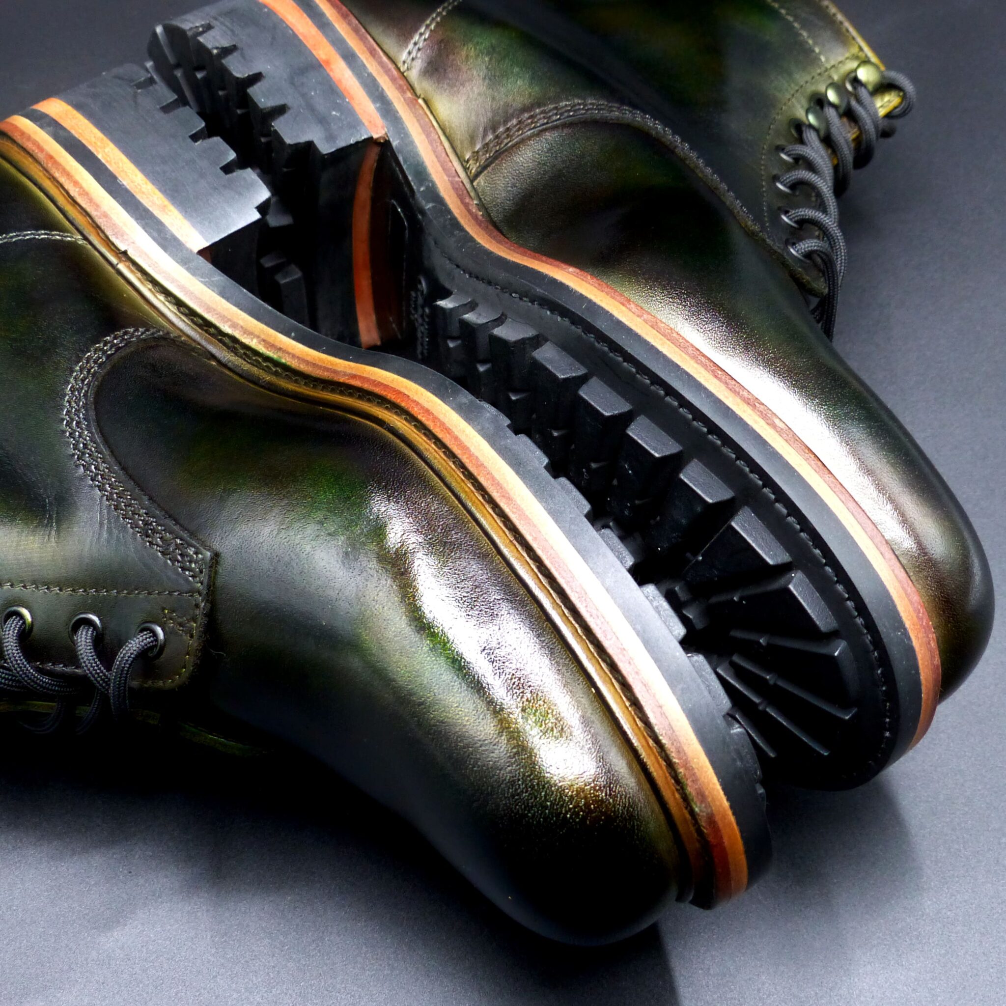
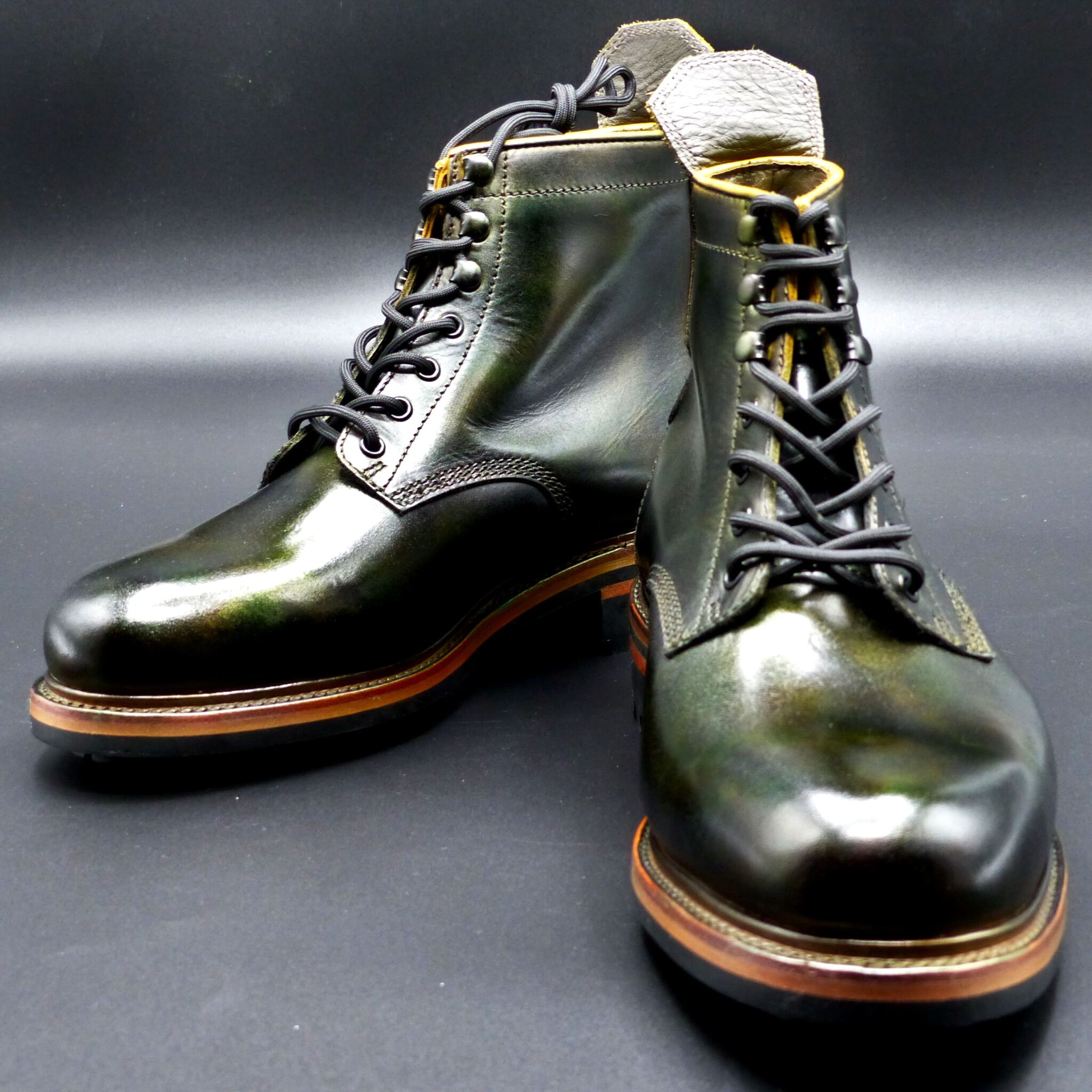
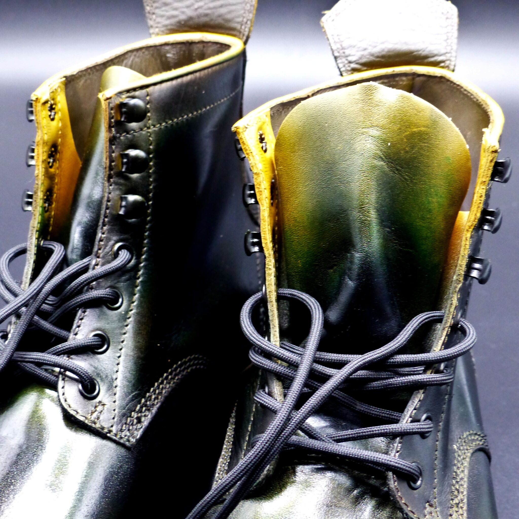

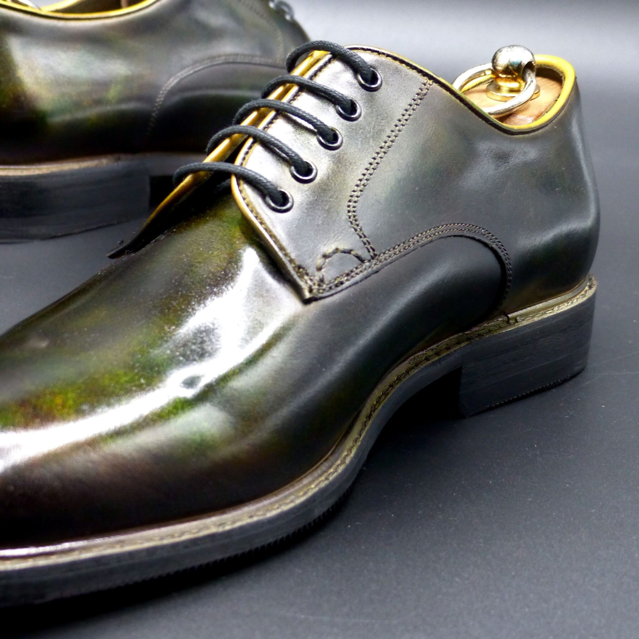
●山吹襲とは●
山吹襲は、平安時代の装束の「襲(かさね)の色目」のひとつで、春に咲く山吹の花の鮮やかな黄色と、その葉の緑色を表現した配色です。春の陽光に映える山吹の花と、新緑の葉の取り合わせを衣装に反映させた、華やかで温かみのある色の組み合わせです。
ー山吹襲の色構成ー
表(おもて):山吹色(明るい黄色・金色がかった黄色)
裏(うら):緑(若草色や萌黄色)
このように、外側には黄色を、内側には緑を配することで、風が吹いたときや袖口から、山吹の花と葉が重なったような美しい色の対比が生まれるのです。
▴山吹襲の象徴するもの▴
春の訪れと生命の息吹
華やかさと上品さの調和
源氏物語「竹河」に登場し、貴族の美意識を象徴
特に『源氏物語』では、「竹河」の場面で描かれ、桜を眺める女性たちの衣装として登場します。春の優雅な情景を引き立てる、鮮やかでありながら品のある色の重なりとして、平安貴族たちに愛されました。
山吹襲は、単なる黄色と緑の組み合わせではなく、春の空気や光までも映し出す、繊細な美意識の結晶なのです。
Yamabuki-gasane (山吹襲) – The Layered Colors of Yamabuki
Yamabuki-gasane is one of the Kasane no Irome (layered color combinations) from the Heian period, representing the vivid yellow of the yamabuki (Japanese kerria) flower and the green of its leaves. This color combination reflects the bright yellow of the flower and the fresh green of the leaves, capturing the vibrancy of spring sunlight and the harmonious blend of nature’s hues in a garment. It creates a lively, warm, and elegant visual effect.
Color Composition of Yamabuki-gasane
- Outer layer (omote): Yamabuki-iro (bright yellow, tinged with gold)
- Inner layer (ura): Green (young grass color or pale green)
By placing yellow on the outside and green on the inside, the combination creates a beautiful contrast, as if the yamabuki flower and its leaves overlap, especially when wind rustles the fabric or when seen from the sleeve openings.
What Yamabuki-gasane Symbolizes
- The arrival of spring and the breath of life
- A harmonious balance of vibrancy and elegance
- The symbol of noble aesthetic values, as depicted in The Tale of Genji
In particular, The Tale of Genji features this color in the “Takekawa” (Bamboo River) chapter, where women watching the cherry blossoms wear garments in this color combination. The vibrant yet refined overlapping hues highlight the graceful spring scenery, and the color became beloved by Heian aristocrats.
Yamabuki-gasane is not simply a combination of yellow and green; it is a delicate embodiment of the spring atmosphere, capturing both the light and air of the season, and reflecting the refined beauty of the time.
シングル・モンク
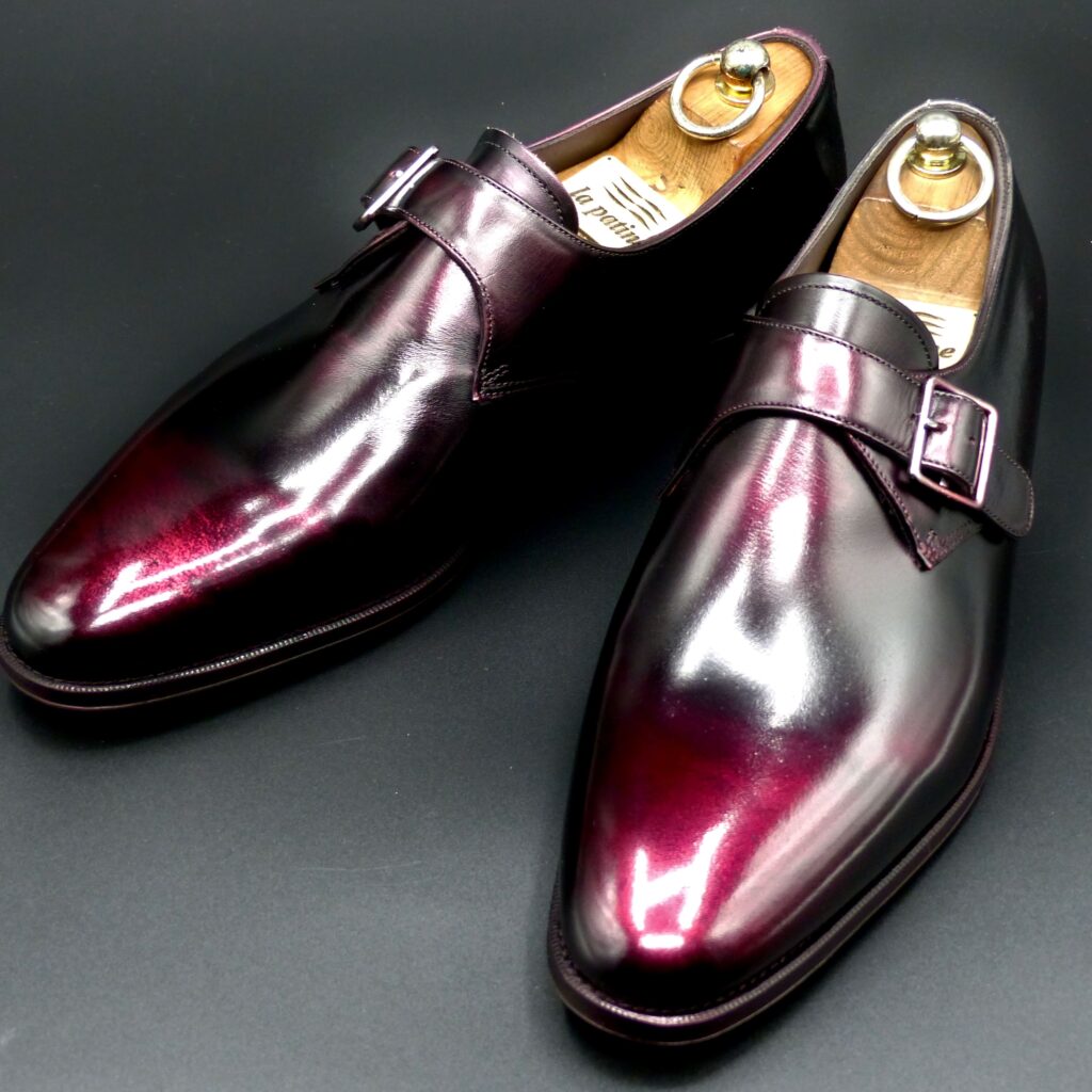
color name;
[ Akasuke]
赤透
Single Monk
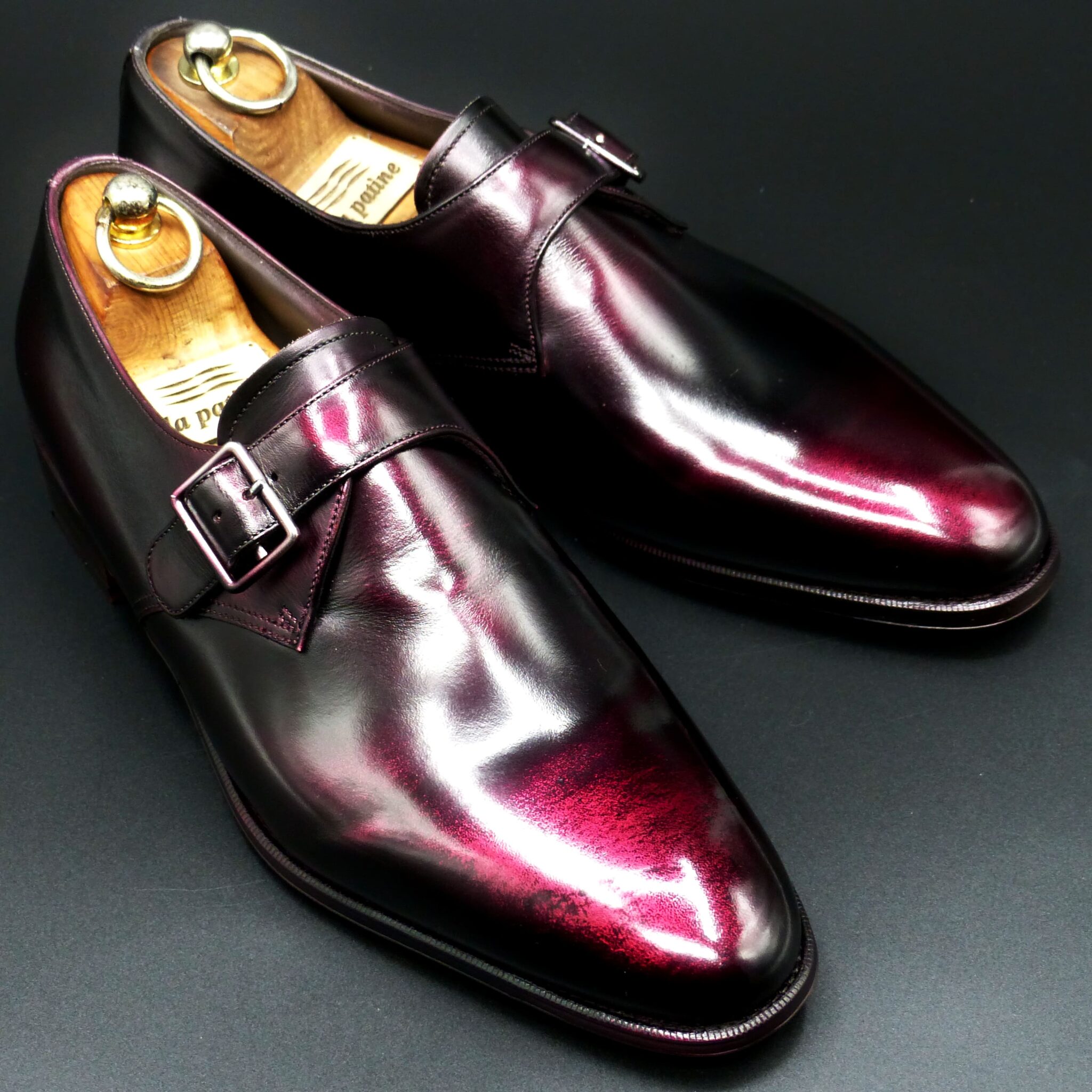
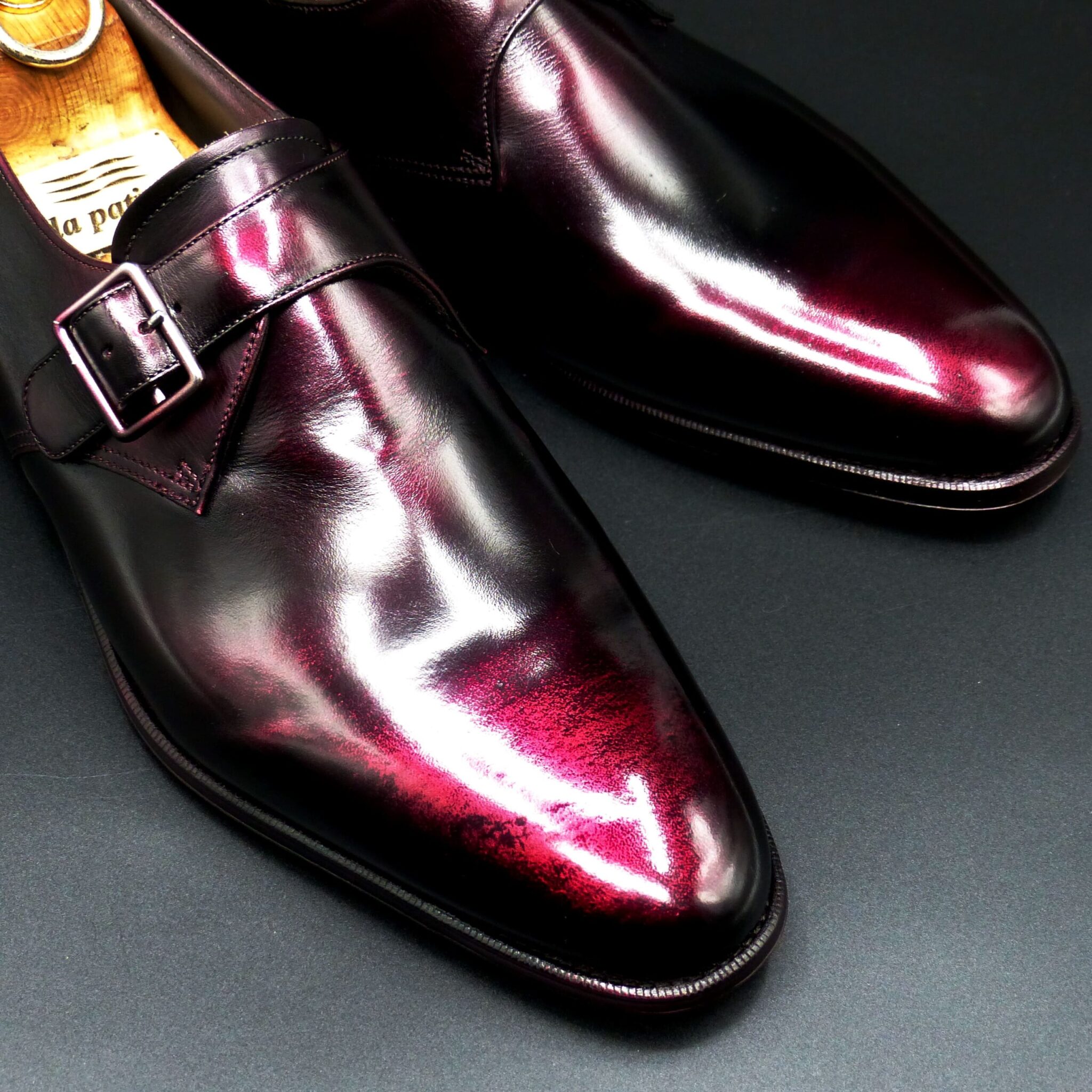
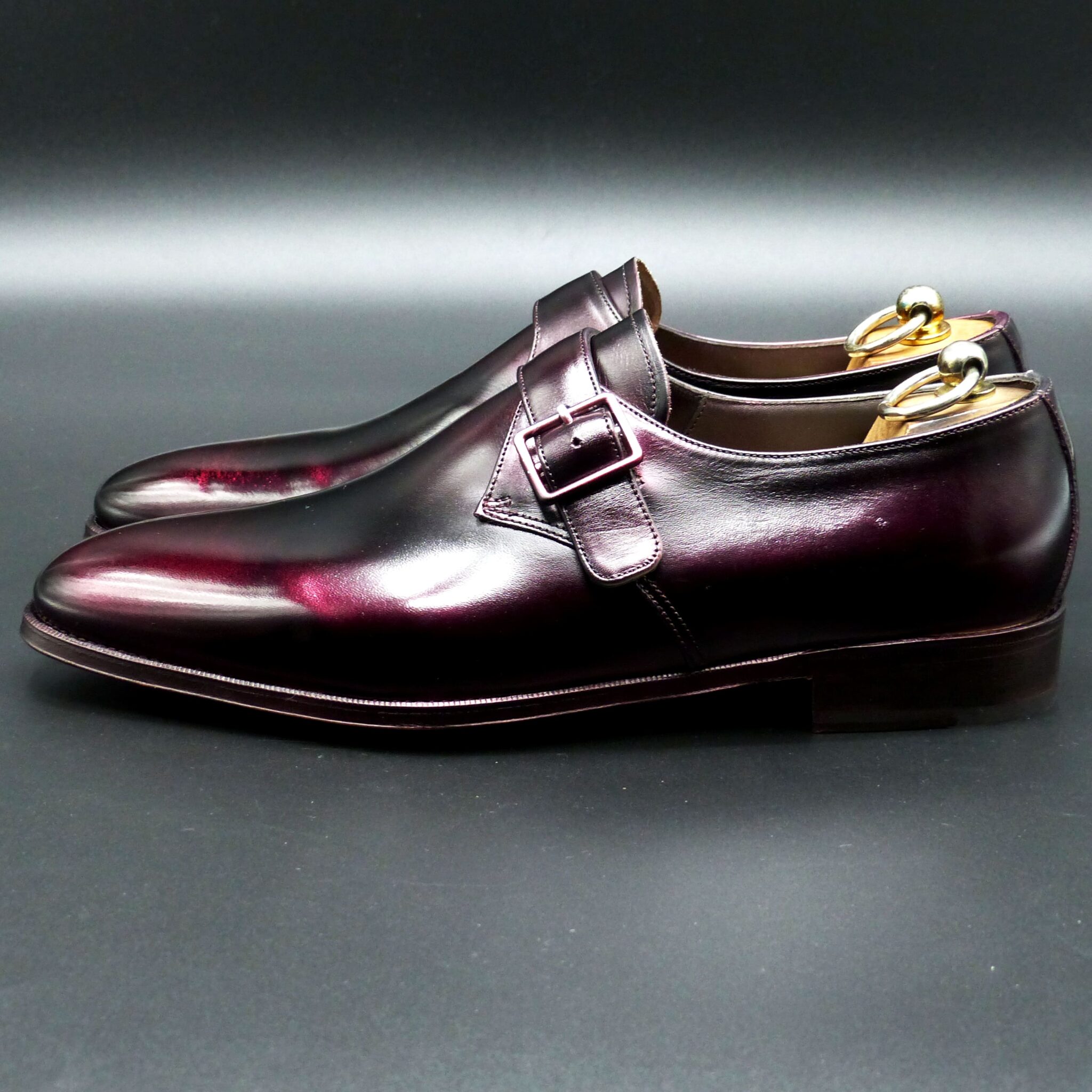
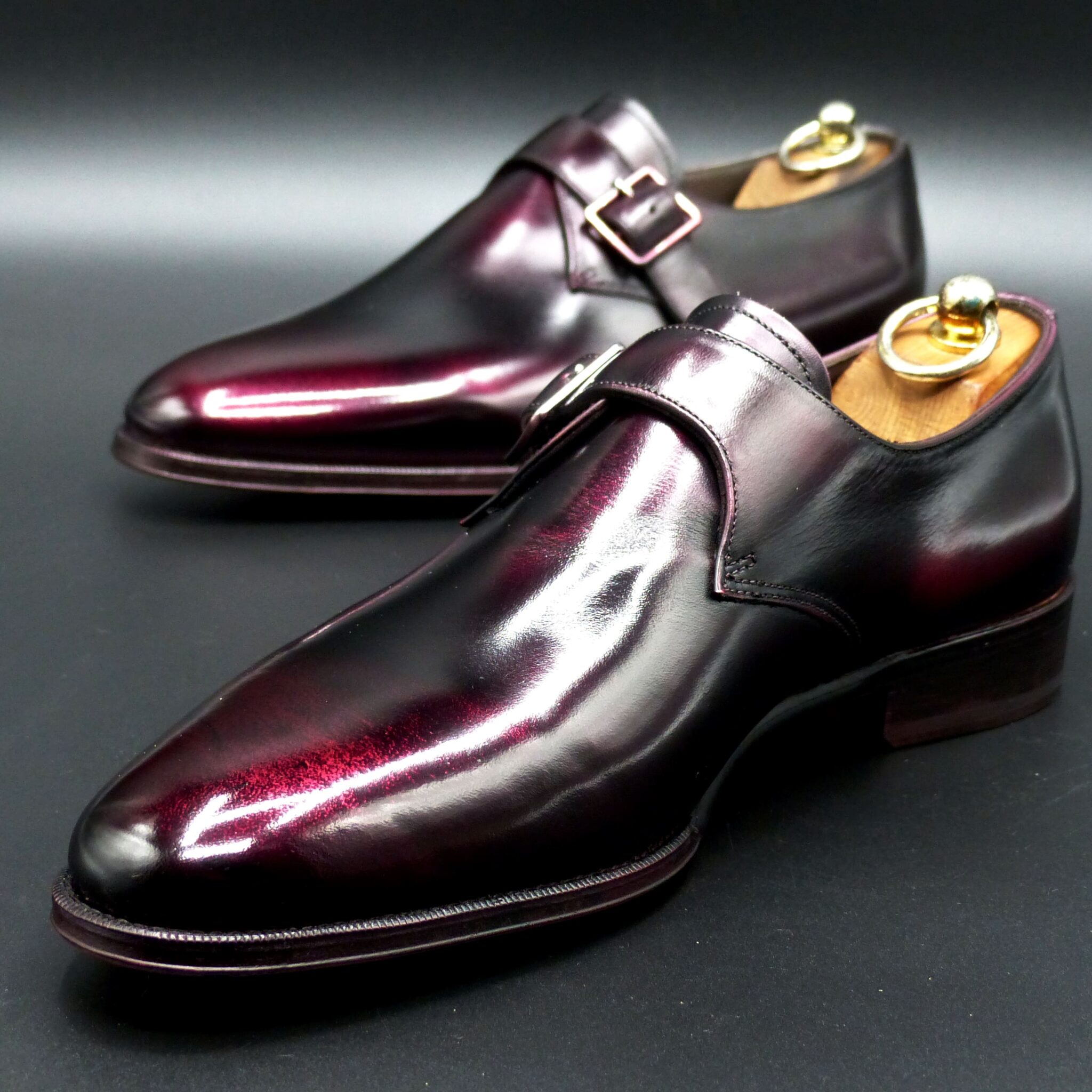
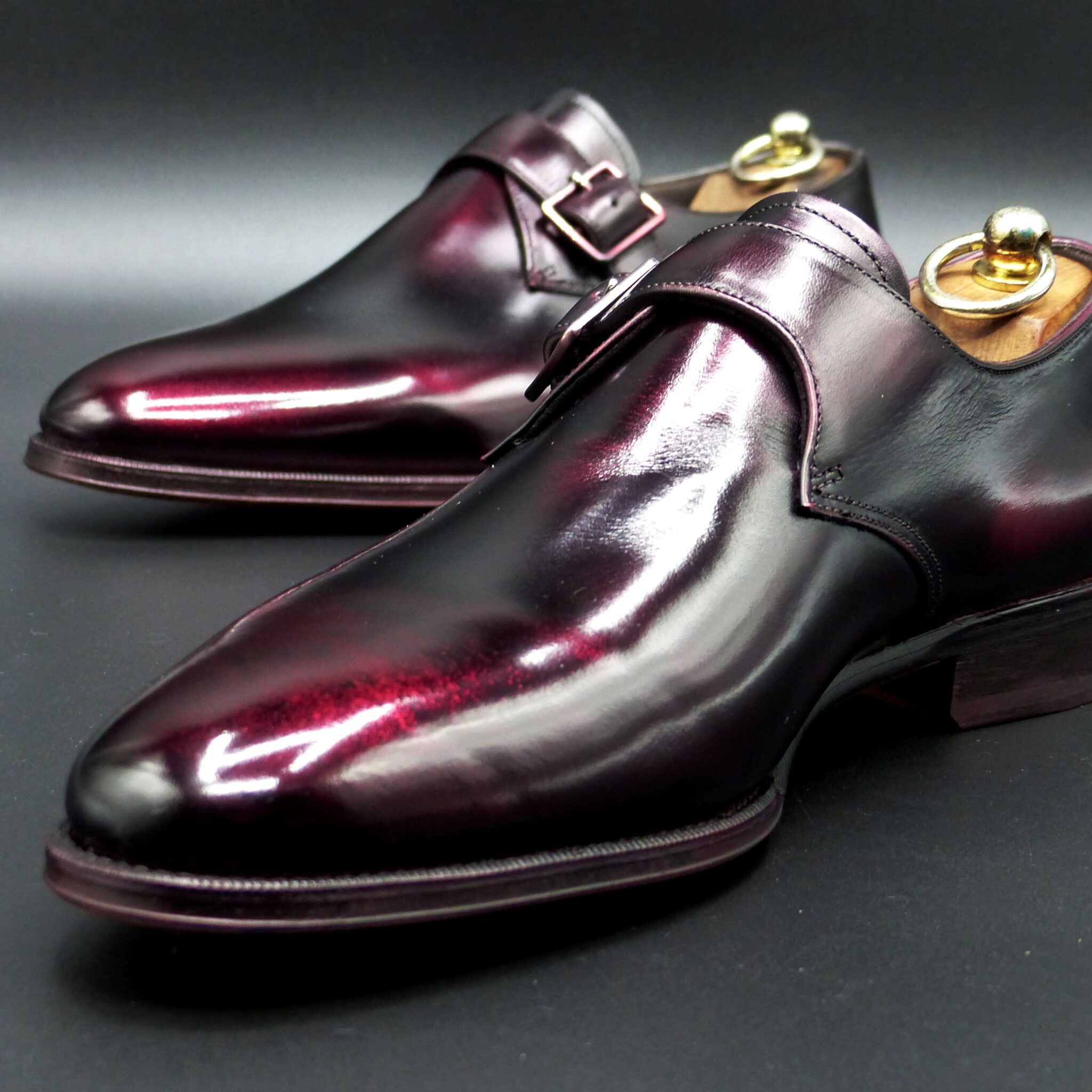
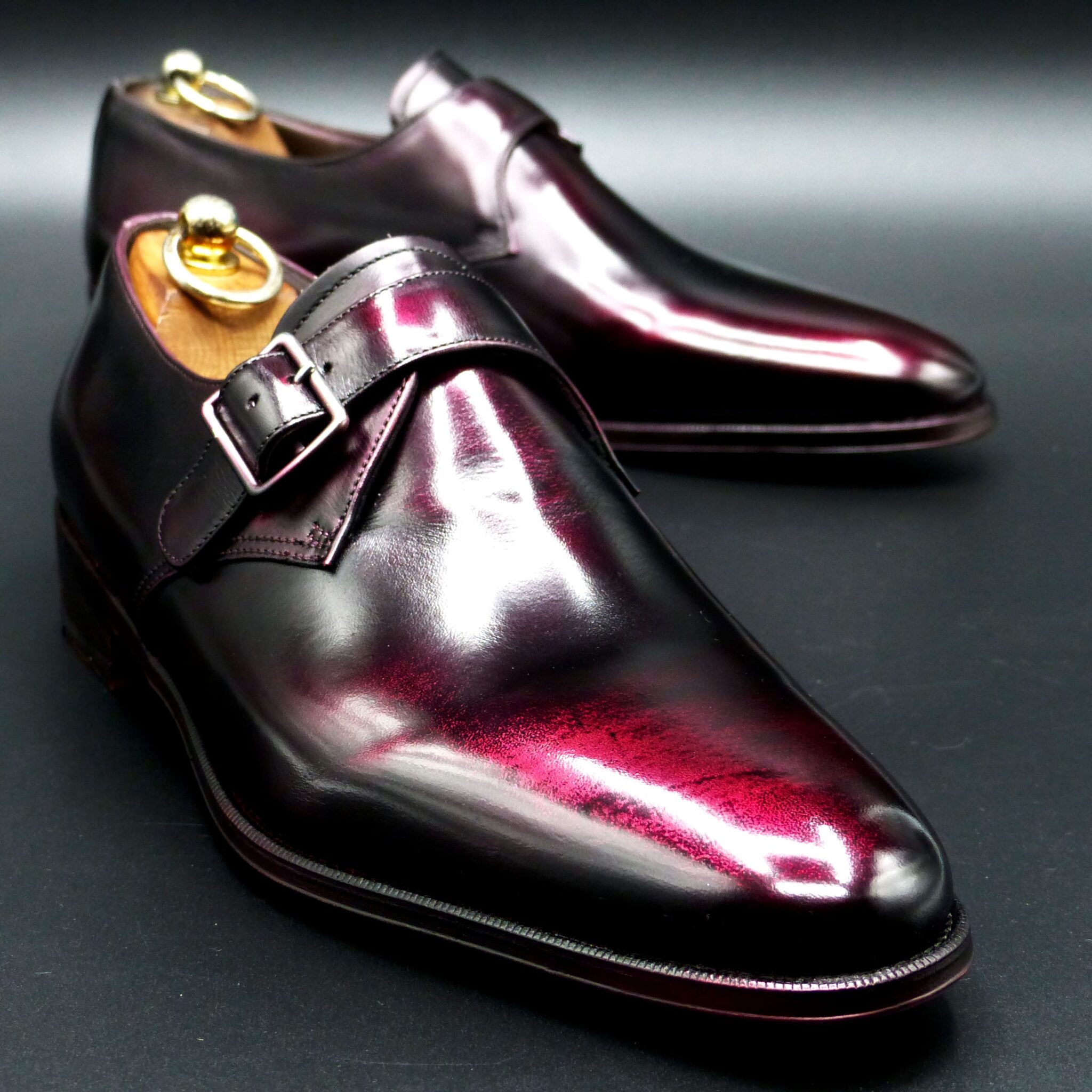
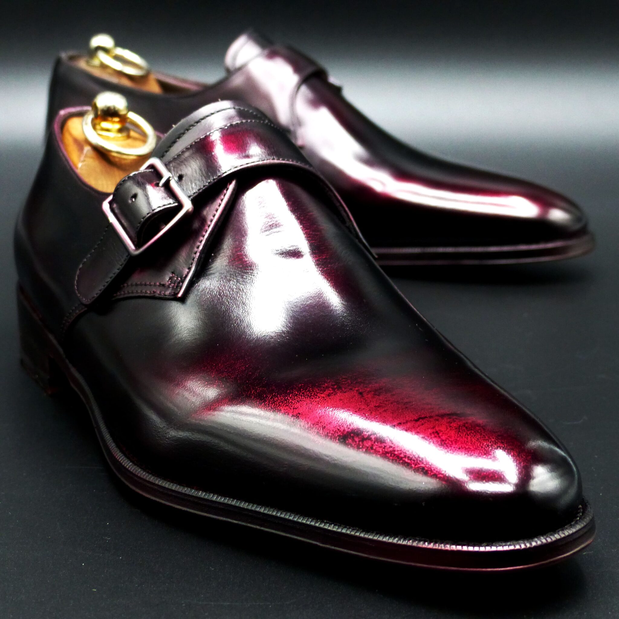
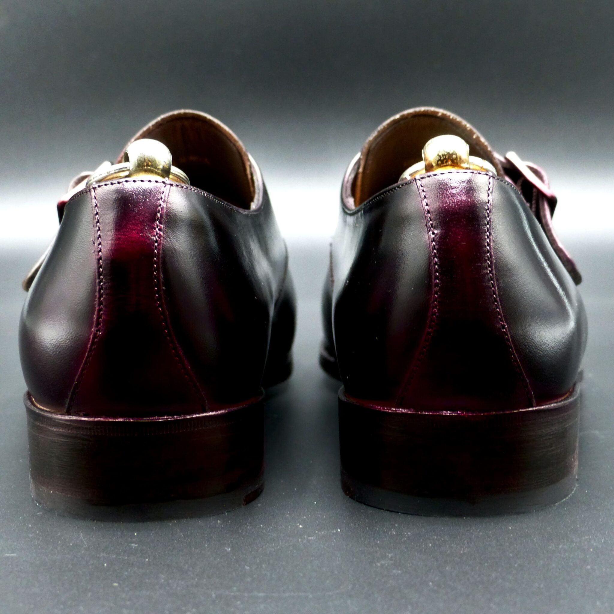

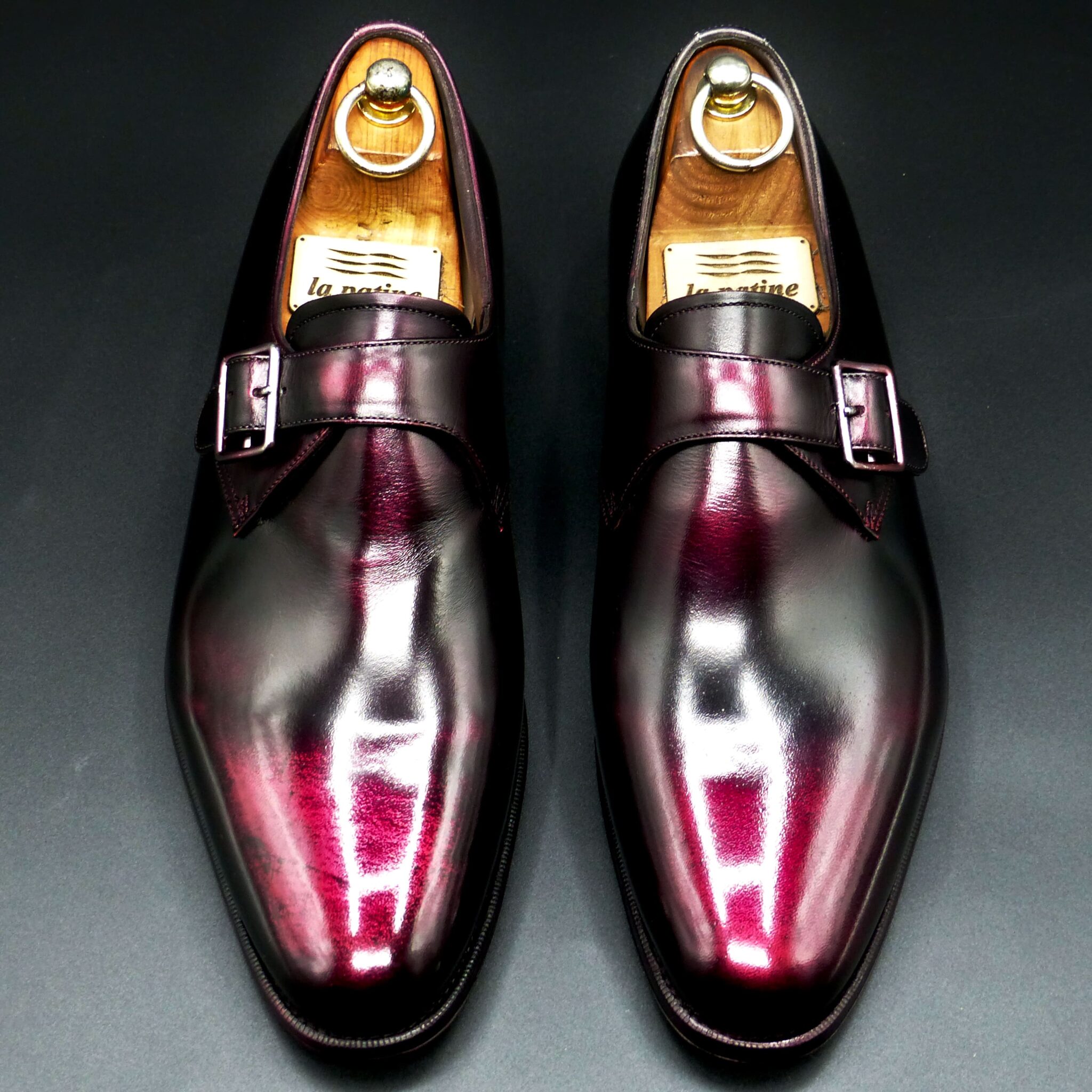
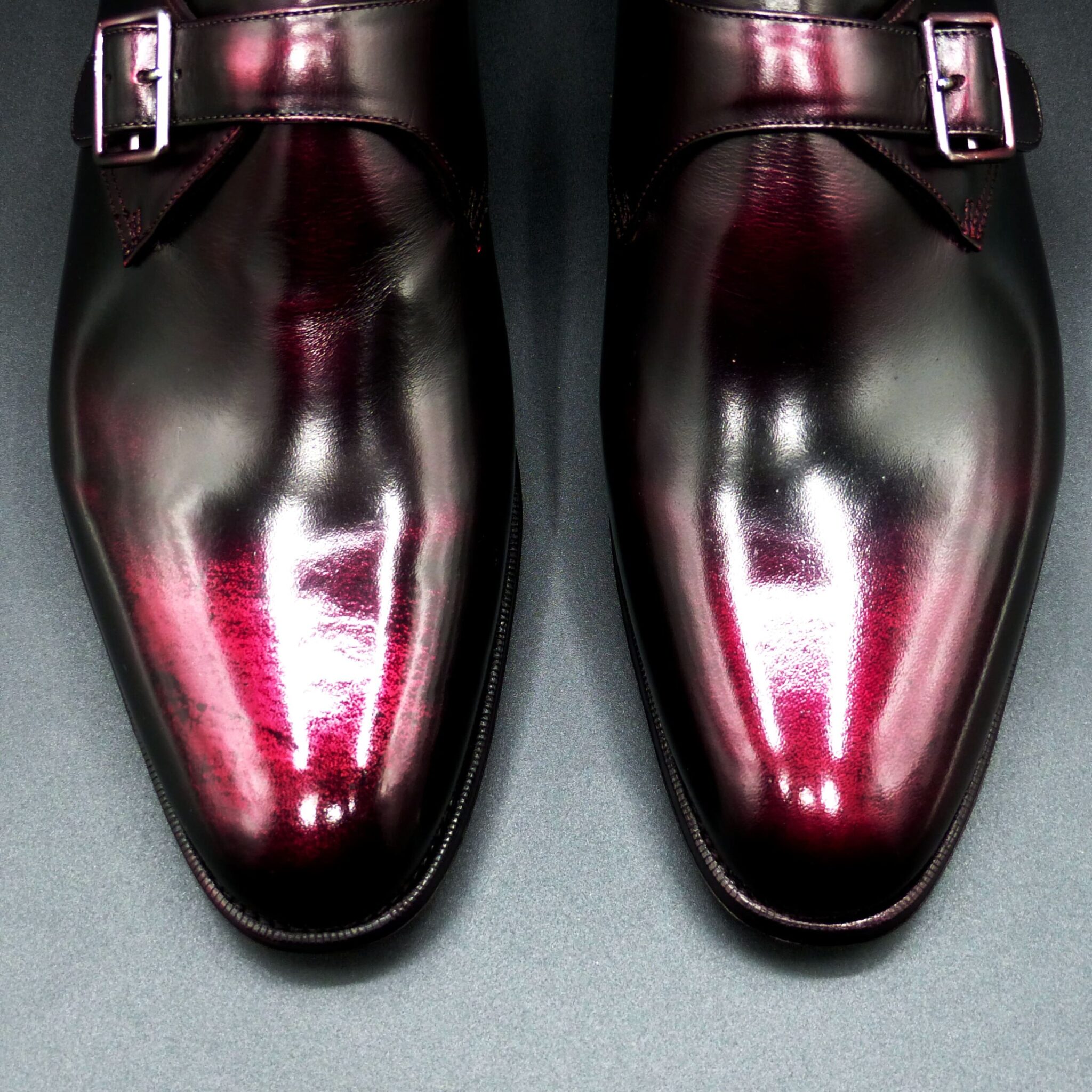
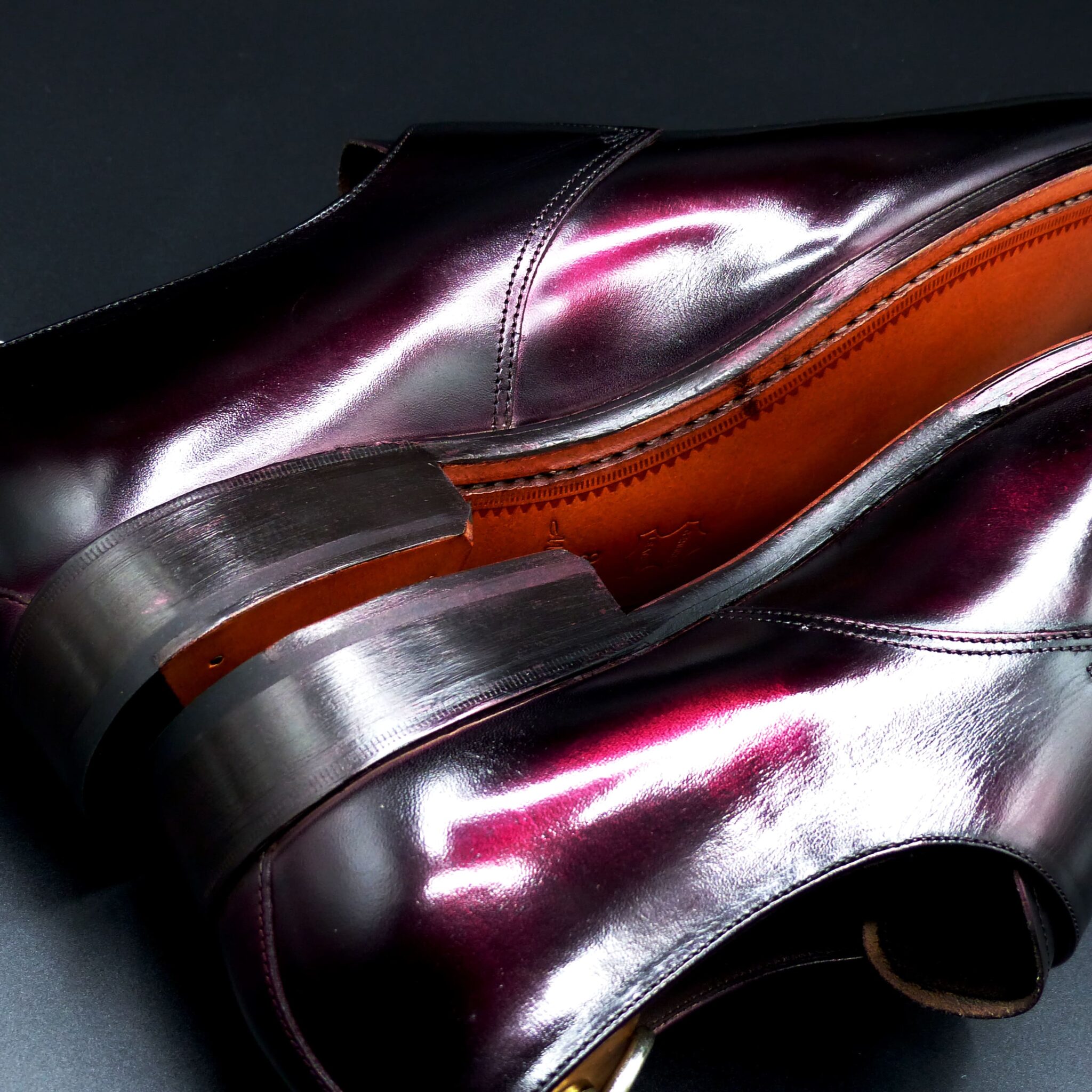
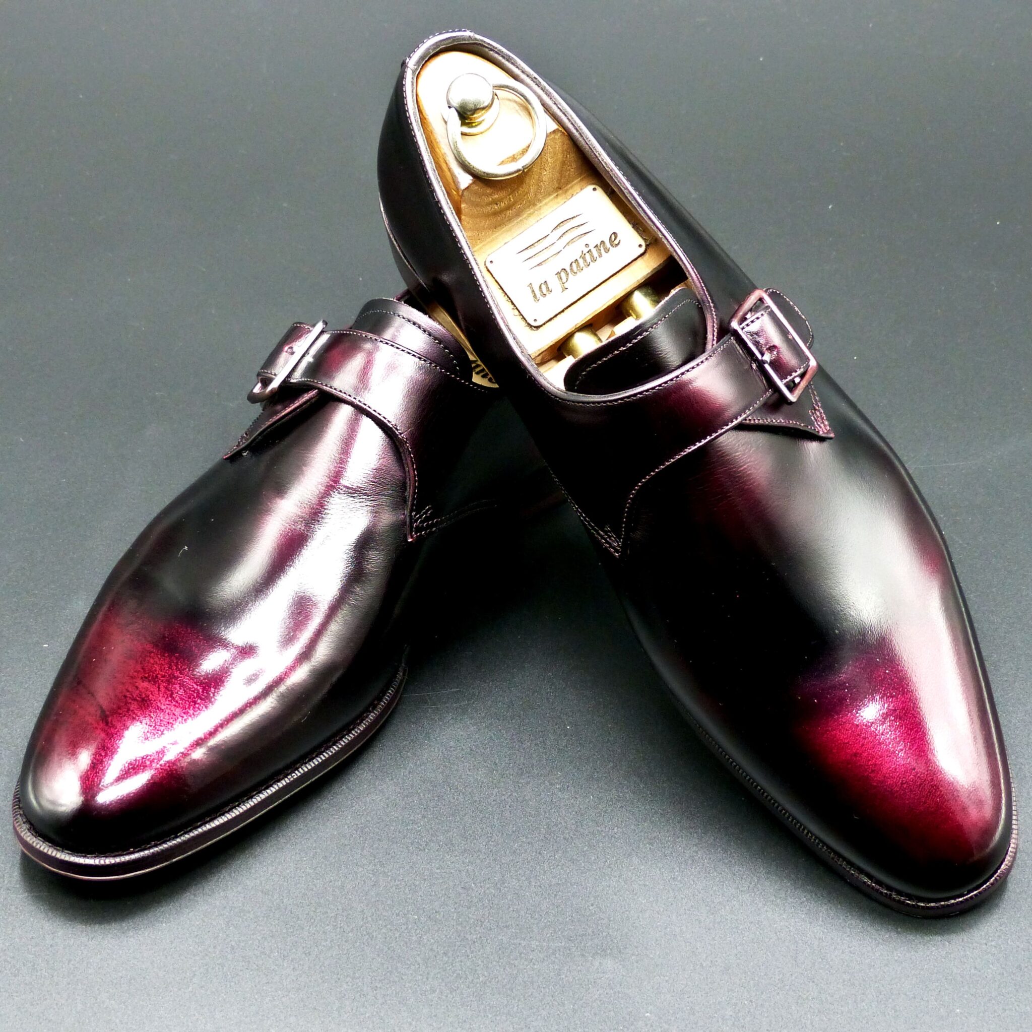
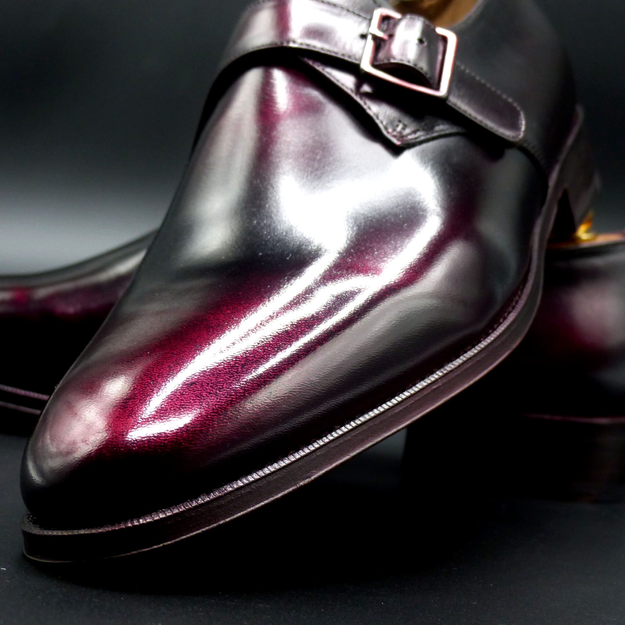
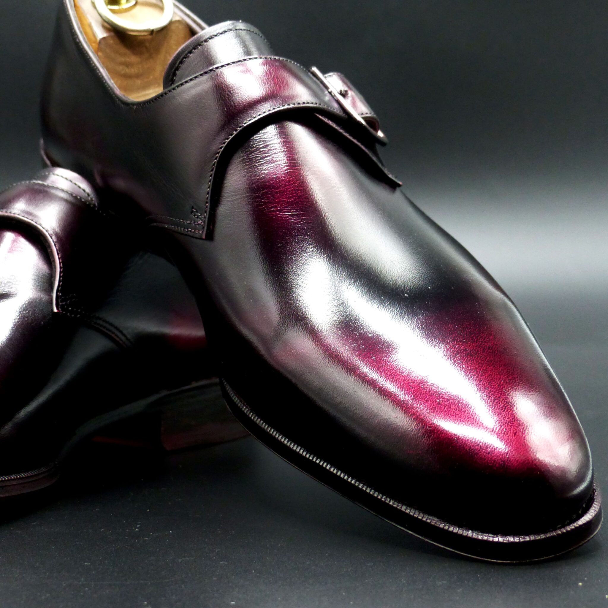
**赤透(あかすけ)**
七宝焼きの伝統的な色彩の一つで、透明感のある鮮やかな赤色を特徴としています。この色は、明治時代初期に名古屋の七宝職人・太田甚之栄によって開発されました。
**赤透の色構成**
- 表(おもて):透明感のある鮮やかな赤色。この赤色は、釉薬に金を溶かし込むことで実現され、宝石のルビーのような深みと輝きを持ちます。
- 裏(うら):通常、七宝焼きの作品では裏面は見えない部分となりますが、作品全体の調和を考慮して、黒や深緑などの落ち着いた色が用いられることがあります。
このように、表面に鮮やかな赤色を施し、裏面に落ち着いた色を配することで、作品に深みと高級感を与えています。
**赤透が象徴するもの**
- 情熱と活力:鮮やかな赤色は、生命力やエネルギーを象徴し、見る者に力強い印象を与えます。
- 魔除けと厄除け:日本文化において、赤色は古くから魔除けや厄除けの力があると信じられ、神社の鳥居や祭礼の装飾などに用いられてきました。
- 祝いと喜び:赤色は祝い事や特別な行事の際に好まれる色であり、喜びや幸福を象徴します。
赤透の色合いは、これらの象徴性を持ちながら、七宝焼きの技術と融合することで、作品に深みと魅力を加えています。
Akasuke is a traditional color in Japanese cloisonné enamelware, characterized by its vivid and transparent red hue. This color was developed in the early Meiji period by the cloisonné artisan Jinsiei Ota from Nagoya.
Color Composition of Akasuke
- Surface (Omote): A bright, transparent red achieved by incorporating gold into the enamel glaze, resulting in a depth and brilliance reminiscent of a ruby.
- Underside (Ura): In cloisonné works, the underside is typically not visible; however, to ensure overall harmony, subdued colors such as black or deep green are sometimes used.
By applying a vibrant red on the surface and a more subdued color on the underside, the piece attains a sense of depth and sophistication.
Symbolism of Akasuke
- Passion and Vitality: The vivid red symbolizes life force and energy, imparting a strong impression to the viewer.
- Protection and Warding Off Evil: In Japanese culture, red has long been believed to possess protective qualities, often used in Shinto shrine gates (torii) and festival decorations.
- Celebration and Joy: Red is a favored color during festive occasions and special ceremonies, symbolizing happiness and good fortune.
The rich hue of Akasu embodies these symbolic meanings, enhancing the depth and allure of cloisonné artworks through its fusion with traditional craftsmanship.
プレーン・ダービー
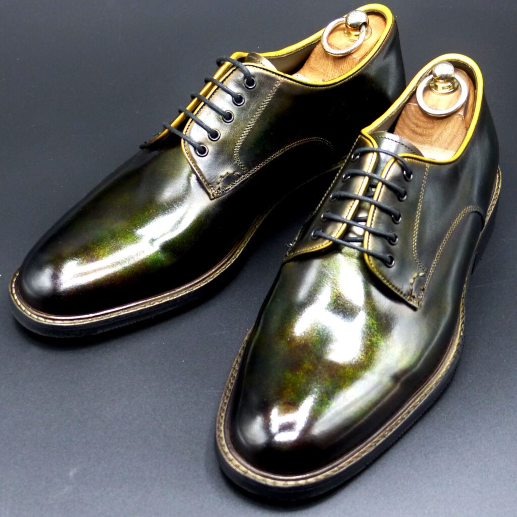
color name;
[ Yamabuki-Gasane]
山吹襲
Plaine Derby
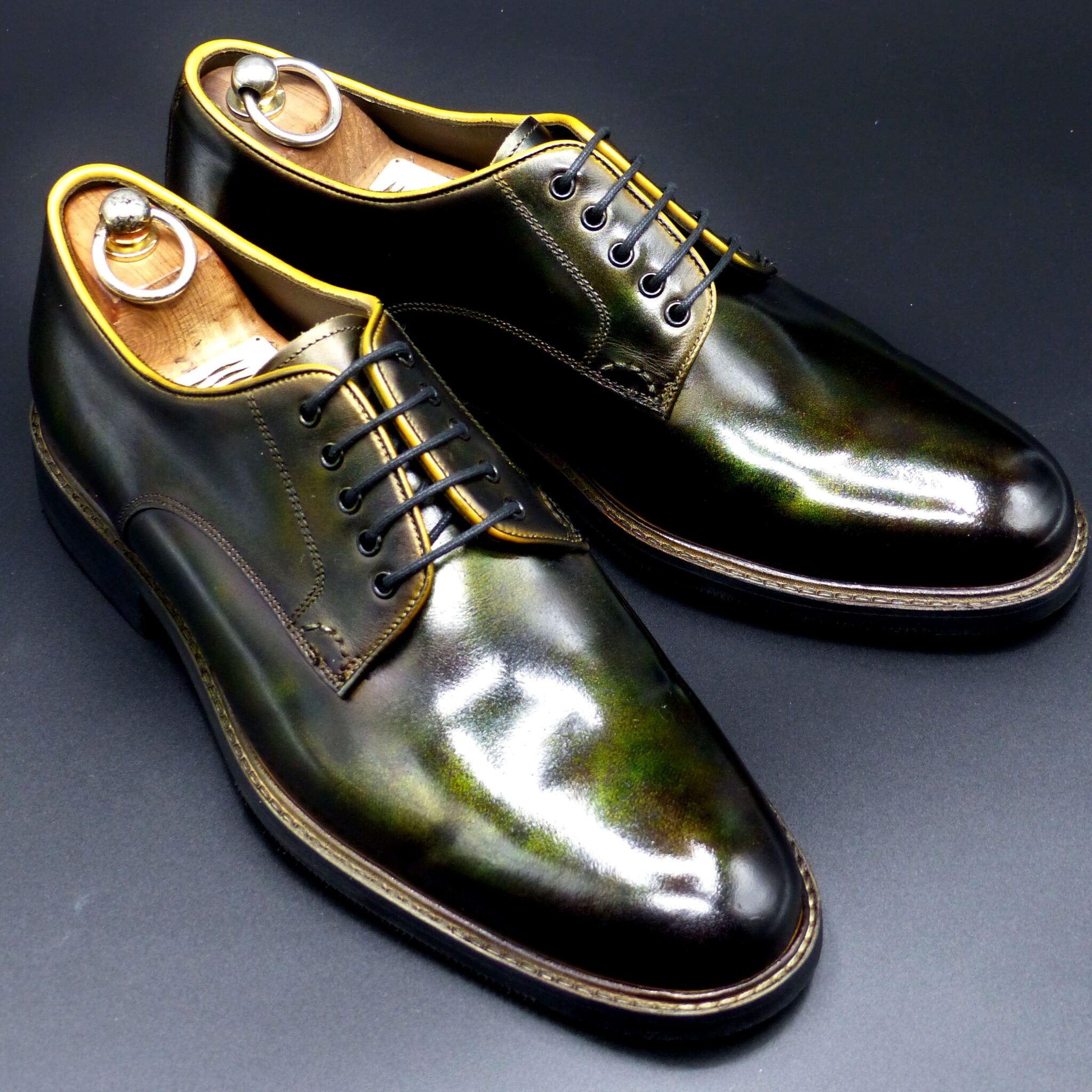
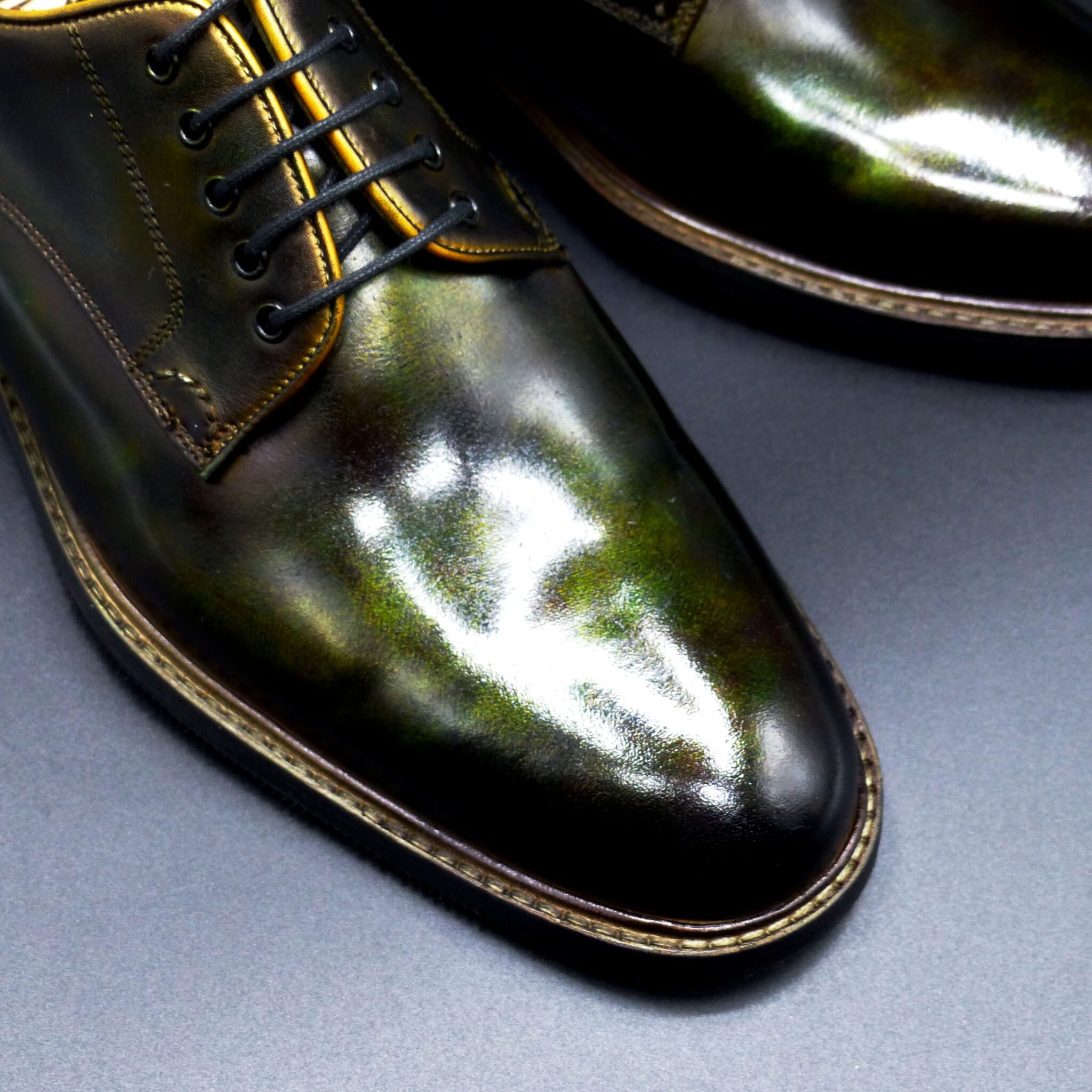
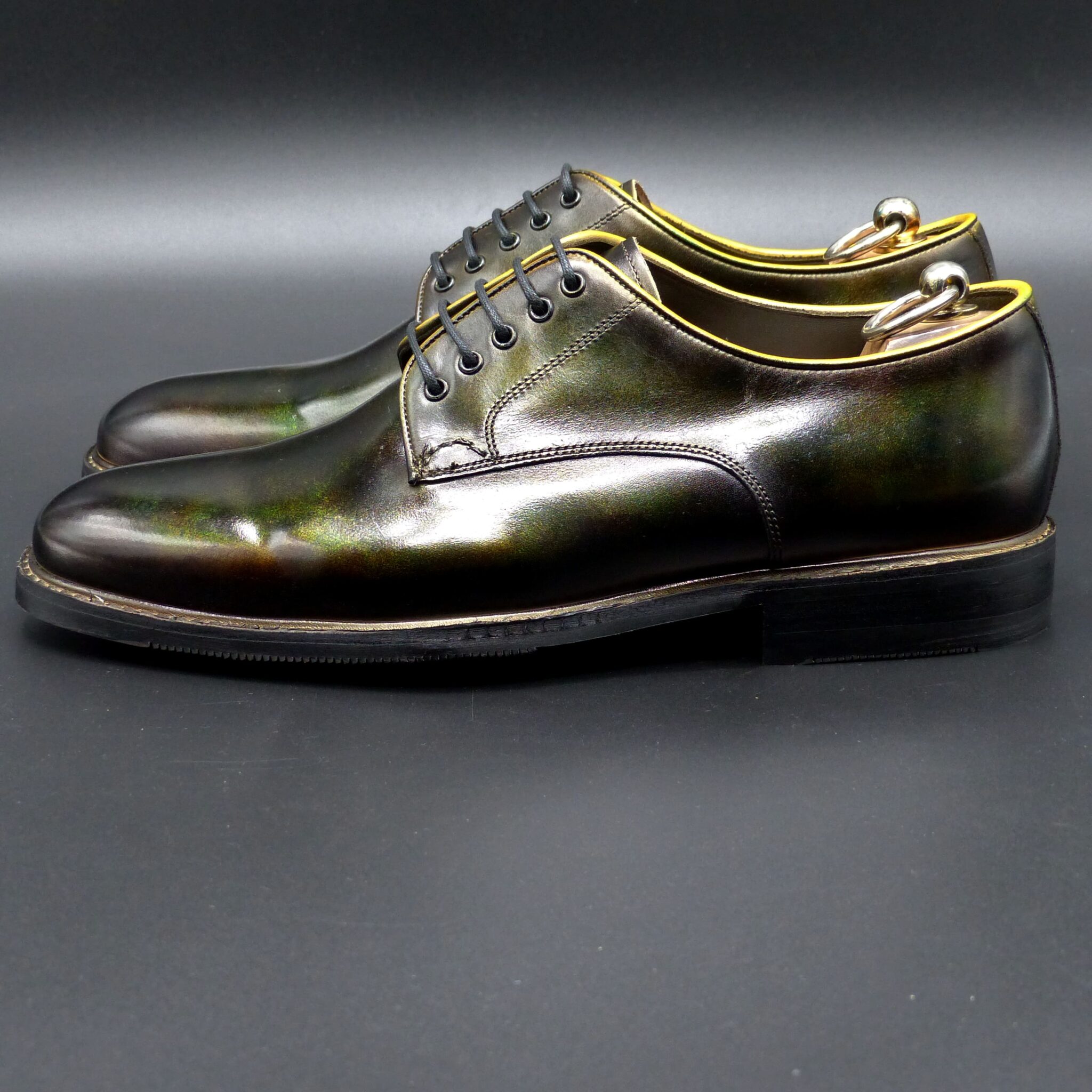
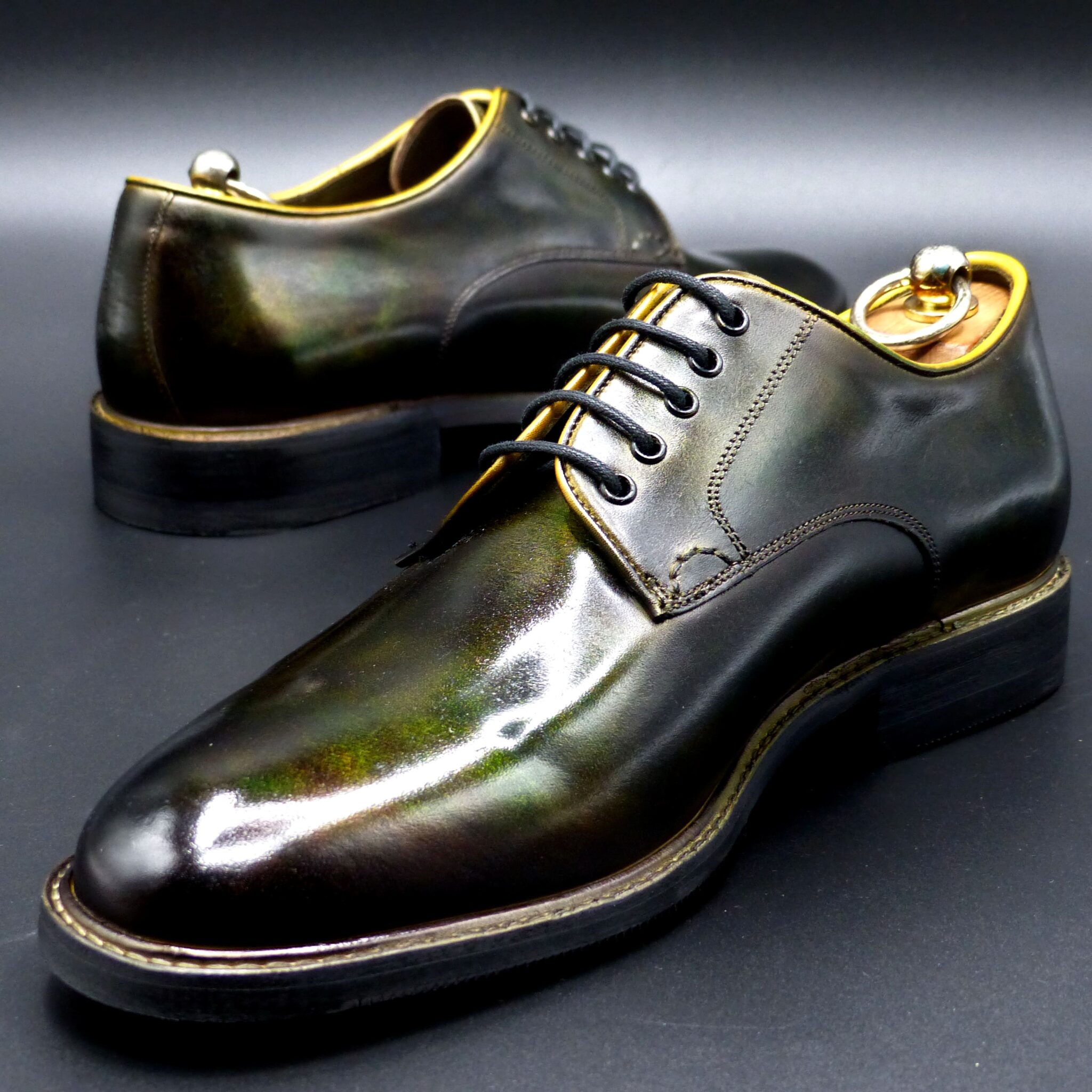
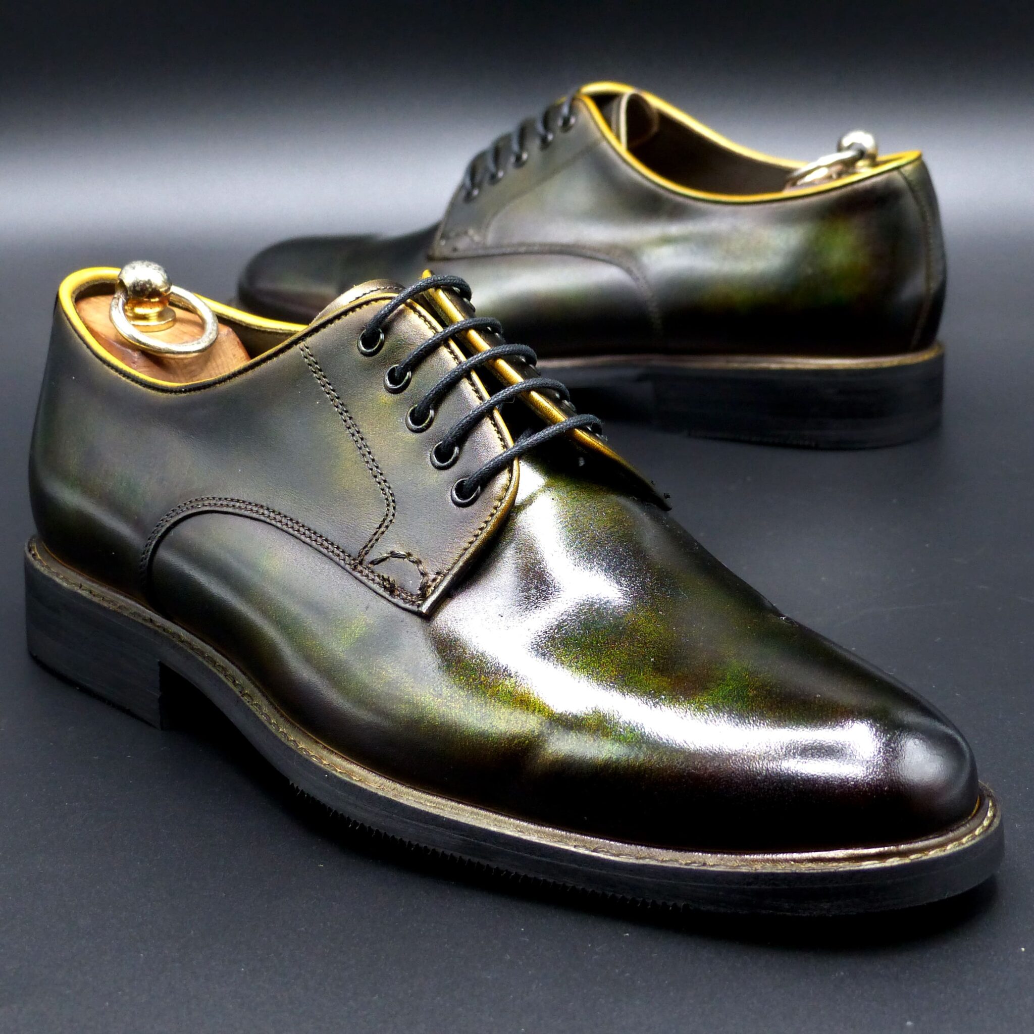

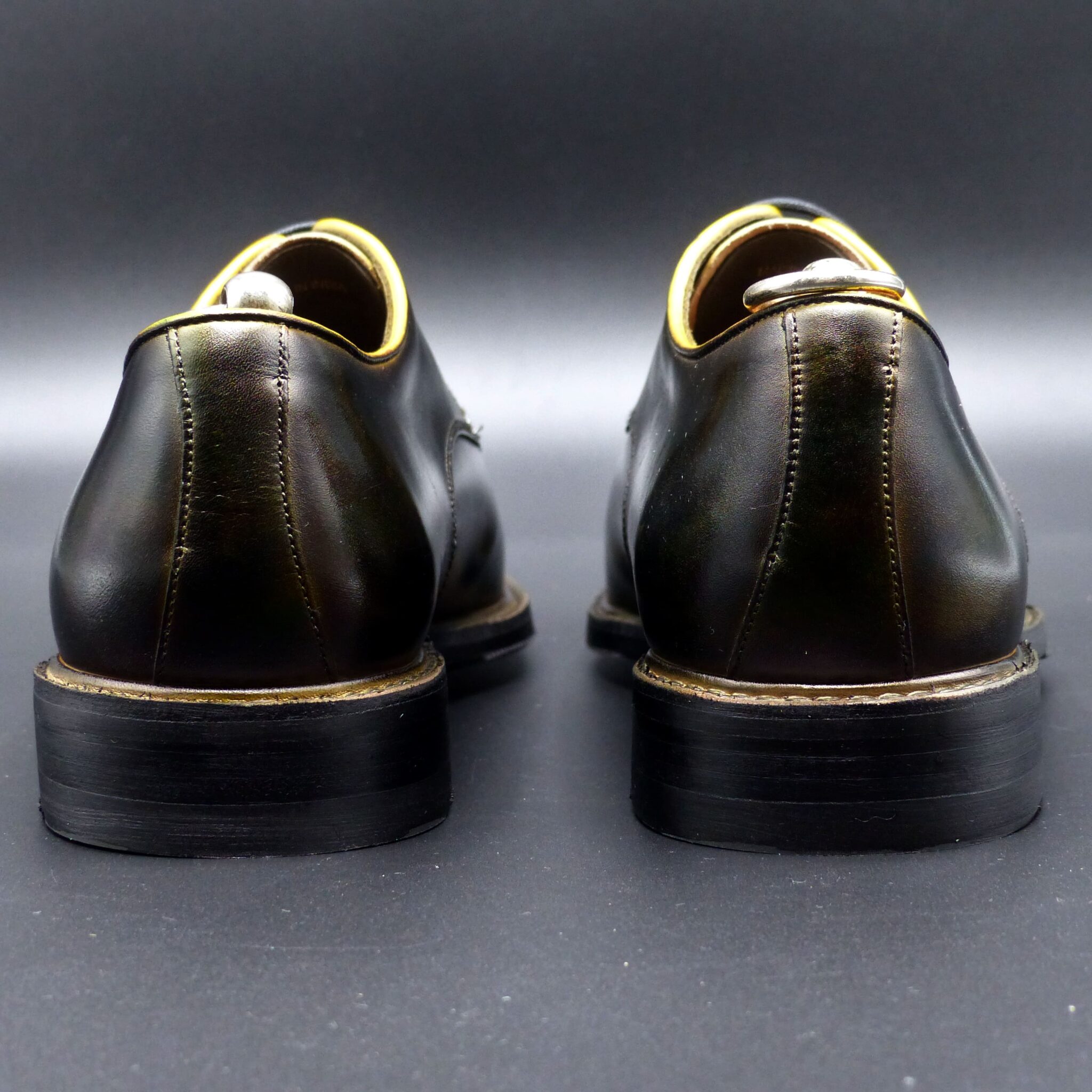
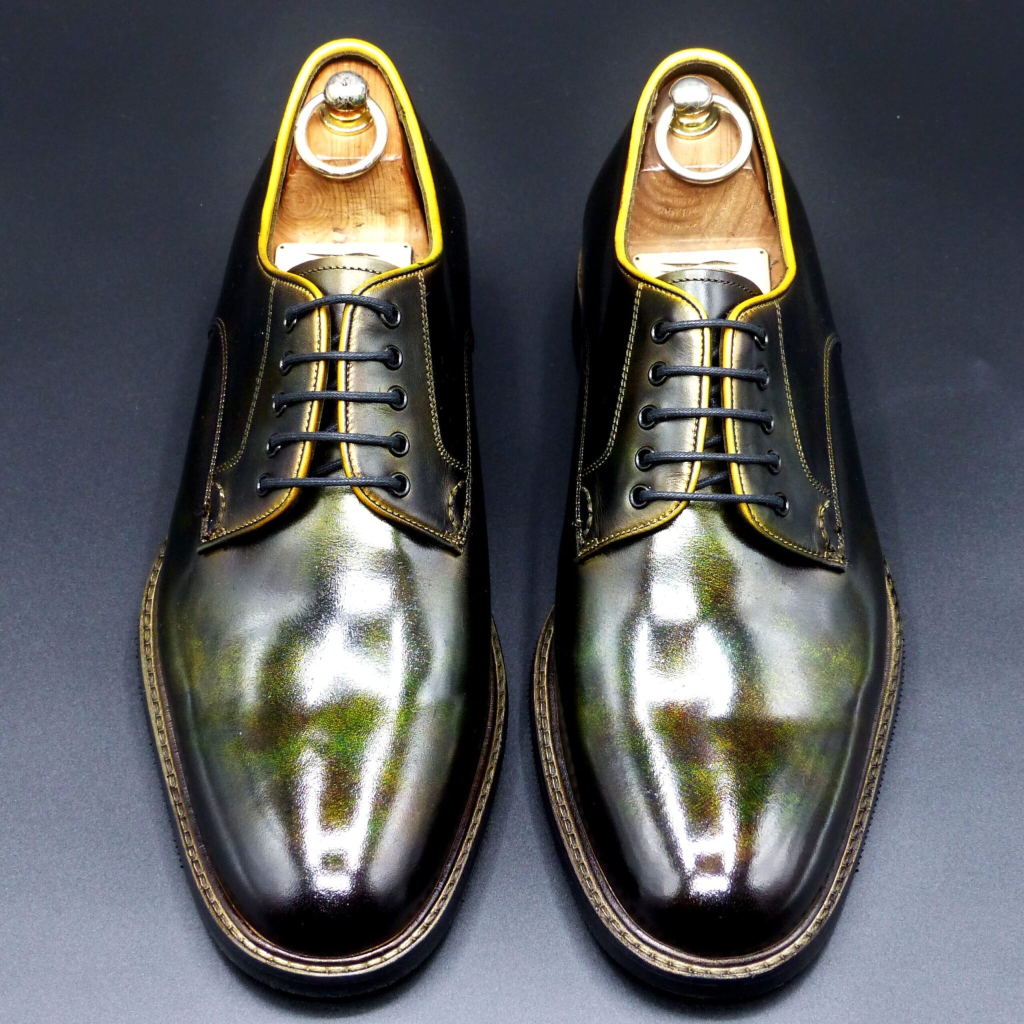
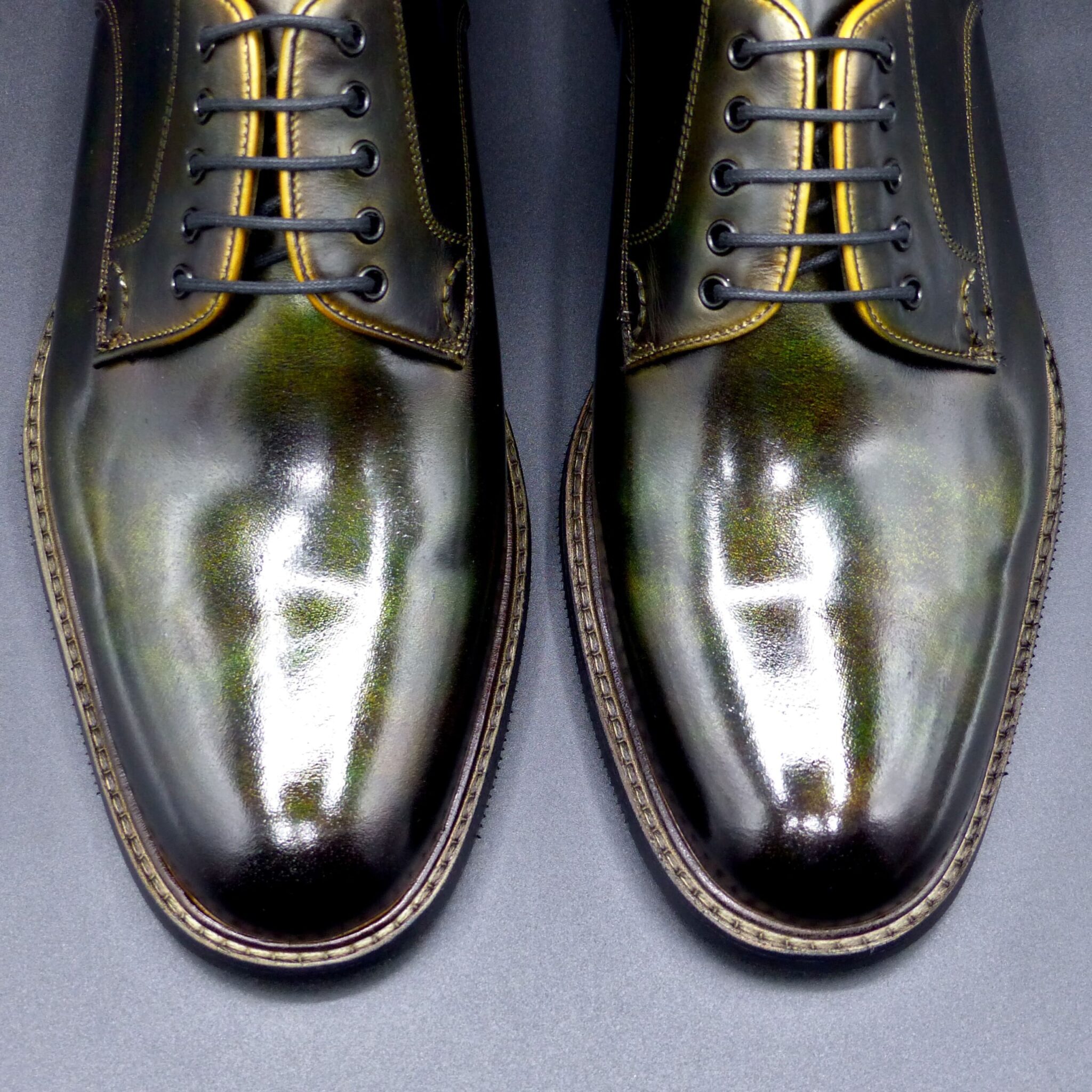
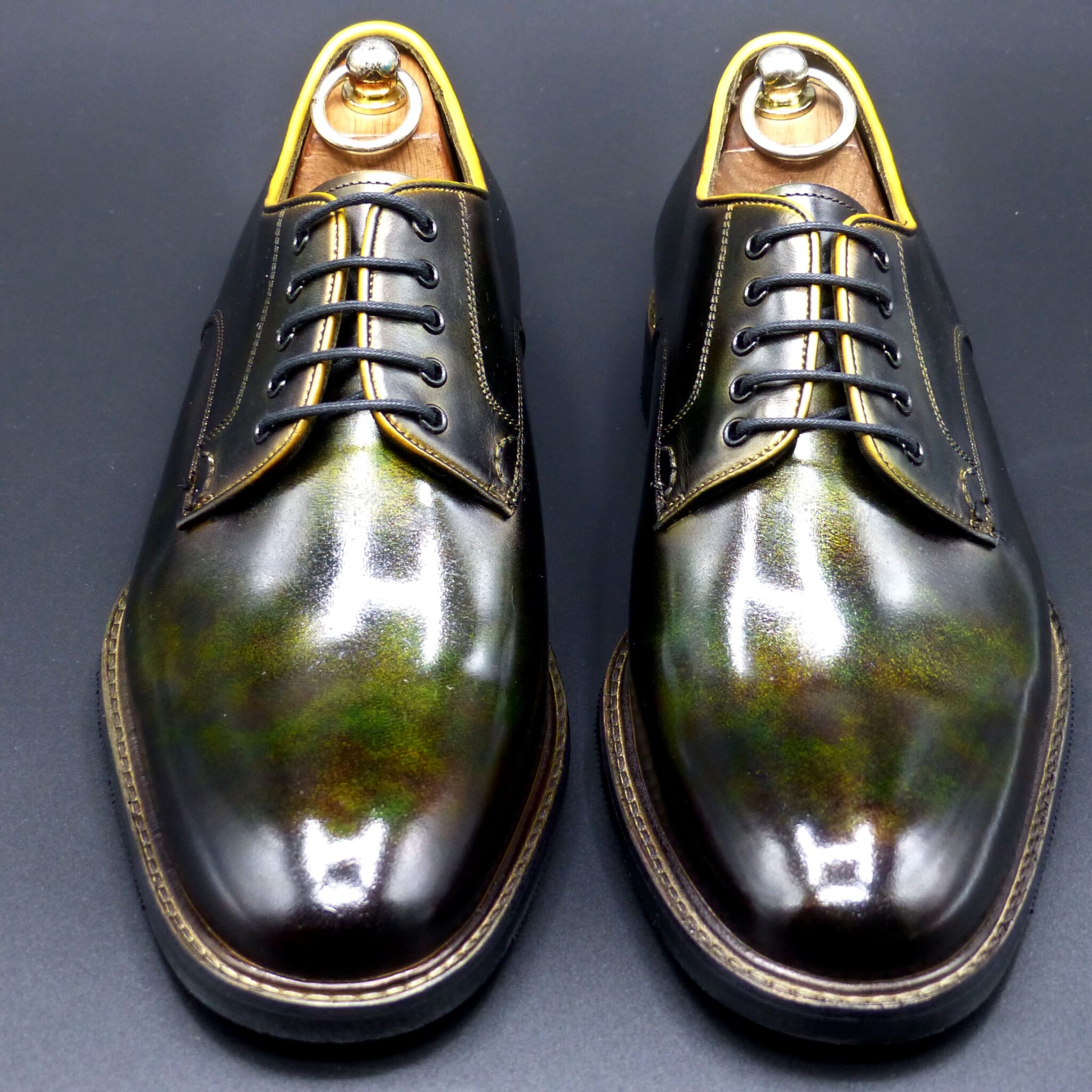
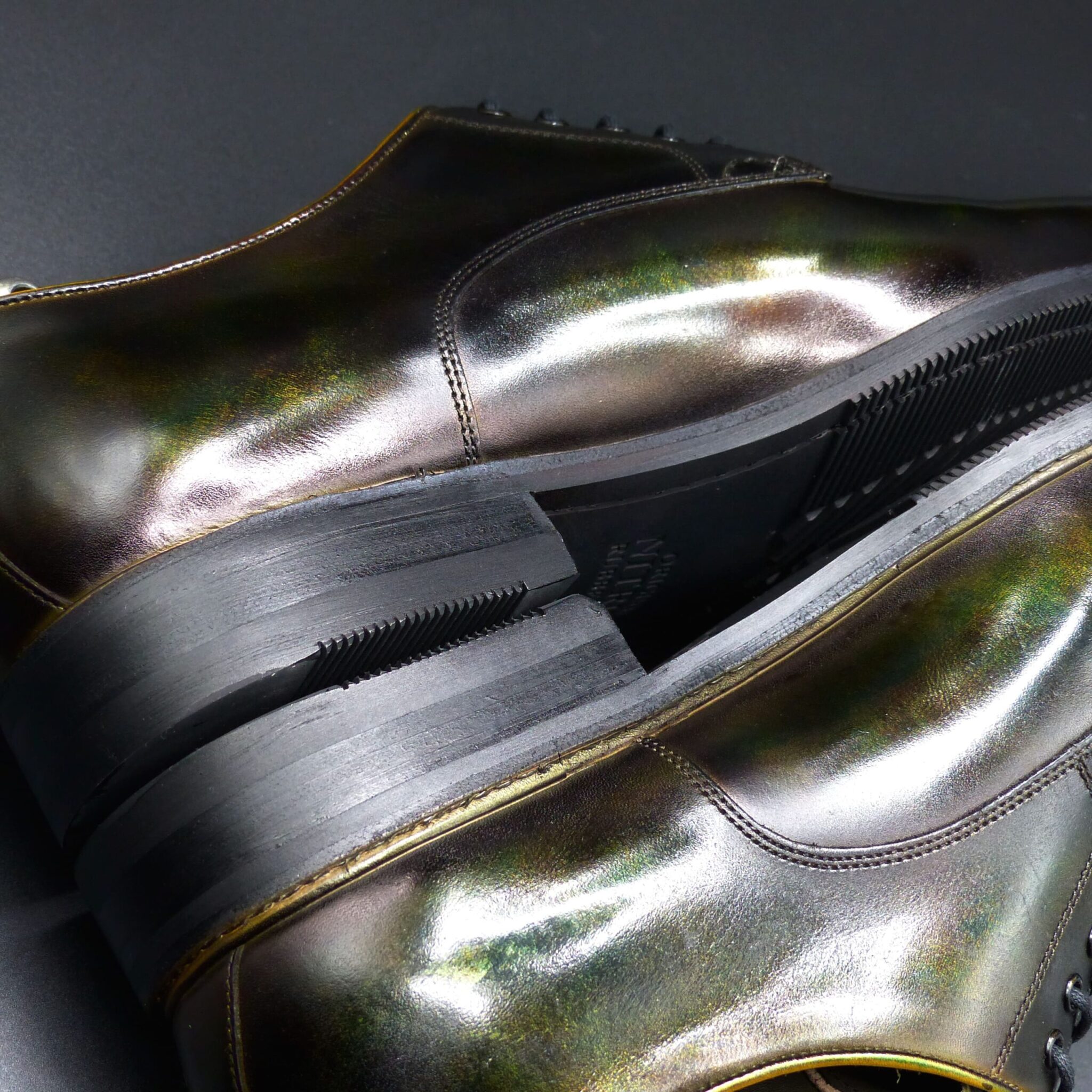


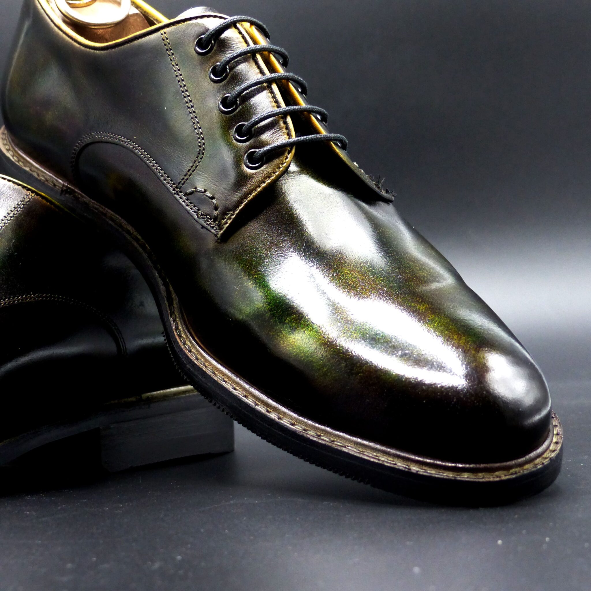
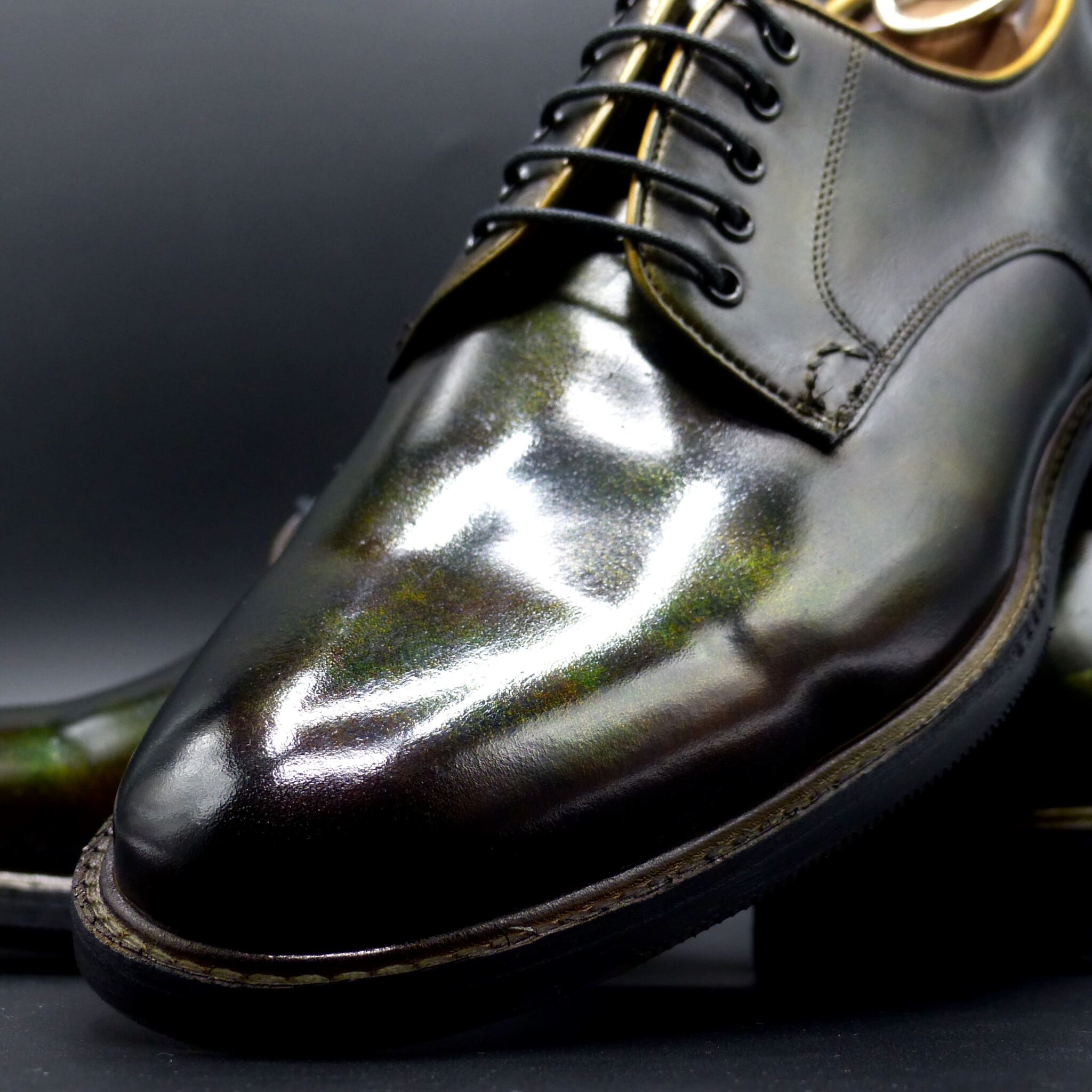
●山吹襲とは●
山吹襲は、平安時代の装束の「襲(かさね)の色目」のひとつで、春に咲く山吹の花の鮮やかな黄色と、その葉の緑色を表現した配色です。春の陽光に映える山吹の花と、新緑の葉の取り合わせを衣装に反映させた、華やかで温かみのある色の組み合わせです。
ー山吹襲の色構成ー
表(おもて):山吹色(明るい黄色・金色がかった黄色)
裏(うら):緑(若草色や萌黄色)
このように、外側には黄色を、内側には緑を配することで、風が吹いたときや袖口から、山吹の花と葉が重なったような美しい色の対比が生まれるのです。
▴山吹襲の象徴するもの▴
春の訪れと生命の息吹
華やかさと上品さの調和
源氏物語「竹河」に登場し、貴族の美意識を象徴
特に『源氏物語』では、「竹河」の場面で描かれ、桜を眺める女性たちの衣装として登場します。春の優雅な情景を引き立てる、鮮やかでありながら品のある色の重なりとして、平安貴族たちに愛されました。
山吹襲は、単なる黄色と緑の組み合わせではなく、春の空気や光までも映し出す、繊細な美意識の結晶なのです。
Yamabuki-gasane (山吹襲) – The Layered Colors of Yamabuki
Yamabuki-gasane is one of the Kasane no Irome (layered color combinations) from the Heian period, representing the vivid yellow of the yamabuki (Japanese kerria) flower and the green of its leaves. This color combination reflects the bright yellow of the flower and the fresh green of the leaves, capturing the vibrancy of spring sunlight and the harmonious blend of nature’s hues in a garment. It creates a lively, warm, and elegant visual effect.
Color Composition of Yamabuki-gasane
- Outer layer (omote): Yamabuki-iro (bright yellow, tinged with gold)
- Inner layer (ura): Green (young grass color or pale green)
By placing yellow on the outside and green on the inside, the combination creates a beautiful contrast, as if the yamabuki flower and its leaves overlap, especially when wind rustles the fabric or when seen from the sleeve openings.
What Yamabuki-gasane Symbolizes
- The arrival of spring and the breath of life
- A harmonious balance of vibrancy and elegance
- The symbol of noble aesthetic values, as depicted in The Tale of Genji
In particular, The Tale of Genji features this color in the “Takekawa” (Bamboo River) chapter, where women watching the cherry blossoms wear garments in this color combination. The vibrant yet refined overlapping hues highlight the graceful spring scenery, and the color became beloved by Heian aristocrats.
Yamabuki-gasane is not simply a combination of yellow and green; it is a delicate embodiment of the spring atmosphere, capturing both the light and air of the season, and reflecting the refined beauty of the time.
プレーン・オックスフォード
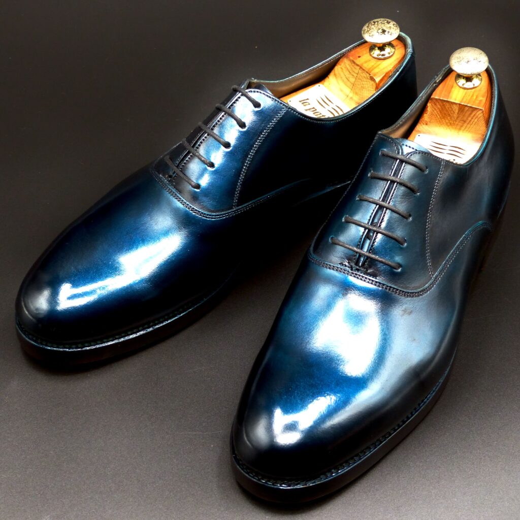
color name;
[ Seido]
青銅
Plaine Oxford
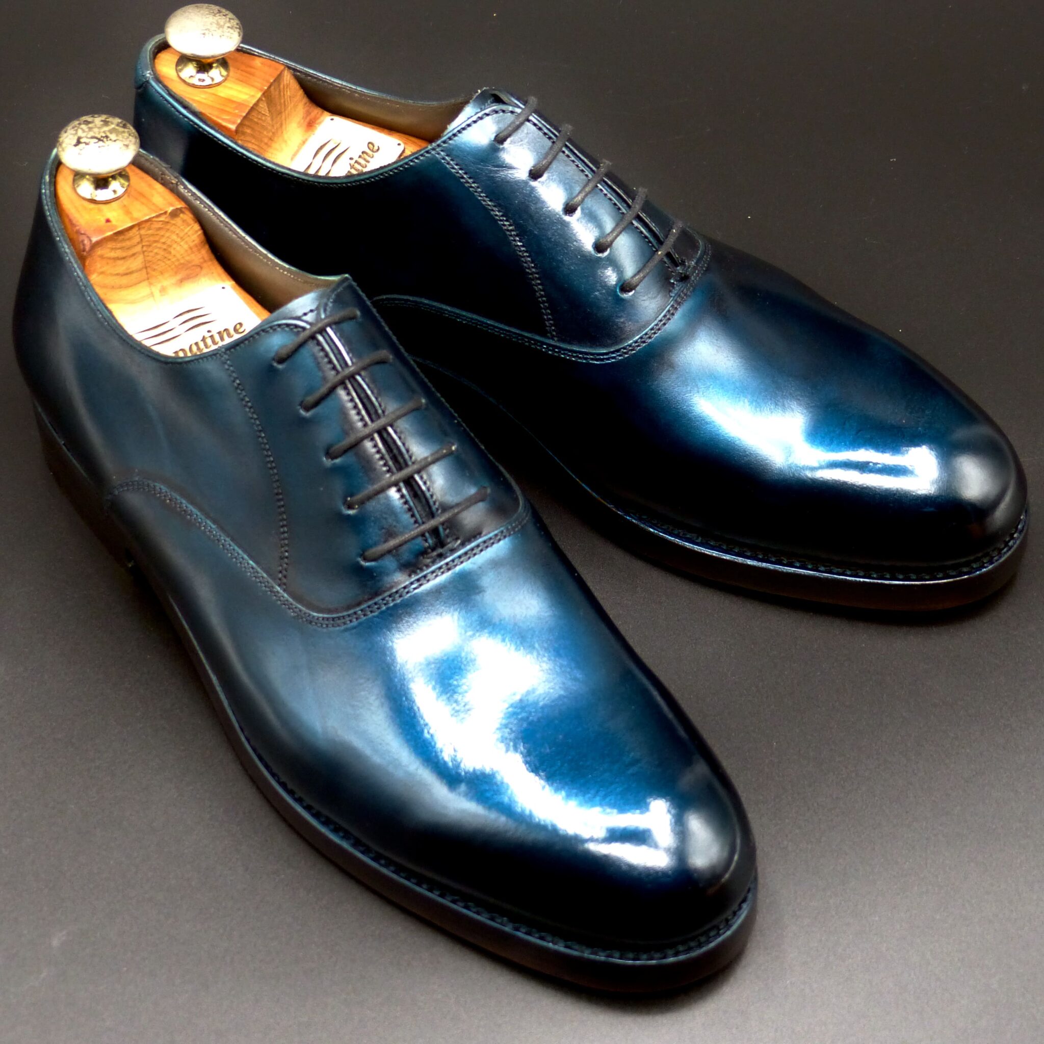
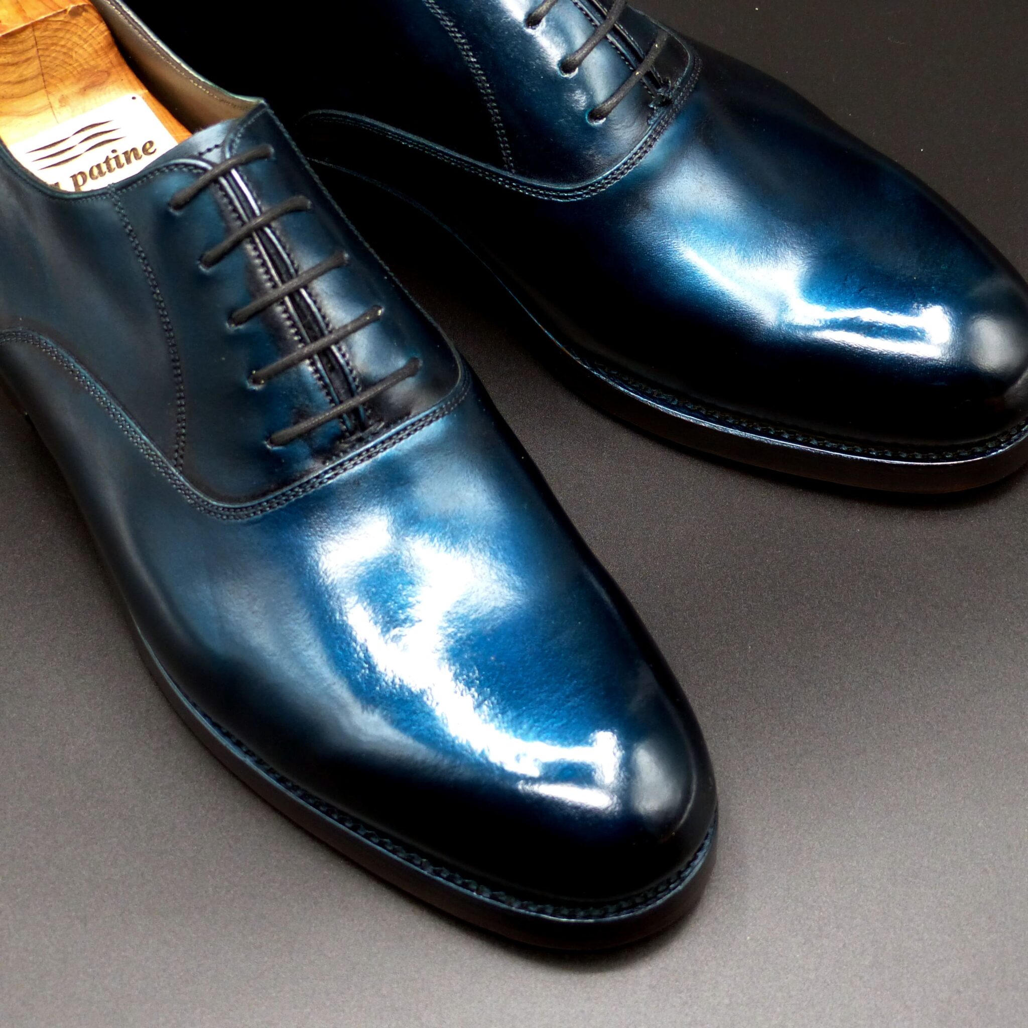
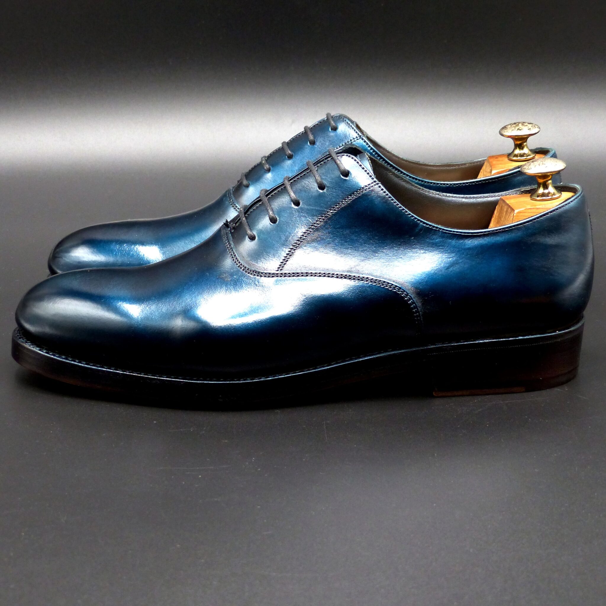
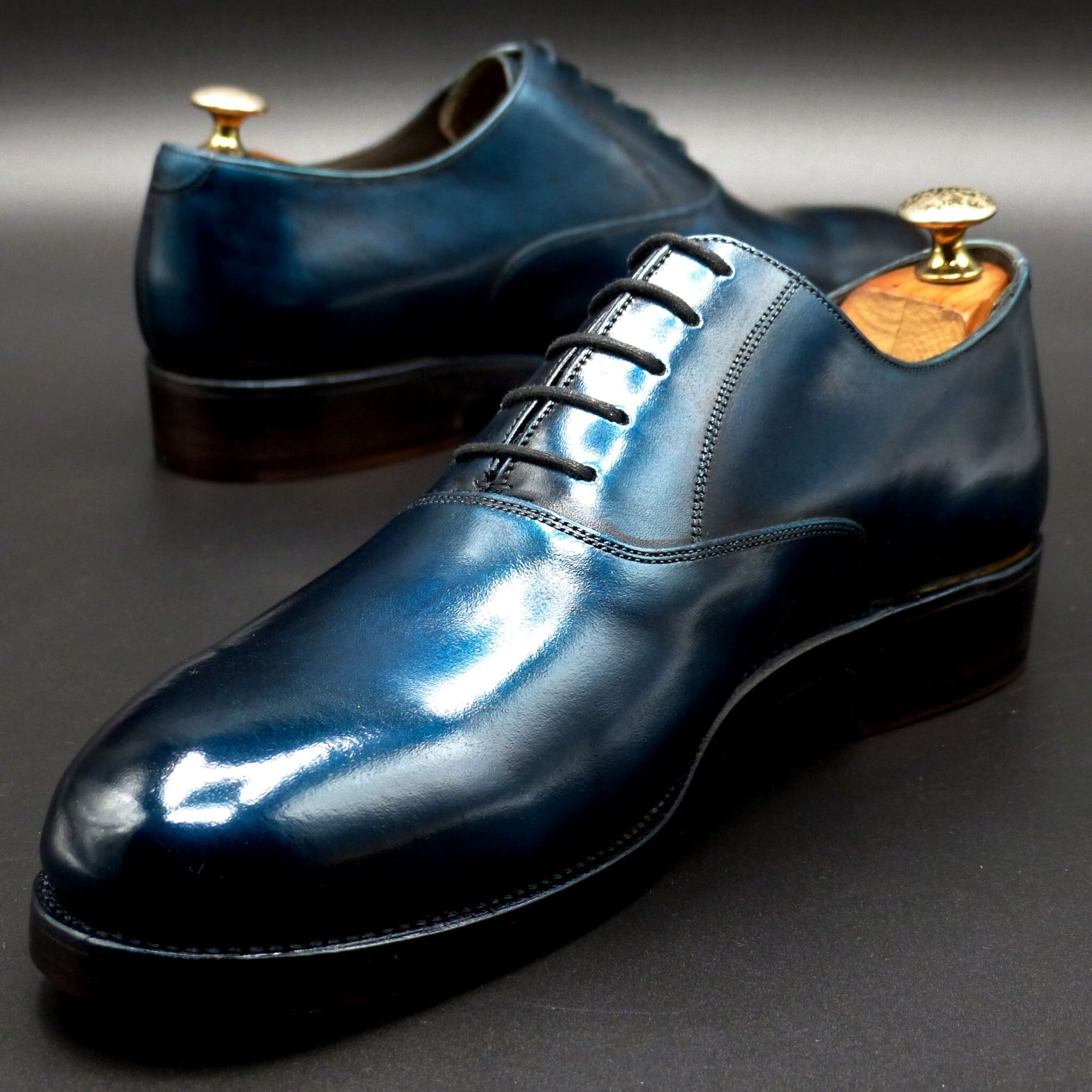
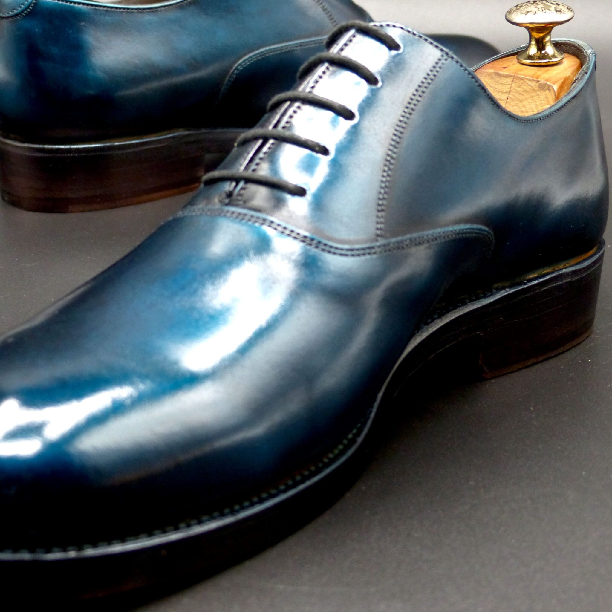
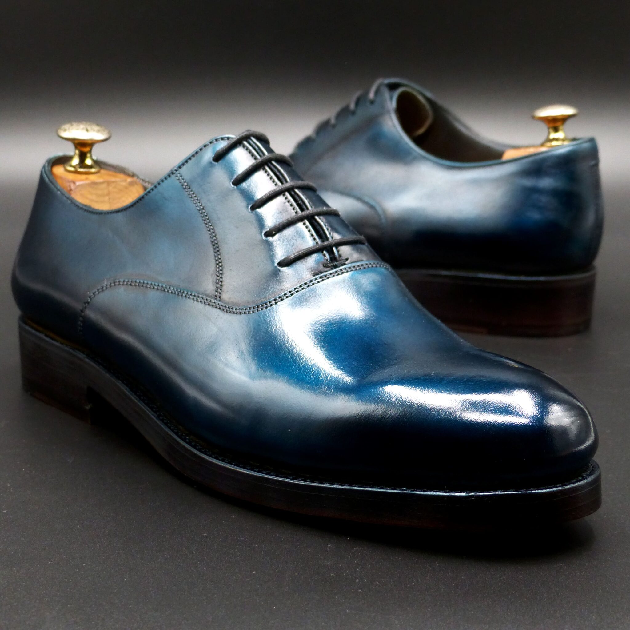
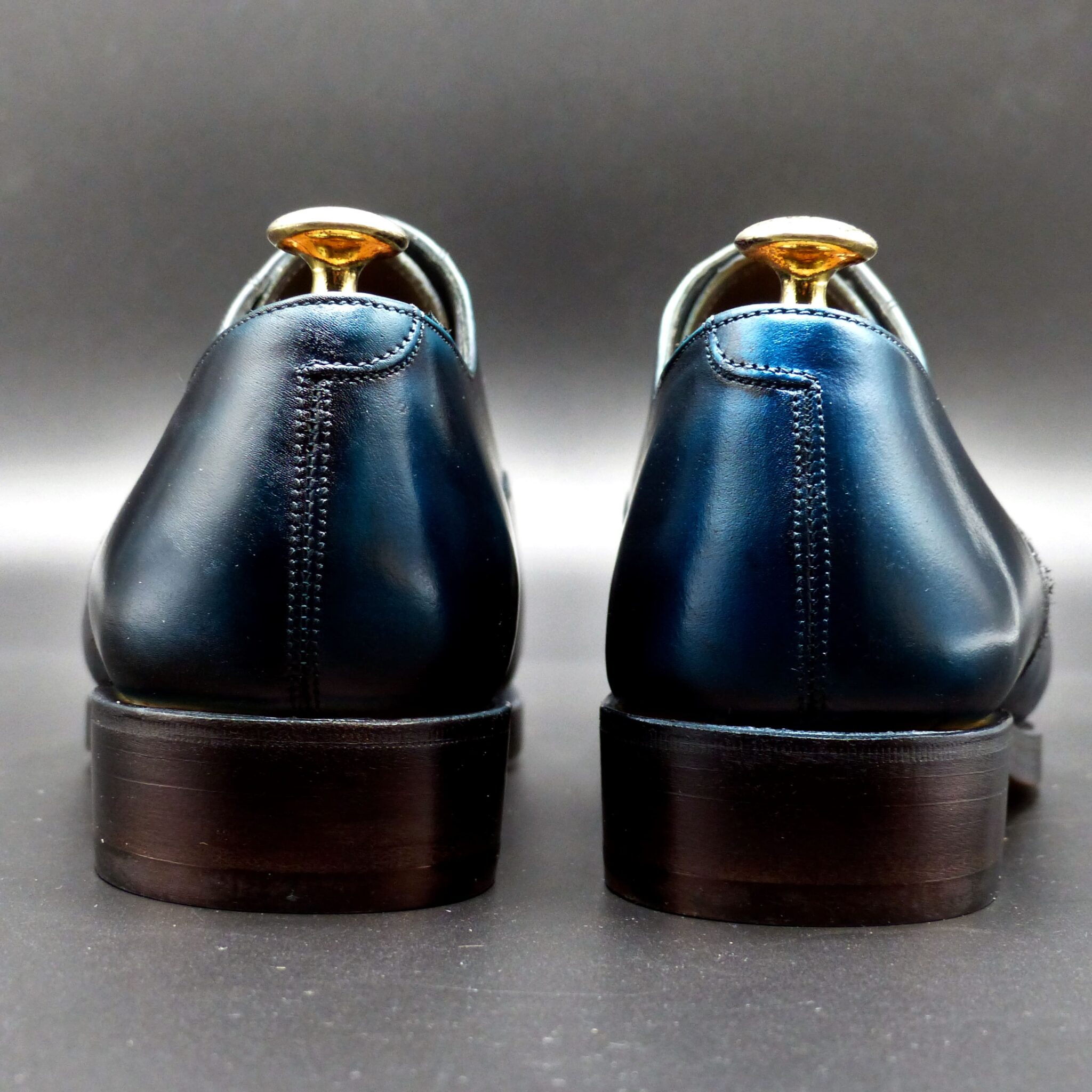

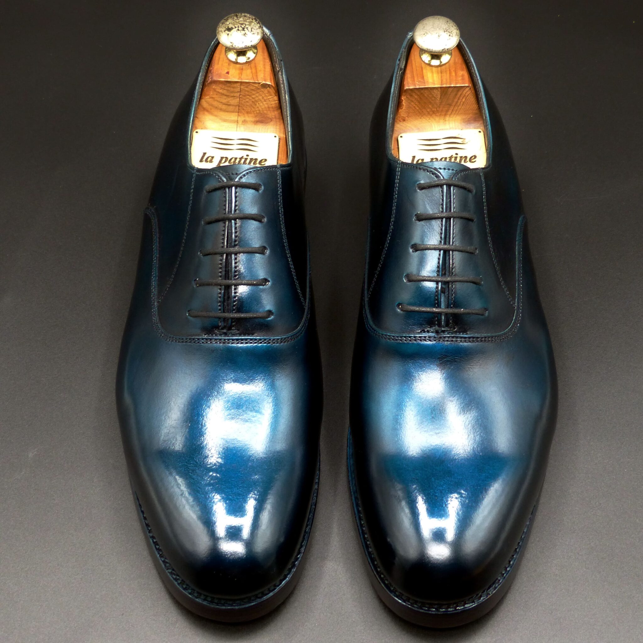
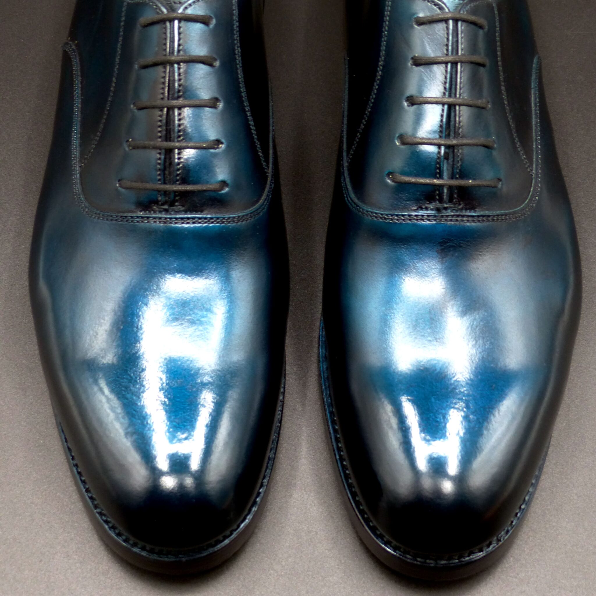
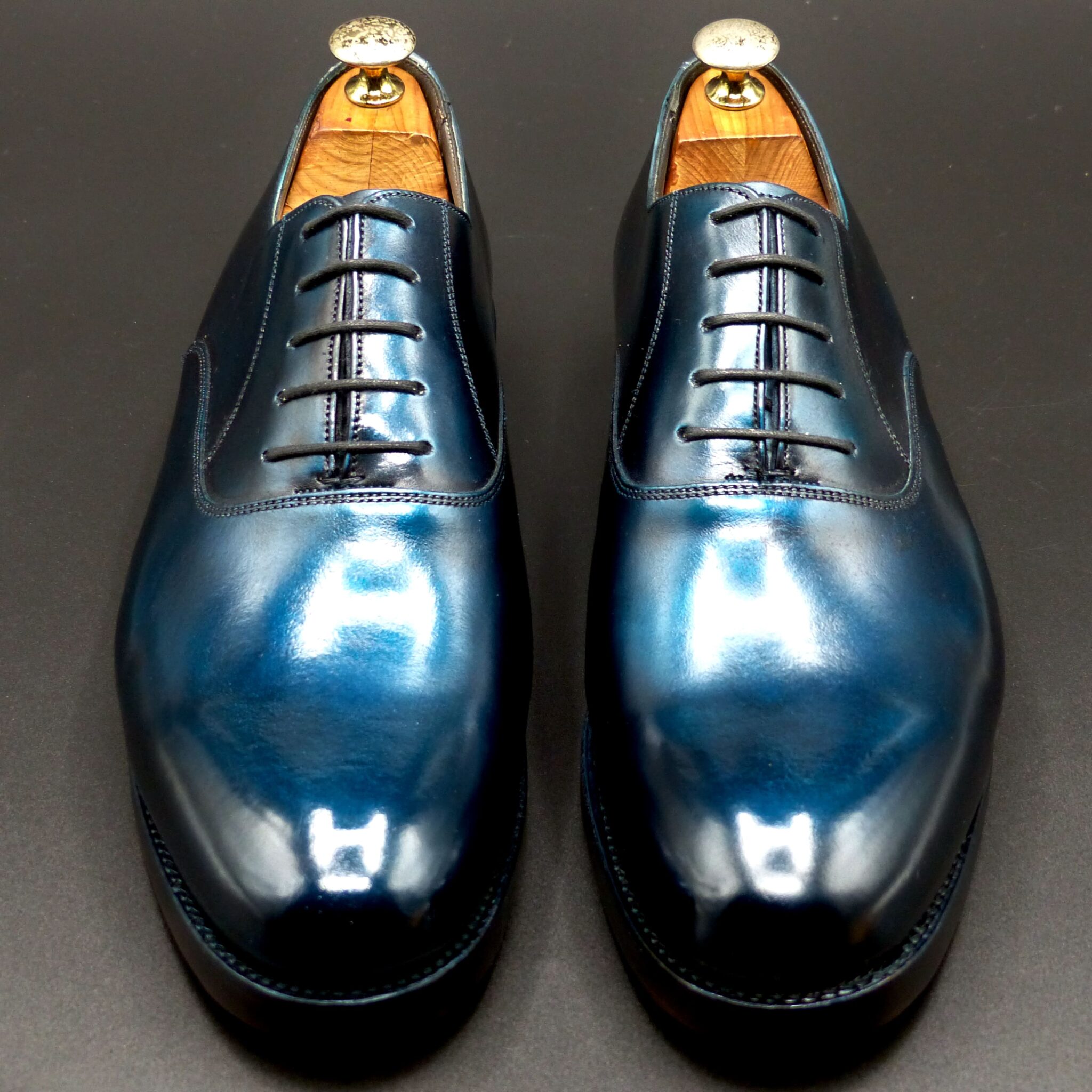
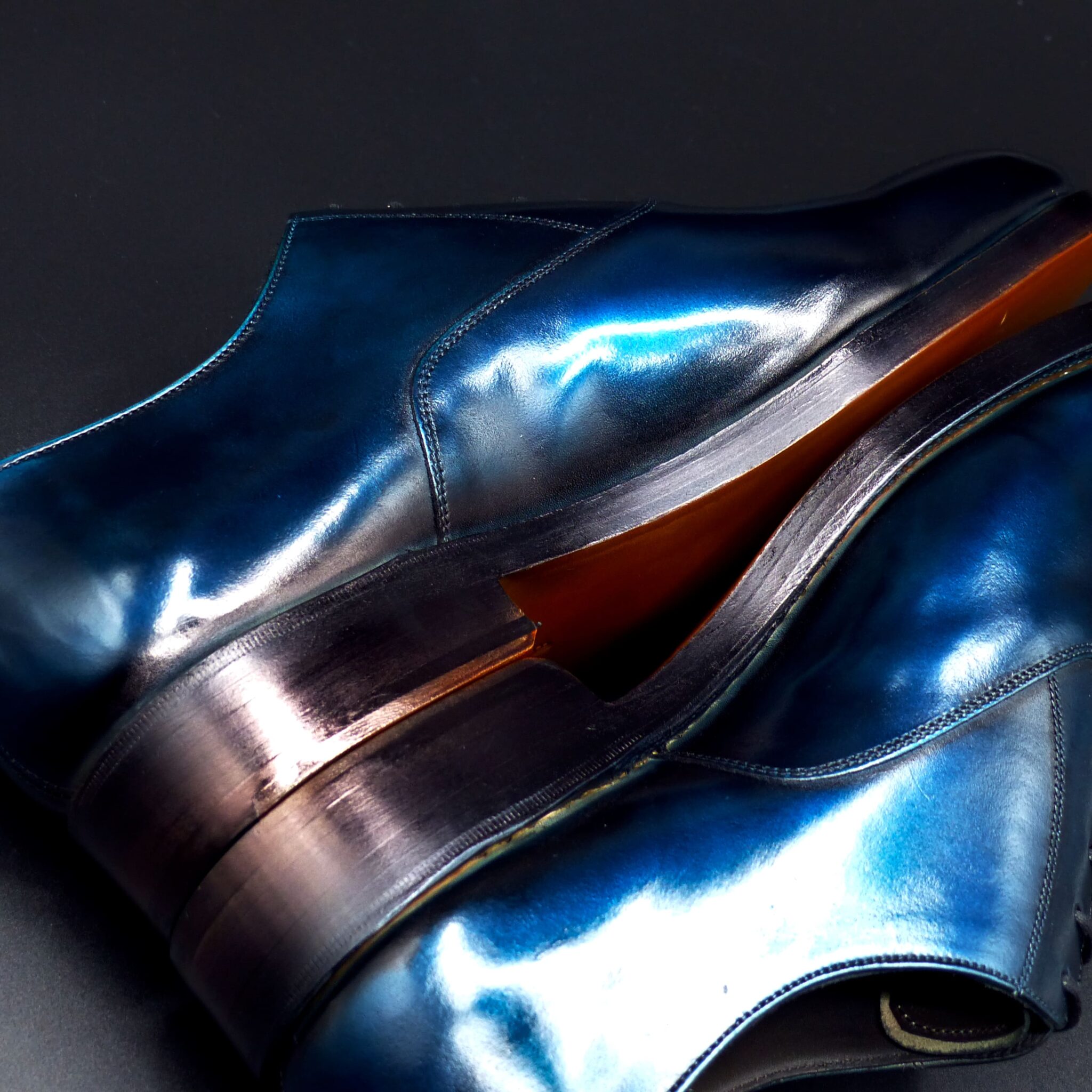
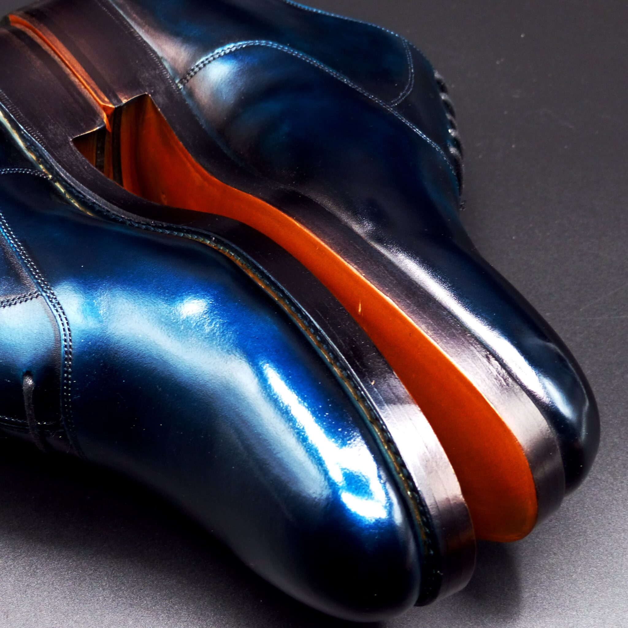
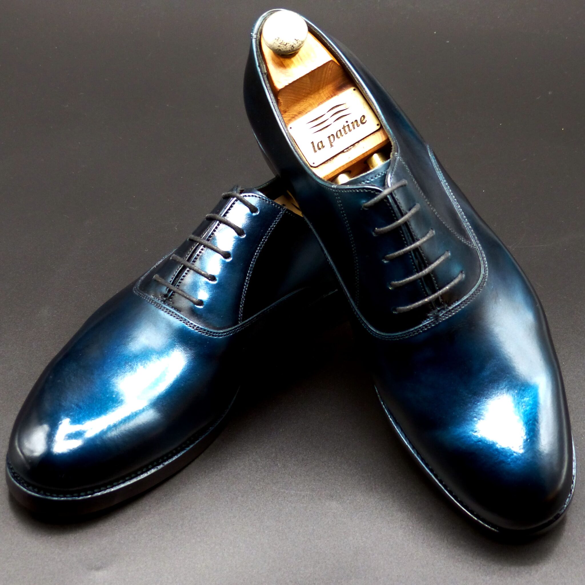
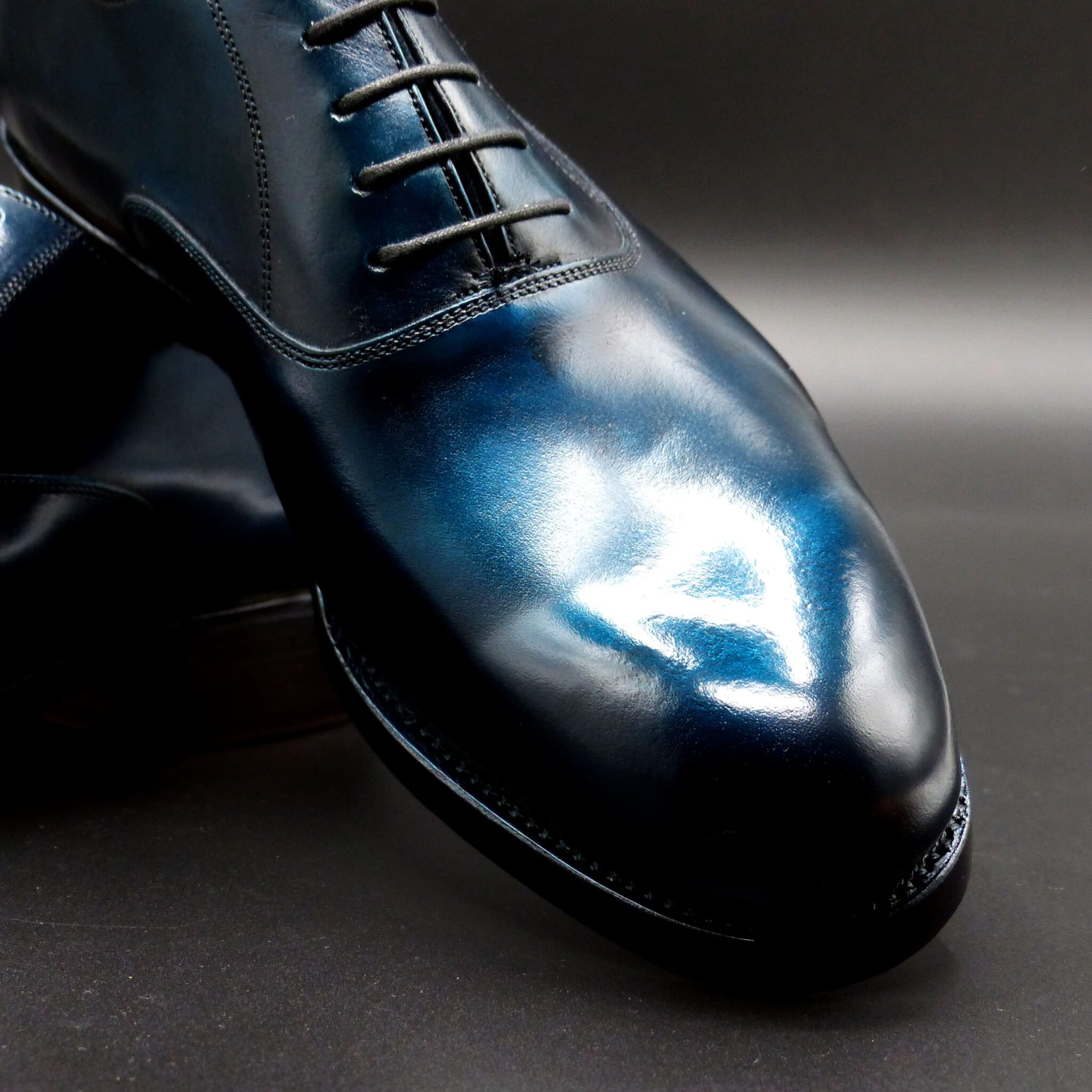
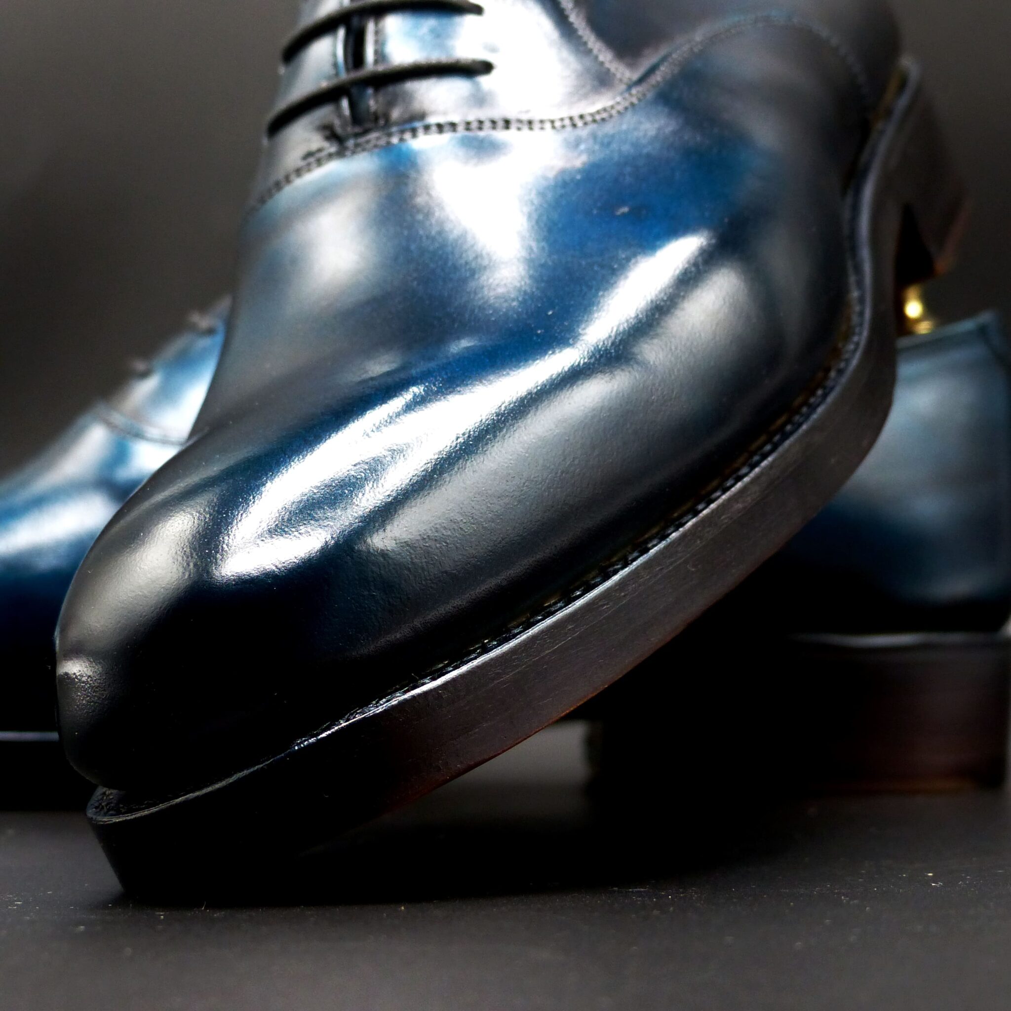
青銅(せいどう)とは?
青銅は、主に銅に錫(すず)を加えて作られる合金で、古代より金属器や装飾品に用いられてきました。青みを帯びた落ち着いた金属の光沢が特徴で、時の経過とともに渋く変化していくその風合いは、単なる素材以上の意味を持っています。
色校正(色の特徴)
青銅色は、金属ならではの奥行きと、経年変化による味わい深さが特徴です。
- 色調:青みを帯びた緑灰色〜鈍い金属光沢のある灰青色
- 近似色:緑青(ろくしょう)、鈍色(にびいろ)、千歳緑
- 変化:年月とともに酸化し、緑青(パティナ)をまとっていく
古代日本では、これらの変化そのものが「時の美」として捉えられていました。
象徴するもの
神聖と威厳の象徴
- 青銅は、弥生時代の銅鐸(どうたく)や銅剣など、祭祀や権威の象徴として使われていました。
- その冷たく青い輝きは、天と地をつなぐ神秘的な力を宿すものとされ、神具や宝物にも用いられました。
時間の重なりと変化の美
- 青銅は空気や湿度と反応して表情を変えるため、「変化を受け入れる美意識」の象徴でもあります。
- 風雨にさらされて緑青をまとうその姿は、移ろいゆく自然との調和を体現しています。
調和と均衡の精神
- 銅と錫、場合によっては鉛など、異なる素材が調和して生まれる青銅は、異なる要素がひとつになることの象徴でもありました。
- これは、日本古来の**「和」や「中庸」**の価値観とも重なります。
古代日本における青銅
青銅の文化は、弥生時代に大陸から伝来し、日本独自の進化を遂げました。
- 銅鐸・銅剣・銅矛などは、祭祀や儀礼で使われる神聖な道具として位置づけられ、稲作文化や祖霊信仰と深く結びついています。
- また、奈良時代以降には仏像や仏具にも青銅が用いられ、宗教的・芸術的素材としての価値が高まりました。
その色と質感は、「強さ」と「静けさ」、「技」と「祈り」を併せ持つものとして、日本人の精神性の中に深く根付いています。
まとめ
青銅色は、単なる金属の色を超えて、日本人の祈り・美意識・調和の心を象徴する色です。
それは時の流れとともに変化し、深みを増しながら、今もなお私たちに静かな感動を与えてくれます。
What is Seidō (Bronze)?
Seidō, or bronze, is an alloy primarily composed of copper and tin, used in Japan since ancient times for crafting ritual implements, weapons, and decorative objects. Known for its subdued blue-gray metallic sheen, bronze carries a quiet elegance that deepens over time, embodying both strength and spiritual depth.
Color Characteristics
Bronze possesses a unique color expression that evolves with age and exposure to the elements.
- Hue: Bluish green-gray to dull metallic gray-blue
- Similar Colors: Verdigris, dull gray (nibi-iro), thousand-year green (chitose-midori)
- Transformation: Develops a green patina (verdigris) over time, enhancing its depth and texture
In ancient Japan, such natural aging was not seen as deterioration but as a beautiful expression of time and harmony with nature.
Symbolism
Sacredness and Authority
- Bronze was used in the Yayoi period for ritual tools such as dōtaku (ritual bells) and dōken (bronze swords), symbolizing spiritual power and societal prestige.
- Its cool, bluish glow was believed to hold a divine quality, linking heaven and earth through sacred objects and ceremonies.
The Beauty of Time and Change
- As bronze oxidizes and ages, it takes on a patina that reflects the passing of time—symbolizing the acceptance of impermanence and the Japanese appreciation for change as a form of beauty.
Harmony and Balance
- Being a fusion of copper, tin, and occasionally lead, bronze represents unity through contrast.
- This aligns with traditional Japanese values of wa (harmony) and chūyō (balance and moderation).
Seidō in Ancient Japan
Bronze was introduced to Japan during the Yayoi period via the Asian continent and quickly took root in Japan’s spiritual and cultural landscape.
- It was used to craft ritual artifacts like dōtaku, which were deeply connected to agricultural rites and ancestral worship.
- In later periods such as Nara and Heian, bronze became a key material for Buddhist statues and ritual implements, enhancing its role as both a sacred and artistic medium.
Bronze came to embody not just technical skill, but also spiritual reverence and the Japanese worldview of coexistence with nature.
Conclusion
Seidō, or bronze, is far more than a material—it is a color and substance that reflects the Japanese spirit, symbolizing prayer, transformation, and harmony.
Its quiet strength and evolving beauty continue to resonate deeply with those who seek meaning in the passage of time.
シングル・モンク
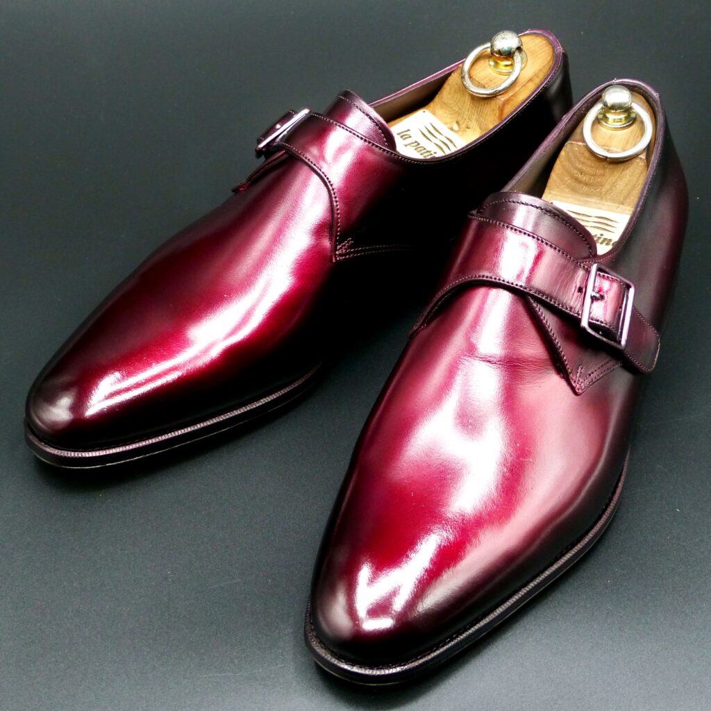
color name;
[ Akasuke]
赤透
Single Monk
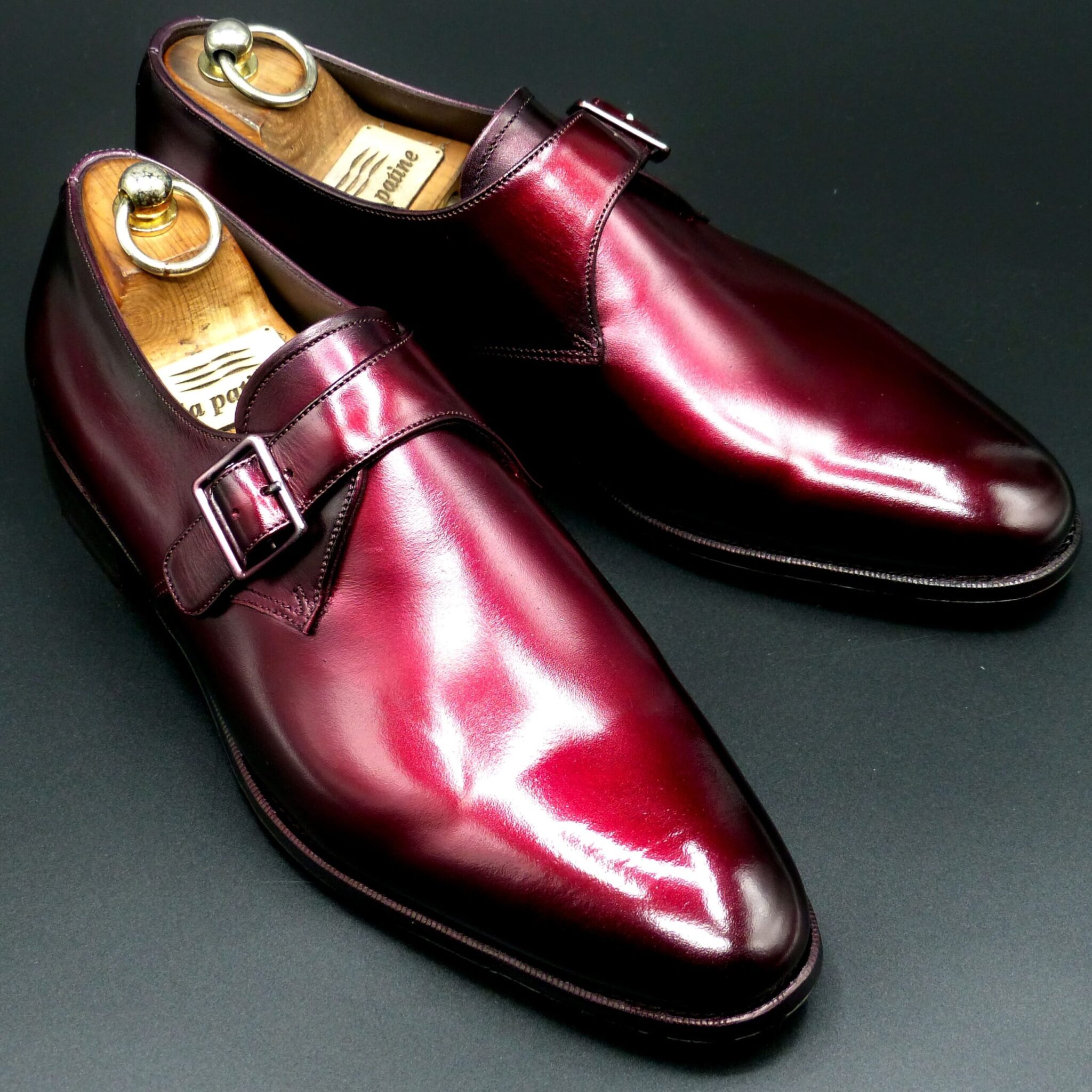
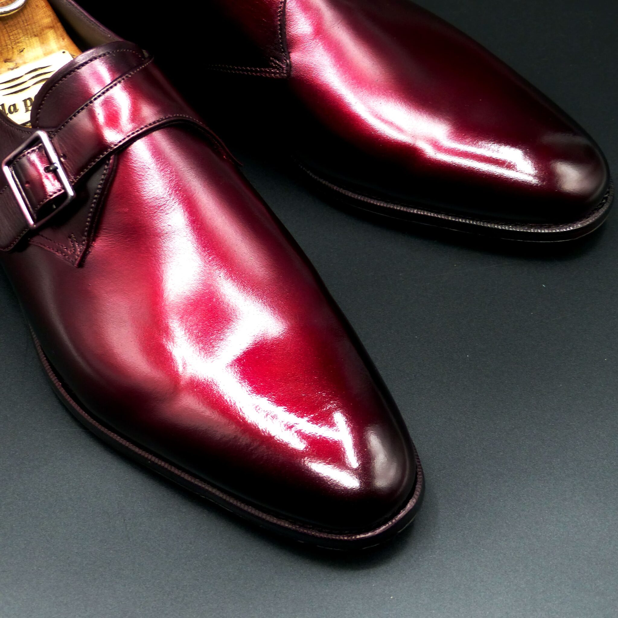
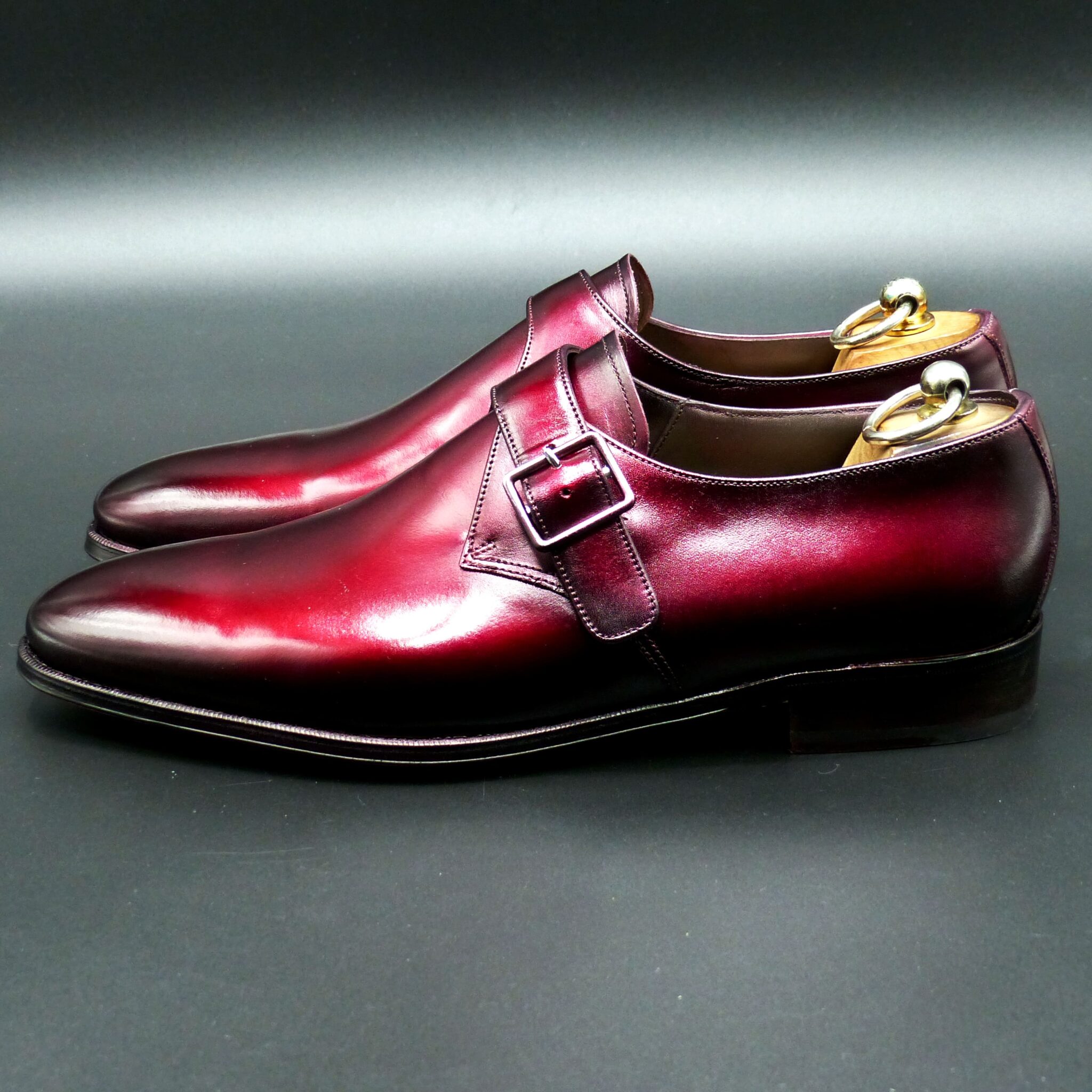
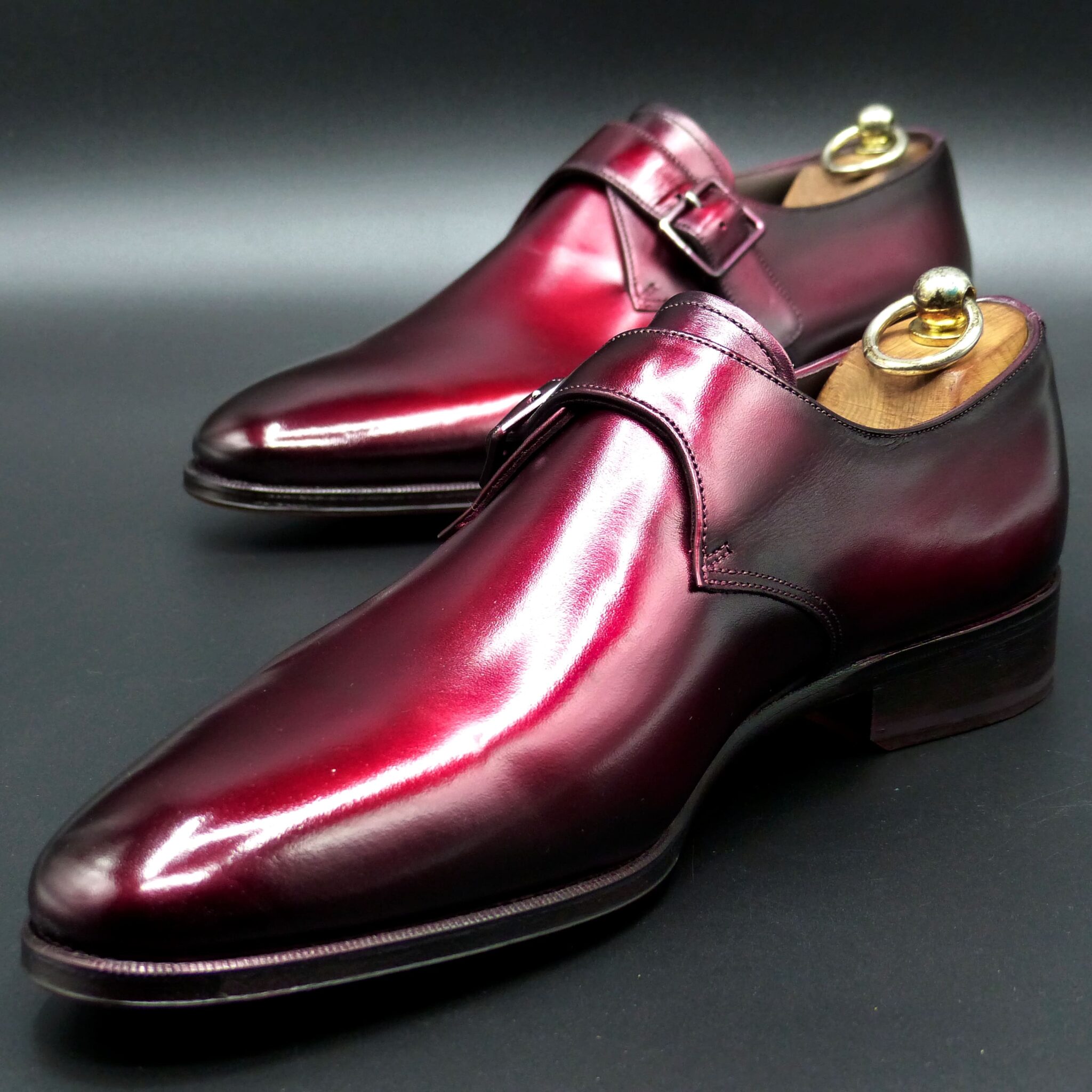
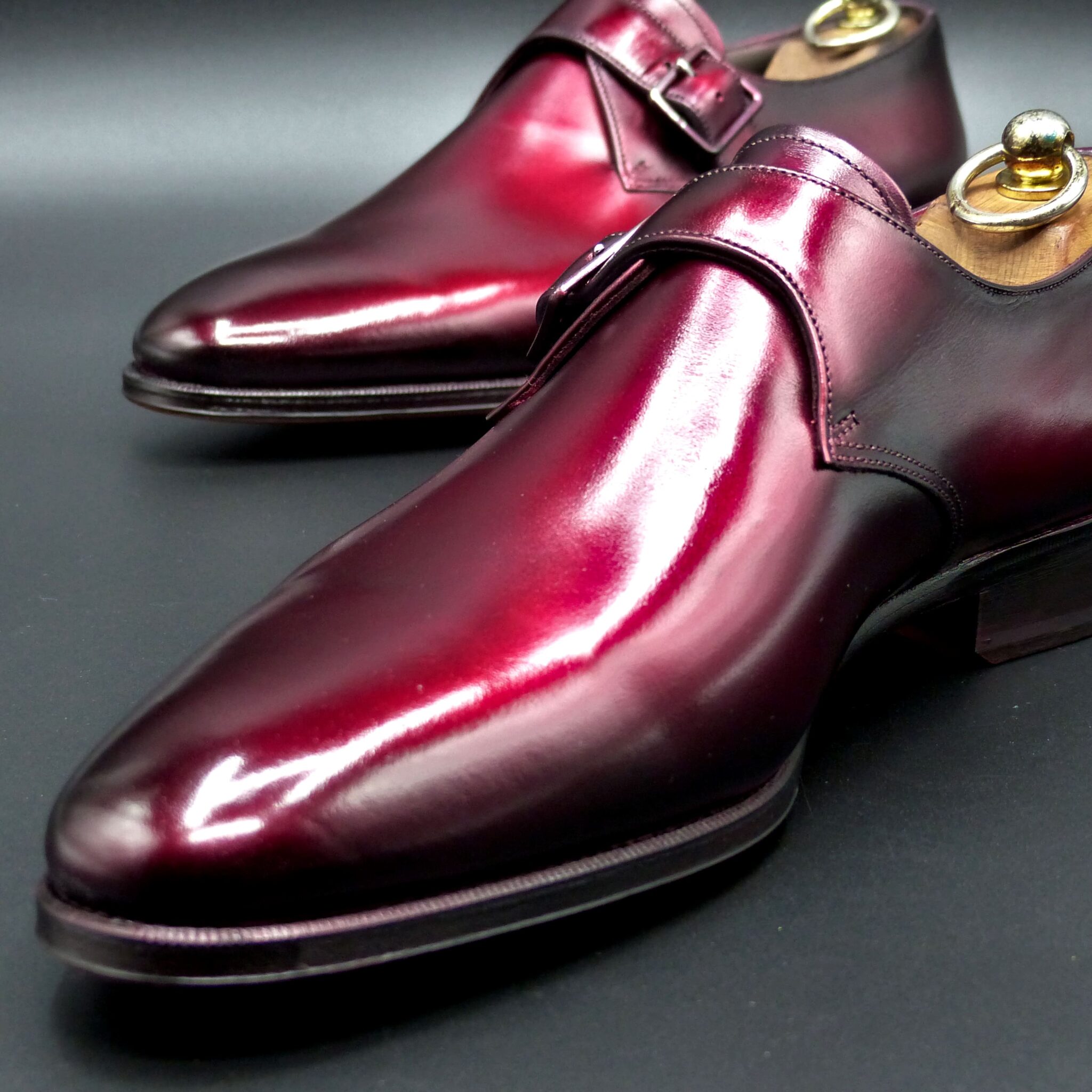
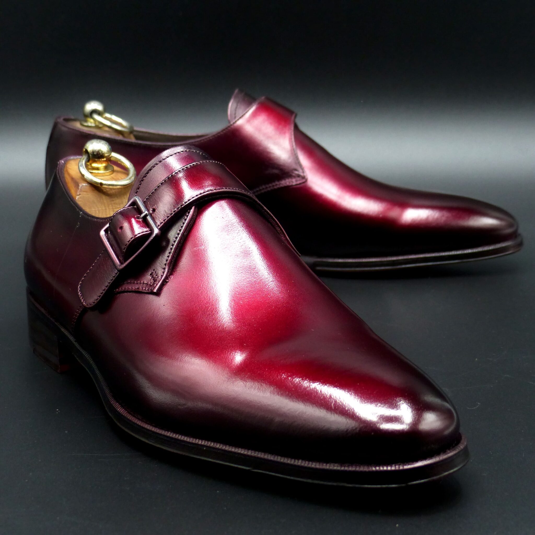
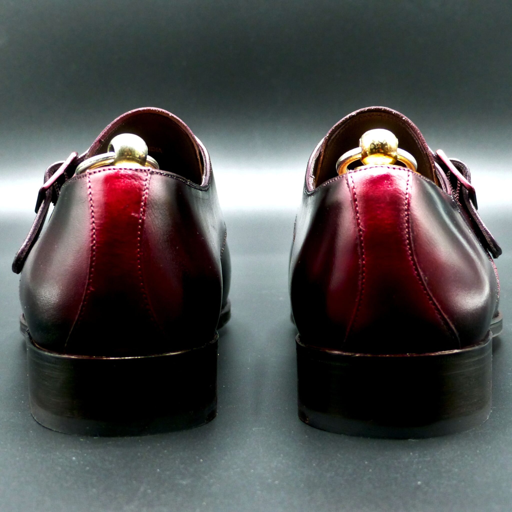
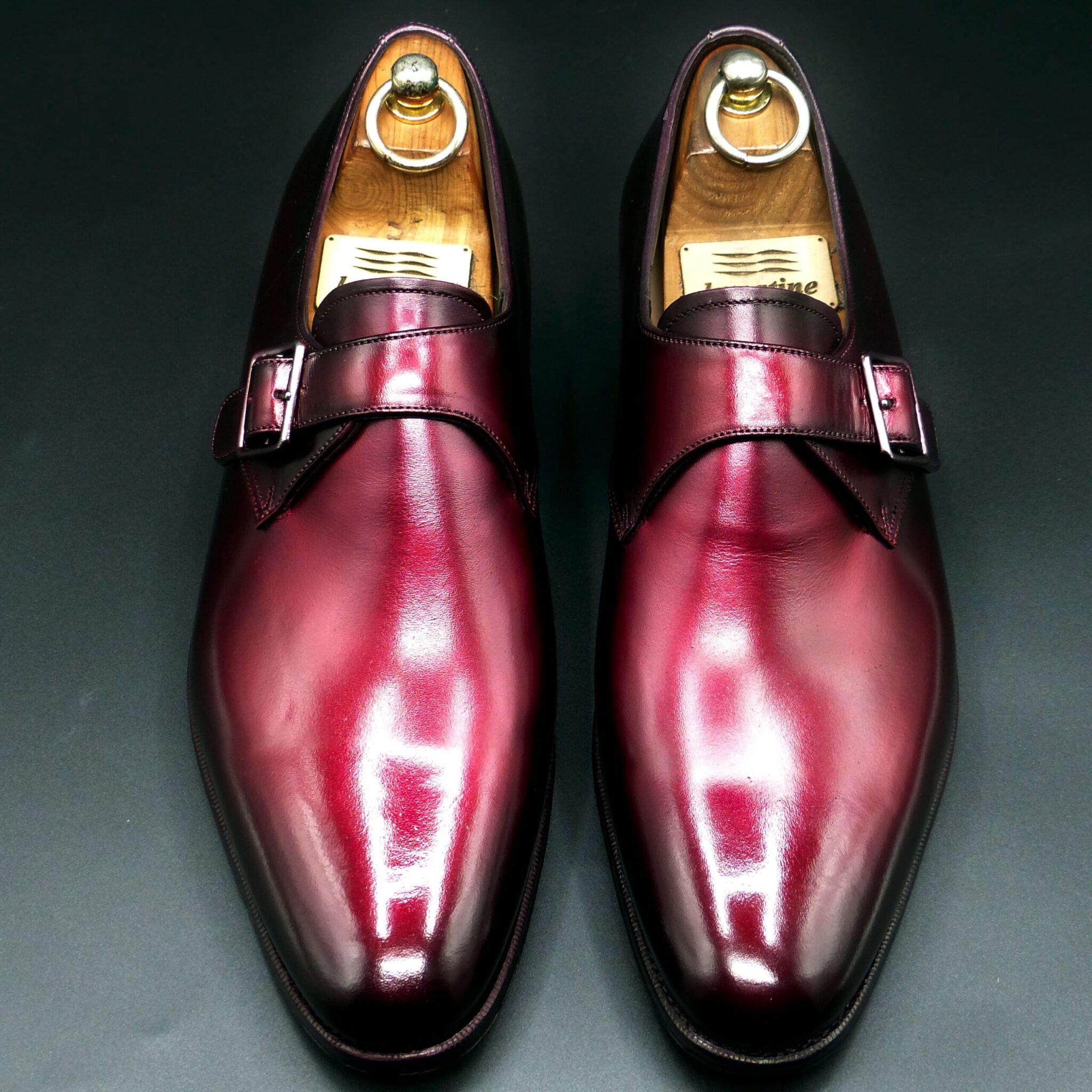
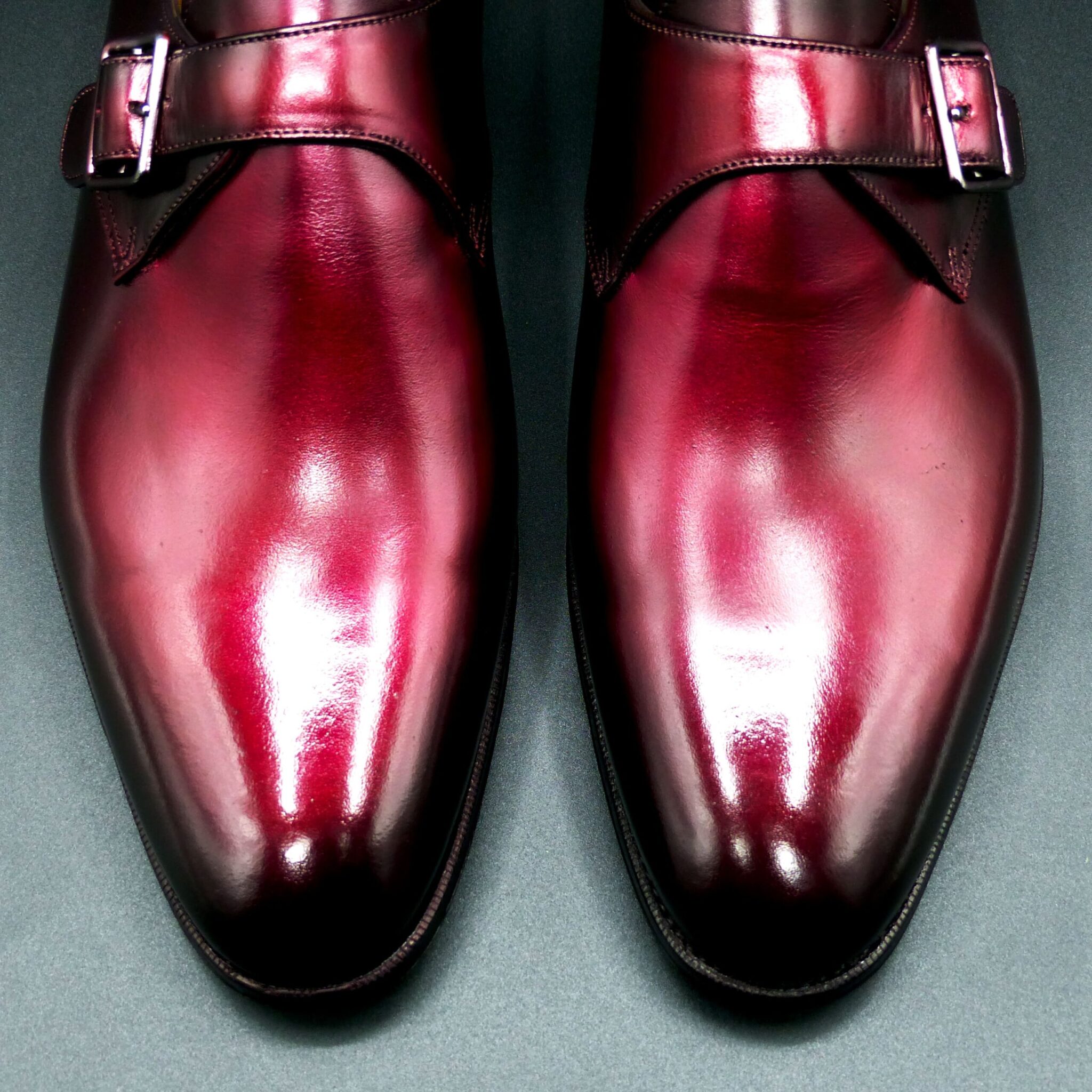
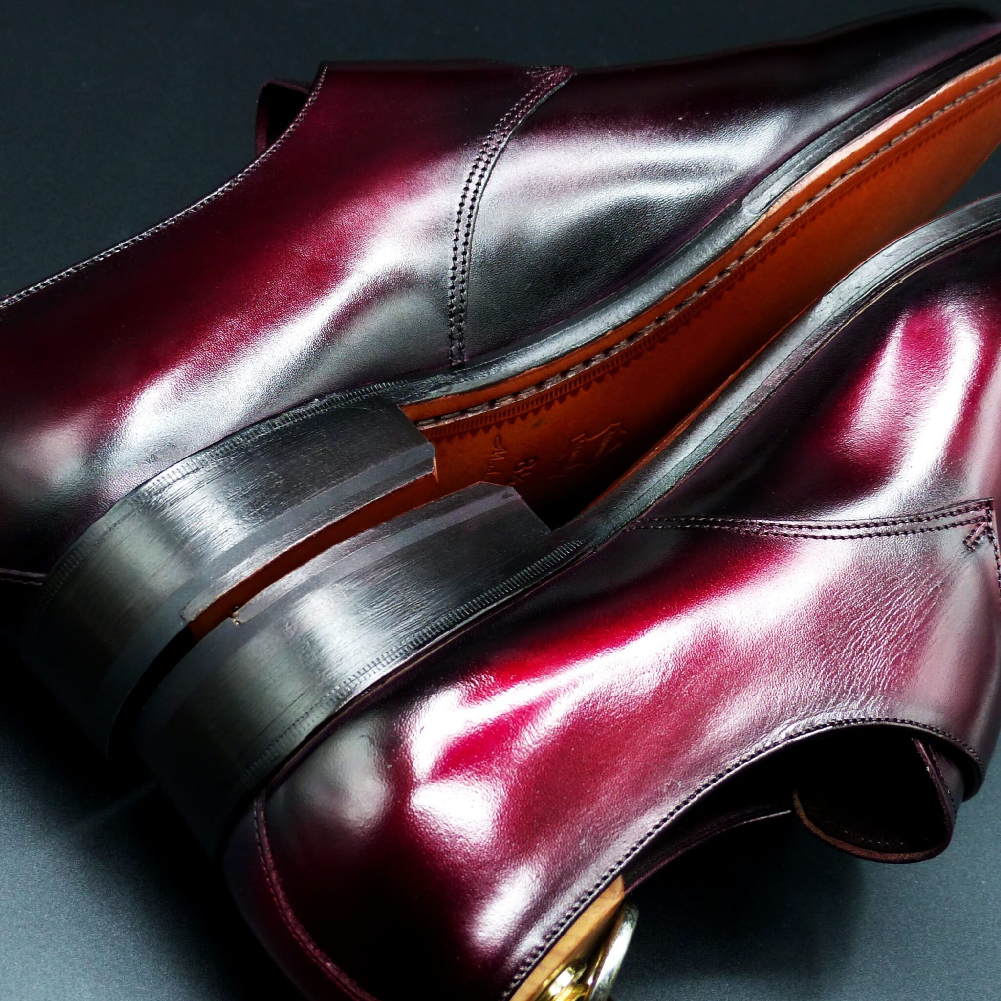
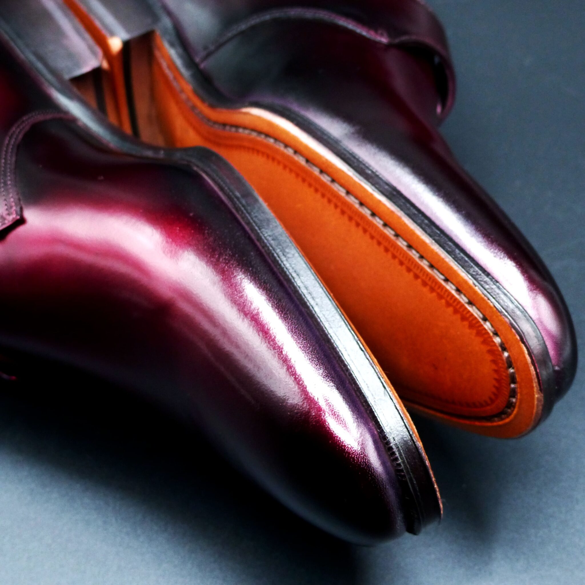
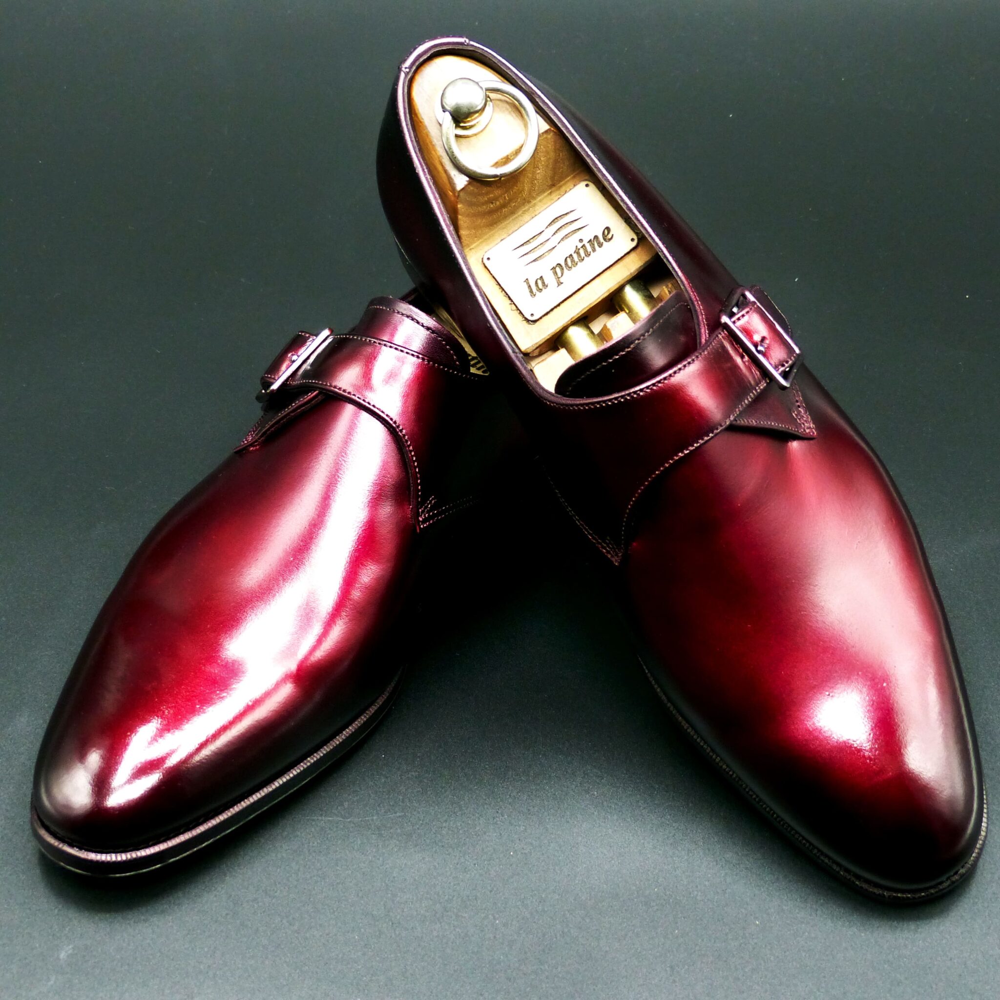
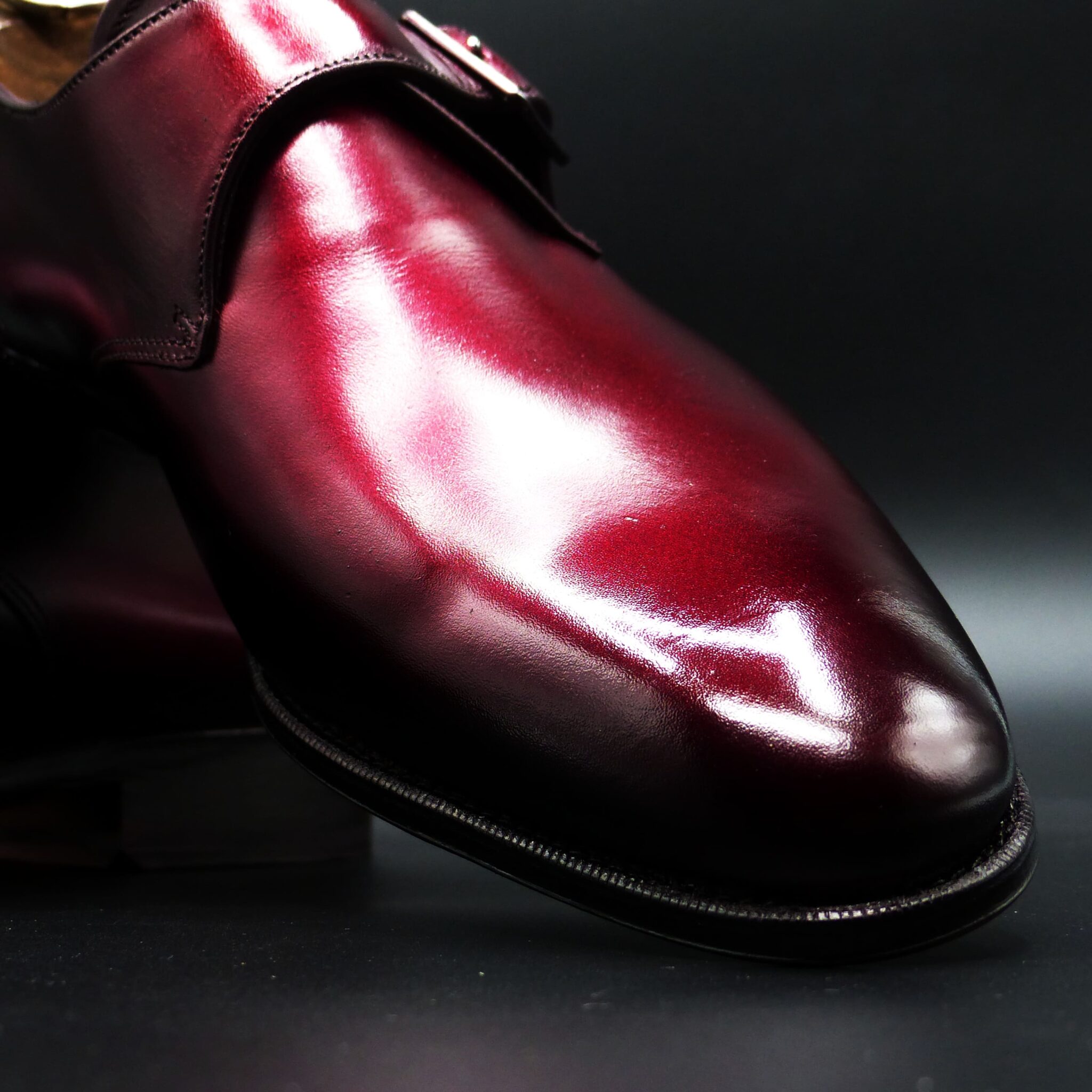
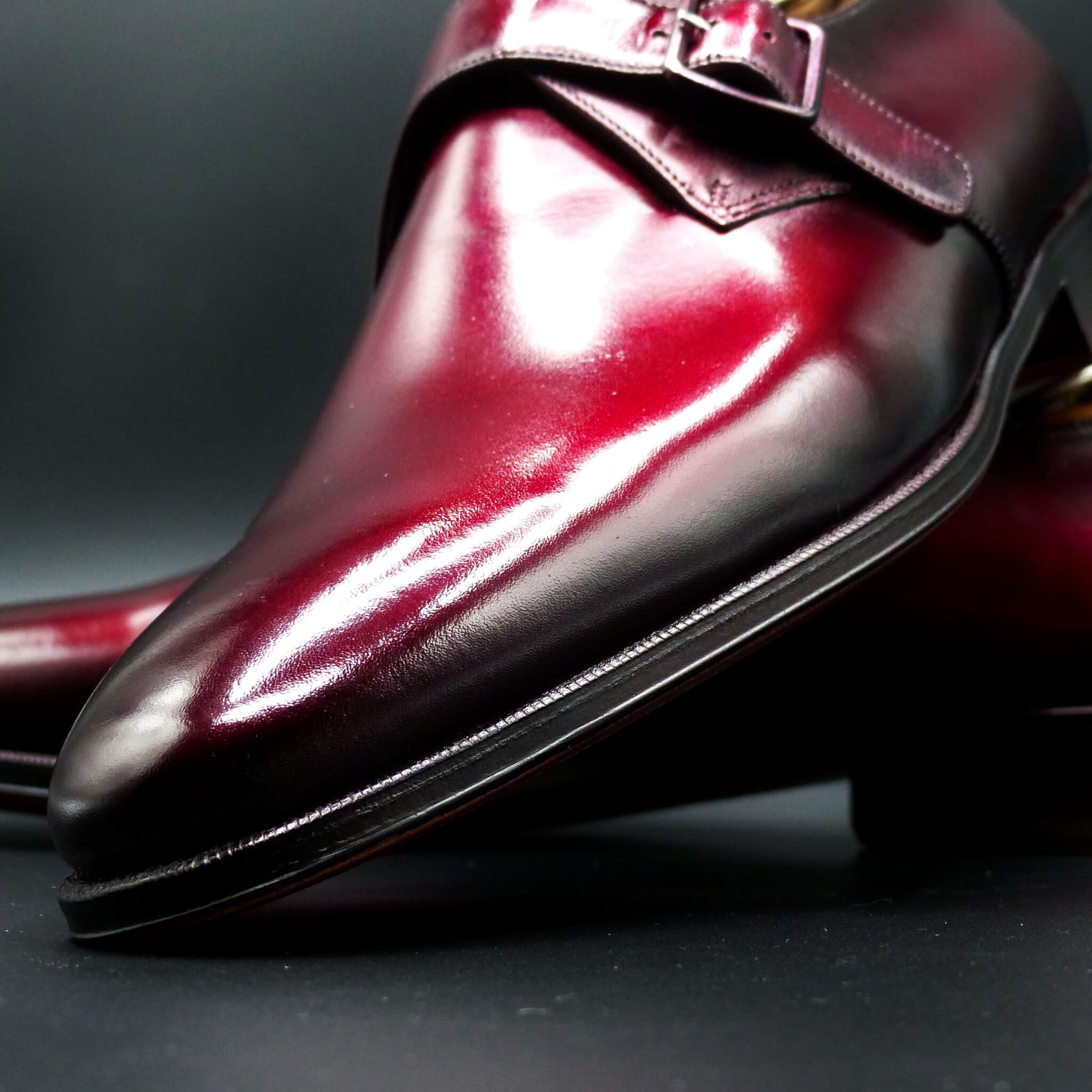

**赤透(あかすけ)**
七宝焼きの伝統的な色彩の一つで、透明感のある鮮やかな赤色を特徴としています。この色は、明治時代初期に名古屋の七宝職人・太田甚之栄によって開発されました。
**赤透の色構成**
- 表(おもて):透明感のある鮮やかな赤色。この赤色は、釉薬に金を溶かし込むことで実現され、宝石のルビーのような深みと輝きを持ちます。
- 裏(うら):通常、七宝焼きの作品では裏面は見えない部分となりますが、作品全体の調和を考慮して、黒や深緑などの落ち着いた色が用いられることがあります。
このように、表面に鮮やかな赤色を施し、裏面に落ち着いた色を配することで、作品に深みと高級感を与えています。
**赤透が象徴するもの**
- 情熱と活力:鮮やかな赤色は、生命力やエネルギーを象徴し、見る者に力強い印象を与えます。
- 魔除けと厄除け:日本文化において、赤色は古くから魔除けや厄除けの力があると信じられ、神社の鳥居や祭礼の装飾などに用いられてきました。
- 祝いと喜び:赤色は祝い事や特別な行事の際に好まれる色であり、喜びや幸福を象徴します。
赤透の色合いは、これらの象徴性を持ちながら、七宝焼きの技術と融合することで、作品に深みと魅力を加えています。
Akasuke is a traditional color in Japanese cloisonné enamelware, characterized by its vivid and transparent red hue. This color was developed in the early Meiji period by the cloisonné artisan Jinsiei Ota from Nagoya.
Color Composition of Akasuke
- Surface (Omote): A bright, transparent red achieved by incorporating gold into the enamel glaze, resulting in a depth and brilliance reminiscent of a ruby.
- Underside (Ura): In cloisonné works, the underside is typically not visible; however, to ensure overall harmony, subdued colors such as black or deep green are sometimes used.
By applying a vibrant red on the surface and a more subdued color on the underside, the piece attains a sense of depth and sophistication.
Symbolism of Akasuke
- Passion and Vitality: The vivid red symbolizes life force and energy, imparting a strong impression to the viewer.
- Protection and Warding Off Evil: In Japanese culture, red has long been believed to possess protective qualities, often used in Shinto shrine gates (torii) and festival decorations.
- Celebration and Joy: Red is a favored color during festive occasions and special ceremonies, symbolizing happiness and good fortune.
The rich hue of Akasu embodies these symbolic meanings, enhancing the depth and allure of cloisonné artworks through its fusion with traditional craftsmanship.
オーステリティ・オックスフォード
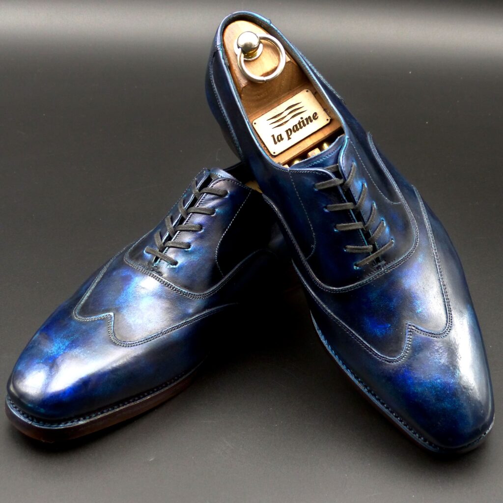
color name;
[ Ruri-Iro]
瑠璃色
Austerity Oxford
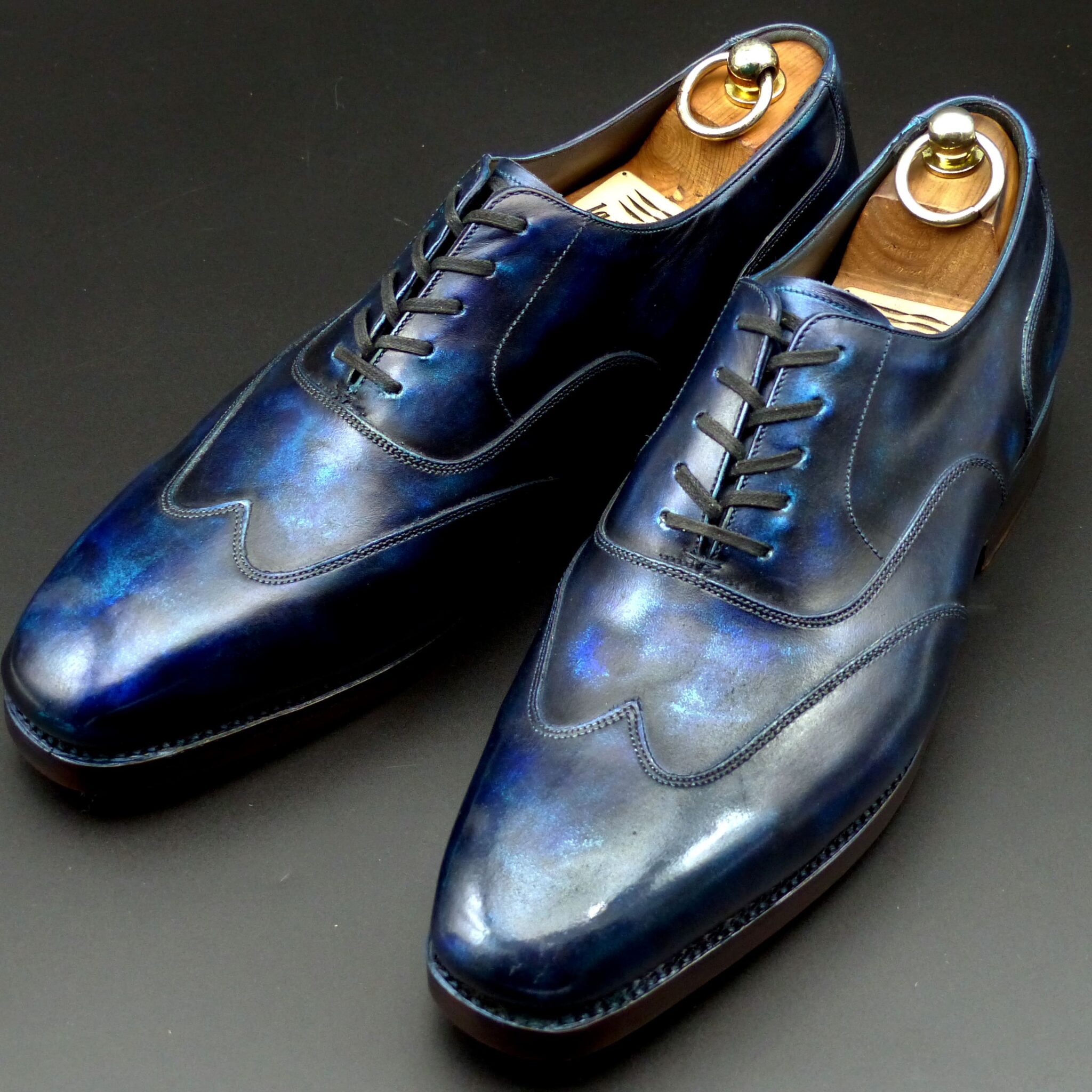
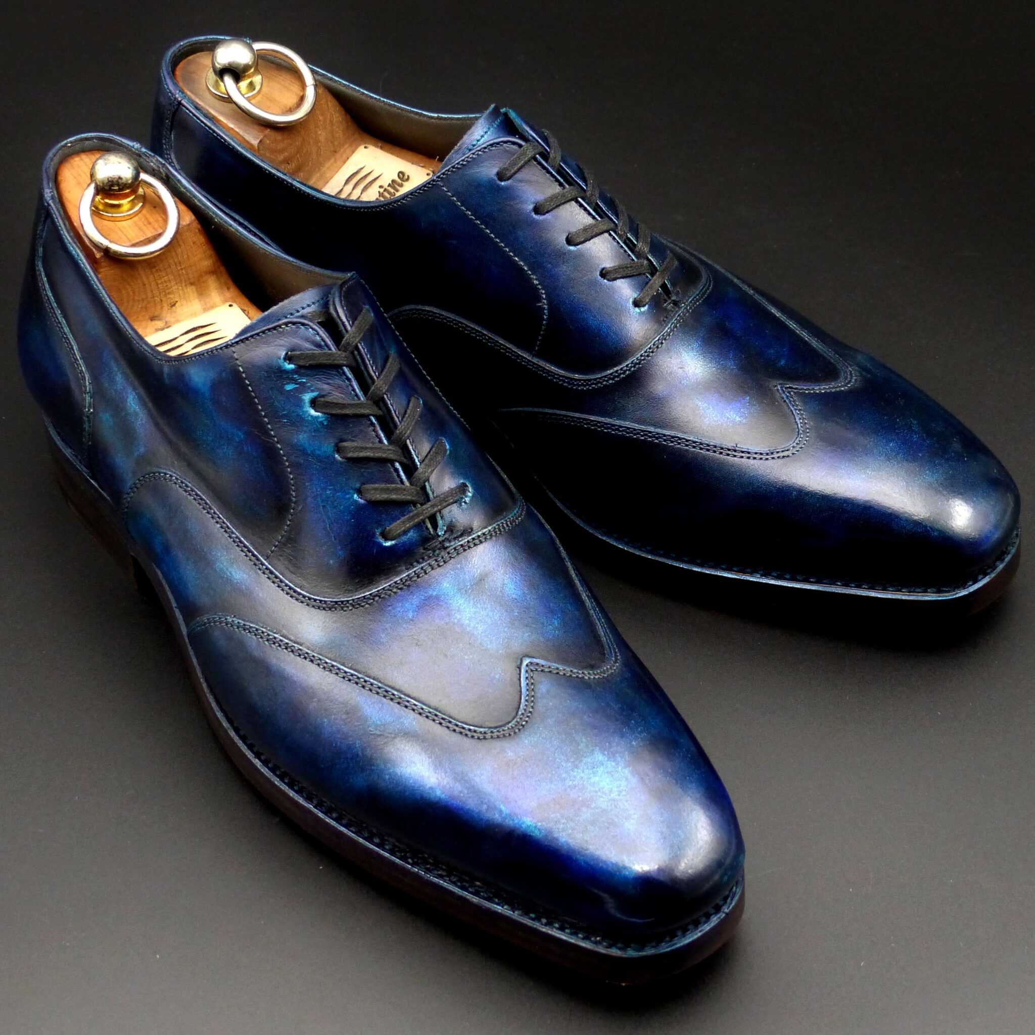
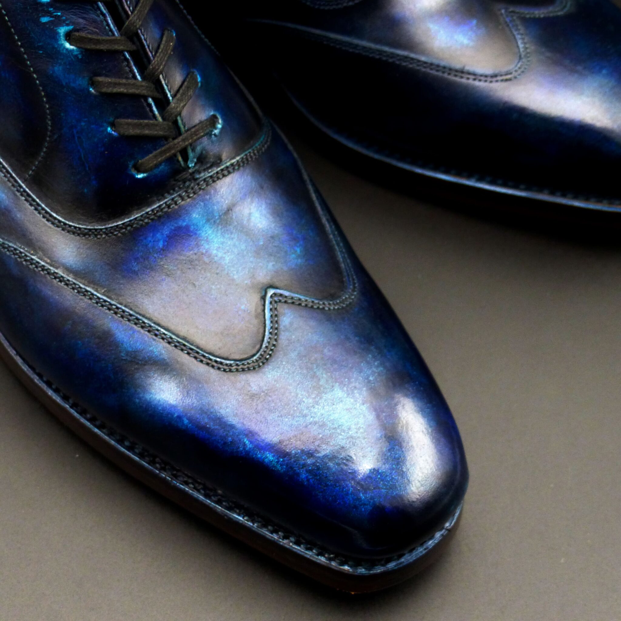
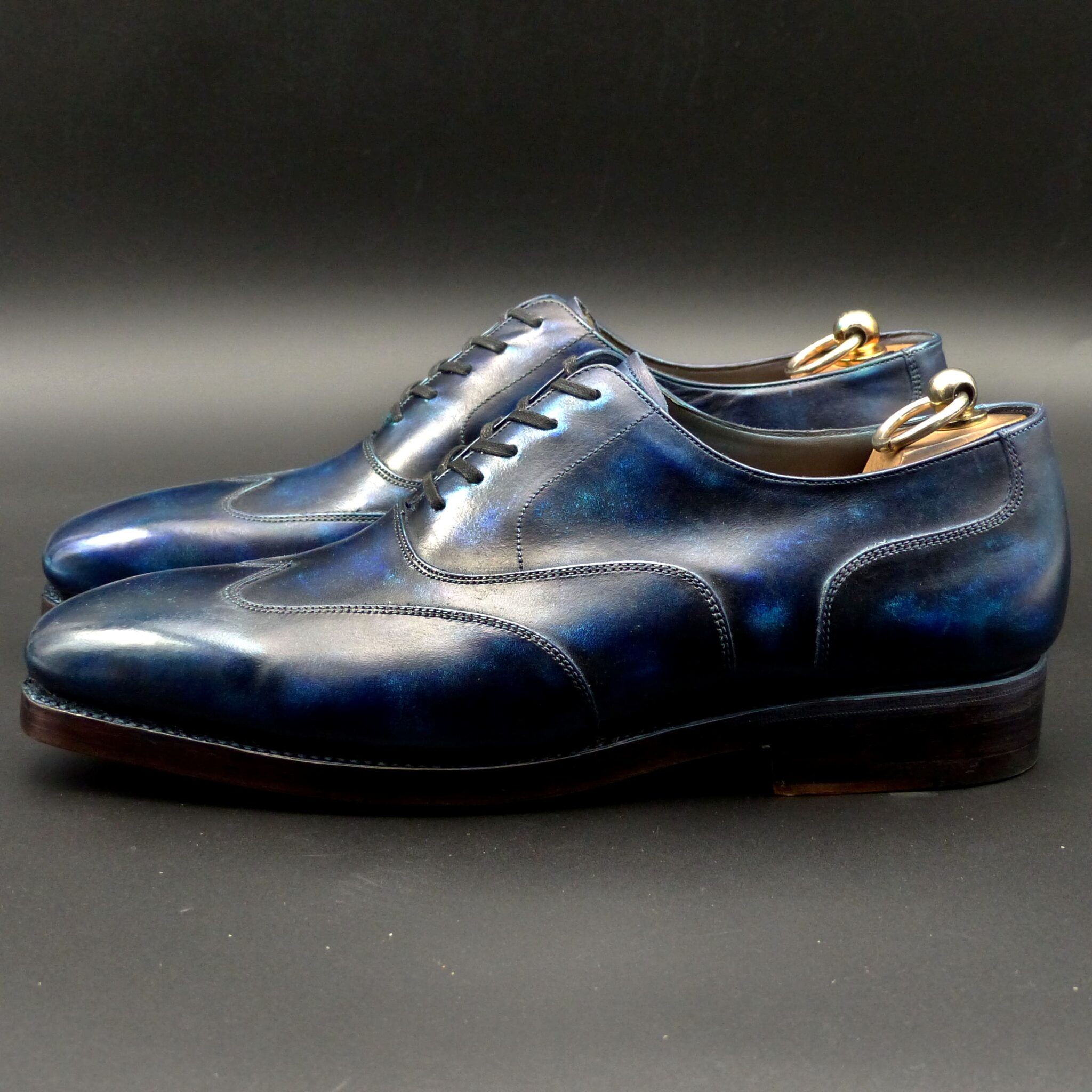
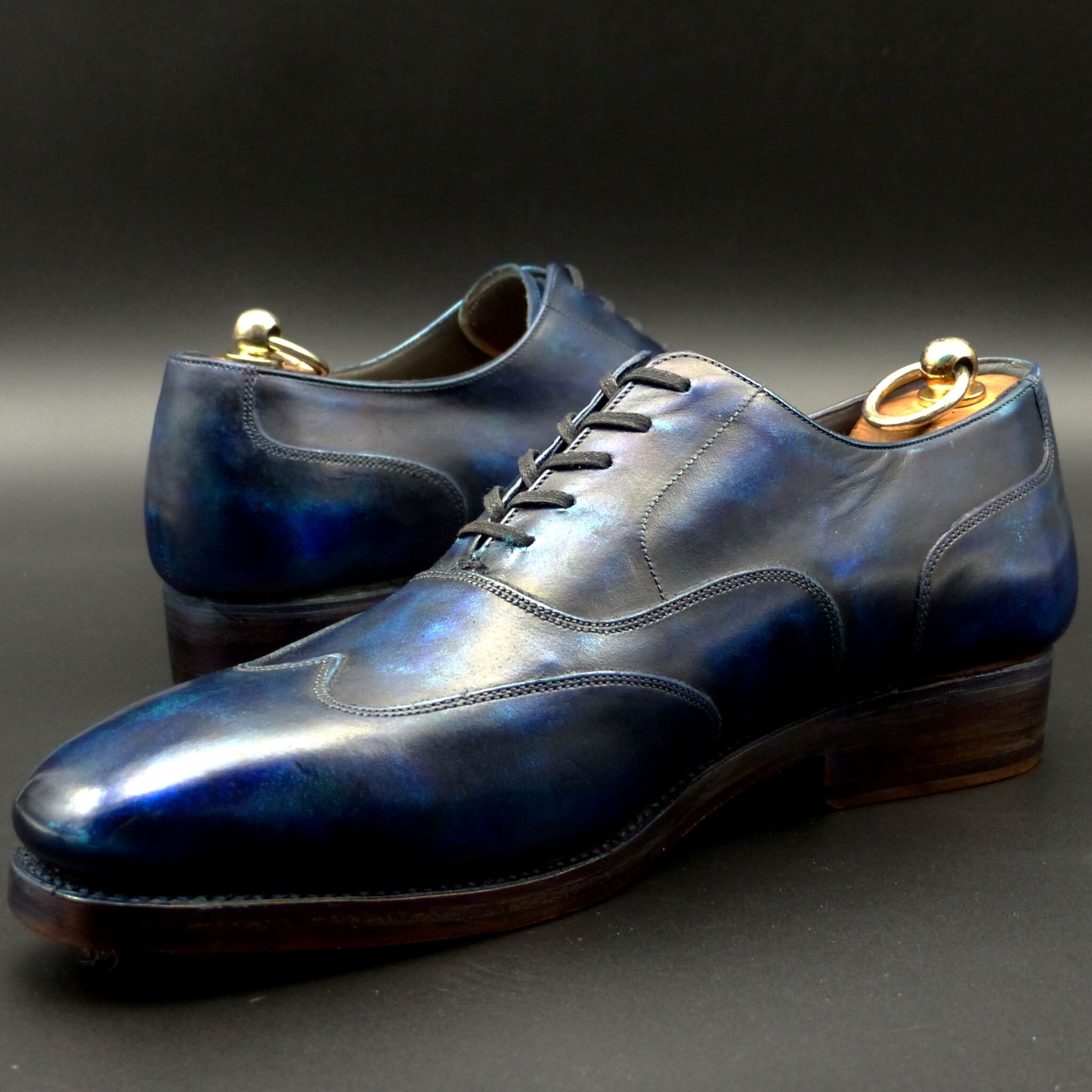
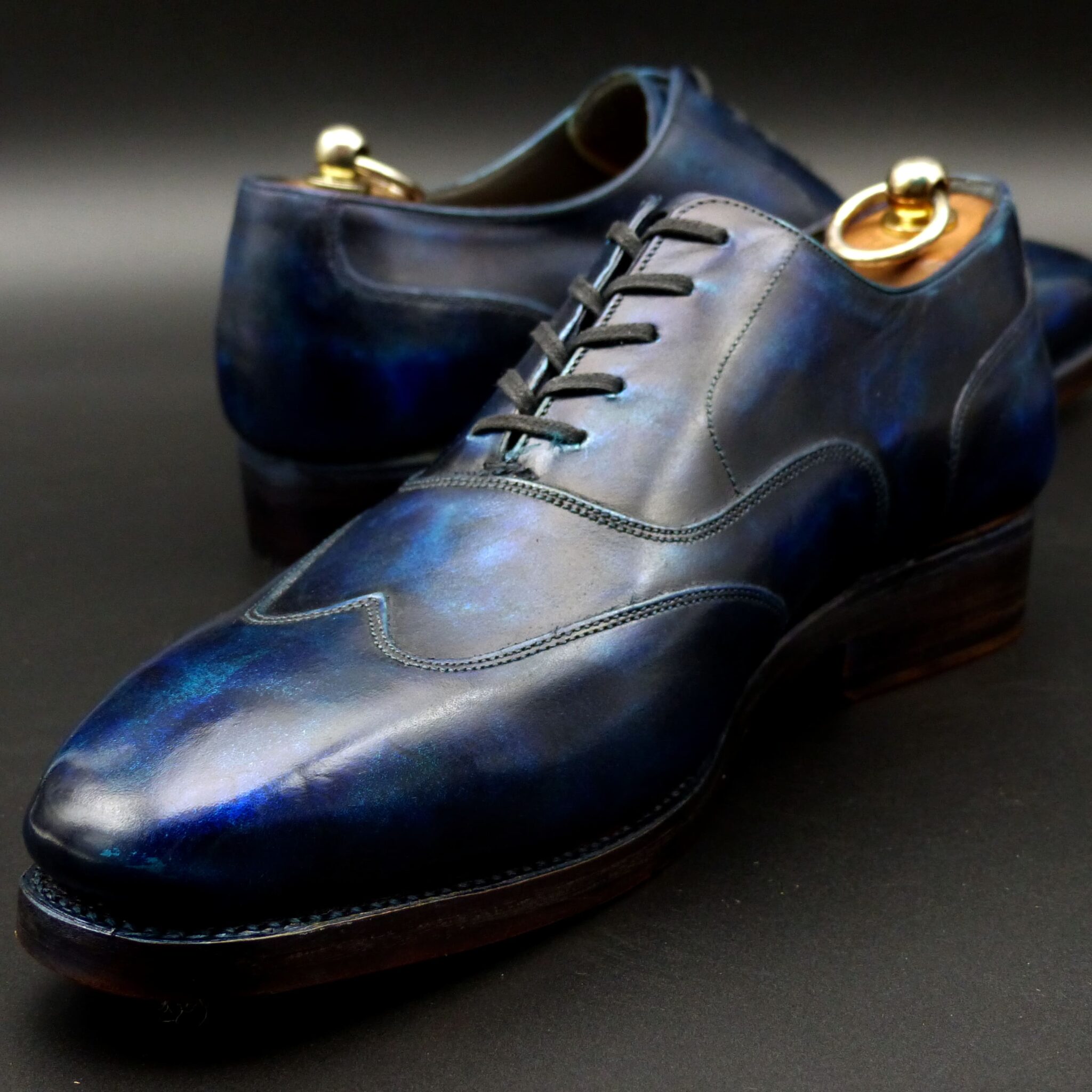
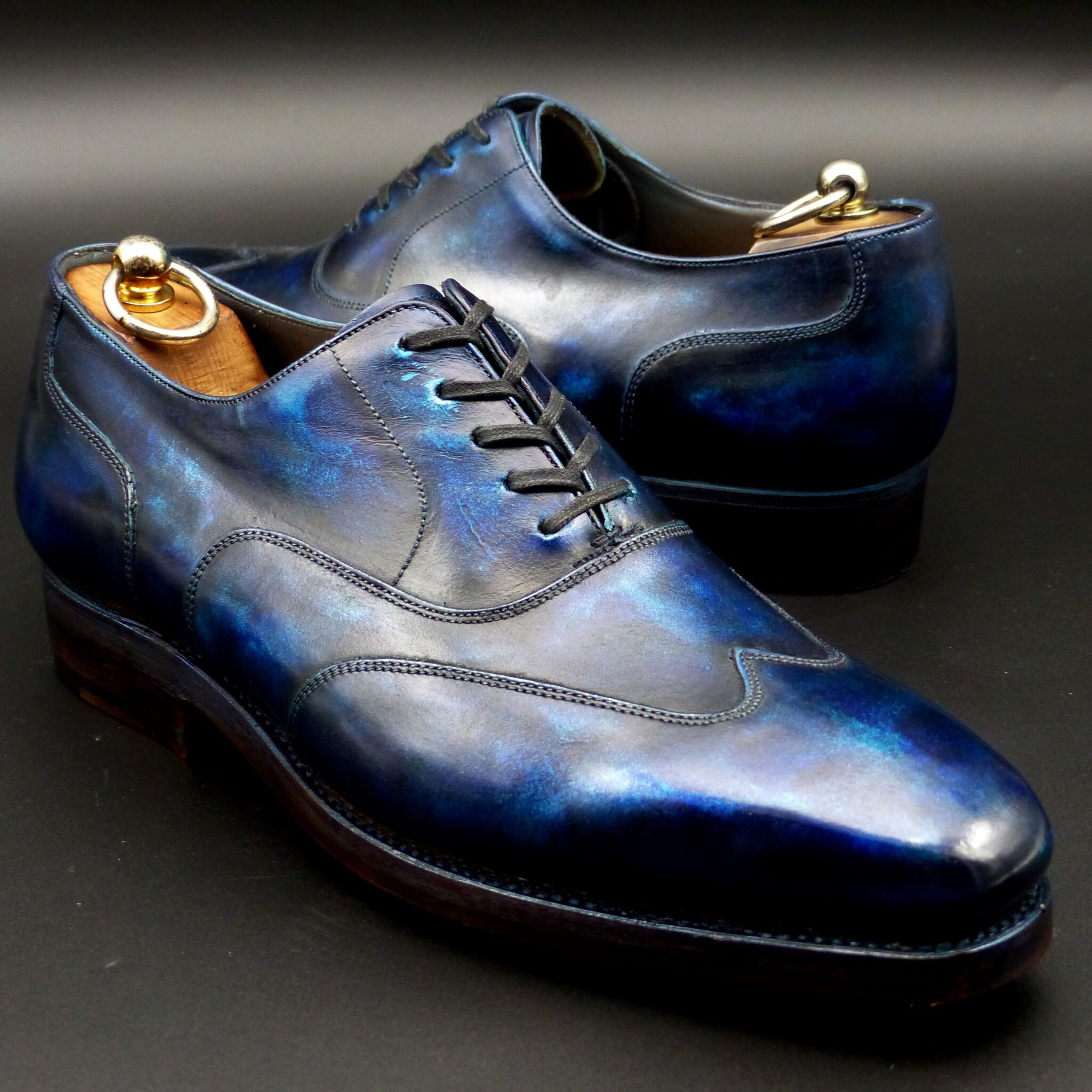
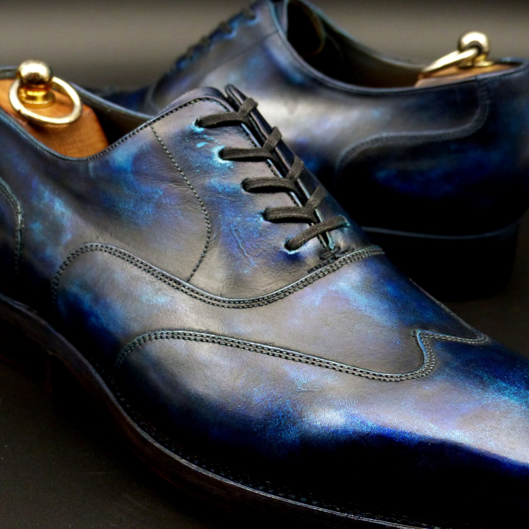

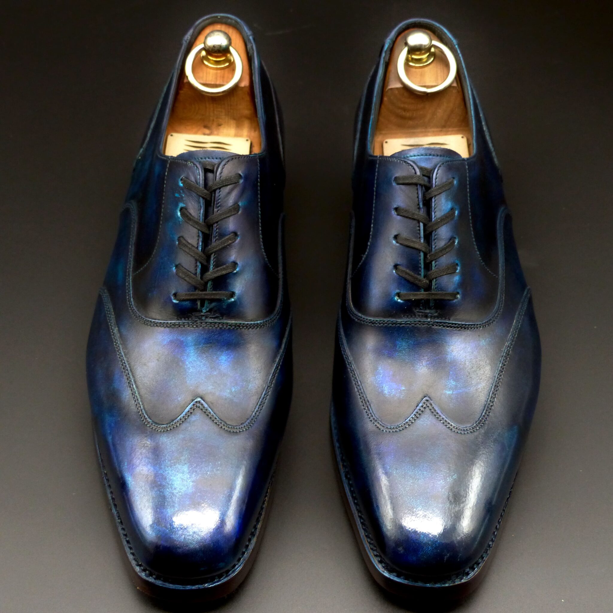
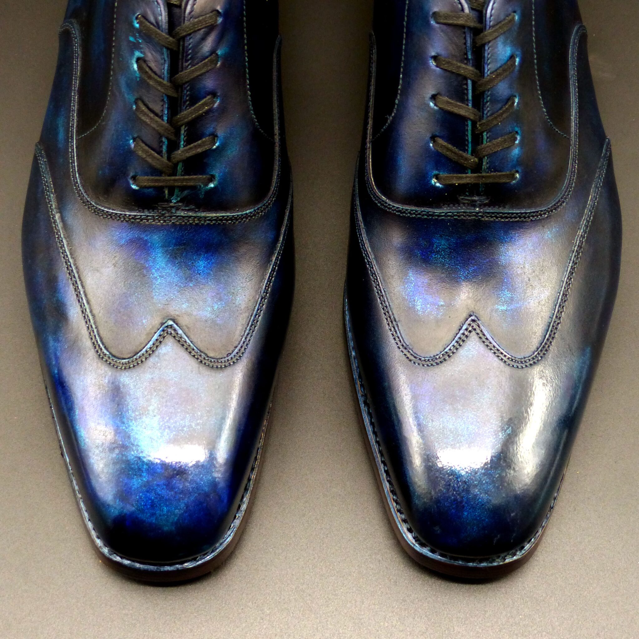
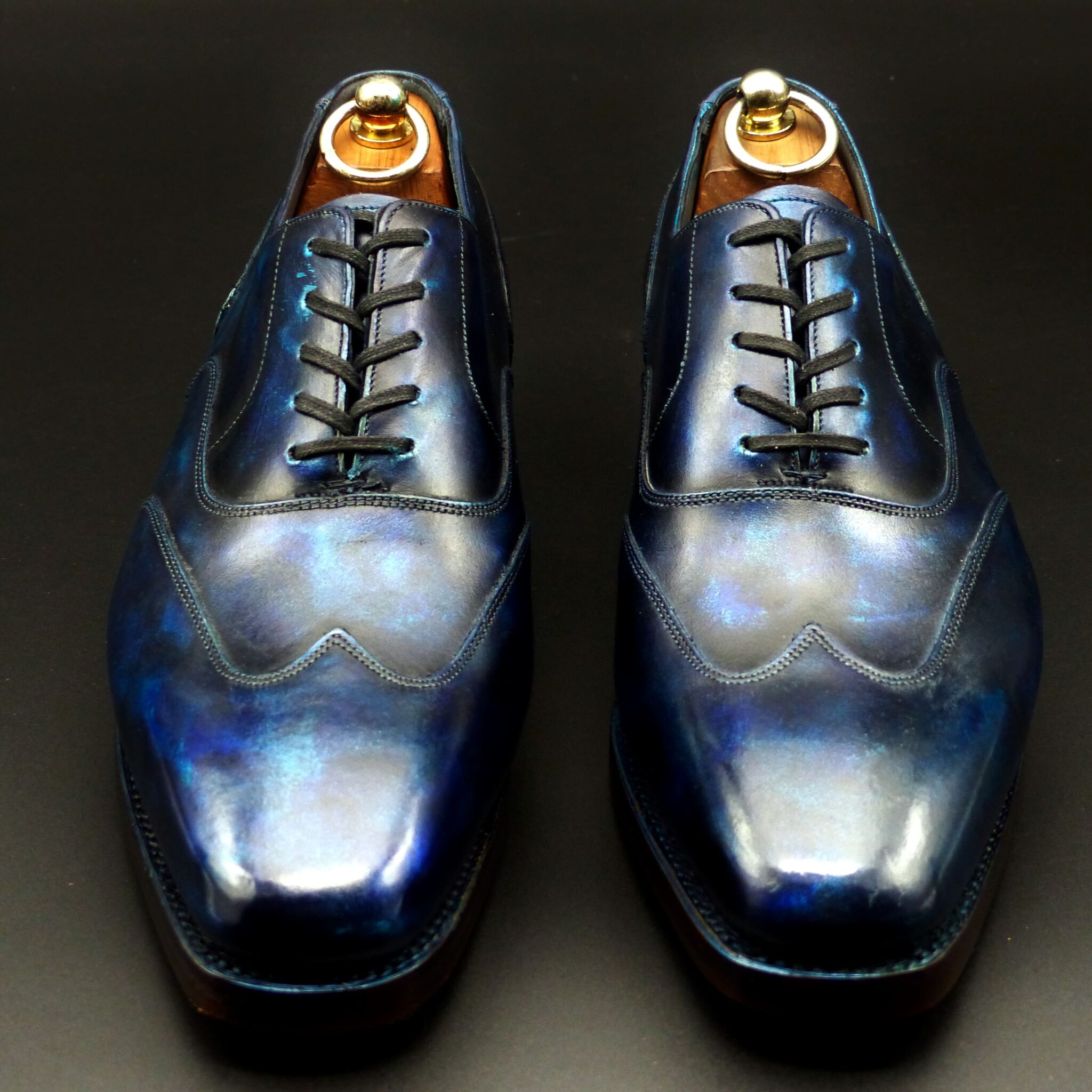
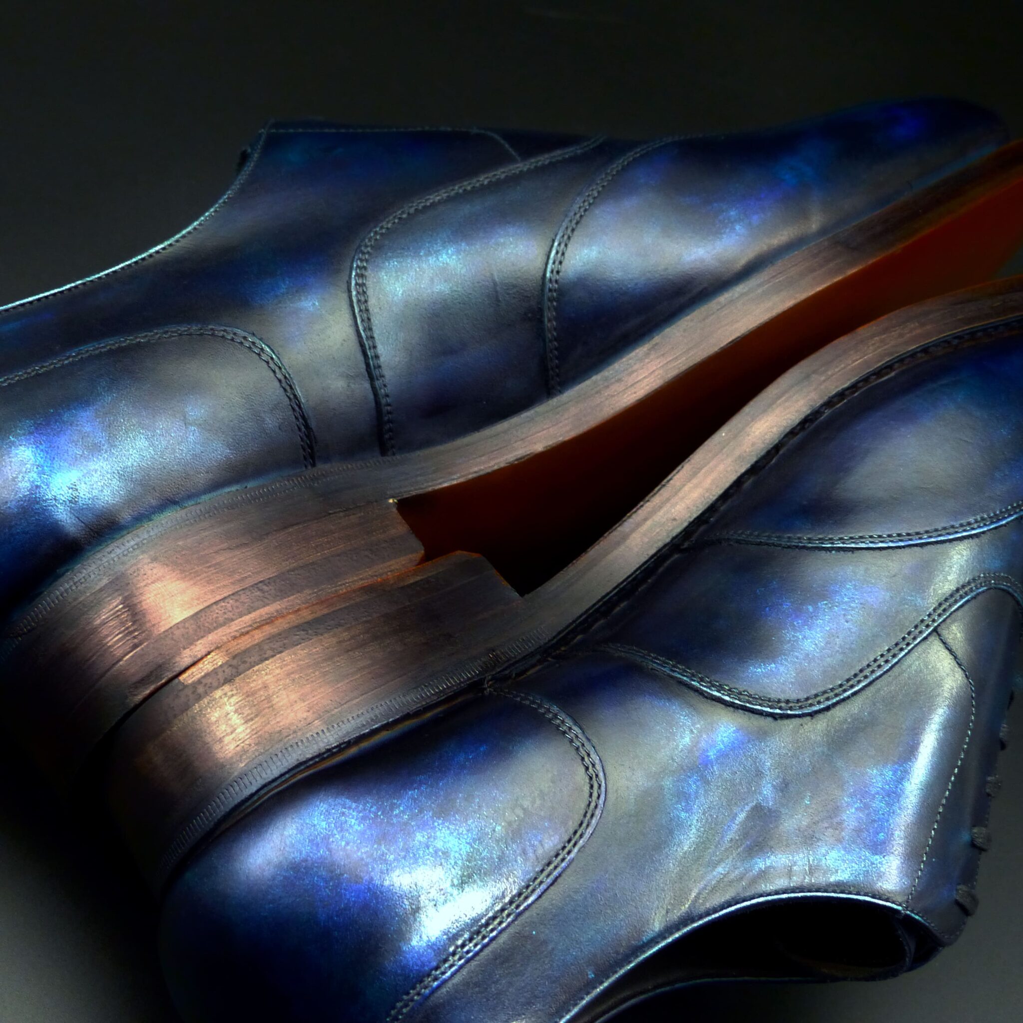
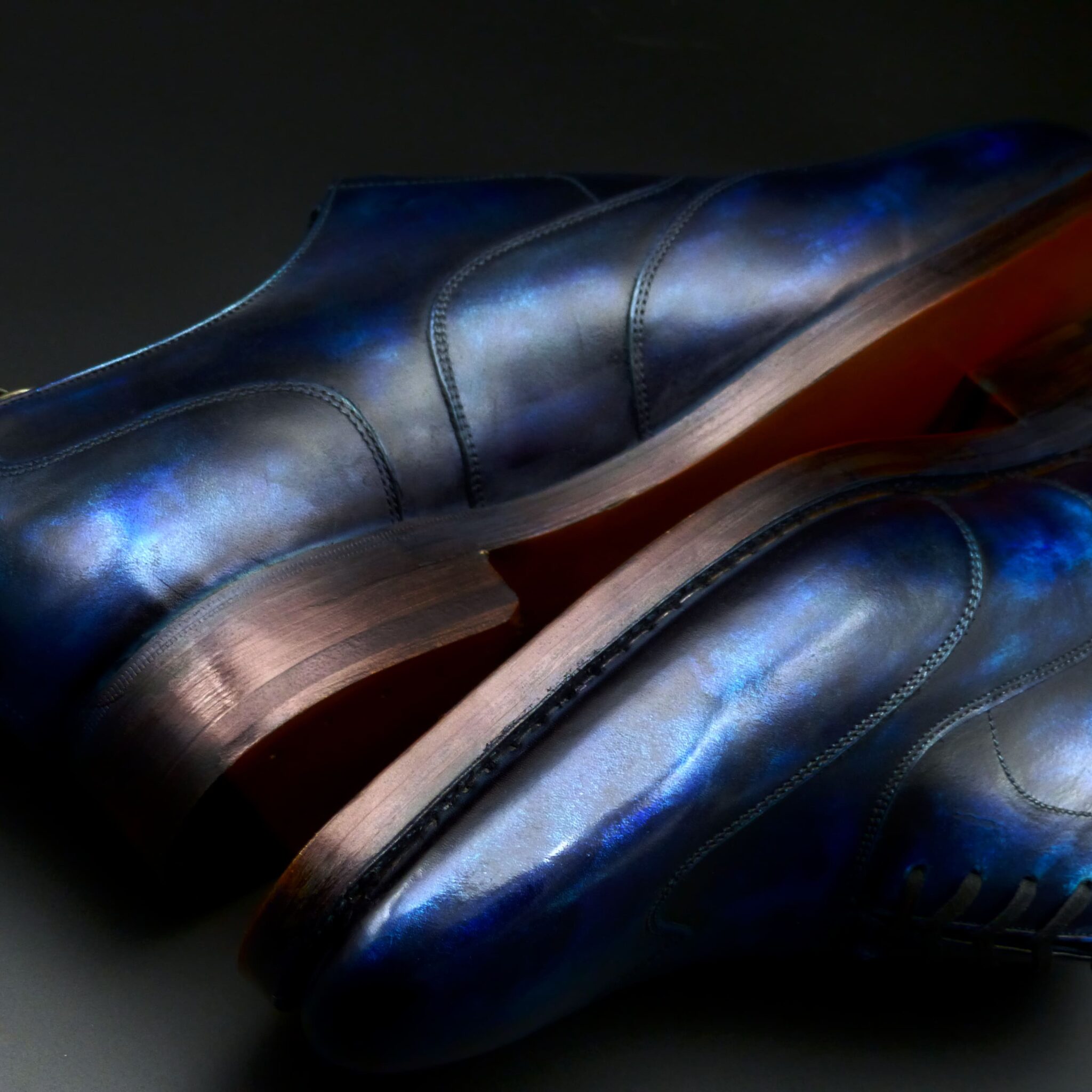
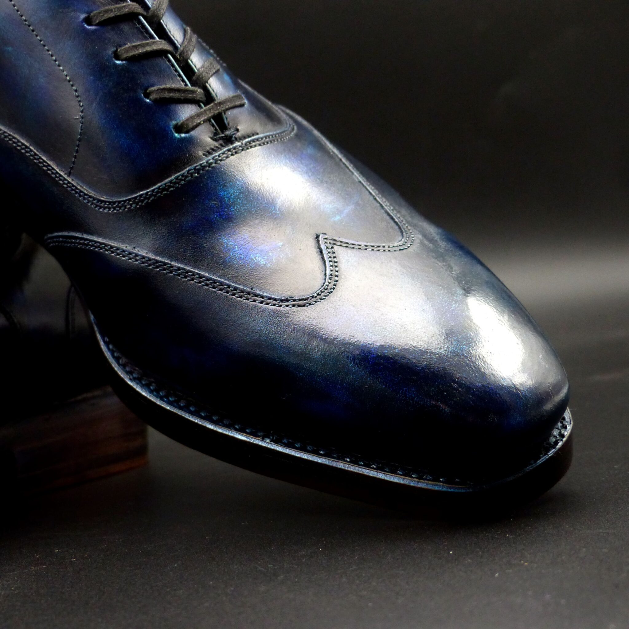
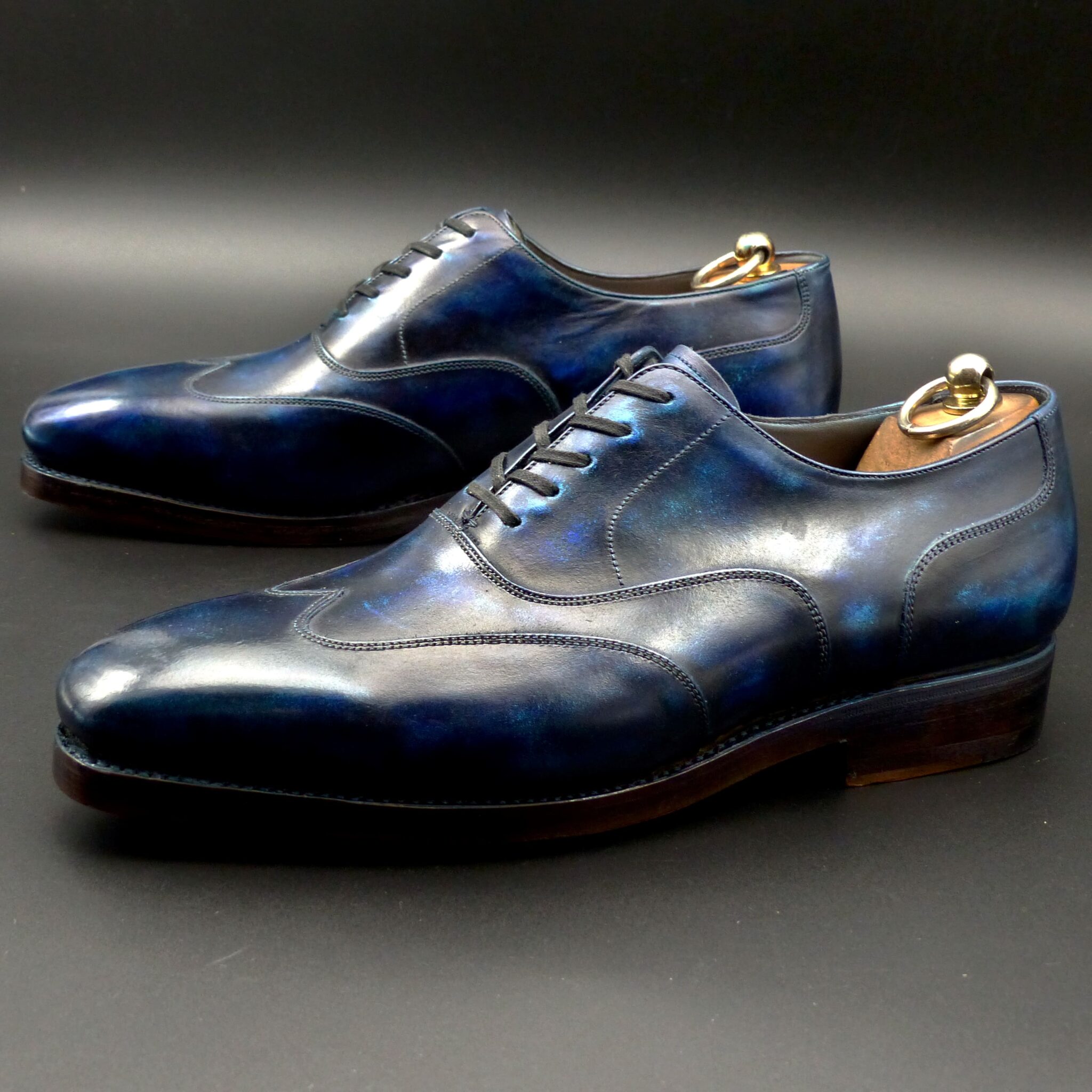
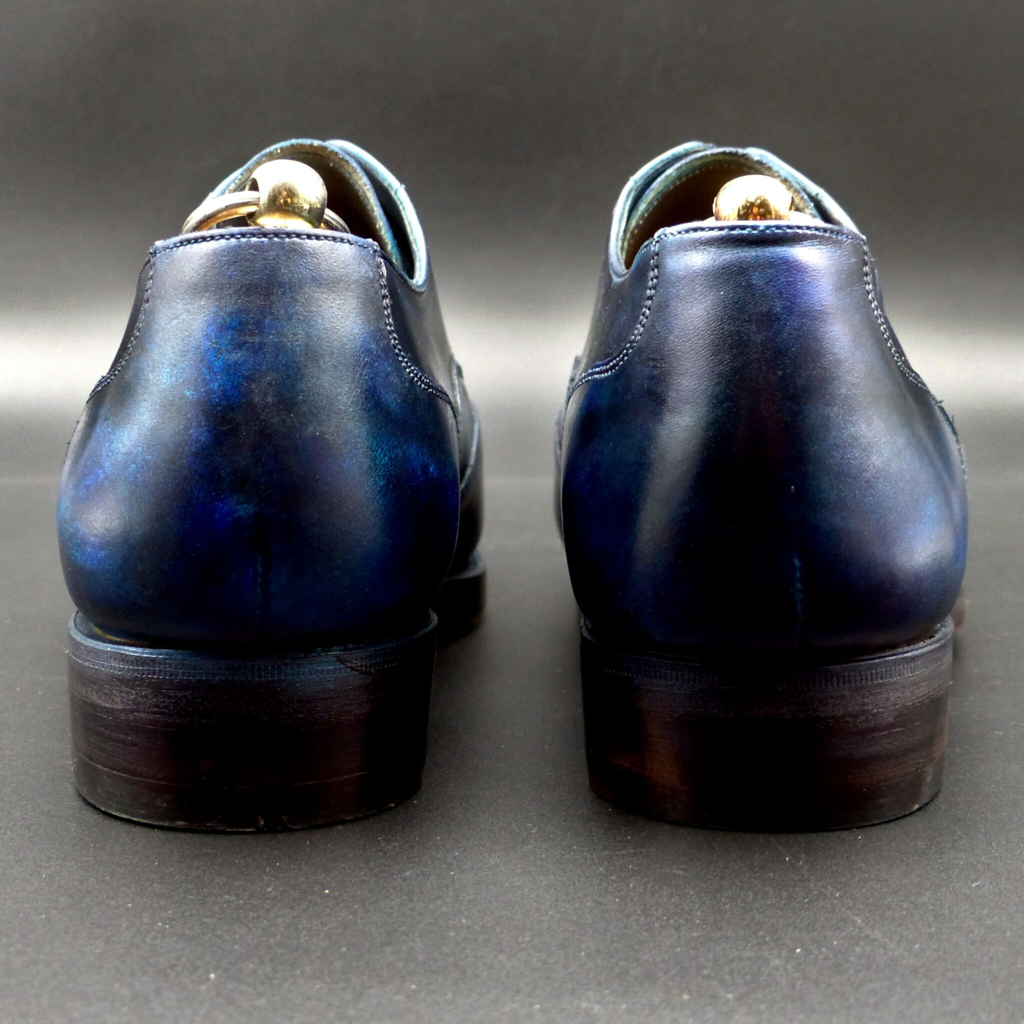
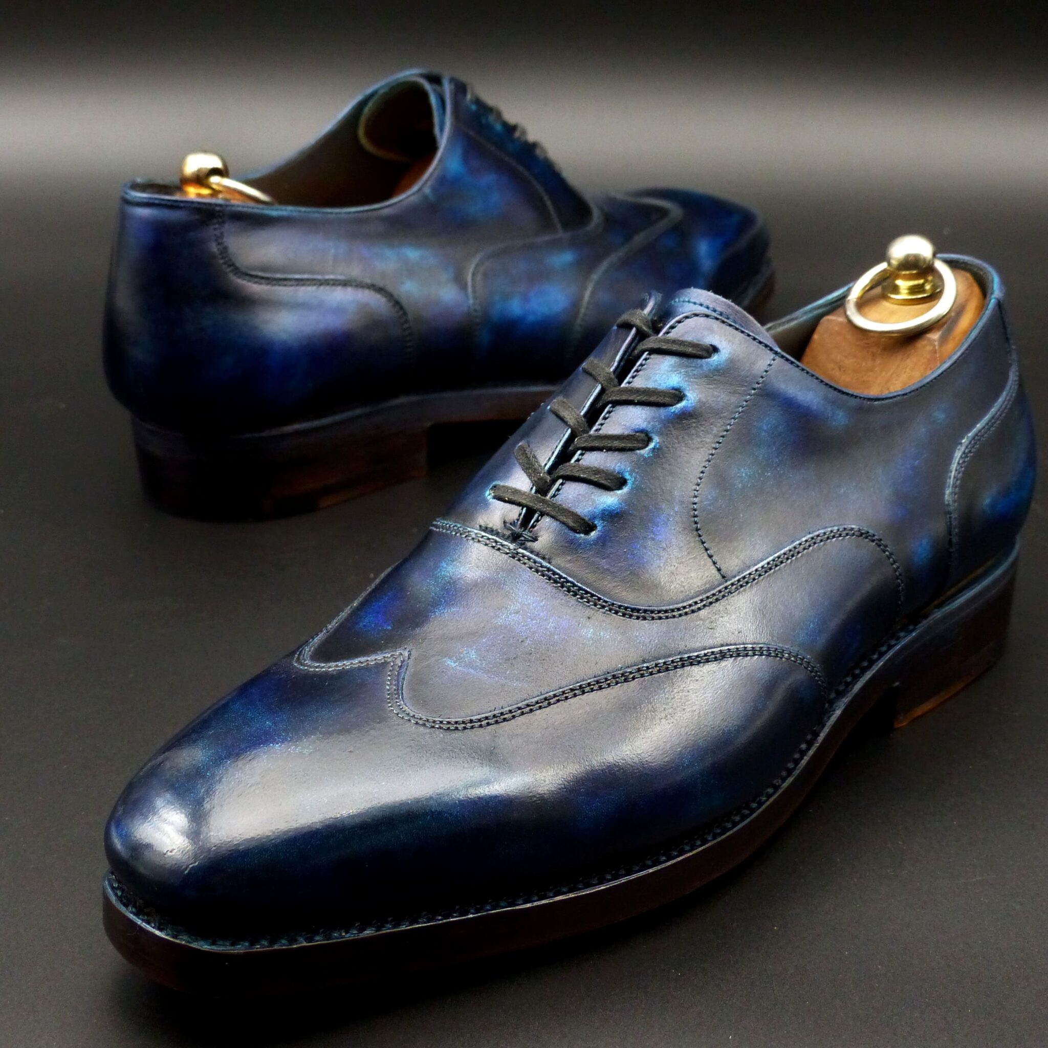
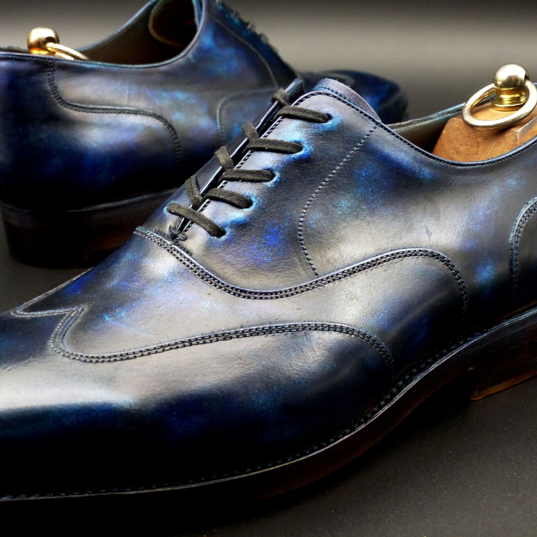
瑠璃色(るりいろ)とは?
瑠璃色(るりいろ)は、古代日本において 深く鮮やかな青色 を指し、仏教や貴族文化の中で特別な意味を持つ色でした。この名称は、宝石の「瑠璃」(ラピスラズリ) に由来し、瑠璃が仏教において神聖なものとされたことから、高貴で神秘的な色とされました。
- 瑠璃色の構成と色の特徴
色の構成
- 濃い群青色に近い深みのある青色。
- 天然のラピスラズリや藍染 から着想を得た色合い。
- 平安時代の『延喜式』にも記録があり、当時の染色技術では 藍染を重ねることで瑠璃色に近づけた と考えられる。
類似の色
- 群青色や紺青色に近いが、やや鮮やかさを持つ深い青。
- 近代では「コバルトブルー」や「ウルトラマリン」に例えられることもある。
- 瑠璃色が使われたシーン
(1)仏教と宗教的シンボル
- 仏教において瑠璃色は極楽浄土を象徴 し、薬師如来の「瑠璃光」から名付けられたとされる。
- 寺院の装飾や仏具、法衣など に瑠璃色が使われることがあった。
- 奈良時代には、仏教の影響で瑠璃色の陶器や装飾品が珍重された。
(2)貴族文化と衣装
- 平安時代には、高貴な身分の人々が愛用 した格式のある色。
- 十二単(じゅうにひとえ)の襲(かさね)の色目 に取り入れられ、特に青系の美しい組み合わせとして用いられた。
(3)染色・工芸品
- 藍染めの最高級の色 とされ、武士や裕福な町人の衣服にも使われた。
- 陶磁器や漆器 などの工芸品にも取り入れられ、江戸時代以降は「瑠璃釉(るりゆう)」という青釉を施した陶器が人気を博した。
- 瑠璃色が象徴するもの
① 神聖さと浄化
- 仏教では「瑠璃光」が病や災厄を払う力を持つとされる。
- 「清らかさ」「精神の純粋さ」を表し、邪気を払う神聖な色 として信じられた。
② 高貴さと格式
- 平安時代には 位の高い貴族の装束 に用いられ、威厳と品格を象徴した。
- 深みのある青は、落ち着きや品位を感じさせる色として重視された。
③ 知恵と静寂
- 瑠璃色は、深く澄んだ空や海の色を連想させ、「知性」「冷静さ」「真理の探求」 を表す色とされた。
- 侘び寂びの美意識にも通じ、茶道や工芸品の中で洗練された色として扱われた。
- まとめ
瑠璃色は、古代日本において 仏教の神聖な色、高貴な貴族の色、格式ある工芸の色 として大切にされました。その深く鮮やかな青は 「神聖さ」「知性」「高貴さ」 を象徴し、宗教や宮廷文化の中で重要な役割を果たしてきました。現代でも、和装や陶器、伝統工芸の分野で瑠璃色の美しさが受け継がれています。
What is Ruriiro (瑠璃色)?
Ruriiro (瑠璃色) is a deep and vivid blue that held special significance in ancient Japan, particularly in Buddhism and aristocratic culture. The name comes from the gemstone “ruri” (lapis lazuli), which was considered sacred in Buddhism. As a result, ruriiro was regarded as a noble and mystical color.
- Composition and Characteristics of Ruriiro
Color Composition
- A rich ultramarine blue close to deep azure.
- Inspired by natural lapis lazuli and indigo dyeing techniques.
- According to historical records such as the Engishiki (延喜式) of the Heian period, the color was achieved by layering indigo dye to create a deep, radiant blue.
Similar Colors
- Close to gunjō-iro (ultramarine) and konjō-iro (deep navy blue) but slightly more vibrant.
- In modern terms, it is often compared to cobalt blue or ultramarine blue.
- Usage of Ruriiro in Ancient Japan
(1) Buddhism and Religious Symbols
- In Buddhism, ruriiro symbolizes the Pure Land, derived from Yakushi Nyorai’s (Medicine Buddha) “Ruriko” (瑠璃光, Lapis Lazuli Light).
- It was used in temple decorations, Buddhist ritual objects, and priestly robes.
- During the Nara period, the influence of Buddhism led to the production of ruriiro-colored ceramics and ornaments, which were highly prized.
(2) Aristocratic Culture and Attire
- During the Heian period, ruriiro was favored by the nobility as a prestigious color.
- It was incorporated into jūnihitoe (twelve-layered kimono) and kasane no irome (layered color combinations) to create elegant and refined attire.
(3) Dyeing and Craftwork
- Considered the highest grade of indigo dye, ruriiro was also used in the clothing of samurai and wealthy townspeople.
- The color was applied to ceramics, lacquerware, and other crafts, and from the Edo period onward, ruriyū (瑠璃釉, blue glaze) became a popular ceramic technique.
- Symbolism of Ruriiro
① Sacredness and Purification
- In Buddhism, “Ruriko” (瑠璃光, Lapis Lazuli Light) was believed to have the power to ward off illness and misfortune.
- The color represented purity, spiritual clarity, and divine protection.
② Nobility and Prestige
- During the Heian period, ruriiro was used in the attire of high-ranking nobles, symbolizing dignity and refinement.
- Its deep, serene hue was associated with elegance, sophistication, and authority.
③ Wisdom and Tranquility
- The deep, clear blue of ruriiro evoked the vast sky and sea, symbolizing intelligence, calmness, and the pursuit of truth.
- It also resonated with the Japanese aesthetics of wabi-sabi, influencing tea ceremonies and traditional crafts.
- Conclusion
Ruriiro was deeply valued in ancient Japan as a sacred Buddhist color, an aristocratic hue, and a refined artistic shade. Its vibrant blue represented divinity, wisdom, and nobility, playing a crucial role in religious, courtly, and artistic traditions. Even today, ruriiro continues to be cherished in kimono, ceramics, and traditional crafts, preserving its timeless beauty.
プレーン・ダービー
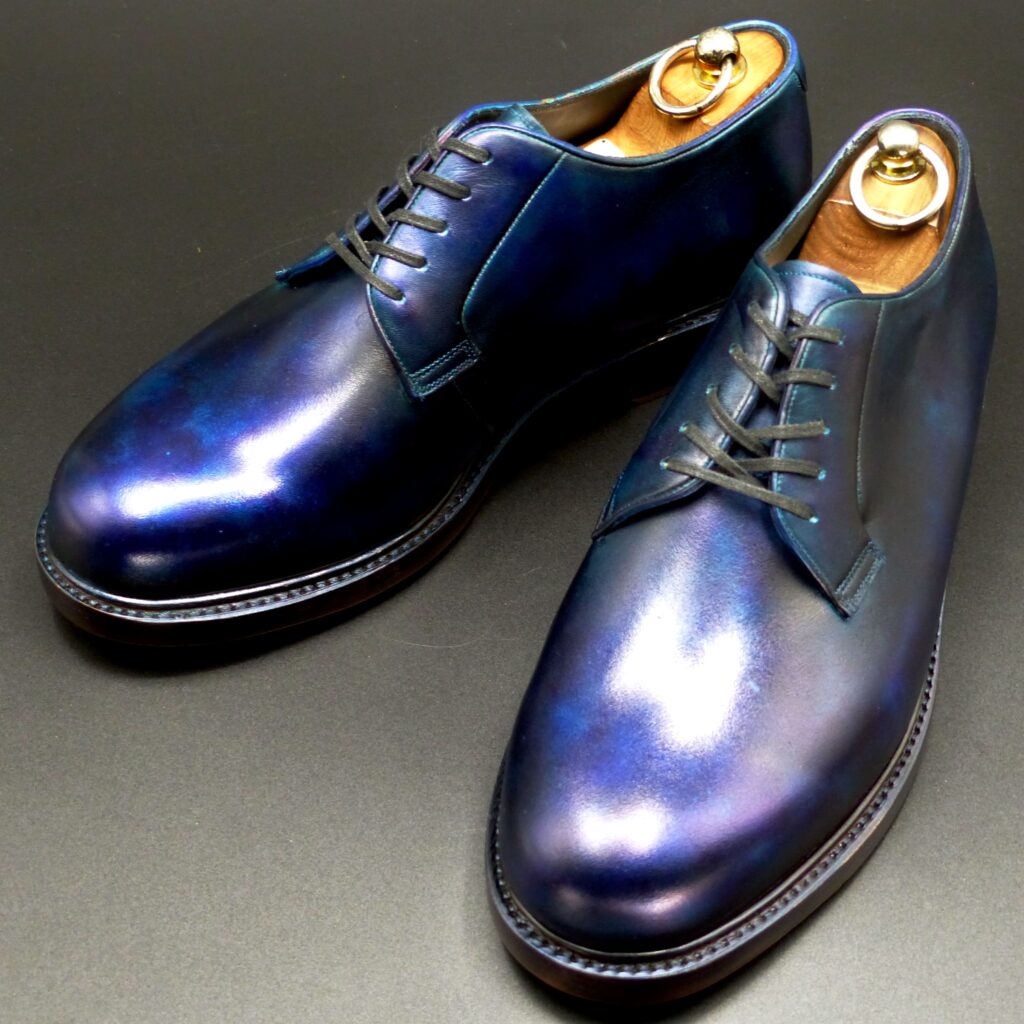
color name;
[ Kachi-Iro]
勝色
Plain Derby
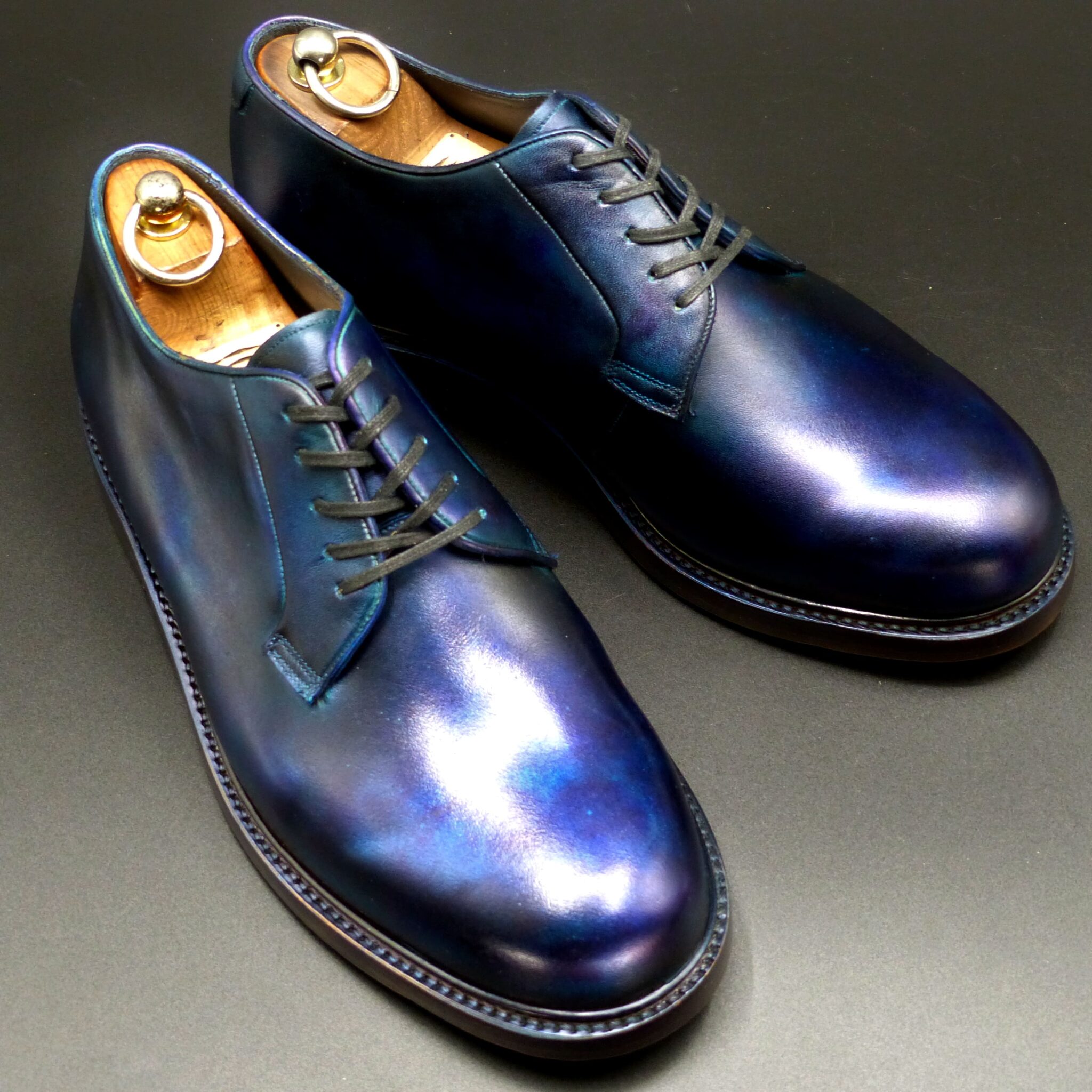
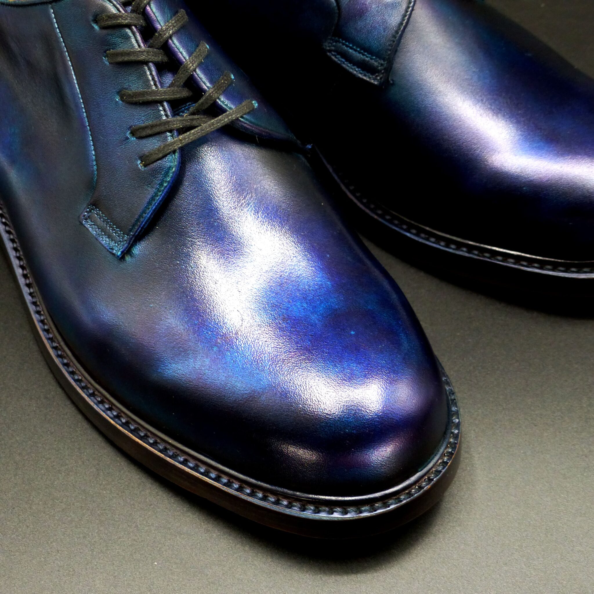
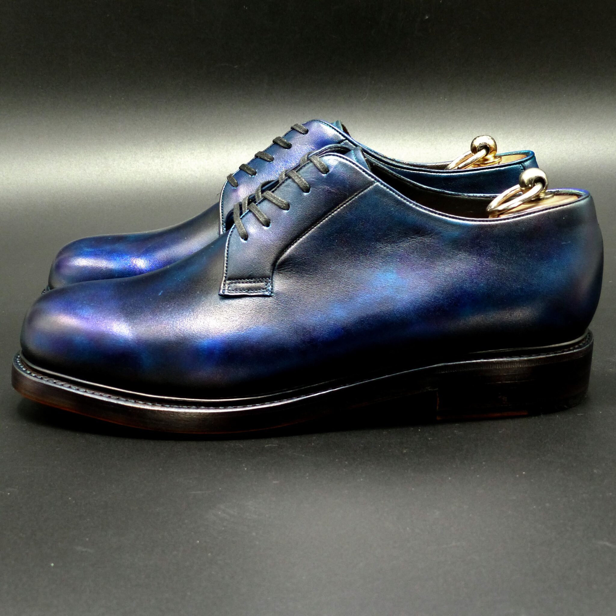
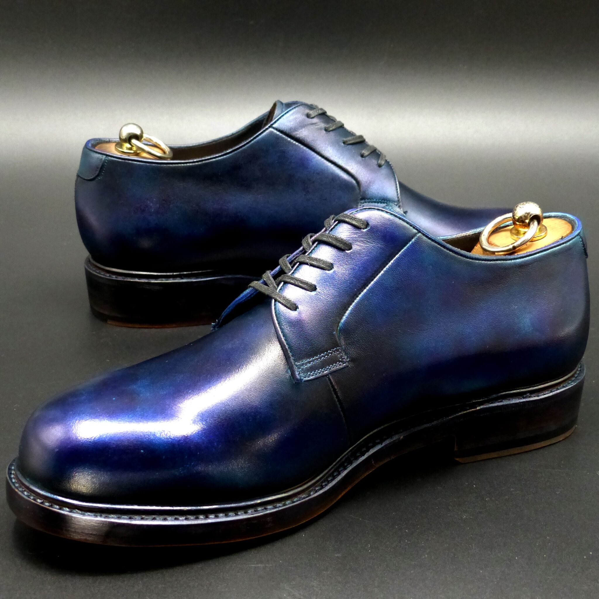
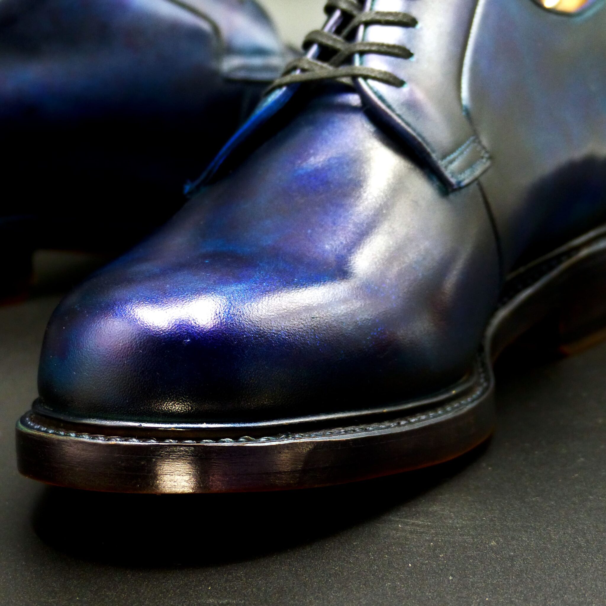
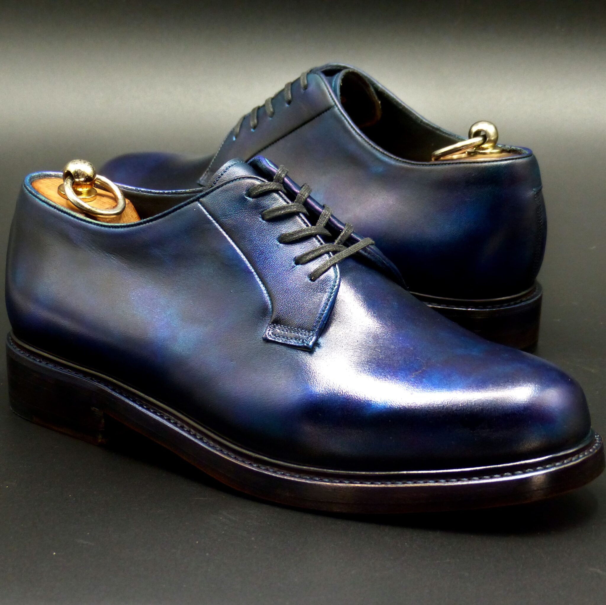
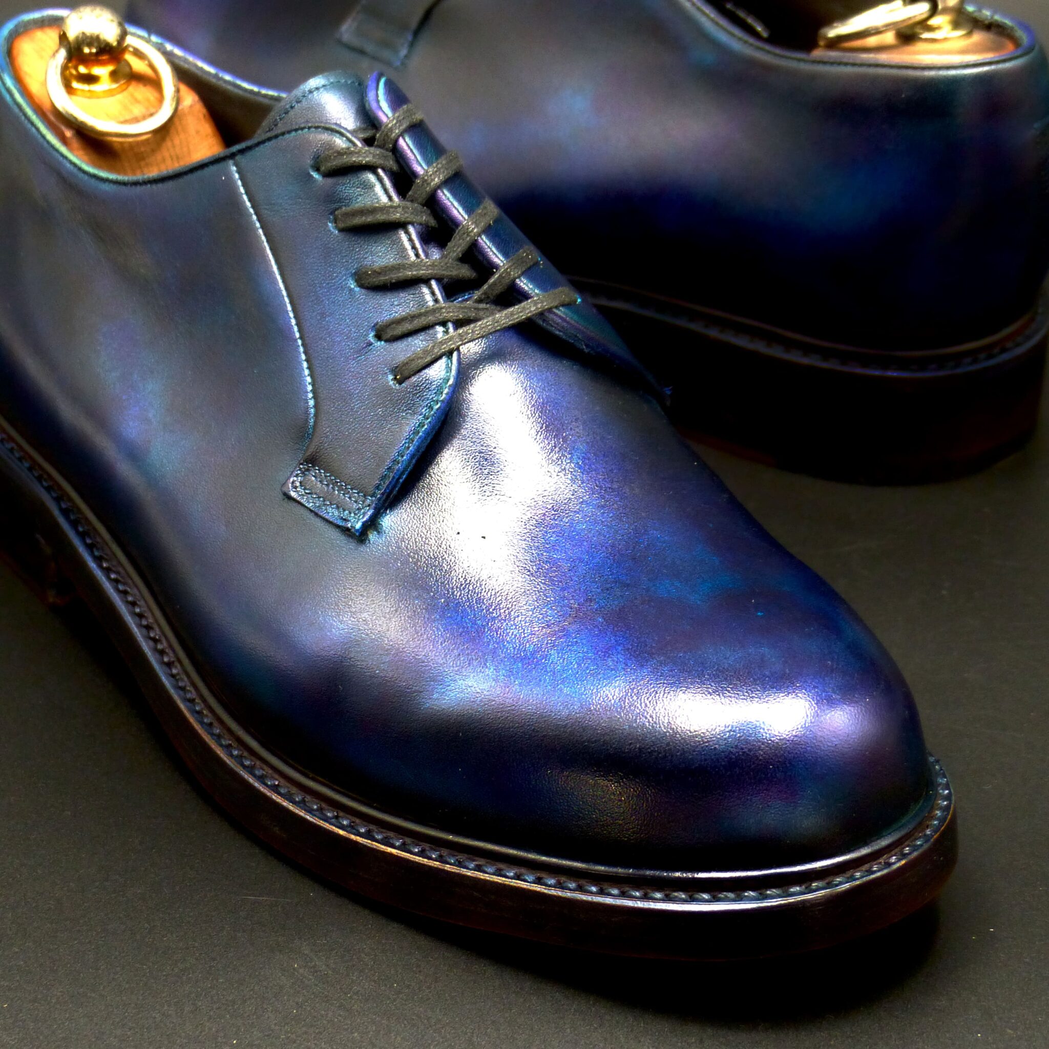
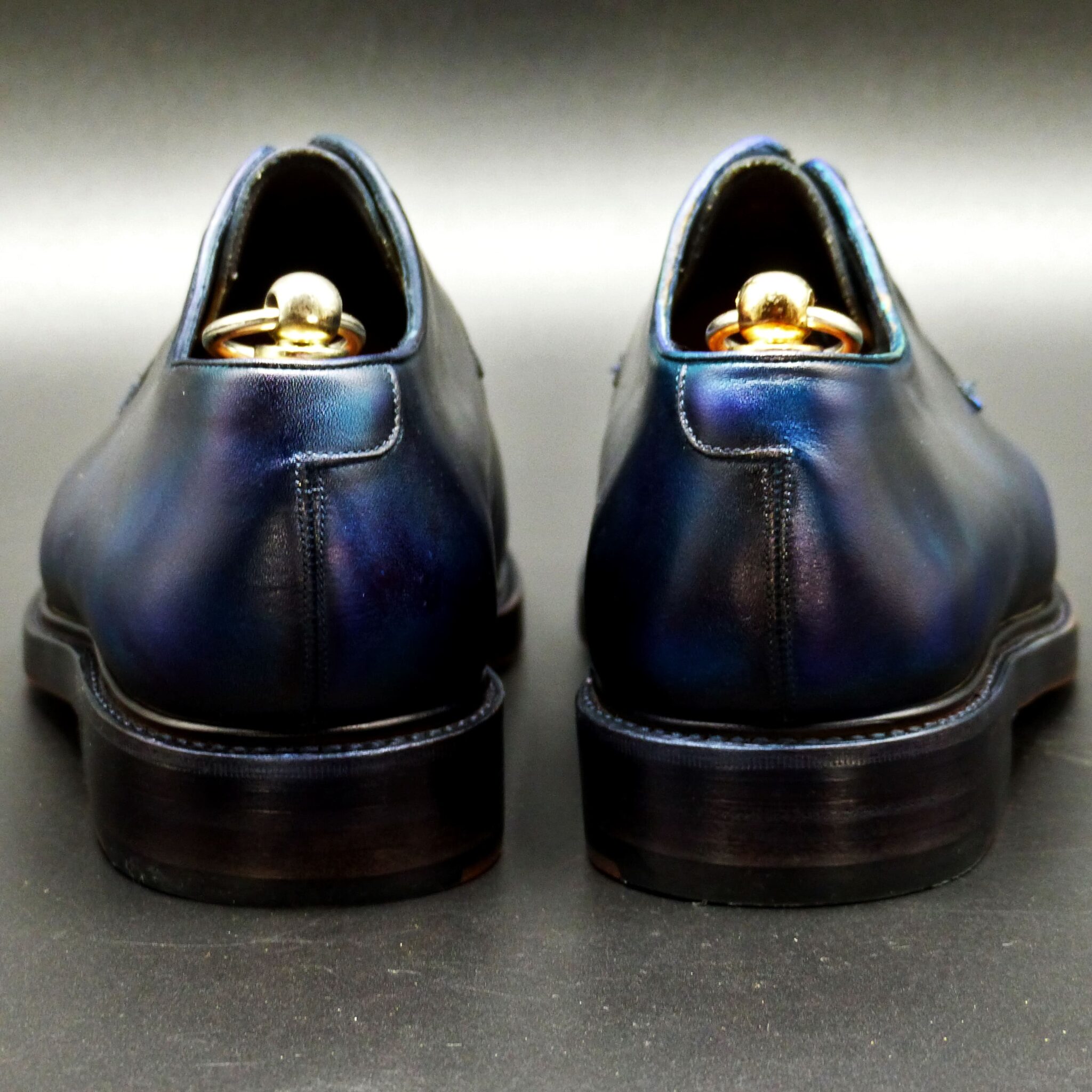

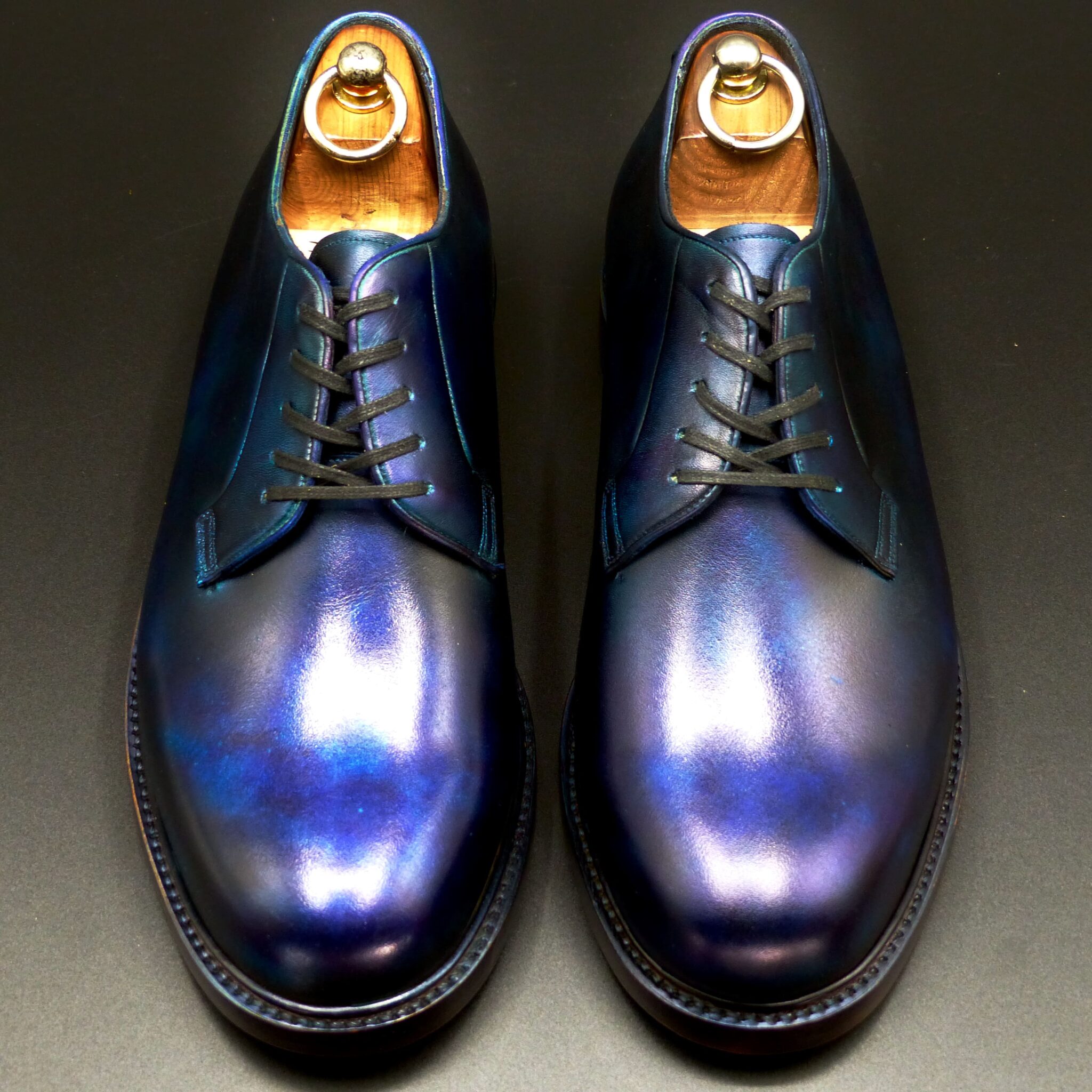
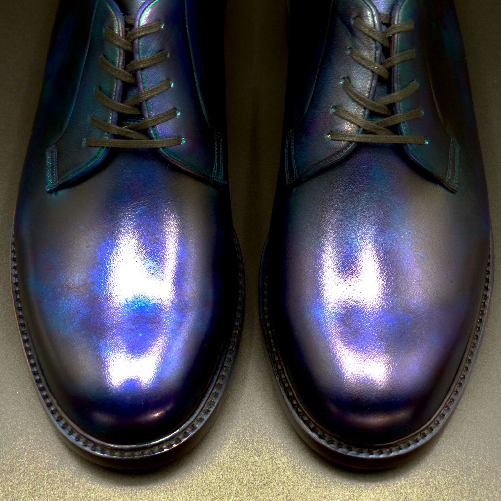
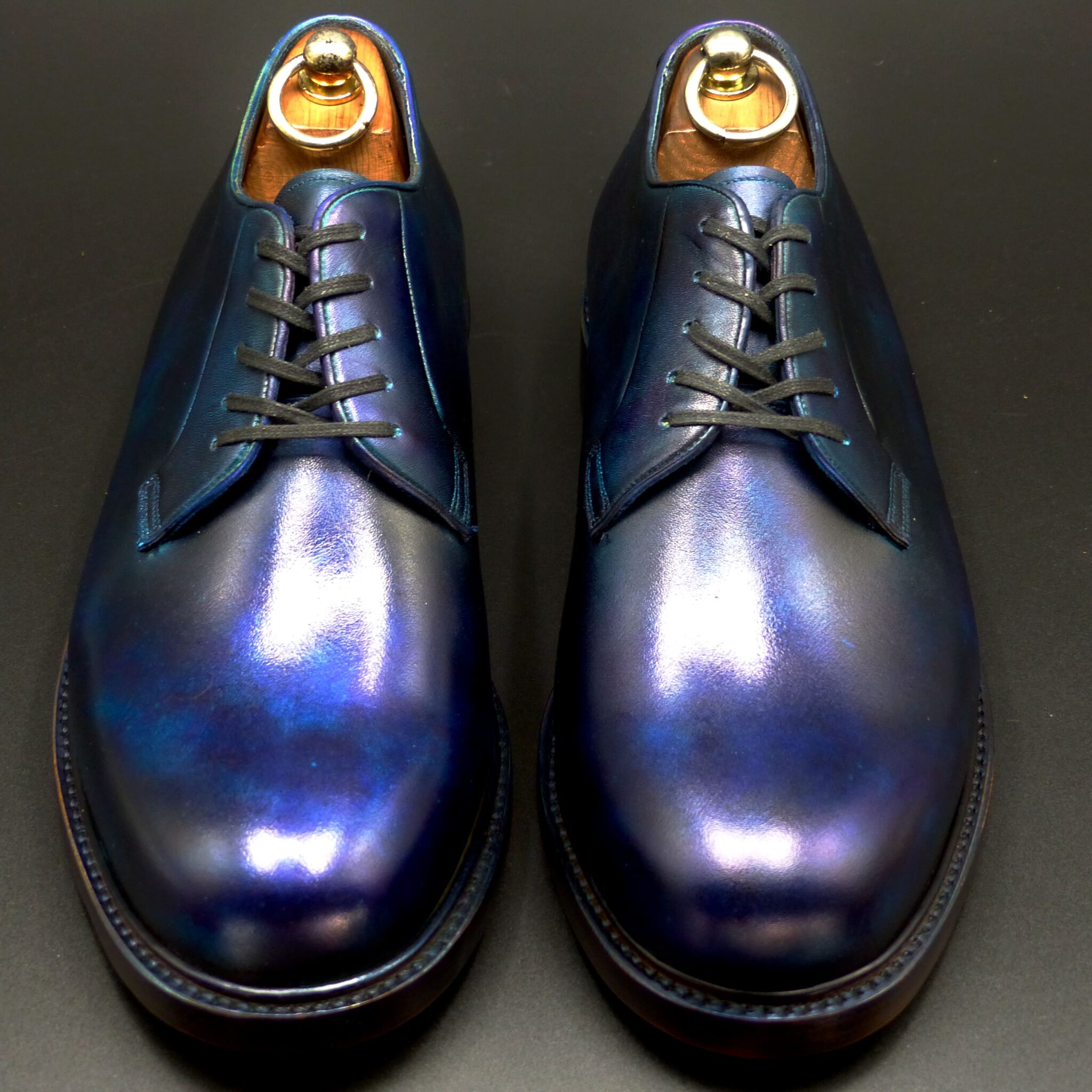
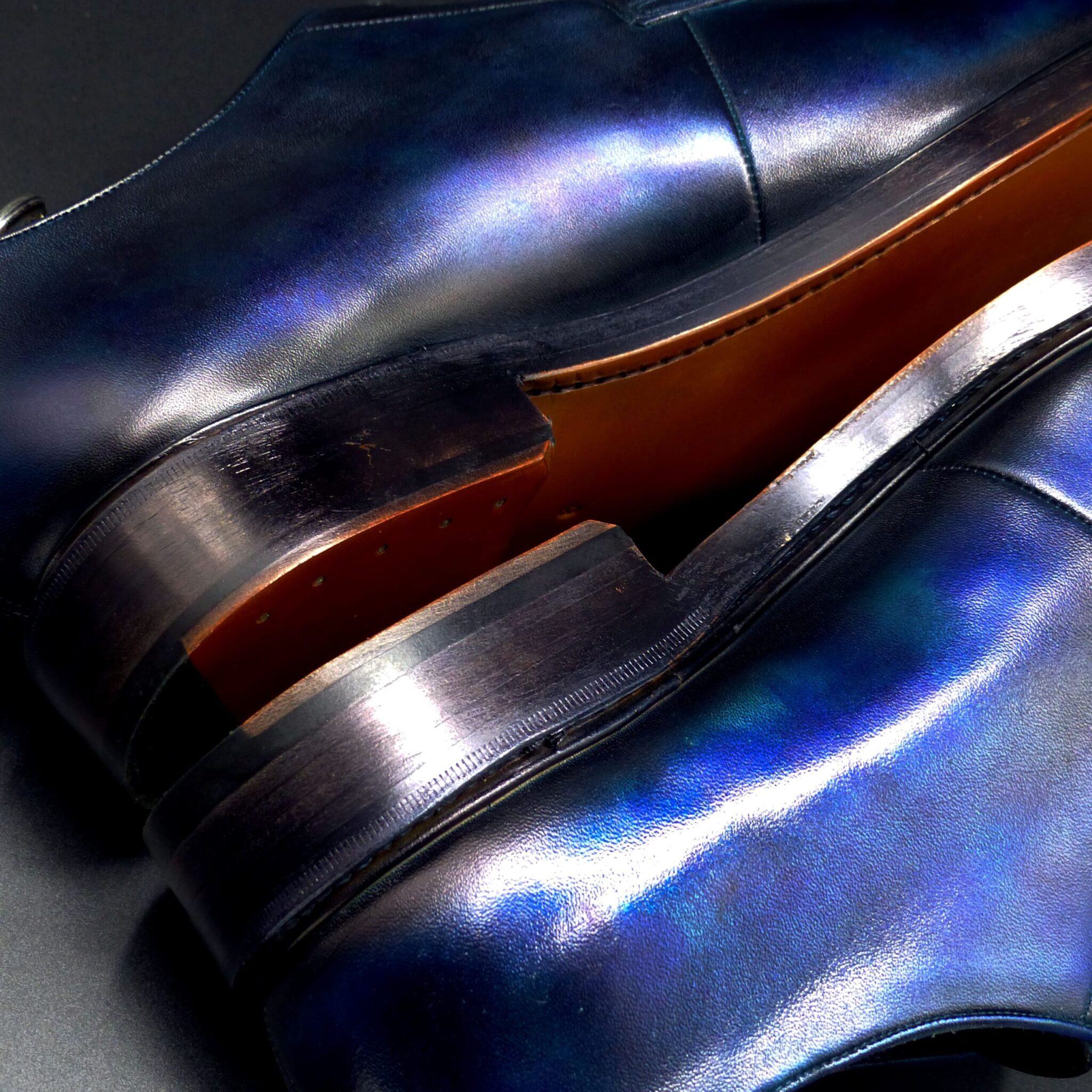
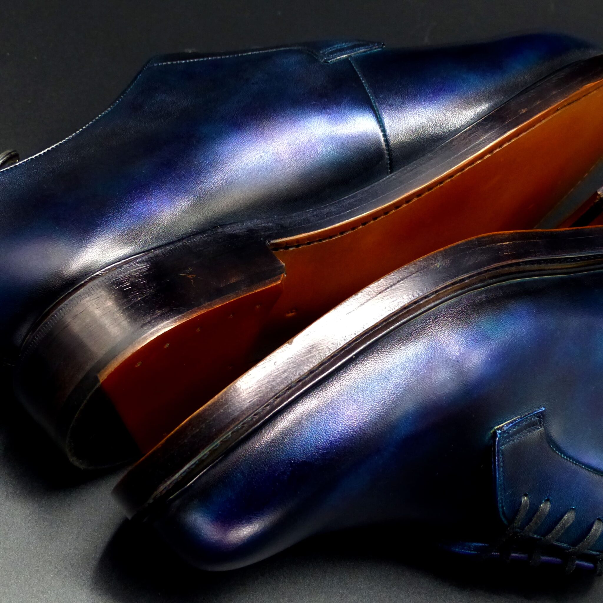
勝色(かちいろ)とは?
勝色(かちいろ)は、古代から中世にかけて使われた非常に濃い藍色で、ほぼ黒に見えるほど深い色合いを持ちます。特に武士の間で好まれ、「勝利」に通じる縁起の良い色とされました。
- 勝色の構成と色の特徴
色の構成
- 藍染の中でも特に濃く染められたものです。
- 染色を重ねることで、黒に近い深い藍色が得られます。
- 鉄媒染(鉄分を使った染色技法) により、さらに暗く、金属的な深みが出ることもあります。
類似の色
- 「褐色(かちいろ)」と混同されることもあるが、古代では「褐(かち)」が「勝」に通じることから、同じ意味で使われることもありました。
- 勝色が使われたシーン
(1)武士の装束・武具
- 鎌倉時代以降、武士の間で好まれた色
- 「勝つ」という語感から、縁起の良い色として戦装束や武具に用いられました。
- 鎧や兜の紐(組紐)、鉢巻、陣羽織 などに勝色が施されました。
- 武士の「精神的な支え」としても機能しました。
(2)衣服・染織文化
- 平安時代には庶民の衣服にも使われていましたが、武士文化の発展とともに特に重要視されました。
- 藍染の中で最高位の色 とされ、格式のある色として扱われました。
(3)精神的・宗教的な象徴
- 武士道とともに「忍耐」「不屈の精神」「勝利への願い」を象徴する色となります。
- 禅宗の影響 もあり、無駄を省いた簡素な美の象徴としても受け入れられました。
- 勝色が象徴するもの
① 勝利と武運
- 武士にとって「勝つ」ことは生死を分ける重要な要素であり、縁起を担ぐ意味で愛用されました。
- 戦場での士気を高める色でもありました。
② 忍耐・不屈の精神
- 濃い藍色は、何度も染めを重ねることで得られることから、「根気強さ」「耐久性」の象徴です。
- 戦国武将が「耐えて勝つ」ことを意識する色として好みました。
③ 伝統と格式
- 貴族文化が色彩豊かだったのに対し、武士は質実剛健を重んじ、濃い色を好みました。
- 江戸時代以降も、侍の着物や袴に用いられ、格式のある色として残りました。
勝色は、単なる藍染の一種ではなく、「勝利への願い」「忍耐」「武士の精神」を象徴する色として、戦装束や武具に用いられました。特に鎌倉・戦国時代の武士たちに愛され、精神的な支えともなった色です。江戸時代以降も格式ある色として扱われ、現在でも和装や工芸品などにその名残を見ることができます。
What is Kachi-iro?
Kachi-iro is an extremely deep indigo color used from ancient times to the medieval period. It is so dark that it appears almost black. Particularly favored by samurai, this color was considered auspicious as its name “kachi” (勝ち) is associated with “victory” (勝利).
- Composition and Characteristics of Kachi-iro
Composition of the Color
- A deep shade of indigo dye (aizome).
- Achieved by repeated dyeing to create an almost black, intense indigo.
- Iron mordant (tetsubaisen) was sometimes used to further darken the color, adding a metallic depth.
Similar Colors
- Sometimes confused with “kasshoku” (褐色), as “katsu” (褐) was pronounced the same as “kachi” (勝) in ancient times. Both were used interchangeably in some cases.
- Situations Where Kachi-iro Was Used
(1) Samurai Attire and Armor
- Favored by samurai from the Kamakura period onward.
- Due to its association with “winning” (勝つ), it was considered a lucky color and was used in battle attire and weapons.
- Laces for armor and helmets (kumihimo), headbands, and battle surcoats (jinbaori) were often dyed in kachi-iro.
- It also served as a psychological support for warriors.
(2) Clothing and Dyeing Culture
- While it was worn by commoners during the Heian period, it became particularly significant as samurai culture developed.
- Considered the highest-ranking shade of indigo, symbolizing formality and dignity.
(3) Symbolism in Spiritual and Religious Contexts
- With the rise of Bushido, it came to represent endurance, resilience, and the wish for victory.
- Influenced by Zen Buddhism, it was also embraced as a symbol of simple and minimalist beauty.
- Symbolism of Kachi-iro
① Victory and Military Fortune
- For samurai, “winning” (勝つ) was a matter of life and death, making this color an auspicious choice.
- It was also used to boost morale on the battlefield.
② Endurance and Resilience
- The deep indigo was achieved through repeated dyeing, symbolizing persistence and durability.
- Sengoku warlords saw it as a reminder to “endure and win”.
③ Tradition and Prestige
- Unlike the vibrant colors favored by the aristocracy, samurai valued simplicity and strength, preferring darker shades.
- Even after the Edo period, it remained a formal and prestigious color for samurai attire, such as hakama and kimono.
- Conclusion
Kachi-iro was not merely a shade of indigo but a symbol of victory, endurance, and the samurai spirit. It was widely used in battle gear and weapons, especially during the Kamakura and Sengoku periods. Even after the age of the samurai ended, it continued to be regarded as a distinguished color, and its legacy lives on today in traditional Japanese clothing and crafts.
ダブル・モンク
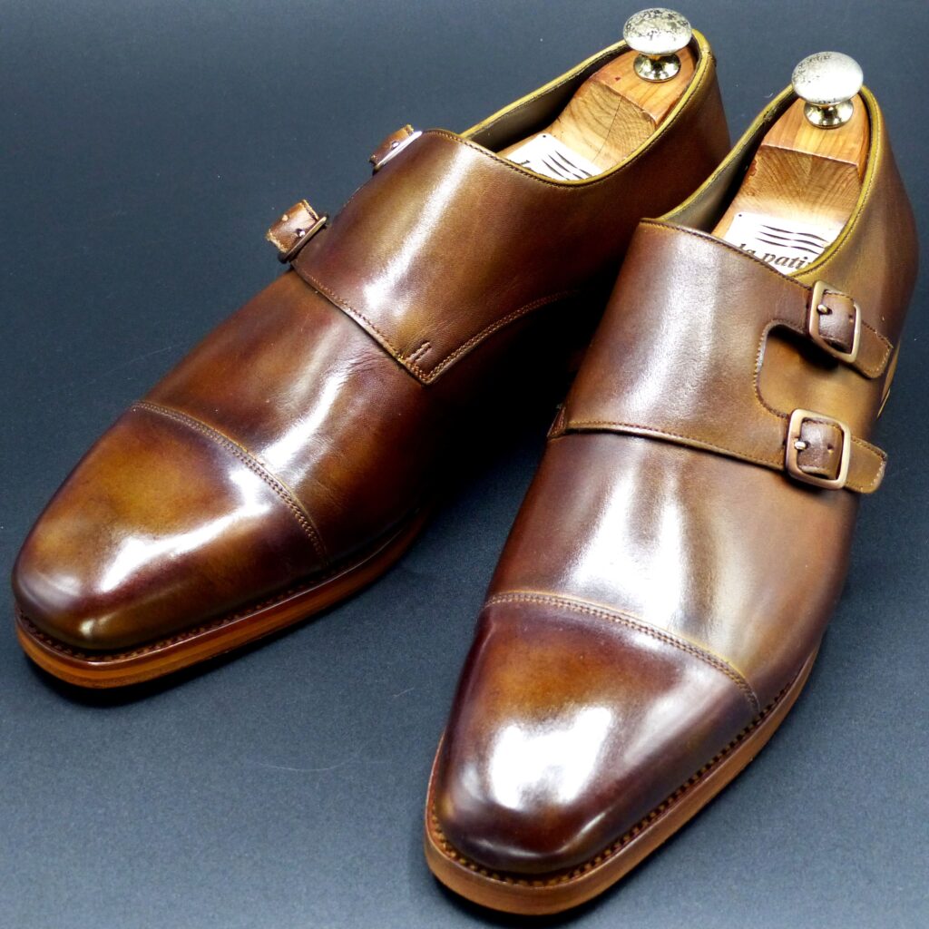
color name;
[ Fujizome-Iro]
柴染色
Double Monk
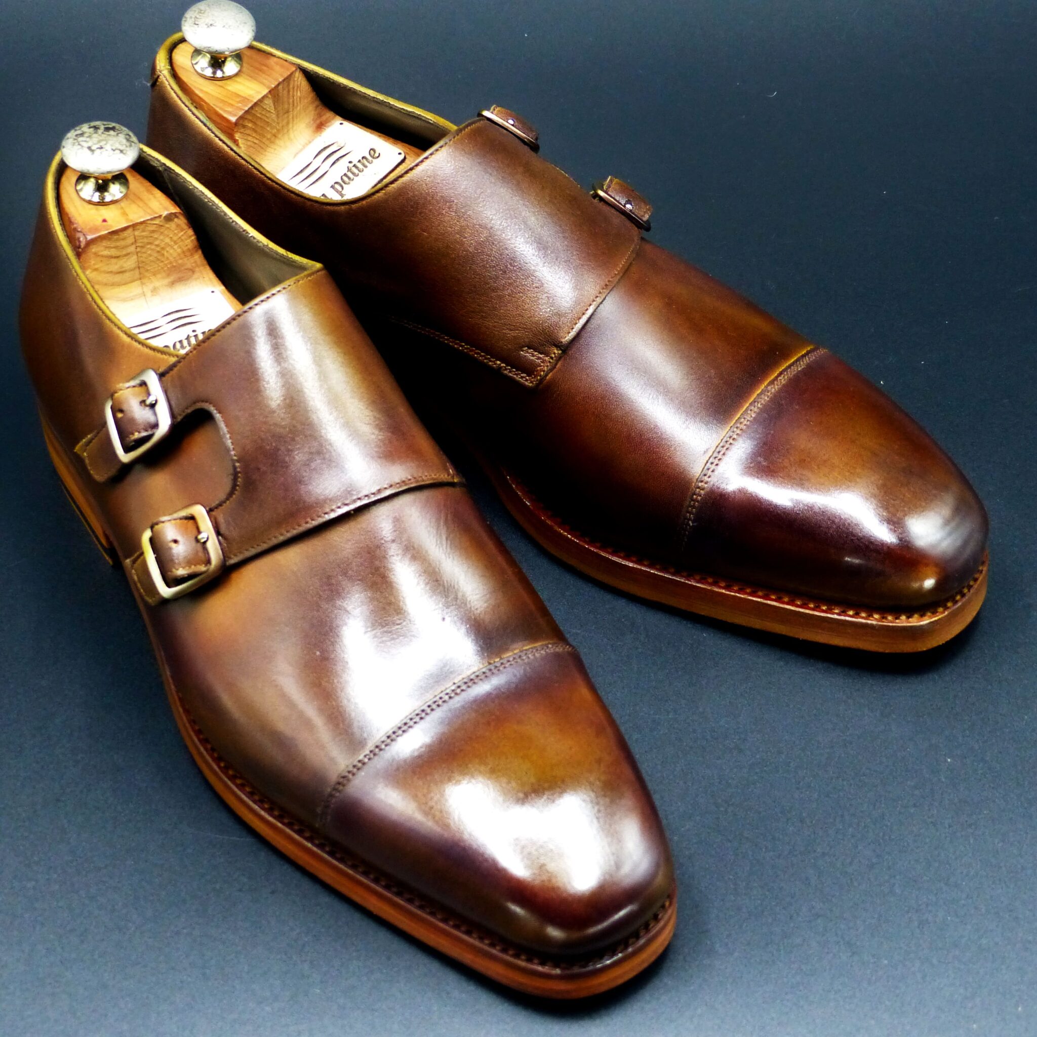
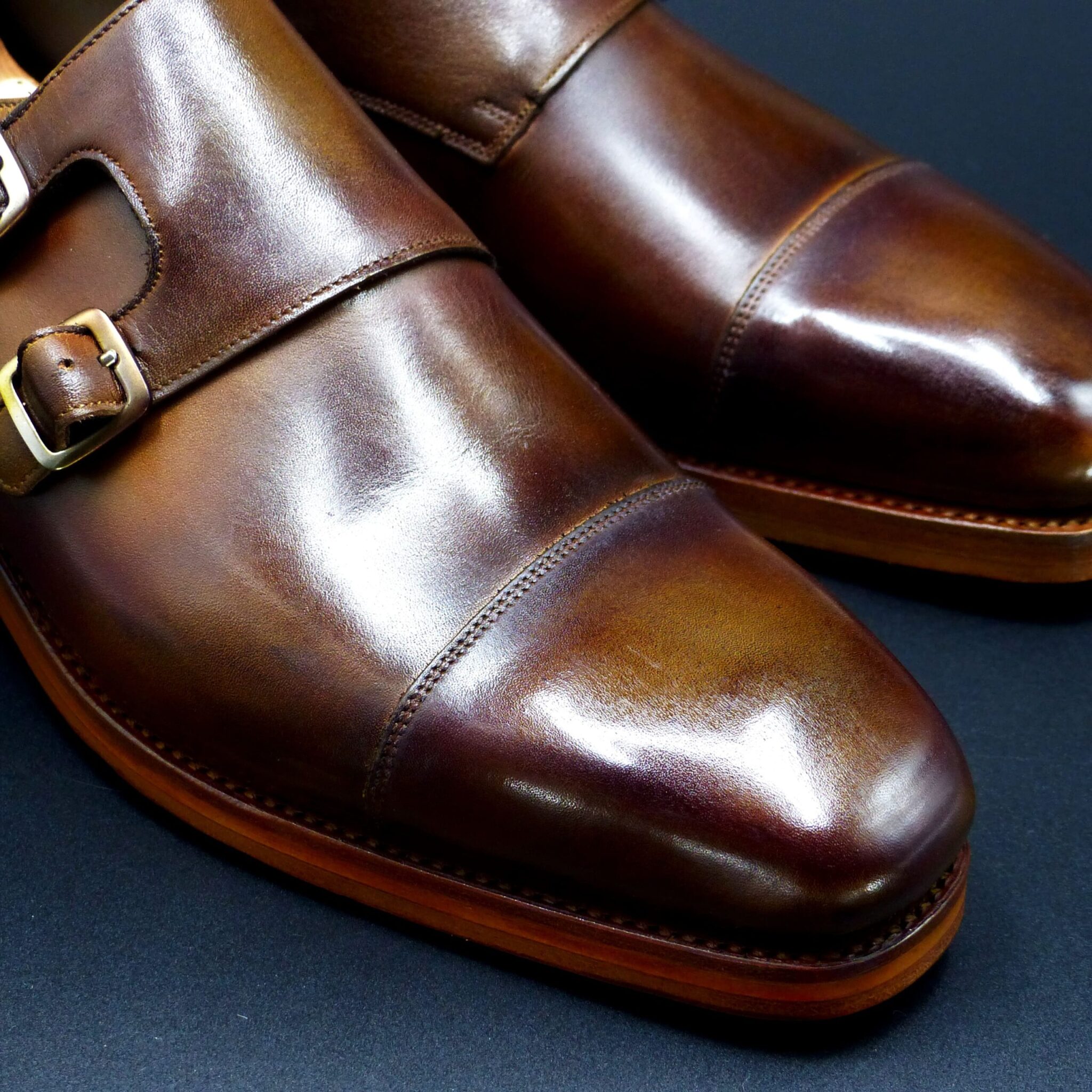
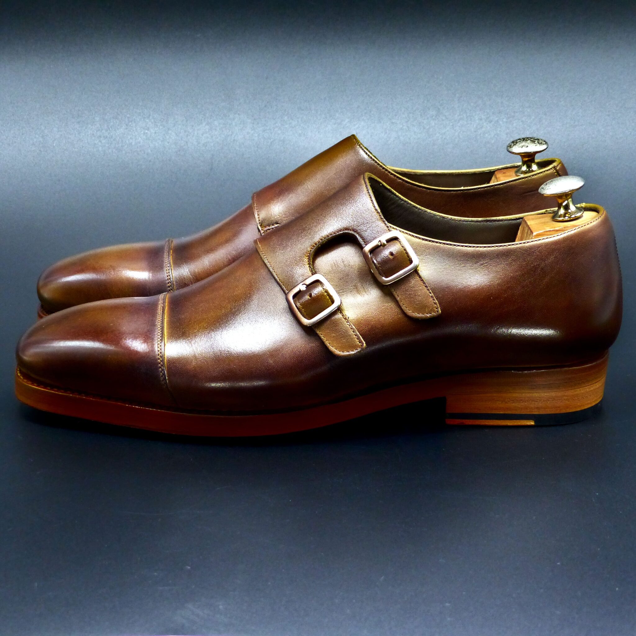
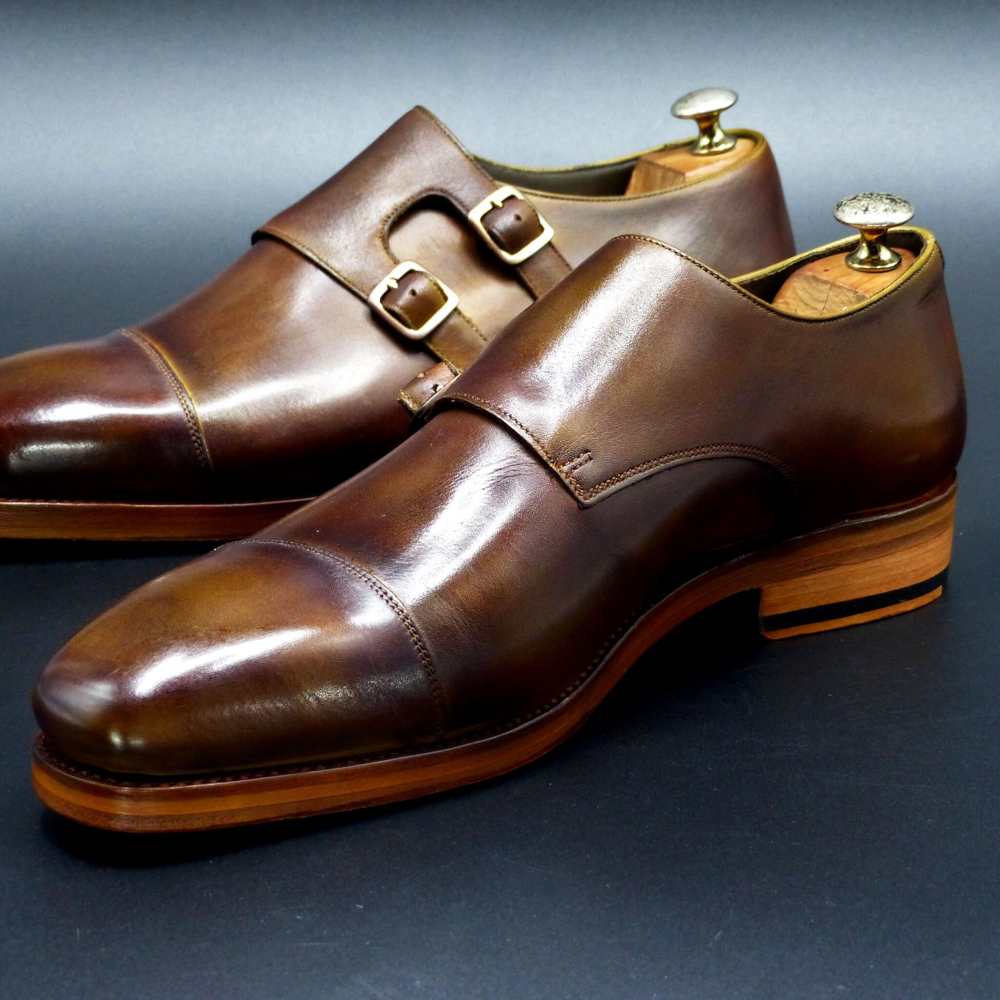
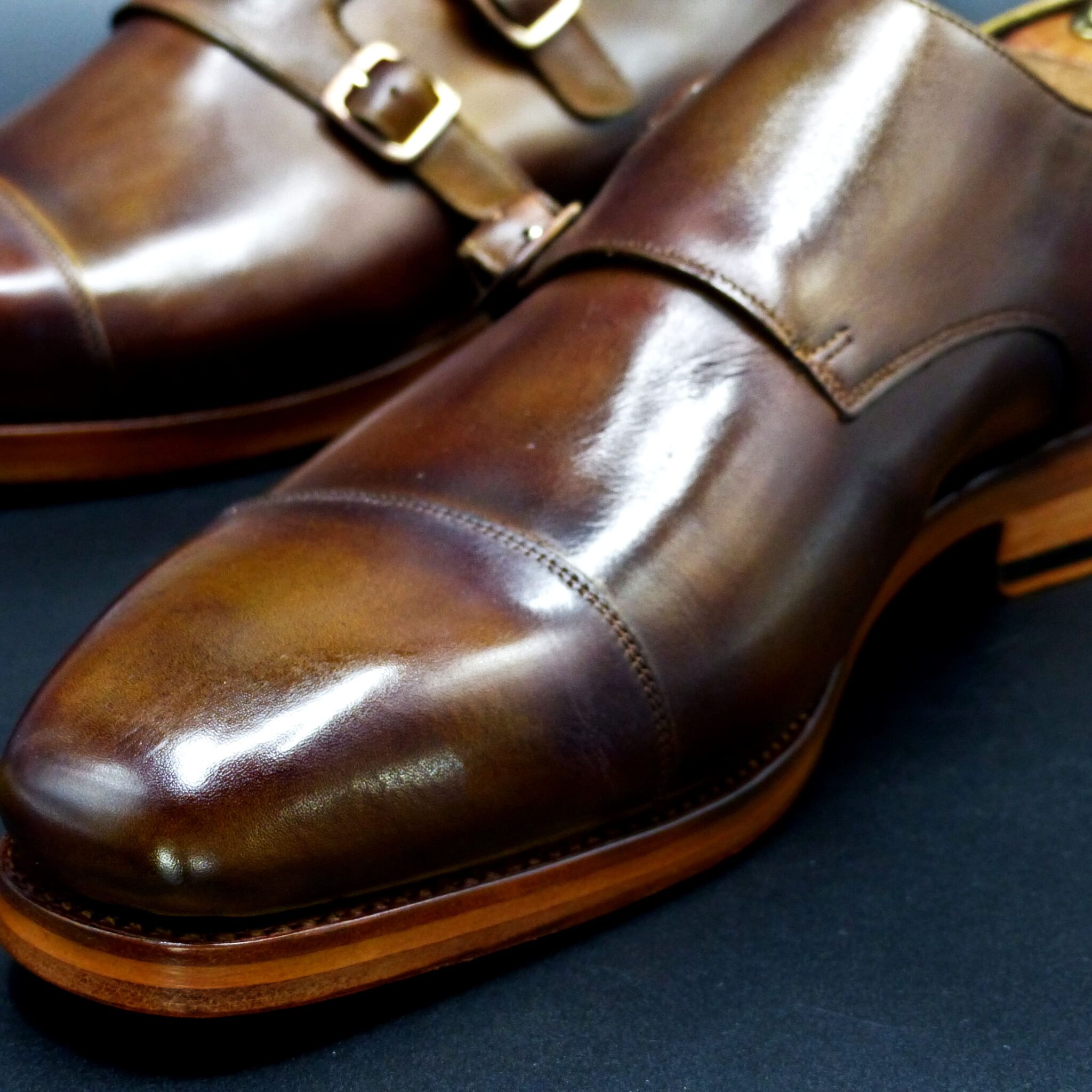
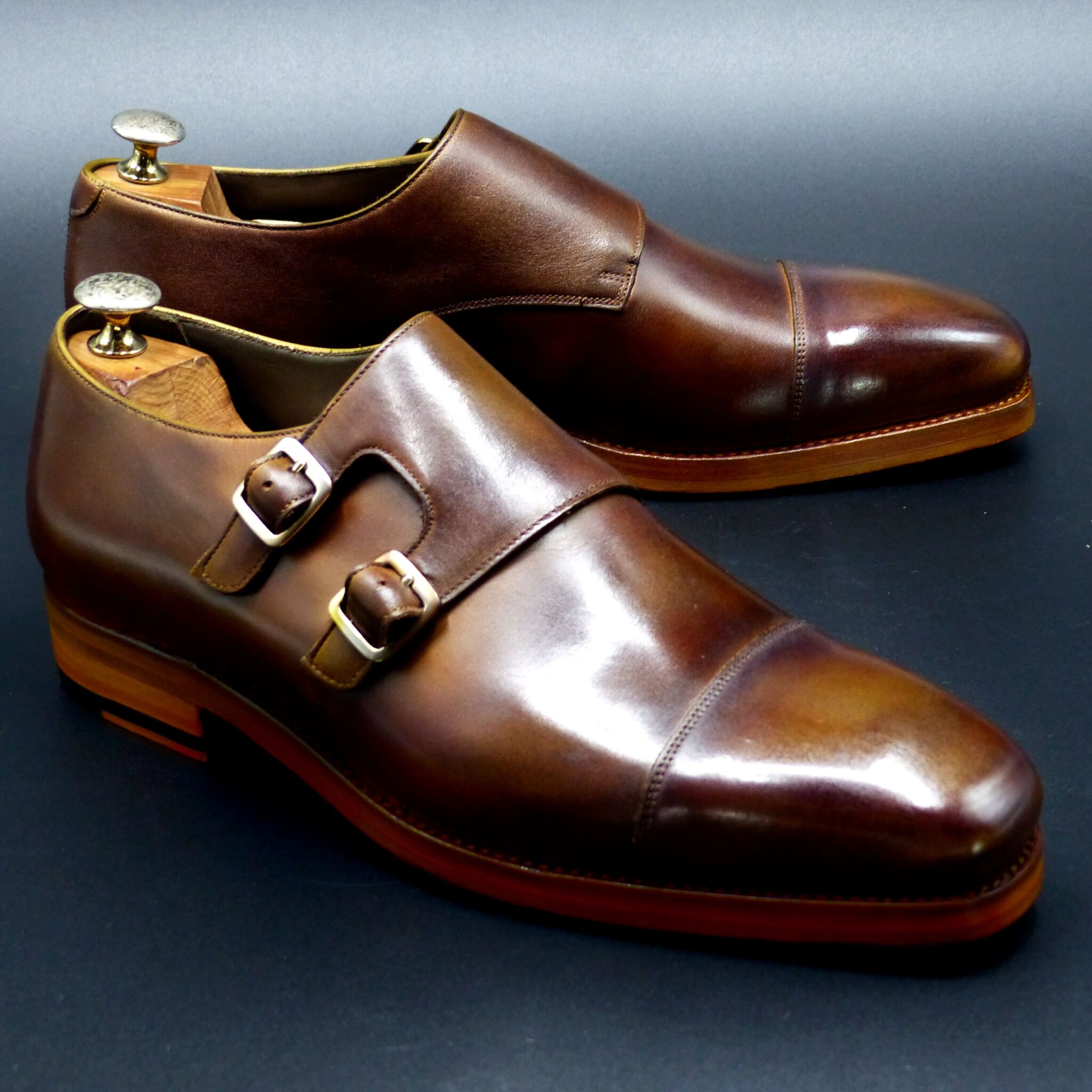
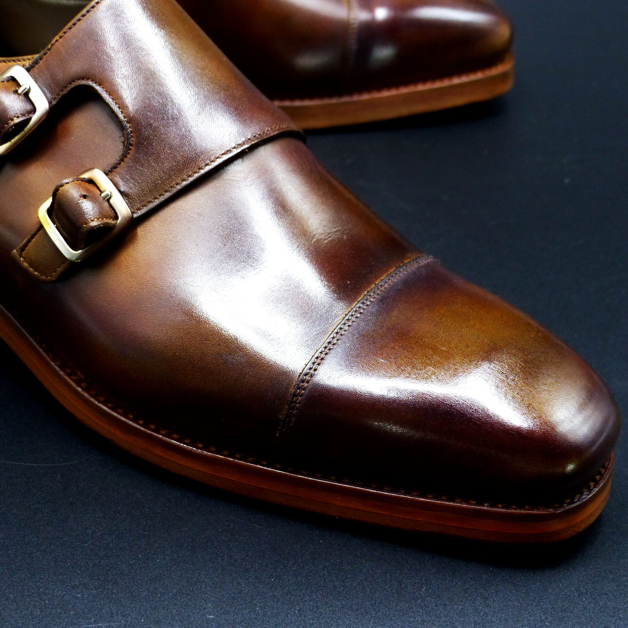
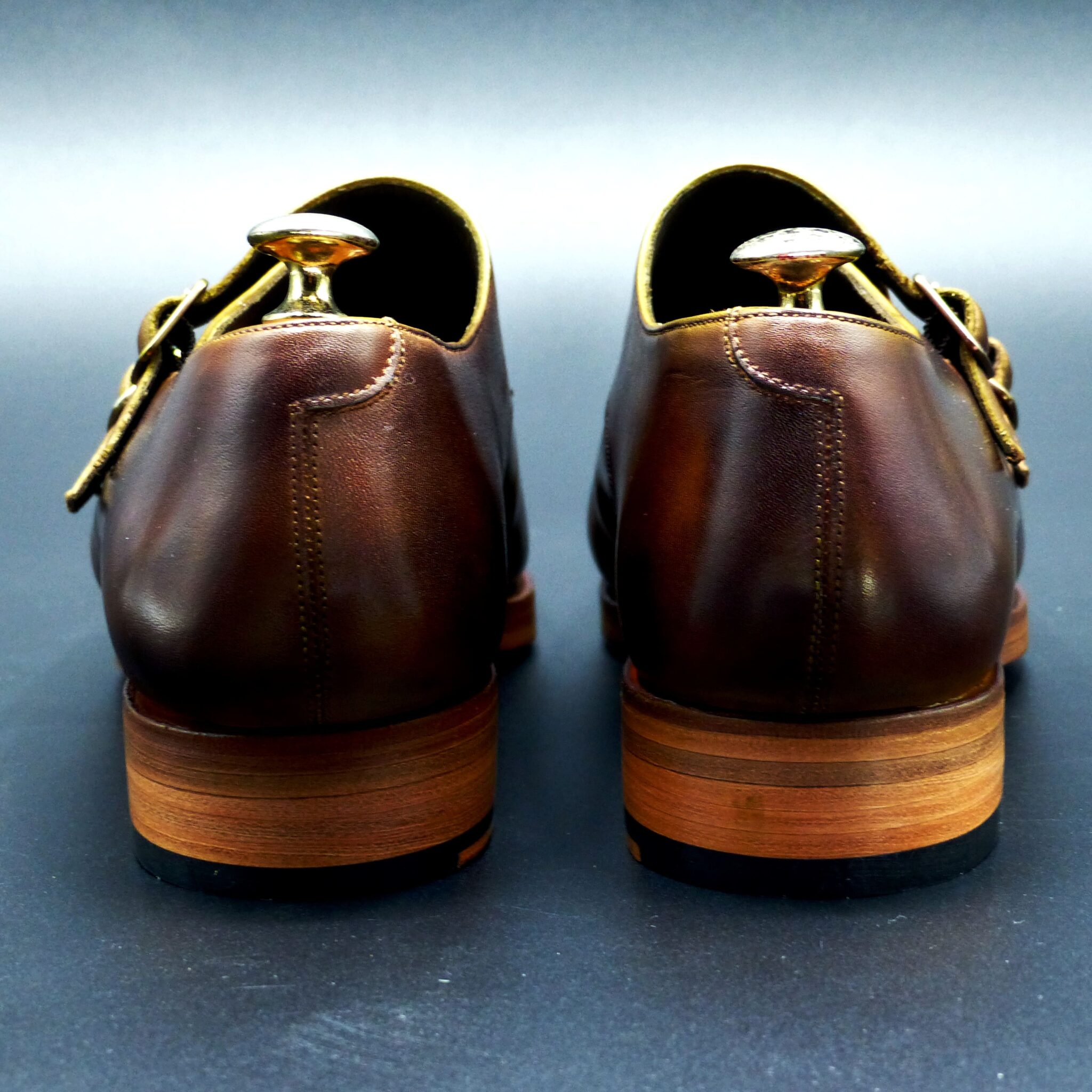
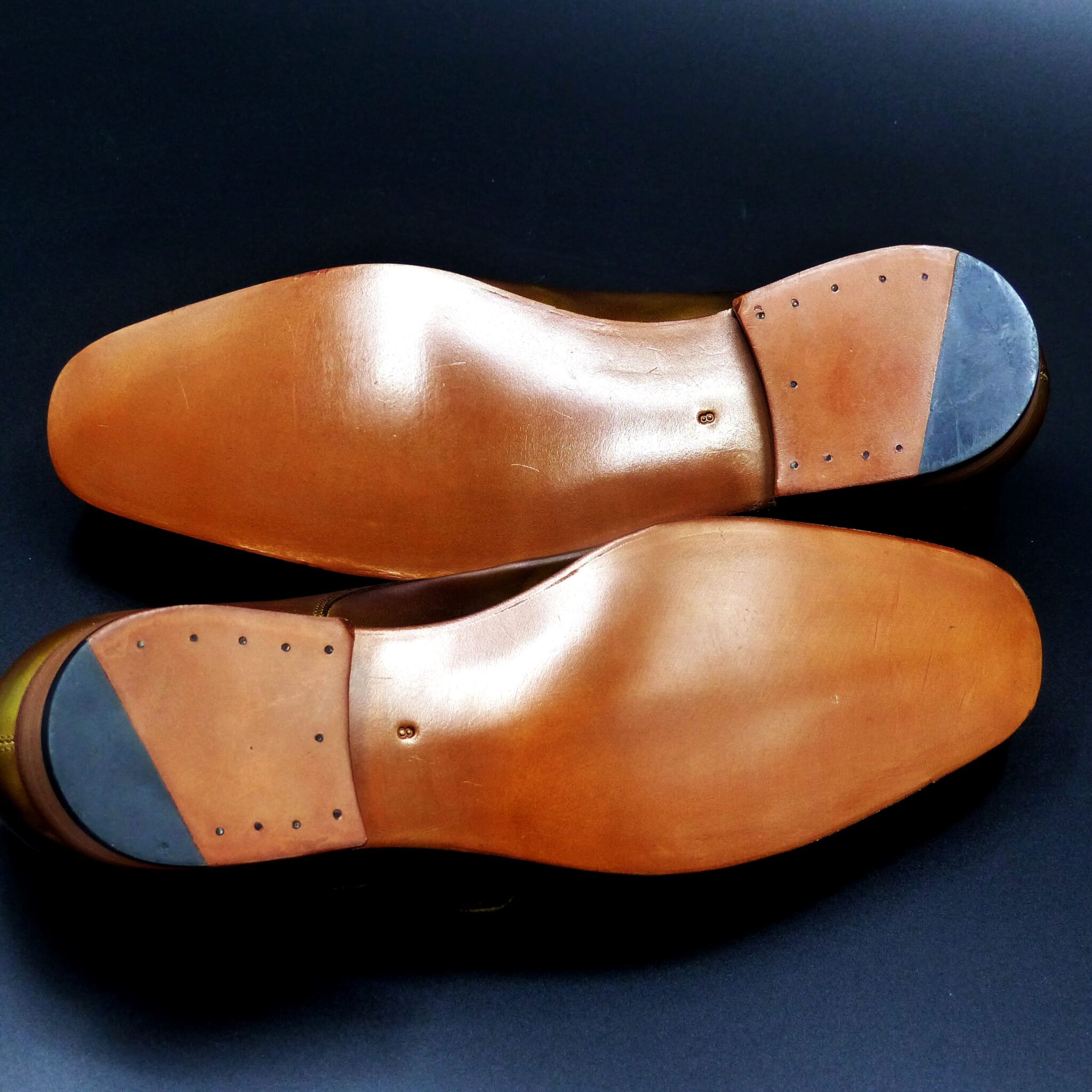
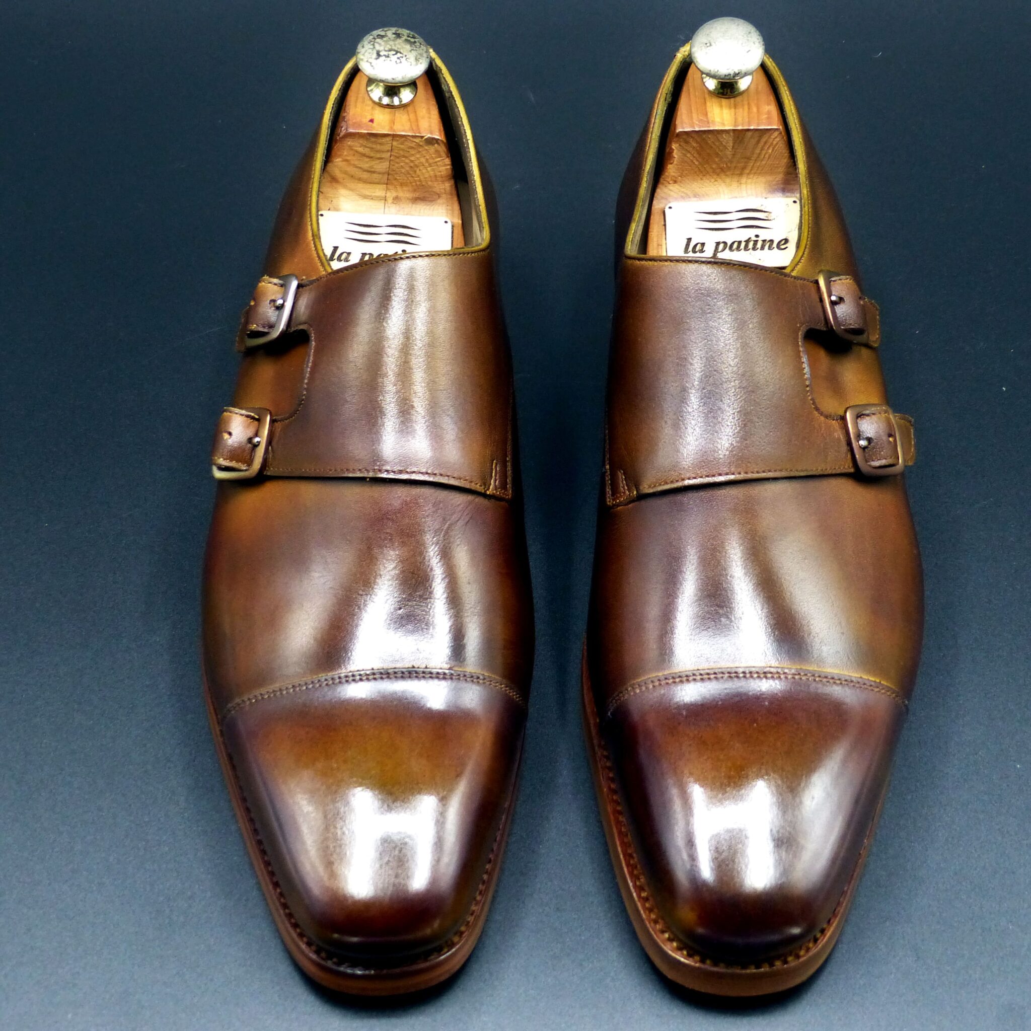
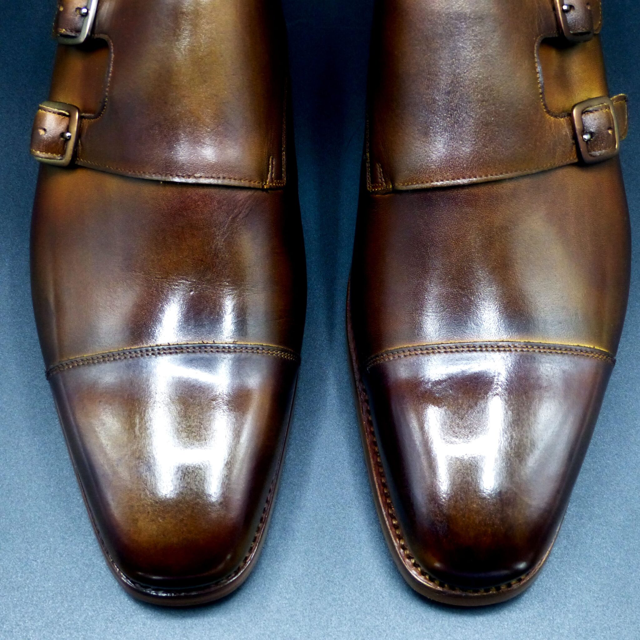
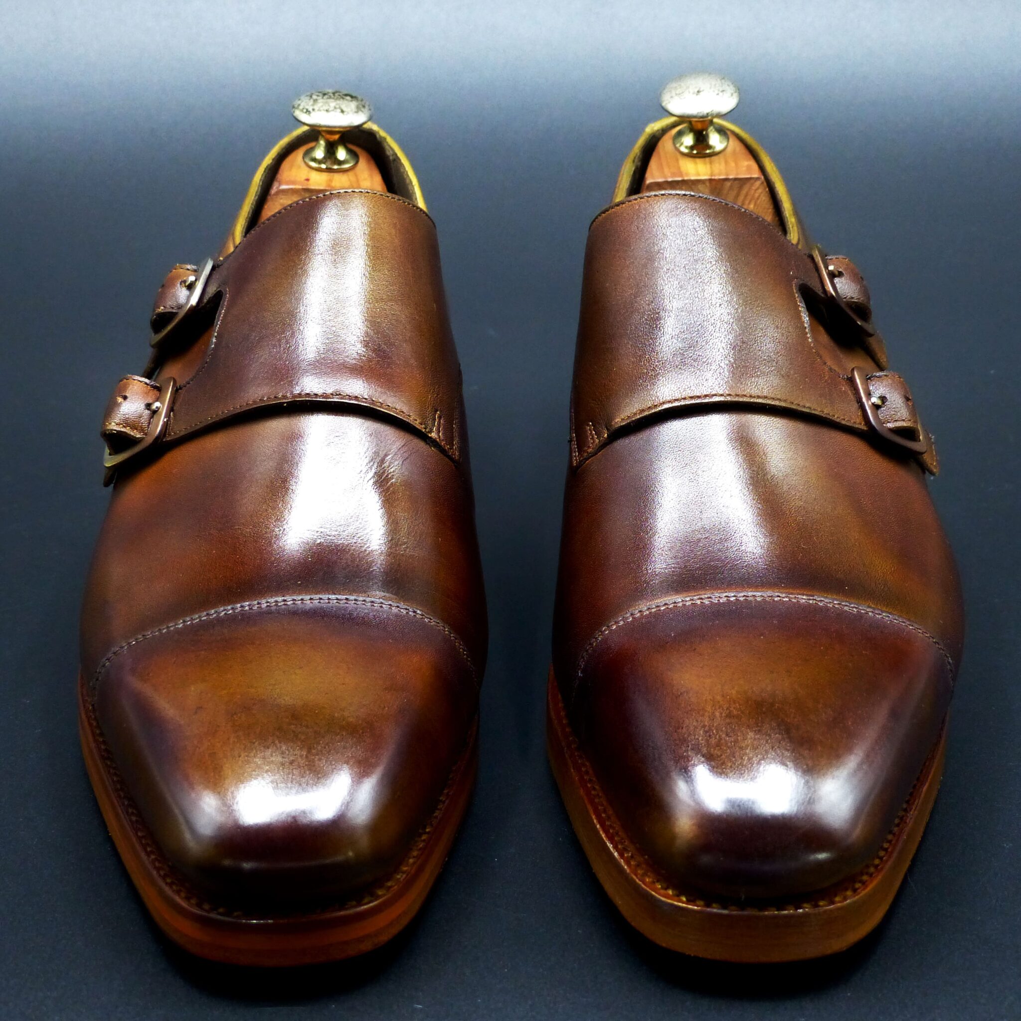
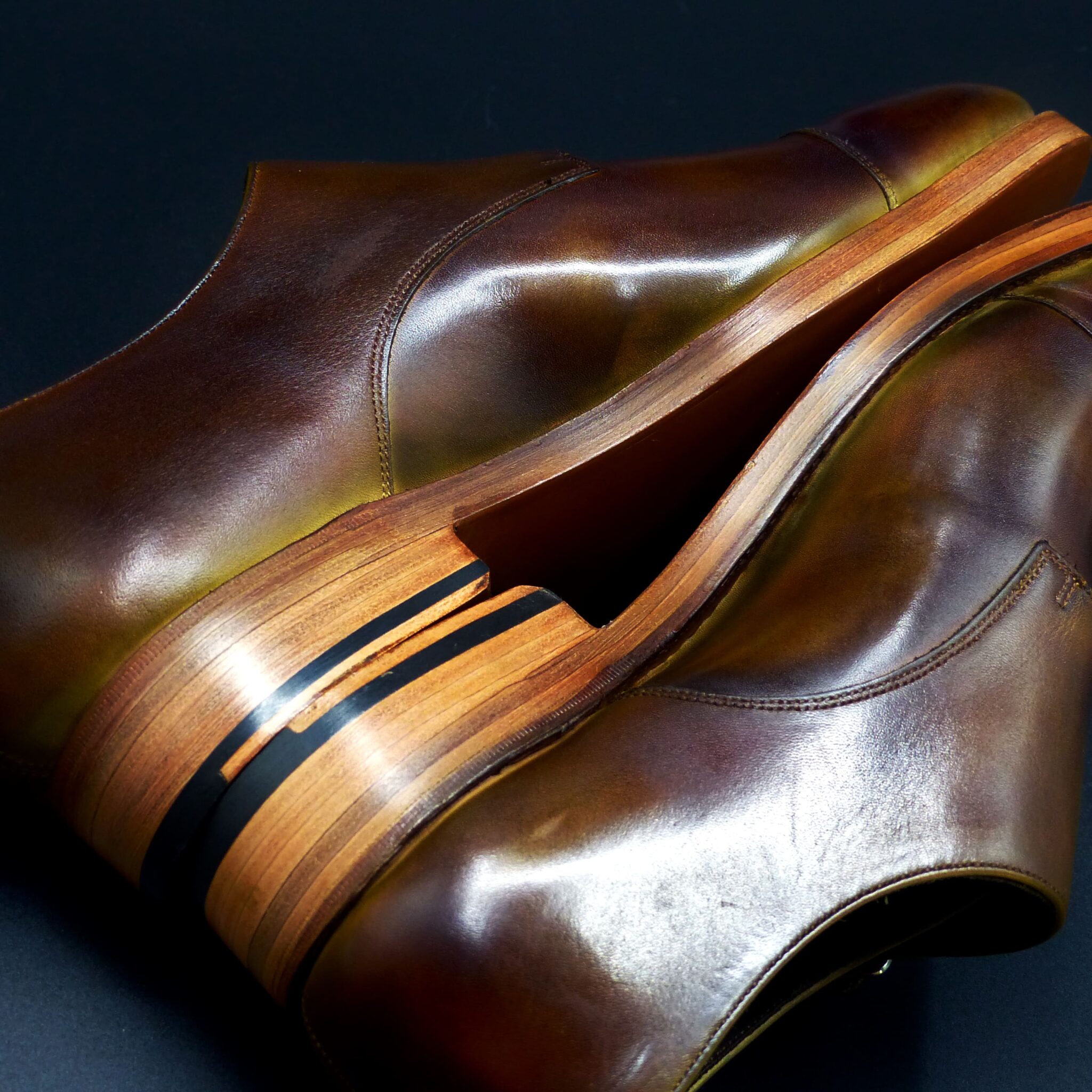
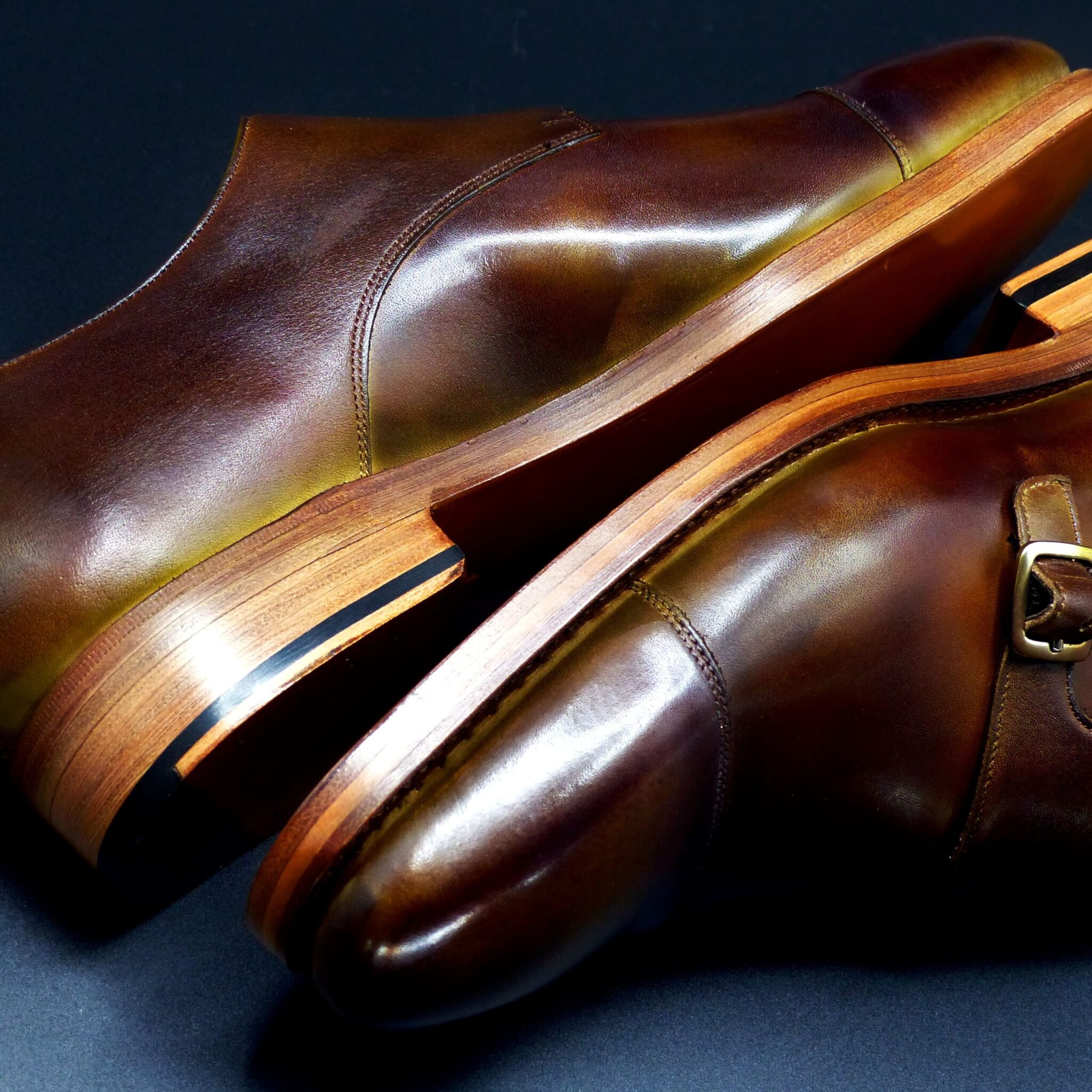
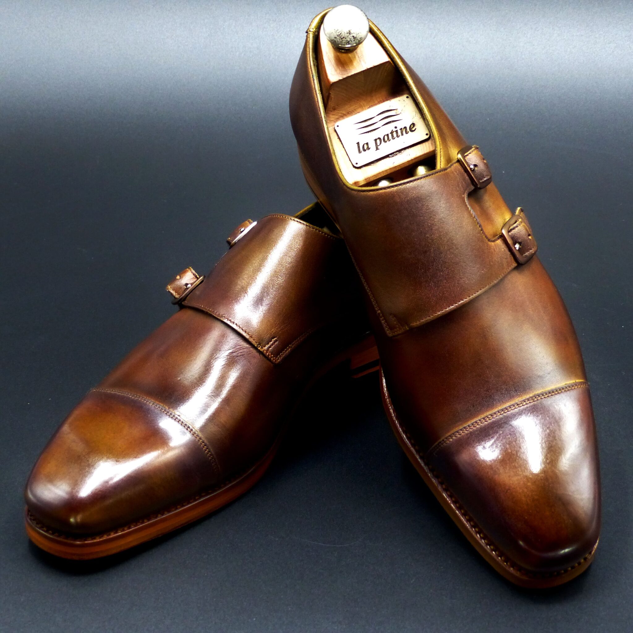
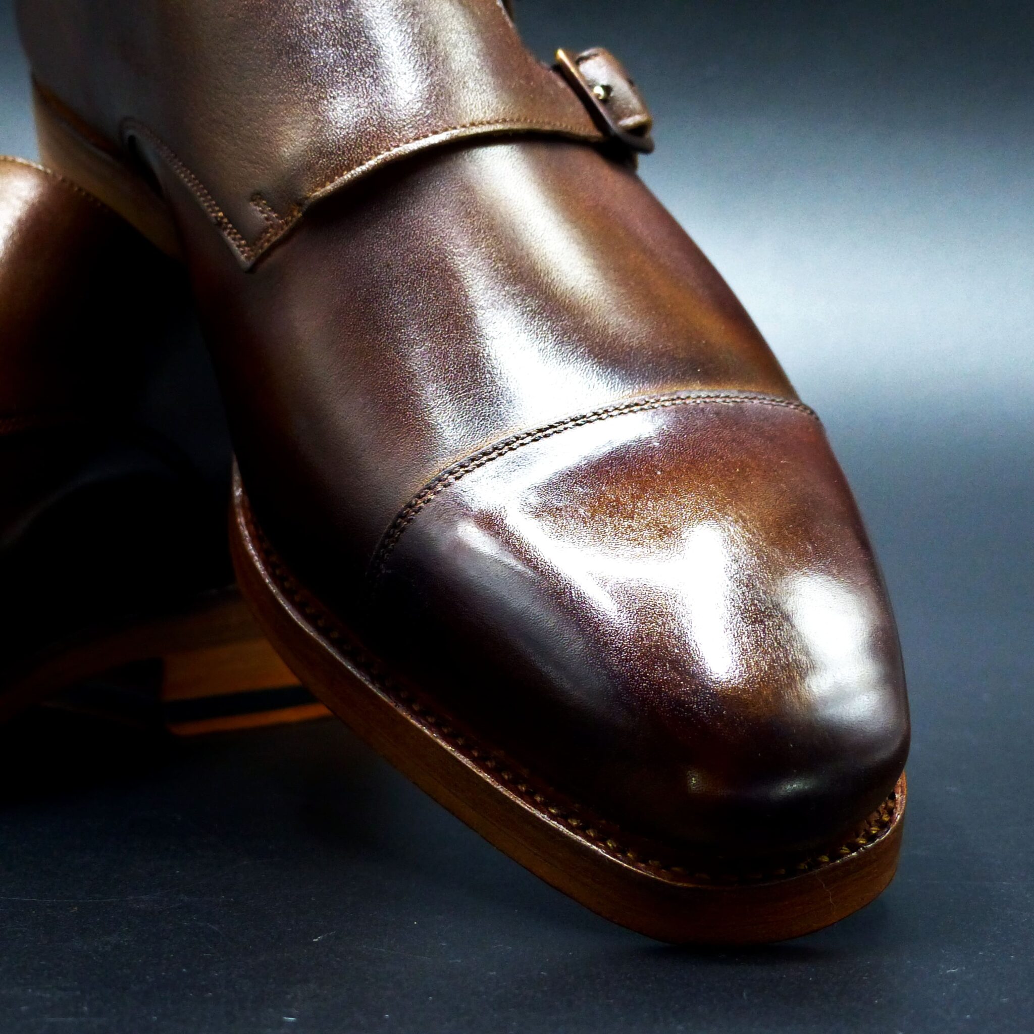
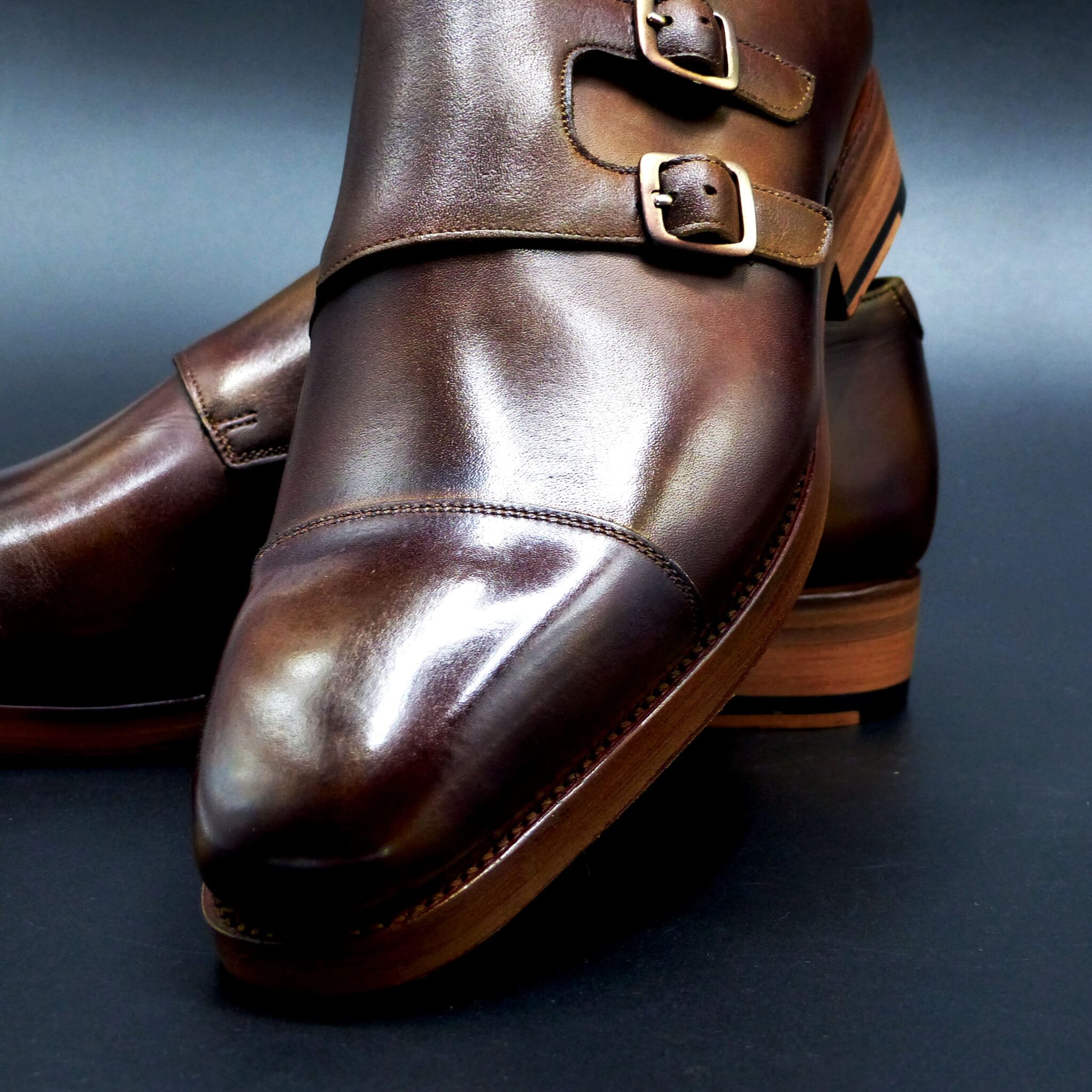
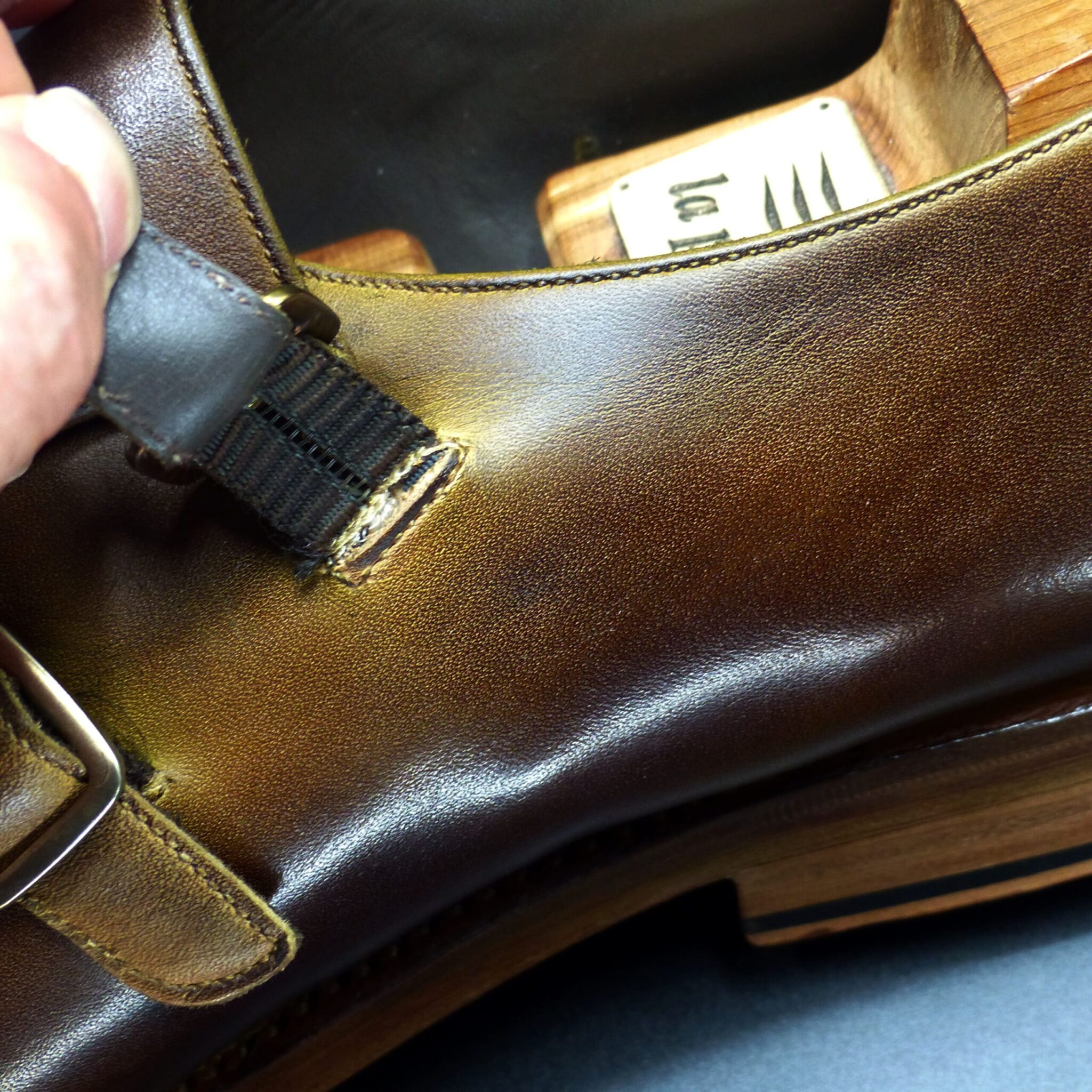
柴染(ふしぞめ)とは?
柴染(ふしぞめ)は、古代日本で用いられた 淡い黄褐色(茶色がかった黄土色)で、主に植物の樹皮や草木を用いた染色技法によって得られた色です。自然な色調でありながらも品位があり、平安時代には官人や貴族の装束にも使われました。
- 柴染の構成と色の特徴
色の構成
- 草木染めによる黄褐色系統の色
- 媒染剤(鉄・灰汁など) を調整することで、やや赤みを帯びたものや黄土色寄りのものができます。
- 主に柴(しば)や樹皮(楊梅・樫など)を原料 として使用されました。
類似の色
- 「黄土色」や「朽葉色」に近いが、やや茶色みがかった落ち着いた色合いです。
- 平安時代の『延喜式』には 「柴染(ふしぞめ)」が公式な色名 として記録されています。
- 柴染が使われたシーン
(1)官人や貴族の装束
- 平安時代には 位階の低い官人の衣服 に用いられました。
- 朝廷の服色規定(『延喜式』)では 「四位・五位の狩衣(かりぎぬ)」 に指定されていました。
- 貴族階級の中でも、高位の者よりもやや下の位の官人が着る色として定められていました。
(2)武士や庶民の衣服
- 鎌倉・室町時代以降、武士の平常服や庶民の衣服 にも普及しました。
- 華美な色ではなく、実用性があり汚れが目立ちにくいため、庶民の間で長く愛用されました。
(3)染織文化と芸術
- 草木染めの代表的な色 として、茶道や和装に取り入れられました。
- 現代でも 和紙、織物、工芸品 などで柴染の色が使われることがあります。
- 柴染が象徴するもの
① 質素と実用性
- 華やかさを抑えた 控えめな色合い で、質実剛健な武士や庶民の精神に通じています。
- 汚れが目立ちにくく、実用的な色 として重宝されました。
② 身分と格式
- 平安時代には 四位・五位の官人の装束 に用いられたことから、中流階級の格式を示す色でもありました。
- 侍や庶民にも広がり、身分を問わず使われた色 でもありました。
③ 自然との調和
- 草木の色に近く、日本人の「侘び寂び」の美意識 にも通じます。
- 和服や茶道具にも使われ、自然に溶け込む落ち着いた美しさ
柴染(ふしぞめ)は、古代から武士や庶民に親しまれた 黄褐色の草木染め で、実用的でありながらも格式のある色でした。平安時代には官人の衣服に指定され、鎌倉時代以降は武士や庶民の日常着にも取り入れられました。その 「質素」「格式」「自然との調和」 を象徴する性質は、現代の和装や工芸品にも受け継がれています。
What is Fushizome?
Fushizome is a pale yellowish-brown (a brownish ochre) color used in ancient Japan. It was derived from plant-based dyeing techniques using tree bark and shrubs. Despite its natural and subdued tone, it carried an air of refinement and was used for the garments of officials and nobles during the Heian period.
- Composition and Characteristics of Fushizome
Color Composition
- A yellowish-brown shade produced by plant-based dyeing.
- The use of mordants (such as iron and ash lye) allowed for variations, producing hues that leaned toward reddish or ochre tones.
- Main dye sources included shrubs and tree bark, such as wax myrtle and oak.
Similar Colors
- Resembles ochre and kuchiba-iro (withered leaf color) but has a more brownish, subdued tone.
- The Engishiki (a Heian-period legal document) officially records “Fushizome” as a recognized color name.
- Situations Where Fushizome Was Used
(1) Garments of Officials and Nobles
- During the Heian period, it was used for lower-ranking officials’ attire.
- According to the imperial clothing regulations (Engishiki), Fushizome was designated for the hunting robes (kariginu) of fourth- and fifth-rank officials.
- While noble, it was a color worn by officials of middle rank rather than those of the highest status.
(2) Clothing of Samurai and Commoners
- From the Kamakura and Muromachi periods onward, it became popular among samurai and commoners.
- It was not a flashy color but rather practical and resistant to visible stains, making it widely used among the general population.
(3) Dyeing Culture and the Arts
- As a representative color of plant-based dyeing, it was integrated into tea ceremony aesthetics and traditional Japanese clothing.
- Even today, washi paper, textiles, and crafts sometimes incorporate Fushizome shades.
- Symbolism of Fushizome
① Simplicity and Practicality
- Its subtle and understated tone resonated with the disciplined spirit of both samurai and commoners.
- Resistant to stains and highly practical, making it a favored choice for everyday wear.
② Social Status and Rank
- Since it was used in the garments of fourth- and fifth-rank officials during the Heian period, it symbolized middle-ranking status.
- However, as it spread to samurai and commoners, it became a color that transcended social classes.
③ Harmony with Nature
- Resembling natural plant hues, it aligned with the Japanese aesthetic of wabi-sabi.
- It was widely used in kimono and tea ceremony utensils, expressing a serene and organic beauty.
- Conclusion
Fushizome, a yellowish-brown plant-dyed color, was widely appreciated by samurai and commoners for its practicality and dignified presence. In the Heian period, it was designated for official garments, and from the Kamakura period onward, it was adopted in everyday wear. The values it represents—simplicity, status, and harmony with nature—continue to be reflected in modern Japanese traditional clothing and craftsmanship.
メルボルン・オックスフォード
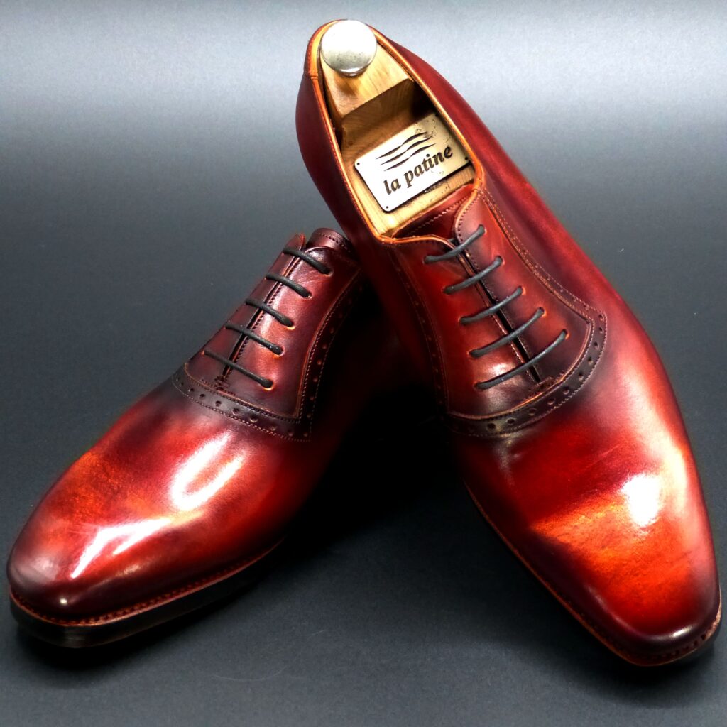
color name;
[ Hanezu-Iro ]
朱華色
Melbourne Oxford
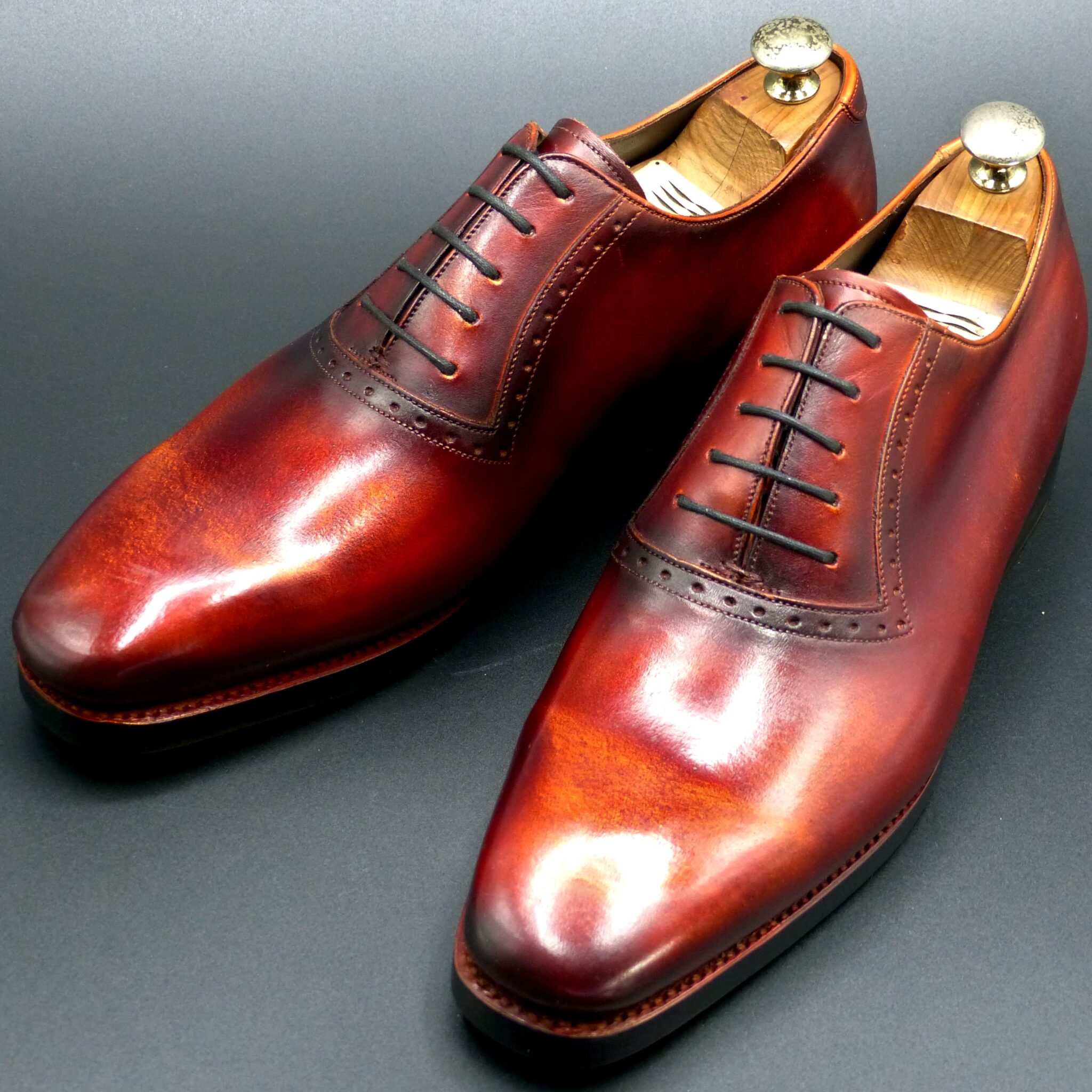
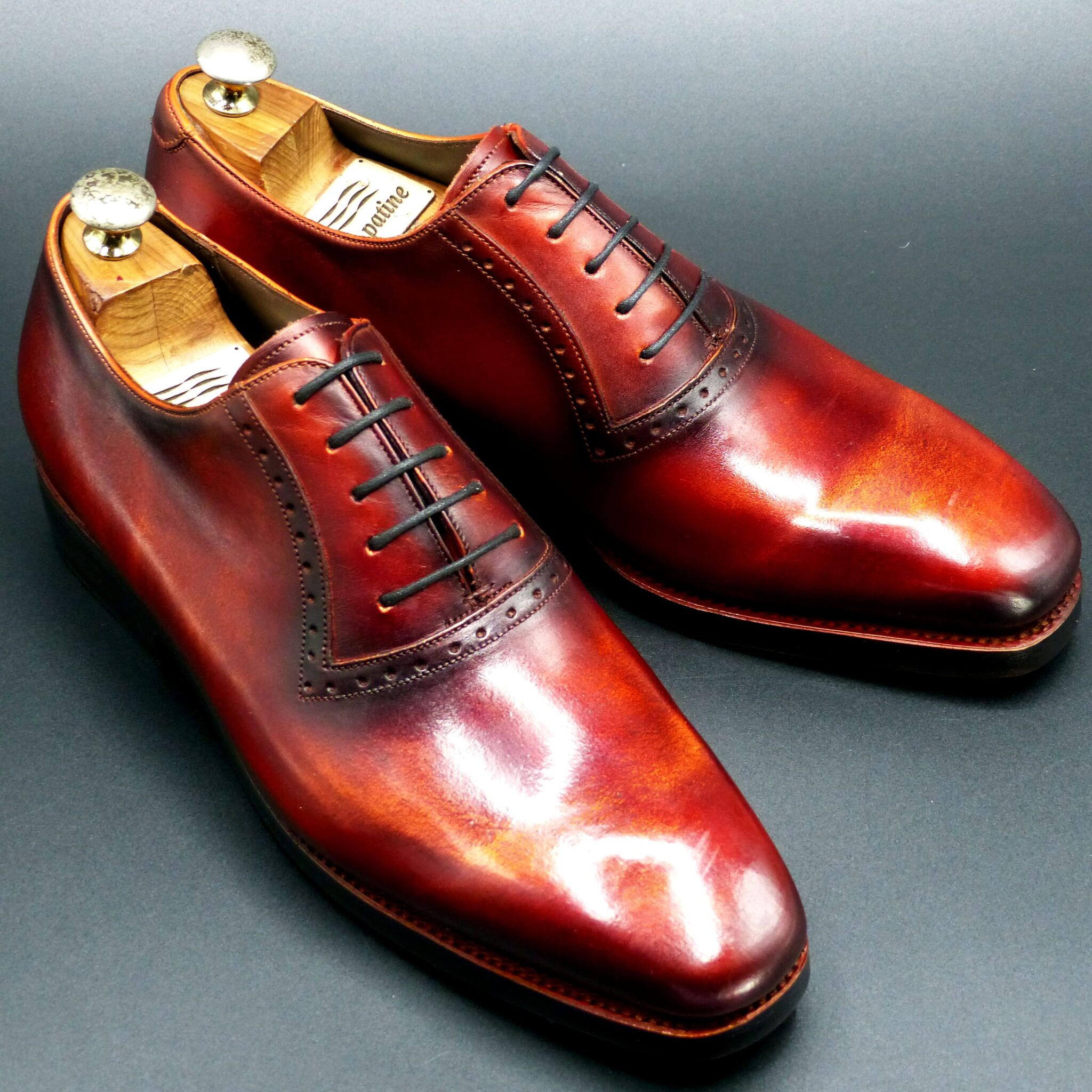
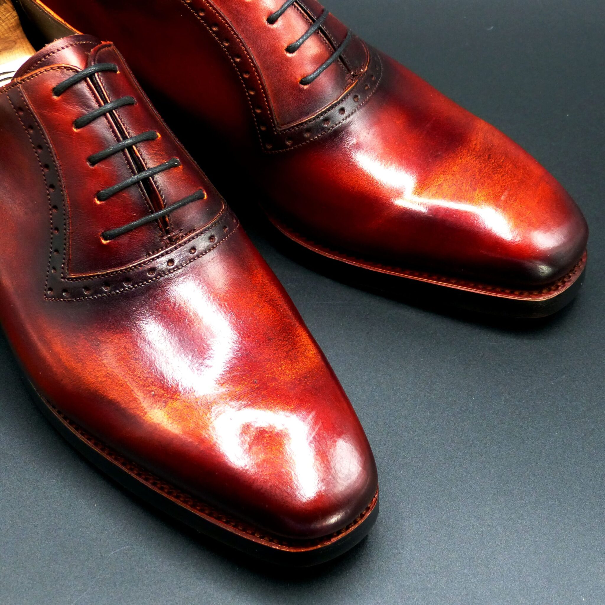
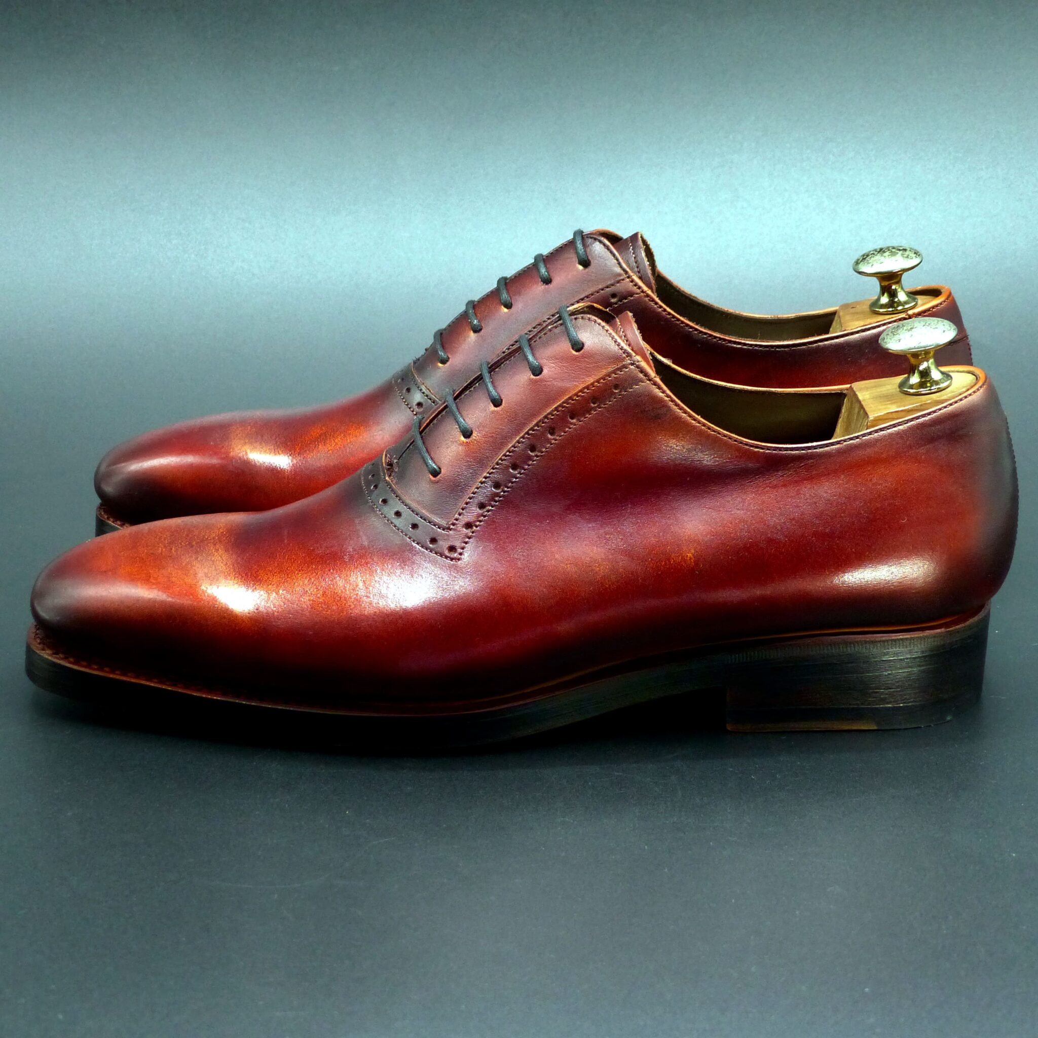
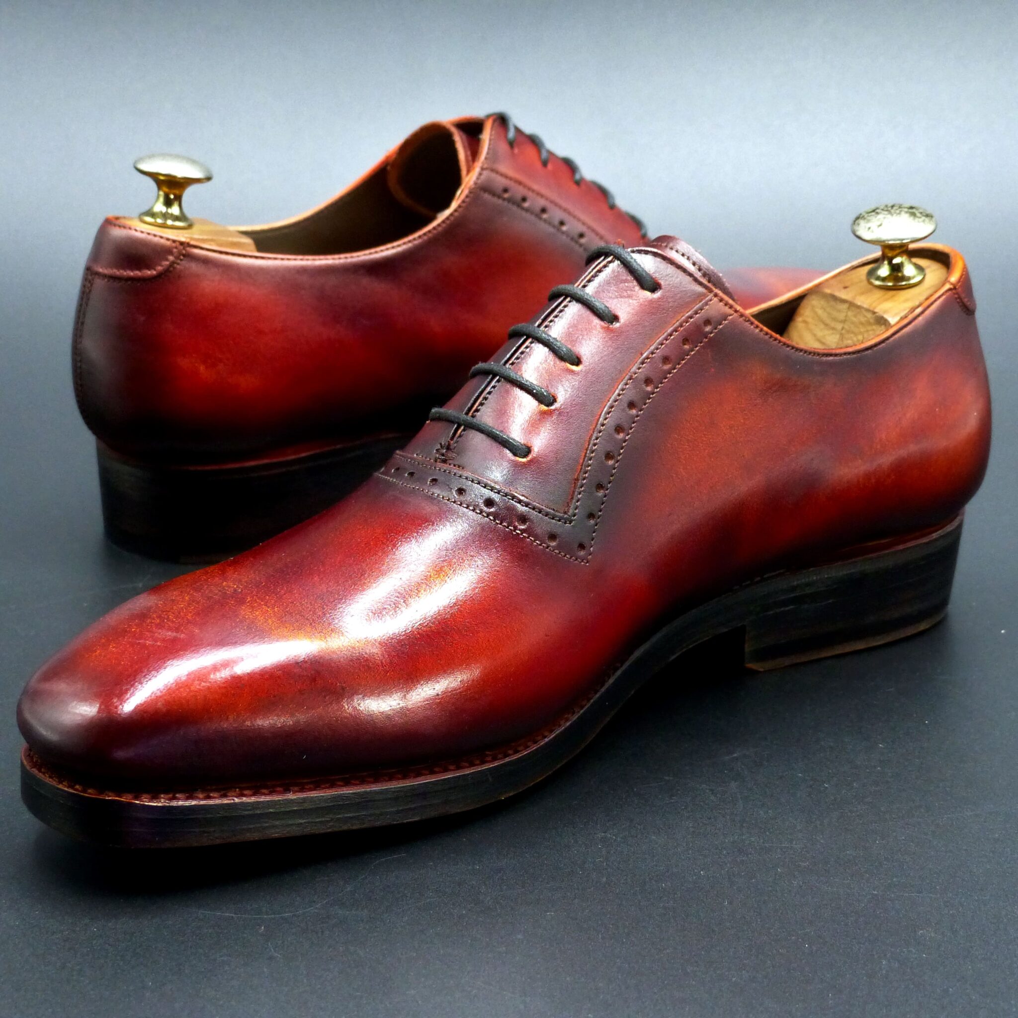
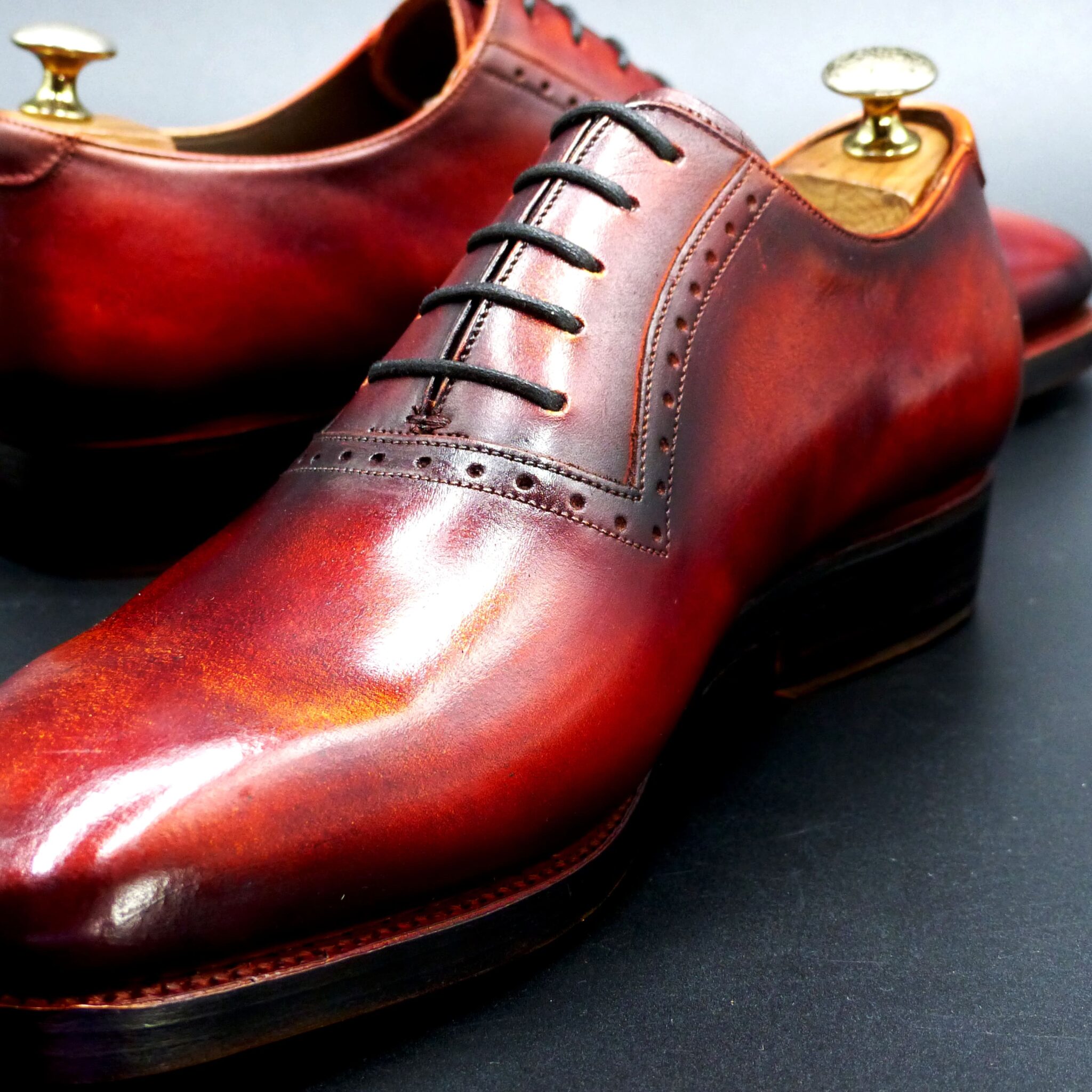
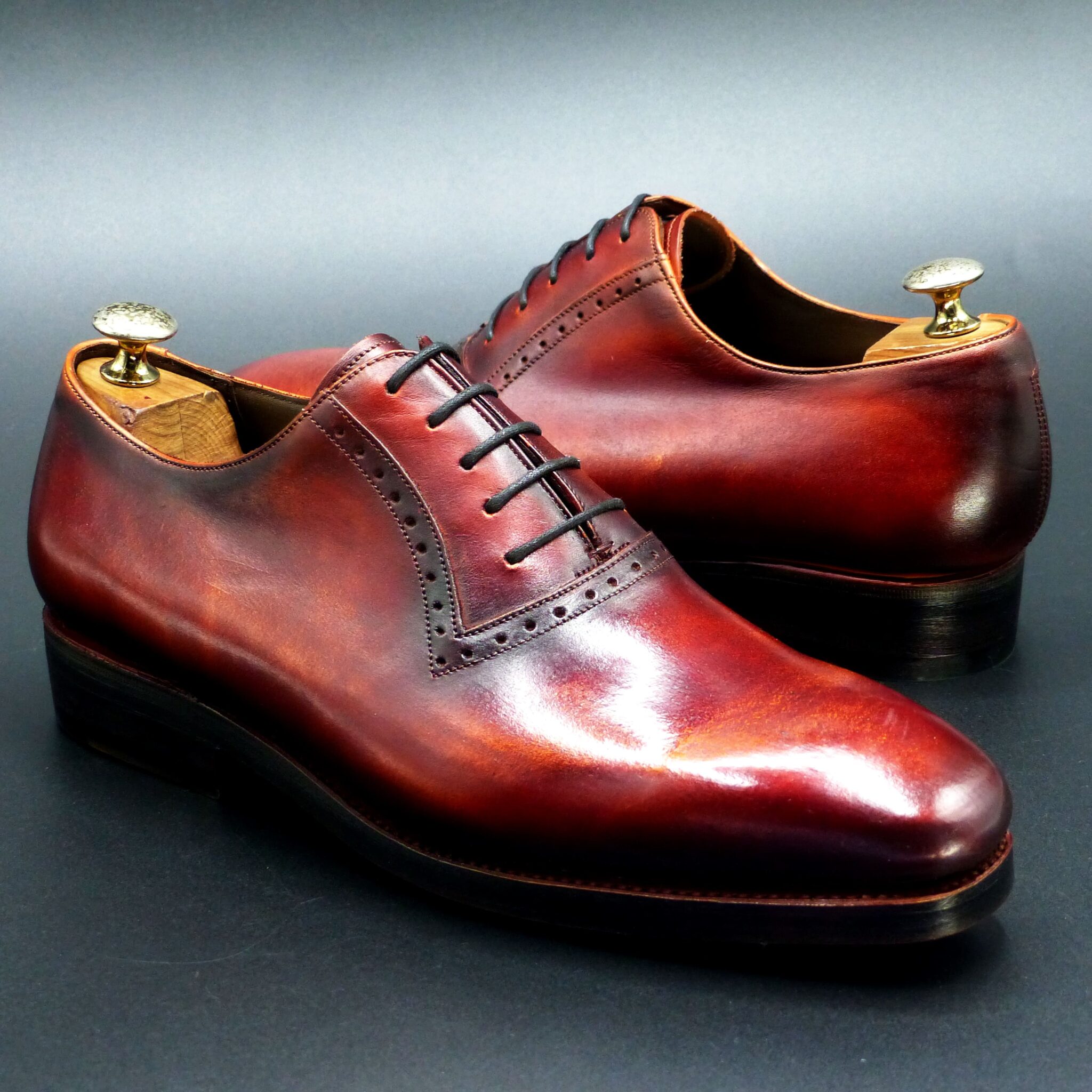
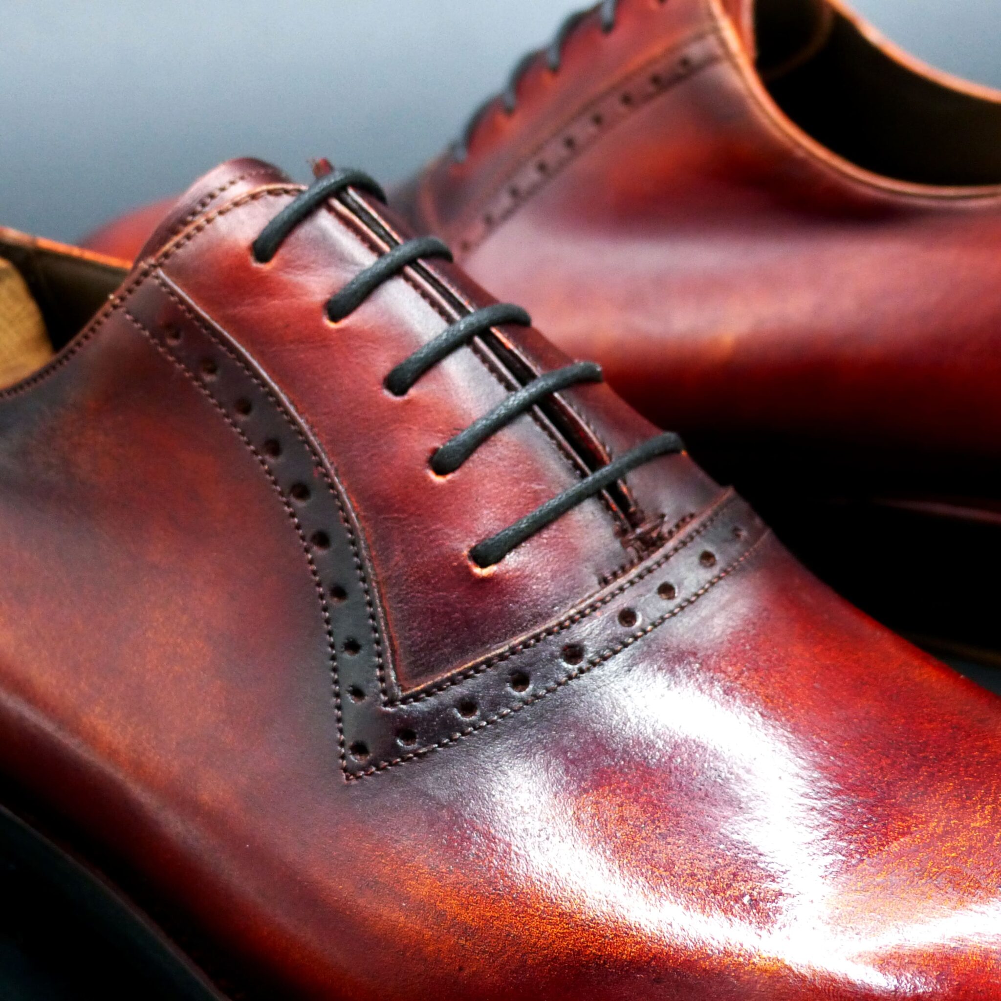
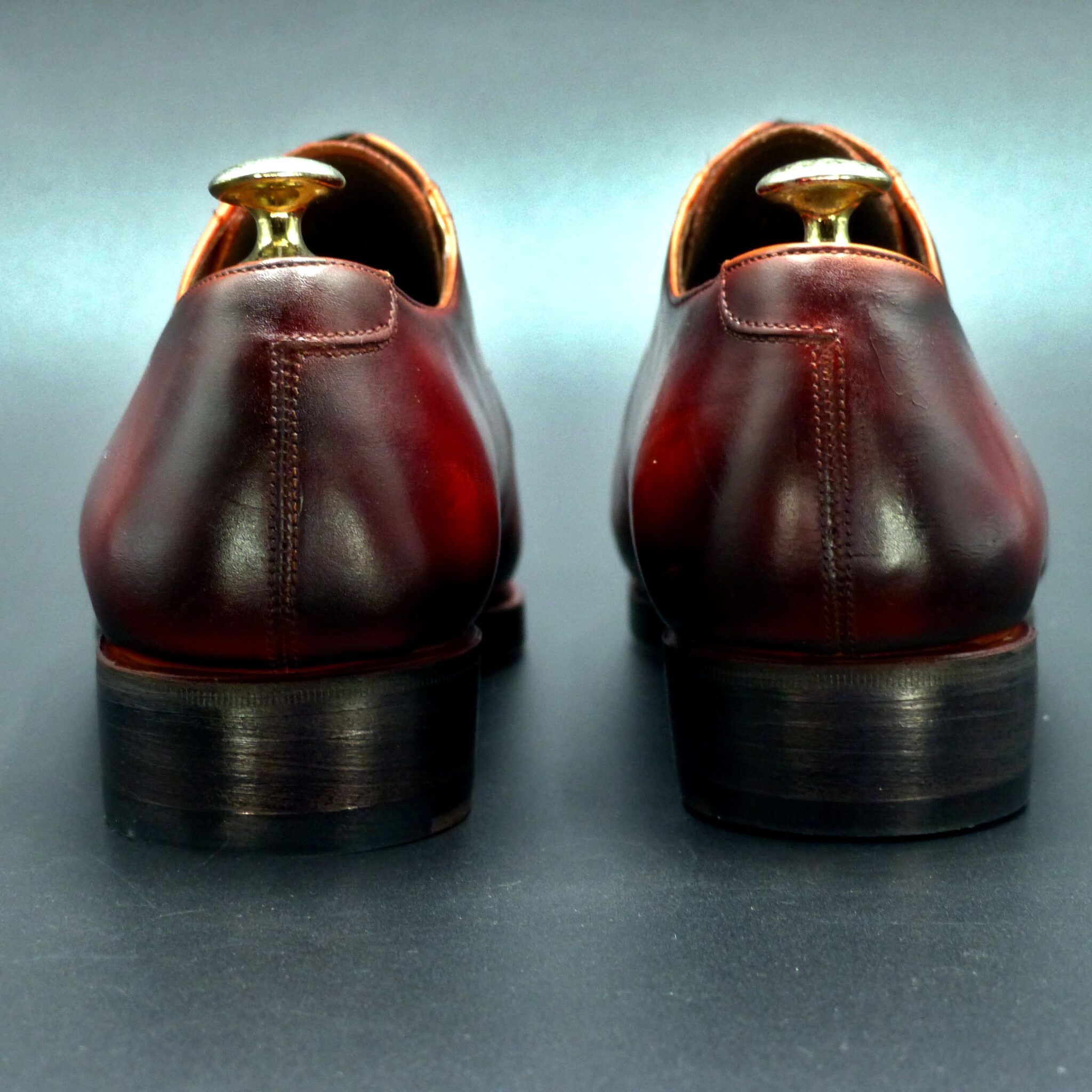
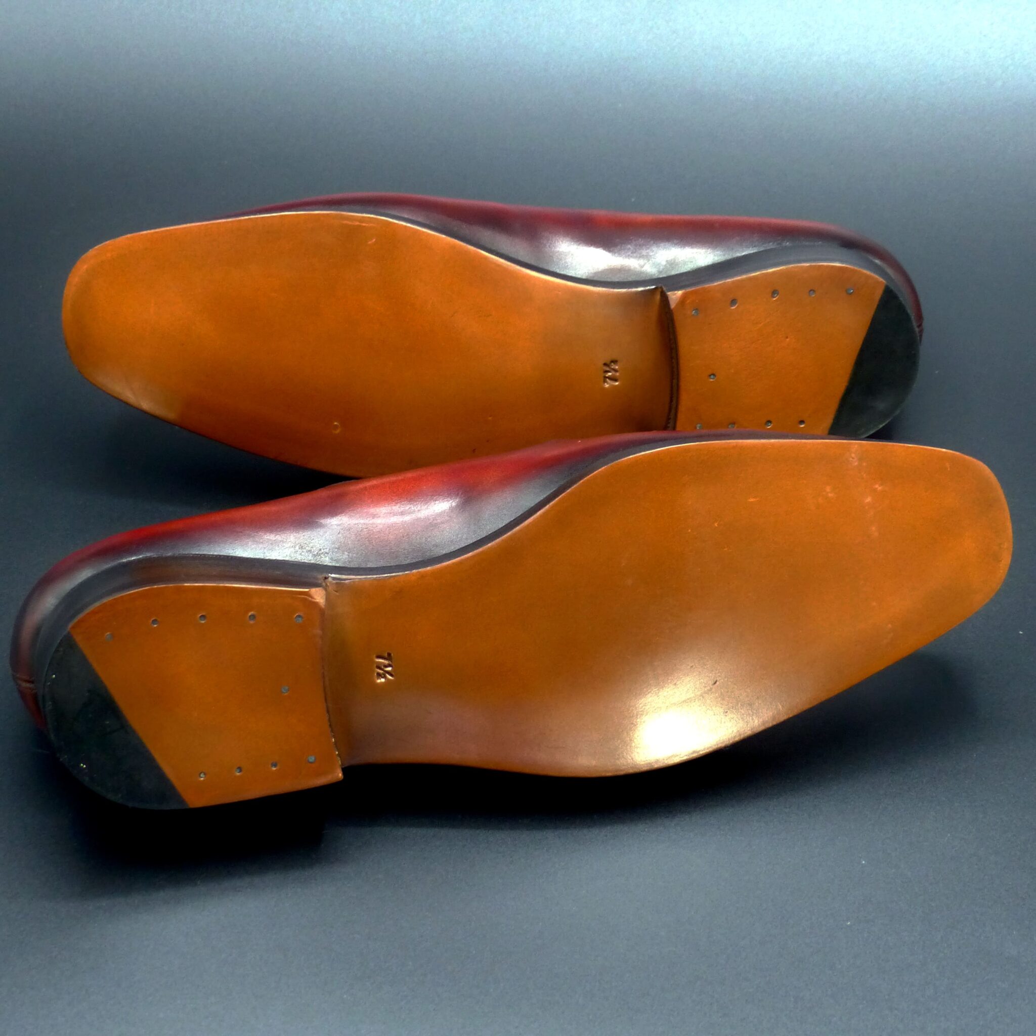
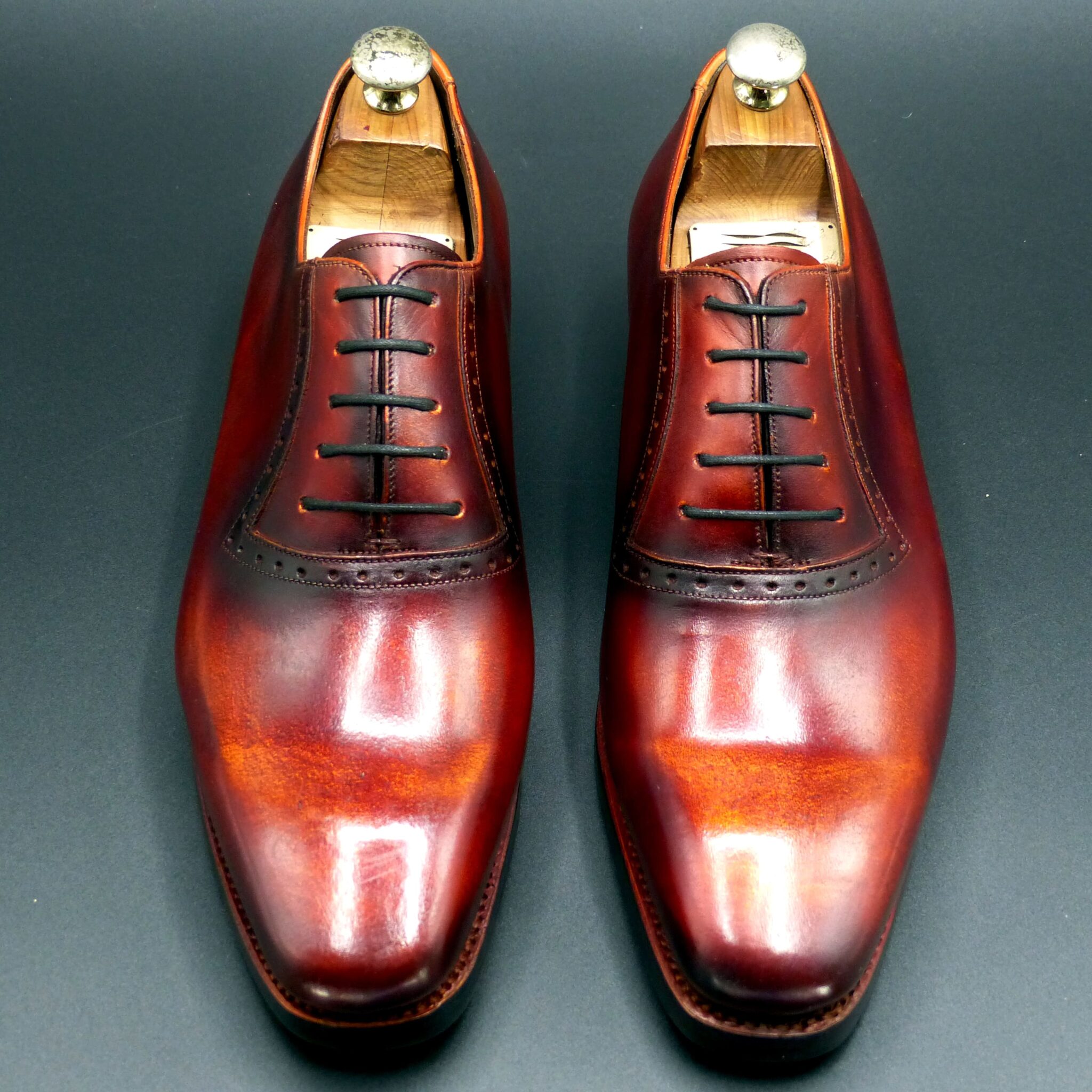
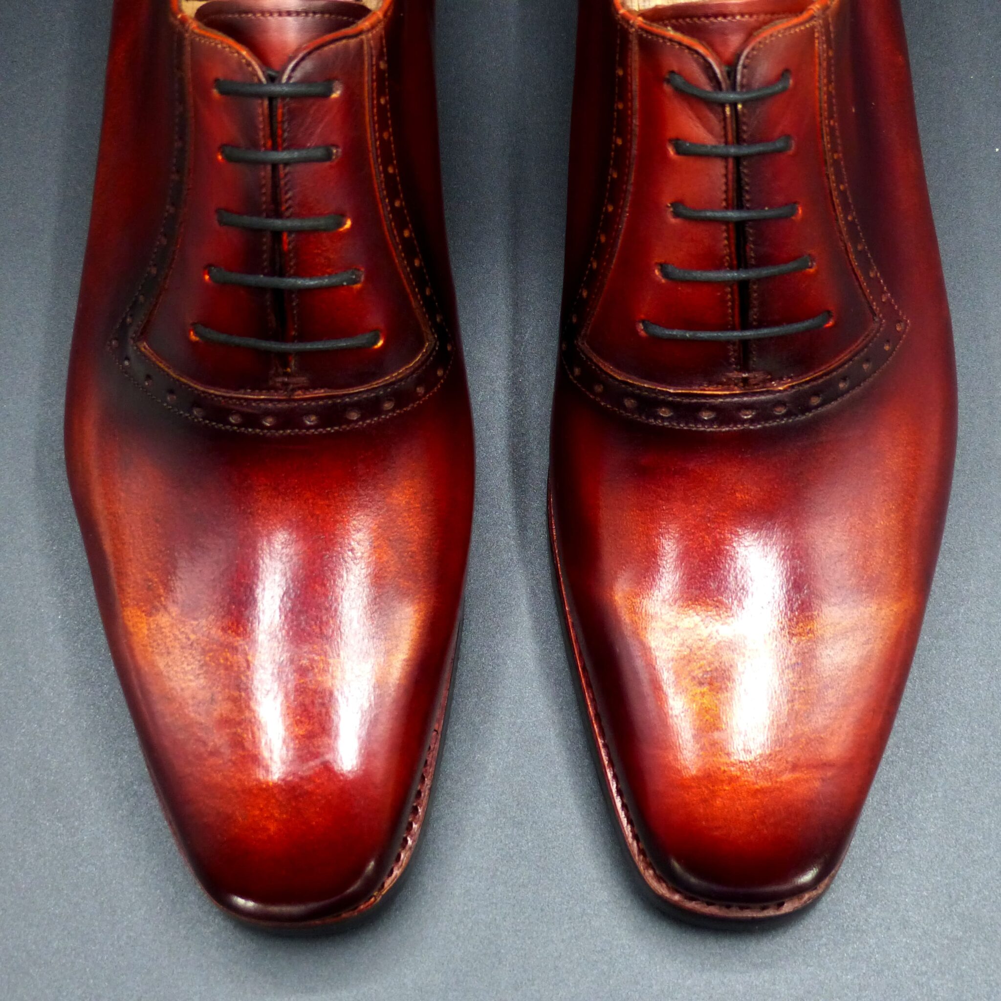
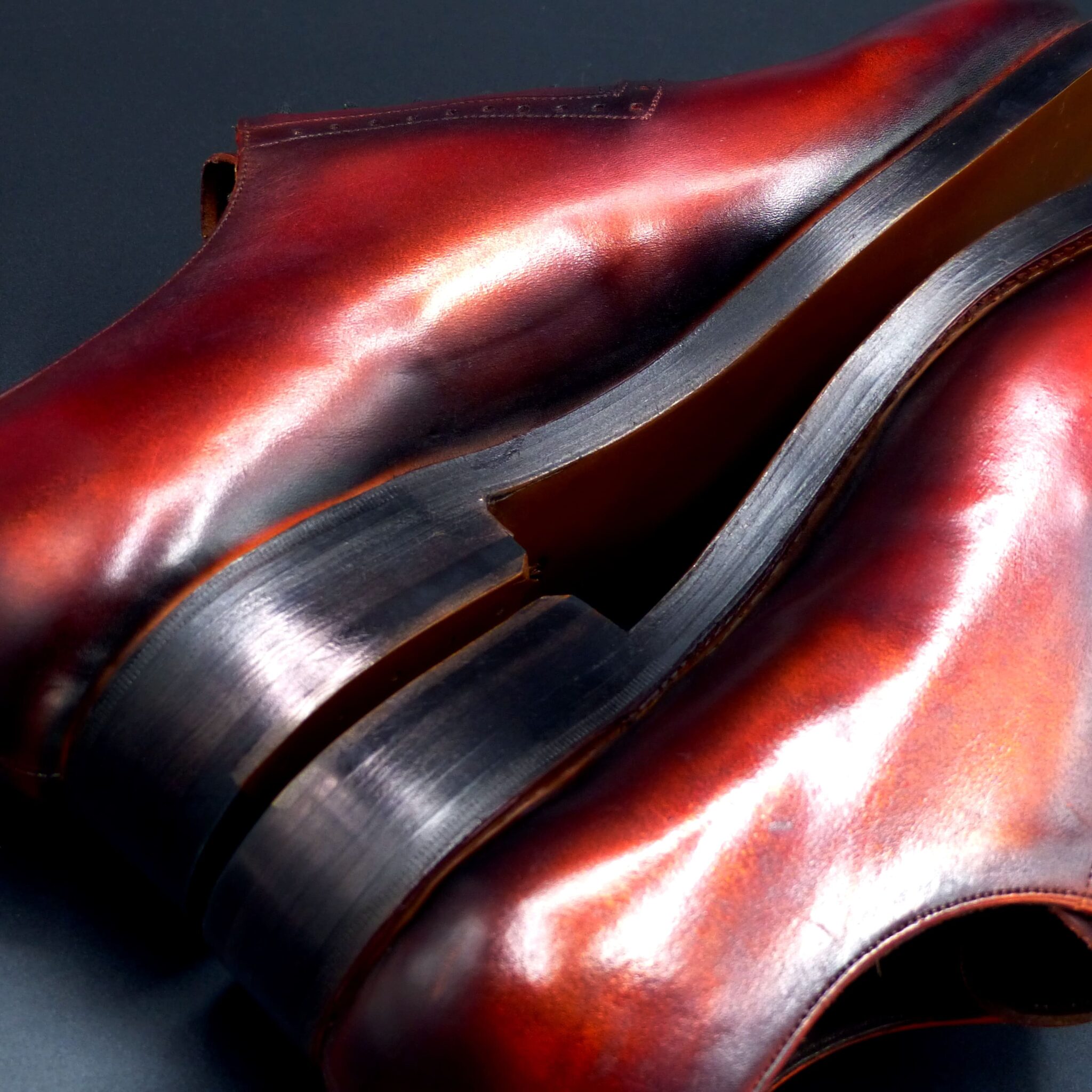
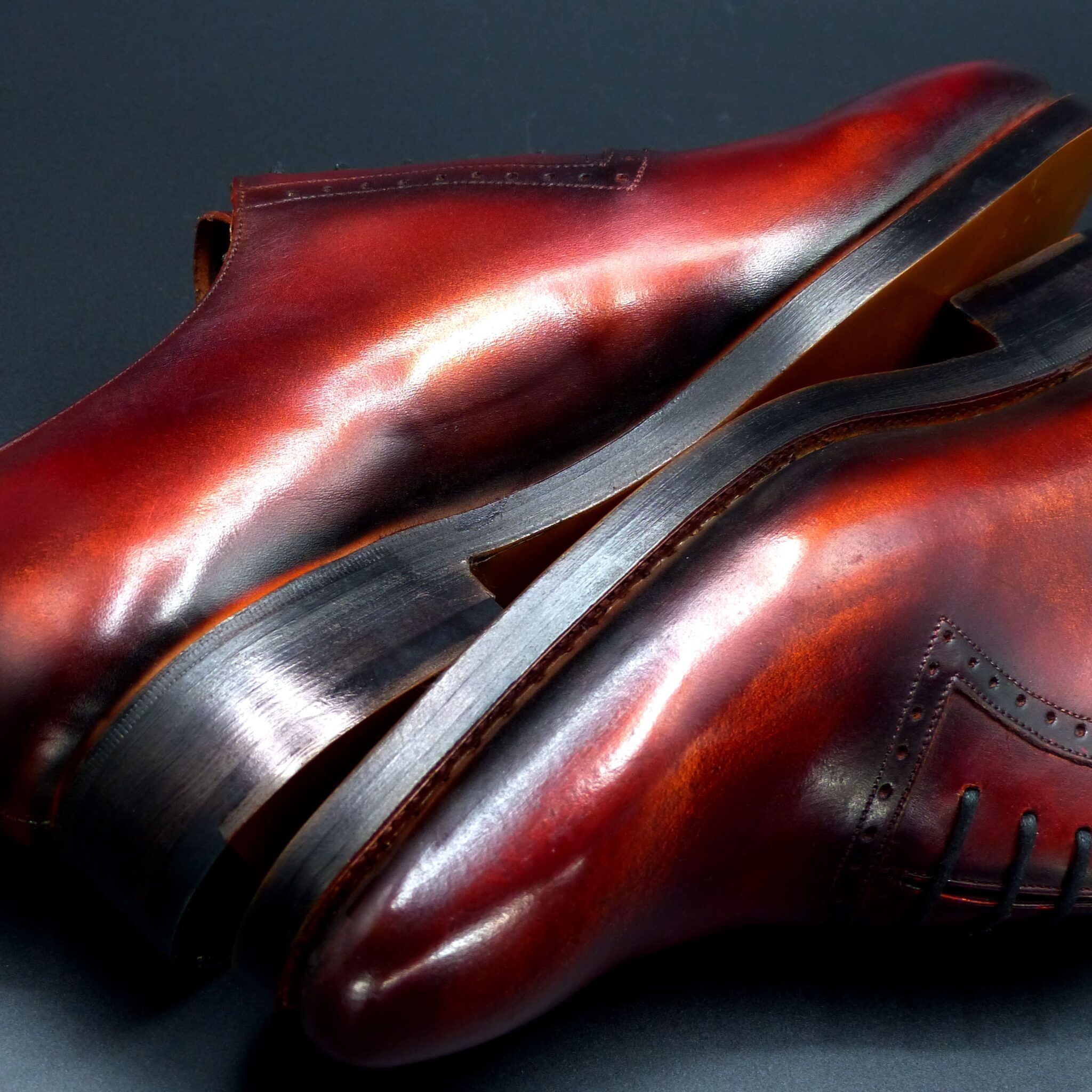
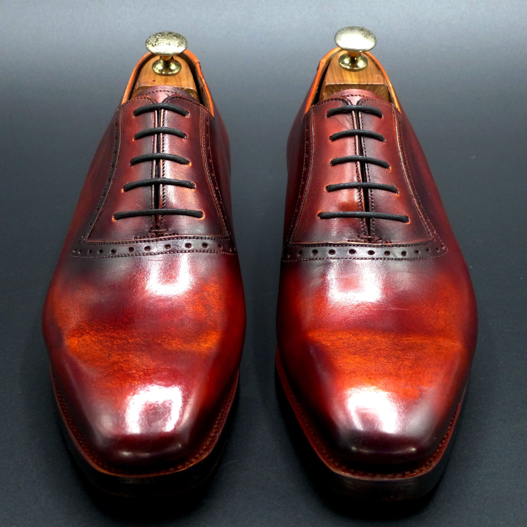
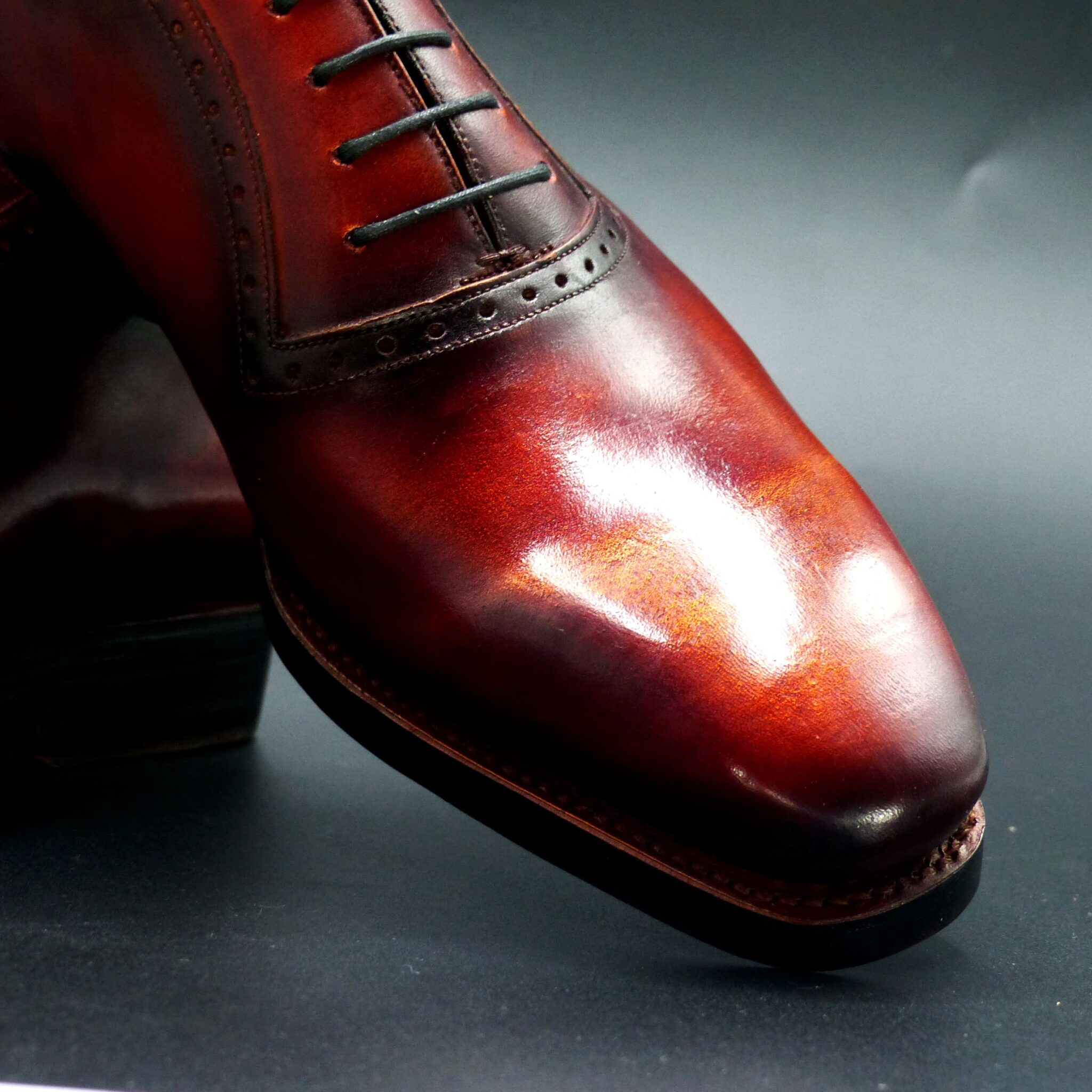
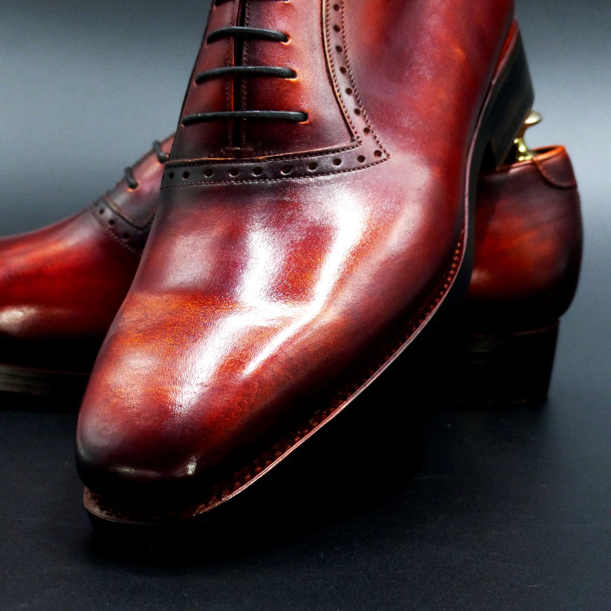
朱華色(はねずいろ)とは?
朱華色(はねずいろ)は、古代日本で使われた 淡い赤橙色 で、桜や桃の花びらのような優しい色合いを持ちます。特に飛鳥時代から平安時代にかけて、高貴な色として貴族の衣装に用いられました。「朱華(はねず)」の名は、「朱(あけ)」が転じたものとされ、明るく華やかな色彩を意味します。
- 朱華色の構成と色の特徴
色の構成
- 茜(あかね)や紅花(べにばな) などの天然染料を使用して染められます。
- 濃い赤ではなく、白を含んだ淡い赤橙色。
- 染め重ねの回数や媒染剤によって、より鮮やかにも淡くもなります。
類似の色
- 「桃色」や「珊瑚色」に近いが、朱色に白みを加えたような柔らかな色合いです。
- 平安時代には「朱華」と書いて「はねず」と読まれることが一般的でした。
- 朱華色が使われたシーン
(1)貴族女性の衣装
- 平安貴族の女性が愛用した優雅な色 で、特に若い貴族の女性が着る衣装として人気がありました。
- 十二単(じゅうにひとえ)の表着や襲(かさね) に取り入れられました。
- 「はねず色の衣装」は、春の季節感を表すものとされました。
(2)宮中の儀式・行事
- 宮廷の春の行事や祭礼で、春の花をイメージさせる色 として用いられました。
- 朱華色は 「生命力」「繁栄」 を象徴し、祝いの場にふさわしい色とされました。
(3)詩歌・文学の中の象徴
- 『万葉集』や『古今和歌集』 には「はねずの色」が春を象徴するものとして詠まれています。
- 「はねず色」は、淡く儚い美しさ を表現する言葉としても用いられました。
- 朱華色が象徴するもの
① 儚さと春の美しさ
- 桜や桃の花に通じる色 であり、「春の訪れ」や「短い命の美しさ」を象徴しています。
- 万葉集などの詩歌では、「はねずの色は散りやすい花のように儚いもの」として詠まれました。
② 高貴さと格式
- 平安時代の貴族女性の装束に用いられた格式の高い色 であり、上流階級の象徴でした。
- 「紅色」よりも淡く上品であり、宮廷文化の優雅さを体現する色とされました。
③ 生命力と繁栄
- 「朱(あけ)」の系統の色であり、太陽の光や炎のようなエネルギー を持つ色です。
- 縁起の良い色として、宮中の行事やお祝いの場で使われました。
朱華色(はねずいろ)は、古代日本で 春を象徴する貴族の色 として愛されました。特に平安時代には宮廷の女性たちの衣装に用いられ、春の訪れや儚い美しさを表す色とされました。また、「高貴さ」「生命力」「繁栄」といった意味合いも持ち、宮中行事や文学の中でも重要な役割を果たしてきました。その優雅な色合いは、現代の和服や染織文化にも受け継がれています。
What is Hanezuiro (朱華色)?
Hanezuiro (朱華色) is a soft reddish-orange color used in ancient Japan, resembling the delicate hues of cherry and peach blossoms. Particularly from the Asuka to the Heian period, it was considered a noble color and was used for aristocratic clothing. The name “Hanezu” is derived from “Ake” (朱, meaning vermilion or red), signifying a bright and elegant shade.
1. Composition and Characteristics of Hanezuiro
Color Composition
- Natural dyes such as madder (茜, Akane) and safflower (紅花, Benibana) were used for dyeing.
- Instead of a deep red, it has a soft reddish-orange hue mixed with white.
- The intensity of the color varied depending on the number of dyeing layers and the type of mordant used.
Similar Colors
- It closely resembles peach pink or coral pink, but with a warmer, more orange-toned appearance.
- In the Heian period, the kanji “朱華” (Hanezuiro) was commonly used to represent this color.
2. Occasions Where Hanezuiro Was Used
(1) Aristocratic Women’s Attire
- A refined and elegant color favored by Heian-period noblewomen, particularly by young aristocratic women.
- Featured in the outer garments or layers of the jūnihitoe (十二単, a traditional court dress).
- The “Hanezu-colored garments” were associated with the spring season and its delicate beauty.
(2) Court Rituals and Ceremonies
- During imperial spring events and festivals, it was used as a color representing the beauty of flowers.
- Hanezuiro symbolized “vitality” and “prosperity,” making it a suitable color for celebratory occasions.
(3) Symbolism in Poetry and Literature
- Classical Japanese poetry collections such as “Manyoshu” (万葉集) and “Kokin Wakashu” (古今和歌集) mention “Hanezu no iro” as a symbol of spring.
- The color was often used metaphorically to express fleeting and delicate beauty.
3. Symbolic Meanings of Hanezuiro
① Transience and Springtime Beauty
- Associated with cherry and peach blossoms, it symbolizes the arrival of spring and the ephemeral beauty of life.
- In classical poetry, Hanezuiro often represented the fragility of things that fade quickly, like blossoms in the wind.
② Nobility and Prestige
- A high-status color used for aristocratic women’s clothing in the Heian period, signifying elegance and refinement.
- Compared to the deeper beni (紅, crimson) color, Hanezuiro is softer and more graceful, embodying the sophistication of court culture.
③ Vitality and Prosperity
- As a shade derived from “Ake” (朱, bright red), it carries the energy of sunlight and fire.
- Considered an auspicious color, it was used in imperial ceremonies and celebrations.
4. Conclusion
Hanezuiro (朱華色) was cherished in ancient Japan as a symbolic color of spring and aristocratic refinement. Particularly in the Heian period, it was worn by noblewomen and represented the beauty of fleeting moments. Additionally, its meanings of nobility, vitality, and prosperity made it an important color in both court ceremonies and classical literature. This elegant hue continues to be appreciated today in traditional Japanese clothing and dyeing arts.
オーステリティ・オックスフォード
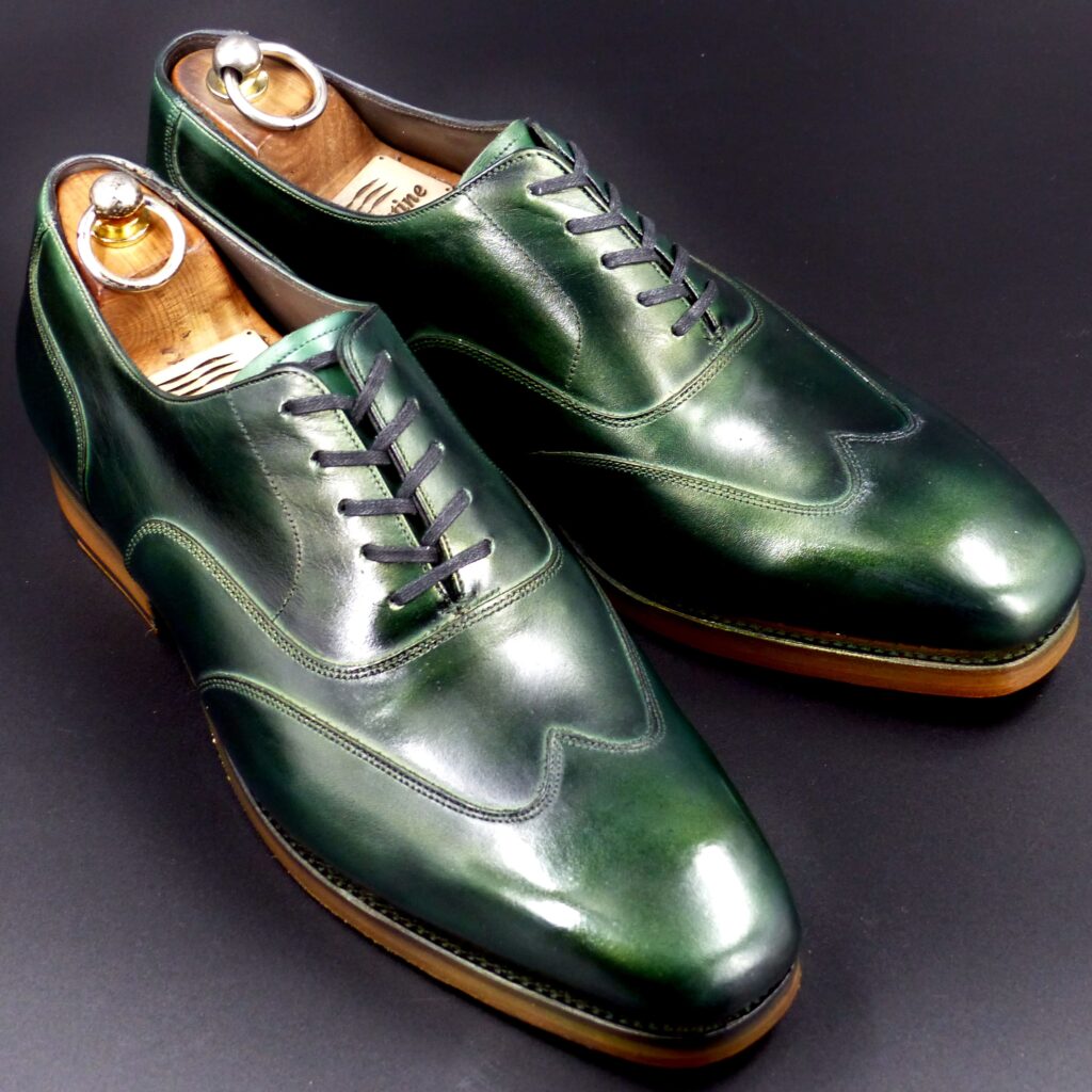
color name;
[ Kujaku-Ishi]
孔雀石
Austerity Oxford
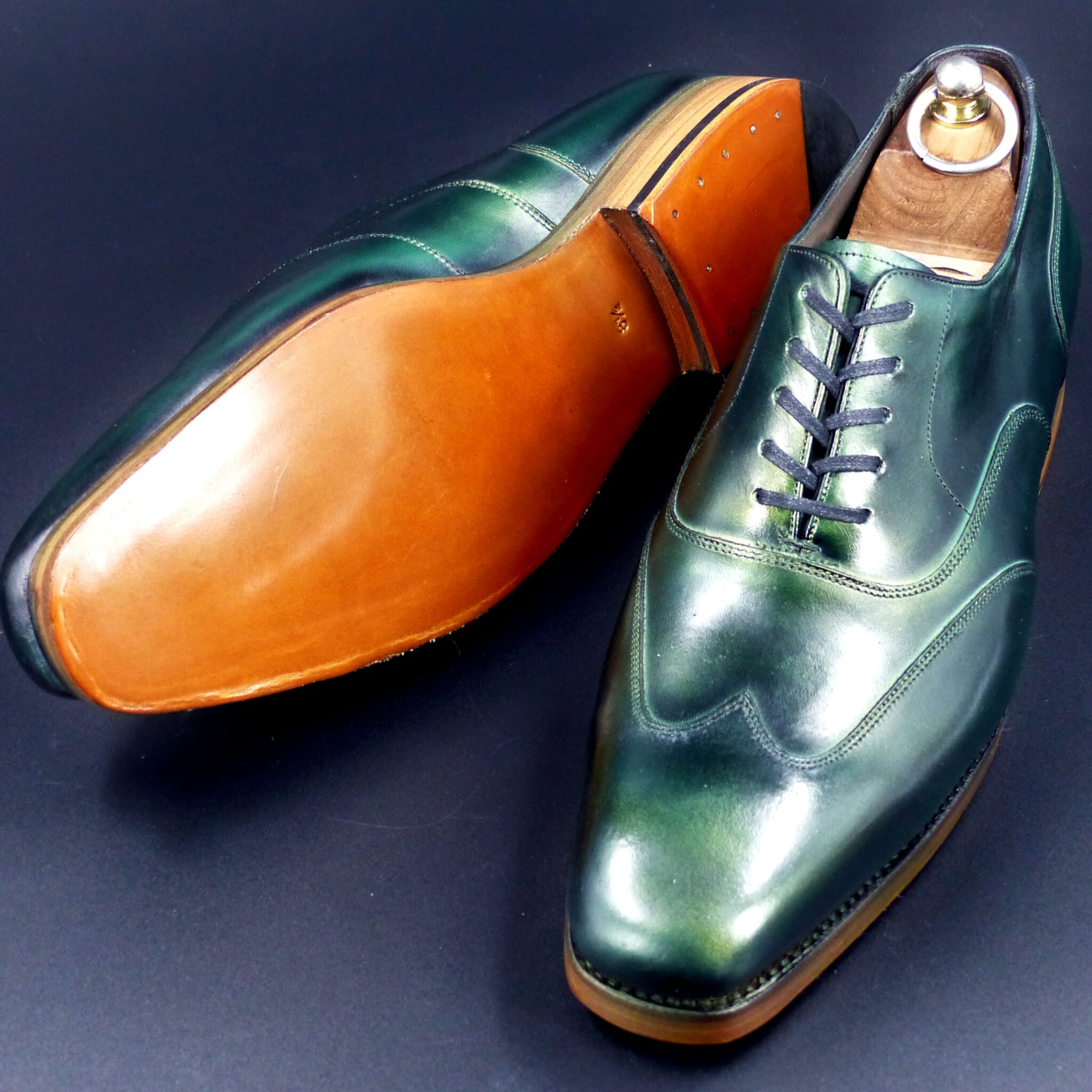
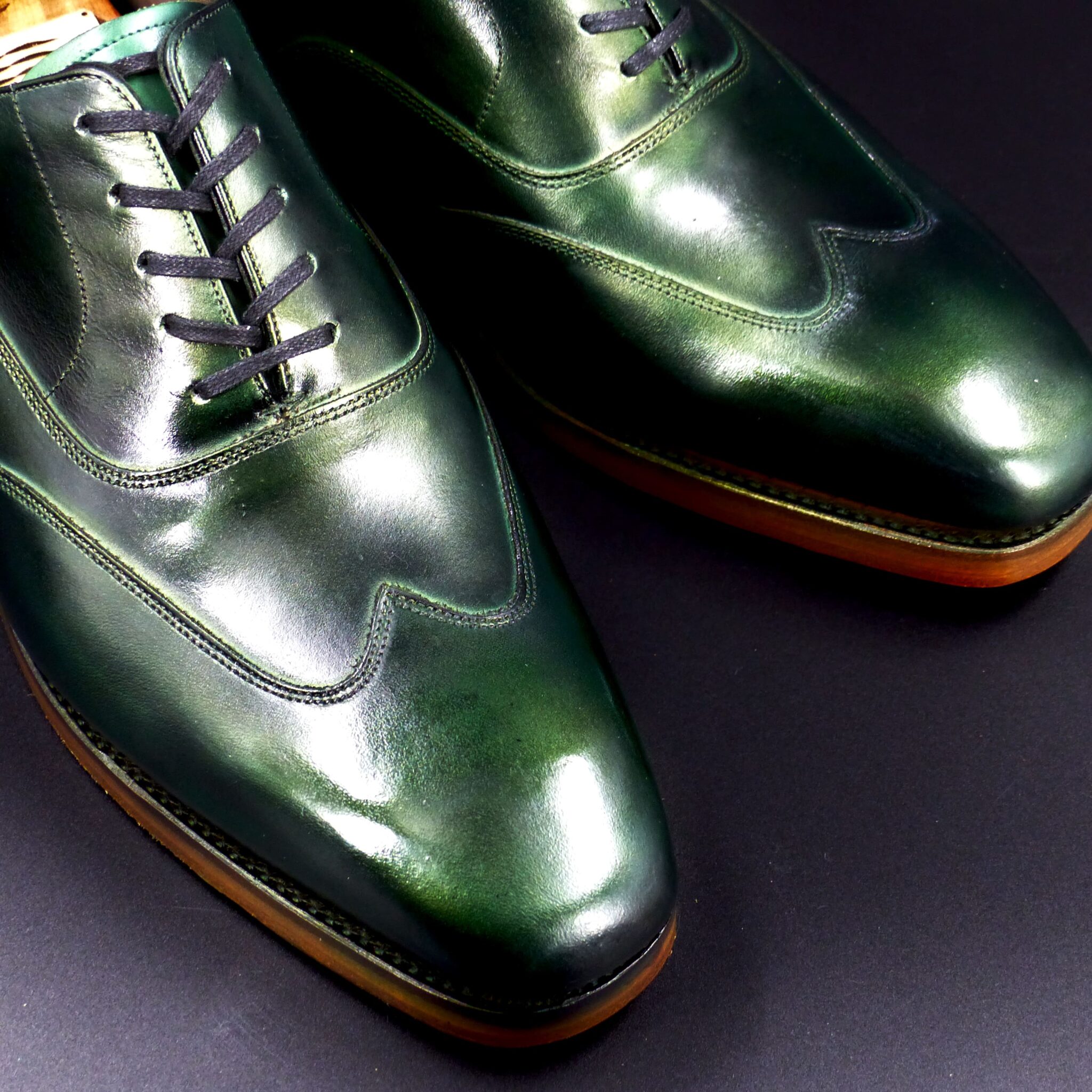
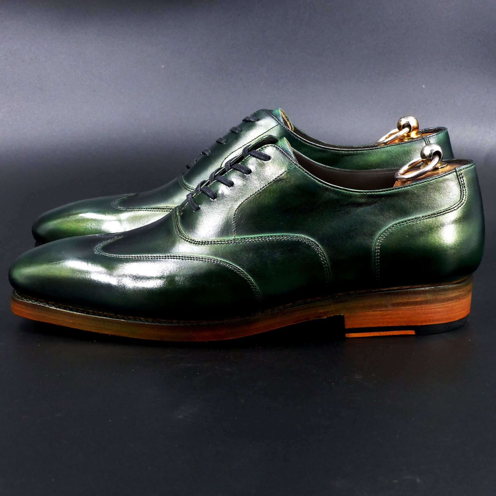
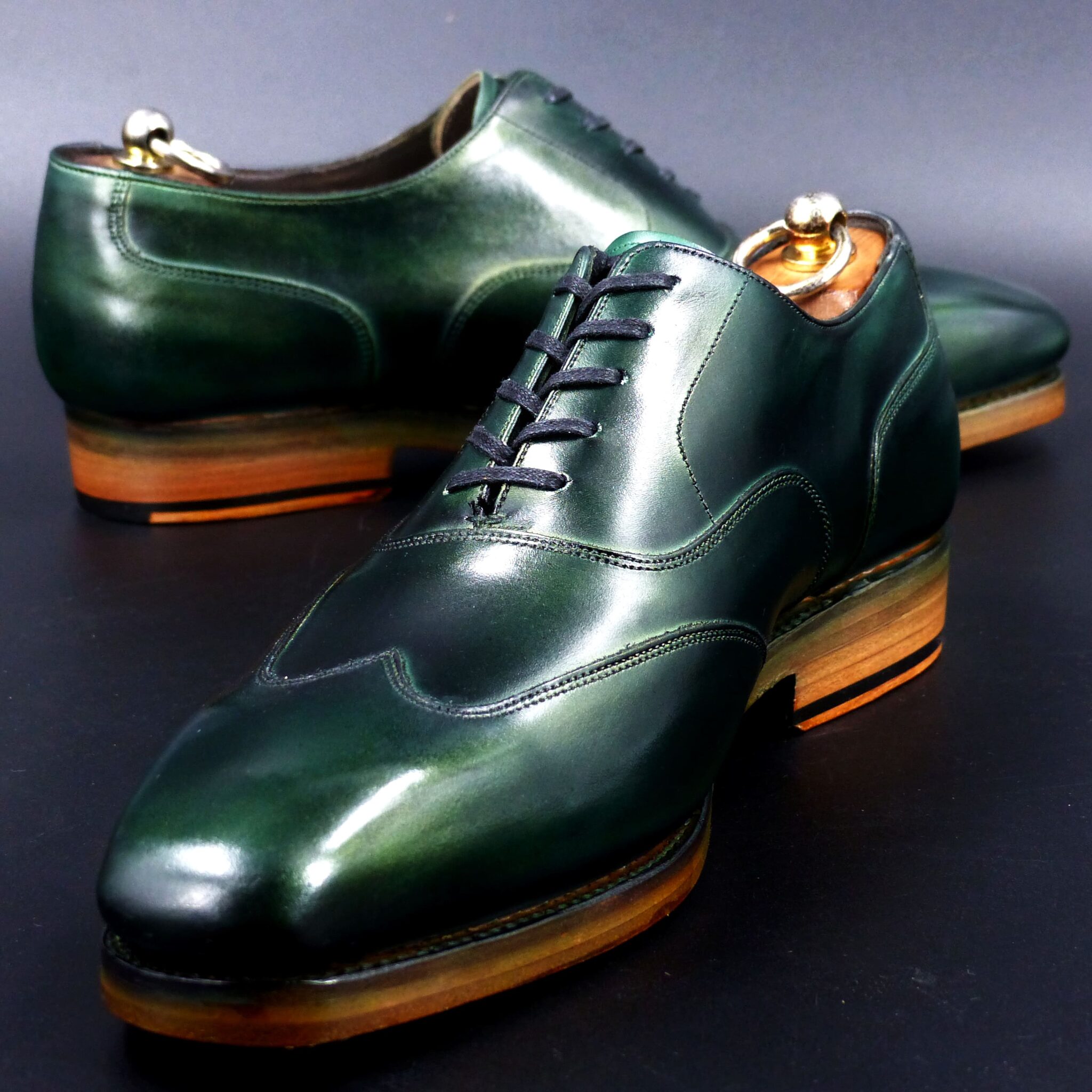
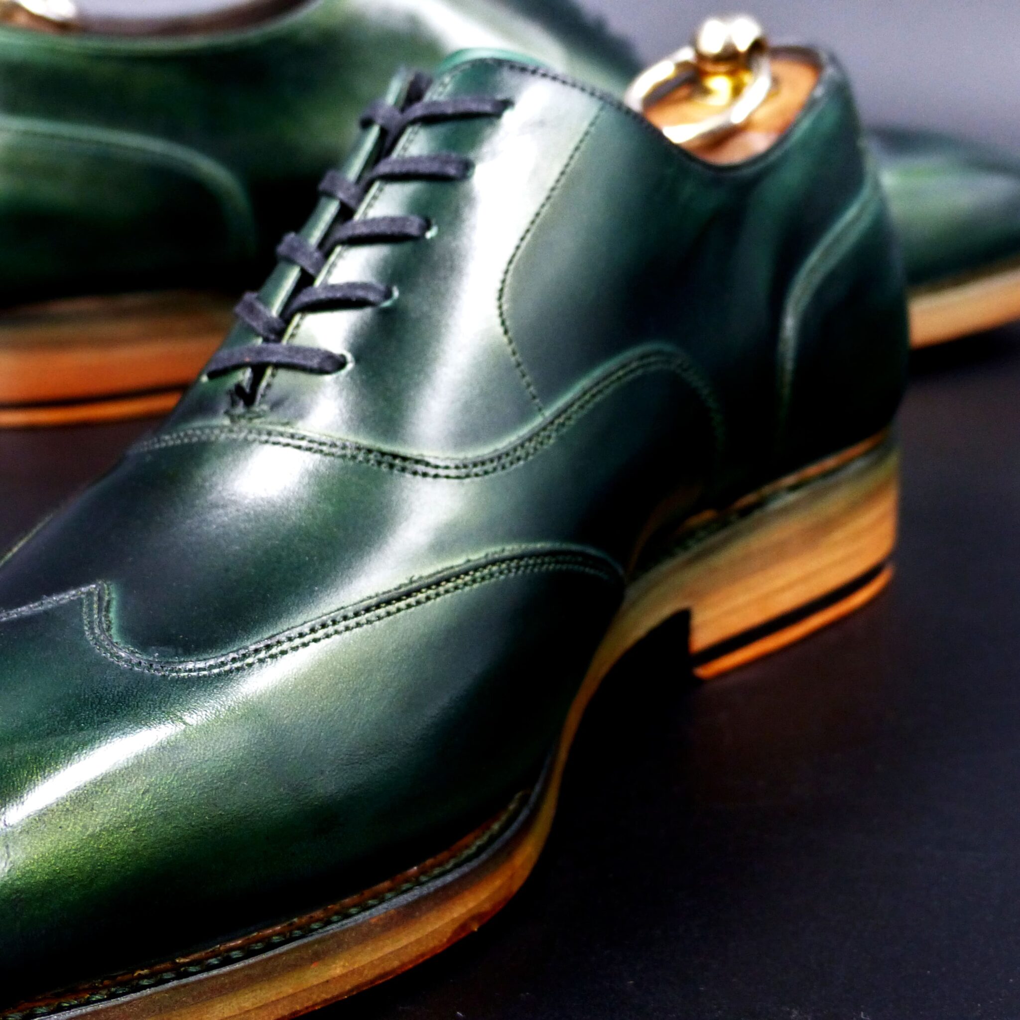
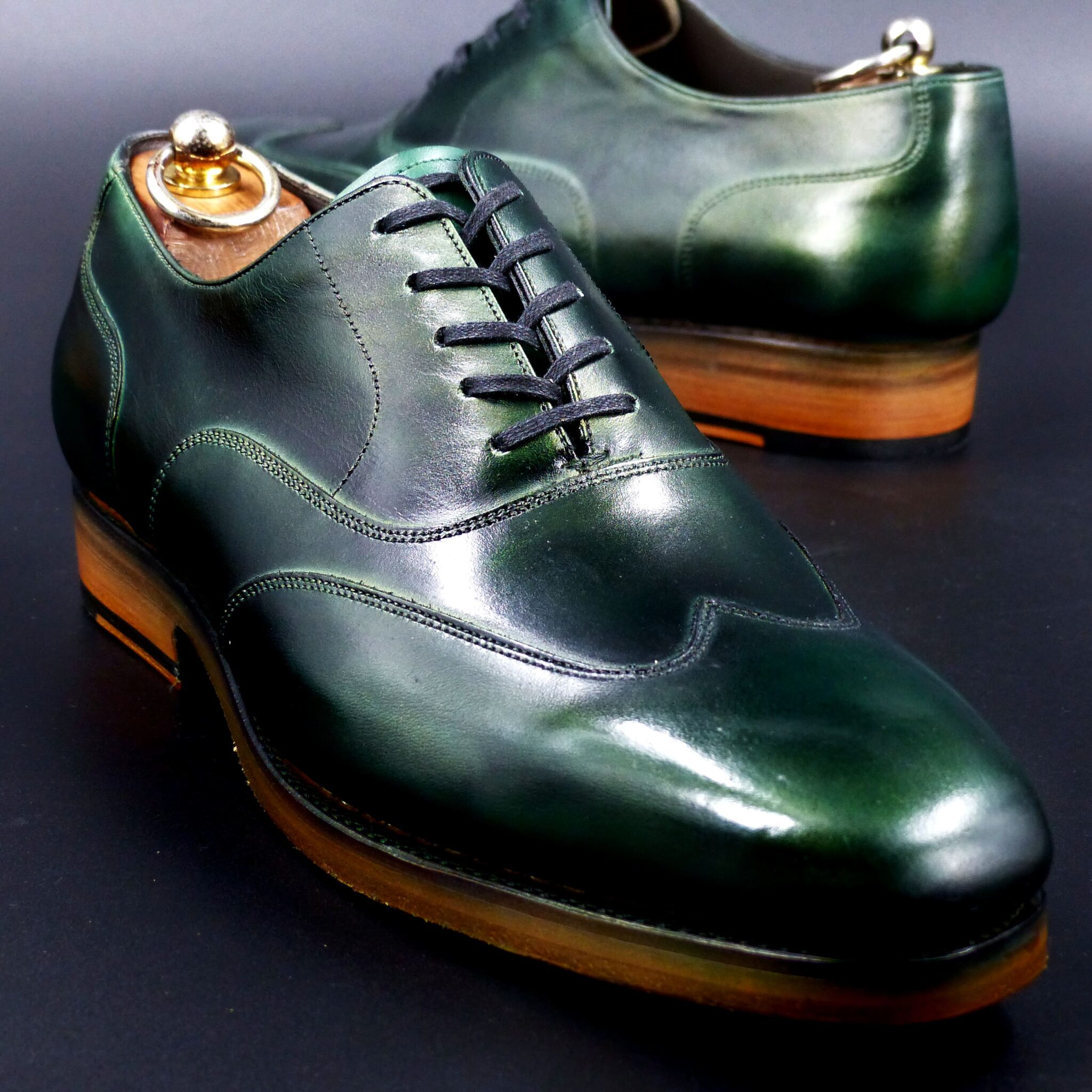
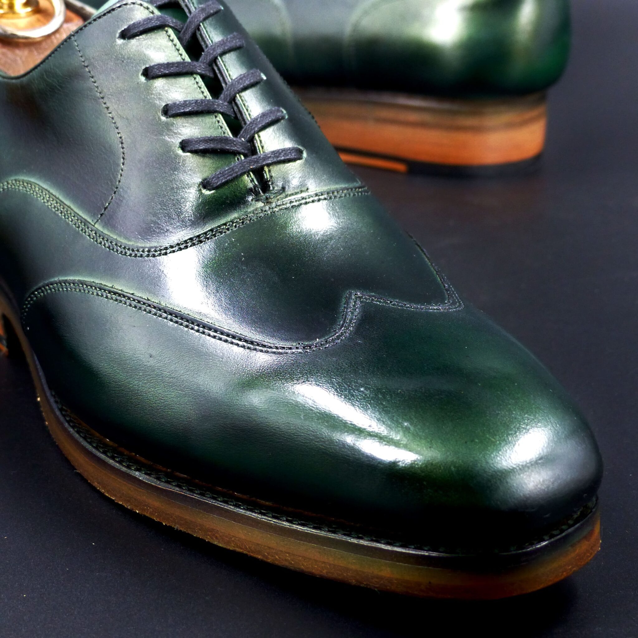
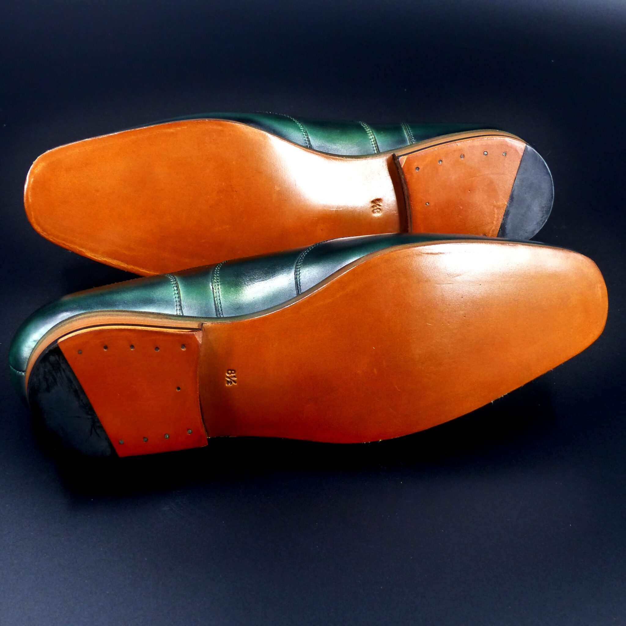
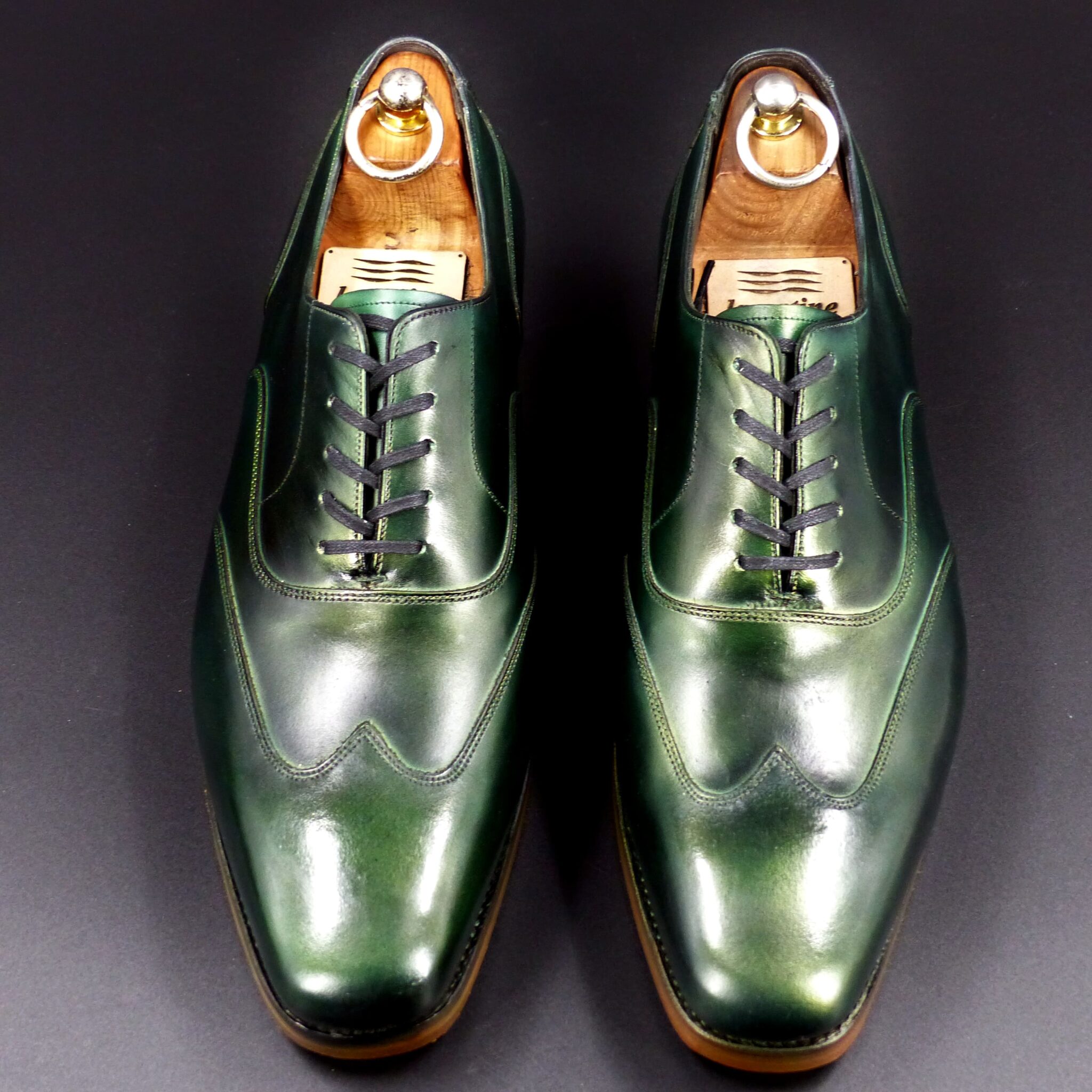
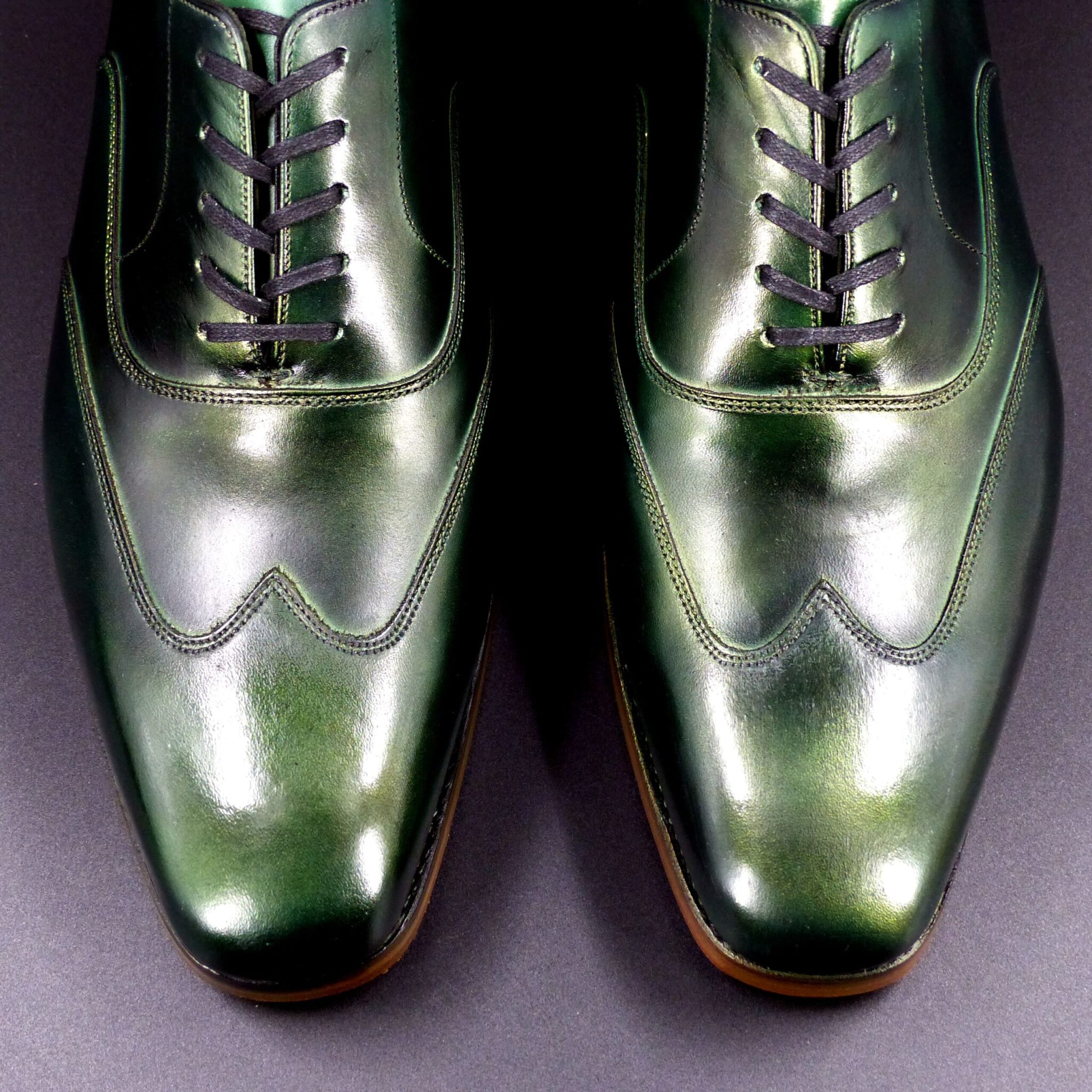
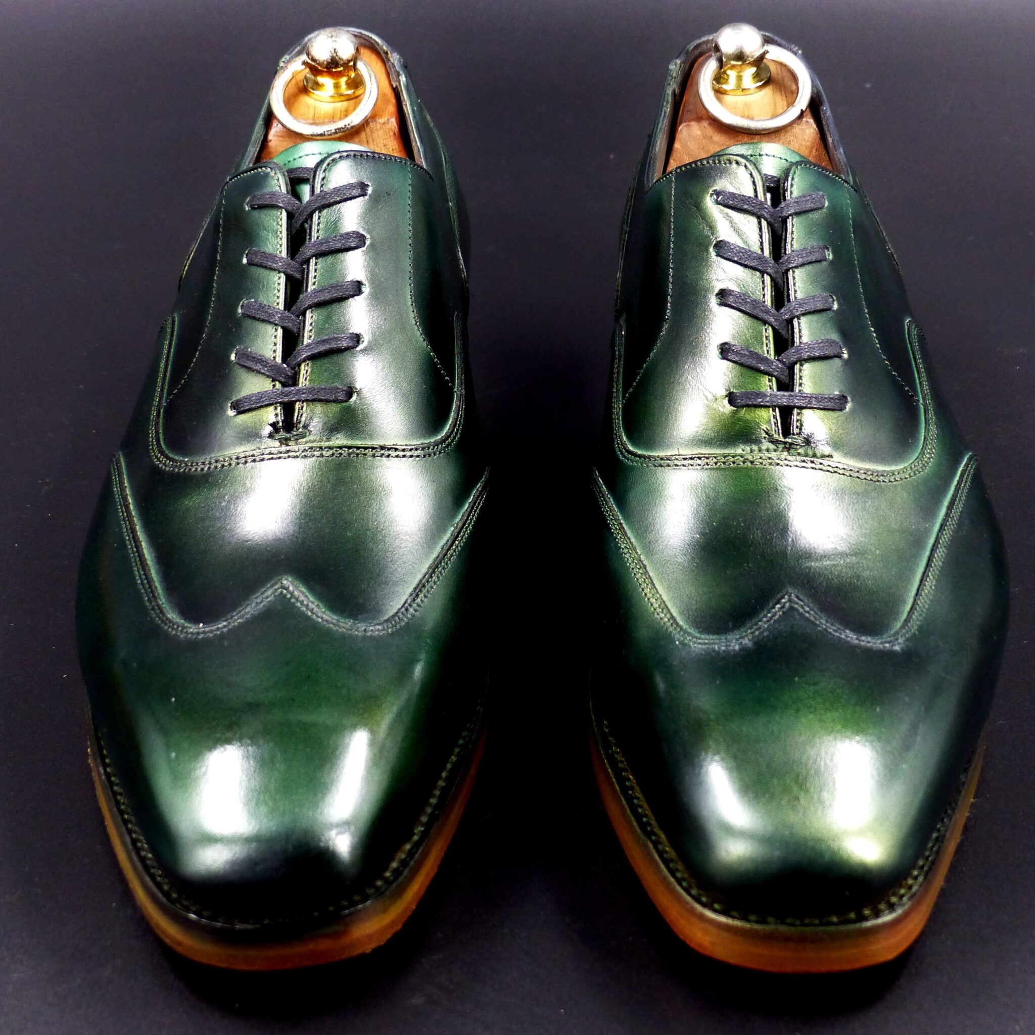
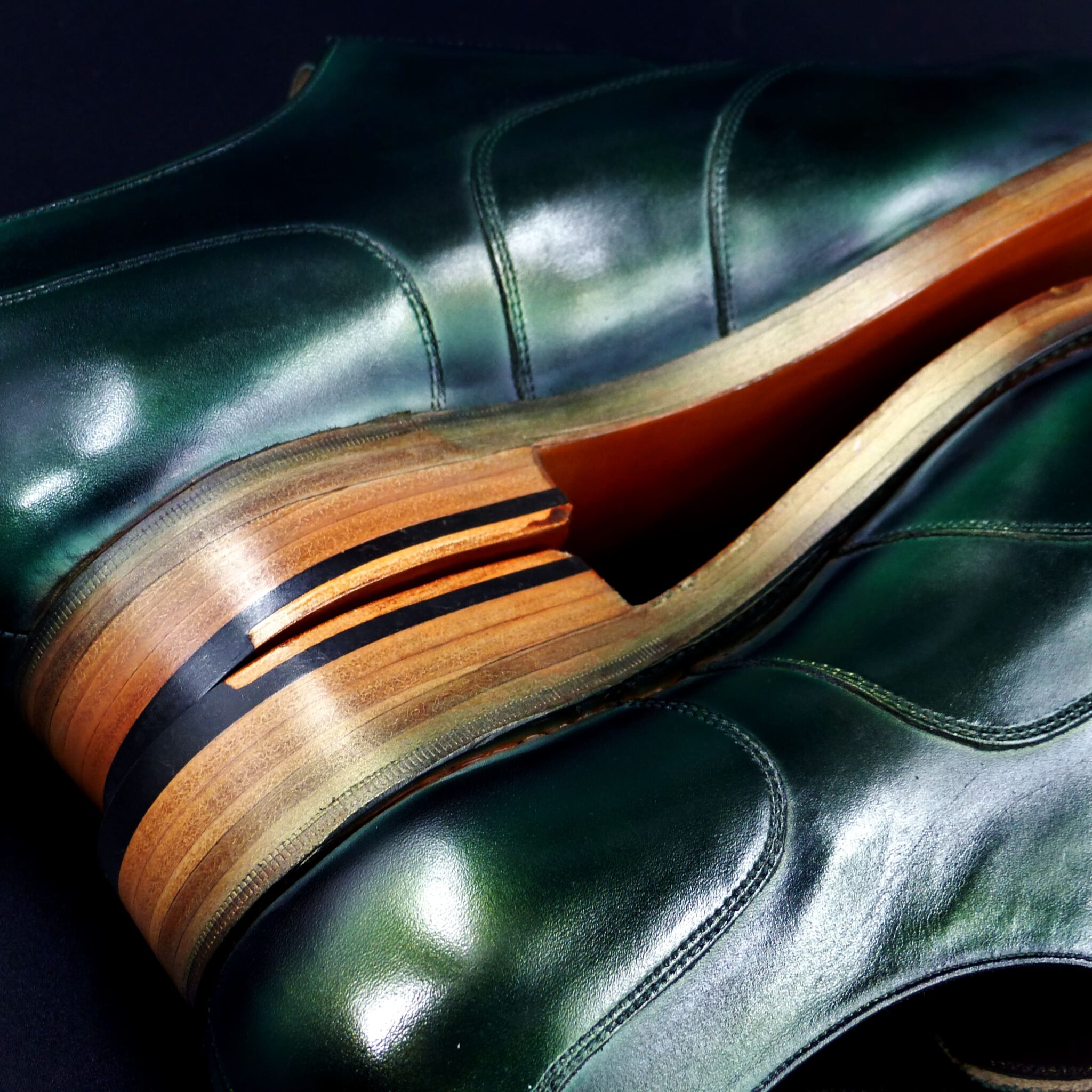
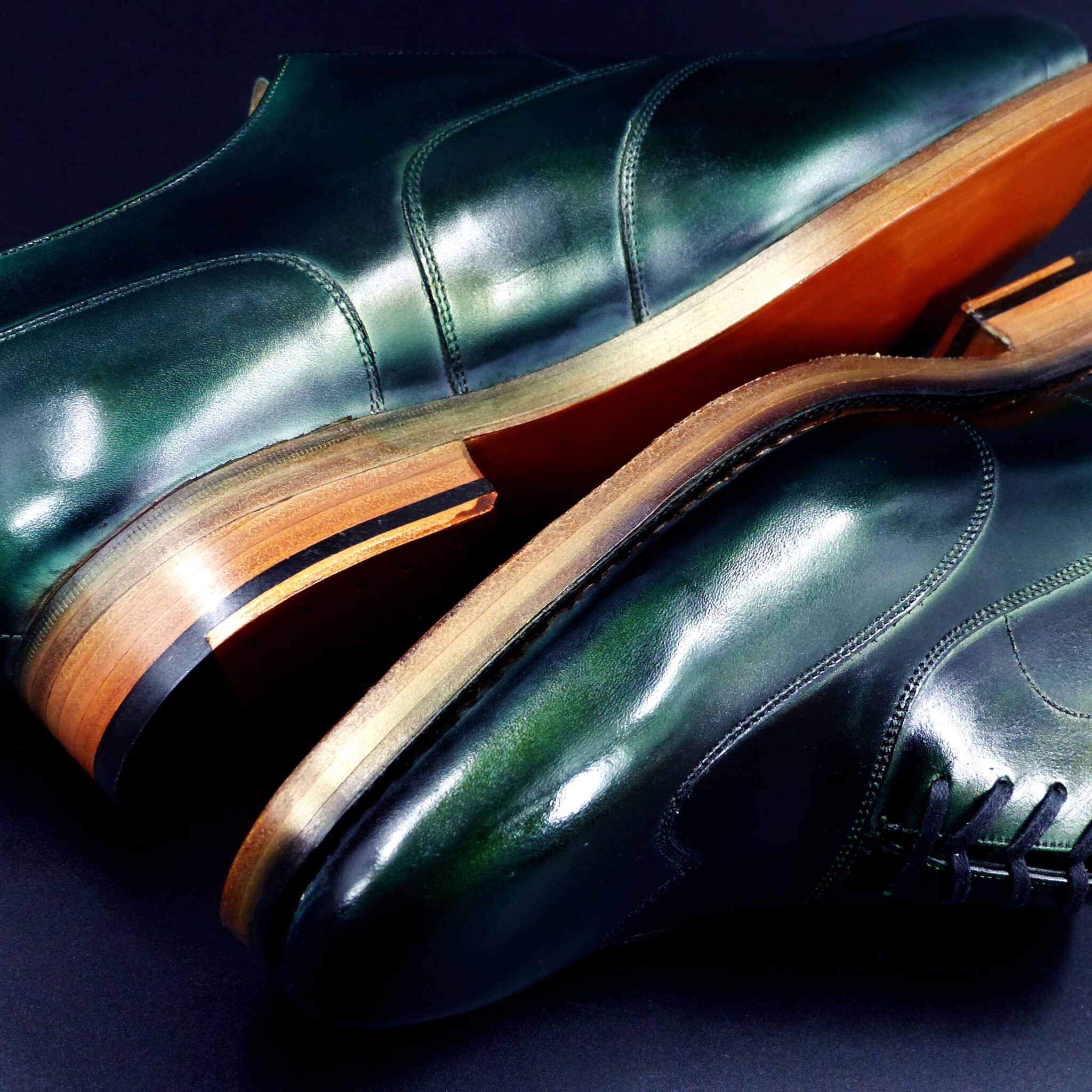
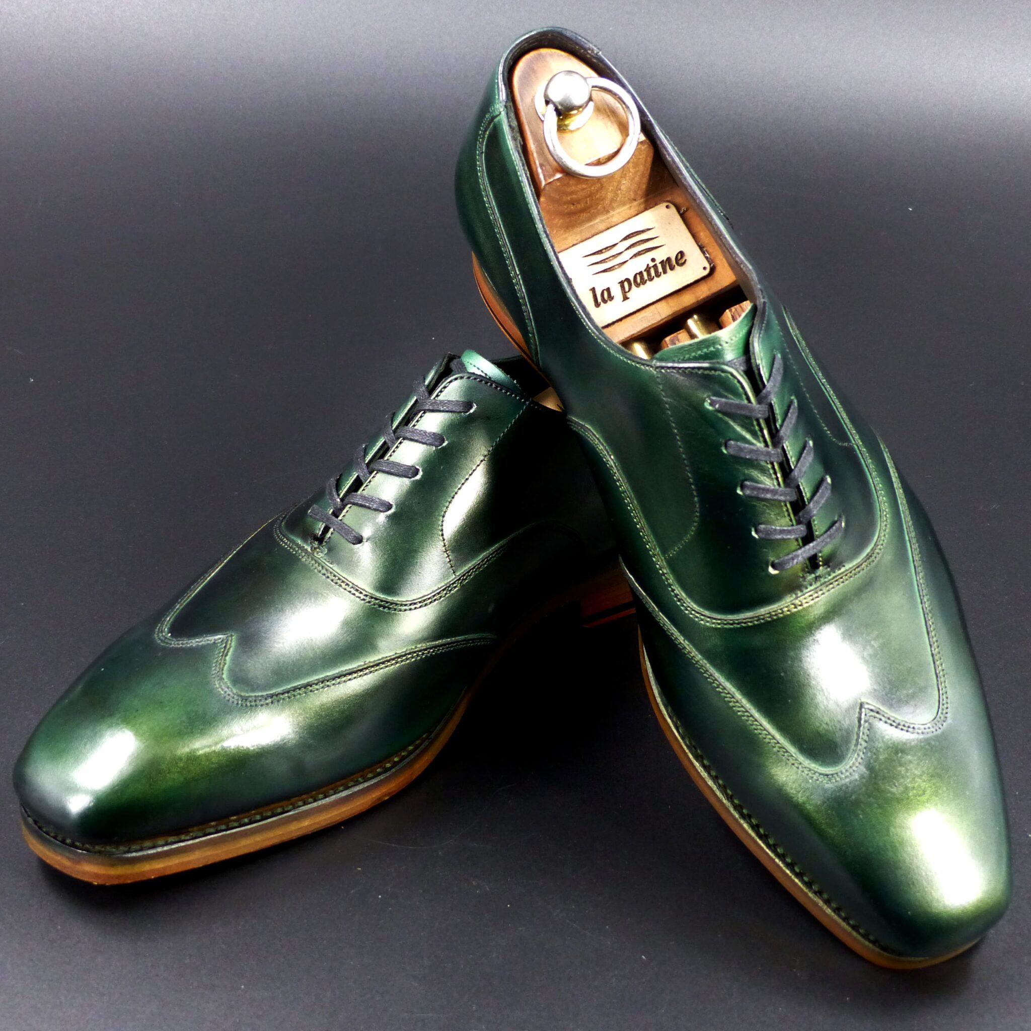
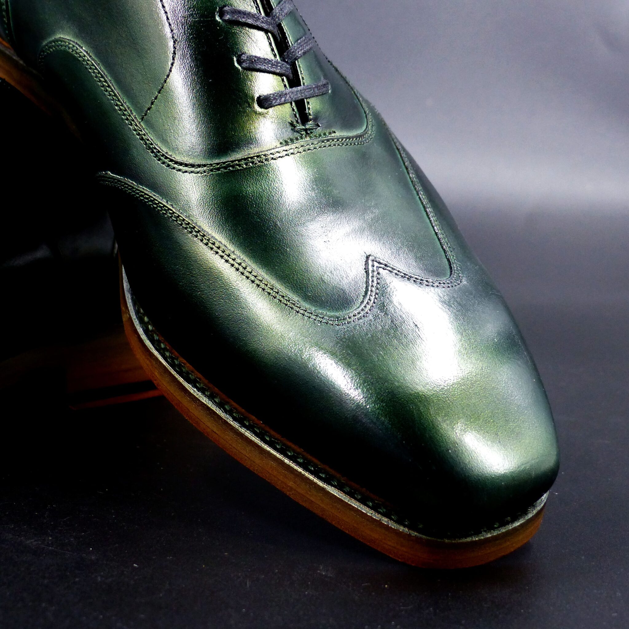
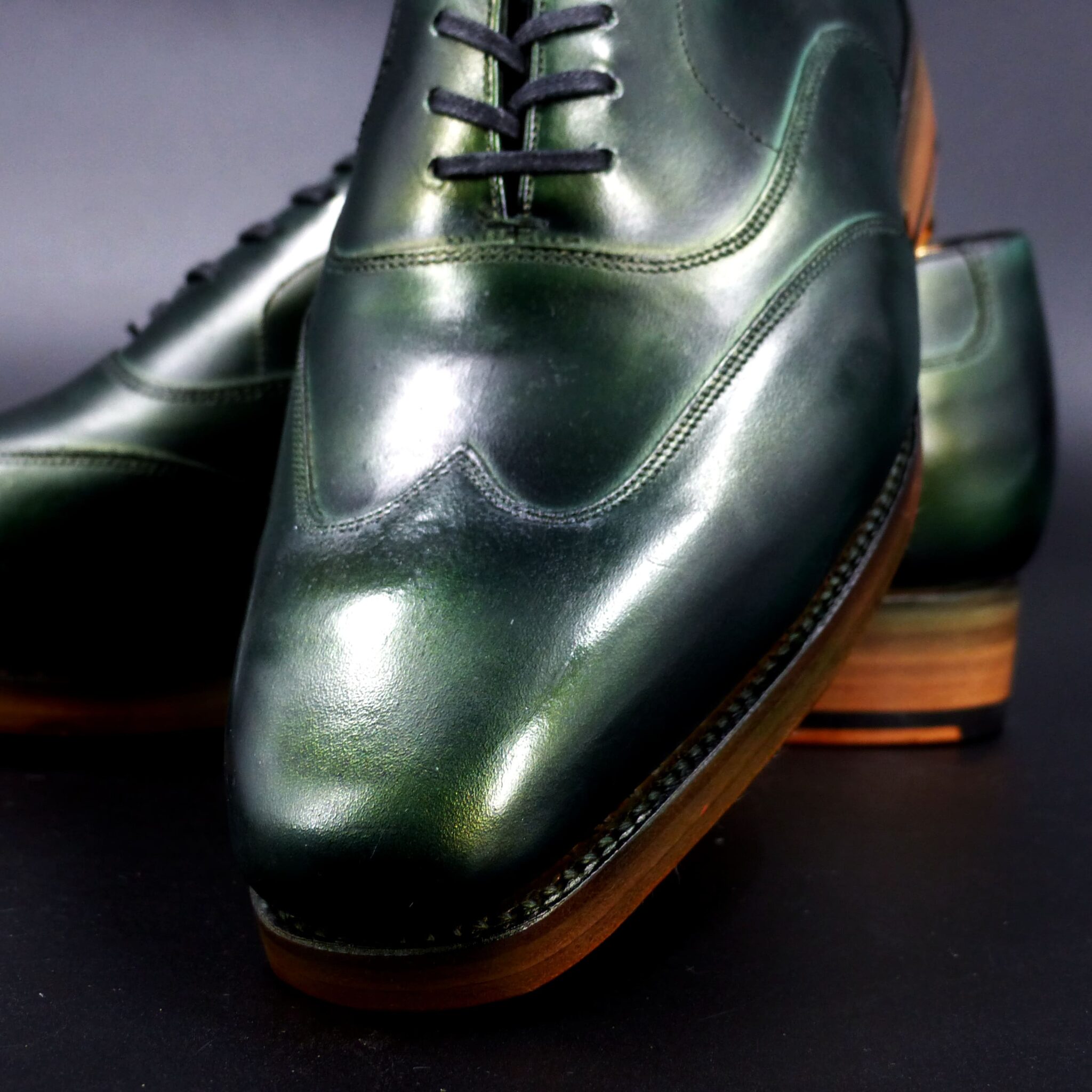
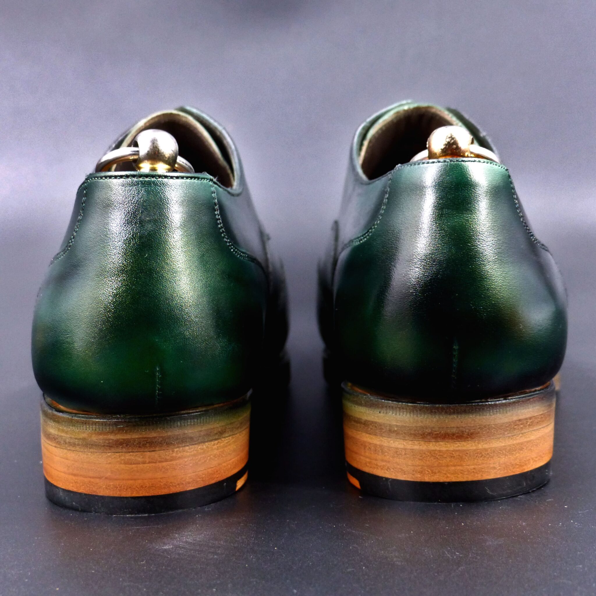
**クジャク石(マラカイト)**とは
これは、銅の錆から得られる青緑色の顔料として知られ、
日本の美術や工芸に広く用いられました。
**色構成**
マラカイトの色は、日本の伝統色に影響を与え、「緑青」や「孔雀緑」といった美しい緑系の色として表現されました。
緑青(ろくしょう) → 鮮やかでやや青みがかった緑。古代の仏画や装飾に使われました。
孔雀緑(くじゃくみどり) → 深みのある青緑色で、孔雀の羽のような鮮やかな輝きを持ちます。 千歳緑(ちとせみどり) → 深く落ち着いた緑。長寿や繁栄を象徴する色とされてきました。
マラカイトは、時間が経過しても色褪せにくく、その鮮やかな緑は長寿や自然の生命力を感じさせるものとされました。
**緑青(マラカイト)が象徴するもの**
古代日本では、緑青(ろくしょう)は神聖な色・長寿・魔除けを象徴し、次のような意味を持っていました。
- 神聖な色 仏像や寺院の壁画に使われ、仏教美術の装飾に欠かせない色だった。 平安時代には、高貴な身分の者が青緑の装束を着ることがあり、格式の高い色とされました。
② 長寿と繁栄 松や常緑樹の色と関連し、「千歳緑」の名の通り、長く続く生命や繁栄を願う象徴。 武士や貴族の間で、家の繁栄と守護の願いを込めて使われました。
- 守護の力 緑青は邪気を払う力があると信じられ、護符や装飾品としても使用。 特に仏像の装飾や神社仏閣に用いられたことから、「神仏の加護を受ける色」とされました。
古代日本では、クジャク石(マラカイト)は**「緑青(ろくしょう)」と呼ばれ、神聖な色として扱われました。その青緑の美しい色合いは、仏教美術・装飾・衣服に取り入れられ、長寿・繁栄を象徴する色として人々に尊ばれてきました。
Peacock Stone (Malachite) in Ancient Japan: Its Name and Symbolism
In ancient Japan, Peacock Stone (Malachite) was known as “Rokusho” (緑青). This term referred to the blue-green pigment derived from copper rust, widely used in Japanese art and craftsmanship.
- Color Composition
The color of malachite influenced traditional Japanese colors and was expressed through beautiful shades of green, such as “Rokusho” and “Peacock Green.”
- Rokusho (緑青)
→ A vivid, slightly bluish green. Used in ancient Buddhist paintings and decorations. - Peacock Green (孔雀緑, Kujaku Midori)
→ A deep blue-green hue with a brilliant luster resembling a peacock’s feathers. - Chitose Green (千歳緑, Chitose Midori)
→ A deep, calm green symbolizing longevity and prosperity.
Malachite retains its vibrant color over time, and its rich green shade was associated with longevity and the vitality of nature.
- The Symbolism of Rokusho (Malachite) in Ancient Japan
In ancient Japan, Rokusho (malachite) symbolized divinity, longevity, and protection against evil and held the following meanings:
① A Sacred Color
- Used in Buddhist statues and temple murals, it was an essential color in Buddhist art.
- In the Heian period, people of high status wore garments in blue-green shades, marking it as a prestigious color.
② Longevity and Prosperity
- Associated with pine trees and evergreen plants, symbolizing everlasting life and prosperity, as reflected in the name “Chitose Midori” (meaning “a thousand years of green”).
- Warriors and aristocrats used it as a symbol of their family’s prosperity and protection.
③ Protective and Purifying Power
- Rokusho was believed to ward off evil spirits and was used in protective talismans and ornaments.
- Especially in Buddhist statues and shrines, it represented divine protection and was considered a sacred color.
Conclusion
In ancient Japan, Peacock Stone (Malachite) was called “Rokusho” (緑青) and regarded as a sacred color. Its brilliant blue-green hue was incorporated into Buddhist art, decorations, and clothing, symbolizing longevity, prosperity, and protection against evil and was highly revered by the people.
プレーン・オックスフォード
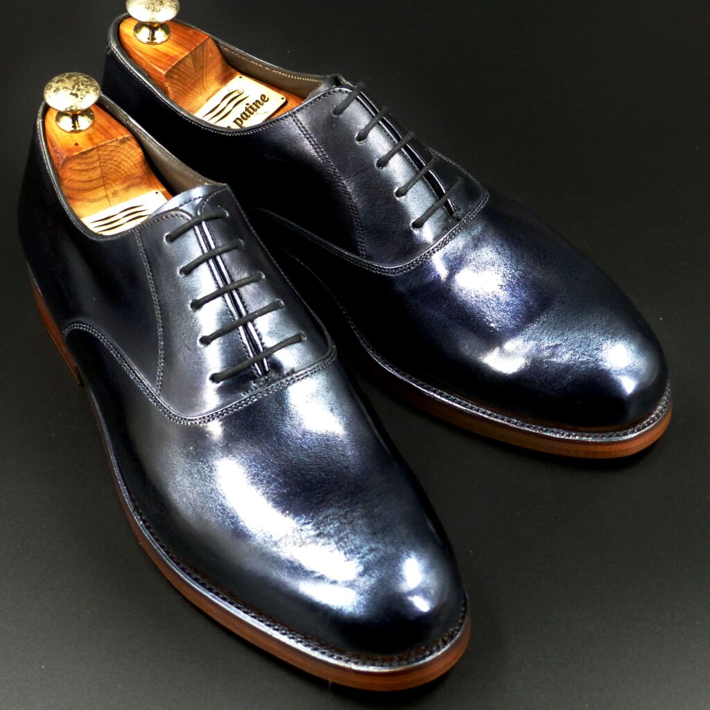
color name;
[ Krogane-Iro]
黒鉄色
Plain Oxford

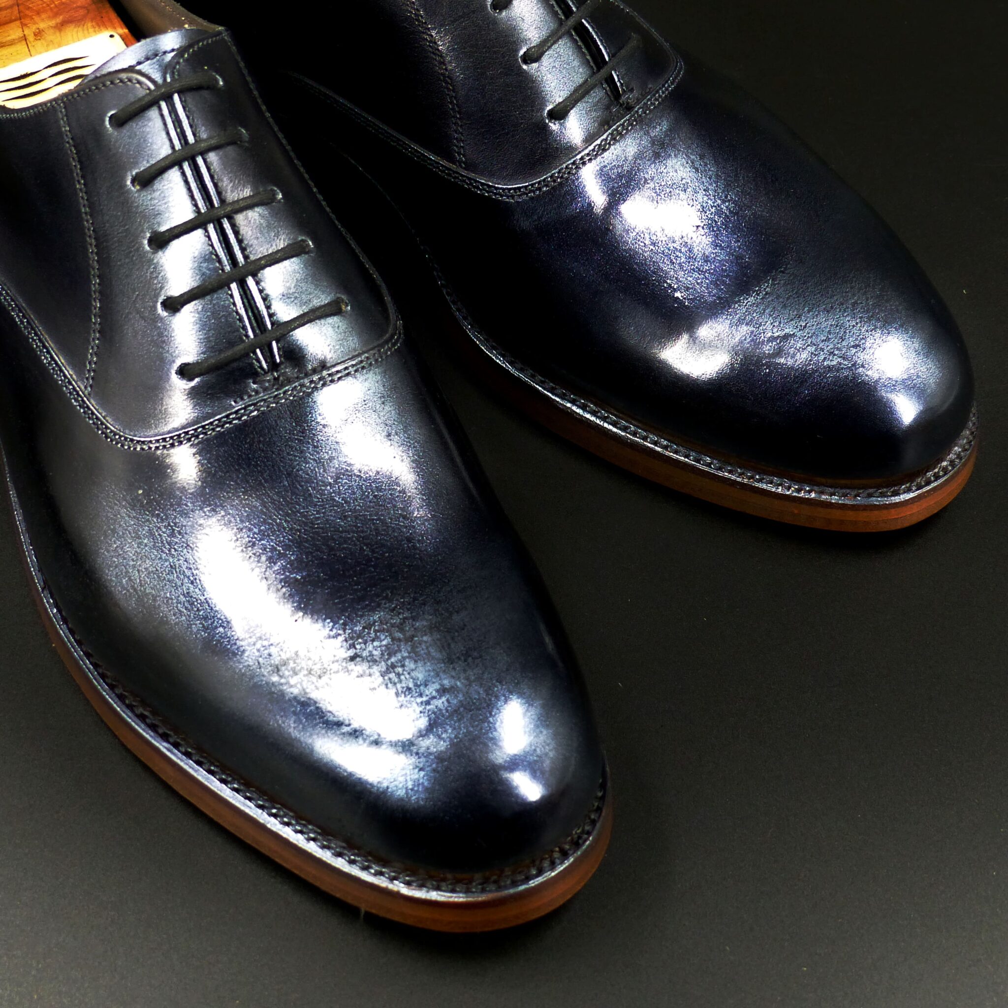
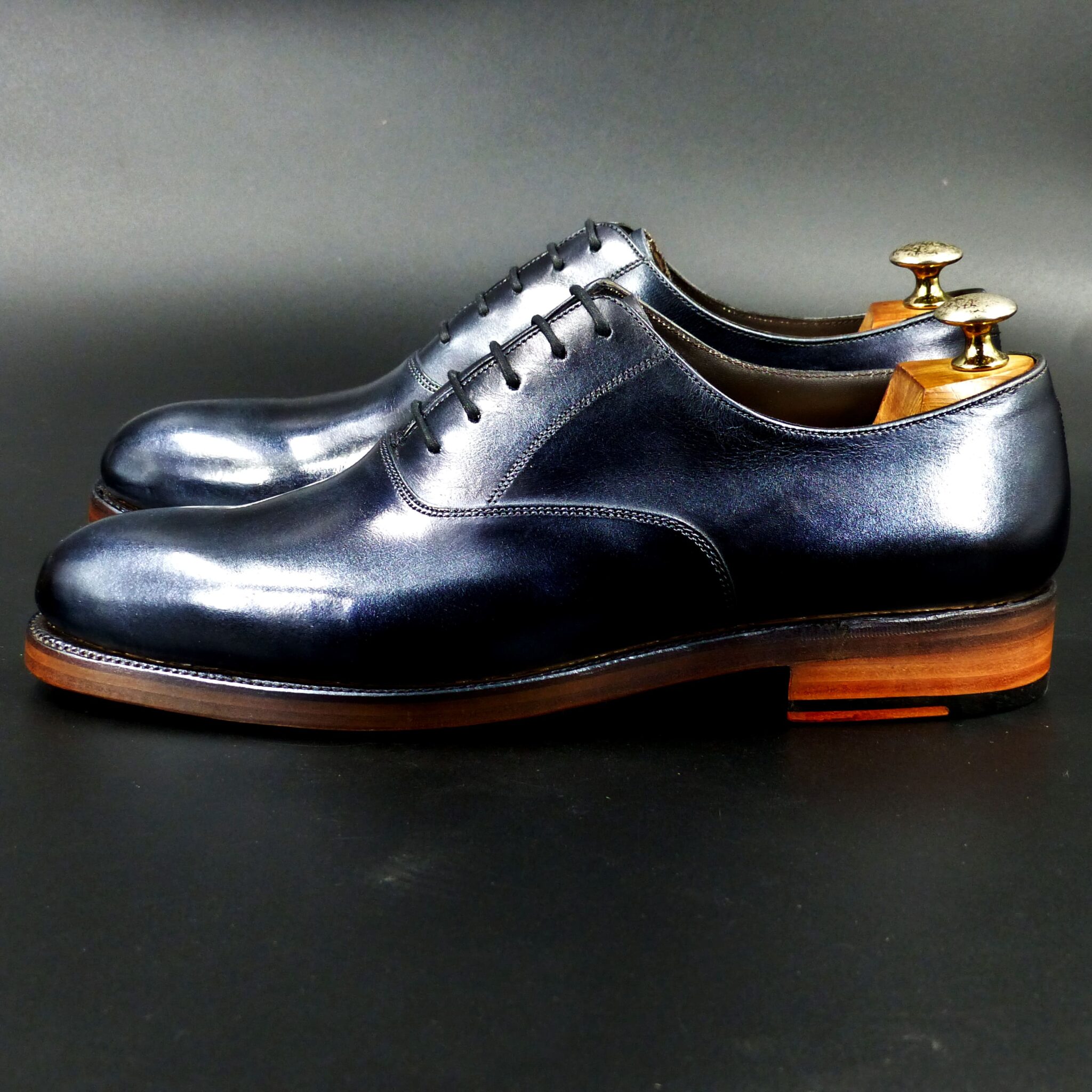
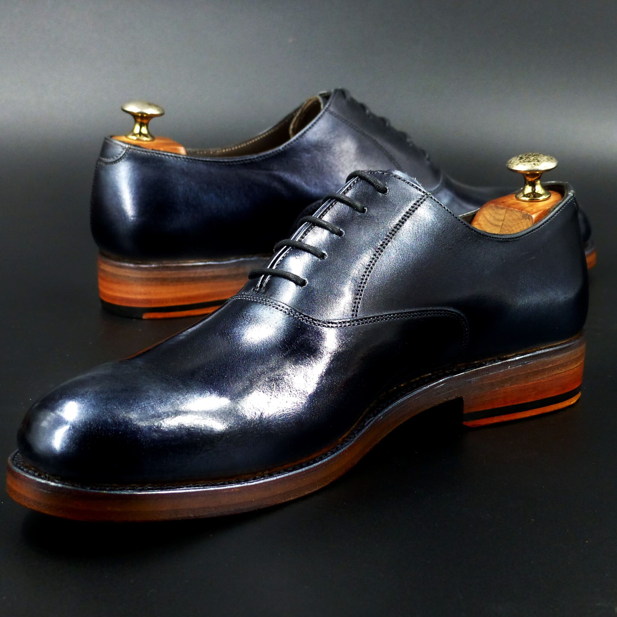
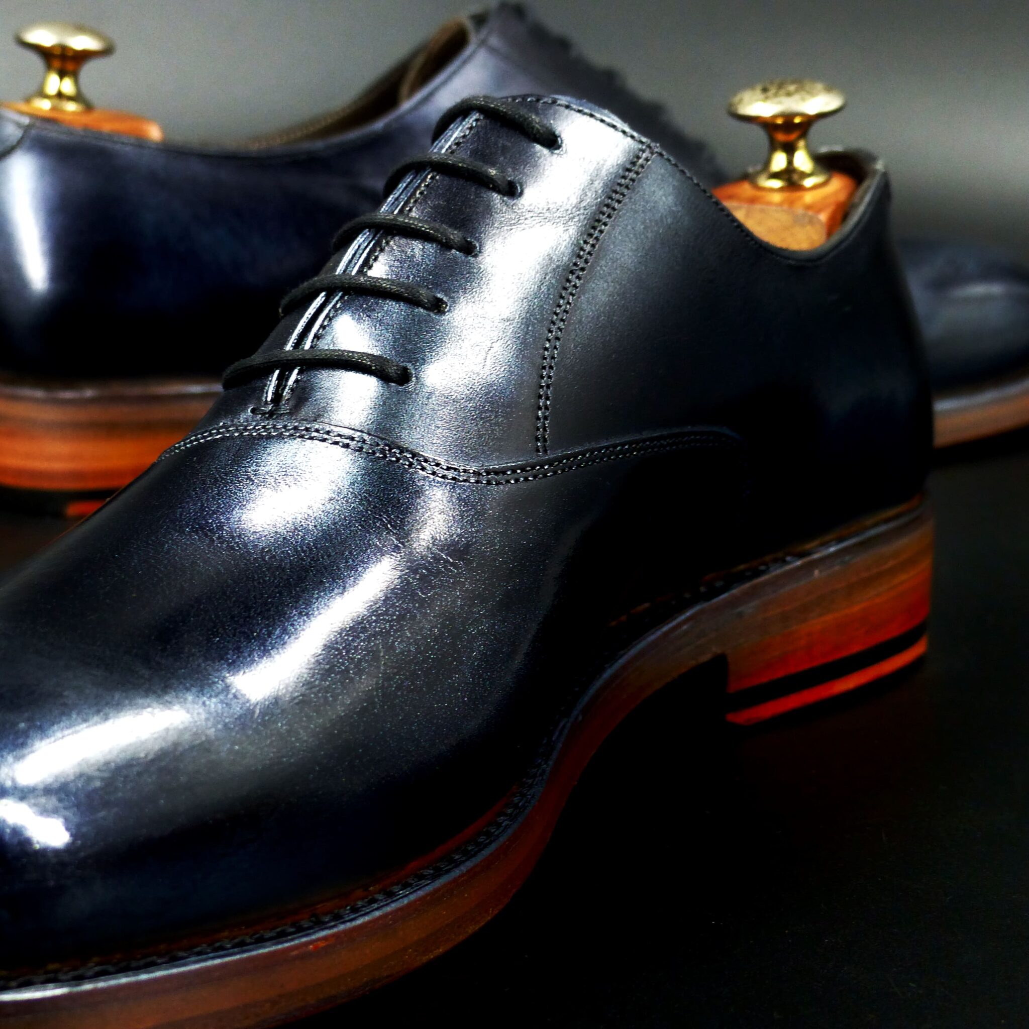
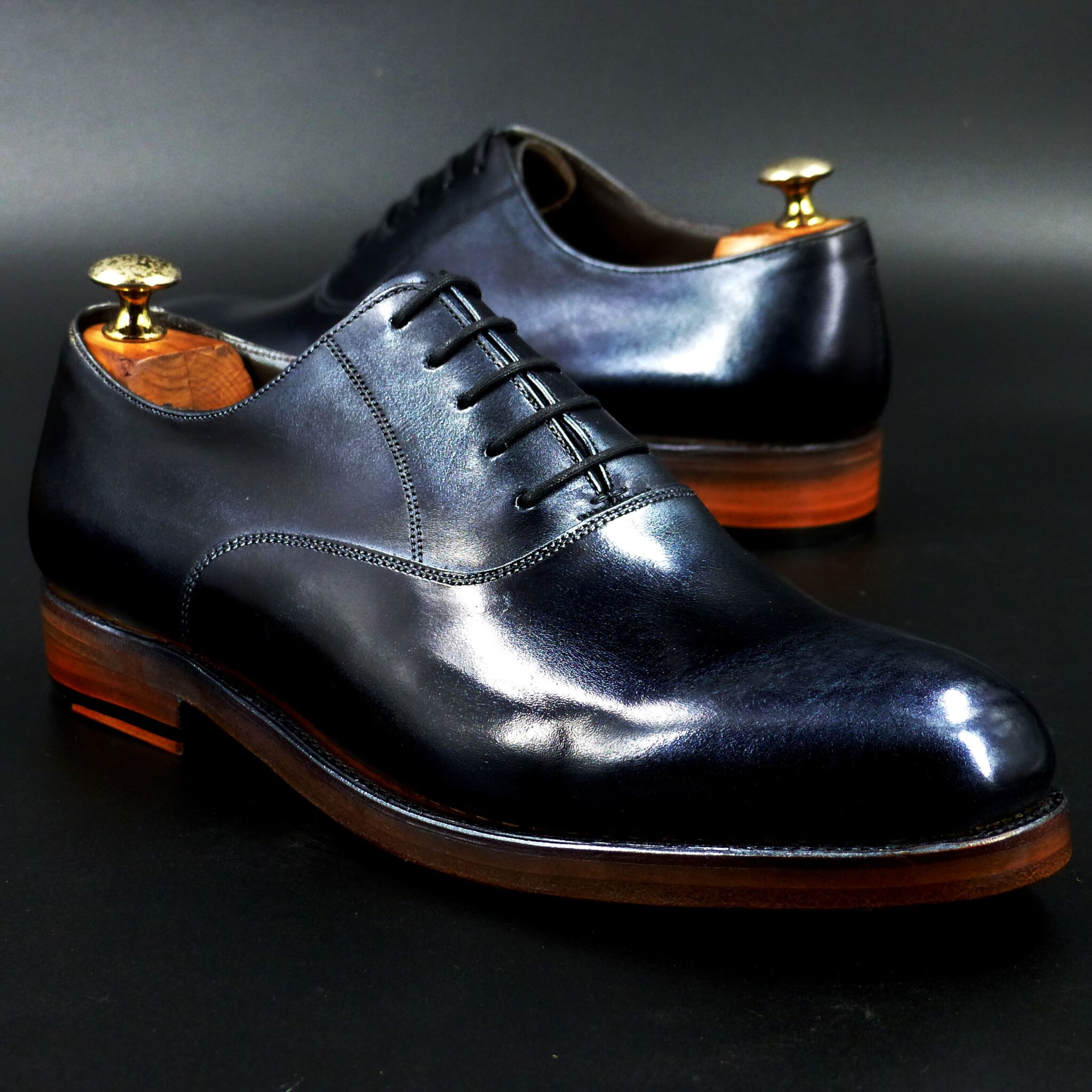
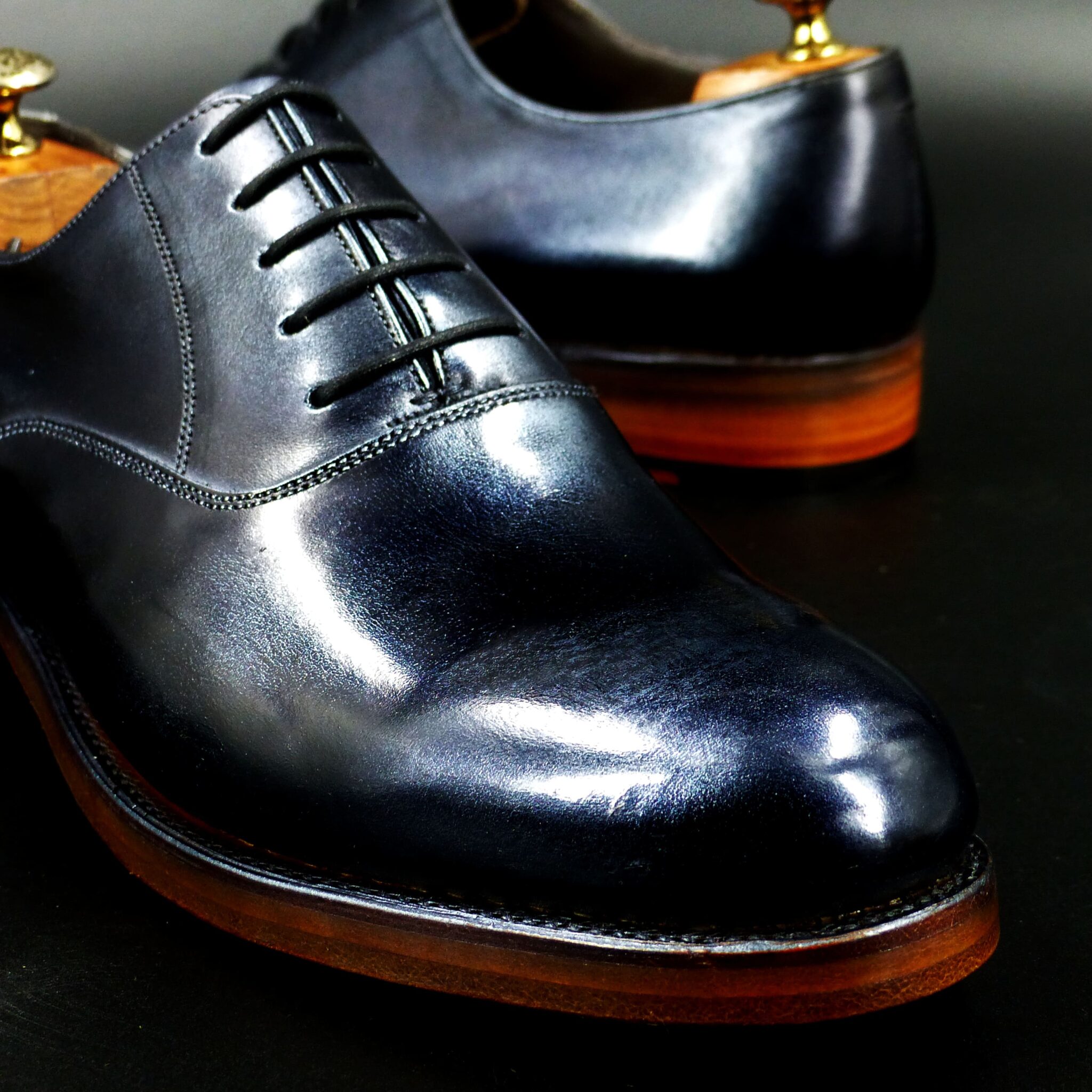
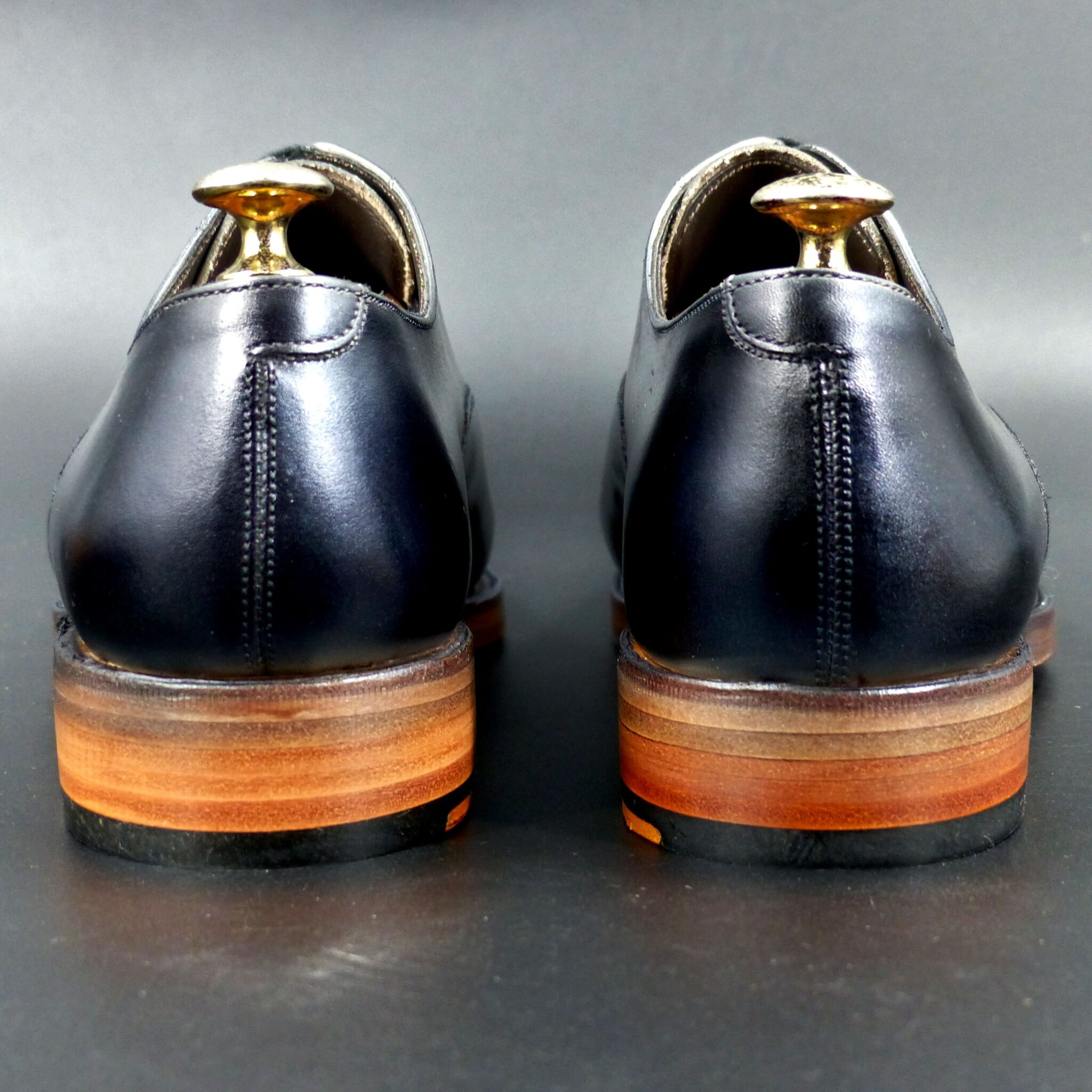
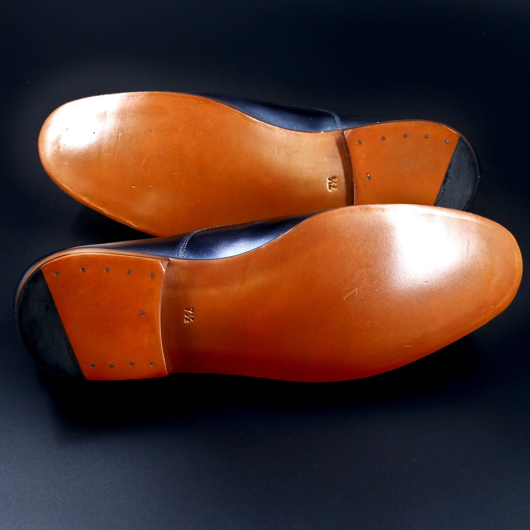
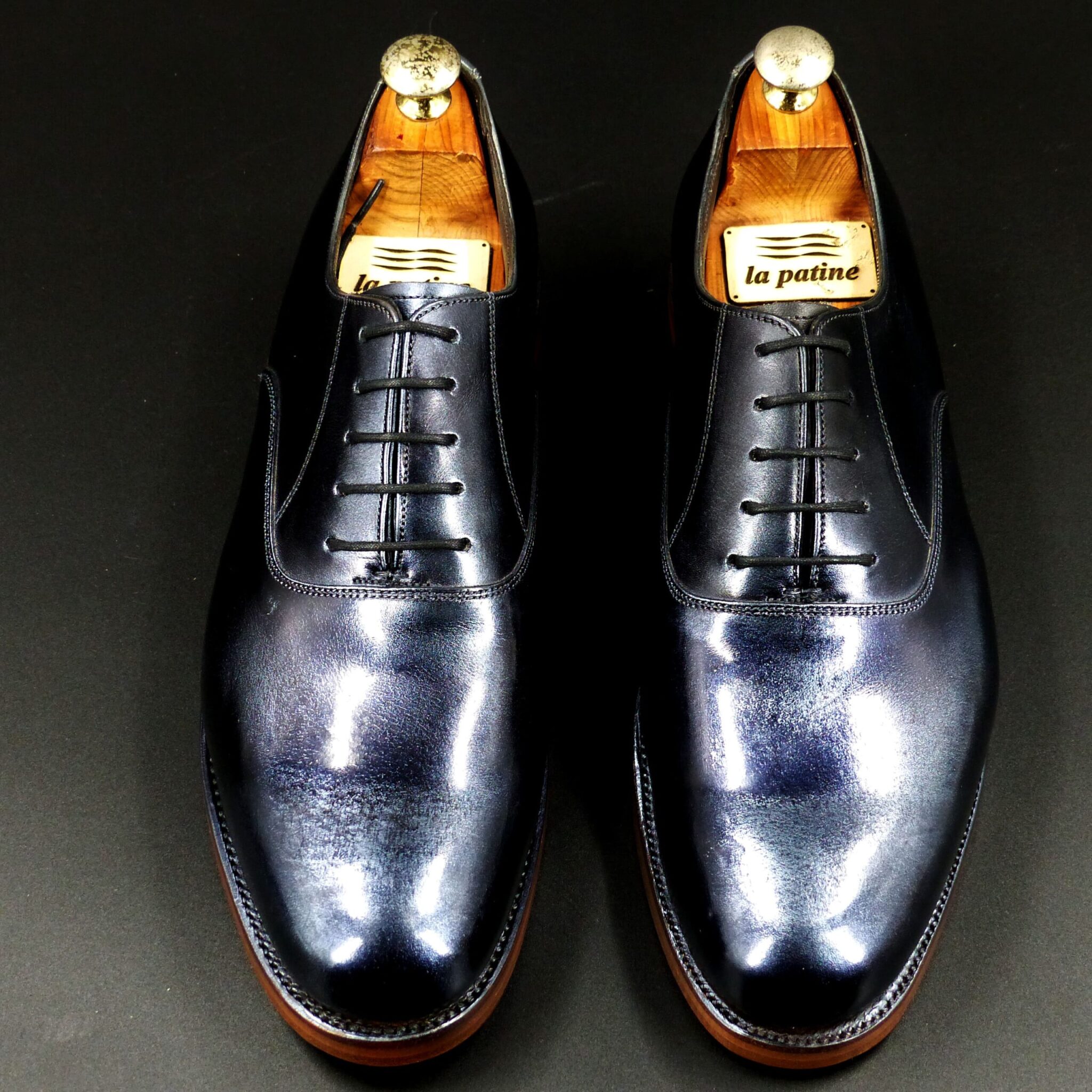
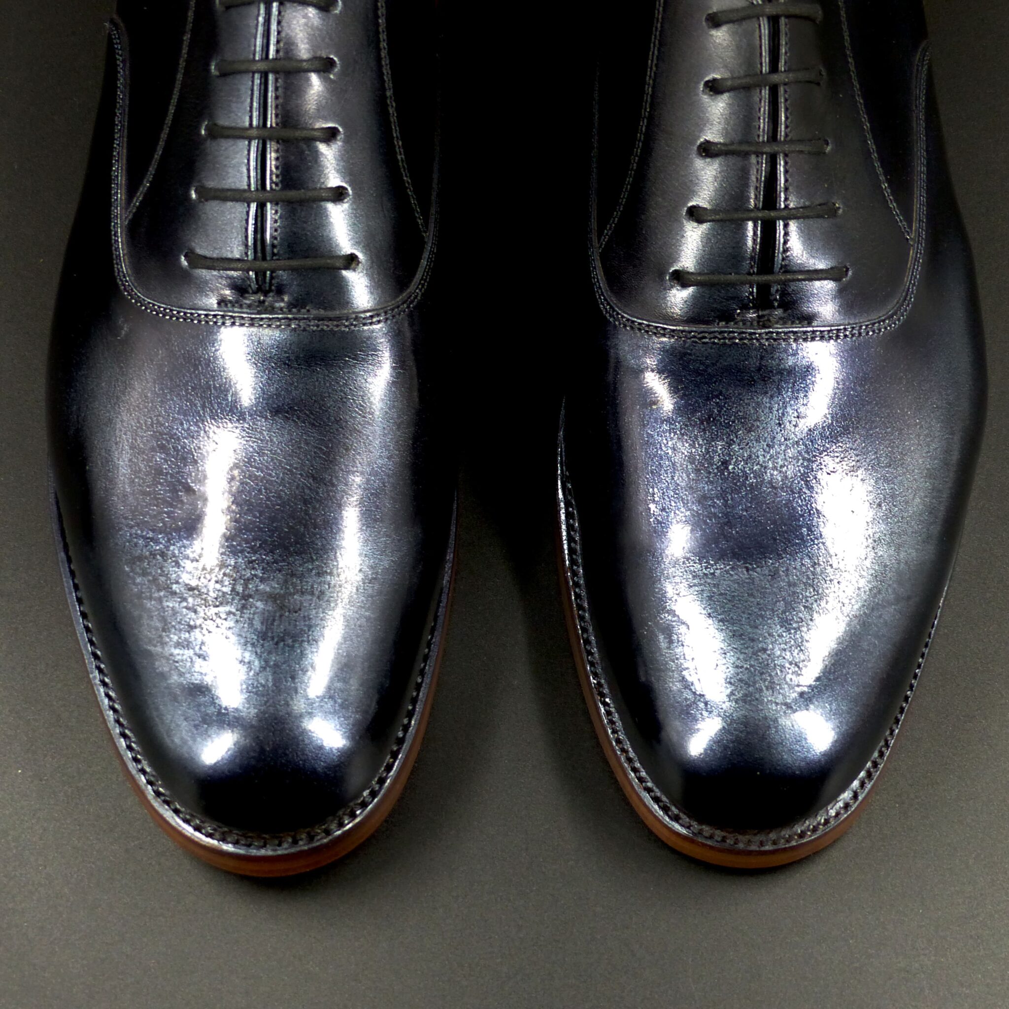
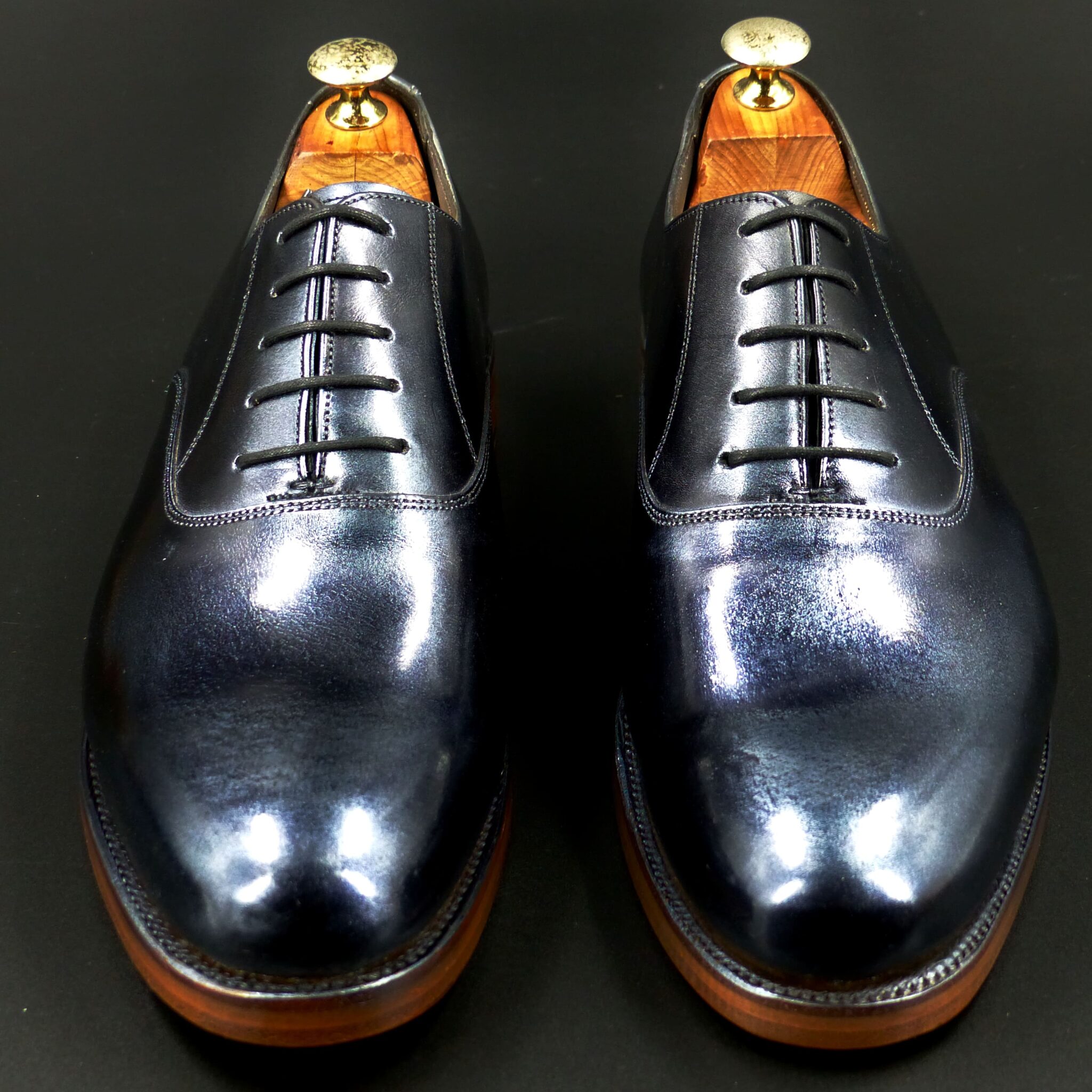
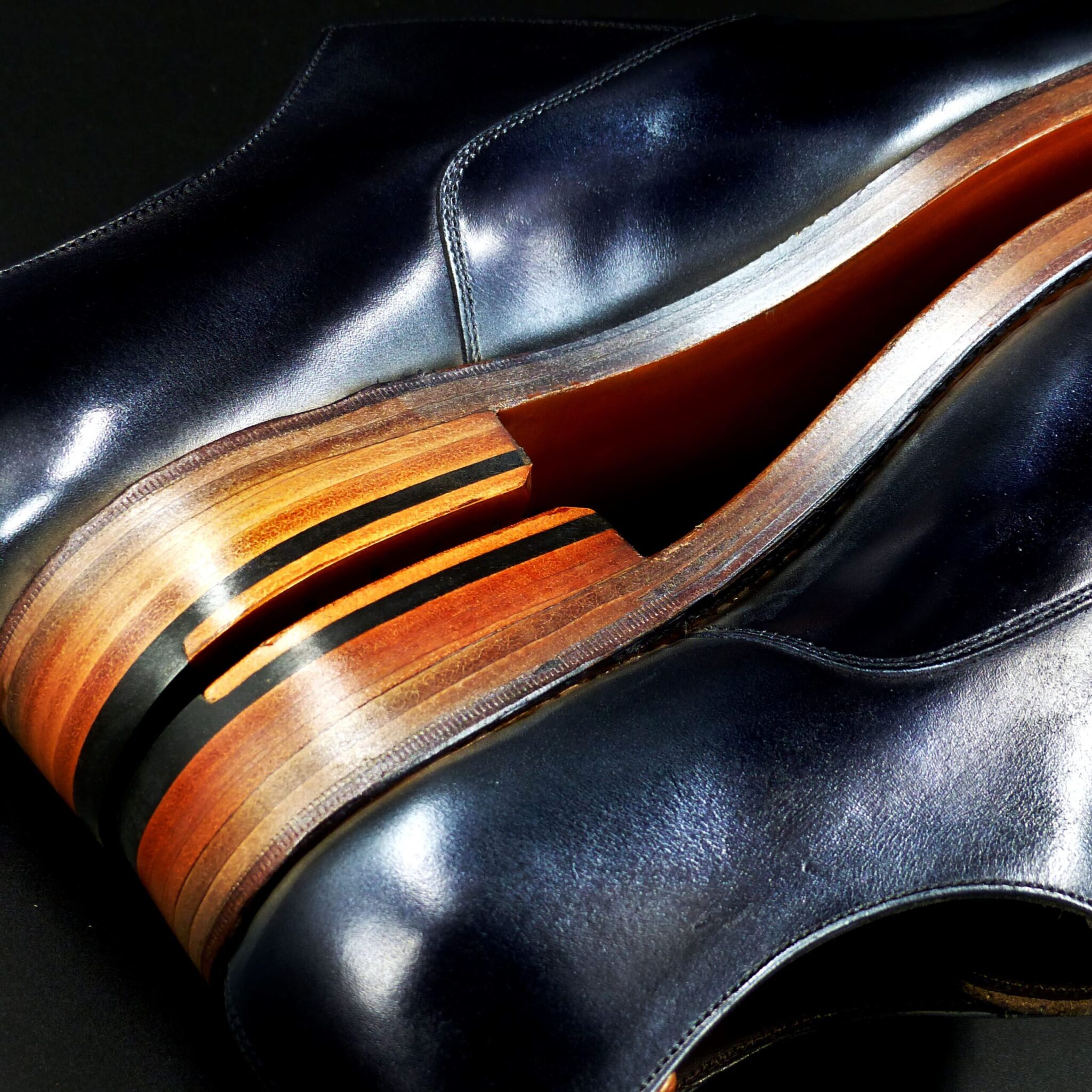
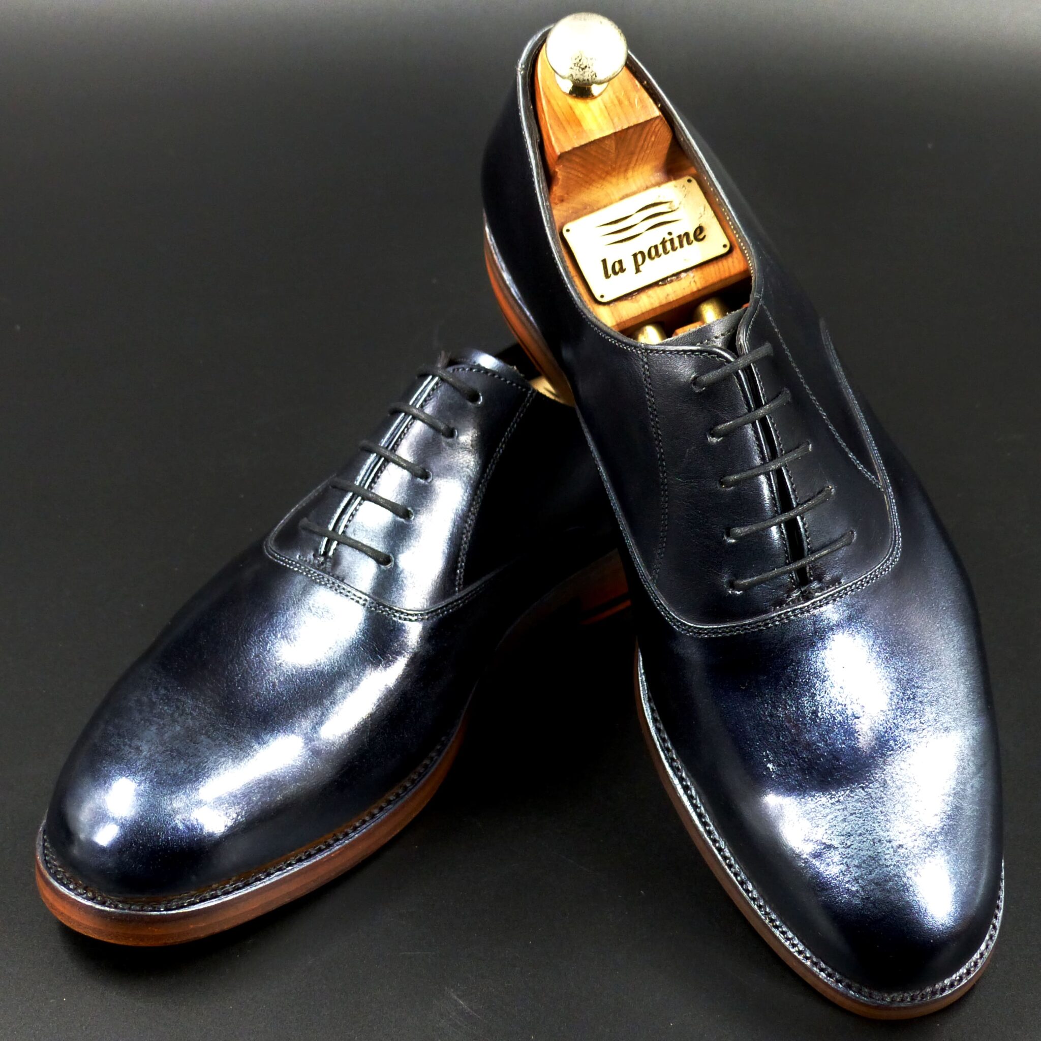
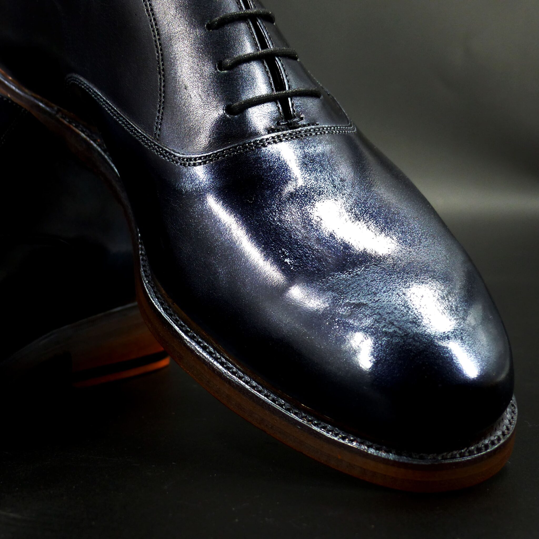
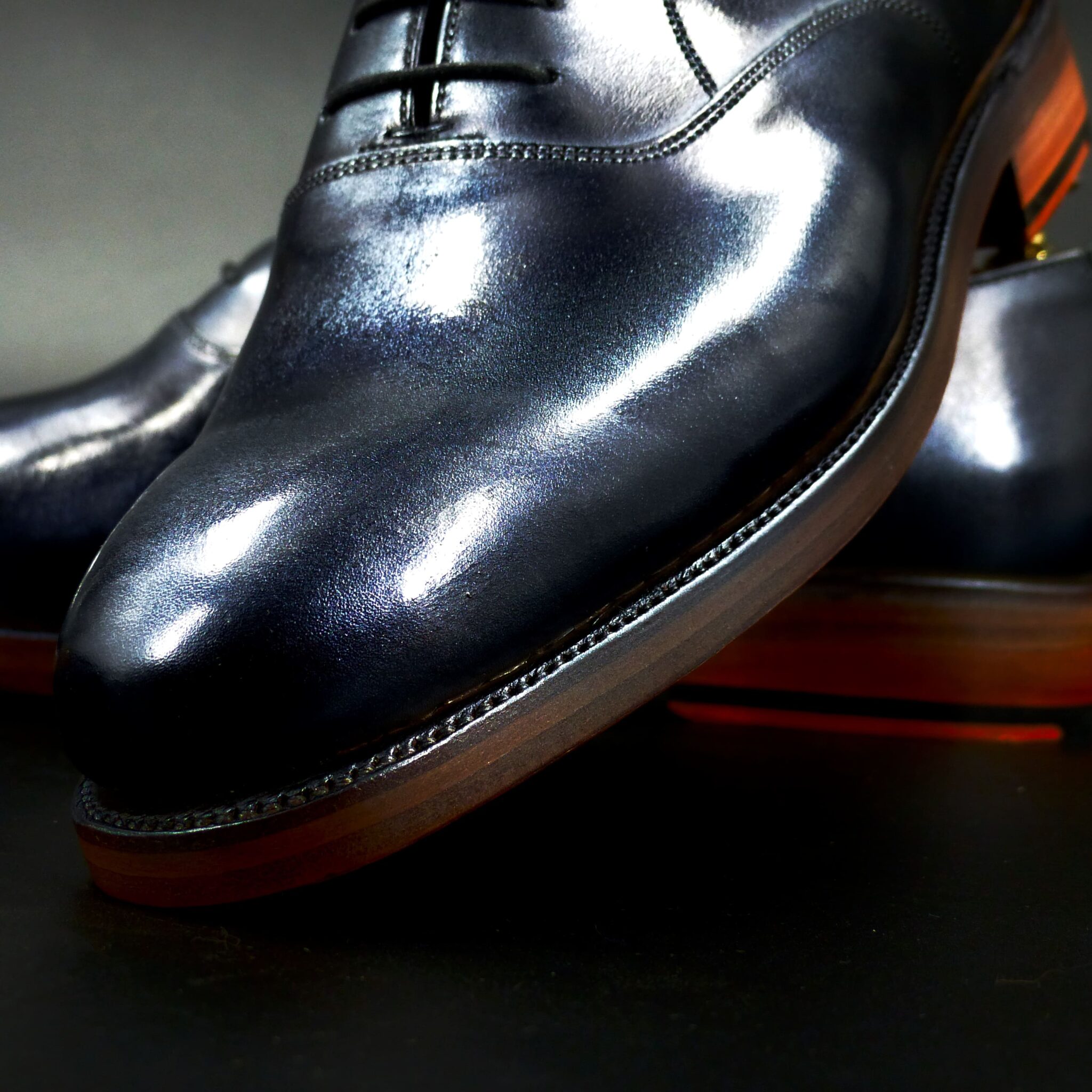
**「くろがね色(黒鉄色)」**とは
鉄を意味する「黒鉄(くろがね)」に由来し、深い青みを帯びた鉄のような黒色です。古代日本では、この色は強さや気品、厳粛さを象徴する色として重宝されました。
**くろがね色の色構成**
くろがね色は、黒にわずかな青みが加わった色合いで、鉄の冷たさと硬さを感じさせる深みのある色です。具体的な色構成は以下の通りです:
- 基調色: 深い黒色、暗い灰色
- 青み: 鉄のように、ほんのりと青を帯びた冷徹な色調
- 質感: 金属的な輝きが微かに感じられ、艶消しのような落ち着きがある
**くろがね色が象徴するもの**
① 武士の精神と強さ
- くろがね色は、古代日本において武士や戦士の象徴的な色とされました。鉄は武器や甲冑に使われ、強靭さや不屈の精神を表現する色として、武士階級の人々に好まれました。
- 特に甲冑(かっちゅう)や武具に多く見られ、戦いの場での勇気や誇りを象徴する色でした。
② 厳粛さと格式
- くろがね色はその深みと重厚感から、格式の高い色としても重視され、儀式や神事、貴族の衣服に取り入れられました。
- 武士や貴族はこの色を身に纏うことで、高貴で威厳のある存在であることを示しました。
③ 時の流れと無常
- 鉄は変化し続ける物質であり、錆びることから、**無常(むじょう)**を象徴する色でもあります。鉄のように耐久性があり、時間の経過に耐える性質が、**仏教の「無常観」**と結びつけられました。
くろがね色(黒鉄色)は、青みがかった深い黒で、鉄の冷たさや硬さを象徴する色です。この色は、古代日本では武士の精神や強さ、格式、無常を象徴する色とされ、戦士の甲冑や貴族の衣装、神事などで使用されました。その深みと静けさは、厳粛さや高貴な存在感を演出し、古代日本の精神性や文化とも深く関わっています。
The Color Composition and Symbolism of “Kurogane-iro (Black Iron Color)” in Ancient Japan
“Kurogane-iro (黒鉄色)”, meaning “black iron,” refers to a deep, bluish-black color resembling iron. In ancient Japan, this color was highly valued for symbolizing strength, nobility, and solemnity.
- Color Composition of Kurogane-iro
Kurogane-iro is a shade of black with a slight bluish tint, evoking the coldness and hardness of iron. The specific color composition is as follows:
- Base color: Deep black, dark gray
- Bluish tint: A cold hue, with just a hint of blue, resembling iron’s color
- Texture: A faint metallic sheen, with a matte quality that suggests calmness
- Symbolism of Kurogane-iro
① The Spirit and Strength of the Samurai
Kurogane-iro was considered a symbolic color of the samurai and warriors in ancient Japan. Iron was used in weapons and armor, and this color expressed strength and indomitable spirit, qualities that were especially revered by the samurai class.
The color was prominently used in armor and weaponry, symbolizing courage and pride on the battlefield.
② Solemnity and Nobility
Due to its depth and weight, kurogane-iro was also regarded as a noble color, highly esteemed for its association with rituals, ceremonies, and the garments of the nobility.
By wearing this color, samurai and aristocrats signaled their high status and dignity, embodying a presence of authority and respect.
③ The Flow of Time and Impermanence
Iron, being a material that changes and rusts over time, also symbolizes impermanence (無常, mujo). The durability and resilience of iron, which withstands the passage of time, are closely associated with the Buddhist concept of mujo, or the transient nature of life.
Thus, this color also reflects the Buddhist view of impermanence—that nothing lasts forever.
Conclusion
Kurogane-iro (black iron color) is a deep, bluish-black color that symbolizes the coldness and hardness of iron. In ancient Japan, this color represented the samurai spirit, strength, nobility, and impermanence. It was used in armor, aristocratic garments, and rituals, with its deep and calm tone conveying solemnity and dignity. This color played a profound role in expressing the spiritual and cultural essence of ancient Japan.
ホールカット

color name;
[ Shigure-cha-Iro]
時雨茶色
Whole cut
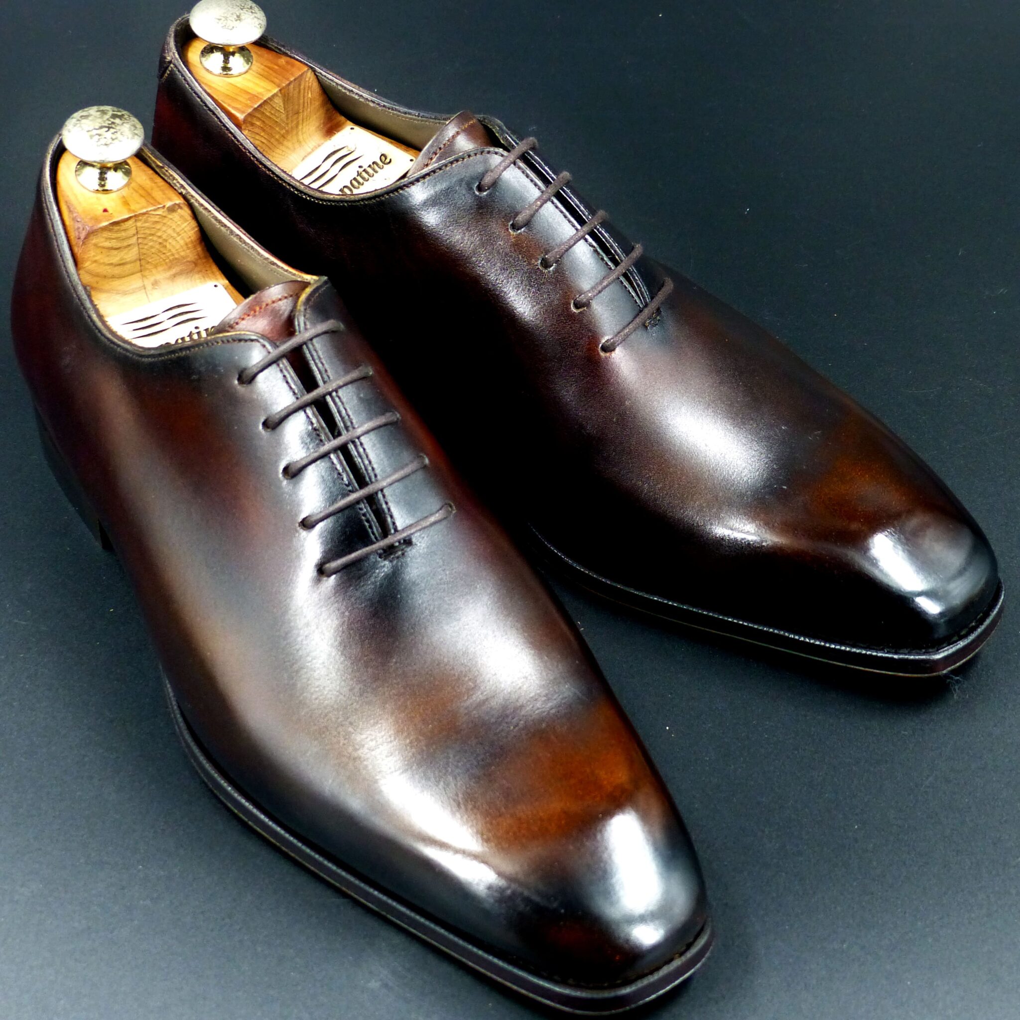
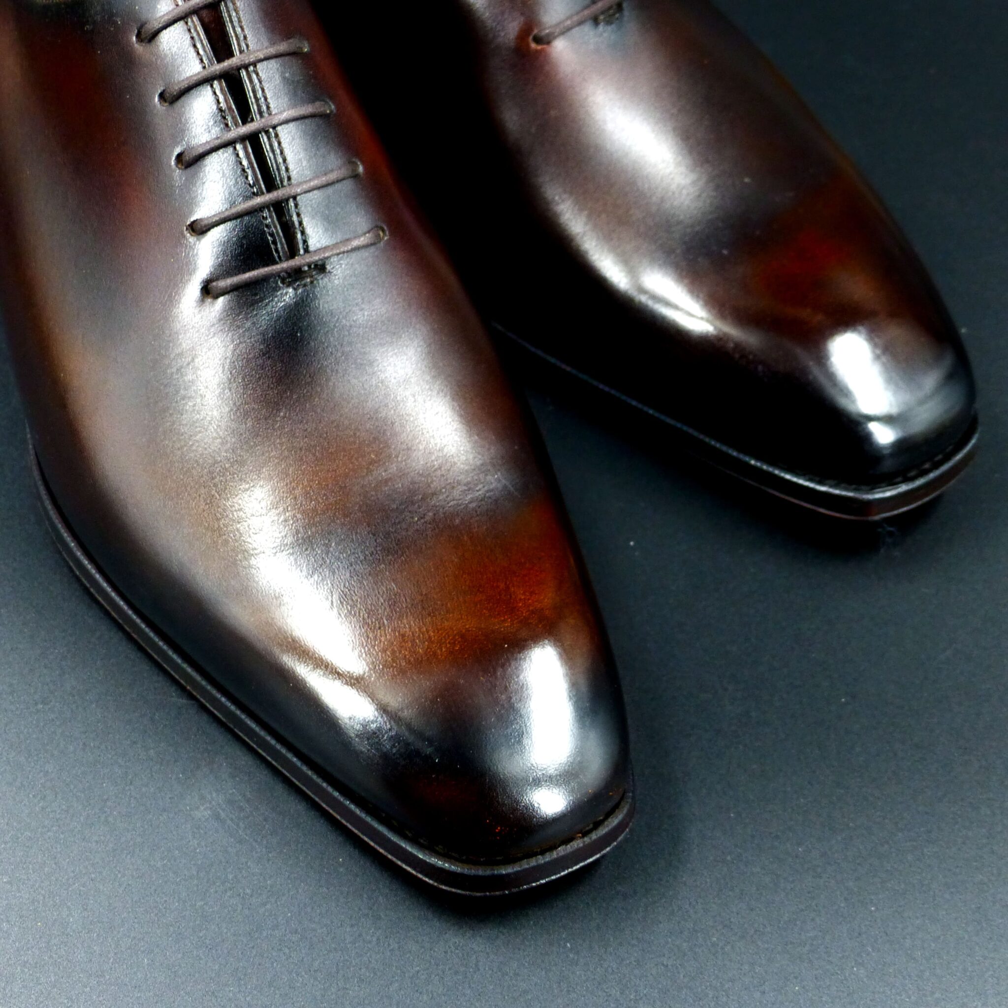
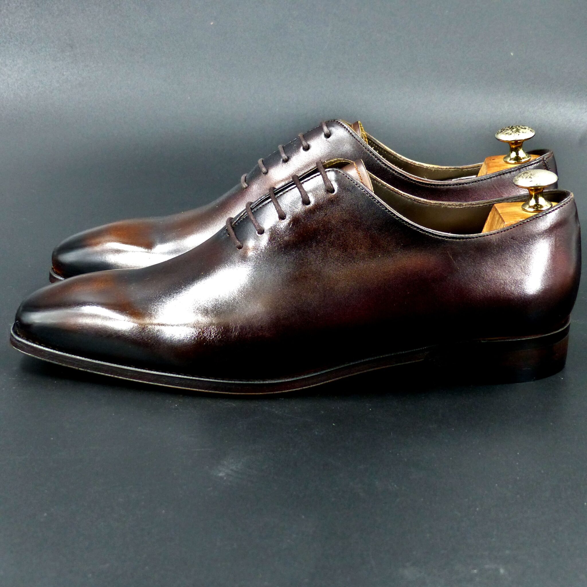
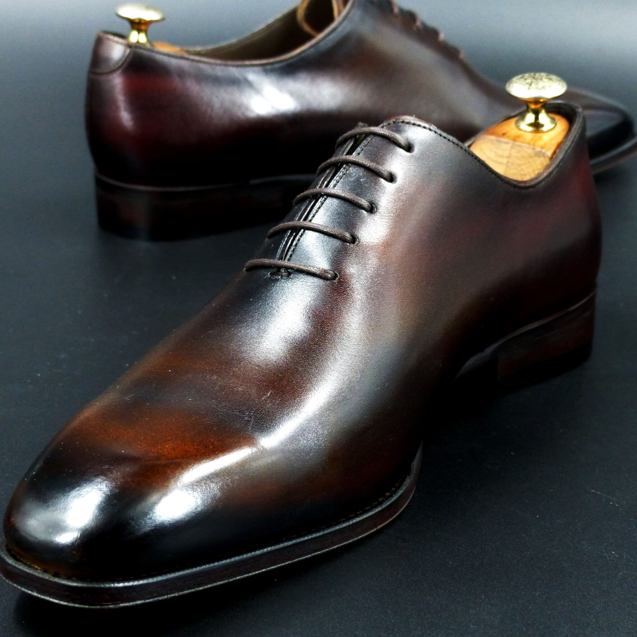
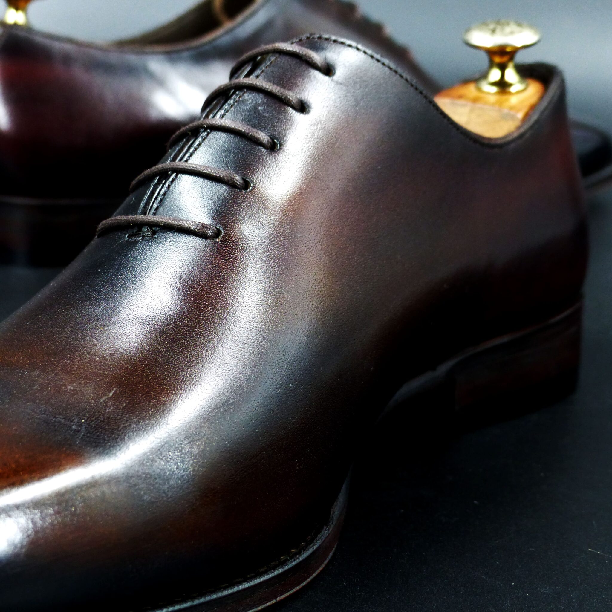
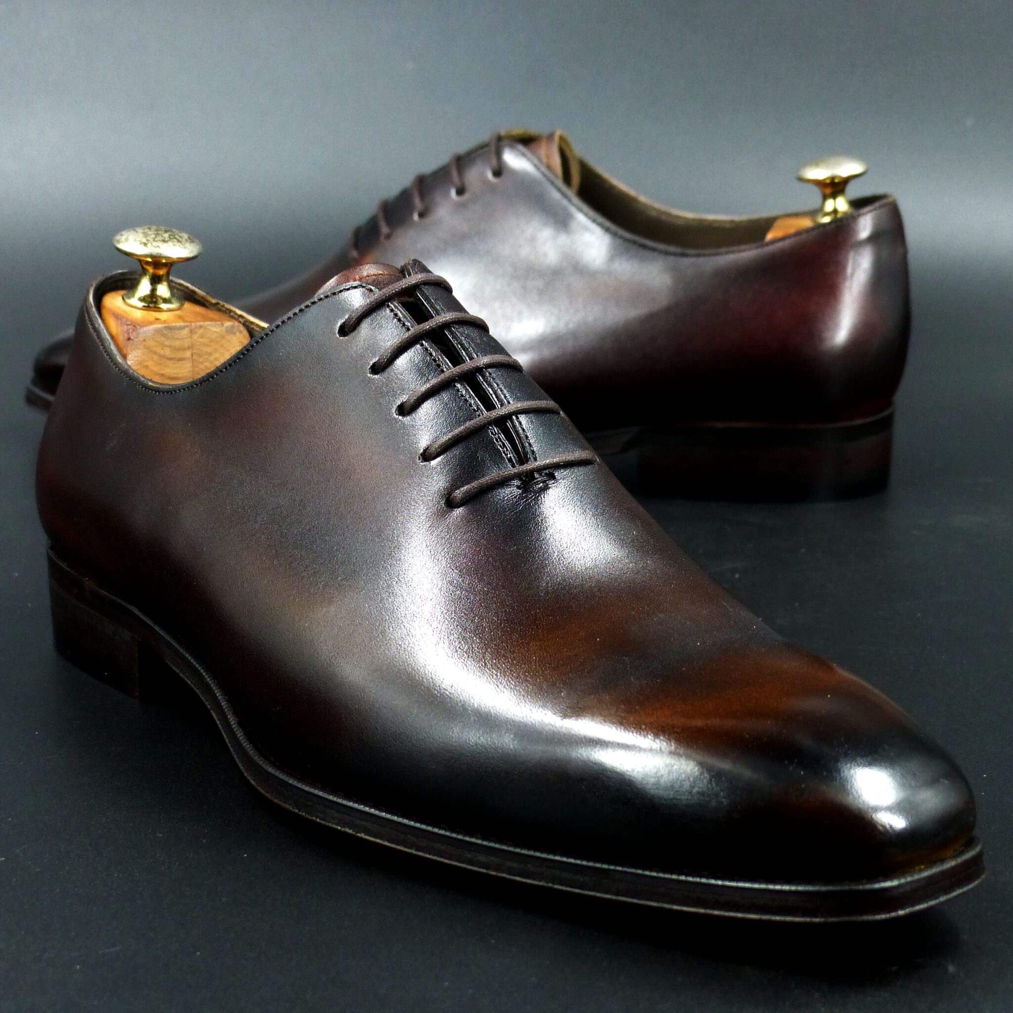

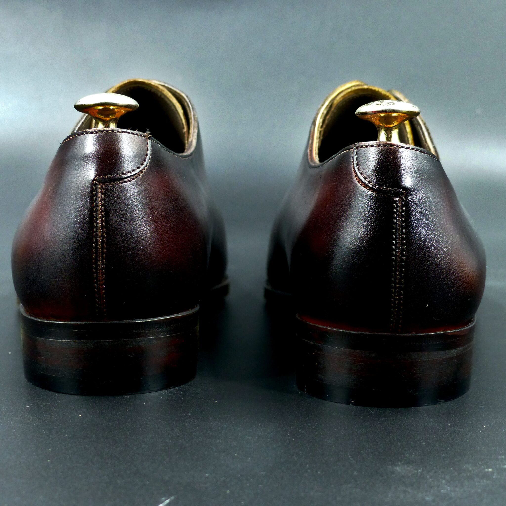
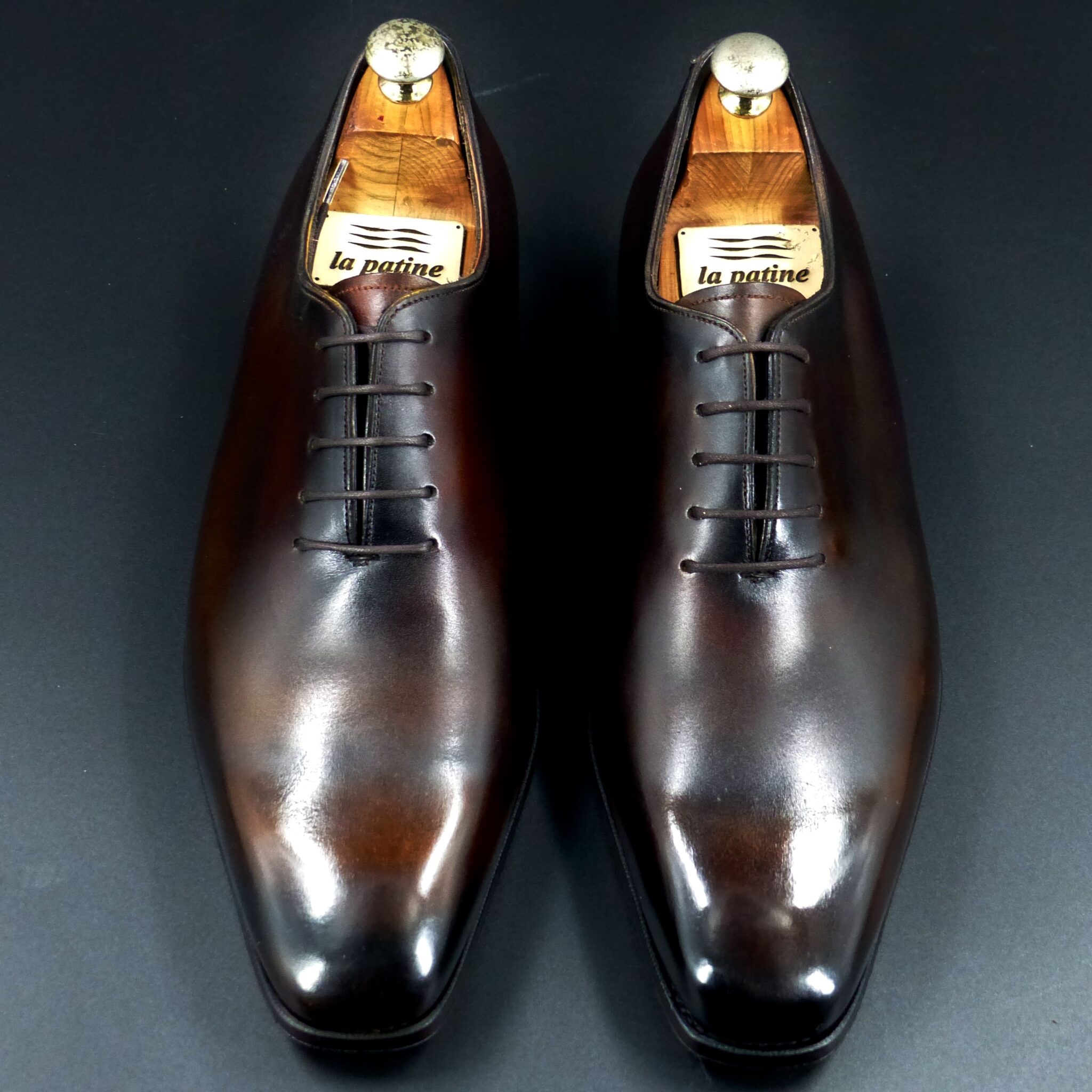
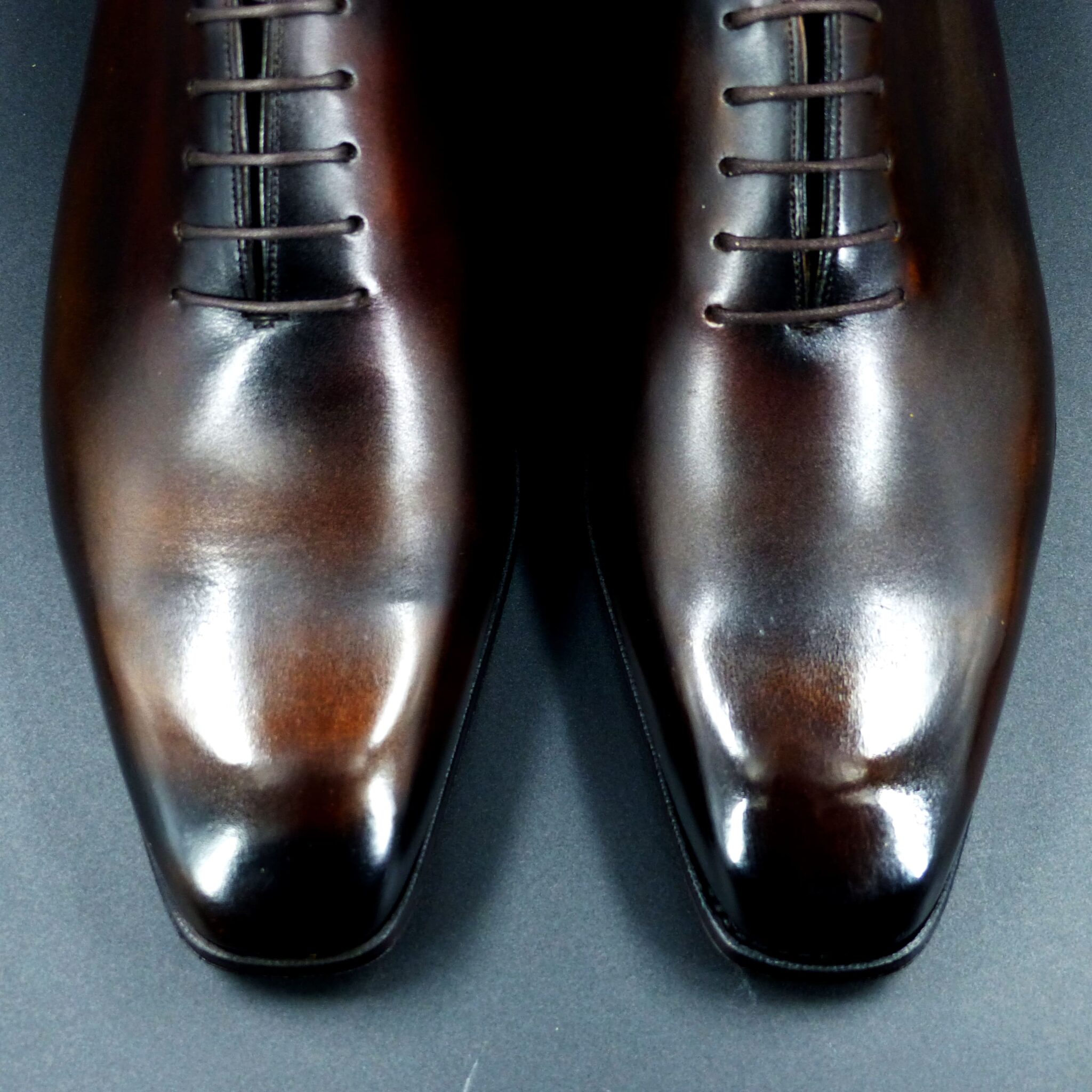
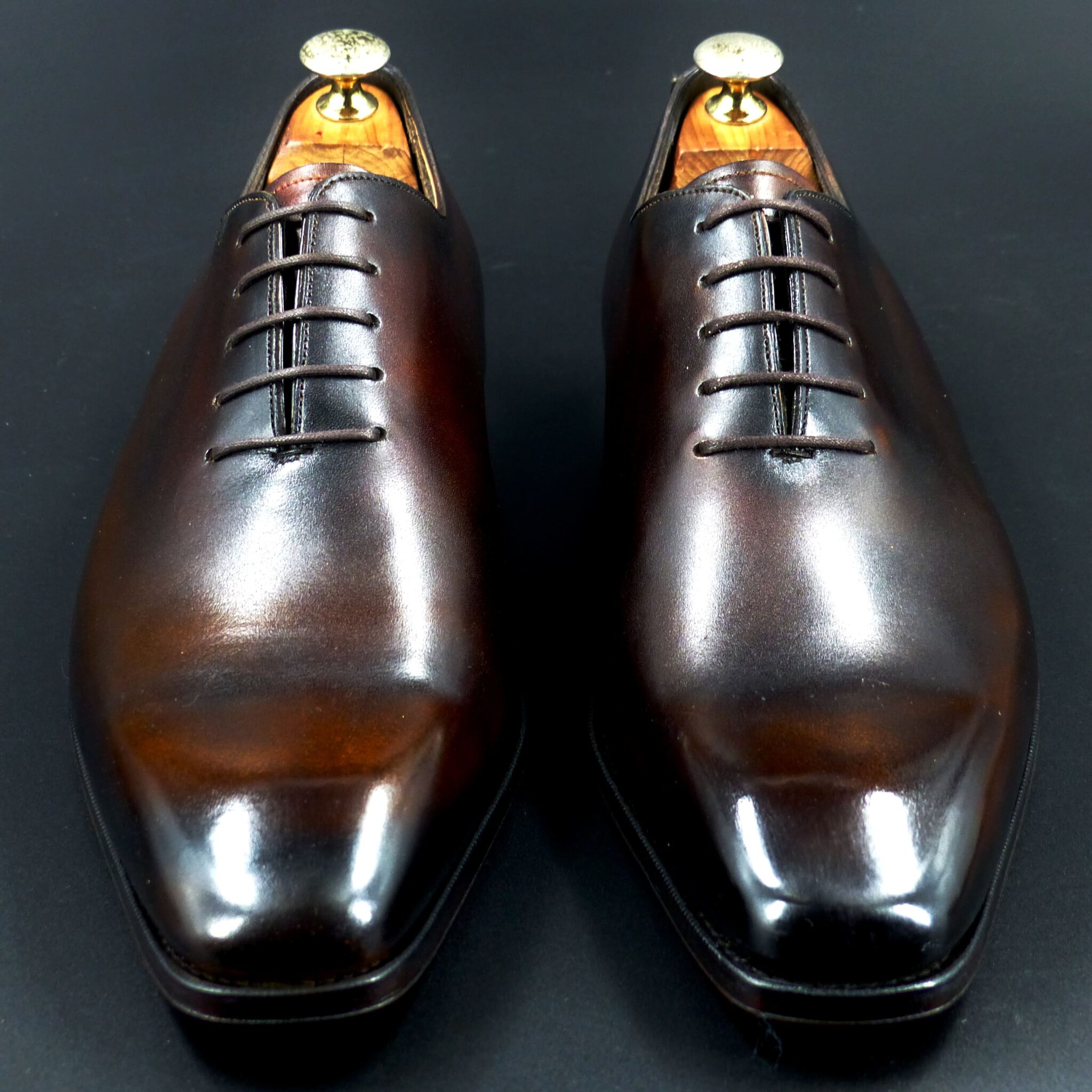

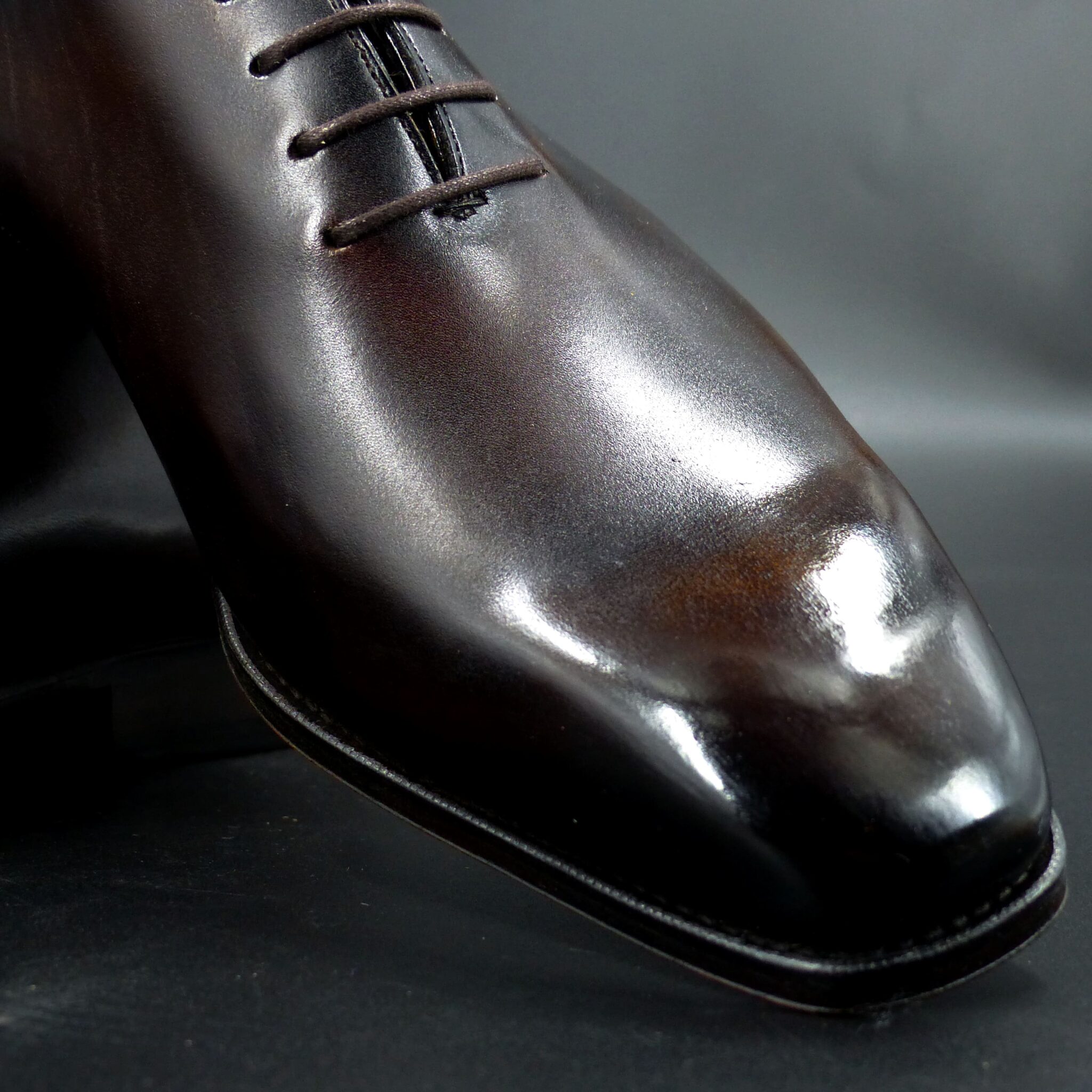
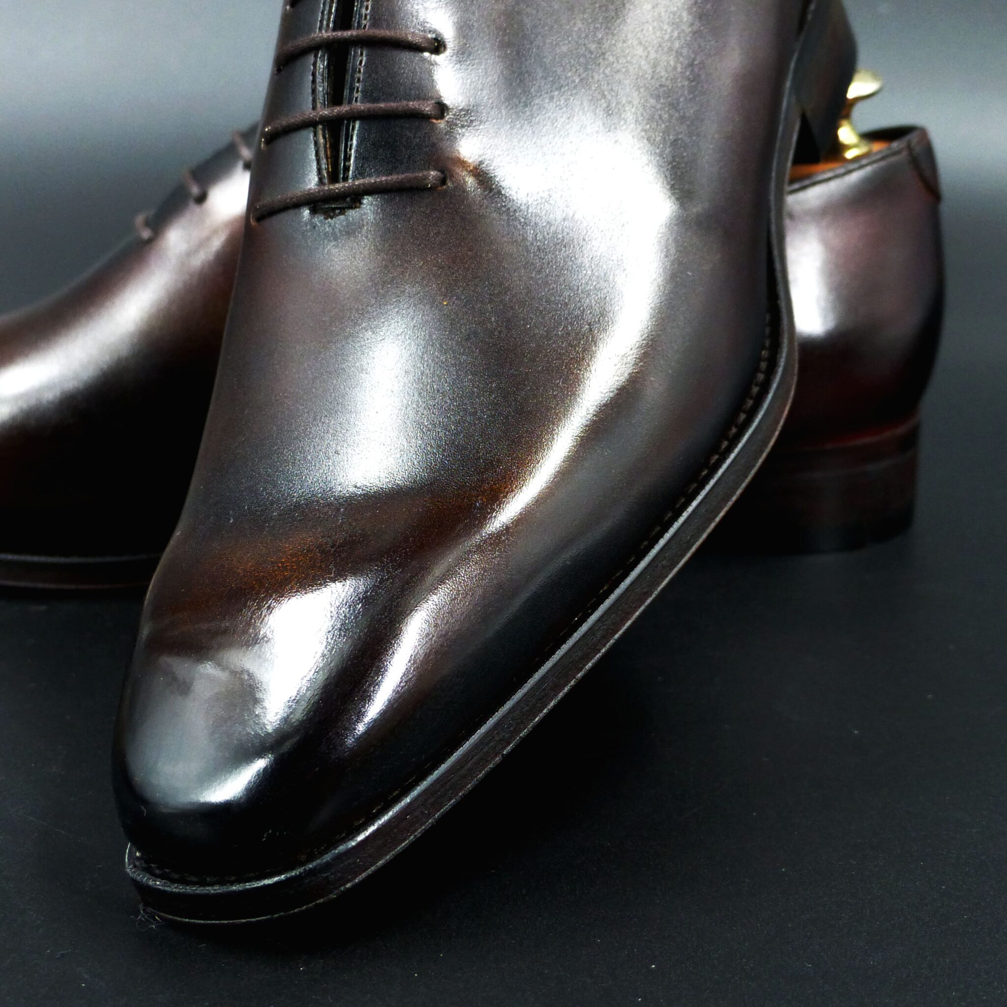
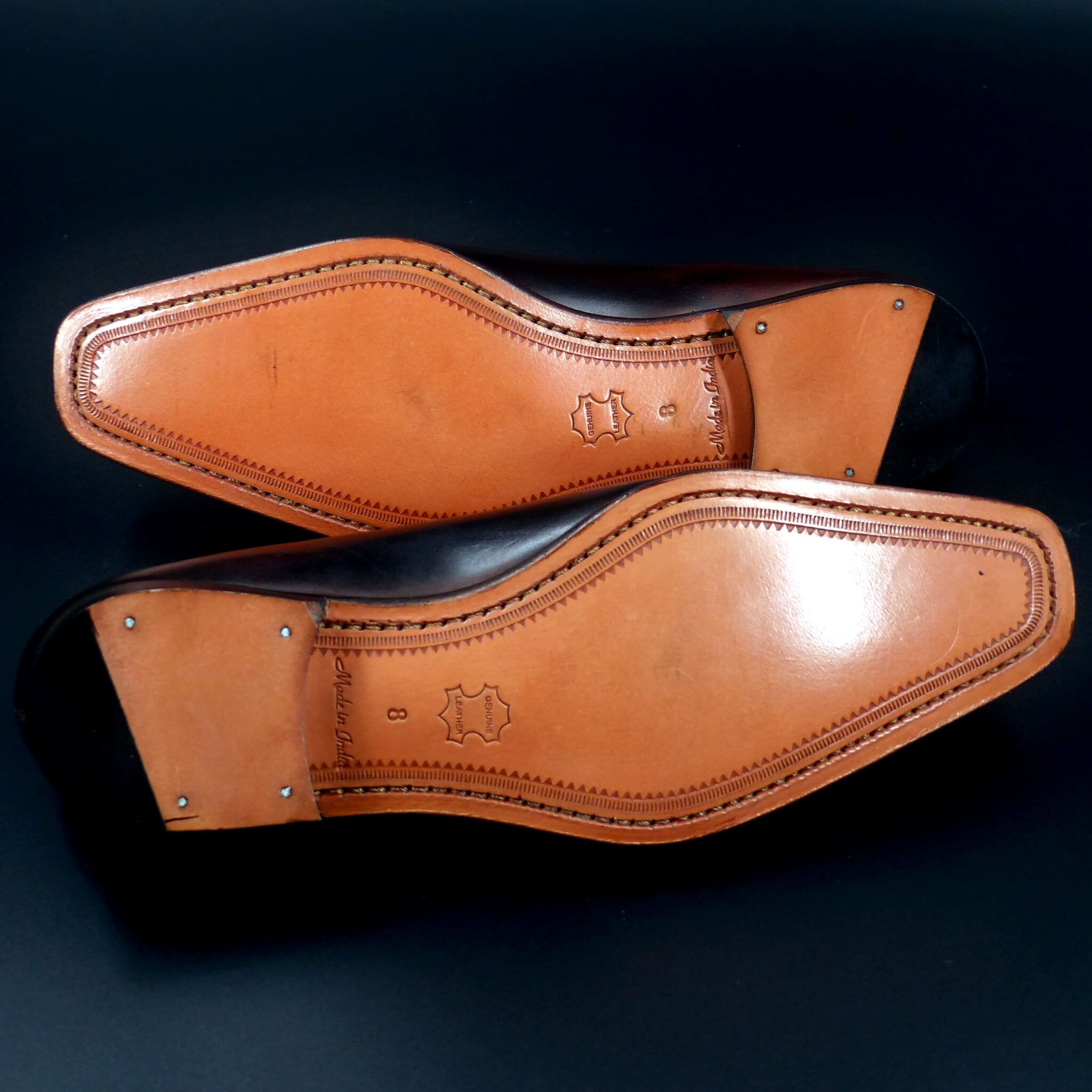
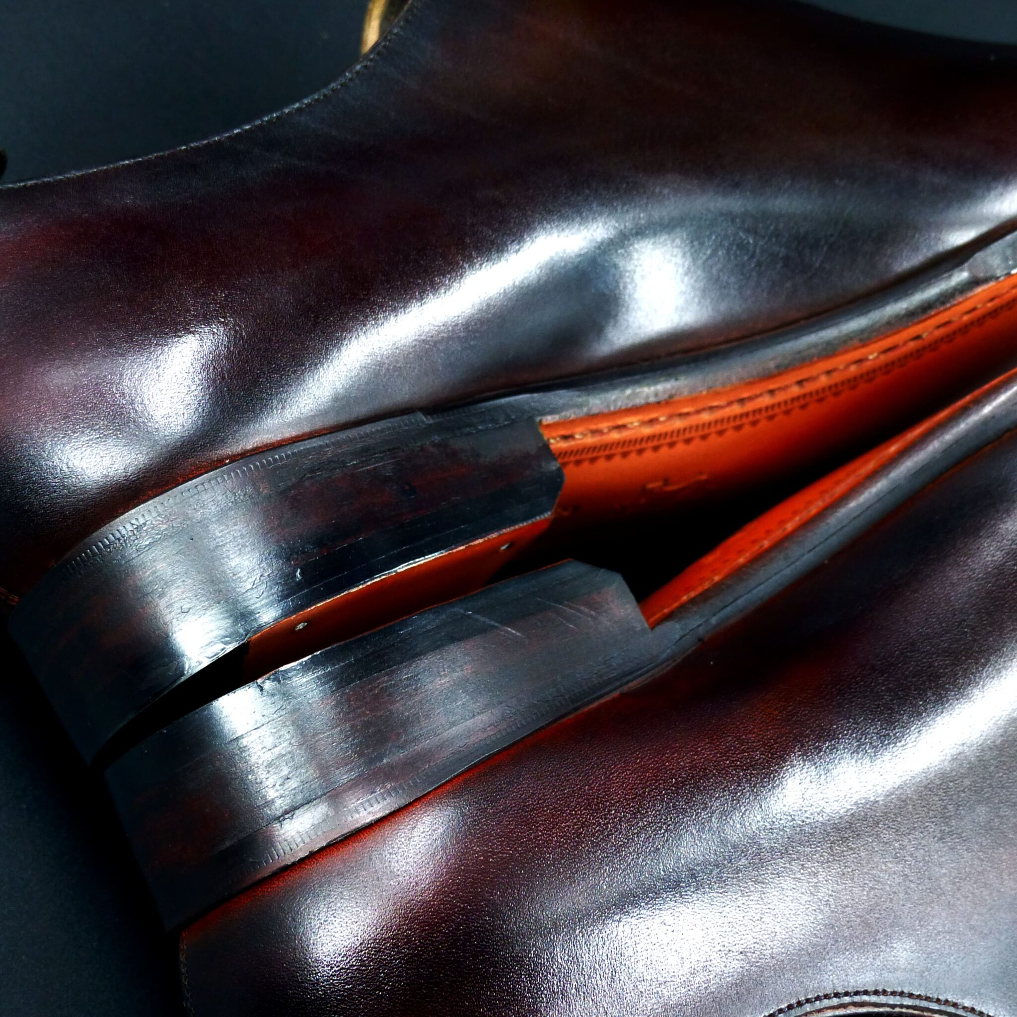
**「時雨茶(しぐれちゃ)」**とは
晩秋から初冬にかけて降る「時雨(しぐれ)」の風情を映した茶色を指します。その色は、雨に濡れた枯葉や土のような、落ち着いた深みのある褐色です。
1. 時雨茶の色構成 「時雨茶」は、茶色に灰色や黒をわずかに含んだ、渋く控えめな色合いです。
• 基調:柔らかく温かみのある茶色 • 濃淡:やや灰みを帯び、湿った土や枯葉のような落ち着きがあります。
• 近い色:
o 煤竹色(すすたけいろ) → 煤けた竹のような深みのある褐色
o 木蘭色(もくらんじき) → くすんだ黄土系の茶色
o 生壁色(なまかべいろ) → 土壁の湿ったような柔らかな茶色 この色は、時雨が降る空の暗さと、濡れた地面の湿り気を感じさせる微妙な色調を持ちます。
2. 時雨茶が象徴するもの
① 侘び寂び(わびさび)の美学
• 「時雨」は、一瞬で過ぎ去る儚さや移ろいを象徴します。
• 「時雨茶」は、まるで秋の終わりから冬の訪れを感じさせるような、静寂で詩的な色とされました。
② 落ち着きと気品 • 目立たないが味わい深いこの色は、控えめな美しさや静かな風格を持つ者にふさわしいとされました。
• 平安時代に党から伝わり、安土桃山時代、千利休らをはじめとする茶人たちにより現代の茶道が確立されました。
③ 無常(むじょう)と自然の調和
• 日本人が大切にする「もののあはれ(物事の移ろいを感じる心)」を映す色とされています。
• 秋から冬へと変わる景色と調和し、「変わらぬものはない」という仏教的思想を象徴しています。
「時雨茶」は、茶色に灰色がかった渋い色合いで、晩秋の時雨に濡れた枯葉や土の風情を感じさせる色です。その落ち着いた色調は、侘び寂びの美学・静かな品位・無常観を象徴し、貴族文化や茶道にも通じる、日本ならではの趣のある色となりました。
“Shigure-cha (時雨茶)” refers to a shade of brown that captures the essence of shigure (時雨)—the fleeting autumn rain that falls between late autumn and early winter. This color resembles the subdued richness of fallen leaves and damp earth, evoking a sense of quietude and depth.
- Composition of Shigure-cha
“Shigure-cha” is a muted and refined brown with subtle hints of gray and black.
- Base tone: A warm and gentle brown
- Shading: Slightly tinged with gray, resembling damp soil and fallen leaves
- Similar traditional colors:
- Susutake-iro (煤竹色) → A deep, smoky brown reminiscent of aged bamboo
- Mokuran-jiki (木蘭色) → A subdued, ochre-like brown
- Namakabe-iro (生壁色) → A soft, earthy brown akin to damp clay walls
This color carries the subtle nuances of a dim autumn sky and the moisture of rain-soaked ground.
- Symbolism of Shigure-cha
① The Aesthetics of Wabi-Sabi (侘び寂び)
- Shigure represents the ephemeral nature of things and the passage of time.
- Shigure-cha embodies a quiet, poetic quality, reminiscent of the transition from autumn to winter.
② Elegance and Serenity
- This understated yet profound color was considered suitable for those who appreciated subtle beauty and quiet dignity.
- Introduced to Japan from the Tang Dynasty during the Heian period, it later became associated with tea culture, particularly during the Azuchi-Momoyama period, when Sen no Rikyū and other tea masters helped establish the modern form of the Japanese tea ceremony.
③ Impermanence (無常) and Harmony with Nature
- Shigure-cha reflects the Japanese concept of mono no aware (もののあはれ)—the deep awareness of life’s transience.
- Its earthy tones harmonize with the changing landscapes of autumn and winter, symbolizing the Buddhist philosophy that nothing remains unchanged.
Conclusion
“Shigure-cha” is a subdued brown with a hint of gray, reminiscent of fallen leaves dampened by the fleeting rain of late autumn. Its calm and refined tone symbolizes the aesthetic of wabi-sabi, quiet elegance, and impermanence, making it a color deeply connected to Japanese aristocratic culture and the tea ceremony.
ロングウィングチップ・ダービー
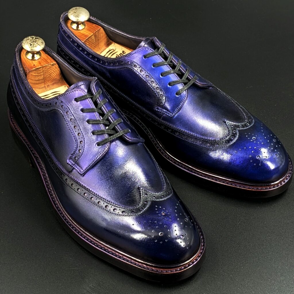
color name;
[ Koiai]
濃藍
Long Wing Tip Derby
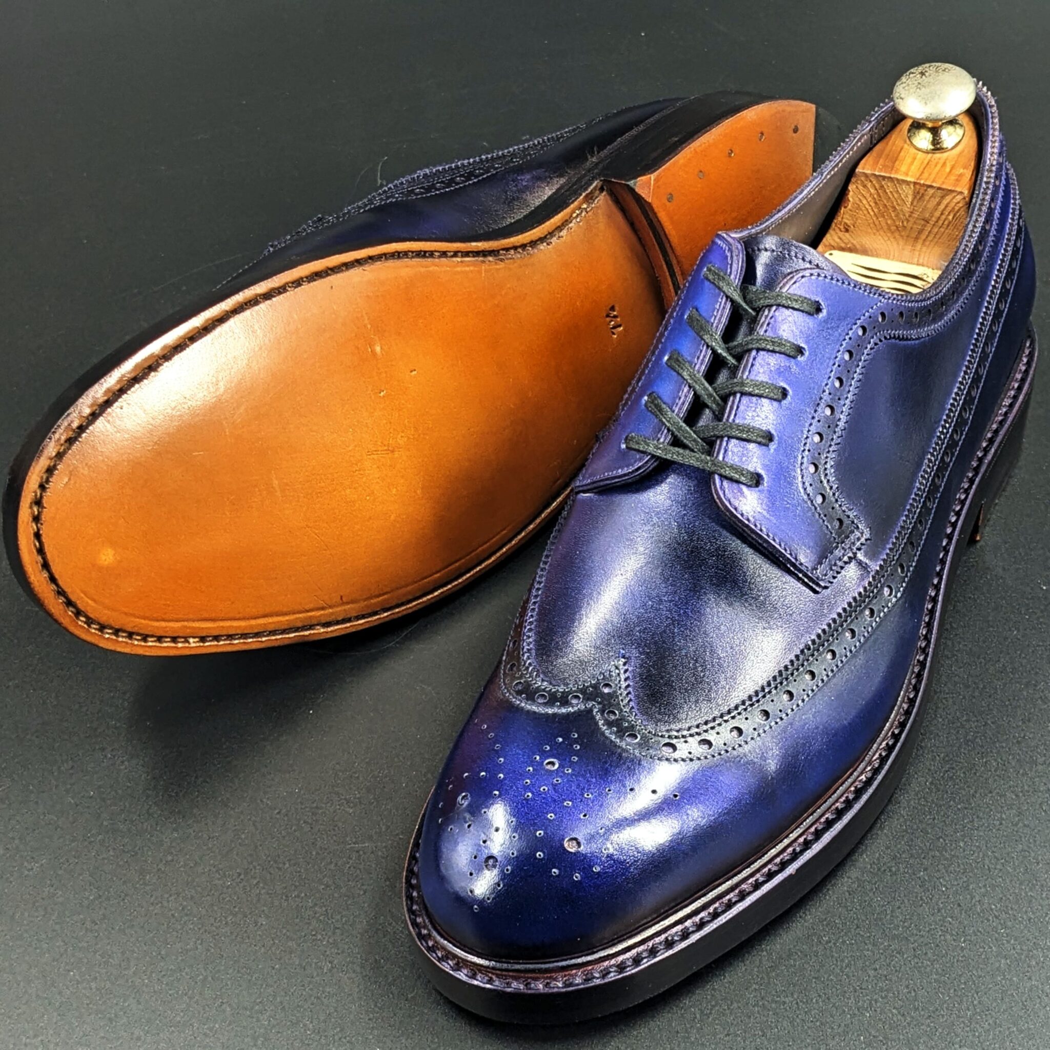
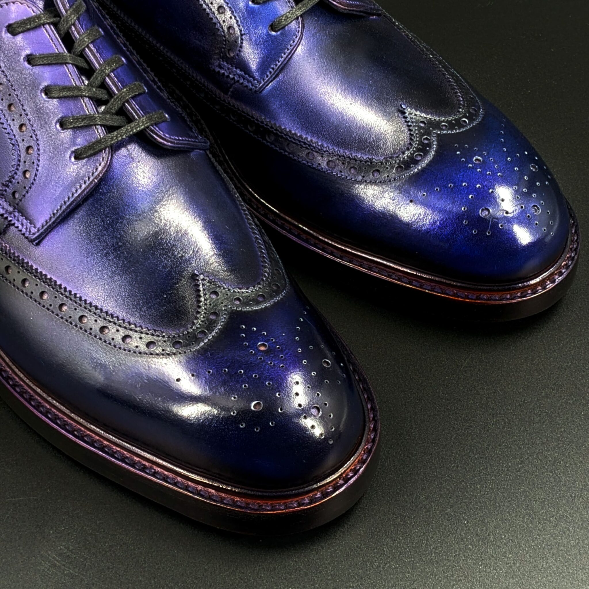
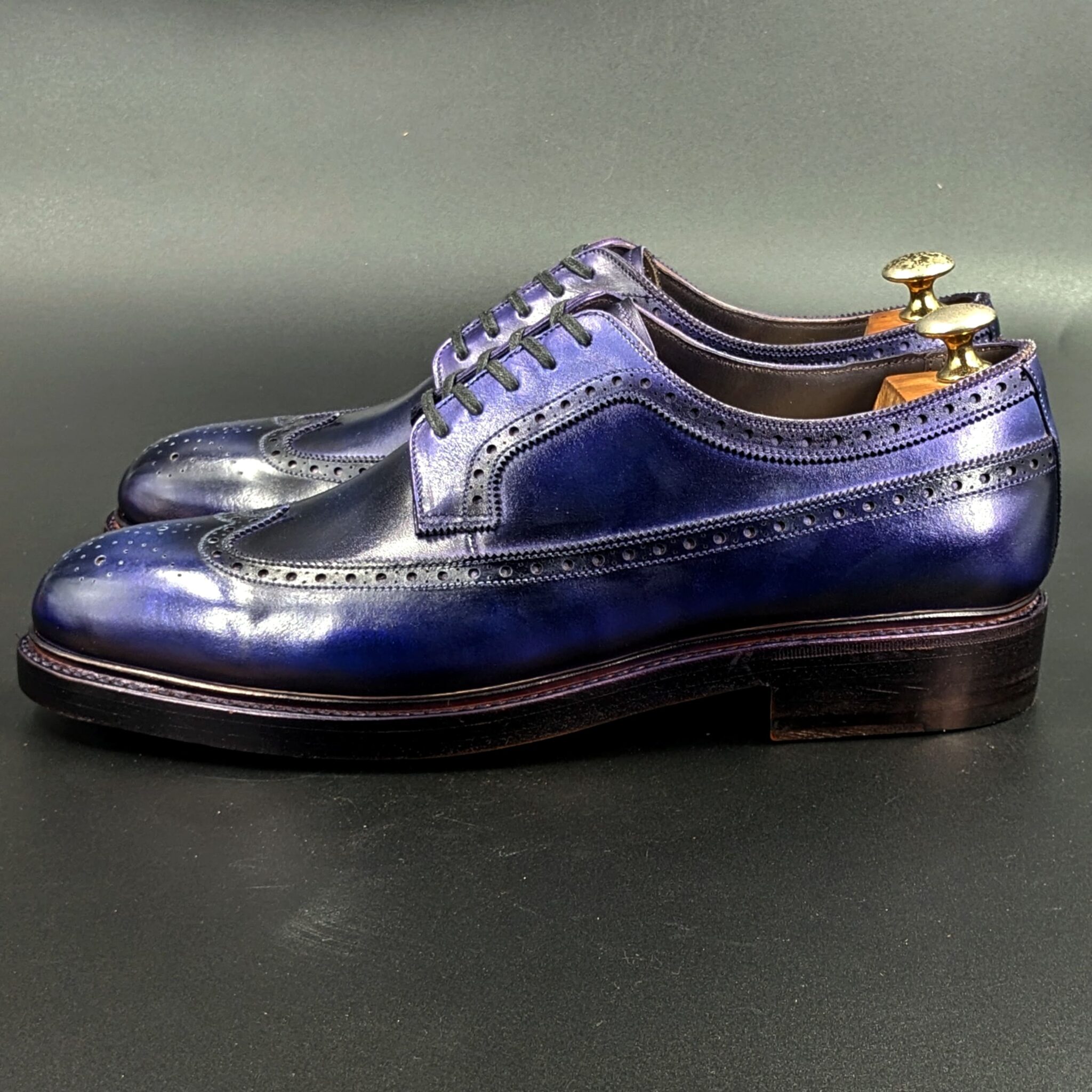
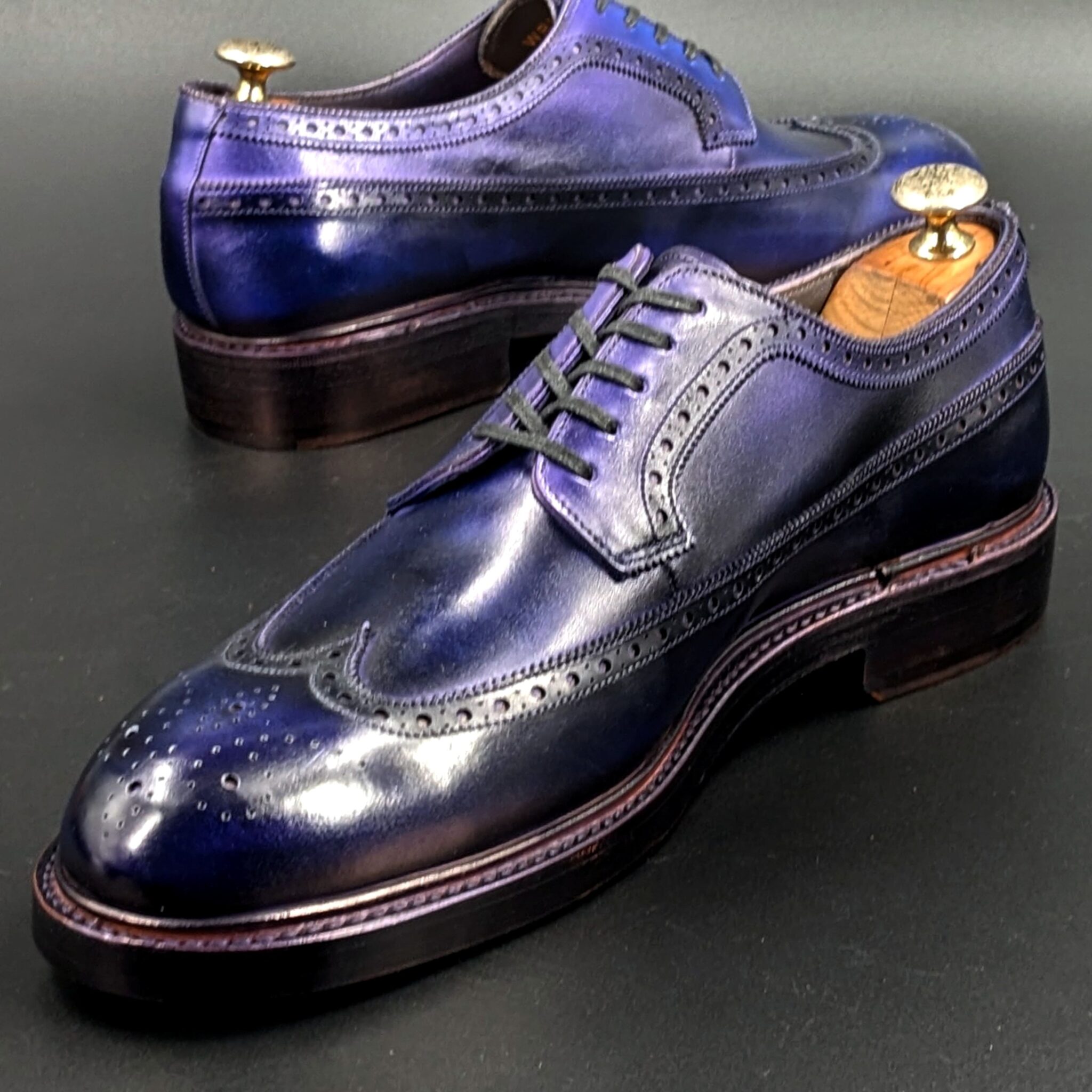
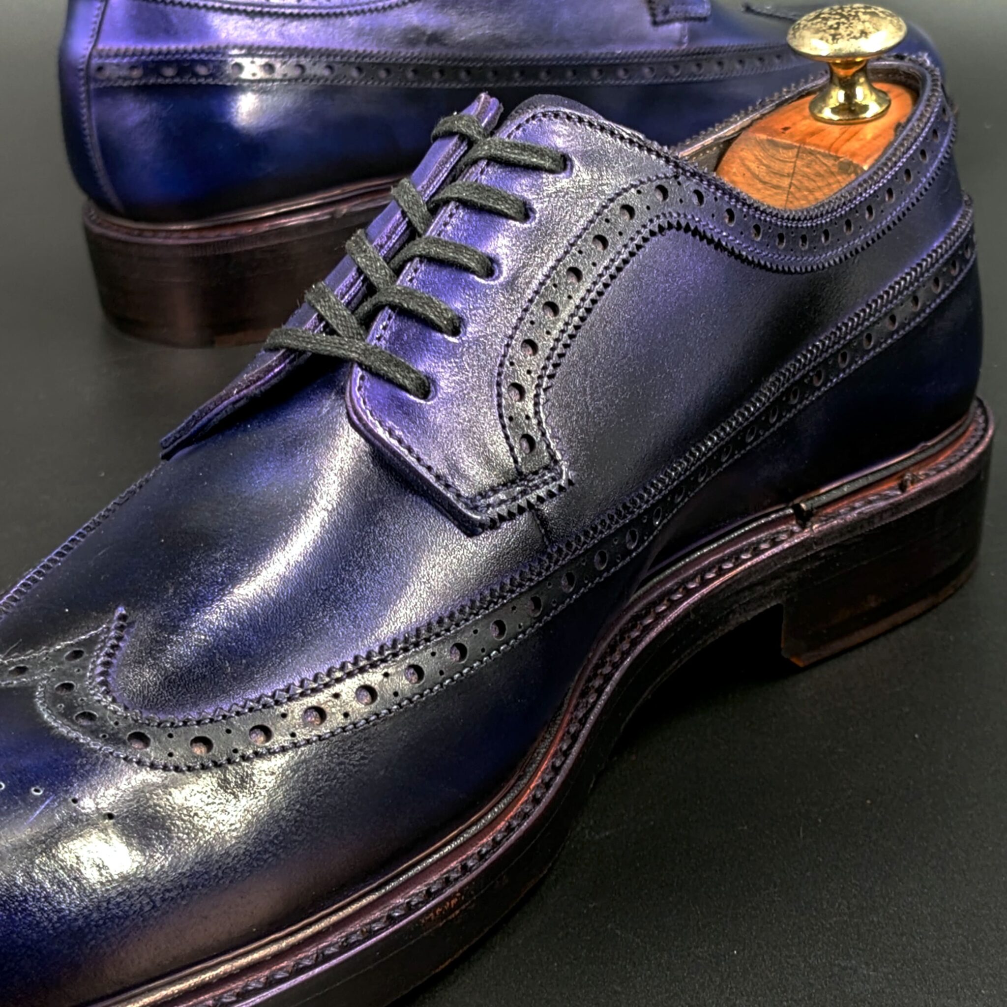
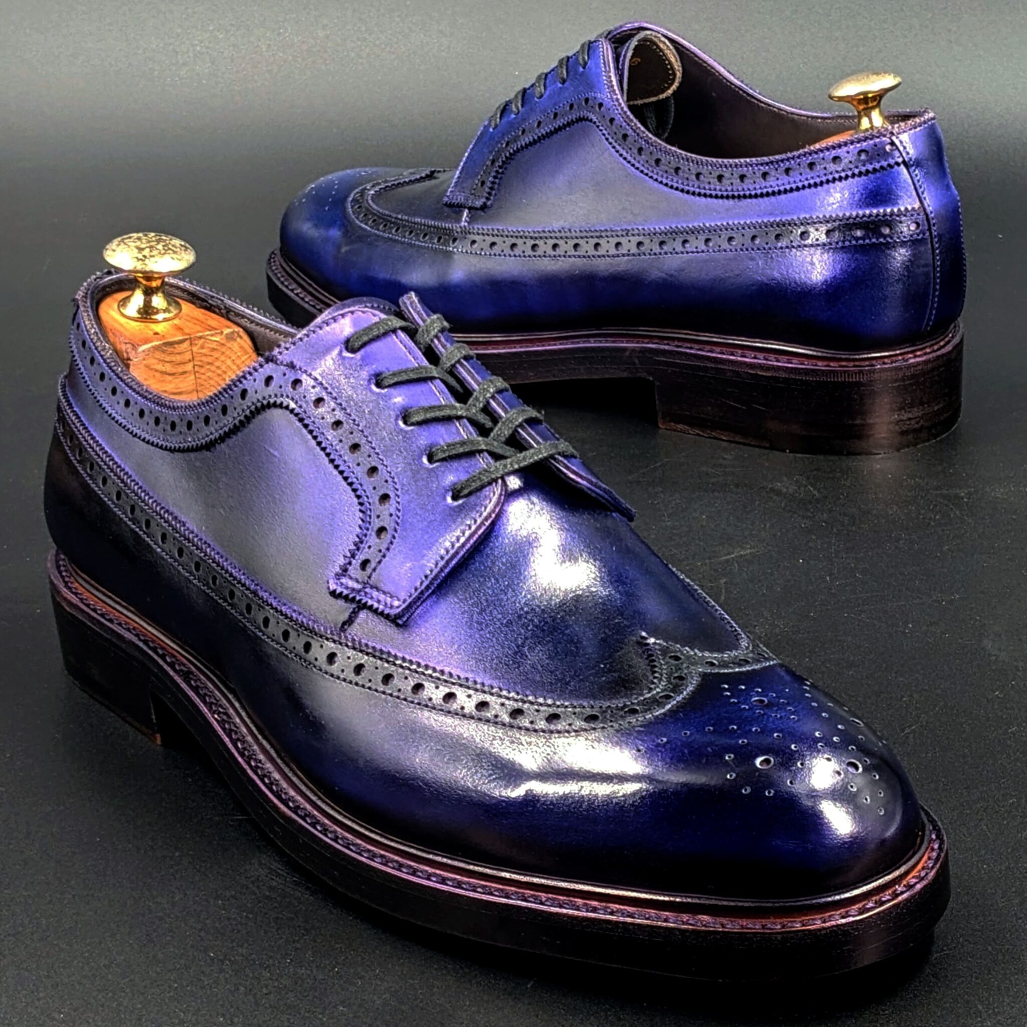
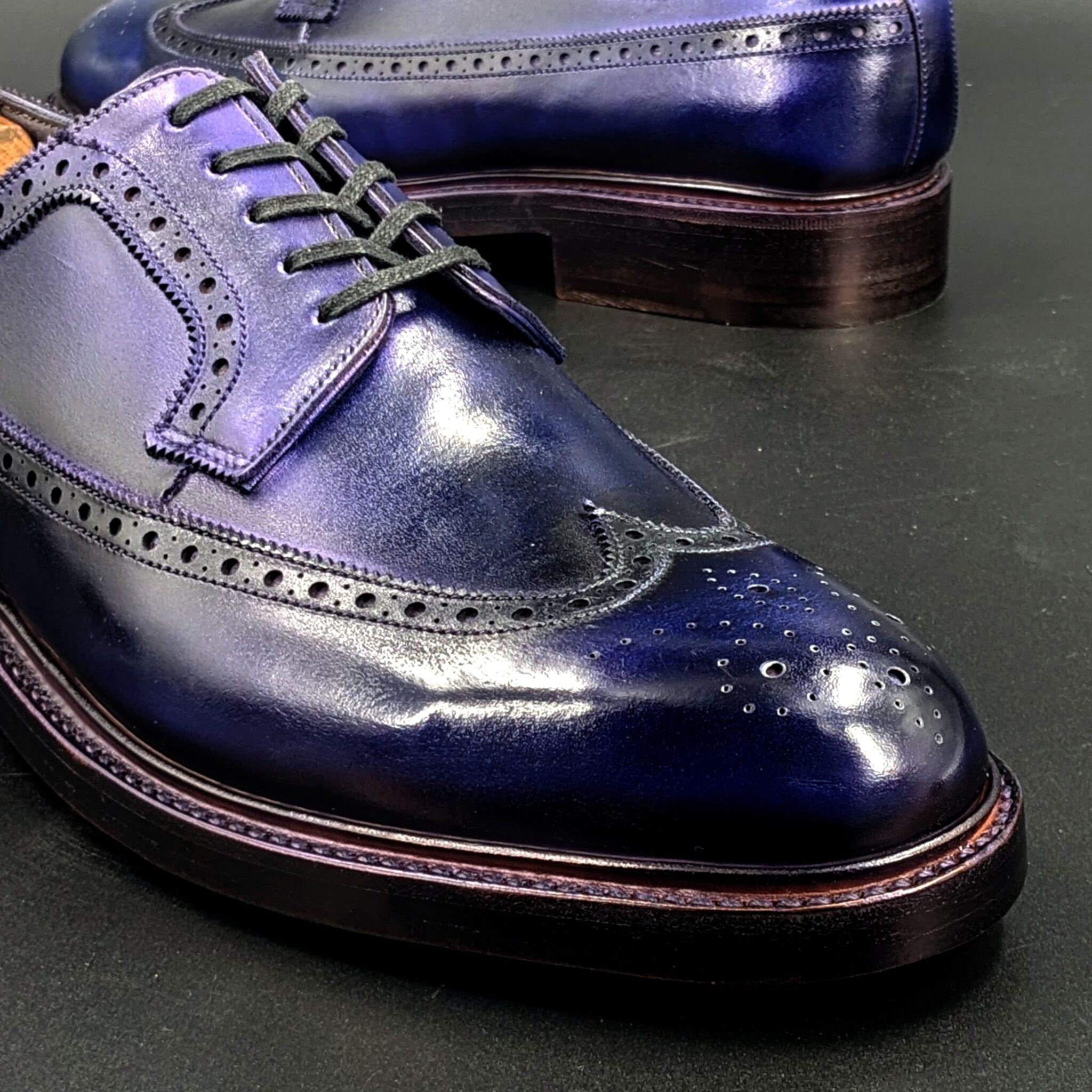
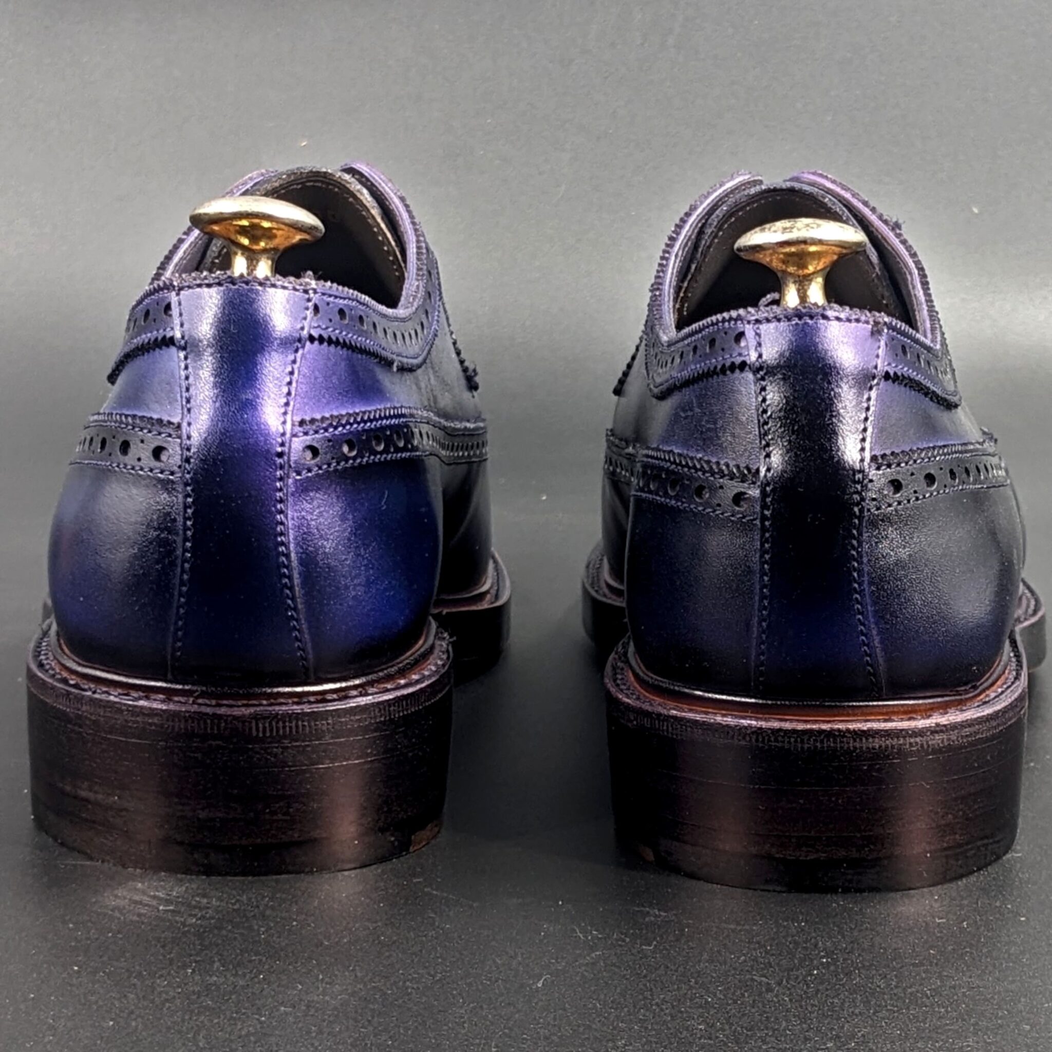
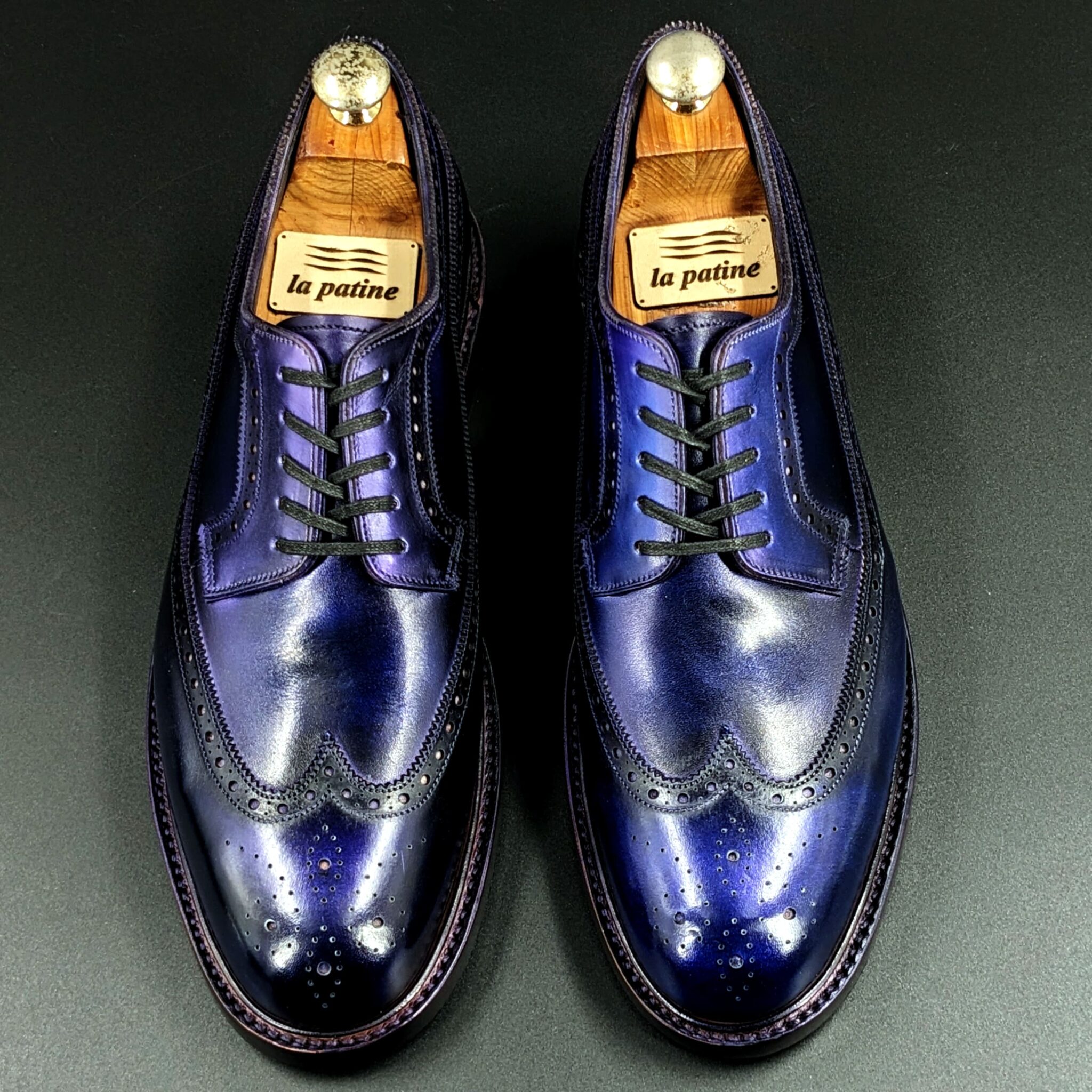
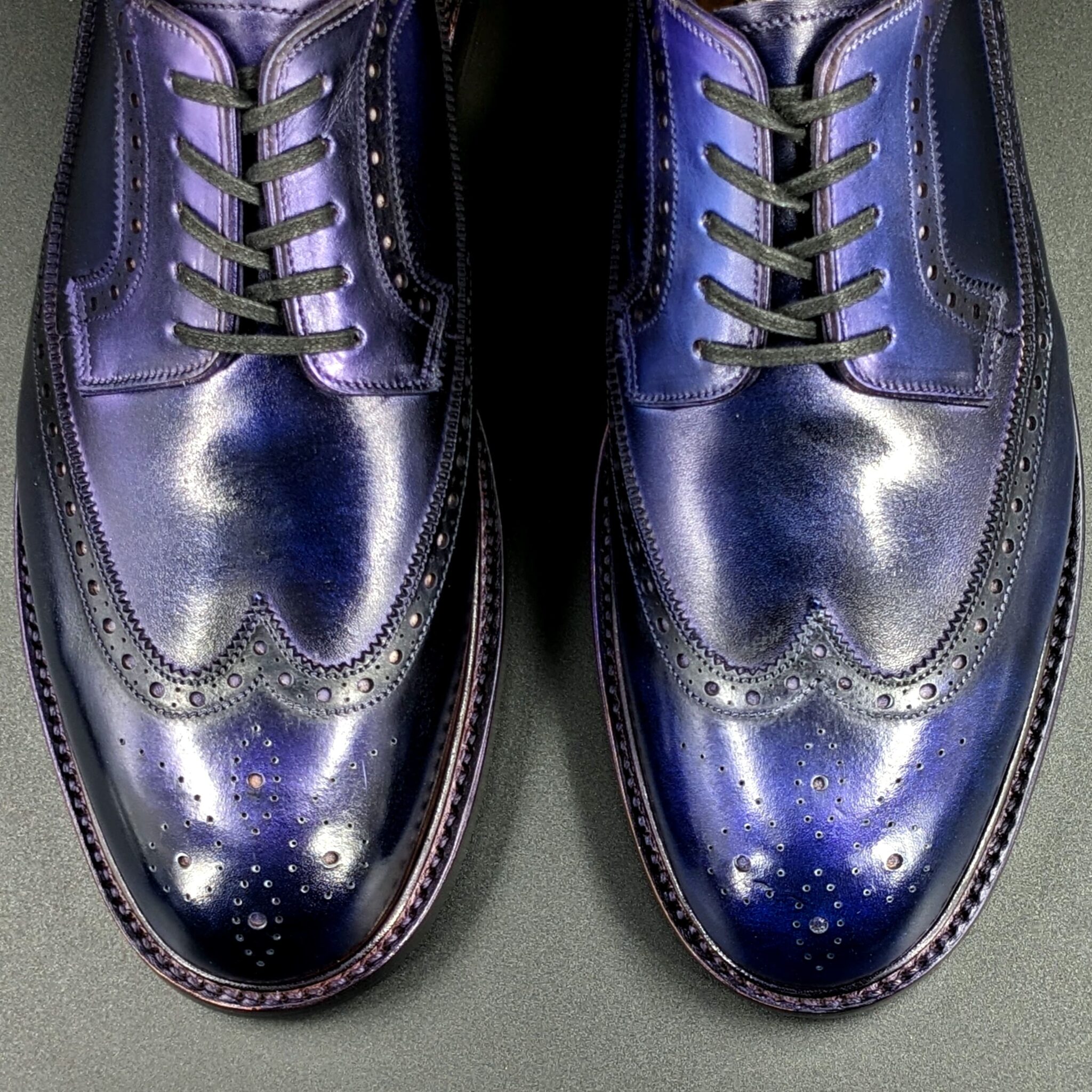
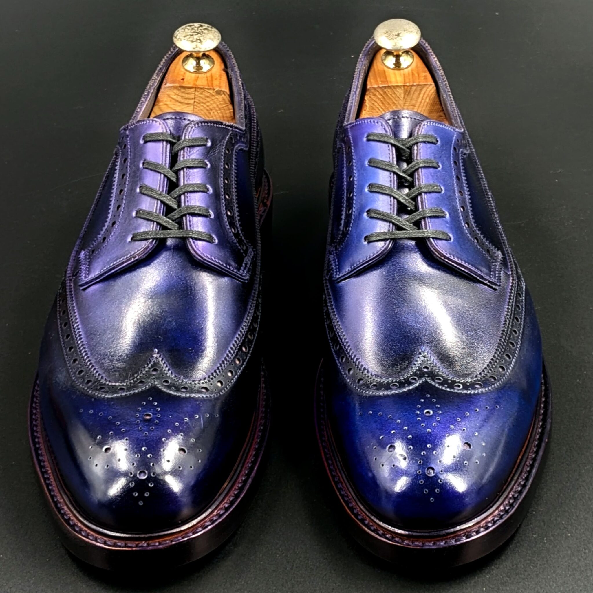
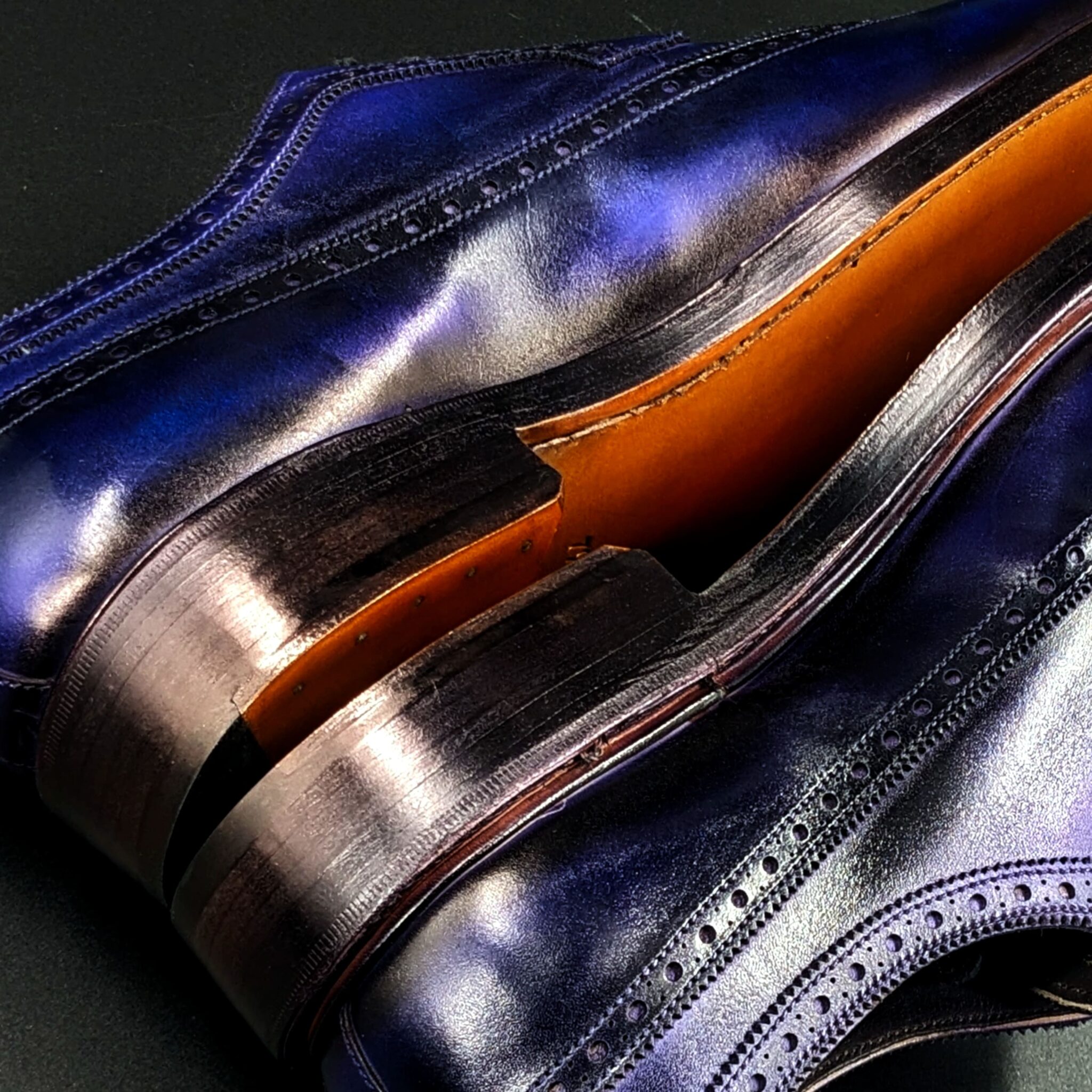
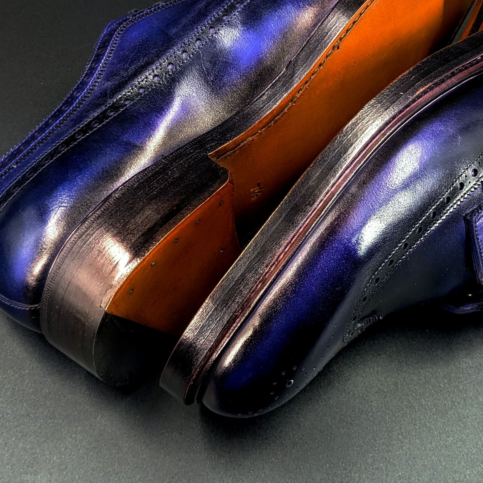
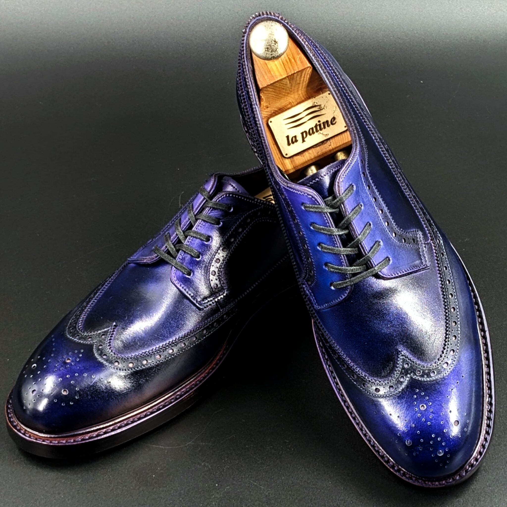
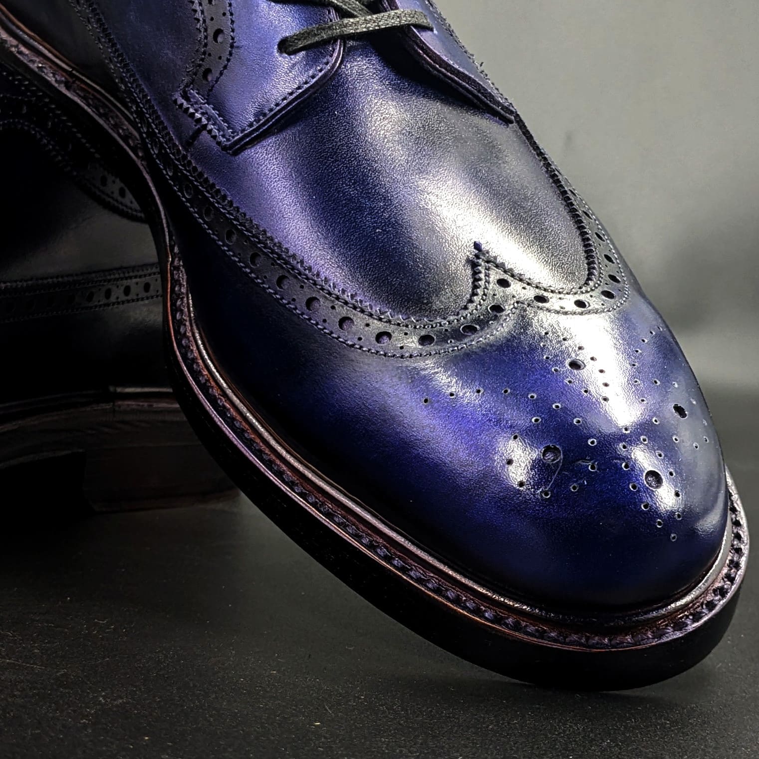
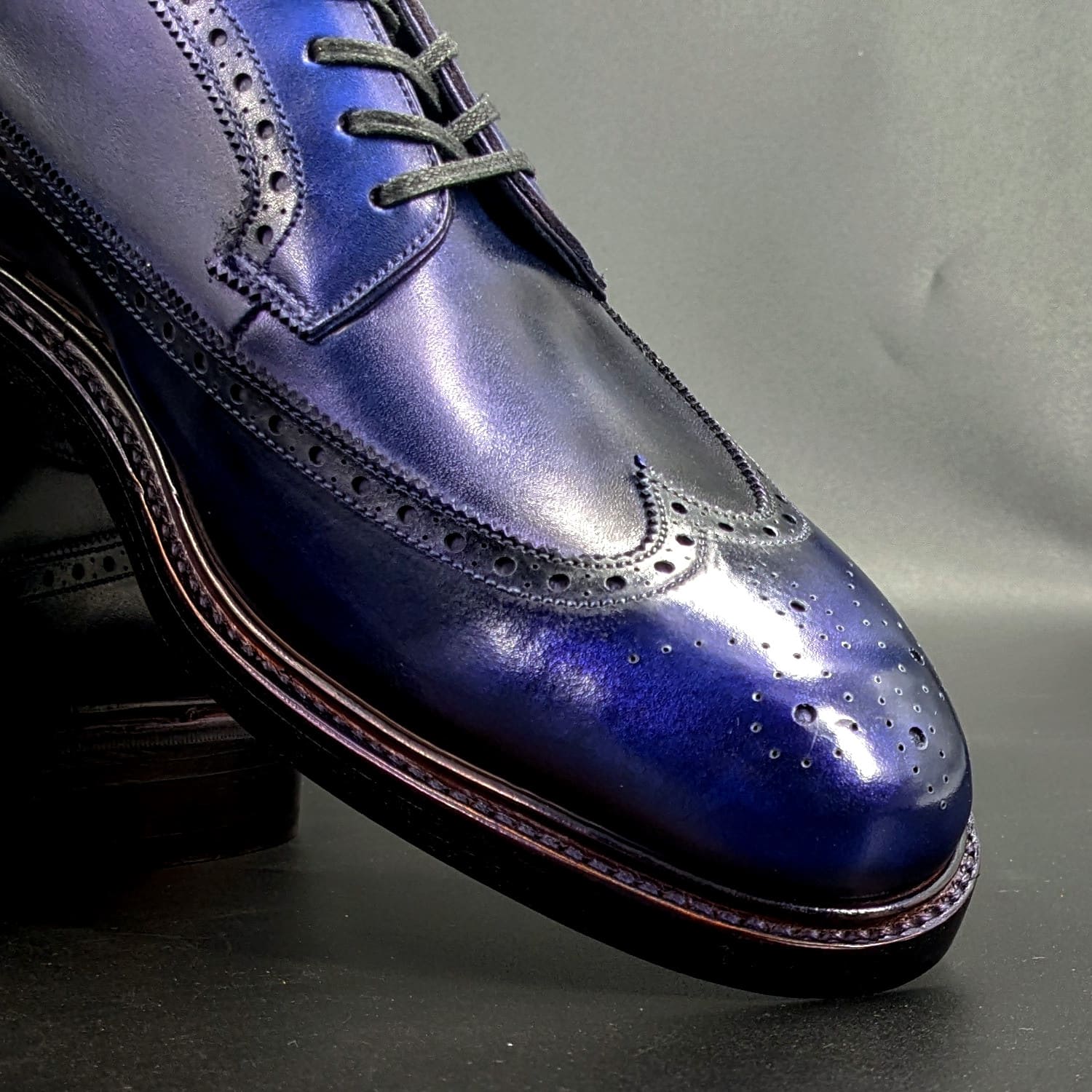
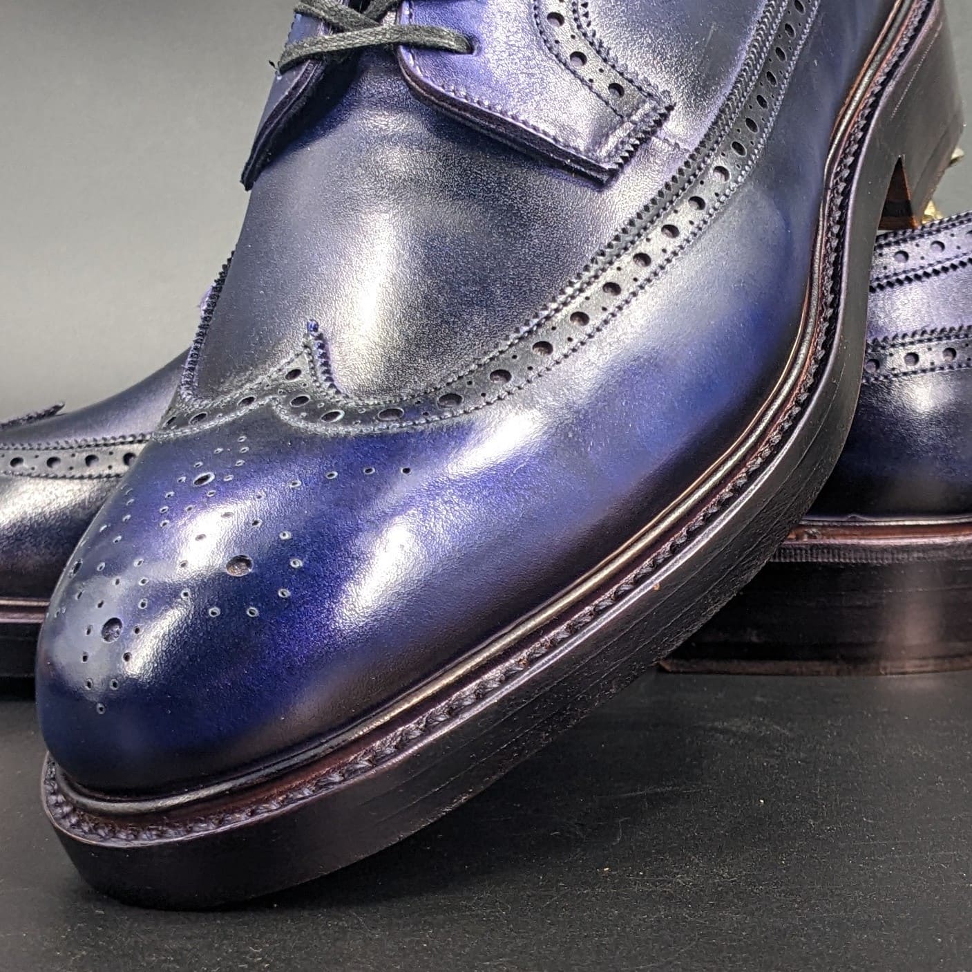
**濃藍(こいあい)とは**
濃藍(こいあい) は、古来日本において最も深く濃く染められた藍色のことを指します。現在の「ネイビー」に近い色合いで、光の加減によって青みが強く見えるのが特徴です。特に平安時代から武士の時代にかけて、高貴な色として衣服や旗指物(軍旗)に用いられました。
**濃藍の色構成**
濃藍は、伝統的な藍染の技術によって生まれる色で、以下のような色の重なりによって表されます。
- 藍色(あいいろ) – 基本となる青系の染料
- 黒色(墨色・漆黒) – 何度も染め重ねることで生まれる深み
藍を繰り返し染めることで、通常の藍色よりもさらに暗く、深みのある色調が生まれます。
**濃藍が象徴するもの**
- 格式と高貴さ
- 平安時代には貴族や高官の衣装として用いられ、身分の高さを表す色とされました。
- 江戸時代には、武士の裃(かみしも)や羽織に取り入れられ、品格のある色として尊ばれました。
- 武士の気品と誠実さ
- 武士の間では、濃藍は「忠誠心」や「誠実さ」を象徴する色とされました。
- 「藍は武士の色」とも言われ、質素ながらも強さを感じさせる色として好まれました。
- 静寂と精神性
- 濃藍の落ち着いた深い色は、禅の精神とも通じ、「内省」や「静寂」を象徴する色とされました。
- 茶道や能の衣装にも使われ、精神の安定や知性を表す色とされました。
濃藍は、深く染め上げられた格式高い藍色であり、貴族や武士の誇り、誠実さ、精神の安定 を象徴する色でした。現在でも、日本の伝統的な色として着物や工芸品などに受け継がれています。
Koi-ai (濃藍, Deep Indigo) Explanation in English
What is Koi-ai?
Koi-ai (濃藍) refers to the deepest and darkest shade of indigo dye in ancient Japan. It is similar to modern navy blue, with a unique characteristic where its blue hue appears more vivid depending on the lighting. From the Heian period through the era of the samurai, it was considered a noble color, often used in clothing and hata-jirushi (war banners).
Color Composition of Koi-ai
Koi-ai is created through the traditional Japanese indigo dyeing technique, achieved by layering multiple colors:
- Ai-iro (藍色, Indigo Blue) – The primary blue-based dye.
- Kuro-iro (黒色, Black) / Sumi-iro (墨色, Ink Black) / Shikkoku (漆黒, Jet Black) – Added depth through repeated dyeing.
By repeatedly dyeing the fabric, koi-ai becomes a darker, richer shade of blue than standard indigo.
Symbolism of Koi-ai
- Formality and Nobility
- During the Heian period, koi-ai was worn by nobles and high-ranking officials, symbolizing social status and prestige.
- In the Edo period, samurai adopted koi-ai for their kamishimo (formal attire) and haori (short jackets), valuing its dignified and refined appearance.
- Samurai Dignity and Integrity
- Among samurai, koi-ai symbolized loyalty and sincerity.
- It was known as “the color of the samurai”, representing simplicity yet strength, making it a favored choice for warriors.
- Tranquility and Spirituality
- The deep and subdued tone of koi-ai was associated with Zen philosophy, embodying self-reflection and serenity.
- It was also used in tea ceremony and Noh theater costumes, signifying mental stability and wisdom.
Conclusion
Koi-ai, with its rich and profound indigo hue, symbolized nobility, samurai honor, sincerity, and spiritual depth. Even today, it remains an essential color in Japanese traditional clothing, crafts, and cultural artifacts, continuing to embody Japan’s aesthetic heritage
オーステリティ・オックスフォード
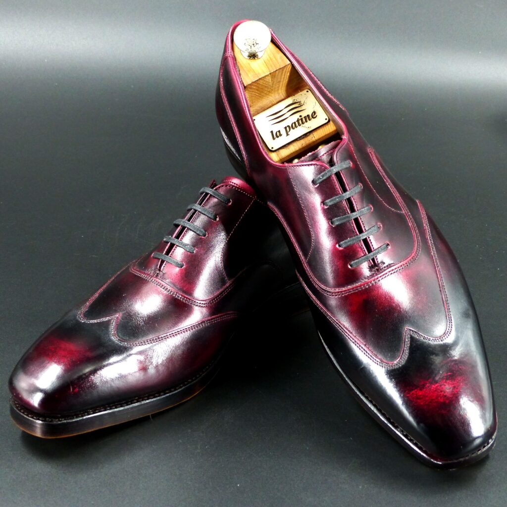
color name;
[ Akasuke]
赤透
Austerity Oxford
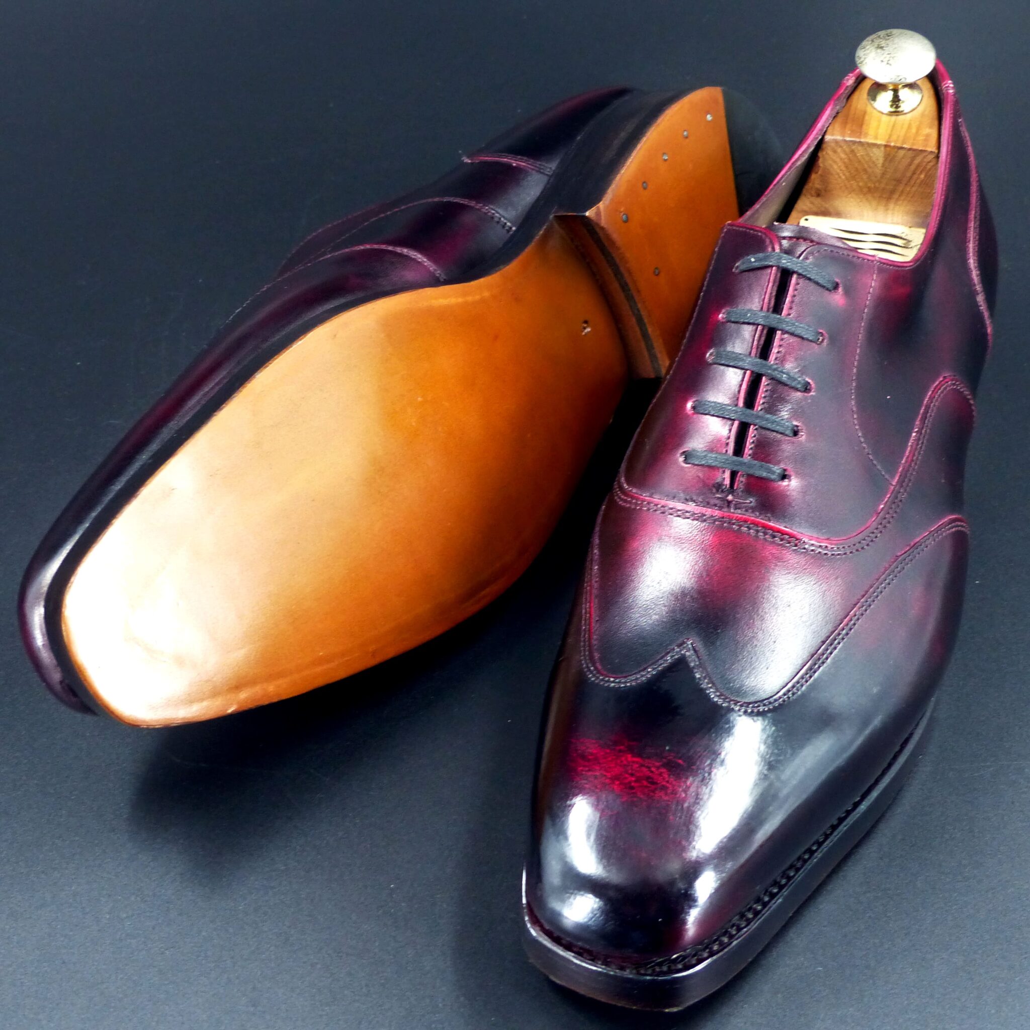
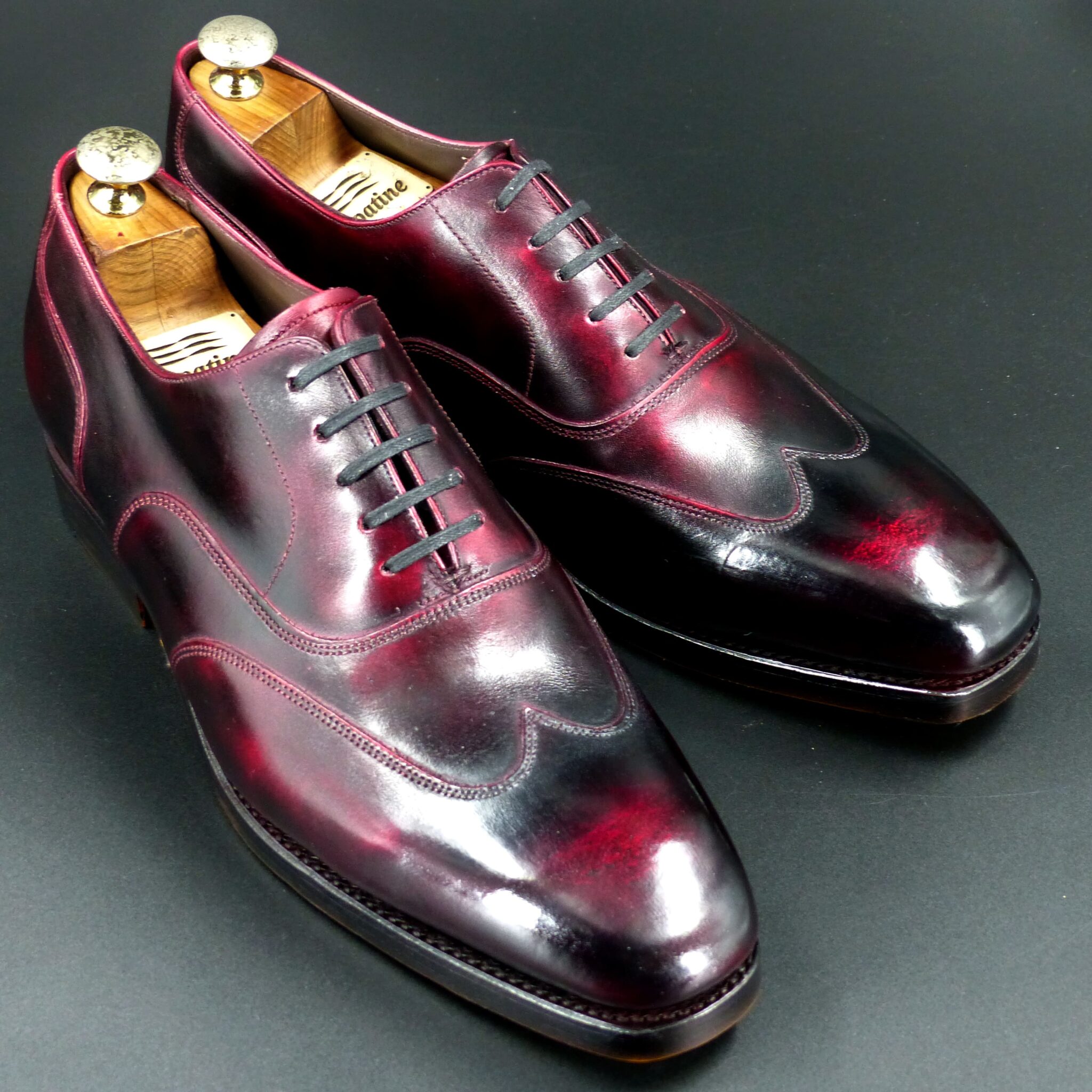
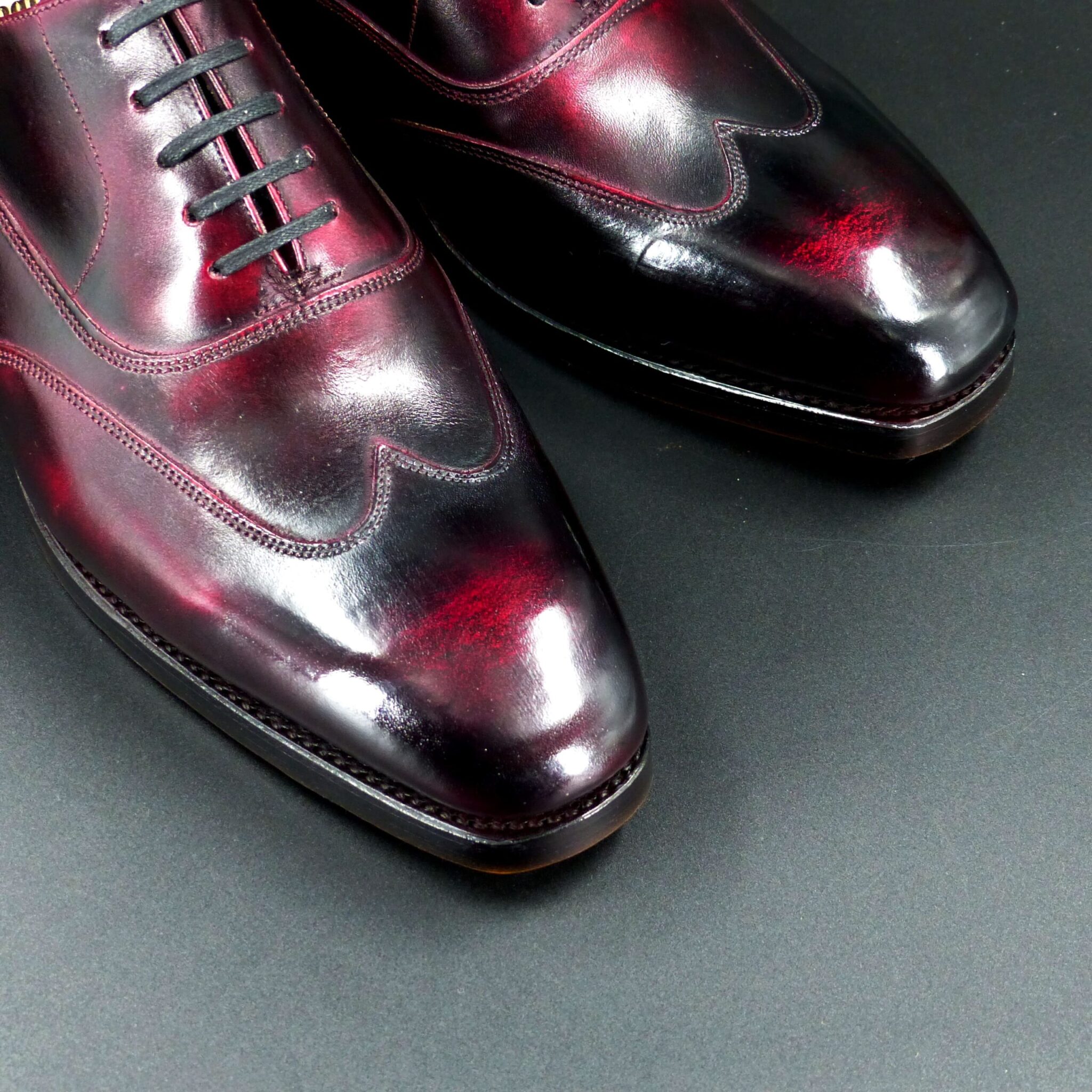
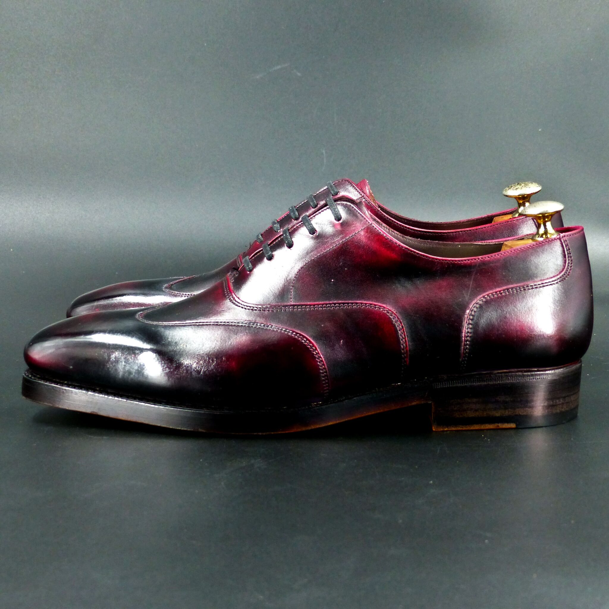
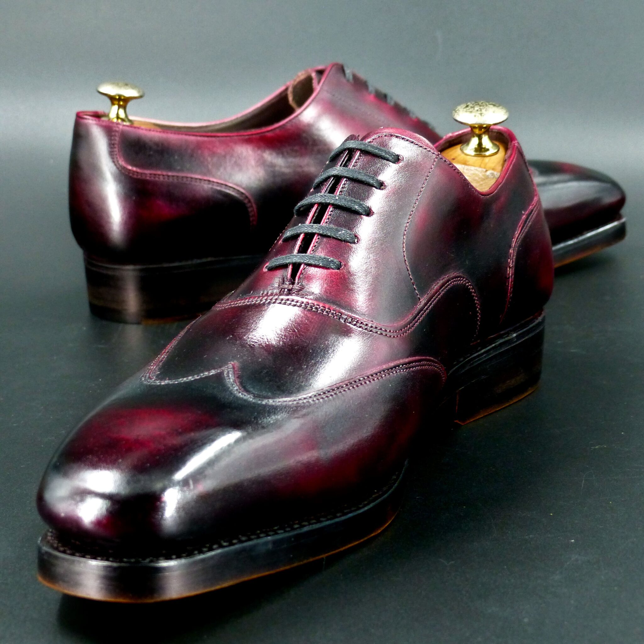
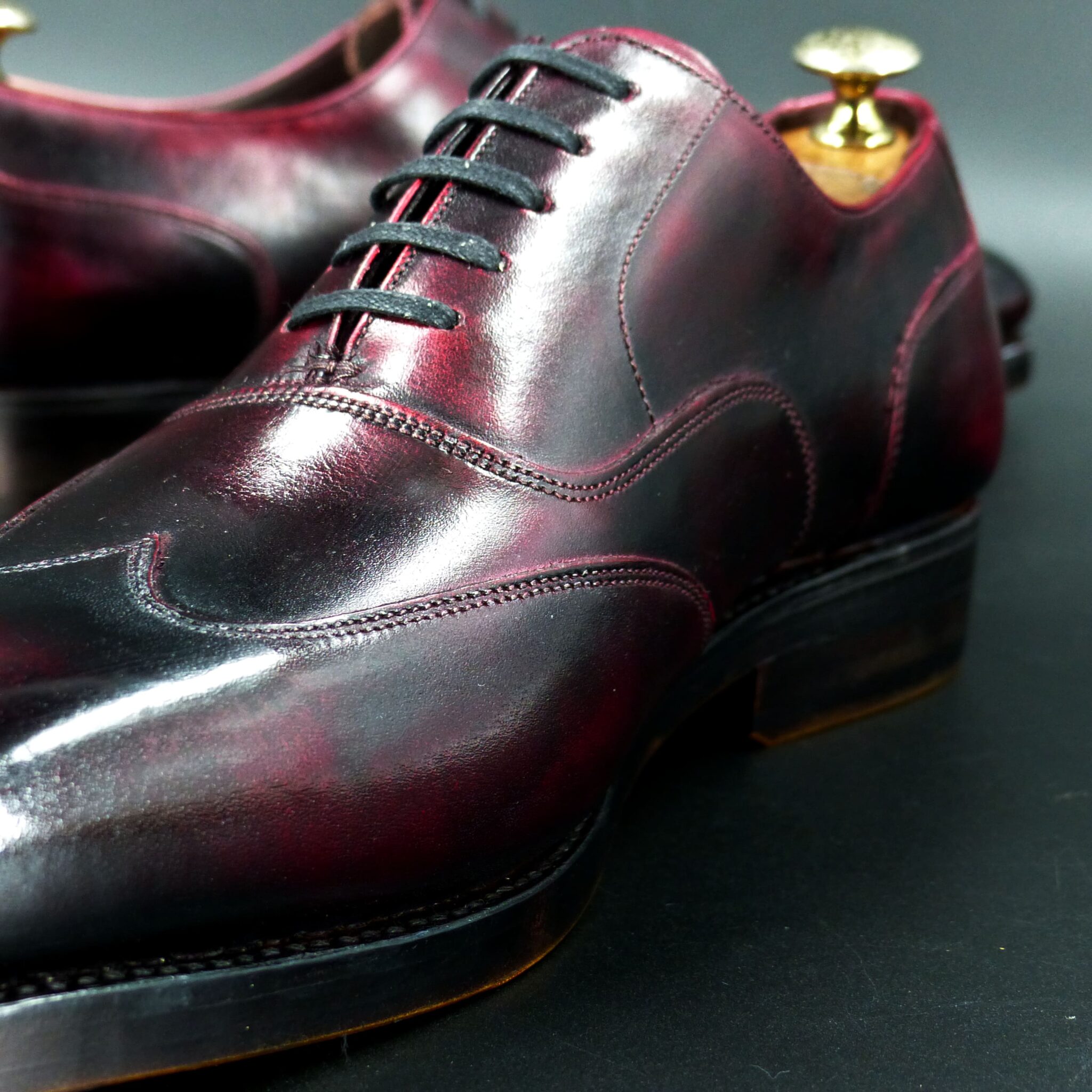
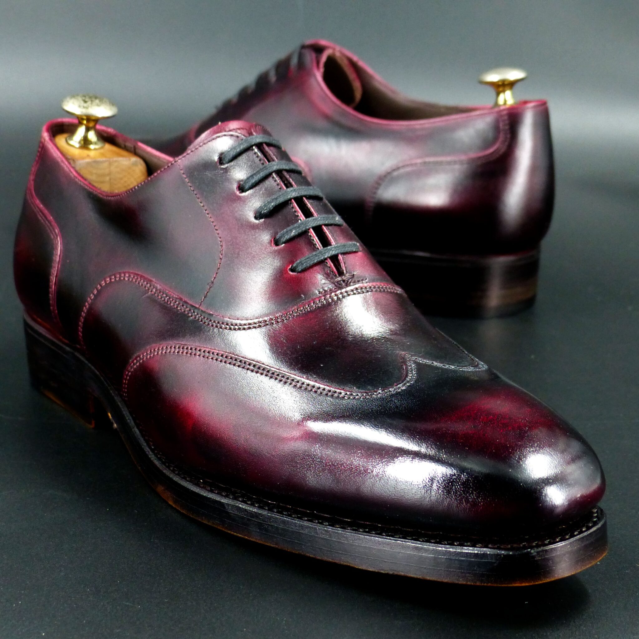
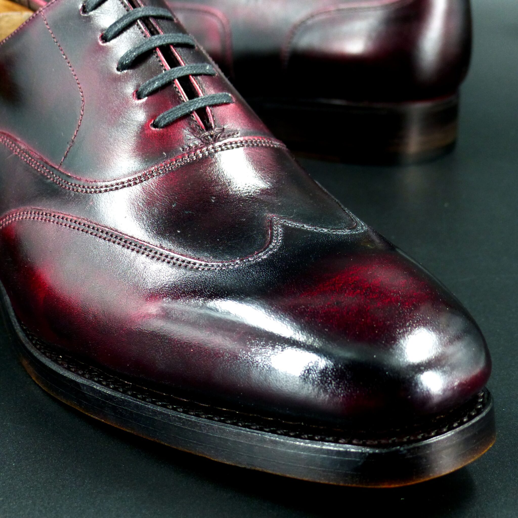
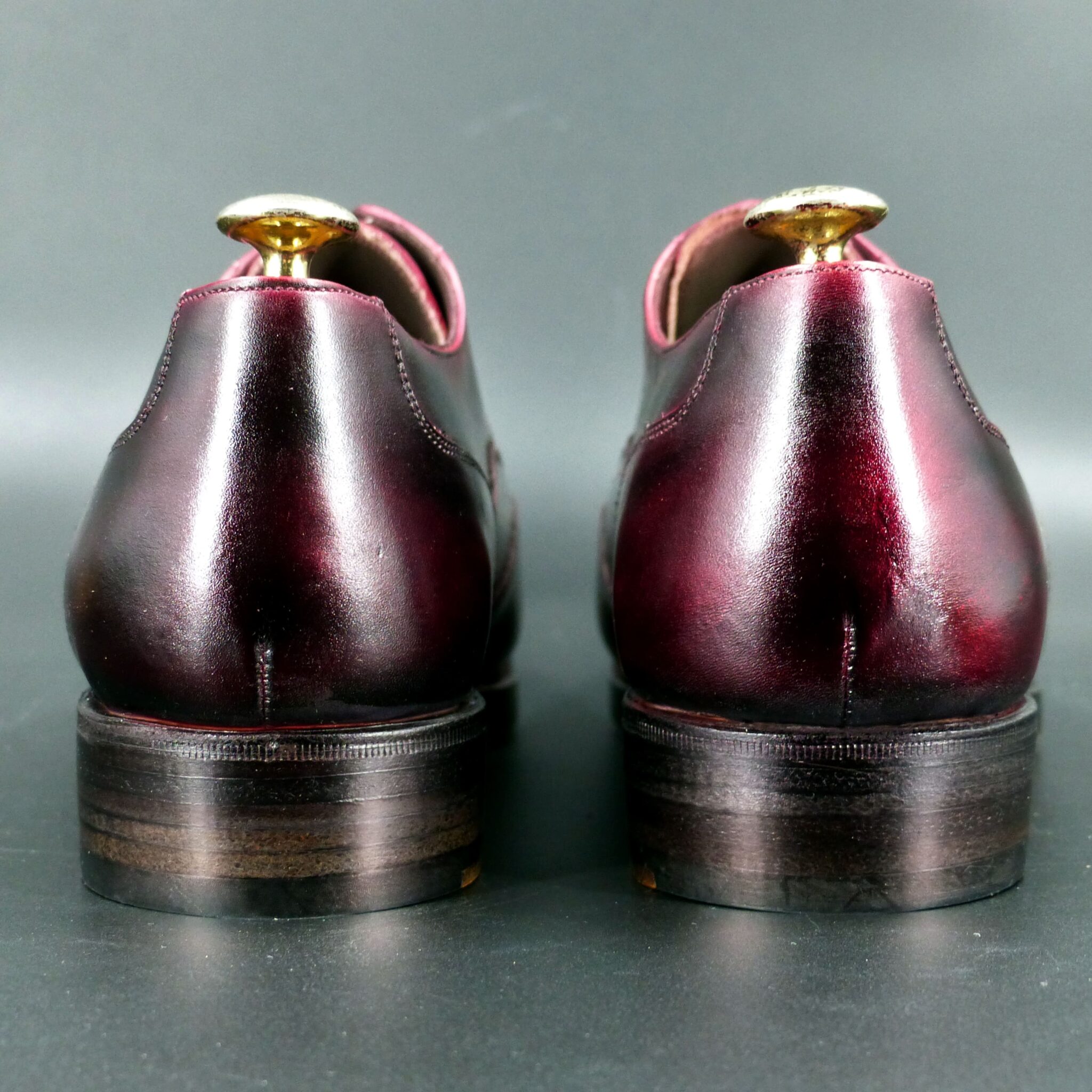
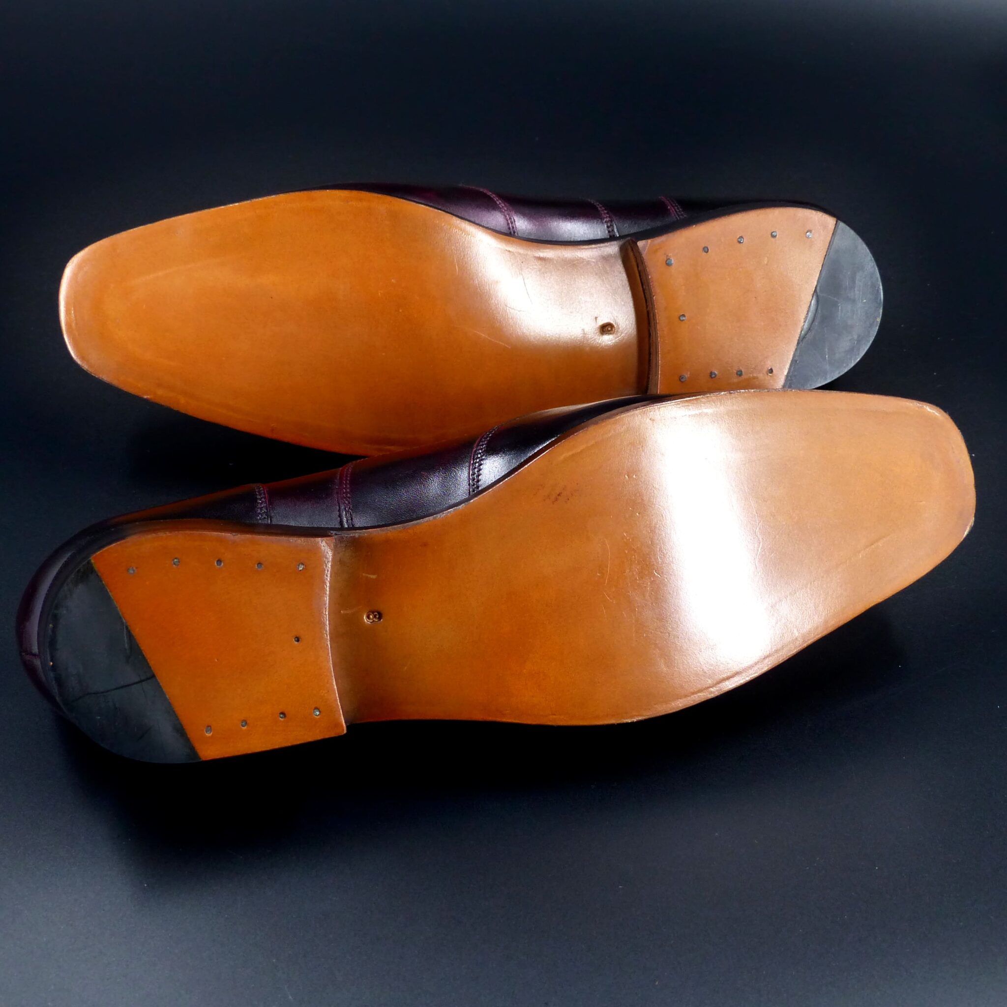
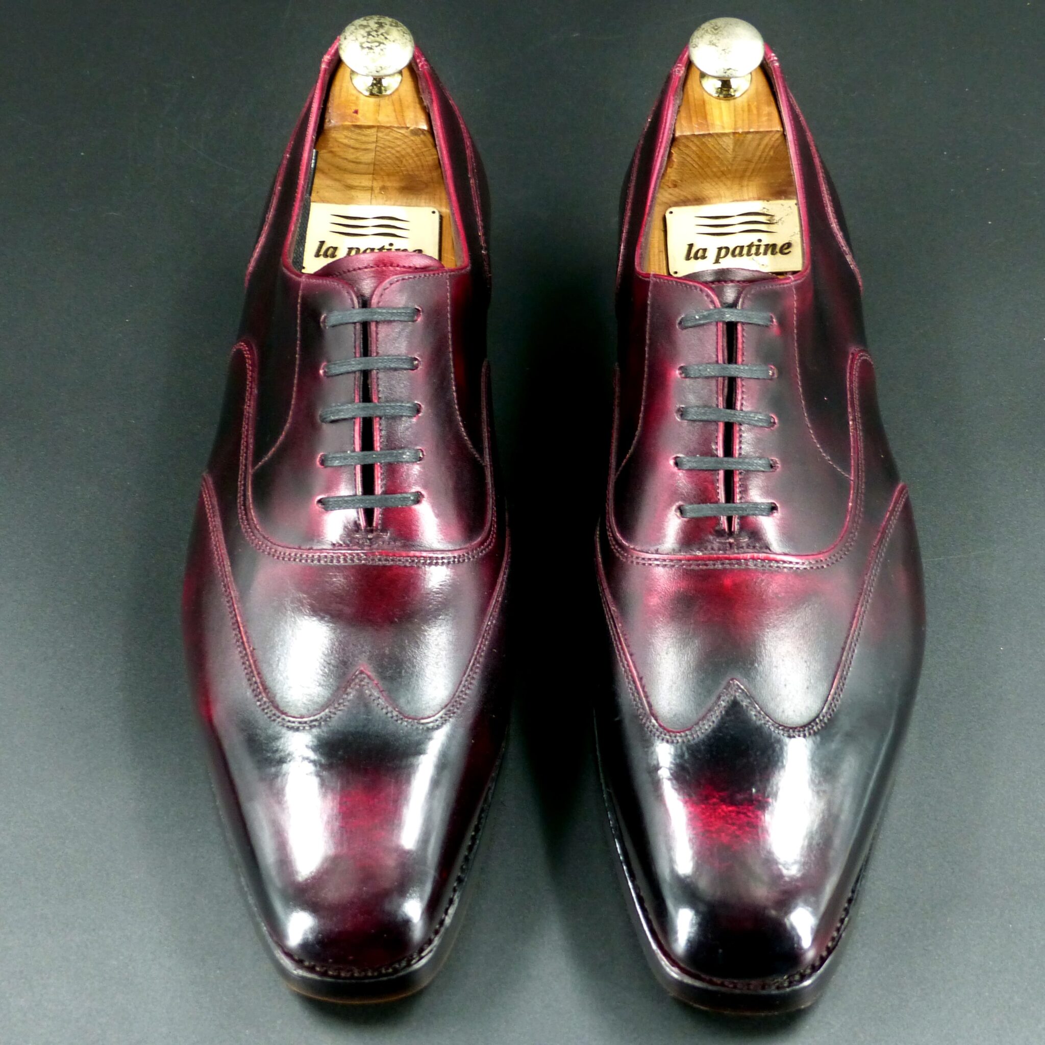
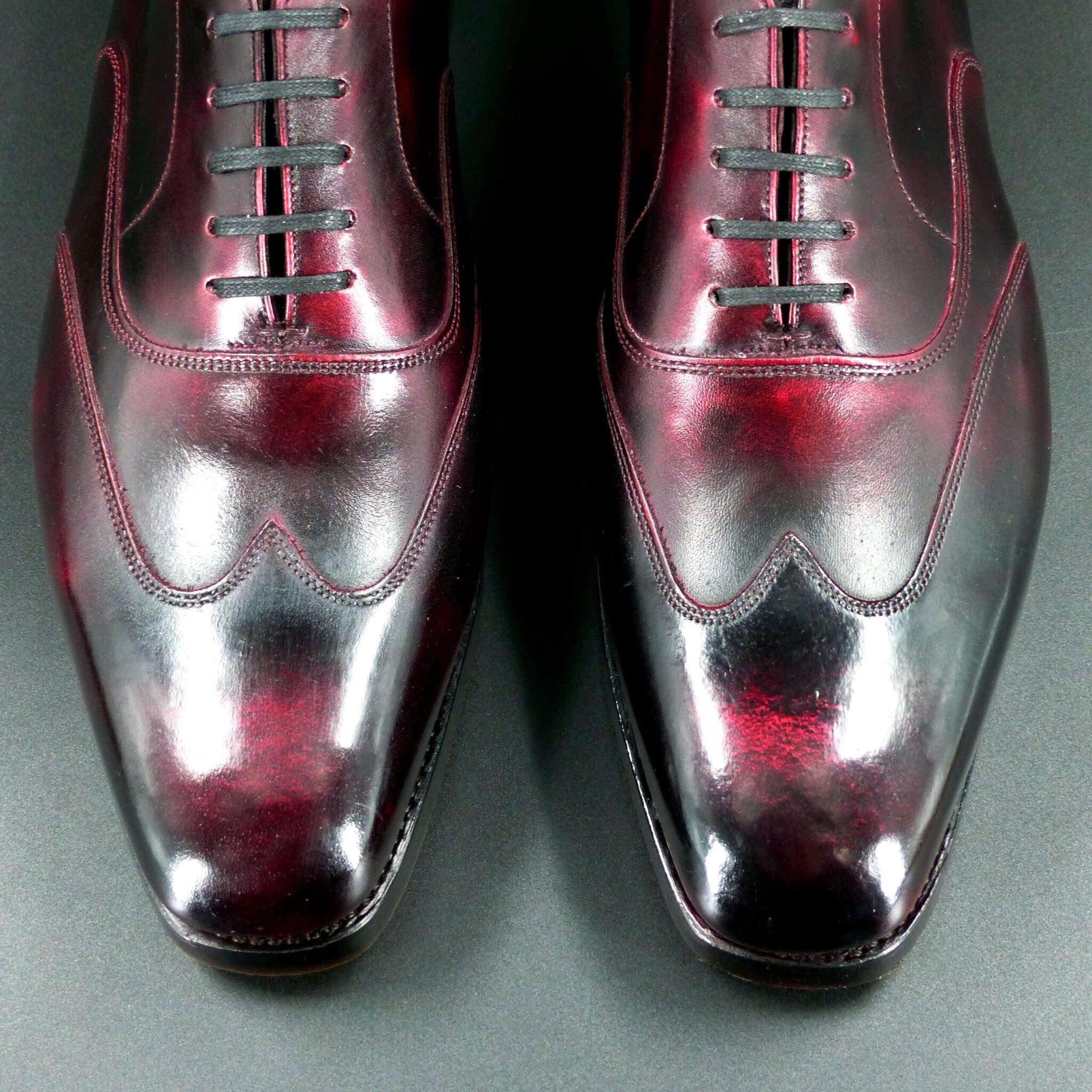
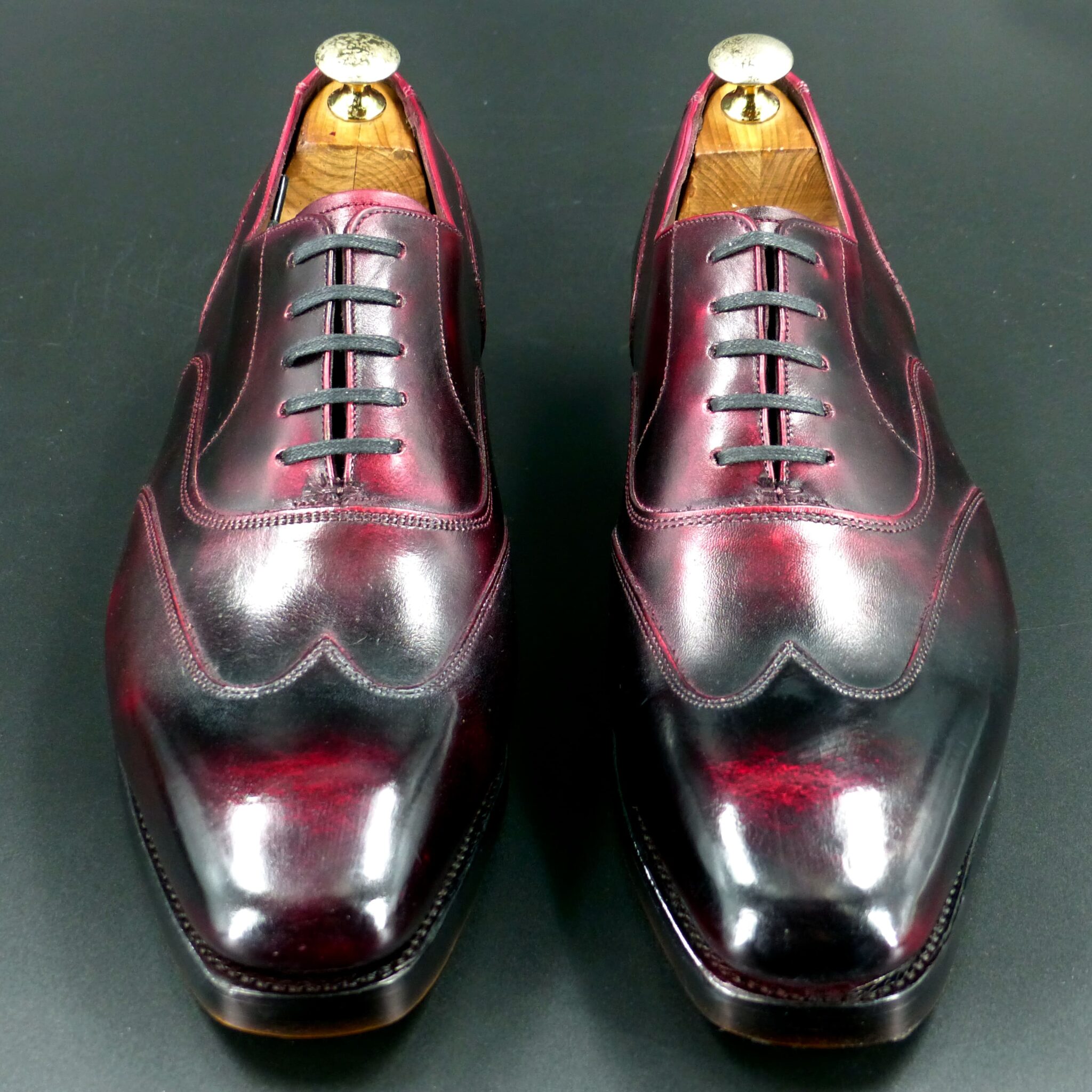
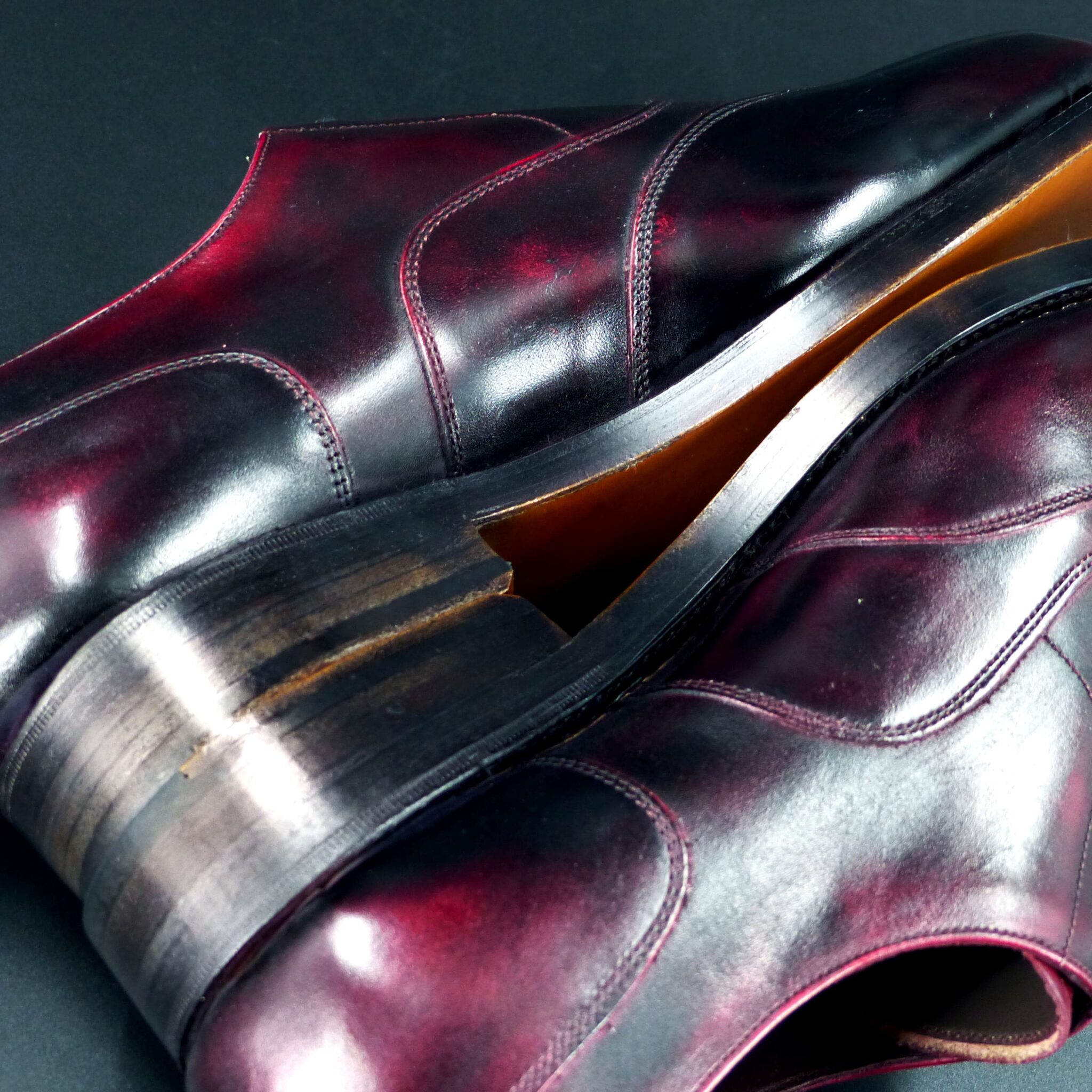
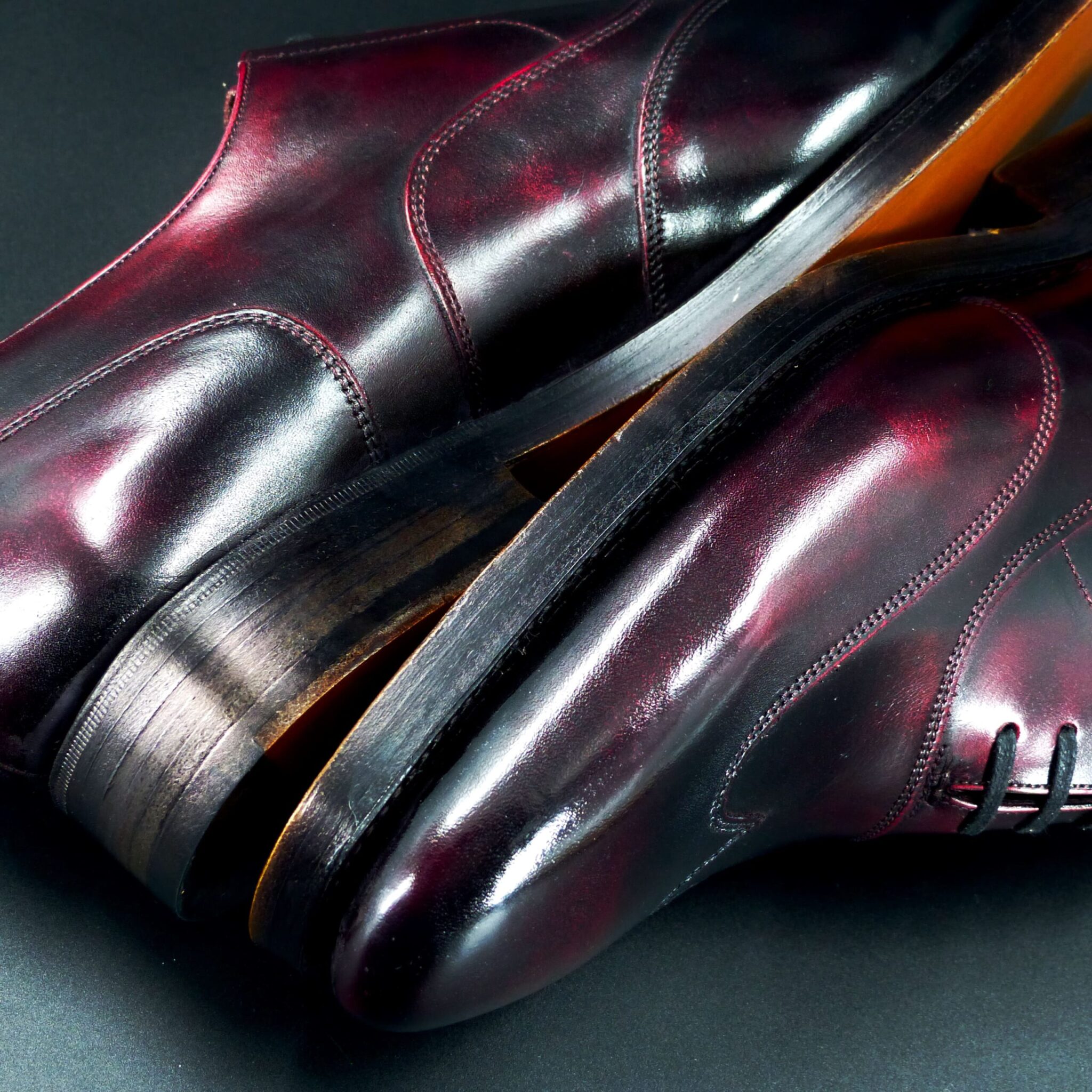
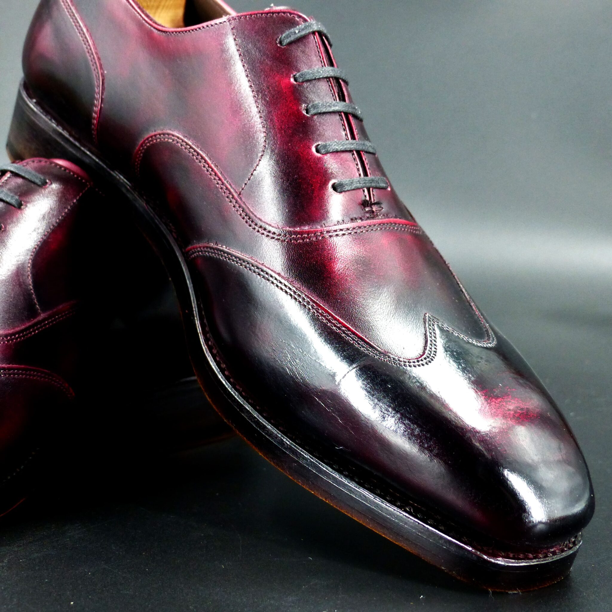

**赤透(あかすけ)**
七宝焼きの伝統的な色彩の一つで、透明感のある鮮やかな赤色を特徴としています。この色は、明治時代初期に名古屋の七宝職人・太田甚之栄によって開発されました。
**赤透の色構成**
- 表(おもて):透明感のある鮮やかな赤色。この赤色は、釉薬に金を溶かし込むことで実現され、宝石のルビーのような深みと輝きを持ちます。
- 裏(うら):通常、七宝焼きの作品では裏面は見えない部分となりますが、作品全体の調和を考慮して、黒や深緑などの落ち着いた色が用いられることがあります。
このように、表面に鮮やかな赤色を施し、裏面に落ち着いた色を配することで、作品に深みと高級感を与えています。
**赤透が象徴するもの**
- 情熱と活力:鮮やかな赤色は、生命力やエネルギーを象徴し、見る者に力強い印象を与えます。
- 魔除けと厄除け:日本文化において、赤色は古くから魔除けや厄除けの力があると信じられ、神社の鳥居や祭礼の装飾などに用いられてきました。
- 祝いと喜び:赤色は祝い事や特別な行事の際に好まれる色であり、喜びや幸福を象徴します。
赤透の色合いは、これらの象徴性を持ちながら、七宝焼きの技術と融合することで、作品に深みと魅力を加えています。
Akasuke is a traditional color in Japanese cloisonné enamelware, characterized by its vivid and transparent red hue. This color was developed in the early Meiji period by the cloisonné artisan Jinsiei Ota from Nagoya.
Color Composition of Akasuke
- Surface (Omote): A bright, transparent red achieved by incorporating gold into the enamel glaze, resulting in a depth and brilliance reminiscent of a ruby.
- Underside (Ura): In cloisonné works, the underside is typically not visible; however, to ensure overall harmony, subdued colors such as black or deep green are sometimes used.
By applying a vibrant red on the surface and a more subdued color on the underside, the piece attains a sense of depth and sophistication.
Symbolism of Akasuke
- Passion and Vitality: The vivid red symbolizes life force and energy, imparting a strong impression to the viewer.
- Protection and Warding Off Evil: In Japanese culture, red has long been believed to possess protective qualities, often used in Shinto shrine gates (torii) and festival decorations.
- Celebration and Joy: Red is a favored color during festive occasions and special ceremonies, symbolizing happiness and good fortune.
The rich hue of Akasu embodies these symbolic meanings, enhancing the depth and allure of cloisonné artworks through its fusion with traditional craftsmanship.
ホールカット
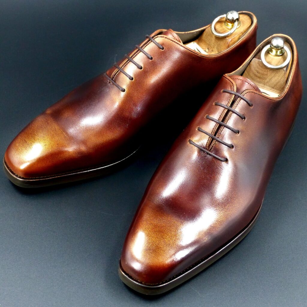
color name;
[ Kincha-Iro]
金茶色
Whole cut
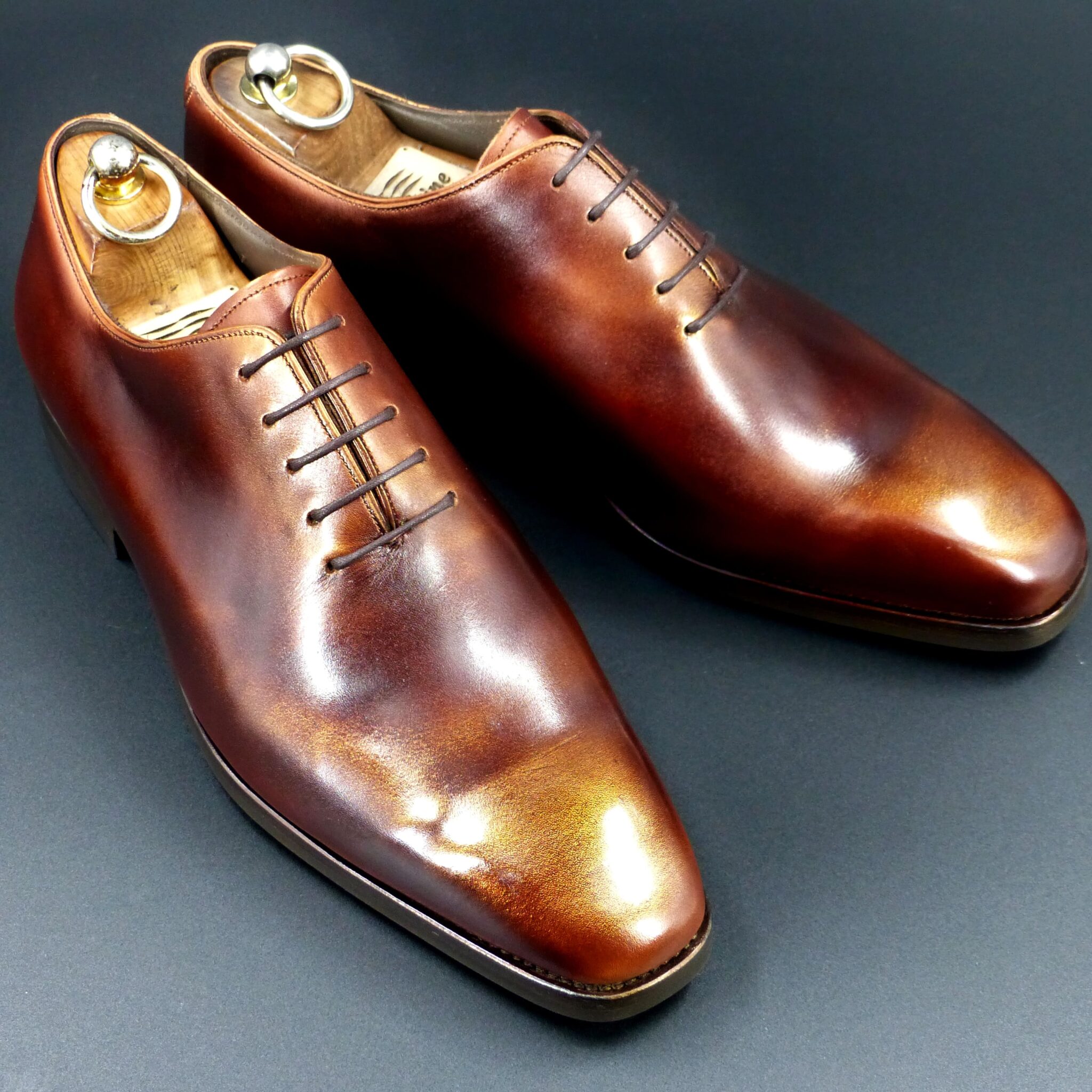
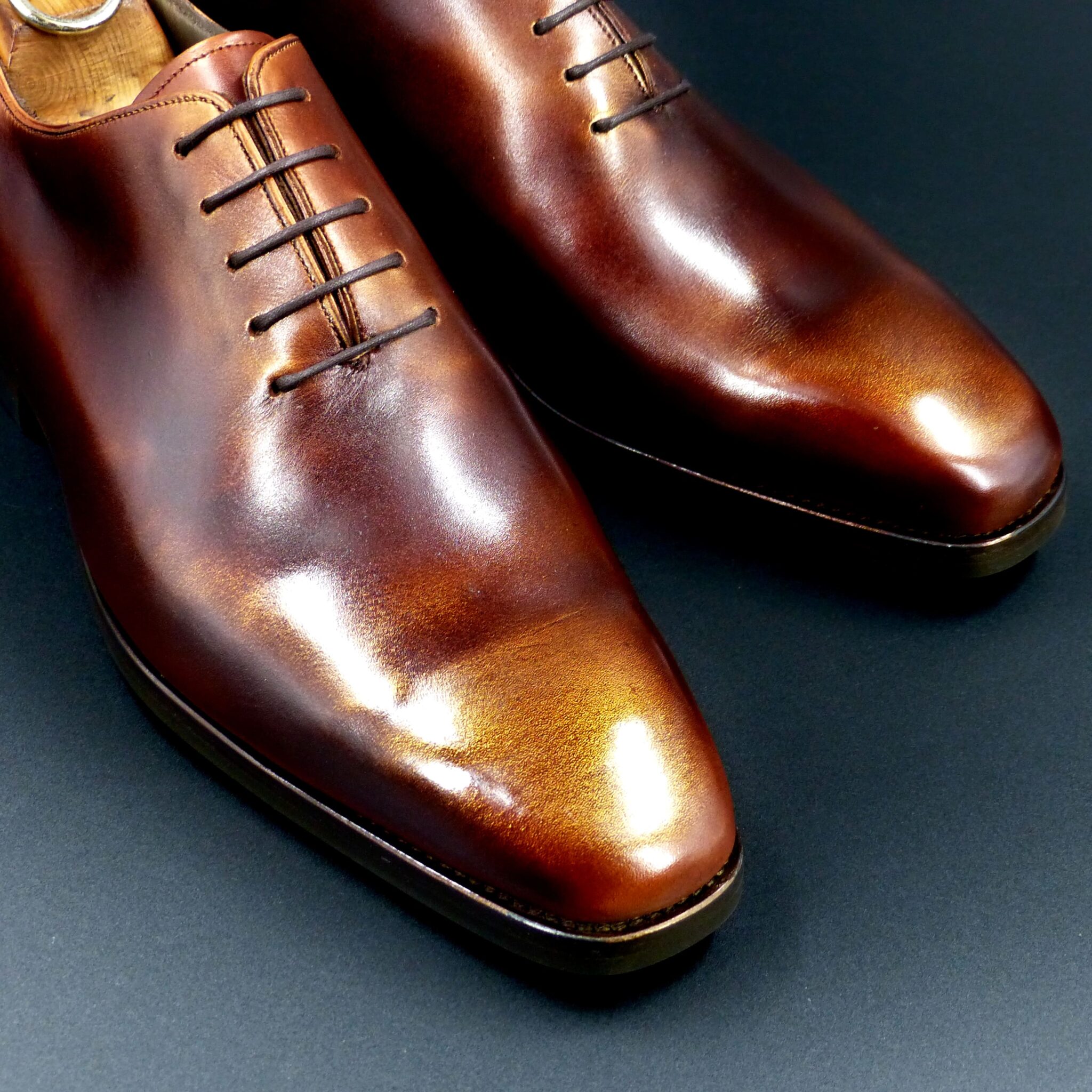
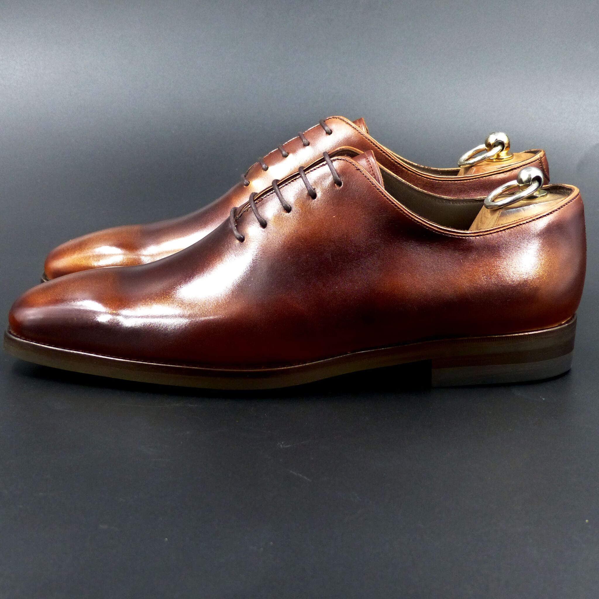
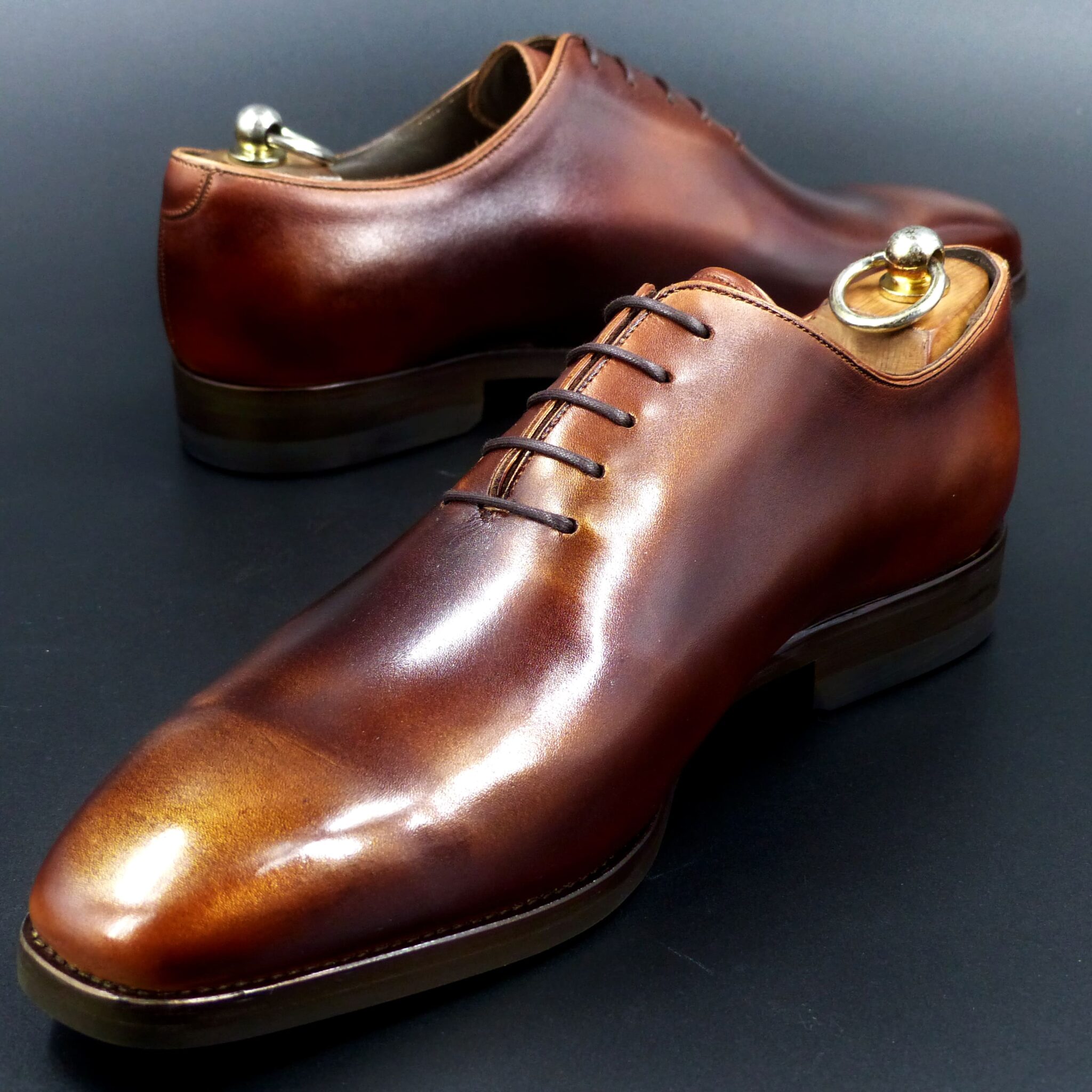
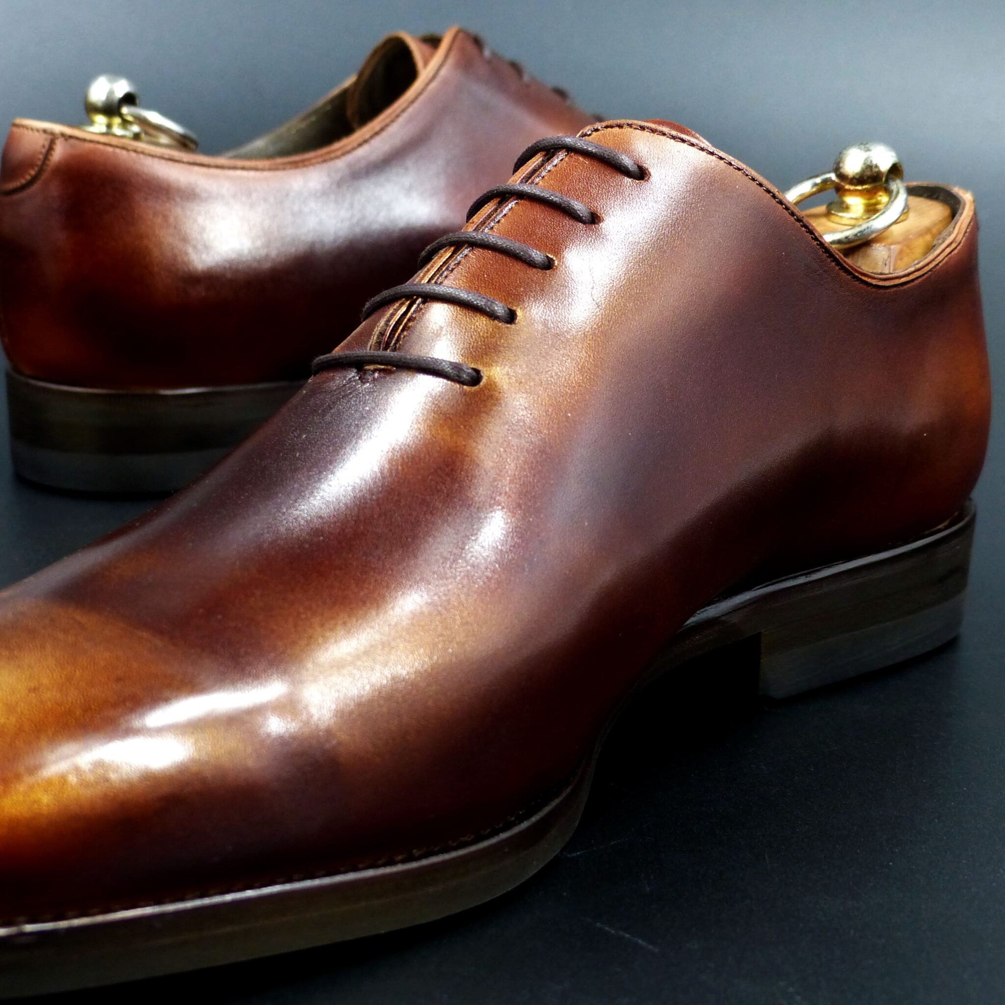
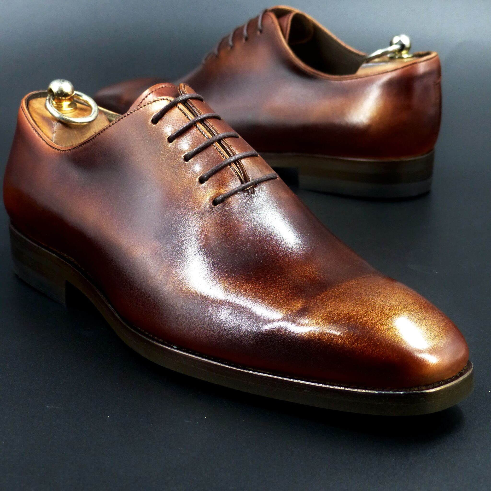
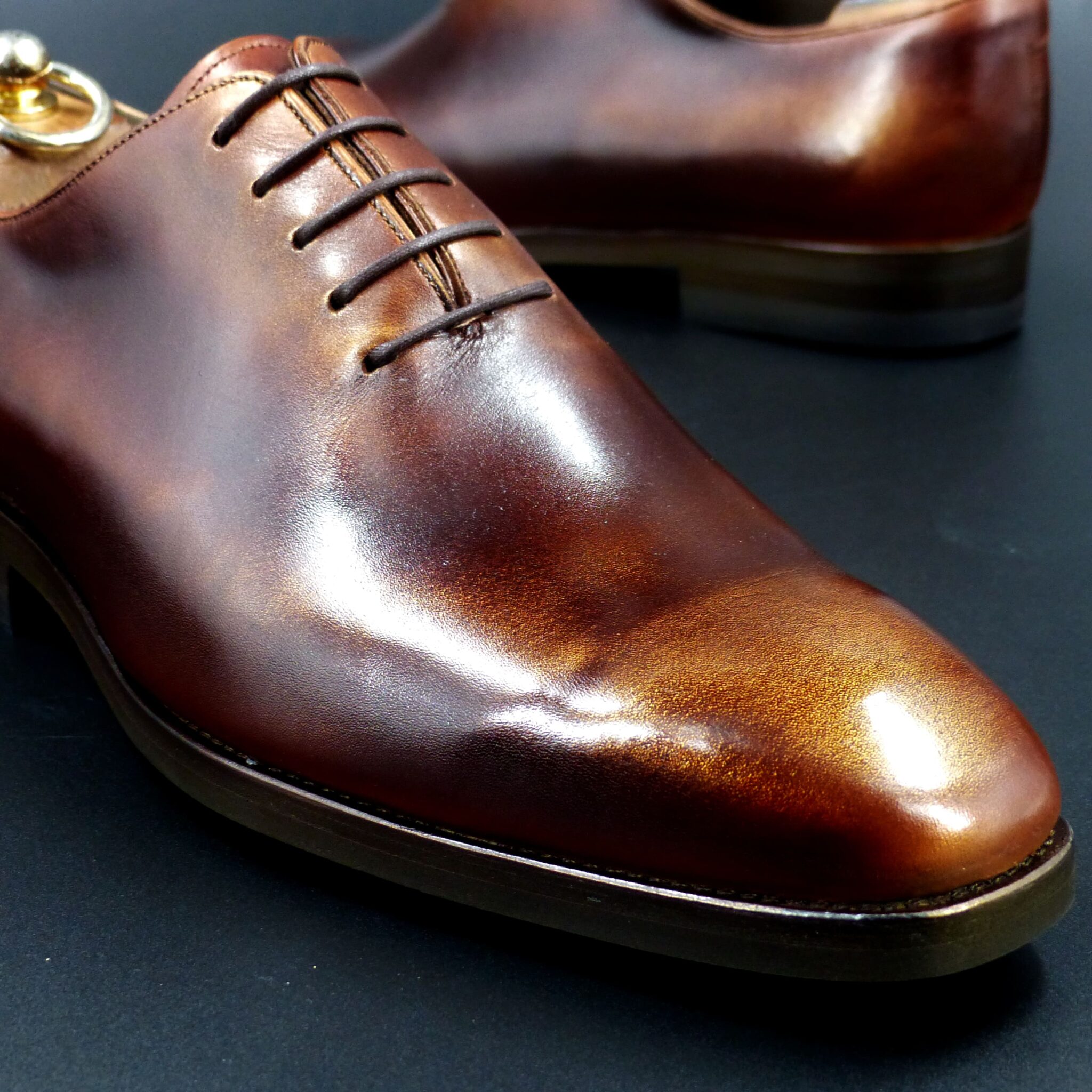
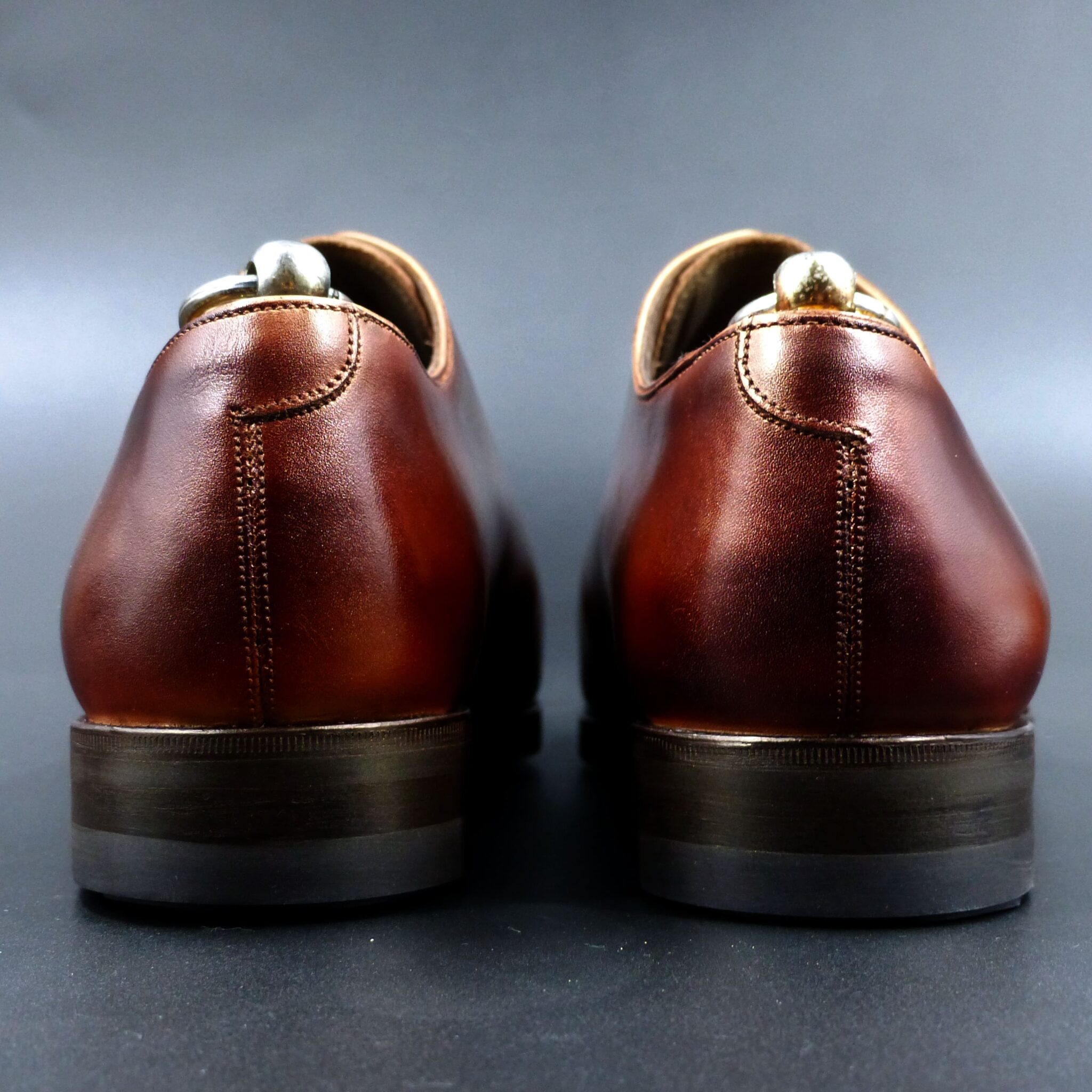
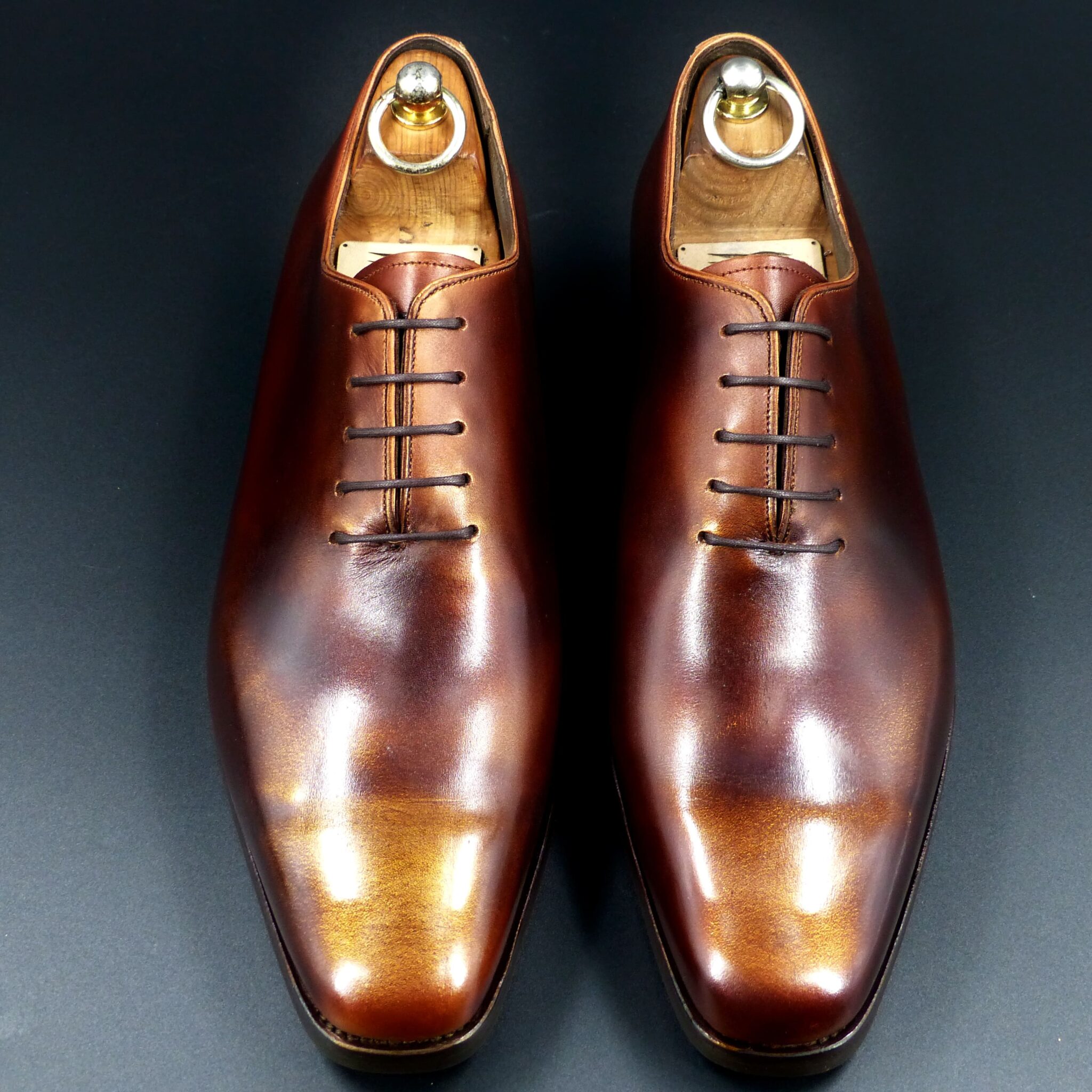
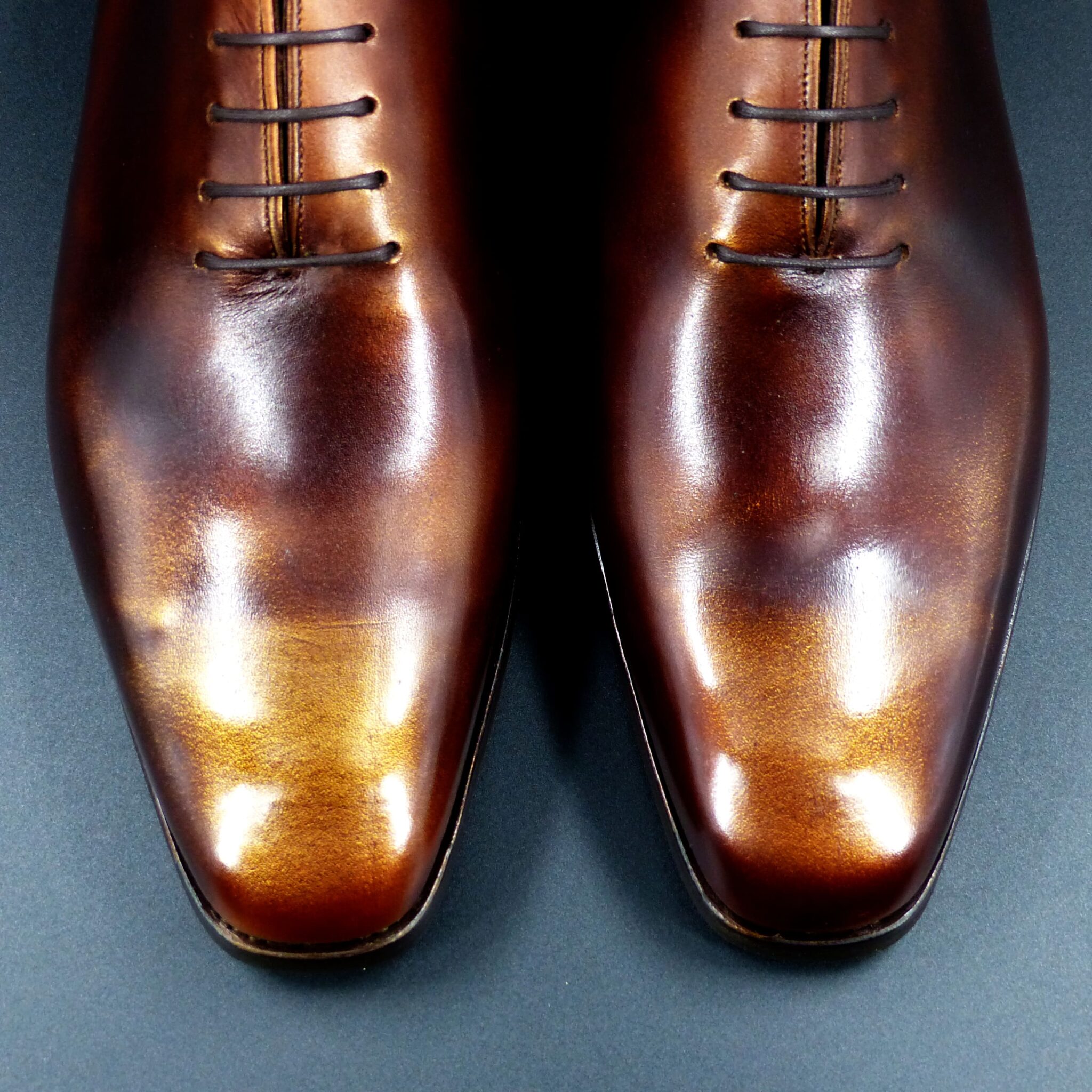
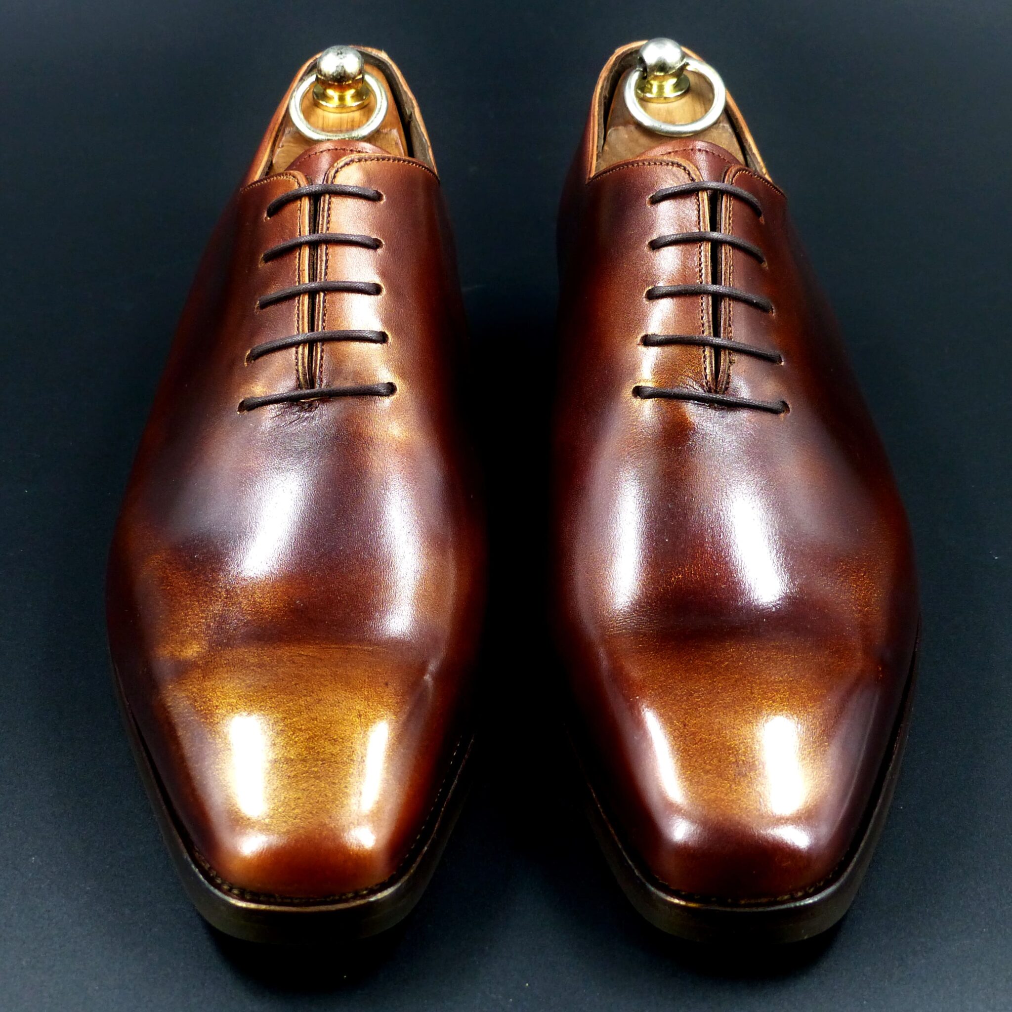
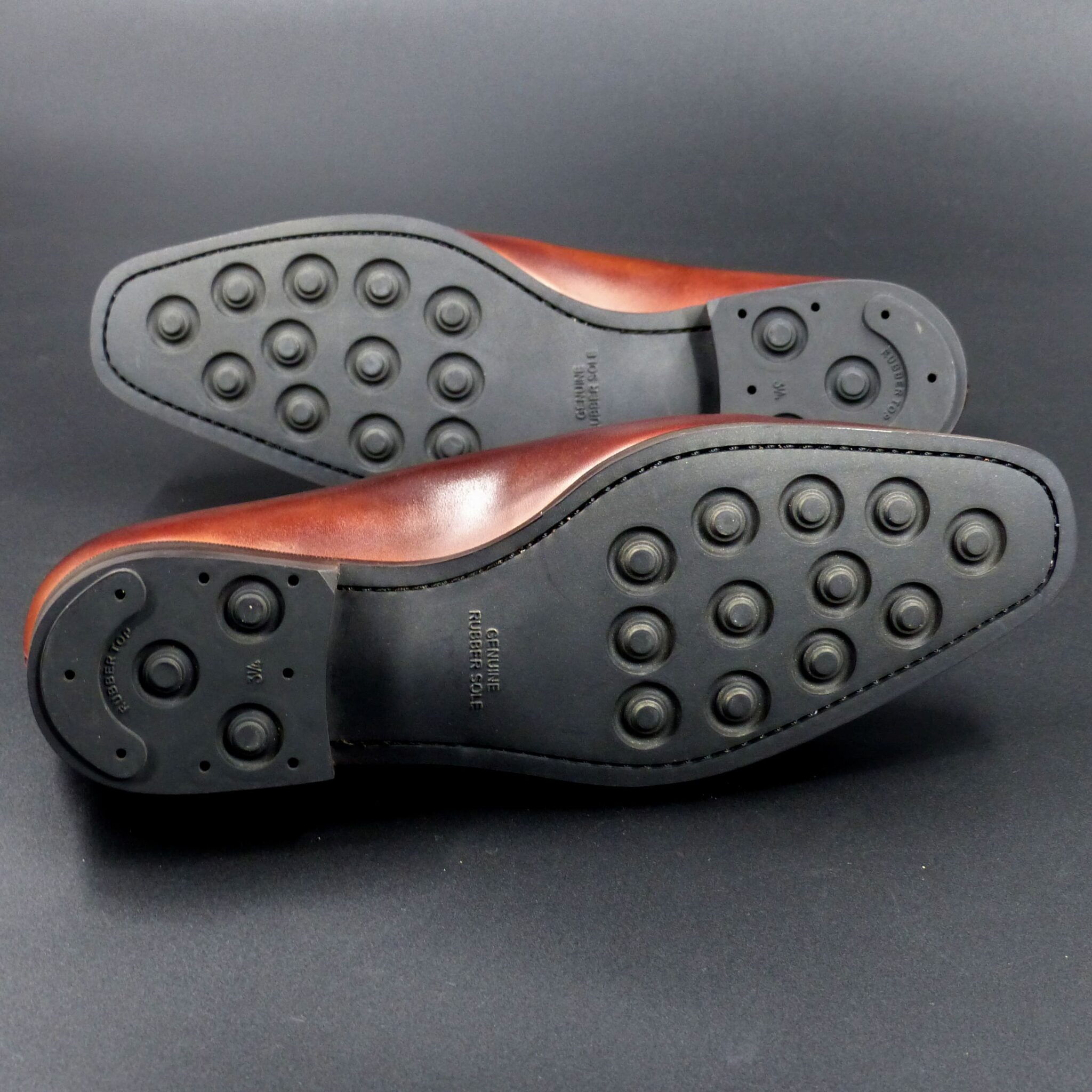
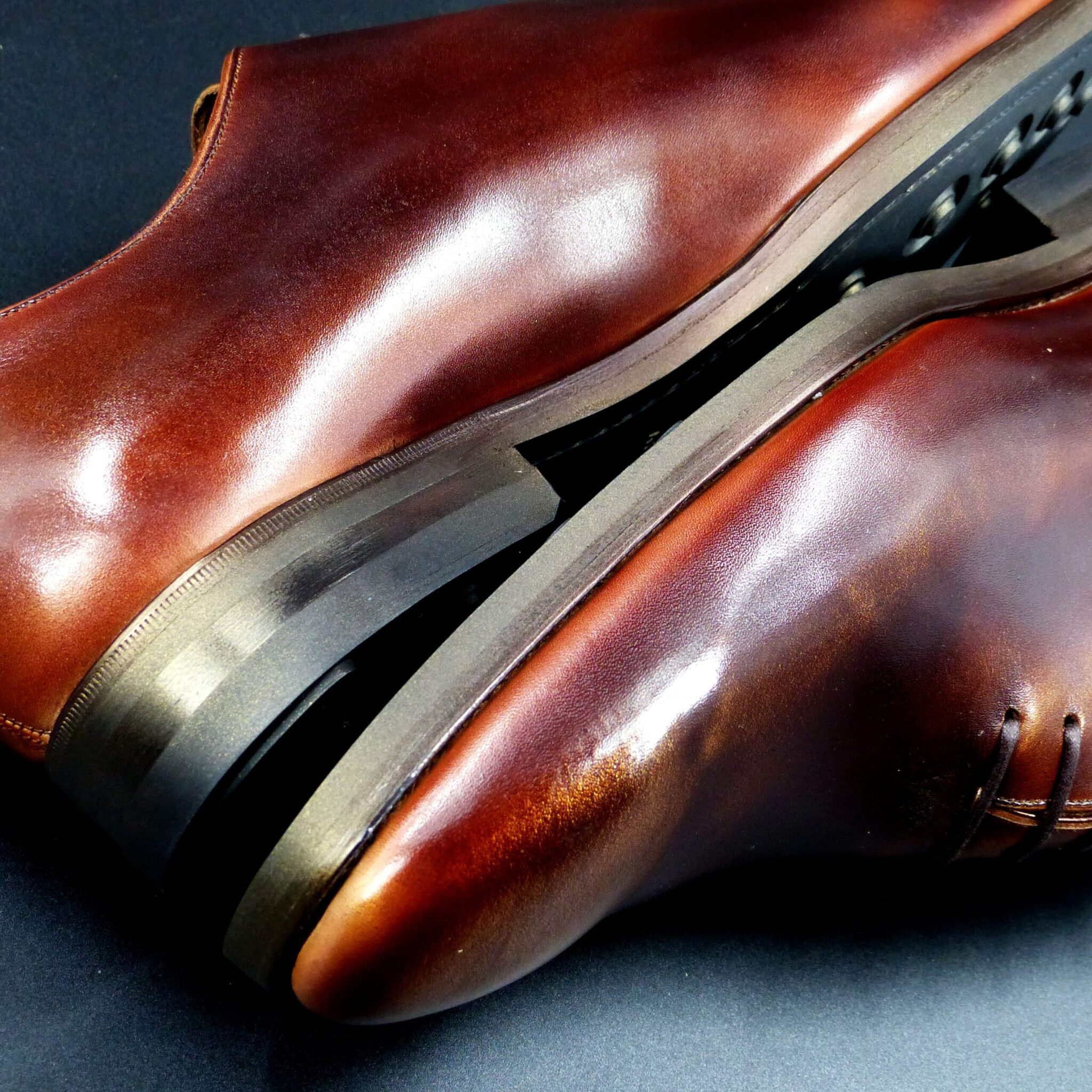

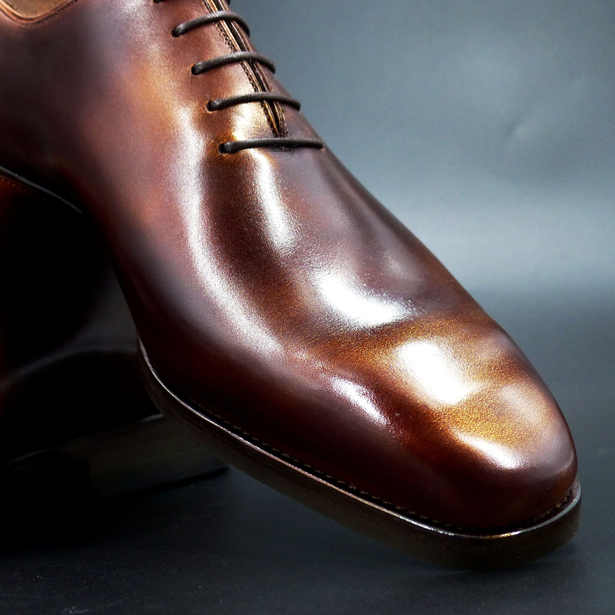
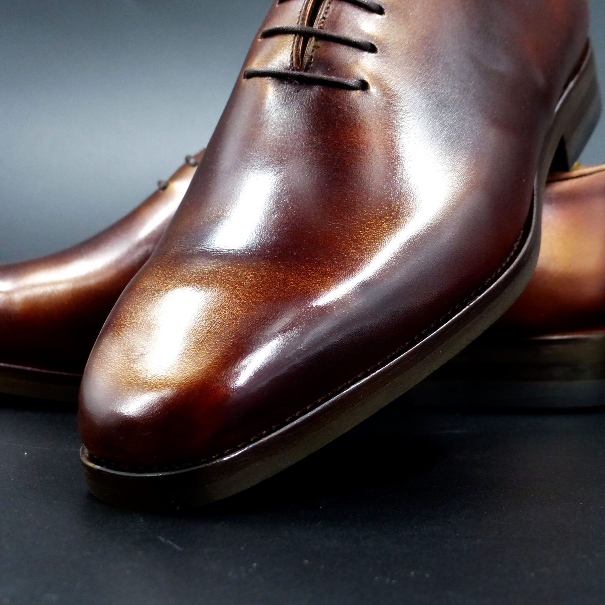
**金茶色とは**
一般に、 金色 がかった明るい 茶色 のことで、山吹色 に近く、江戸時代に染色の色として流行したとされています。 和服、和装小物、風呂敷、作務衣 さむえ などに用いられるほか、洋服にも相性が良く、多くのブランドにも採用されています。
**金茶色の色構成**
金茶色は、日本の伝統色の中で「黄」や「橙」に近い色で、以下のような色の混合で表されます。
- 黄(山吹色・黄土色)
- 赤(紅・朱)
金茶色は、黄金のような温かみと深みを持つ色合いで、光や生命力を感じさせる配色です。
**金茶色が象徴するもの**
- 富貴と高貴
- 金茶色は黄金を思わせる色であり、財産や権威の象徴とされました。
- 平安時代の貴族の装束や武家の意匠にも似た色が使われています。
- 太陽と生命力
- 太陽の光を思わせる温かい色調で、生命の輝きや成長を表す色です。
- 収穫の色とも関連し、豊穣や実りの象徴とされました。
- 成熟と円熟
- 秋の紅葉や熟した穀物を連想させるため、円熟した知恵や経験を表します。
- 侘び寂びの精神にも通じ、時の流れの美しさを象徴する色とされています。
現代の日本でも、金茶色は伝統と温もりを感じさせる色として、工芸品や和装、茶道具などに使われています。
What is Kincha-iro (Golden Brown)?
Kincha-iro is generally a bright brown with a golden hue, similar to yamabuki-iro (Japanese yellow) and was popular as a dye color during the Edo period. It is used in traditional Japanese clothing, accessories, furoshiki (wrapping cloths), and samue (work attire), as well as in modern fashion, where it is widely adopted by many brands.
Color Composition of Kincha-iro
Kincha-iro is a traditional Japanese color close to yellow and orange, created by blending the following hues:
- Yellow (Yamabuki-iro, Odo-iro / ochre)
- Red (Beni / crimson, Shu / vermilion)
Kincha-iro has a warm and deep golden tone, evoking light and vitality.
Symbolism of Kincha-iro
- Wealth and Nobility
- Kincha-iro resembles gold and has been regarded as a symbol of wealth and authority.
- Similar colors were used in the garments of Heian-period aristocrats and in samurai designs.
- Sun and Vitality
- Its warm hue resembles sunlight, representing the brilliance of life and growth.
- It is also associated with harvest colors, symbolizing abundance and prosperity.
- Maturity and Wisdom
- The color is reminiscent of autumn leaves and ripened crops, symbolizing wisdom and experience.
- It aligns with the Japanese aesthetics of wabi-sabi, reflecting the beauty of time and imperfection.
Even in modern Japan, kincha-iro remains a color that conveys tradition and warmth, often seen in crafts, traditional clothing, and tea utensils.
ダブル・モンク
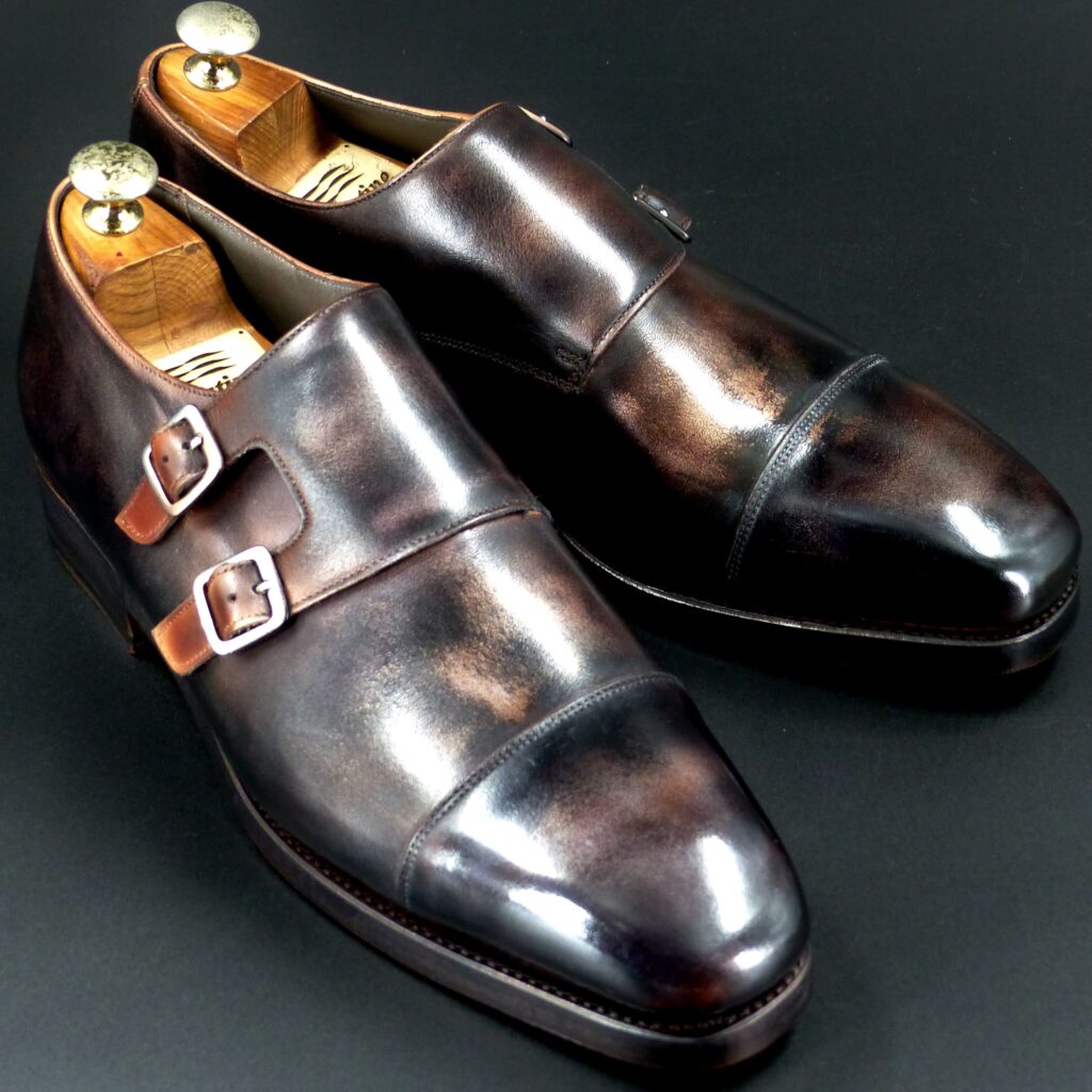
color name;
[ Susutake-Iro]
煤竹色
Double Monk
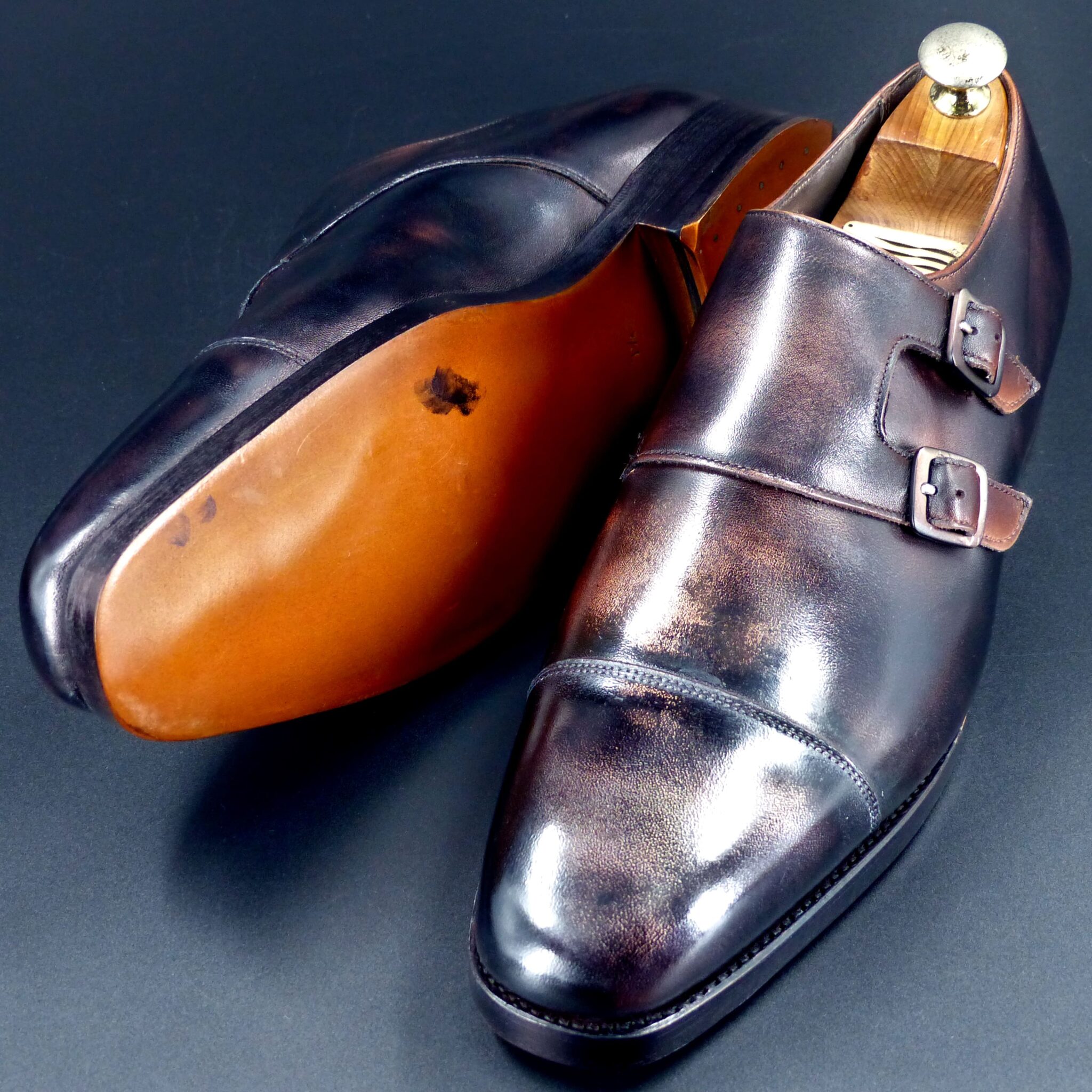
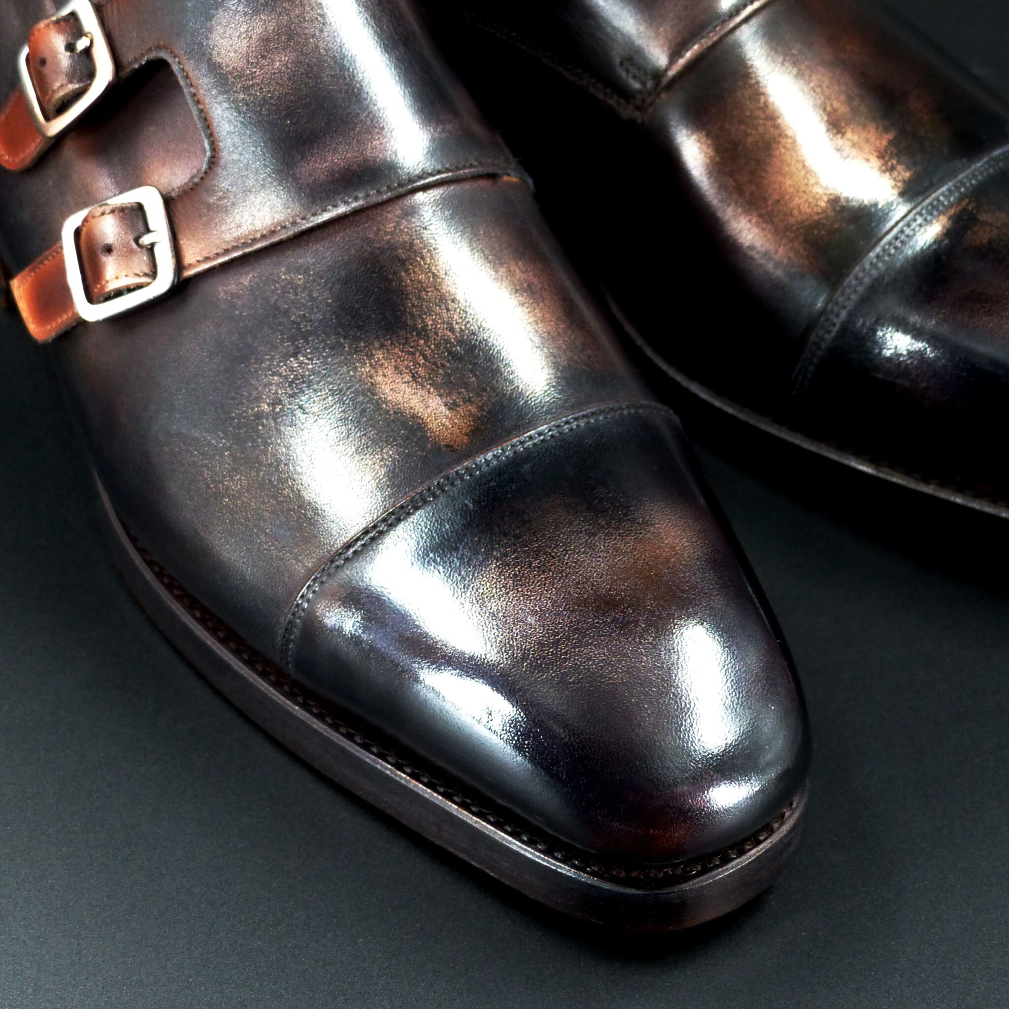
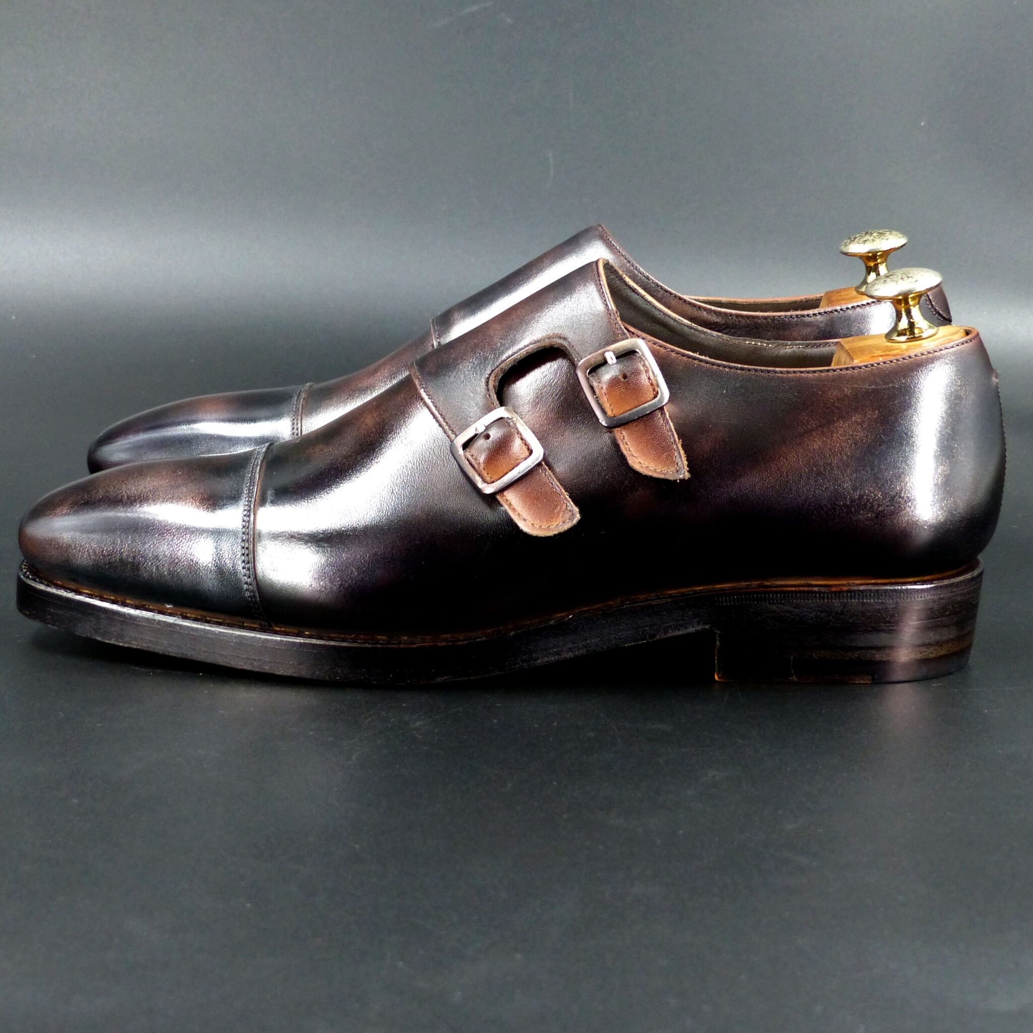
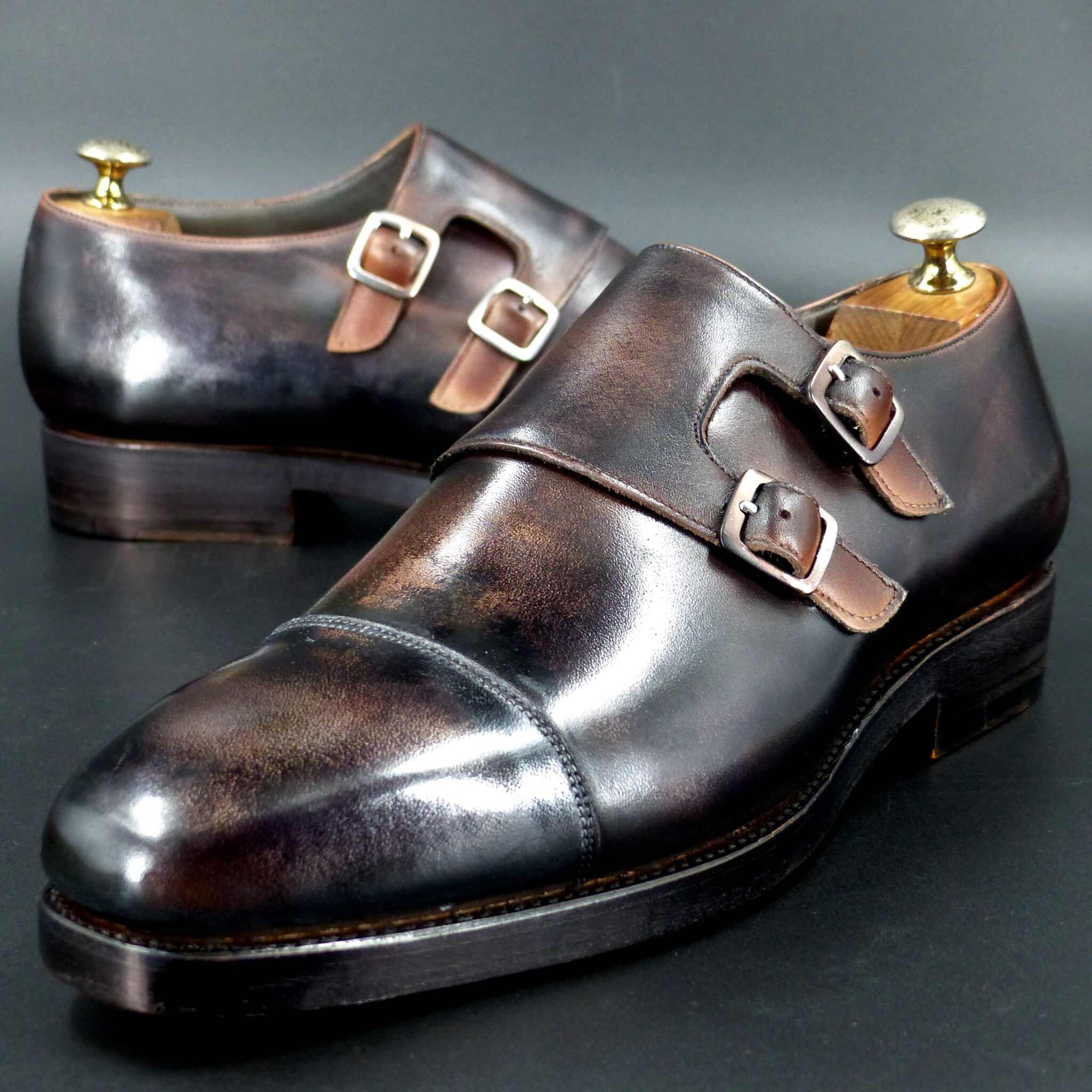
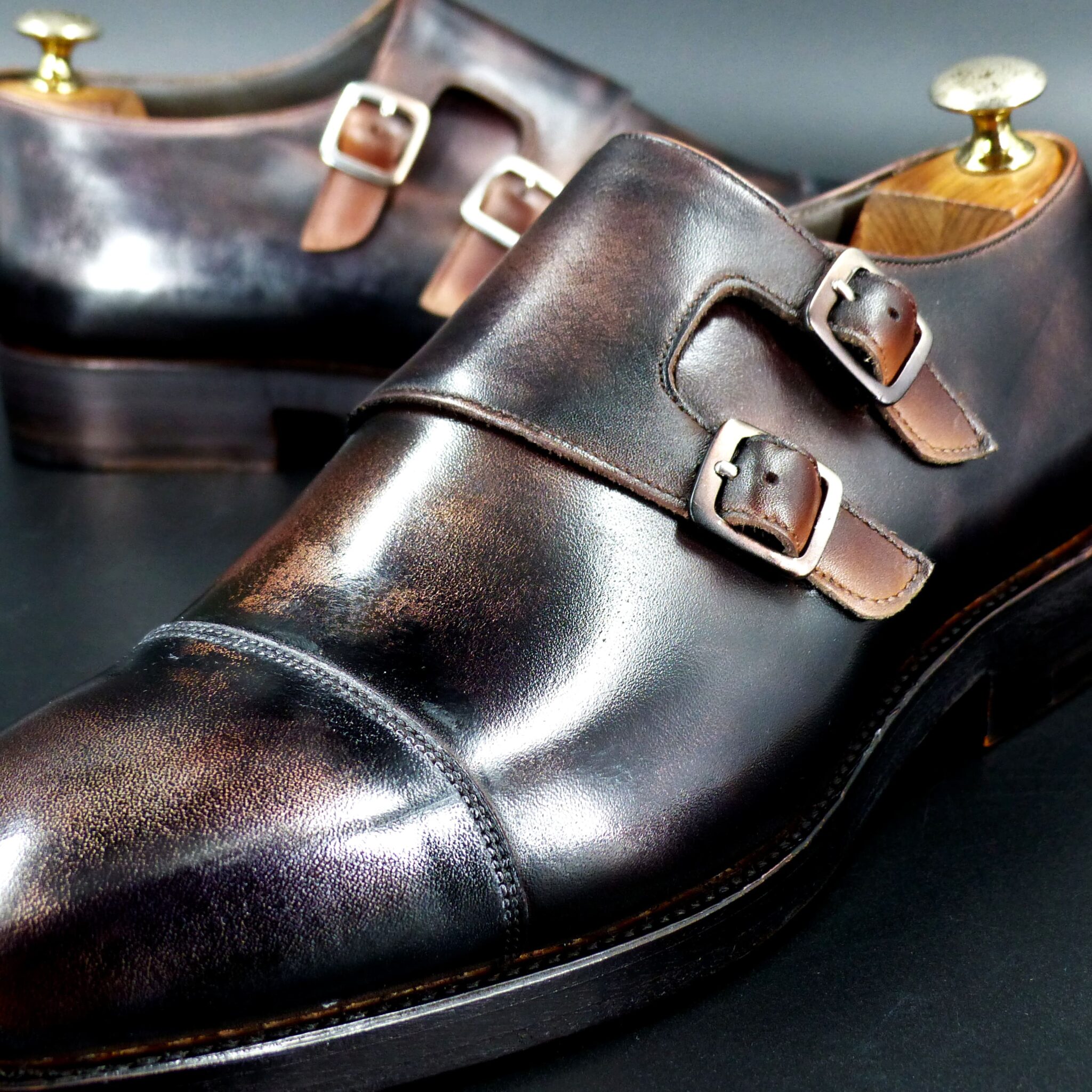
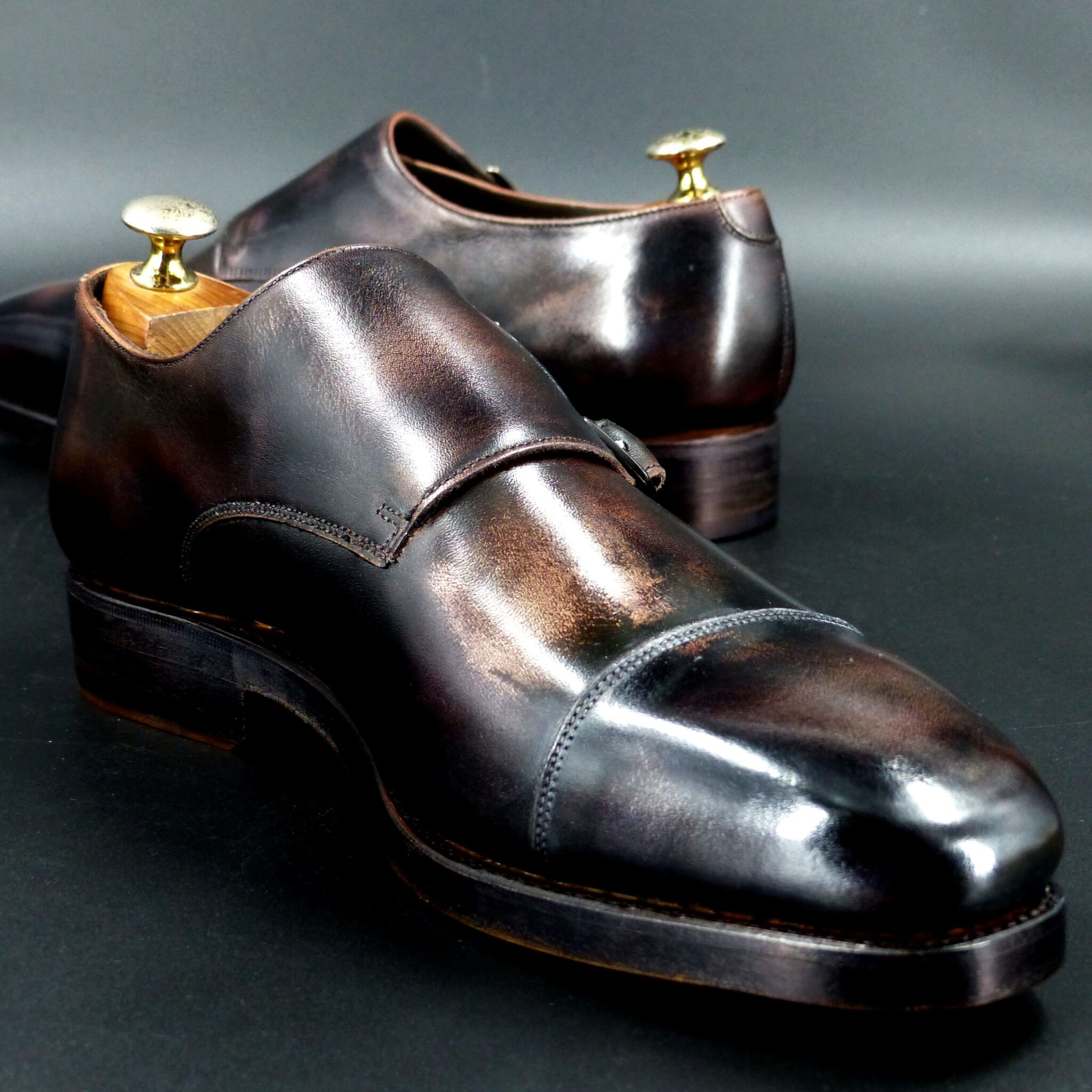
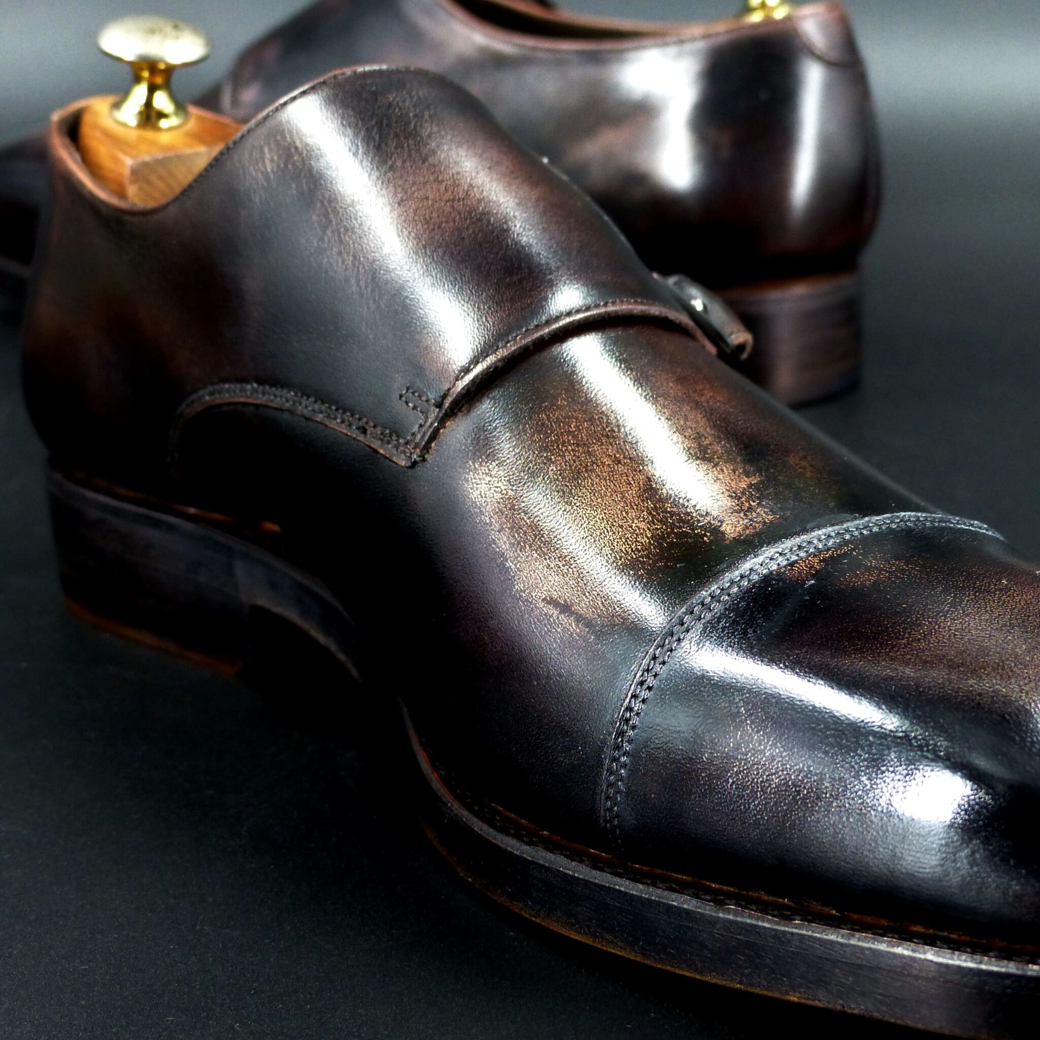
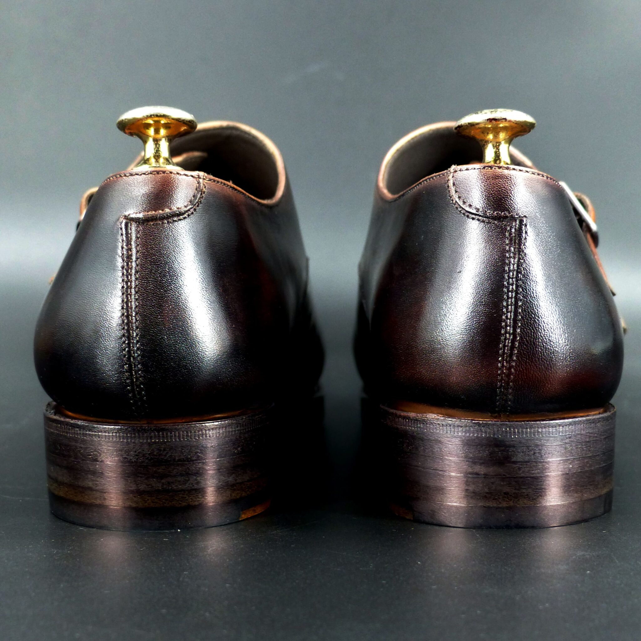
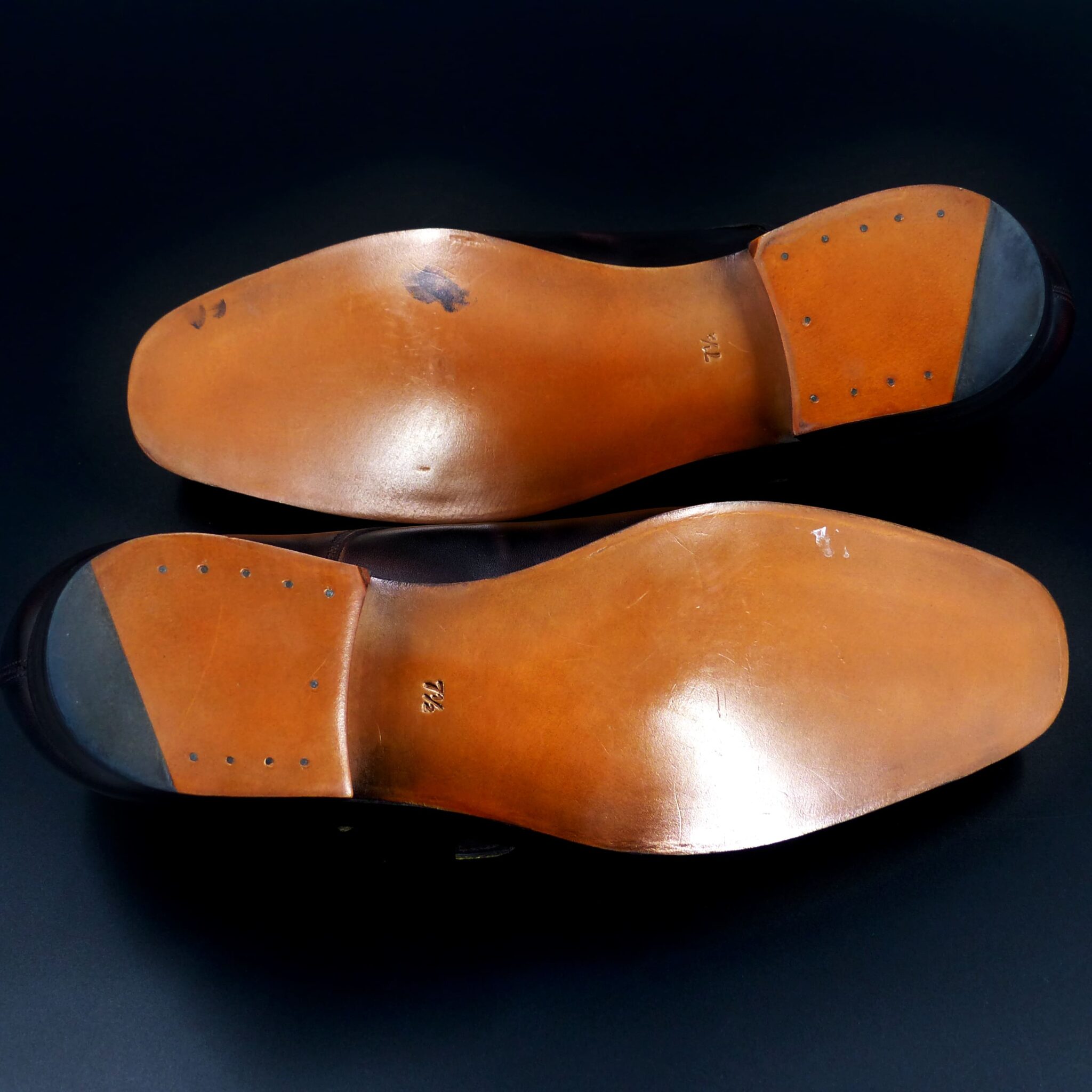
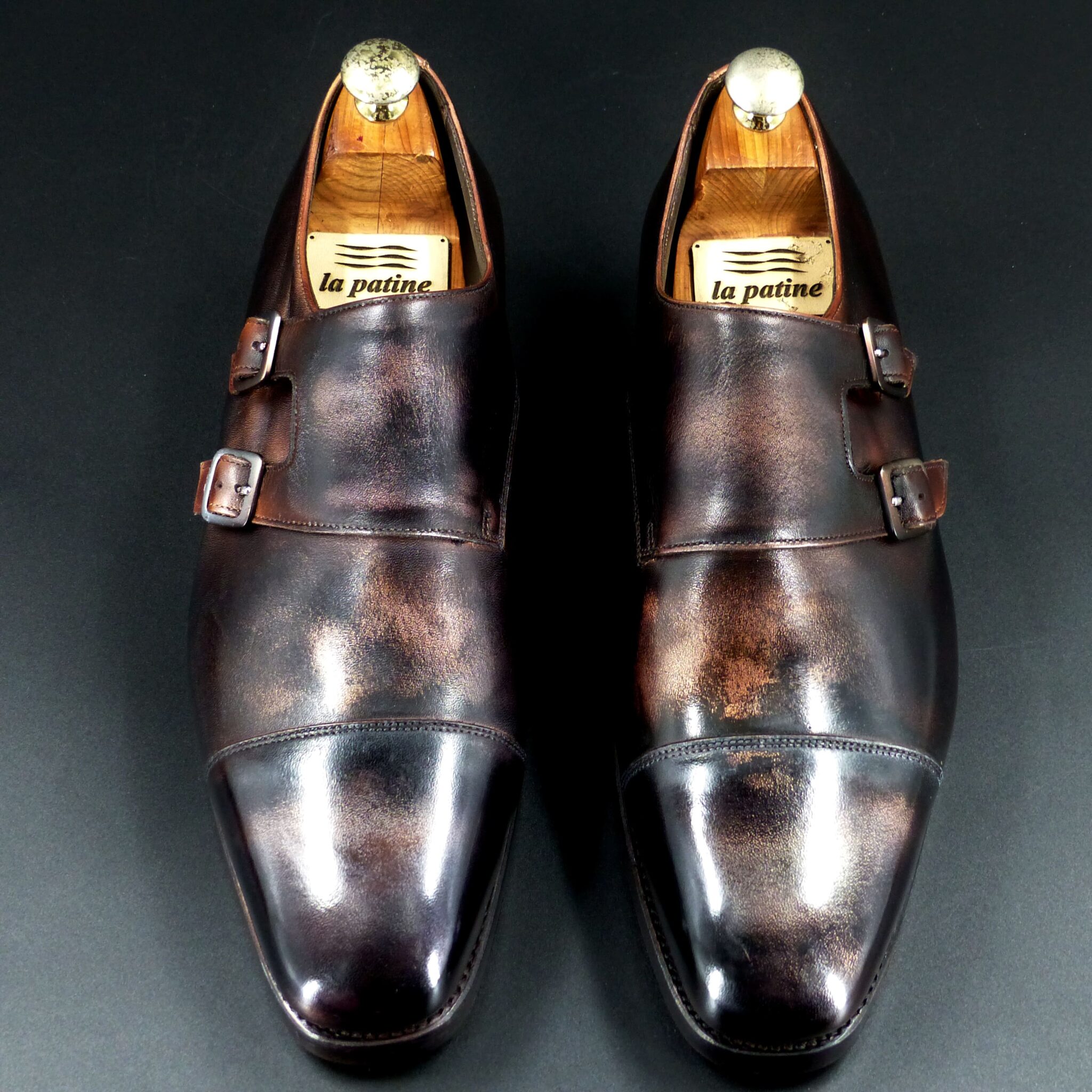
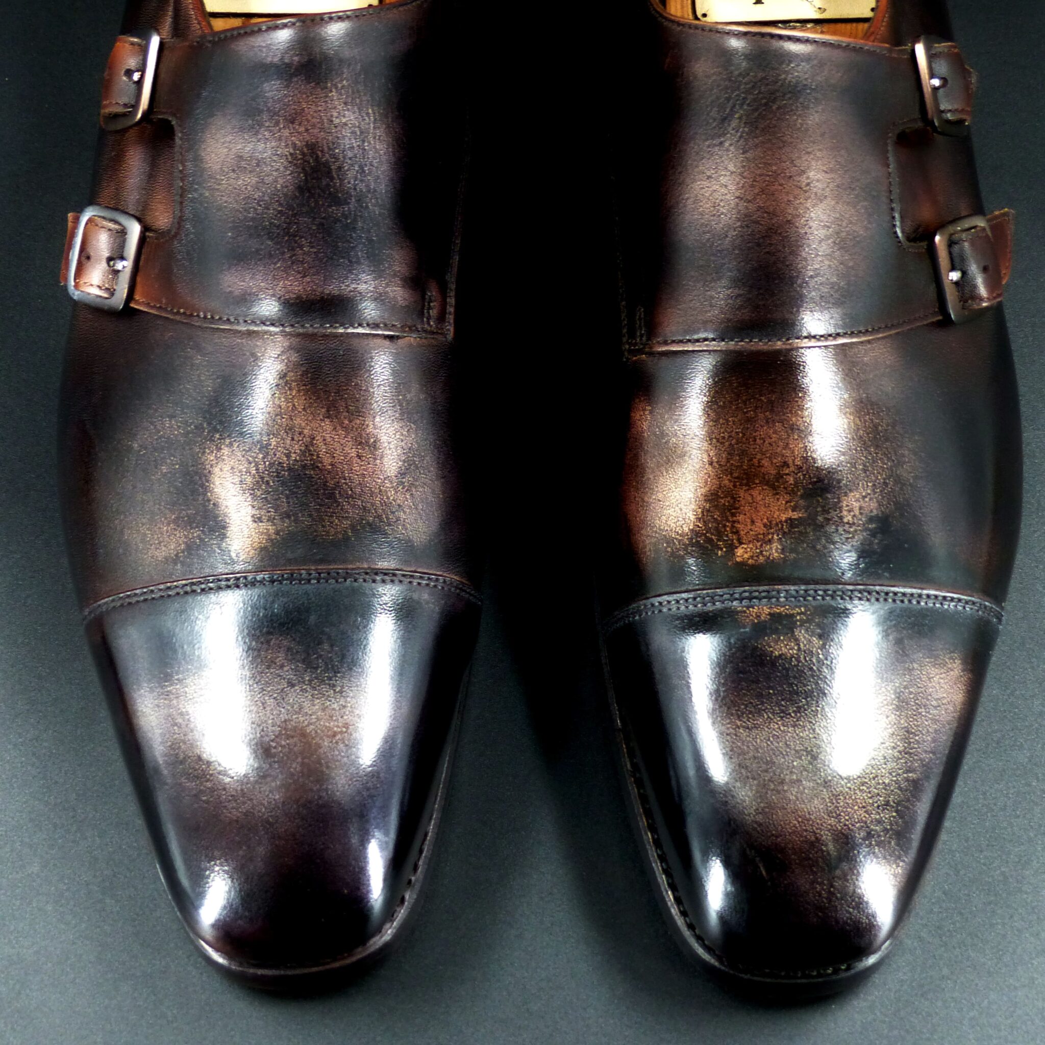
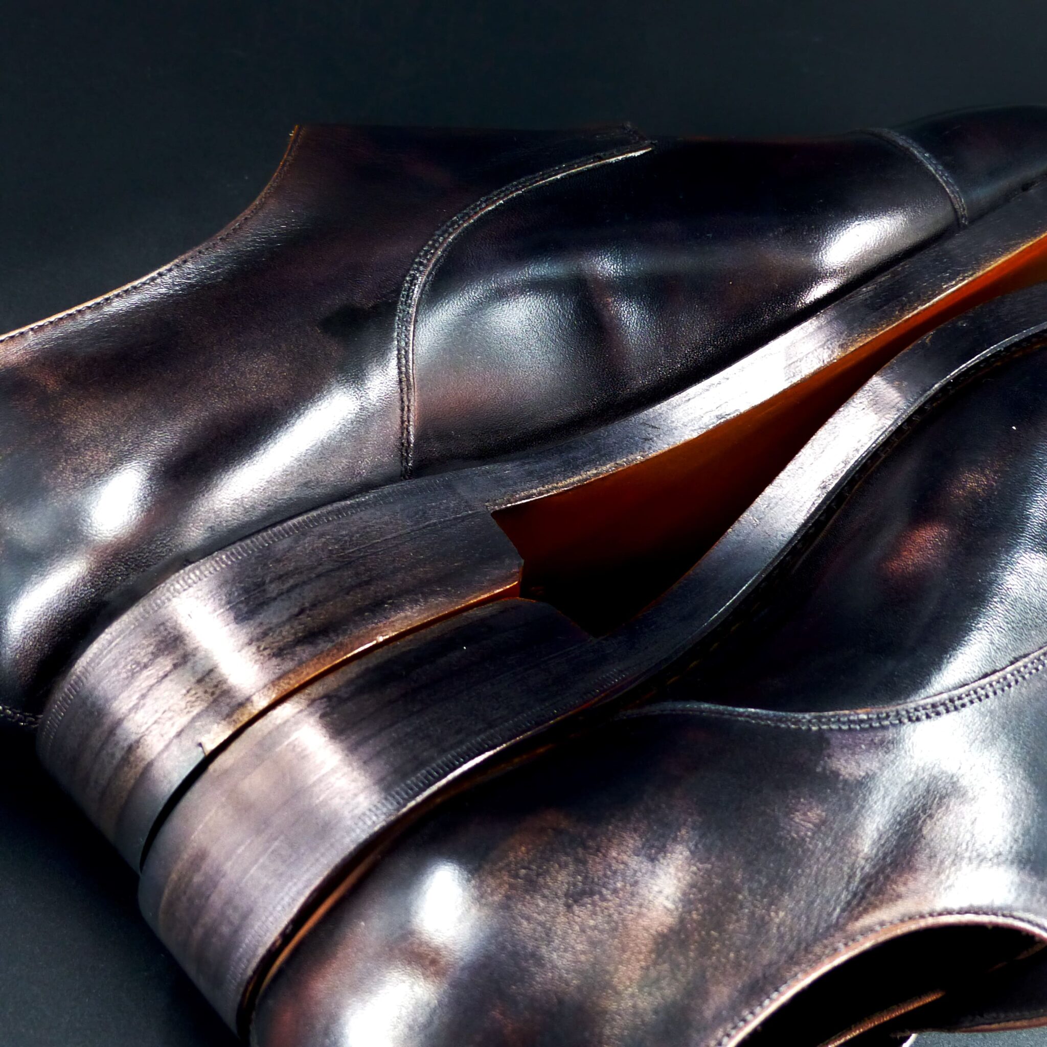
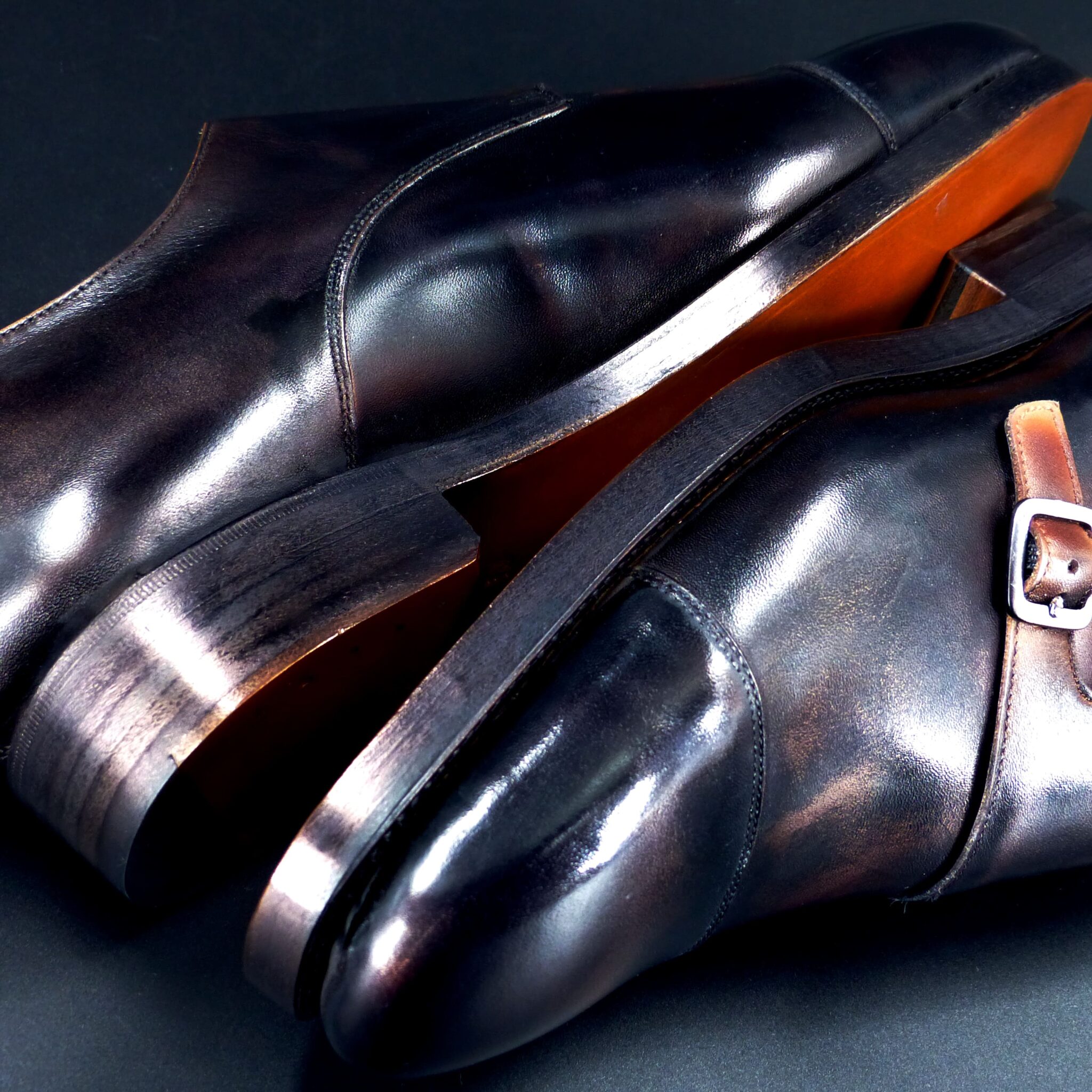
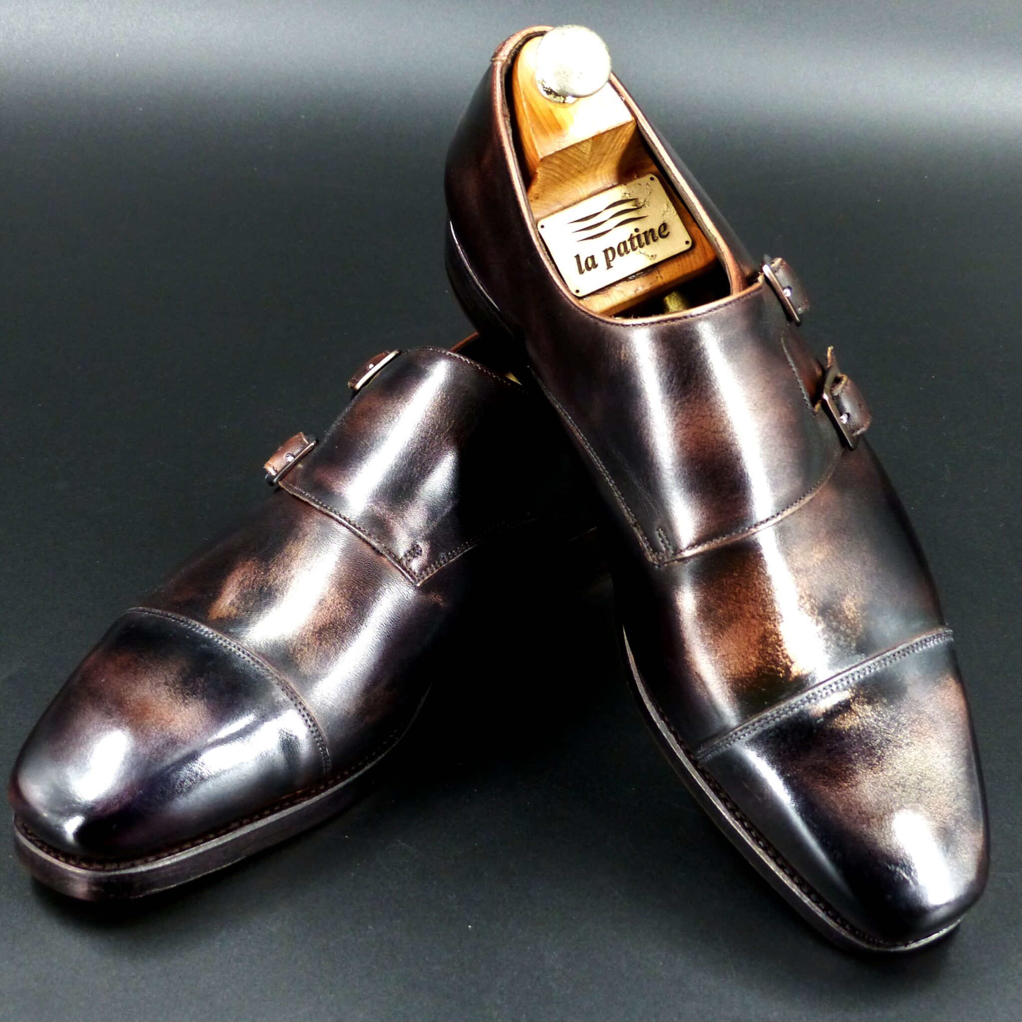
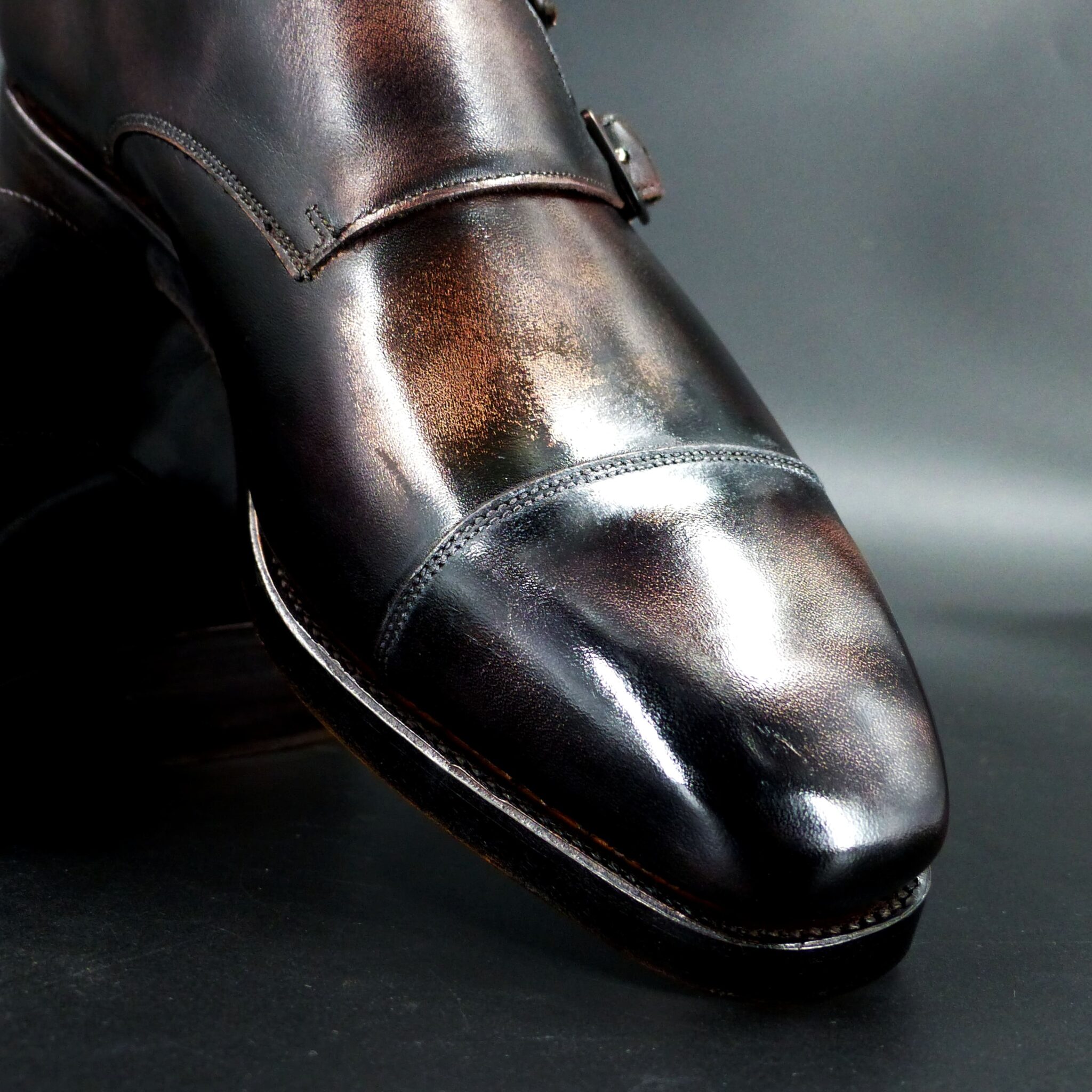
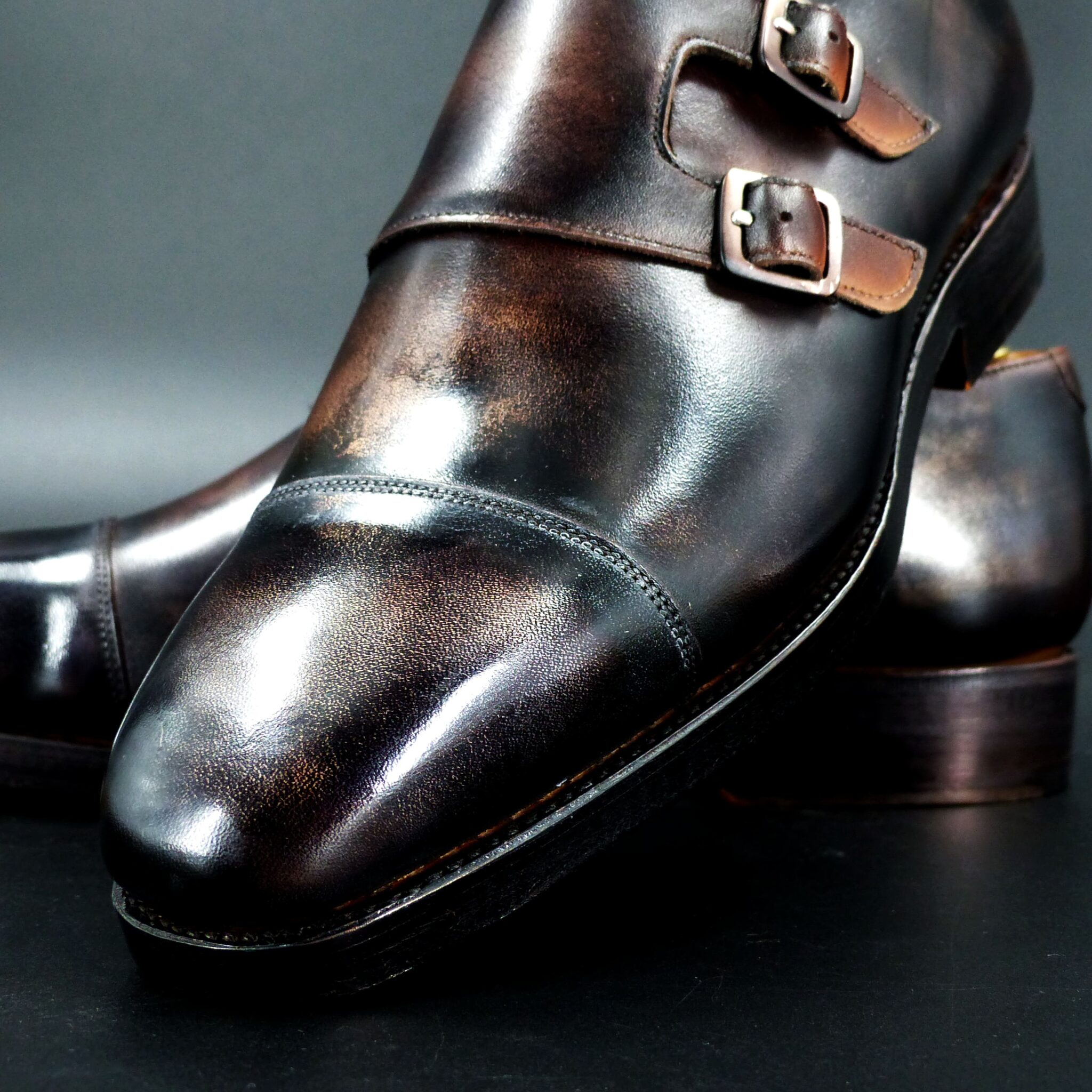
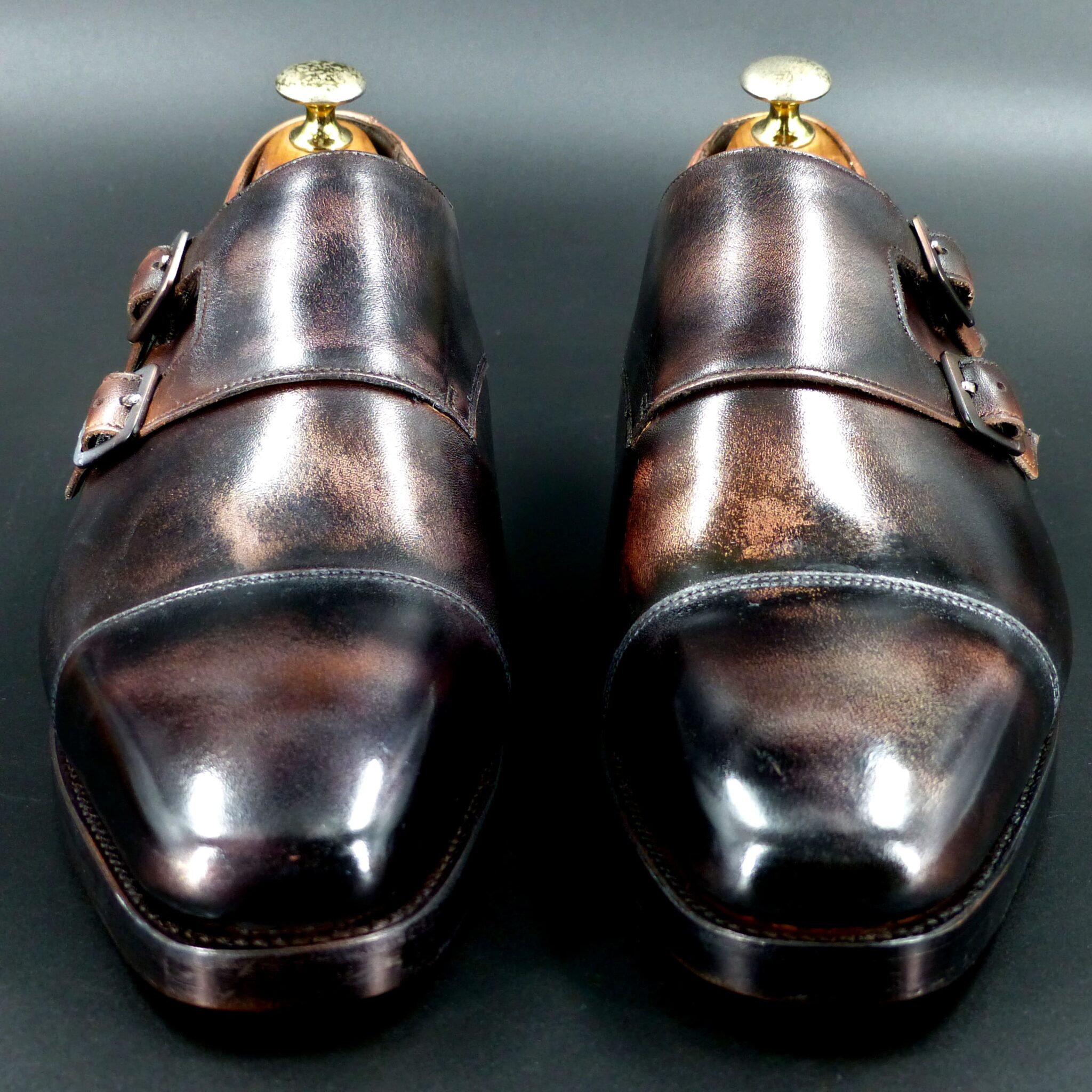
●煤竹色(すすたけいろ)とは●
煤竹色は、長年囲炉裏やかまどの煤(すす)を浴びて燻された竹の色を指します。深みのある黄褐色から茶褐色にかけての色合いで、時間の経過とともに渋みを増す独特の美しさを持ちます。
ー色校正(色の特徴)ー
煤竹色は、以下のような色の特徴を持っています。
色調:茶色がかった黄褐色~黒褐色
近似色:黄土色、枯茶色、焦茶色
変化:時間が経つほど深みが増し、独特の艶が出る
古代日本では、自然由来の色彩を重視し、煤竹色は木材や布の染色にも取り入れられました。
▴象徴するもの▴
煤竹色は、古代日本において以下のような象徴的意味を持ちます。
時の積み重ねと風格
煤竹は年月を経て独特の色合いを持つため、「経年美化」 や 「長寿」 を象徴しました。
古民家の梁や茶道具などにも見られ、古き良きものを大切にする精神と結びつきます。
素朴さと渋さの美
華やかさはないものの、落ち着いた味わいがあるため、日本独特の**「わび・さび」** の美意識を象徴する色とされました。
実直さと忍耐
煤竹は長年の煤を浴びて色が変わるため、「忍耐」や「勤勉」を表す色とされ、職人文化や侍の精神とも親和性があります。
古代日本における煤竹色
古代では、竹は生活の必需品であり、煤竹色は自然と馴染む色として尊ばれました。特に、神社仏閣や茶道具、武具などにも使われ、格式ある色として認識されていた可能性があります。
また、染色技術が発達する前の時代、植物染料を使った布や紙が煤で燻され、結果的に煤竹色に変化することもありました。そのため、煤竹色は**「自然の摂理の中で生まれる色」**として、神聖視されることもあったでしょう。
煤竹色は、単なる色ではなく、日本人の美意識や精神性を反映する深い意味を持つ色です。
Susutake-iro (煤竹色) – Soot Bamboo Color
Susutake-iro refers to the color of bamboo that has been exposed to smoke and soot from an irori (traditional Japanese hearth) or stove for many years. It exhibits a deep yellow-brown to brownish hue, gaining a distinctive elegance and richness over time.
Color Characteristics
Susutake-iro has the following color characteristics:
- Hue: Brownish yellow to dark brown
- Similar Colors: Ochre, withered brown, burnt brown
- Transformation: The color deepens over time, developing a unique luster
In ancient Japan, natural colors were highly valued, and susutake-iro was incorporated into woodwork and fabric dyeing.
Symbolic Meaning
In ancient Japan, susutake-iro carried the following symbolic meanings:
Accumulation of Time and Dignity
- Susutake naturally develops a unique color over the years, symbolizing “aging beauty” and “longevity.”
- It was used in the beams of old houses and in tea utensils, embodying the appreciation of aged objects and traditions.
Simplicity and Subtle Beauty
- Though not flamboyant, its subdued charm represents the Japanese aesthetic of “wabi-sabi”—the beauty of imperfection and transience.
Diligence and Perseverance
- As susutake gradually darkens through long exposure to soot, it came to symbolize “patience” and “diligence,” resonating with Japan’s craftsmanship and samurai culture.
Susutake-iro in Ancient Japan
In ancient times, bamboo was an essential material for daily life, and susutake-iro was cherished as a natural and harmonious color. It was particularly used in shrines, temples, tea utensils, and armor, suggesting its status as a refined and prestigious color.
Before advanced dyeing techniques were developed, plant-dyed fabrics and paper were sometimes exposed to soot, unintentionally turning into susutake-iro. For this reason, the color was often regarded as “a hue born through nature’s process” and even considered sacred.
Susutake-iro is more than just a color—it embodies Japanese aesthetics and spirituality, reflecting the nation’s deep appreciation for nature, time, and understated beauty.
ロングウィングチップ・ダービー
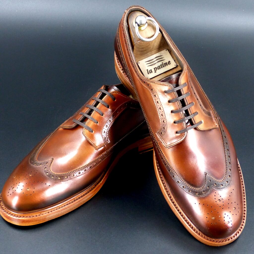
color name;
[ Akakuchiba]
赤朽葉
Long Wing-tip Derby

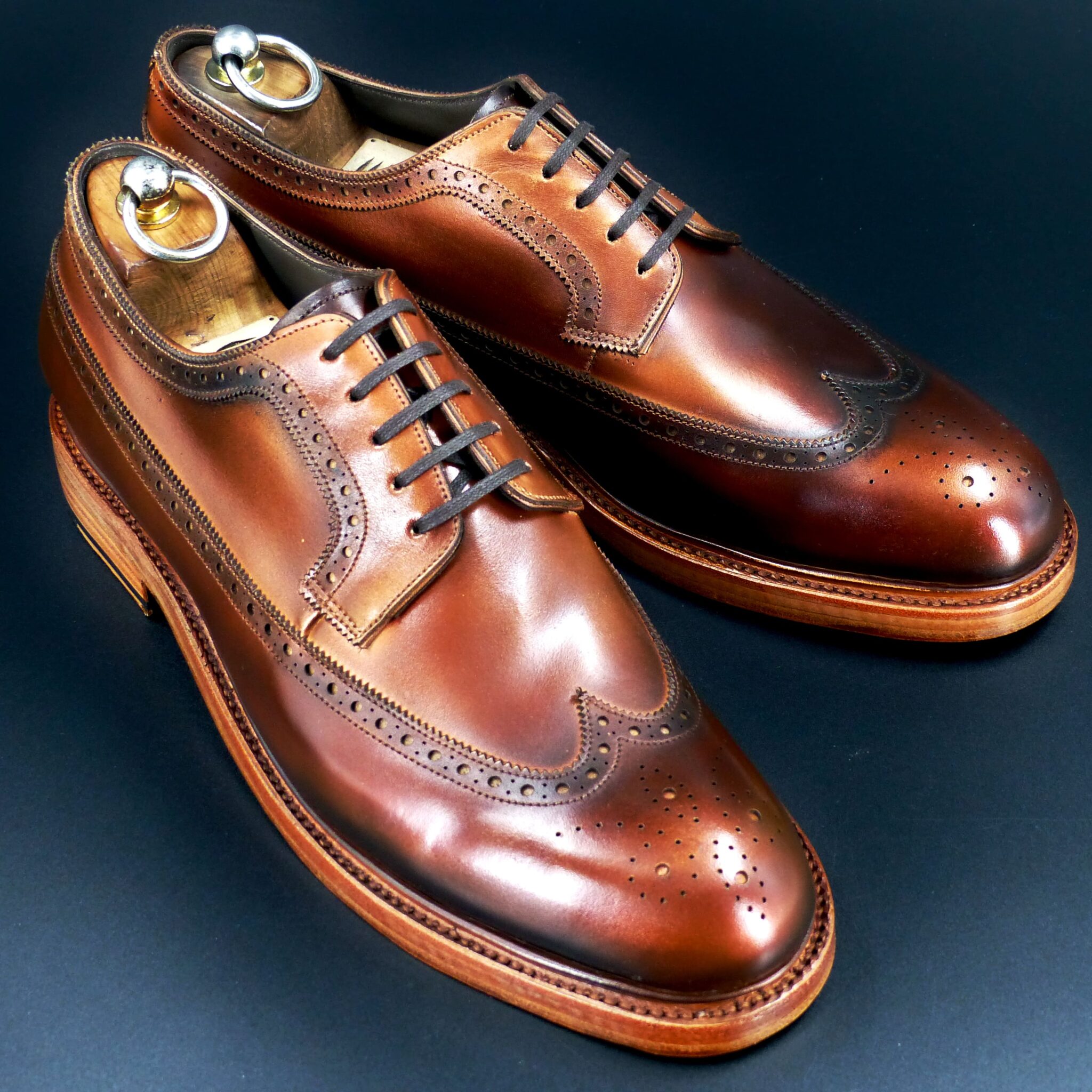
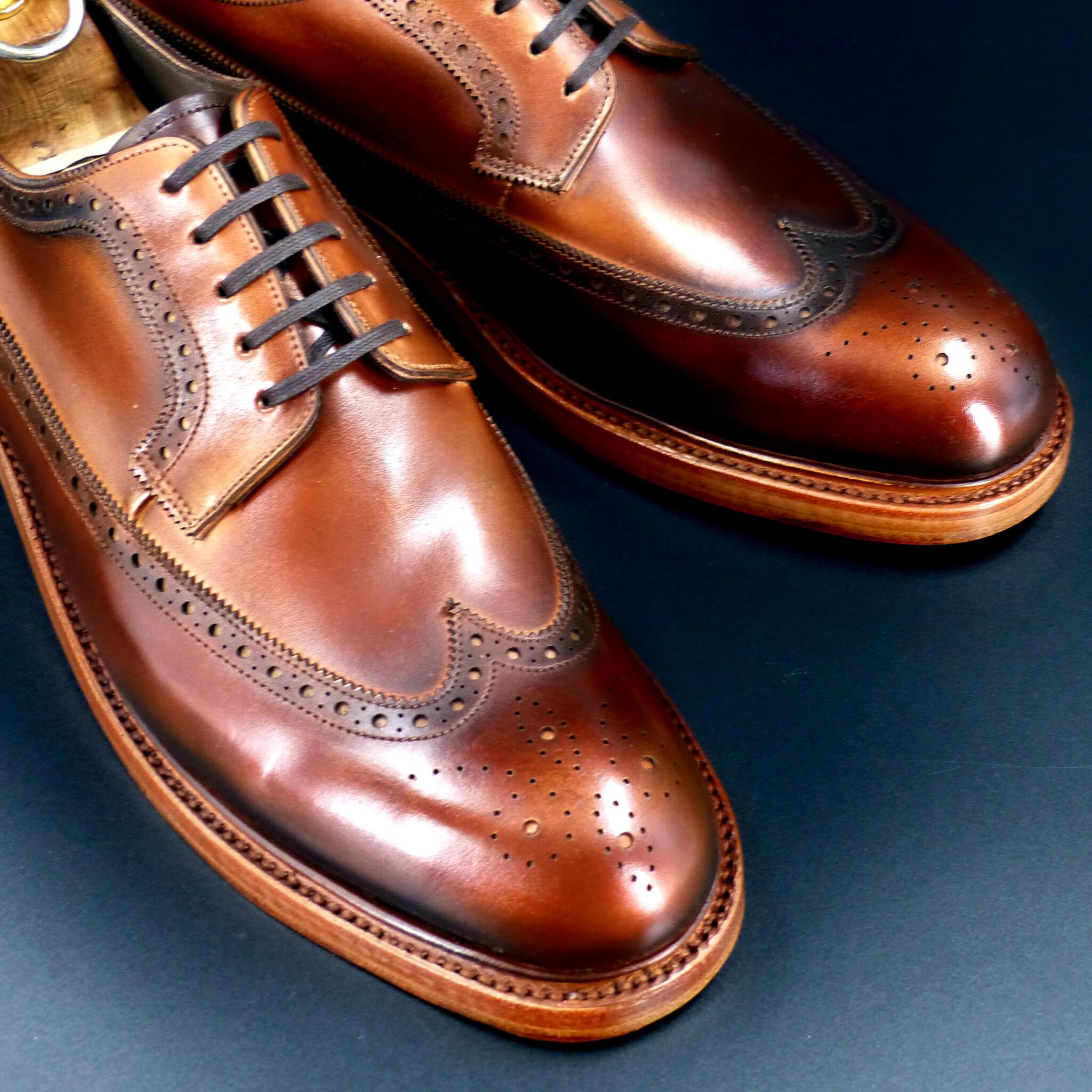
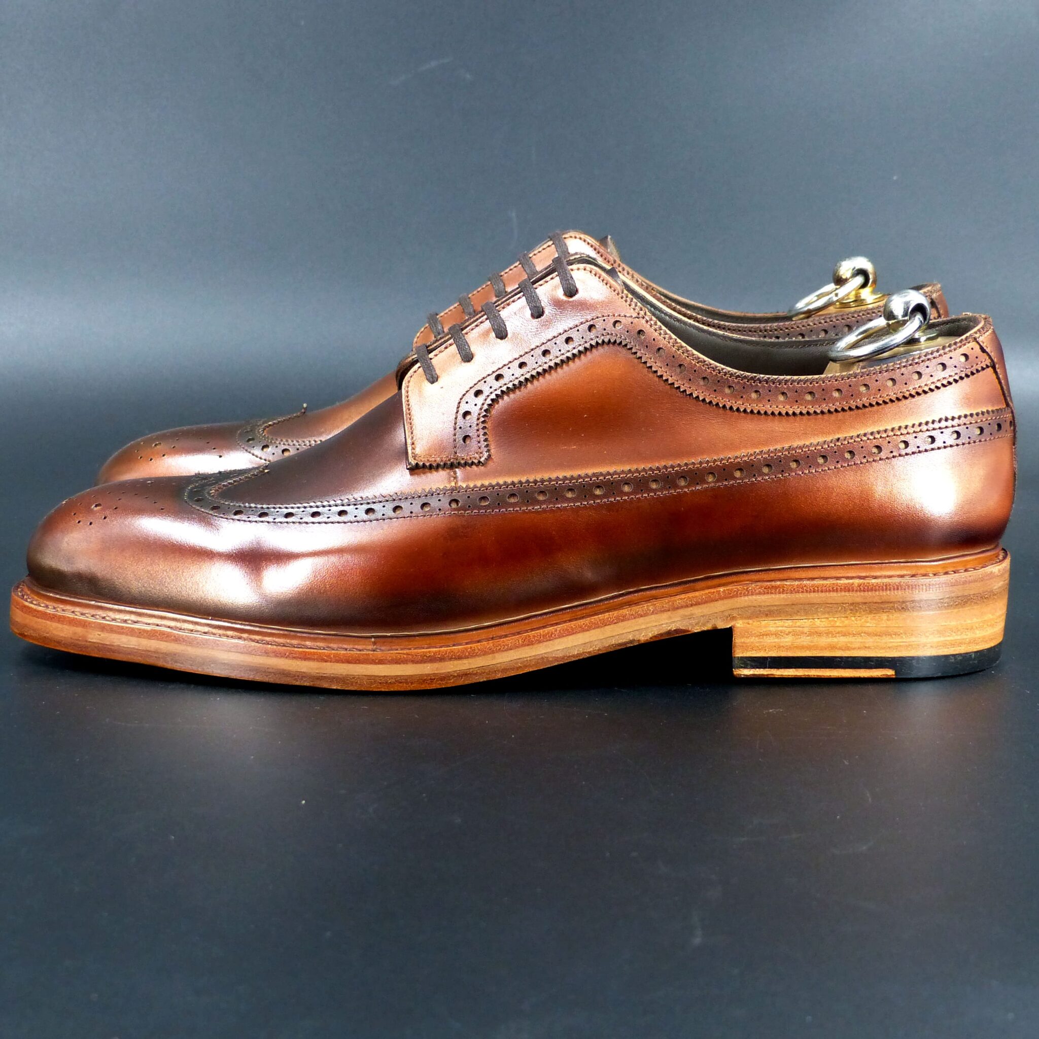
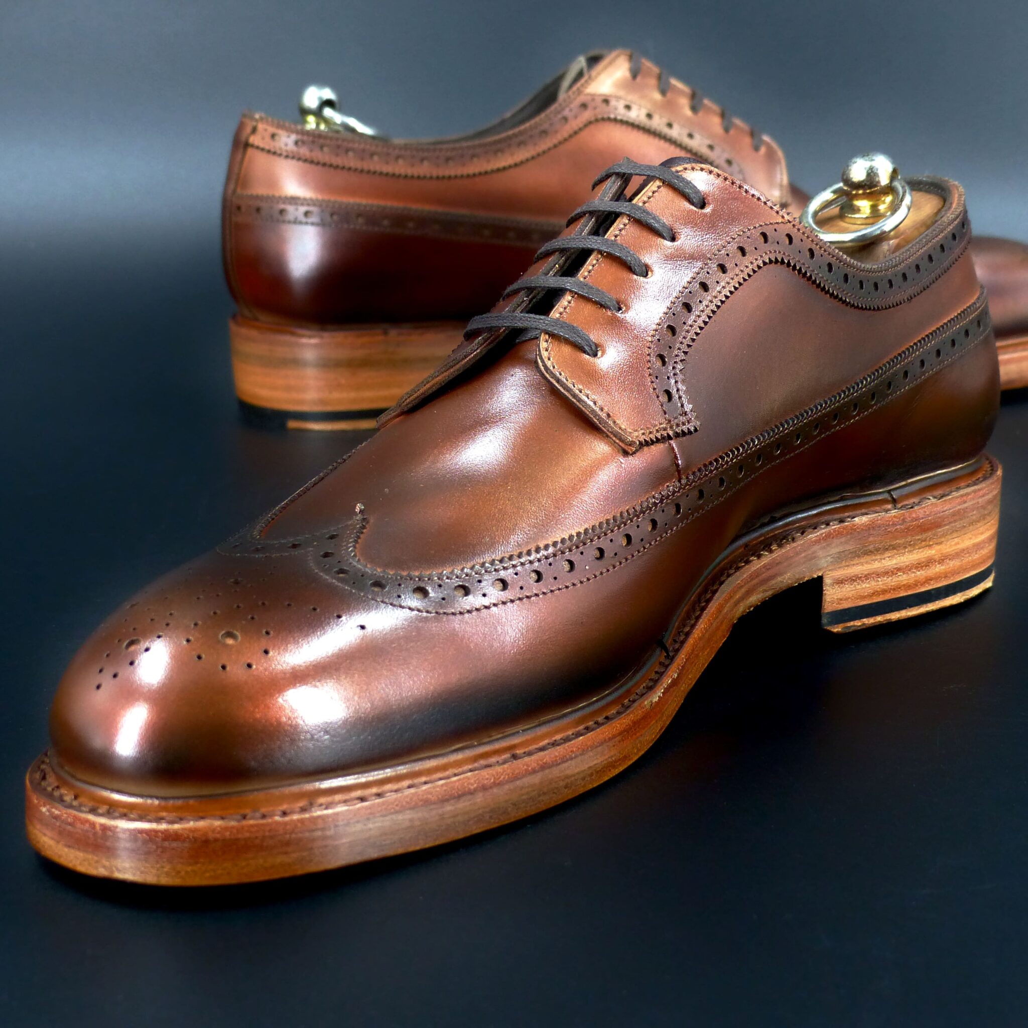
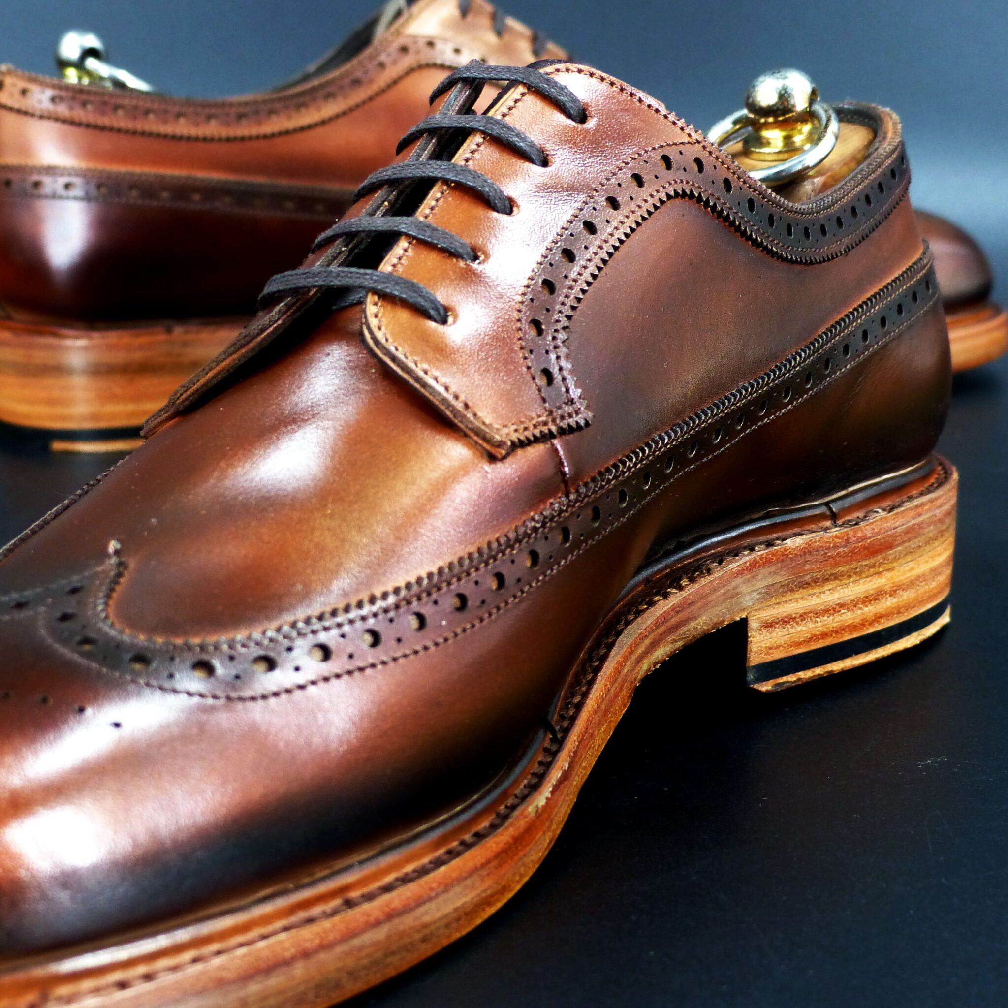
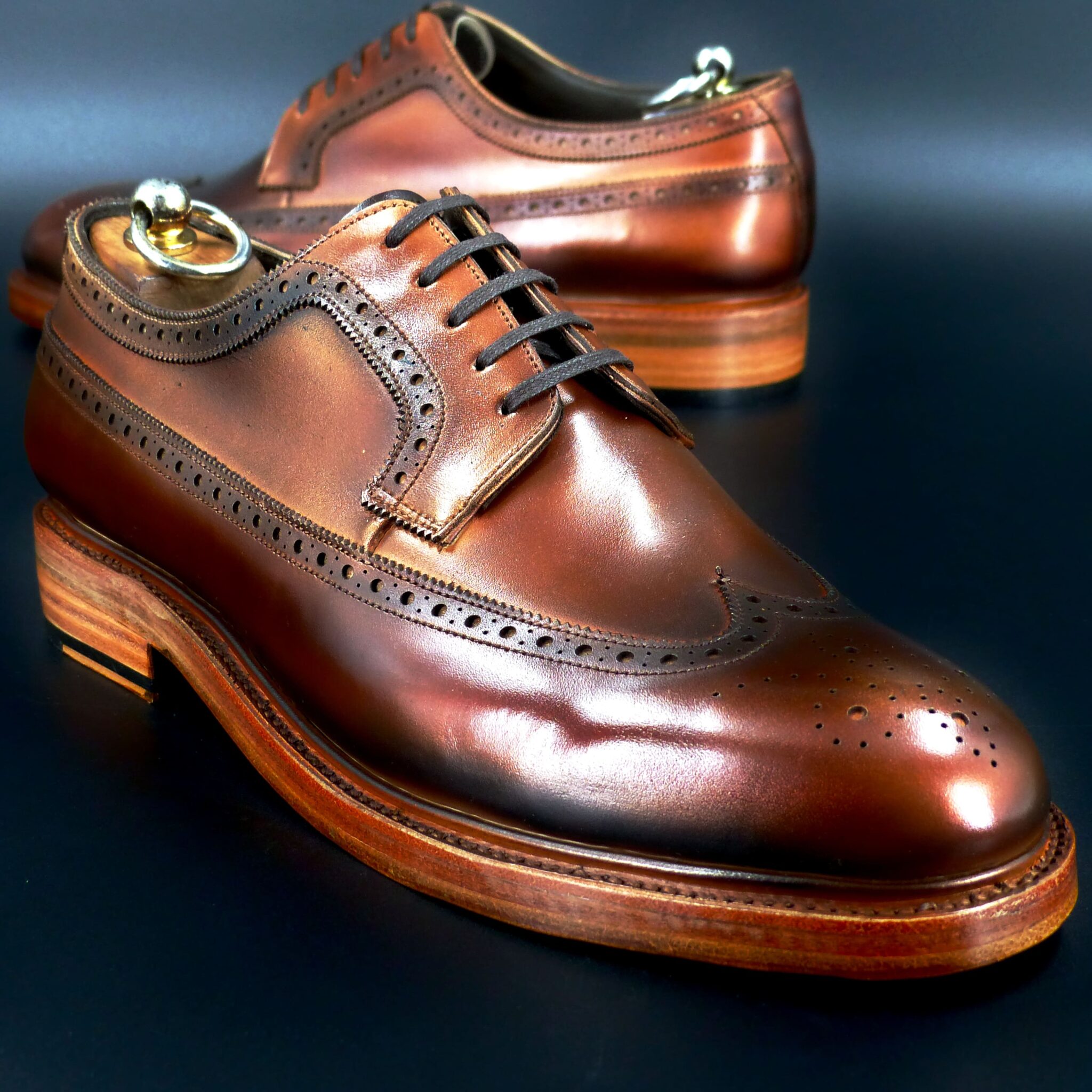
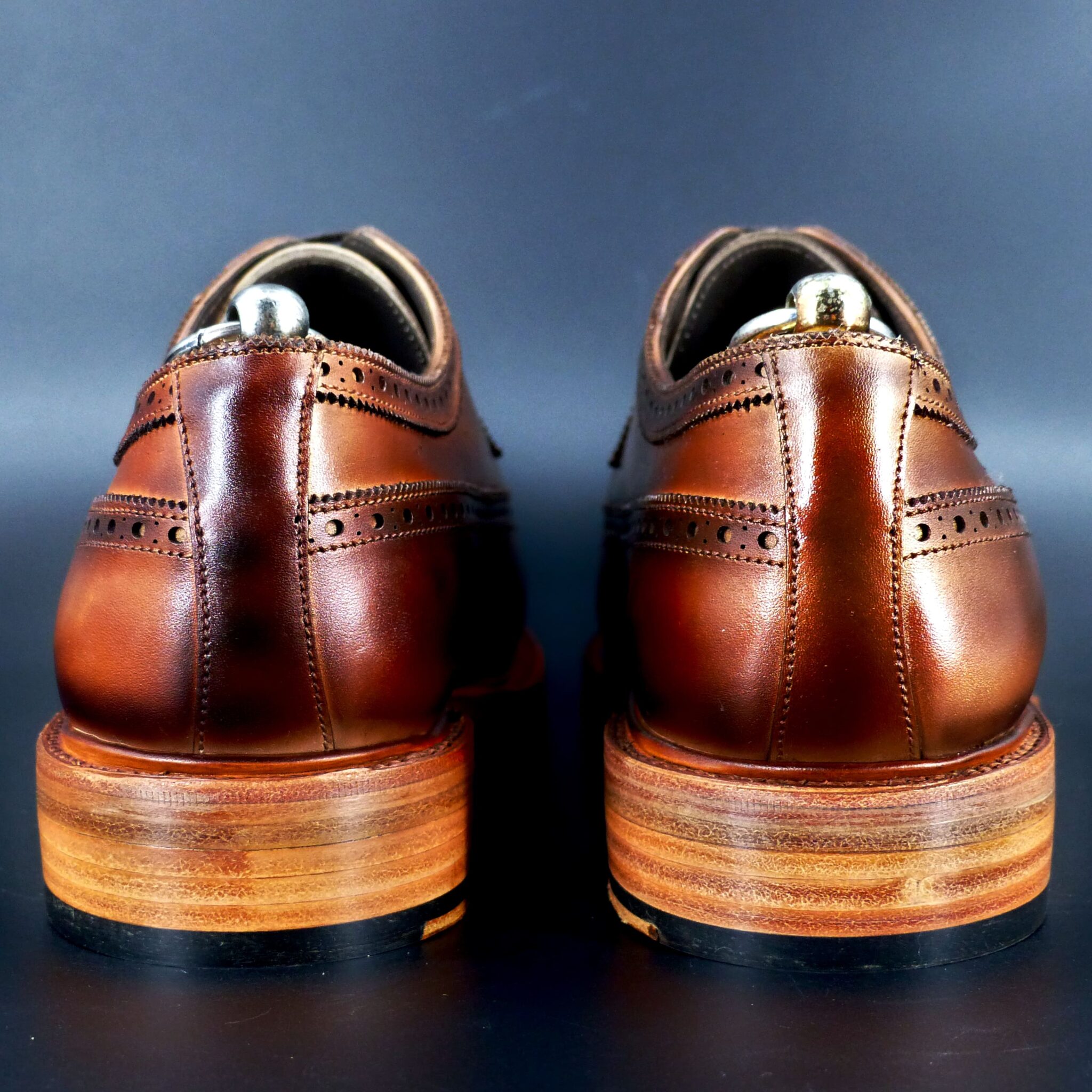

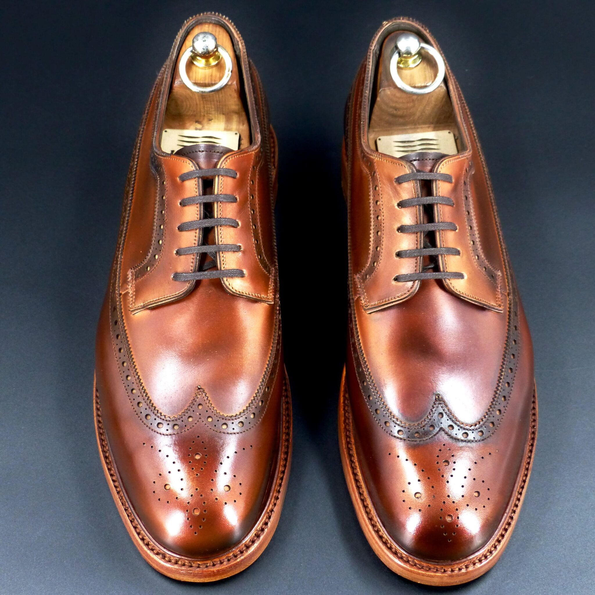
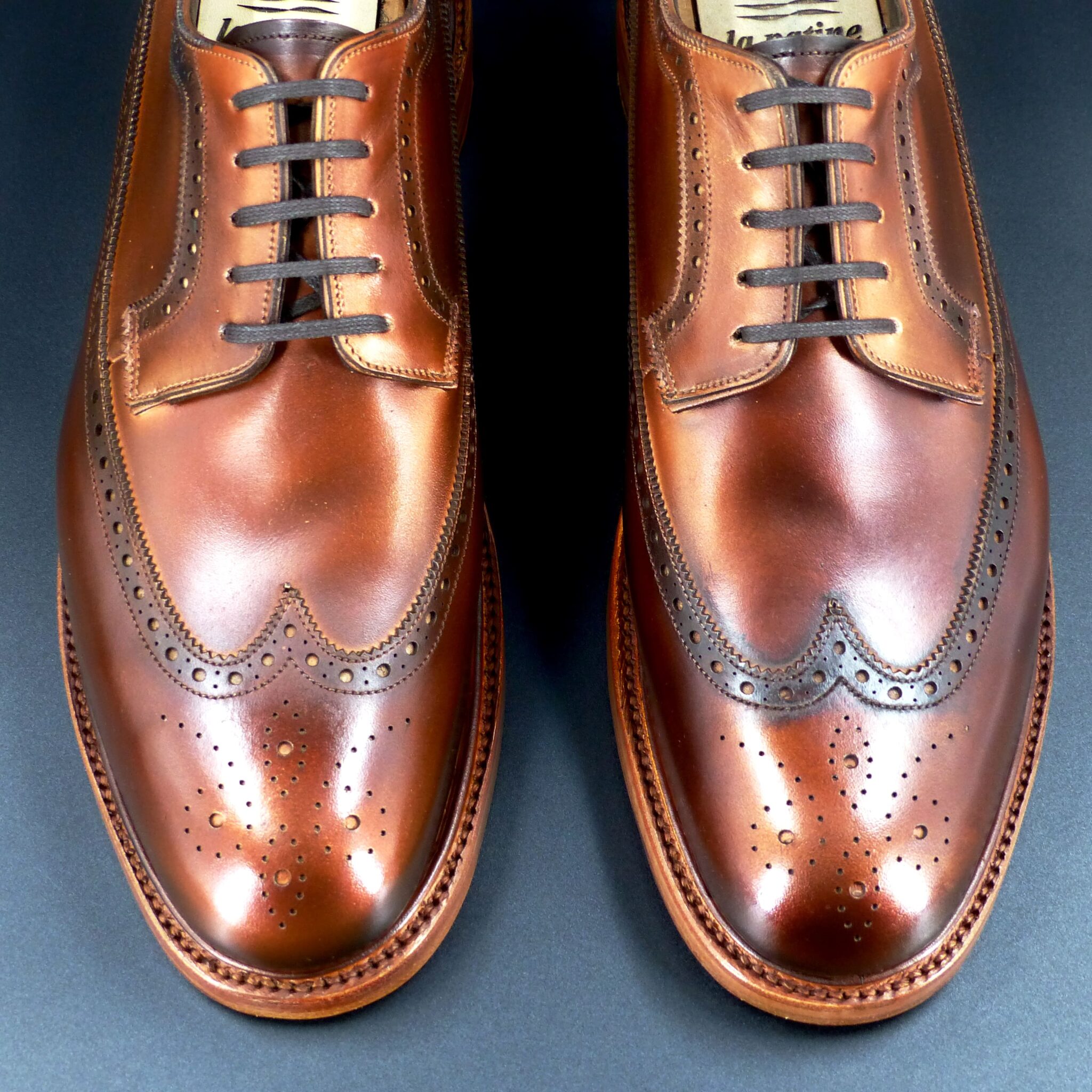
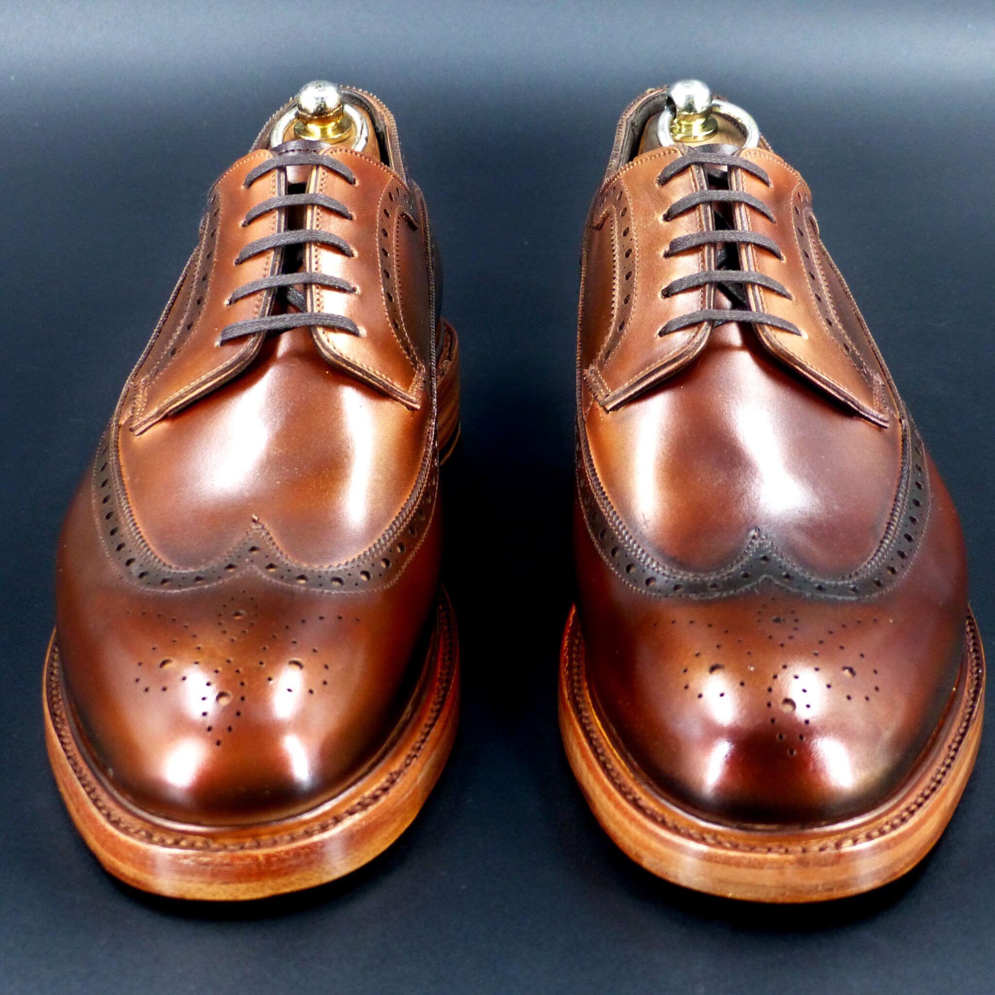
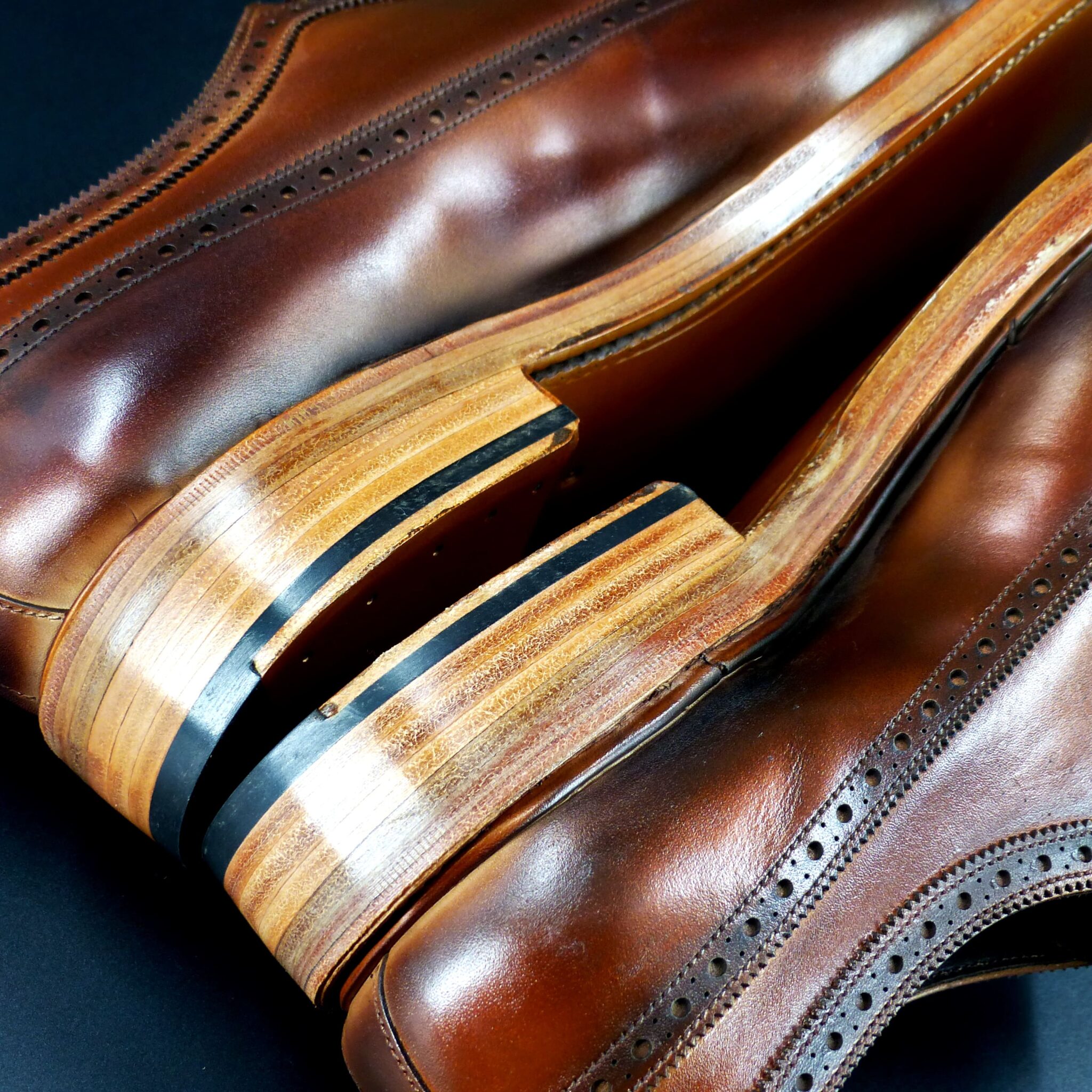
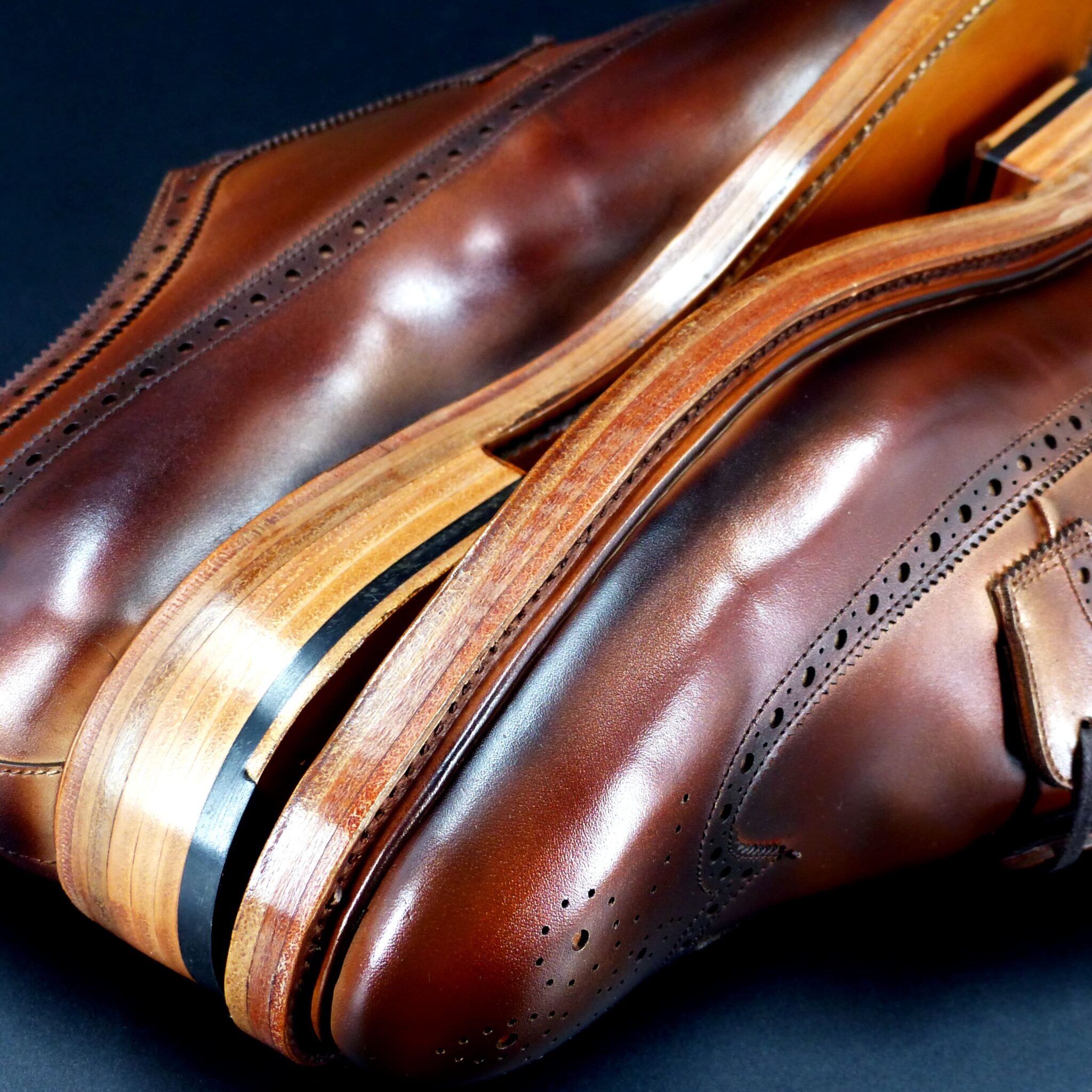
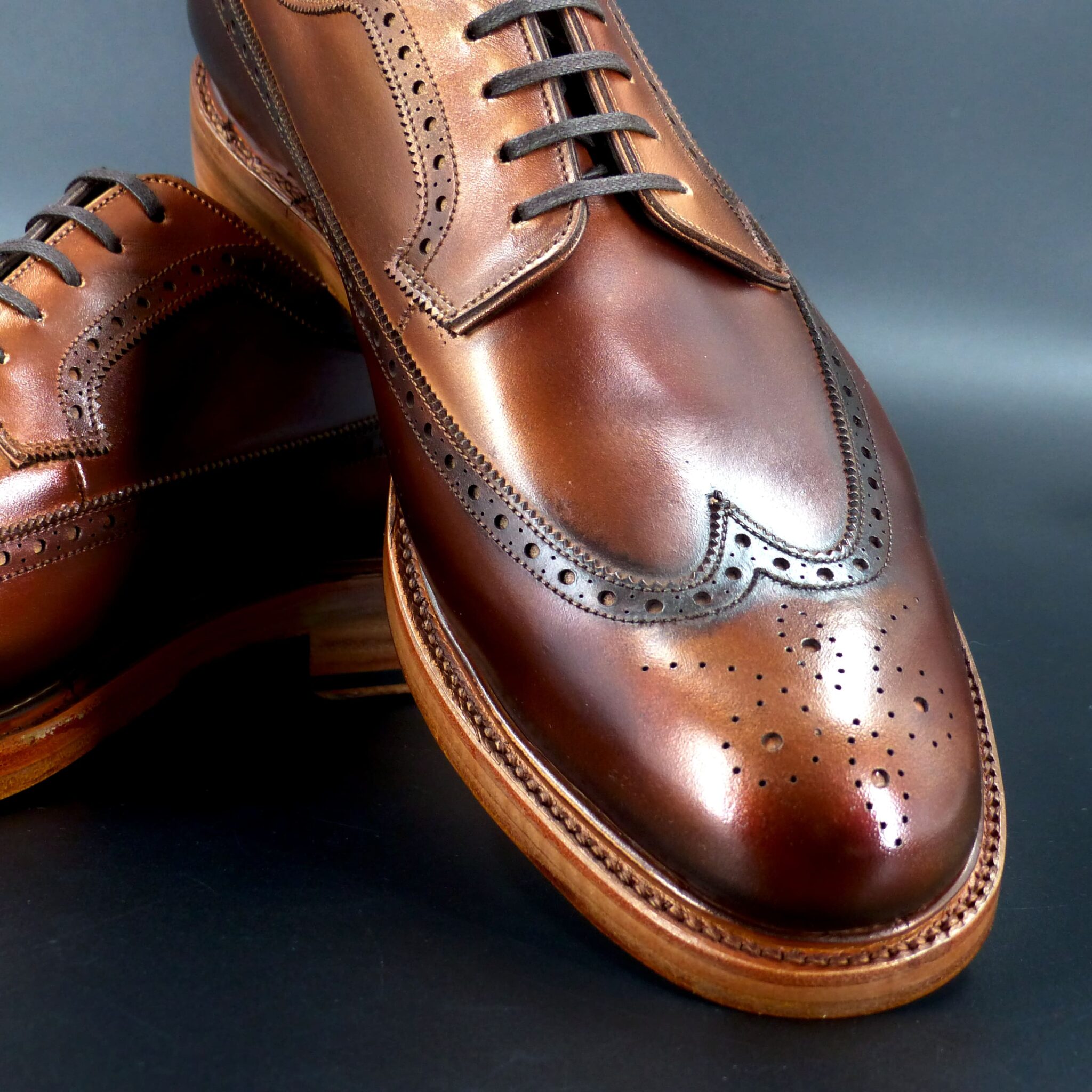
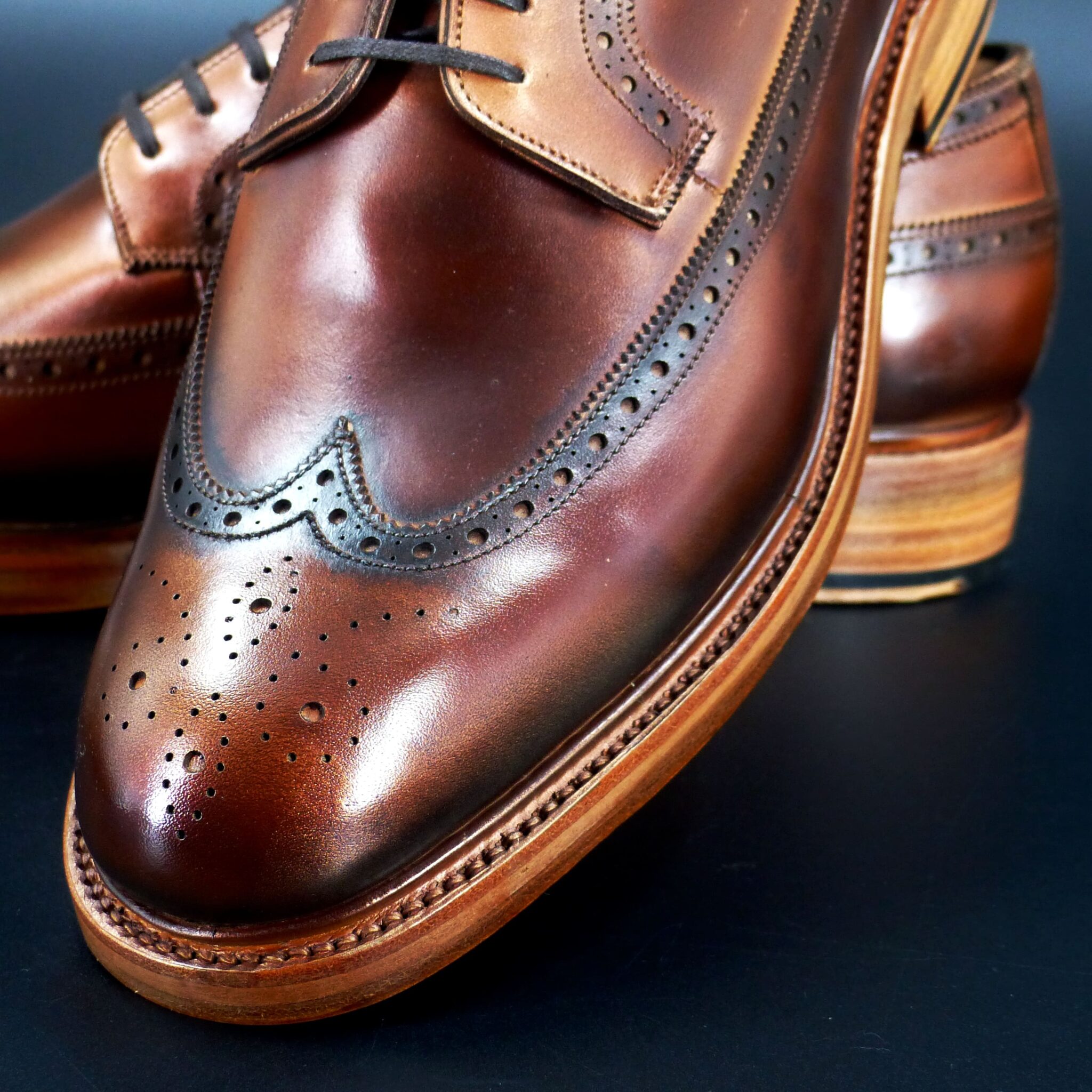
赤朽葉(あかくちば)――深まる秋の色です。
赤茶色に染まる朽葉のようなこの色名は、平安時代から伝わるものです。襲(かさね)の色目としては、表に経紅(たてくれない)と緯洗黄(ぬらしき)、裏には黄を配し、晩秋に赤く色づく朽葉の様子を表しています。
「朽葉色」と似ていますが、赤朽葉のほうがより華やかな印象を持ちます。単なる枯葉の色ではなく、秋が深まるにつれて鮮やかに燃えるような美しさを秘めています。
この色は、平安時代の文学にも登場します。『源氏物語』では「赤朽葉の羅(うすもの)のかざみ」として、『かげろふ日記』には「うすもののあかくちばをきたるを……」と記されています。
古の人々が愛し、秋の名残を映した色――それが赤朽葉です。
Akakuchiba (赤朽葉) – The Color of Deepening Autumn
Akakuchiba, a deep red-brown color reminiscent of decaying leaves in autumn, has been passed down since the Heian period. As part of the Kasane no Irome (layered color combinations), it pairs Tatekurenai (a rich crimson) and Nurashiki (a muted yellow) on the outer layers, while the inner layer features yellow, symbolizing the red leaves of late autumn.
Although similar to the color Kuchiba-iro (decayed leaf color), Akakuchiba is more vibrant and gives a more striking impression. It is not merely the color of withered leaves but carries the beauty of autumn’s vivid flames as the season deepens.
This color also appears in Heian literature. In The Tale of Genji, it is described as “Akakuchiba no ra” (a thin robe of red-decayed leaf color), and in The Kagero Diary, it is mentioned as “a garment of thin fabric in akakuchiba…”
Akakuchiba is a color that reflects the nostalgia of autumn and was cherished by ancient people, symbolizing the passing beauty of the season.
ダブル・モンク

color name;
[ Yamabuki-Gasane]
山吹襲
Double Monk
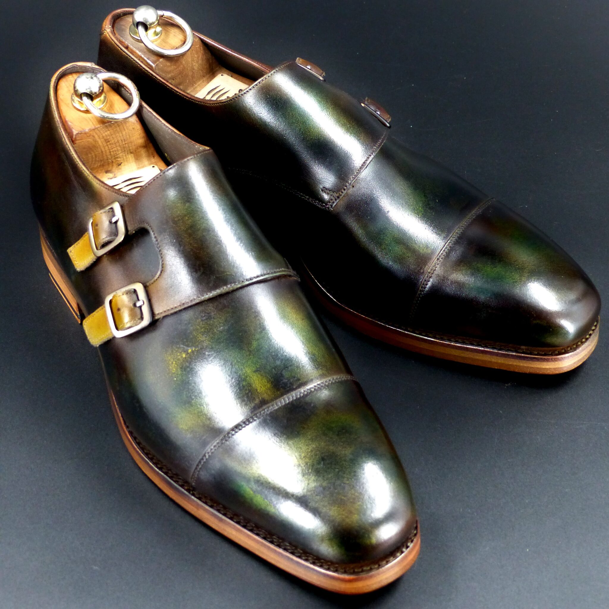
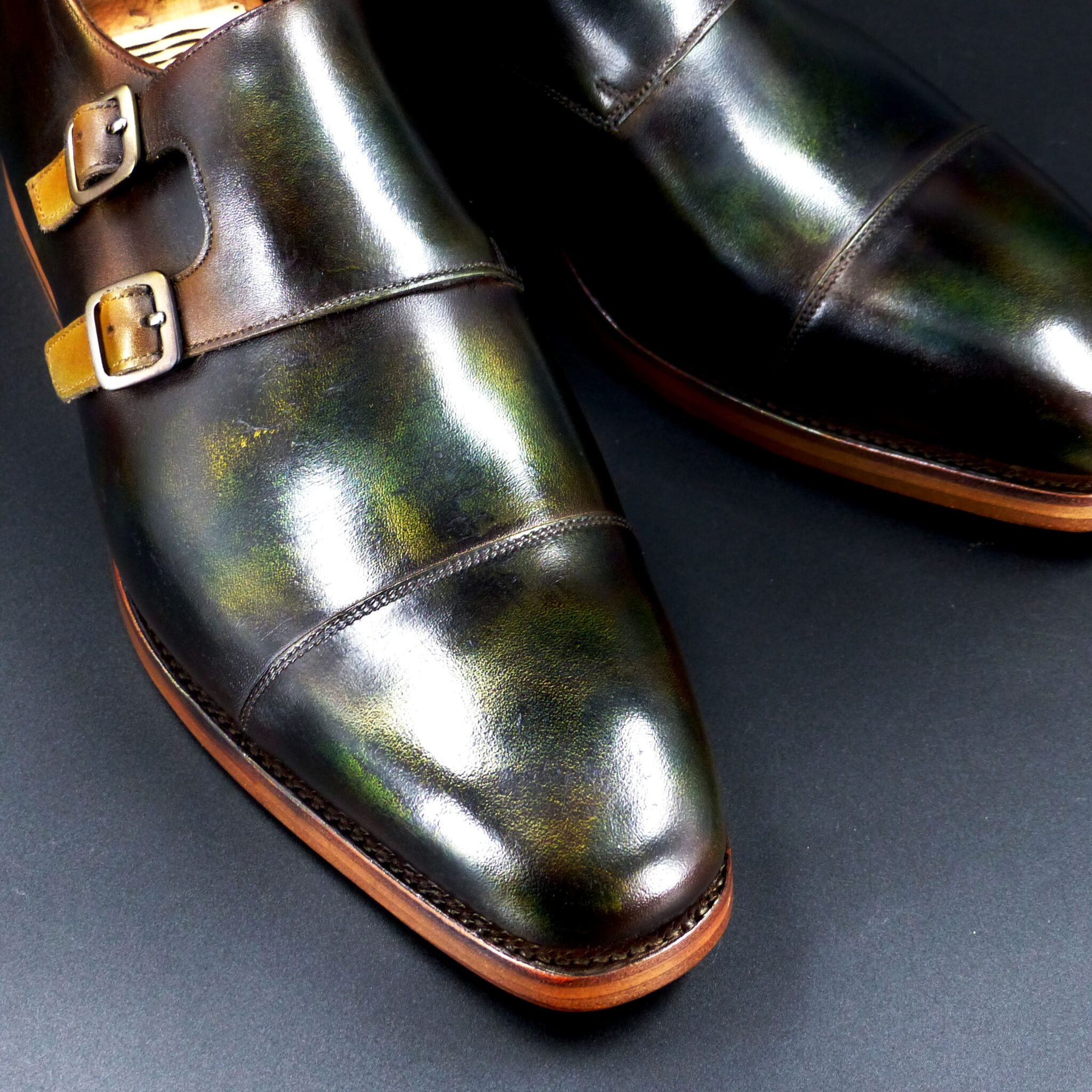
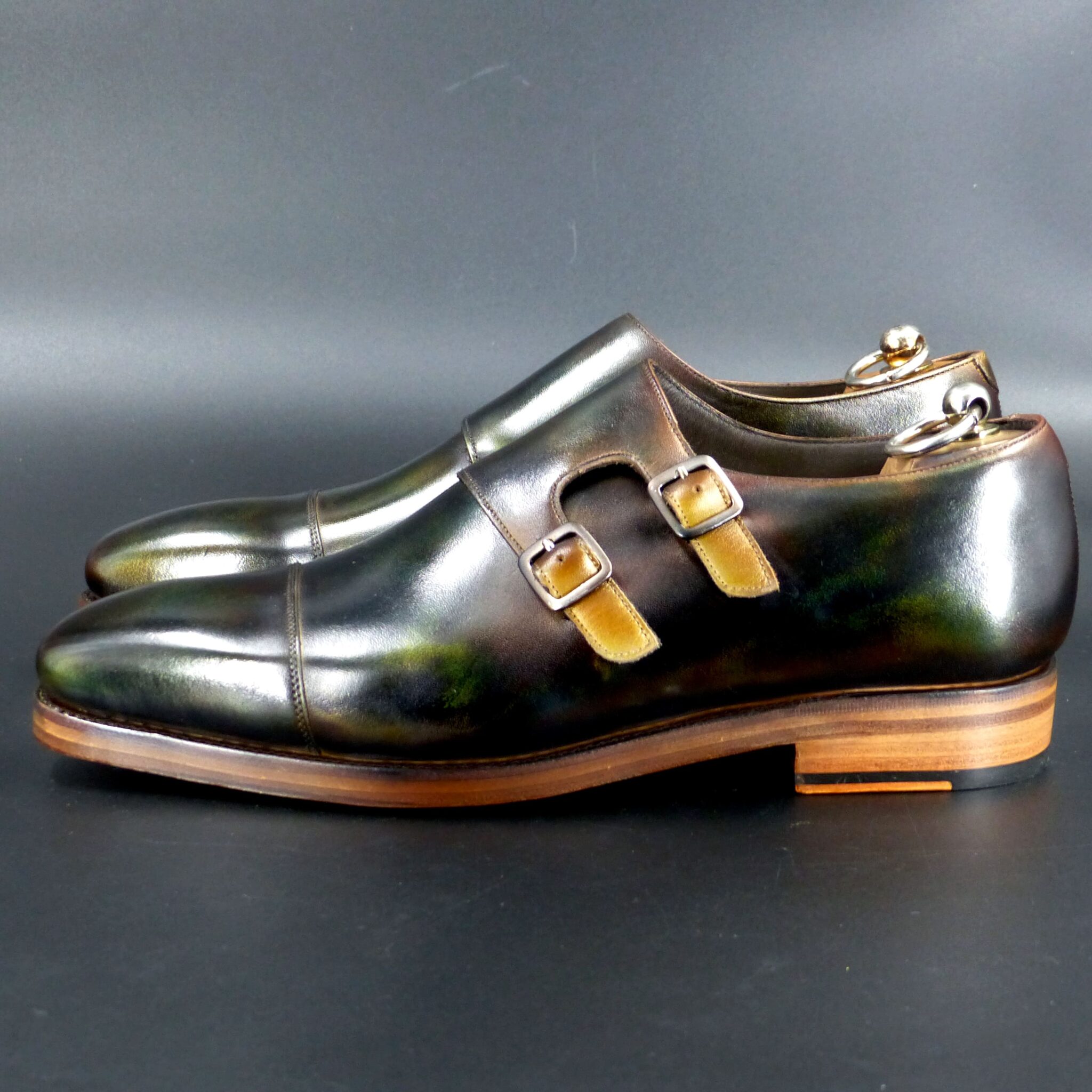
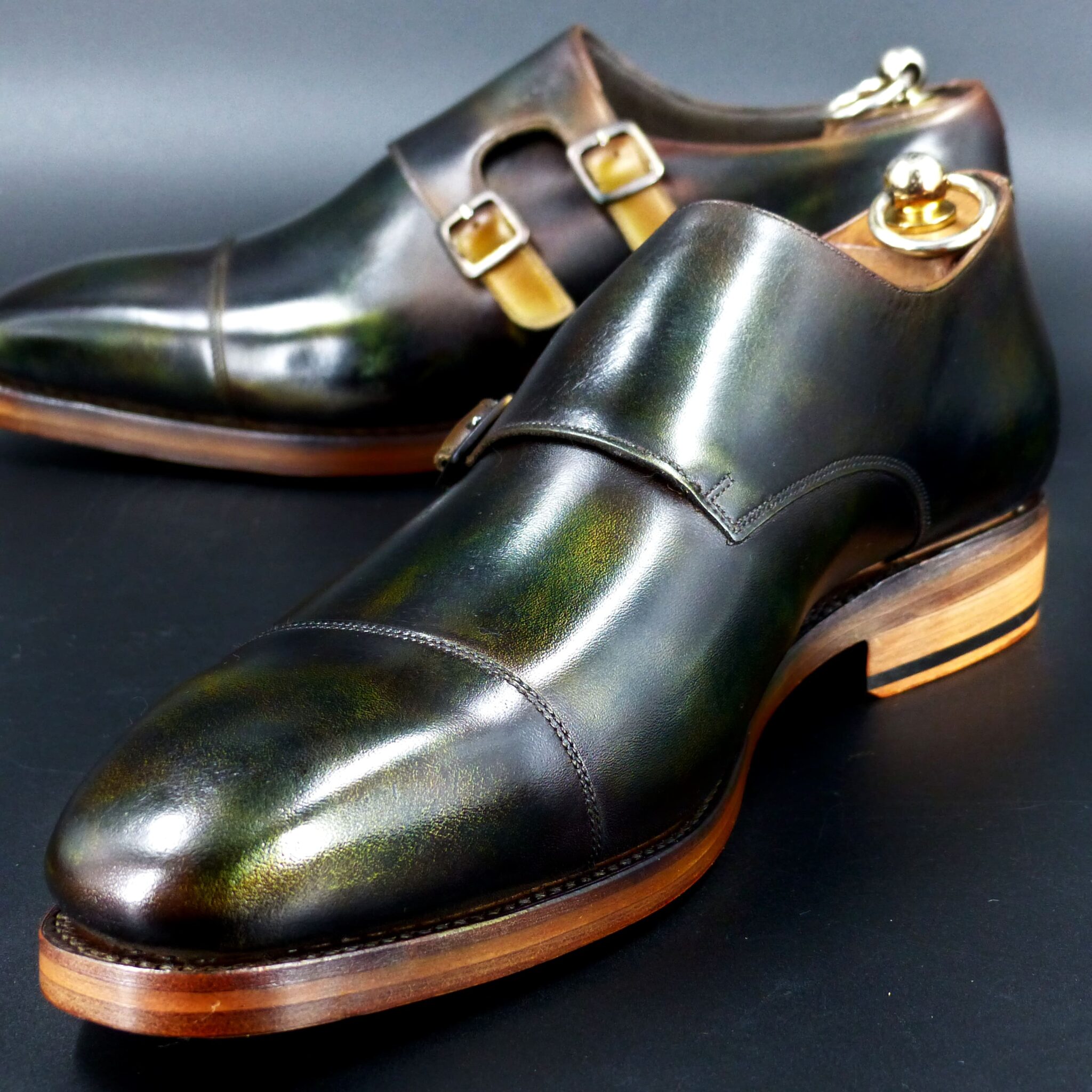
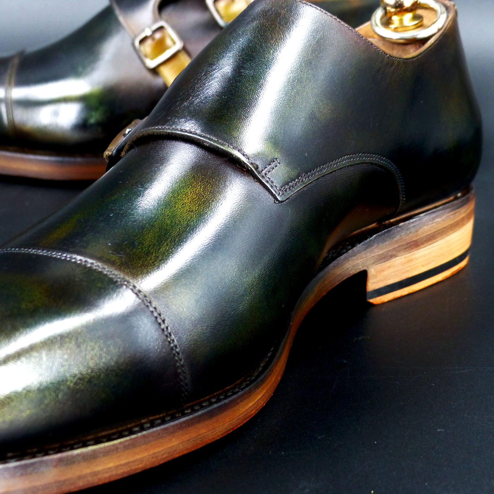
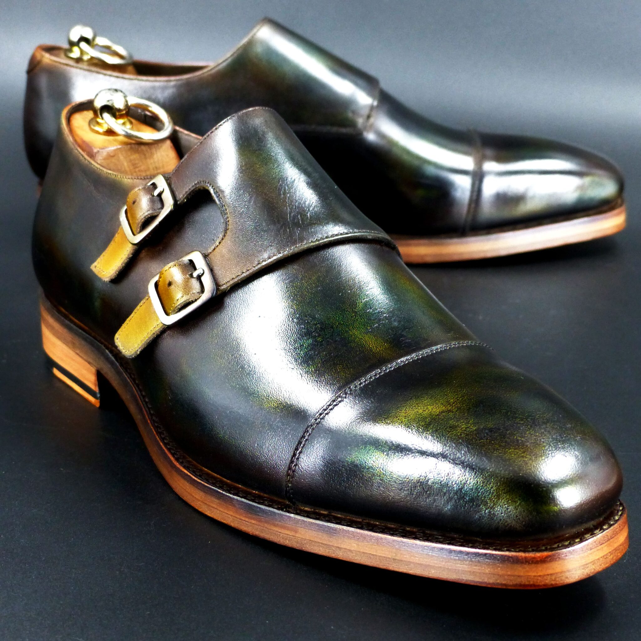
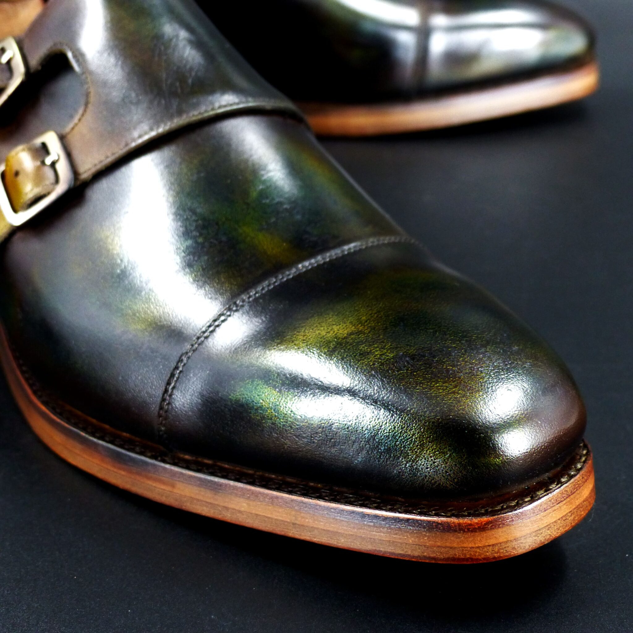
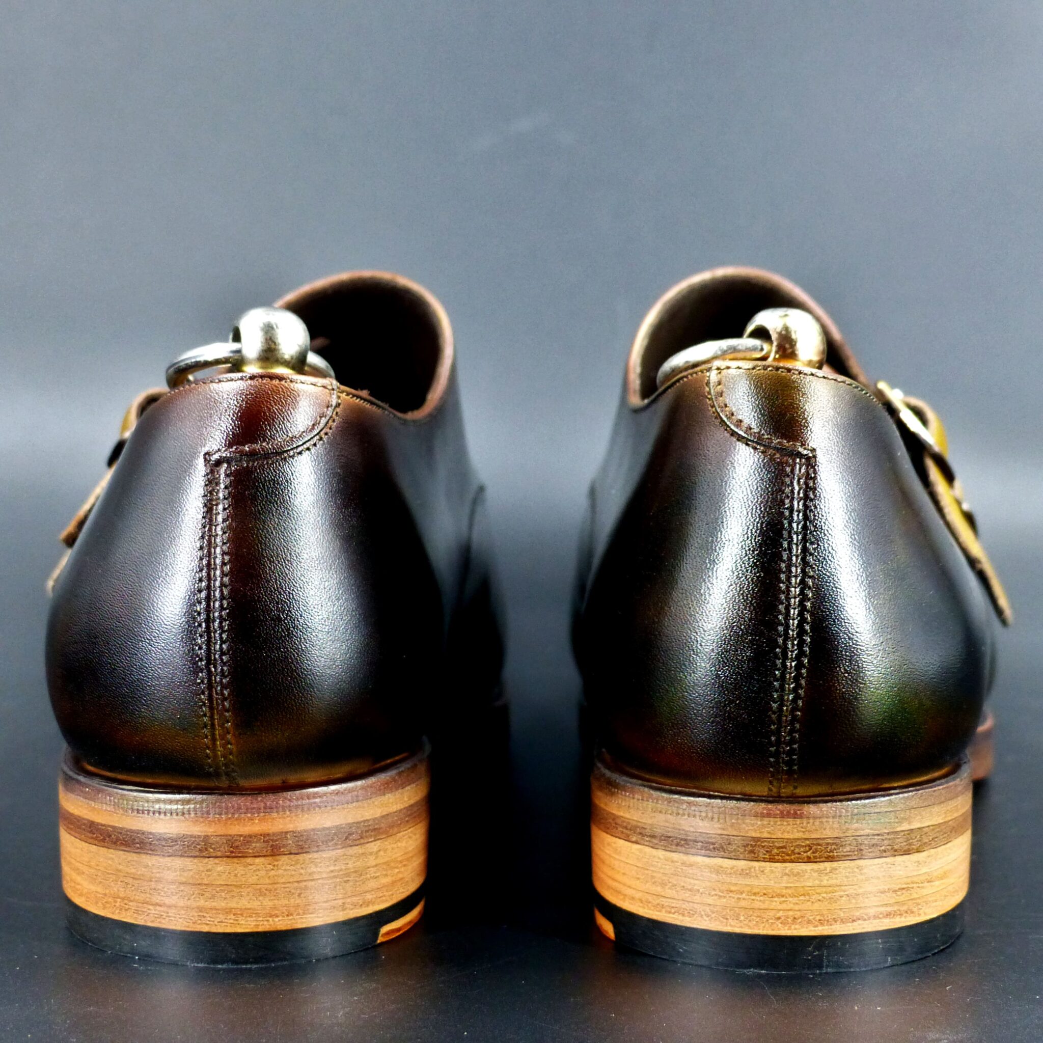

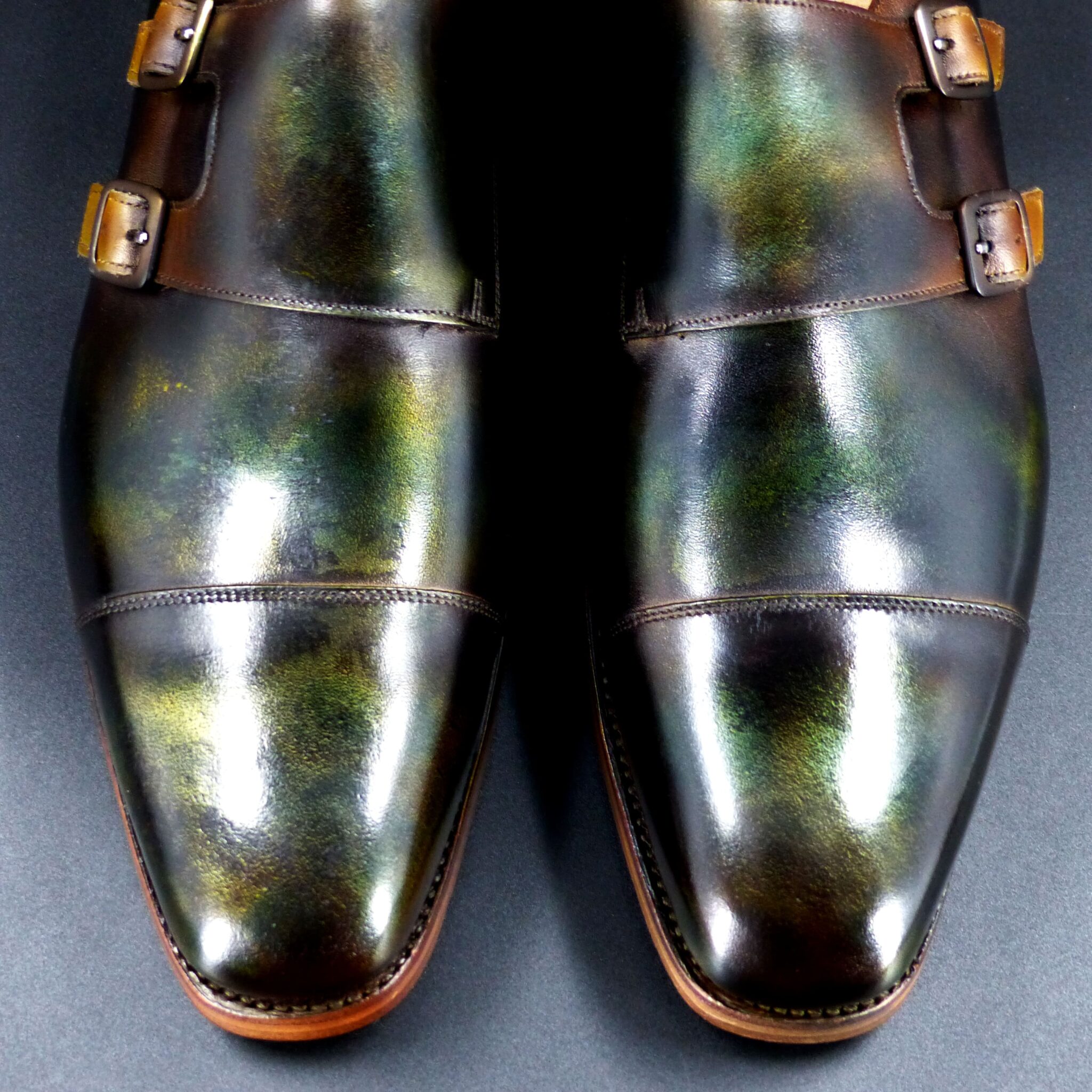
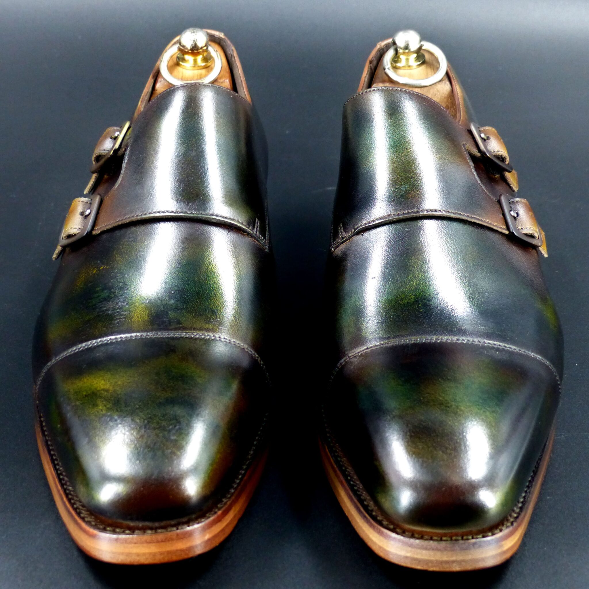
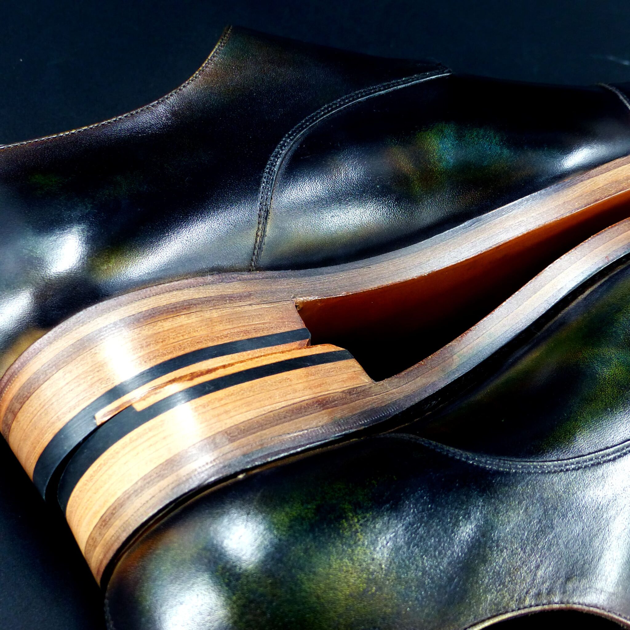
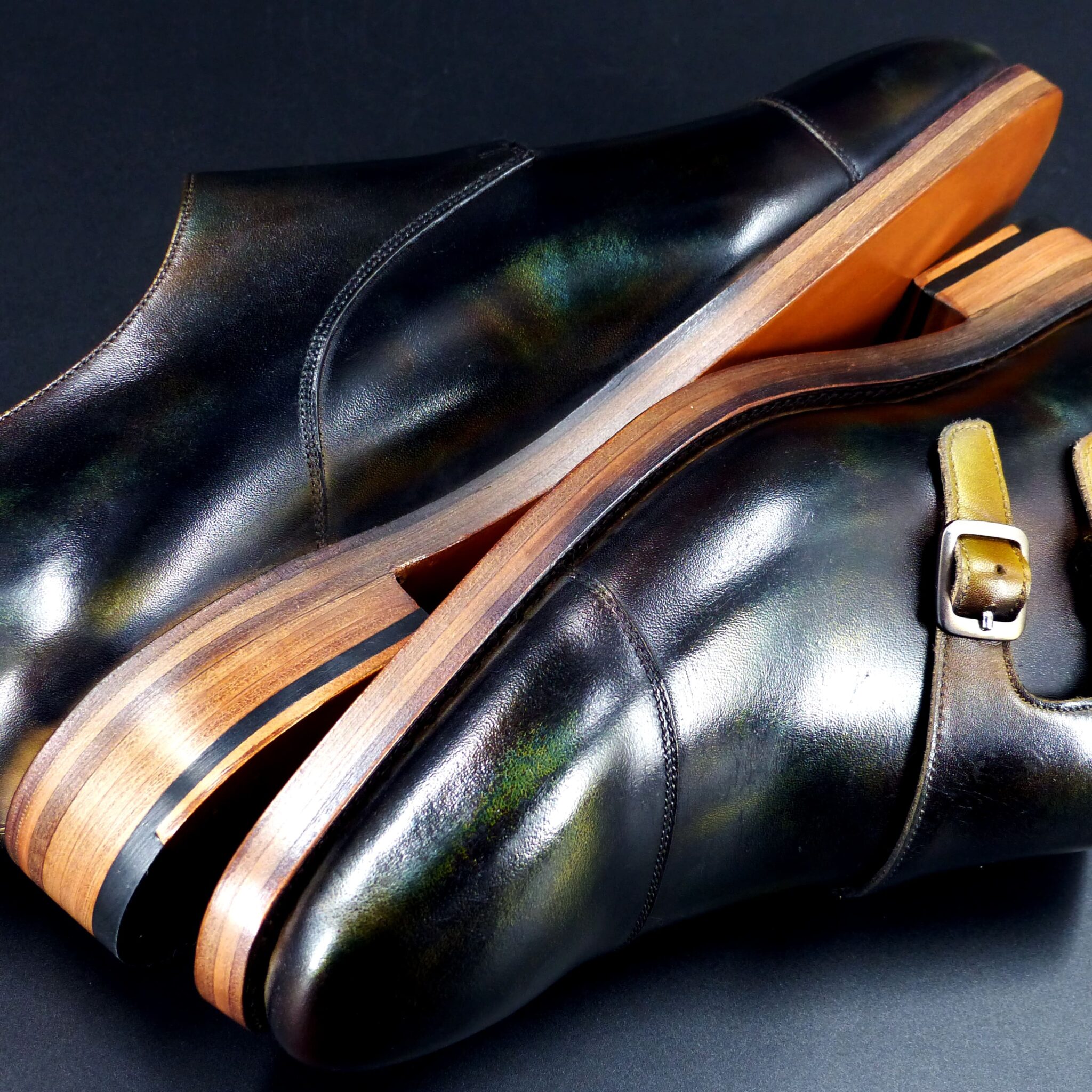
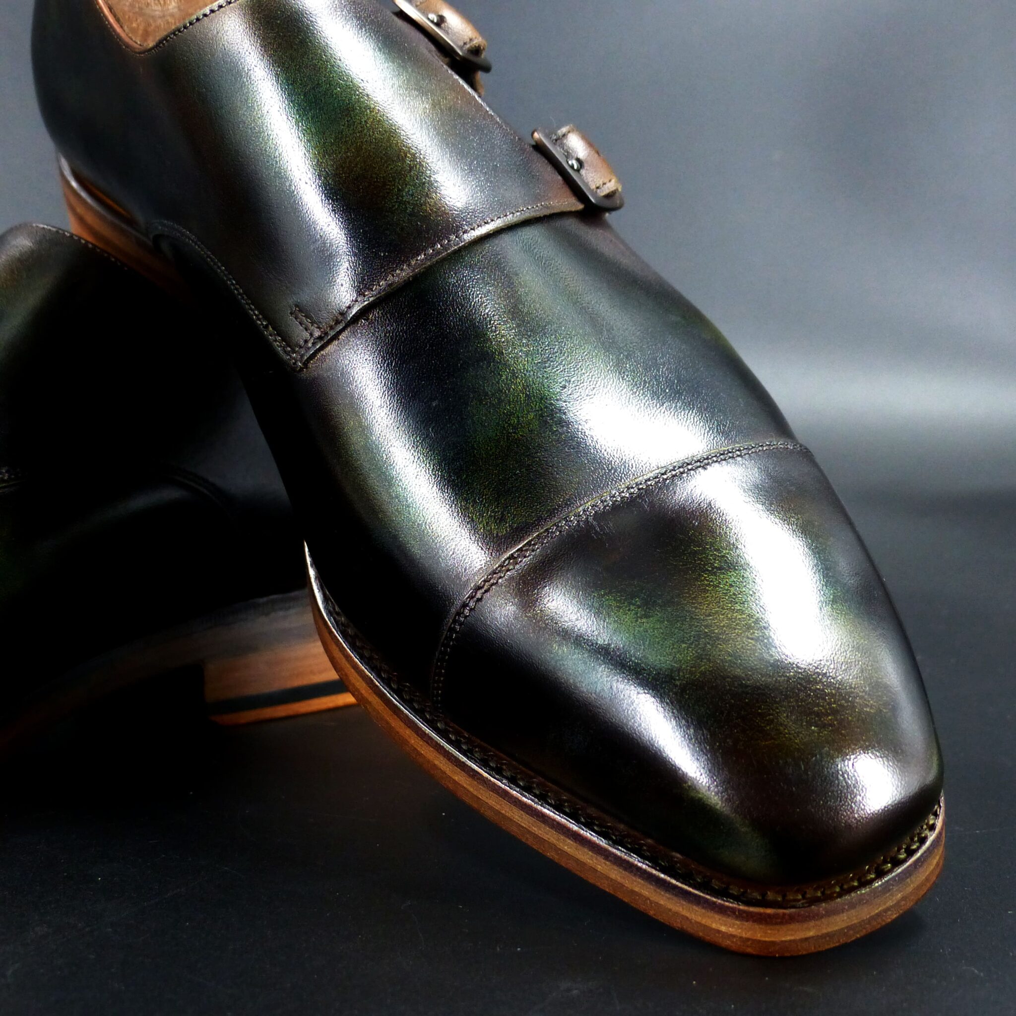
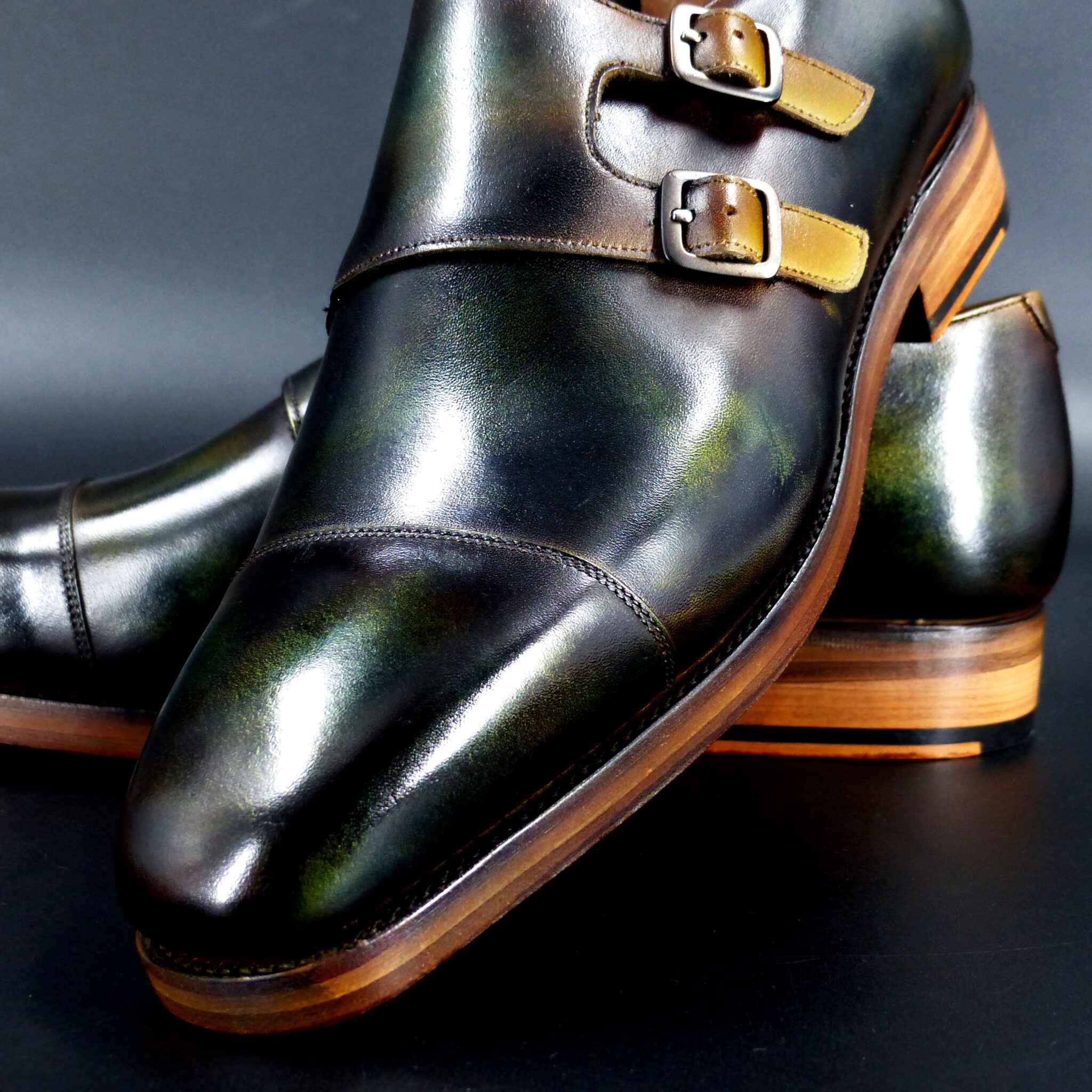

●山吹襲とは●
山吹襲は、平安時代の装束の「襲(かさね)の色目」のひとつで、春に咲く山吹の花の鮮やかな黄色と、その葉の緑色を表現した配色です。春の陽光に映える山吹の花と、新緑の葉の取り合わせを衣装に反映させた、華やかで温かみのある色の組み合わせです。
ー山吹襲の色構成ー
表(おもて):山吹色(明るい黄色・金色がかった黄色)
裏(うら):緑(若草色や萌黄色)
このように、外側には黄色を、内側には緑を配することで、風が吹いたときや袖口から、山吹の花と葉が重なったような美しい色の対比が生まれるのです。
▴山吹襲の象徴するもの▴
春の訪れと生命の息吹
華やかさと上品さの調和
源氏物語「竹河」に登場し、貴族の美意識を象徴
特に『源氏物語』では、「竹河」の場面で描かれ、桜を眺める女性たちの衣装として登場します。春の優雅な情景を引き立てる、鮮やかでありながら品のある色の重なりとして、平安貴族たちに愛されました。
山吹襲は、単なる黄色と緑の組み合わせではなく、春の空気や光までも映し出す、繊細な美意識の結晶なのです。
Yamabuki-gasane (山吹襲) – The Layered Colors of Yamabuki
Yamabuki-gasane is one of the Kasane no Irome (layered color combinations) from the Heian period, representing the vivid yellow of the yamabuki (Japanese kerria) flower and the green of its leaves. This color combination reflects the bright yellow of the flower and the fresh green of the leaves, capturing the vibrancy of spring sunlight and the harmonious blend of nature’s hues in a garment. It creates a lively, warm, and elegant visual effect.
Color Composition of Yamabuki-gasane
- Outer layer (omote): Yamabuki-iro (bright yellow, tinged with gold)
- Inner layer (ura): Green (young grass color or pale green)
By placing yellow on the outside and green on the inside, the combination creates a beautiful contrast, as if the yamabuki flower and its leaves overlap, especially when wind rustles the fabric or when seen from the sleeve openings.
What Yamabuki-gasane Symbolizes
- The arrival of spring and the breath of life
- A harmonious balance of vibrancy and elegance
- The symbol of noble aesthetic values, as depicted in The Tale of Genji
In particular, The Tale of Genji features this color in the “Takekawa” (Bamboo River) chapter, where women watching the cherry blossoms wear garments in this color combination. The vibrant yet refined overlapping hues highlight the graceful spring scenery, and the color became beloved by Heian aristocrats.
Yamabuki-gasane is not simply a combination of yellow and green; it is a delicate embodiment of the spring atmosphere, capturing both the light and air of the season, and reflecting the refined beauty of the time.
ダブル・モンク

color name;
[ Dousabi-Iro]
銅錆色
Double Monk
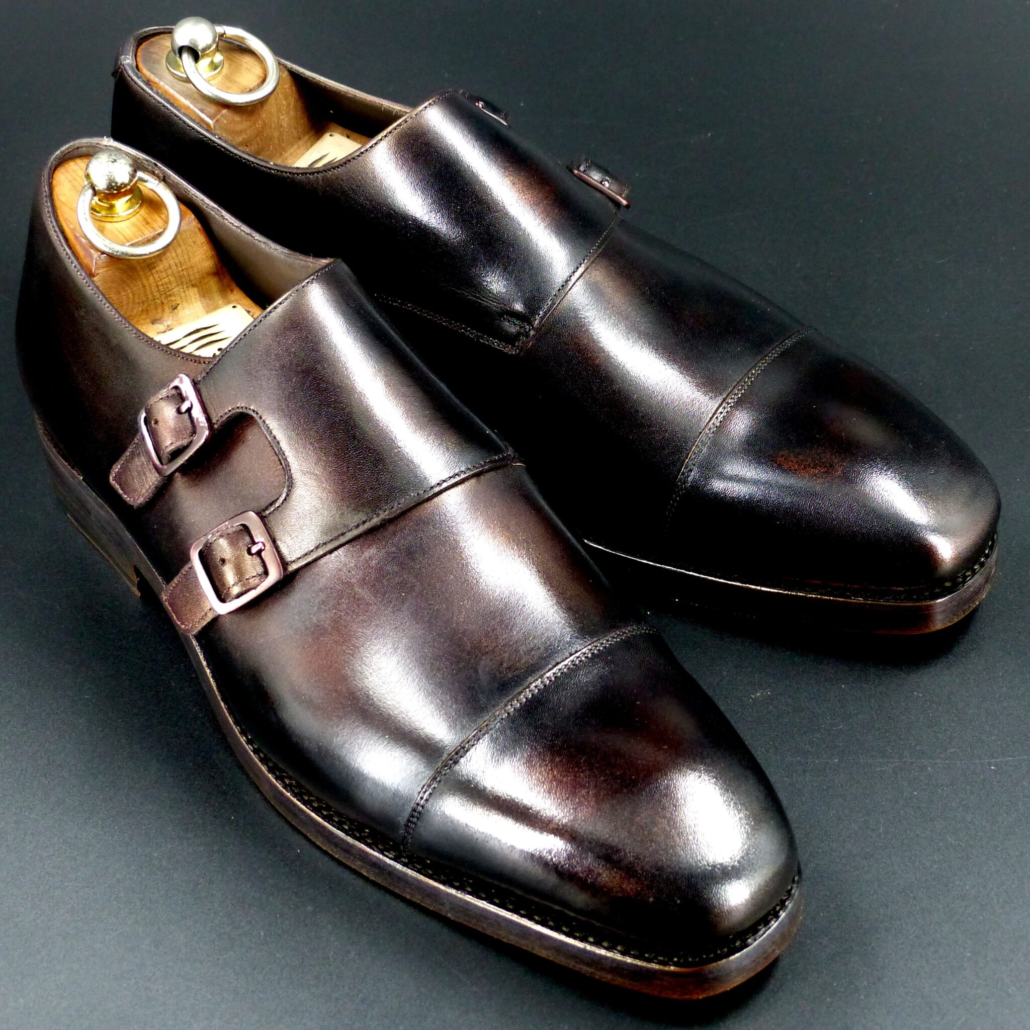
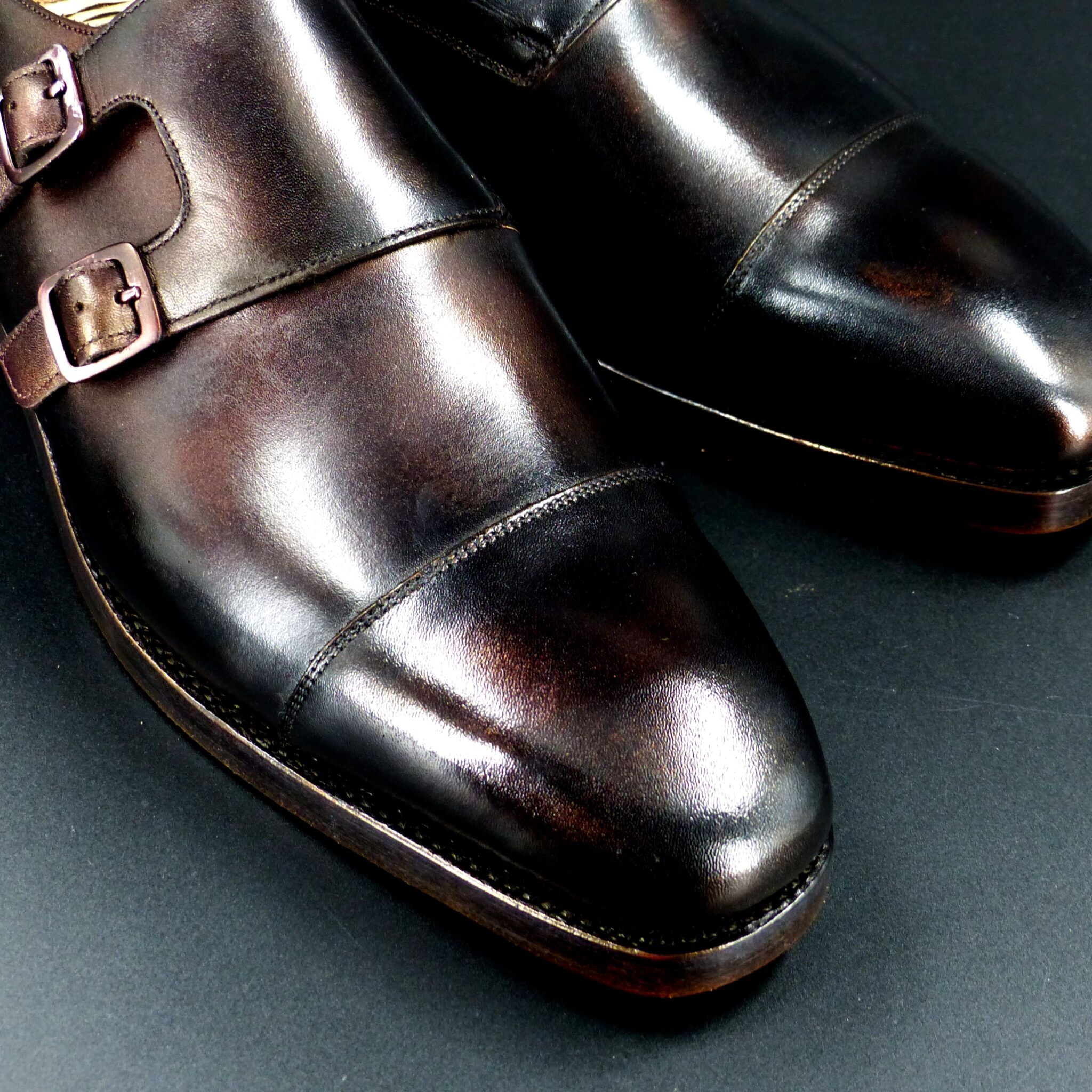
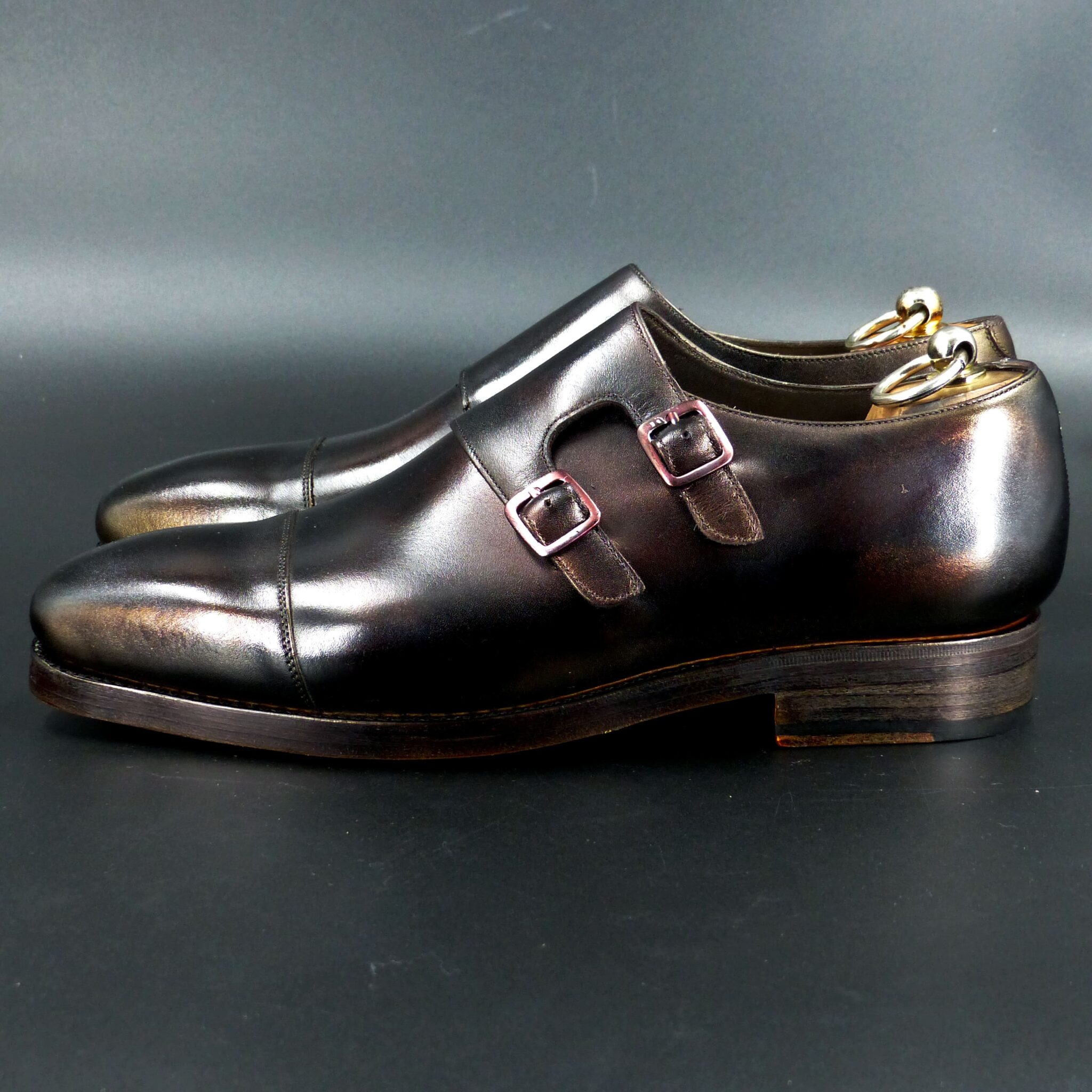
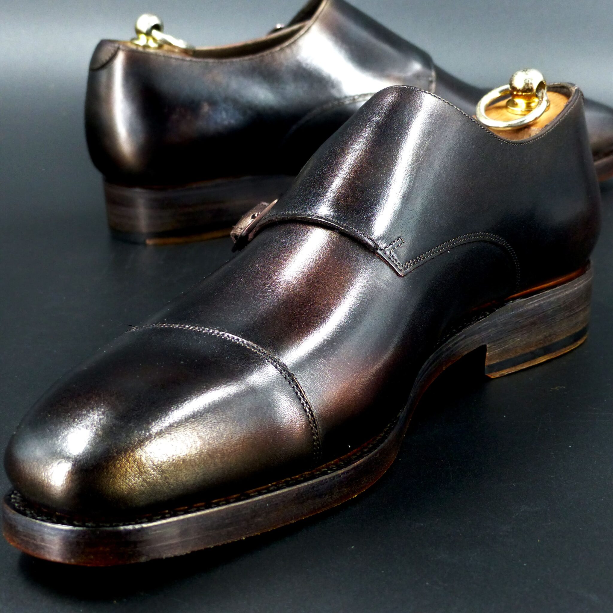
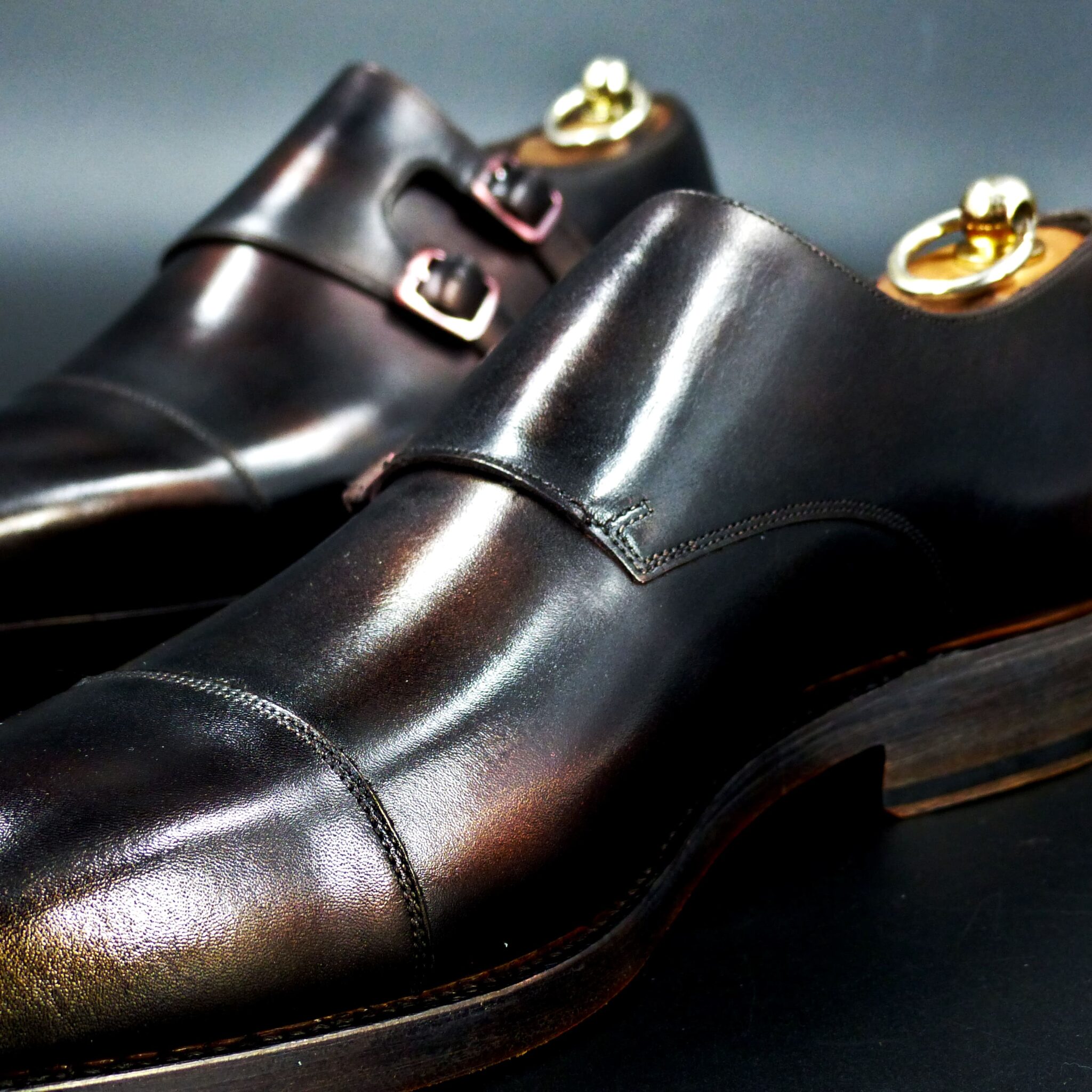
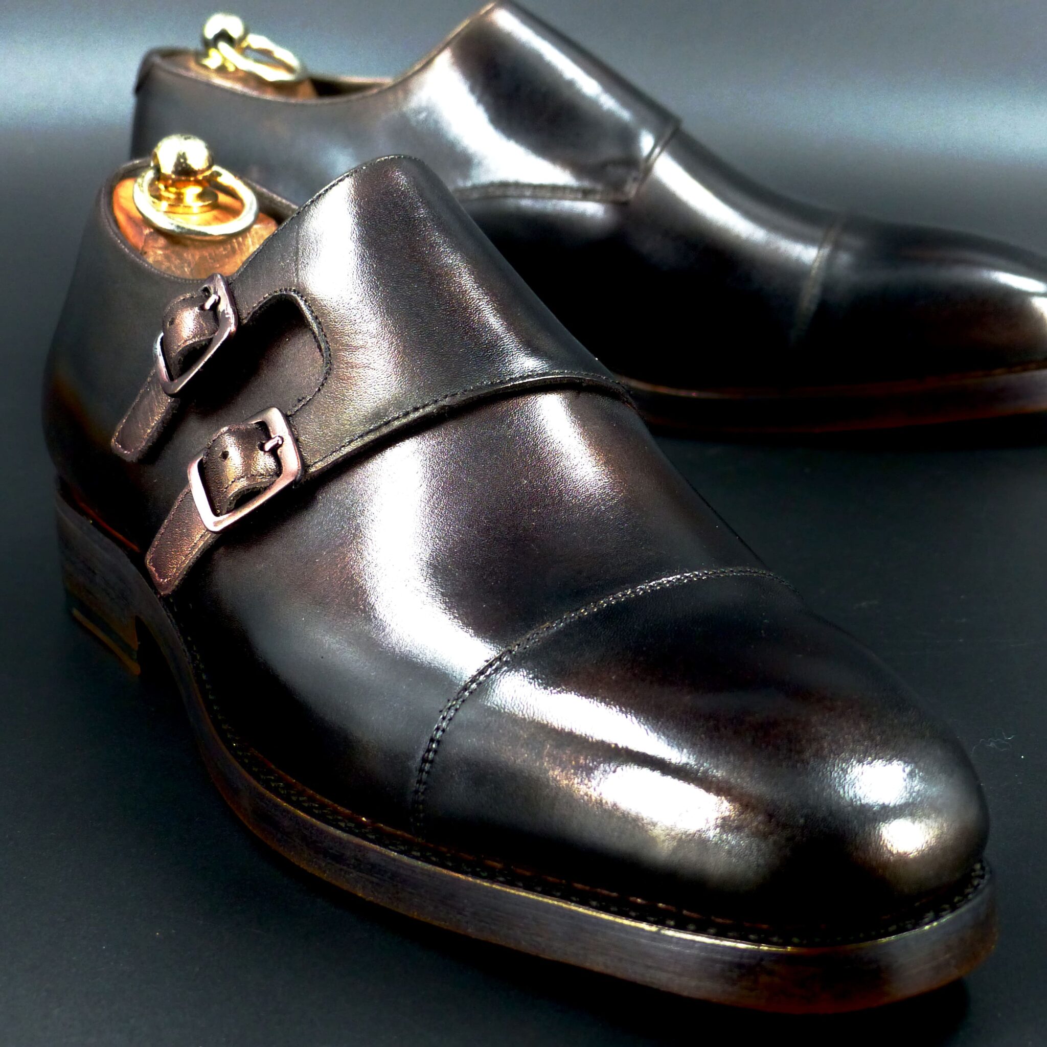
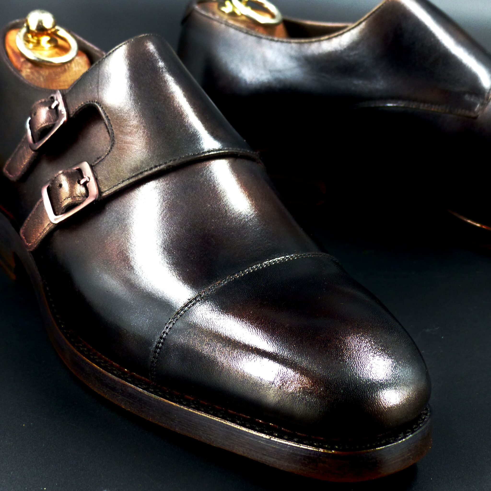
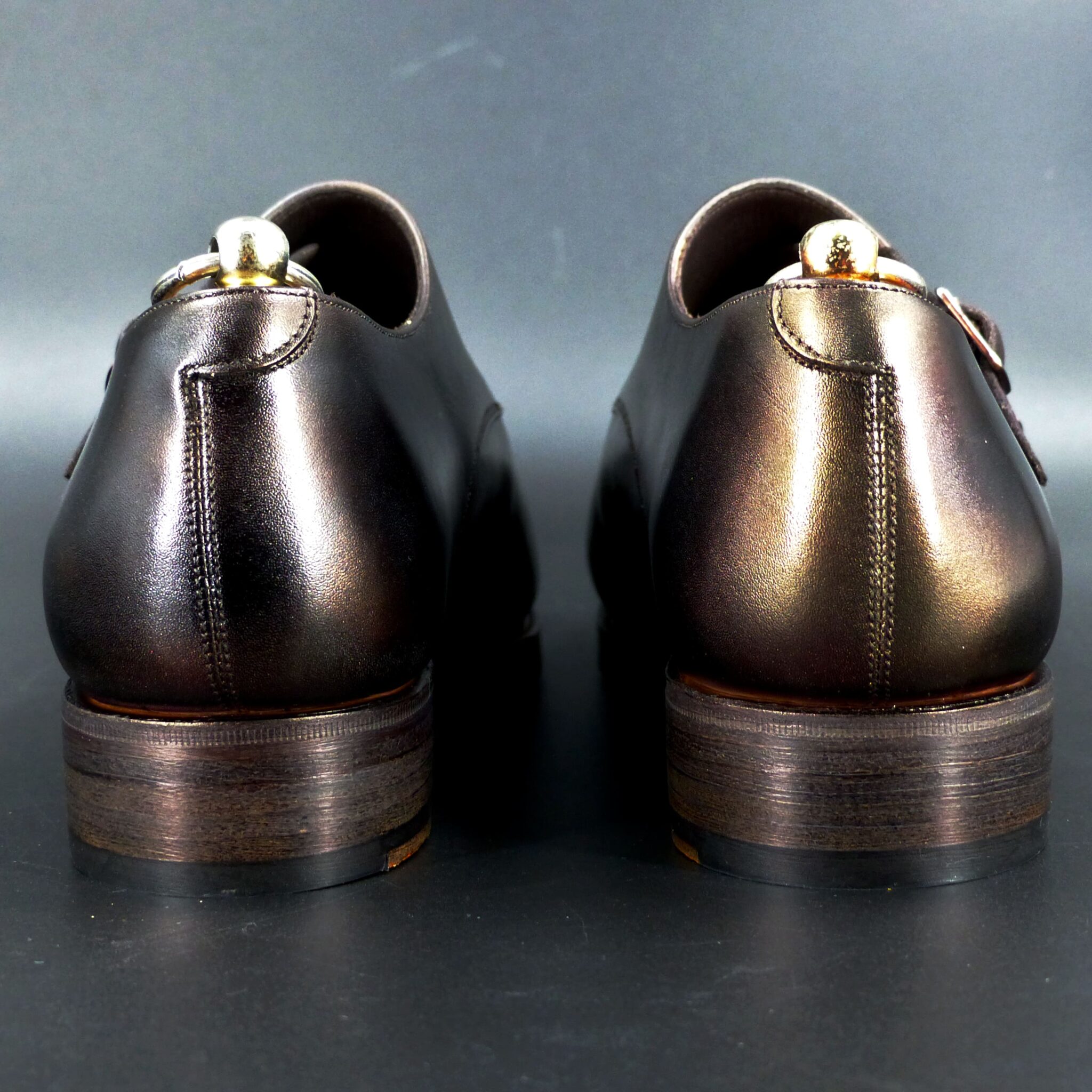
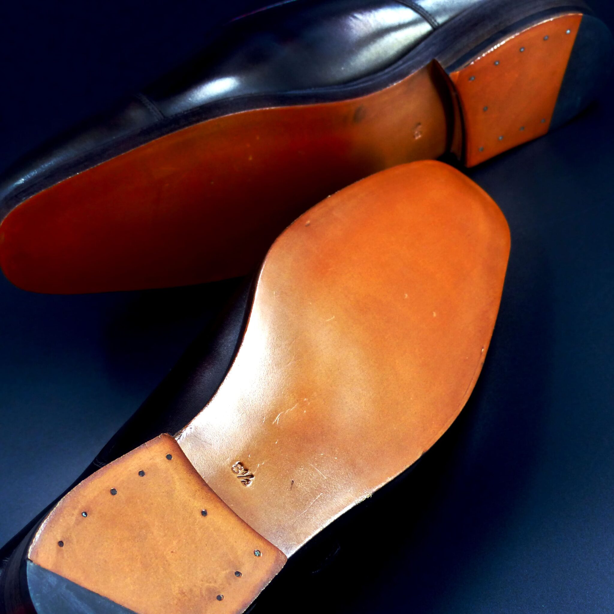
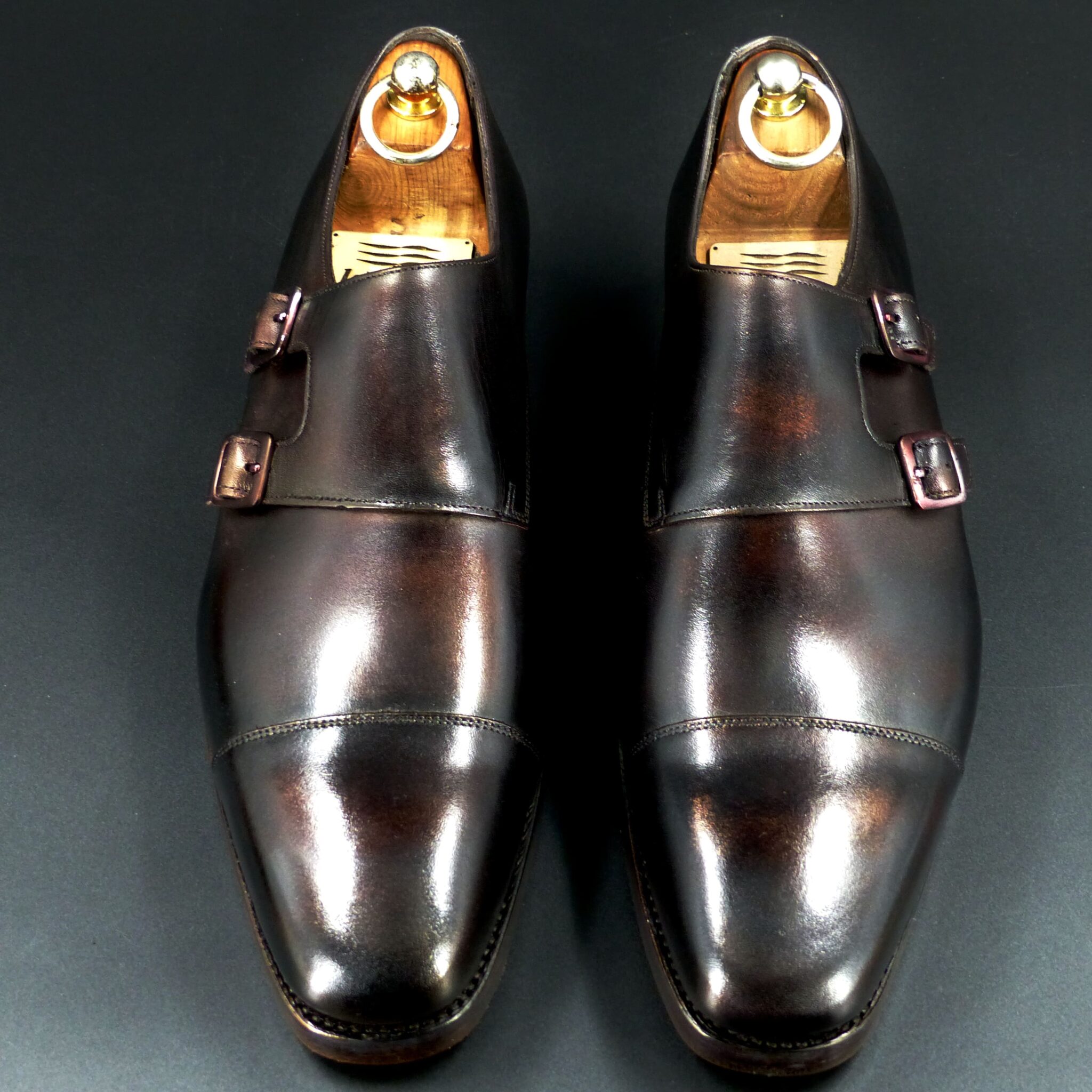
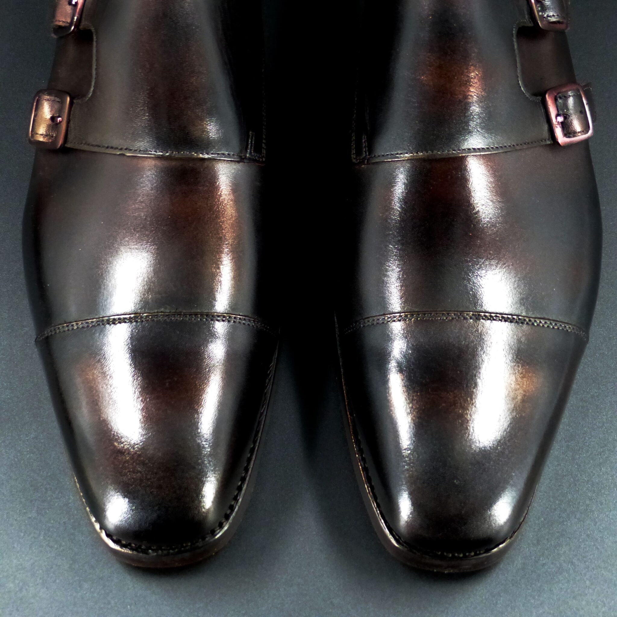
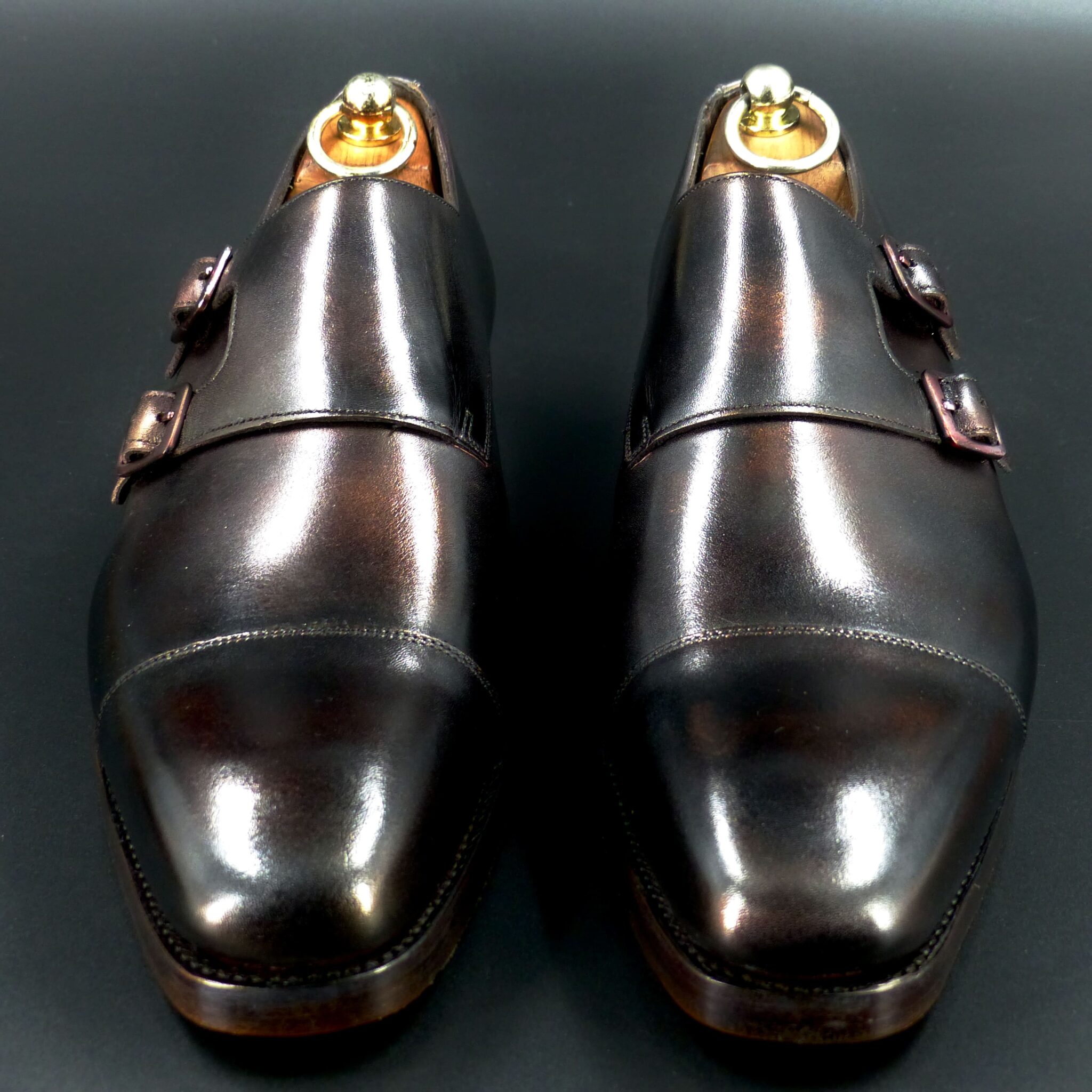
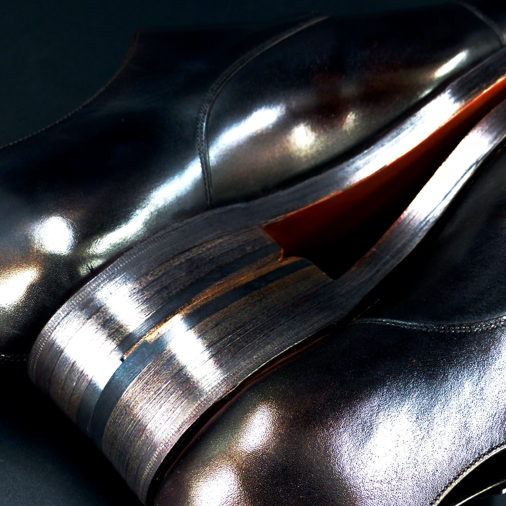
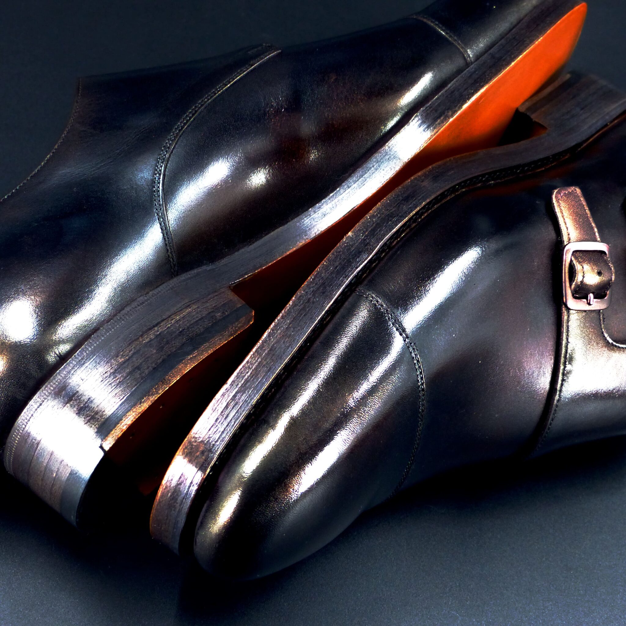
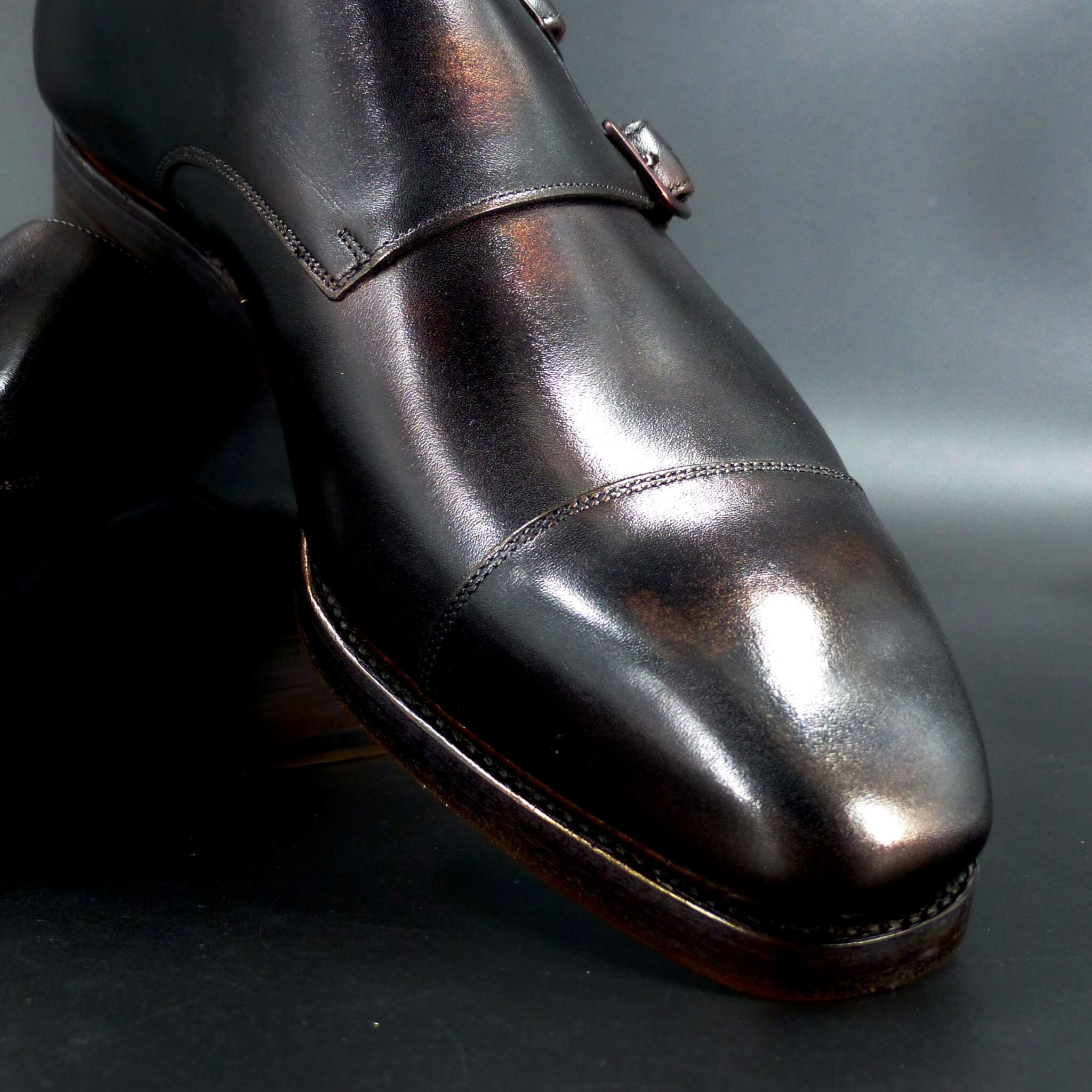
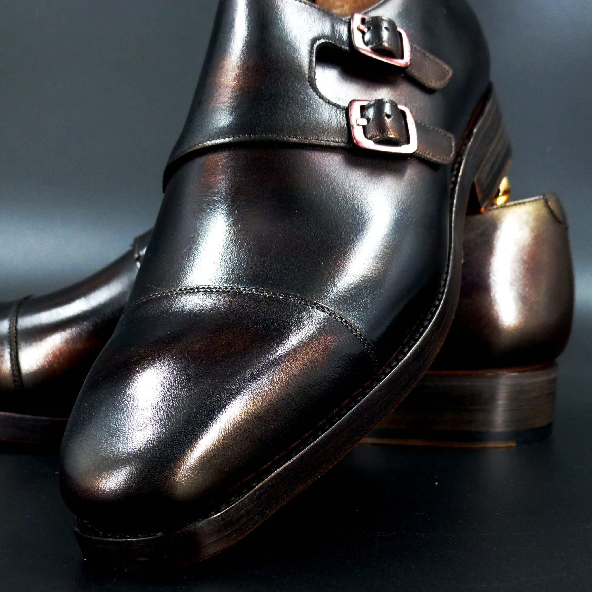

銅錆色(どうさびいろ)とは
銅が時間とともに酸化し、表面に生じる緑青(ろくしょう)の色を表した、日本の伝統色です。深みのある青緑色で、ややくすんだ落ち着いた印象を持ちます。
この色名は、平安時代の貴族文化の中で確立され、染色にも用いられました。襲(かさね)の色目としては、青系統と組み合わせることで、金属の経年変化が生み出す美しさを再現していました。
銅錆色は、自然がつくり出す色彩の一つであり、侘び寂びの美意識とも通じるものがあります。時を経てなお風格を増す銅のように、この色もまた、静かで深い趣を持つ色として愛されてきました。
Dōsabi-iro (銅錆色) – The Aged Patina of Copper
Dōsabi-iro is a traditional Japanese color that represents the hue of rokujō (緑青), the greenish-blue patina that forms on copper over time due to oxidation. It is a deep, muted blue-green shade with a subdued and calming appearance.
This color name was established during the Heian period as part of aristocratic culture and was also used in dyeing fabrics. In Kasane no Irome (layered color combinations), it was often paired with other shades of blue to reflect the beauty of metal’s natural aging process.
Dōsabi-iro is one of the colors created by nature, embodying the aesthetics of wabi-sabi—the appreciation of imperfection and the passage of time. Just as aged copper gains a dignified character over the years, this color has been cherished as a quiet yet profound hue, rich in depth and tradition.
メルボルン・オックスフォード
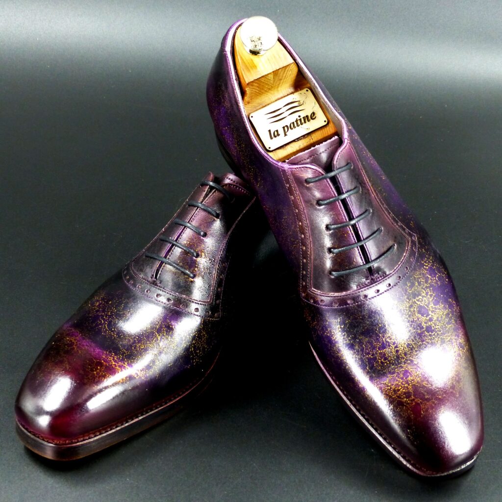
color name;
[ Shion-no-Chichi ]
紫苑蜘糸
Melbourne Oxford
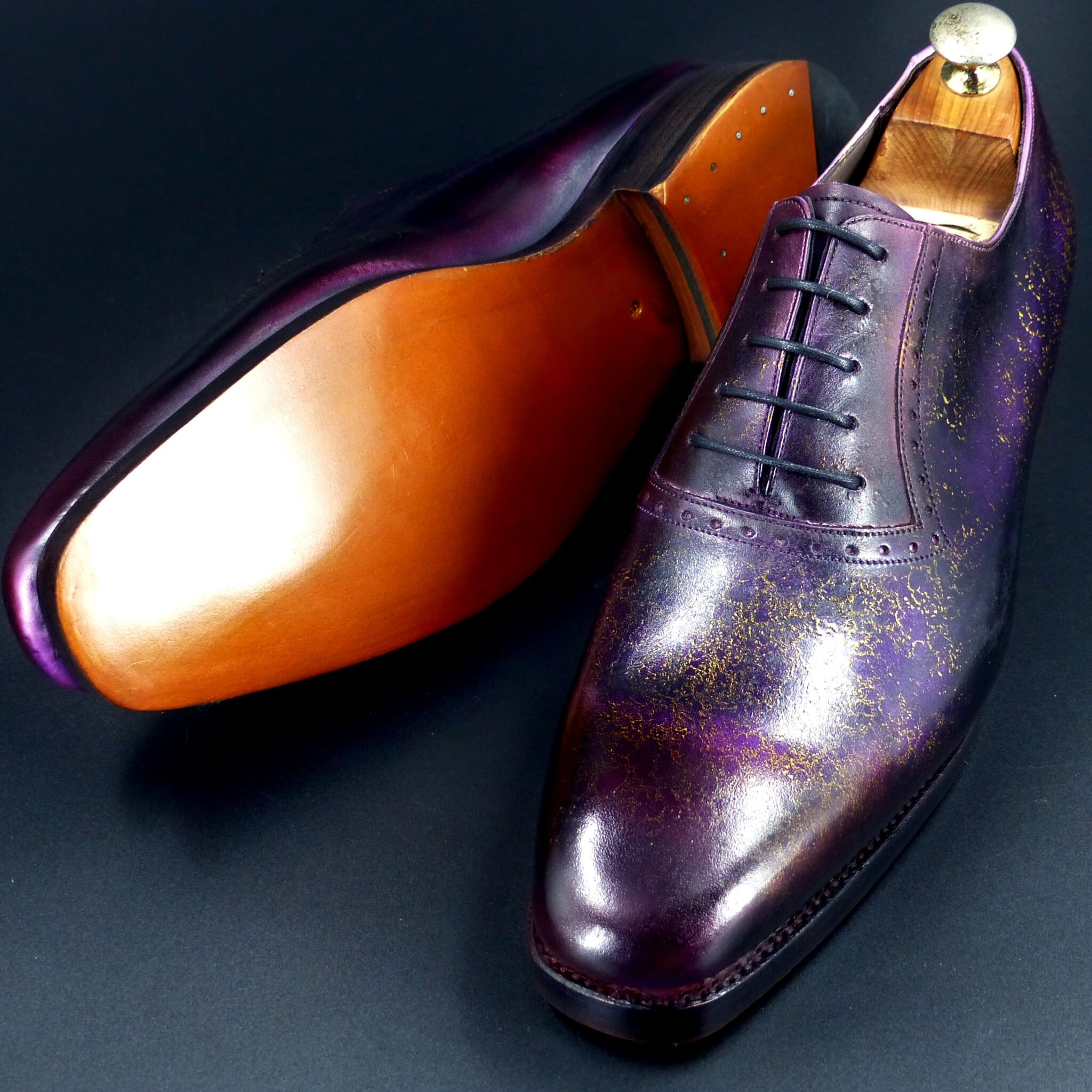
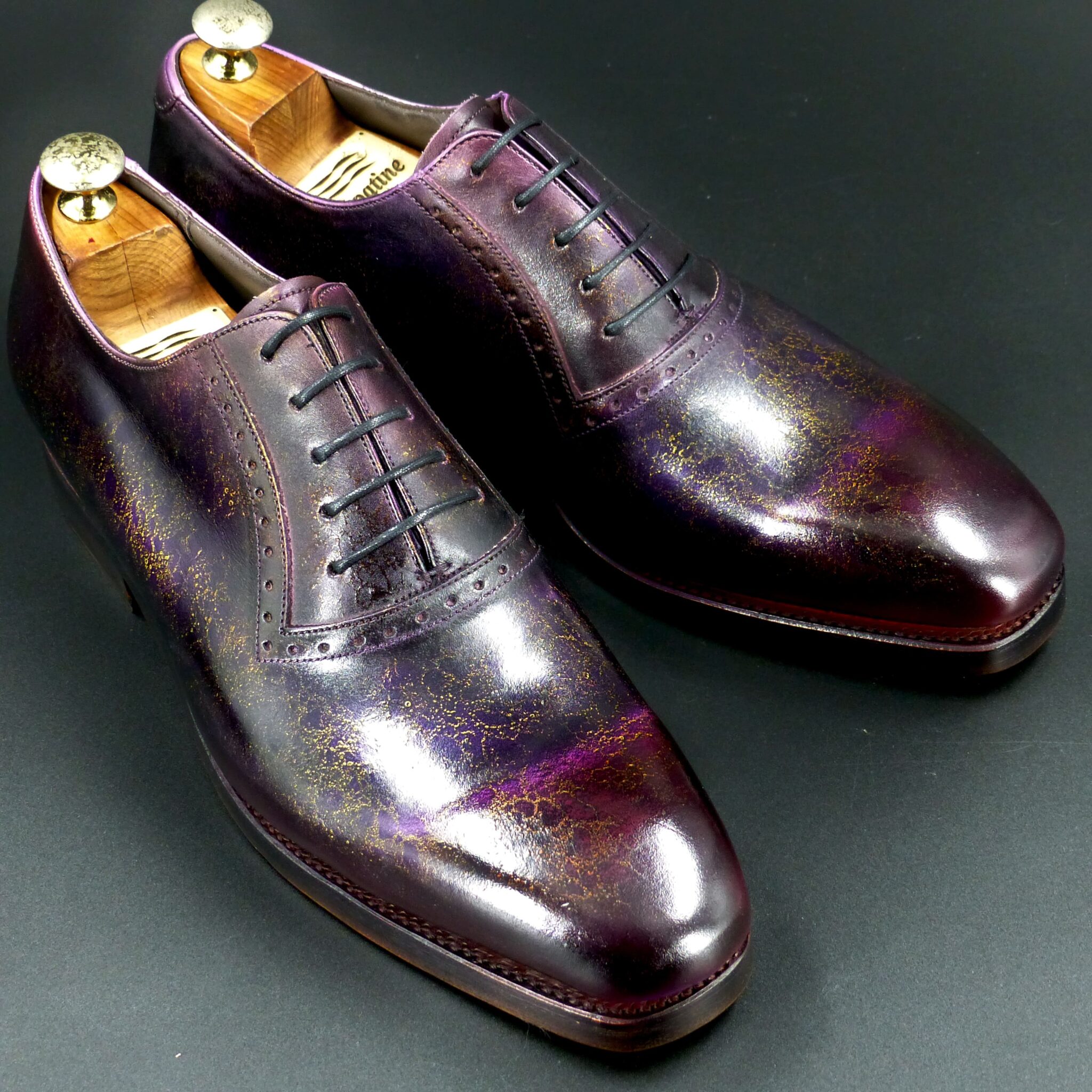
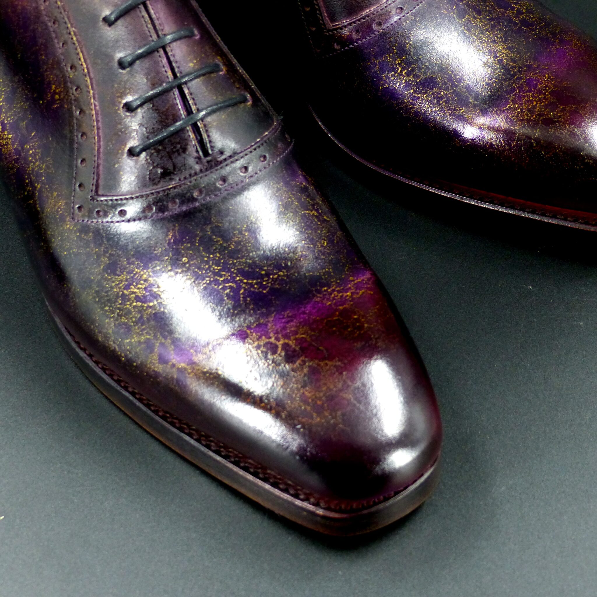
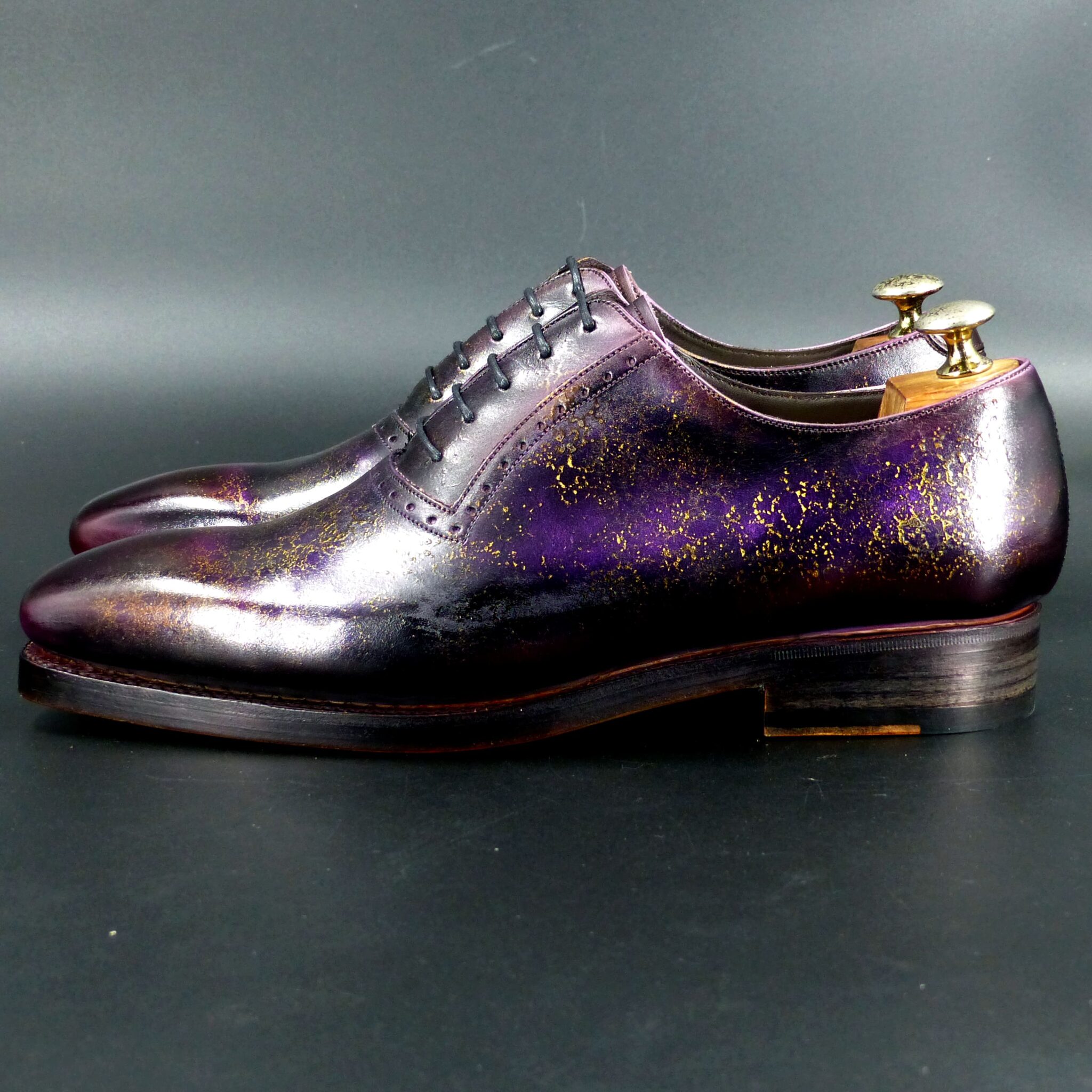
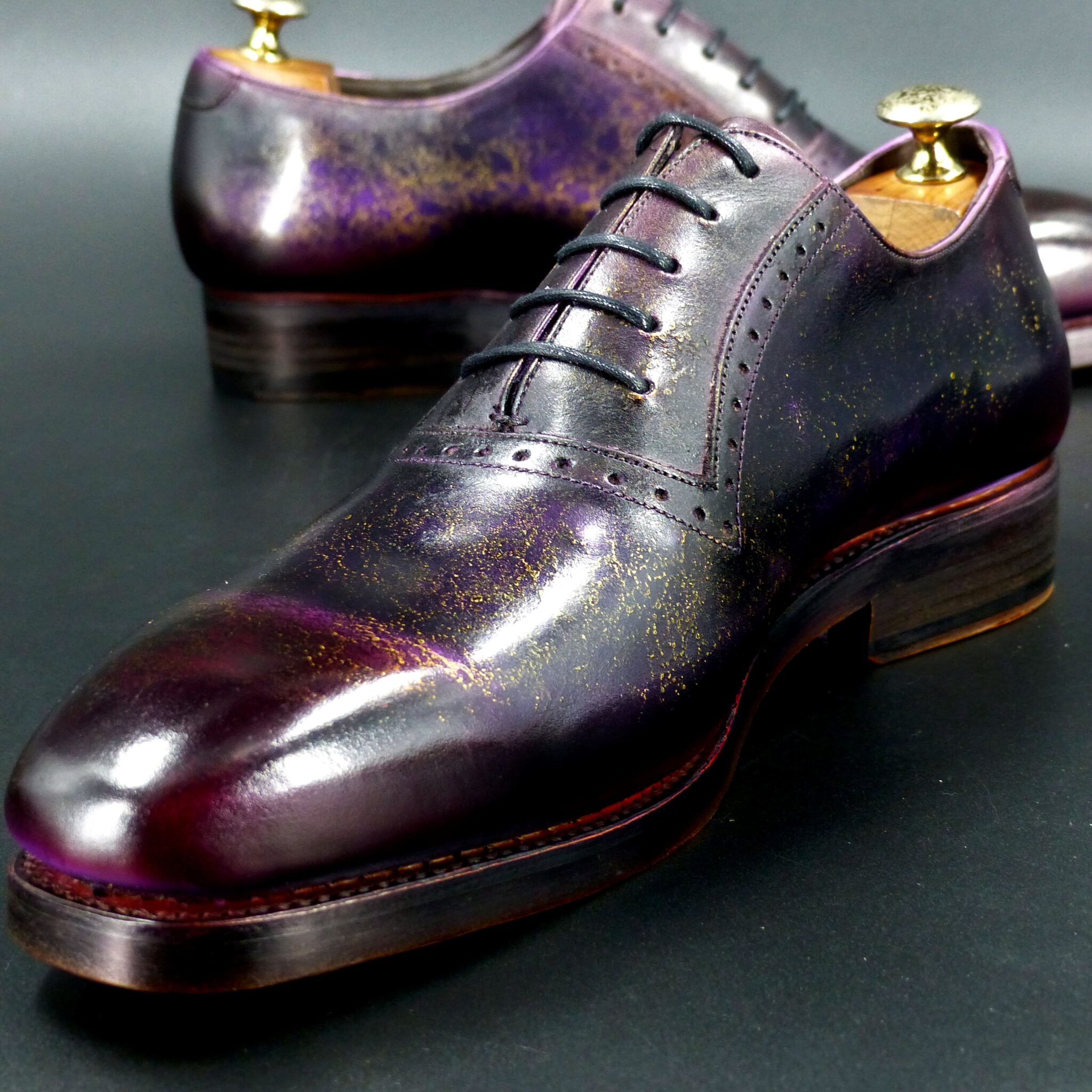
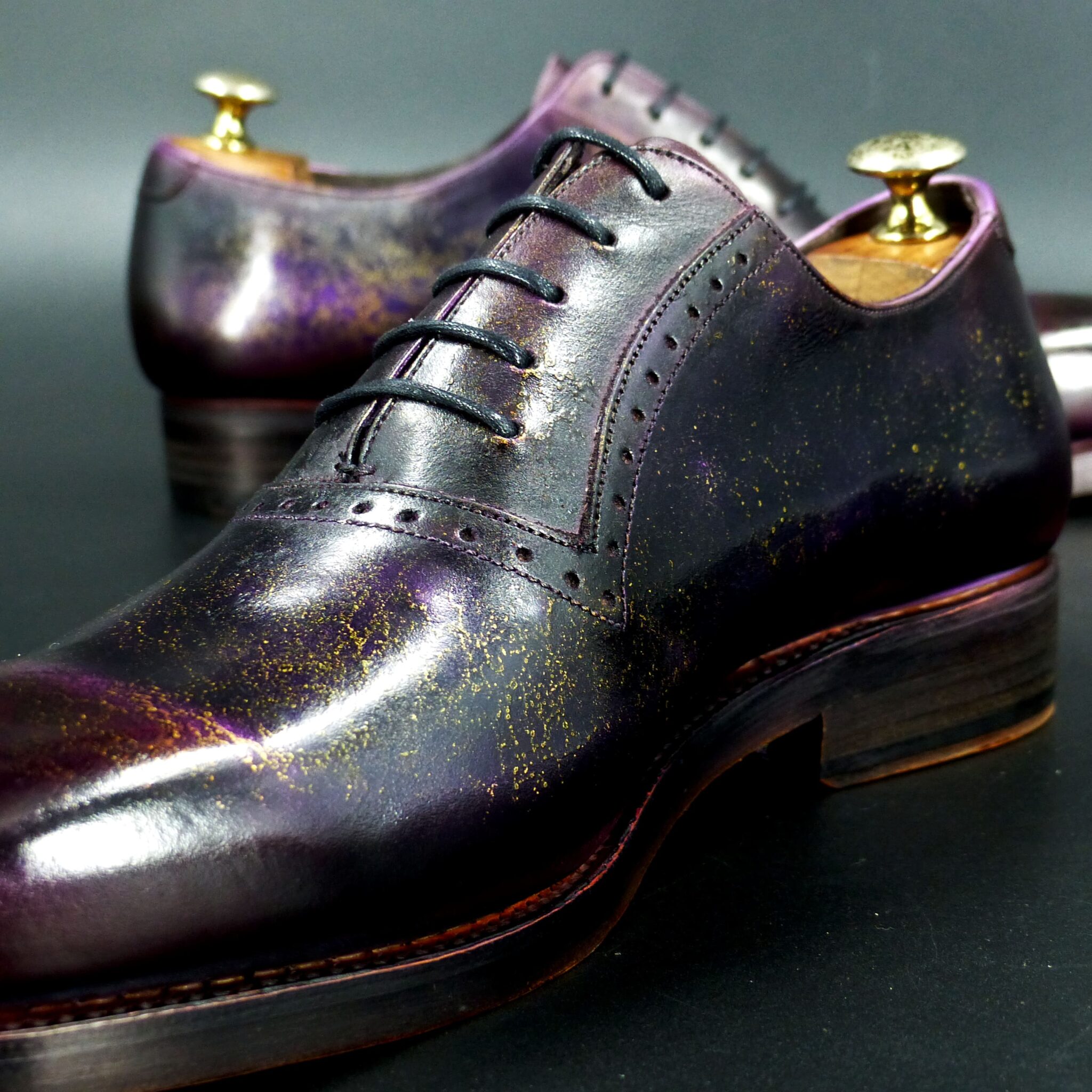
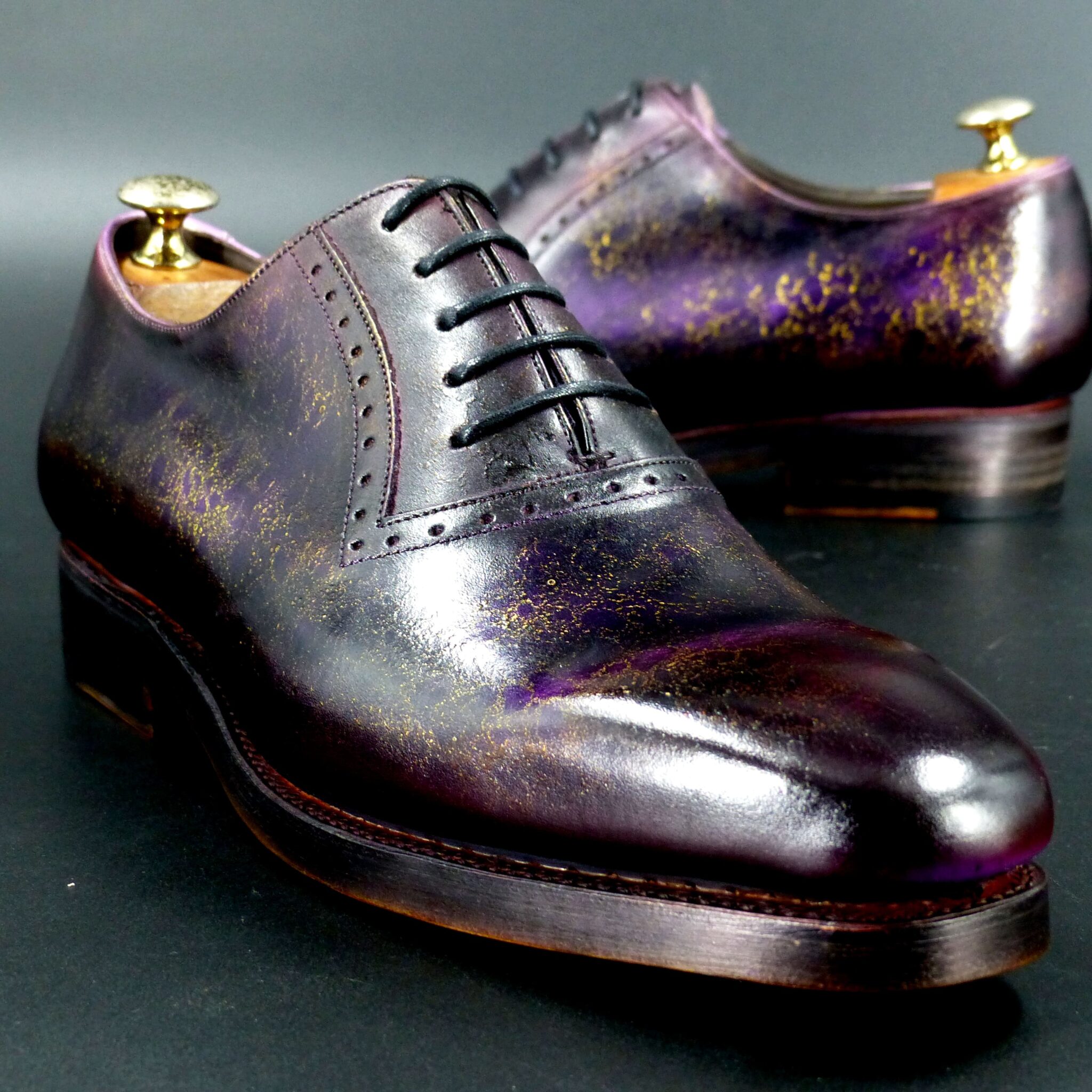
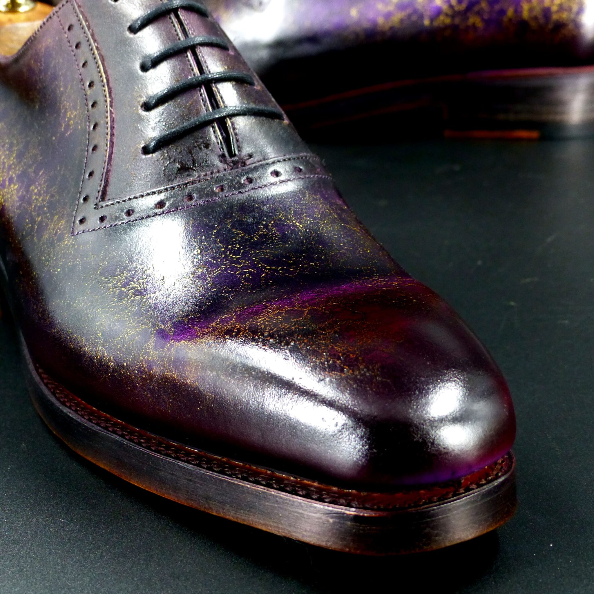
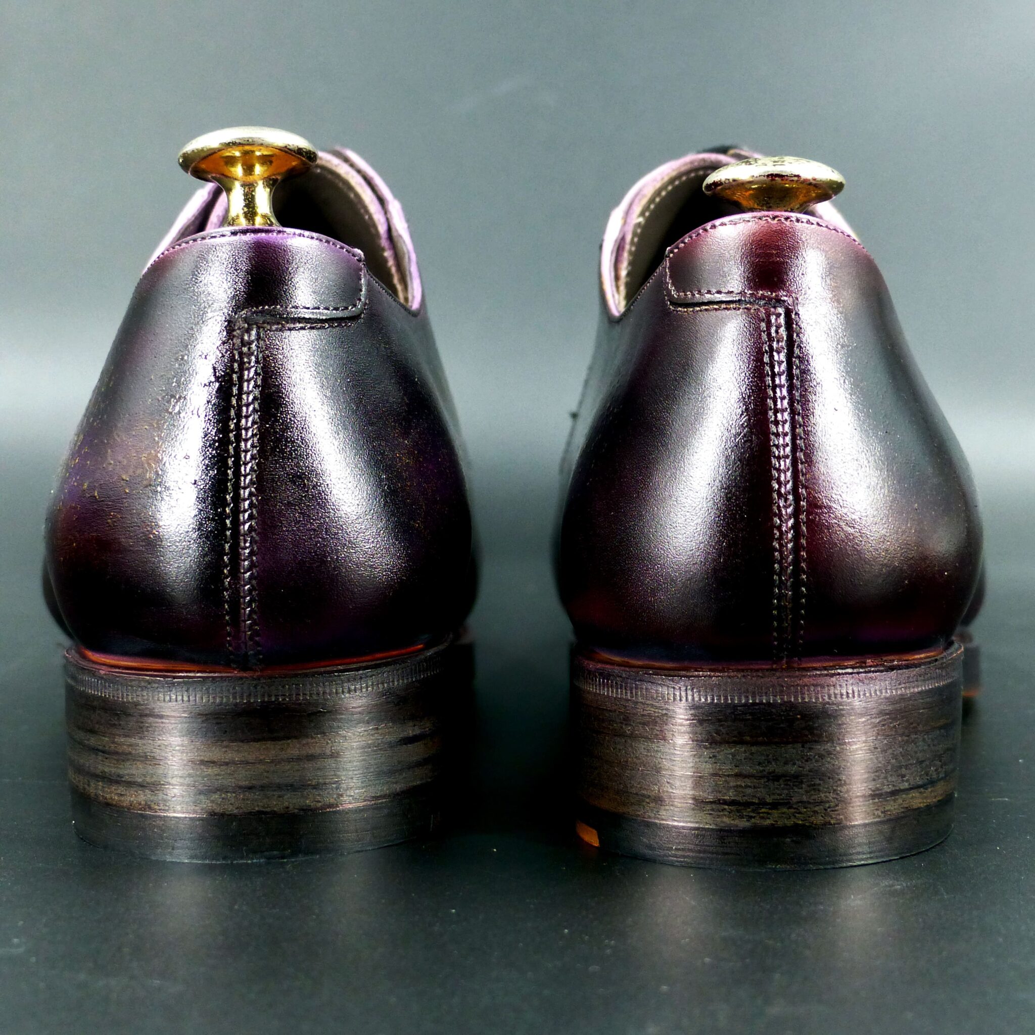
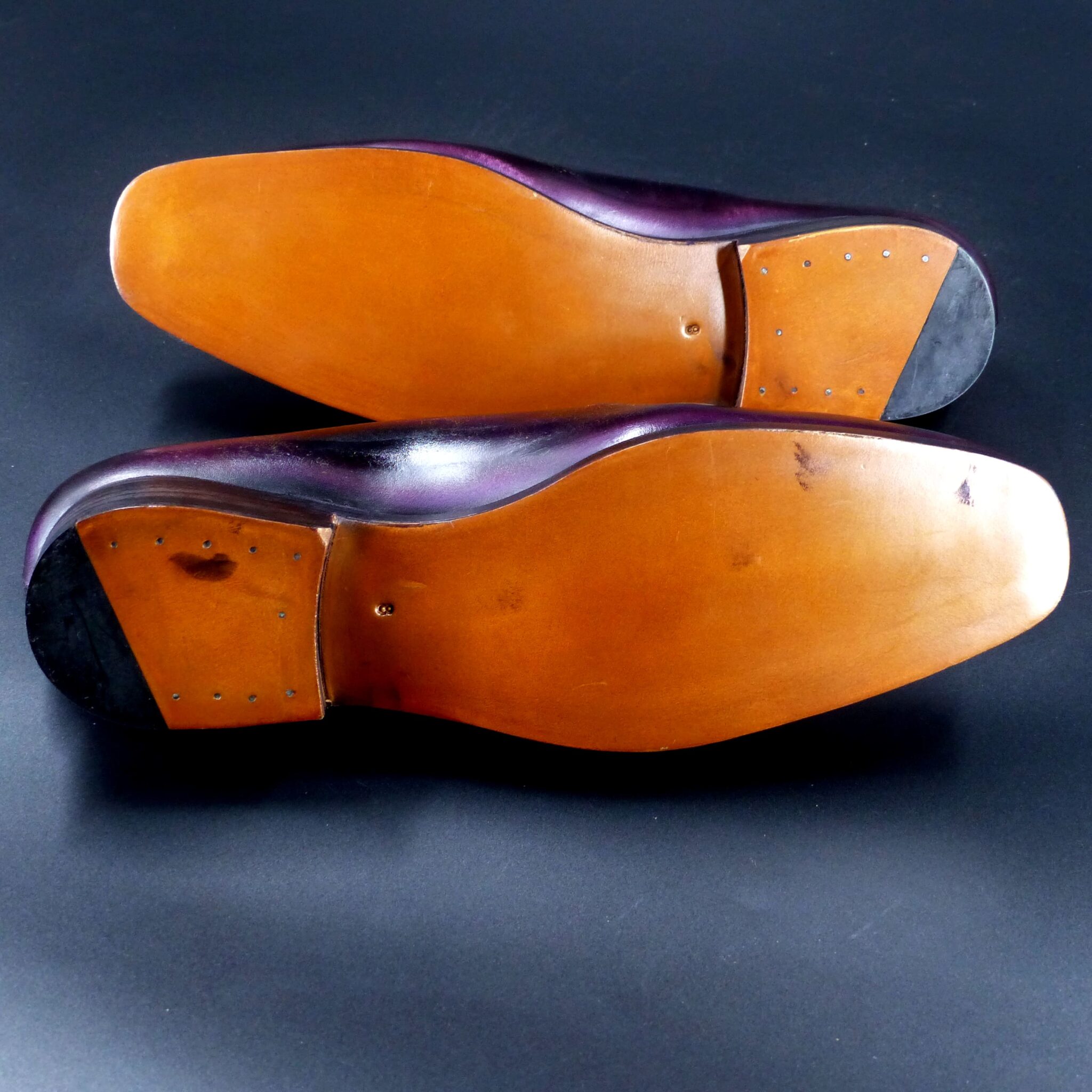
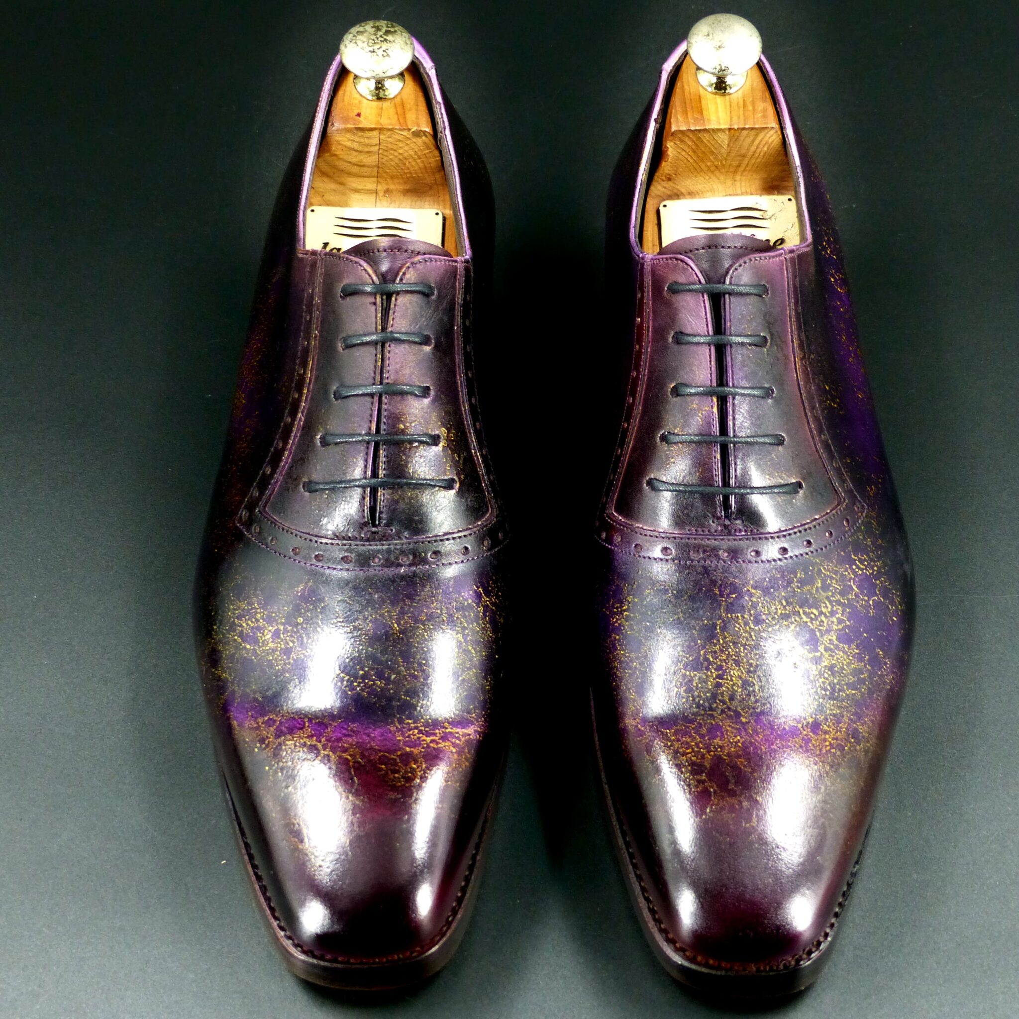
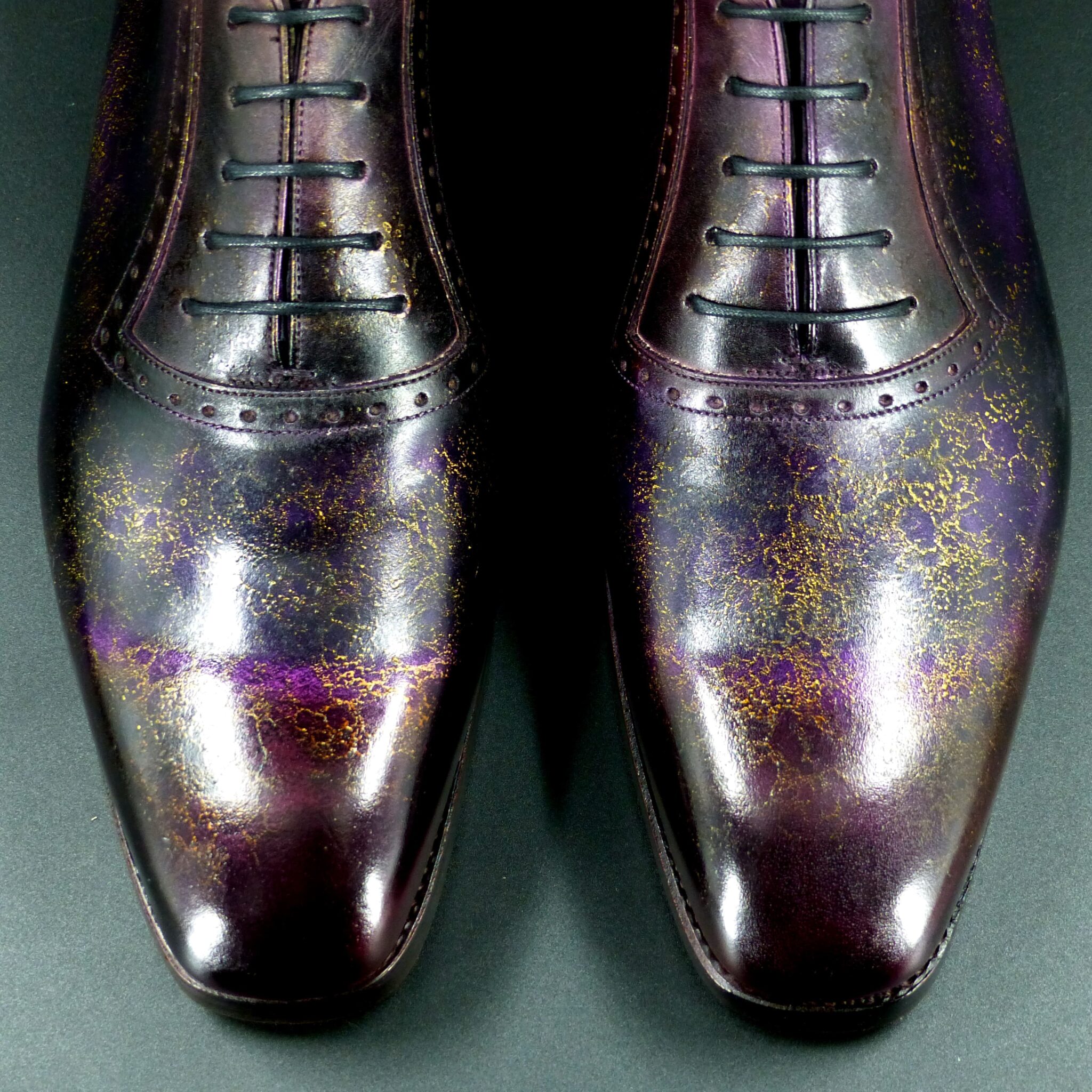
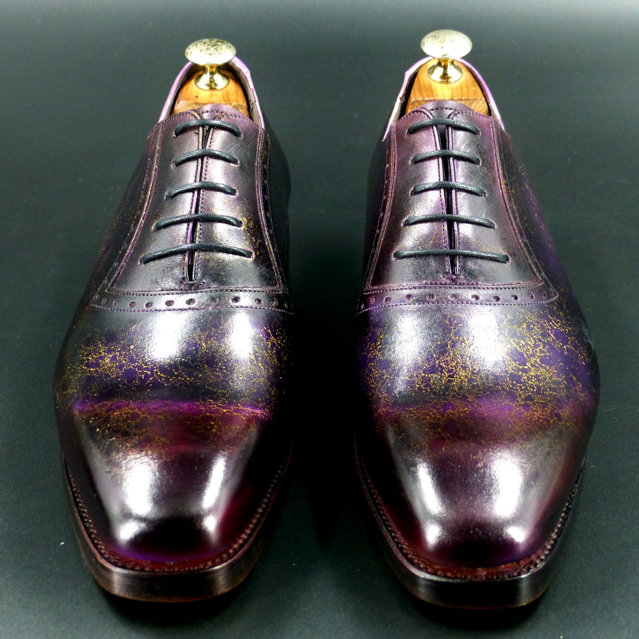
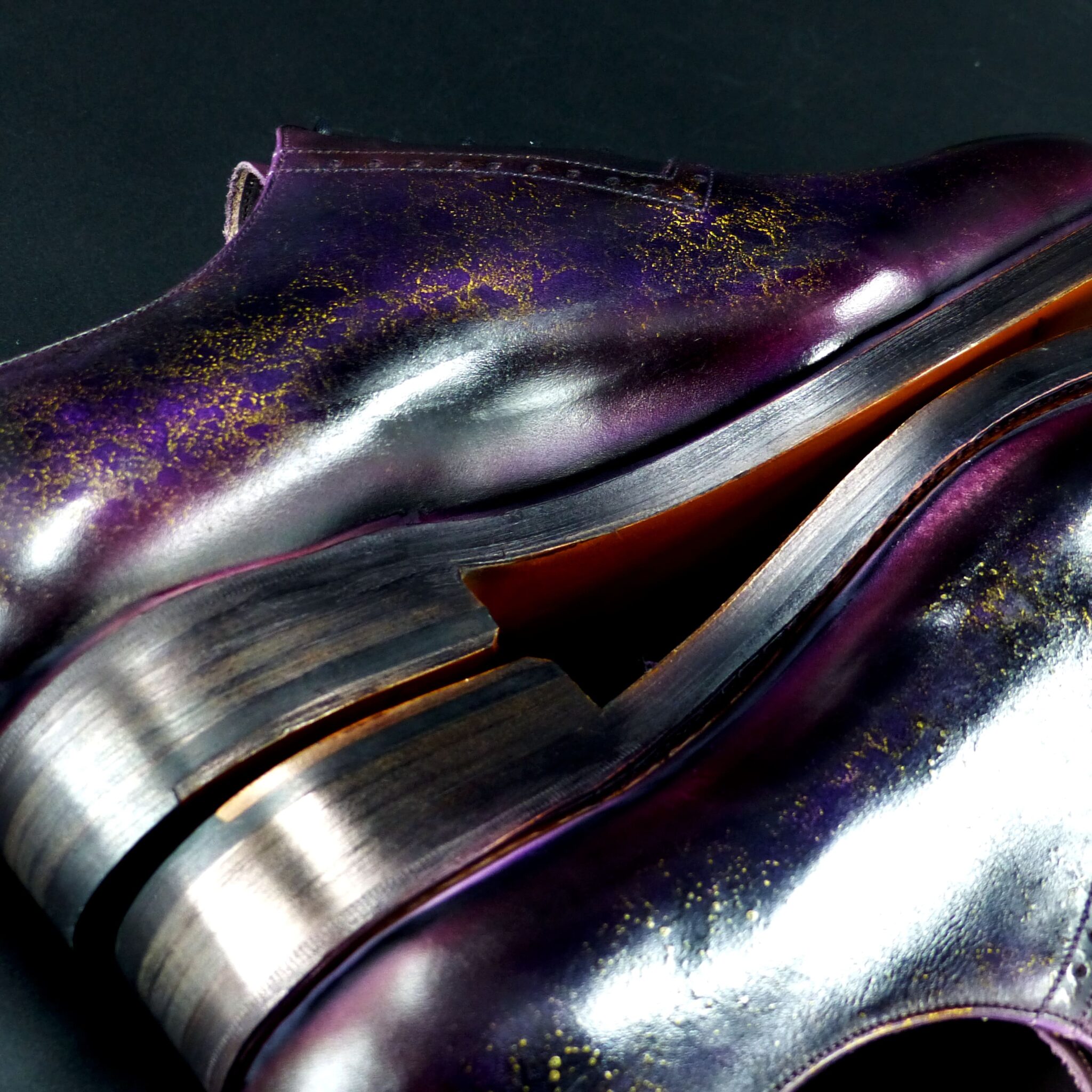
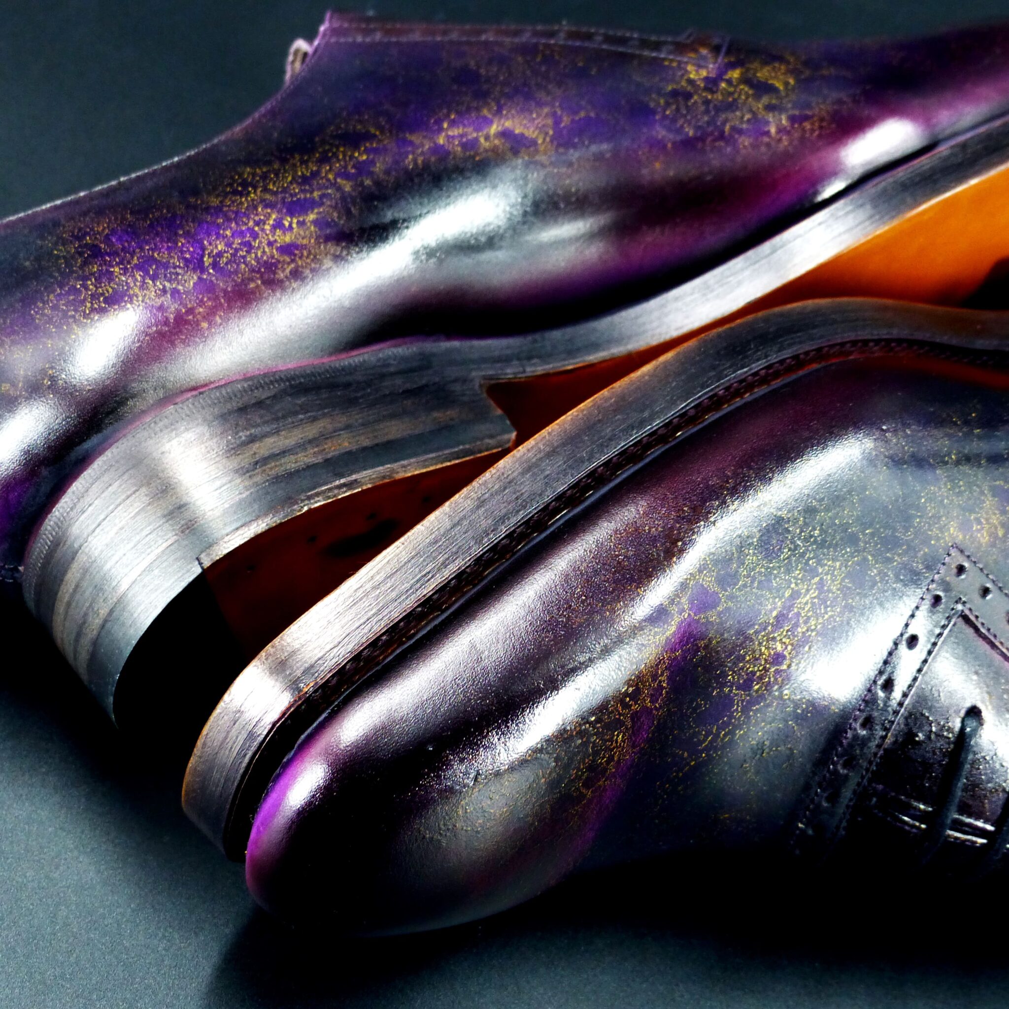
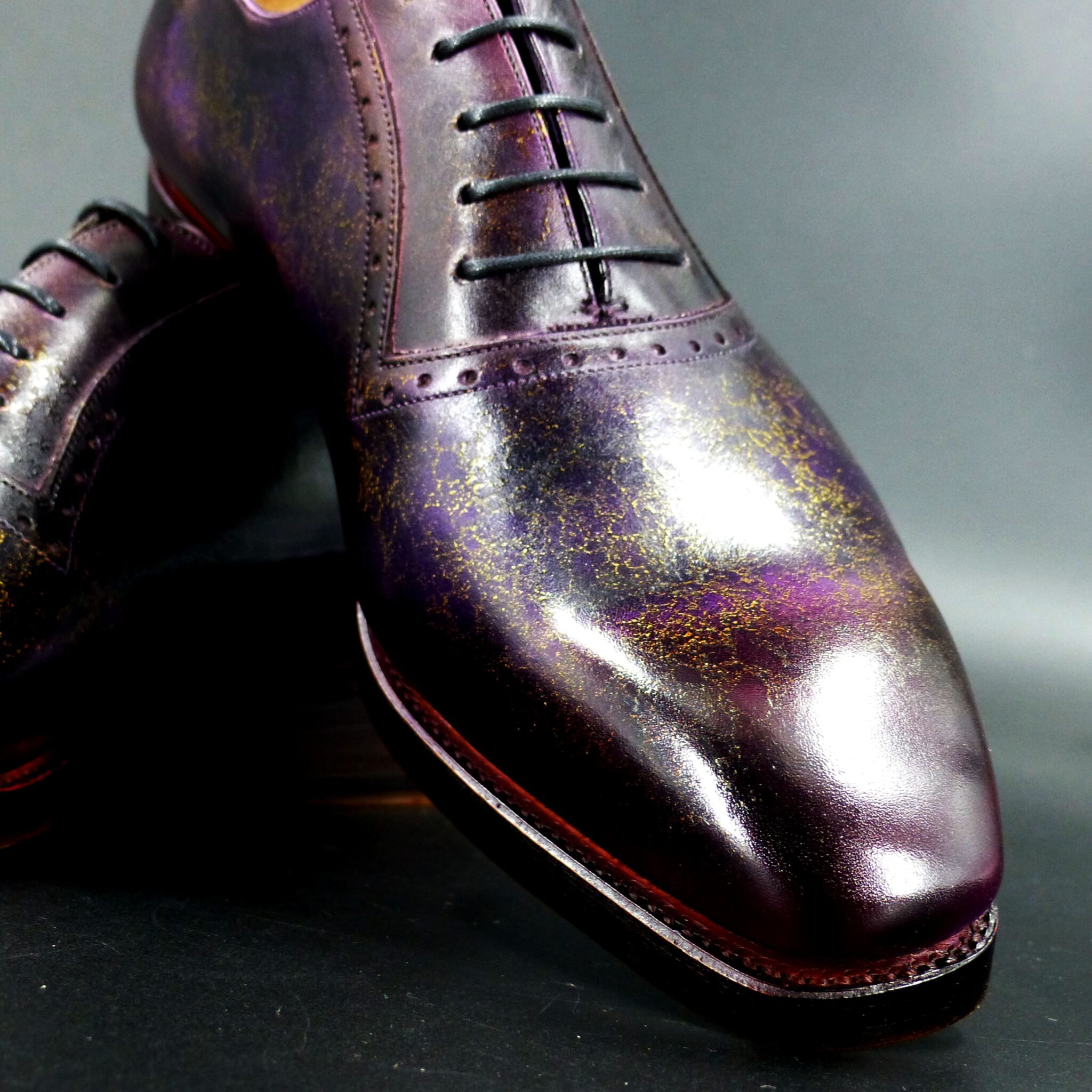
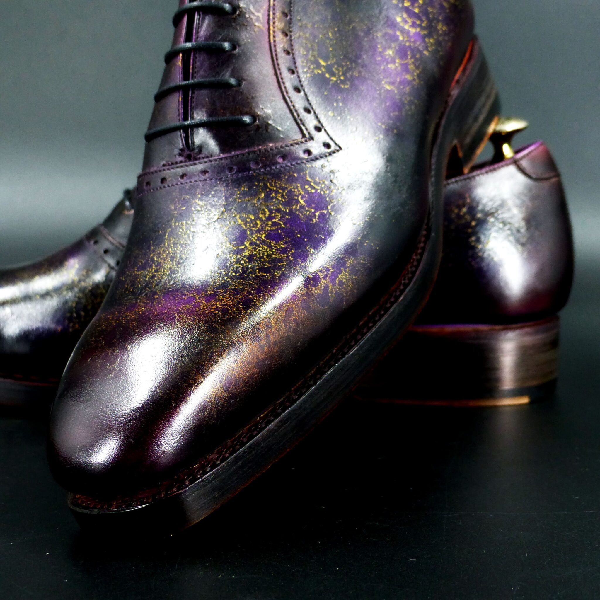
紫苑蜘糸(しおんのちち)とは
紫苑蜘糸は、平安時代の伝統色のひとつで、淡く上品な紫色を指します。「紫苑(しおん)」は秋に咲く紫色の花であり、「蜘糸(ちち)」は蜘蛛の糸のように繊細で淡い色合いを表しています。つまり、紫苑の花の色を、ごく薄く柔らかくしたような色ということになります。
この色は、平安貴族の装束において襲(かさね)の色目にも用いられ、特に高貴で優雅な印象を与える色とされました。紫は古来より位の高い色とされていましたが、紫苑蜘糸はその中でも穏やかで落ち着いた風情を持ち、秋の静かな気配を感じさせる色です。
文学作品にも登場し、優雅で繊細な美を象徴する色として、平安時代の文化の中で愛されてきました。
Shion no Chichi (紫苑蜘糸) – A Delicate, Elegant Shade of Pale Purple
Shion no Chichi is one of the traditional colors of the Heian period, referring to a soft and refined shade of pale purple. The name is derived from “Shion” (紫苑), a purple autumn flower, and “Chichi” (蜘糸), which means spider silk, symbolizing a delicate and faint color. In other words, it is a subtly muted version of the Shion flower’s hue, embodying a gentle and graceful appearance.
This color was used in the Kasane no Irome (layered color combinations) of noble attire, conveying a sense of nobility and elegance. Purple has long been considered a prestigious color, and among its variations, Shion no Chichi stands out for its calm, subdued beauty, evoking the quiet atmosphere of autumn.
It also appears in literary works, representing refined and delicate beauty, and was cherished in the Heian period as a color deeply rooted in the aesthetics of aristocratic culture.
ホールカット

color name;
[ Senzaicha ]
仙斎茶
Whole Cut

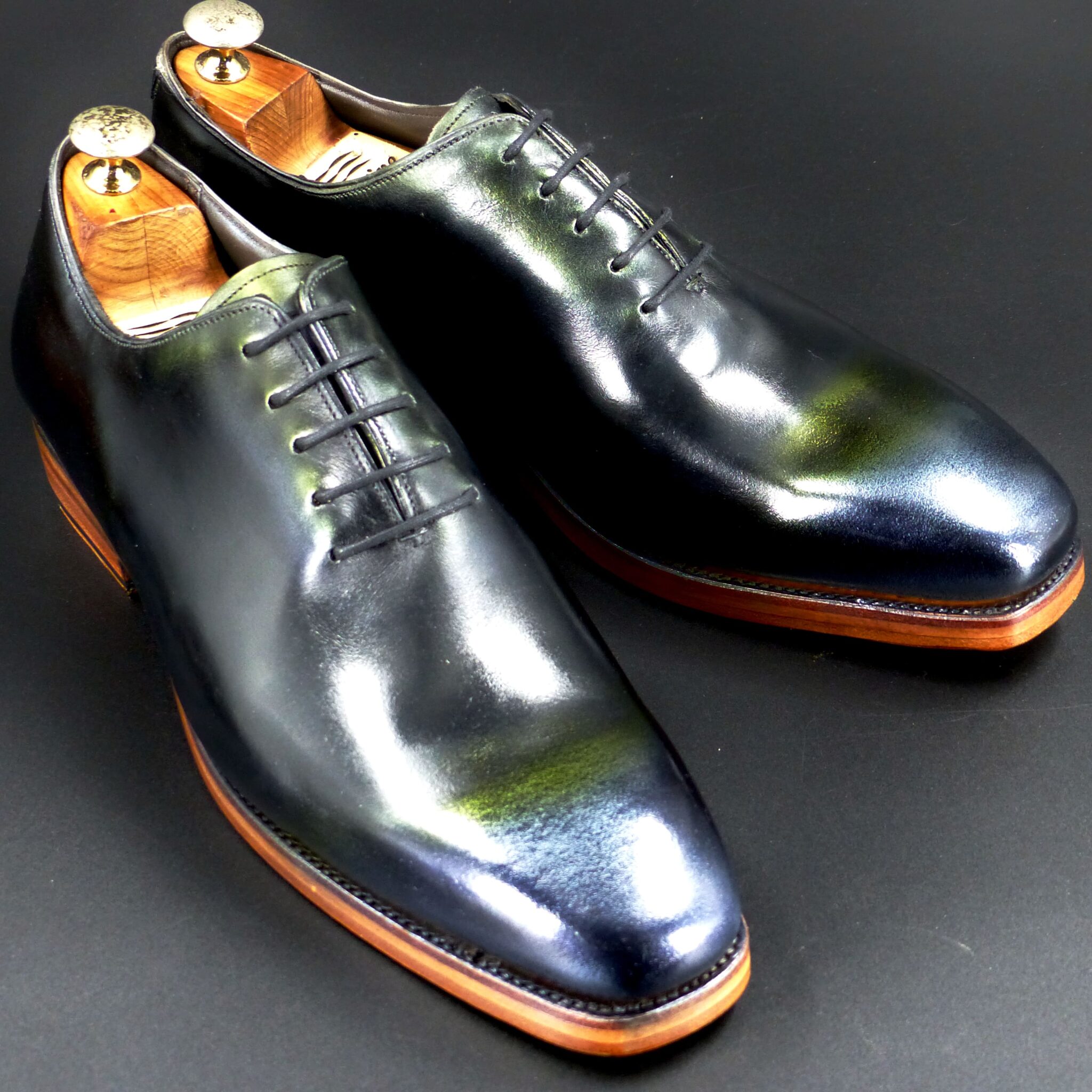
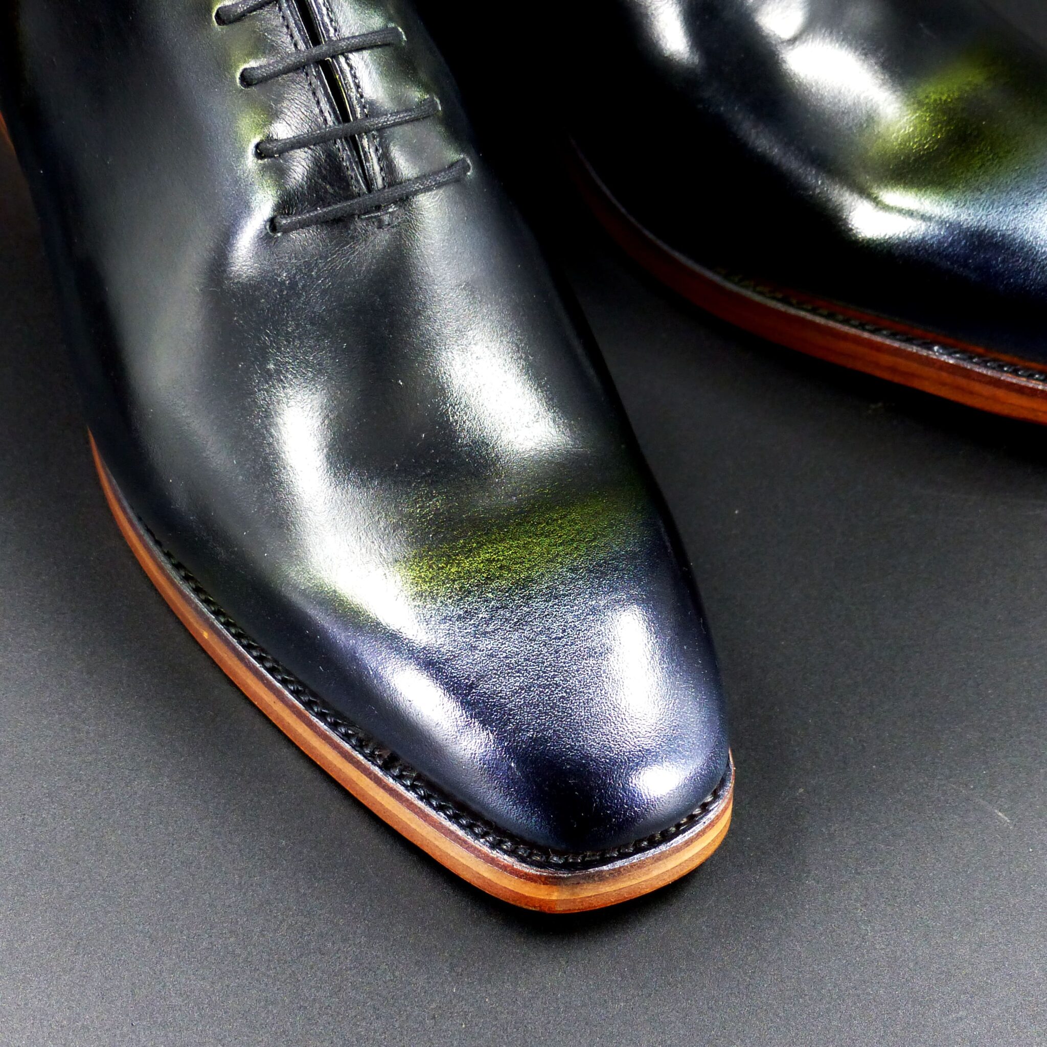
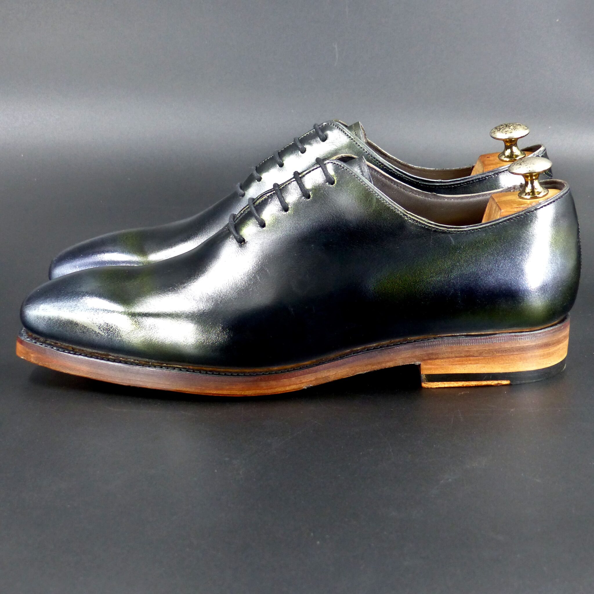
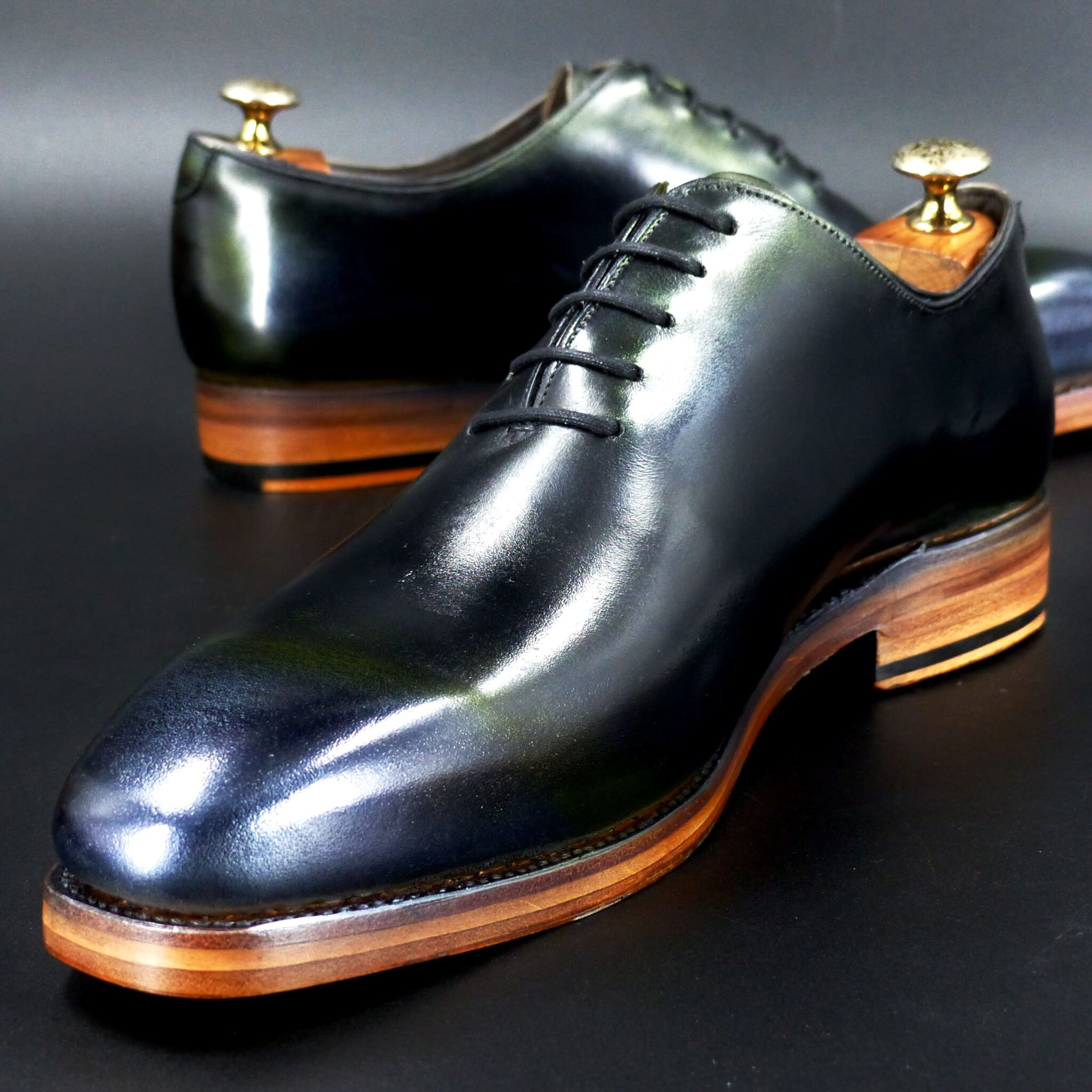
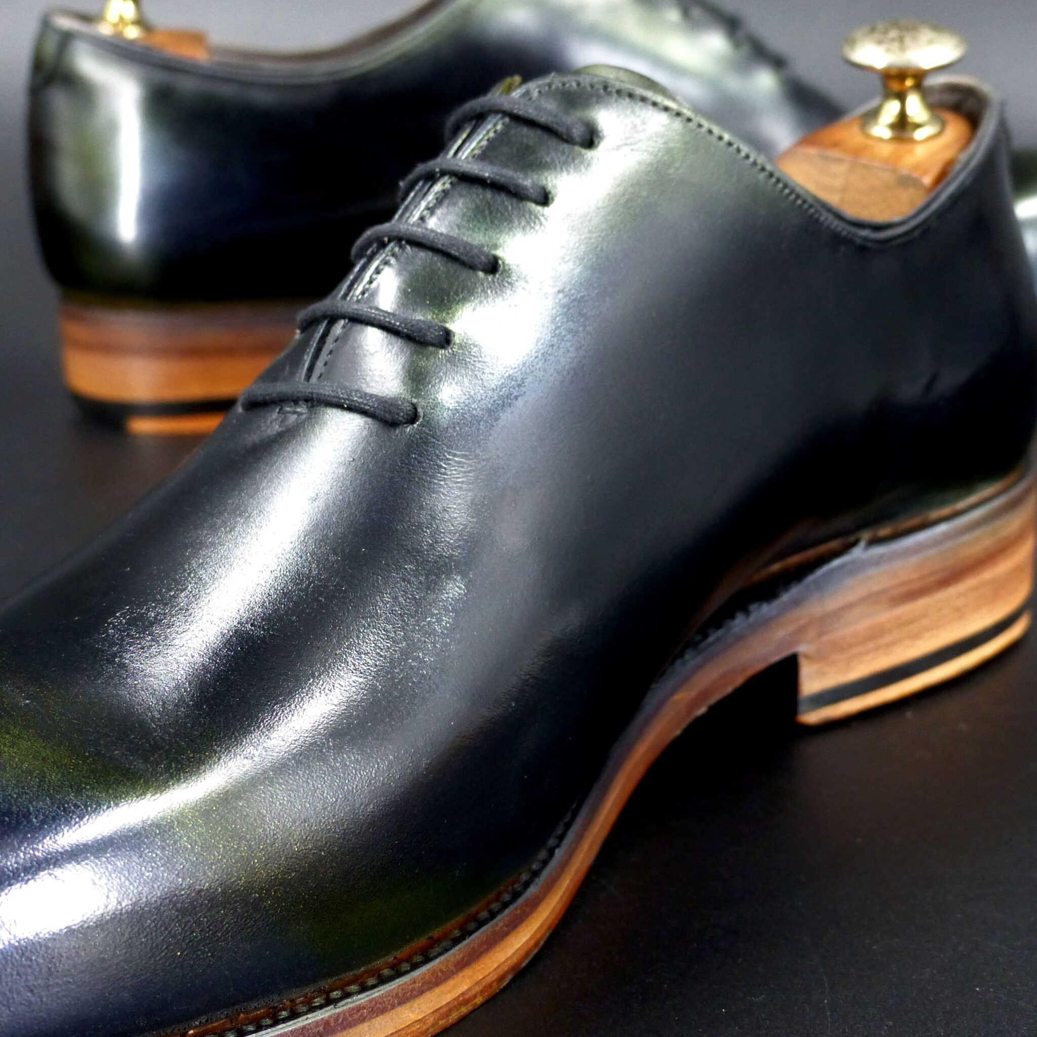
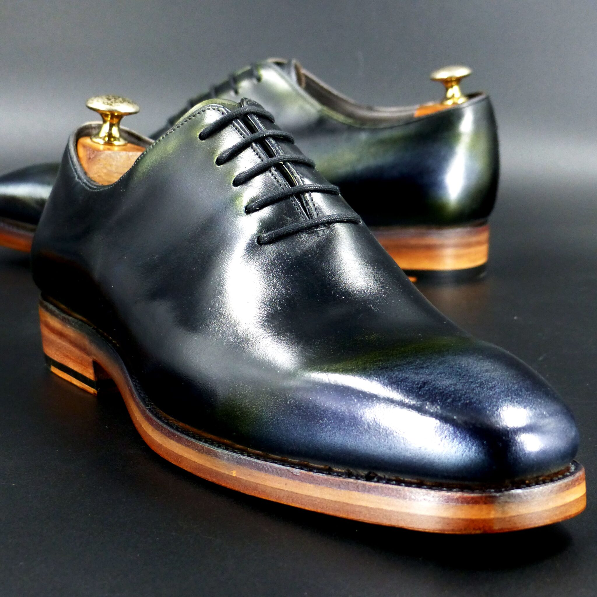
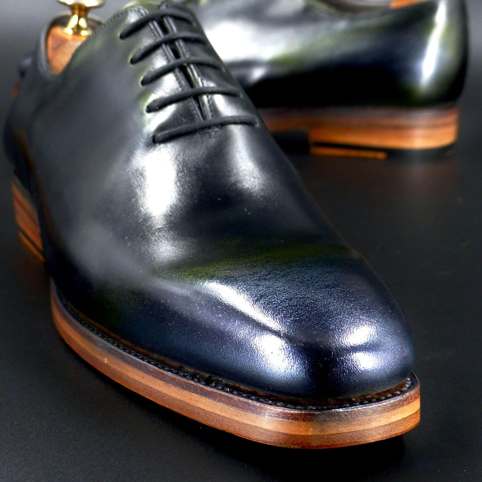
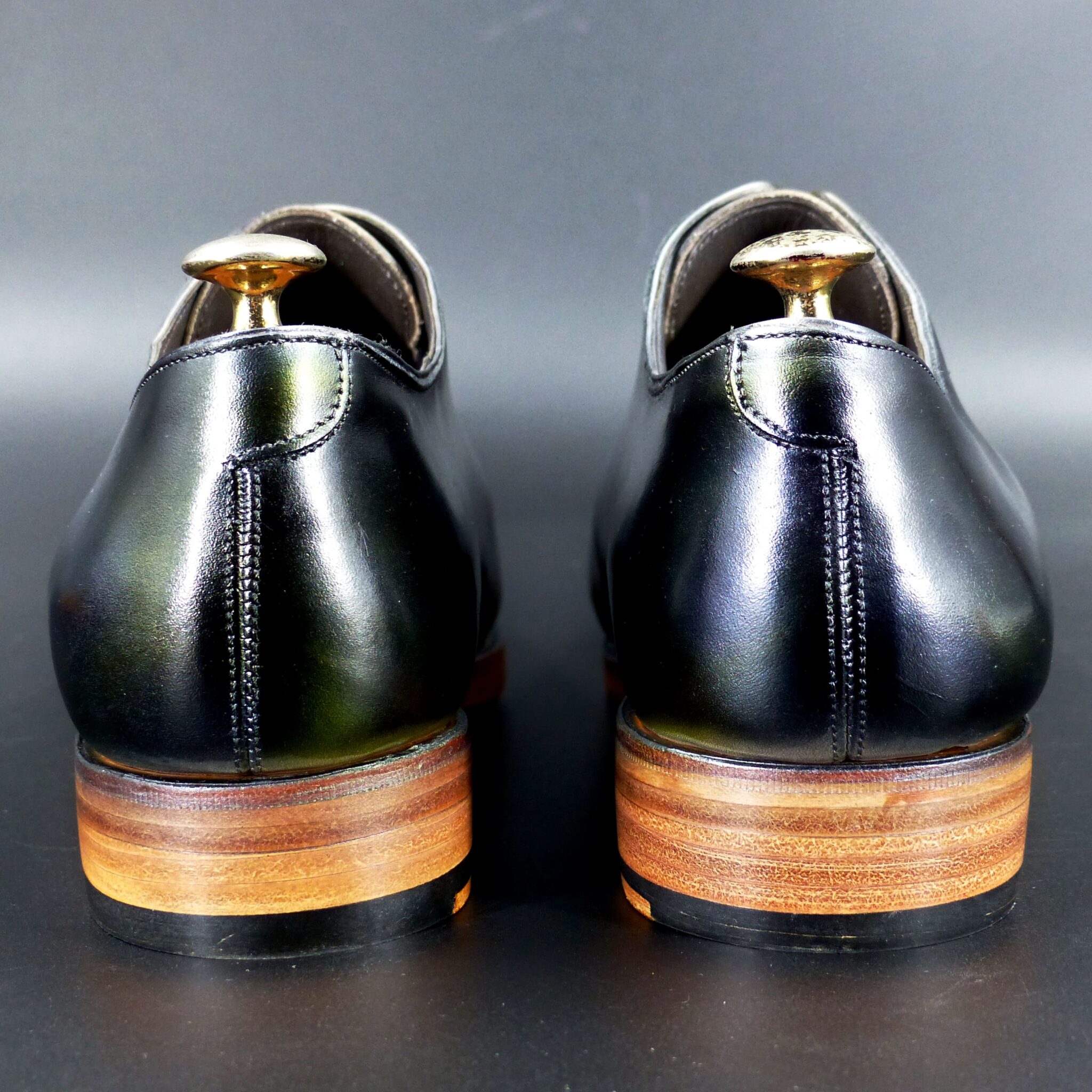
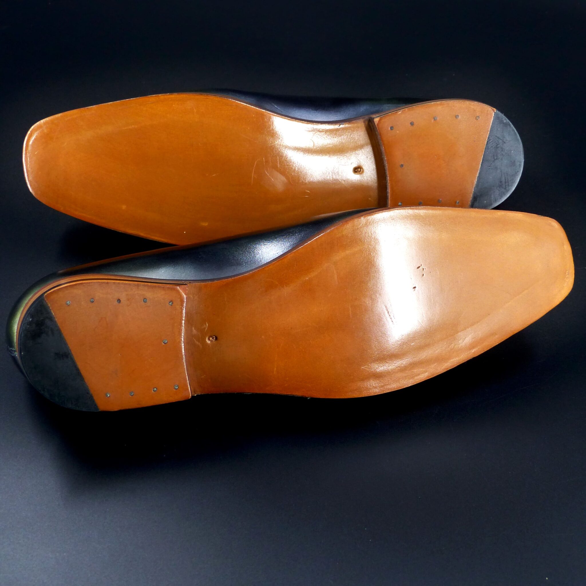
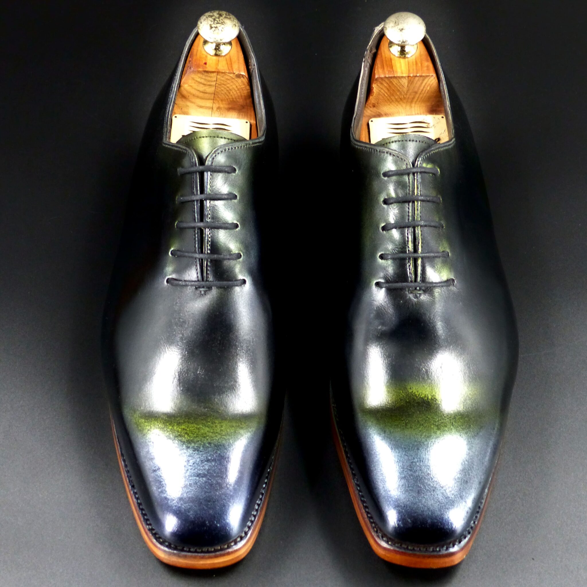
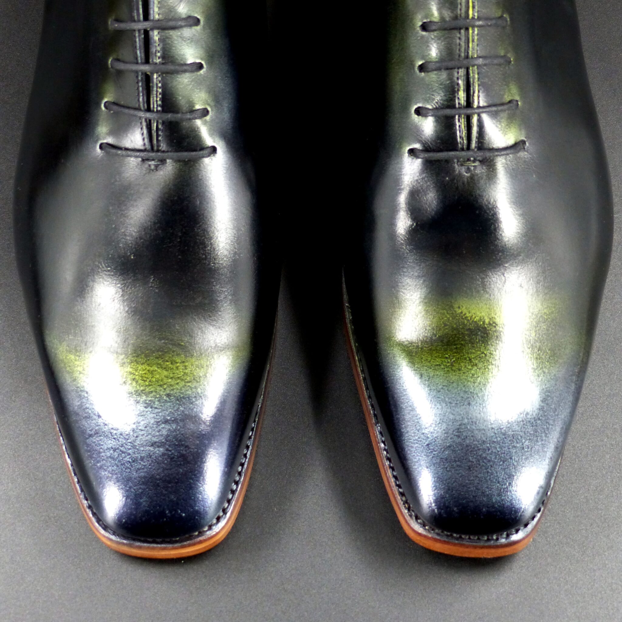
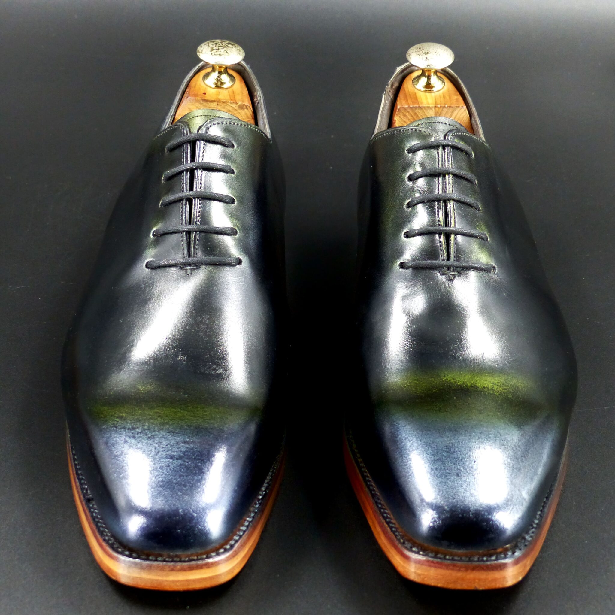
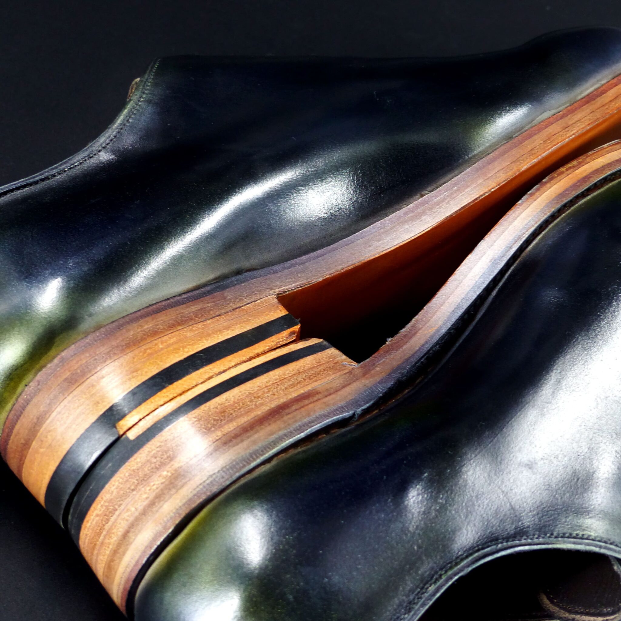
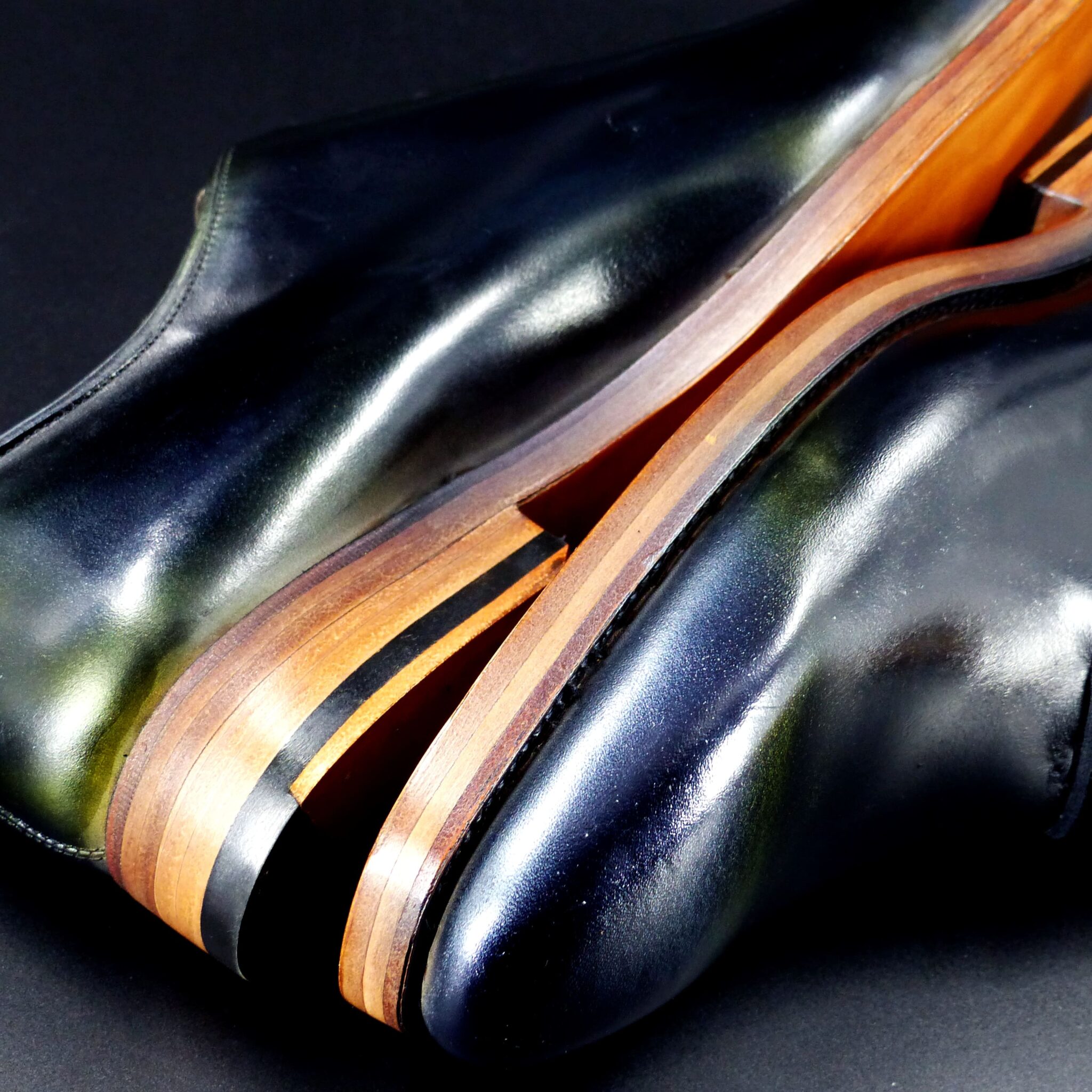
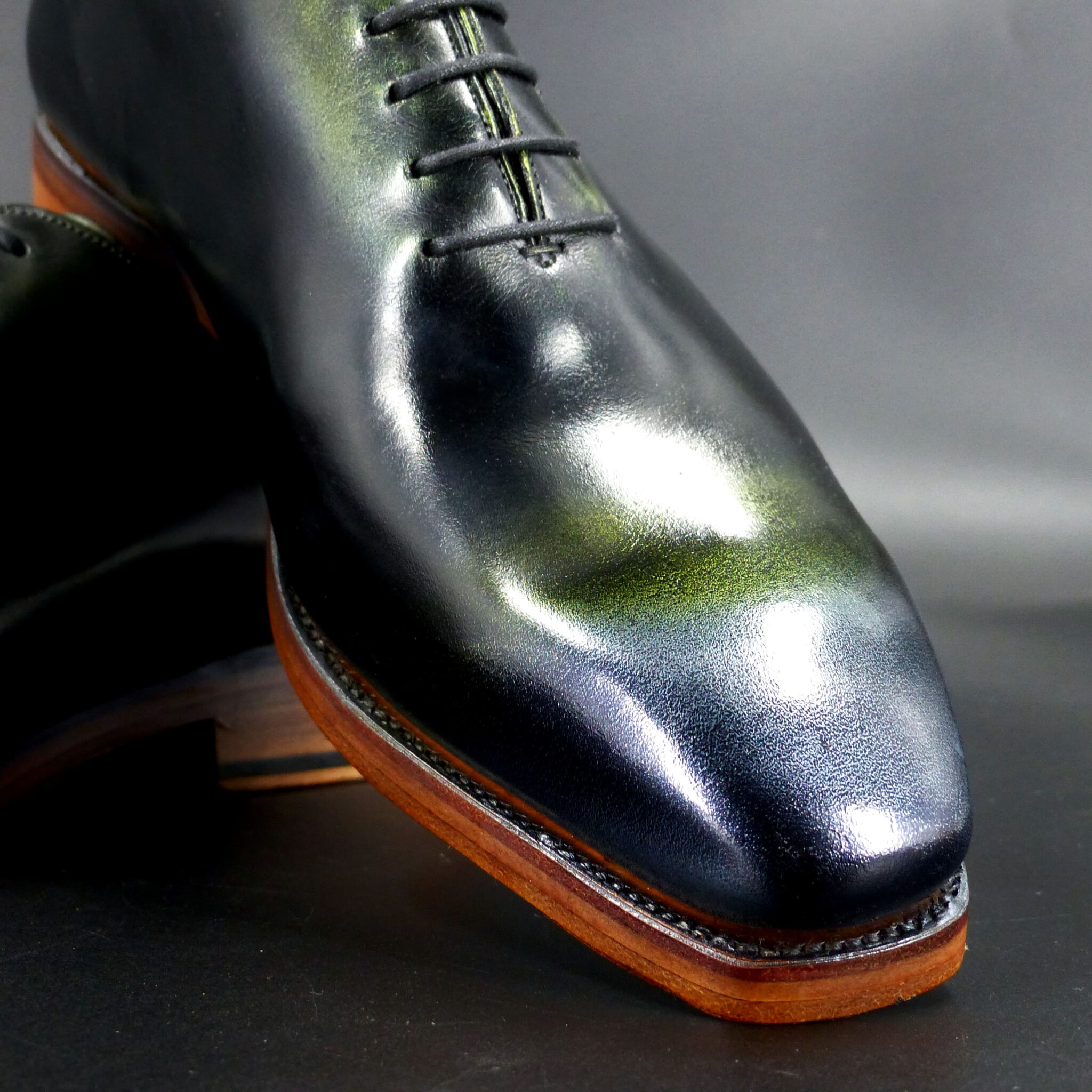
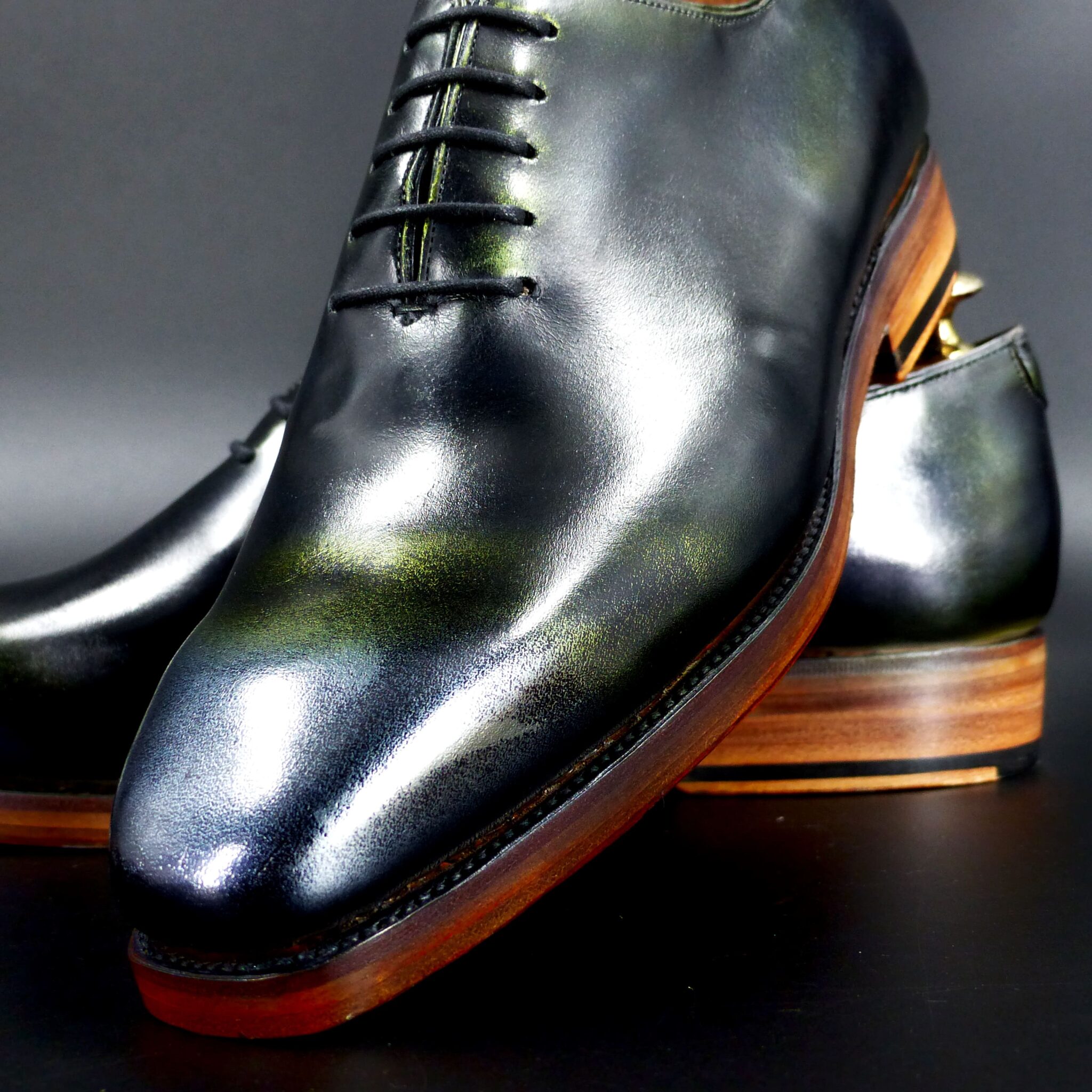
仙斎茶(せんさいちゃ)は緑がかった茶色、または暗い緑色の一種です。
現代の感覚では「茶」とついているため茶色を想像しがちですが、実際には深くくすんだ緑色を指します。灰色がかったオリーブグリーンのような色合いで、抹茶をさらに渋く落ち着かせたような印象です。
-仙斎茶の特徴-
江戸時代に好まれた、落ち着いた侘び寂びを感じさせる色。
武士や茶人の装いにふさわしく、派手さを抑えた粋な色合い。
暗い緑系統の色でありながら、茶色がかった渋みのある色彩。
つまり、「仙斎茶」は、単なる茶色ではなく、緑がかった渋い色です。
Senzai-cha (仙斎茶) – A Muted Greenish-Brown or Dark Green Hue
In modern perception, the term “cha” (茶) in its name may lead one to think of brown, but Senzai-cha is actually a deep, subdued green color with a hint of brown. It has a grayish olive-green tone, resembling matcha but with a more muted and refined appearance.
Characteristics of Senzai-cha
- A reserved, wabi-sabi-inspired color that was favored during the Edo period.
- Ideal for samurai and tea masters’ attire, embodying understated elegance.
- A dark green-based hue with subtle brown undertones, giving it a refined, subdued charm.
In essence, Senzai-cha is not merely brown but rather a greenish, subdued, and sophisticated shade, embodying the quiet beauty cherished in traditional Japanese aesthetics.